Multi Panel Abstract Wall Art
Multi Panel Abstract Wall Art
-
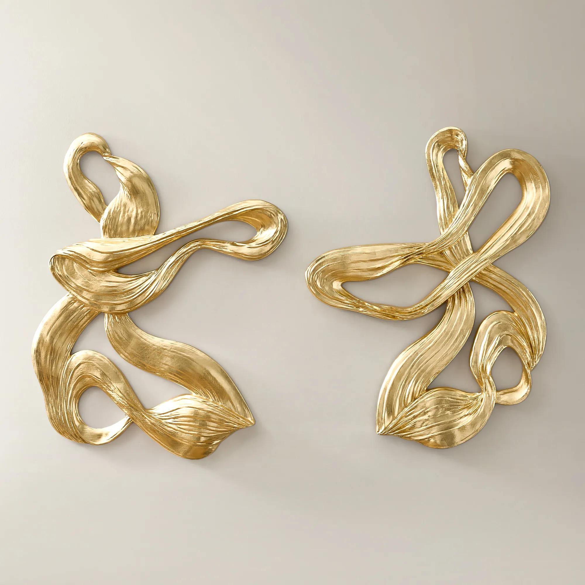
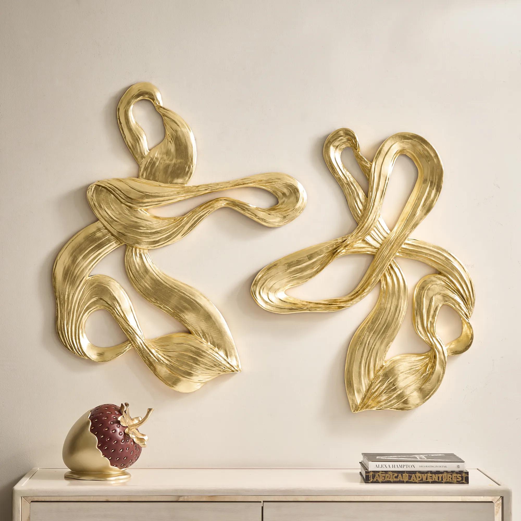 Vela Gold Leaf Sculpted Resin Wall Decor 30.5" x 39.25" Set of 2$699
A set of two resin wall sculptures featuring abstract loop designs and soft gold leafing for modern elegance.
Add To Cart -
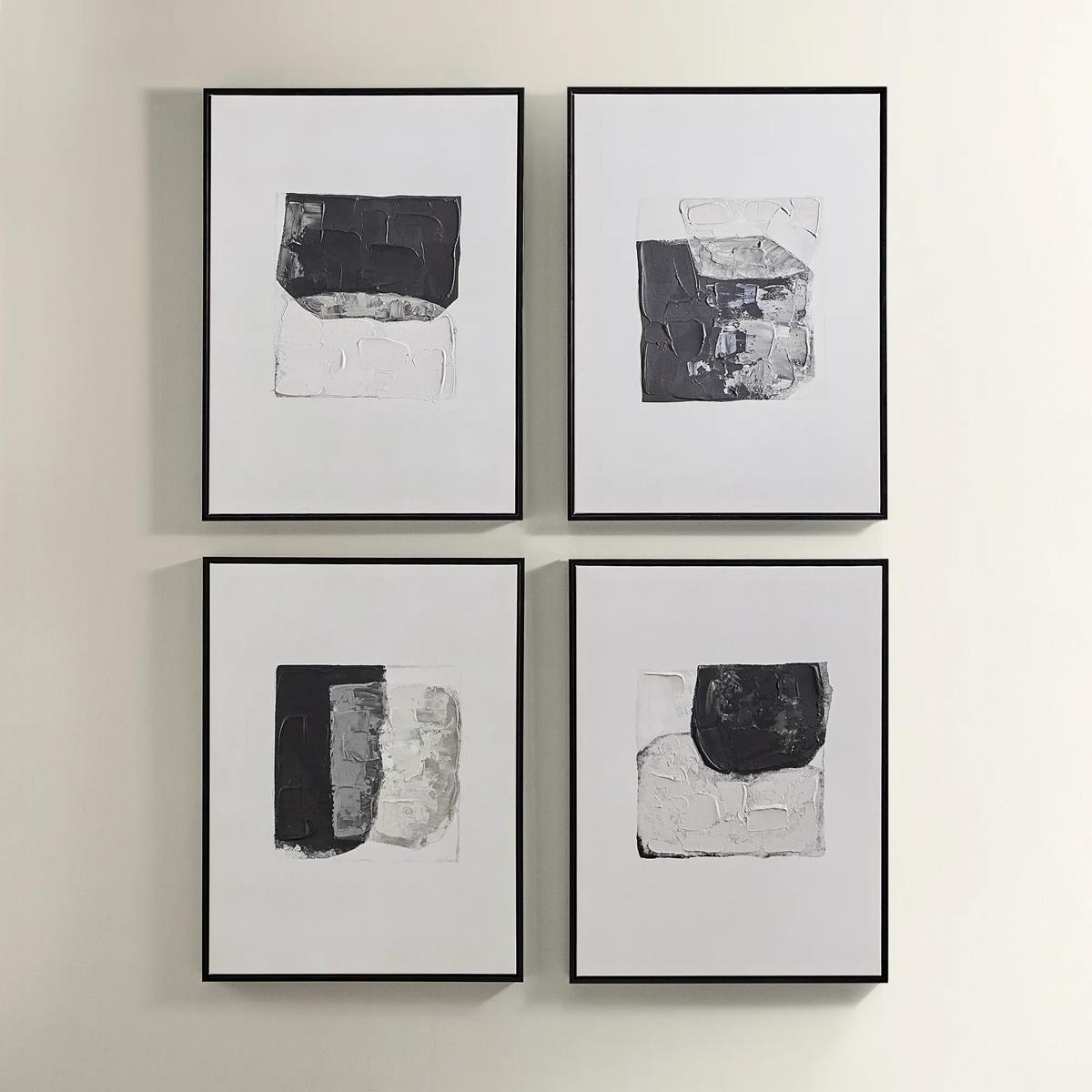
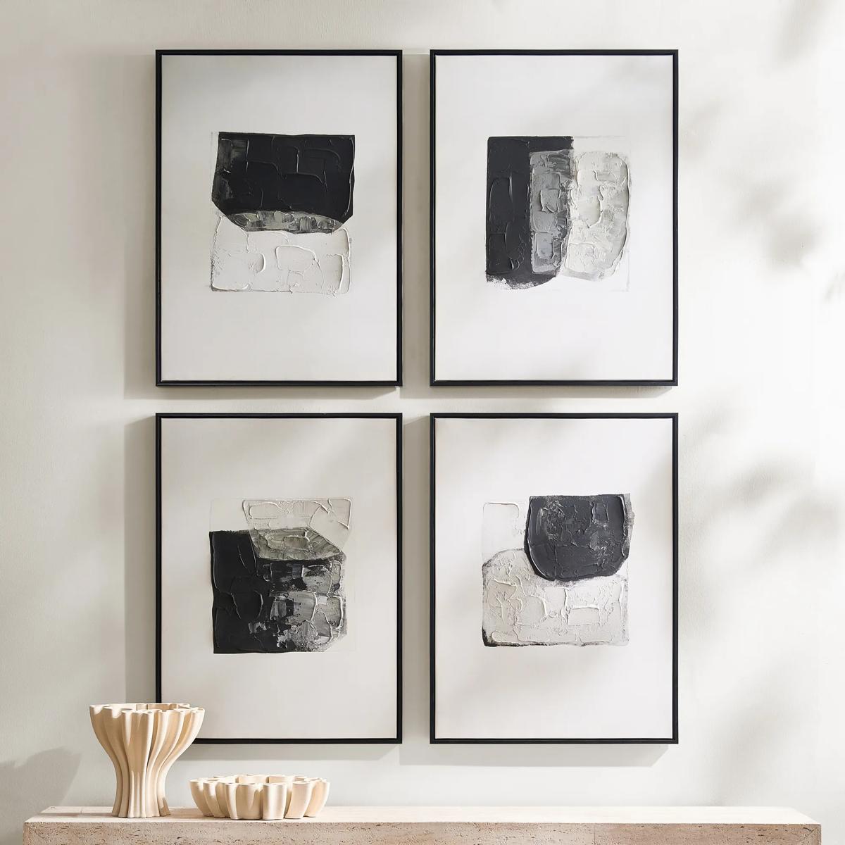 Shadows Framed Painted Wall Art Set of 4$299
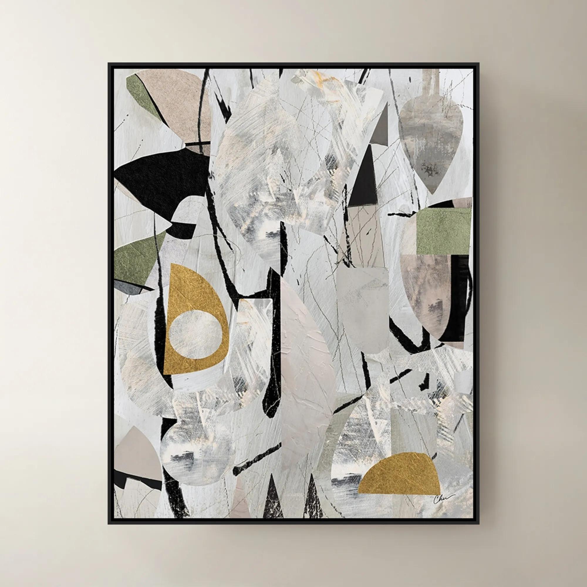
A set of four hand-painted abstract canvases featuring black, white, and gold accents in black frames.
Add To Cart -
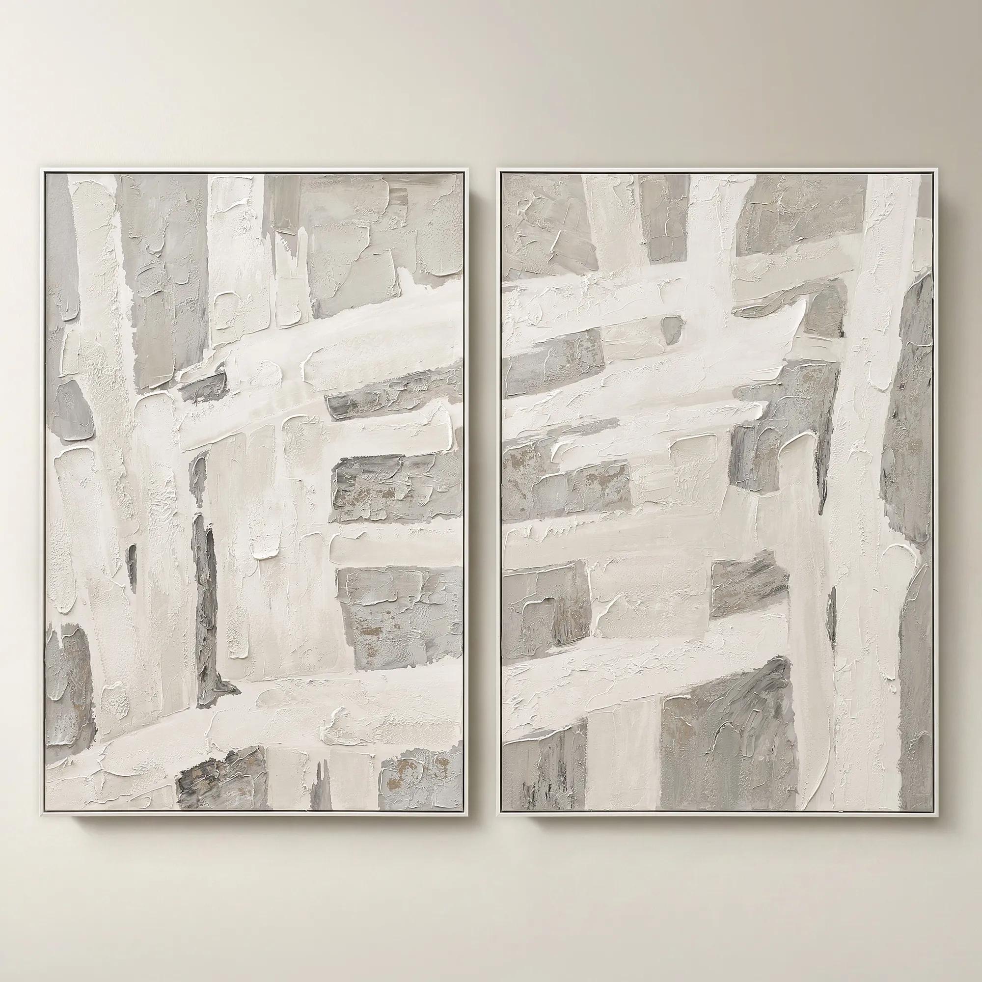 Traverse Framed Painted Wall Art 40" x 60" Set of 2$799
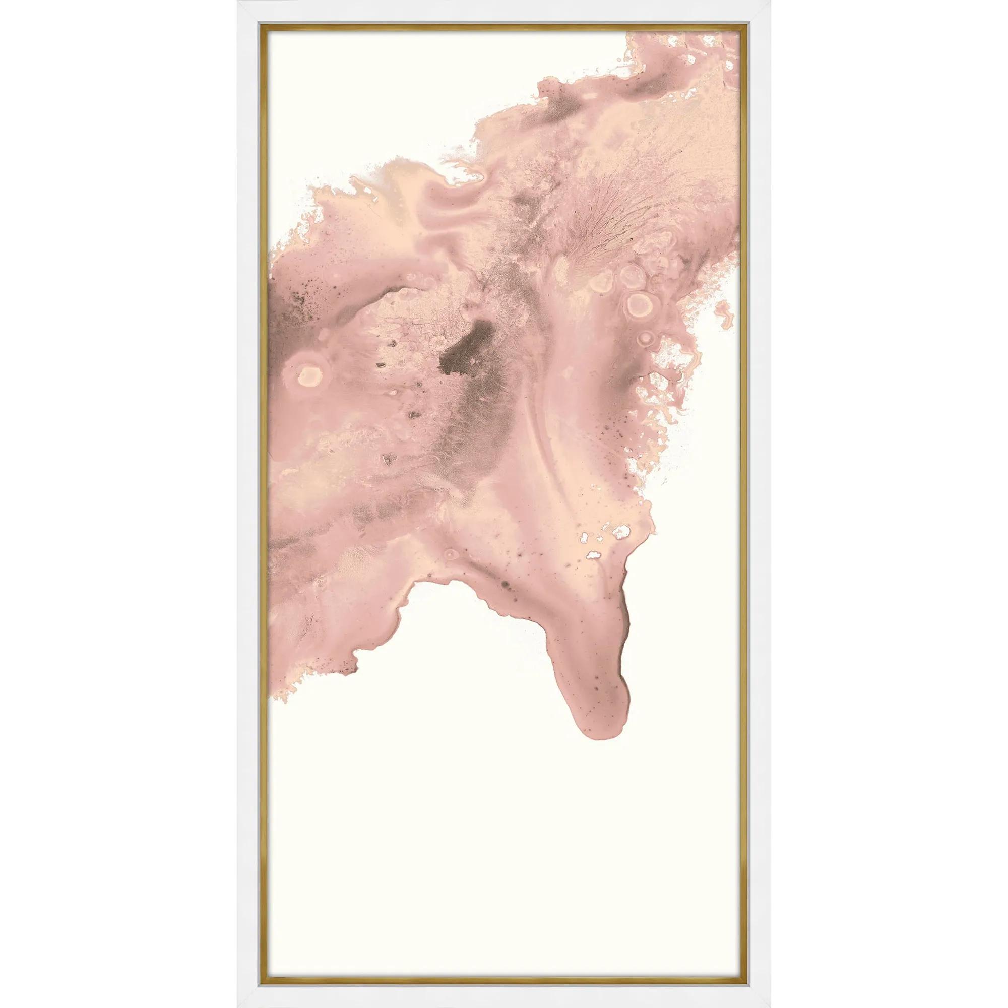
A hand-painted abstract diptych features champagne accents and soft grey, pearl, and alabaster tones in white frames.
Add To Cart -
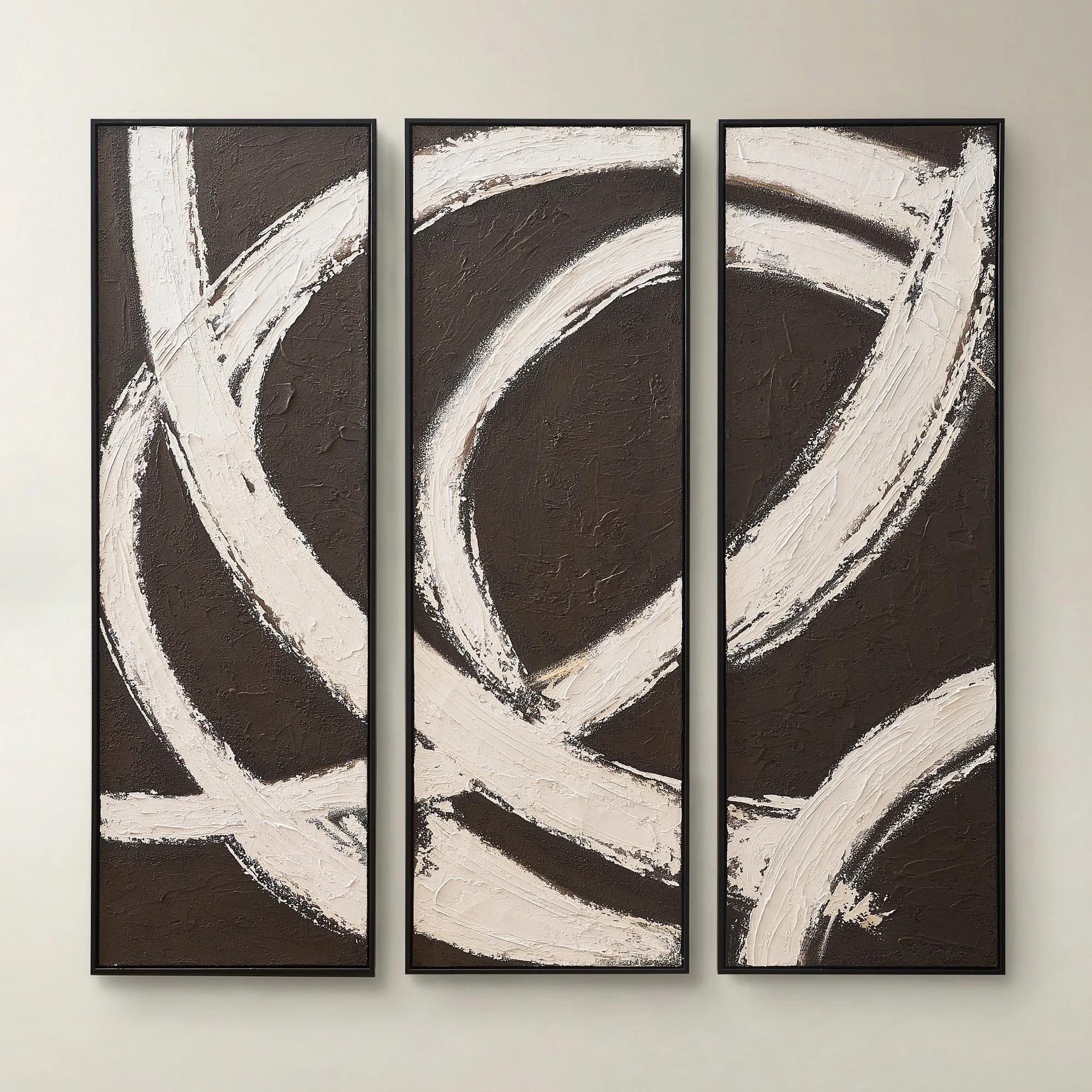
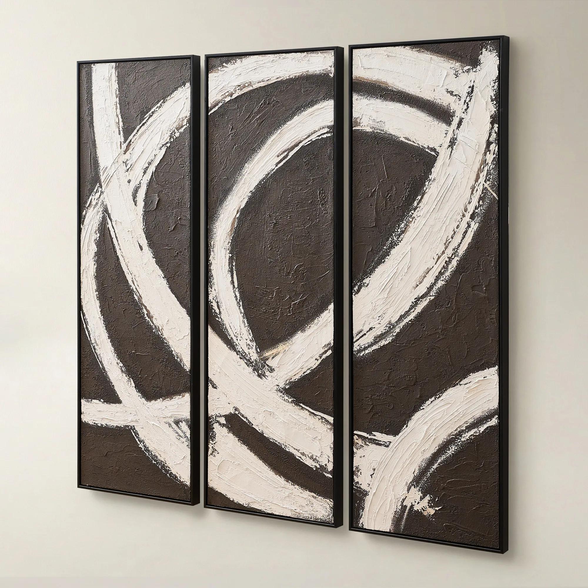 Spun in Coco Framed Painted Wall Art 20" x 60" Set of 3$499
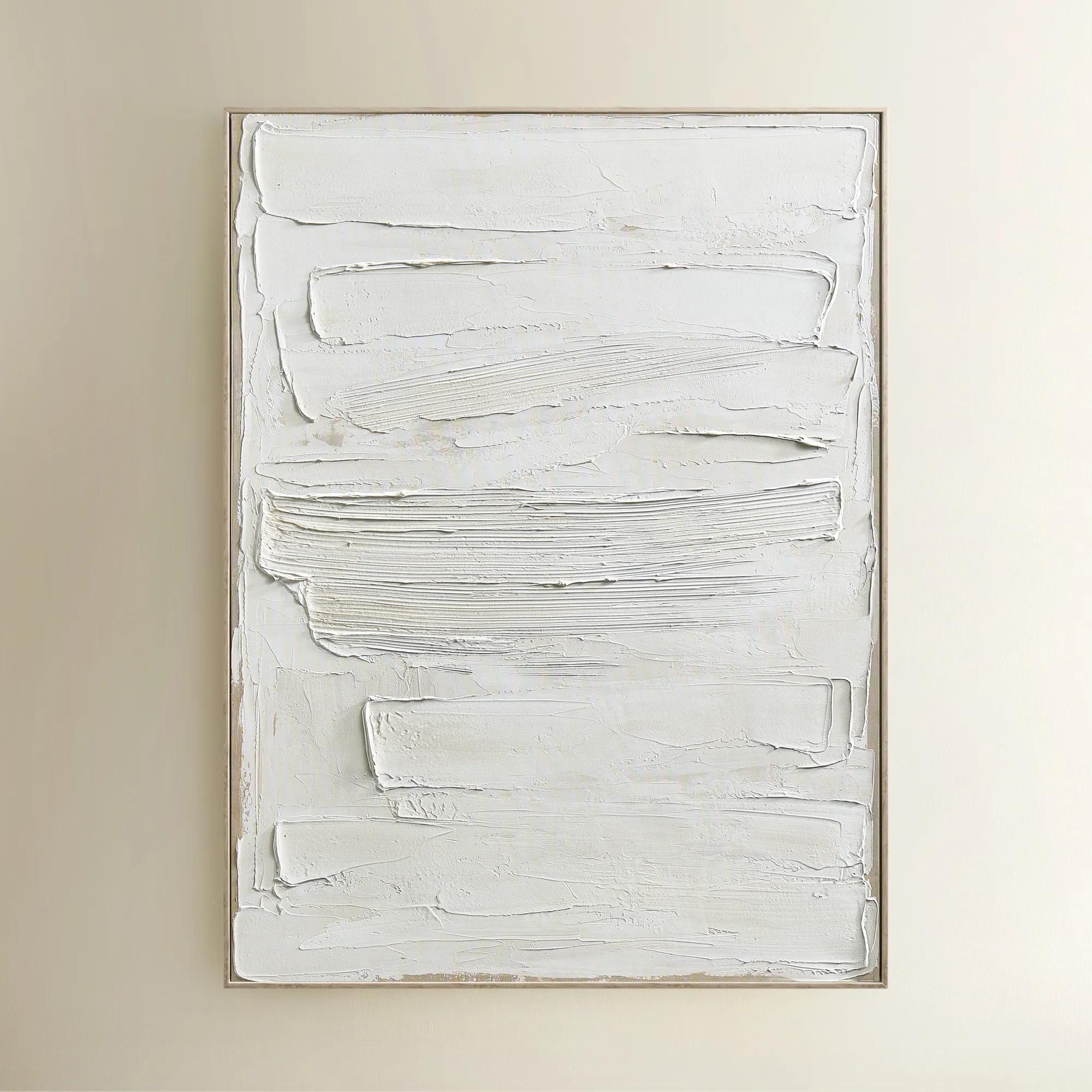
A hand-painted triptych featuring dark chocolate and alabaster tones with rich texture and modern contrast.
Add To Cart -
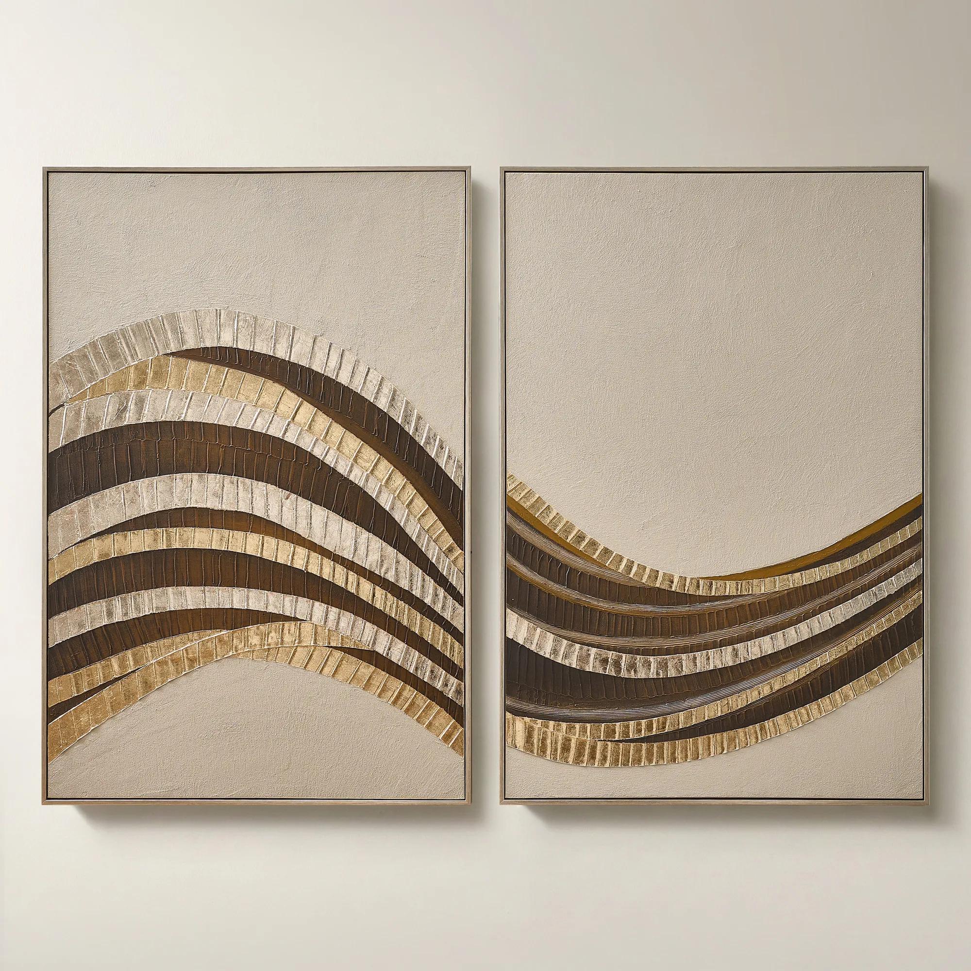 Stillness in Motion Framed Gold Leaf Painted Wall Art 40" x 60" Set of 2$899
A hand-painted abstract diptych with gold leaf accents, textured surface, and brushed champagne frames.
Add To Cart -
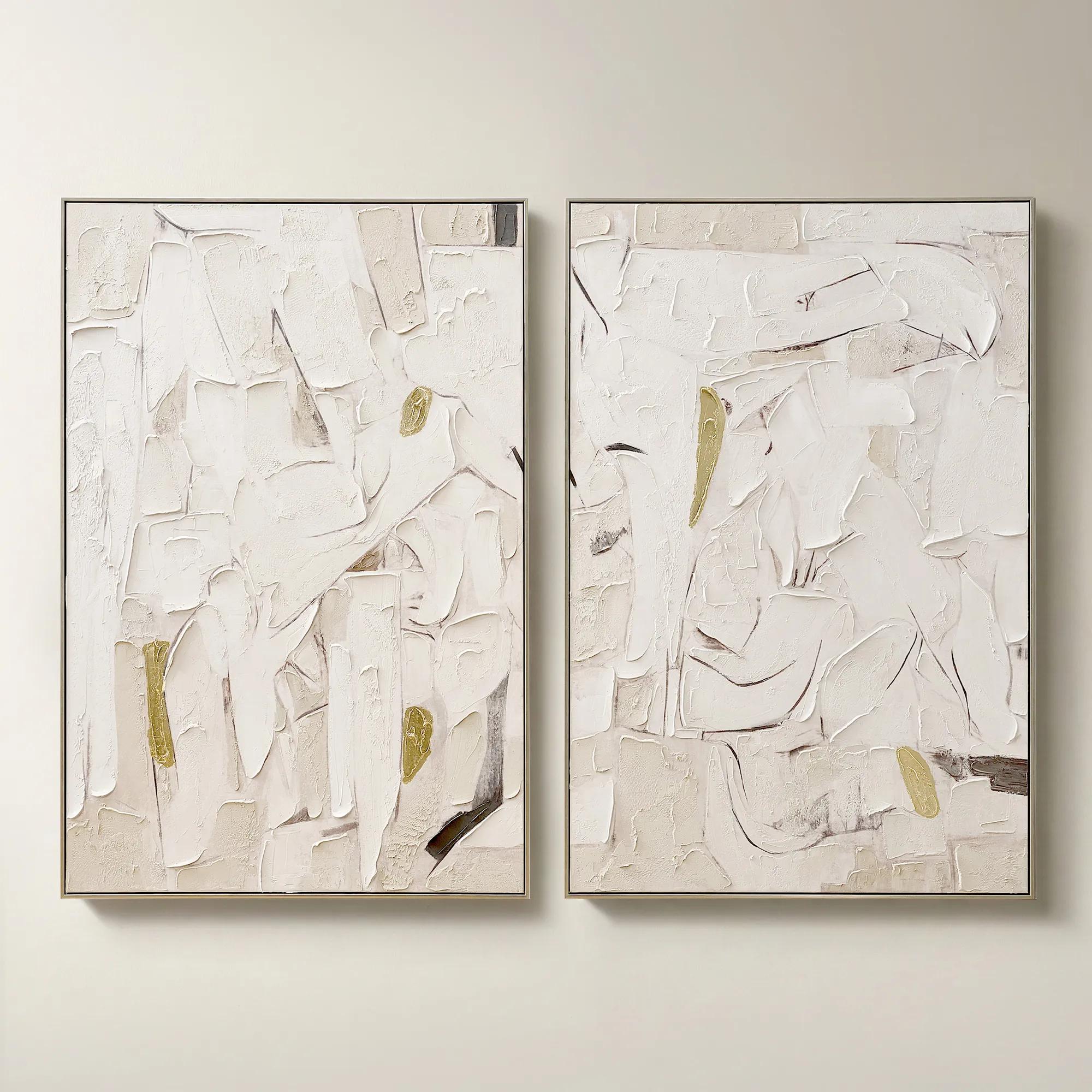 Beneath the Surface Framed Gold Leaf Painted Wall Art 40" x 60" Set of 2$799
A hand-painted abstract diptych featuring gold detailing and layered texture in alabaster and tawny hues.
Add To Cart -
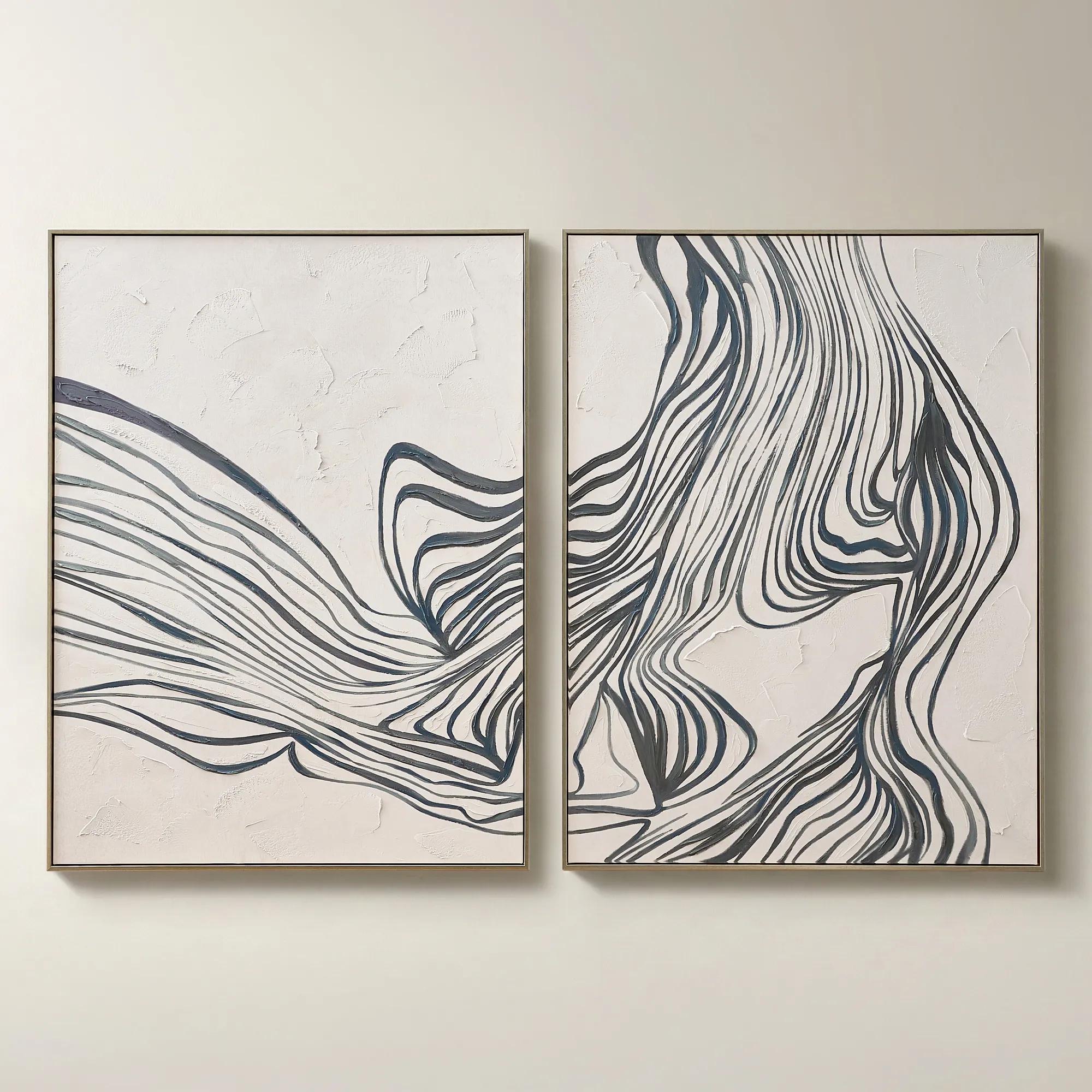
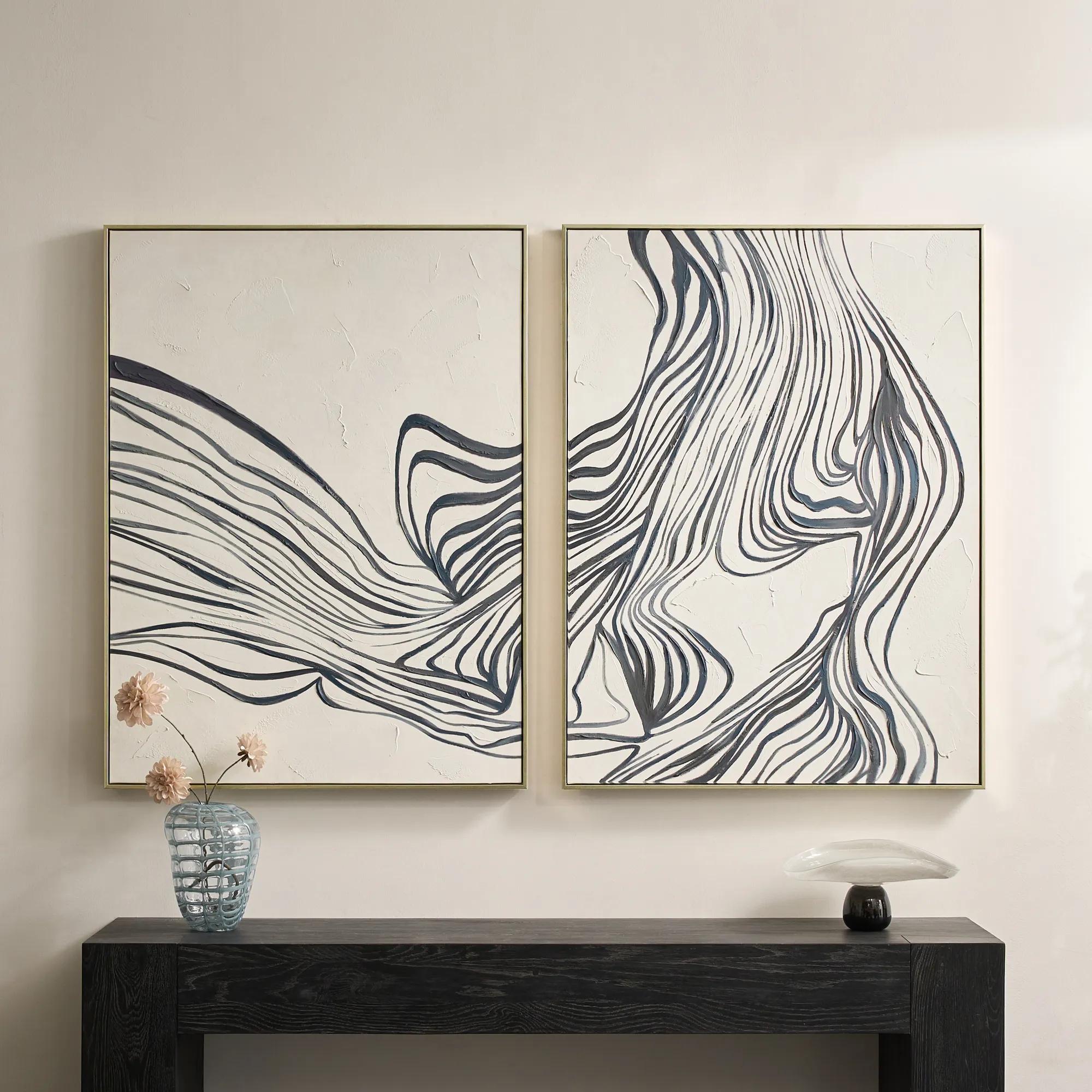 Rhythmic Framed Painted Wall Art 36" x 48" Set of 2$599
A hand-painted diptych featuring bold abstract stripes in dark slate and dusty blue with champagne frames.
Add To Cart -
 Relic Framed Painted Triptych Wall Art Set of 3$399
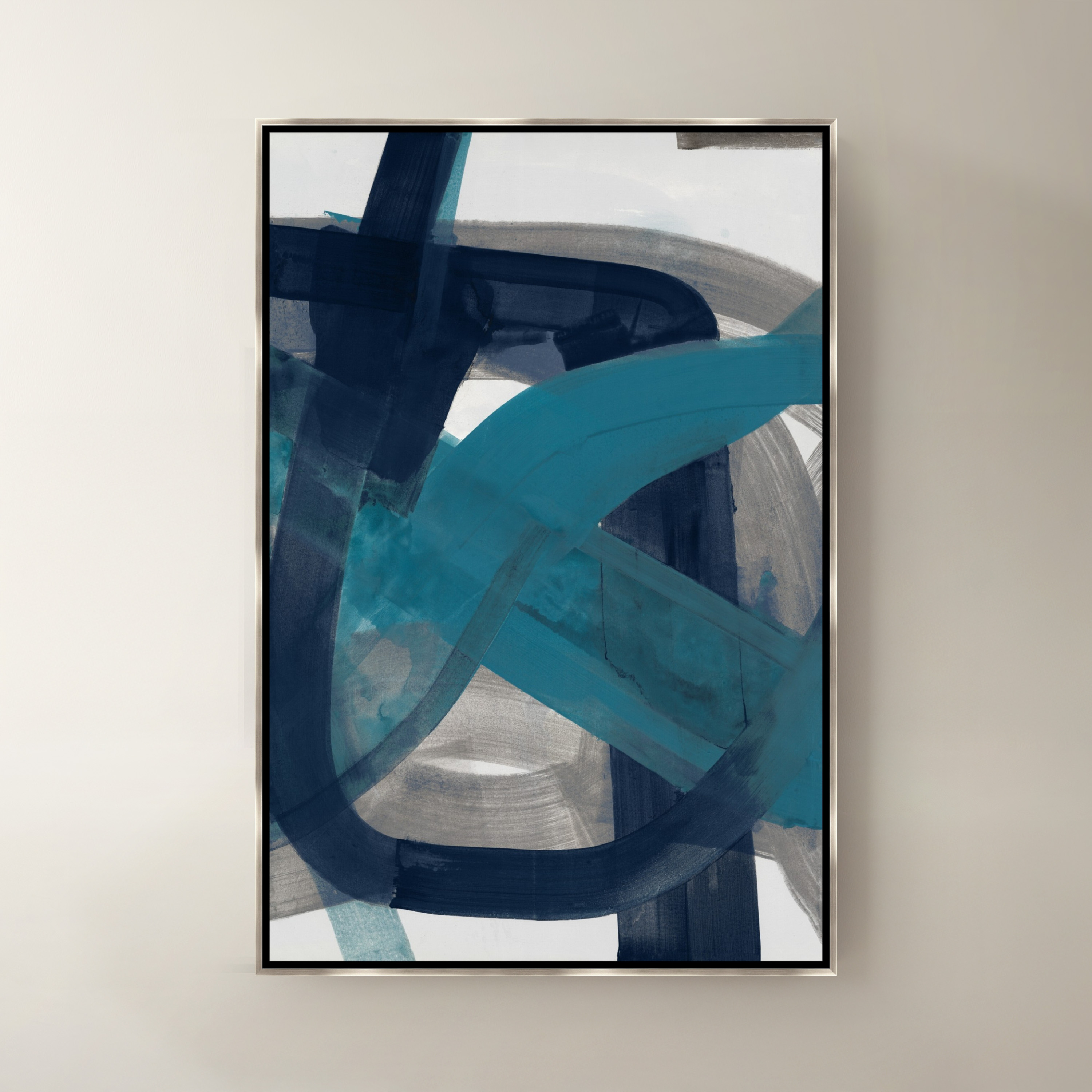
A hand-painted abstract triptych in deep navy and neutral tones, set in sleek black floater frames.
Add To Cart -
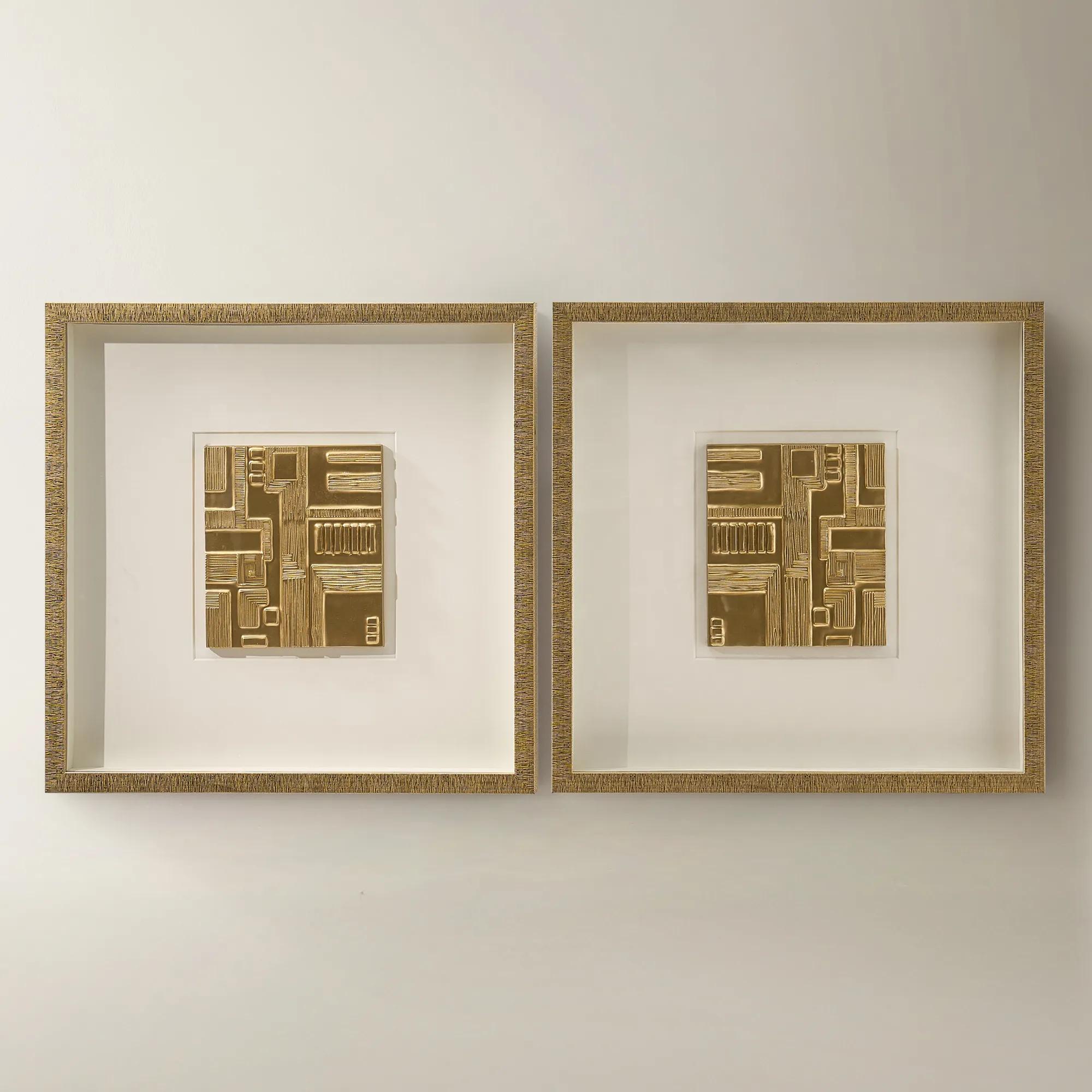
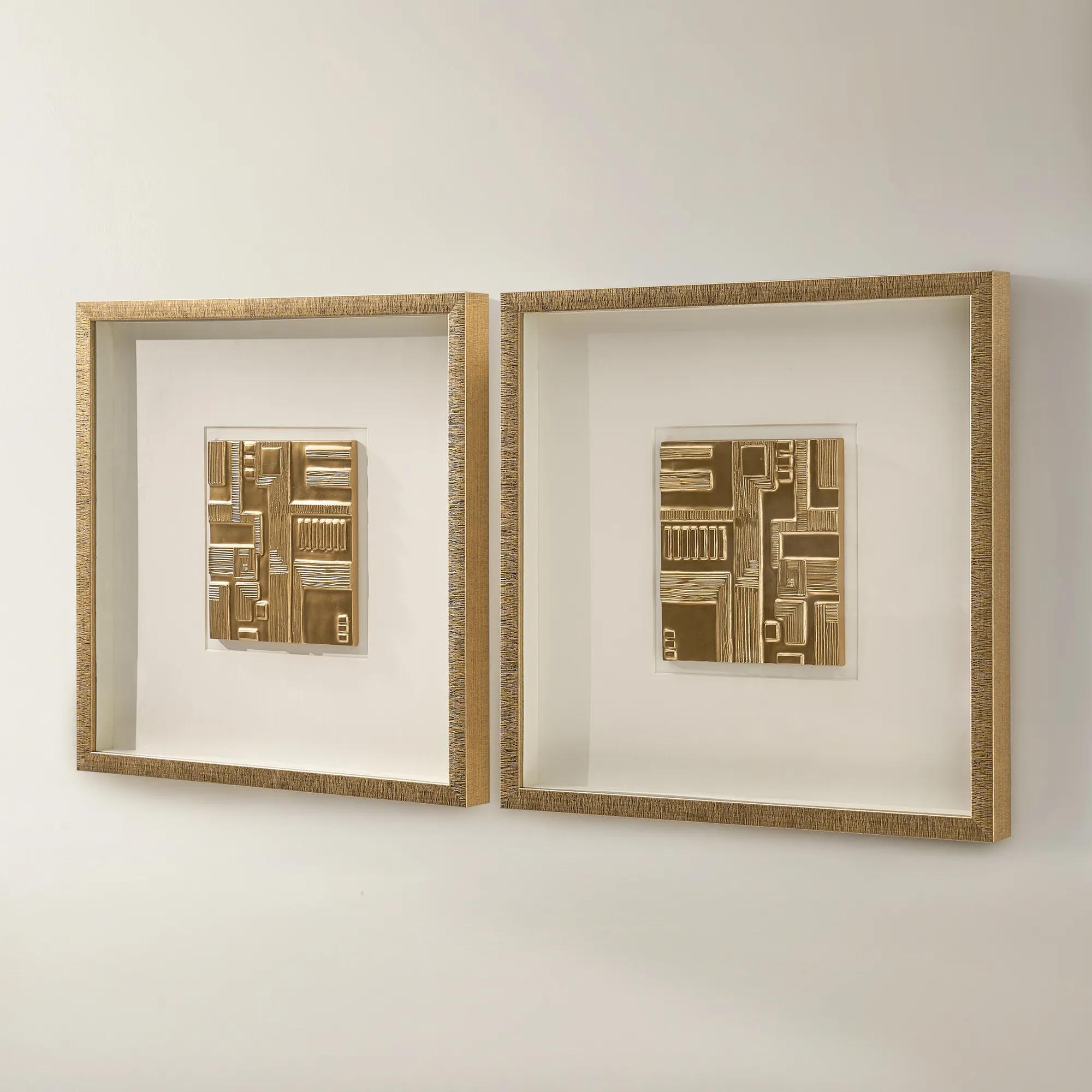 Ritual Framed Woodcarving Wall Decor Set of 2$329
A set of two gold-framed woodcarvings with ivory mats and dimensional relief for gallery-style wall decor.
Add To Cart -
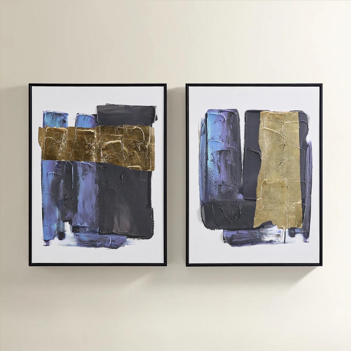
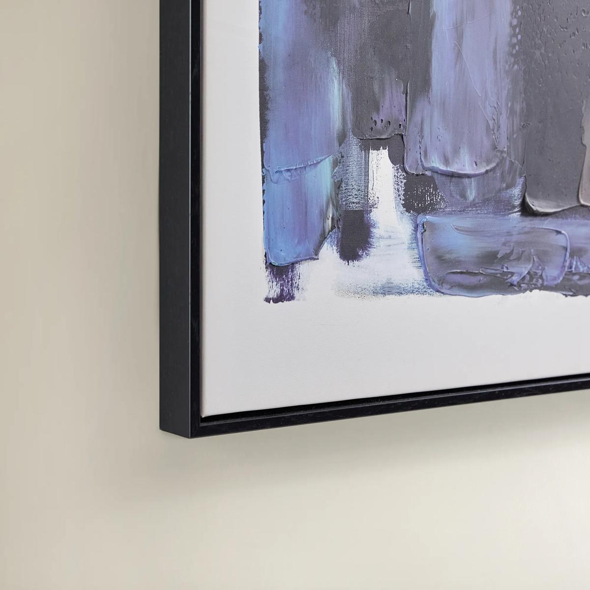 Deep Thoughts Gold Leaf Painted Wall Art Set of 2$199
A set of two hand-painted abstract canvases in blue and gold leaf, framed in sleek black.
Add To Cart -
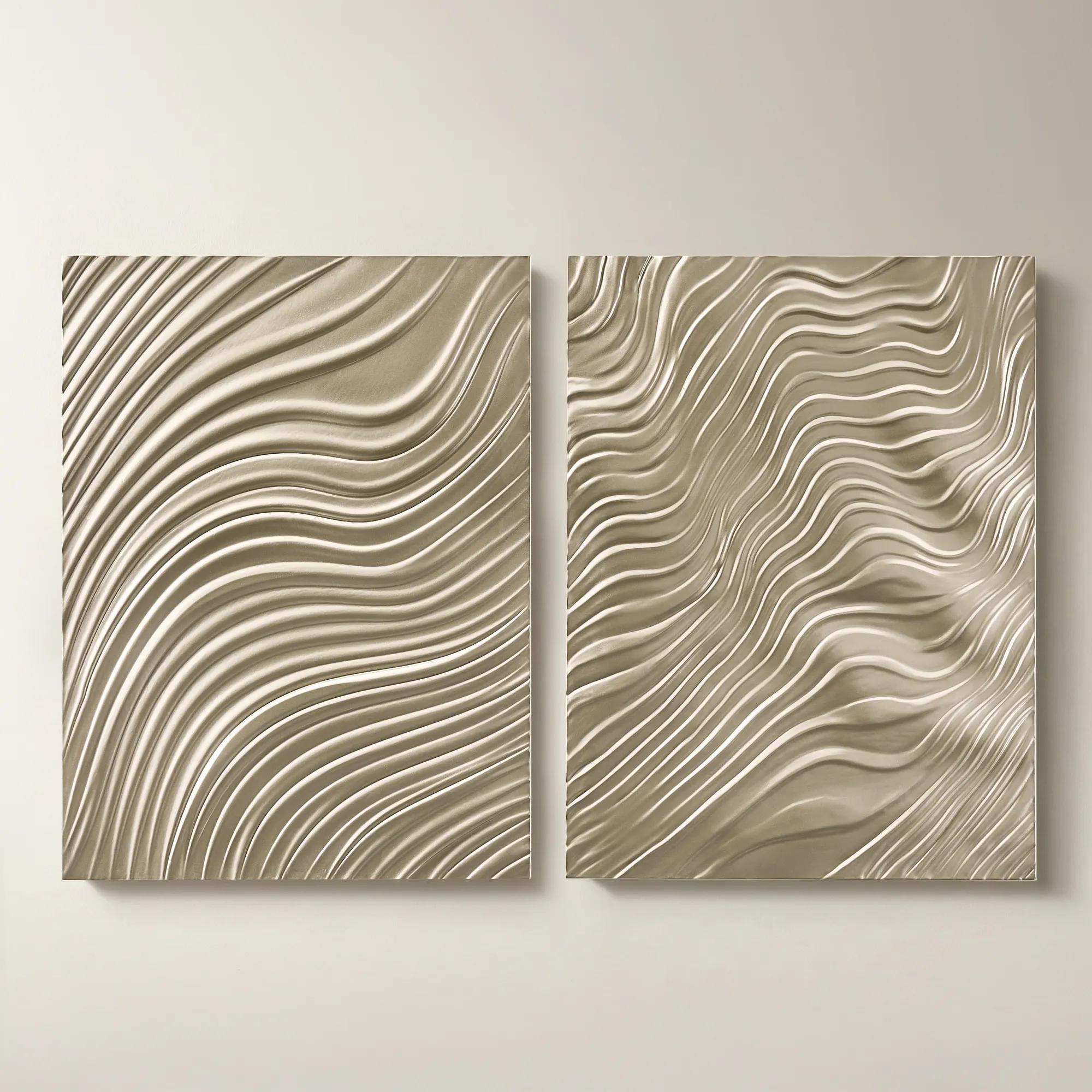
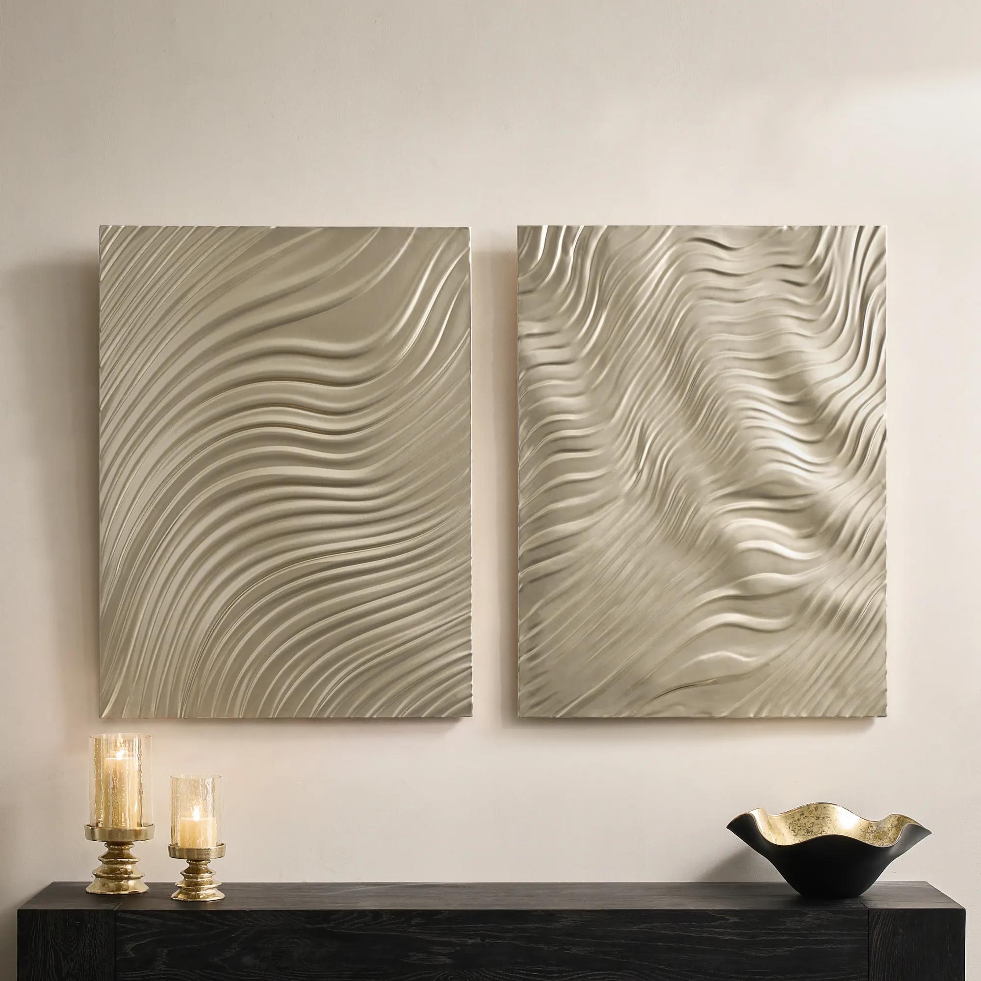 Mirage Champagne Carved Wood Wall Panels 30" x 40" Set of 2$799
A set of two intricately carved wood composite panels in a champagne finish with flowing 3D patterns.
Add To Cart -
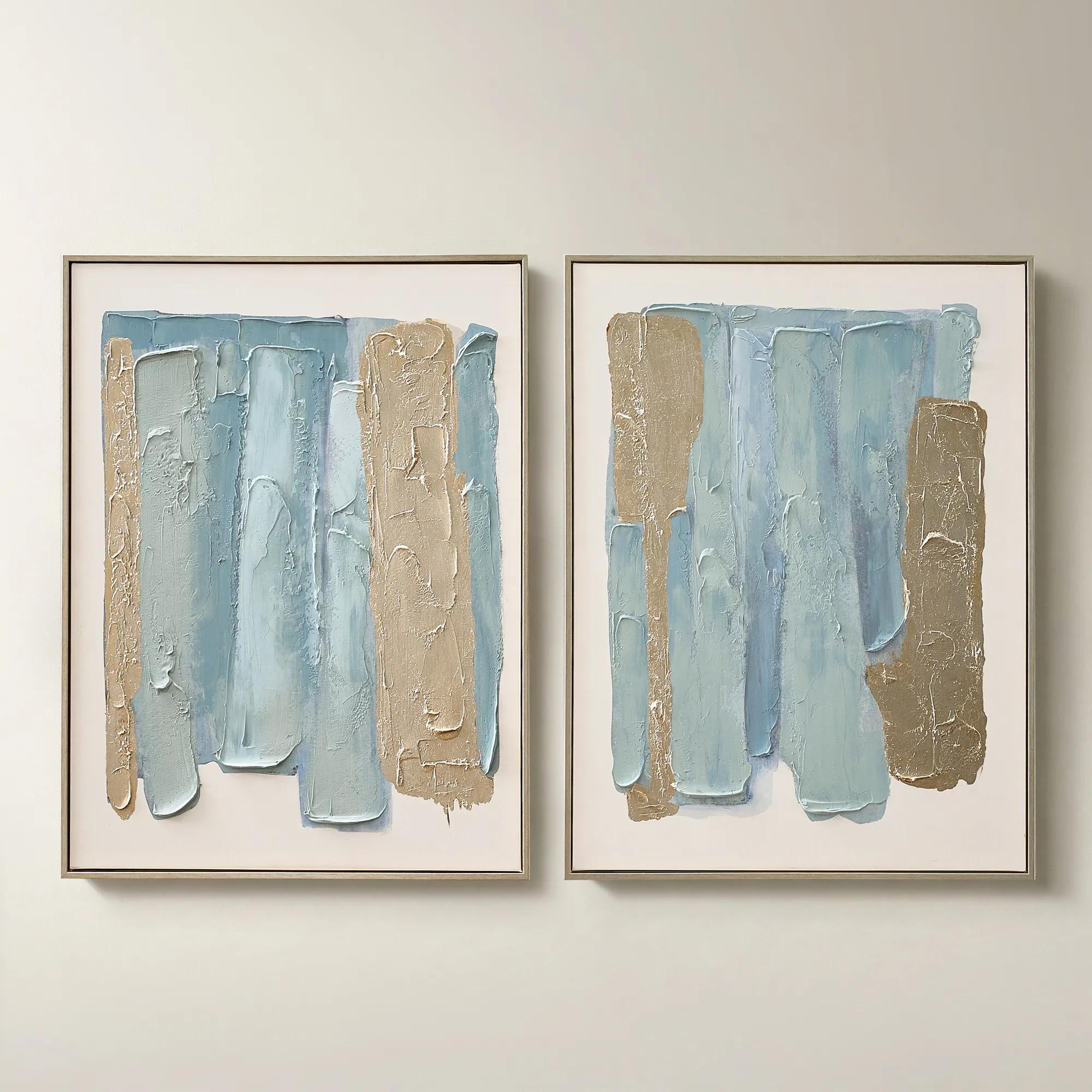
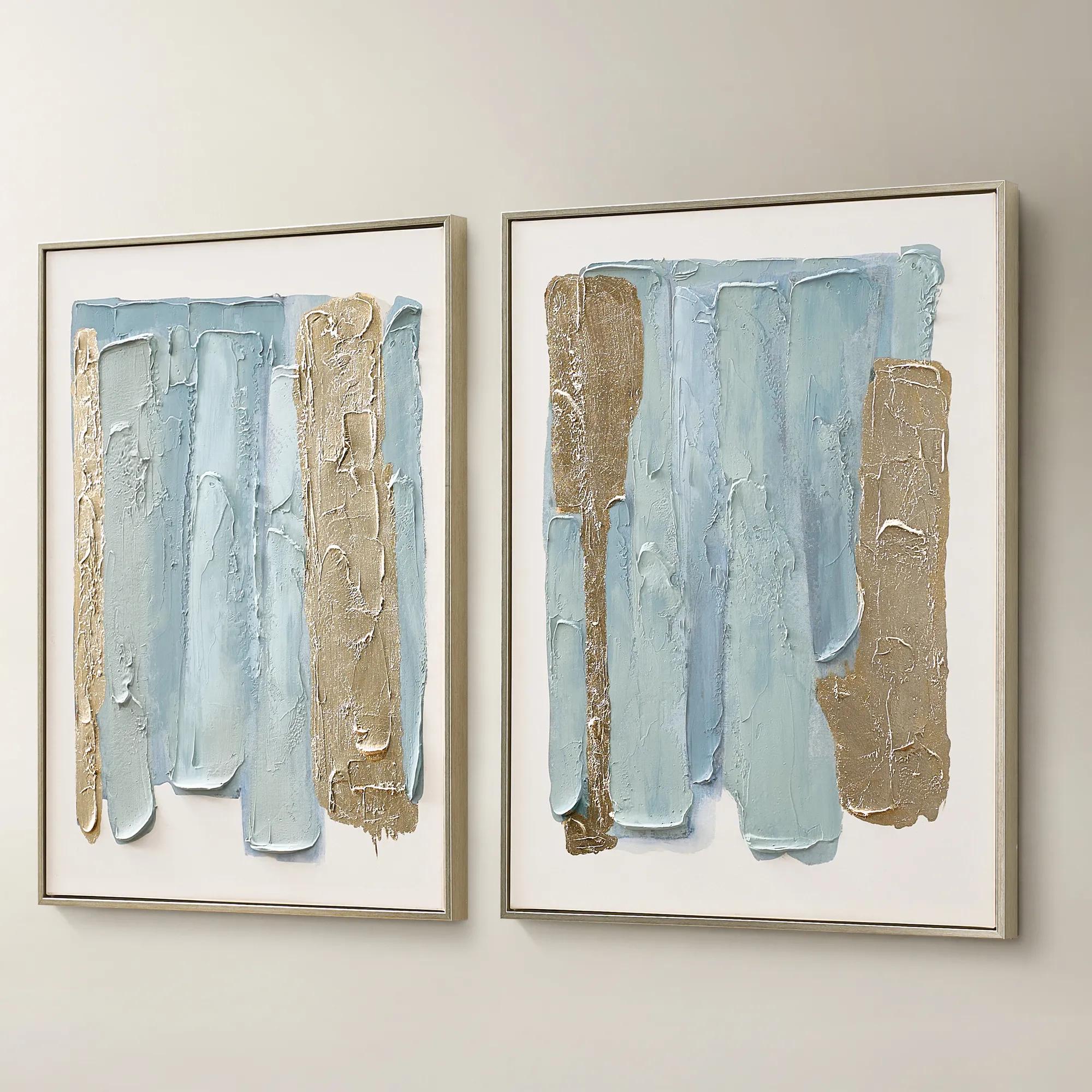 Blue Drift Framed Champagne Painted Wall Art 24" x 32" Set of 2$199
A set of two hand-painted canvases in dusty blue with champagne leafing and modern abstract movement.
Add To Cart -
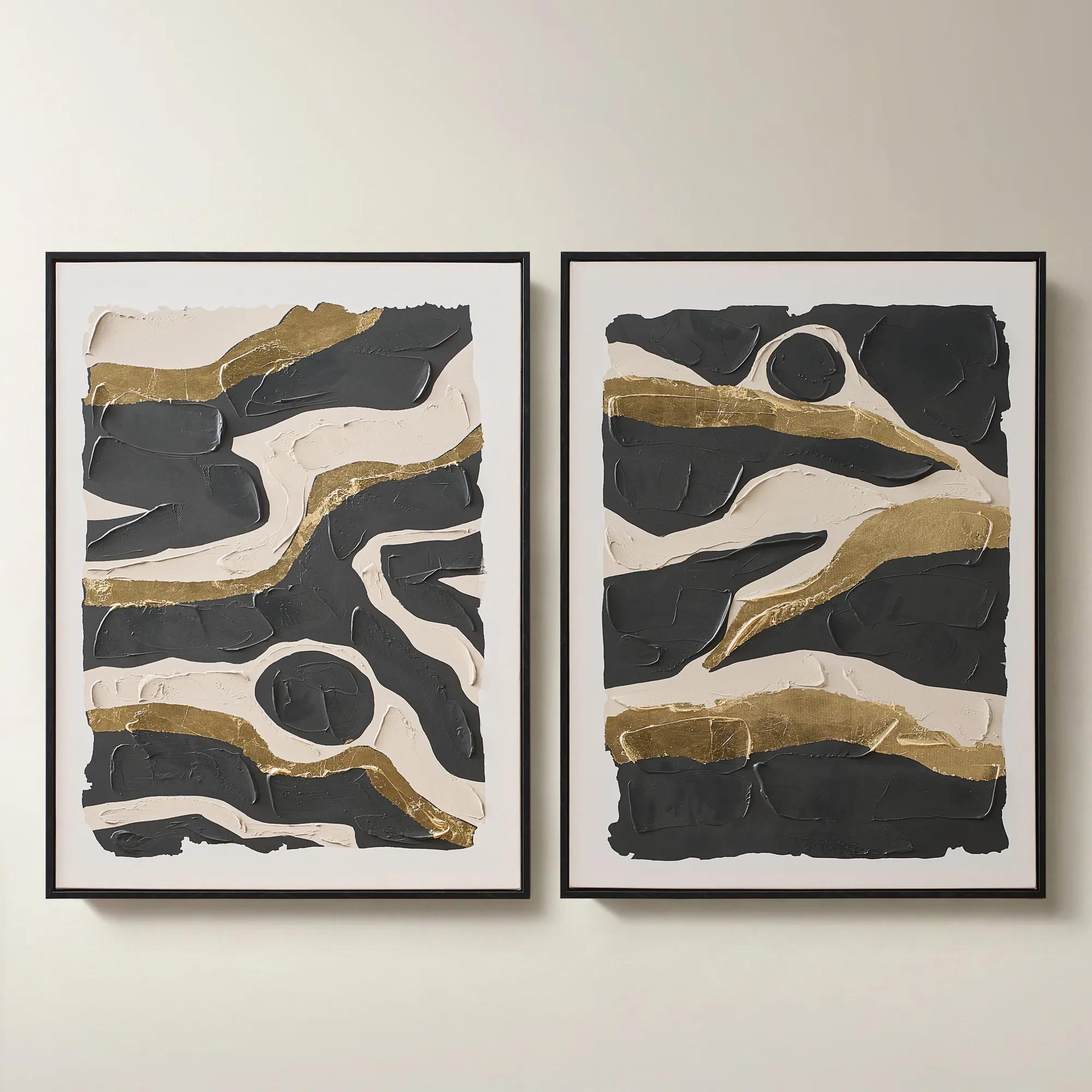
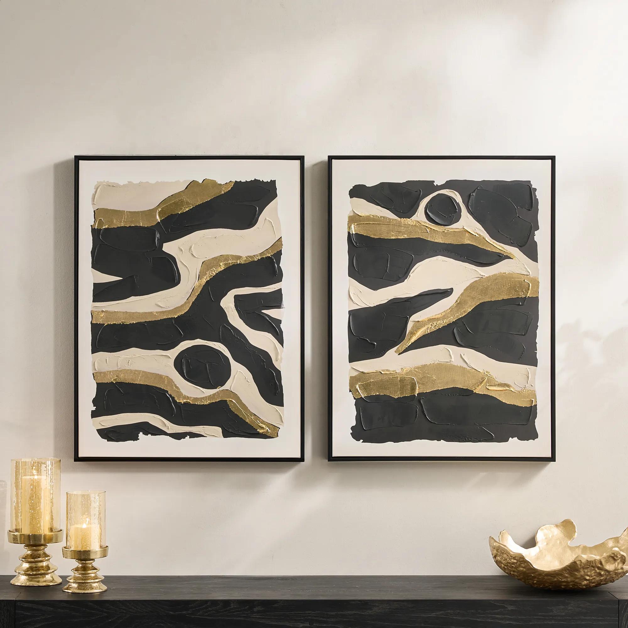 Untamed Framed Gold Leaf Painted Wall Art 24" x 32" Set of 2$199
A hand-painted diptych featuring abstract black and gold canvas art with expressive, gallery-inspired energy.
Add To Cart

Multi Panel Abstract Wall Art
Explore multi-panel abstract wall art for a dramatic focal point that unfolds across visually connected pieces. These coordinated art sets bring rhythm and expressive design to your walls. When choosing a composition, consider how its colors complement your room and measure the full arrangement—including spacing between panels—to plan placement above a sofa, bed, or console.
Multi-panel abstract wall art presents a continuous composition or coordinated imagery across two or more separate panels, creating a statement with movement, scale, and deliberate pauses between each section. Two-panel arrangements are called diptychs, while three-panel compositions are known as triptychs; four- and five-panel groupings extend the artwork’s rhythm across a broader expanse. Unlike a collection of unrelated pictures, these arrangements are designed to read together, with color, line, or texture connecting the individual pieces. A sweep of charcoal may travel from one canvas to the next, while luminous ivory fields or flashes of gold create moments of contrast. The spaces between panels become part of the composition, allowing the wall itself to participate in the design. This interplay makes abstract wall art especially compelling above a generous sofa, along a dining room wall, or behind a bed where a substantial focal point brings the furnishings into balance. The mood can be expansive and serene or richly theatrical: soft tonal washes lend depth without visual noise, while angular forms and saturated color introduce a more assertive presence. Materials shape that impression as much as the imagery. Stretched canvas contributes a subtly textured surface and can offer an unframed presentation with finished edges. Framed prints bring a defined border that can echo nearby architectural details, and works on metal may introduce a sleek surface with a distinctive response to light, depending on their finish. Hand-applied texture, where present, adds another layer of interest, catching light differently as someone moves through the room. The strongest connection is not always an exact color match. A composition that repeats the smoky gray of a rug, the warm undertone of wood, or the glint of metallic accents can feel deeply integrated while retaining its own artistic character. Multi-panel artwork gives those connections room to unfold, turning an open wall into an expressive part of the interior rather than a backdrop.
Scale is central to the appeal of multi-panel abstract wall art, and the complete arrangement matters more than the dimensions of any single panel. Overall width includes every panel plus the spaces between them, a distinction that becomes especially important above furniture or within a recessed wall. Artwork spanning roughly two-thirds to three-quarters of the furniture below often creates a balanced relationship, though ceiling height, neighboring objects, and the composition itself may suggest a different proportion. Above an expansive sectional, a wide triptych can establish a confident horizontal line; over a smaller console, a restrained diptych can deliver impact without crowding lamps or decorative objects. Consistent spacing helps a continuous image remain visually connected. Gaps of about two to three inches can be a useful starting point, but the artwork’s proportions and any supplied placement instructions should determine the final arrangement. Narrower intervals may suit delicate lines that cross between panels, while a larger grouping may need more breathing room. Eye-level placement also depends on how the room is experienced. A center point around 57 to 60 inches from the floor is a familiar reference for an open wall, while artwork above seating often benefits from a closer relationship to the furniture, commonly about six to ten inches above the back. These measurements are reference points rather than rigid rules; tall sofa backs, headboards, and sculptural silhouettes deserve individual consideration. Painter’s tape or paper templates can reveal how an arrangement will occupy the wall before installation. Horizontal compositions emphasize breadth, while staggered or vertically oriented panels can accentuate height. For a narrow wall beside a fireplace or between windows, Large Vertical Abstract Wall Art offers a different proportional direction when a wide arrangement would feel compressed. The surrounding furnishings should leave the artwork enough visual space to register, allowing a bold composition to hold attention without competing with an equally elaborate display immediately below it.
A compelling arrangement also suits the way a space is lived in. In a living room, layered neutrals and broad gestures can connect plush upholstery, polished tables, and tactile rugs without introducing a literal subject. In a dining room, a more dramatic composition can give the wall an architectural presence, especially when its lines complement the length of the table. Bedrooms often welcome quieter contrasts and flowing forms, while a home office may benefit from a decisive graphic arrangement that remains engaging from across the room. Abstract imagery also leaves room for personal interpretation, making it appealing to collectors who prefer atmosphere and expression over recognizable scenes. Construction and finish deserve the same attention as color. Canvas tension, frame joinery, finished edges, backing, and mounting hardware all influence how confidently a grouping presents itself and how well it holds up over time. A substantial appearance does not necessarily indicate substantial weight, and each panel needs support appropriate to its actual weight and the wall material. Drywall, plaster, masonry, and other surfaces require different fastening solutions; heavy or oversized arrangements may warrant professional installation. In active households, positioning artwork away from frequent contact helps protect corners, textured surfaces, and frame finishes. Direct sunlight can contribute to fading, while persistent humidity or placement near heating and cooling vents may affect certain materials. Care should follow the instructions for the particular surface: gentle dusting may suit some canvases, while glazed prints require cleaning methods appropriate to their glass or acrylic covering. Spraying cleaner directly onto artwork can allow moisture to reach vulnerable edges, so surface-specific care is essential. Multi-panel art can also make a meaningful housewarming or wedding gift when the recipient’s aesthetic, available wall dimensions, and preferred palette are well understood. Whether chosen for a newly furnished room or an established interior seeking a bolder point of view, a coordinated arrangement brings color and structure into conversation. Its presence is both artistic and spatial, giving a room a focal point that feels considered from the first panel to the last.
FAQs
Multi-panel abstract wall art brings two or more individual artworks together in one expressive composition. The panels may continue a single image or share colors, shapes, and gestures. Displayed together, they create a sense of rhythm and movement, transforming a wall into an artful focal point.
Begin with the mood you want to create. Jewel tones introduce rich, confident drama, while soft neutrals invite a more serene atmosphere. Echo a color from your upholstery or decorative accents for cohesion, or choose a contrasting palette that gives the artwork a commanding presence.
Multi-panel abstract art can bring expressive energy to modern, contemporary, and glamorous interiors. Fluid compositions soften clean-lined furnishings, while graphic designs introduce definition and contrast. In an eclectic room, a shared color palette can connect the artwork with layered patterns and distinctive decorative objects.
Let the composition guide the arrangement. When an image flows across several panels, preserve its intended sequence so lines and shapes connect visually. For separate but coordinated pieces, look for a progression of color or movement that makes the grouping feel deliberate and beautifully composed.
Give the artwork visual priority by pairing it with furnishings and accents that support rather than compete with its composition. Repeat a standout hue in a pillow or sculptural vase, and balance energetic brushwork with quieter surrounding surfaces. The result is a layered room with a clear artistic point of view.