Large Colorful Abstract Wall Art
Large Colorful Abstract Wall Art
-
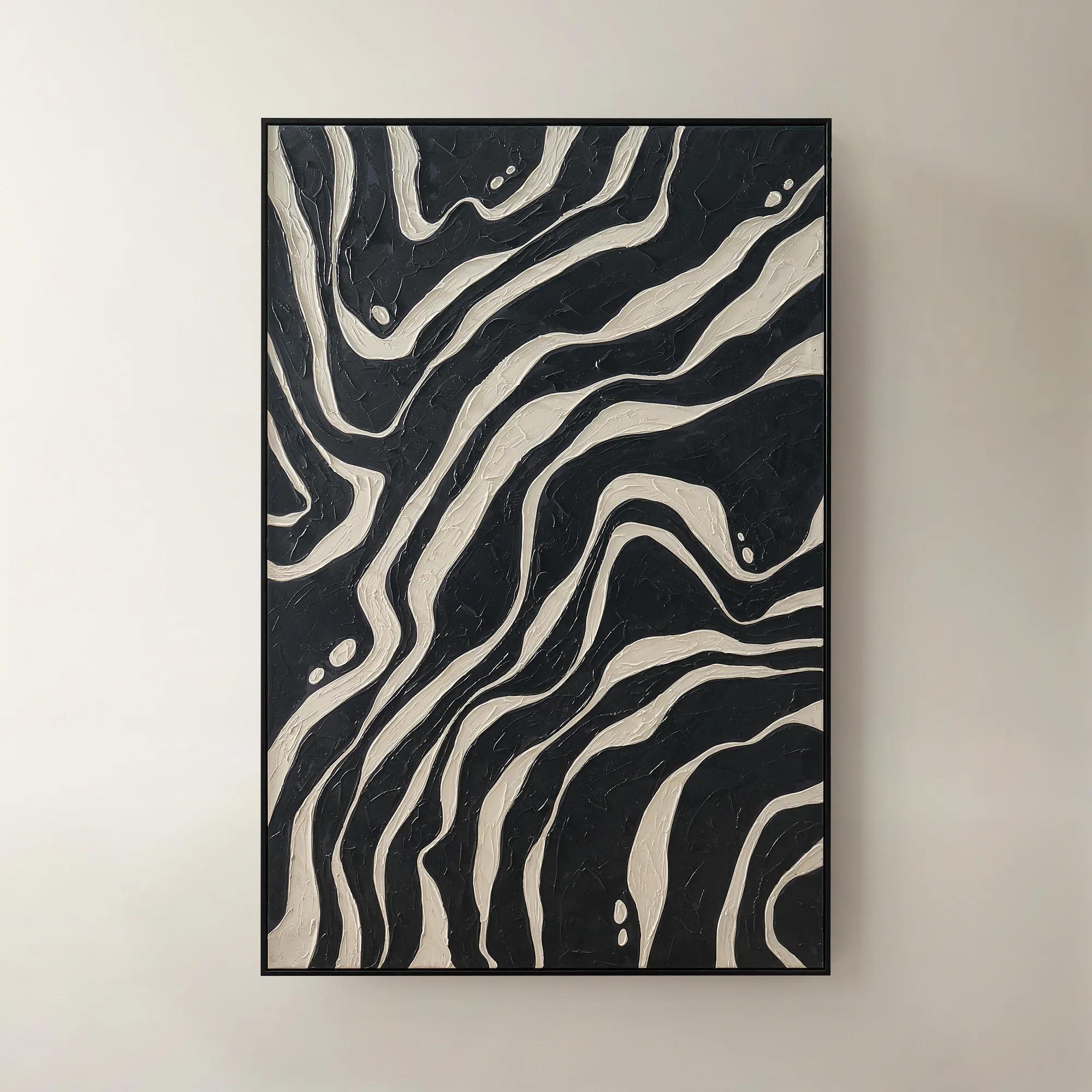
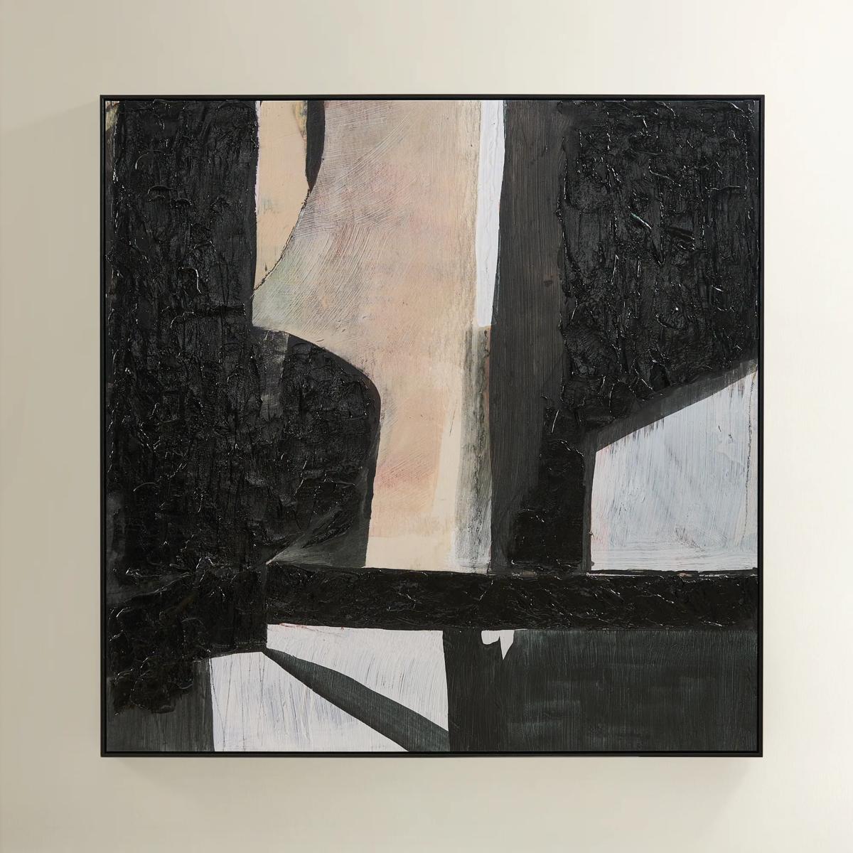 Grounded Painting$699
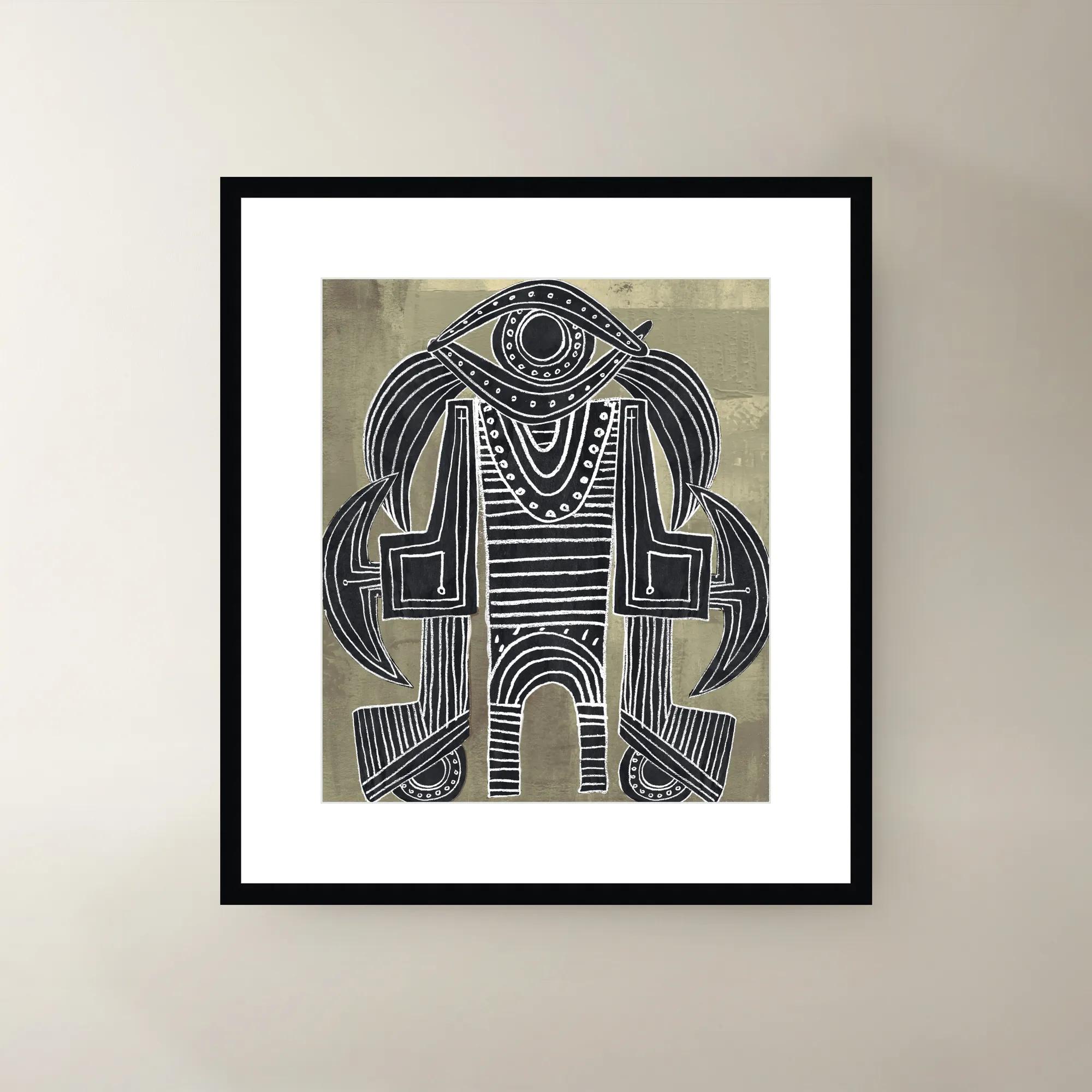
A hand-painted abstract canvas featuring black, cream, and earth tones in a sleek black floater frame.
Add To Cart -
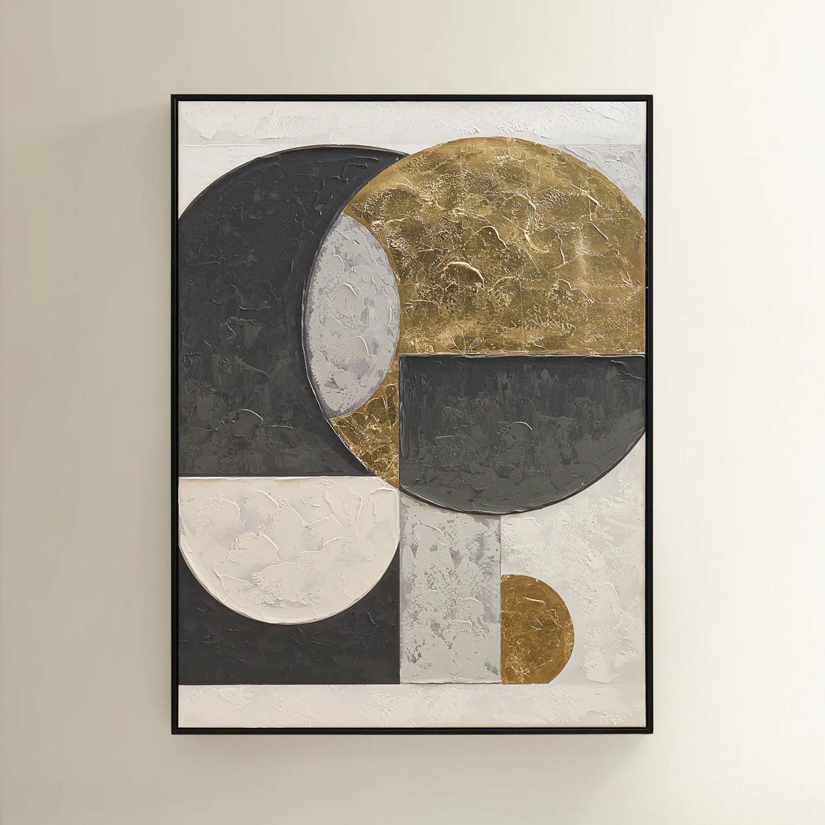
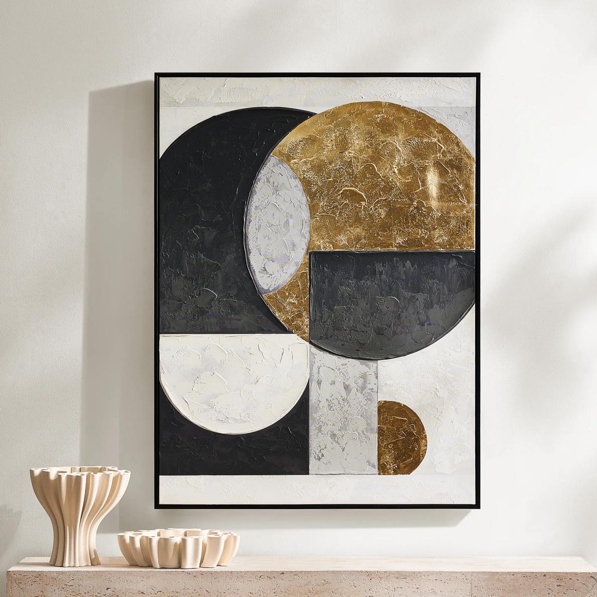 Eclipse Framed Gold Leaf Painted Wall Art 35.25" x 47.25"$449
A hand-painted canvas featuring bold black, grey, and gold geometric shapes with shimmering gold leaf accents.
Add To Cart -
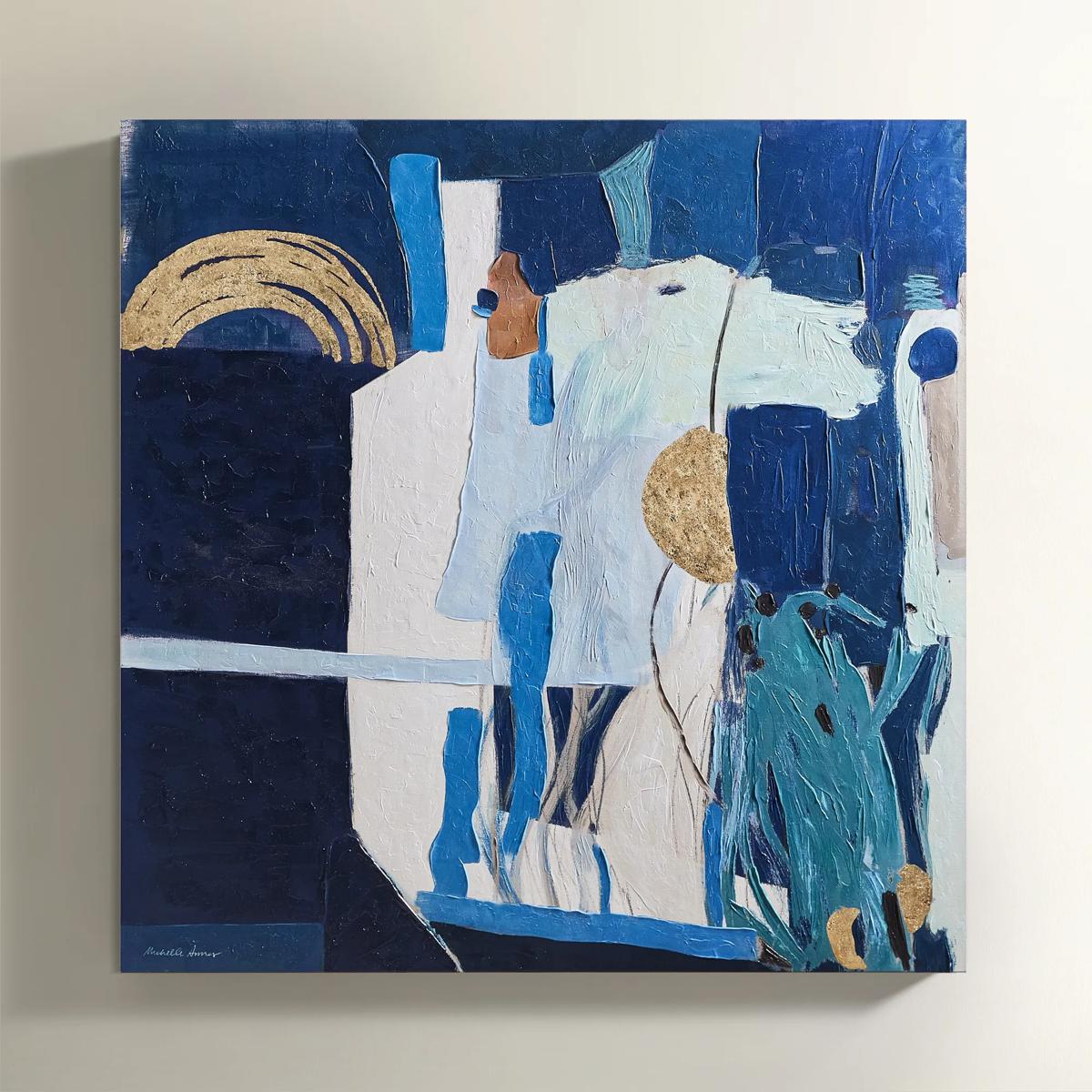
 In Flux Painting$699
A hand-embellished canvas artwork featuring deep teal, green, ivory, and gold in a black Art Deco frame.
Add To Cart -
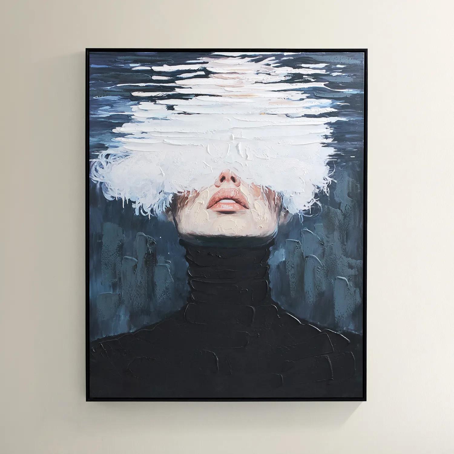
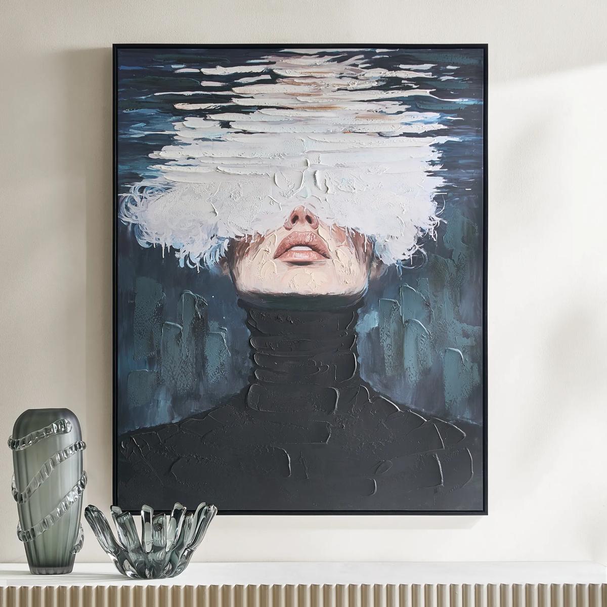 Submerged Framed Painted Wall Art 40" x 50"$599
A hand-painted canvas featuring a surreal portrait in black, blue, and white with a black floater frame.
Add To Cart -
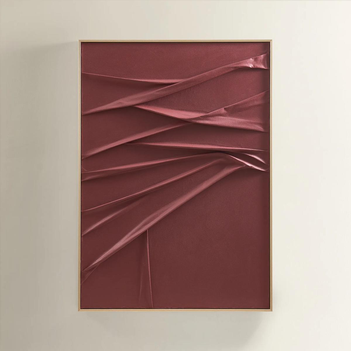
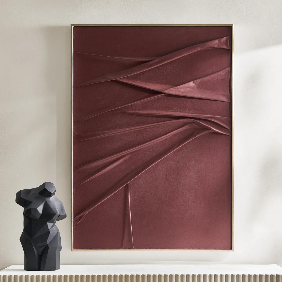 Crimson Painting$599
A handcrafted burgundy canvas artwork with sculptural folds, framed in champagne for a dramatic, textured effect.
Add To Cart -
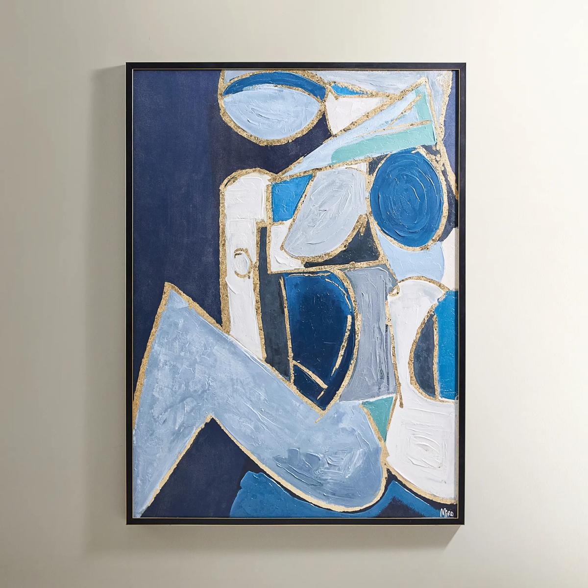
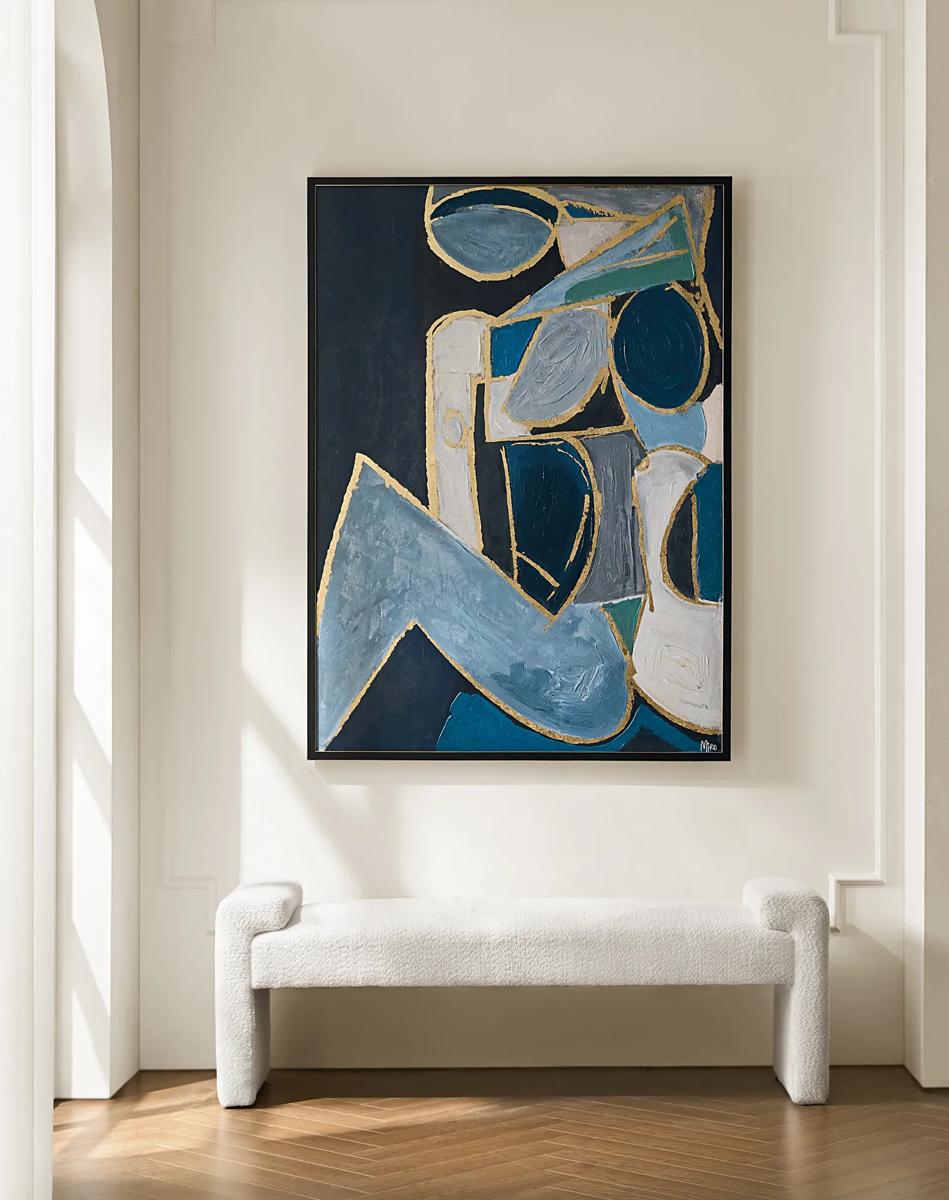 Figure in Cubism Painting$599
A hand-embellished canvas artwork featuring blue, gold, and white hues with elegant silver foil accents.
Add To Cart -
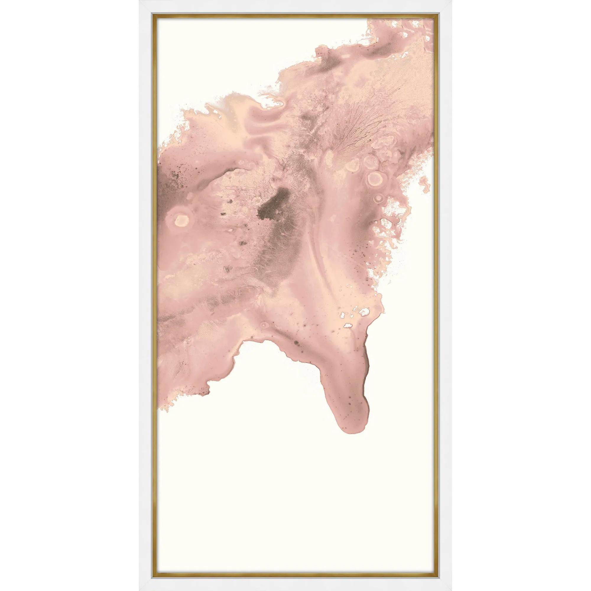
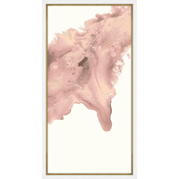 Blush Conduit 2 Framed Wall Art 24" x 48"$849
A striking abstract print on pearl paper, elegantly framed in gold and matte white for modern appeal.
Add To Cart -
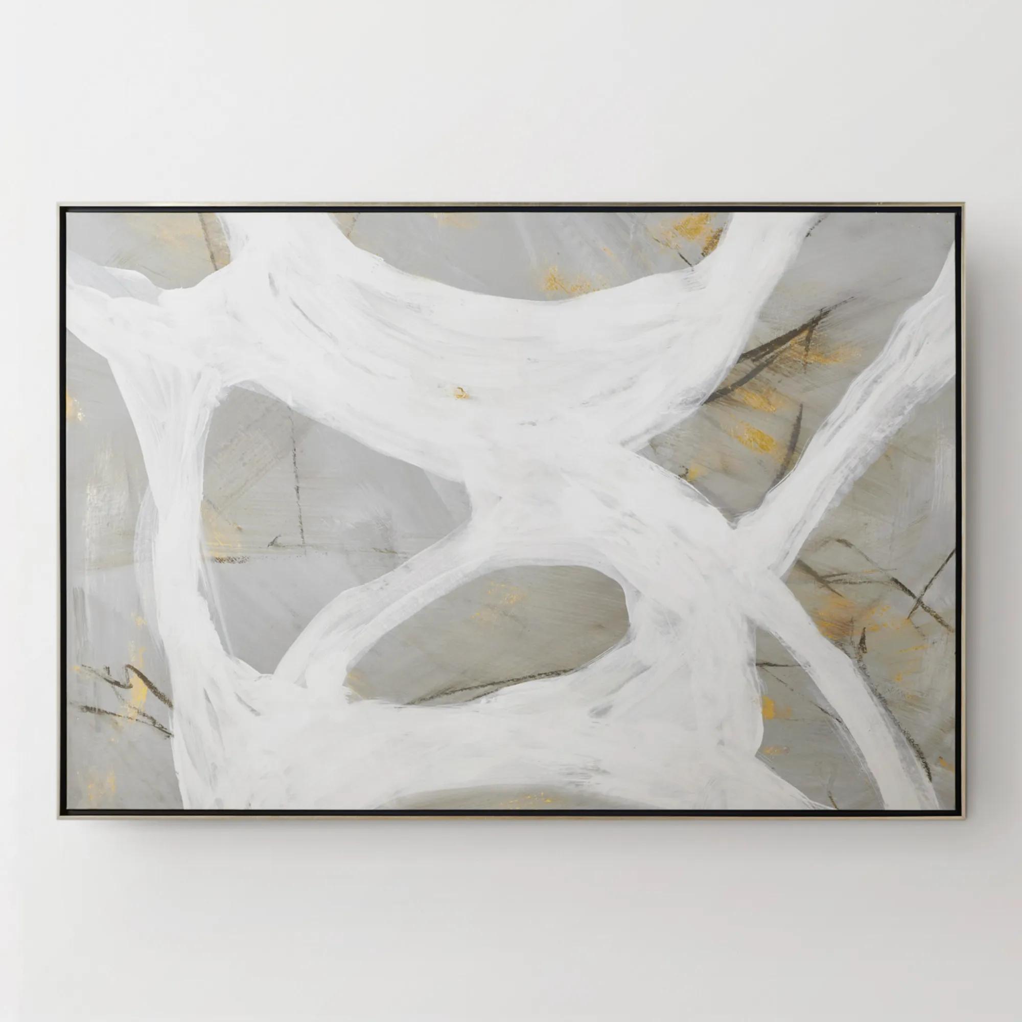
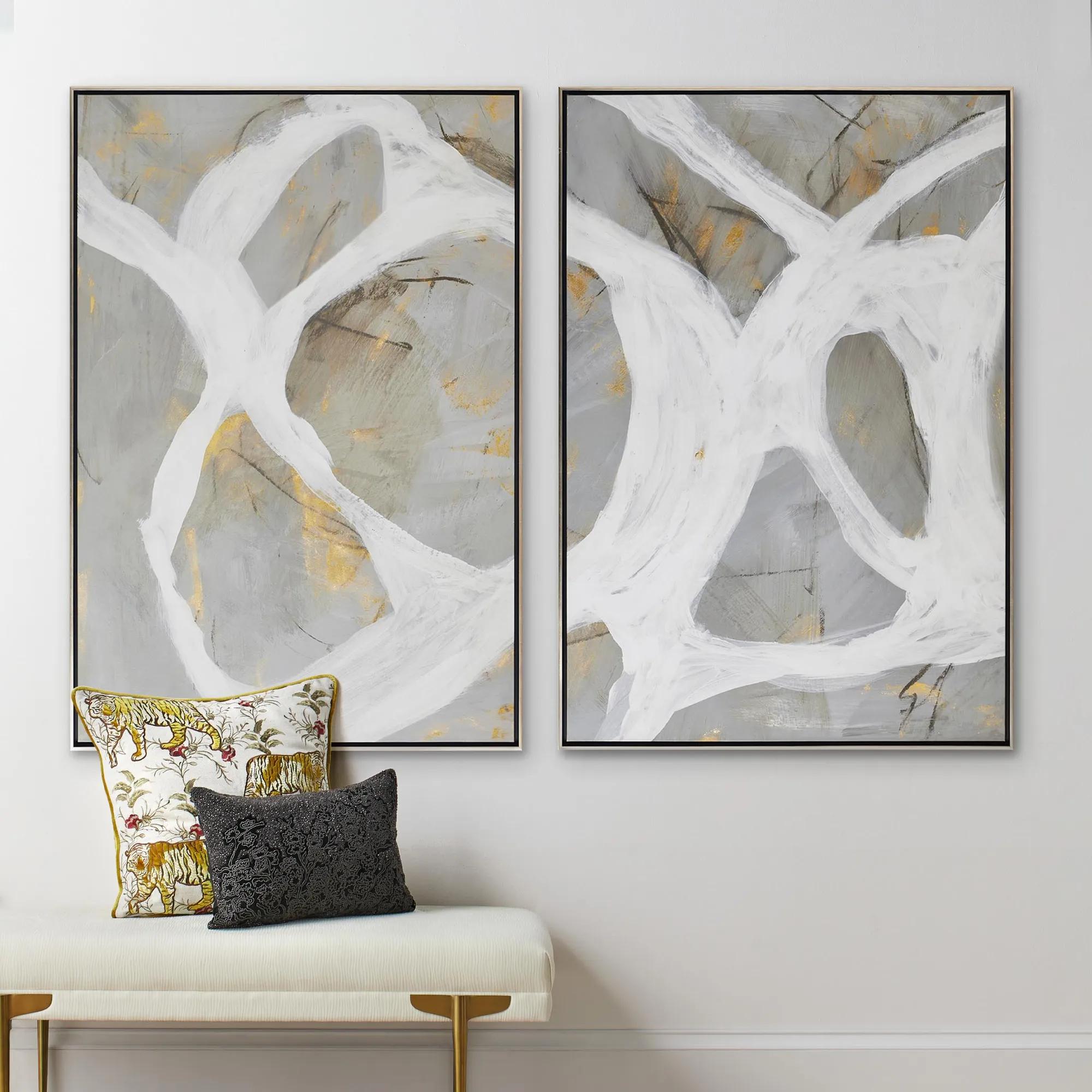 Les Series Framed Painted Wall Art II 61" x 41"$1099
An abstract canvas artwork featuring bold brushstrokes, hand-applied gold accents, and a silver floater frame.
Add To Cart -
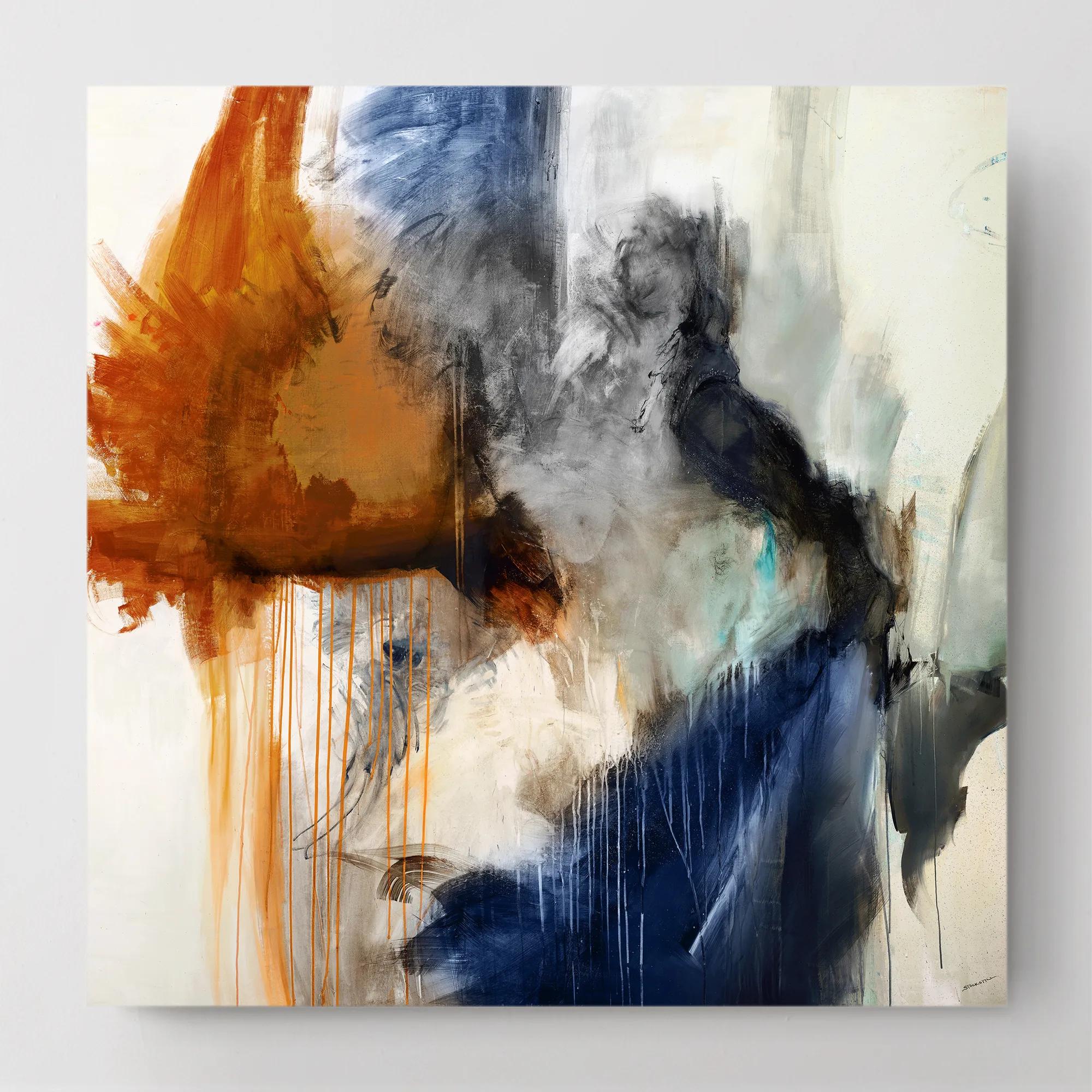
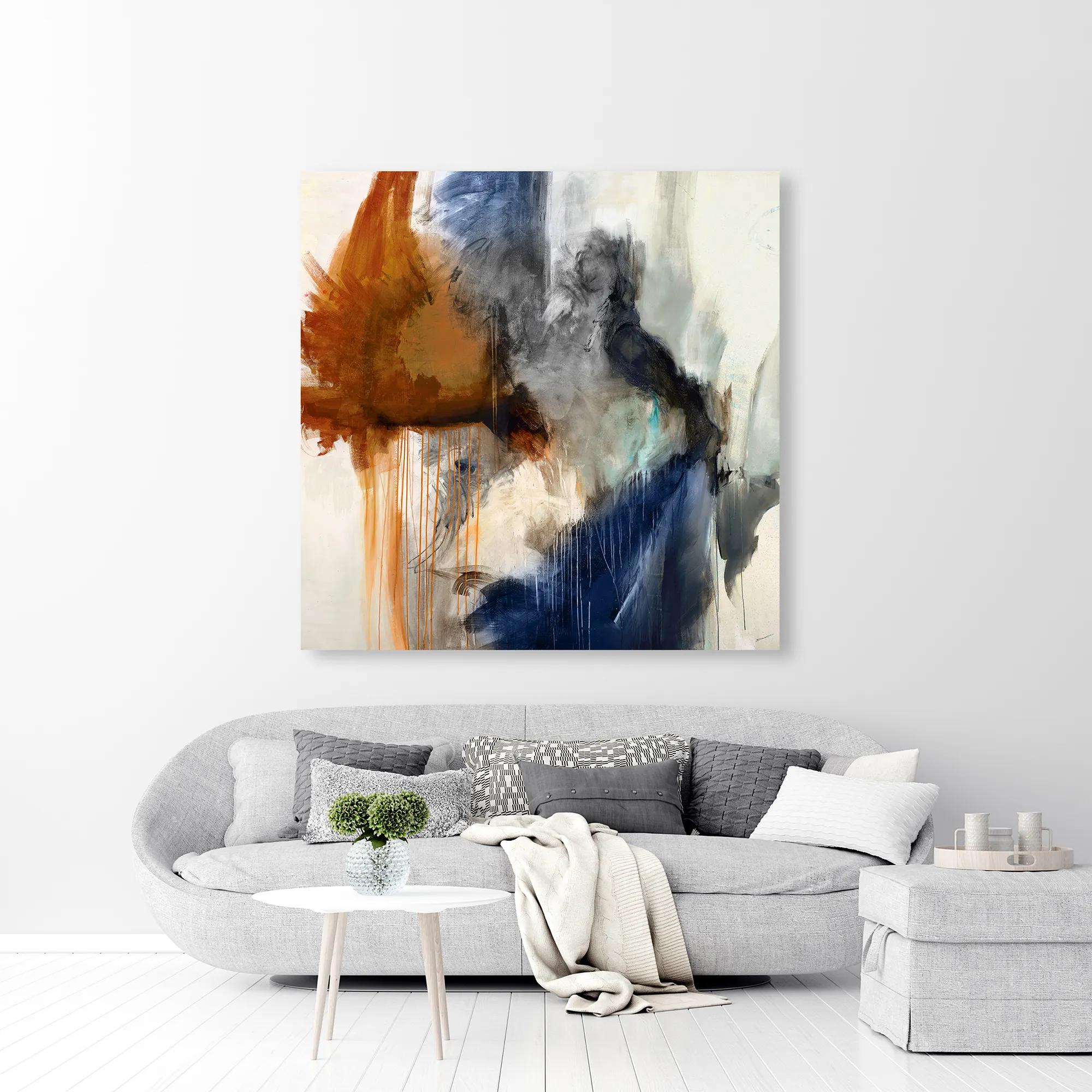 Swoon 6 Wall Art 54" x 54"$899
A gallery-wrapped canvas featuring a hand-applied image brush gel finish for a textured, artistic look.
Add To Cart -
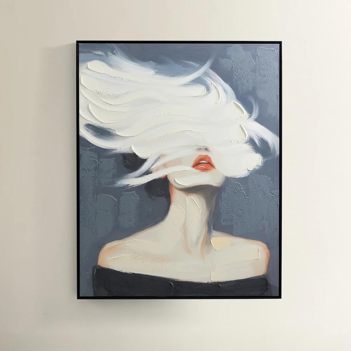
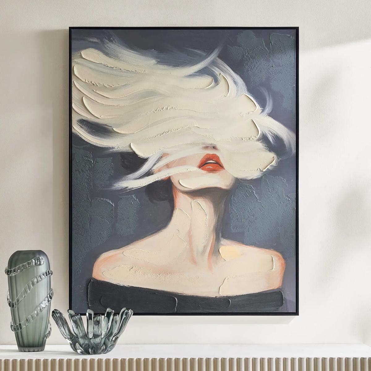 Daydreamer Painting$599
A hand-painted canvas portrait with sculptural white brushstrokes, bold red lips, and a sleek black frame.
Add To Cart -
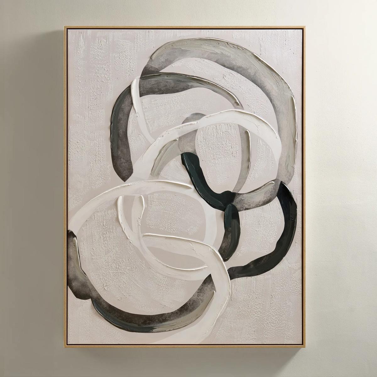
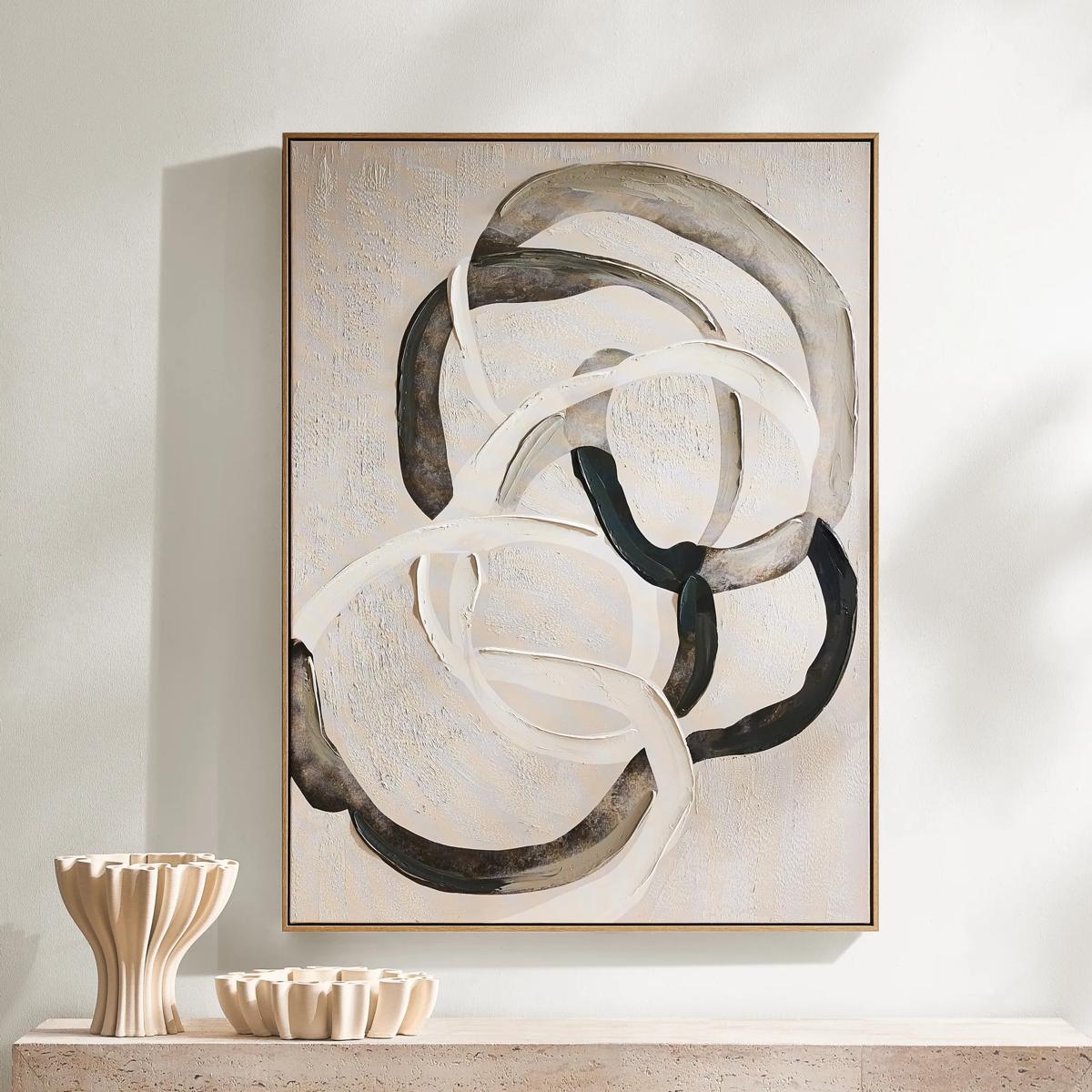 Round About Framed Painted Wall Art 35.25" x 47.25"$349
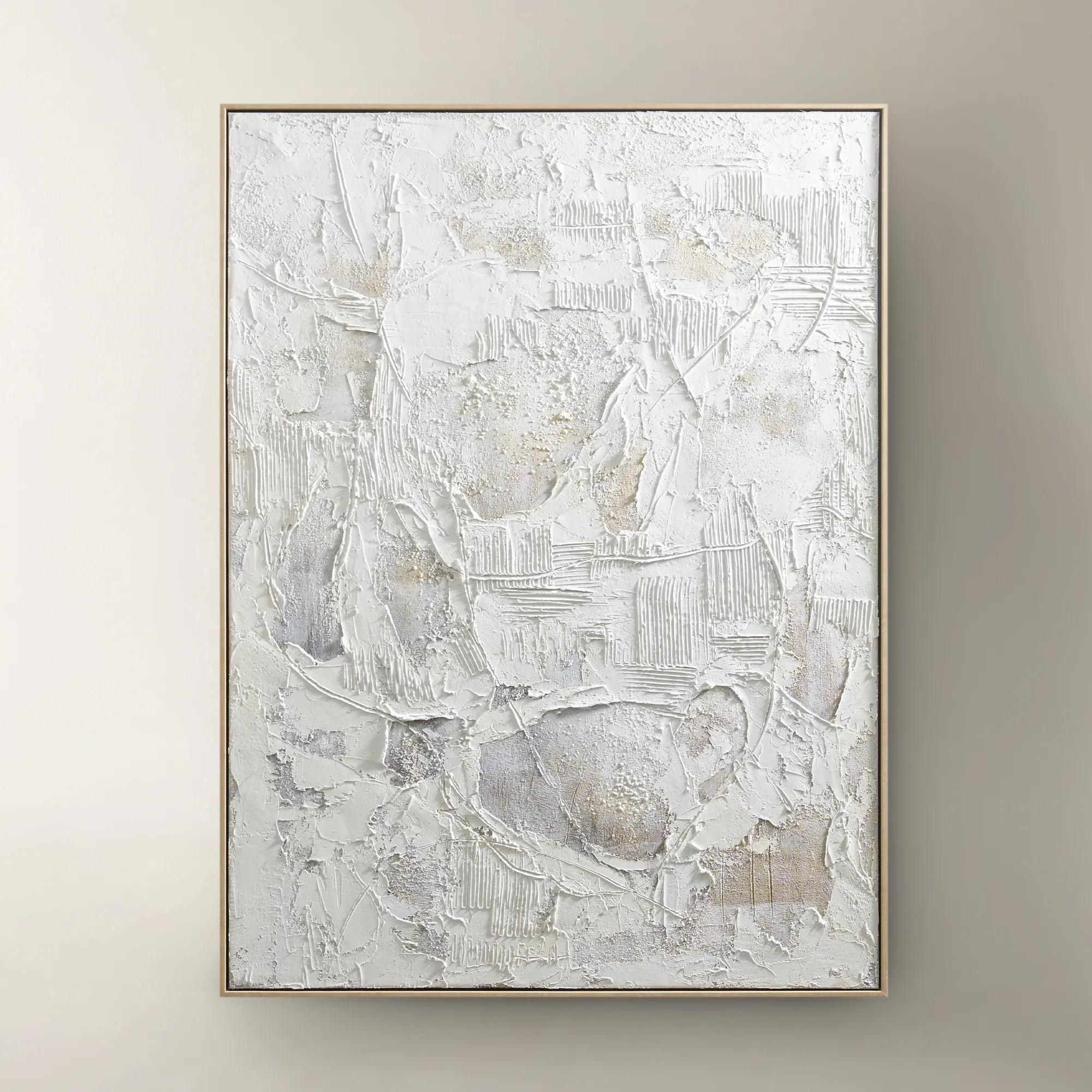
An abstract hand-painted canvas with tonal whites, charcoals, and taupes in a light wood floater frame.
Add To Cart -
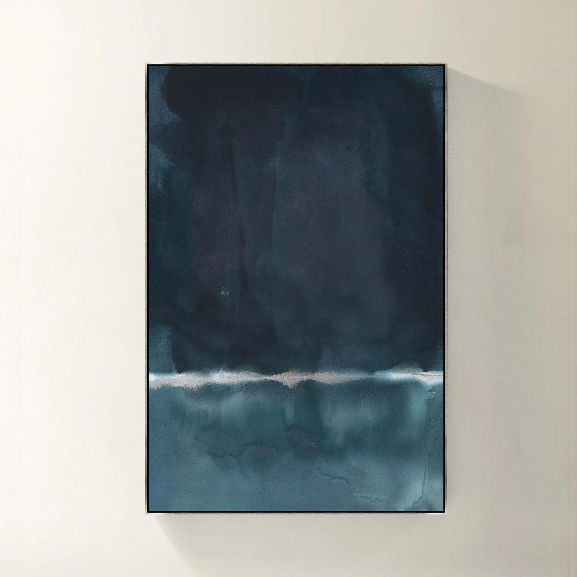 Blue Monday Framed Wall Art 40" x 60"$1119
A gallery-wrapped blue canvas with hand-embellished silver accents in a sleek silver floater frame.
Add To Cart -
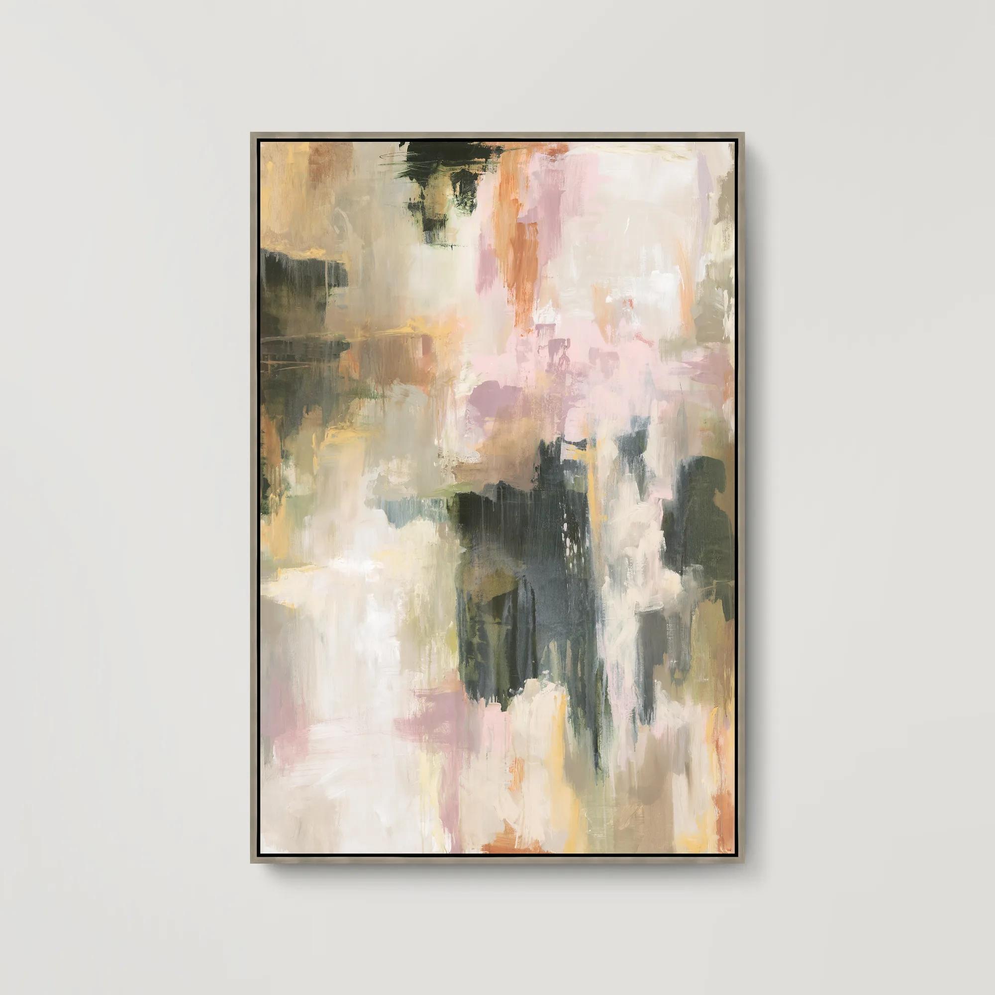
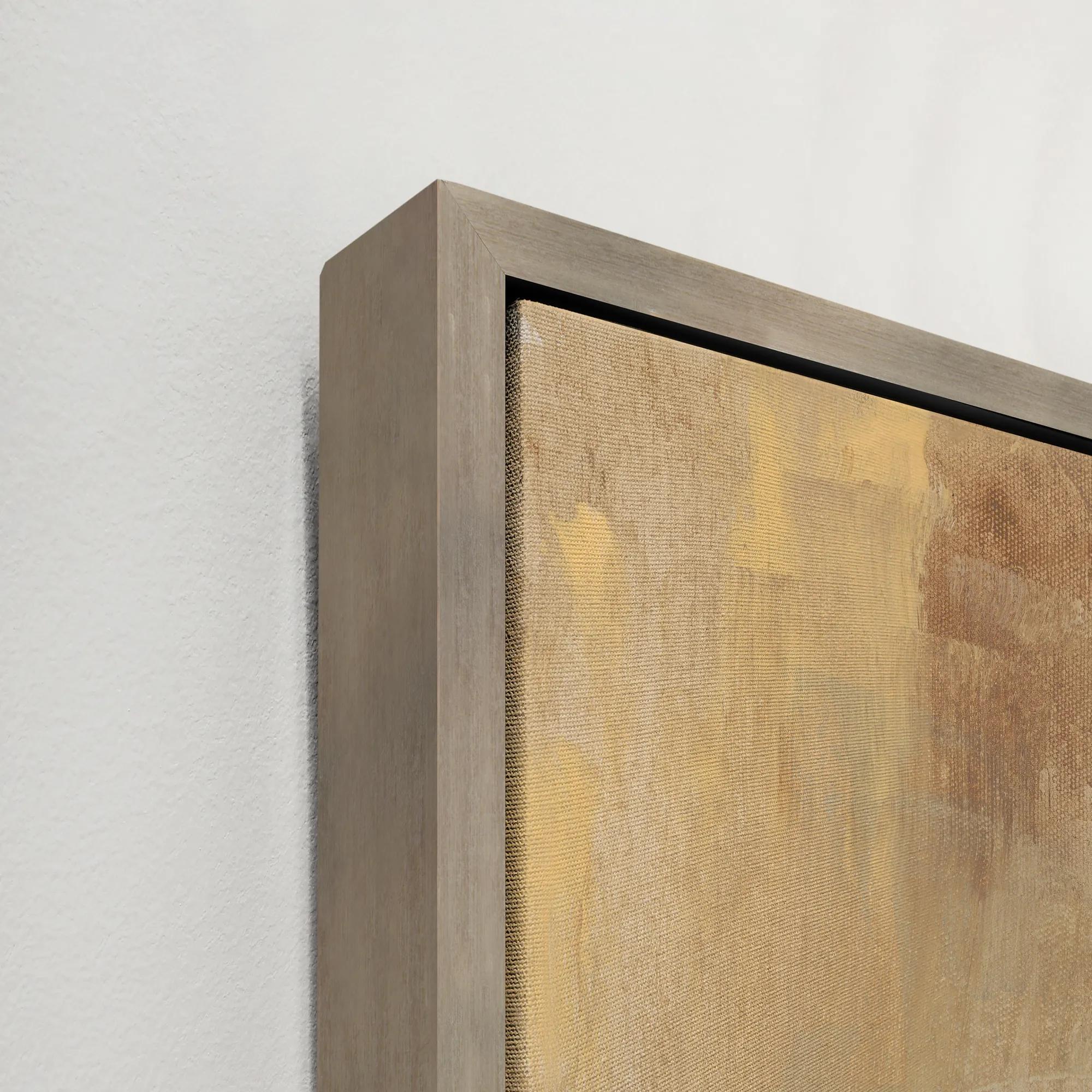 Sculpted Dreamscape Framed Wall Art 41.5" x 61.5"$999
A gallery-wrapped canvas artwork featuring a hand-applied gel finish and a sleek silver floater frame.
Add To Cart -
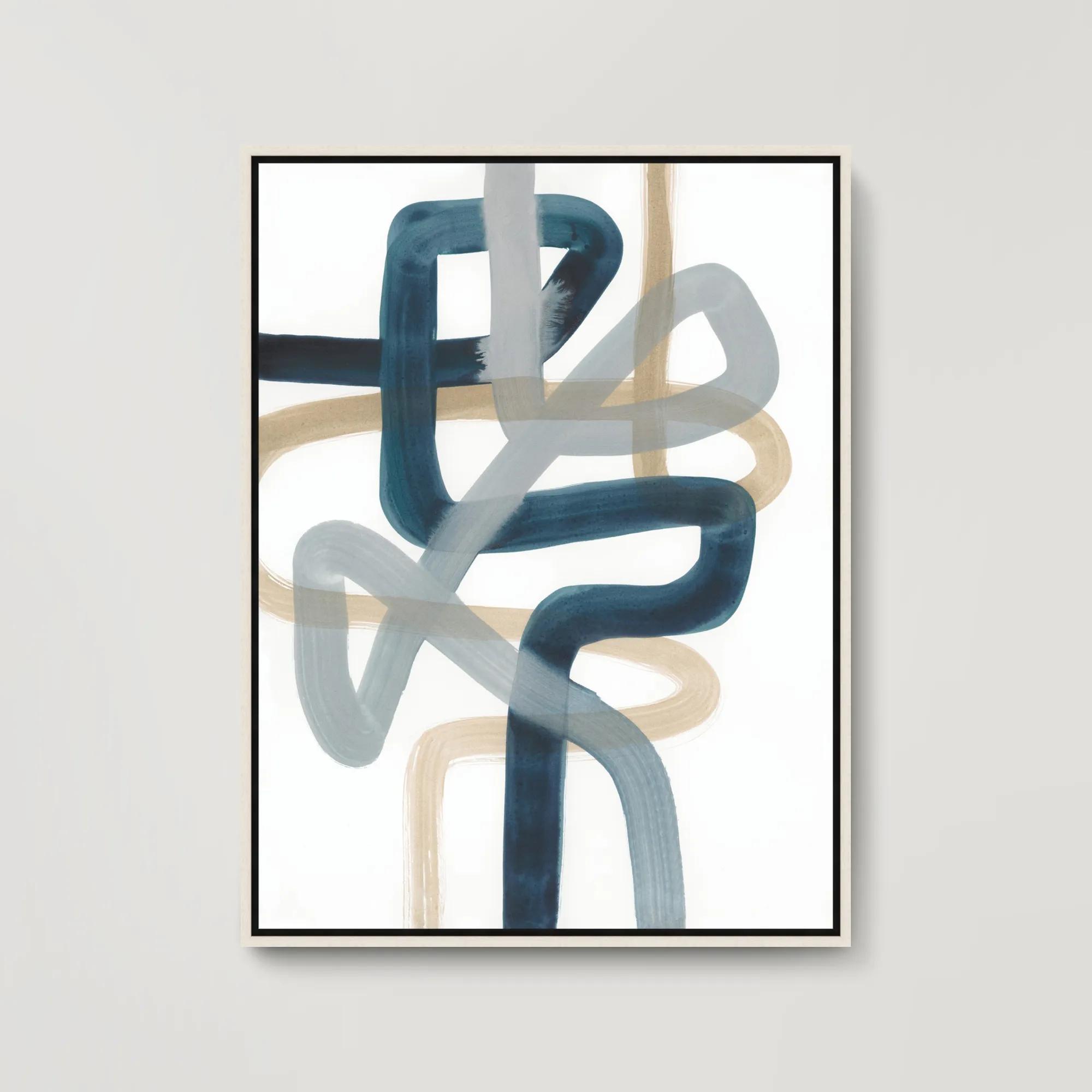
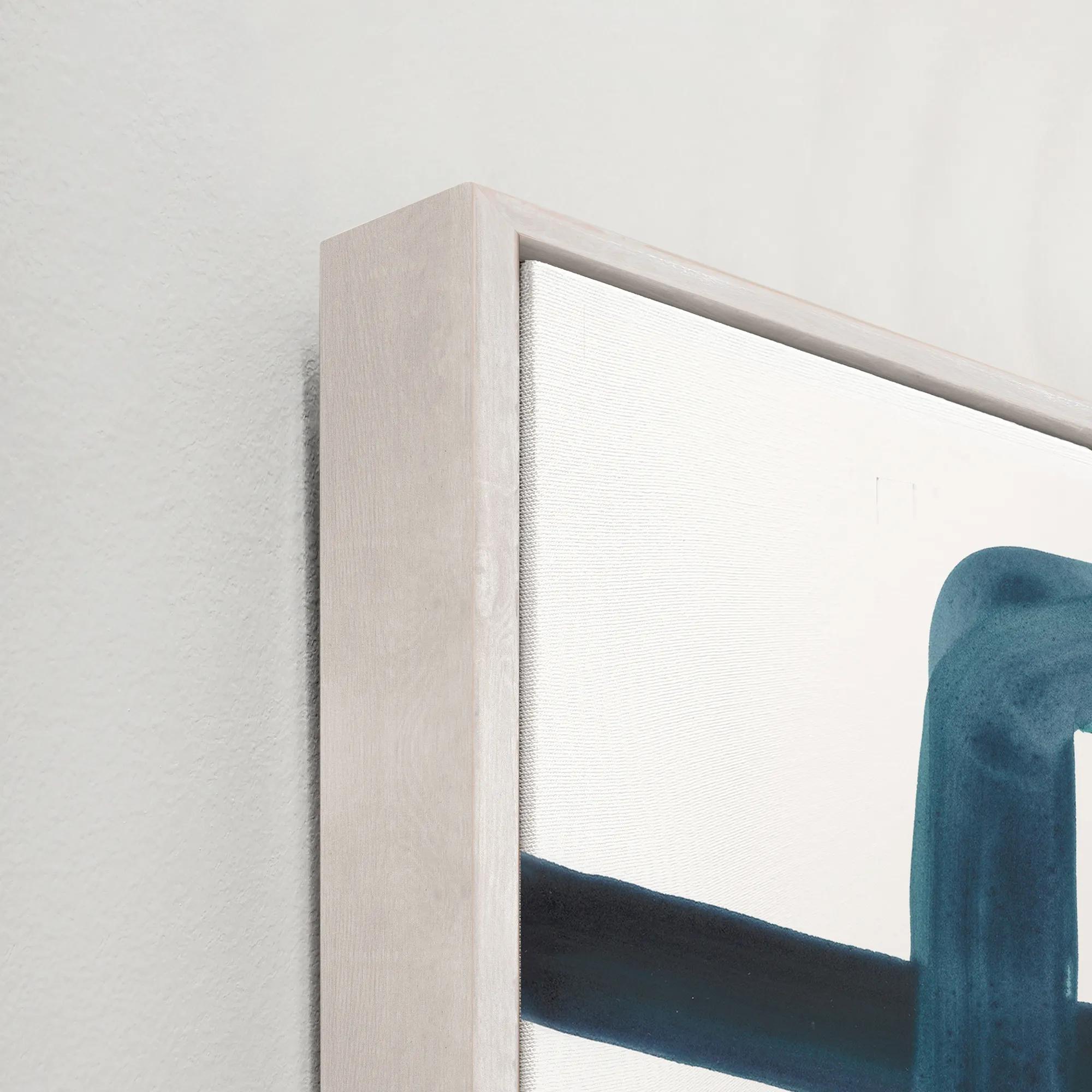 Looped In I Framed Wall Art 31.5" x 41.5"$699
A gallery-wrapped abstract canvas featuring hand-applied brush gel and a sleek white floater frame.
Add To Cart -
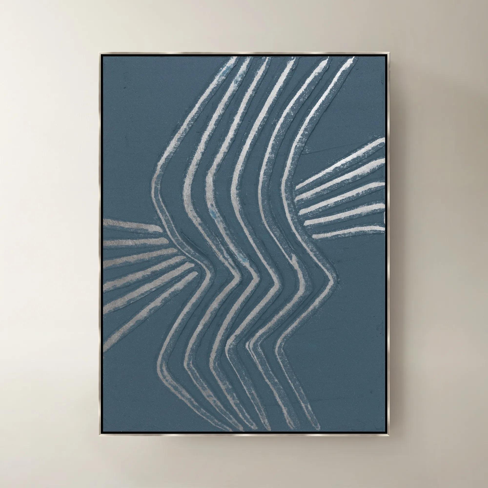
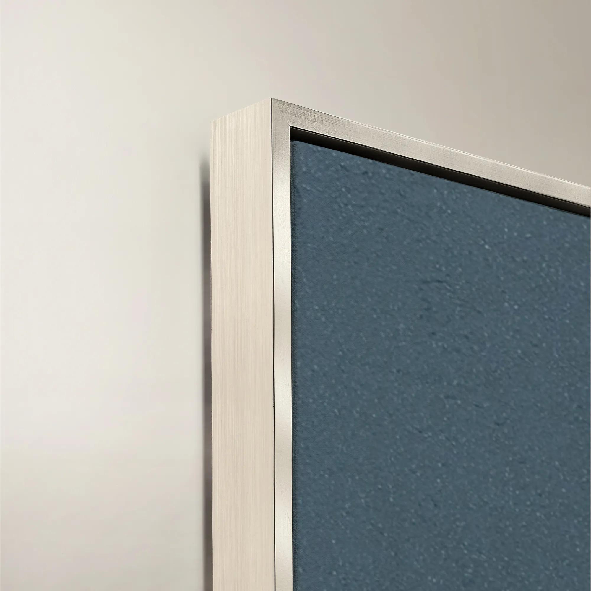 Gilded Waves IV Framed Painted Wall Art 40" x 53"$1399
A framed painted canvas artwork featuring flowing gilded waves in soothing blue and purple tones.
Add To Cart -
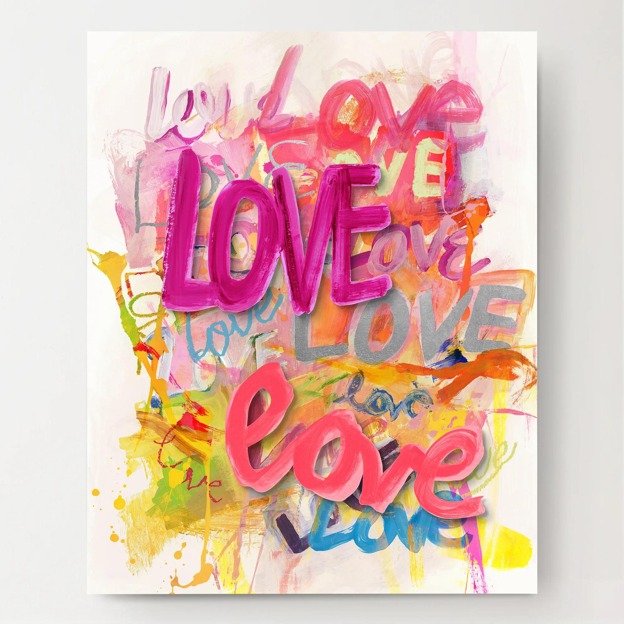
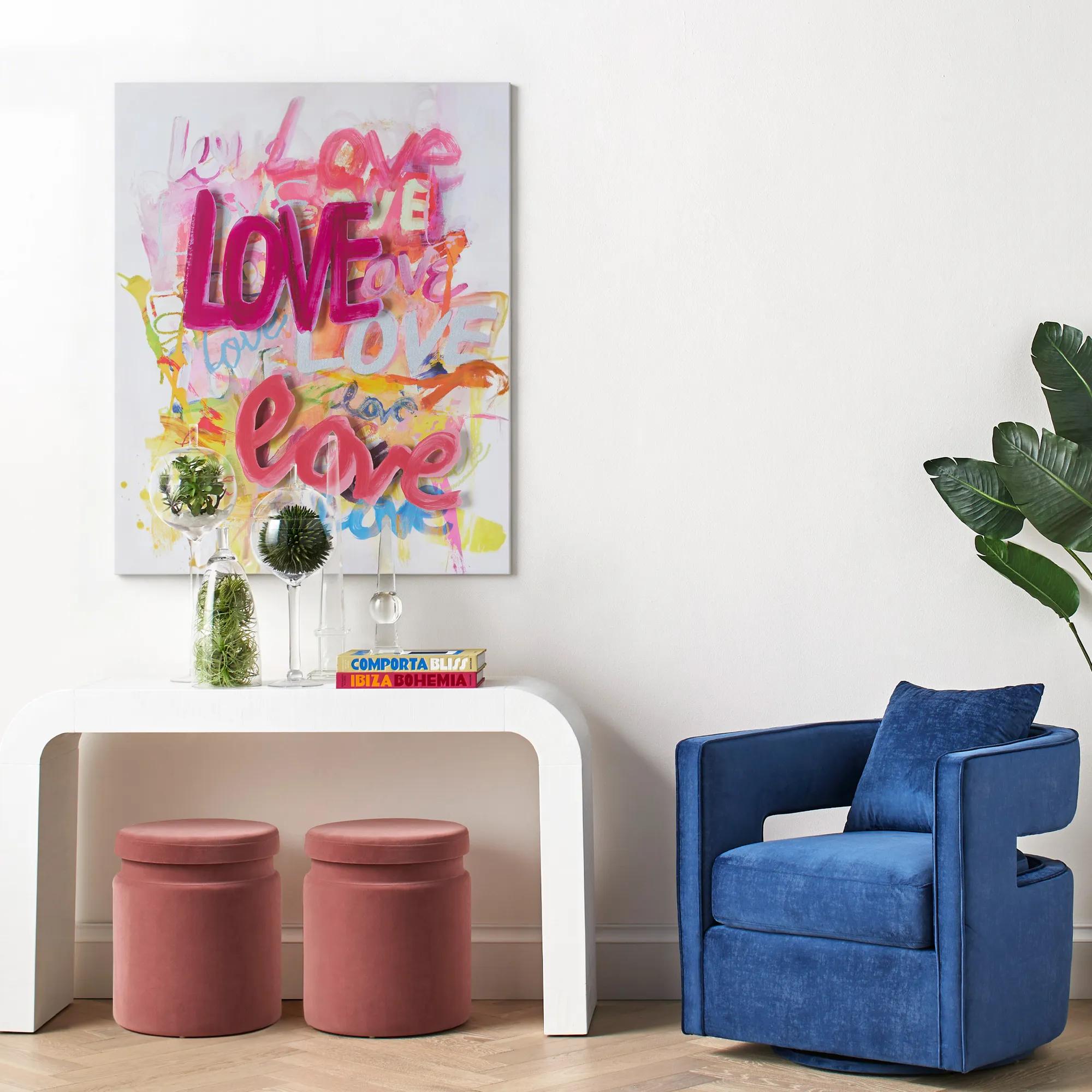 Love Is In The Air Wall Art 40" x 50"$1399
A vibrant giclee canvas print featuring hand-applied silver gilding and dimensional acrylic "Love" lettering.
Add To Cart -
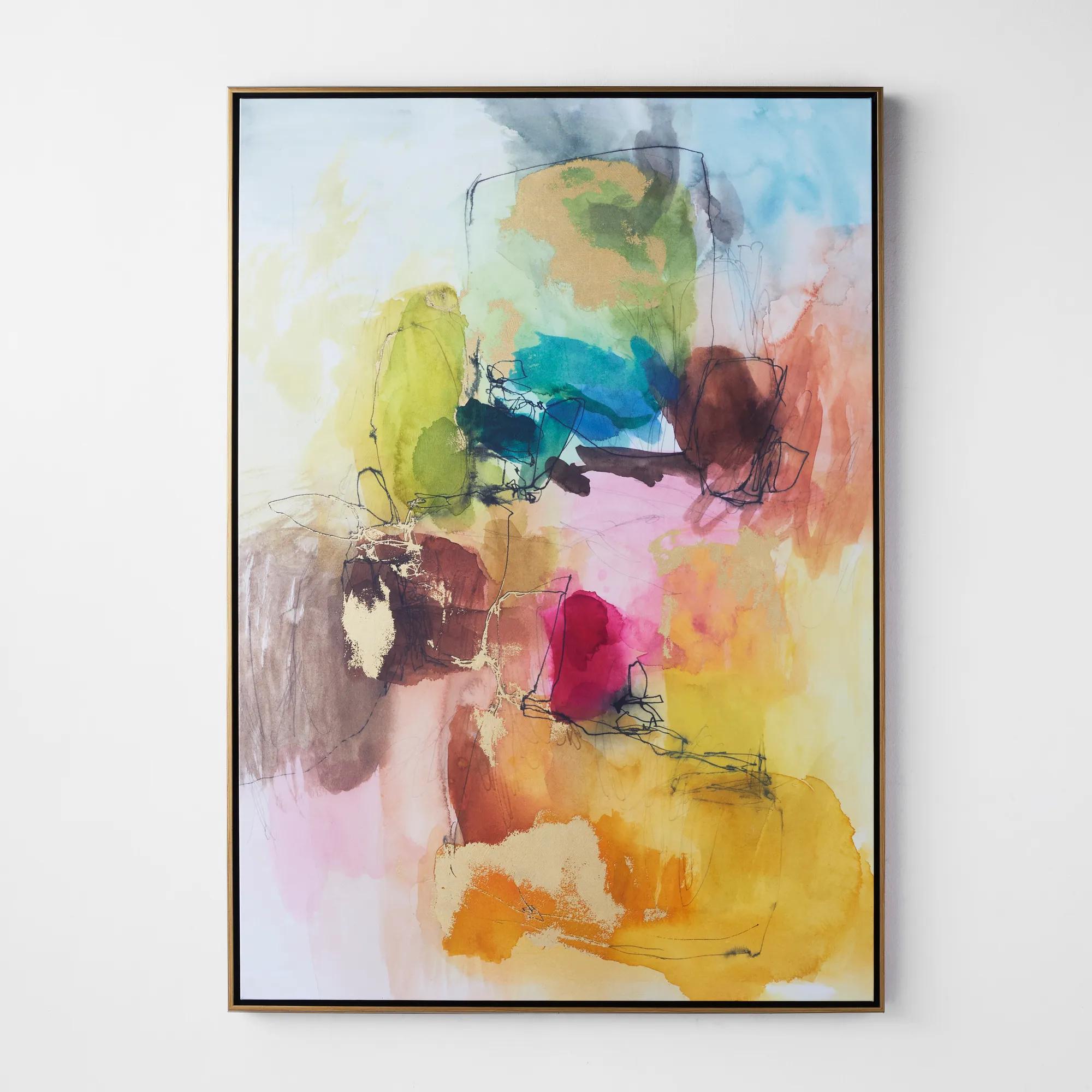 Apricity 3 Framed Wall Art 41" x 58"$899
A vibrant giclee on canvas featuring hand-applied gold gilding and a gold floater frame.
Add To Cart -
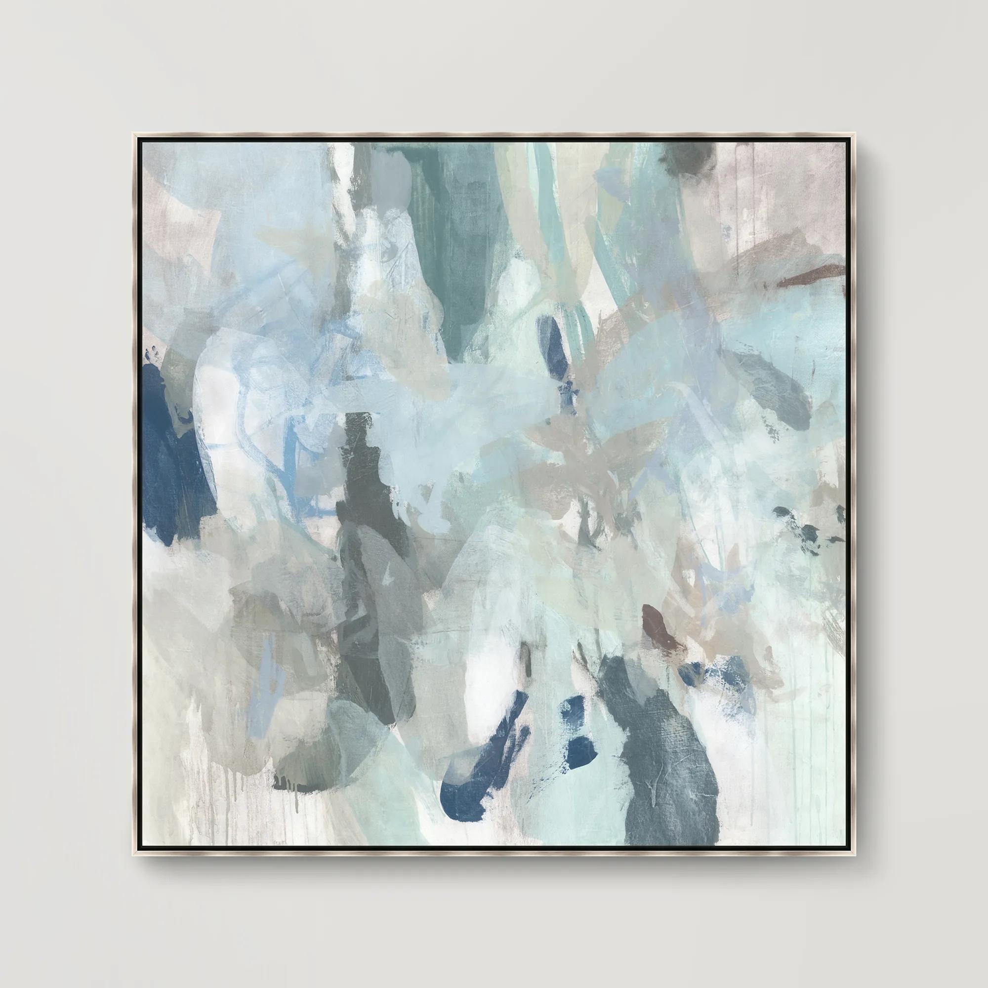
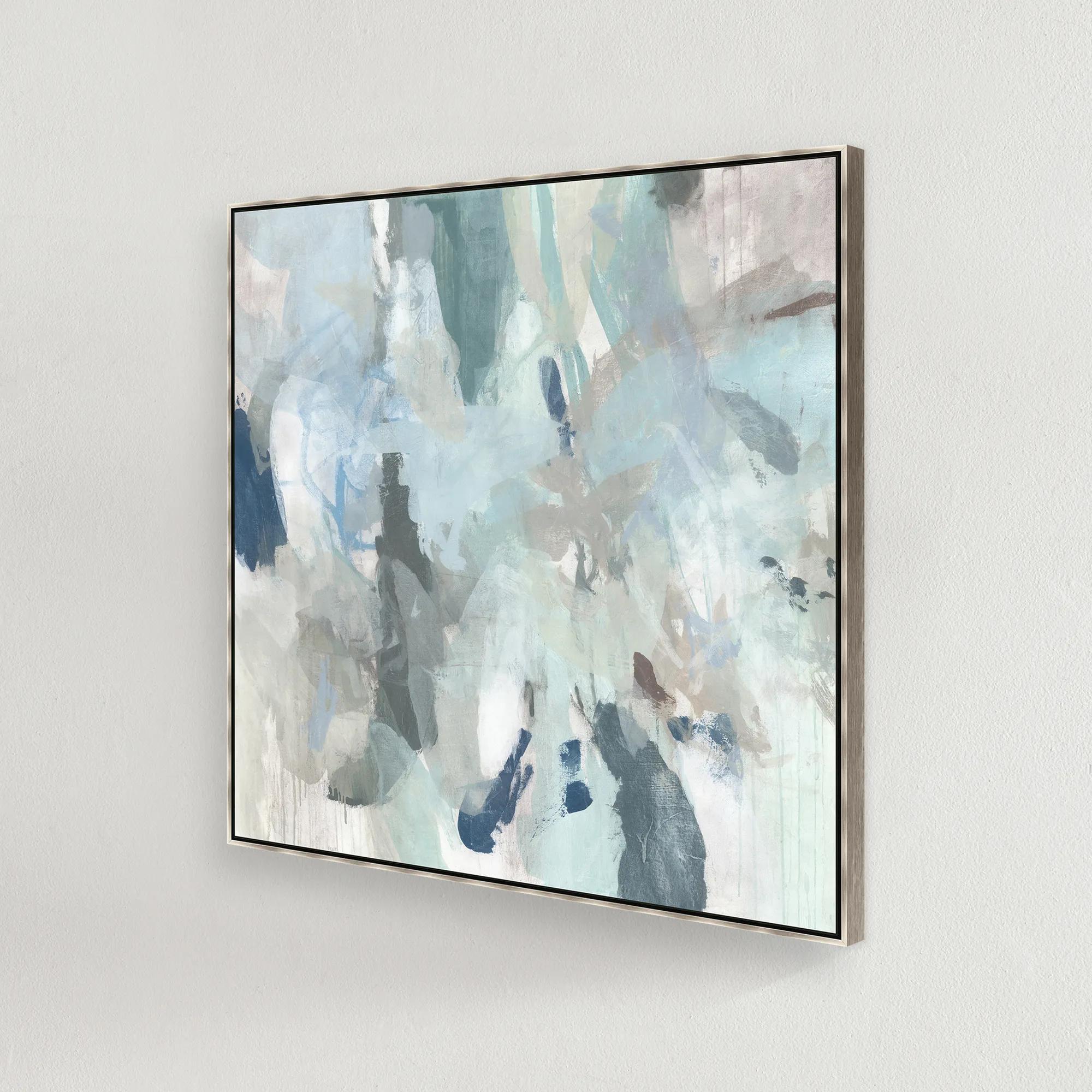 Sage Honey Dew I Framed Wall Art 41.5" x 41.5"$749
A gallery-wrapped abstract canvas featuring hand-applied gel finish in a silver floater frame.
Add To Cart -
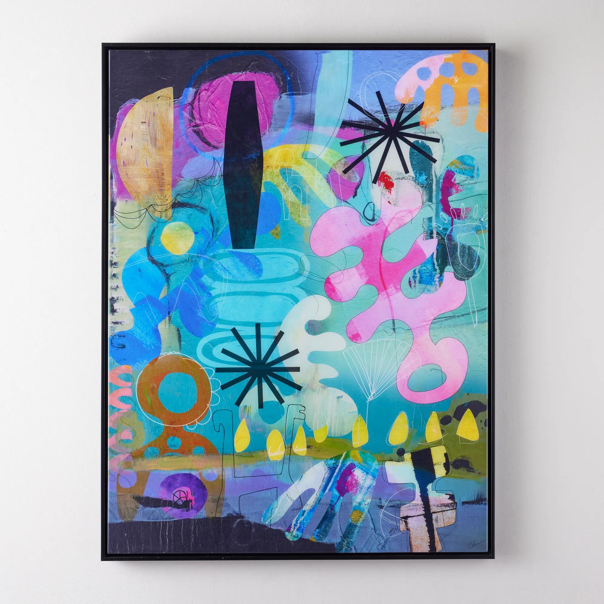
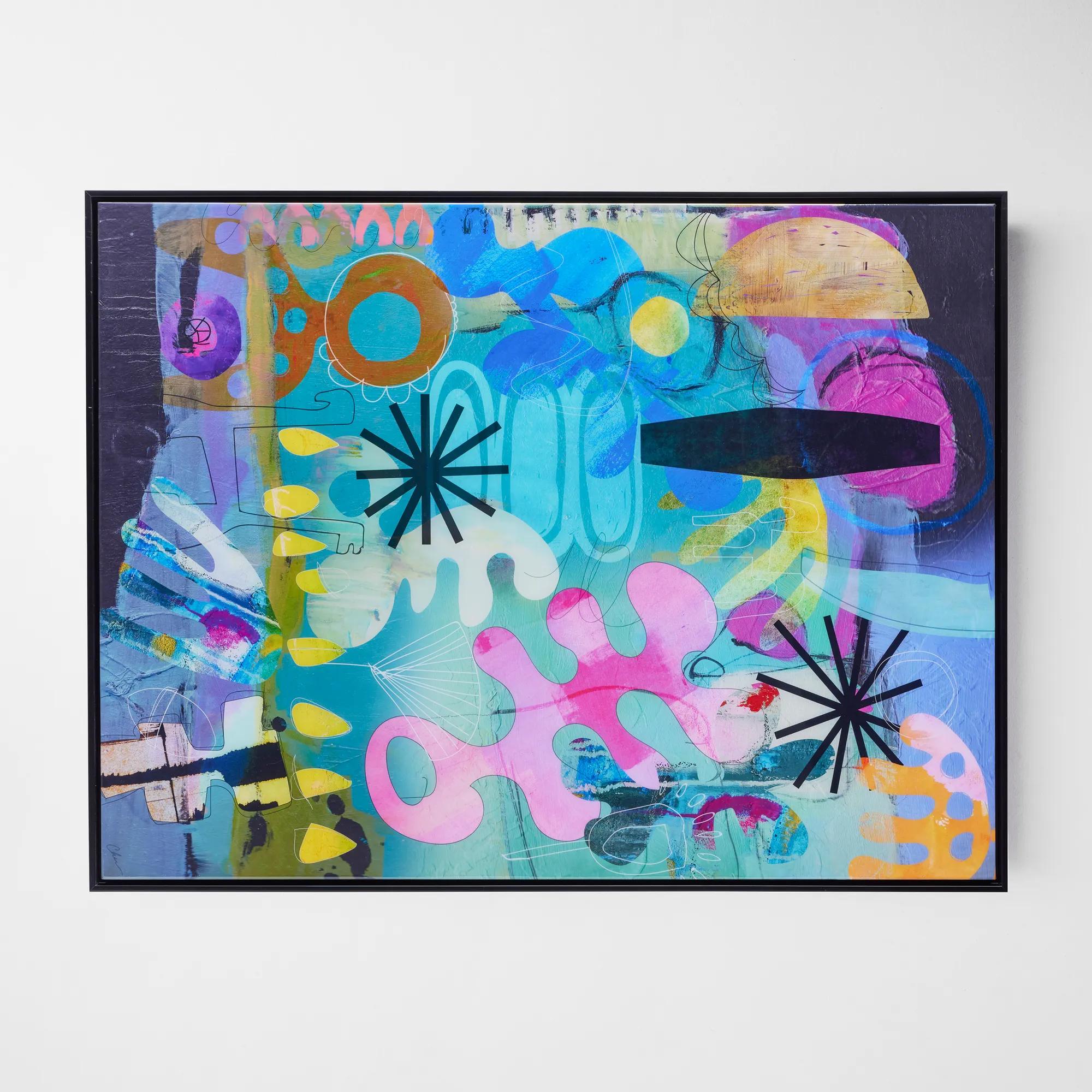 Nikki Chu Detailed Vision Framed Wall Art 54" x 41"$1099
A vibrant, high-gloss artwork with a black frame, designed to hang vertically or horizontally.
Add To Cart -
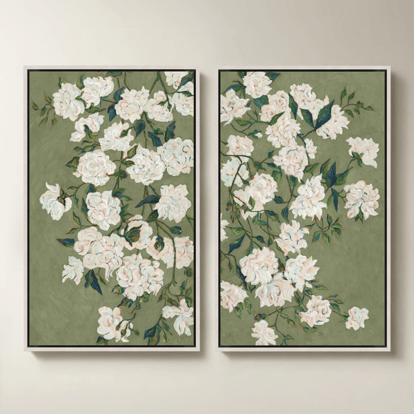
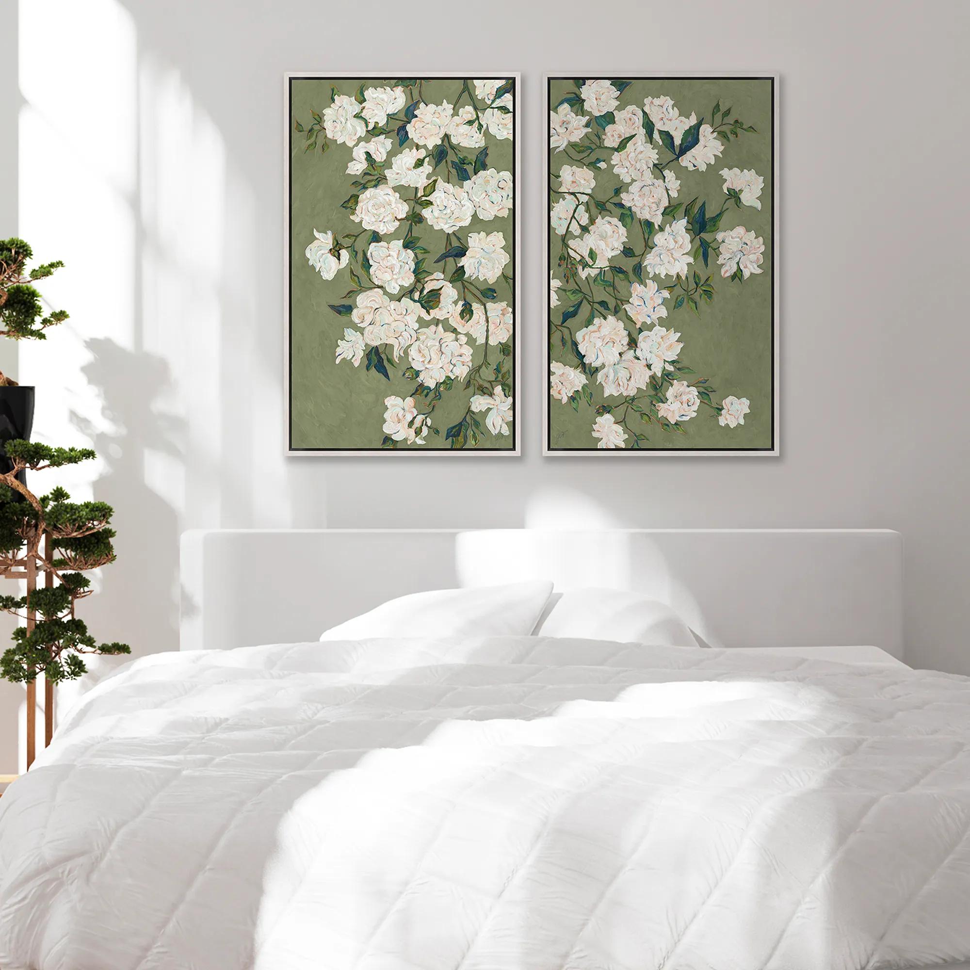 Verdi Vincent Framed Wall Art 21.5" x 41.5" Set of 2$949
A set of two gallery-wrapped fiber texture canvases in white floater frames for modern wall decor.
Add To Cart -
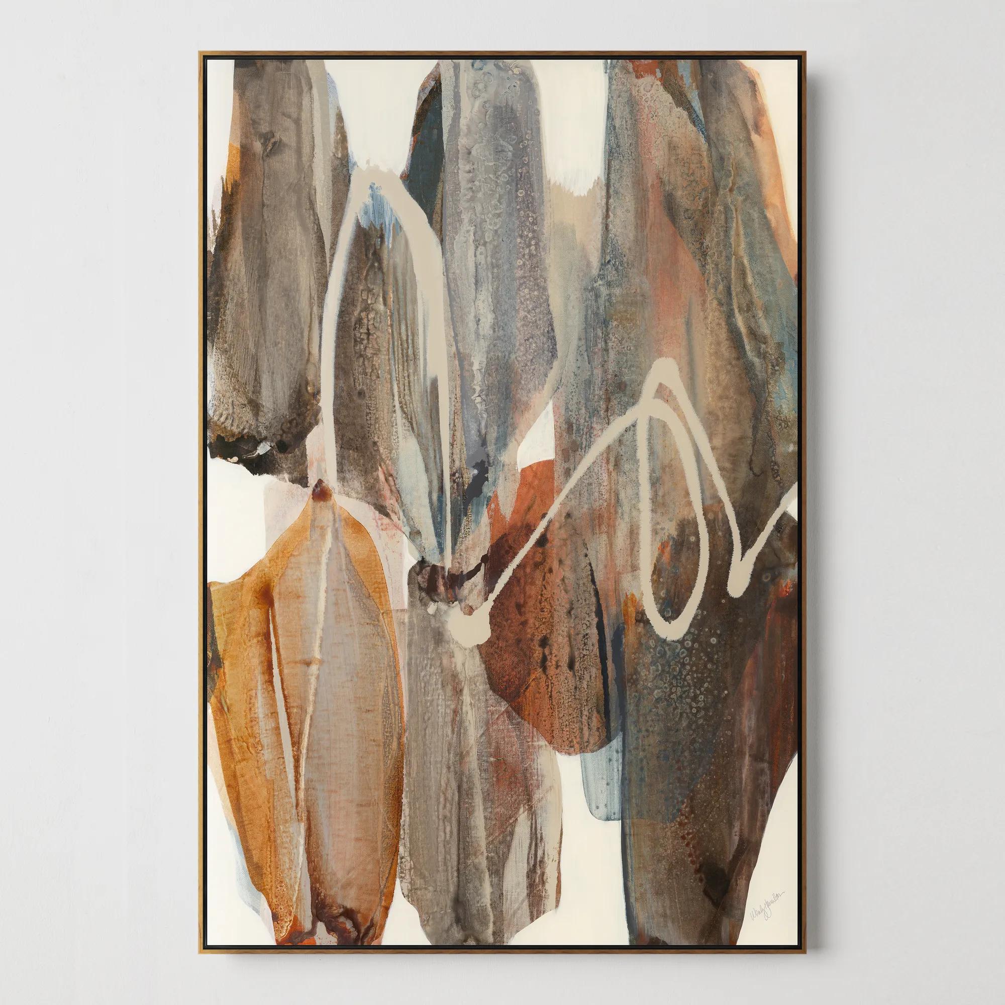
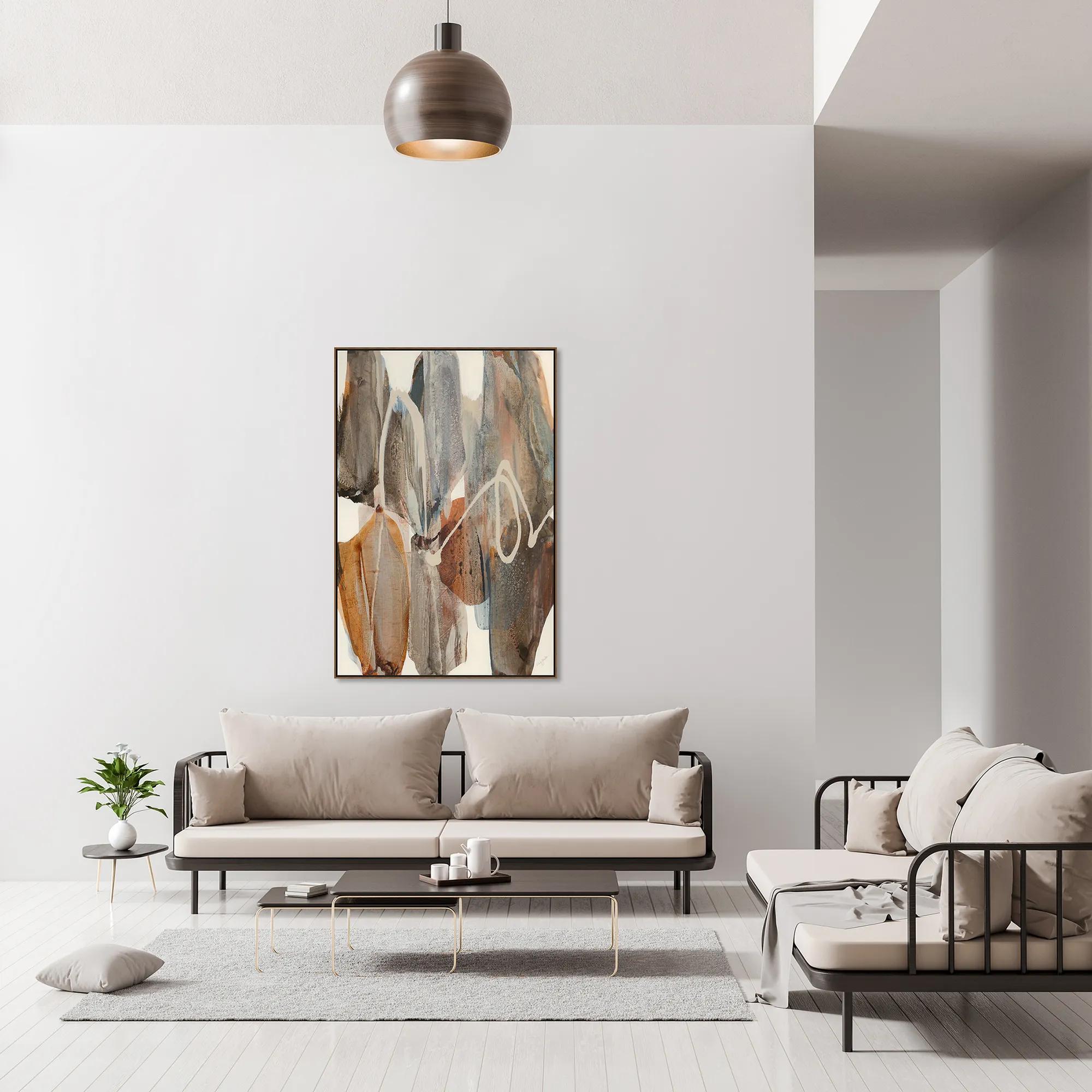 Boundless Framed Wall Art 40" x 60"$999
A gallery-wrapped canvas artwork with hand-applied brush gel finish in an oak floater frame.
Add To Cart -
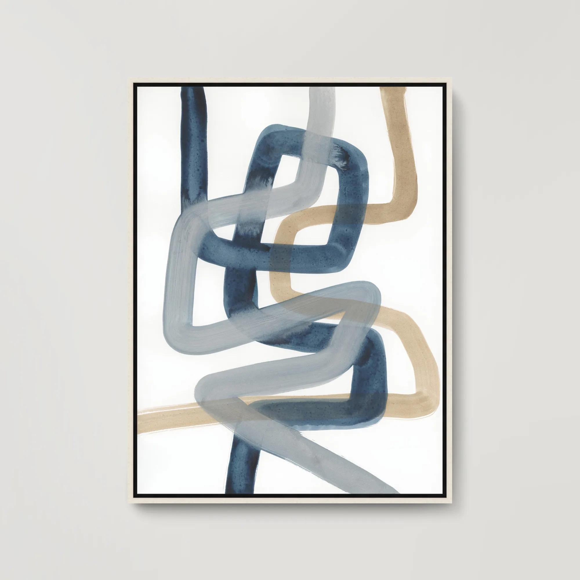 Looped In II Framed Wall Art 31.5" x 41.5"$699
A gallery-wrapped abstract canvas with hand-applied brush gel finish, set in a sleek white floater frame.
Add To Cart -
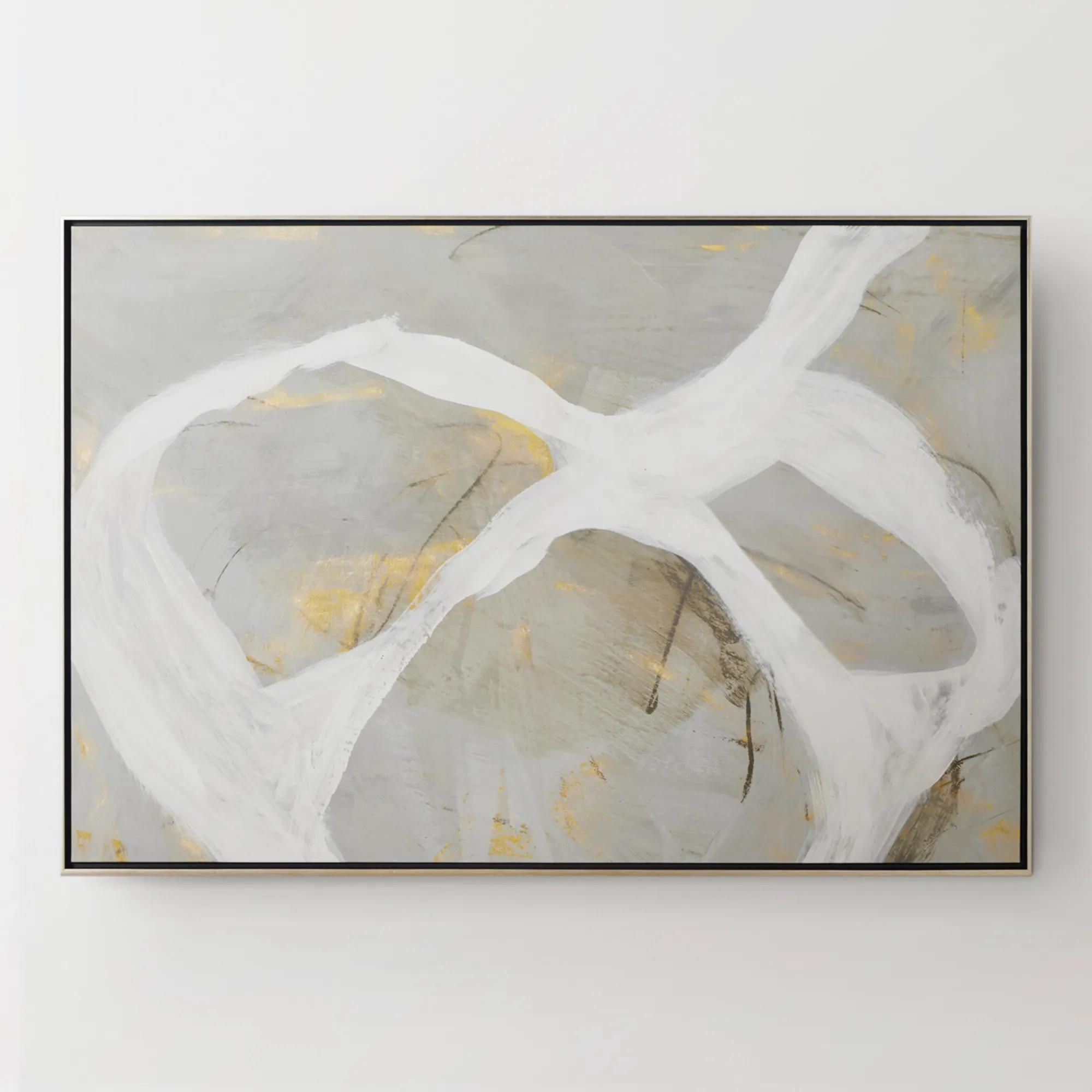
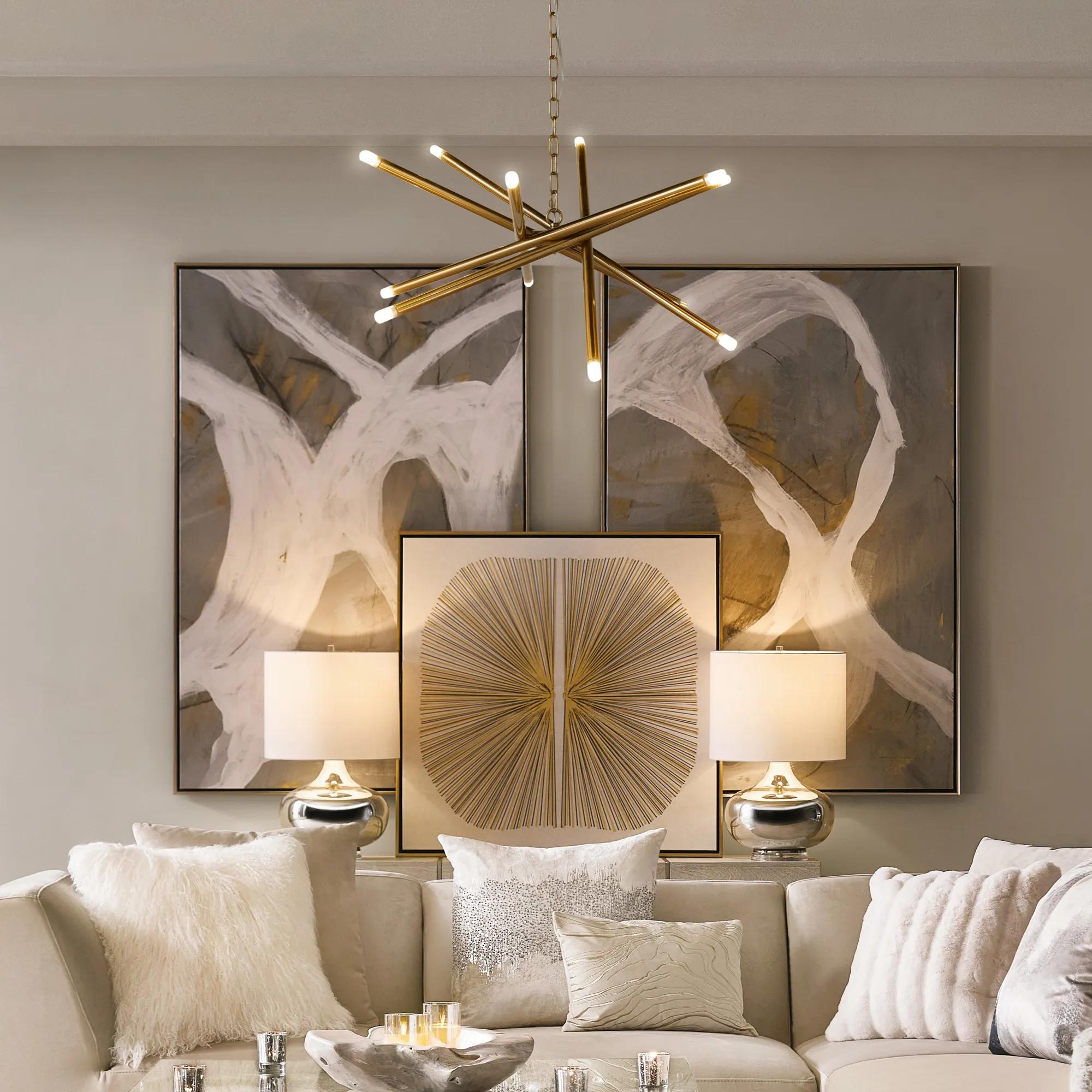 Les Series Framed Painted Wall Art I 61" x 41"$1099
An abstract canvas artwork featuring bold brushstrokes, hand-applied gold accents, and a silver floater frame.
Add To Cart -
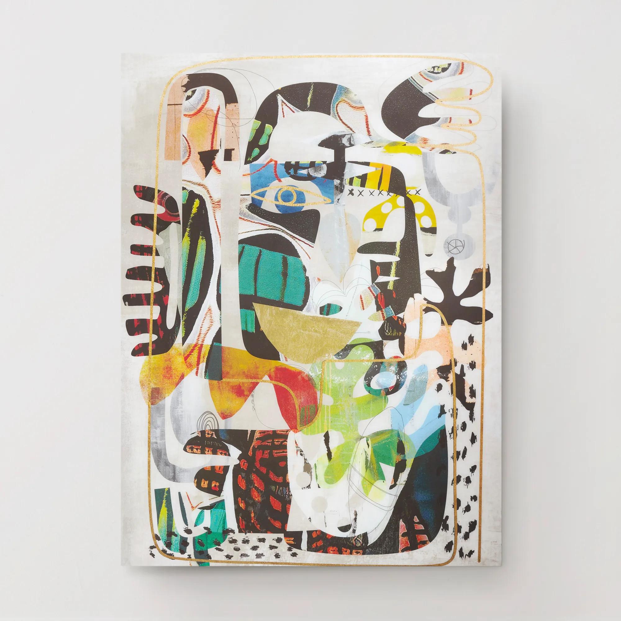
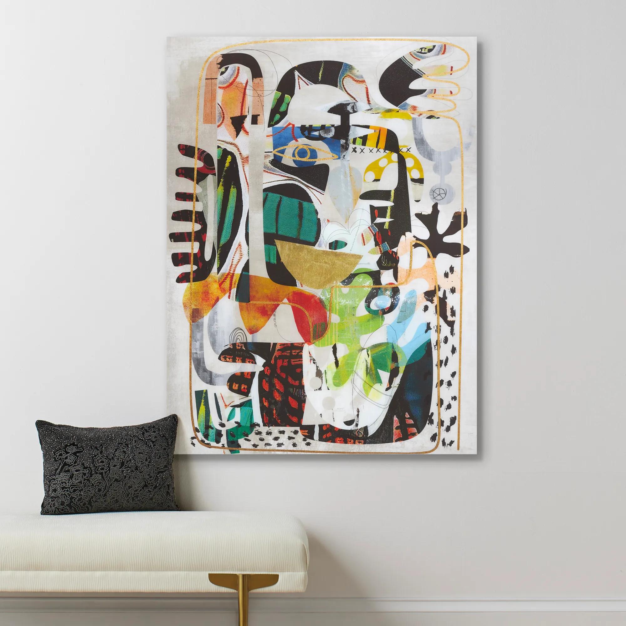 Nikki Chu Masked Wall Art 40" x 54"$899
A vibrant giclee print on canvas featuring a hand-applied glossy finish for a modern statement.
Add To Cart

Large Colorful Abstract Wall Art
Explore large colorful abstract wall art to give an expansive wall a bold focal point. Expressive color and abstract compositions bring drama to living rooms, dining spaces, and bedrooms. Consider the artwork’s dimensions alongside your furniture, and choose a palette that echoes existing accents or introduces a striking contrast.
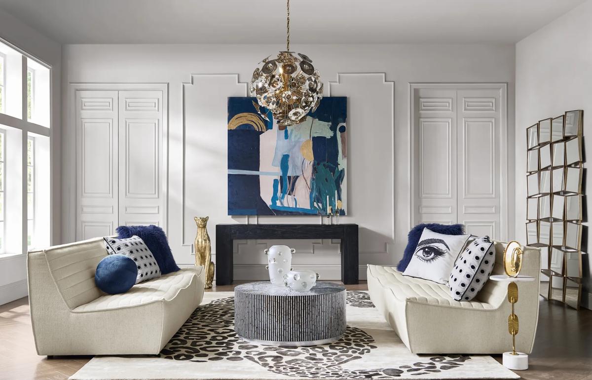
Large colorful abstract wall art gives a room a commanding point of view, transforming an open wall into an expressive composition of color, movement, and scale. Sweeping gestures, unexpected contrasts, and expansive fields of pigment invite the eye to linger, creating an atmosphere that feels personal rather than prescribed. In a living room, oversized abstract wall art can establish the palette for an entire seating area: a saturated blue might find an echo in accent pillows, while a flash of gold can inspire a gleaming decorative accent. Rich jewel tones lend depth and drama, while vibrant coral, citron, and turquoise introduce a more exuberant energy. To choose a compelling piece, consider not only which colors you love, but also how the composition makes the space feel. Bold, angular forms create visual momentum; fluid shapes and softly blended hues bring a gentler rhythm without sacrificing presence. The most captivating colorful wall decor connects with the room while expressing something distinctly your own. Decorating with large colorful abstract wall art is as much about proportion as it is about palette. Above a sofa, console, or headboard, a generous composition creates a focal point that visually anchors the furniture beneath it. As a starting point, look for artwork approximately two-thirds to three-quarters the width of the furniture, then adjust for ceiling height, surrounding architectural details, and the visual weight of the piece. Leave enough space around the artwork for its edges and color relationships to read clearly; an oversized abstract composition often needs fewer neighboring accents to feel complete. A wide horizontal format can emphasize the sweep of a living room, while a tall vertical piece draws attention upward in an entryway or beside a sculptural accent chair. For a cohesive modern interior, repeat one or two of the artwork’s secondary colors elsewhere rather than matching every hue. Thoughtfully placed lighting can reveal subtle shifts in the composition and give vibrant abstract wall art a more dimensional presence after dark. The result is a room with a deliberate sense of drama, where color leads the eye and every surrounding detail contributes to the story.
FAQs
Large colorful abstract wall art brings expressive energy to modern, contemporary, and glamorous interiors. Sweeping gestures and vivid hues create a striking contrast with tailored furniture, while layered, eclectic rooms welcome their artistic intensity. Let the artwork establish the mood, then echo its curves or colors through a few considered accents.
Begin with the atmosphere you want to create. Jewel tones lend a sumptuous richness, warm reds and corals introduce spirited drama, and blues and greens suggest a more contemplative mood. Choose artwork that picks up one existing accent color, or introduce a contrasting hue for a room with a more daring point of view.
Give the artwork and your patterns a shared visual thread, such as a recurring color or flowing line. An expressive abstract composition can pair beautifully with crisp geometric pillows or a subtly patterned rug. Balance those layers with solid upholstery so each element feels intentional and the art retains its presence.
A streamlined black frame lends definition to vivid color, while a metallic finish adds a luminous, glamorous edge. White frames can create a crisp transition against pale walls, and wood tones introduce warmth. Take your cue from the composition and nearby finishes, choosing a frame that supports the artwork rather than competes with it.
No—an expressive interior benefits from contrast, not exact repetition. Echo one or two shades from the artwork in decorative accents, then allow the remaining colors to stand on their own. That selective connection gives the room cohesion while preserving the unexpected character that makes abstract art so compelling.