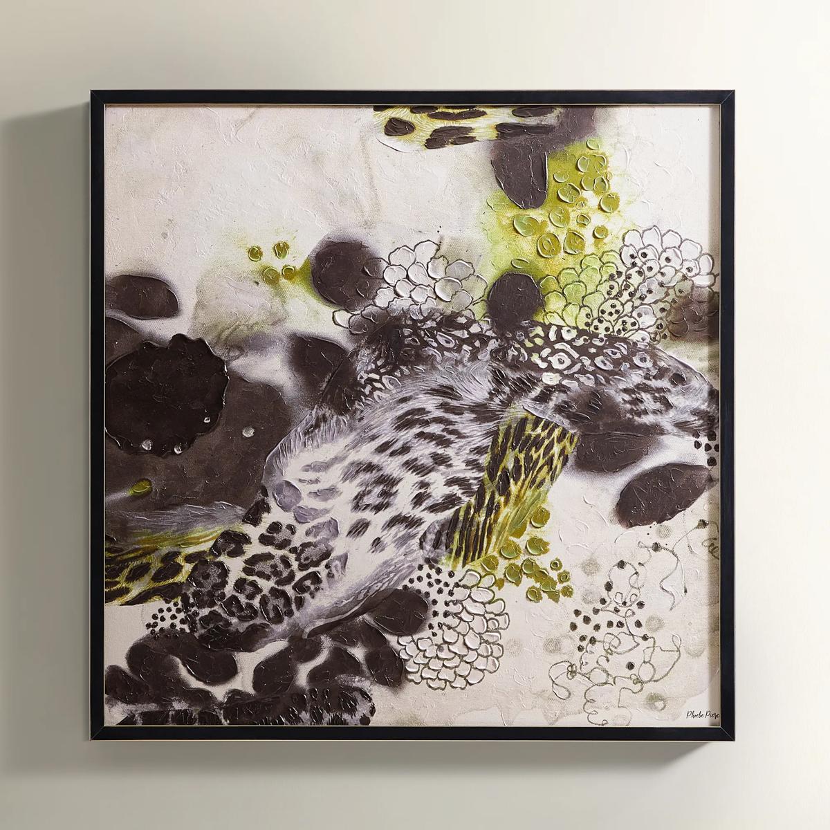
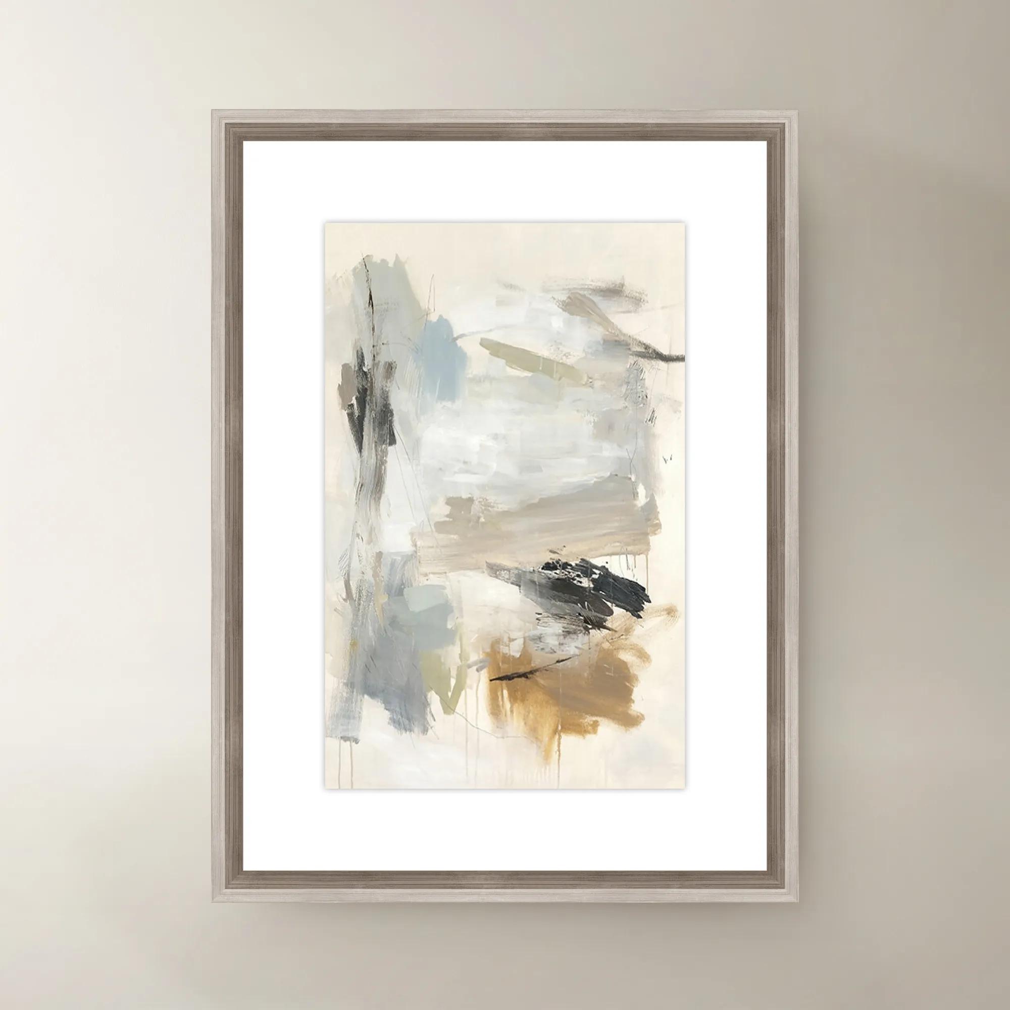
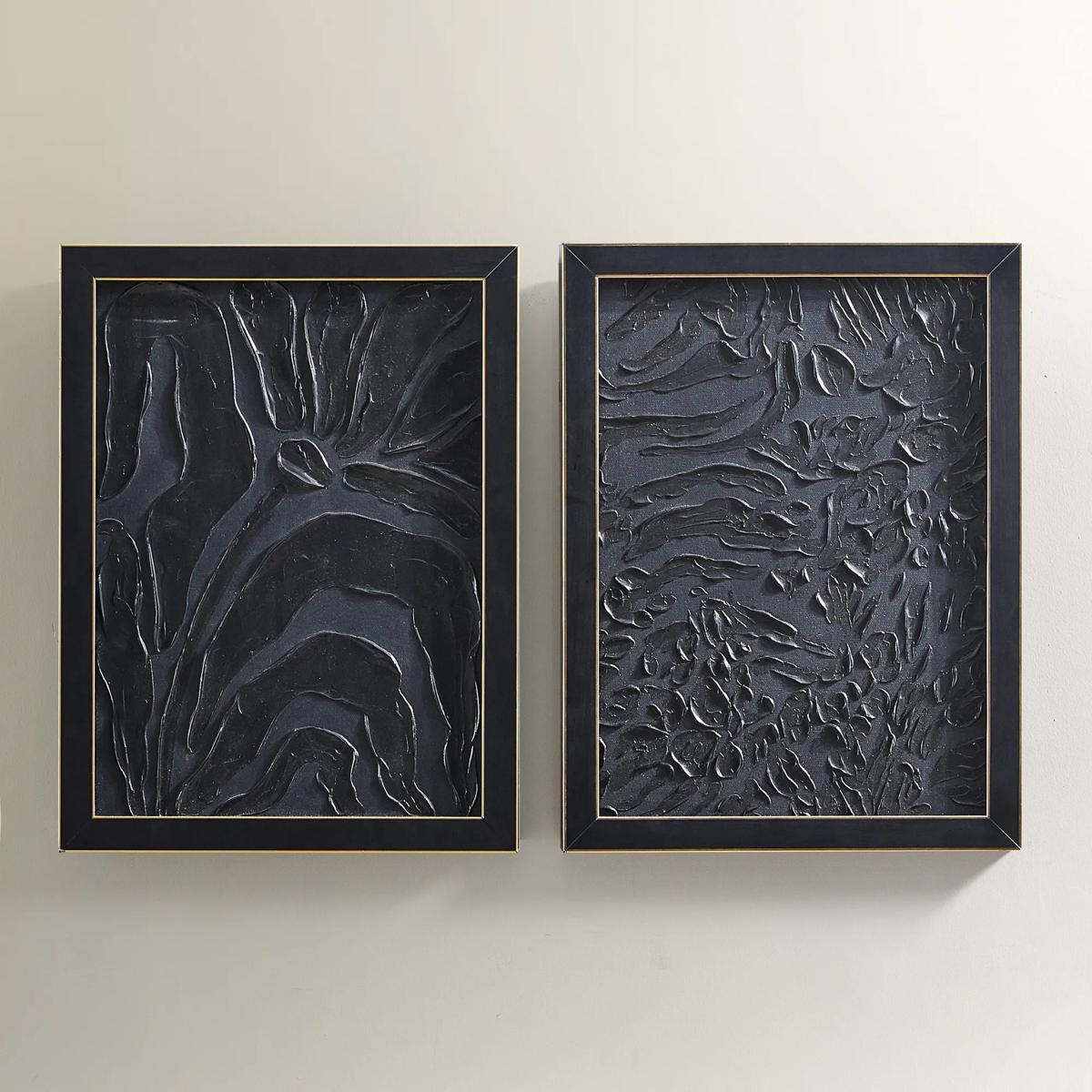
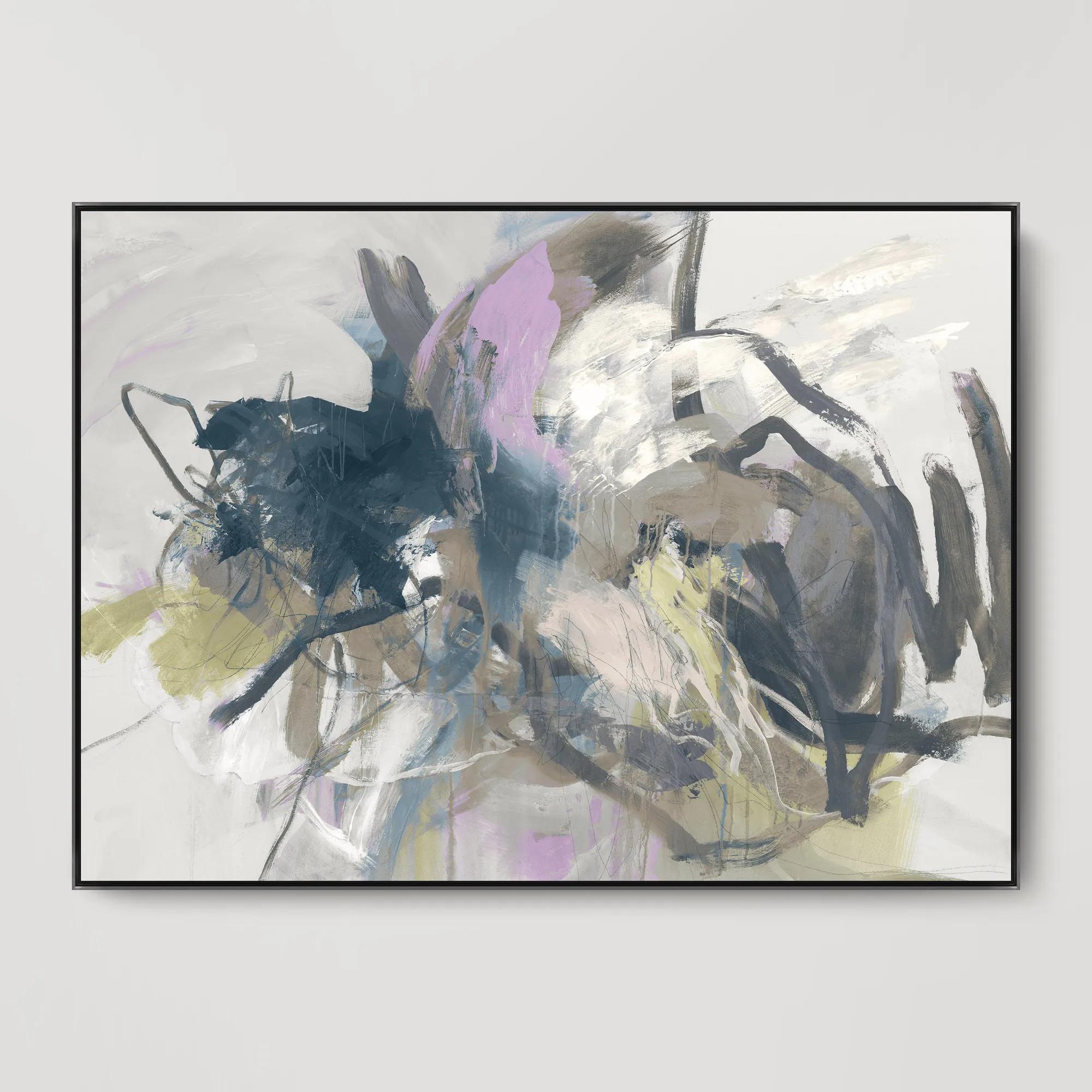
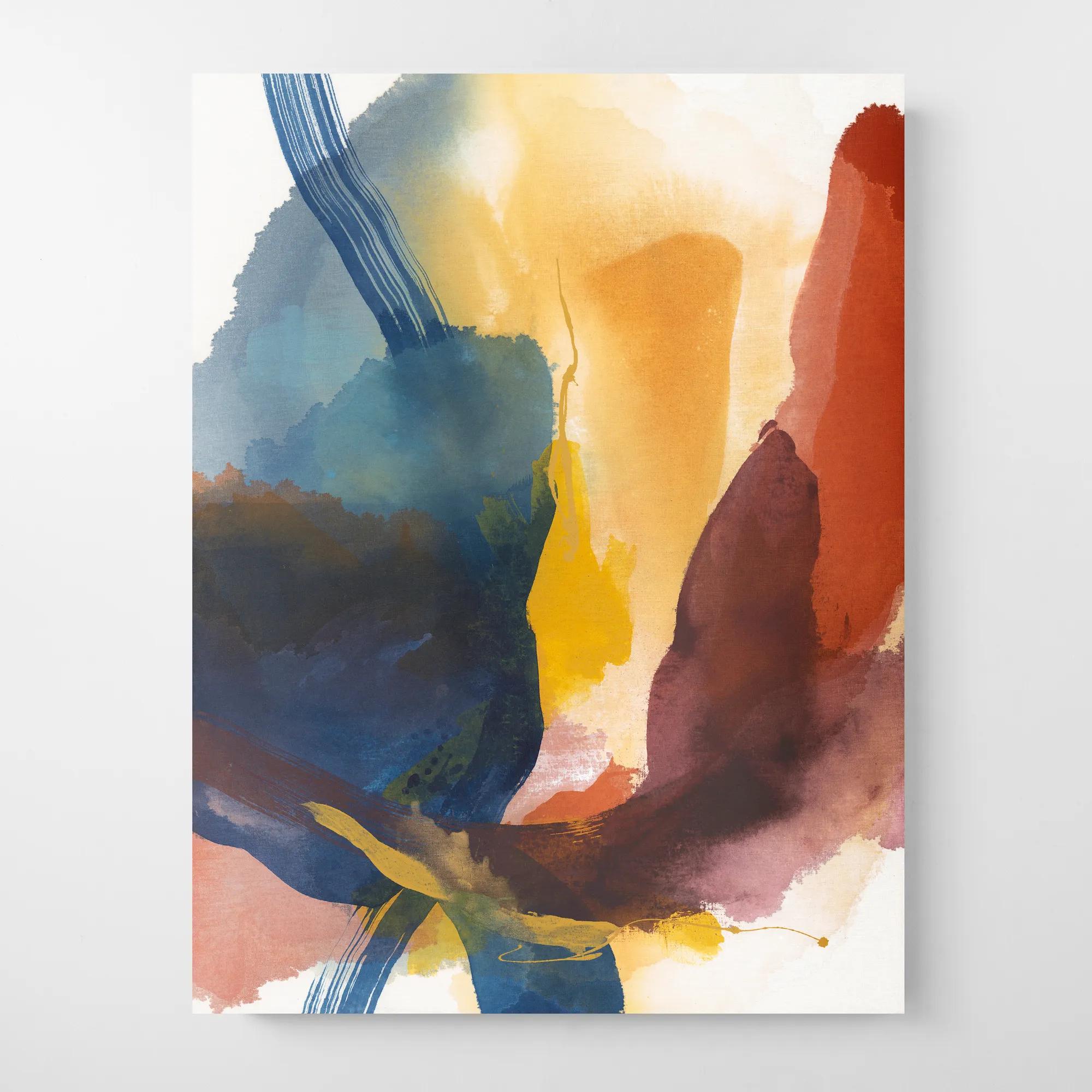
White Abstract Canvas Wall Art
White Abstract Canvas Wall Art
-
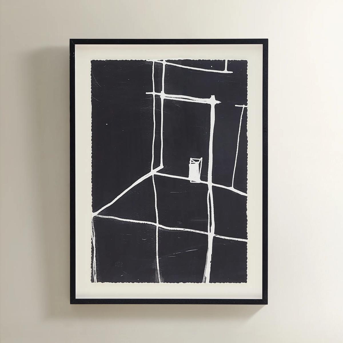 Solitude Art$269
A minimalist black-and-white abstract print featuring bold white lines in a sleek black polyresin frame.
Add To Cart -
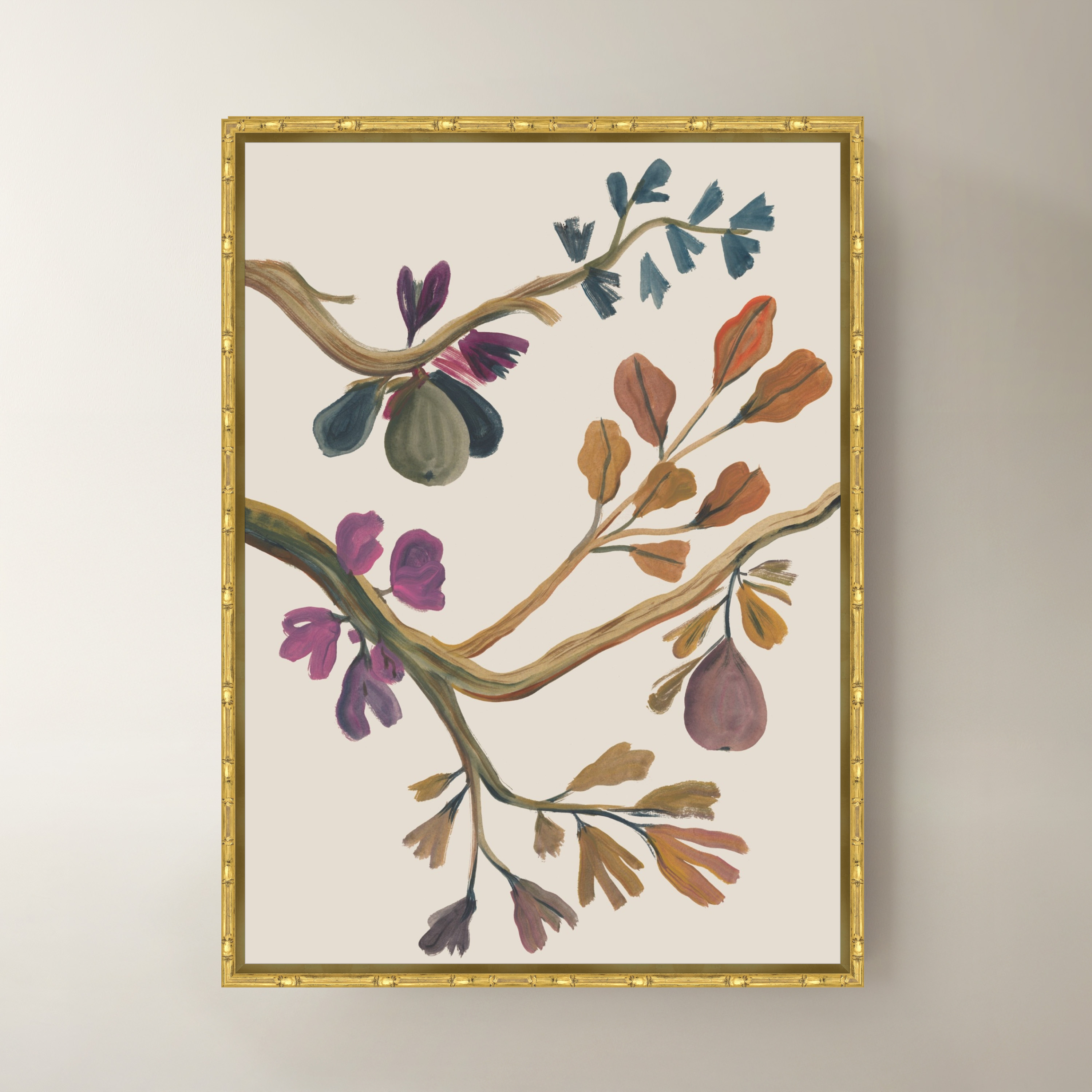
 Whispering Orchard II Framed Wall Art 24" x 33"$749
A multicolored canvas wall art piece presented in an elegant frame for contemporary interiors.
Add To Cart -
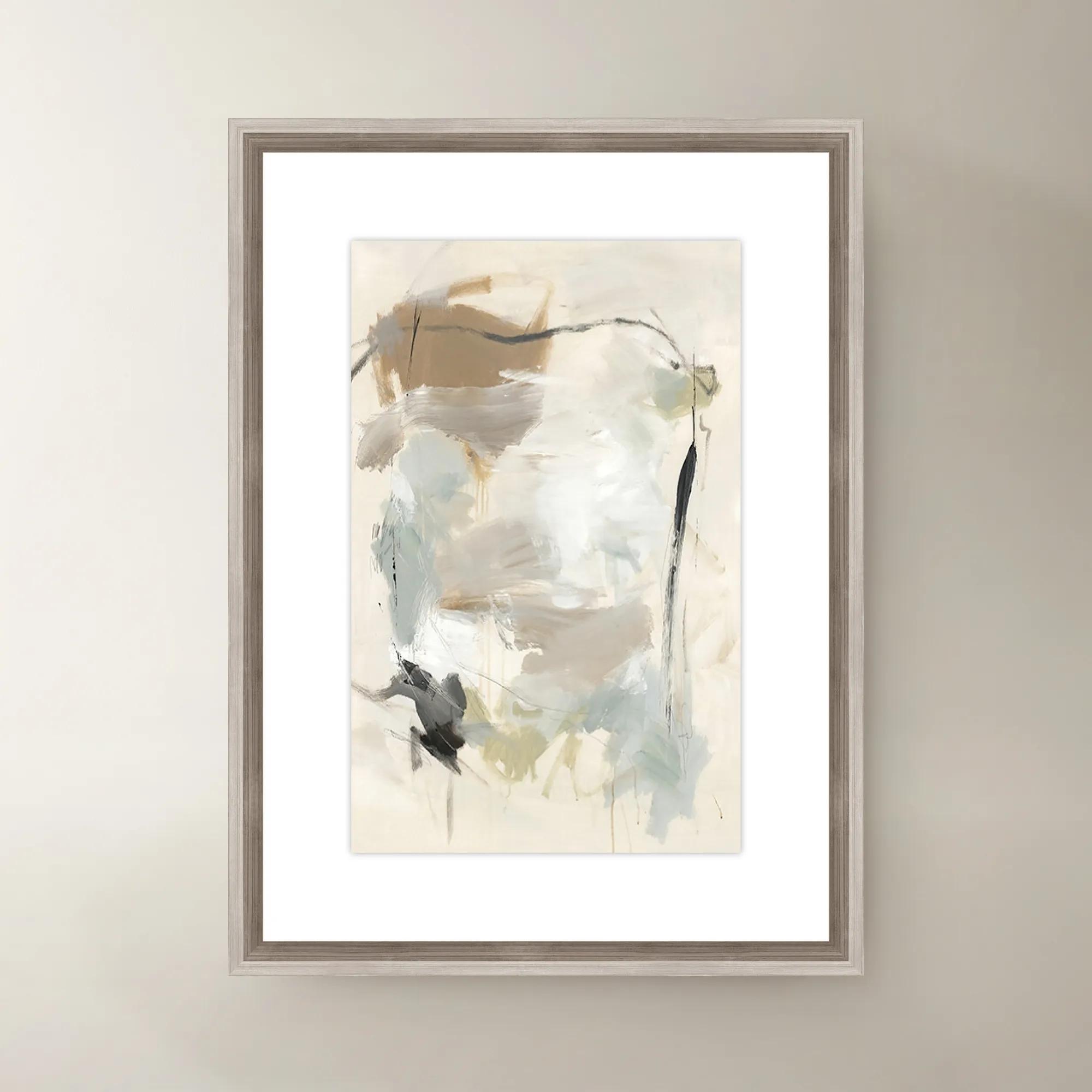
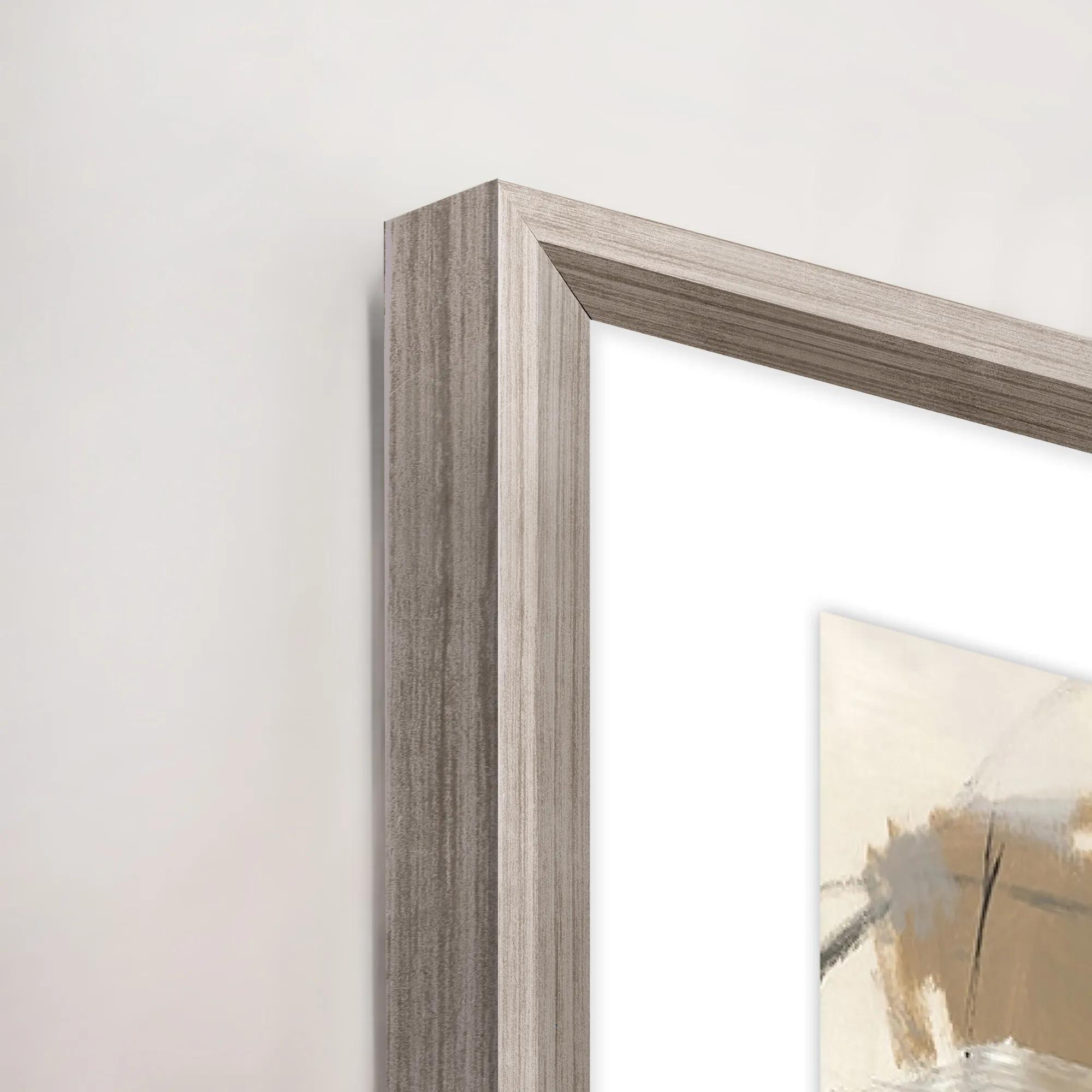 French Bakery I Framed Wall Art 20" x 30"$419
A multi-colored canvas wall artwork in a framed presentation, inspired by a charming French bakery.
Add To Cart -
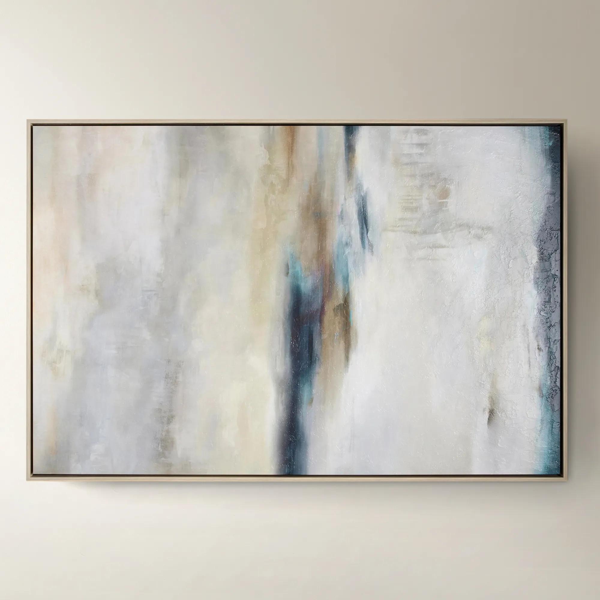
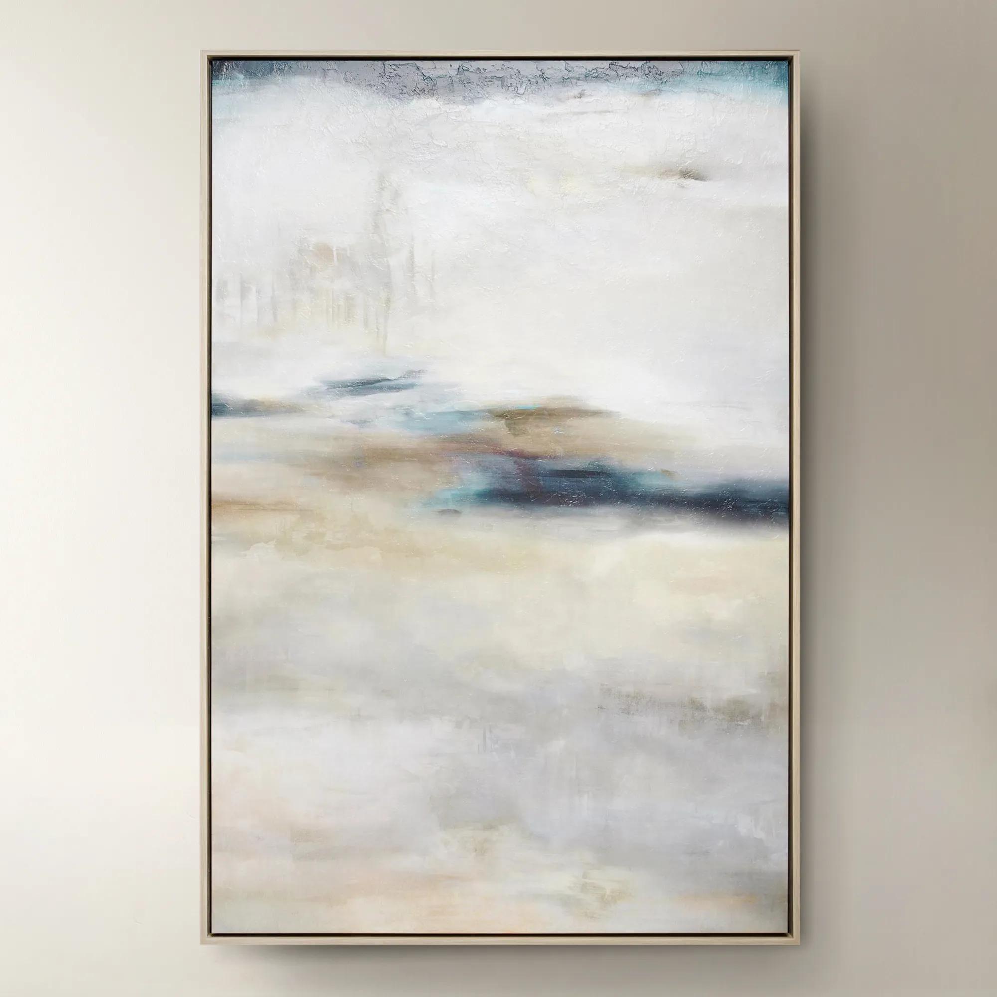 Forward Looking$1299
A softly layered abstract canvas print with a gel finish, set in a natural-hued floater frame.
Add To Cart -
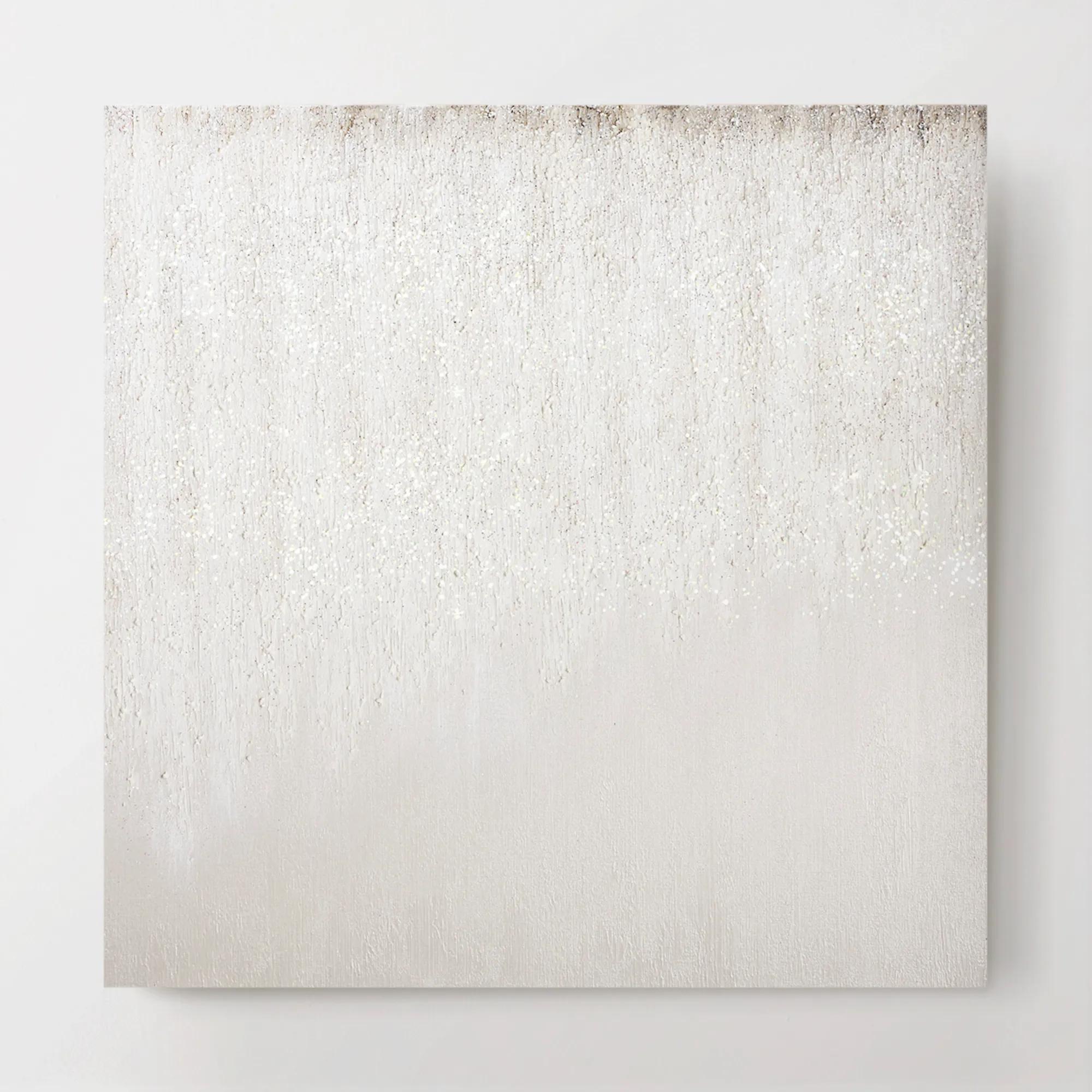 Je T'aime Glitter Painted Wall Art 30" x 30"$499
A hand-painted canvas artwork featuring ethereal hazy brushstrokes and subtle glitter embellishments.
Add To Cart -
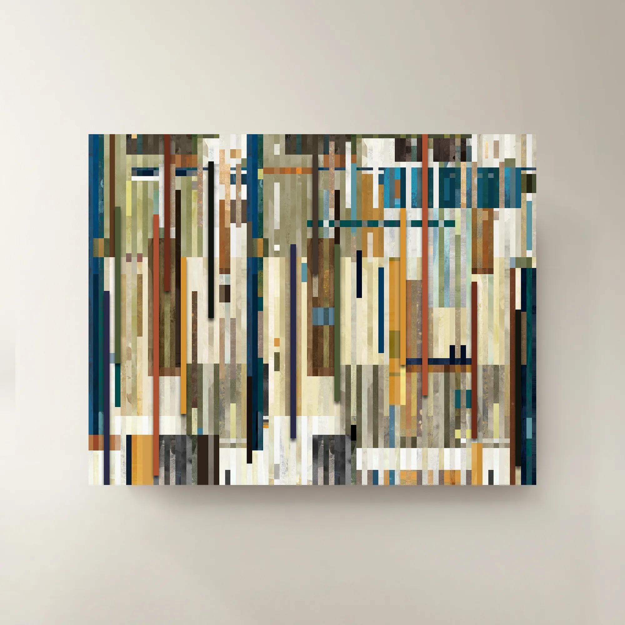
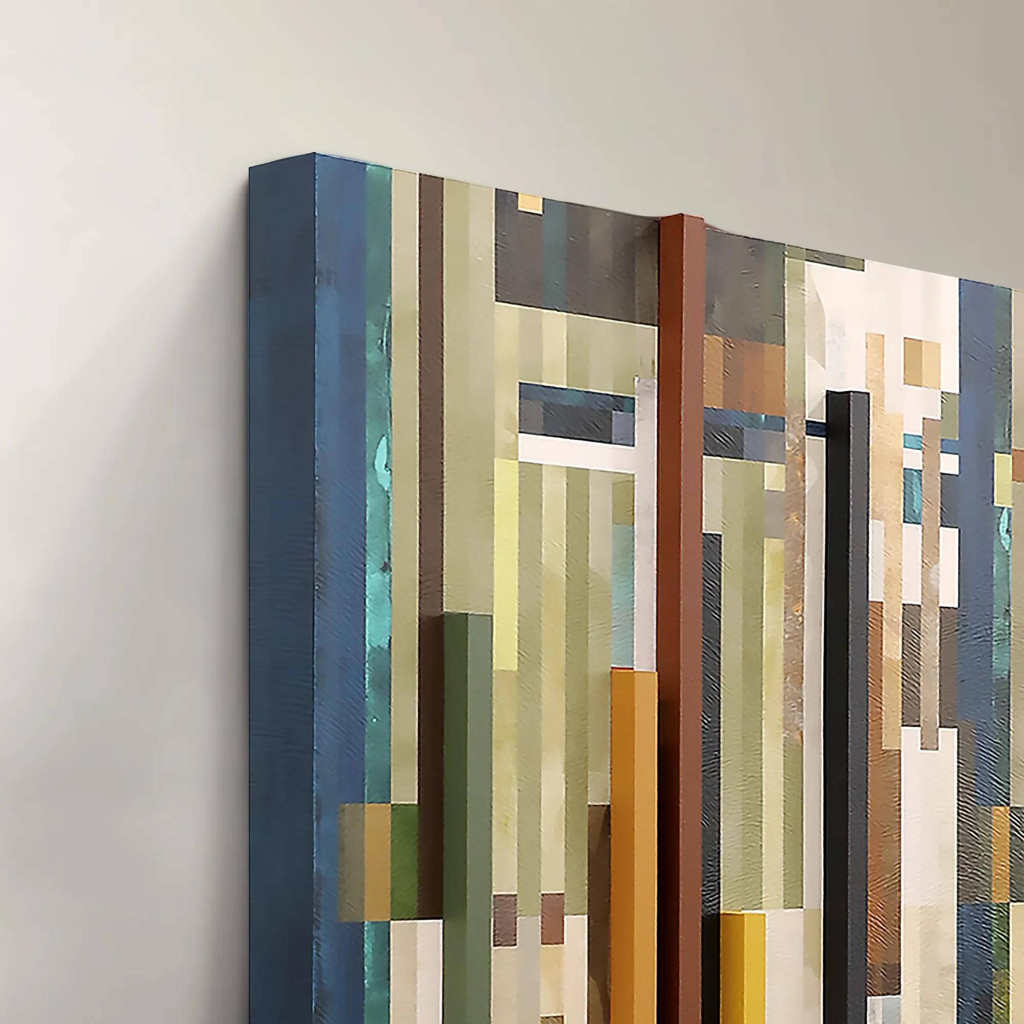 Chromatic Rhythms II Wall Art 60" x 47"$1899
A dynamic blue abstract canvas artwork featuring rhythmic geometric composition.
Add To Cart -
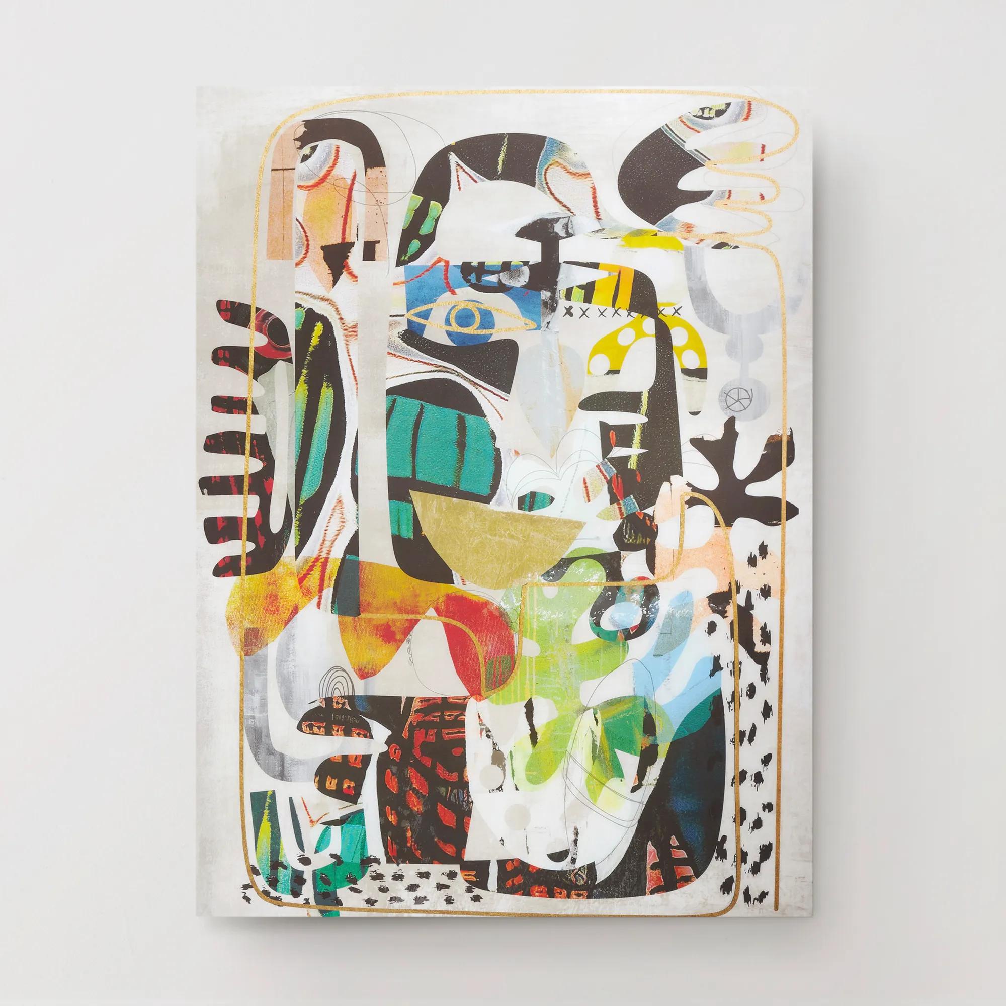
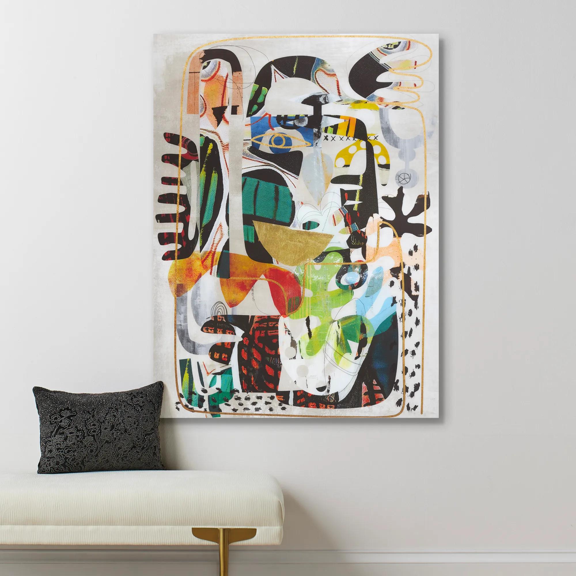 Nikki Chu Masked Wall Art 40" x 54"$899
A vibrant giclee print on canvas featuring a hand-applied glossy finish for a modern statement.
Add To Cart -
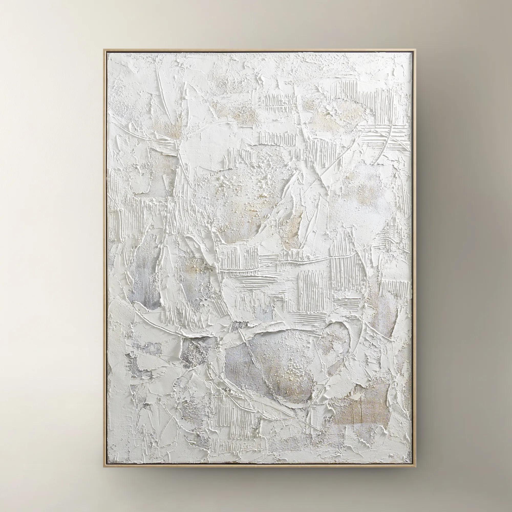 Stone Heritage Painting$399
A hand-painted canvas featuring textured white tones, elegantly framed in warm beech wood for refined appeal.
Add To Cart -
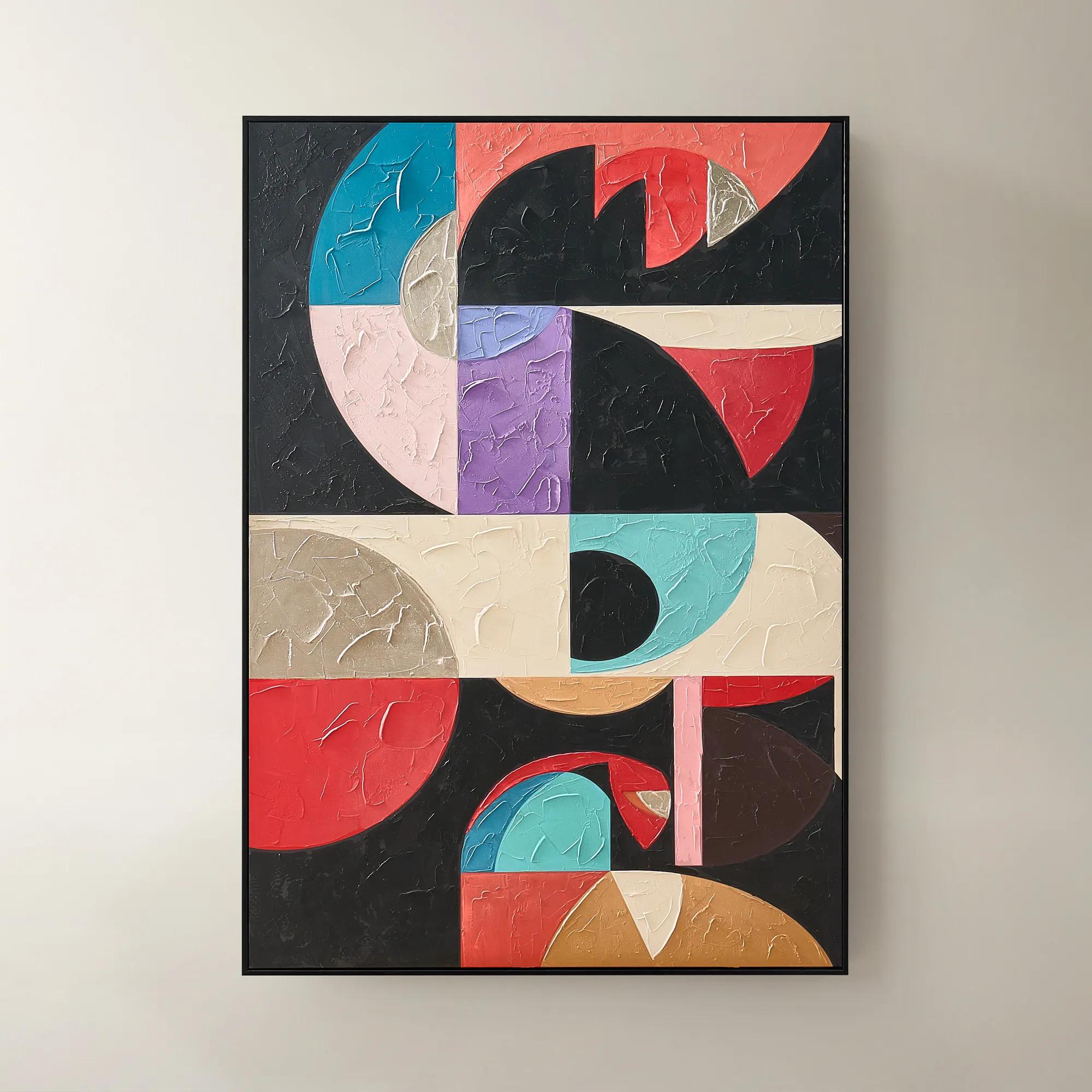
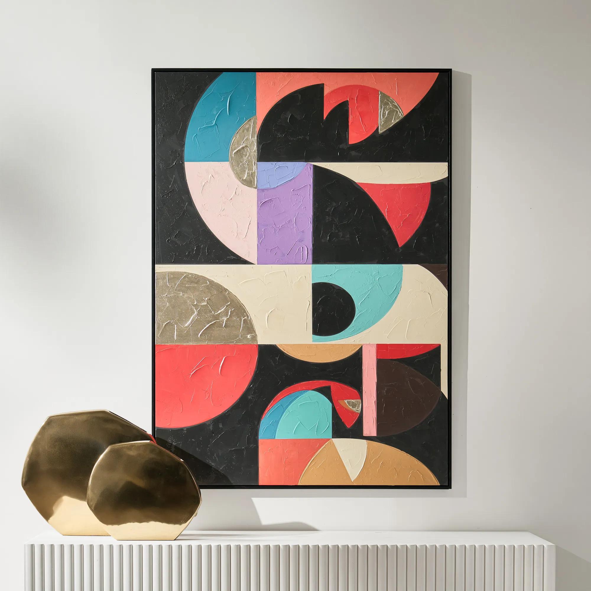 Labyrinth Art$499
A striking multicolored canvas artwork adding contemporary dimension to modern interiors.
Add To Cart -
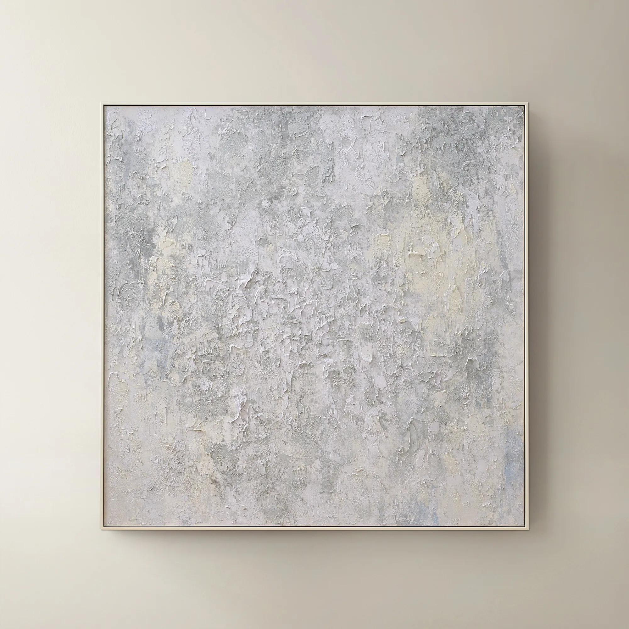 Breathe of Fresh Air Framed Painted Wall Art 50" x 50"$499
A hand-painted abstract canvas in dusty blue hues, elegantly framed in white for a serene, modern accent.
Add To Cart -
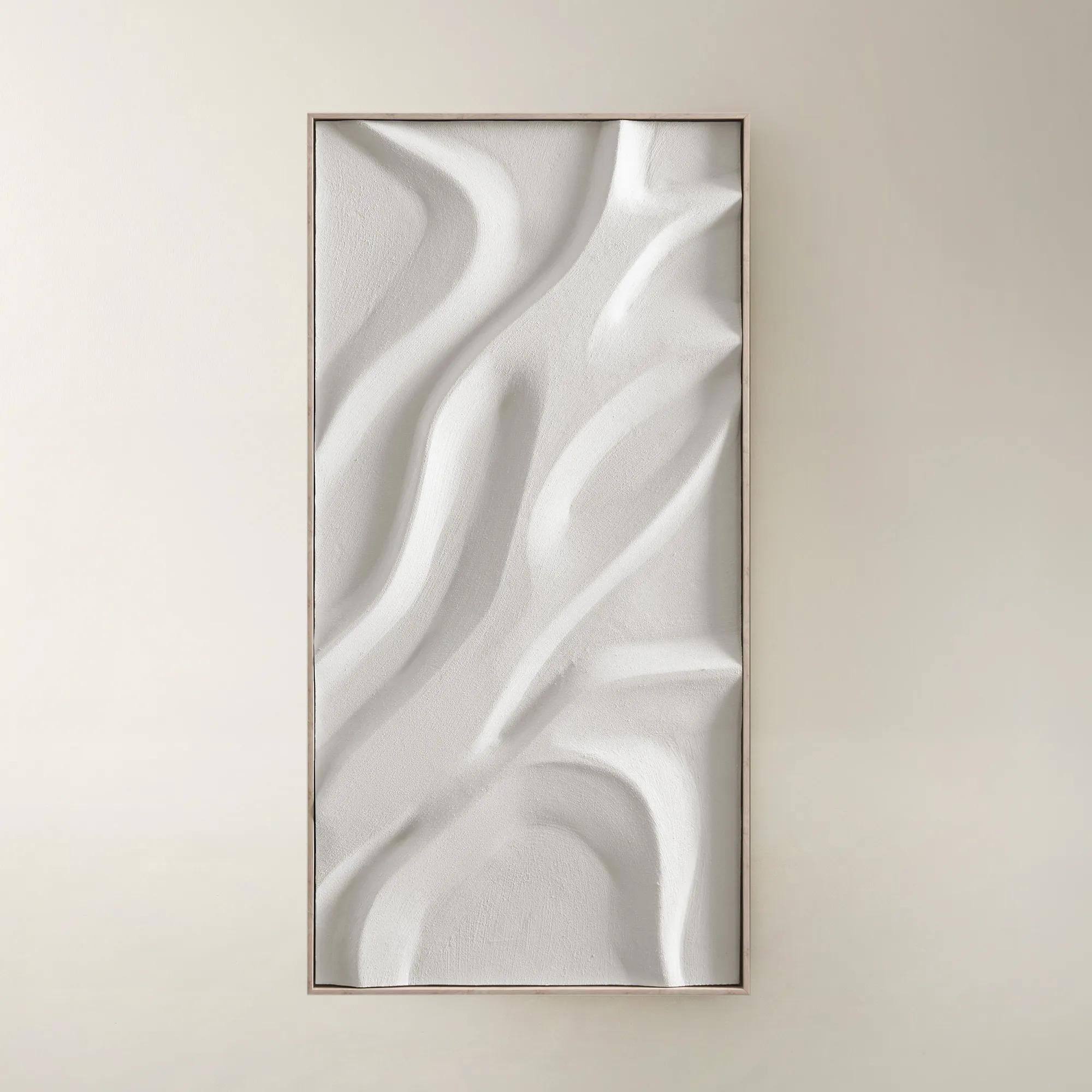
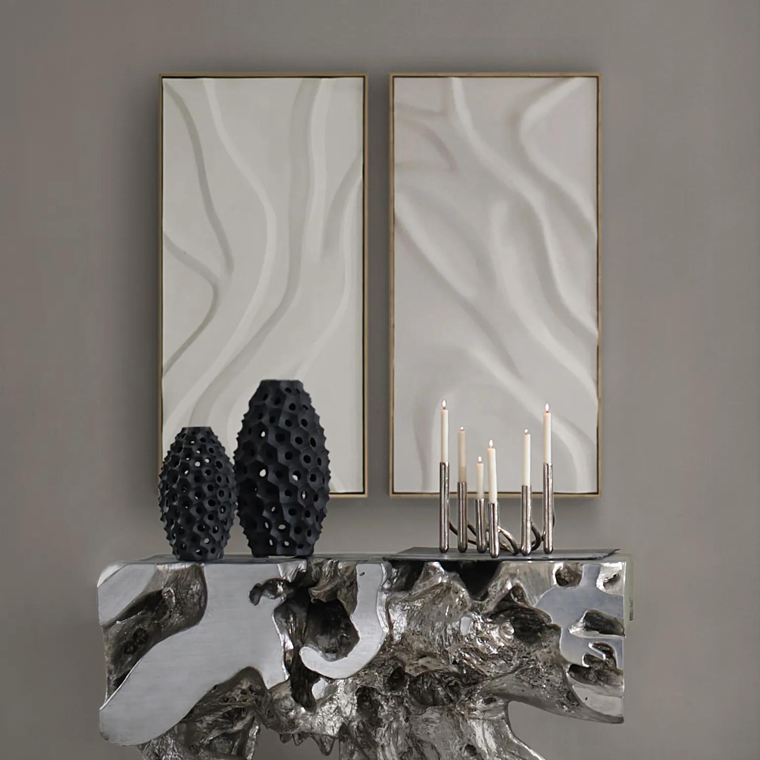 Au Lait Framed Painted Wall Art II 47.2" x 23.6"$199
A serene hand-painted canvas in beige, set in a warm whitewash floater frame for modern interiors.
Add To Cart -
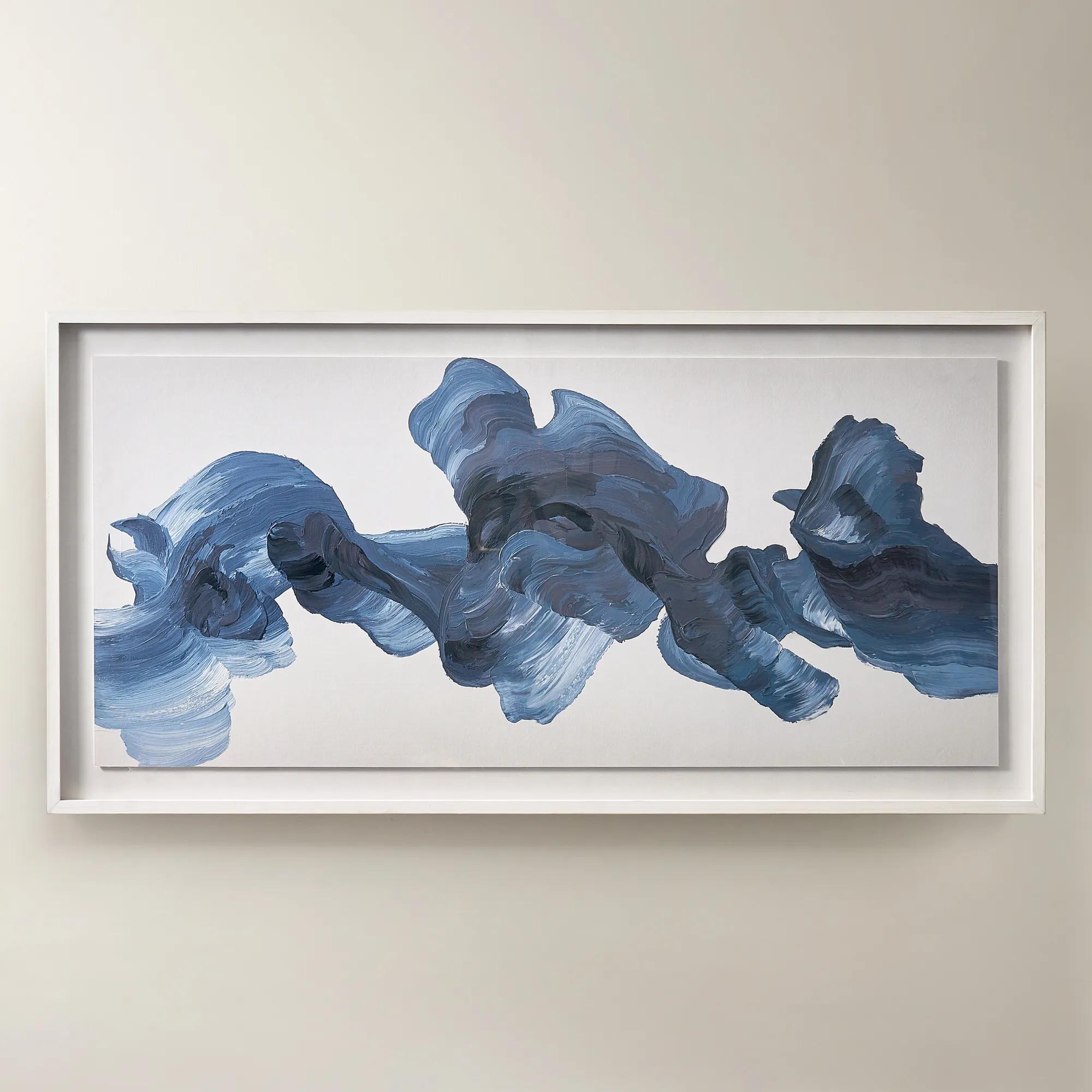
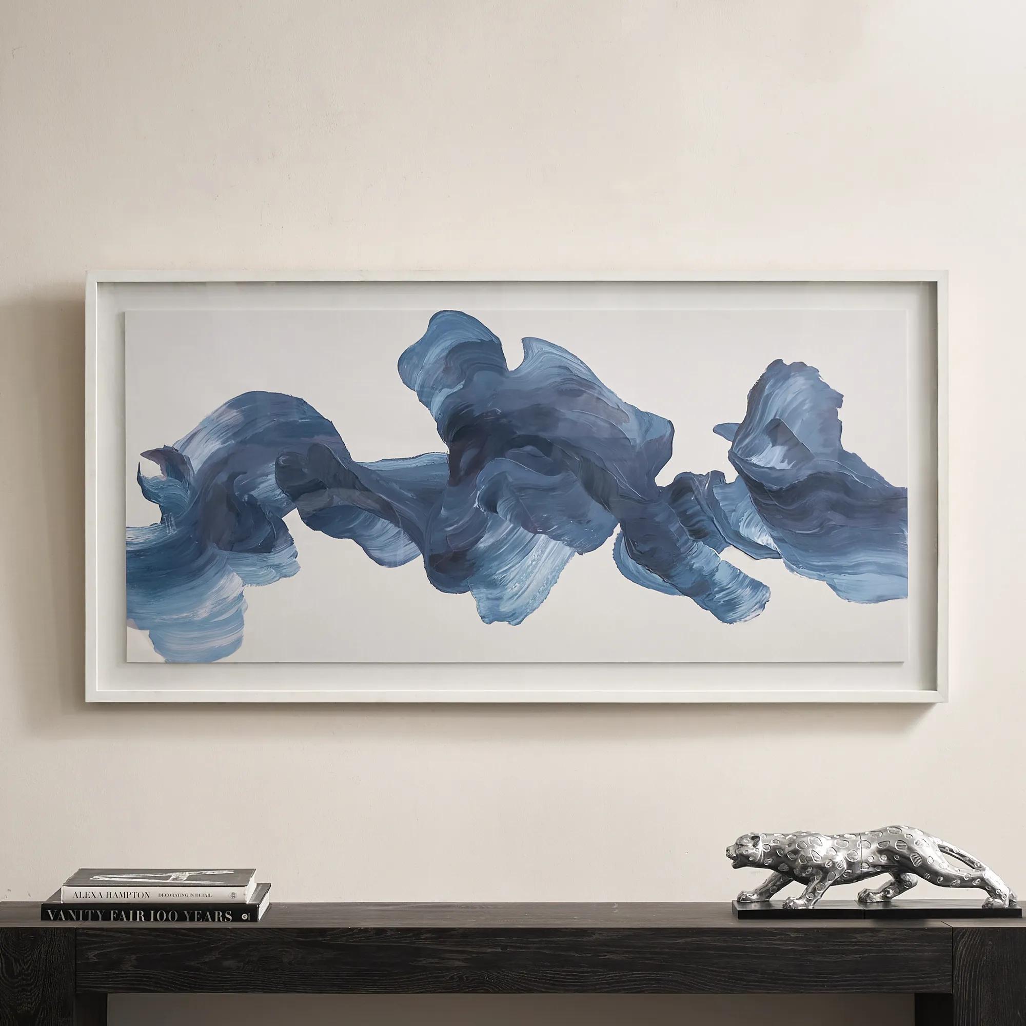 Blue Theory Framed Painted Wall Art in Acrylic 60" x 30"$499
A hand-painted canvas in deep ink blue, framed under acrylic with a whitewashed wood frame.
Add To Cart -
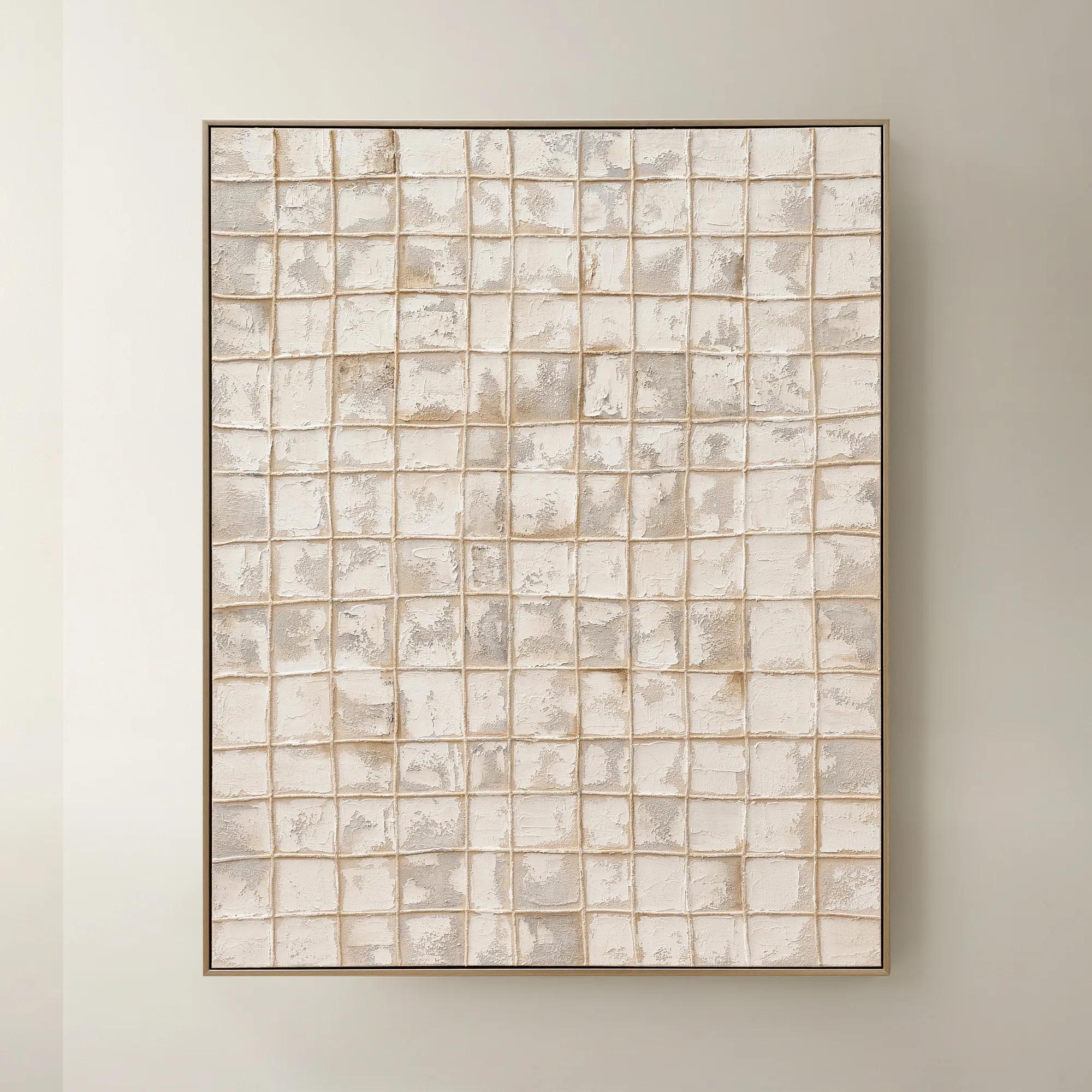
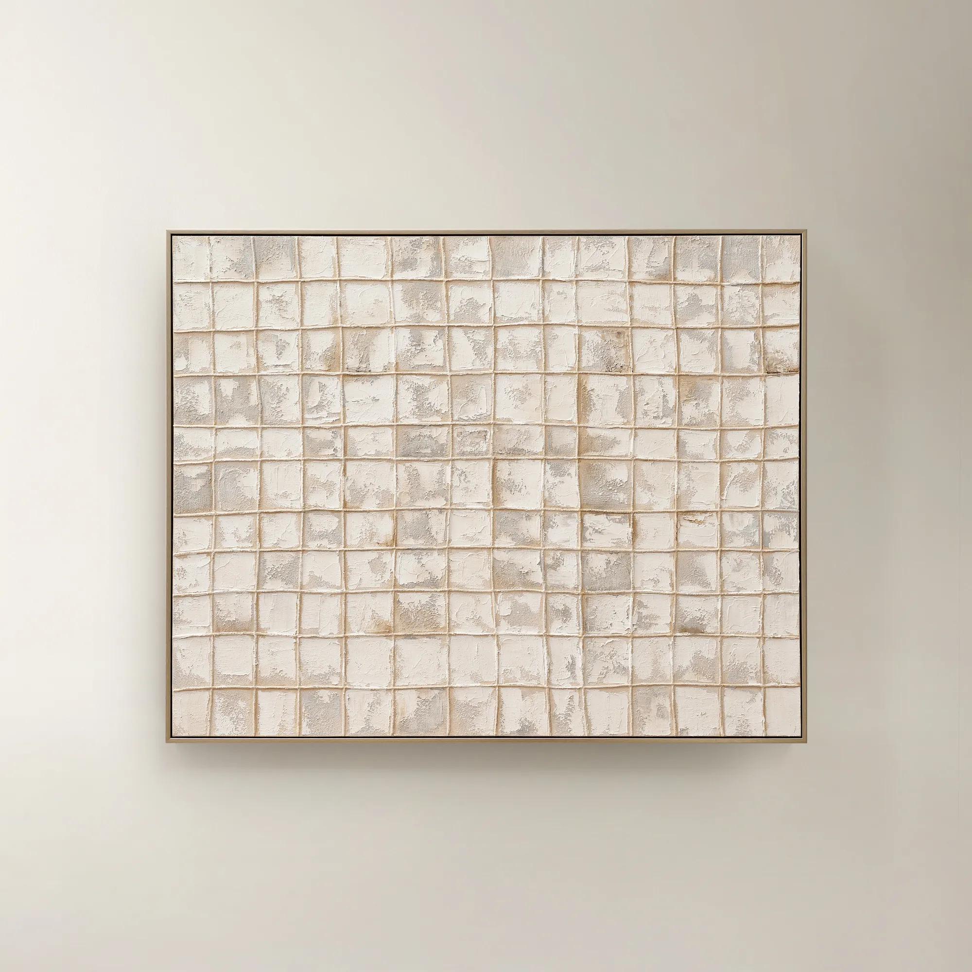 Painted Echos Framed Gold Leaf Wall Art 60" x 48"$699
A hand-painted abstract canvas with gold leaf accents and a champagne frame for modern, versatile display.
Add To Cart -
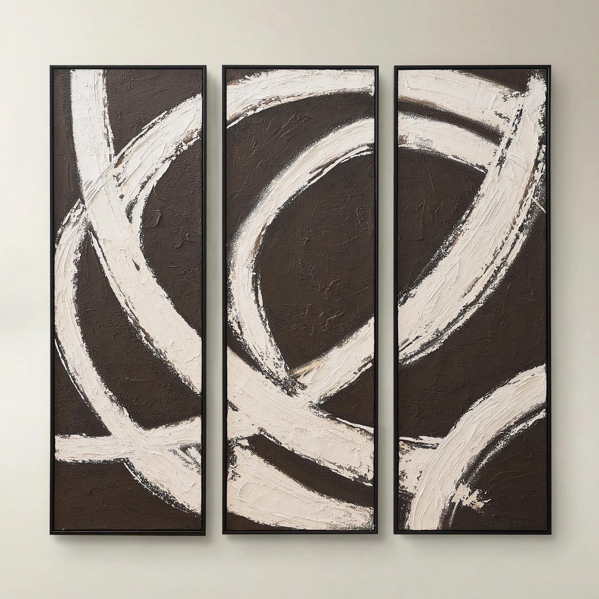
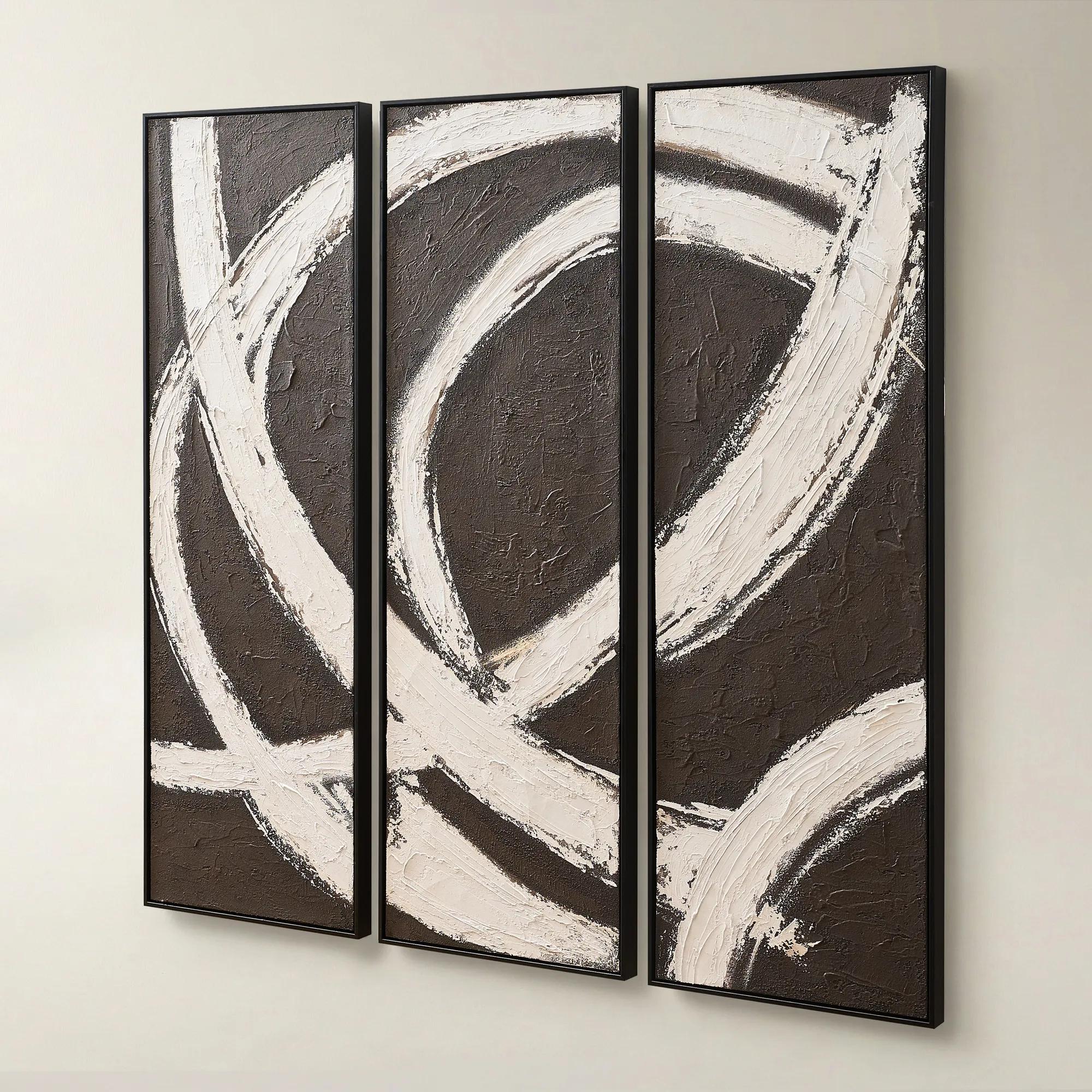 Spun in Coco Framed Painted Wall Art 20" x 60" Set of 3$499
A hand-painted triptych featuring dark chocolate and alabaster tones with rich texture and modern contrast.
Add To Cart -
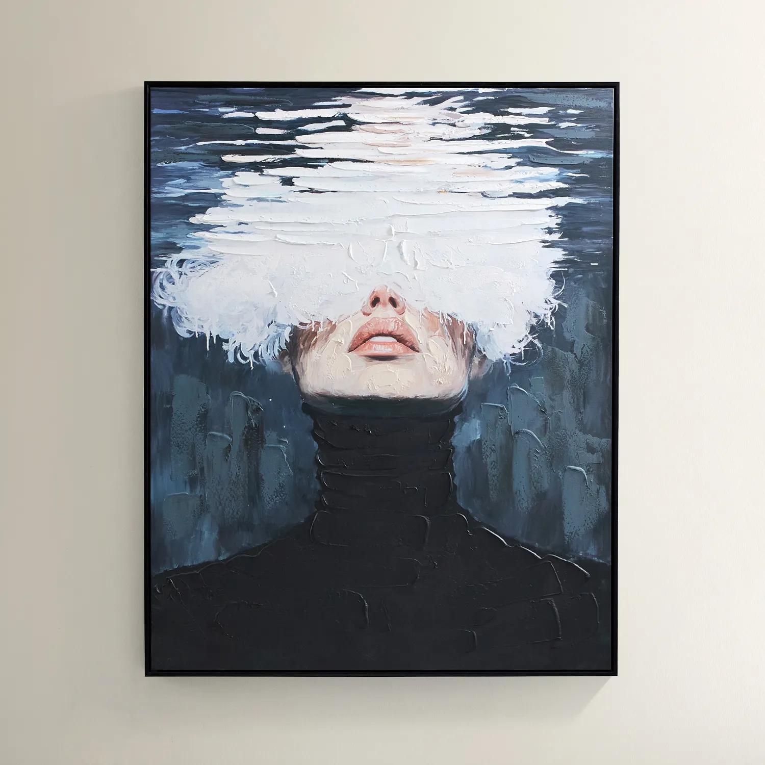
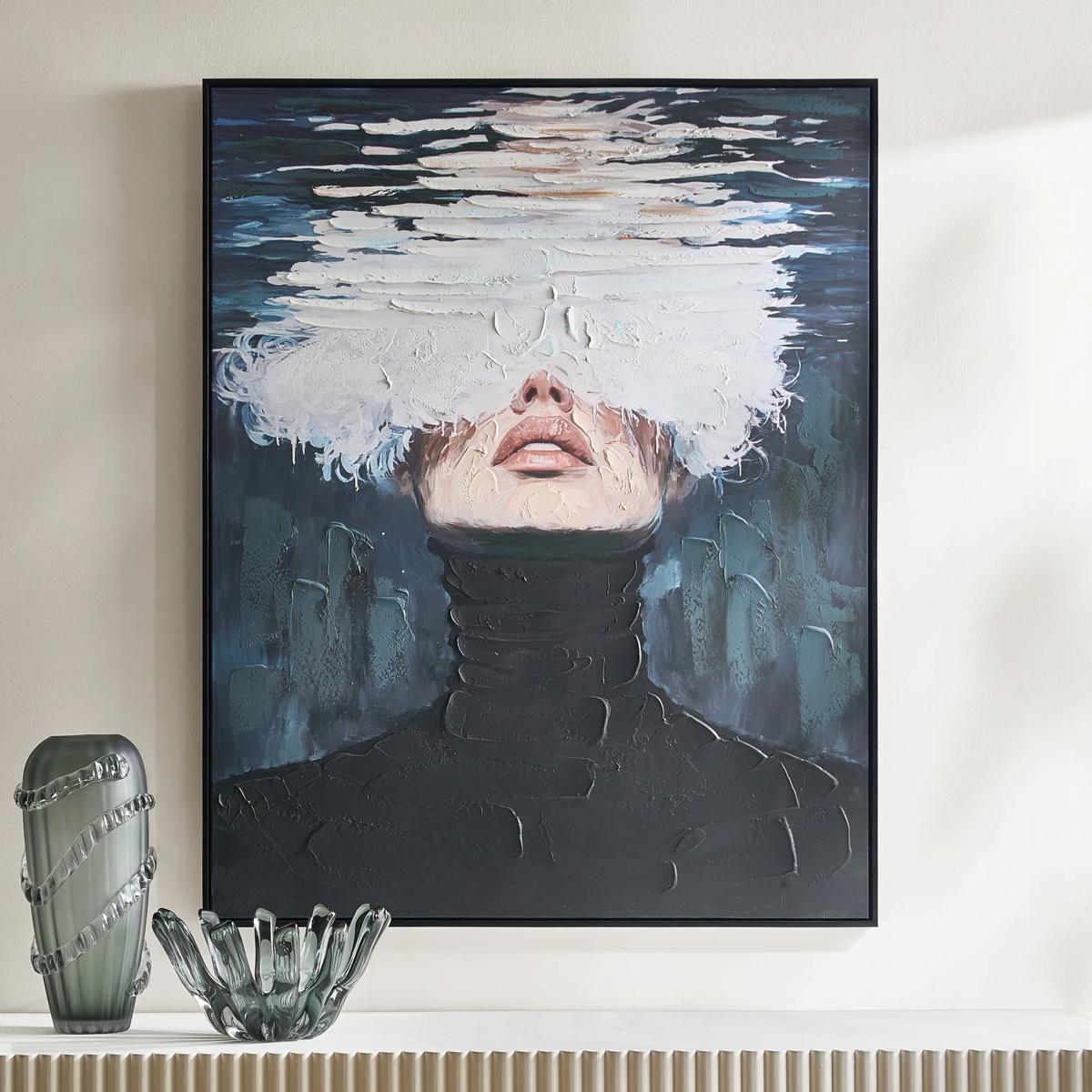 Submerged Framed Painted Wall Art 40" x 50"$599
A hand-painted canvas featuring a surreal portrait in black, blue, and white with a black floater frame.
Add To Cart -
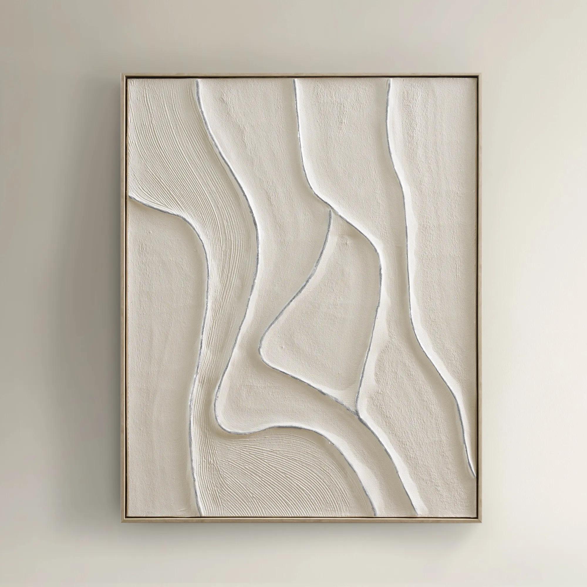
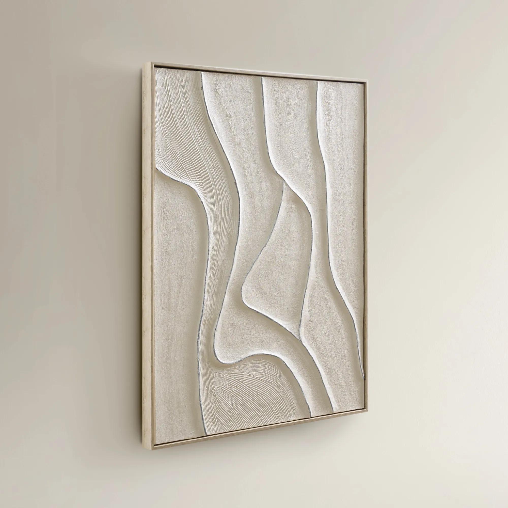 Vivre Framed Painted Wall Art 39.25" x 31.5"$199
A hand-painted canvas featuring tranquil beige hues and flowing lines in a warm whitewash floater frame.
Add To Cart -
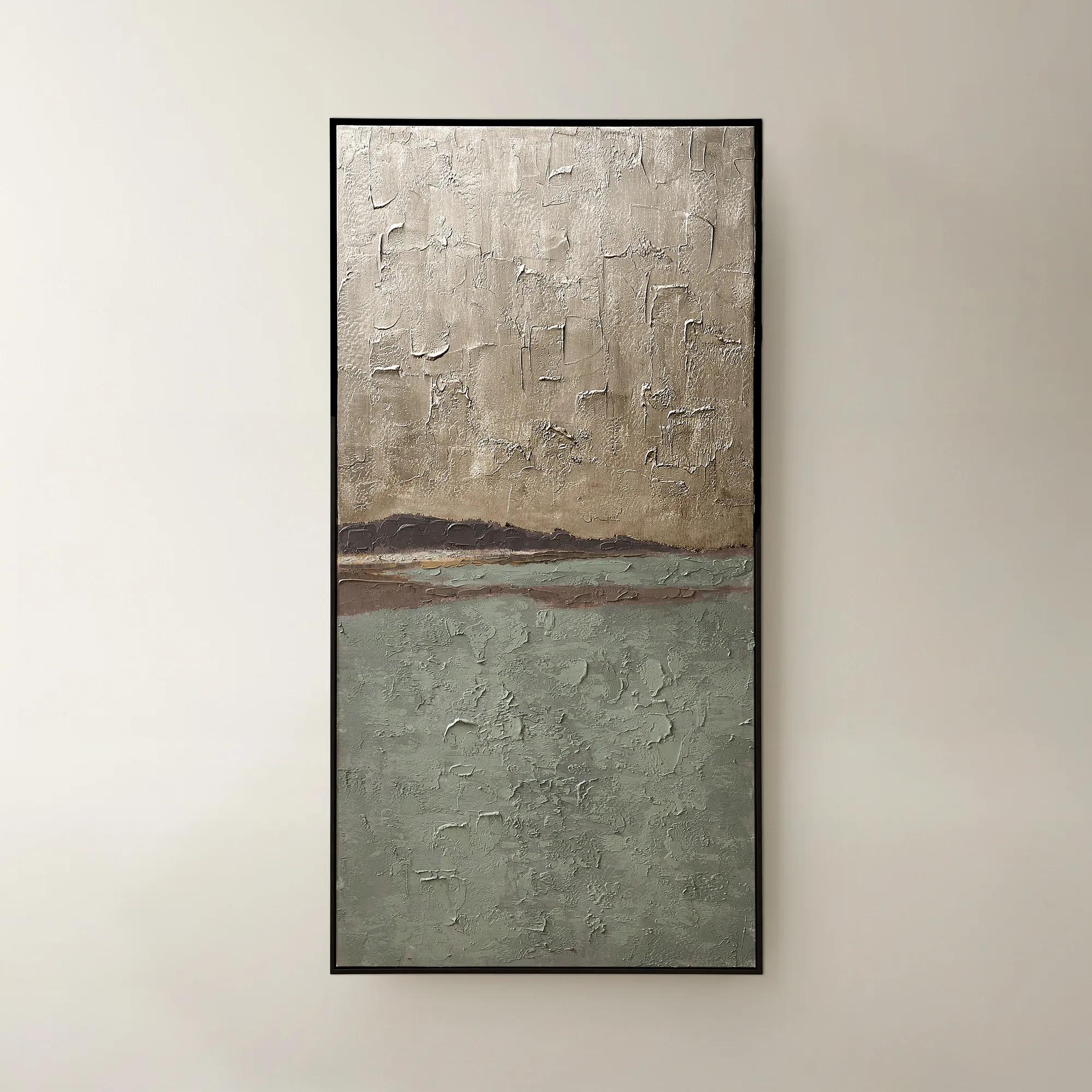
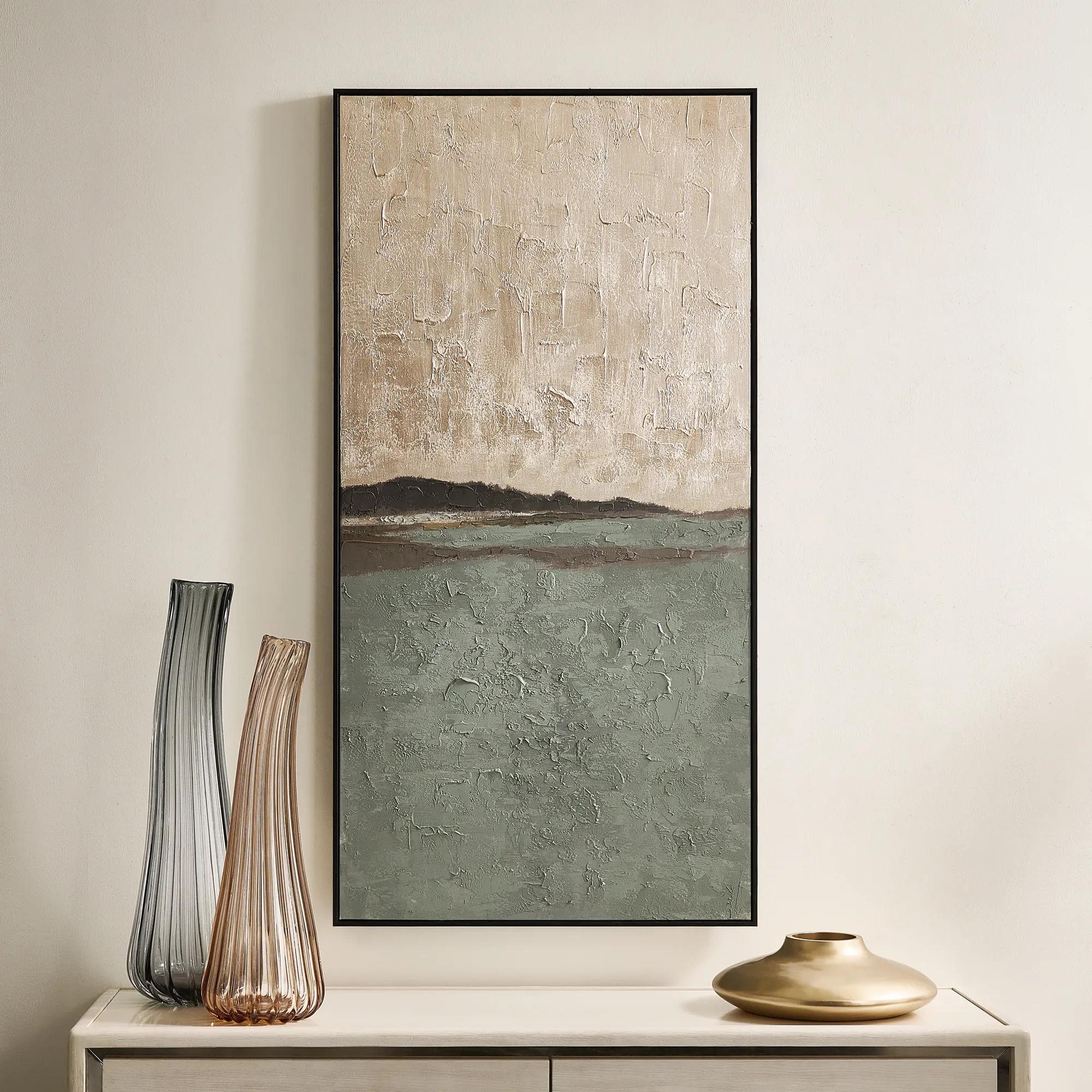 Fields of Gold Framed Painted Wall Art 60" x 30"$399
A hand-painted sage and champagne abstract canvas with a black frame, offering versatile vertical or horizontal display.
Add To Cart -
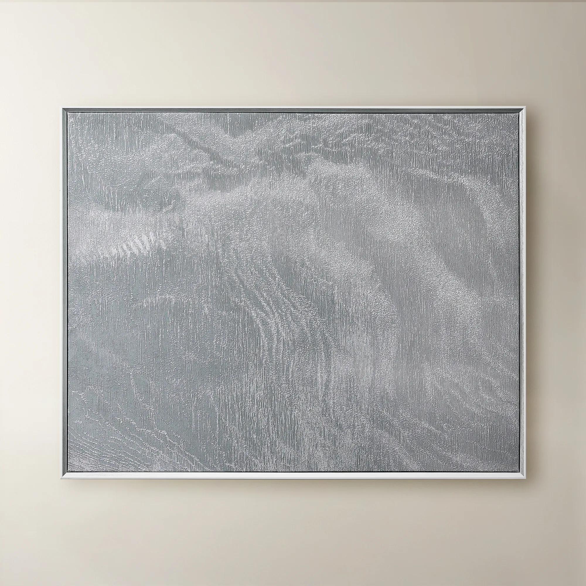 Slow Blue Morning Framed Silver Foil Wall Art 48" x 60"$599
A serene powder blue abstract canvas with silver foil accents, framed in silver and white for modern elegance.
Add To Cart -
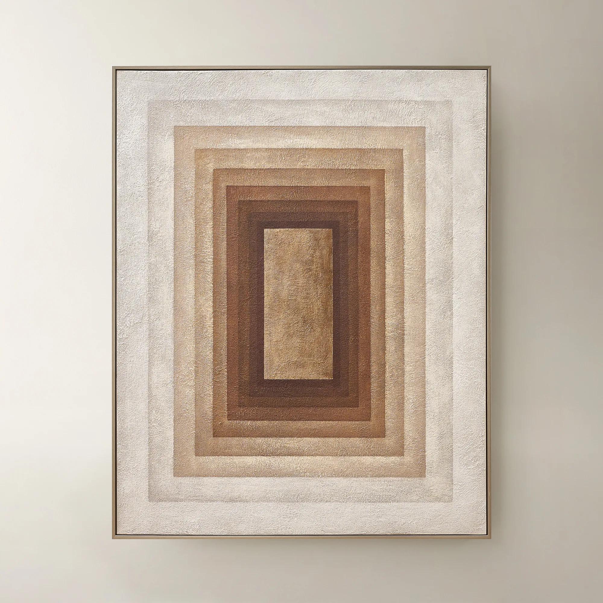 Monochrome Drift Framed Painted Wall Art 60" x 48"$699
A hand-painted abstract canvas with champagne leafing, featuring cocoa and gold tones in modern geometric design.
Add To Cart -
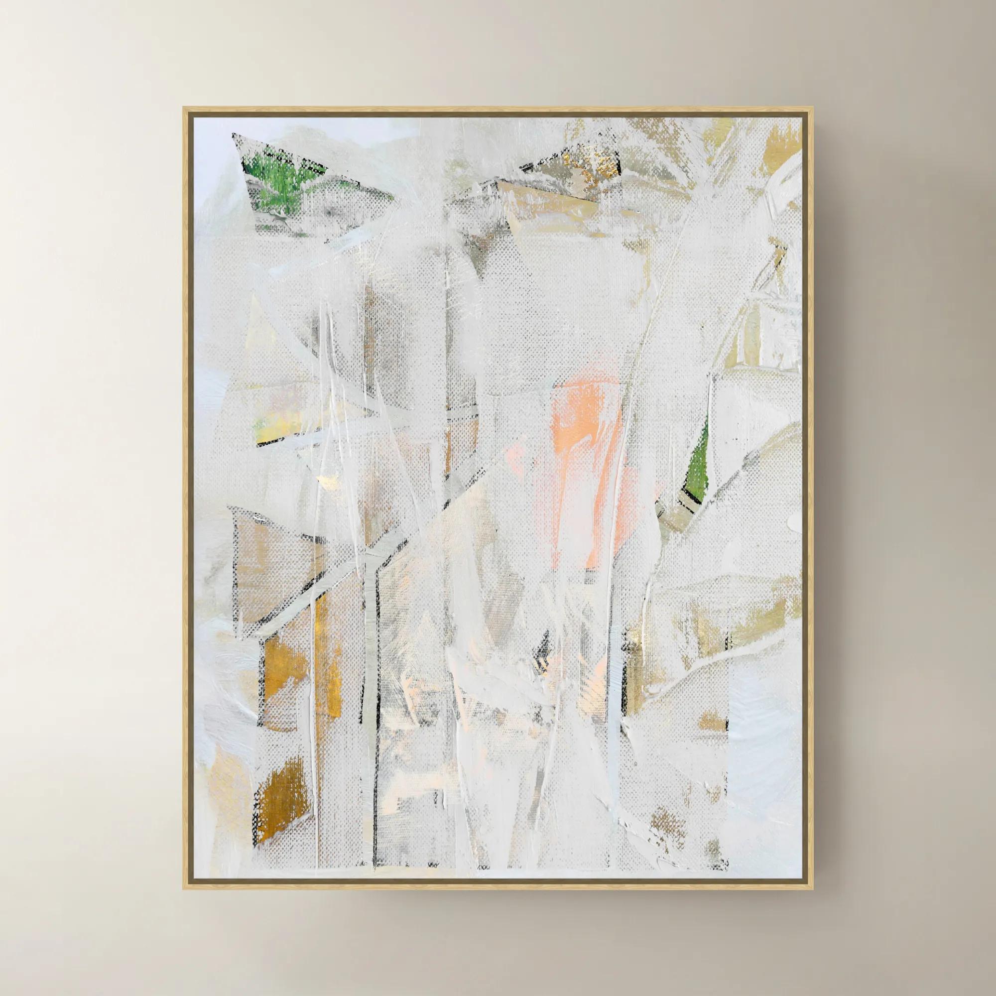
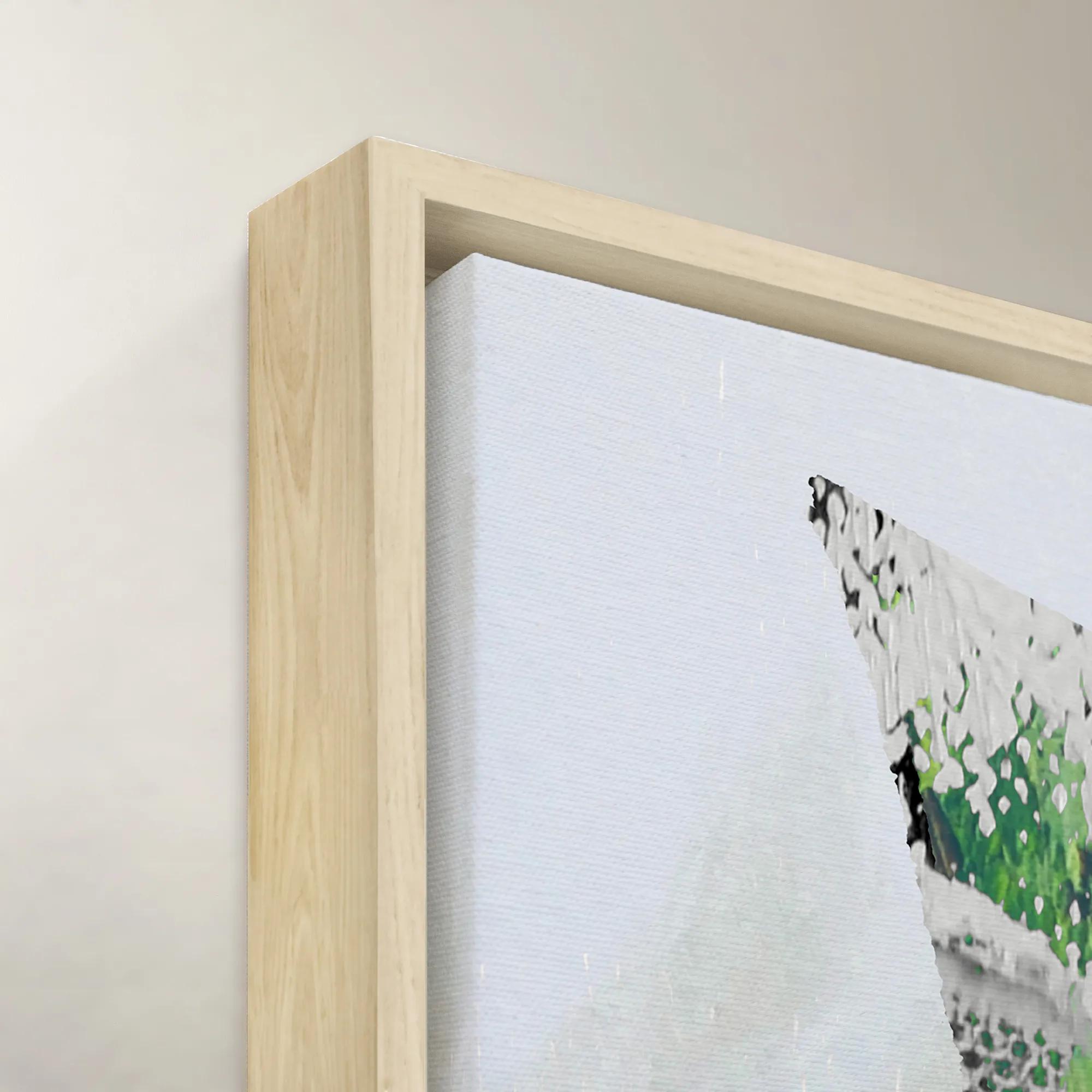 Builder Framed Wall Art 40" x 40"$1199
An inspiring art piece by Nikki Chu, blending modern design with her signature creative flair.
Add To Cart -

 Transformation Framed Wall Art 47" x 47"$1099
A sophisticated brown canvas wall artwork in a striking framed design for modern interiors.
Add To Cart -
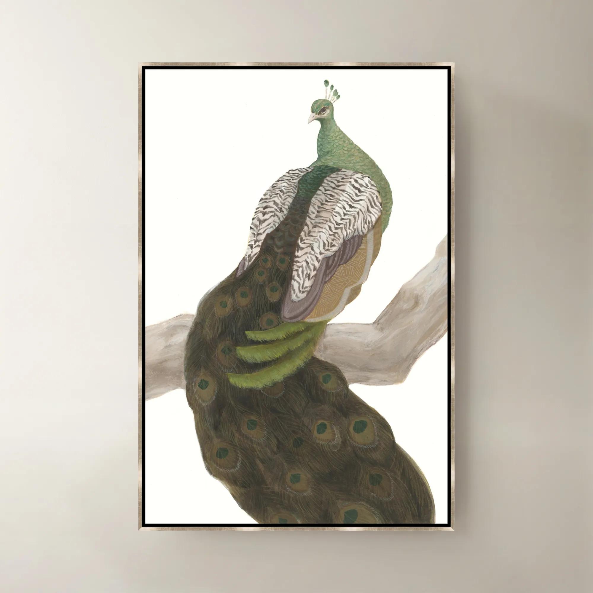 Royal Mirage Framed Wall Art 30" x 45"$799
A multicolored framed canvas artwork bringing sophisticated visual interest to contemporary interiors.
Add To Cart -
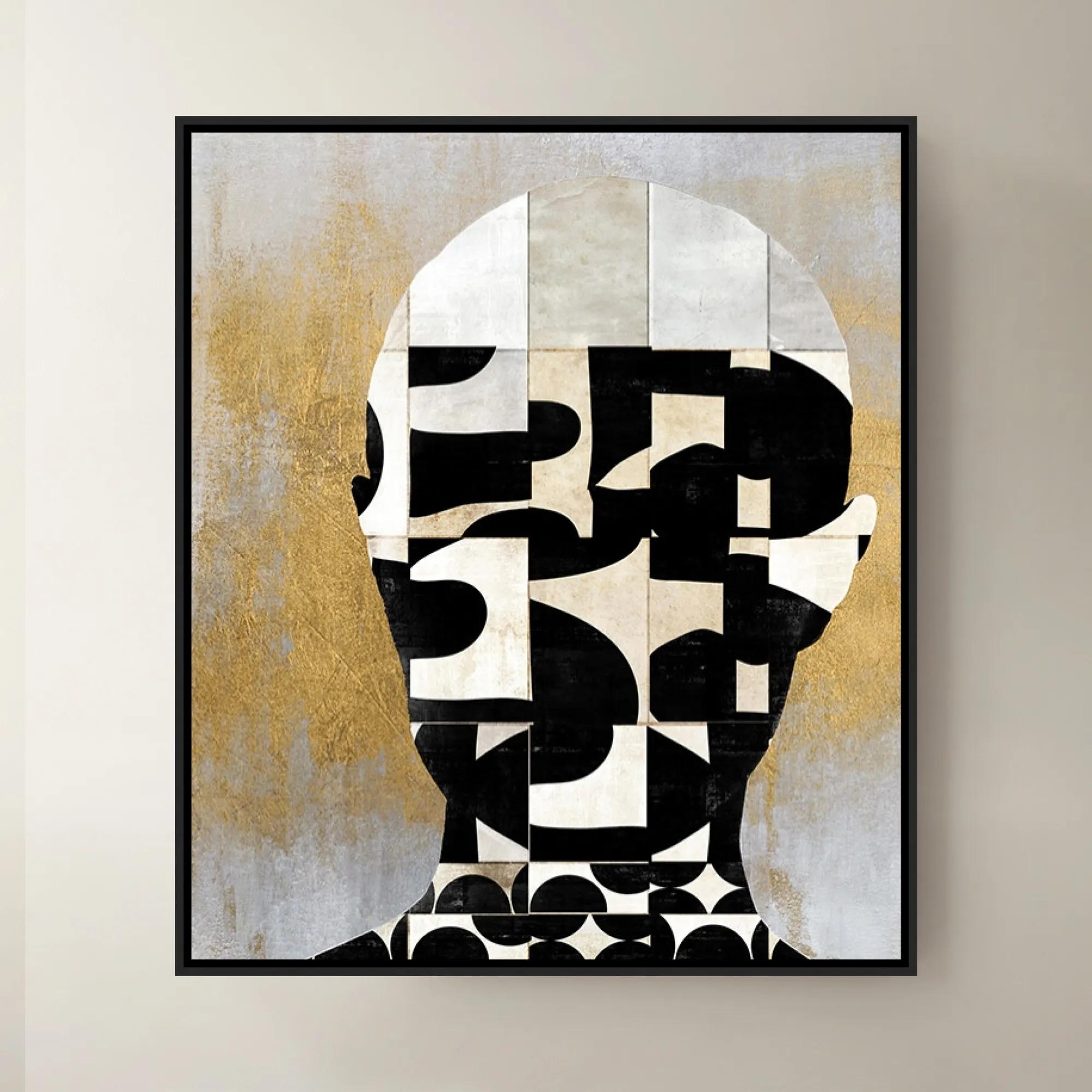
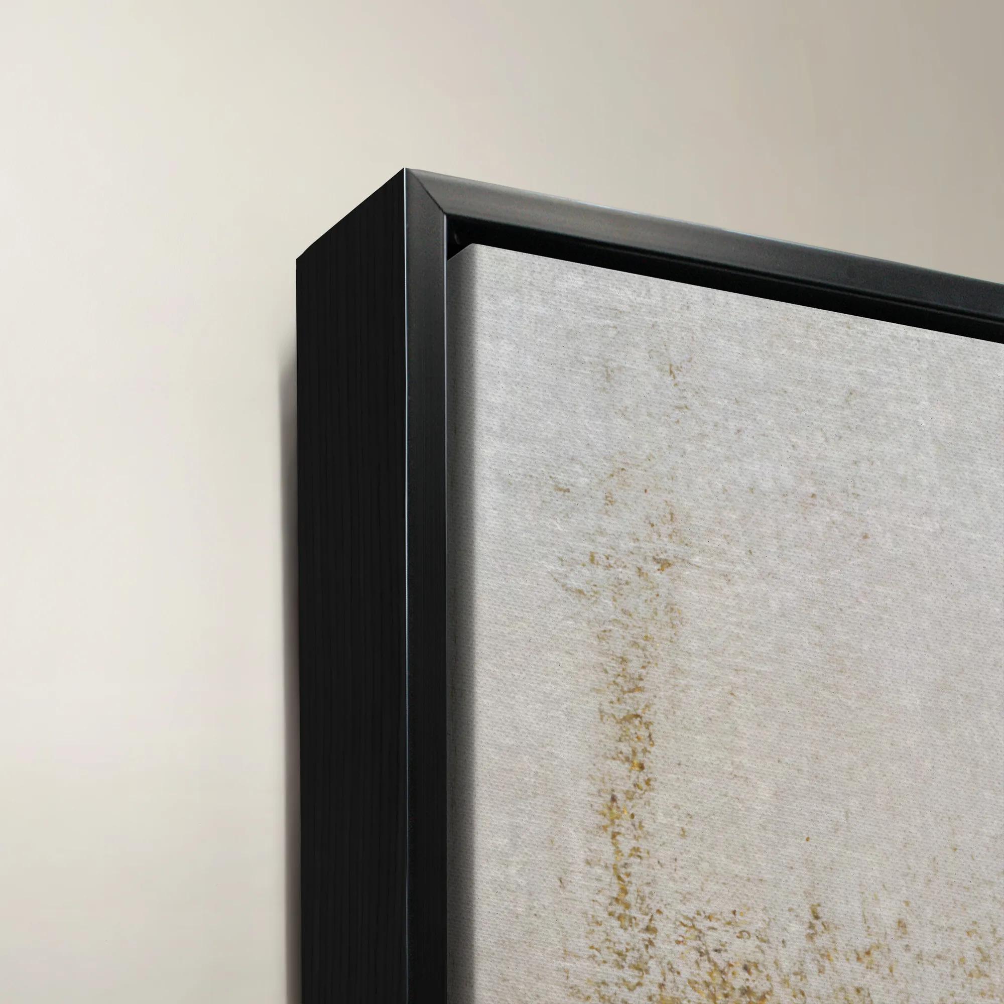 Lets Face It II Framed Wall Art 30" x 35"$699
A striking contemporary art piece showcasing bold design and creative flair by a renowned interior designer.
Add To Cart -
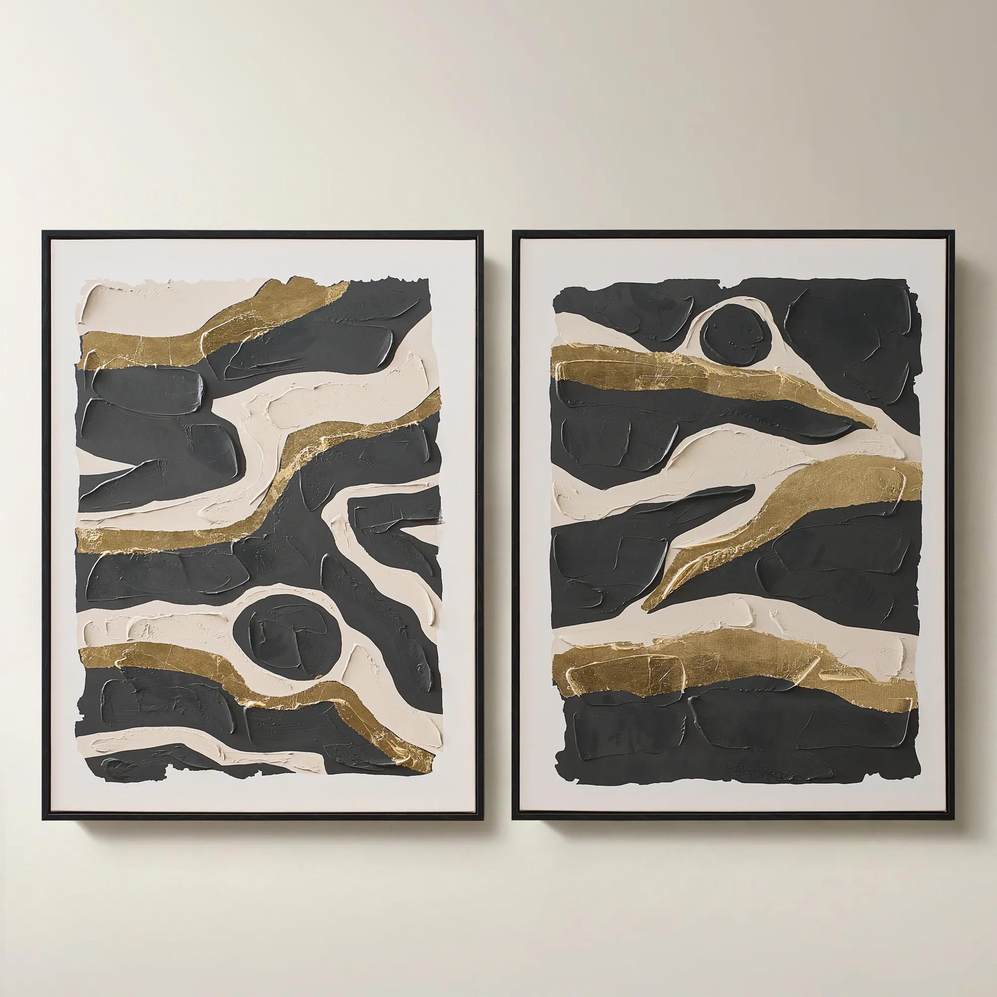
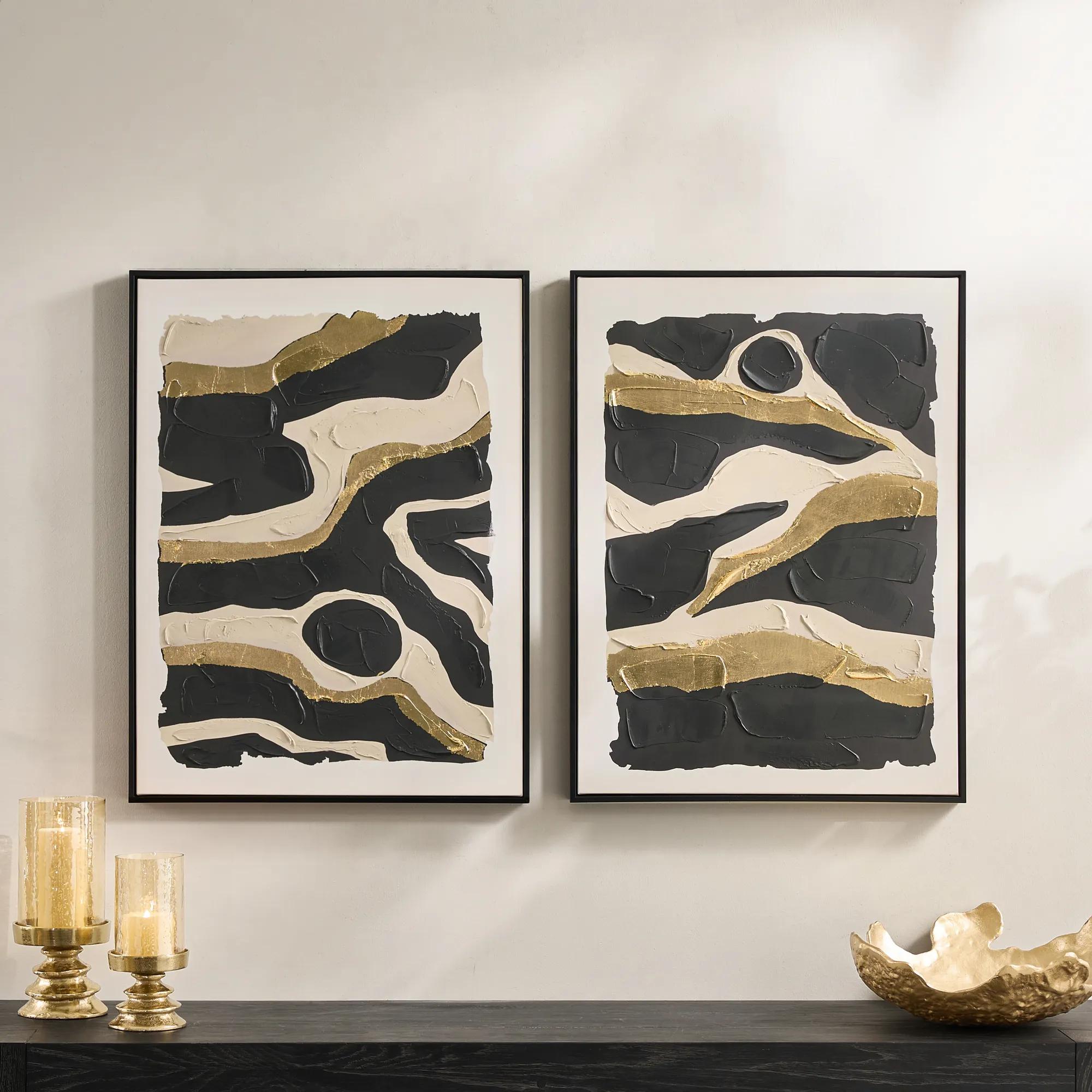 Untamed Framed Gold Leaf Painted Wall Art 24" x 32" Set of 2$199
A hand-painted diptych featuring abstract black and gold canvas art with expressive, gallery-inspired energy.
Add To Cart

White Abstract Canvas Wall Art
Explore white abstract canvas wall art for a focal point that feels serene yet expressive. This selection brings white tones and abstract imagery into focus, adding subtle dimension to neutral interiors or luminous contrast against darker walls. Consider the artwork’s scale alongside nearby furniture to create a balanced, gallery-inspired arrangement.
White abstract canvas wall art creates a modern focal point through pale color, expressive composition, and the interplay of light and texture. Rather than depicting a recognizable subject, it draws attention to gestures, shapes, layers, and the space between them. The effect can be serene without feeling restrained: a sweeping ivory curve, a field of chalky brushwork, or a sculptural arrangement of white-on-white forms can give a room remarkable presence. This category encompasses more than a single shade. Porcelain, cream, oyster, and soft alabaster each bring a different character, while touches of charcoal, taupe, silver, or gold can sharpen the composition or introduce a luminous accent. Against a deep wall, predominantly white artwork creates a striking contrast; against a pale wall, its edges, shadows, and surface details become the attraction. Canvas contributes its own woven character, lending visual depth to both printed images and painted compositions. A printed work may reproduce the appearance of thick brushstrokes, while an embellished or dimensional surface may have actual raised details that catch light differently throughout the day. That distinction matters when choosing between a graphic statement and a more tactile presence. Look closely at the description and detail photography to understand whether the texture is part of the image, the physical surface, or both. Warm whites often sit beautifully beside walnut, brass, and camel upholstery, while cooler whites can create a crisp dialogue with chrome, glass, and charcoal velvet. Neither approach needs to feel austere. A pale abstract canvas above a richly upholstered sofa offers a visual pause between sumptuous fabrics and gleaming accessories, allowing each material to feel more deliberate. In a dining room, an expansive composition can lend the setting a gallery-like atmosphere without competing with an elaborate chandelier. For anyone drawn to expressive interiors but less interested in literal imagery, white abstraction offers atmosphere, movement, and room for personal interpretation.
Scale and placement determine whether white abstract art feels like an intentional statement or an afterthought. Above a sofa, headboard, or substantial console, a composition measuring roughly two-thirds to three-quarters of the furniture’s width is a useful starting point, adjusted for the wall, surrounding objects, and the artwork’s visual weight. A broad horizontal canvas can echo the lines of a low sofa, while a vertical piece can emphasize height beside an entry console or on a narrow stretch of wall. Multiple canvases create another kind of rhythm: a pair can introduce symmetry, while a coordinated grouping can carry movement across a larger surface. Measure the complete arrangement, including the spaces between pieces, rather than considering each canvas in isolation. Painter’s tape or paper templates can help establish the footprint before any hardware is installed. When hanging artwork above furniture, a gap of approximately six to ten inches often creates a connected composition, though tall accessories and unusual furniture proportions may call for adjustment. Viewing distance matters, too. Subtle tonal variations reward a closer look in a bedroom or reading area, while bolder shapes remain legible across an open living space. Frame treatment adds a further layer of expression. An unframed gallery-wrapped canvas emphasizes the image and its finished edges; a floating frame outlines the work with a narrow shadow gap; a broader frame gives pale artwork a more pronounced architectural boundary. For a softly defined treatment that complements tonal compositions, Whitewash Frame Abstract Wall Art offers a related direction to explore. Consider how the frame finish relates to nearby furniture without expecting every finish to match. A pale wood effect can temper polished metal, and a darker outline can connect white artwork to black accents elsewhere in the room. Lighting completes the arrangement. Soft, angled illumination can reveal dimensional details, while harsh glare may flatten delicate tonal differences. The goal is a composition that feels connected to the room while retaining its own artistic authority.
Materials, construction, and care deserve the same attention as color and composition, especially for artwork intended to remain a lasting part of a room. Canvas may be woven from cotton, linen, or synthetic blends, and its support, tension, printing or painting method, and surface treatment all influence its appearance and care requirements. A well-supported canvas should sit evenly, with secure corners and a shape suited to its intended presentation. For gallery-wrapped work, check how the image or finish continues around the sides; for framed pieces, consider the overall depth and dimensions, not just the visible image area. Hanging hardware should be appropriate for the artwork’s weight and the wall material, particularly with oversized or dimensional compositions. White surfaces can make dust, marks, and discoloration more noticeable, so thoughtful placement helps preserve their character. Avoid prolonged direct sunlight, moisture-prone areas, and positions immediately above active heat sources. A bathroom with frequent steam or a kitchen wall exposed to cooking residue may be less suitable than a living room, bedroom, home office, or sheltered entryway. Follow the maker’s care instructions, since printed canvas, painted surfaces, embellishments, and protective coatings can require different handling. Never spray household cleaner directly onto artwork or assume that a textured finish can tolerate damp wiping. Where permitted, gentle dusting with a clean, soft brush can remove loose particles without pressing into the surface; delicate raised details may require specialist attention. Handle artwork by its frame or support rather than touching the face, and use protective packaging during a move. These considerations are especially worthwhile when choosing art as a housewarming or wedding gift. A predominantly white abstract composition can be a thoughtful choice for someone who appreciates expressive design, provided its scale, undertone, and framing suit the recipient’s space. Chosen with that sensitivity, it becomes more than a decorative accent: it gives a favorite room a distinctive visual signature, whether the surrounding story is richly layered, boldly contrasted, or composed around luminous shades of white.
FAQs
Let white abstract canvas wall art bring a luminous counterpoint to richly layered furnishings. Pair it with sumptuous upholstery, sculptural accents, and a dark console for dramatic contrast. Keep nearby accessories intentional so the artwork’s subtle gestures have room to command attention.
White abstract art creates an elegant dialogue with charcoal, black, and warm neutrals. For a more expressive setting, pair it with emerald, sapphire, or aubergine accents. Echoing the artwork’s warm or cool undertones throughout the room helps the composition feel cohesive without making every detail match.
White abstract compositions can draw their drama from tonal shifts, expressive marks, and the interplay of negative space. Look for contrasts between ivory and crisp white, layered-looking forms, or bold gestures against quiet backgrounds. These visual details invite a closer look while preserving an airy, refined mood.
Build a gallery wall around a shared visual thread, such as a restrained palette, recurring curves, or expressive linework. White abstract canvas art can offer a quiet interval between more saturated pieces. Black-and-white photography or gestural drawings introduce contrast while keeping the arrangement artfully connected.
When choosing a frame, consider the mood you want to create. Black lends crisp definition, gold tones introduce a glamorous note, and pale wood brings warmth. A white frame emphasizes tonal subtlety. Relate the finish to a few accents in the room for a considered, layered composition.