Dark Abstract Art Prints For Moody Fall Interiors
Dark Abstract Art Prints For Moody Fall Interiors
-
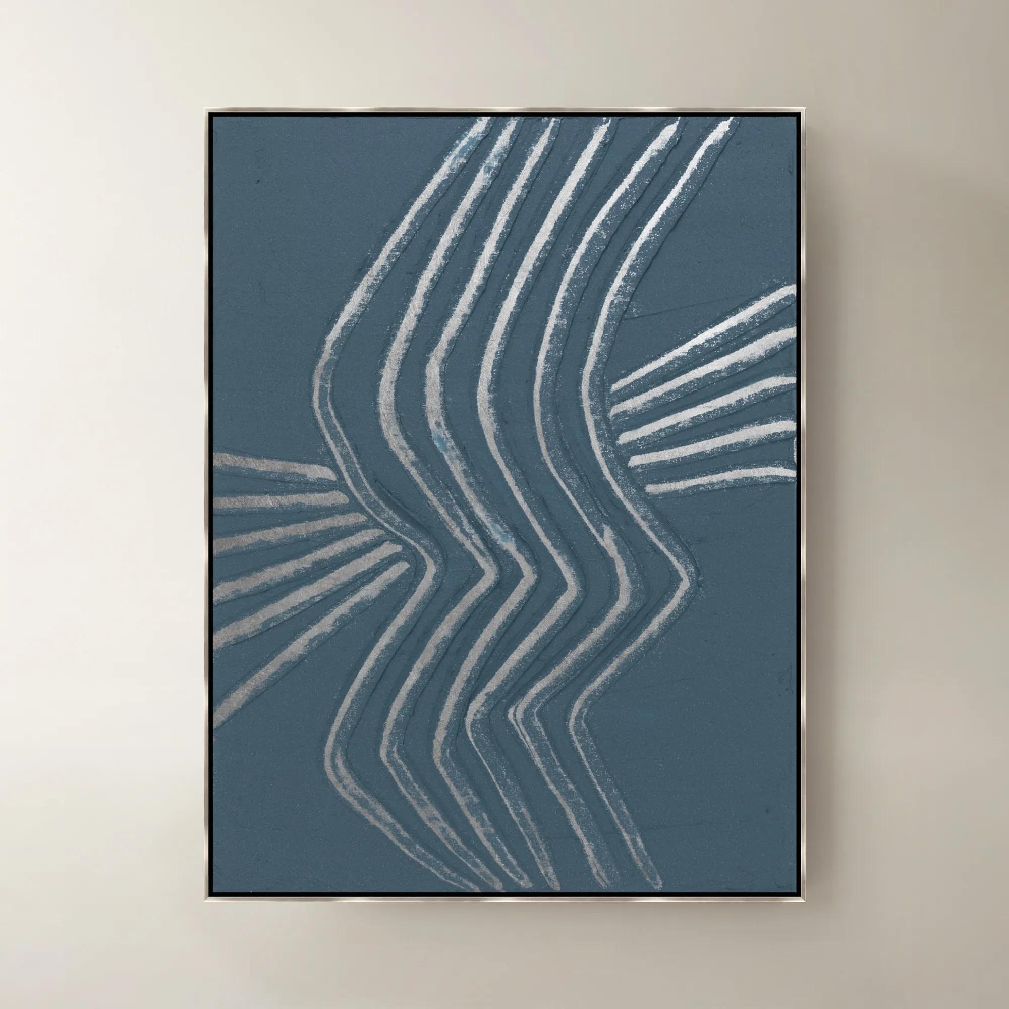
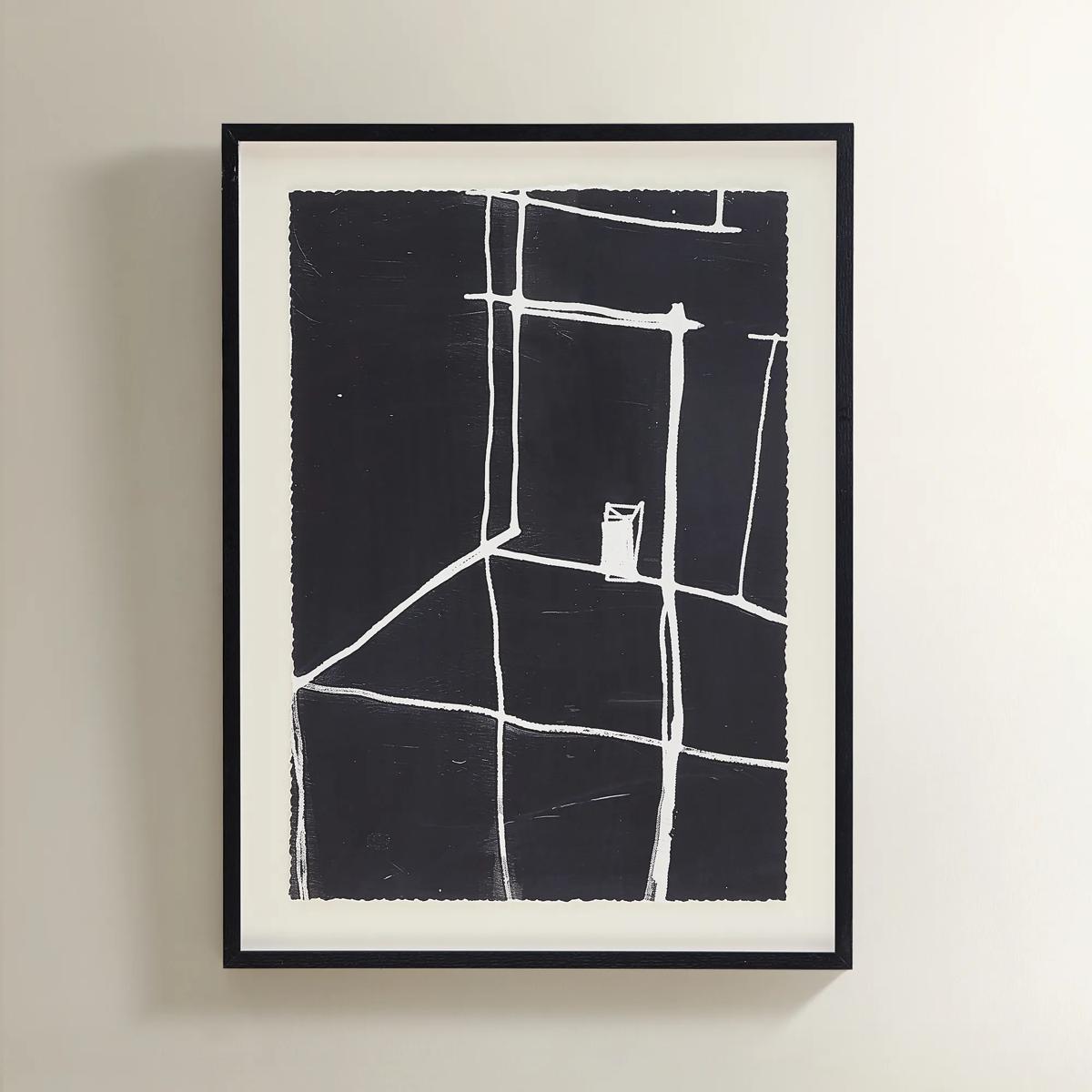 Solitude Art$269
A minimalist black-and-white abstract print featuring bold white lines in a sleek black polyresin frame.
Add To Cart -
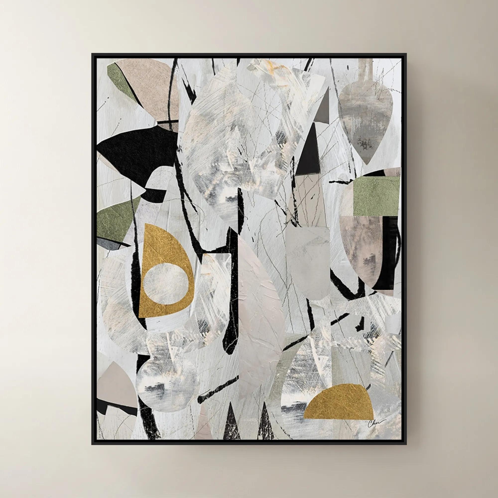
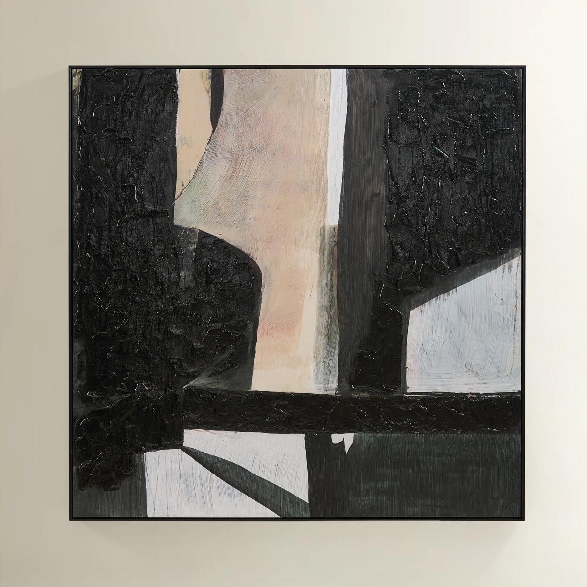 Grounded Painting$699
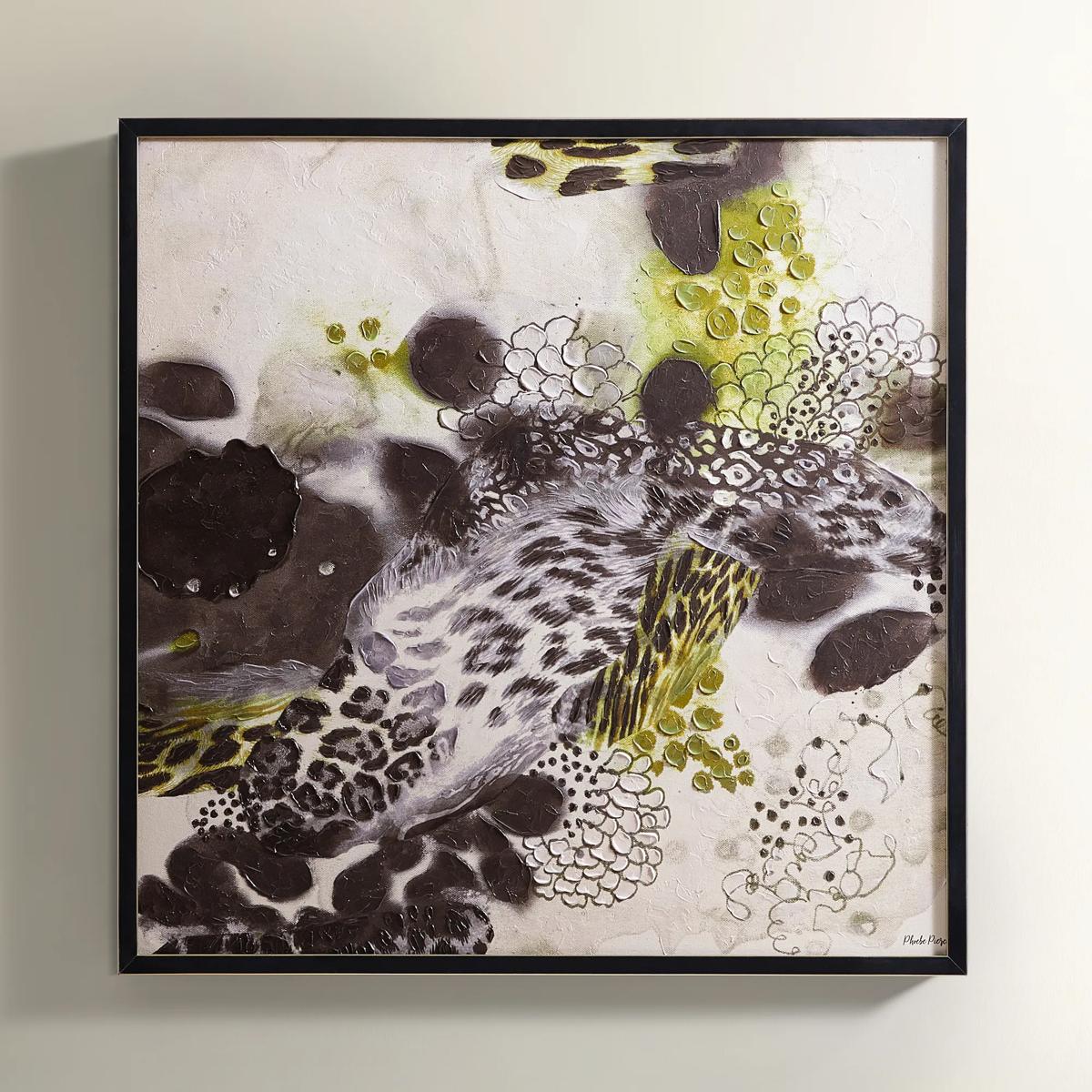
A hand-painted abstract canvas featuring black, cream, and earth tones in a sleek black floater frame.
Add To Cart -
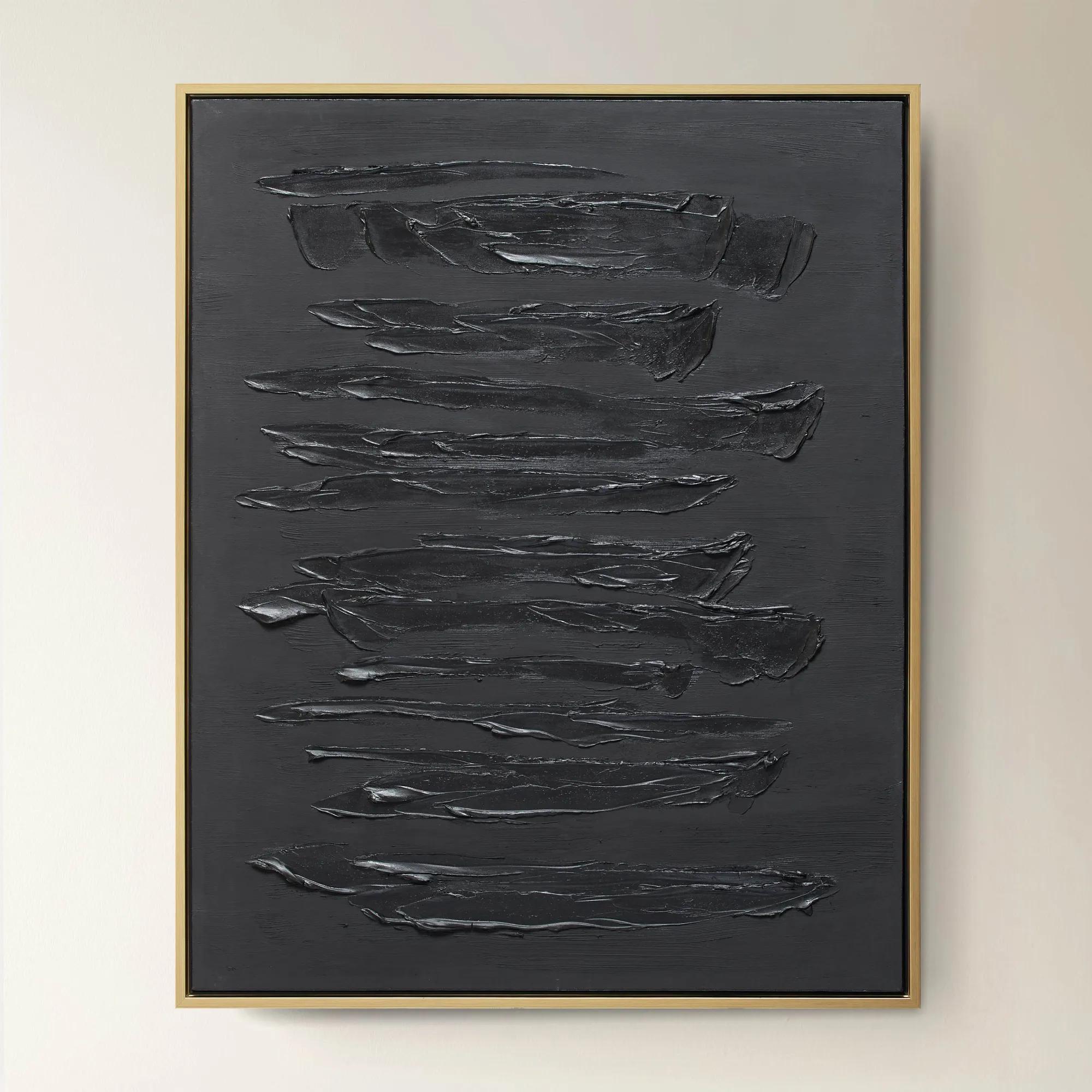
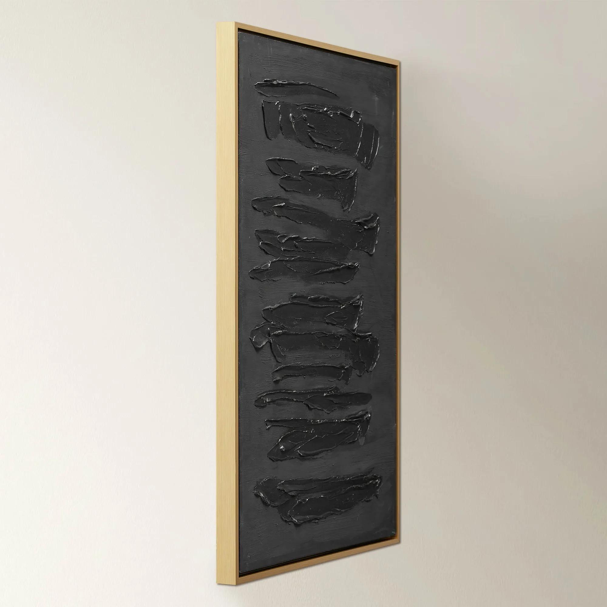 Nocturne$599.95
A dramatic abstract artwork featuring bold, dark brushstrokes on hand-painted canvas in a gold floater frame.
Add To Cart -
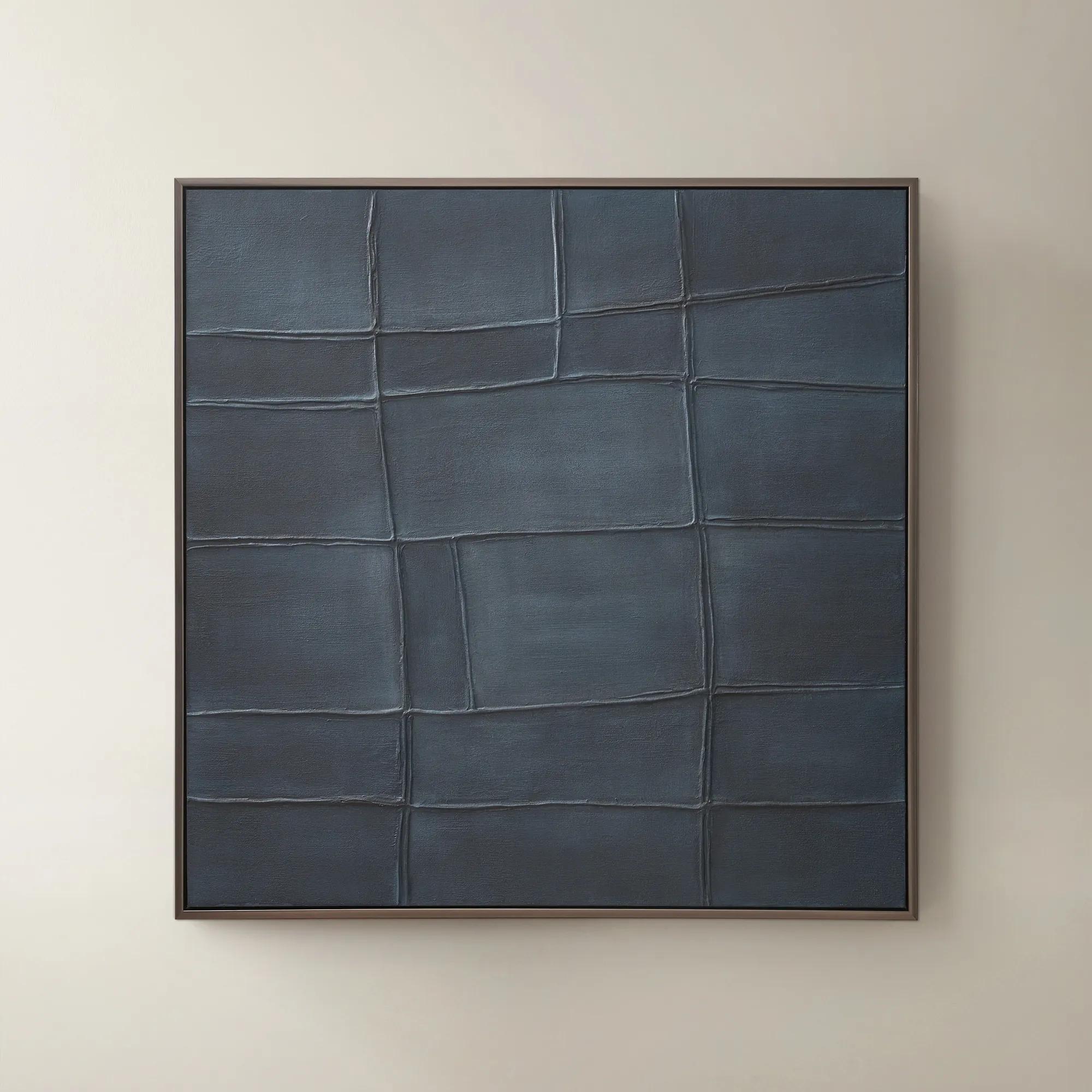
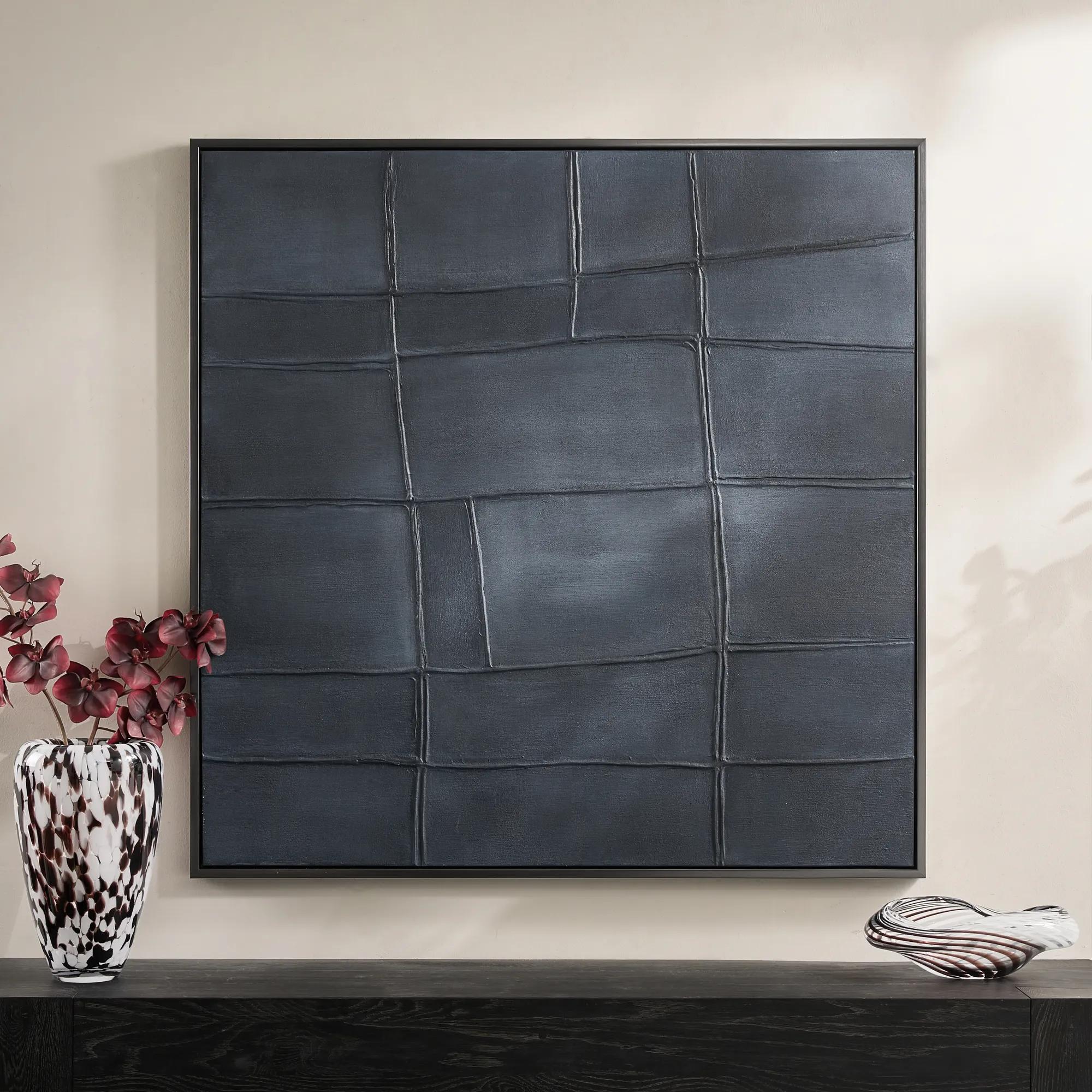 Ink Blue Interval Framed Painted Wall Art 48" x 48"$599
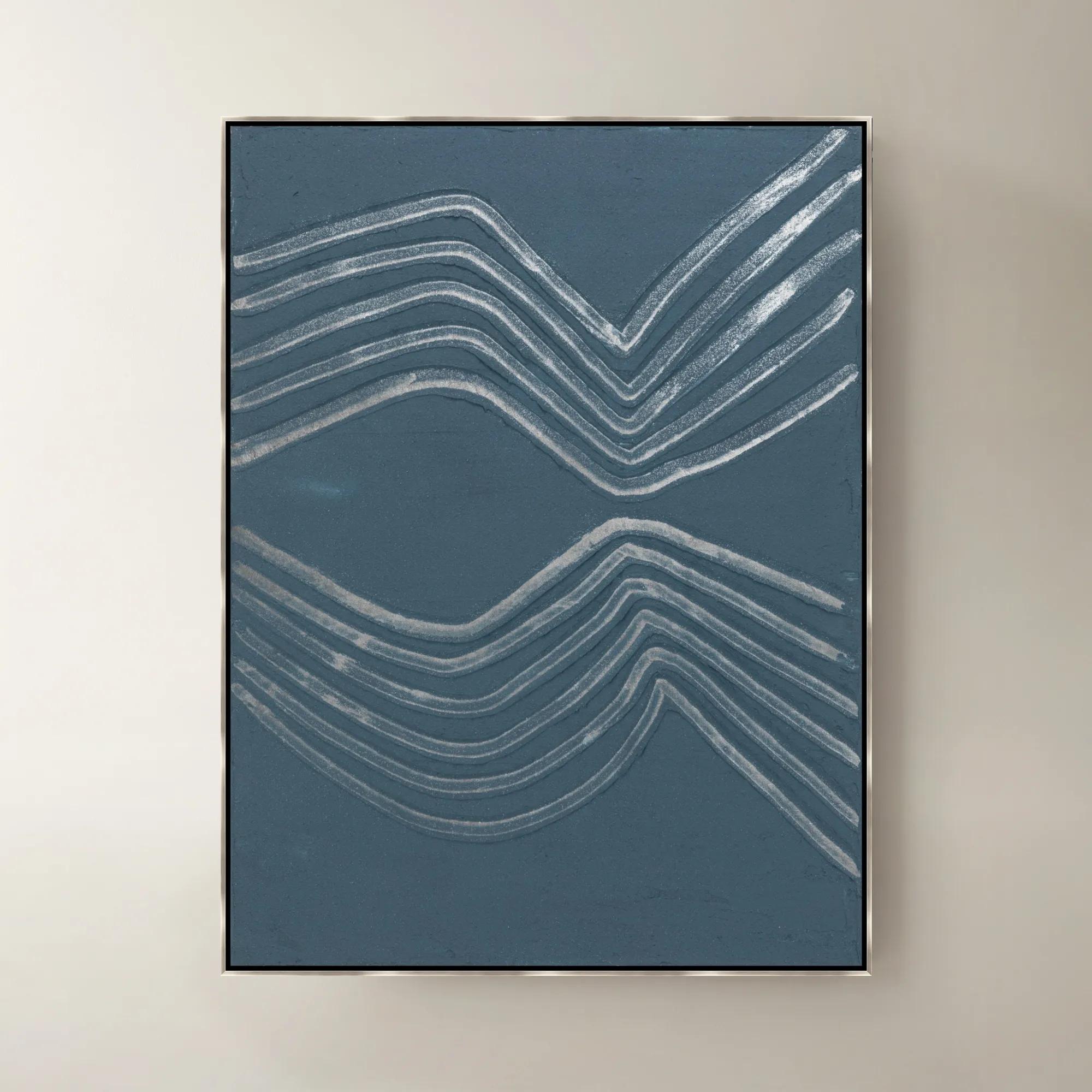
A hand-painted abstract canvas in deep ink blue, finished with a sleek gunmetal frame for modern appeal.
Add To Cart -
 Fossil Painting$299
A bold hand-painted abstract artwork featuring textured black shades in a sleek black floater frame.
Add To Cart -
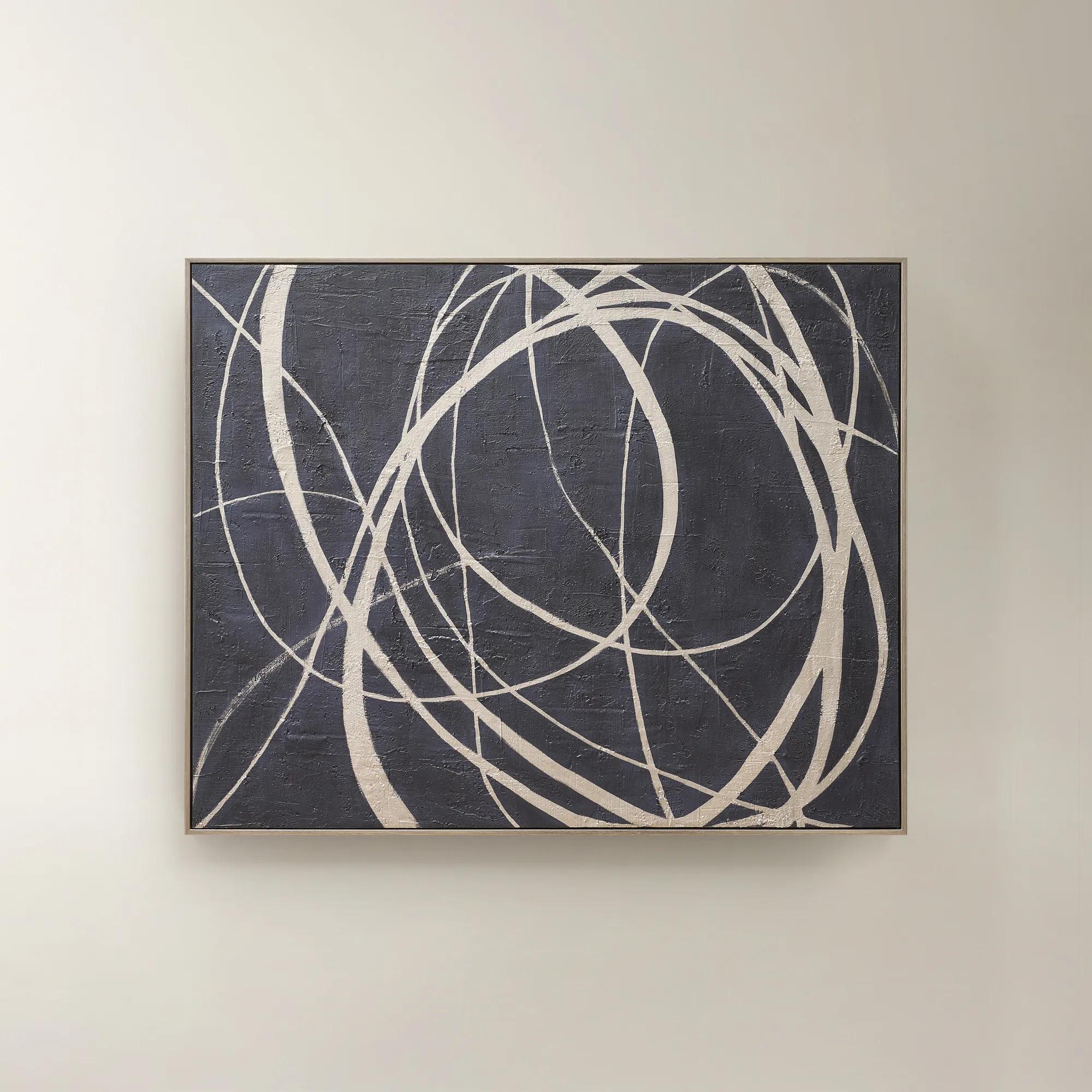 Wandering Framed Painted Wall Art 48" x 60"$699
An expressive hand-painted canvas in deep ink blue with champagne accents for a bold, sophisticated statement.
Add To Cart -

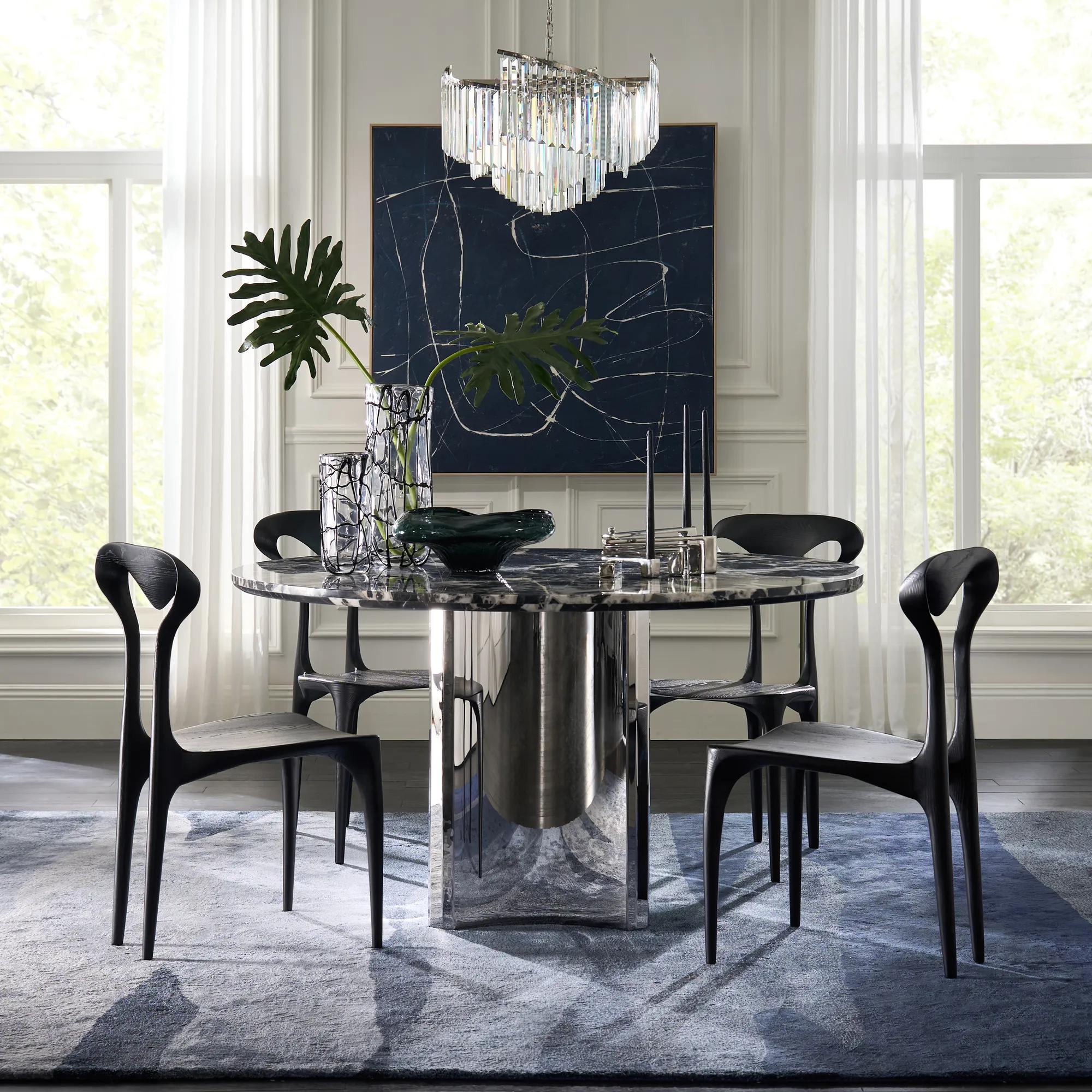 Almost Midnight Painting - Blue$439
A hand-painted canvas featuring bold blue and black tones with delicate white lines in a light wood frame.
Add To Cart -
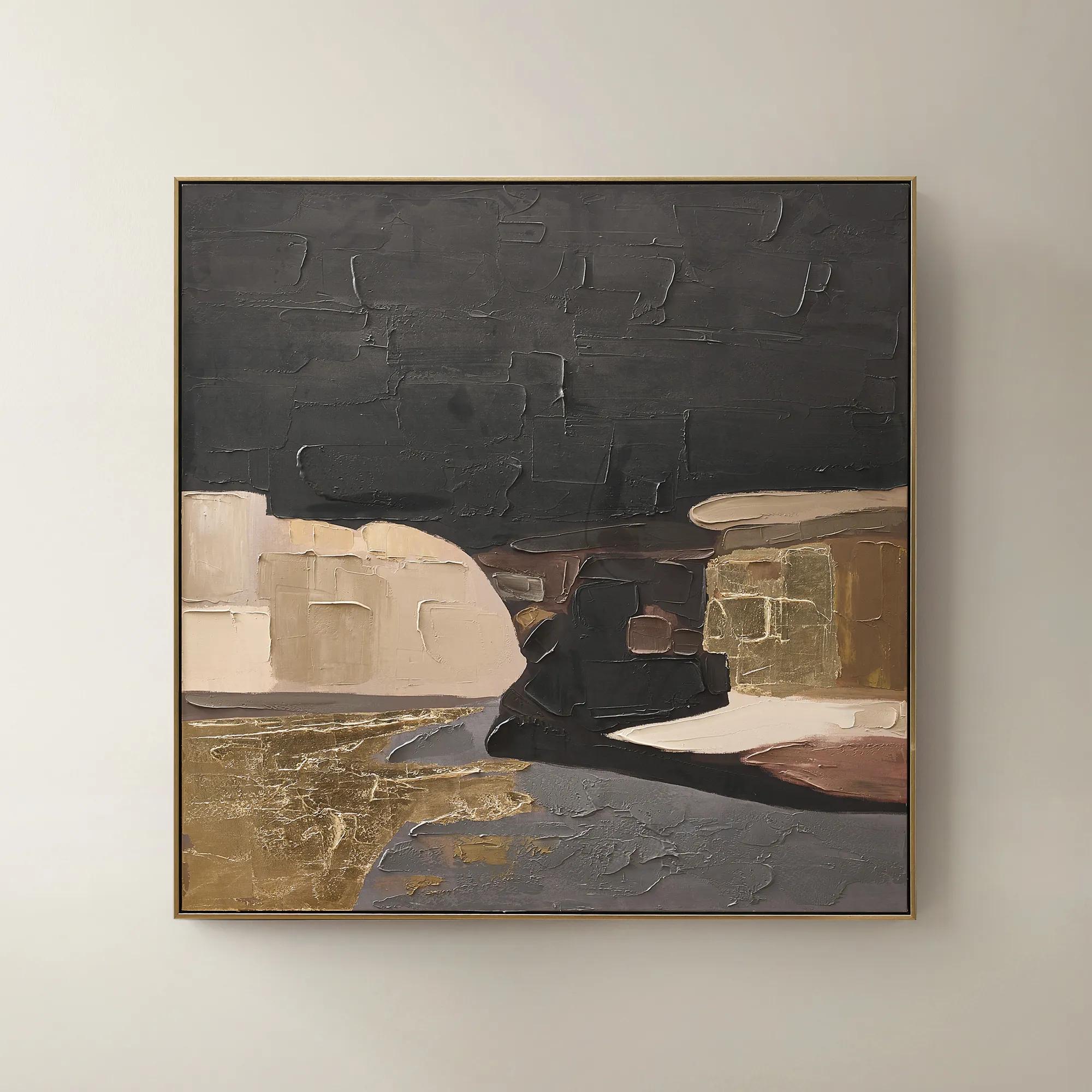 Obscured Light Framed Gold Leaf Painted Wall Art 48" x 48"$499
A hand-painted canvas with gold leaf accents and a black-gold frame in dramatic neutral tones.
Add To Cart -
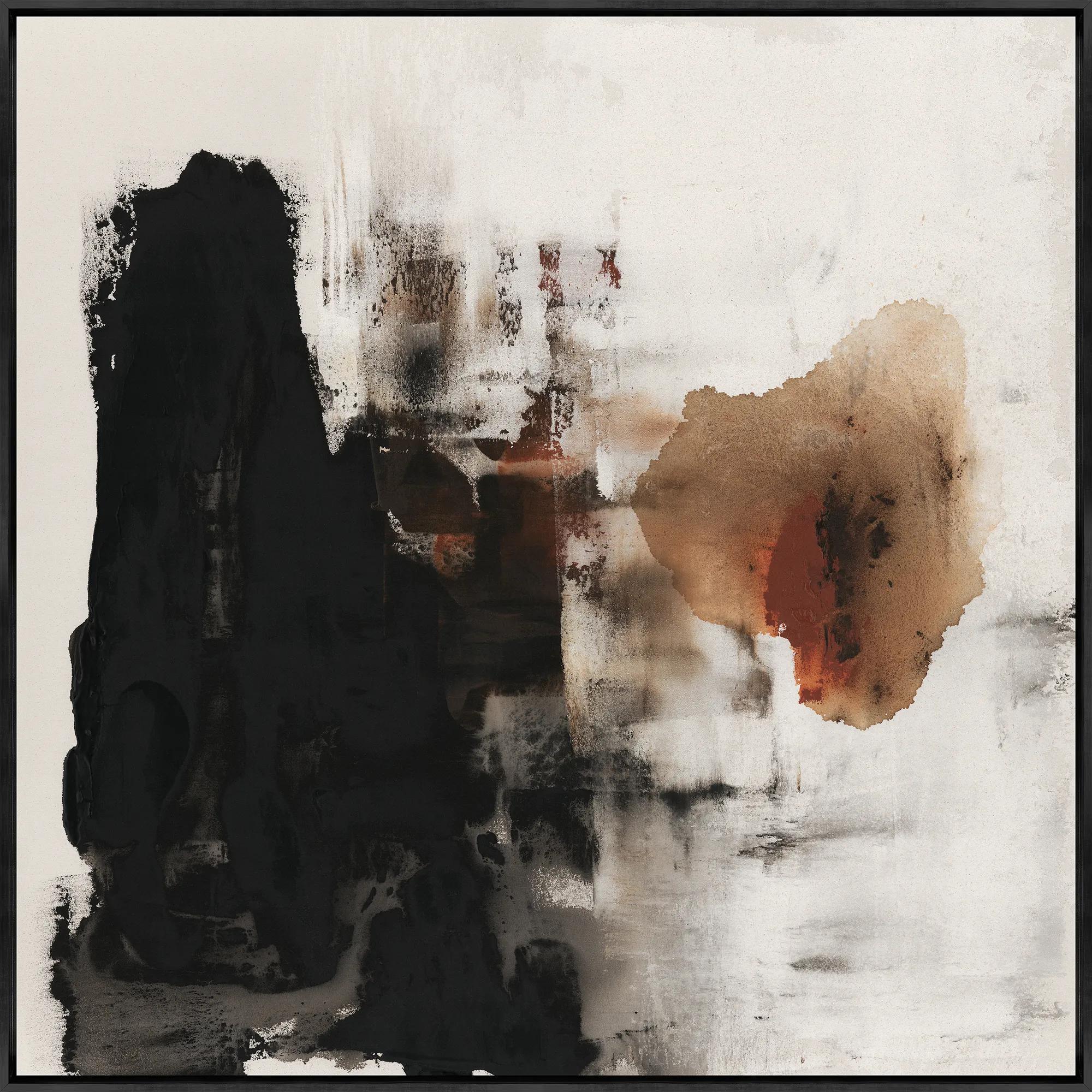 Burning for You I Framed Wall Art 40" x 40"$799
A gallery-wrapped canvas artwork with hand-applied brush gel, set in a sleek black floater frame.
Add To Cart -
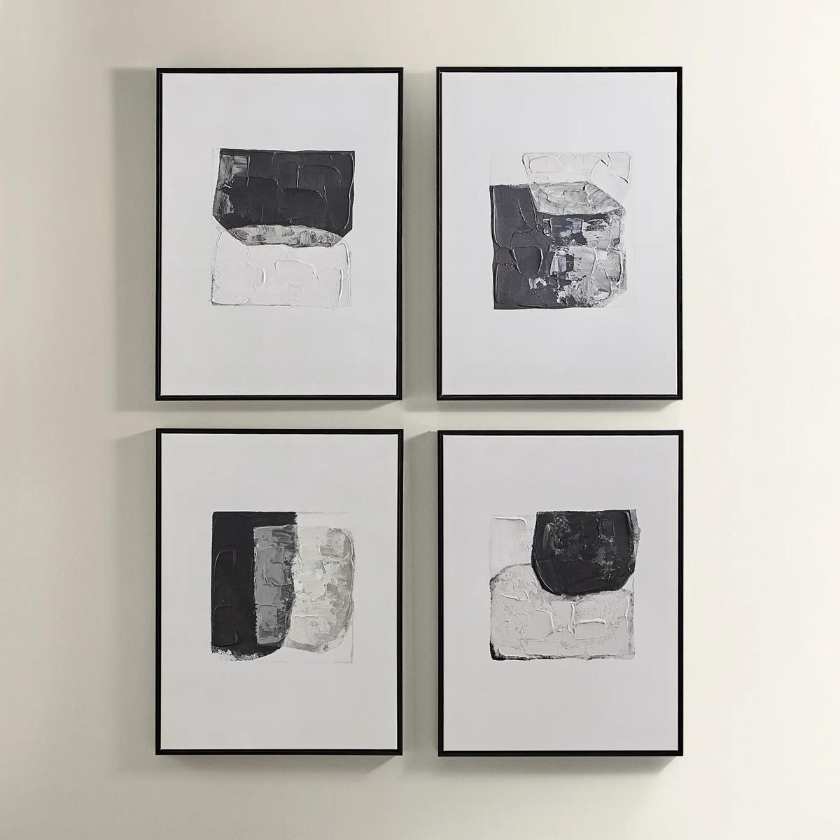
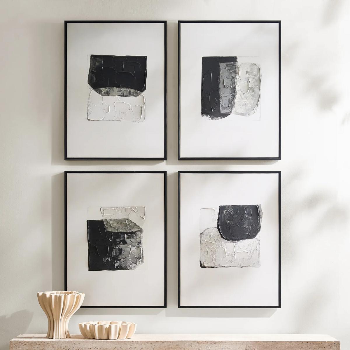 Shadows Framed Painted Wall Art Set of 4$299
A set of four hand-painted abstract canvases featuring black, white, and gold accents in black frames.
Add To Cart -
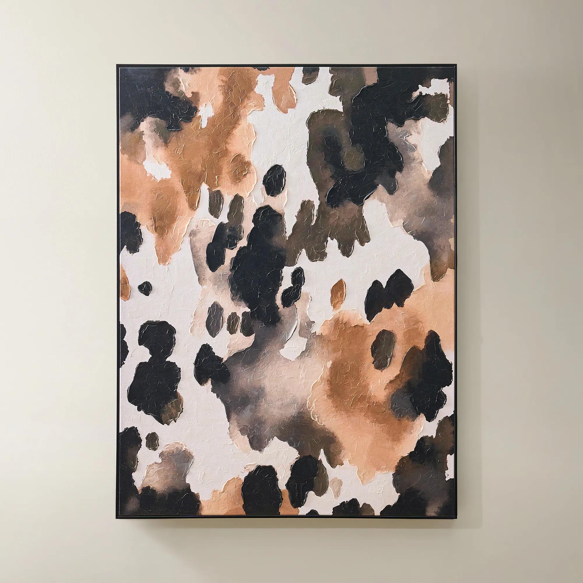
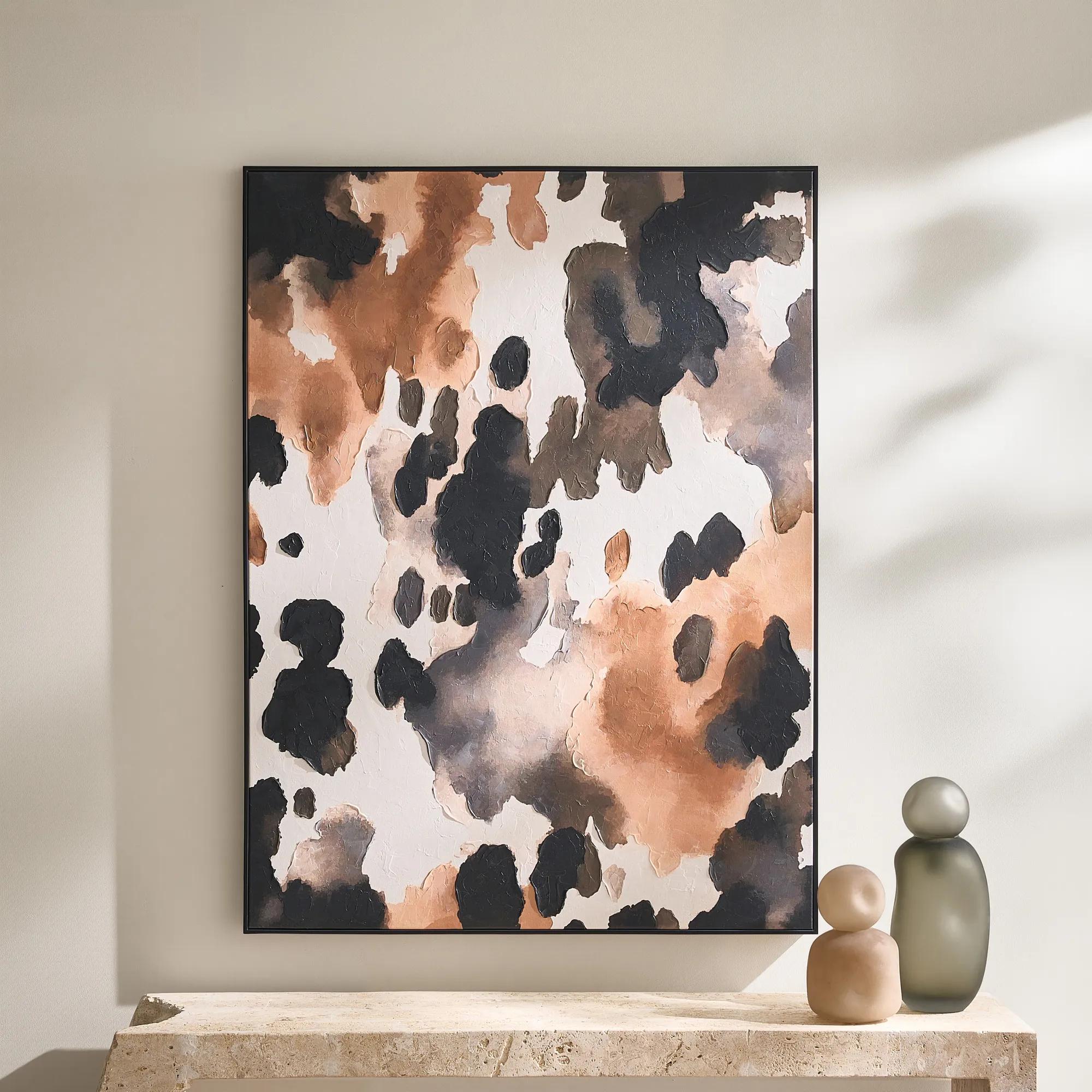 Wilder Framed Painted Wall Art 36" x 48"$499
An abstract hand-painted canvas featuring inky black, taupe, ivory, and coral hues in a sleek black frame.
Add To Cart -
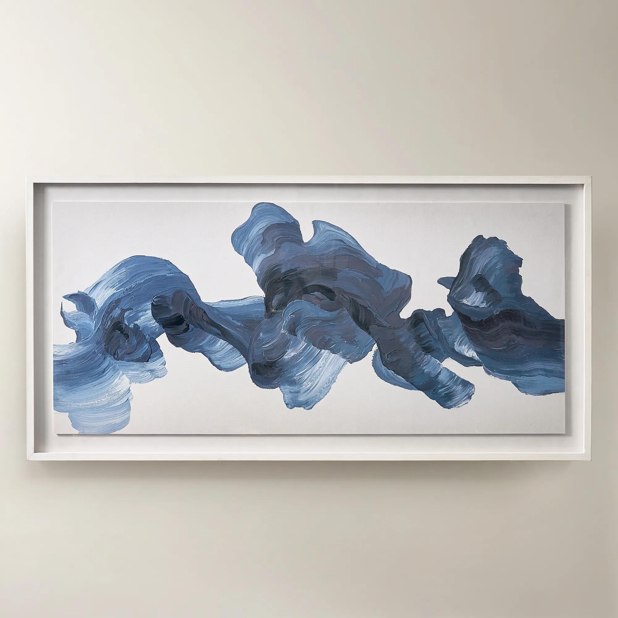
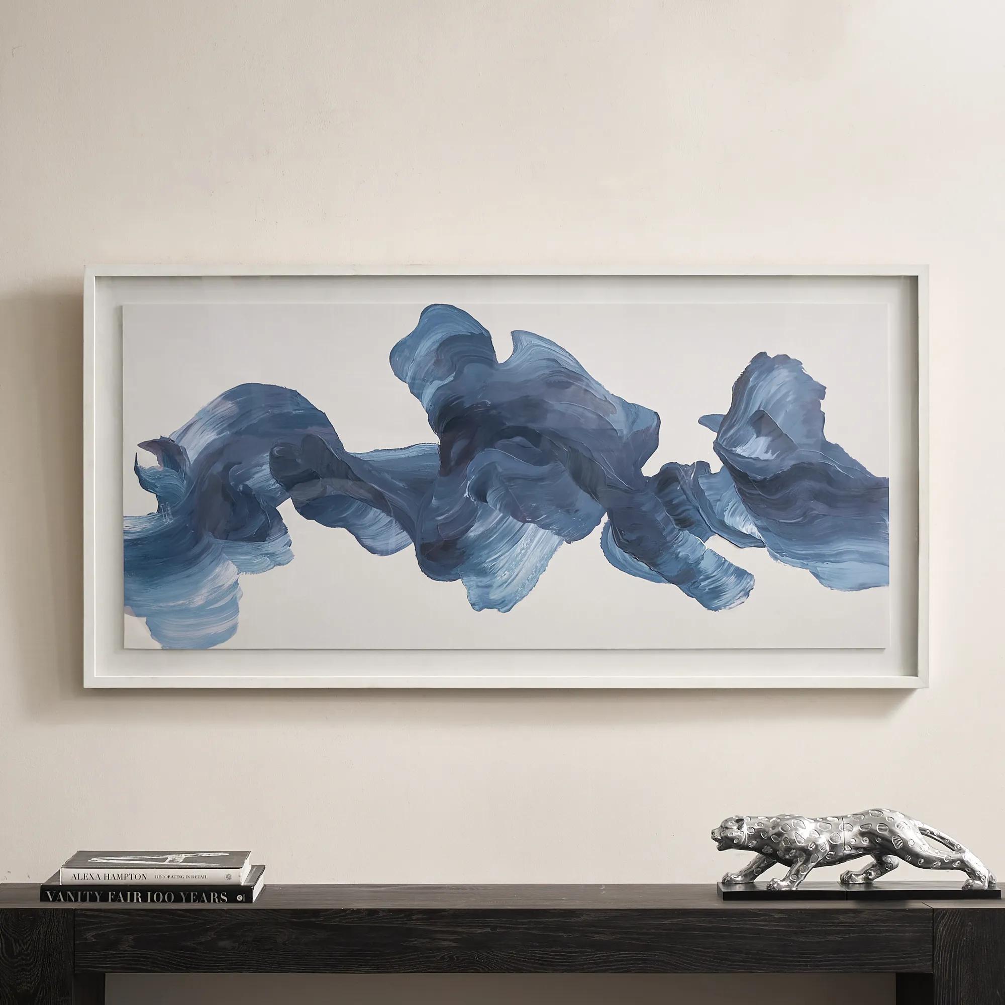 Blue Theory Framed Painted Wall Art in Acrylic 60" x 30"$499
A hand-painted canvas in deep ink blue, framed under acrylic with a whitewashed wood frame.
Add To Cart -
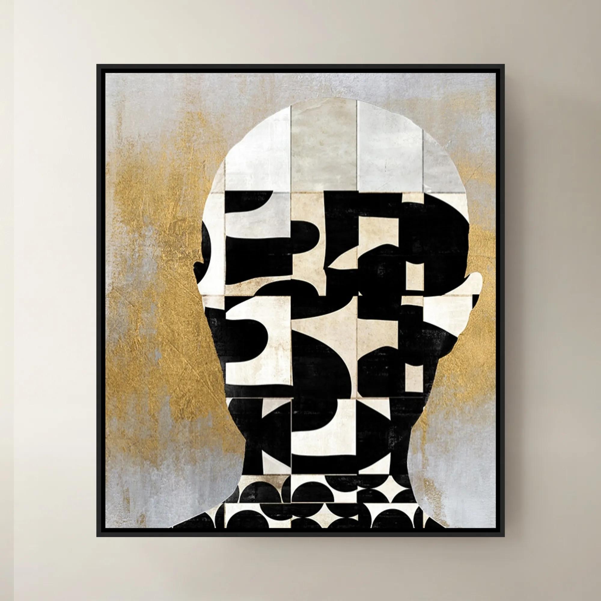
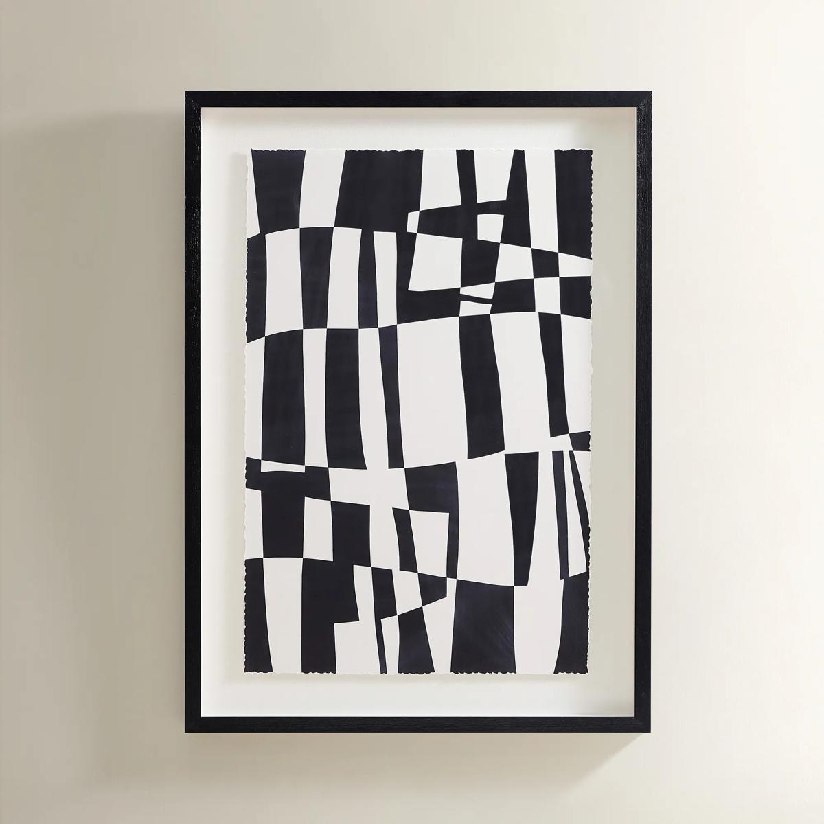 Matrix Art$369
A striking black and white abstract grid print set in a sleek black polyresin frame.
Add To Cart -
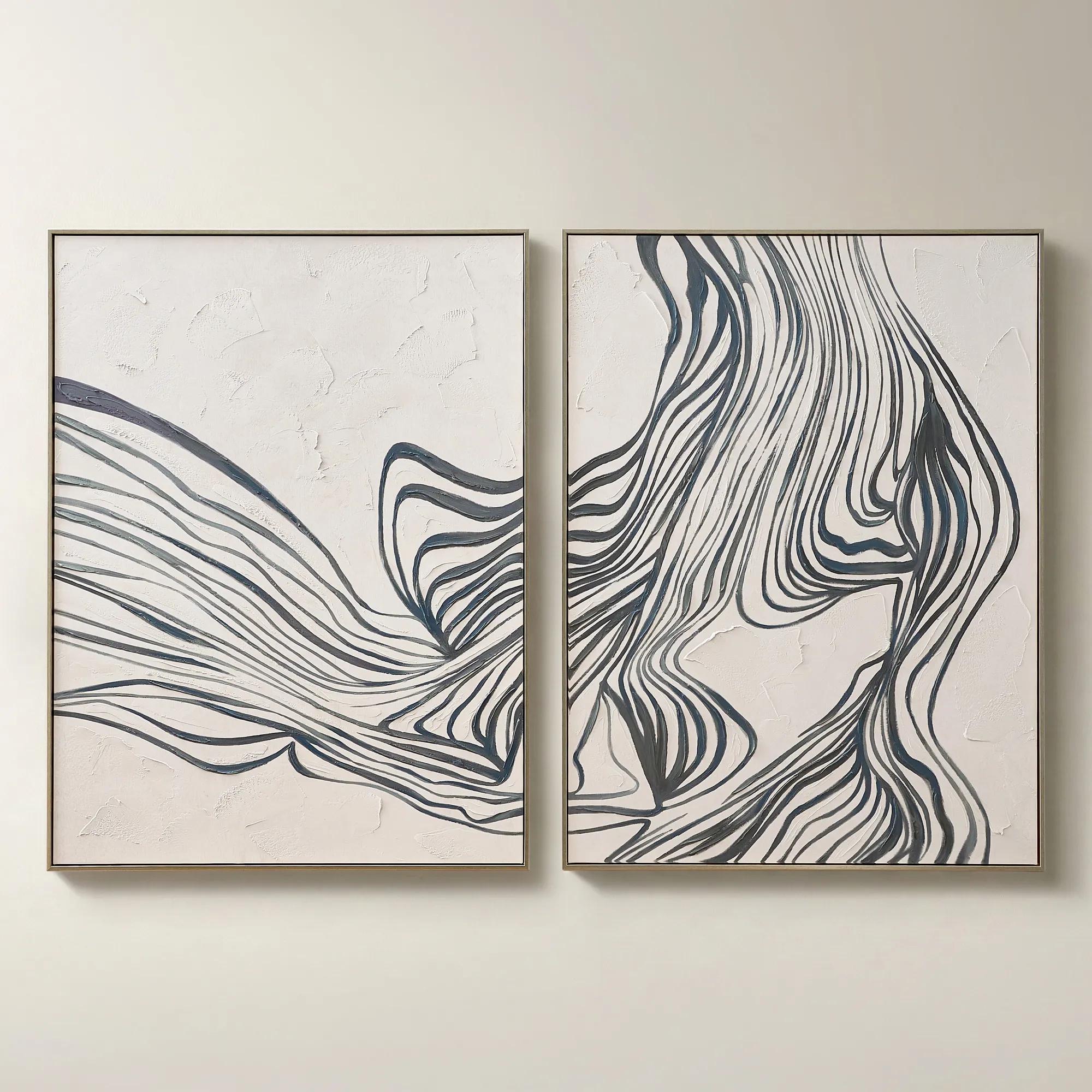
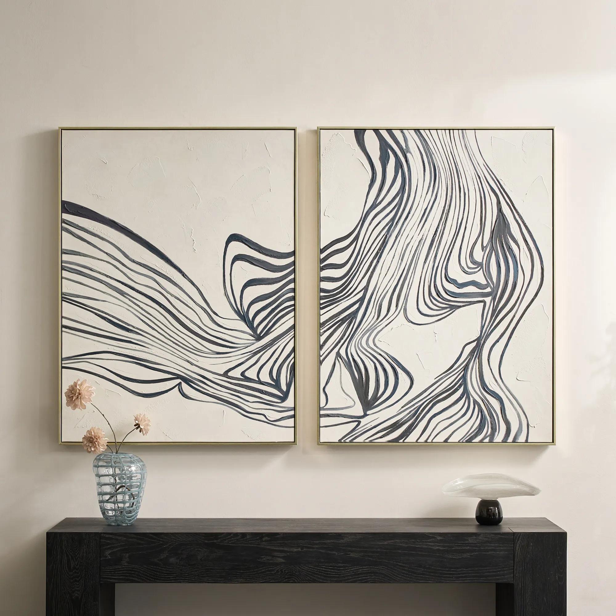 Rhythmic Framed Painted Wall Art 36" x 48" Set of 2$599
A hand-painted diptych featuring bold abstract stripes in dark slate and dusty blue with champagne frames.
Add To Cart -
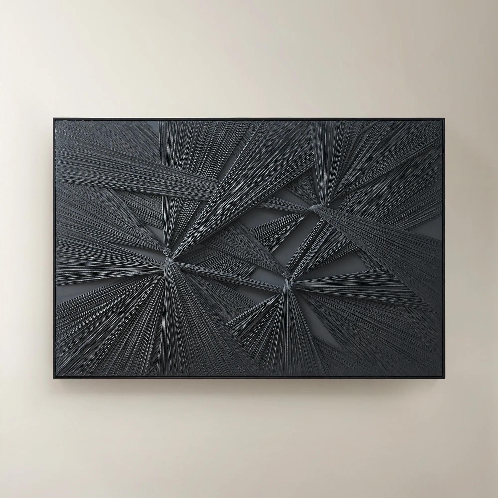 Grace in Dark Slate Hand-crafted Fabric Wall Art 70.75" x 47"$799
A hand-crafted textile wall art piece in dark slate, featuring sculptural texture and versatile display options.
Add To Cart -

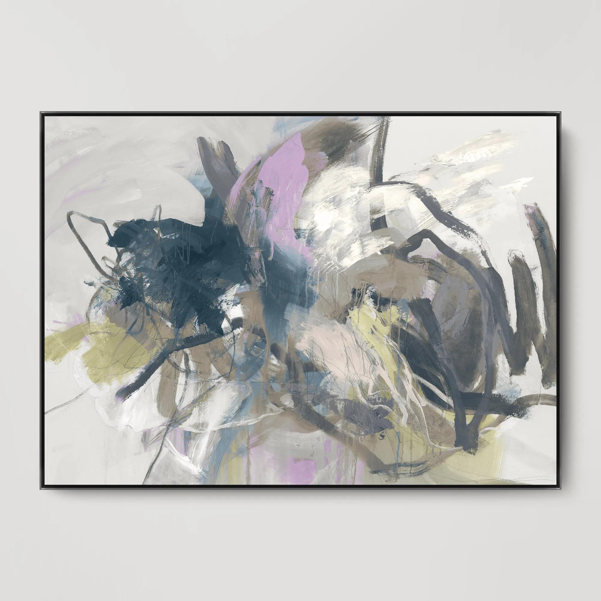
 Fractured Currents II Framed Wall Art 24" x 36"$499
A framed canvas wall artwork featuring dynamic blue and purple tones for a modern, expressive accent.
Add To Cart -
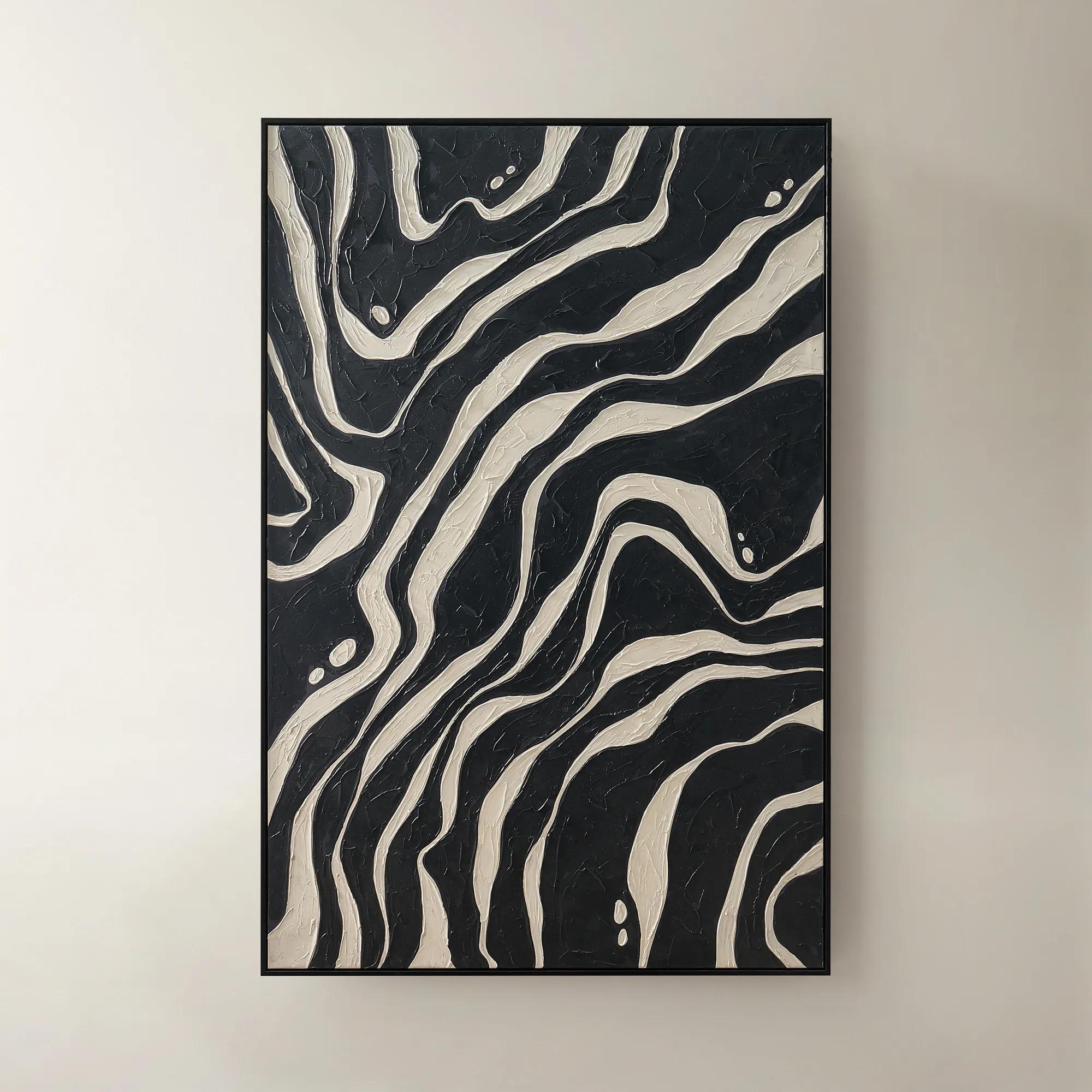
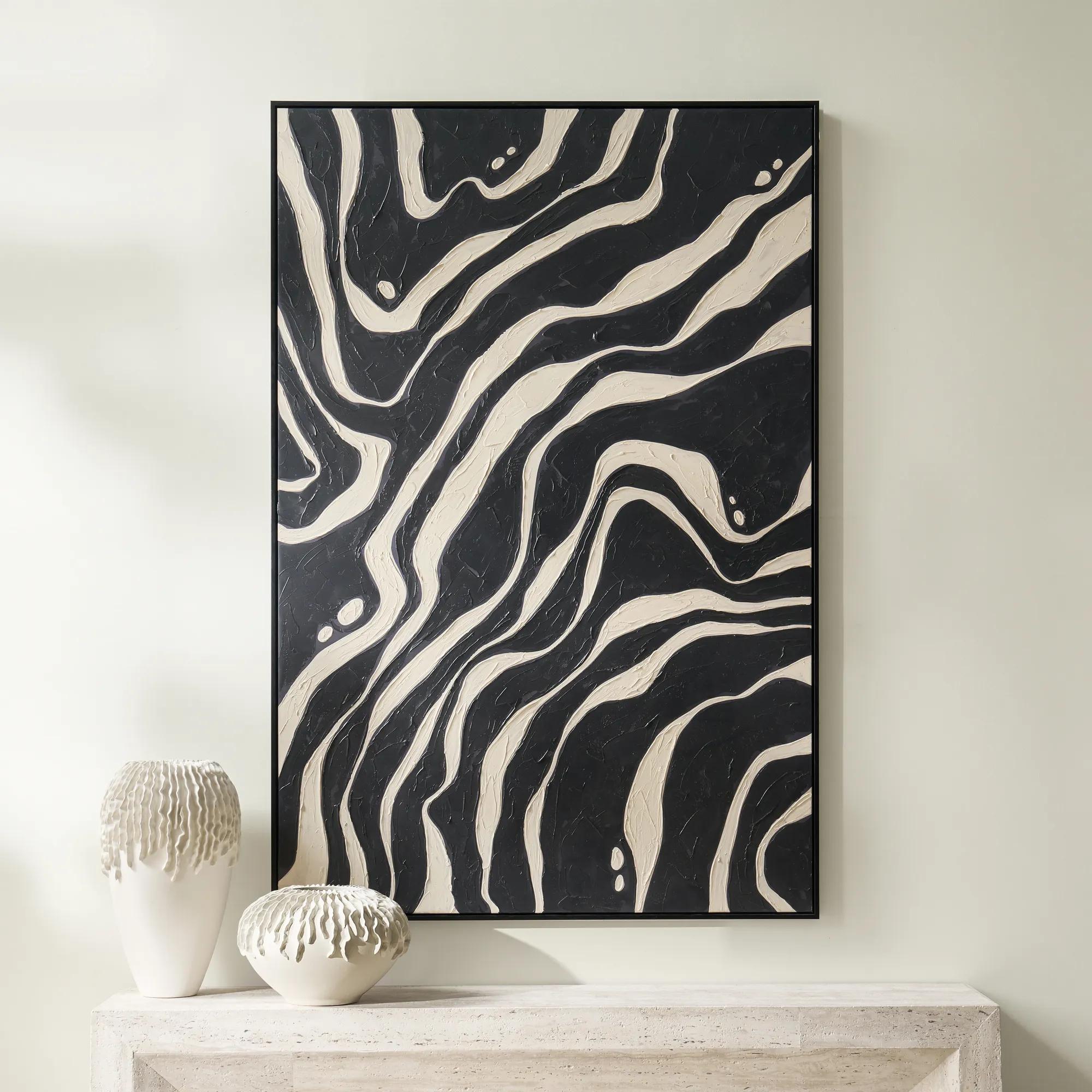 Juxtapose Art$699
A striking black canvas artwork featuring a contemporary, sophisticated design.
Add To Cart -
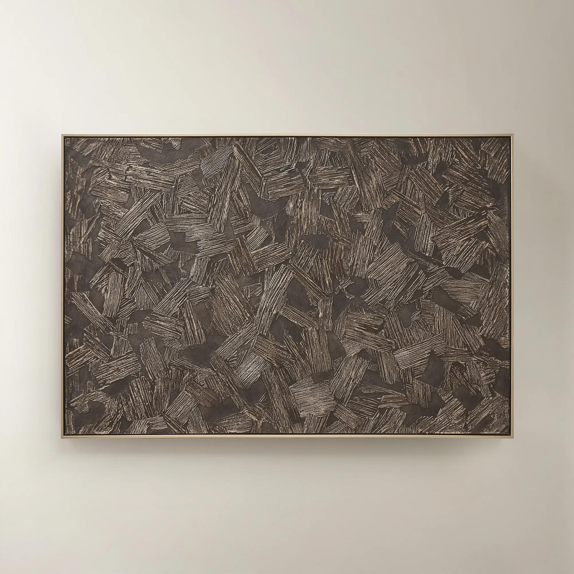
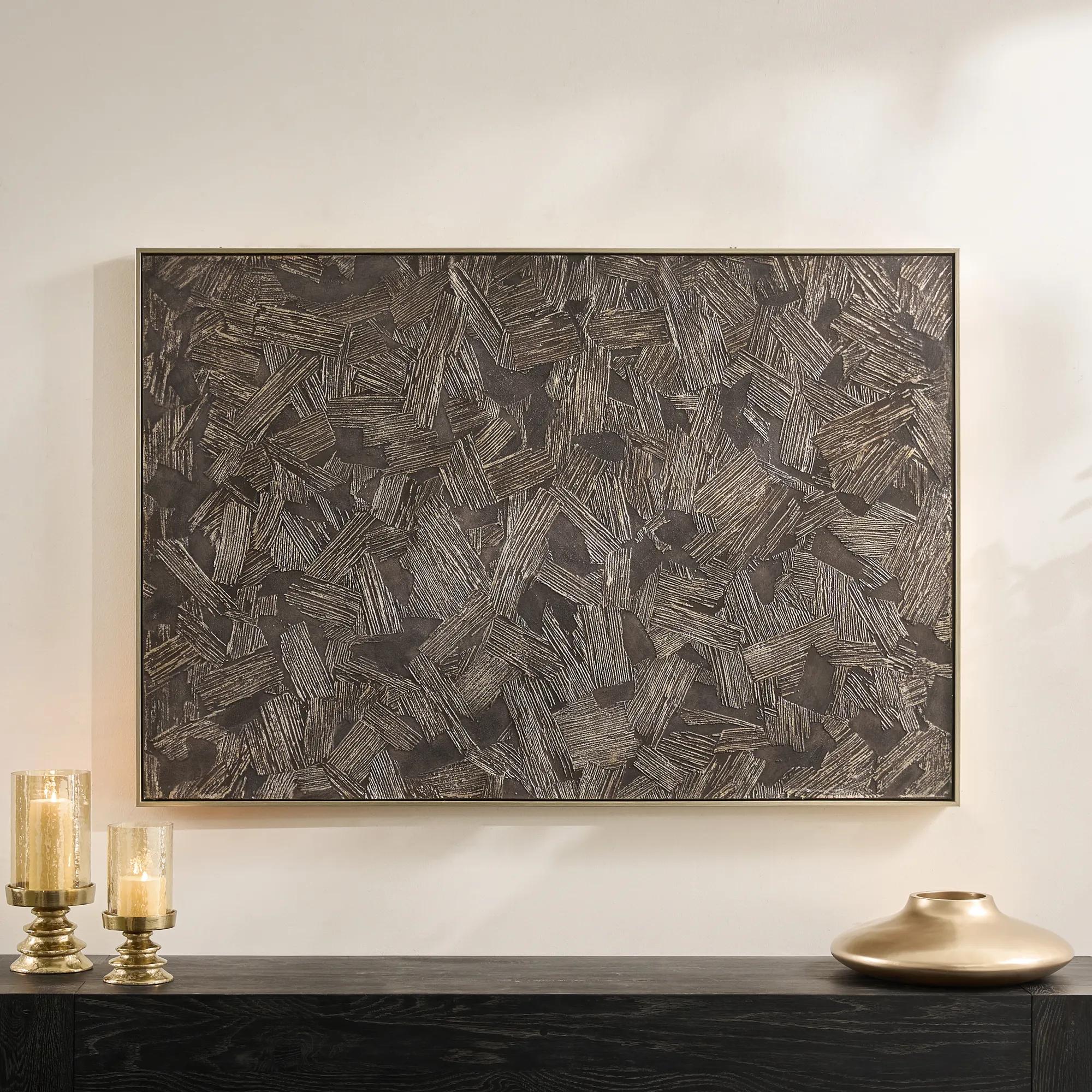 Etched in Darkness Dark Chocolate Wall Panel 53.5" x 36"$329
A hand-painted wrapped canvas features moody dark chocolate hues with champagne accents and a layered, textural finish.
Add To Cart

Dark Abstract Art Prints For Moody Fall Interiors
Dark abstract art prints for moody fall interiors bring depth, movement, and gallery-inspired character to your walls. Explore a curated selection of modern wall art and statement pieces that complement rich seasonal palettes, layered textures, and intimate spaces with expressive shapes and atmospheric detail.
Dark abstract art prints bring atmospheric depth to moody fall interiors through layered color, expressive movement, and the interplay of shadow and light. Charcoal, ink black, deep olive, and smoky brown create a rich foundation, while touches of rust, ochre, or muted ivory keep darker compositions from feeling closed in. These palettes feel especially inviting during the cooler months, when lamplight softens the edges of a room and tactile fabrics become part of its character. Unlike representational artwork, abstract wall art leaves the subject open to interpretation: a blurred horizon might suggest gathering clouds, while fluid washes of pigment can recall polished stone or the shifting surface of water. That ambiguity gives a print lasting interest, allowing it to feel contemplative in a bedroom and more theatrical above a living room sofa. The mood depends as much on contrast as darkness. A predominantly black composition with a slender pale gesture can feel crisp and architectural; a field of umber and forest green feels more enveloping, particularly beside walnut furniture or tobacco-colored upholstery. For an interior with velvet seating, gleaming accents, and sculptural silhouettes, dark abstract wall art adds depth without introducing another literal motif. In a lighter room, it provides a deliberate focal point, giving cream upholstery and pale walls a striking visual counterweight. Prints with broad areas of quiet color tend to support restful spaces, while energetic brushwork and flowing ink-like forms bring movement to dining rooms and gathering areas. A companion selection of Contemporary Moody Wall Arts offers another expression of this shadow-rich aesthetic. The appeal extends beyond a seasonal refresh: these compositions suit anyone drawn to expressive interiors, from the collector building a layered gallery wall to the host seeking an arresting backdrop for intimate evenings. Their colors can echo autumn’s richness without relying on leaves or other seasonal imagery, making the transition into early winter feel seamless.
The material and presentation of a dark abstract art print influence how its colors read and how much presence it brings to a wall. Fine art paper can preserve delicate tonal shifts and sharply defined marks, while canvas introduces a woven surface that lends printed imagery a softer, more painterly character. A reproduction may depict thick brushstrokes, scraped pigment, or luminous metallic-looking passages without having a physically raised or metallic finish; the distinction matters when choosing between visual texture and actual surface dimension. Matte surfaces generally soften reflections, helping charcoal gradients and subtle earth tones remain readable under ambient light. Glazed paper prints offer a different experience, with the frame and protective covering becoming part of the composition’s overall polish. Where glare is a concern, particularly opposite windows or beside bright lamps, glazing specifications deserve attention. Frame finishes further shape the atmosphere: warm walnut complements russet and olive, slender black profiles sharpen graphic compositions, and antique brass tones introduce a burnished contrast to smoky palettes. A generous pale mat can give dense imagery breathing room, while a close-fitting dark frame creates a more immersive effect. Scale is equally important. Above a sofa or console, artwork spanning roughly two-thirds of the furniture’s width is a useful starting point rather than a fixed rule; generous walls, high ceilings, and substantial furnishings may call for a bolder proportion. The total outside dimensions, including the frame, determine the true fit. A large dark abstract print can unify a seating arrangement, whereas two coordinated prints offer rhythm across a longer wall. Multi-panel arrangements need enough space between sections for each panel to register without breaking the composition apart. In a bedroom, a softer charcoal-and-taupe print above a dresser can feel beautifully restrained. In a dining room, an expansive black-and-rust composition beside warm wood and low lighting establishes a more dramatic mood. Leaving visible wall space around the artwork allows those rich colors to carry their full weight.
Dark artwork responds beautifully to thoughtful lighting and surrounding textures, making it particularly effective in rooms designed for lingering. A shaded lamp near a reading chair can reveal the warmth within a brown-black composition, while balanced picture lighting can help distinguish subtle grays that disappear in an underlit corner. Strong, concentrated light may create distracting reflections or flatten the apparent depth, so placement matters as much as brightness. Repeating one secondary color from the print elsewhere in the room creates cohesion without making every detail match: an olive cushion, a rust-toned throw, or a smoked-glass accent can draw the eye gently from the wall into the space. Against a dark painted wall, a pale mat or warm frame defines the edges; against ivory plaster, the artwork itself supplies the contrast. These prints are intended as decorative focal points for interior spaces, and their construction should suit the setting. Paper, canvas, frames, and glazing each have different care requirements, so the stated material and care details are worth reviewing before selecting a location. Acid-free paper and archival-quality printing, when specified, are useful considerations for long-term display, though no print should be treated as immune to fading. Avoid prolonged direct sunlight, excessive humidity, and placement immediately above an active fireplace or other heat source. Gentle dusting with a clean, soft, dry cloth is generally appropriate for frames; printed surfaces require particular care, and liquids or household cleaners should not be applied without explicit manufacturer guidance. For glazed artwork, cleaner belongs on the cloth rather than sprayed directly onto the frame, where moisture can seep toward the print. Secure hanging hardware appropriate to the artwork’s weight and the wall material helps protect both the piece and its surroundings. Dark abstract art also makes a thoughtful housewarming or wedding gift for someone whose taste favors expressive color and contemporary design, especially when the recipient’s wall space and framing preferences are known. Chosen with that same attention for a personal collection, it brings a distinctive sense of intimacy and grandeur to everyday rooms.
FAQs
Dark abstract art prints bring depth, intrigue, and a sense of curated drama to fall interiors. Their expressive shapes and rich tones—think charcoal, espresso, inky blue, and burnished neutrals—create a sophisticated backdrop for layered textures, warm lighting, and luxe furnishings.
Dark abstract art prints pair beautifully with autumnal hues such as rust, ochre, olive, cognac, and deep burgundy. For a more refined composition, balance their intensity with creamy ivory, soft taupe, or gleaming metallic accents that let the artwork remain the focal point.
Display dark abstract art prints wherever you want to create a compelling visual moment, such as above a console, behind a sofa, in a dining room, or within a dramatic bedroom vignette. Place them where layered lighting can reveal the artwork’s tonal shifts and expressive details.
Create a richly layered arrangement by pairing dark abstract art prints with velvet, boucle, aged wood, sculptural ceramics, and candlelight-inspired accents. Repeat one or two tones from the artwork throughout the room to make the space feel intentional, atmospheric, and effortlessly collected.
Absolutely. Dark abstract art prints offer enduring visual impact long after autumn fades. Their moody palette and artistic movement complement winter’s opulence, spring’s contrast, and year-round modern interiors, making them a striking foundation for evolving layers of color and texture.