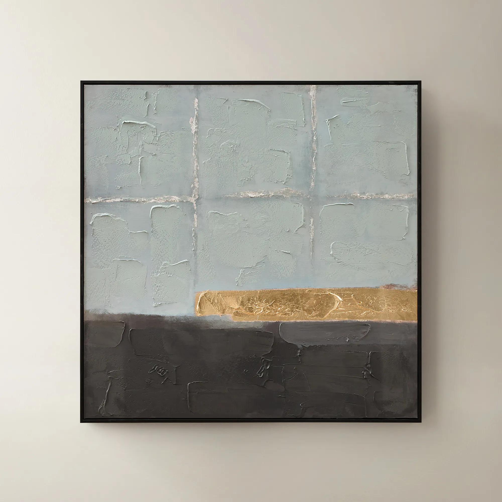
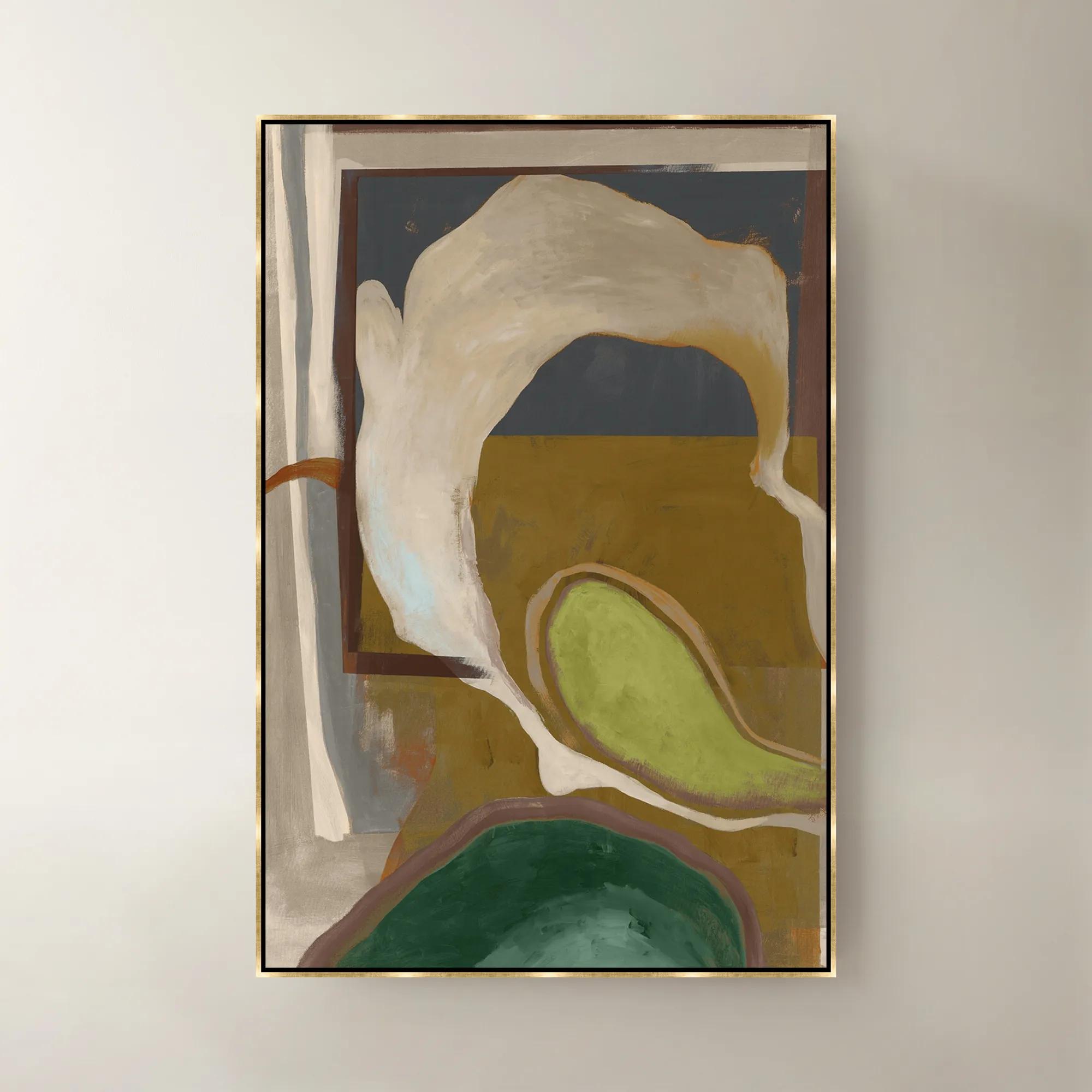
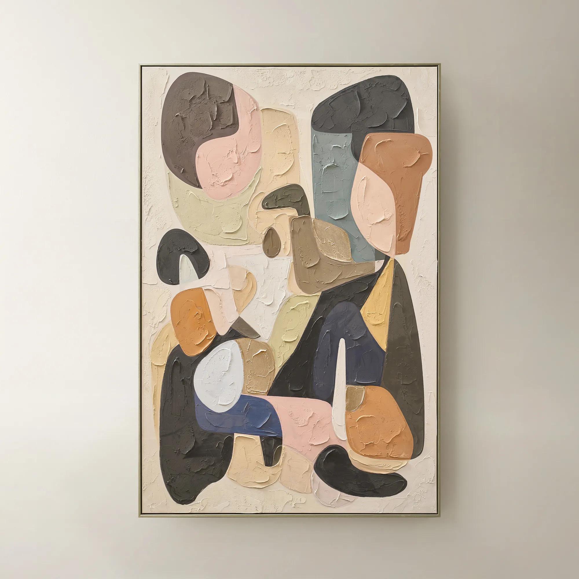
Black And Gold Abstract Art Prints
Black And Gold Abstract Art Prints
-

 Zebra Pop Framed Painted Wall Art 36" x 48"$449
A bold black painted canvas artwork in a sleek frame, bringing graphic energy to modern interiors.
Add To Cart -
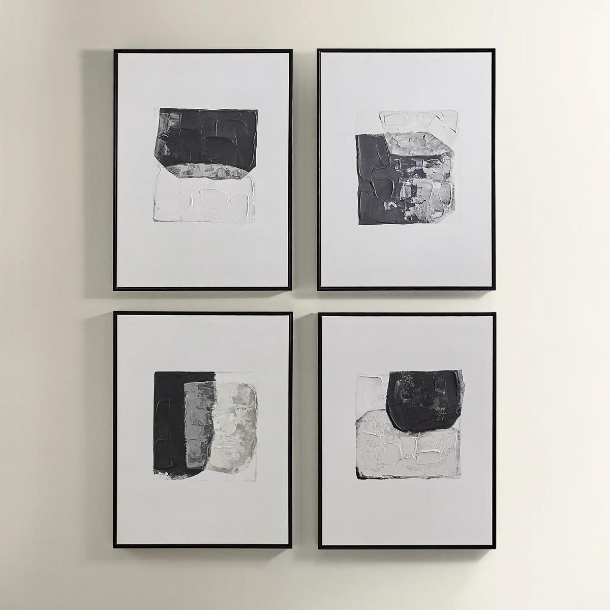
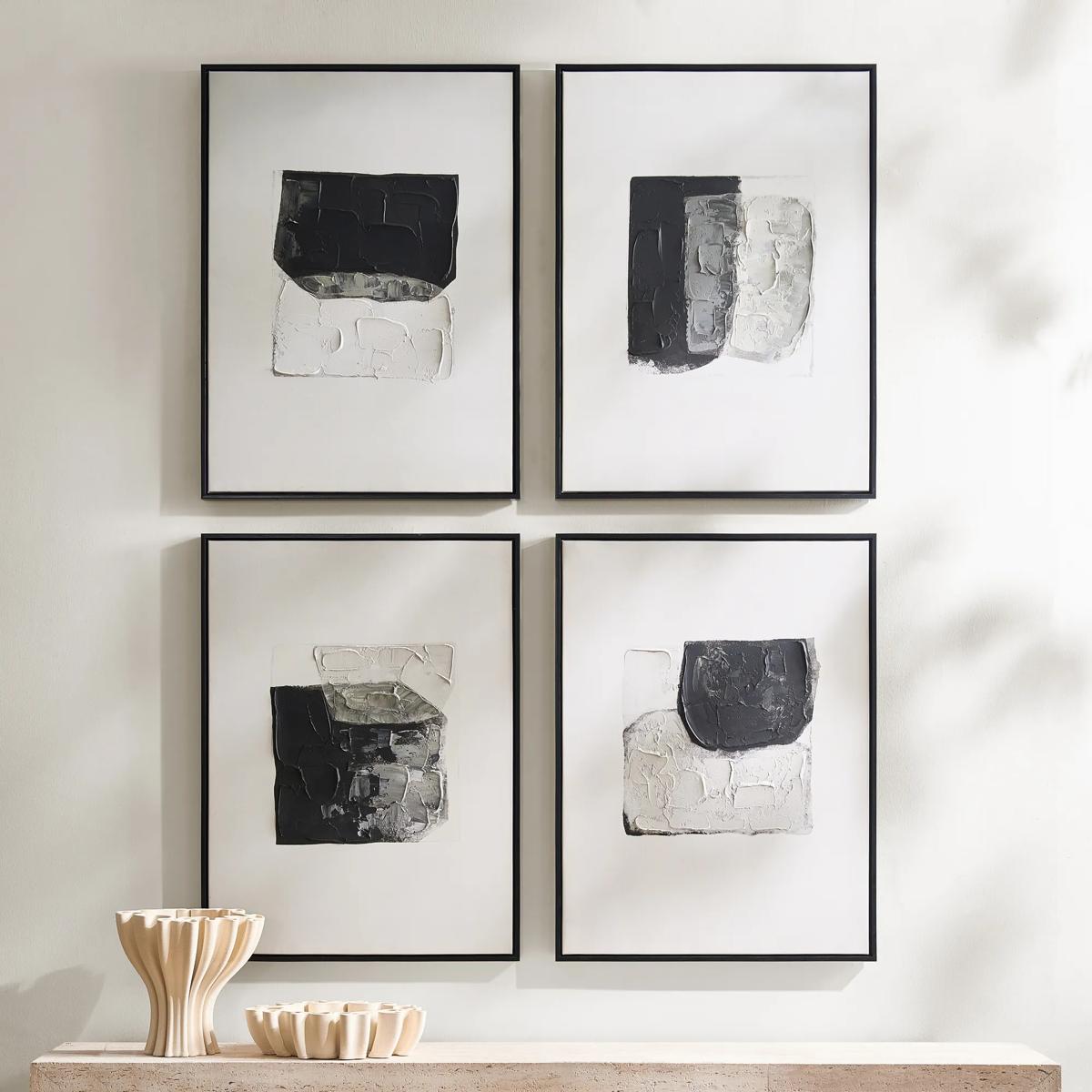 Shadows Framed Painted Wall Art Set of 4$299
A set of four hand-painted abstract canvases featuring black, white, and gold accents in black frames.
Add To Cart -
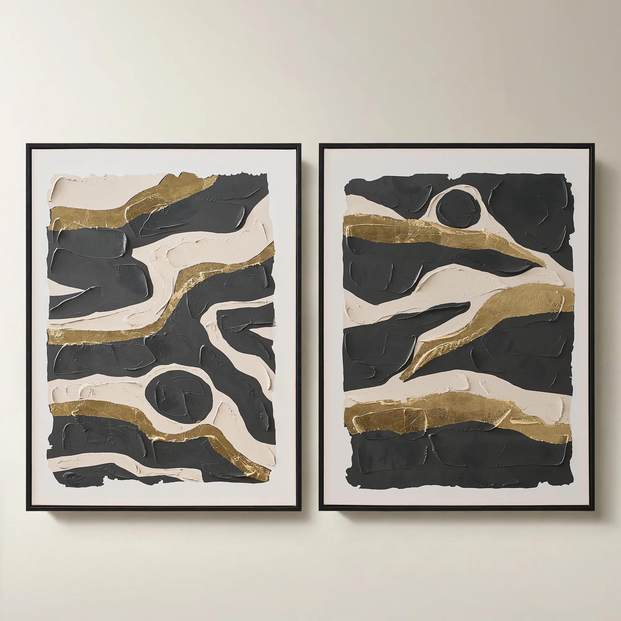
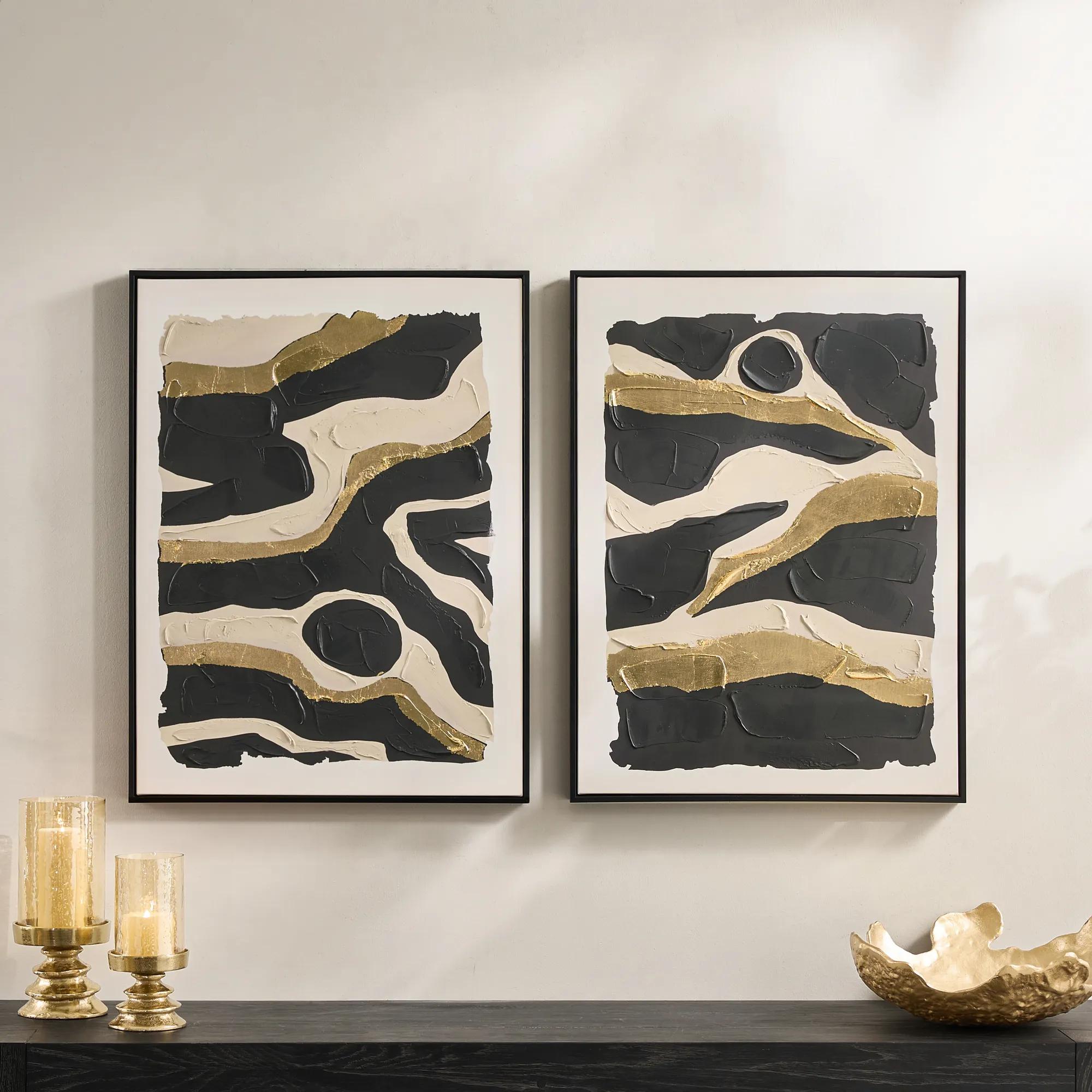 Untamed Framed Gold Leaf Painted Wall Art 24" x 32" Set of 2$199
A hand-painted diptych featuring abstract black and gold canvas art with expressive, gallery-inspired energy.
Add To Cart -
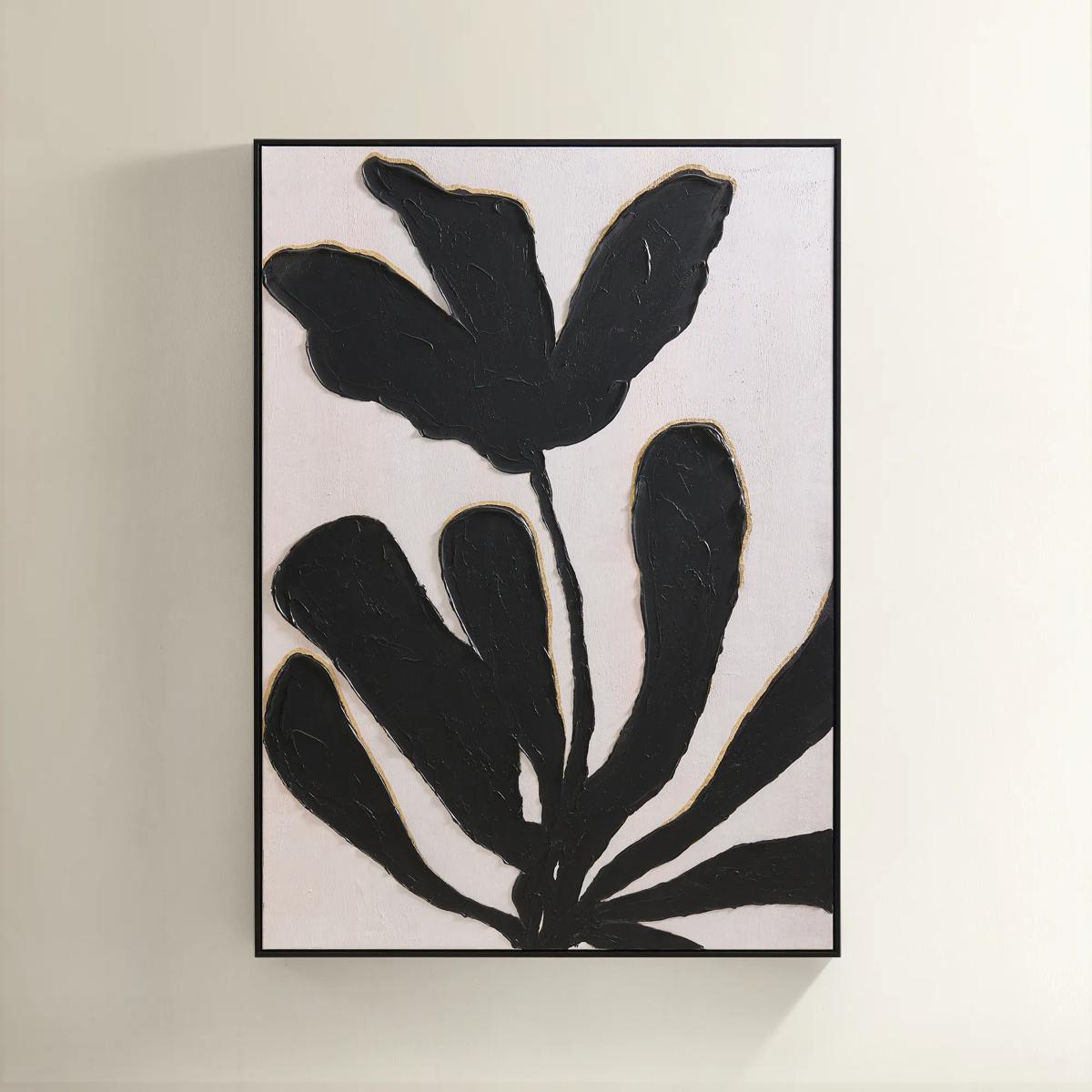
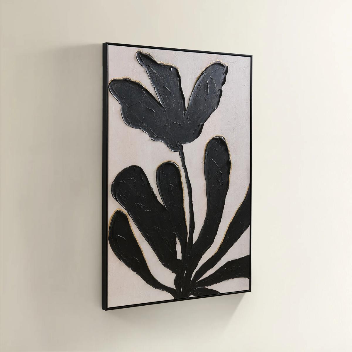 First Bloom Framed Painted Wall Art 39.25" x 55"$499
A hand-painted canvas featuring black abstract leaves and gold leafing on an ivory background in a black frame.
Add To Cart -

 Tribe V Framed Wall Art 24" x 28"$599
A striking contemporary art piece designed by acclaimed interior designer Nikki Chu.
Add To Cart -
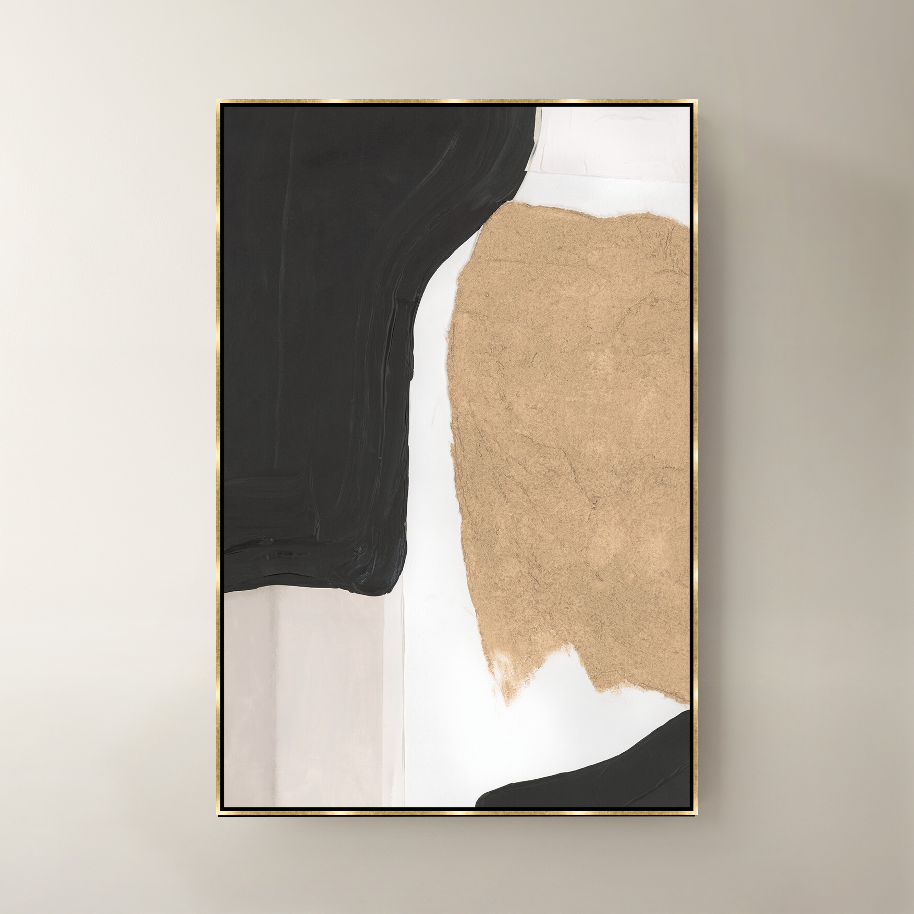
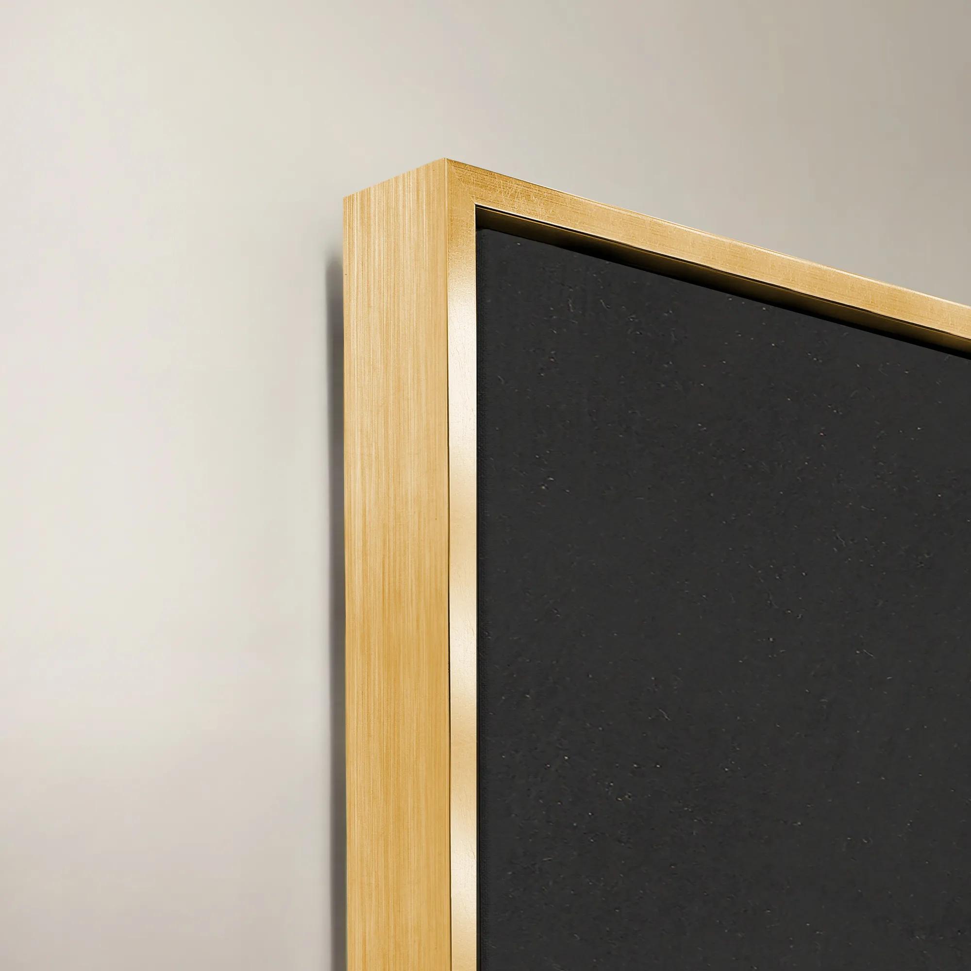 Noir I Framed Wall Art 40" x 60"$1299
A multicolored canvas wall artwork presented in a striking frame for modern interior styling.
Add To Cart -
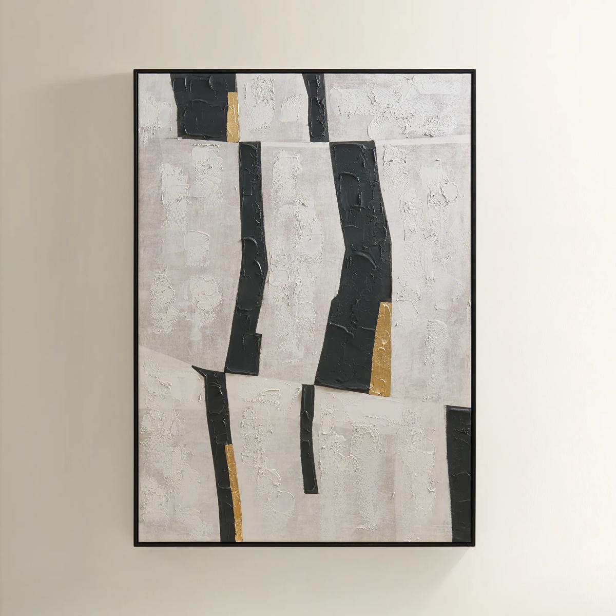
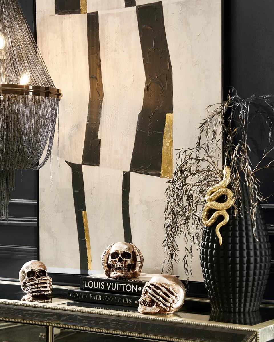 Into the Groove Painting$449
A modern abstract canvas featuring black, gray, and gold leaf accents in a sleek black floater frame.
Add To Cart -
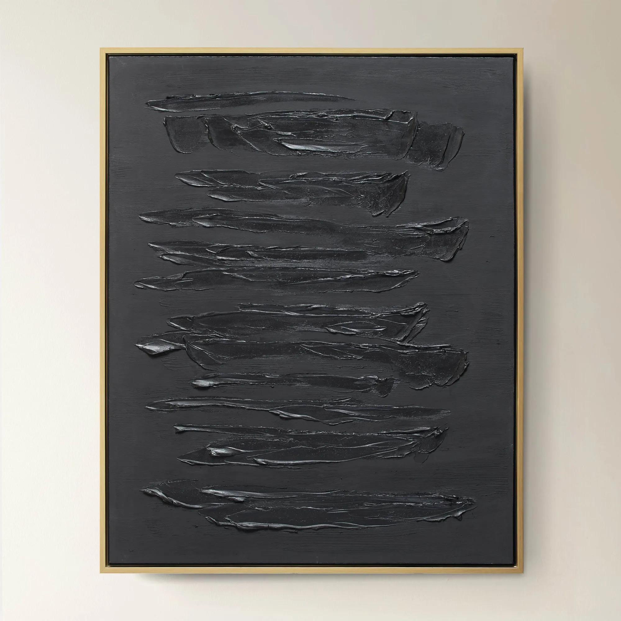
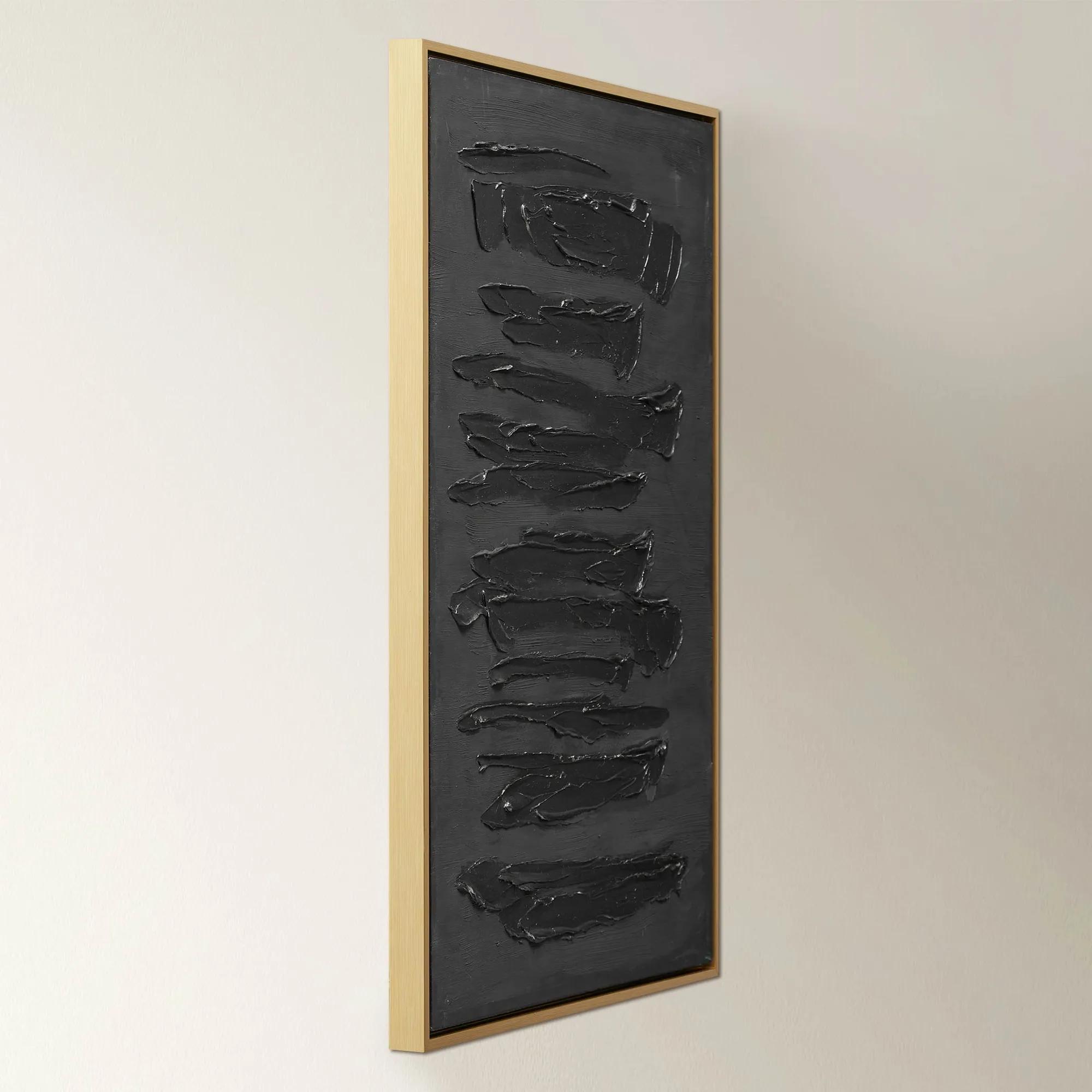 Nocturne$599.95
A dramatic abstract artwork featuring bold, dark brushstrokes on hand-painted canvas in a gold floater frame.
Add To Cart -
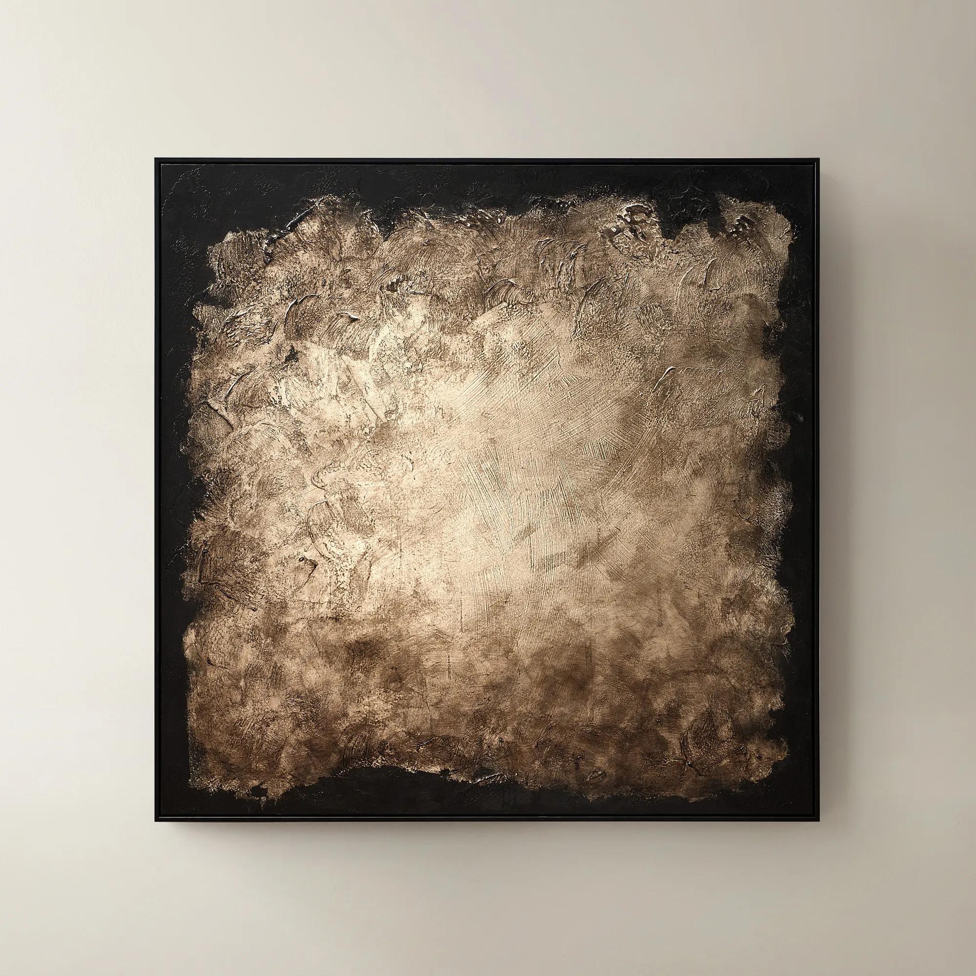 Edge of Knowing Framed Gold Leaf Painted Wall Art 50" x 50"$599
A hand-painted abstract canvas featuring gold leaf accents and a smoked champagne and black palette in a black frame.
Add To Cart -
 Etched in Gold$229
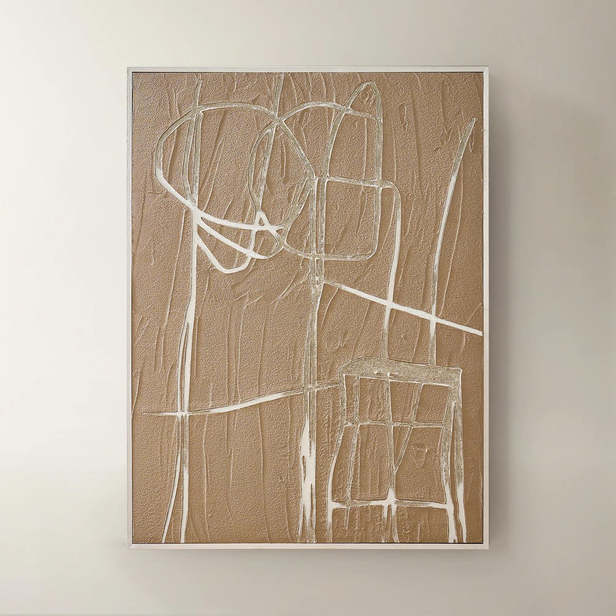
A hand-carved gold copper artwork set in a sleek black alloy frame for modern contrast.
Add To Cart -
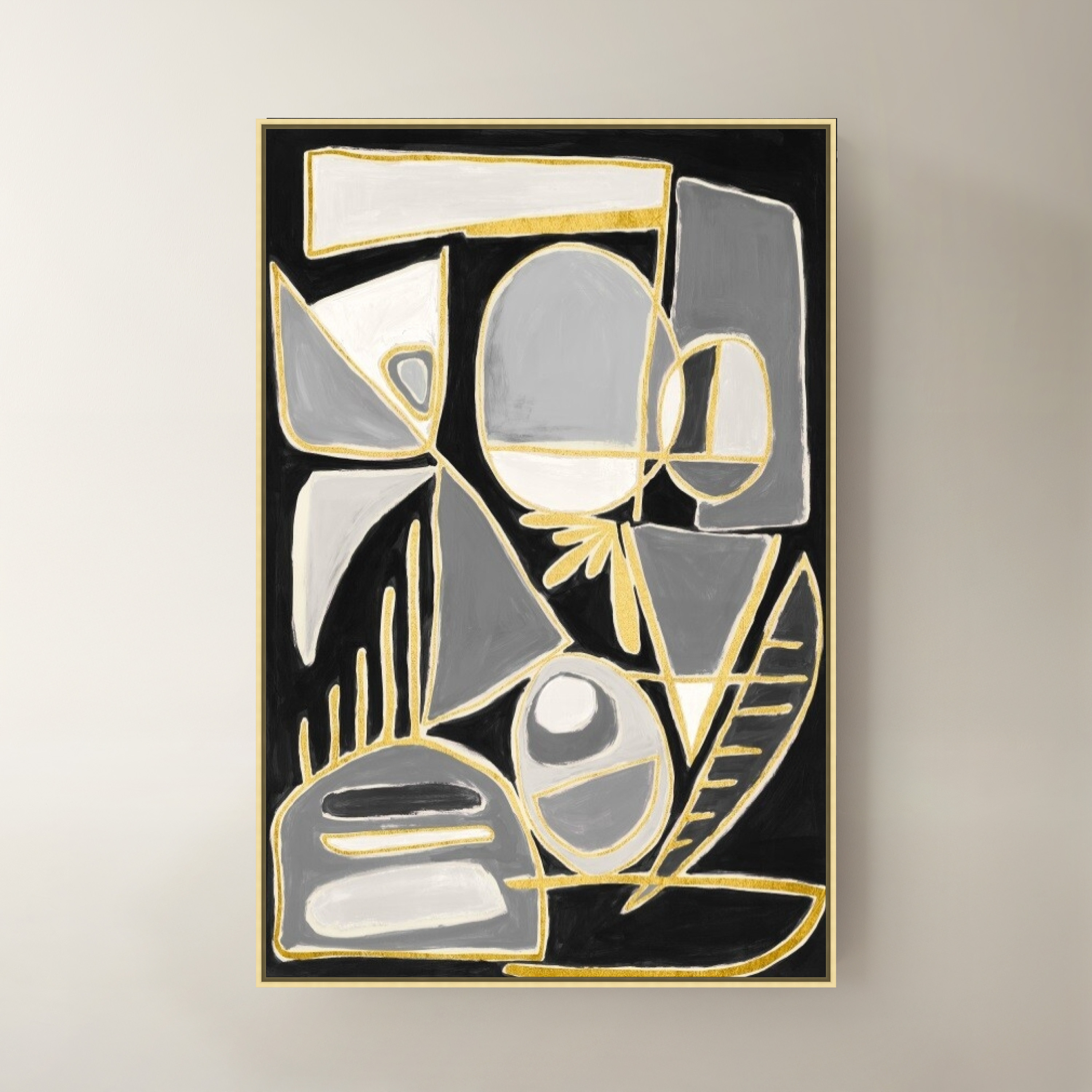
 Shuffle City III Framed Wall Art 40" x 60"$1199
A dramatic black canvas wall artwork presented in a refined frame for contemporary interiors.
Add To Cart -
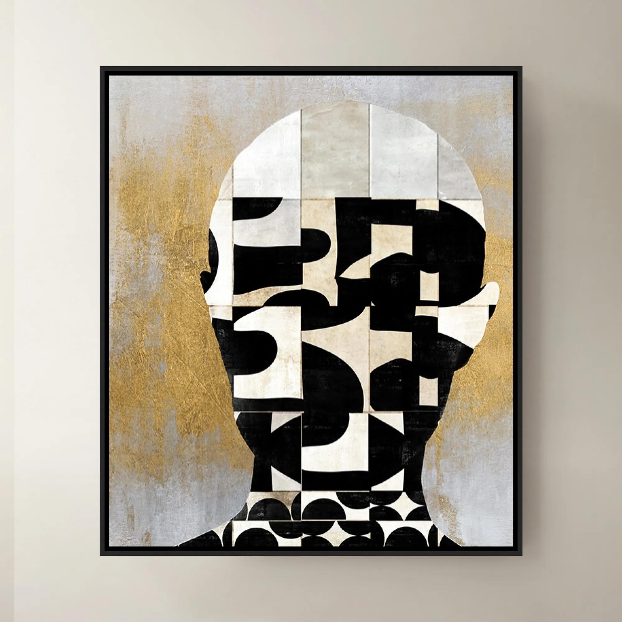
 Lets Face It II Framed Wall Art 30" x 35"$699
A striking contemporary art piece showcasing bold design and creative flair by a renowned interior designer.
Add To Cart -
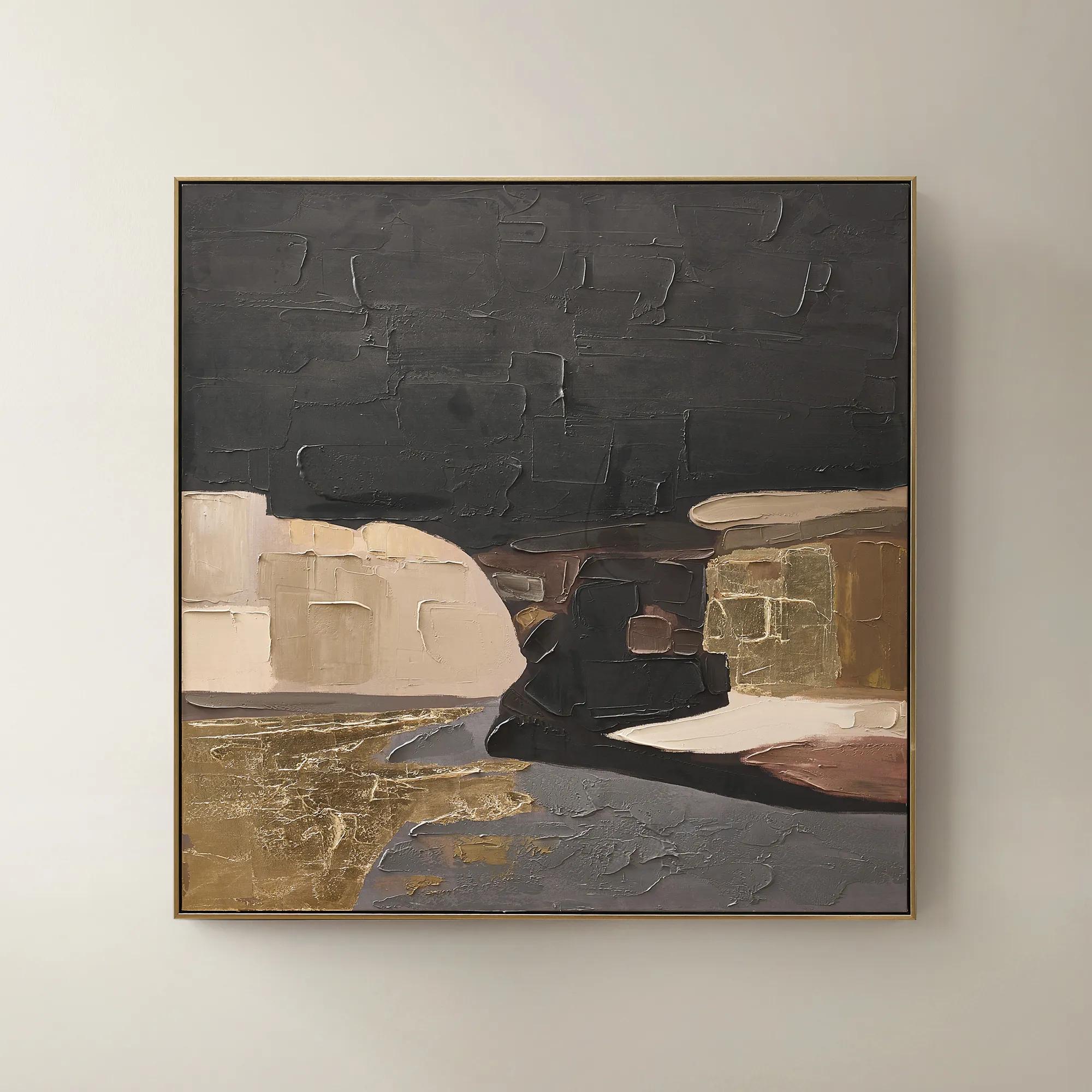 Obscured Light Framed Gold Leaf Painted Wall Art 48" x 48"$499
A hand-painted canvas with gold leaf accents and a black-gold frame in dramatic neutral tones.
Add To Cart -
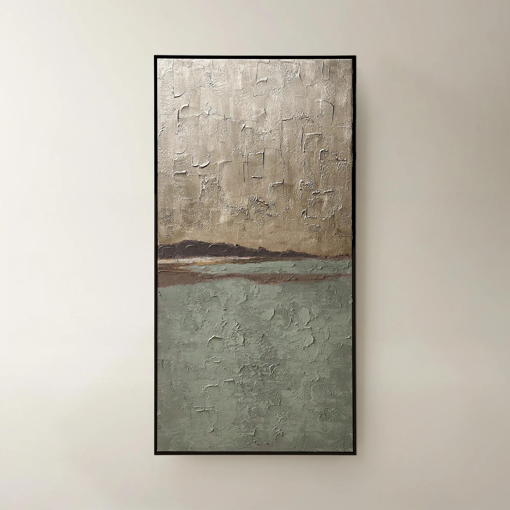
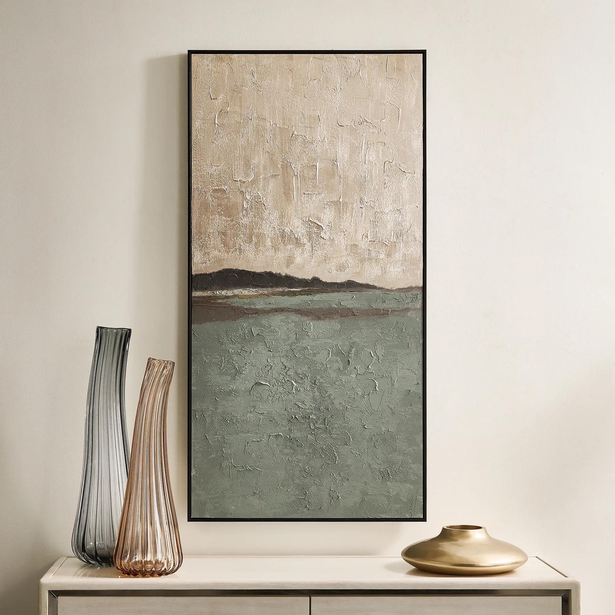 Fields of Gold Framed Painted Wall Art 60" x 30"$399
A hand-painted sage and champagne abstract canvas with a black frame, offering versatile vertical or horizontal display.
Add To Cart -
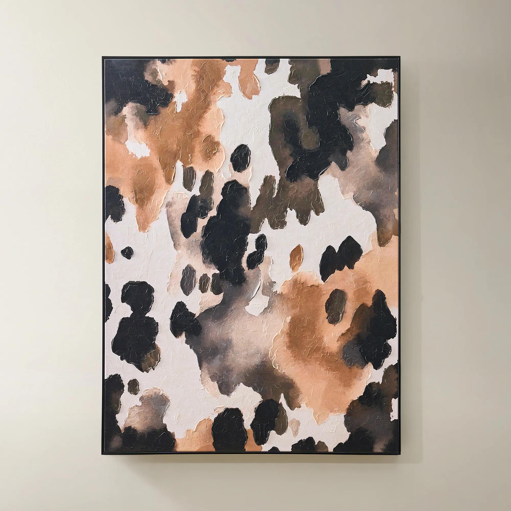
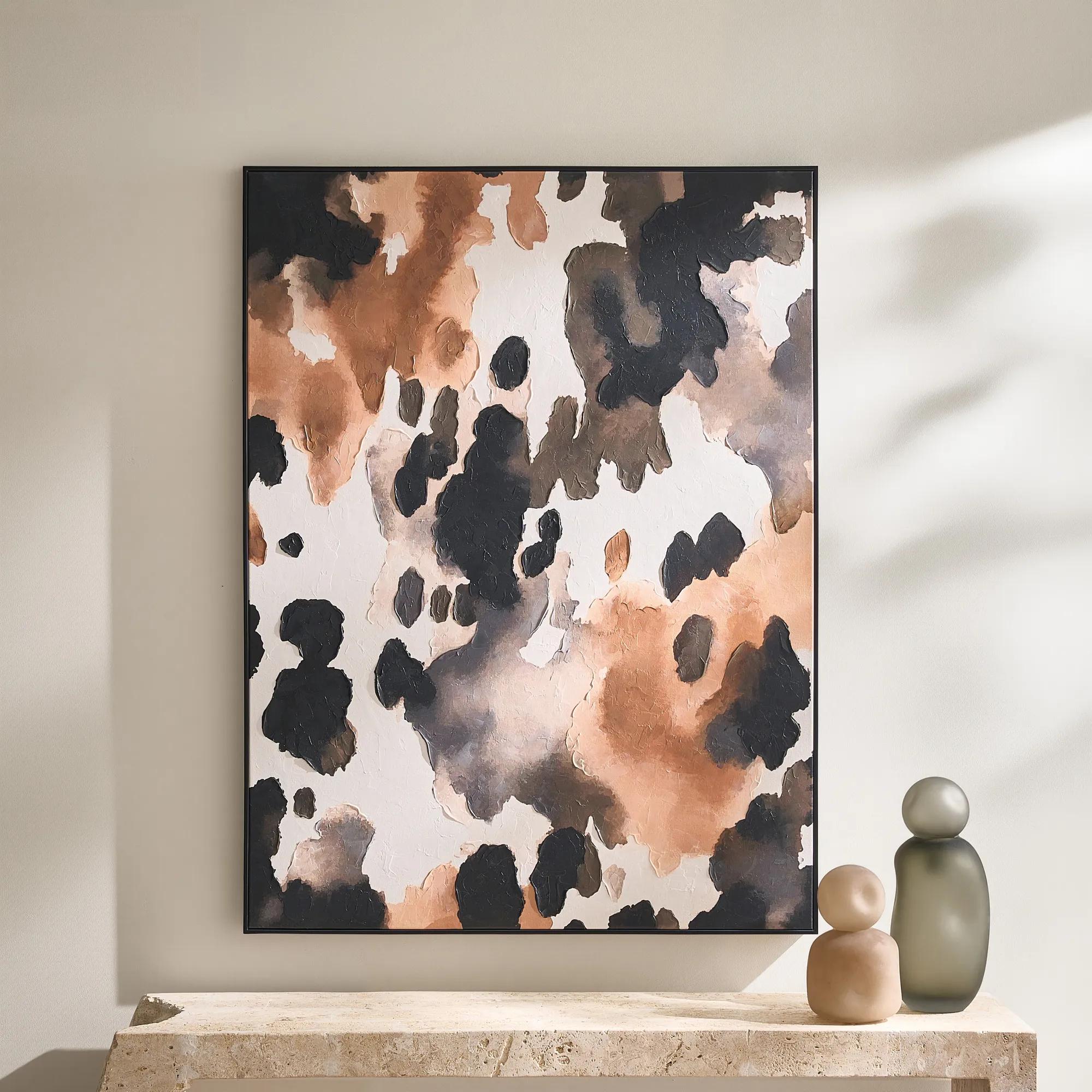 Wilder Framed Painted Wall Art 36" x 48"$499
An abstract hand-painted canvas featuring inky black, taupe, ivory, and coral hues in a sleek black frame.
Add To Cart -
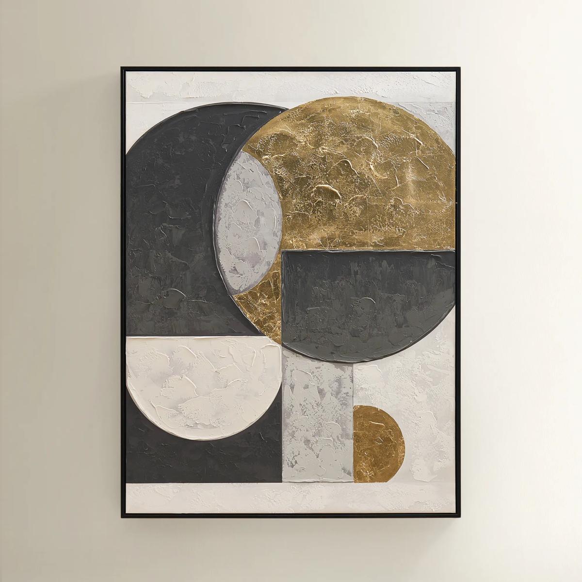
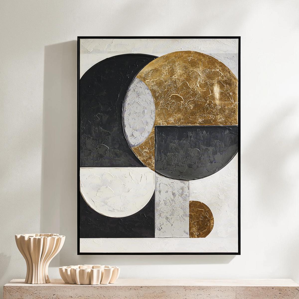 Eclipse Framed Gold Leaf Painted Wall Art 35.25" x 47.25"$449
A hand-painted canvas featuring bold black, grey, and gold geometric shapes with shimmering gold leaf accents.
Add To Cart -

 Floral Jungle II Framed Wall Art 30" x 40"$799
A striking gold-framed canvas artwork depicting lush tropical foliage in an expressive botanical composition.
Add To Cart -
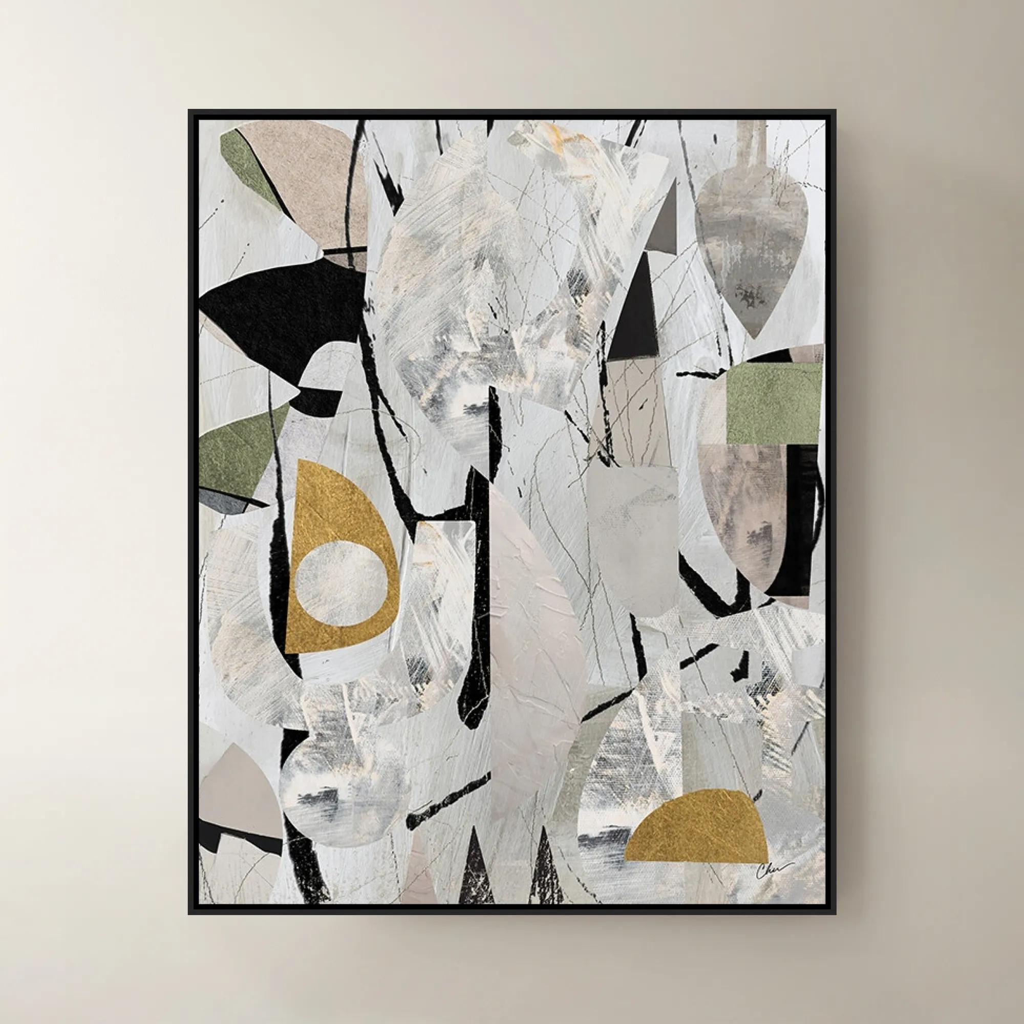
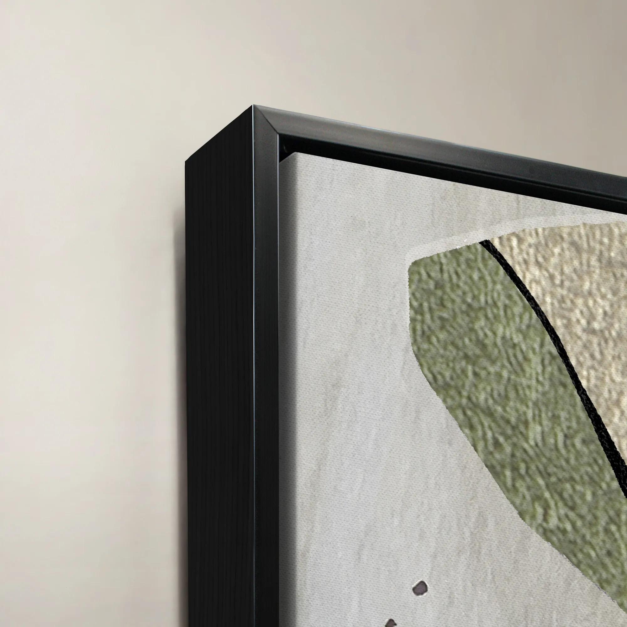 Rogue IV Framed Wall Art 40" x 50"$1199
An abstract art piece designed by Nikki Chu, blending modern style with artistic sophistication.
Add To Cart -
 Etched in Silver$229
An abstract hand-carved aluminum wall art featuring shimmering silver tones in a modern black alloy frame.
Add To Cart -
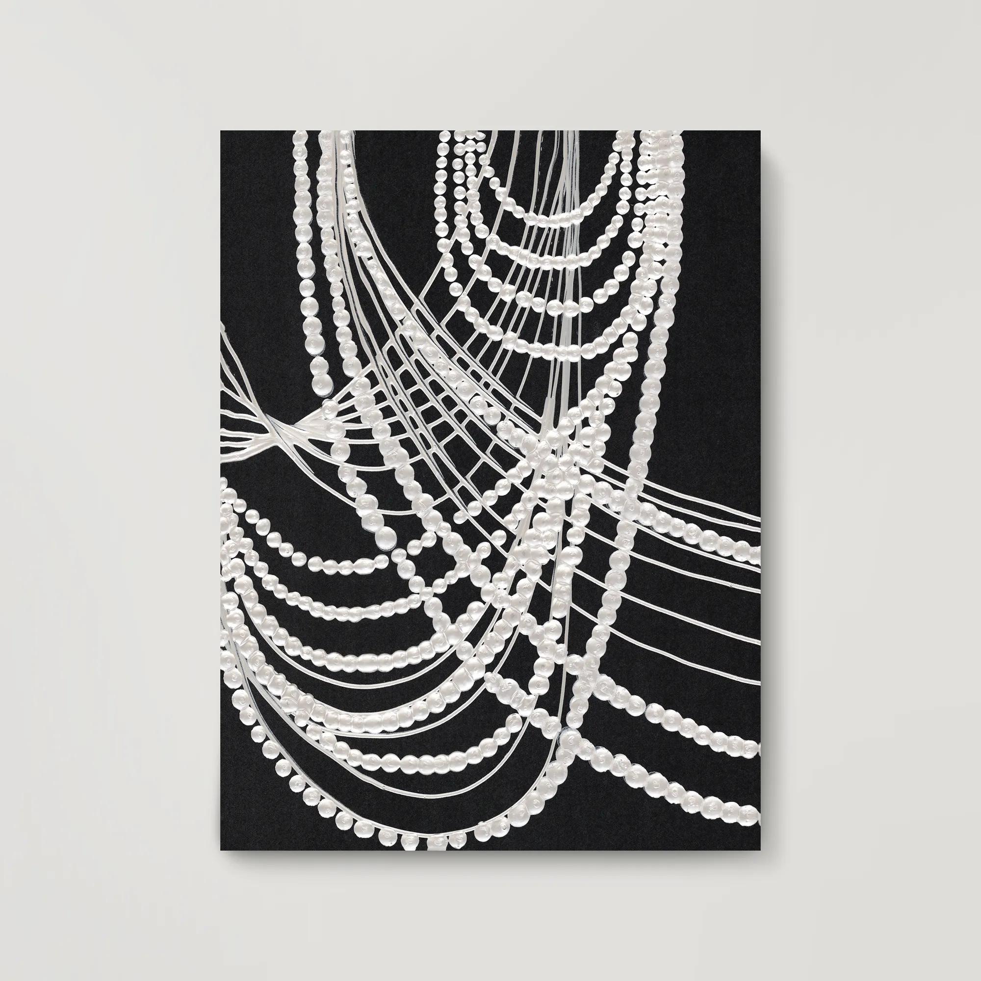 Dripping Pearls Painted Wall Art 36" x 48"$949
A striking hand-painted abstract artwork featuring layered acrylic and watercolor textures in a modern design.
Add To Cart -
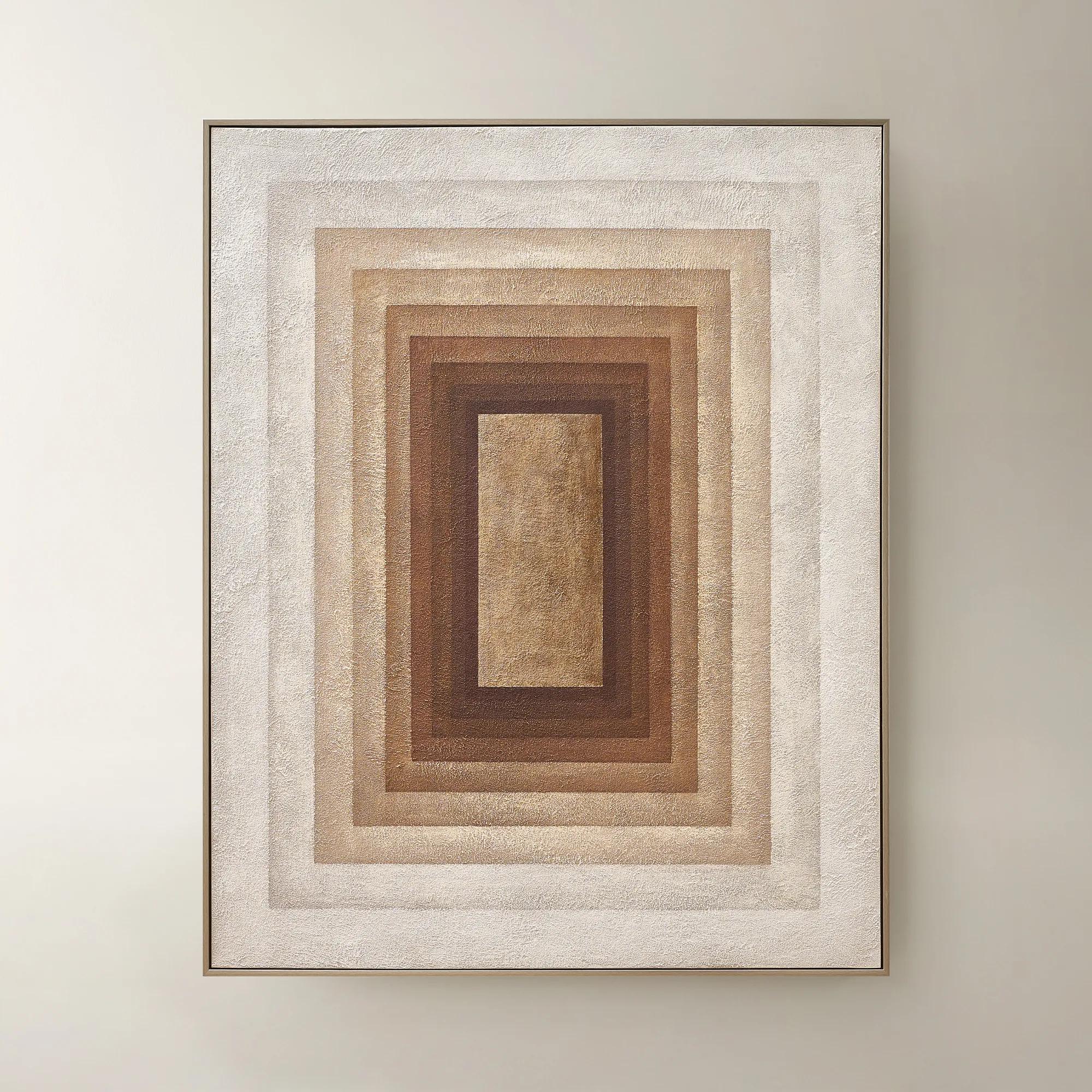 Monochrome Drift Framed Painted Wall Art 60" x 48"$699
A hand-painted abstract canvas with champagne leafing, featuring cocoa and gold tones in modern geometric design.
Add To Cart -
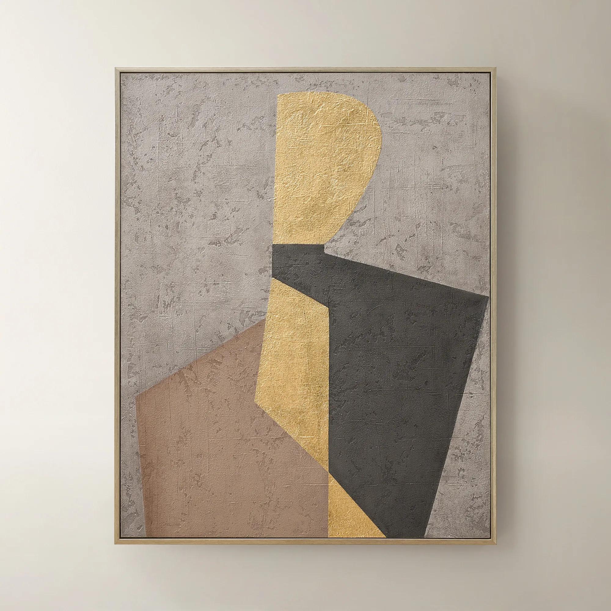 Aura of Gold Framed Painted Wall Art 40" x 50"$399
A hand-painted canvas with champagne leafing and a brushed champagne frame in mocha, grey, black, and gold.
Add To Cart -
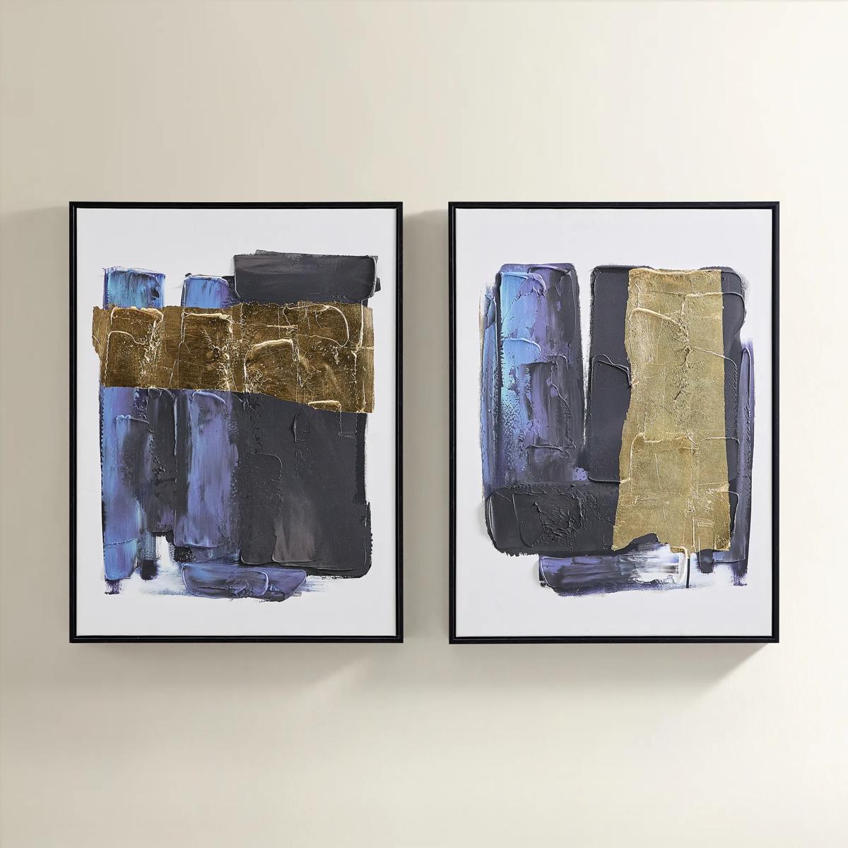
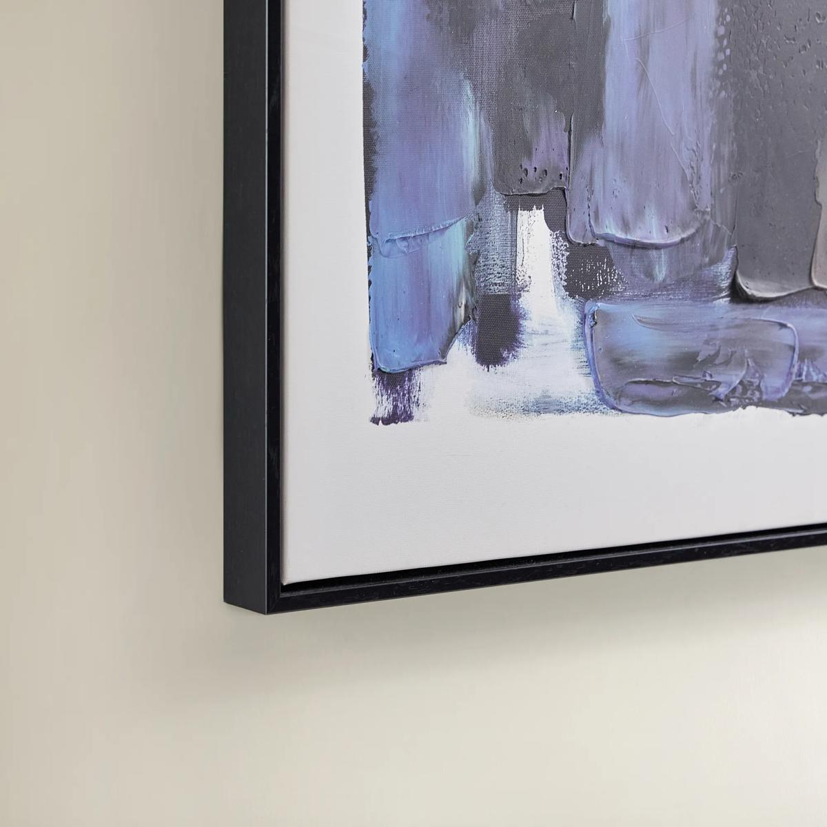 Deep Thoughts Gold Leaf Painted Wall Art Set of 2$199
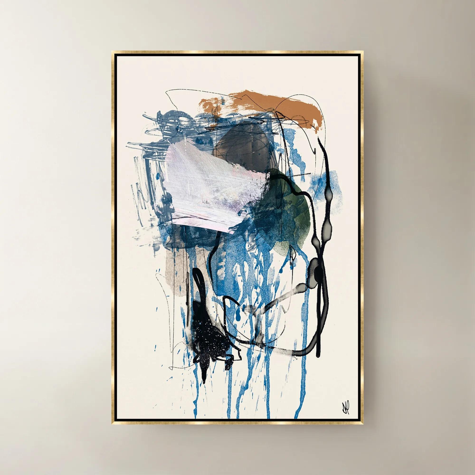
A set of two hand-painted abstract canvases in blue and gold leaf, framed in sleek black.
Add To Cart -

 Sand Storm Framed Gold Foil Wall Art 32" x 47"$329
A refined abstract artwork with gold foil accents, sand and charcoal tones, framed in solid wood.
Add To Cart

Black And Gold Abstract Art Prints
Black and gold abstract art prints ignite the senses with their striking interplay of shadow and shimmer, transforming blank walls into dramatic focal points. Each piece is a celebration of contrast—jet-black depths punctuated by gilded flourishes that catch the light and command attention. These expressive works invite you to curate a gallery brimming with intrigue, sophistication, and unapologetic glamour. Whether anchoring a grand entryway or elevating an intimate nook, black and gold abstract art prints set the stage for interiors that dazzle and inspire, turning every glance into an experience of artistry and allure.
Black and gold abstract art prints create a distinctive focal point through the contrast of deep, grounding tones and luminous gold accents. Their compositions range from sweeping brushstrokes and fluid, mineral-inspired patterns to precise geometric forms, giving this expressive palette a place in both tailored interiors and richly layered rooms. Black lends structure and visual depth; gold introduces warmth and a sense of ceremony. Together, they can make a quiet wall feel intentional without requiring a room full of competing colors. A broad field of black crossed by a slender gold line feels restrained and architectural, while a composition filled with fractured shapes or energetic gestures brings movement to a more dramatic setting. The effect also depends on how gold is represented: gold-toned printed color offers the appearance of warmth, while metallic ink, foil, or applied embellishment, when specified, may reflect light and change with the viewing angle. That distinction matters in a room where the artwork will catch daylight or sit beneath a picture light. Against ivory upholstery, black and gold wall art creates a crisp, sculptural contrast; beside charcoal velvet, it builds a deeper, more enveloping mood. Brass accents, dark wood, glass, and marble can echo the palette without making the entire room feel matched. Even a small connection, such as the warm finish of a lamp base or the black outline of a console, can make the composition feel connected to its surroundings. Abstract imagery leaves room for personal interpretation, making it especially suited to living rooms, dining spaces, entryways, and offices where atmosphere matters as much as decoration. Some viewers may see a shifting landscape in a wash of black and gold; others may respond simply to its rhythm and balance. This openness gives abstract prints their lasting appeal: the artwork contributes personality without prescribing a single subject or story, allowing furniture, objects, and the architecture around it to remain part of the conversation.
The surface and presentation of a print influence its character as much as the image itself. Art paper can preserve the crisp definition of fine lines and geometric edges, while canvas introduces a woven surface that softens the composition and gives it a more tactile presence. A reproduction may depict thick paint, layered brushwork, or distressed gold, but those effects are not necessarily raised or textured on the finished surface; construction details distinguish printed imagery from hand-applied elements. Paper weight, printing method, ink quality, and any protective finish are useful considerations when evaluating how a piece will look and hold up over time. Archival paper and light-resistant inks, when identified in the specifications, can support longevity, although placement and care still matter. Framing adds another visual layer. A slim black frame sharpens the perimeter and connects naturally with dark passages in the artwork, while a gold-toned frame can draw warmer details outward toward the surrounding furnishings. A floating frame gives a canvas a defined silhouette with a narrow reveal around its edges. For a more tailored presentation, Framed Abstract Art Prints offer a finished border that can complement clean-lined furniture or bring definition to a layered wall arrangement. A generous mat around a paper print introduces breathing room, particularly when the image contains dense marks or strong contrast. Overall dimensions deserve close attention because a frame and mat can make the finished piece substantially larger than the image alone. Above a sofa or console, artwork that occupies roughly two-thirds of the furniture’s width often feels balanced, though nearby windows, lamps, and architectural details can change that relationship. A single expansive composition creates a continuous visual statement, while a coordinated pair or three-panel arrangement introduces a more measured rhythm. With grouped prints, the total width includes the spaces between frames, an important detail when imagining how the arrangement will sit above furniture. The strongest fit allows the artwork to command attention while leaving enough surrounding wall to make its shape and scale legible.
Black and gold abstract prints can anchor a room or provide the finishing note that connects its details. In a living room with a low, pale sofa, a horizontal composition can establish breadth and draw attention to the seating area. A vertical print above a narrow entry console creates a different effect, emphasizing height and making the arrival feel considered. In a bedroom, fluid forms and open space within the image can support a composed atmosphere, while denser geometric arrangements may suit a dining room with sculptural chairs and polished accents. Home offices benefit from the palette’s definition, especially when a print is visible behind a desk or across from the main work area. Lighting deserves the same attention as placement: an angled fixture can reveal a reflective finish, but glare on glazing may obscure the image from a favorite chair. Viewing the intended wall from both seated and standing positions helps establish whether the artwork will remain comfortable to enjoy. For lasting beauty, avoid prolonged direct sunlight and locations exposed to persistent moisture or rapid changes in humidity, especially bathrooms, areas above active fireplaces, and walls close to cooking surfaces. Dust frames gently with a soft, dry cloth, and follow the stated care directions for the print surface and glazing; liquid cleaners should not be sprayed directly onto artwork. The weight, frame construction, and wall type determine the appropriate hanging hardware, with secure support especially important for larger pieces. As a housewarming, wedding, or milestone gift, abstract wall art feels most personal when its scale and visual character reflect the recipient’s home rather than color preference alone. A dramatic composition can delight someone who favors expressive interiors, while a quieter arrangement of black forms and fine gold accents may suit a more edited space. Whether placed alone or within a thoughtfully composed gallery wall, black and gold abstract art gives a room depth, warmth, and an unmistakable point of view.
FAQs
Black and gold abstract art prints are remarkably versatile, complementing a wide range of interior styles. They shine in glamorous, contemporary, and modern spaces, but also add a sophisticated edge to classic or transitional rooms. Their bold contrasts and metallic accents can serve as a striking focal point in minimalist settings or blend seamlessly into more eclectic, layered environments.
To create a cohesive black and gold theme, consider repeating these tones in key accents such as lighting, textiles, and decorative objects. Position black and gold abstract art prints in prominent locations, then echo their palette with gold-framed mirrors, black velvet cushions, or metallic accessories. This intentional repetition of color and finish will unify your spaces and create a harmonious, curated look.
Absolutely—black and gold abstract art prints make exceptional gifts for design enthusiasts, newlyweds, or anyone celebrating a milestone moment. Their timeless elegance and bold presence suit a variety of tastes, and their abstract nature allows them to fit seamlessly into many different decor styles, making them a thoughtful and memorable choice.
When placing black and gold abstract art, consider the room’s natural focal points, such as above a fireplace, sofa, or entryway console. Ensure the artwork is hung at eye level for maximum impact, and allow for ample lighting to highlight the metallic elements. Pairing these prints with complementary textures and finishes in the room will further enhance their dramatic effect.
Yes, black and gold abstract art can be beautifully mixed with other colors and styles. For a curated gallery wall, combine these prints with artistic black white portraits or pieces featuring deep jewel tones, blush, or metallics. The key is to balance scale and color intensity, allowing the black and gold pieces to anchor the arrangement while creating visual interest with contrasting works.