Gold And White Framed Art Prints
Gold And White Framed Art Prints
-
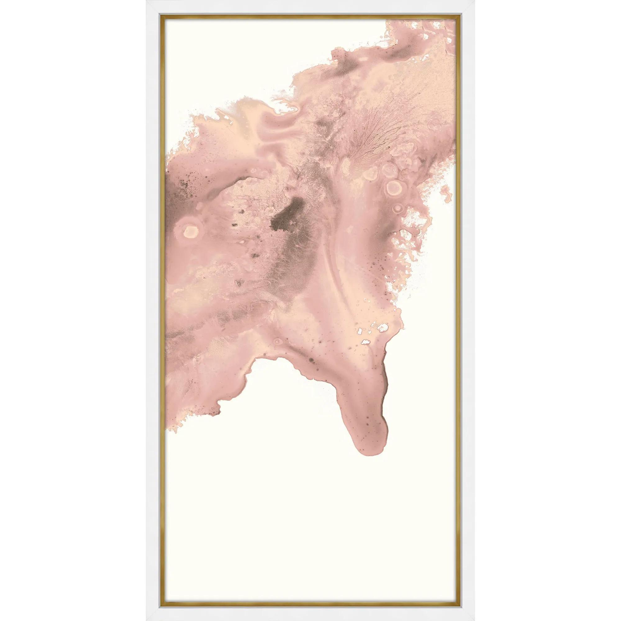
 Blush Conduit 2 Framed Wall Art 24" x 48"$849
A striking abstract print on pearl paper, elegantly framed in gold and matte white for modern appeal.
Add To Cart -
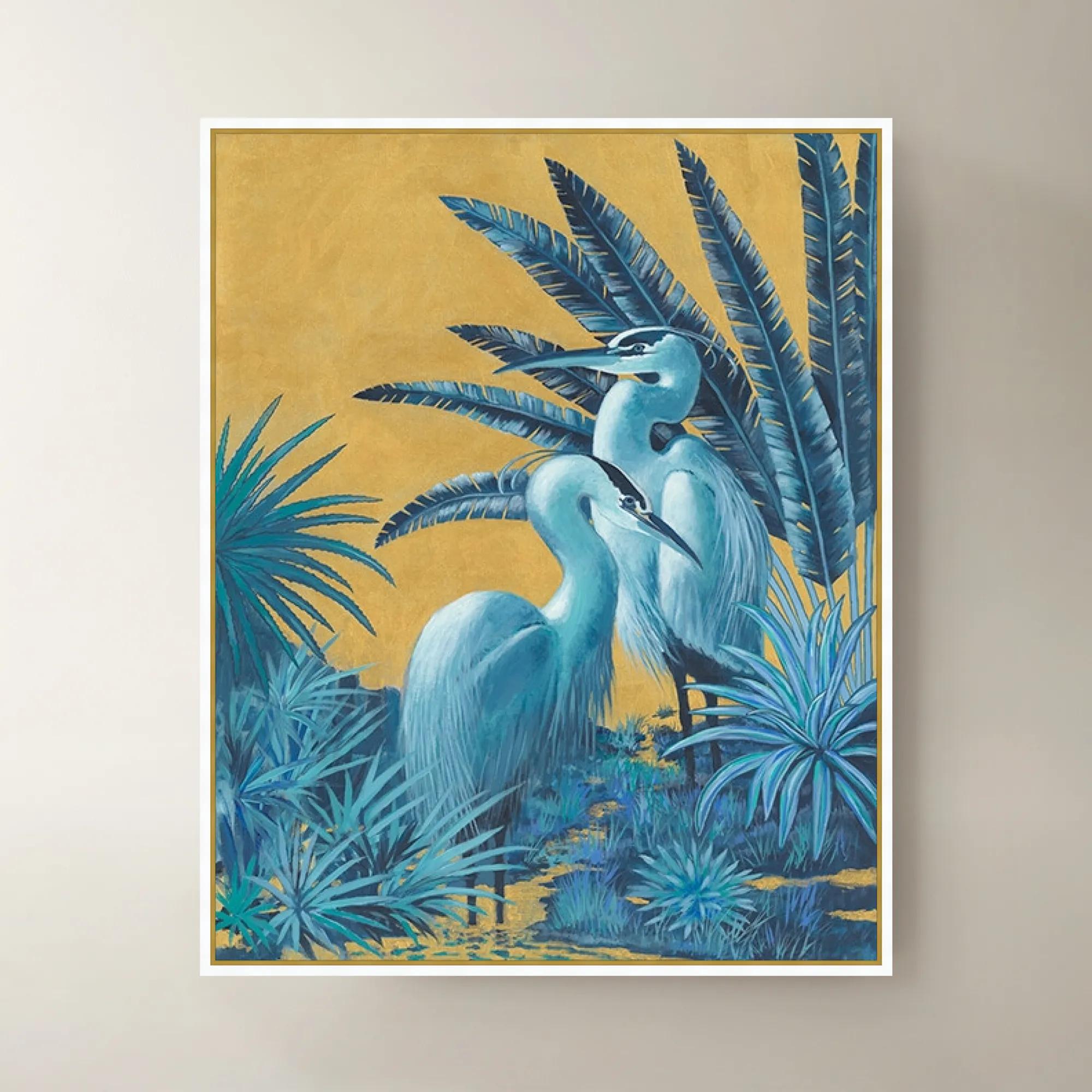
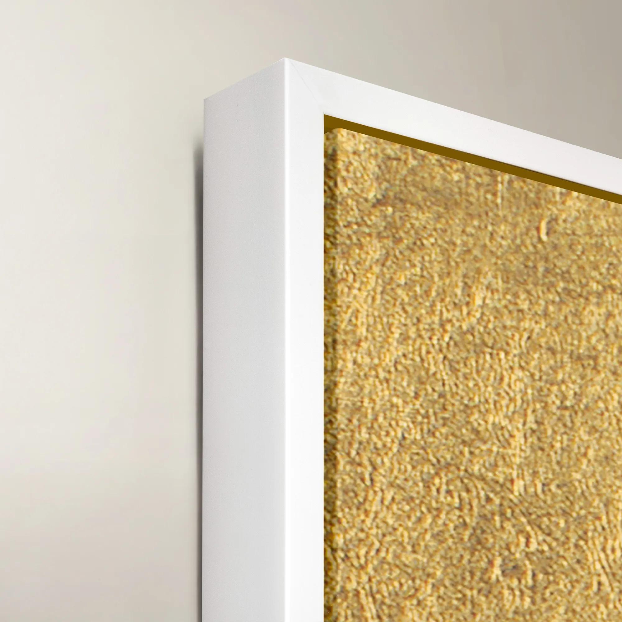 Blue Gold Herons Framed Wall Art 40" x 50"$1199
A striking blue and gold framed canvas artwork featuring elegant herons for sophisticated wall display.
Add To Cart -

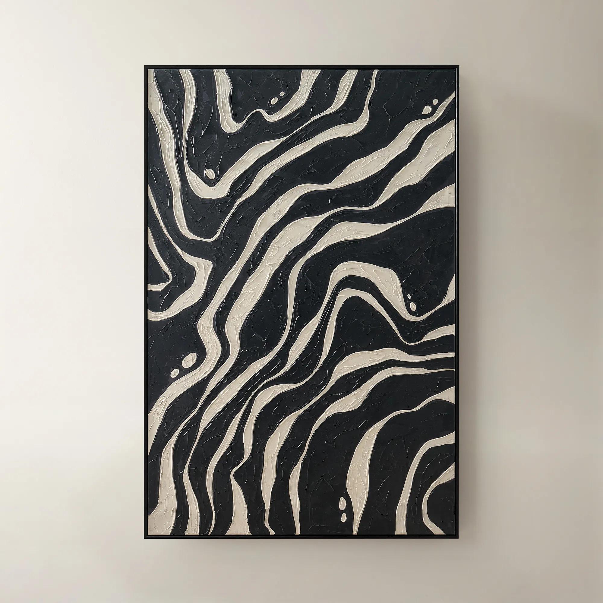
 Zebra Pop Framed Painted Wall Art 36" x 48"$449
A bold black painted canvas artwork in a sleek frame, bringing graphic energy to modern interiors.
Add To Cart -
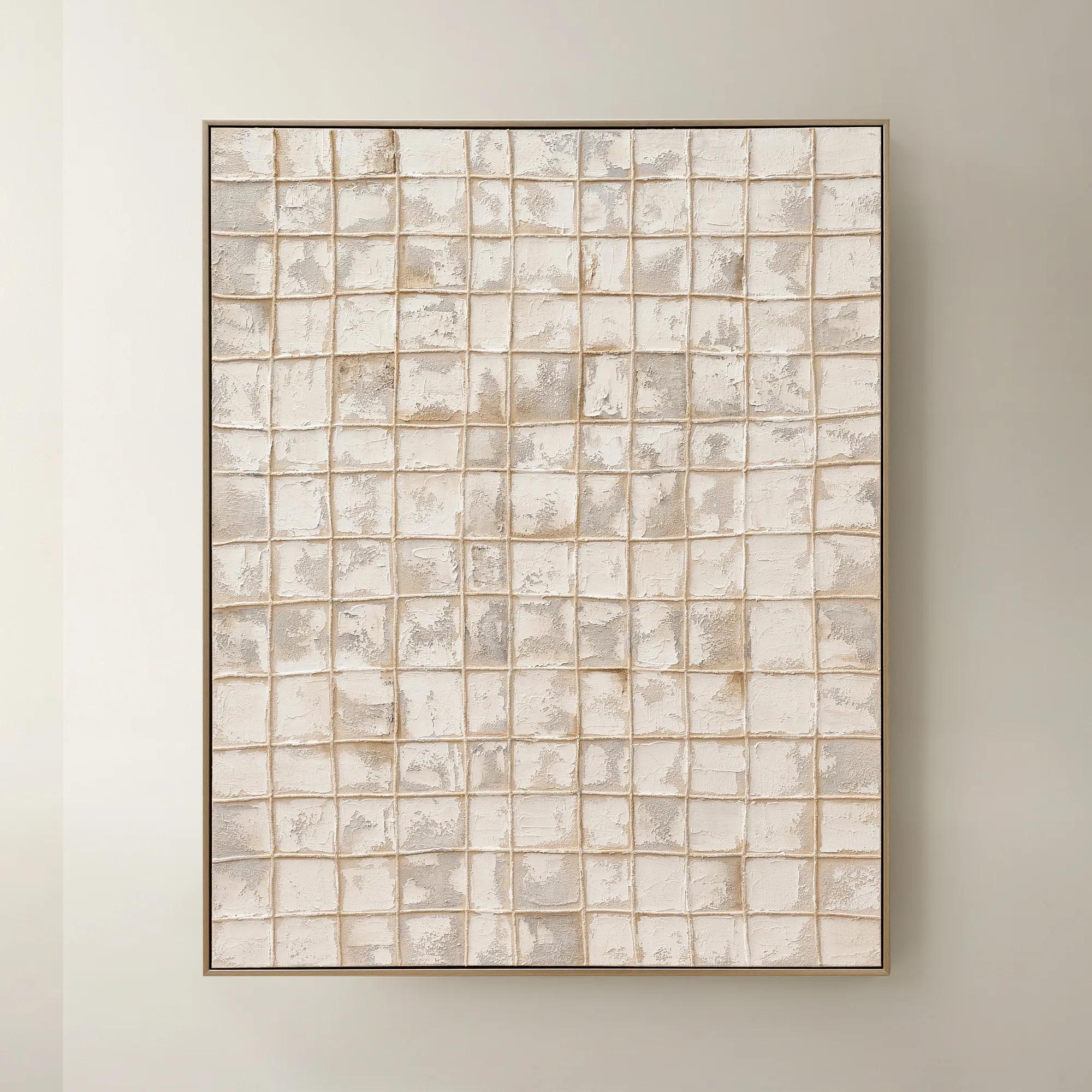
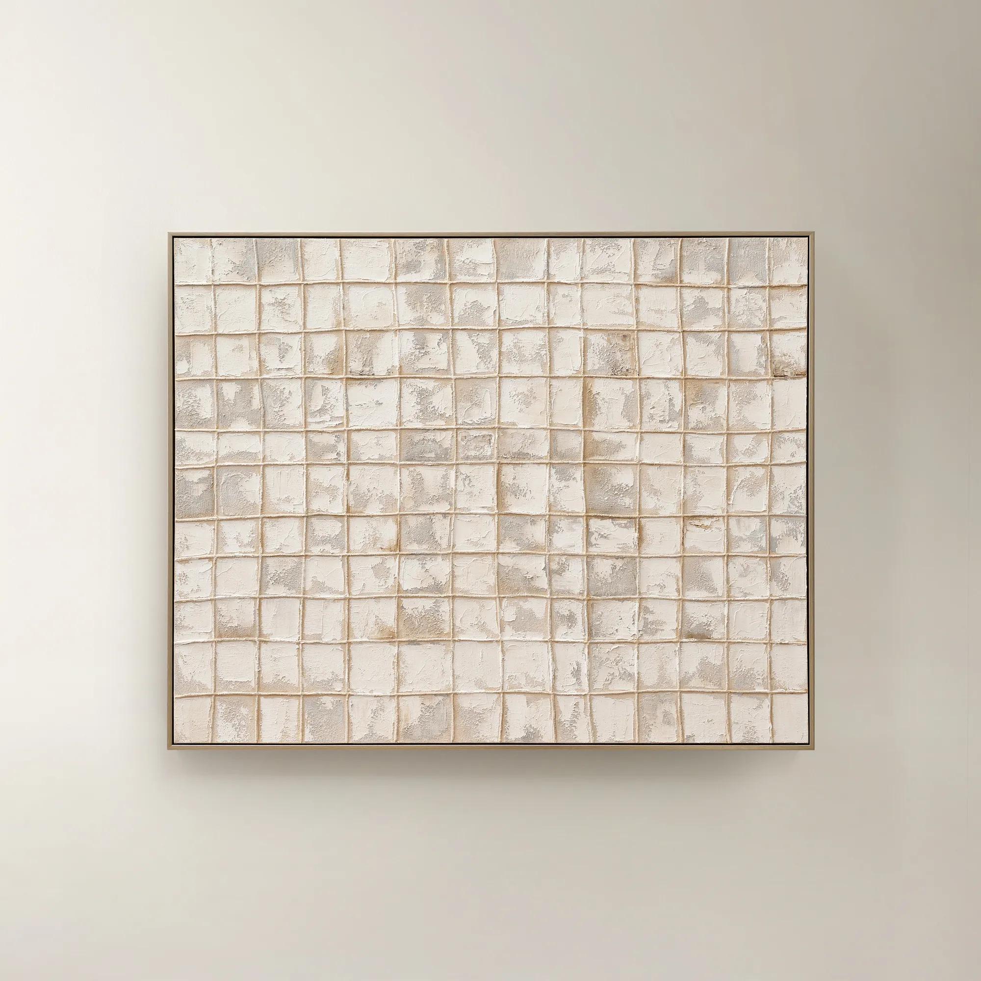 Painted Echos Framed Gold Leaf Wall Art 60" x 48"$699
A hand-painted abstract canvas with gold leaf accents and a champagne frame for modern, versatile display.
Add To Cart -
 Etched in Gold$229
A hand-carved gold copper artwork set in a sleek black alloy frame for modern contrast.
Add To Cart -

 Tribe V Framed Wall Art 24" x 28"$599
A striking contemporary art piece designed by acclaimed interior designer Nikki Chu.
Add To Cart -
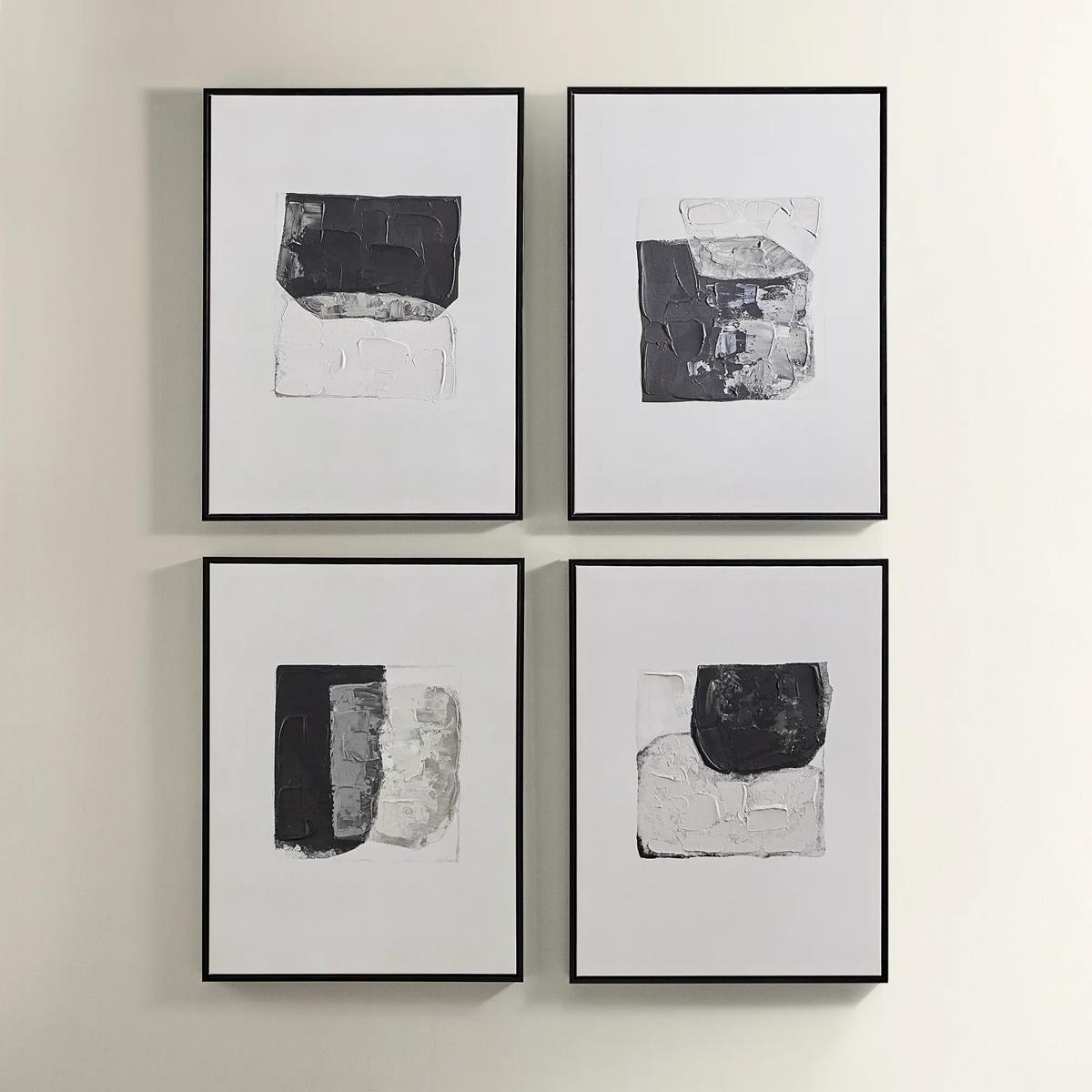
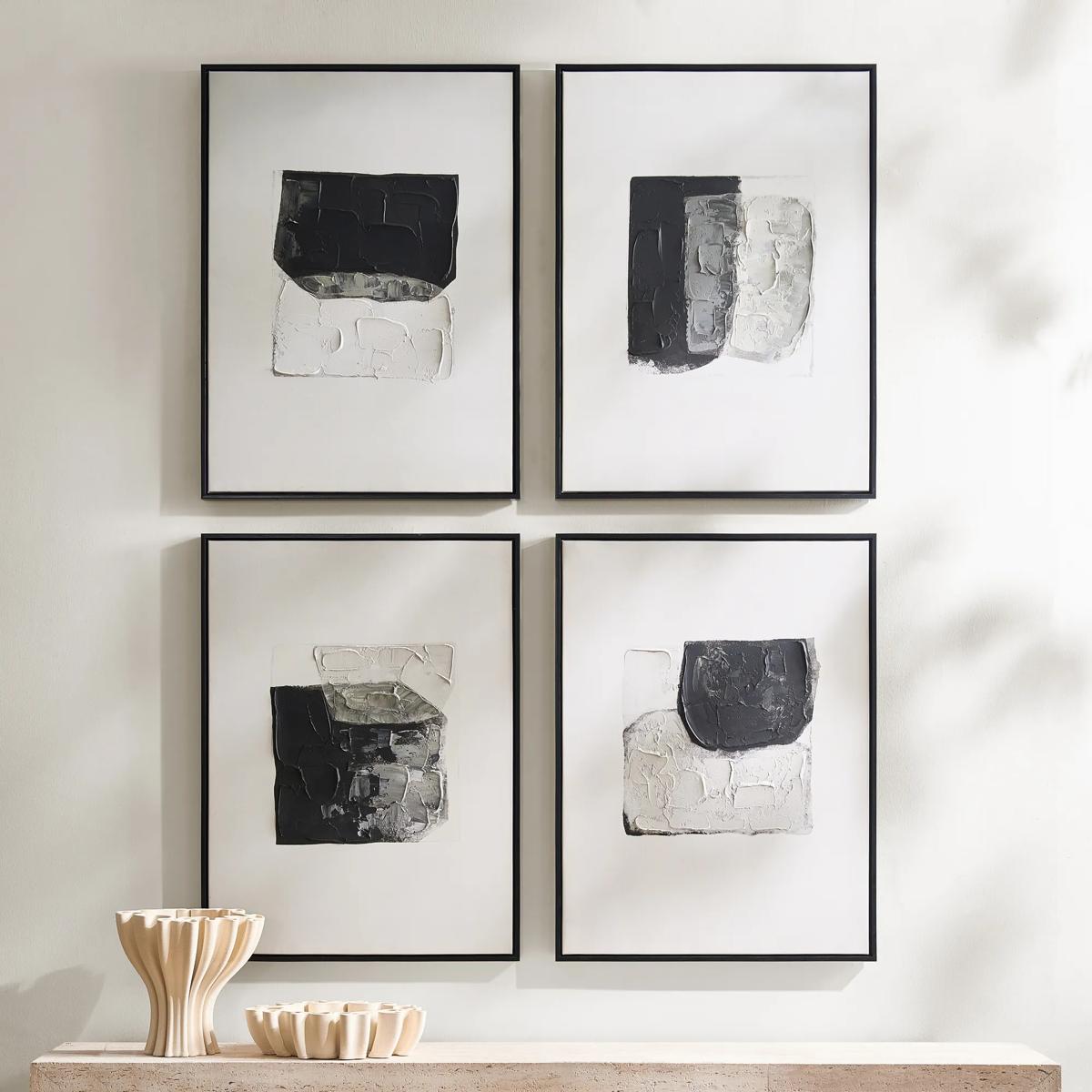 Shadows Framed Painted Wall Art Set of 4$299
A set of four hand-painted abstract canvases featuring black, white, and gold accents in black frames.
Add To Cart -
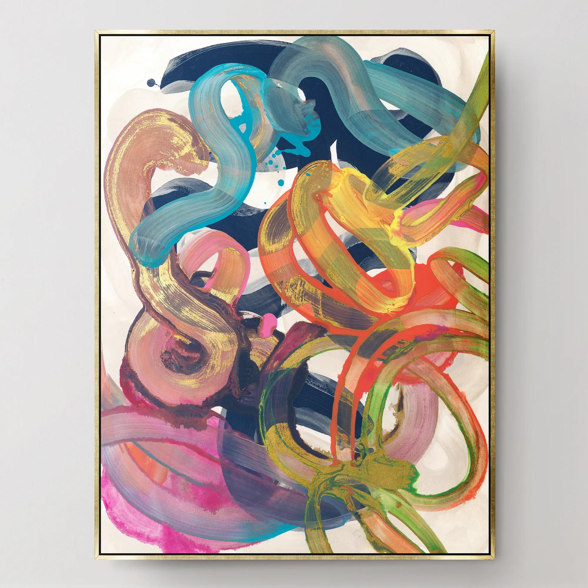
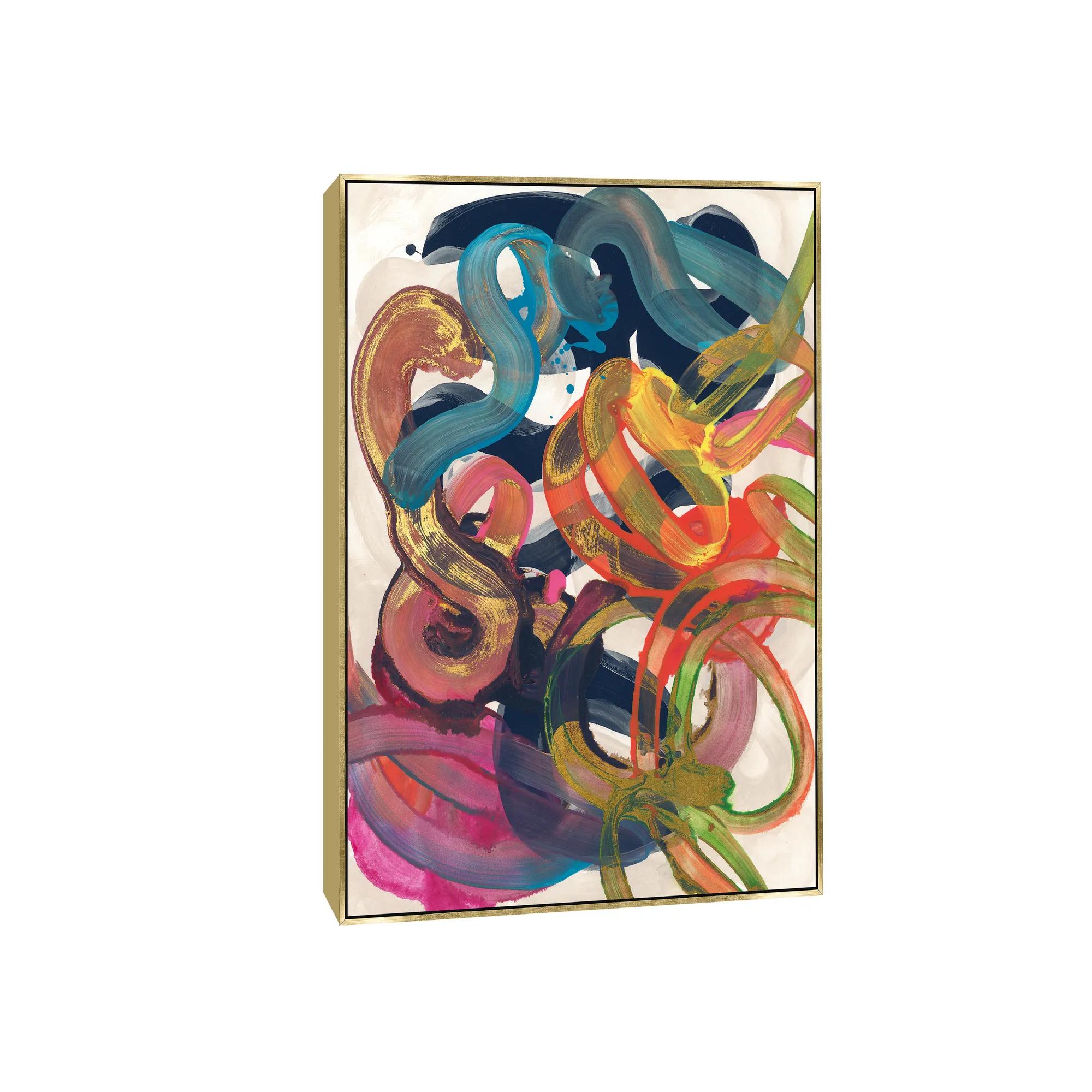 Illogical Conclusions Framed Wall Art 26" x 35"$499
A gallery-wrapped canvas artwork with a hand-applied gel finish, set in a gold float frame.
Add To Cart -
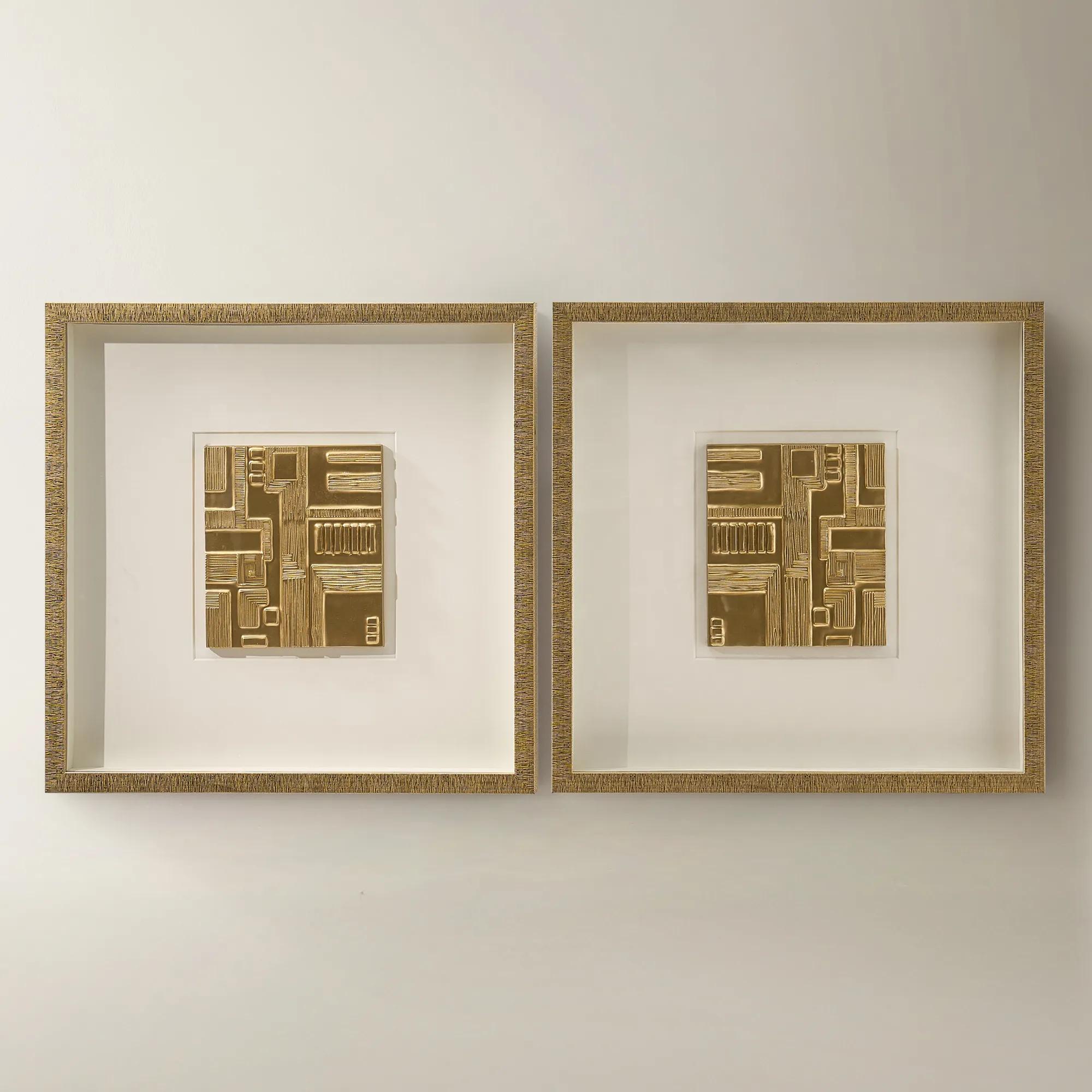
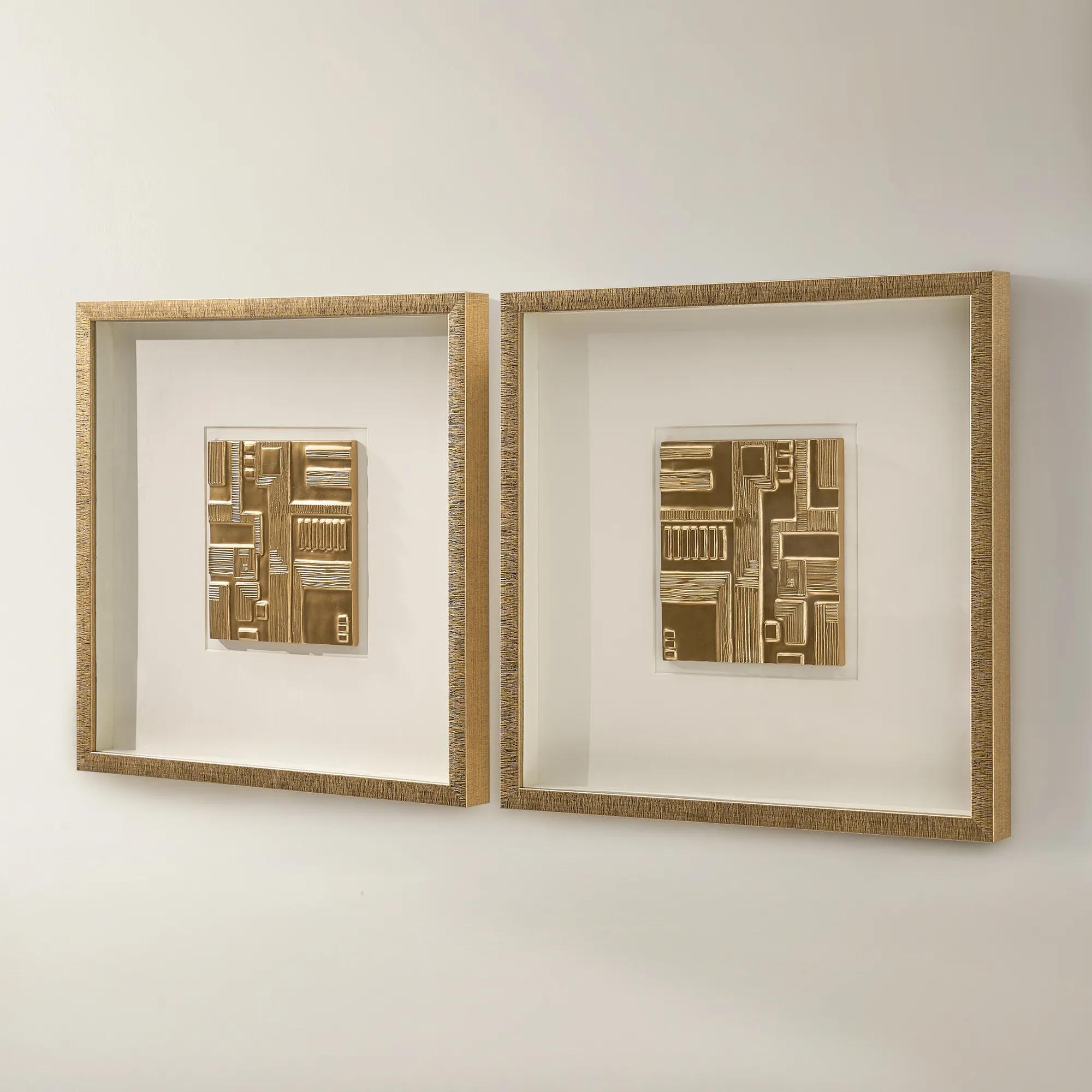 Ritual Framed Woodcarving Wall Decor Set of 2$329
A set of two gold-framed woodcarvings with ivory mats and dimensional relief for gallery-style wall decor.
Add To Cart -
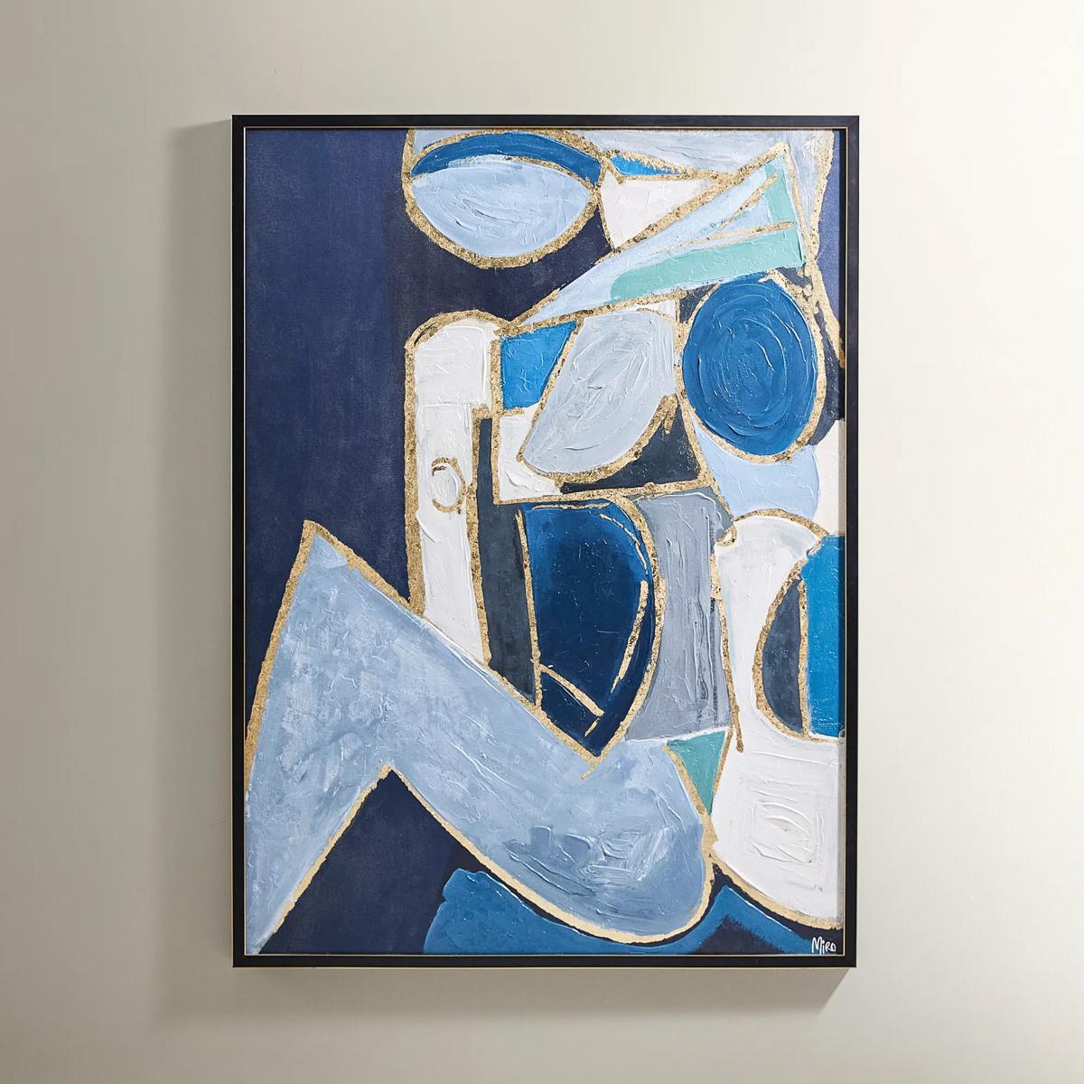
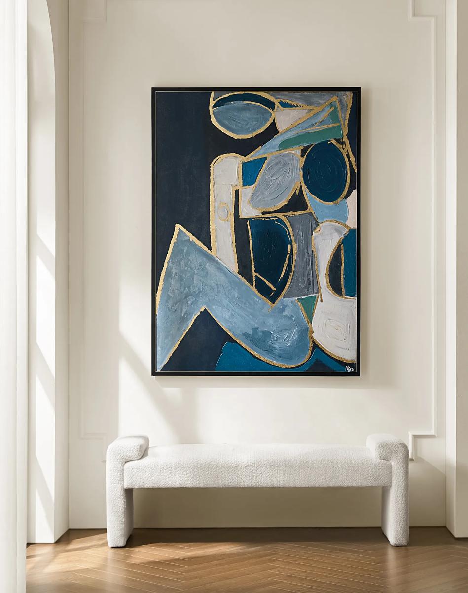 Figure in Cubism Painting$599
A hand-embellished canvas artwork featuring blue, gold, and white hues with elegant silver foil accents.
Add To Cart -
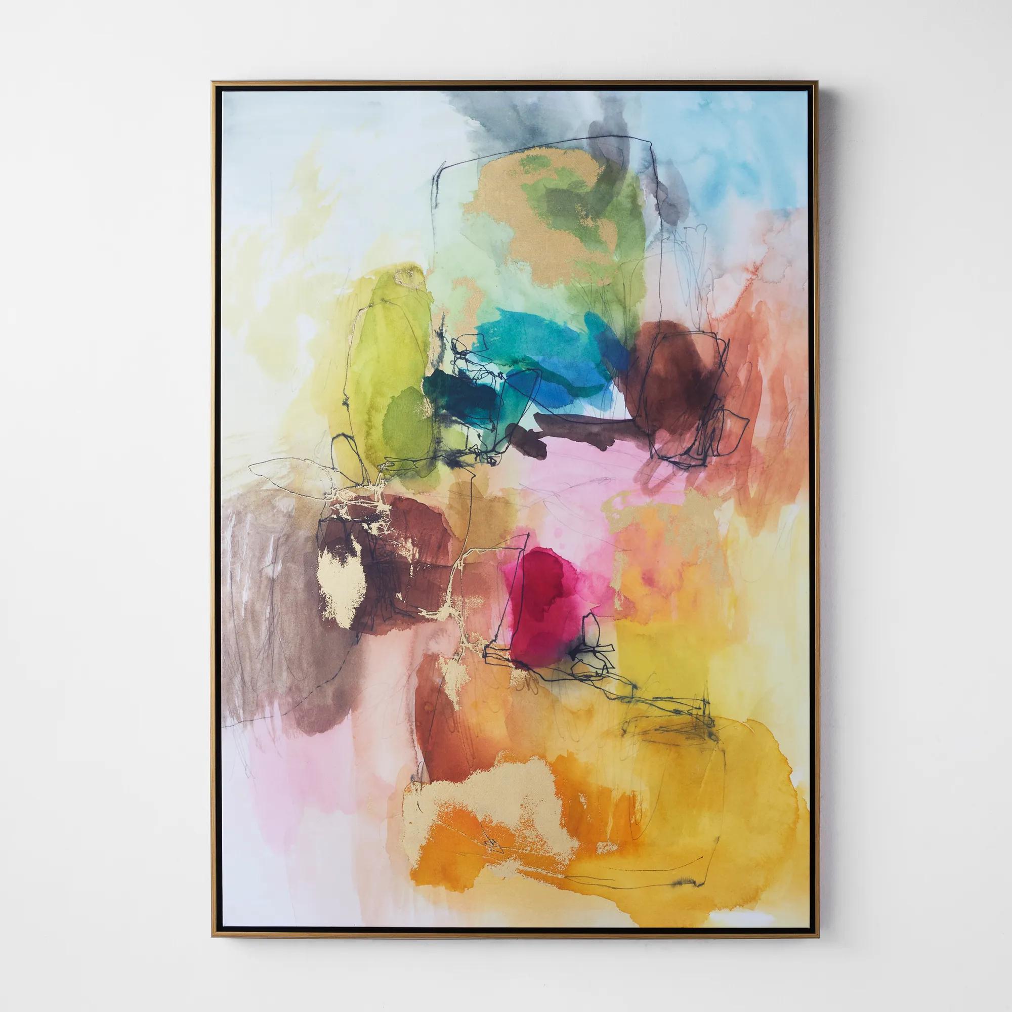 Apricity 3 Framed Wall Art 41" x 58"$899
A vibrant giclee on canvas featuring hand-applied gold gilding and a gold floater frame.
Add To Cart -
 Etched in Silver$229
An abstract hand-carved aluminum wall art featuring shimmering silver tones in a modern black alloy frame.
Add To Cart -
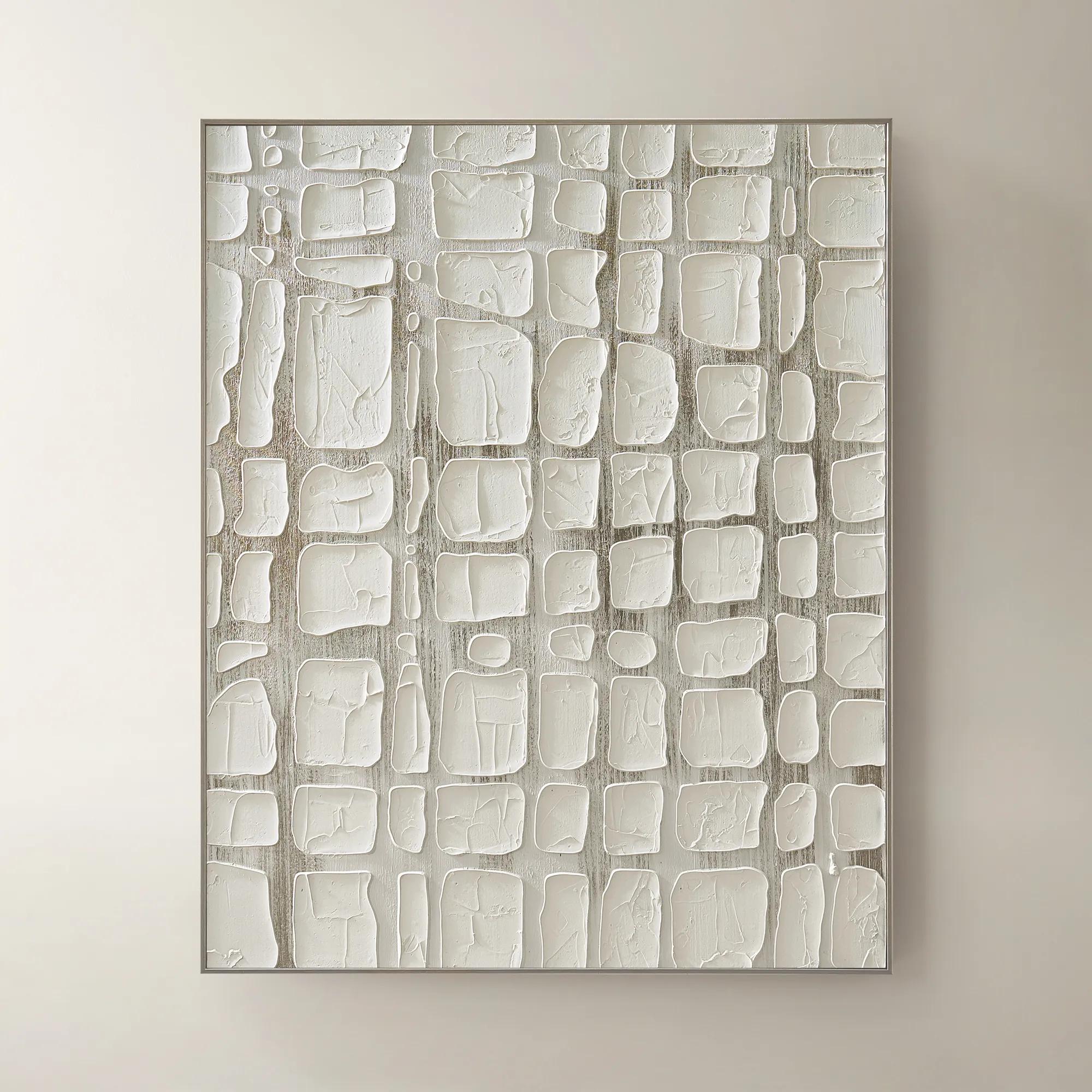
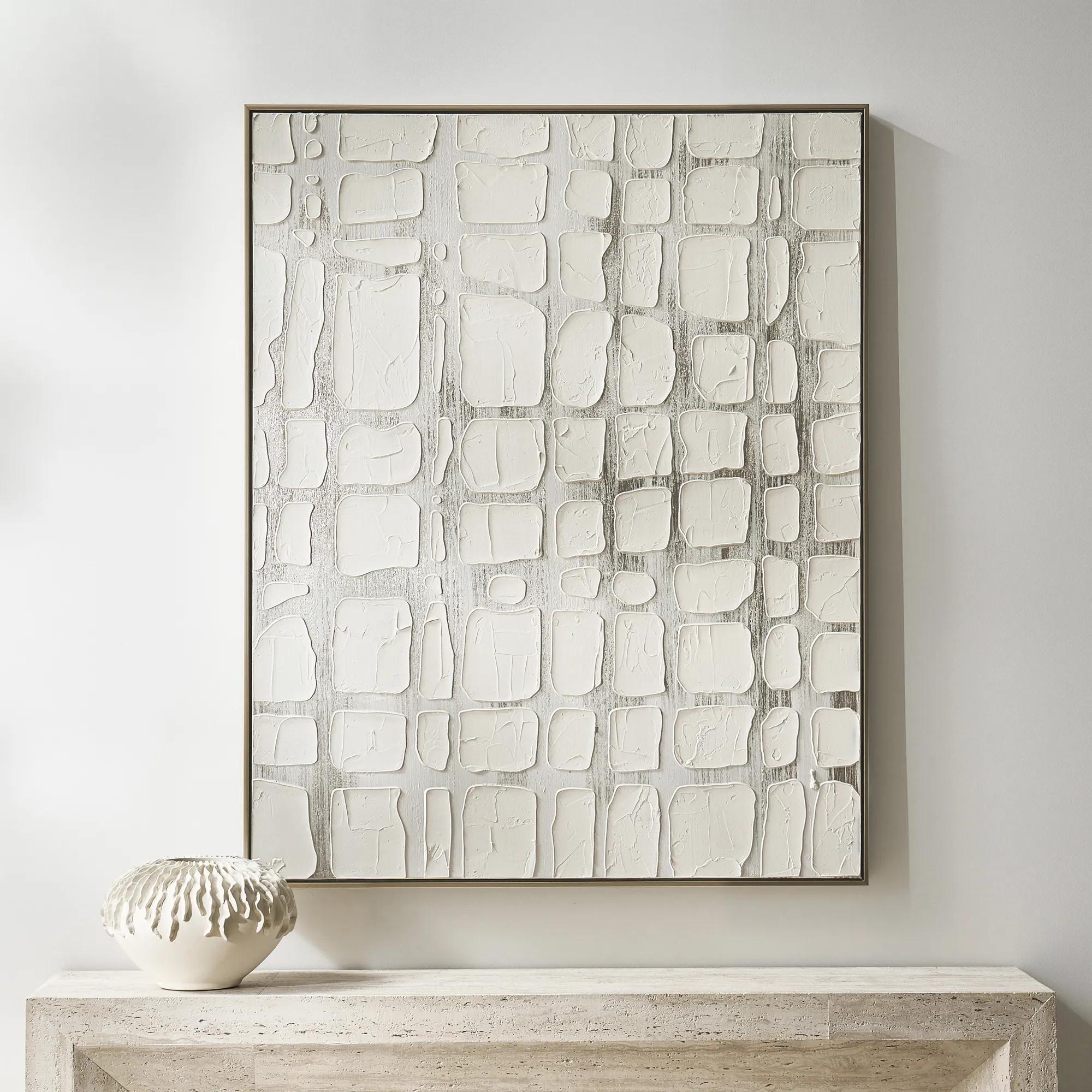 Vanish Framed Painted Wall Art 40" x 50"$499
A hand-painted canvas with raised white forms over champagne metallic ground in a refined floater frame.
Add To Cart -
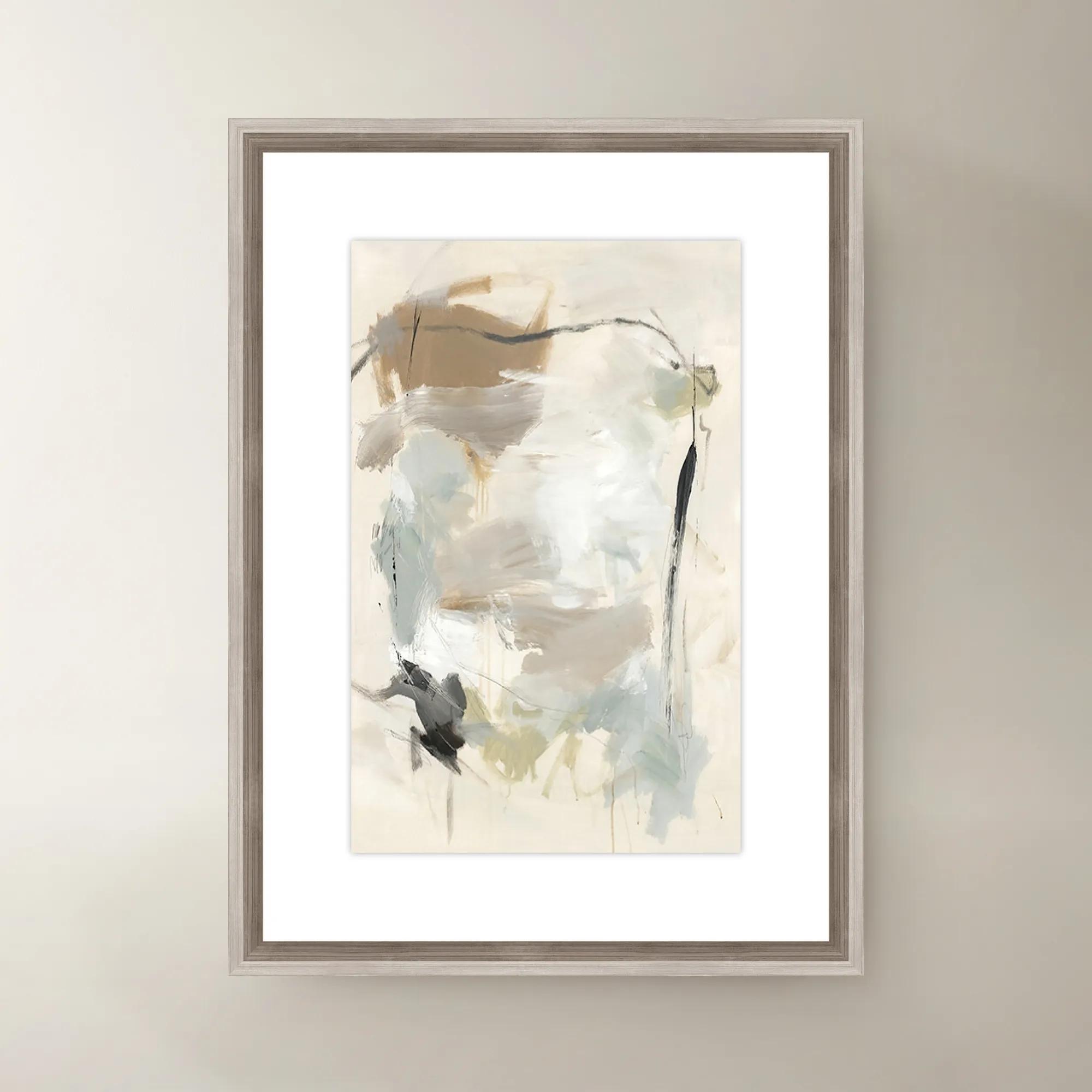
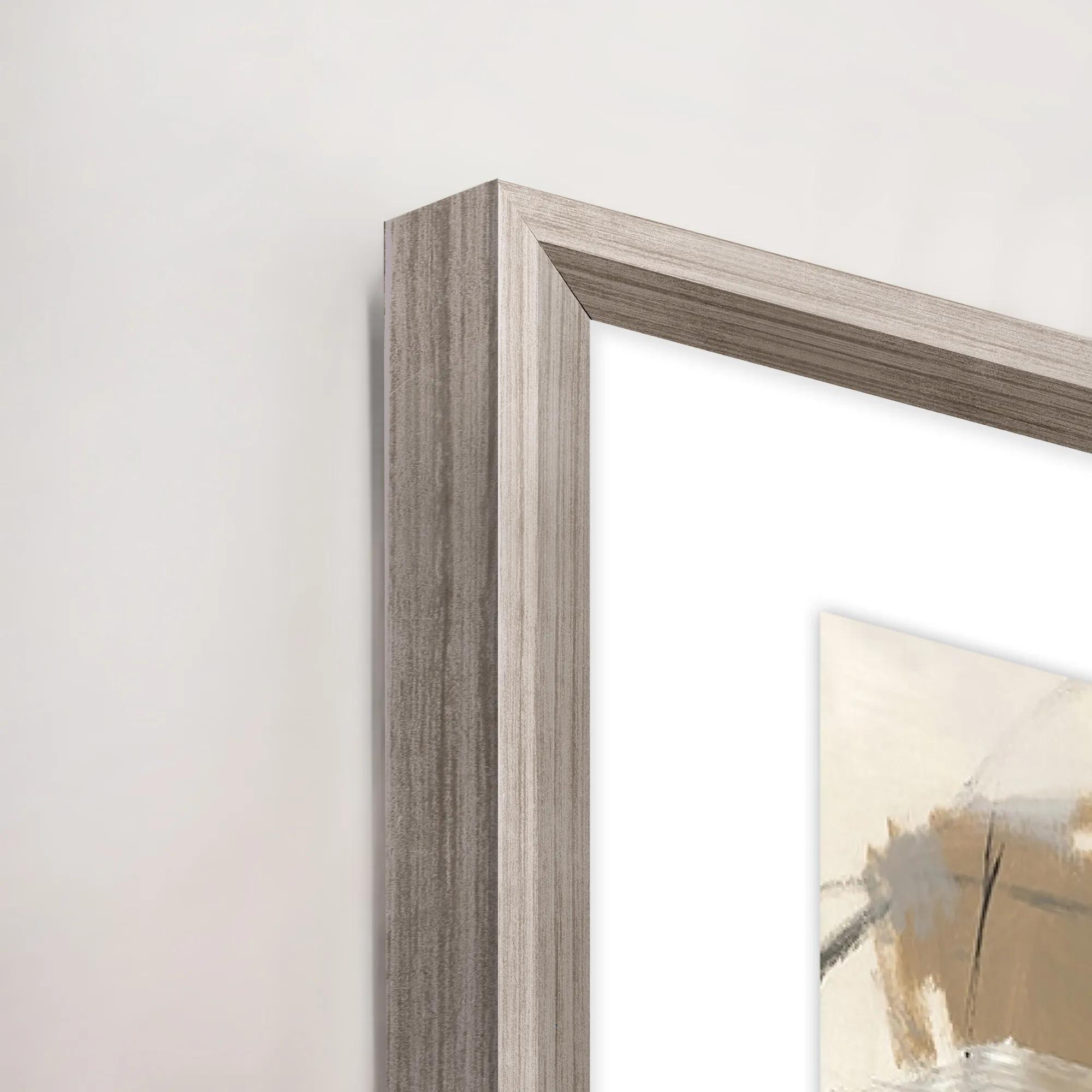 French Bakery I Framed Wall Art 20" x 30"$419
A multi-colored canvas wall artwork in a framed presentation, inspired by a charming French bakery.
Add To Cart -
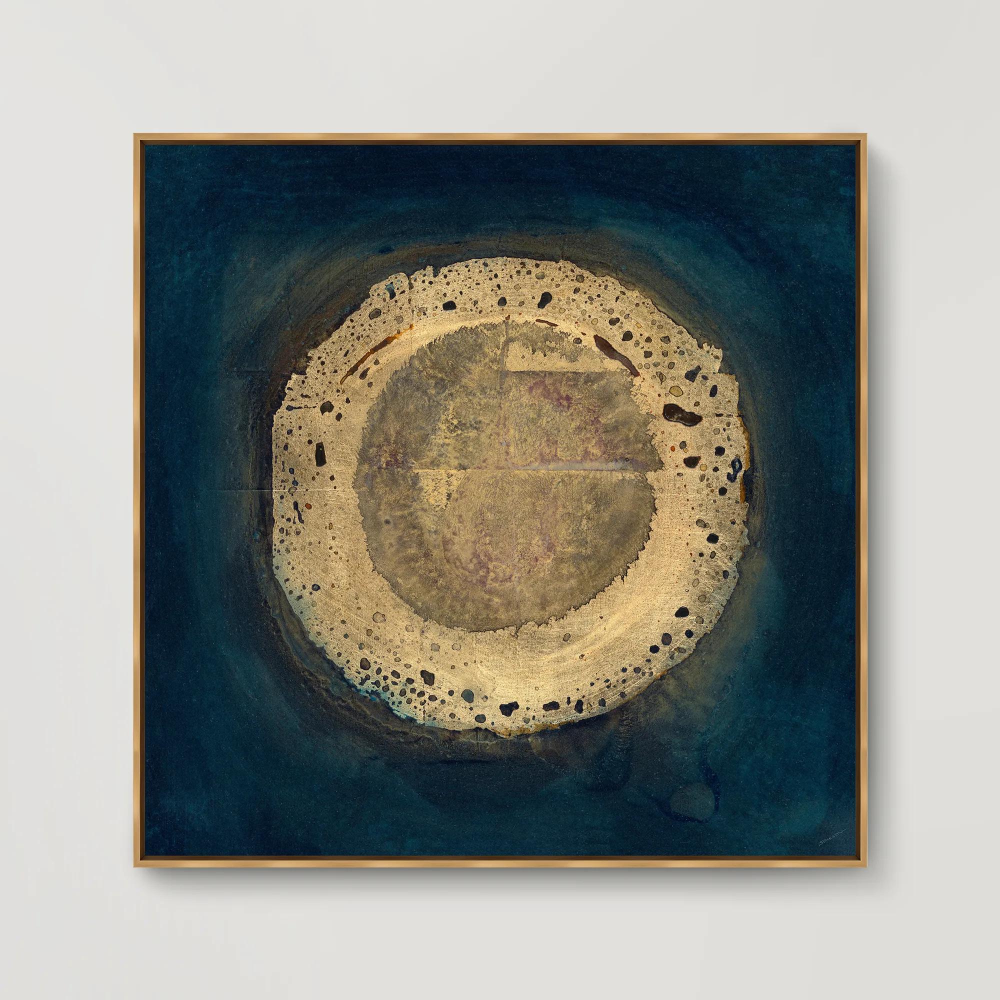
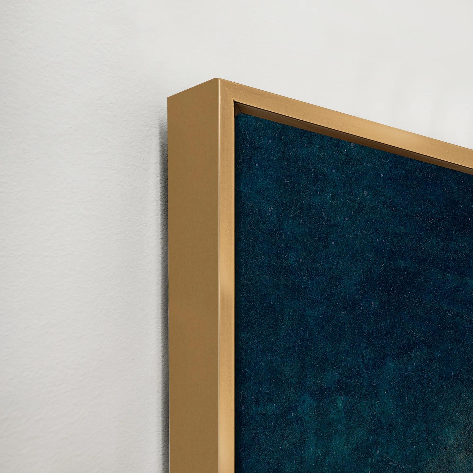 Bramble I Framed Wall Art 41.5" x 41.5"$749
A gallery-wrapped abstract canvas with hand-applied gel finish, set in an elegant gold floater frame.
Add To Cart -
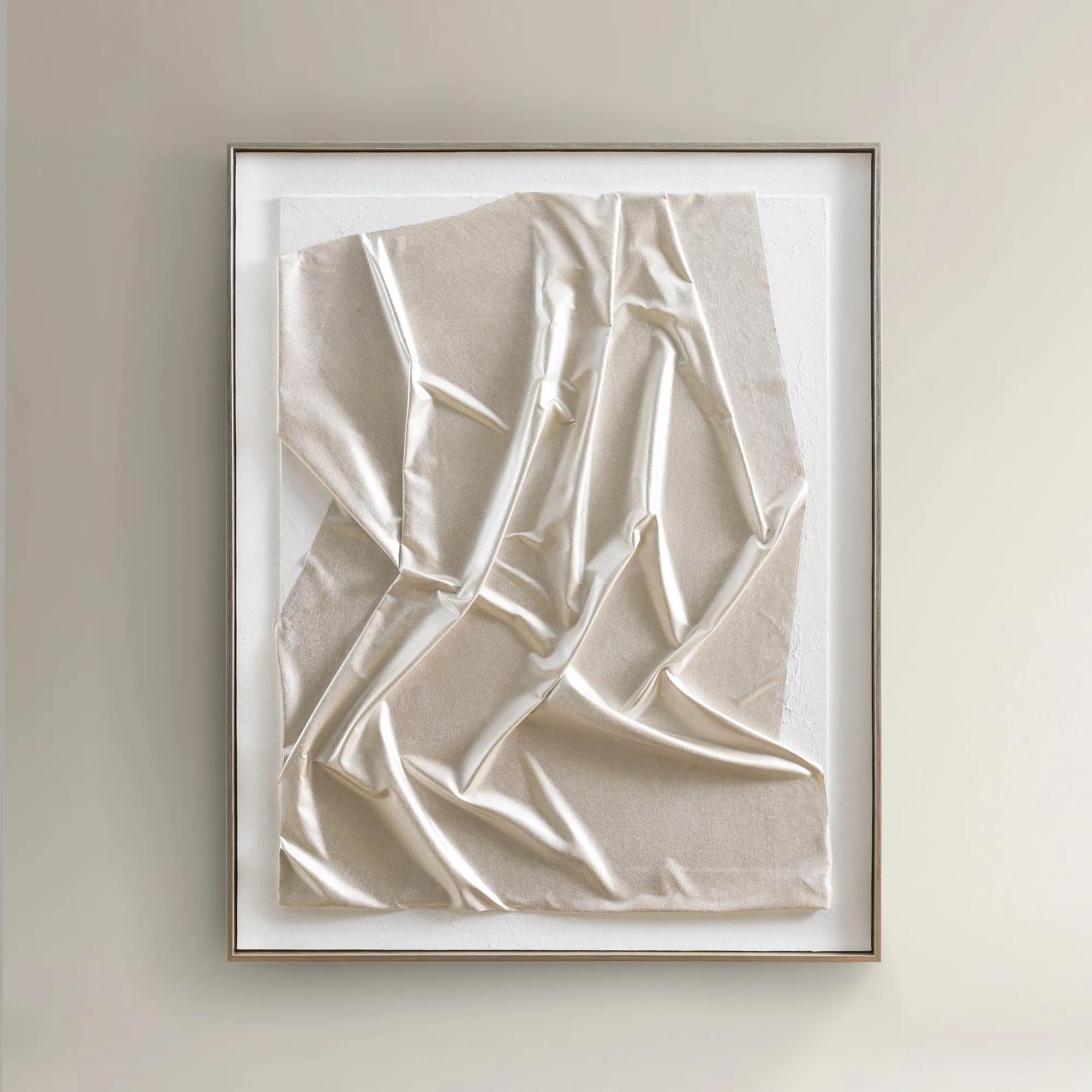
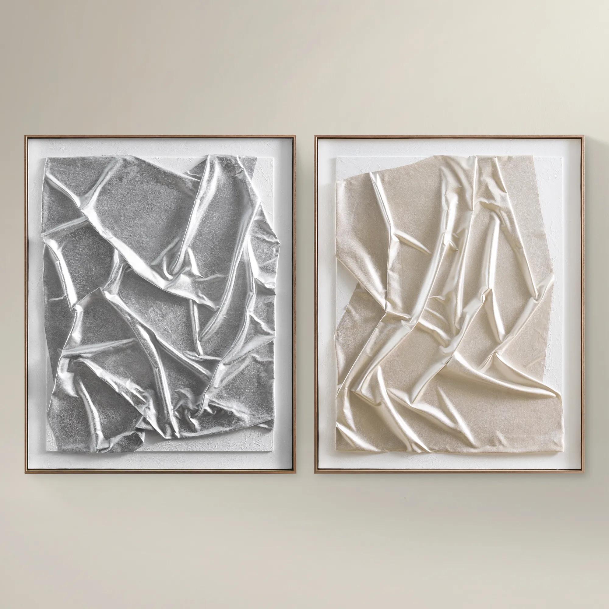 In the Mood Framed Painted Wall Art 31.5" x 39.5"$199
A hand-painted gold canvas artwork featuring textured surfaces and fluid forms in a champagne floater frame.
Add To Cart -
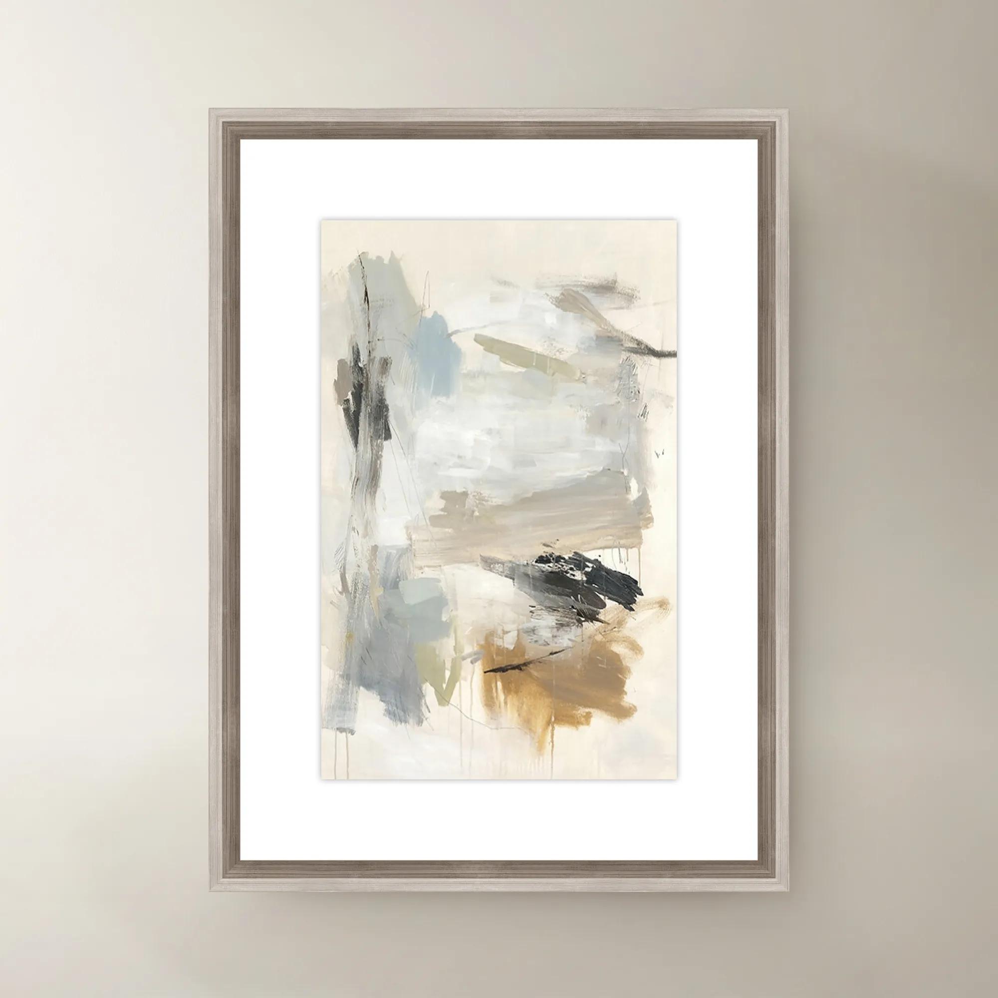
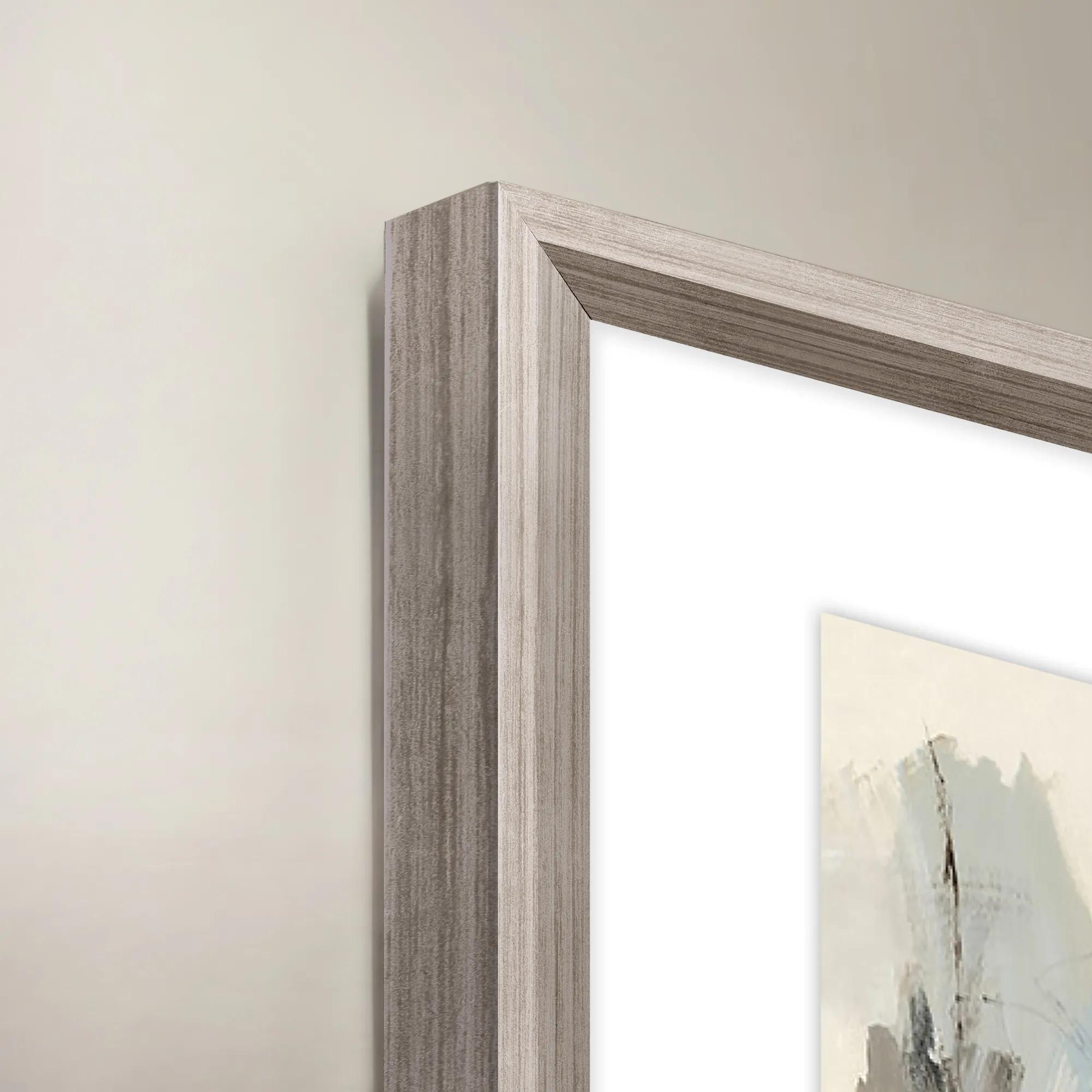 French Bakery II Framed Wall Art 20" x 30"$419
A colorful canvas wall art piece featuring a charming French bakery scene in a decorative frame.
Add To Cart -

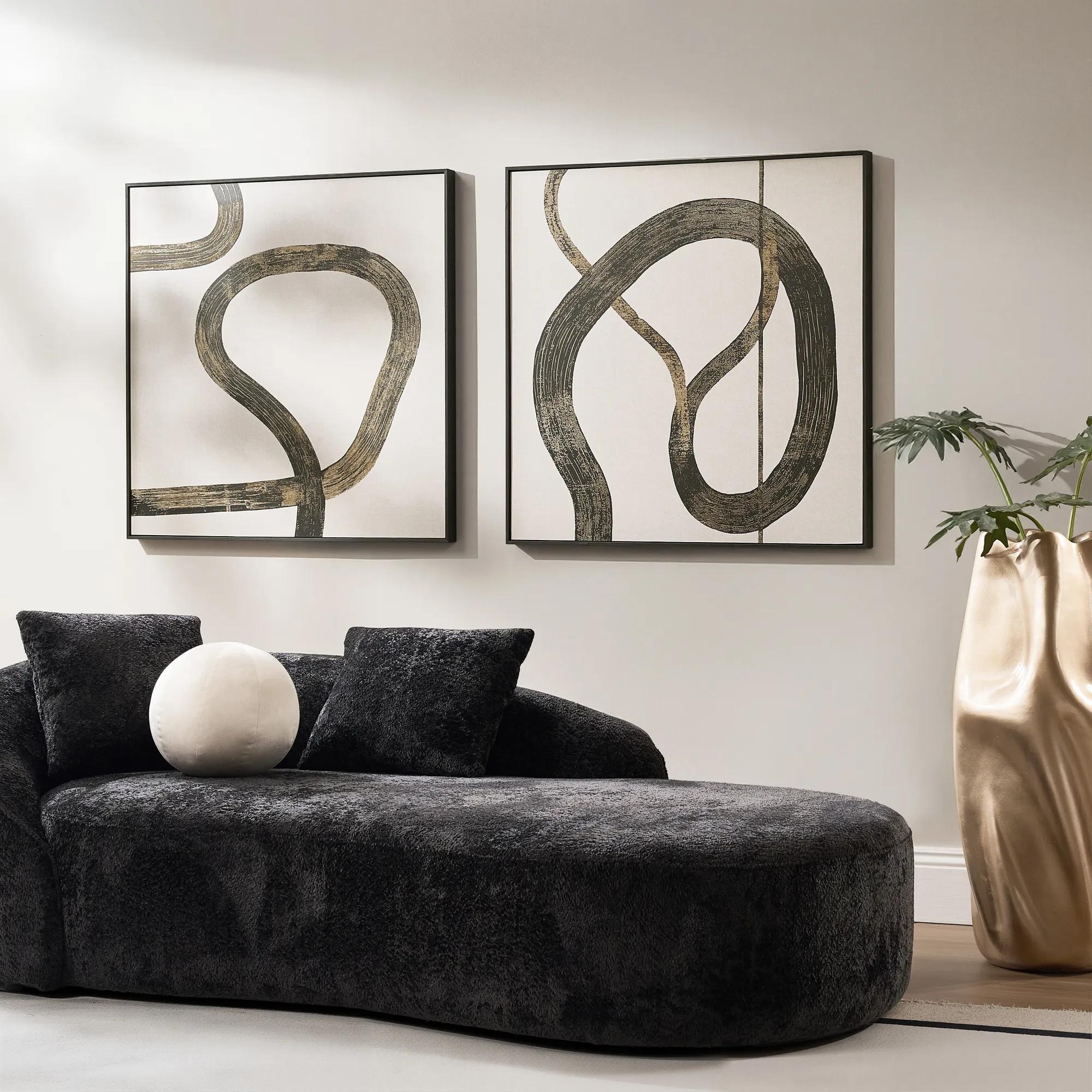 Live Wire Framed Gold Foil Painted Wall Art II 39" x 39"$349
A framed wall artwork featuring gold foil-painted detailing for glamorous modern display.
Add To Cart -
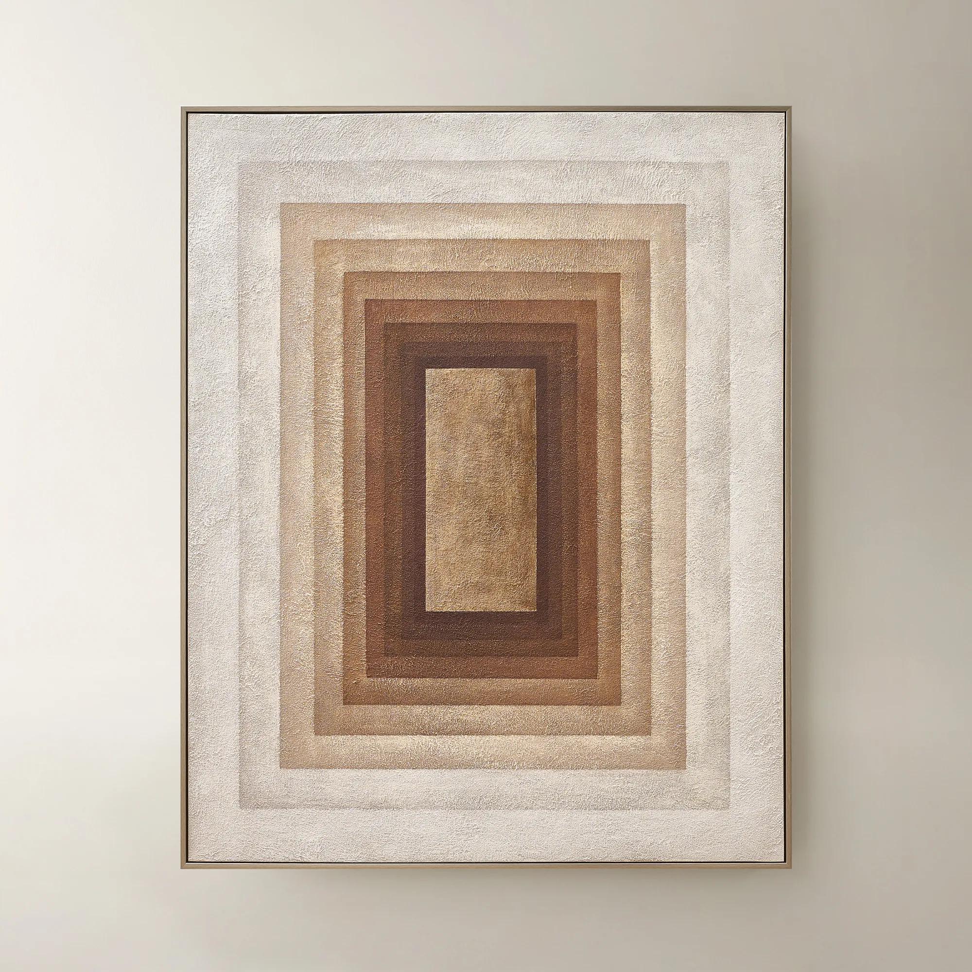 Monochrome Drift Framed Painted Wall Art 60" x 48"$699
A hand-painted abstract canvas with champagne leafing, featuring cocoa and gold tones in modern geometric design.
Add To Cart -
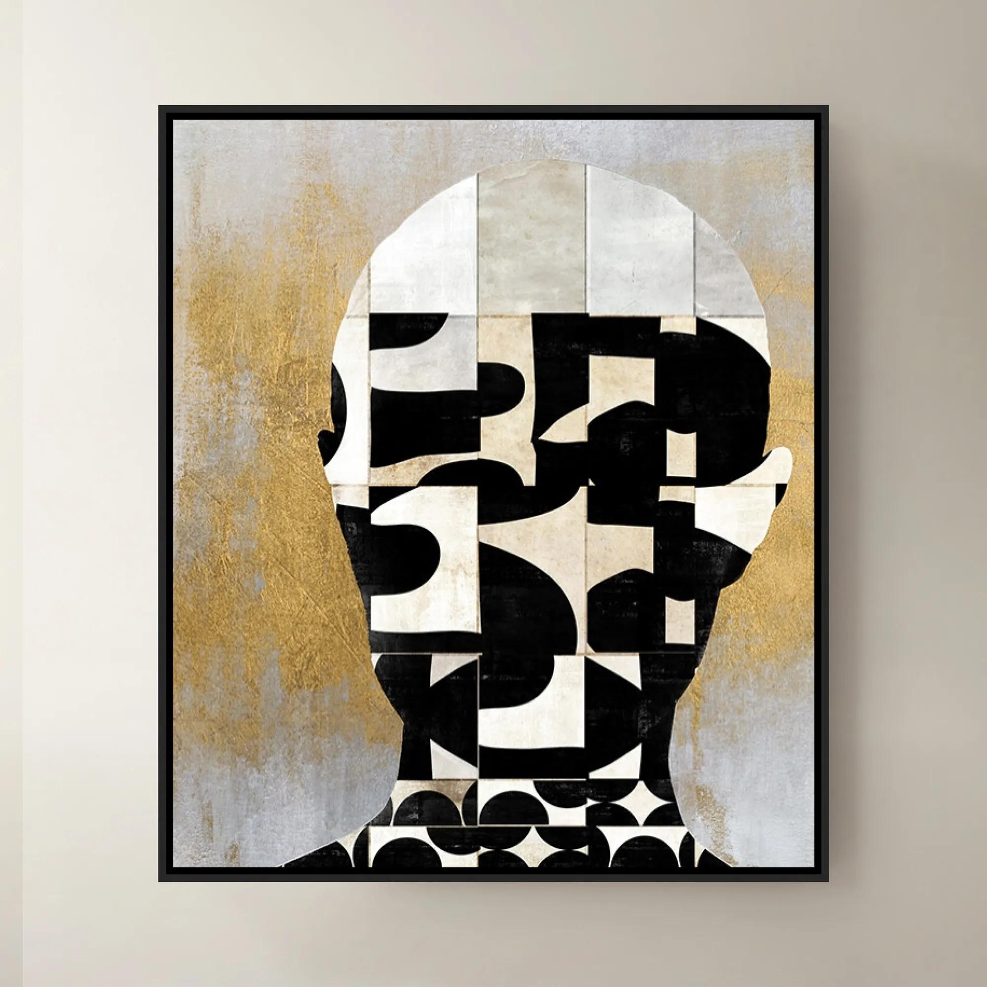
 Lets Face It II Framed Wall Art 30" x 35"$699
A striking contemporary art piece showcasing bold design and creative flair by a renowned interior designer.
Add To Cart -
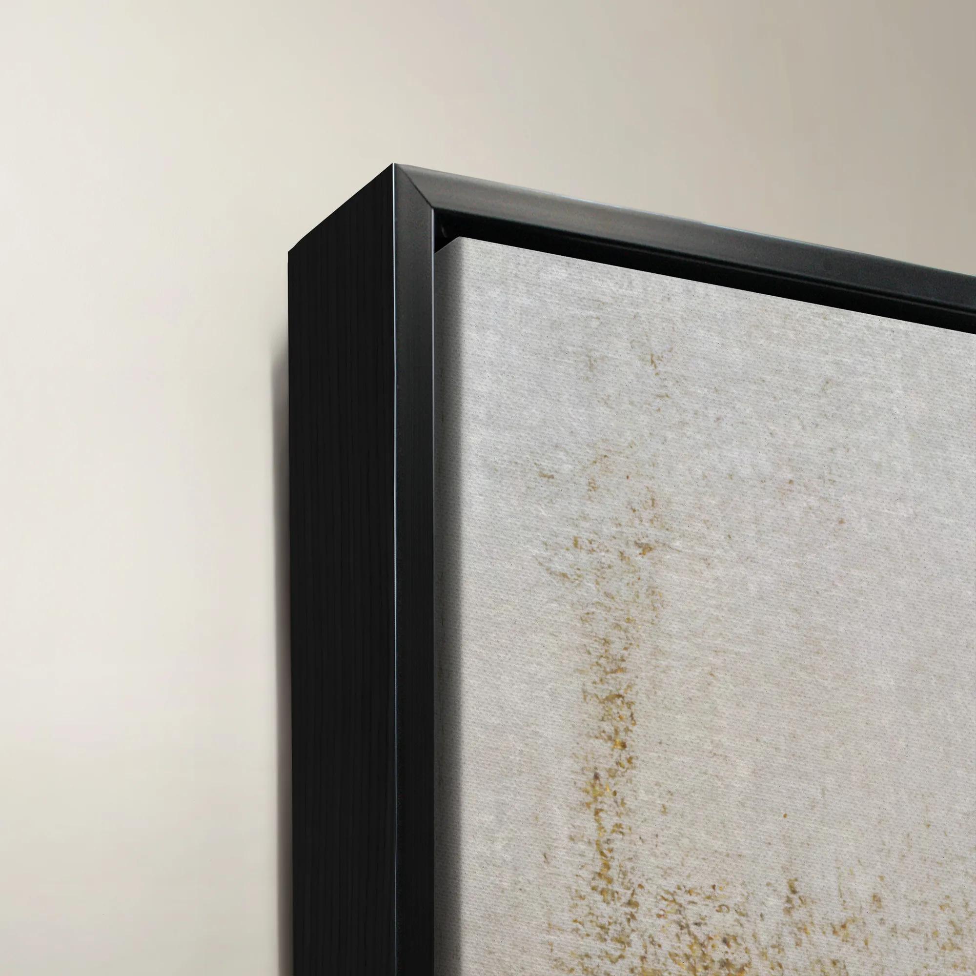
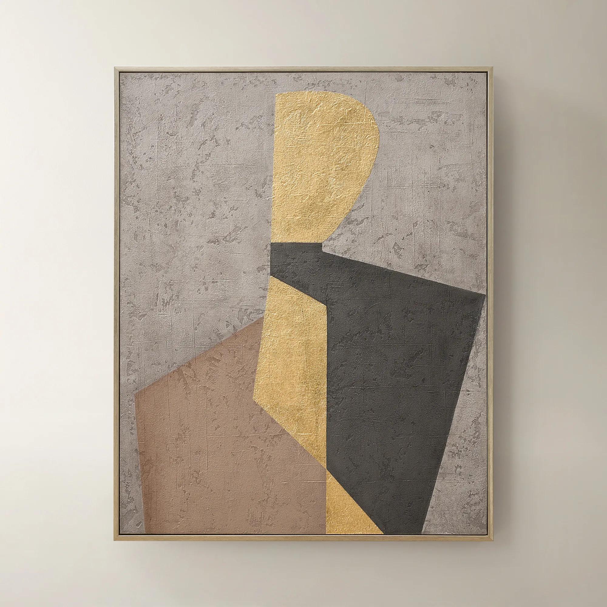 Aura of Gold Framed Painted Wall Art 40" x 50"$399
A hand-painted canvas with champagne leafing and a brushed champagne frame in mocha, grey, black, and gold.
Add To Cart -

 Twin Abstract 1 Framed Wall Art 30" x 45"$699
A captivating abstract canvas artwork featuring layered blue and purple tones in a sophisticated framed presentation.
Add To Cart -

 Sand Storm Framed Gold Foil Wall Art 32" x 47"$329
A refined abstract artwork with gold foil accents, sand and charcoal tones, framed in solid wood.
Add To Cart -
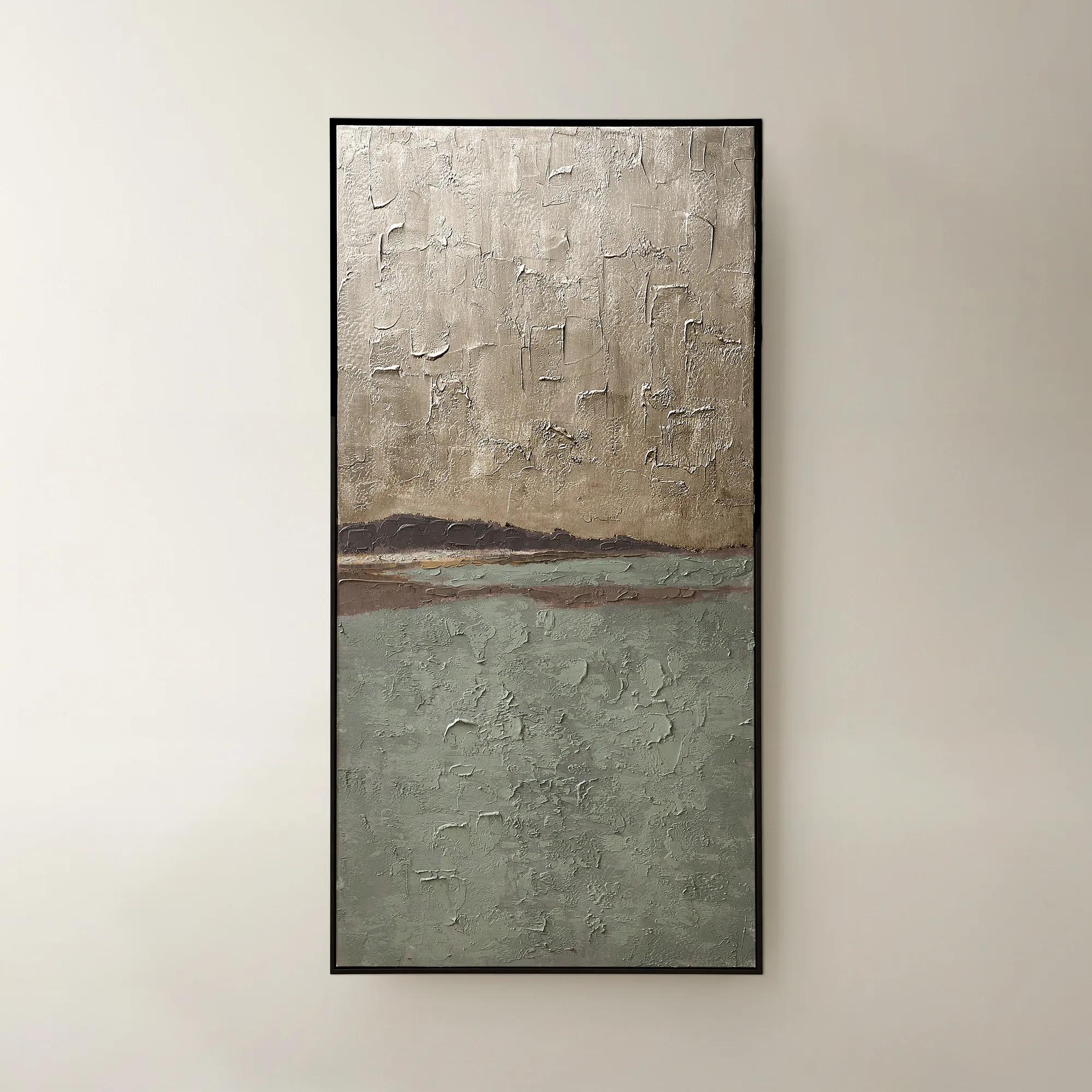
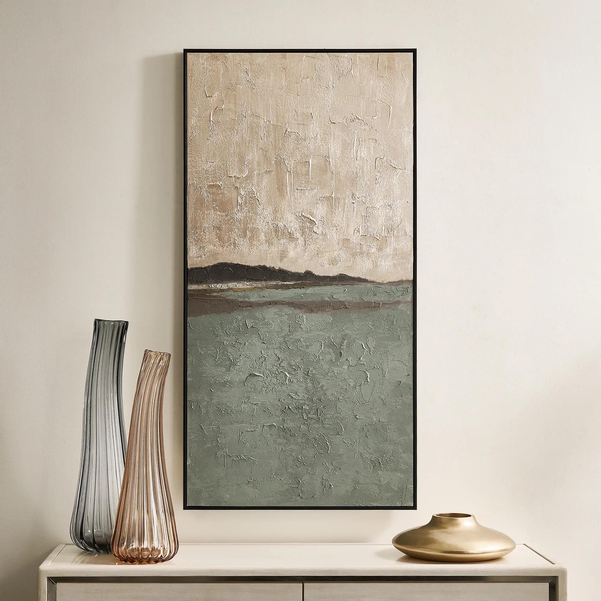 Fields of Gold Framed Painted Wall Art 60" x 30"$399
A hand-painted sage and champagne abstract canvas with a black frame, offering versatile vertical or horizontal display.
Add To Cart

Gold And White Framed Art Prints
Gold and white framed art prints are the ultimate expression of refined glamour—where luminous metallics meet crisp, radiant whites to create a visual symphony of sophistication. Each piece transforms your walls into a curated gallery, infusing every corner with an effortless sense of luxury and light. Whether you’re seeking to elevate a grand foyer or add a touch of brilliance to an intimate alcove, these artful compositions invite admiration and spark conversation. Let your home become a canvas for bold artistry, where every gold and white framed art print radiates opulence and sets the stage for inspired living.
Gold and white framed art prints combine the warmth of gold with the brightness of white, creating wall decor that feels luminous, polished, and expressive. The palette can appear in the artwork itself, in a gold-toned frame surrounding a white field, or through a layered composition of metallic accents, pale imagery, and generous matting. Its appeal lies in the contrast: white gives the eye room to rest, while gold introduces richness and a sense of occasion. Sweeping abstracts bring movement to a tailored living room; delicate botanical forms soften angular furniture; architectural studies and geometric compositions lend structure to an entryway or office. The result depends as much on the treatment of the image as on its colors. A few fine gold lines against an open white background feel distinctly different from a dense composition of gilded shapes, even when both share the same palette. Soft ivory and champagne tones create a mellow, enveloping effect, while bright white and more saturated gold deliver sharper definition. These variations make framed prints appealing to both confident maximalists and those who prefer a carefully edited room with one arresting focal point. Against a dark wall, the white portions of a print appear especially radiant; against a pale wall, the frame becomes an elegant outline that gives the artwork presence. Gold also connects naturally with brass lighting, warm wood, and reflective accessories without requiring every finish in the room to match. A brushed frame can temper the sheen of a nearby mirror, while a more lustrous border brings distinction to upholstered furniture and matte surfaces. For spaces filled with tactile materials such as velvet, linen, or bouclé, the smooth face of a framed print introduces a welcome change in texture. This balance of light, warmth, and definition gives gold and white wall art a broad decorative vocabulary, from the intimate atmosphere of a bedroom to the more theatrical setting of a formal sitting room.
Scale and placement determine whether that visual richness feels intentional. A substantial framed print above a sofa can anchor the entire seating arrangement, while a closely spaced pair introduces rhythm above a console or sideboard. As a starting point, an artwork or grouping spanning roughly two-thirds to three-quarters of the furniture beneath it often feels balanced, although surrounding architecture and ceiling height may call for a different proportion. Measure the full outside dimensions, including the frame, rather than relying on the image size alone. A wide mat and substantial molding can add considerable visual weight, transforming a relatively small image into a more commanding wall feature. In a narrow entry, a vertical composition draws attention upward without spreading beyond the furniture below it; along a generous dining room wall, a horizontal piece or coordinated grouping can echo the length of the table. Gold and white prints also hold their own within a broader arrangement of Elegant Gold Framed Wall Arts, where repeating a metallic tone creates continuity across different subjects. Matching every frame is not essential. Consistent spacing, related undertones, or a recurring white mat can give varied pieces a deliberate relationship. Before hanging, paper templates help reveal whether the arrangement feels crowded, disconnected, or comfortably proportioned. Consider the view from the doorway as well as from a favorite chair: artwork should contribute to the room at a distance and reward a closer look. In spaces intended for conversation, keeping the composition visually connected to nearby seating generally feels more inviting than placing it high above the furniture. Lighting deserves equal attention. A print opposite a window may catch reflections that obscure fine detail, while an adjustable picture light or thoughtfully directed ambient lighting can emphasize the frame and image without overwhelming them. The most compelling placement lets the artwork establish its own presence while remaining part of the room’s larger composition.
Materials influence both the appearance and the long-term care of gold and white framed prints. Paper prints can offer crisp detail and subtle tonal transitions, particularly when a mat creates breathing room around the image. Canvas prints bring a woven surface that lends depth to broad brushwork and layered abstractions, with framing styles that may leave a narrow reveal around the canvas. A printed gold color should not be confused with metallic foil or gold leaf: printed effects suggest the hue of gold, while an actual metallic application can reflect light differently as the viewing angle changes. Product descriptions should identify those treatments rather than leaving the finish to assumption. Frames may be made from wood, metal, or composite materials, and their profiles matter visually as well as structurally. A slender border keeps attention on intricate imagery; a deeper, sculpted molding gives a restrained composition more architectural weight. Glass and acrylic glazing can help shield paper artwork from dust and incidental contact, though neither should be assumed to provide ultraviolet protection unless specified. Acrylic is typically lighter than glass but can scratch more readily, making gentle care important. Dust frames with a soft, dry cloth, and follow the stated cleaning instructions for any glazing or decorative finish. Avoid spraying cleaner directly onto framed artwork, since moisture can travel beneath the frame. Keep prints away from persistent humidity, splashes, and prolonged direct sunlight, and use hanging hardware suited to the piece’s weight and the wall material. Where available, acid-free matting and backing can help reduce discoloration associated with contact materials. These practical considerations preserve the clarity that makes the palette so striking. For a housewarming or wedding gift, a framed print in gold and white can feel personal without requiring an exact match to every furnishing; the strongest choice reflects the recipient’s taste in subject, scale, and ornament. Whether selected for a first home, an established collection, or a room awaiting its defining detail, the pairing brings radiance with purpose: white opens the composition, and gold gives it a memorable edge.
FAQs
Gold and white framed art prints are exceptionally versatile, making them a sophisticated addition to a range of interiors. They shine in glamorous, contemporary, and transitional spaces, but also bring a refined edge to classic, eclectic, and even minimalist rooms. The luminous interplay of gold and white pairs beautifully with velvet, marble, and mirrored surfaces, while also adding a touch of drama to more understated or rustic environments.
To craft a cohesive gallery wall, start by selecting gold and white artwork with complementary themes, textures, or color palettes. Mix abstract prints, line drawings, and photographic pieces in gold frames for visual interest. Arrange your selections at varying heights and distances to create an artful, curated look, and consider anchoring the display with a larger statement piece for added drama.
Absolutely—gold and white paintings make memorable and meaningful gifts for weddings, anniversaries, housewarmings, or milestone celebrations. Their timeless palette and radiant finish offer universal appeal, while the luxurious presentation in a gold frame ensures your gift feels both personal and elevated.
To accentuate gold details, place your framed art gold pieces where they can catch natural or ambient light, such as near windows, under picture lights, or opposite a chandelier. Gold accents come alive with illumination, adding warmth and a touch of glamour to the room. Pairing the artwork with metallic decor or reflective surfaces can further enhance its brilliance.
To preserve the beauty of your gold and white framed art prints, dust the frame and glass regularly with a soft, dry cloth. Avoid harsh chemicals or abrasive materials, as these can damage delicate finishes. Keep the artwork out of direct sunlight to prevent fading, and hang in areas with stable humidity and temperature to ensure longevity.