Bookends For Coffee Table Books
Bookends For Coffee Table Books
-
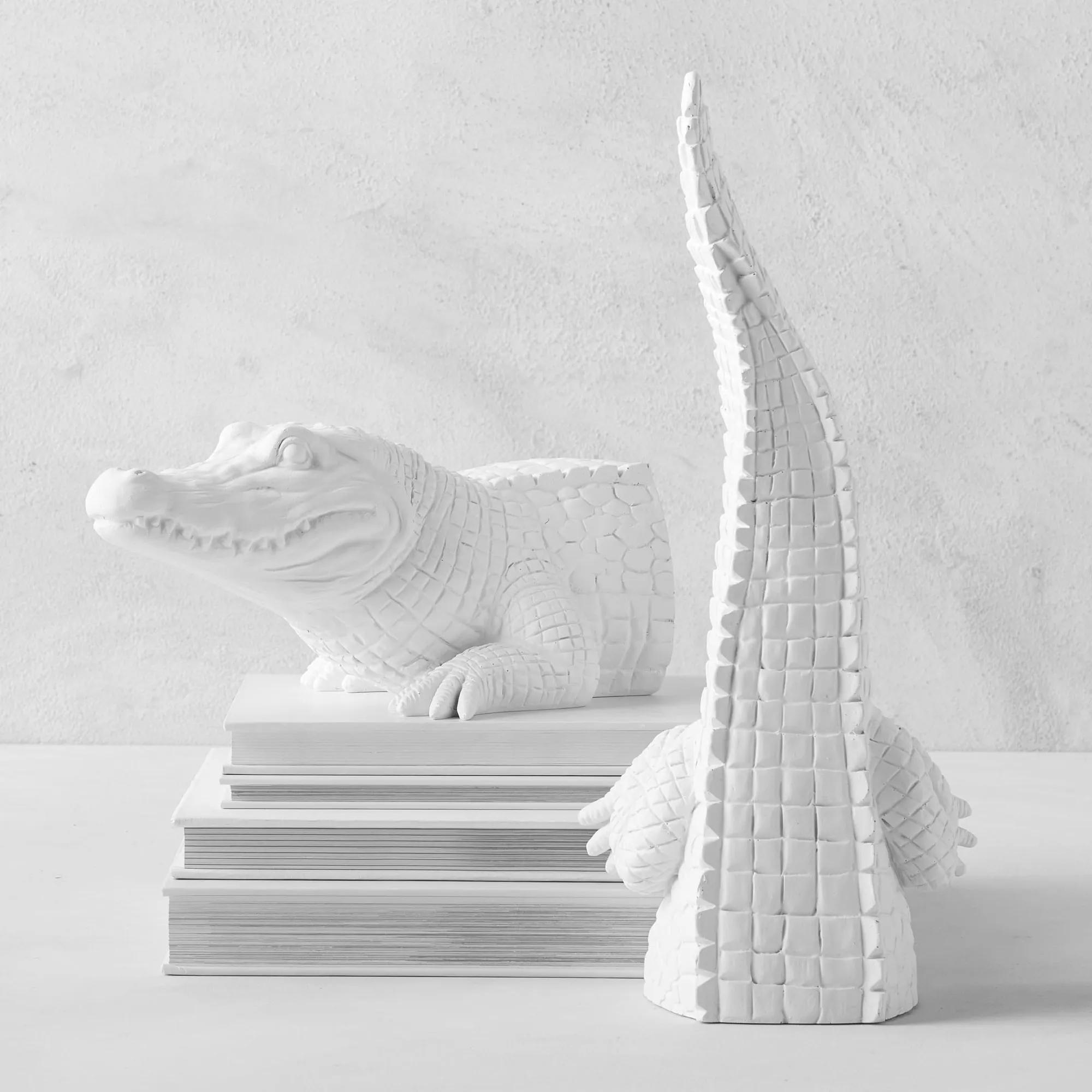
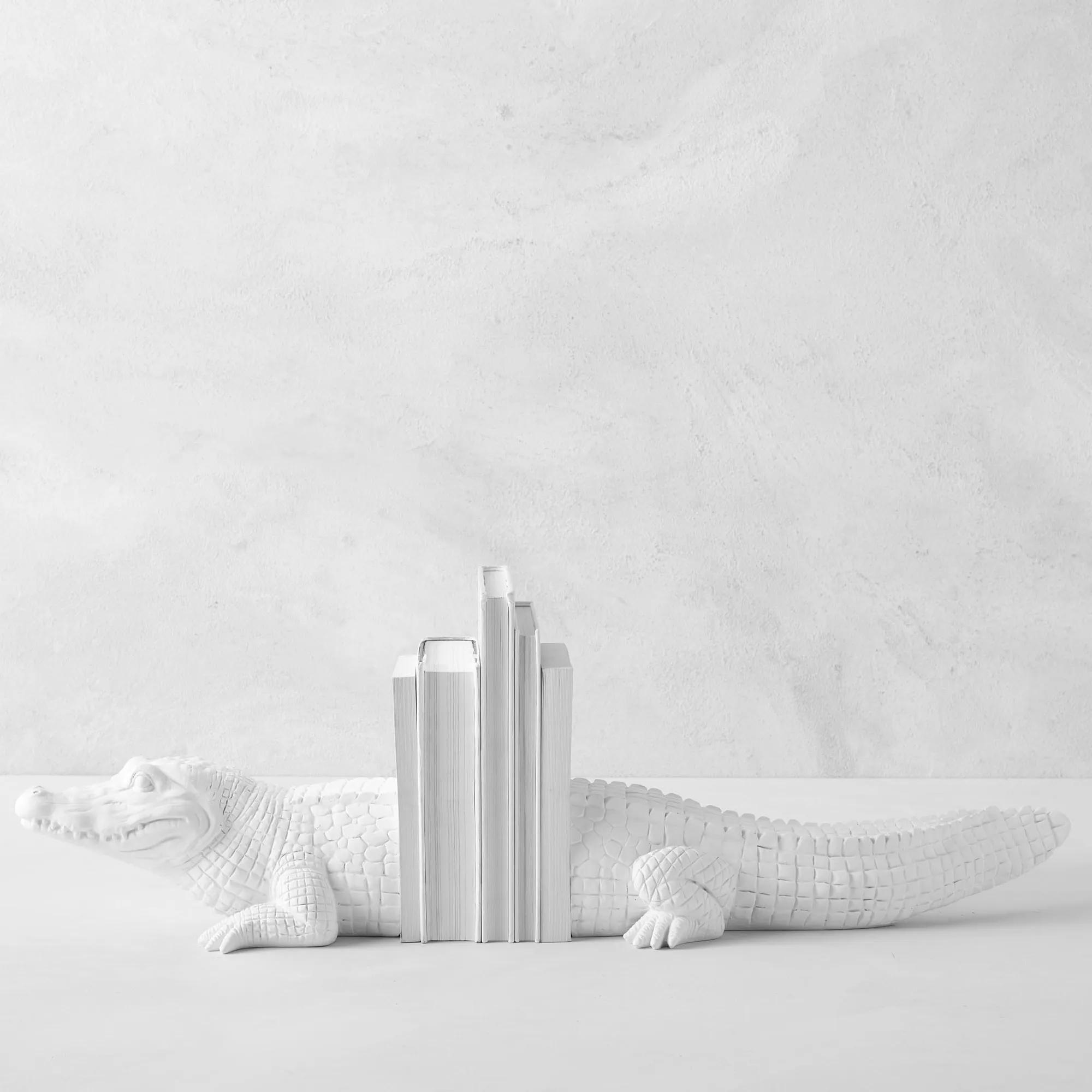 Alligator White Resin Bookends 6.5"$69
A pair of grinning polyresin bookends that add whimsical charm and secure your books in style.
Add To Cart -
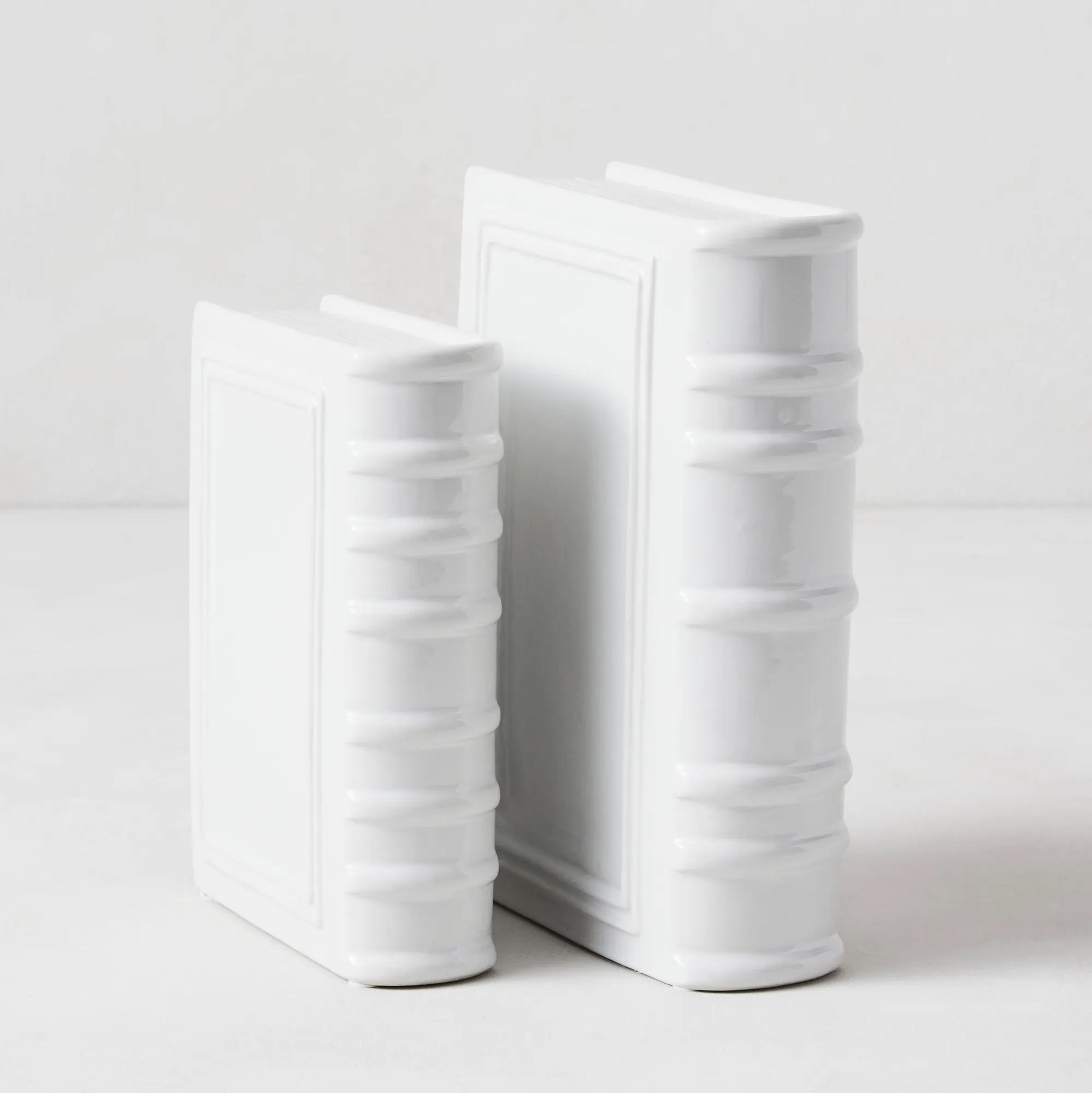
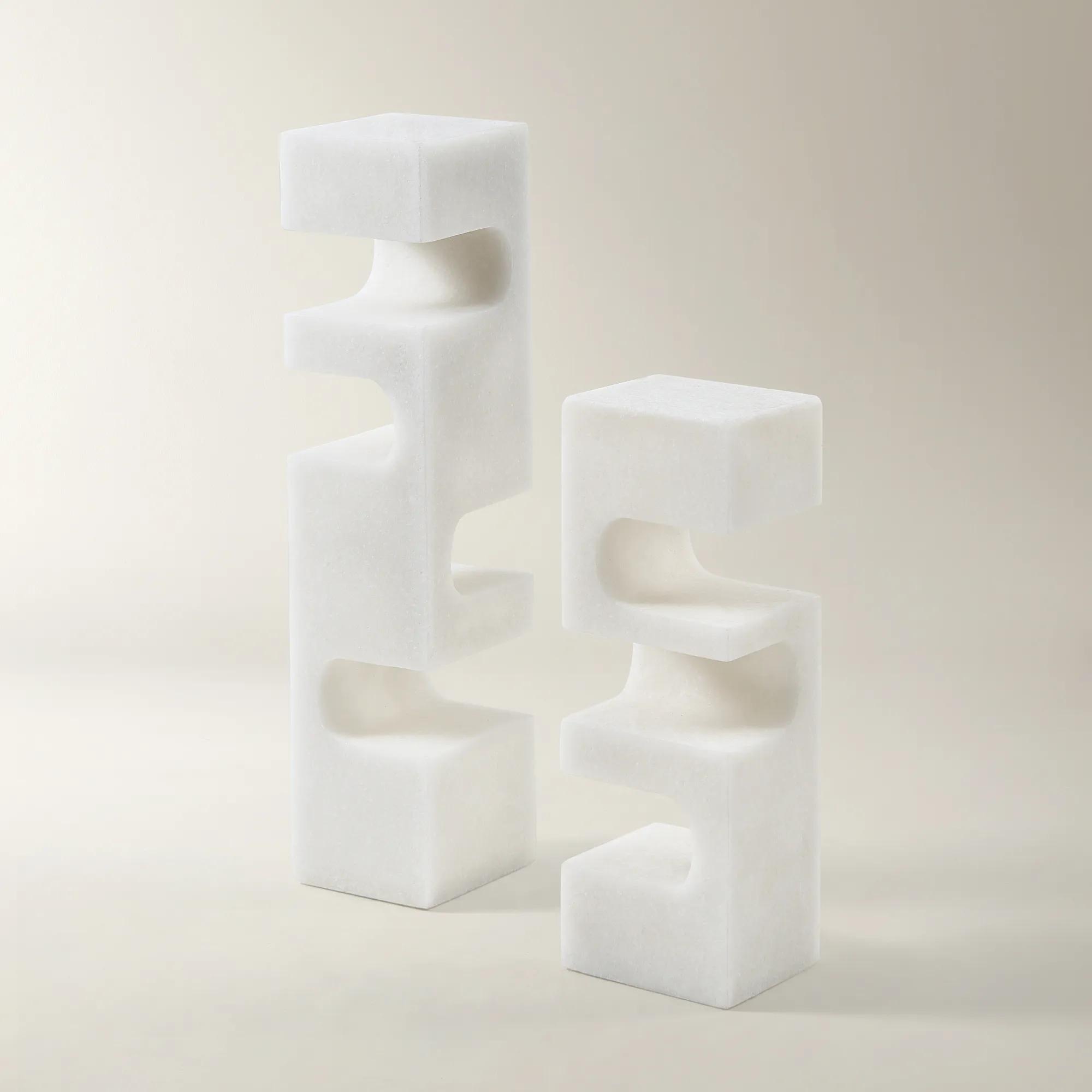
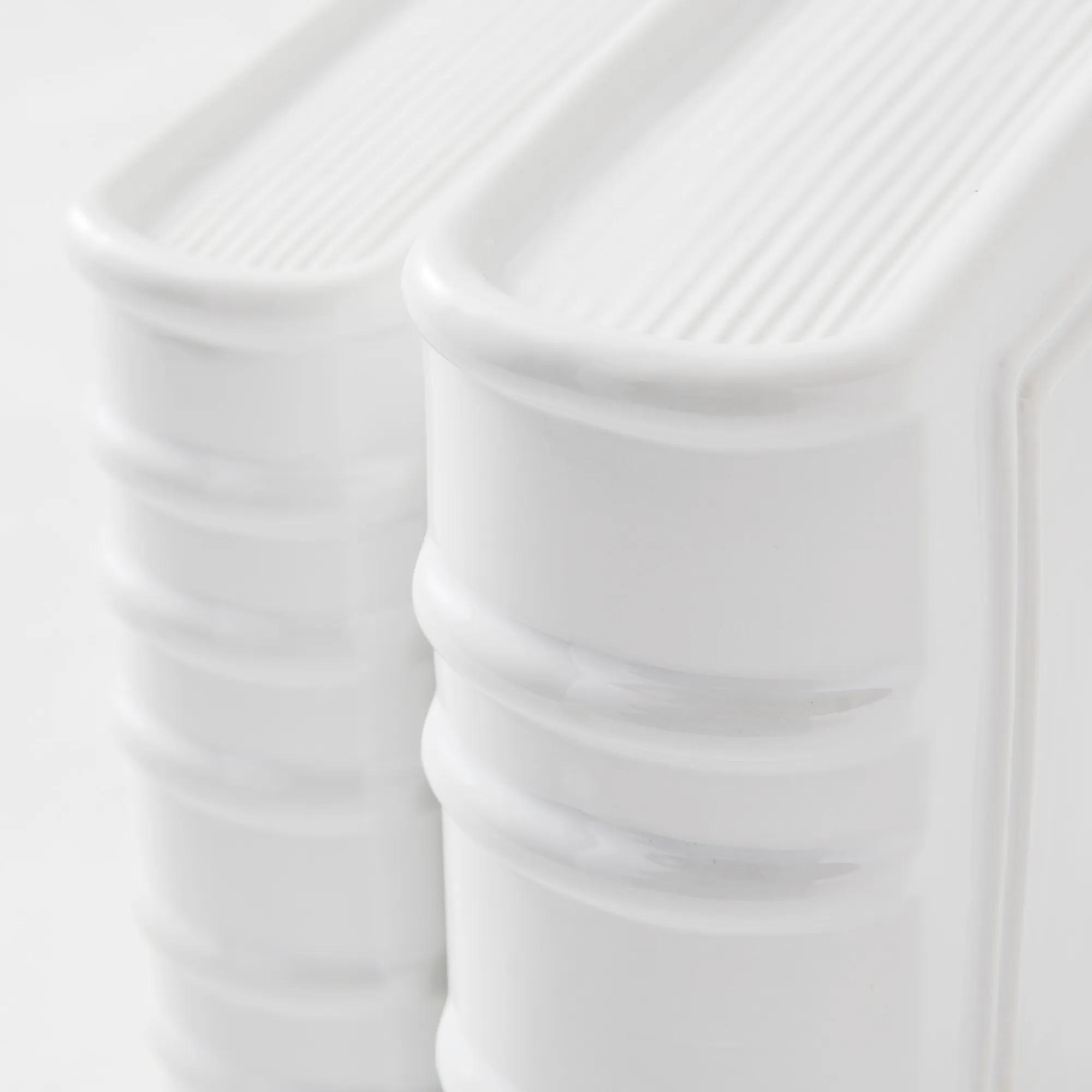 Ceramic Bookends - White$49
A pair of cream ceramic book accents that double as minimalist bookends or decorative console pieces.
Add To Cart -
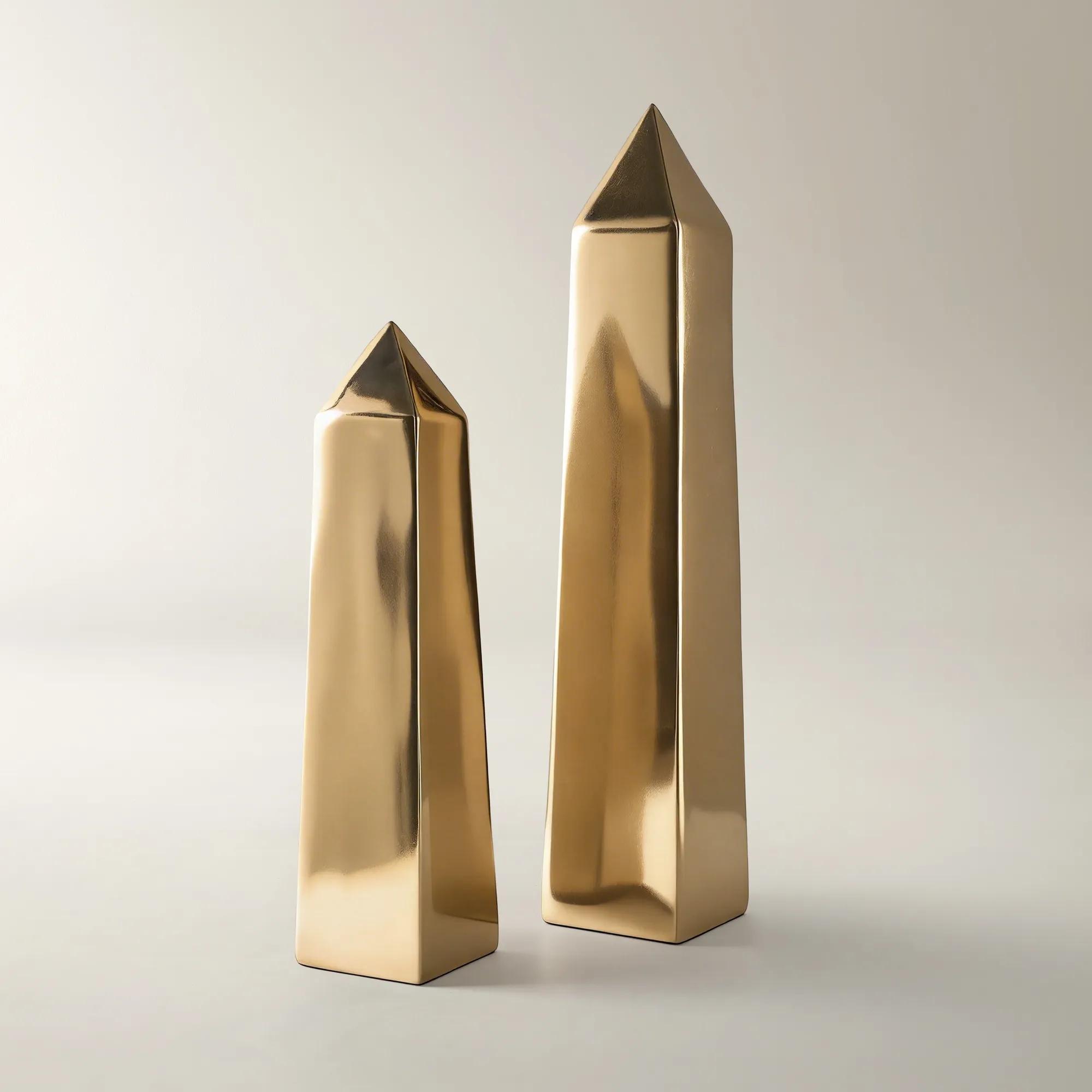
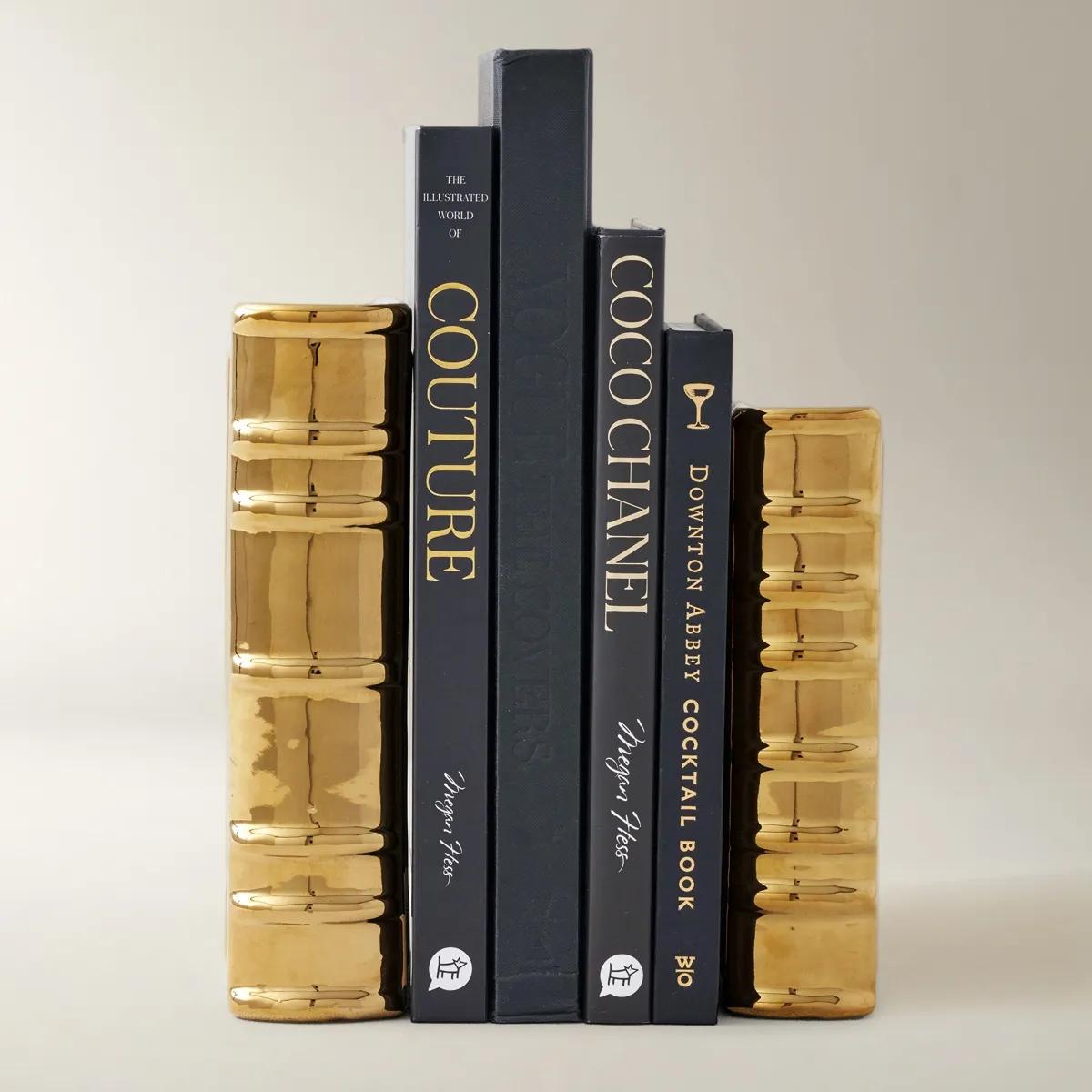 Gold Ceramic Bookends$49
A pair of gold ceramic book accents that double as sleek, modern bookends for any space.
Add To Cart -
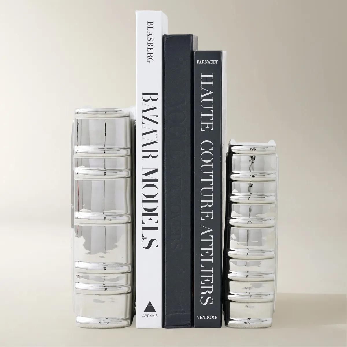
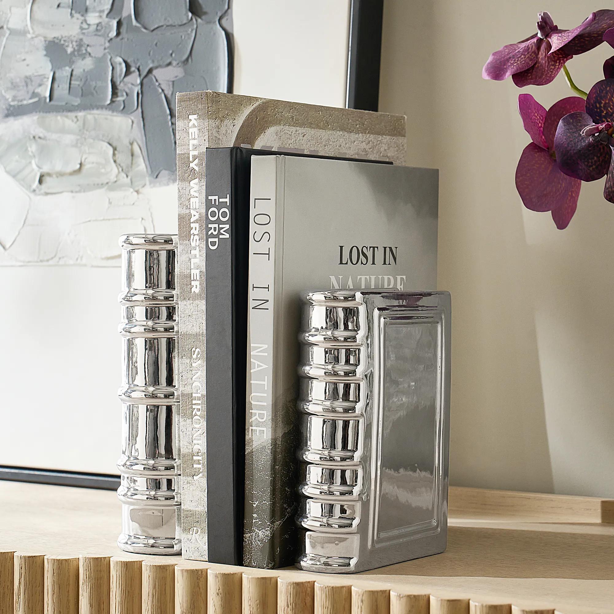 Silver Ceramic Bookends$49
A sleek silver ceramic accent that doubles as stylish bookends for modern decorative displays.
Add To Cart -
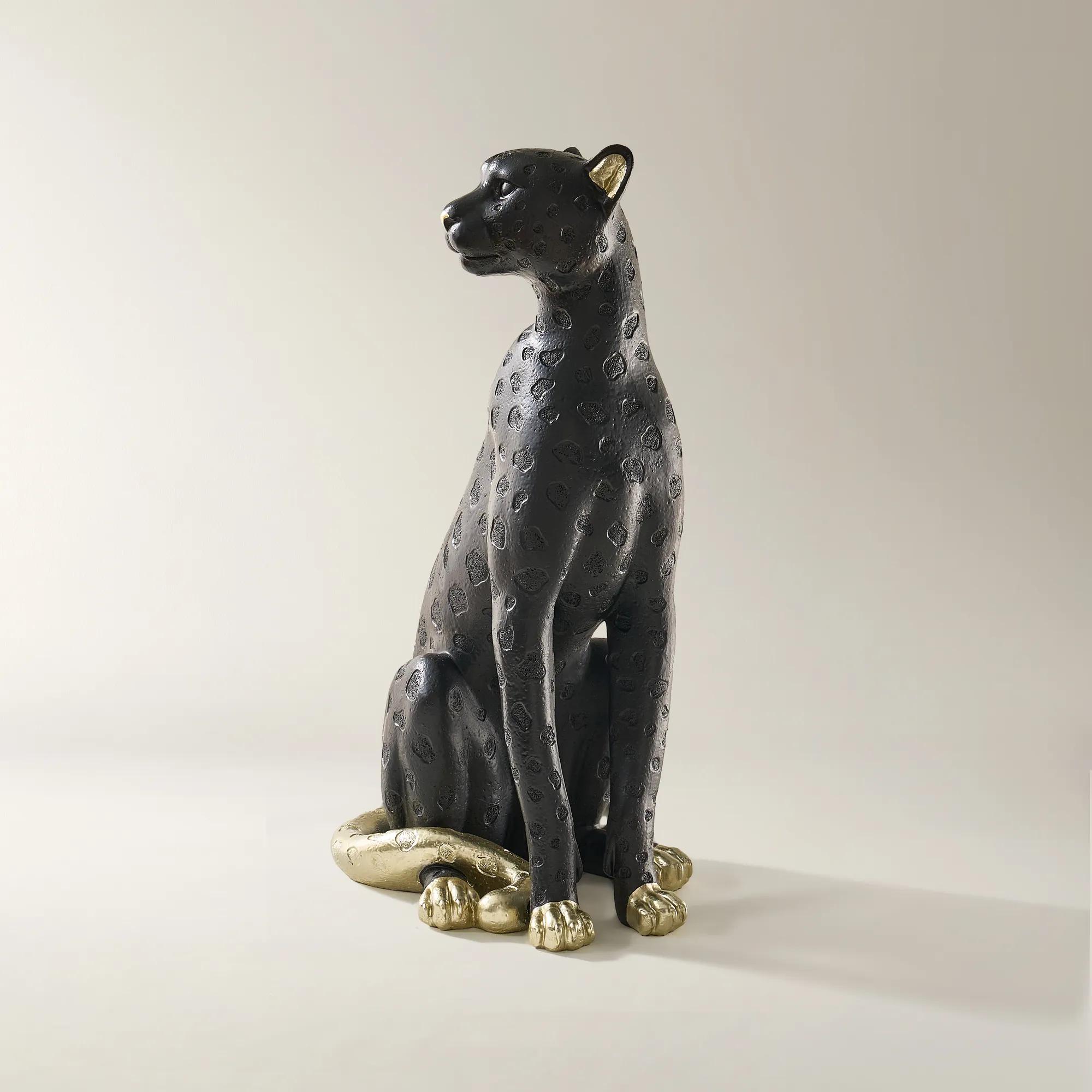
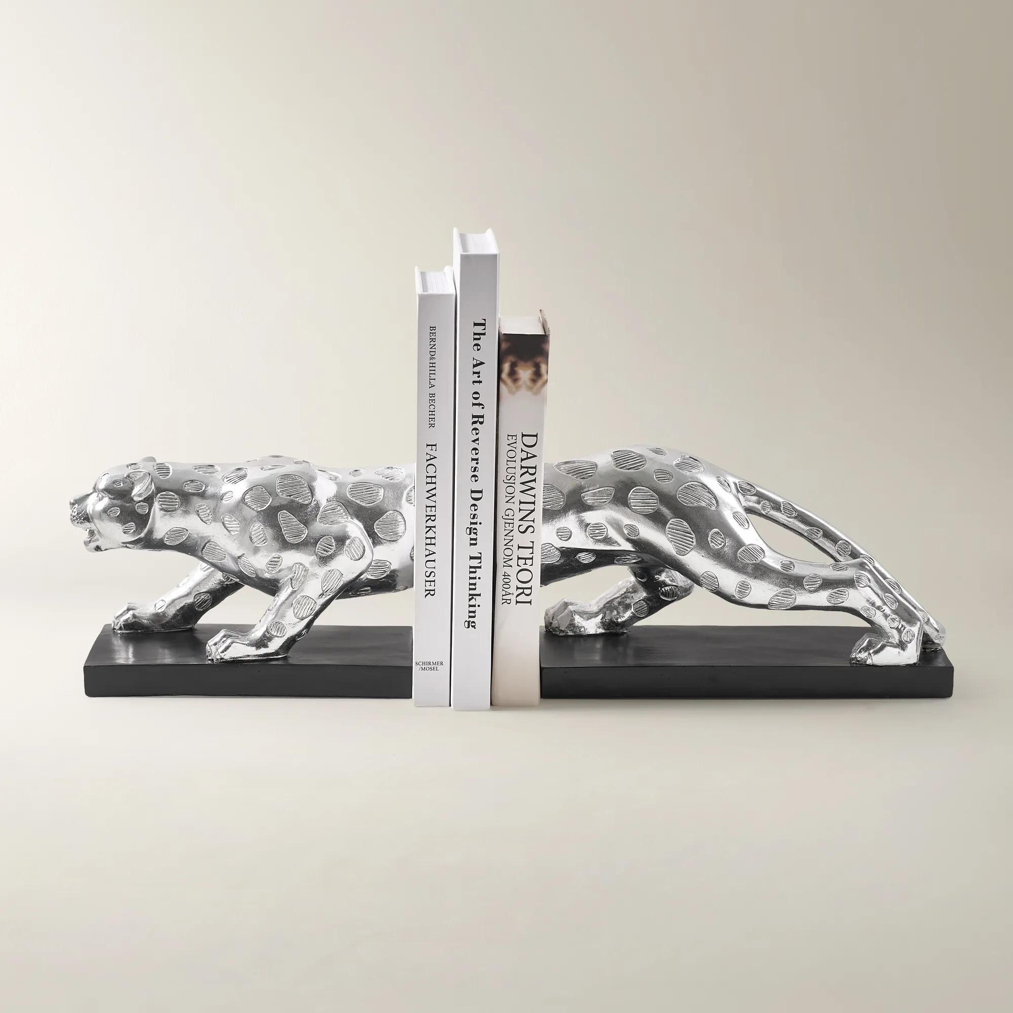 Pose Silver Resin Leopard Bookends$89
A sculptural pair of silver and black polyresin bookends inspired by Leopardo, adding modern glamour.
Add To Cart -

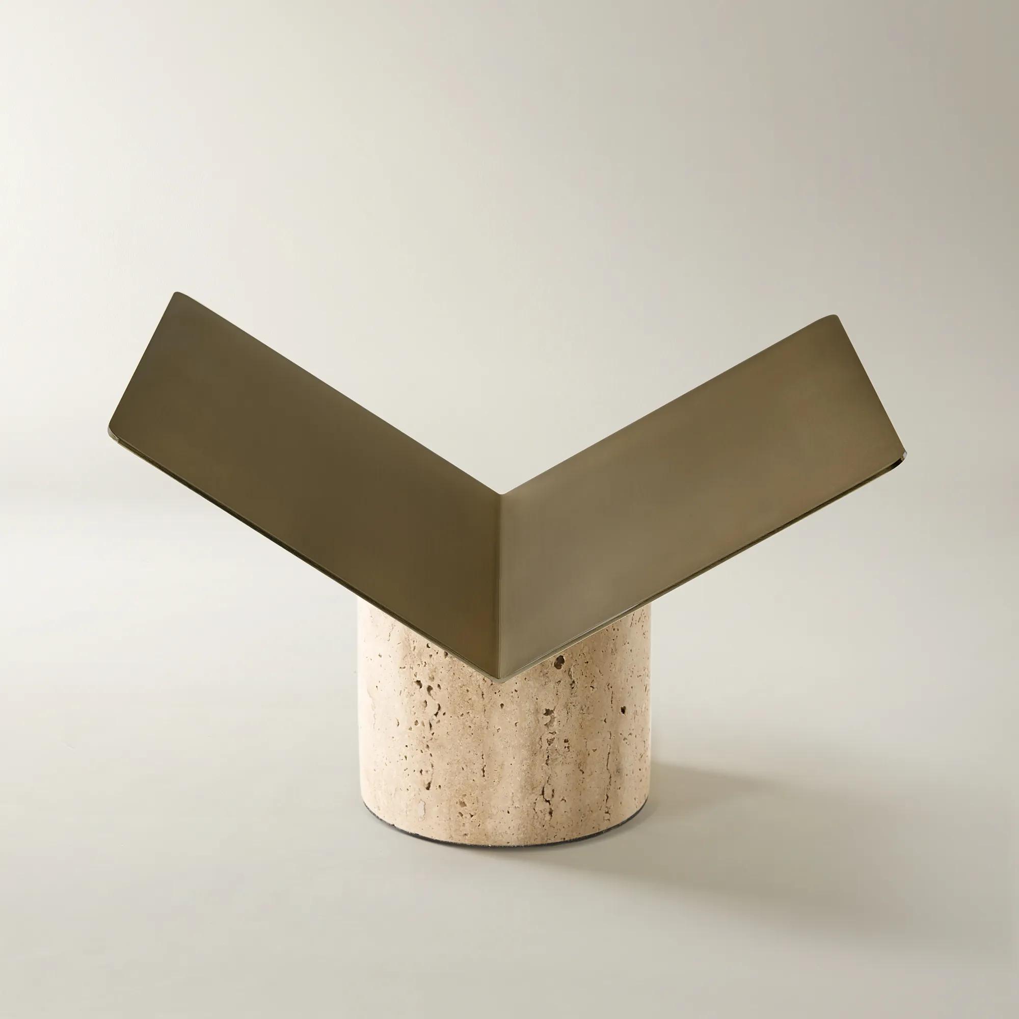
 Travertine Gold Metal Book Display Stand 7"$139
A sculptural beige travertine and gold metal stand that elegantly displays books with unique natural variation.
Add To Cart

Bookends For Coffee Table Books
Explore decorative bookends for coffee table books that give your favorite volumes a striking frame. Consider each design’s height, weight, and footprint alongside the size of your books, especially oversized editions, to choose bookends that support an upright arrangement without overwhelming your coffee table, console, or bookshelf.
Bookends for coffee table books bring sculptural presence to a collection while helping large hardcover volumes stay upright and beautifully arranged. Substantial weight, a stable base, and proportions suited to the books are especially important for oversized editions, whose broad covers and heavy pages need more support than a slim paperback. The result can feel as considered as a gallery display: a pair of expressive forms framing photography, architecture, fashion, or art titles, with each spine contributing color and character to the room. On a generously sized coffee table, a short upright grouping can create a striking counterpoint to a low bowl or an open expanse of polished surface. On a smaller table, the same collection may feel more balanced on a nearby console or bookcase, leaving space for conversation, drinks, and everyday use. Bookends can also stand beside horizontally stacked books as decorative accents, although their practical role is supporting books displayed vertically. For a successful fit, the dimensions of both the books and the furniture matter. A deep art volume should rest fully on the tabletop or shelf rather than project beyond its edge, and the supporting bookend should meet enough of the cover to resist tipping. Height alone does not establish strength; weight distribution, base depth, and the way the bookend contacts the books all influence stability. A low, weighty form may support a compact grouping more effectively than a tall, slender ornament. Felt or other protective backing can help cushion contact with furniture, while a suitable nonslip underside can reduce movement on smooth surfaces. These functional details allow the decorative silhouette to take the lead, whether the room calls for crisp geometry, an organic curve, or an abstract shape that turns a favorite reading collection into a personal composition. A few deliberately displayed volumes give their covers room to breathe, making the arrangement feel collected rather than crowded. That balance is particularly appealing in living rooms where books are handled often and the display needs to remain inviting rather than untouchable.
Material gives decorative bookends much of their visual authority, influencing not only their weight but also how they interact with surrounding finishes. Marble and other stone can introduce substantial mass, cool surfaces, and veining that makes each form visually distinctive. Against a richly colored book jacket, pale stone creates a luminous contrast; beside neutral covers, darker stone can establish a dramatic outline. Metal offers a different expression, from sharply defined silhouettes to rounded, sculptural profiles. Solid and hollow constructions can differ considerably in weight, so appearance alone is not a reliable measure of support. Resin can accommodate intricate shapes and expressive textures, but its suitability for heavier books depends on its construction, dimensions, and any added weighting. Ceramic and glass bring their own artistry, though delicate edges and more fragile forms deserve thoughtful placement away from frequent knocks. For interiors with warm metallic accents, Gold Bookends can create a connection between a book collection and the gleam of a nearby lamp, mirror frame, or decorative tray. A gold finish describes color and surface treatment, not necessarily the underlying material, and its sheen can range from softly brushed to highly reflective. That distinction changes the mood: a subdued luster adds warmth without competing with patterned covers, while a polished surface introduces flashes of light and a more theatrical presence. Matching every finish is unnecessary. A warm metallic pair against a dark wood table can feel intentional alongside clear glass and textured upholstery, particularly when another small accent repeats the tone. The shape of the bookends can also echo the room’s architecture or soften it. Curved forms offer contrast to angular furniture, while clean geometric profiles lend definition to a setting layered with plush fabrics. Leaving visible space around these elements preserves their outlines and allows the books themselves to remain part of the visual story. The most compelling arrangement gives material, silhouette, and cover art distinct roles without asking every detail to compete for attention.
Everyday durability matters most when a beautiful display is also a working library. Books pulled out for a quiet evening, shared with guests, or returned after browsing place repeated demands on the supporting pieces. Smooth contact surfaces help limit abrasion against covers, while a secure stance reduces the need for constant adjustment. Heavy bookends are best lifted rather than dragged across furniture, even when protective pads are present, because trapped grit can scratch a finish. Pads should remain clean, intact, and appropriate for the surface beneath them; weight and prolonged contact can affect some delicate finishes. Routine care is usually restrained: gentle dusting with a soft cloth, prompt attention to moisture, and cleaning methods suited to the stated material and finish. Natural stone may be vulnerable to acidic cleaners, and decorative metal coatings can lose their character under abrasive polishing. Product-specific care instructions take precedence, especially for plated surfaces, porous stone, painted details, or mixed-material construction. Keeping bookends and books clear of drink spills helps protect both the decorative finish and the paper collection. Placement matters for daily comfort, too. Tall volumes should not block the view between seats, and substantial pieces belong on stable furniture where they are unlikely to be brushed by passing hands or caught near an edge. In a reading corner, a supported selection of favorite titles makes browsing feel effortless; on a console behind a sofa, the same arrangement adds personality without occupying the main tabletop. For an art enthusiast, design devotee, photographer, or devoted reader, decorative bookends can be a thoughtful housewarming, wedding, or milestone gift, particularly when their proportions suit books the recipient already treasures. Their appeal lies in that meeting of purpose and expression: they support objects with personal meaning while contributing something distinctive of their own. Paired with a treasured volume or presented as a sculptural accent, they give a familiar collection a more deliberate setting, allowing books to become part of the room’s architecture, color, and unmistakable point of view.
FAQs
Arrange a curated edit of coffee table books between expressive bookends, allowing distinctive covers and spines to become part of the composition. Leave some tabletop space open, then introduce a decorative bowl or artful object nearby. The result feels like a personal gallery rather than a crowded display.
Sculptural bookends echo the creative spirit of art and fashion books. Consider fluid silhouettes for a collection devoted to couture, or angular forms alongside architecture and photography titles. Choose a design that creates a visual conversation with your books without competing with their cover art.
Matching is only one way to compose a striking display. Echo a color from a favorite book cover for a cohesive look, or introduce a contrasting hue to give the arrangement dramatic definition. Repeating that accent elsewhere in the room makes the contrast feel intentional.
Bring the pairing to a console, bookshelf, or home office credenza to turn favorite titles into an expressive vignette. On an entryway console, books and sculptural bookends offer a glimpse of your interests; in a living room, they add an artful layer to the surrounding decor.
Give the arrangement a shared visual thread, such as a recurring curve, geometric motif, or accent color. Pair expressive bookends with a restrained vase, or let a dramatic decorative object lead beside simpler silhouettes. Contrast gives each detail distinction while keeping the composition beautifully connected.