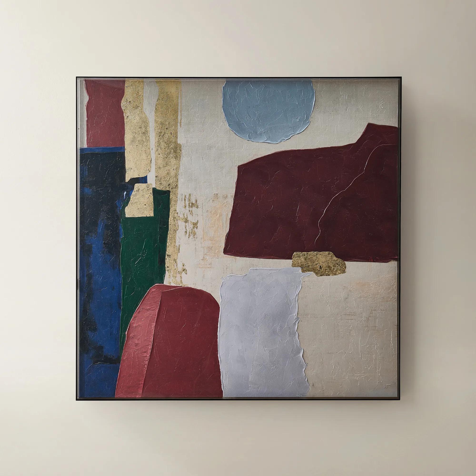
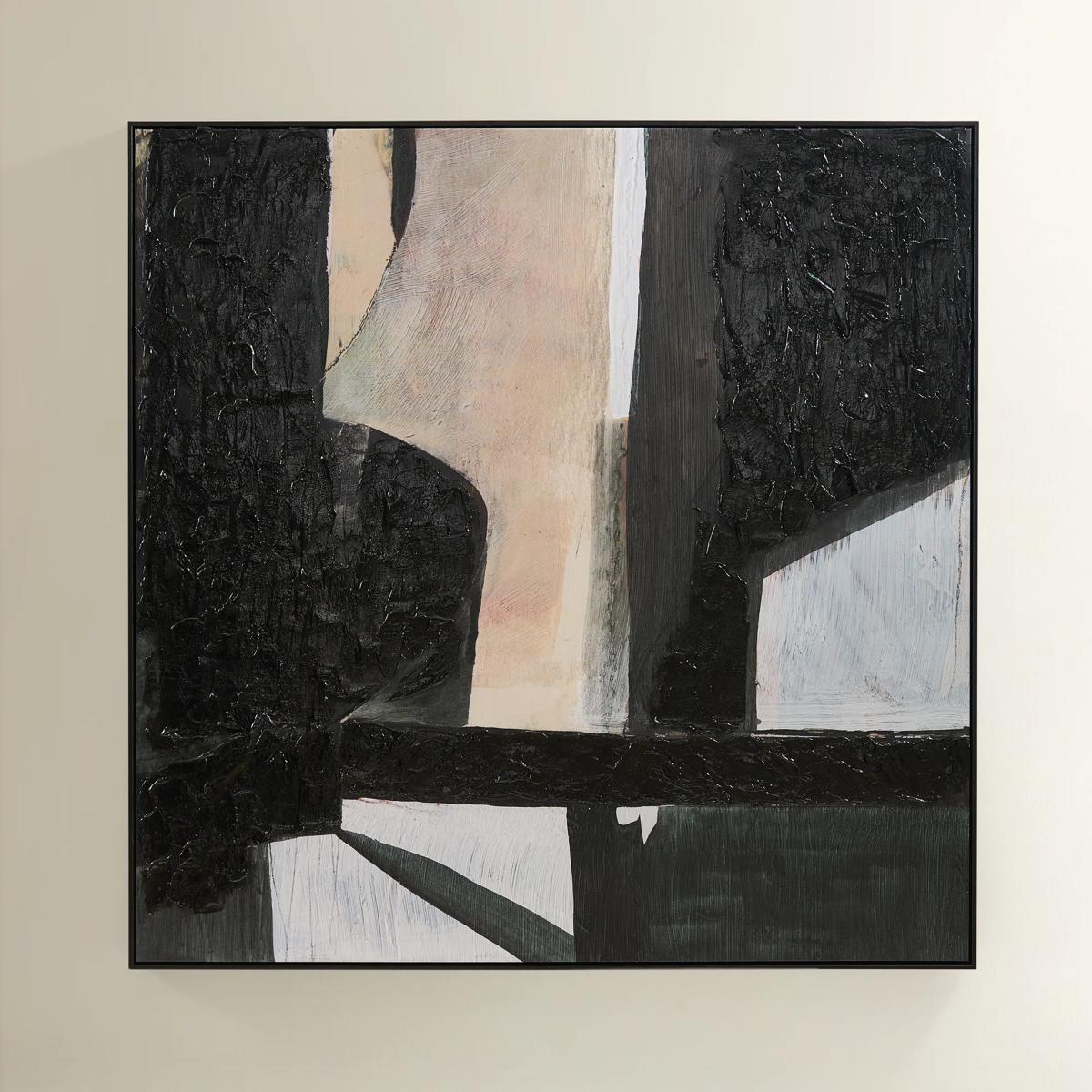
Art For Home Staging
Art For Home Staging
-
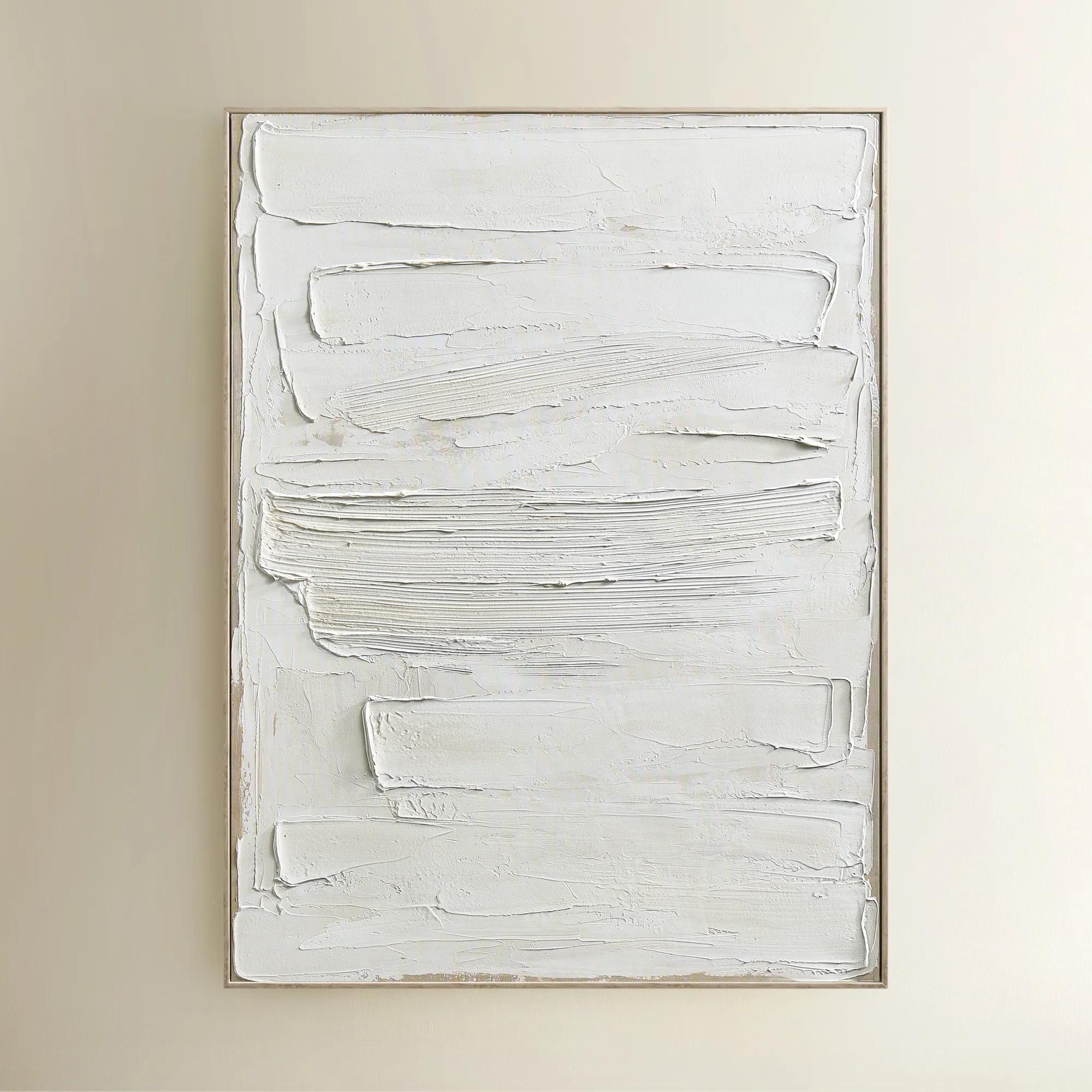
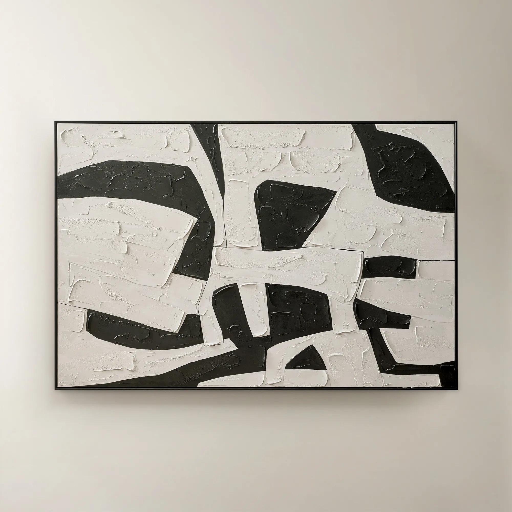 Space Between Shadows Framed Painted Wall Art 72" x 48"$799
A hand-painted abstract canvas featuring bold alabaster and black geometric forms in a sleek black frame.
Add To Cart -
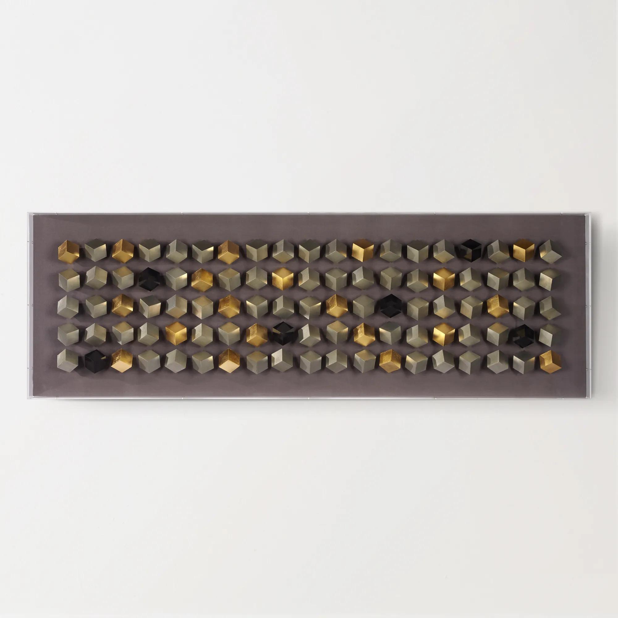
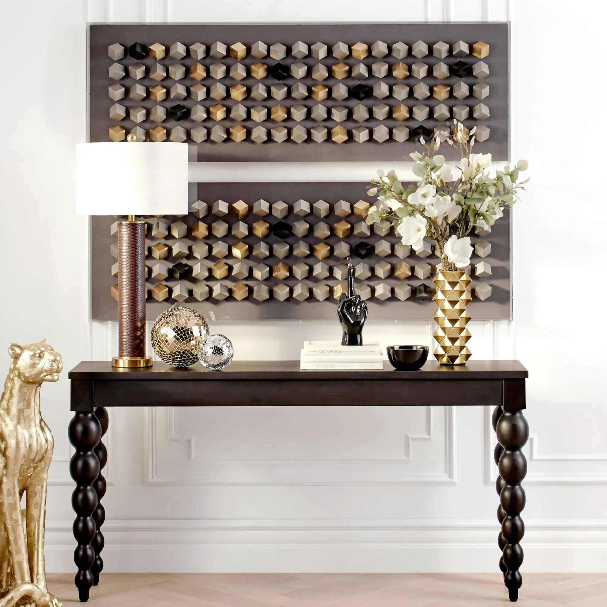 Cubic Array Dimensional Wall Decor in Acrylic 59" x 19.75"$599
A striking shadowbox wall art featuring a cubic, dimensional design with a tri-tone metallic finish.
Add To Cart -
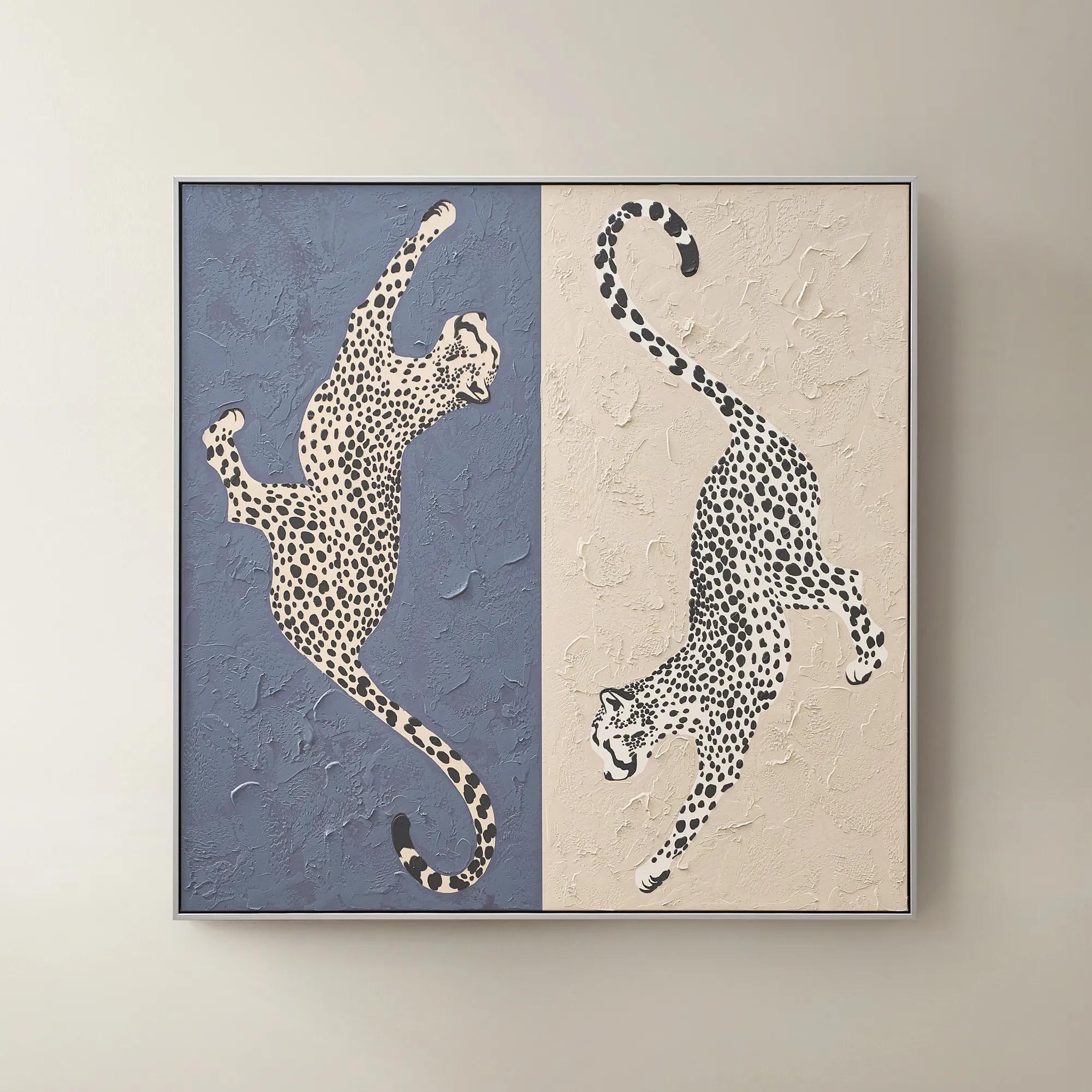 Leopard At Play Framed Painted Wall Art 40" x 40"$299
A hand-painted canvas in ink blue and taupe features playful leopard-inspired art with a silver-black frame.
Add To Cart -
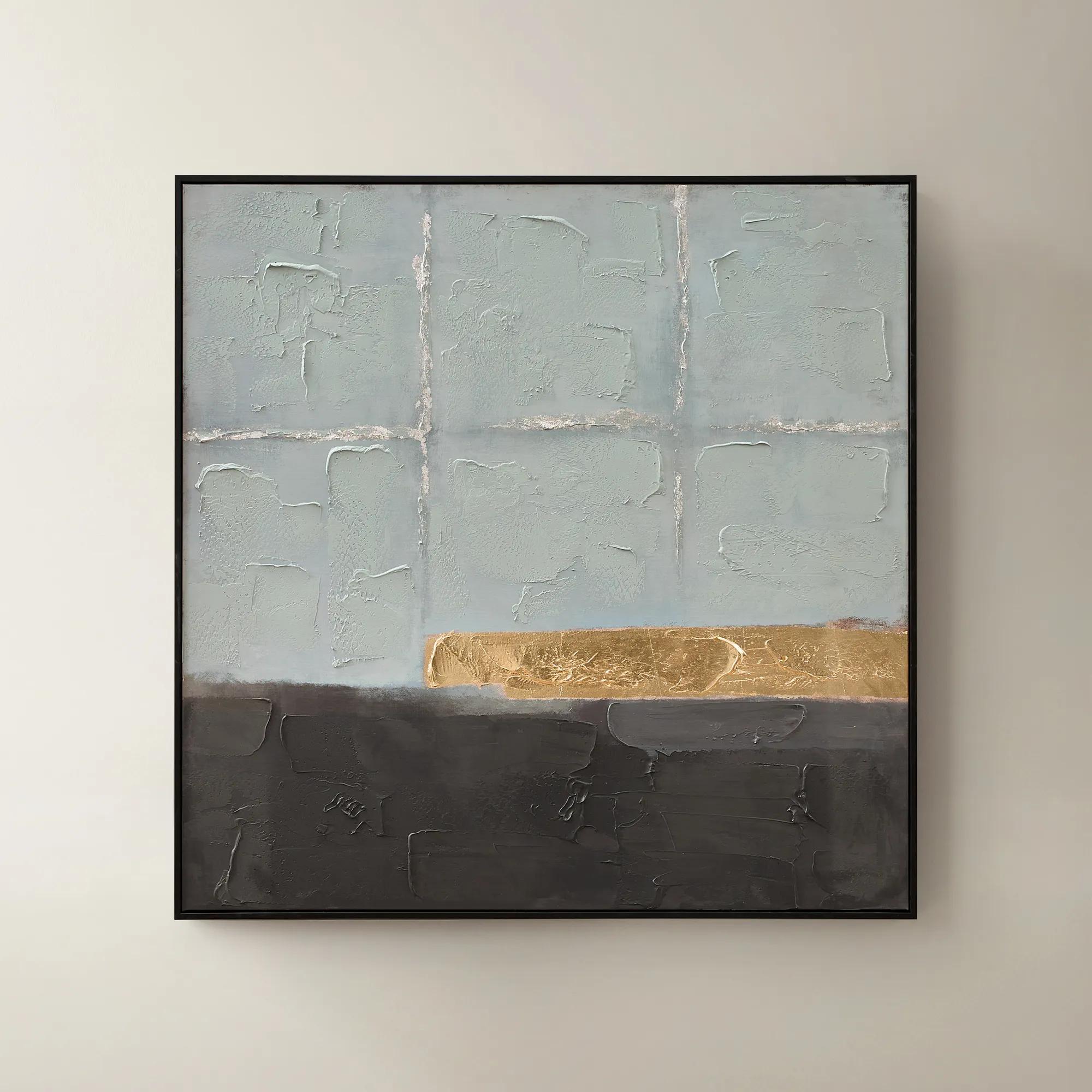
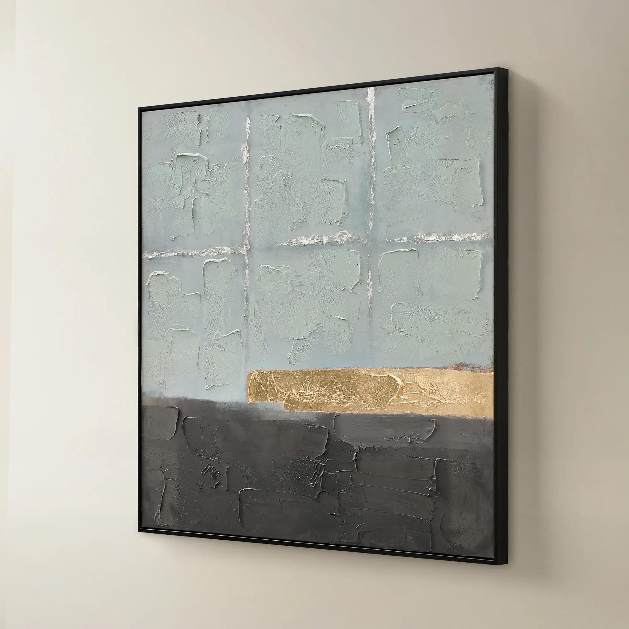 Jules Framed Gold Leaf Painted Wall Art 40" x 40"$299
A hand-painted canvas in mineral blue with gold leaf accents and a sleek black frame for modern appeal.
Add To Cart -
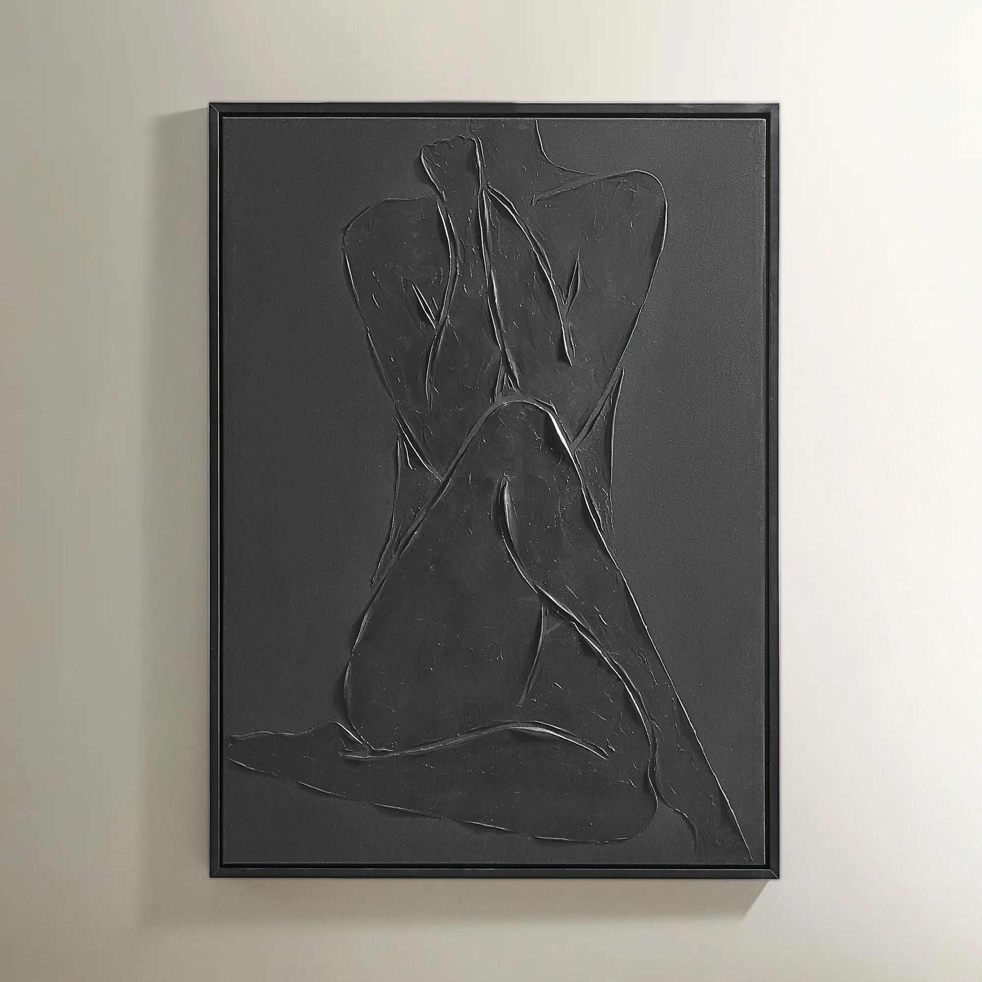 Modern Elegance Nude Black Framed Painted Wall Art 35.5" x 47.25"$599
A hand-embellished canvas artwork featuring textured strokes and vibrant hues in a black and gold Art Deco frame.
Add To Cart -
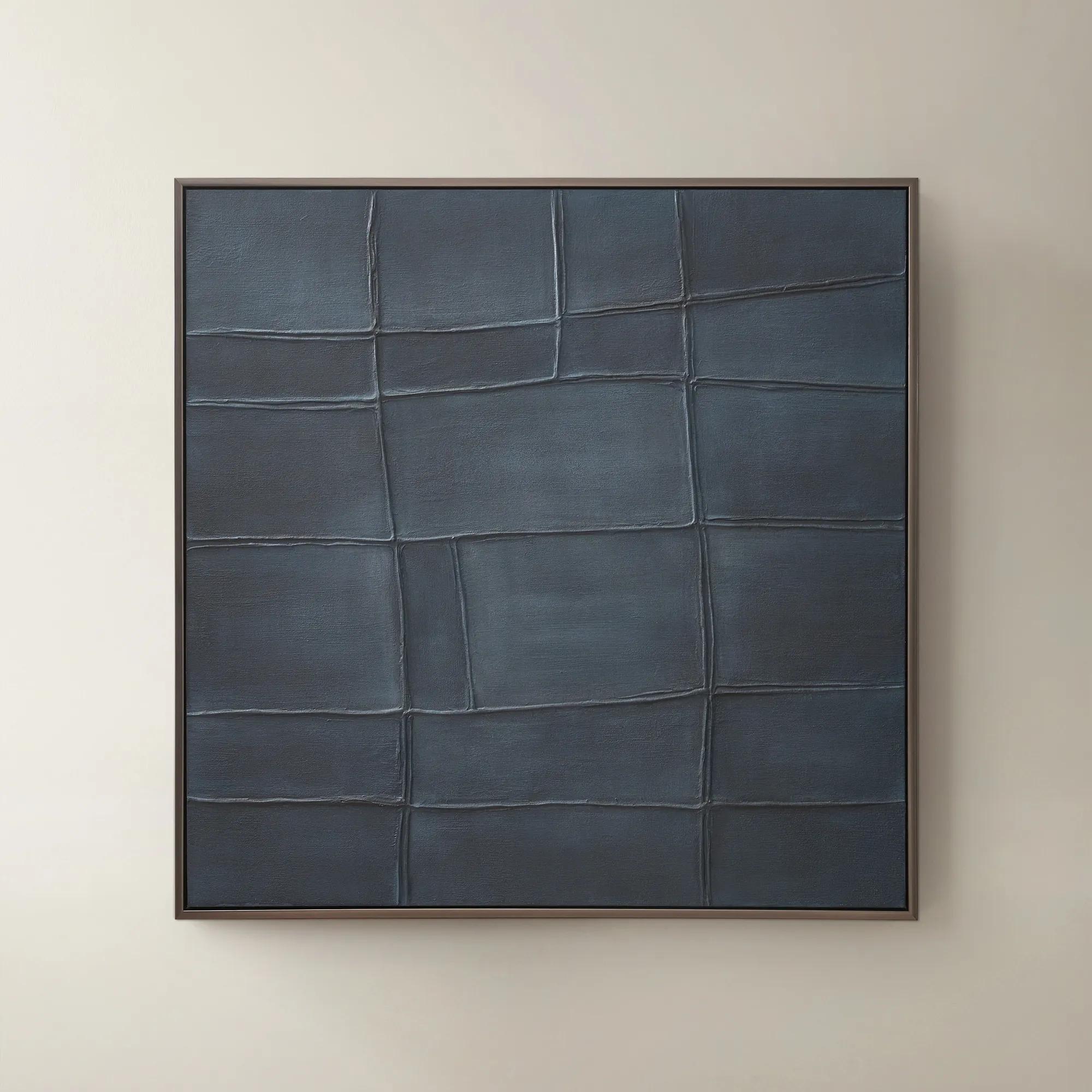
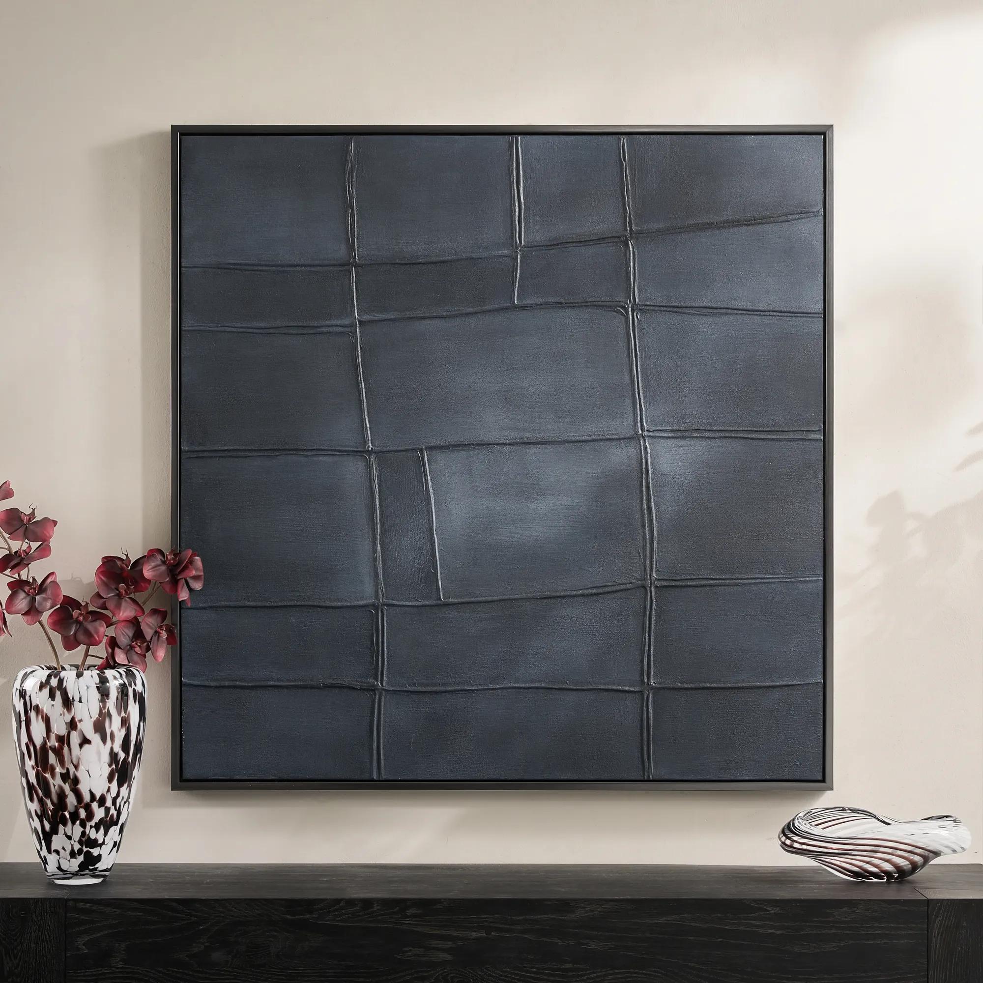 Ink Blue Interval Framed Painted Wall Art 48" x 48"$599
A hand-painted abstract canvas in deep ink blue, finished with a sleek gunmetal frame for modern appeal.
Add To Cart -
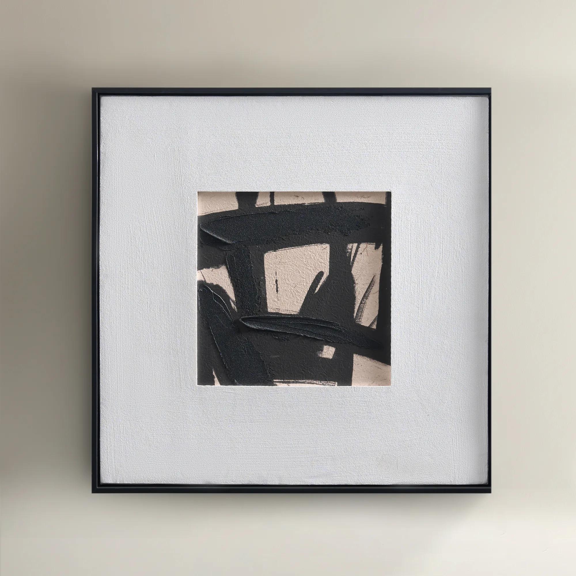
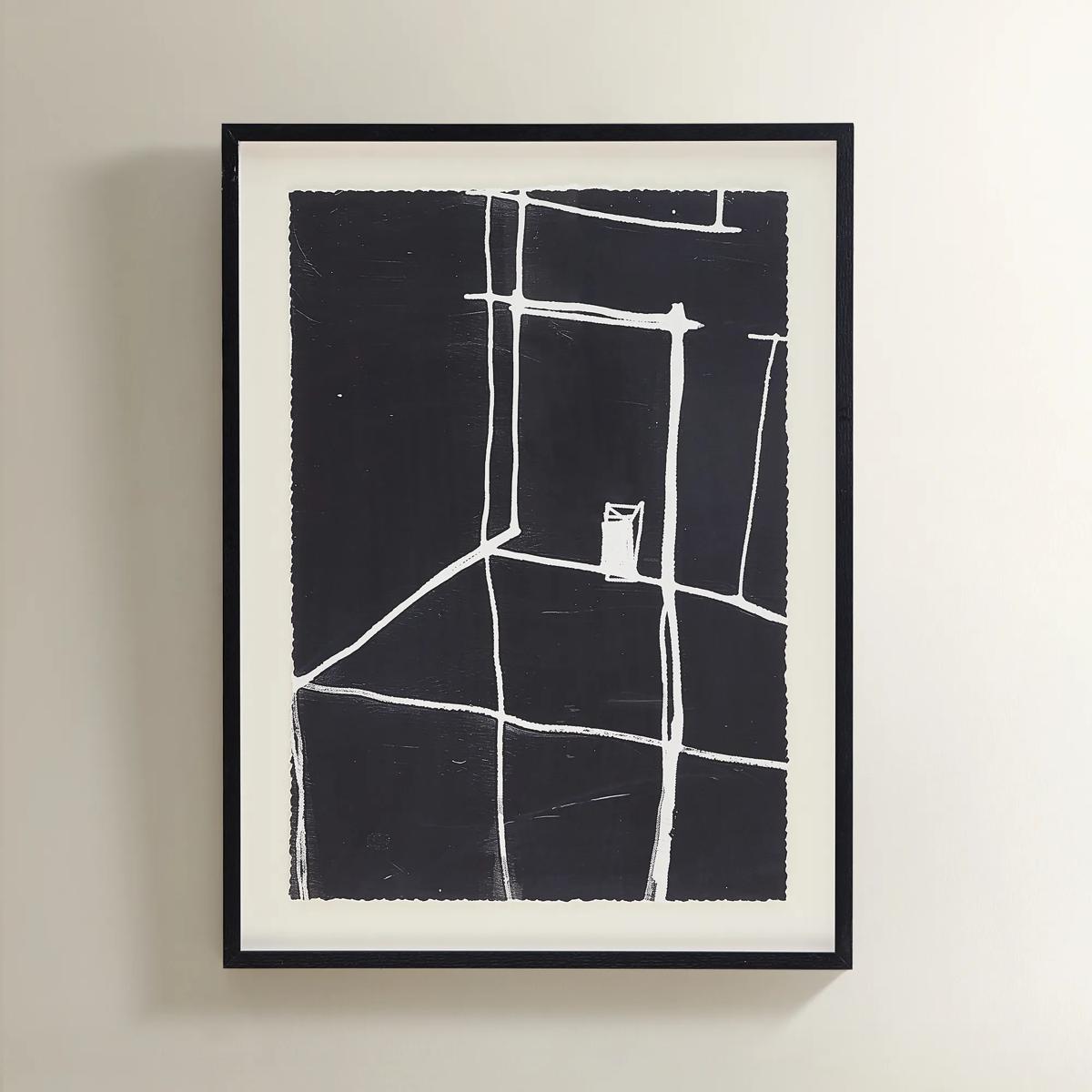 Solitude Art$269
A minimalist black-and-white abstract print featuring bold white lines in a sleek black polyresin frame.
Add To Cart -
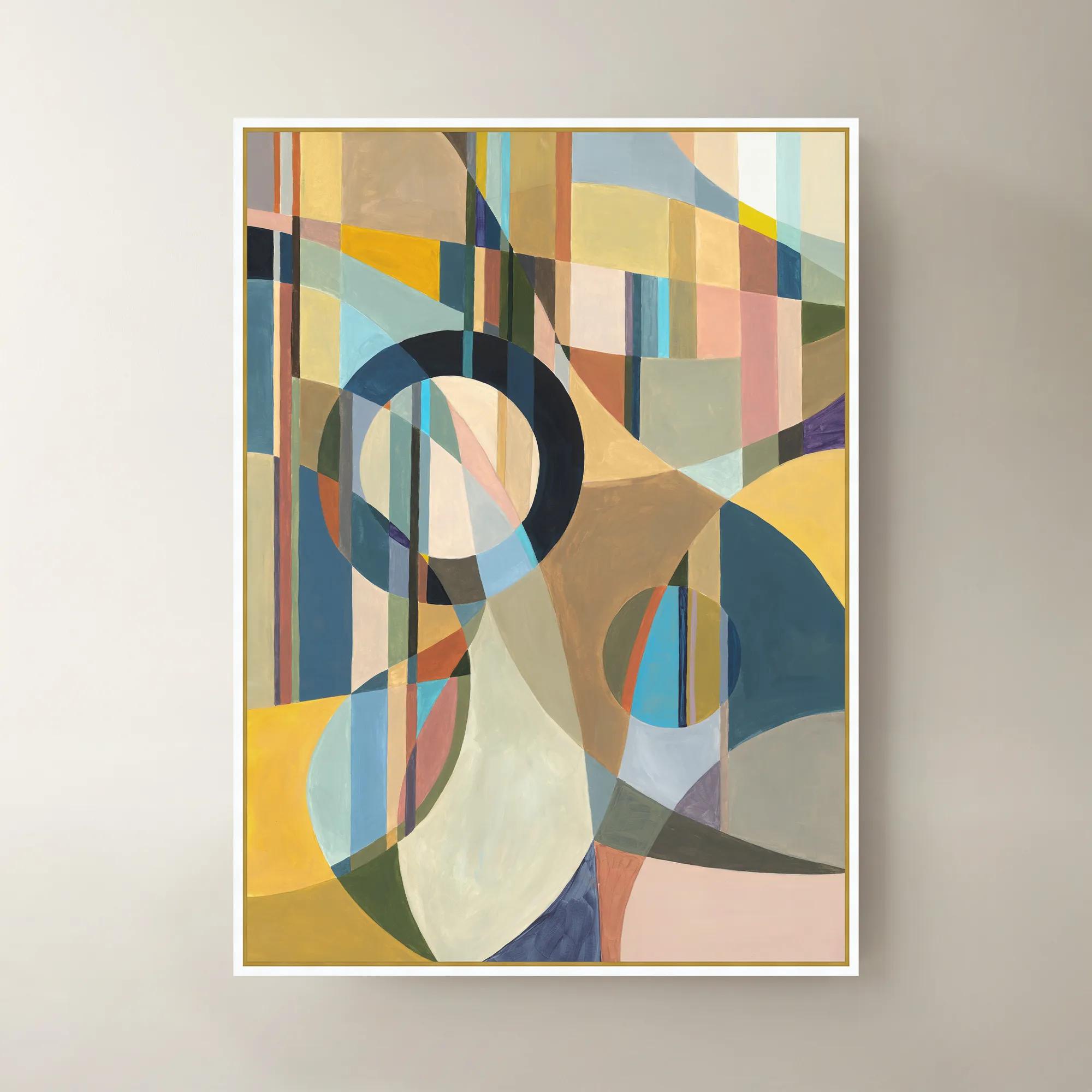
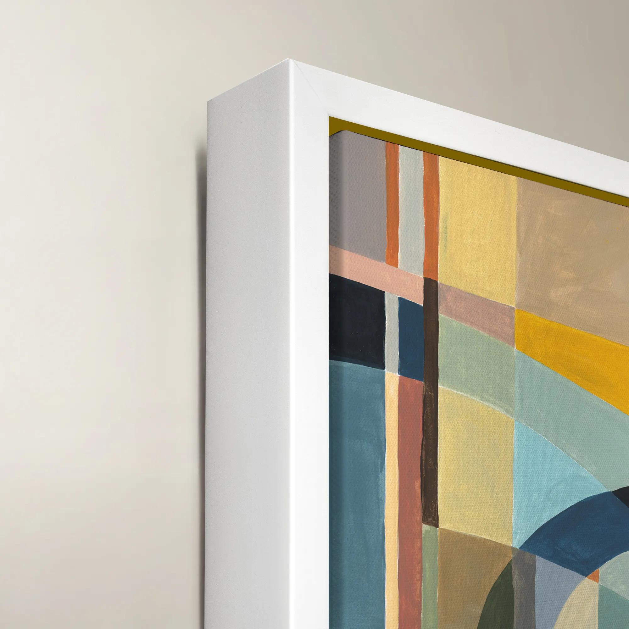 Happy Mistake Framed Wall Art 40" x 54"$1099
A vibrant multicolored framed canvas artwork adding expressive style to modern interiors.
Add To Cart -
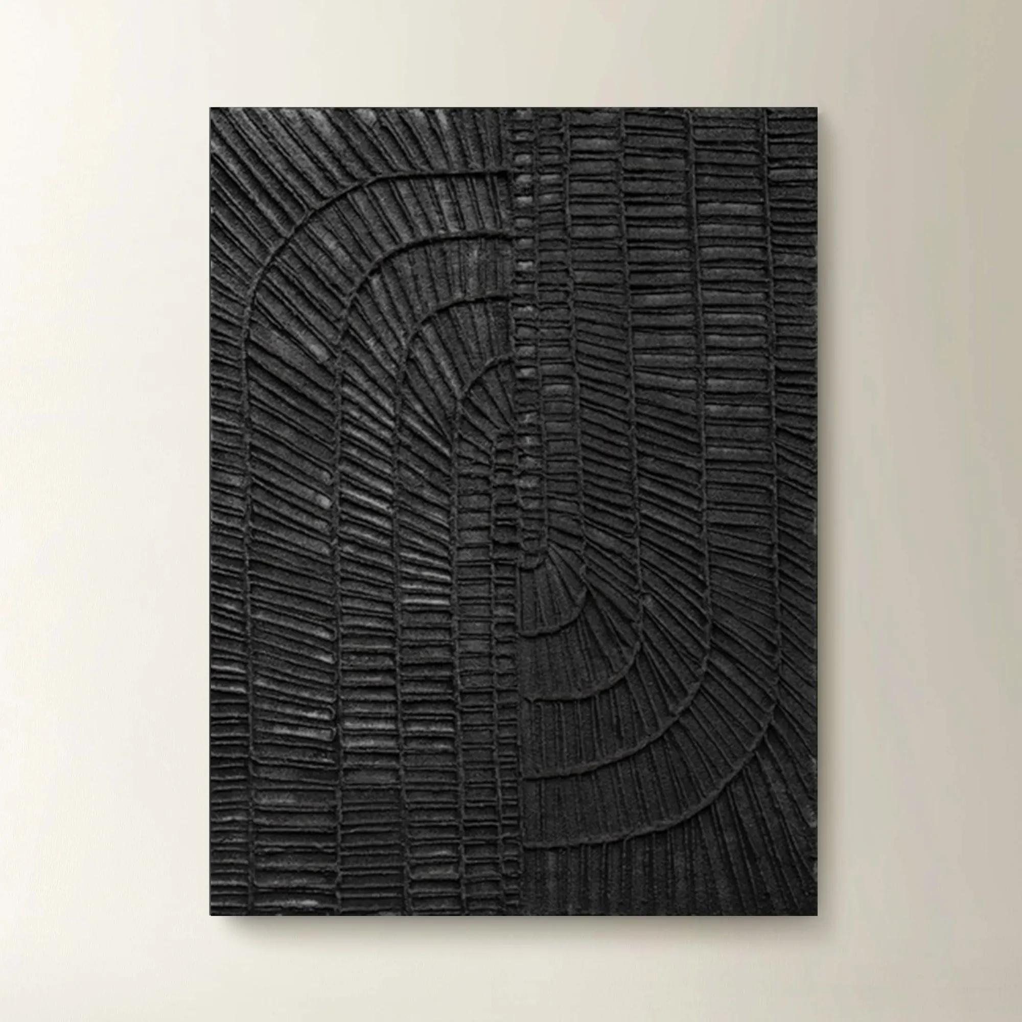 Textured Haze Black II Painted Wall Art 26" x 35"$499
A striking hand-painted black artwork featuring textured details for versatile vertical or horizontal display.
Add To Cart -
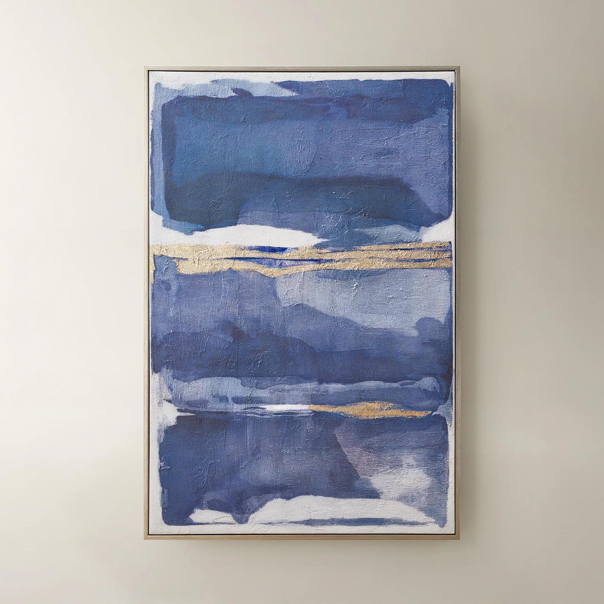
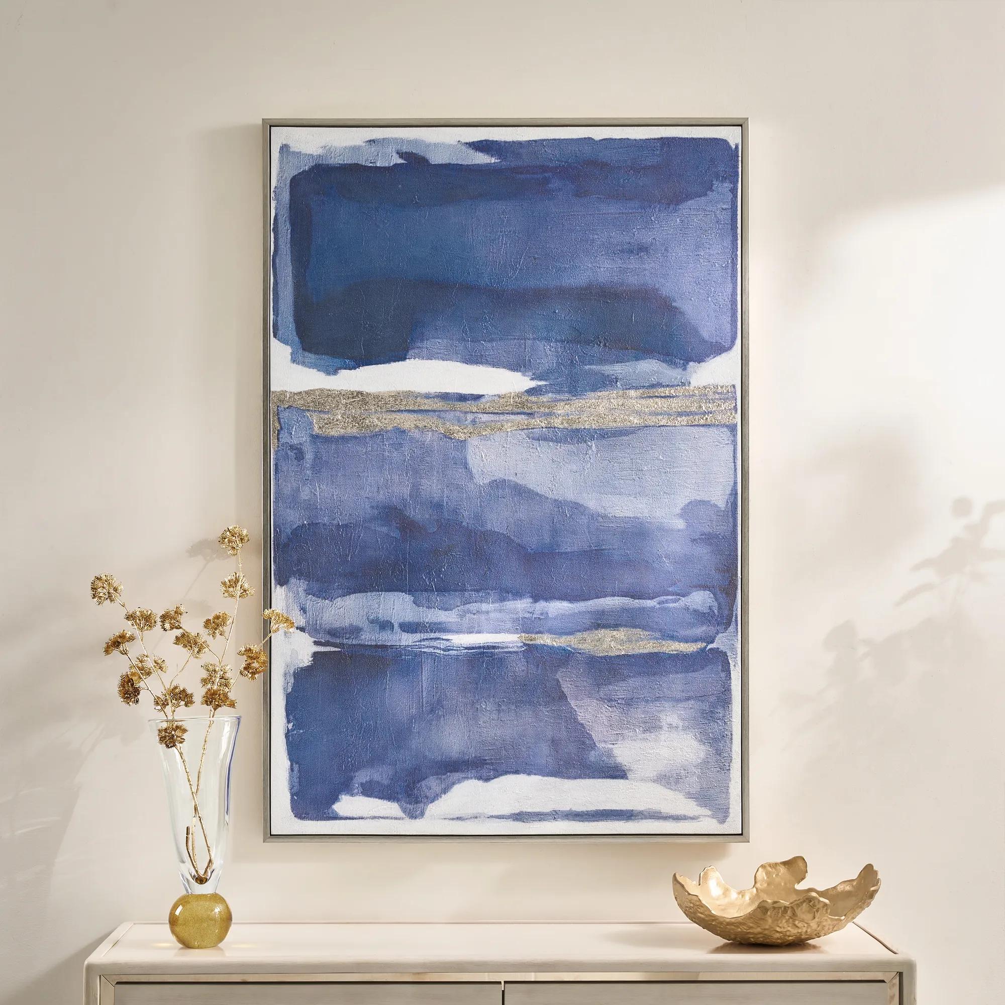 Memories in Blue Framed Painted Wall Art 40" x 60"$499
A hand-painted canvas in deep ink blue with champagne leafing for a sophisticated, gallery-inspired look.
Add To Cart -

 Zebra Pop Framed Painted Wall Art 36" x 48"$449
A bold black painted canvas artwork in a sleek frame, bringing graphic energy to modern interiors.
Add To Cart -
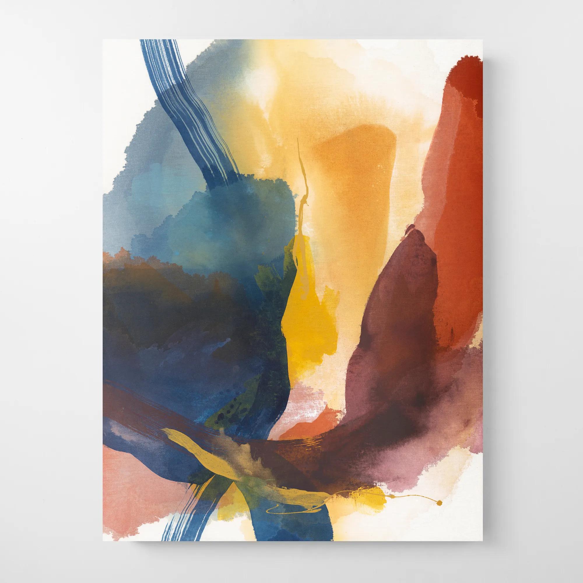
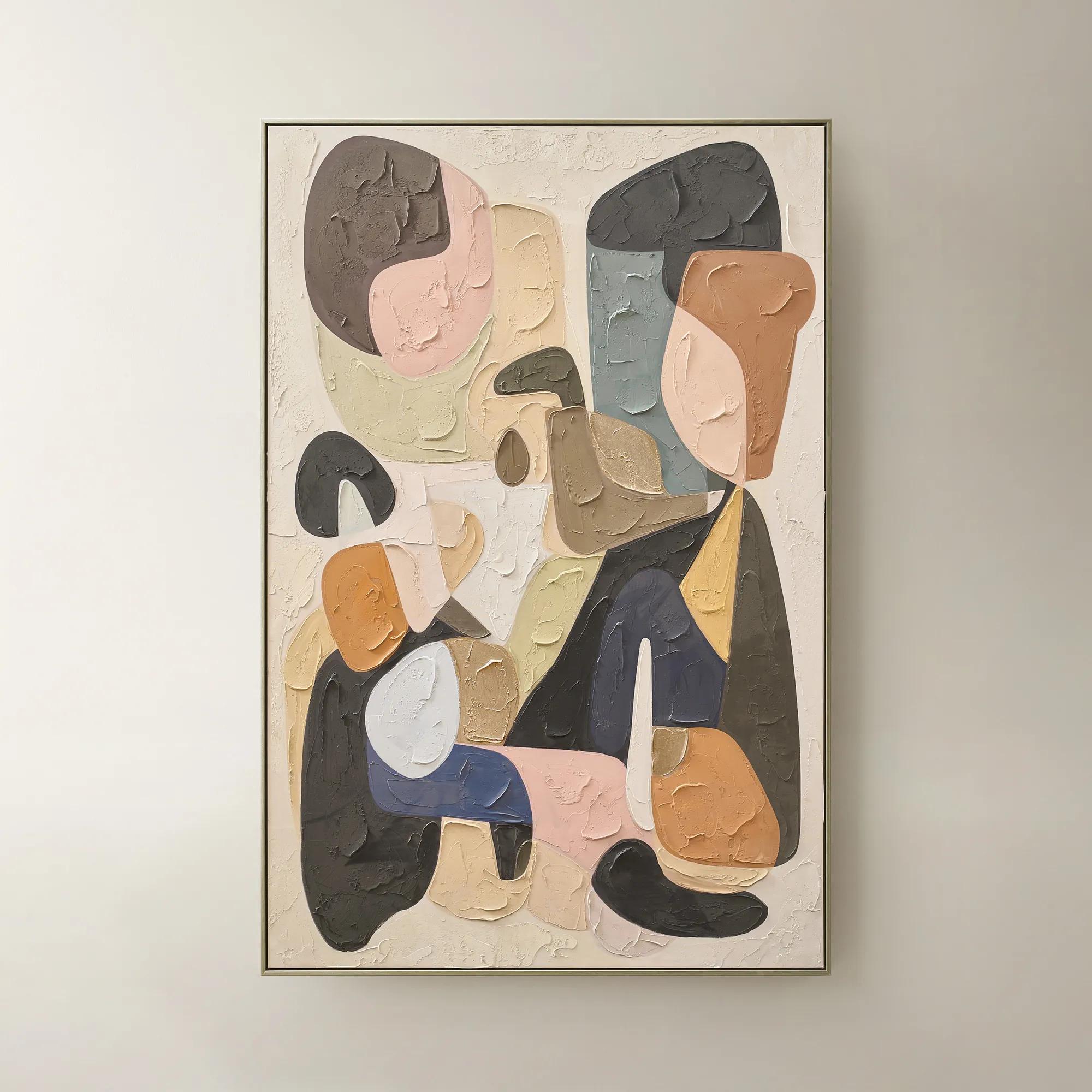 Chromatic Bloom Framed Painted Wall Art 40" x 60"$519
A hand-painted abstract canvas featuring a vibrant multi-color palette and shimmering champagne detailing.
Add To Cart -
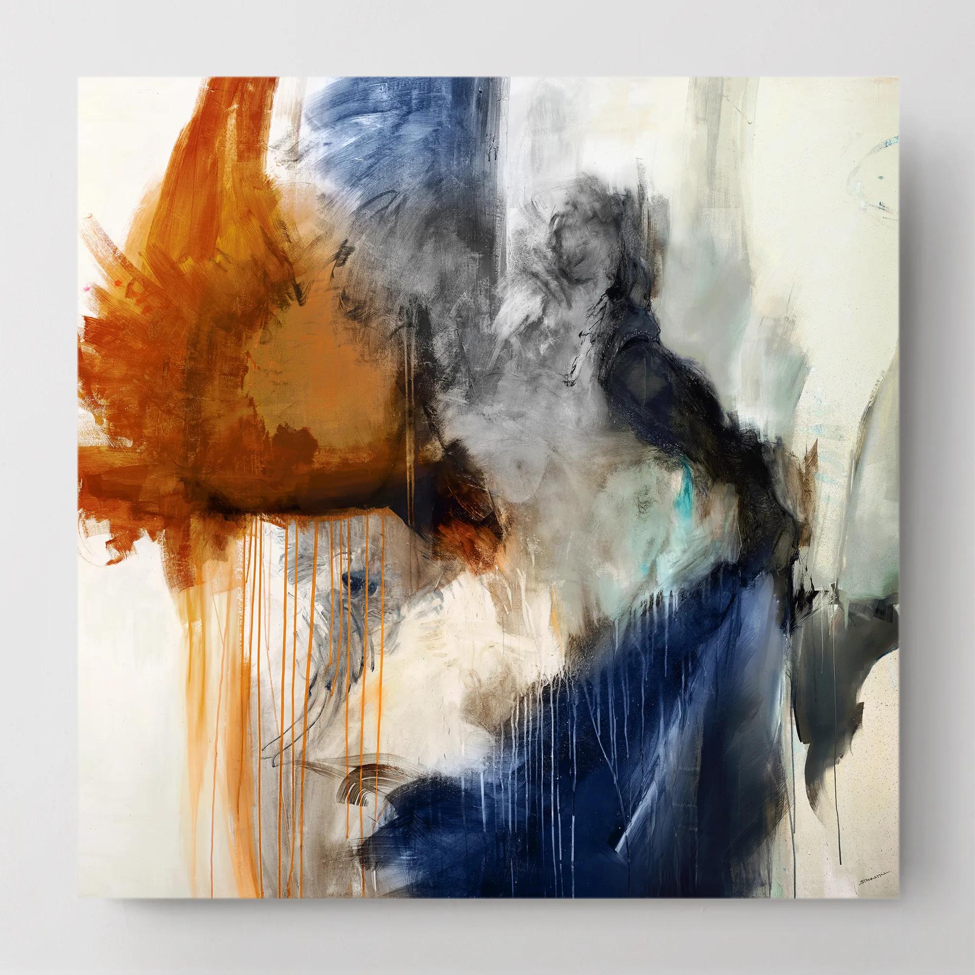
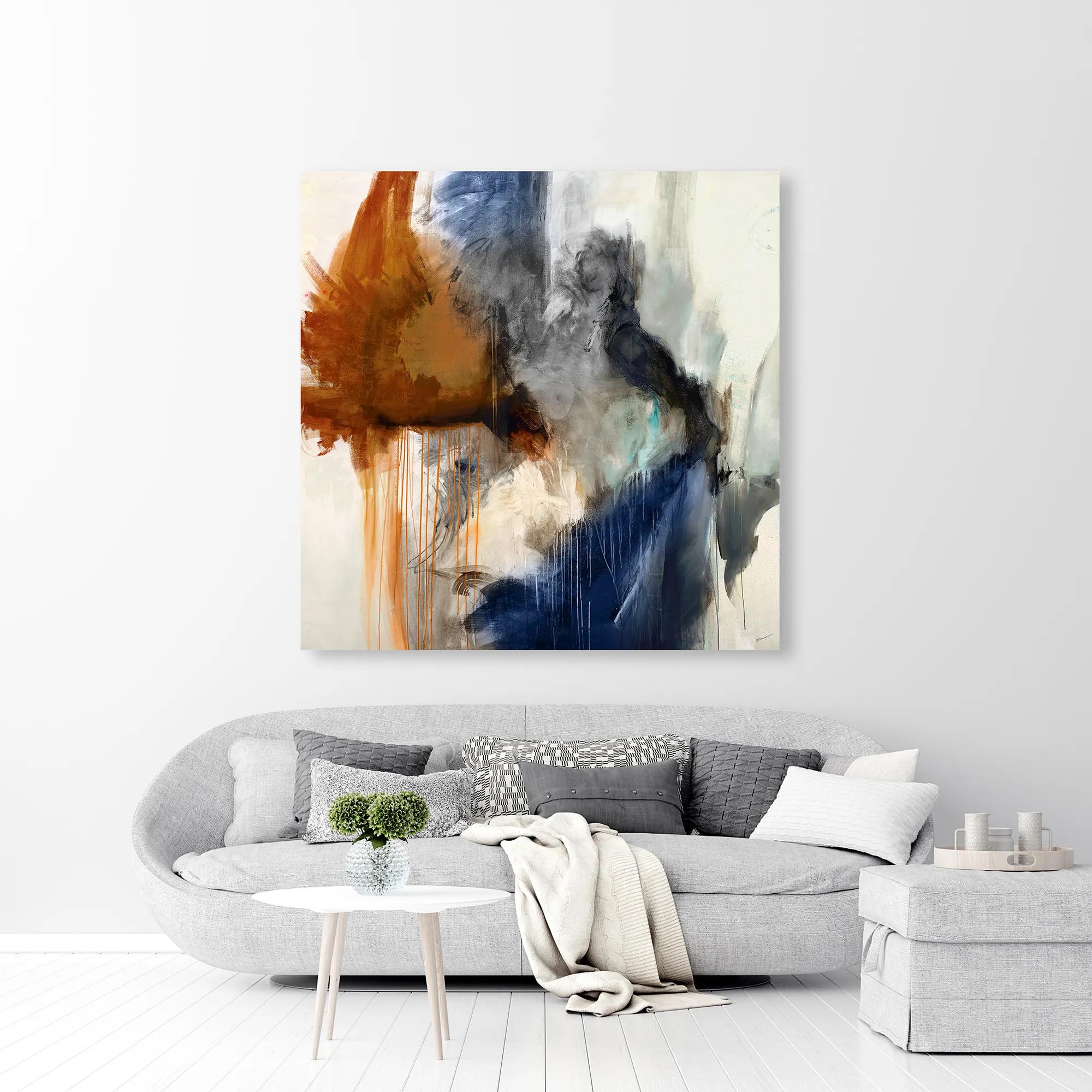 Swoon 6 Wall Art 54" x 54"$899
A gallery-wrapped canvas featuring a hand-applied image brush gel finish for a textured, artistic look.
Add To Cart -
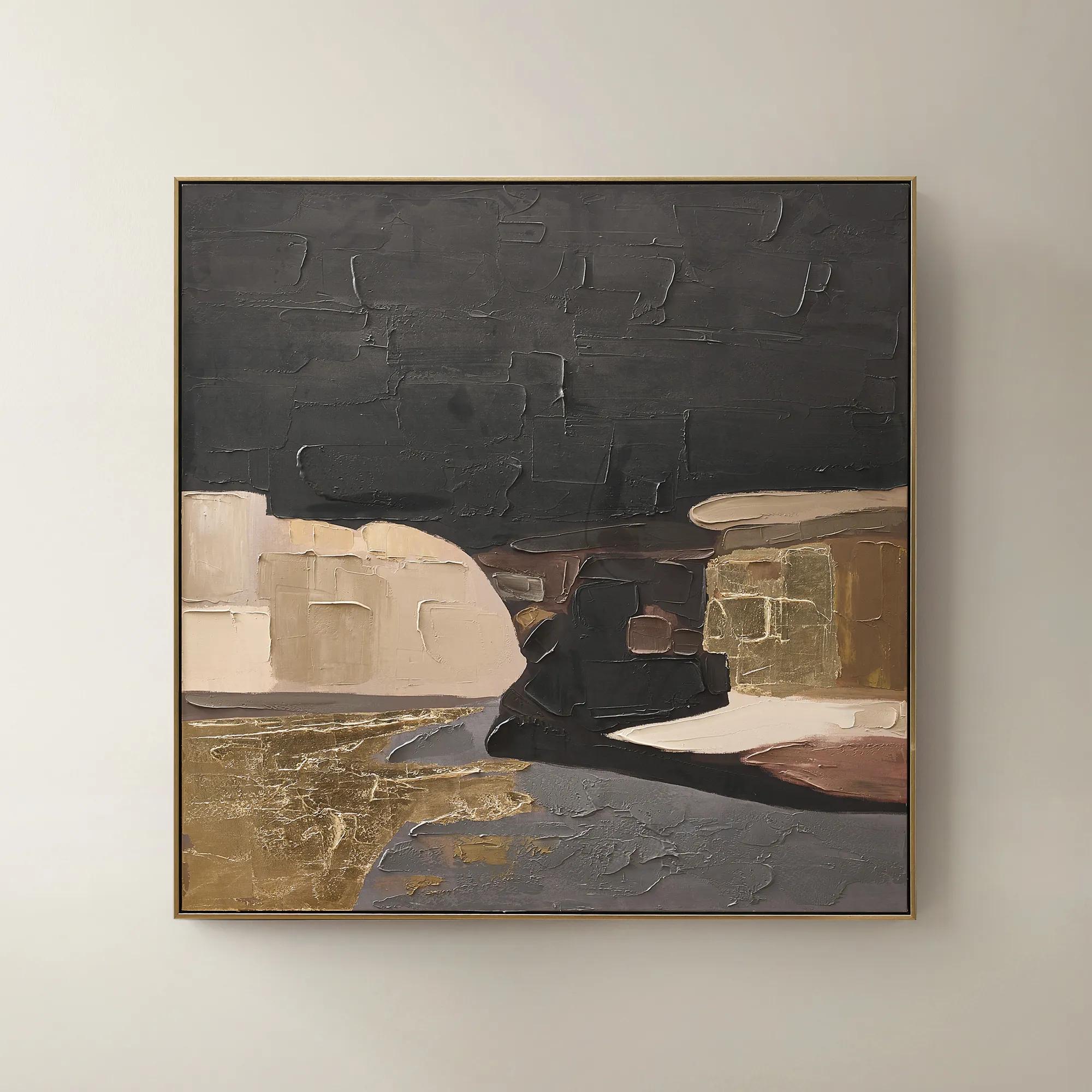 Obscured Light Framed Gold Leaf Painted Wall Art 48" x 48"$499
A hand-painted canvas with gold leaf accents and a black-gold frame in dramatic neutral tones.
Add To Cart -
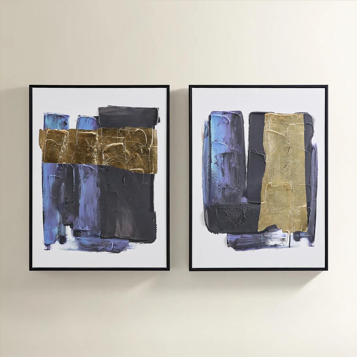
 Relic Framed Painted Triptych Wall Art Set of 3$399
A hand-painted abstract triptych in deep navy and neutral tones, set in sleek black floater frames.
Add To Cart -
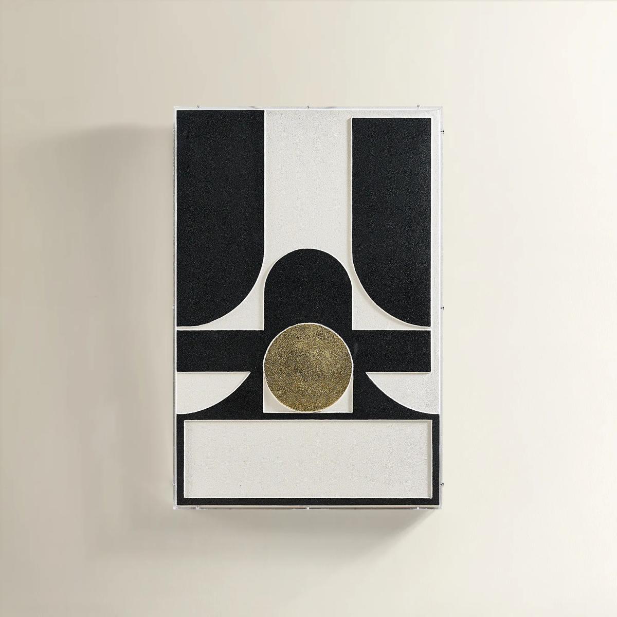
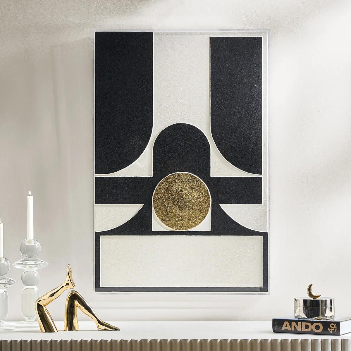 Siren Black And Gold Wall Decor in Acrylic 23.5" x 35.5"$299
A layered composition of black, ivory, and gold geometric forms set in a sleek acrylic shadow box.
Add To Cart -
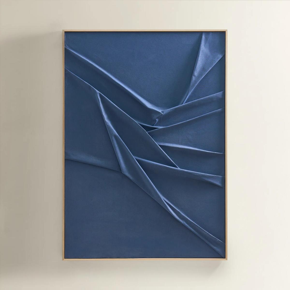 Deep Sea Painting$599
A hand-sculpted navy canvas with dimensional folds, framed in soft champagne for modern, serene elegance.
Add To Cart -
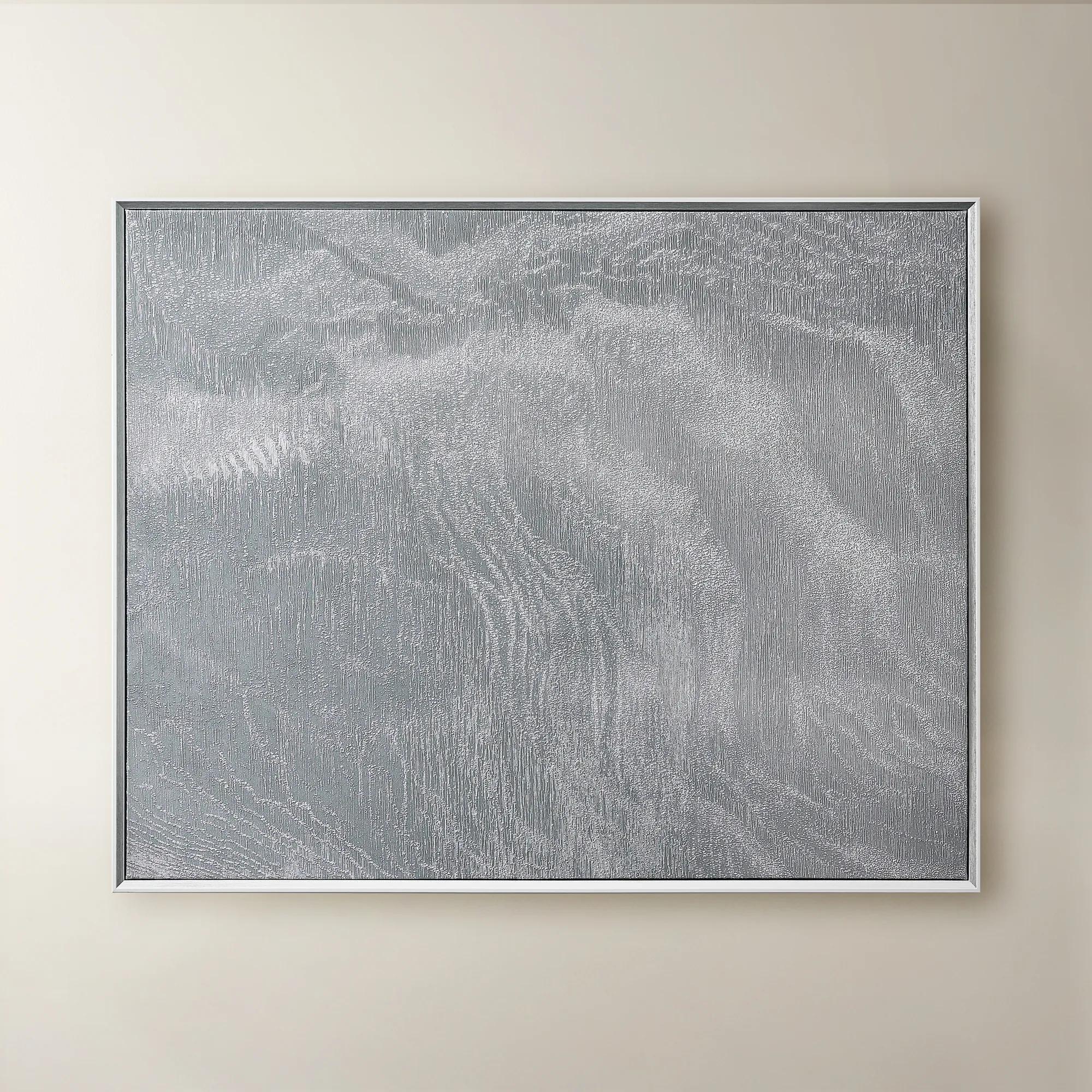 Slow Blue Morning Framed Silver Foil Wall Art 48" x 60"$599
A serene powder blue abstract canvas with silver foil accents, framed in silver and white for modern elegance.
Add To Cart -
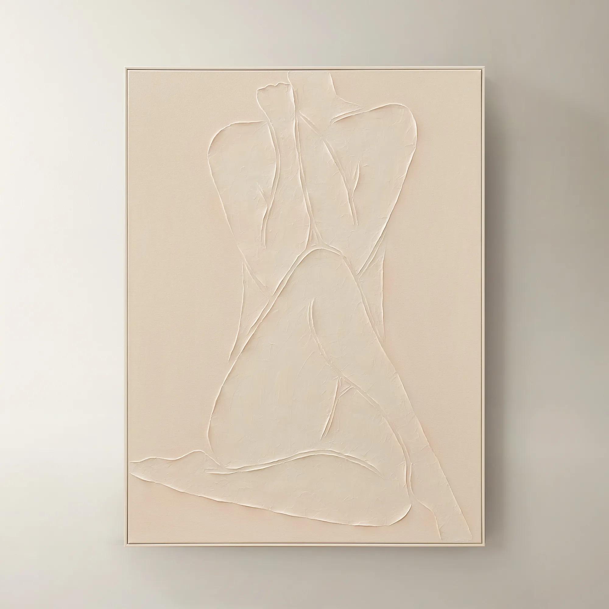
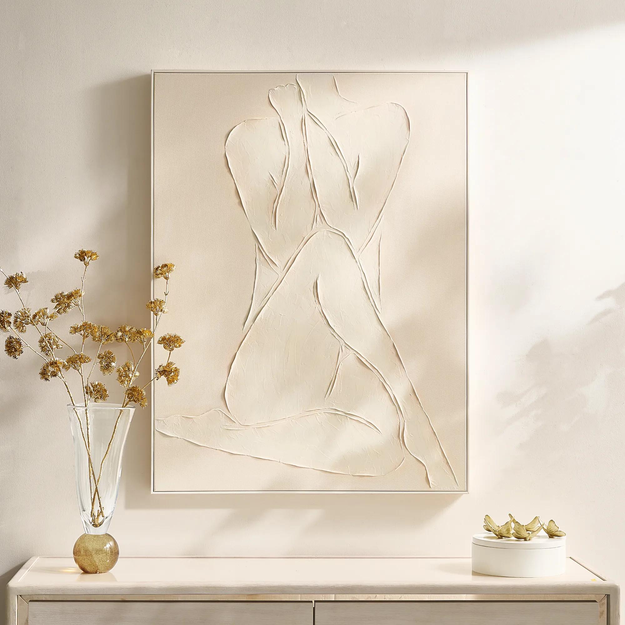 Modern Elegance Nude Ivory Framed Painted Wall Art 35.5" x 47.25"$599
A hand-painted ivory canvas in a white frame brings serene, modern artistry to any space.
Add To Cart -
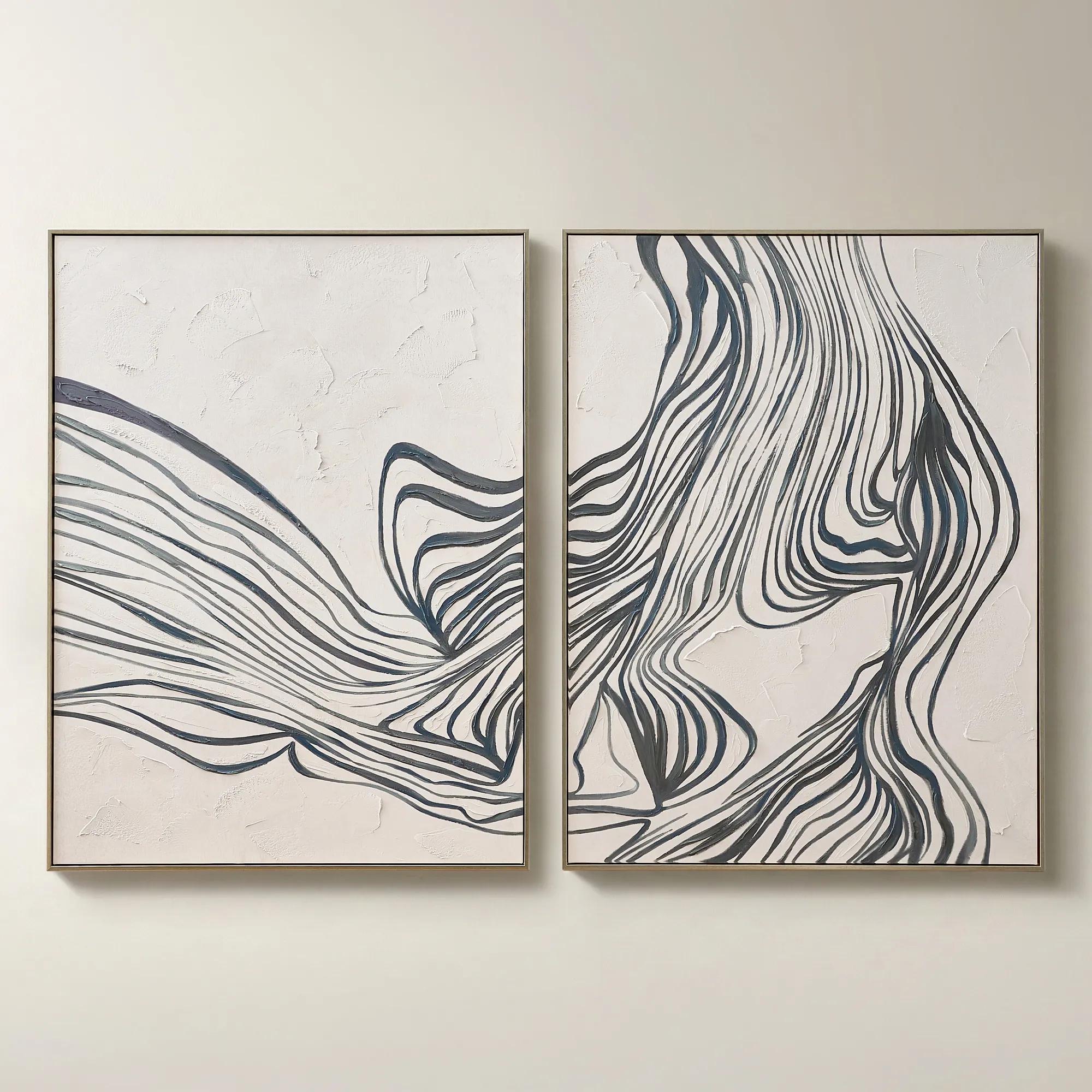
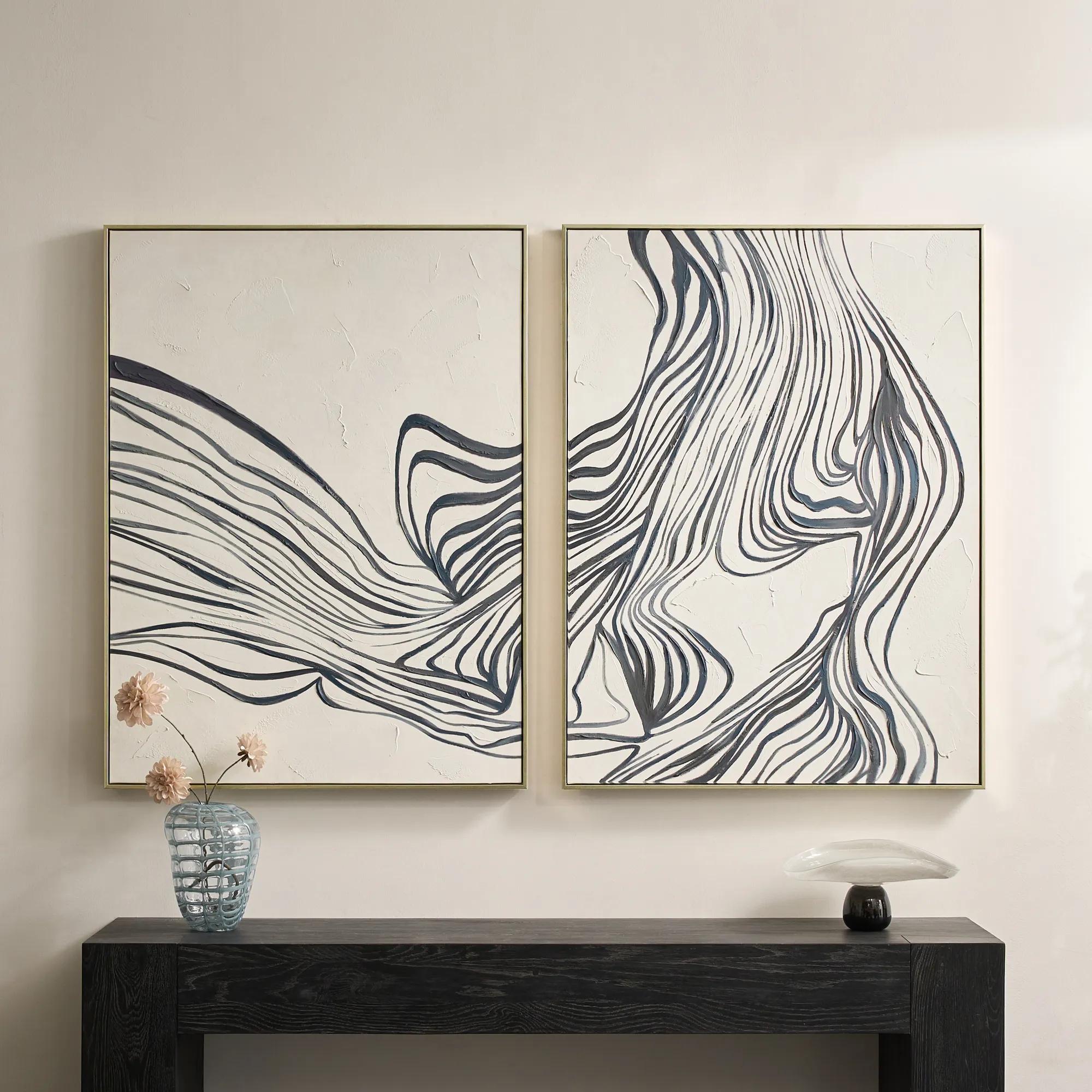 Rhythmic Framed Painted Wall Art 36" x 48" Set of 2$599
A hand-painted diptych featuring bold abstract stripes in dark slate and dusty blue with champagne frames.
Add To Cart -
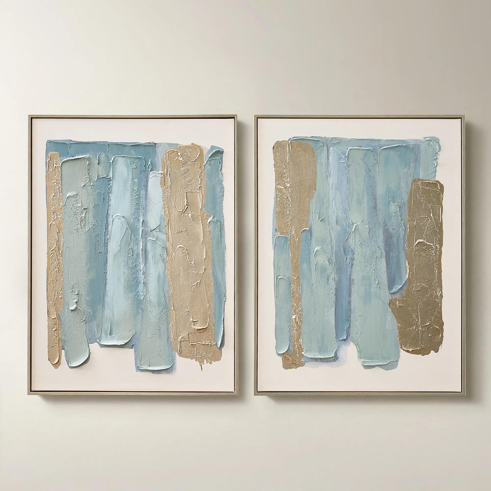
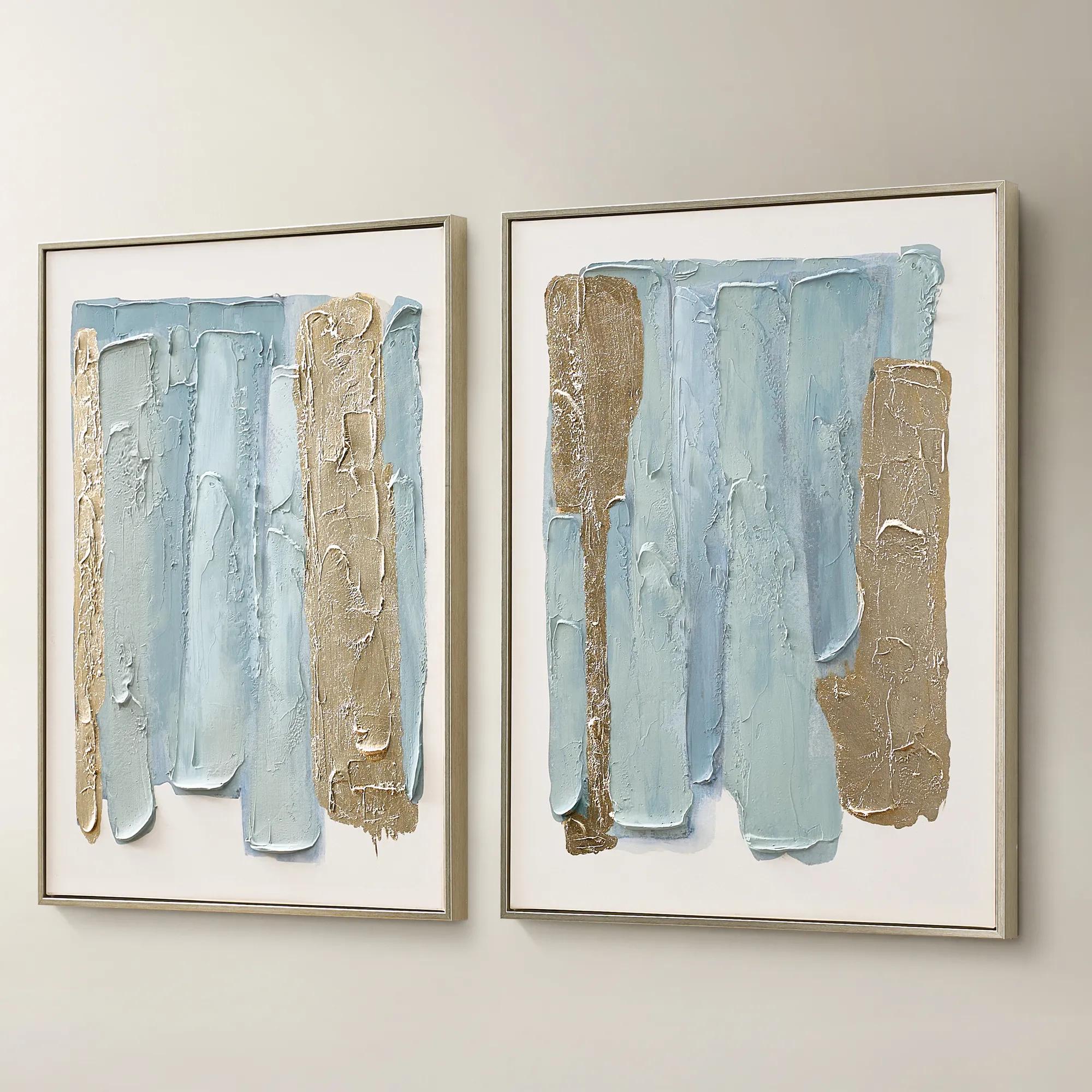 Blue Drift Framed Champagne Painted Wall Art 24" x 32" Set of 2$199
A set of two hand-painted canvases in dusty blue with champagne leafing and modern abstract movement.
Add To Cart -
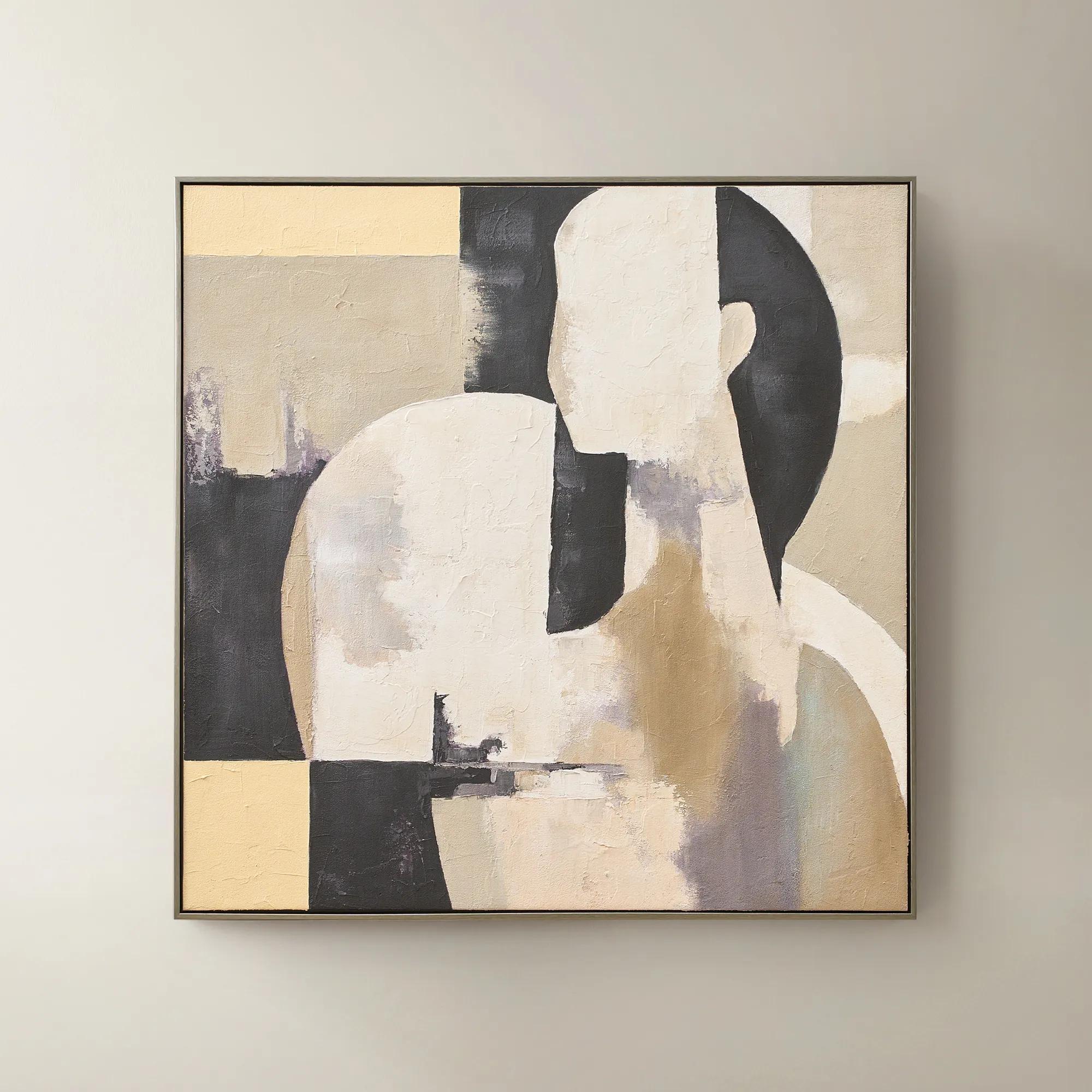 Afternoon Rest Framed Painted Wall Art 40" x 40"$399
A hand-painted abstract figure in buttercream, turtledove, and black hues framed in dark grey.
Add To Cart -
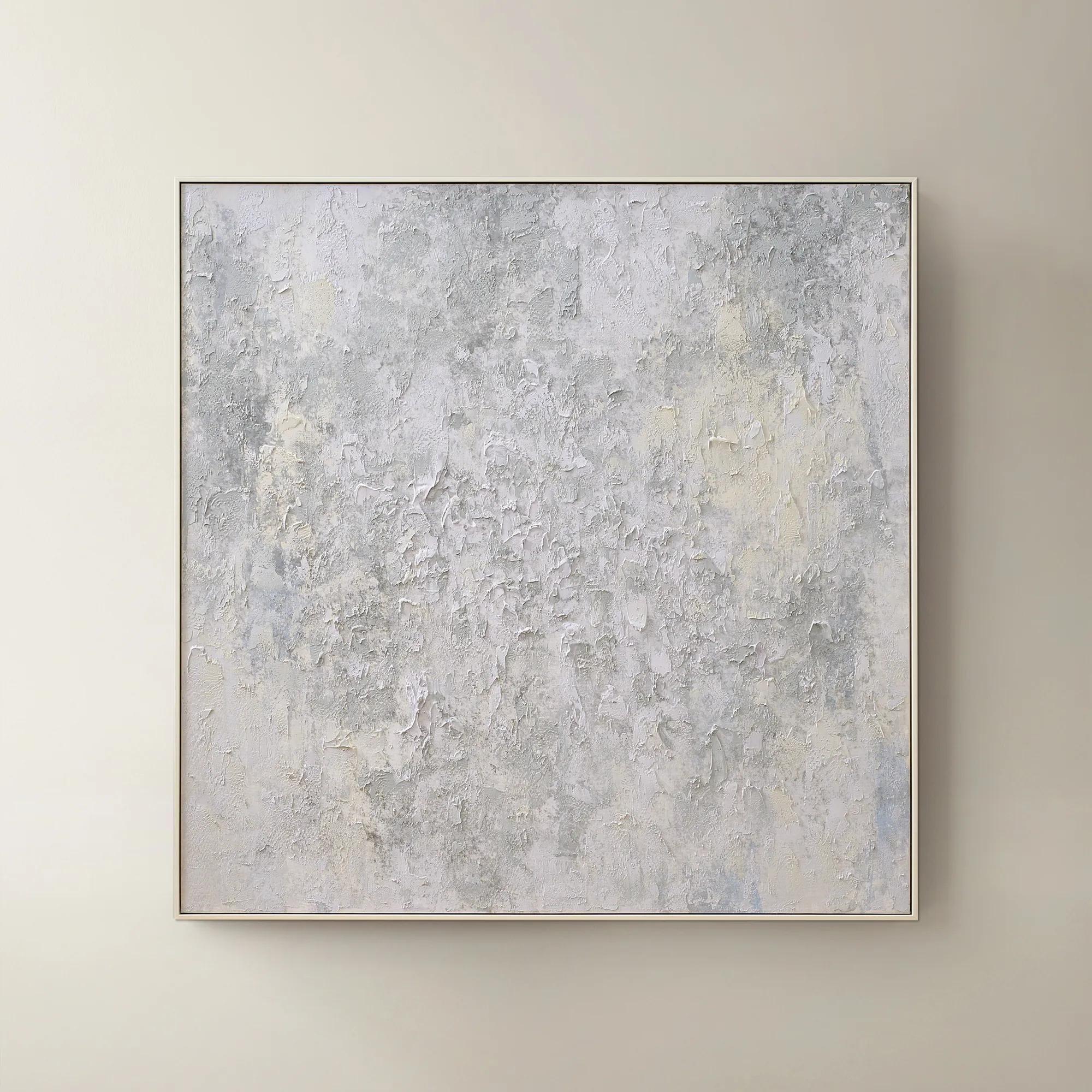 Breathe of Fresh Air Framed Painted Wall Art 50" x 50"$499
A hand-painted abstract canvas in dusty blue hues, elegantly framed in white for a serene, modern accent.
Add To Cart -
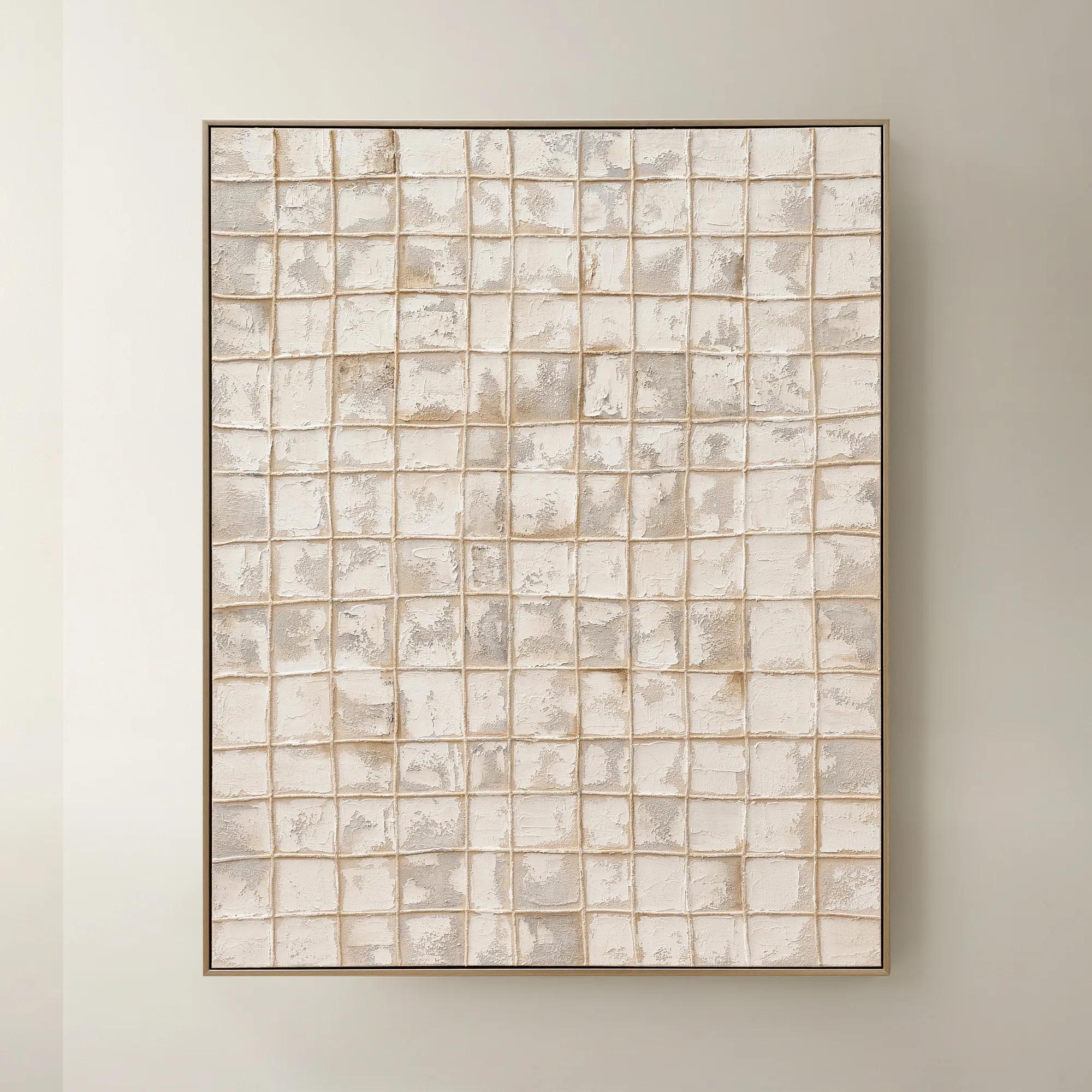
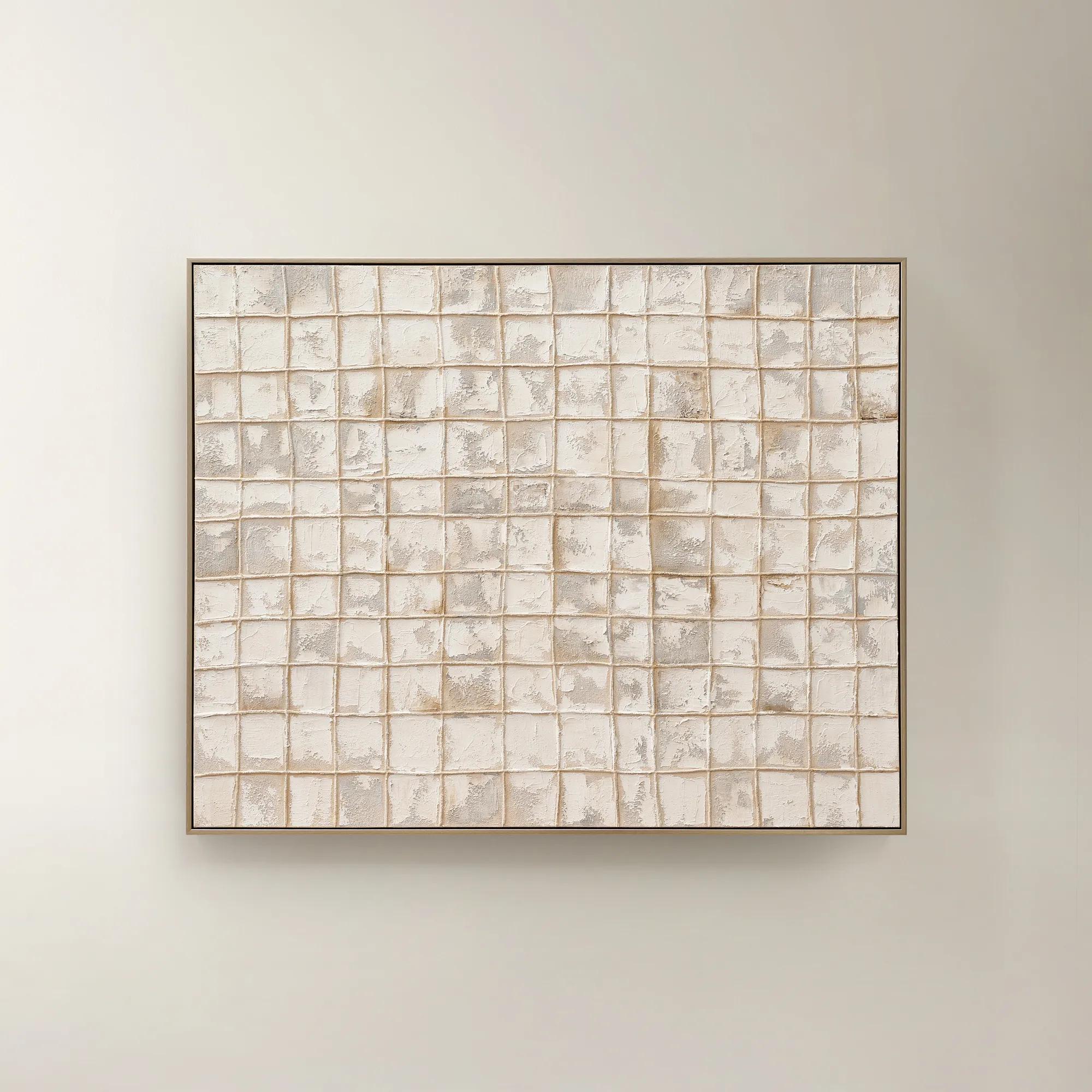 Painted Echos Framed Gold Leaf Wall Art 60" x 48"$699
A hand-painted abstract canvas with gold leaf accents and a champagne frame for modern, versatile display.
Add To Cart

Art For Home Staging
Choose art for home staging that gives rooms a polished focal point and helps prospective buyers picture themselves at home. Explore artwork to anchor living areas, bring definition to dining spaces, or give an entryway a gallery-inspired finish. Consider scale, color, and placement to complement the furnishings and highlight the room’s architecture without overwhelming it.
Art for home staging is decorative wall art chosen to make a property feel inviting, visually balanced, and ready for potential buyers to imagine as their own. It complements the home’s architecture, establishes a cohesive palette, and gives each room a focal point without distracting from the space itself. The effect is polished rather than anonymous: a sweeping abstract can lend a living room quiet grandeur, while a softly rendered landscape can give a bedroom a sense of repose. Home staging art works best when it suggests a lifestyle without telling an overly personal story. Tonal compositions, architectural imagery, expressive brushwork, and nature-inspired subjects offer visual interest with broad appeal; highly personal photographs, provocative imagery, or dominant text can pull attention away from the property. Neutral does not have to mean colorless. Ivory, charcoal, taupe, and layered grays can create depth, while restrained touches of blue, green, or metallic warmth connect the artwork to upholstery, finishes, and decorative accents. In an open living and dining area, repeating one or two colors across different compositions creates continuity without making the rooms feel identical. A pale wall gains definition from a dark frame; a room with strong architectural lines may benefit from a composition with fluid movement. For homeowners preparing to sell, professional home stagers, real estate professionals, and interior designers, the purpose is the same: to give a space presence while keeping its proportions and possibilities in view. A generous artwork above a sofa can make the seating arrangement feel resolved, and a carefully scaled piece beside a doorway can draw the eye toward the next room. Each placement becomes part of the property’s visual narrative, allowing a fireplace, a broad window, or a gracious ceiling height to remain the true attraction. The most compelling result feels considered and expressive, with enough restraint to leave room for a buyer’s imagination.
Material, finish, and scale determine how convincingly artwork belongs in a staged interior. Canvas brings a softly textured surface that can temper sleek furniture and polished stone, while framed paper prints offer crisp definition and a more tailored presentation. Dimensional wall art introduces shadow and sculptural detail, especially where a room needs character without another strong color. The distinction matters in photographs as well as in person: pronounced texture may create dramatic shadows, and glossy surfaces or glass can reflect windows, lamps, or the photographer. Matte surfaces and thoughtfully positioned lighting often produce a calmer image, although the right finish depends on the artwork and the room. Frames can echo an existing finish without matching every metal or wood tone. A slender dark border may sharpen a pale composition, while a warm metallic frame can bring a measured gleam to a restrained palette. Size deserves equal attention. Artwork around two-thirds the width of the furniture beneath it can be a useful starting point, but surrounding trim, ceiling height, and visual weight all affect the final balance. A small piece floating above a substantial sofa may look disconnected; a larger composition can anchor the arrangement without adding furniture. Hanging height also shapes the relationship between art and room, with a comfortable viewing level generally more effective than a placement that leaves the work hovering near the ceiling. Durability becomes particularly important for staging collections that travel between properties. Secure frame construction, suitable hanging hardware, and protective packing help reduce damage during handling, while heavier pieces require mounting appropriate to both their weight and the wall surface. Care varies by material: frames generally benefit from gentle dusting, canvas surfaces should be handled cautiously, and cleaning products should never be sprayed directly onto artwork. Manufacturer care instructions take priority, especially for embellished or dimensional surfaces. Protection from prolonged direct sunlight, moisture, and abrasive contact helps preserve the finish for use beyond a single showing.
The most persuasive staged rooms feel complete without appearing crowded, and wall art helps create that distinction. In a compact entry, a vertical composition can emphasize height while leaving the walking path clear. Above a dining room sideboard, a broad abstract can establish a destination for the eye, giving the setting a sense of occasion without requiring an elaborate tabletop arrangement. A bedroom often benefits from a gentler visual rhythm: spacious compositions, softened contrast, and colors that connect with the bedding can make the room feel restful without becoming overly personal. In a home office, architectural photography or a controlled geometric composition can suggest focus and sophistication while allowing the desk and usable floor area to remain visible. Not every wall needs an artwork. Deliberate open space gives a strong composition room to register and keeps doorways, built-ins, and distinctive finishes from competing for attention. Consistency across rooms comes from shared undertones, compatible framing, and a similar level of visual intensity rather than a series of matching images. This approach is especially valuable for listing photography, where each frame needs a clear focal point and an easy-to-read sense of scale. Art can also connect recently updated rooms to the rest of a property, softening the transition between new finishes and existing furnishings. For spaces where refreshed architecture and decorative expression meet, Art for Stylish Home Renovations offers a related perspective on bringing walls into the overall design. Whether selected for a single property or a reusable staging collection, artwork earns its place through proportion, mood, and versatility. The goal is not to disguise a home’s character, but to reveal it with greater clarity: a luminous composition that draws attention to generous light, a sculptural accent that complements clean lines, or a richly layered abstract that gives an otherwise quiet room a memorable sense of distinction.
FAQs
Abstract compositions, architectural photography, and softly rendered landscapes offer distinct directions for home staging art. Choose a visual language that complements the home's character: fluid forms for a serene interior, graphic imagery for a contemporary setting, or expressive brushwork for a touch of drama.
Take your cue from the room's existing palette, then introduce art with a deliberate connection to those hues. Cream, charcoal, and soft earth tones create a composed foundation, while a restrained accent of blue or gold adds richness. Aim for a thoughtful conversation between the artwork and its surroundings.
Look for shared colors, shapes, or moods rather than an exact match. A fluid abstract can echo the curves of an accent chair, while architectural imagery can complement furniture with crisp lines. Repeat a select hue through pillows or decorative objects for a layered, intentionally styled vignette.
Give each room its own artistic mood while maintaining a common visual thread. Consider expressive compositions in living areas, atmospheric landscapes in bedrooms, and striking photography in an entryway. Carry a recurring palette or artistic style throughout the home so each space feels distinct yet connected.
Build a gallery wall around one unifying idea, such as monochromatic photography, gestural abstracts, or botanical imagery. Coordinate frame finishes and let a few expressive pieces lead the composition. Keep surrounding decor thoughtfully edited so the arrangement reads as a curated collection rather than a competing mix of accents.