Art For Interior Designers
Art For Interior Designers
-
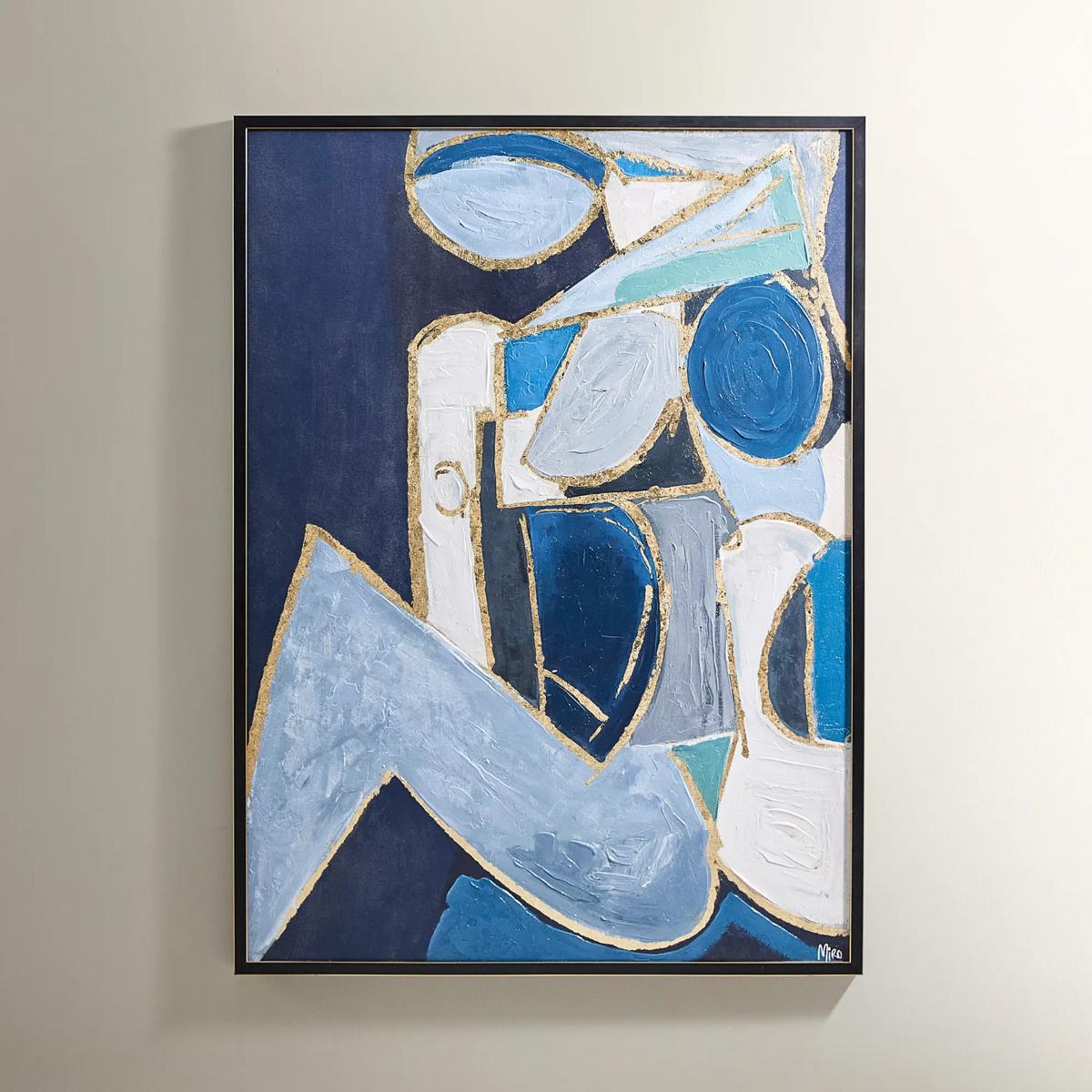
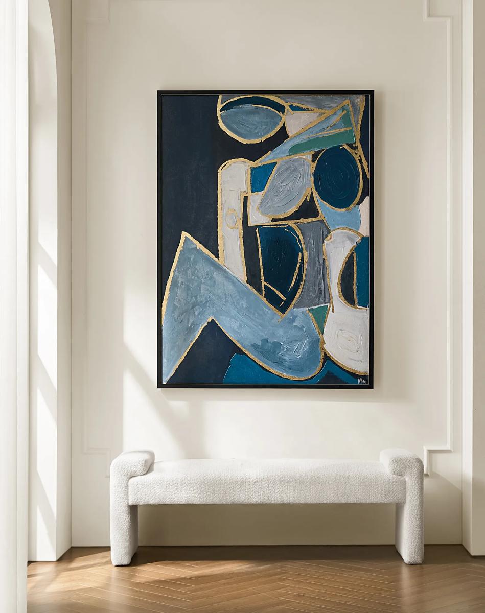 Figure in Cubism Painting$599
A hand-embellished canvas artwork featuring blue, gold, and white hues with elegant silver foil accents.
Add To Cart -

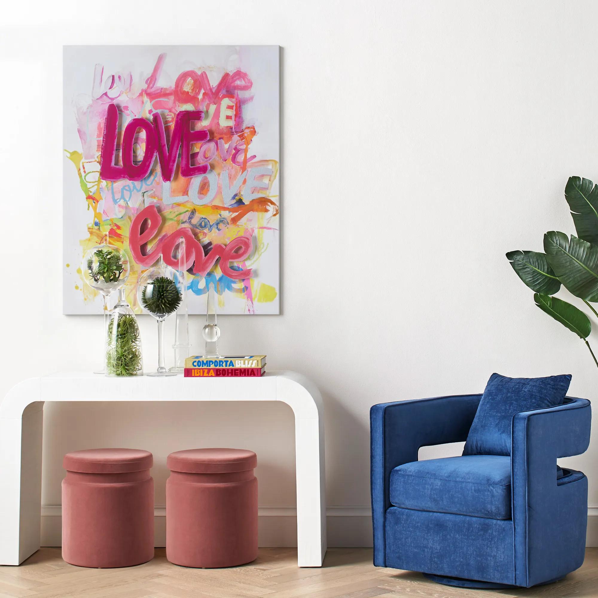 Love Is In The Air Wall Art 40" x 50"$1399
A vibrant giclee canvas print featuring hand-applied silver gilding and dimensional acrylic "Love" lettering.
Add To Cart -
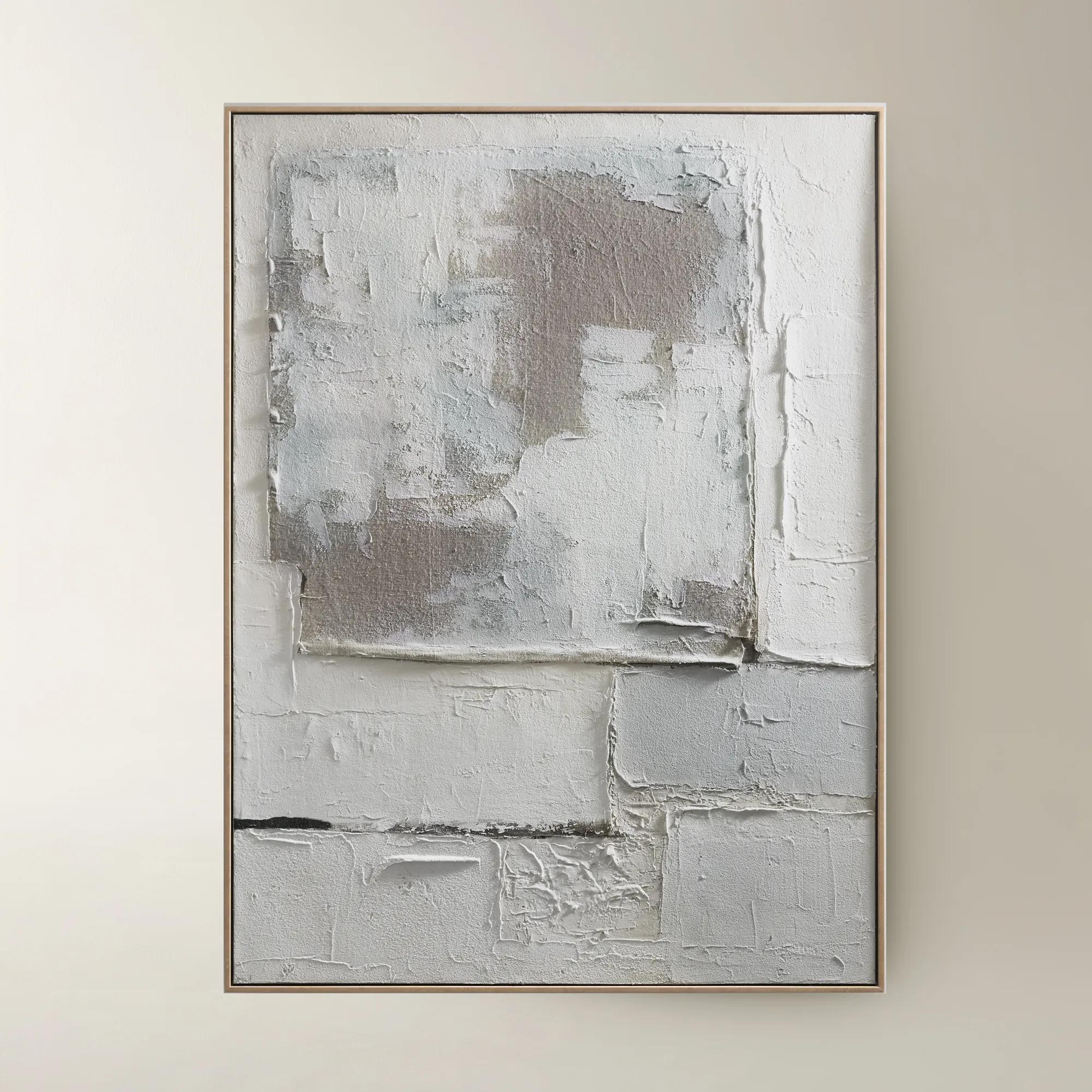
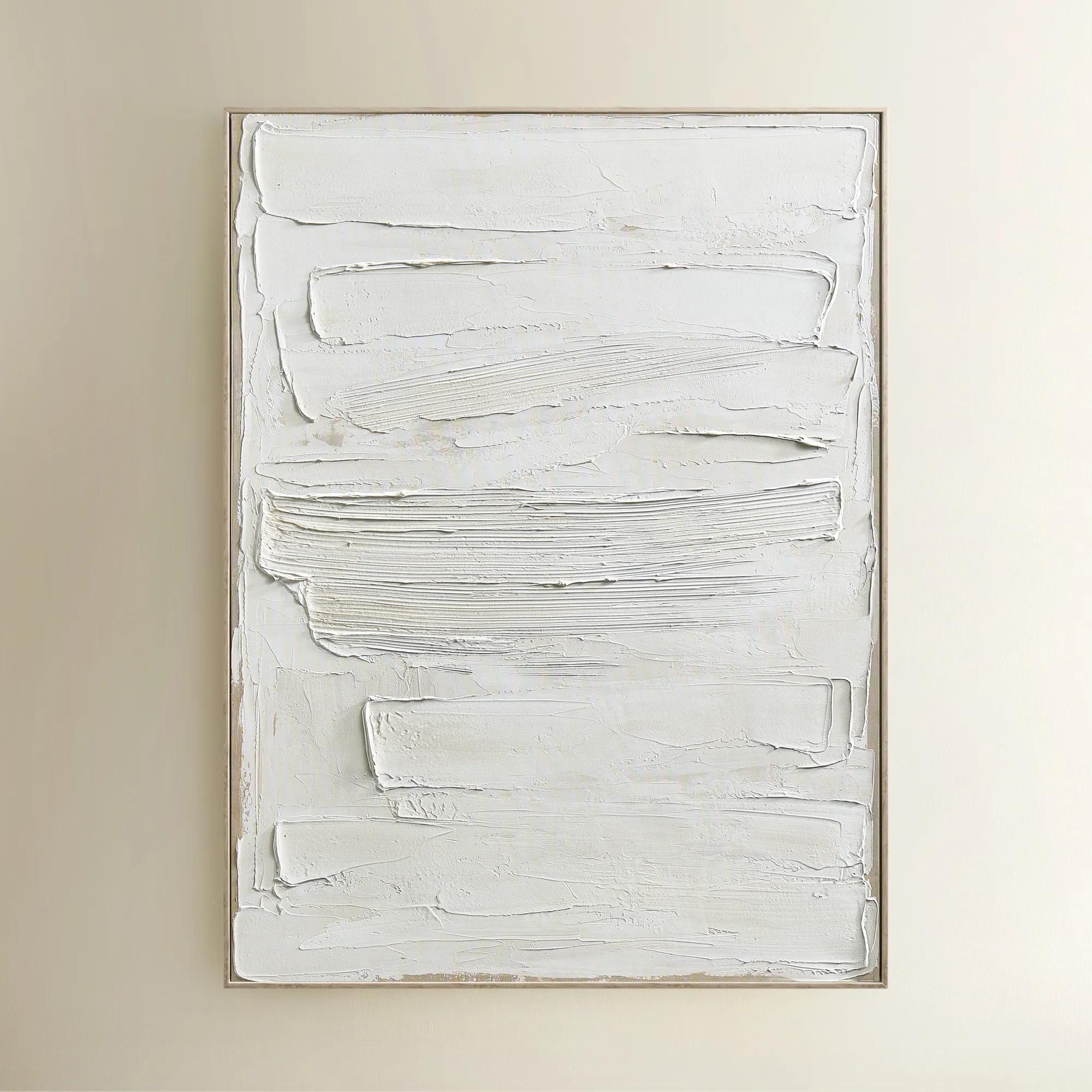
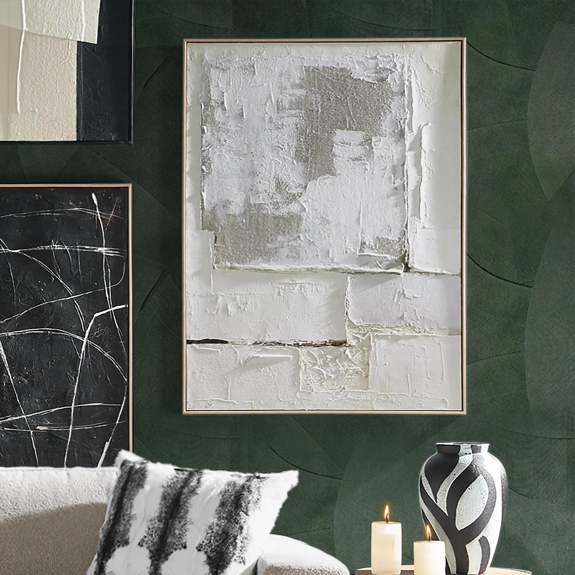 Marrow Painting$399
A hand-painted abstract canvas in subtle beige hues, elegantly framed in a warm beech wood floater.
Add To Cart -

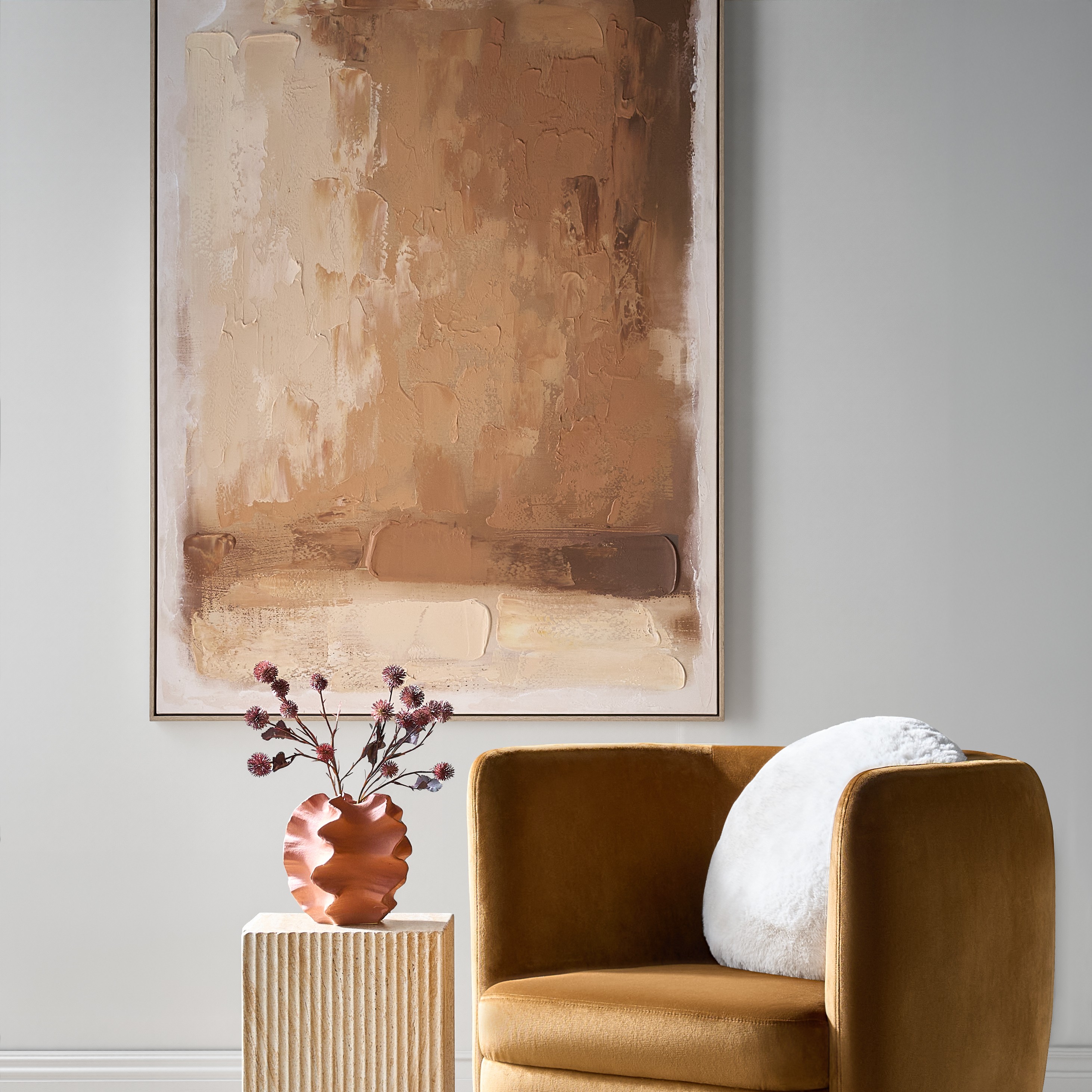 Ember Glow Framed Painted Wall Art 39.25" x 55"$499
A hand-painted abstract canvas blending ochre, terracotta, and golden clay hues in a light natural frame.
Add To Cart -
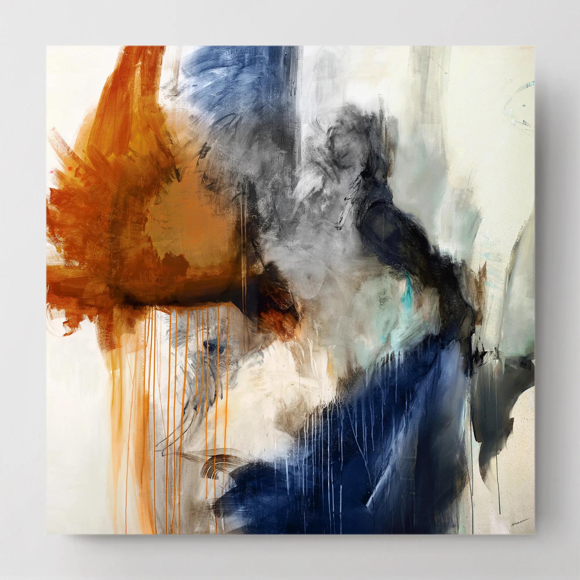
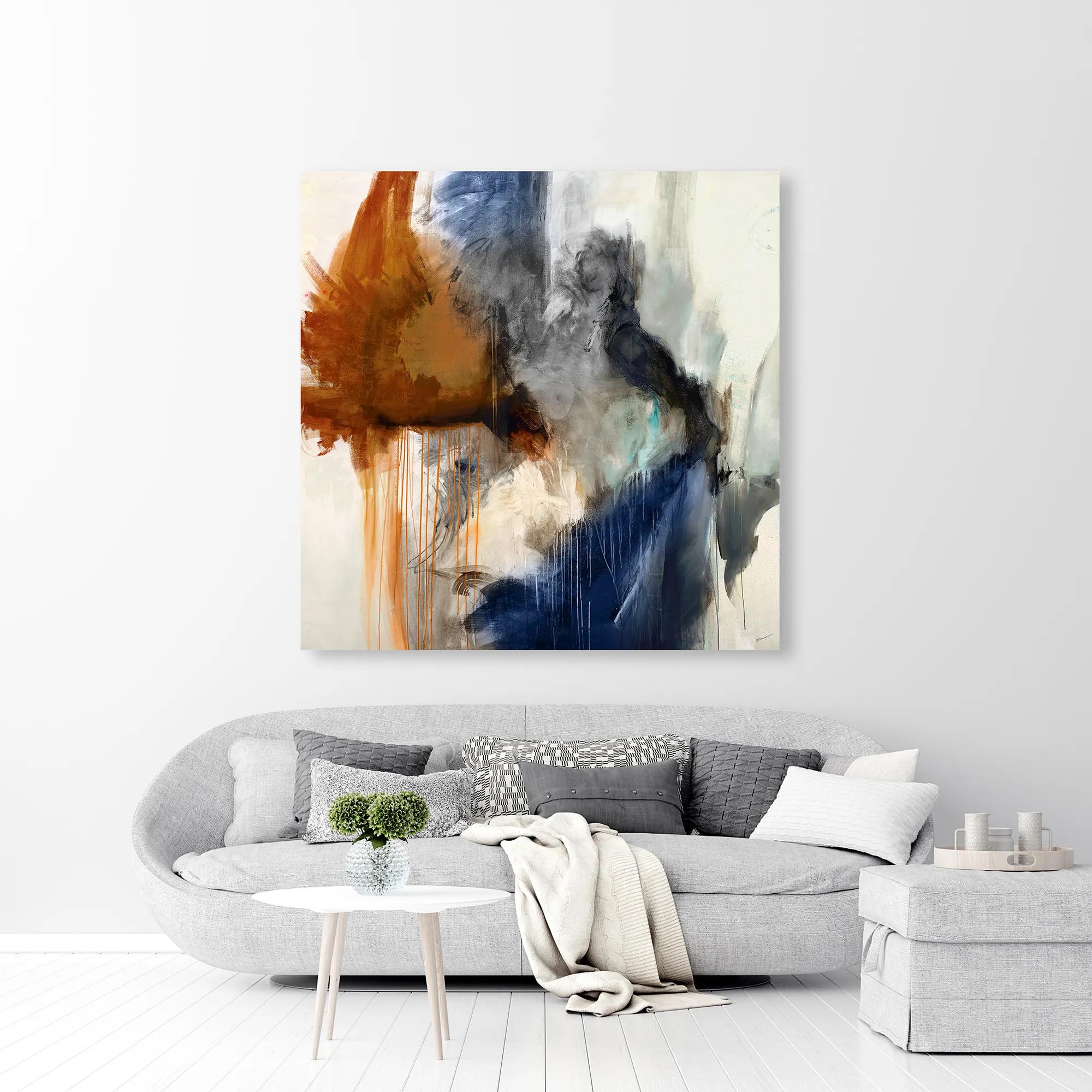 Swoon 6 Wall Art 54" x 54"$899
A gallery-wrapped canvas featuring a hand-applied image brush gel finish for a textured, artistic look.
Add To Cart -
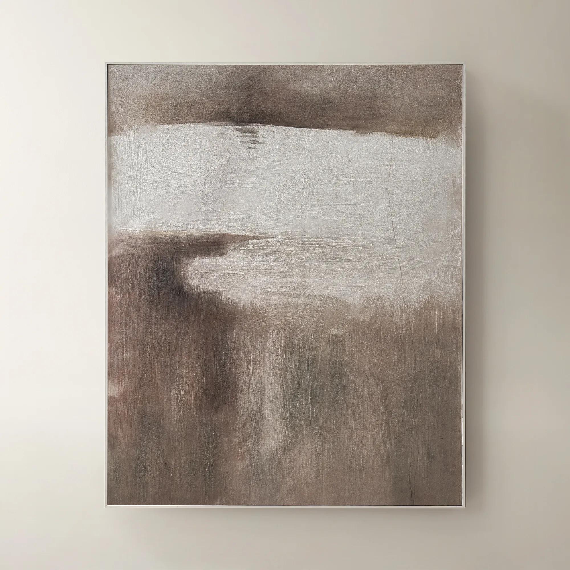 Desert Wind Art$599
A richly hued brown canvas artwork bringing warm, desert-inspired movement to modern interiors.
Add To Cart -
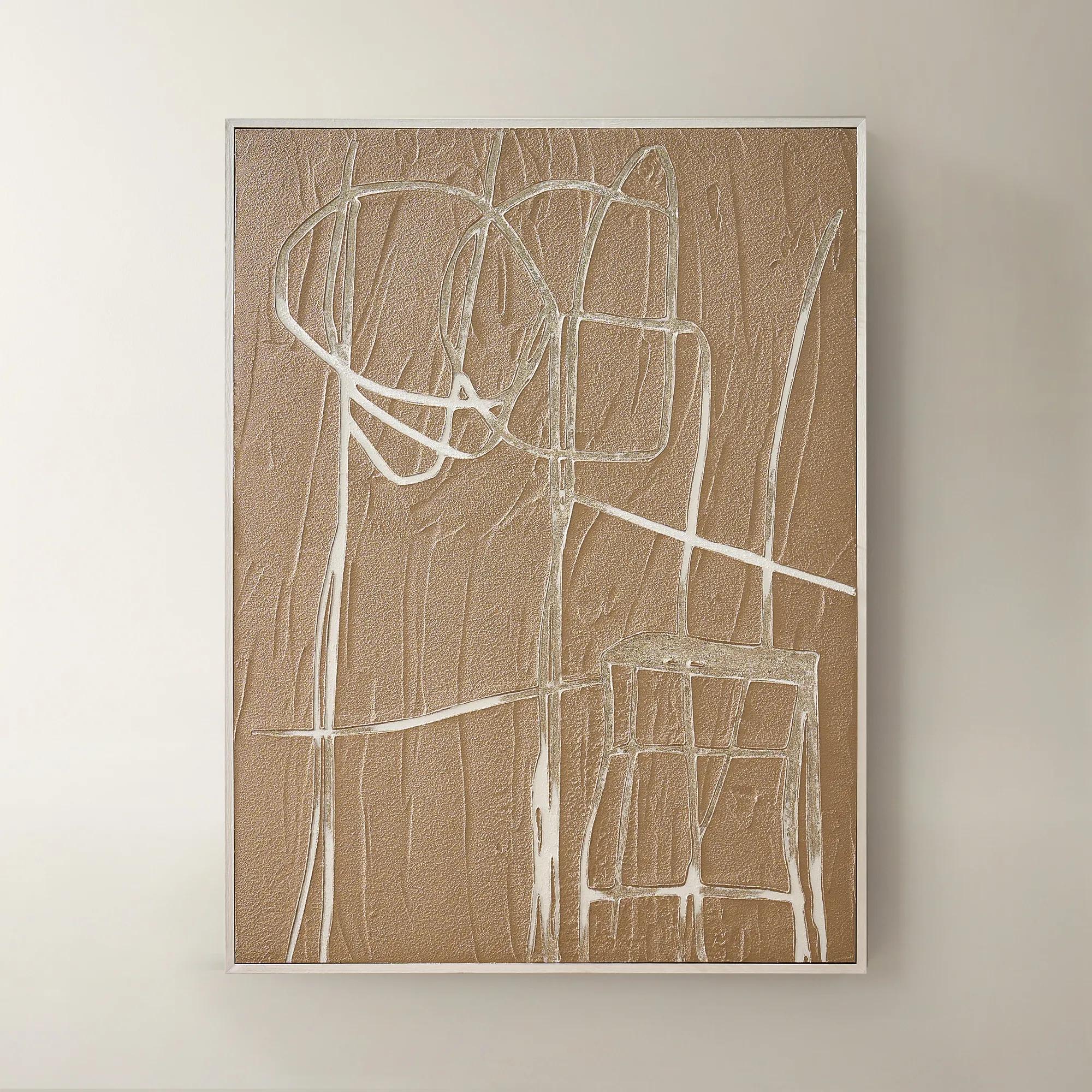
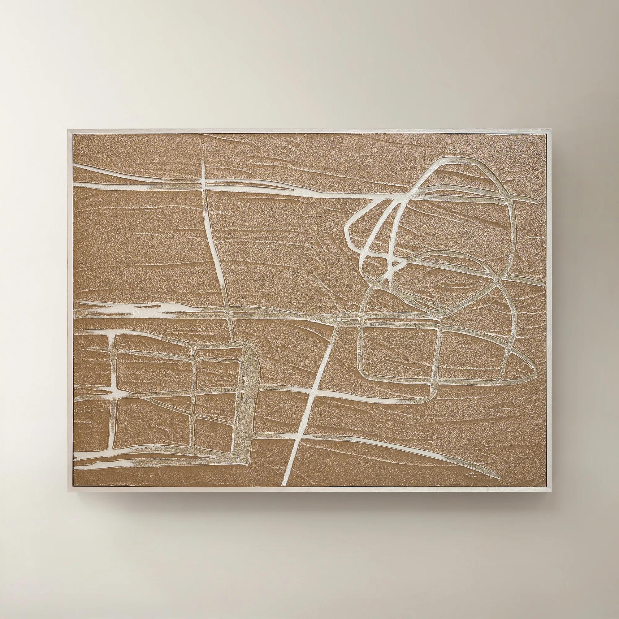 Linear Sand Framed Painted Wall Art 35" x 47"$369
A contemporary sand-toned painted canvas artwork framed for sophisticated modern interiors.
Add To Cart -
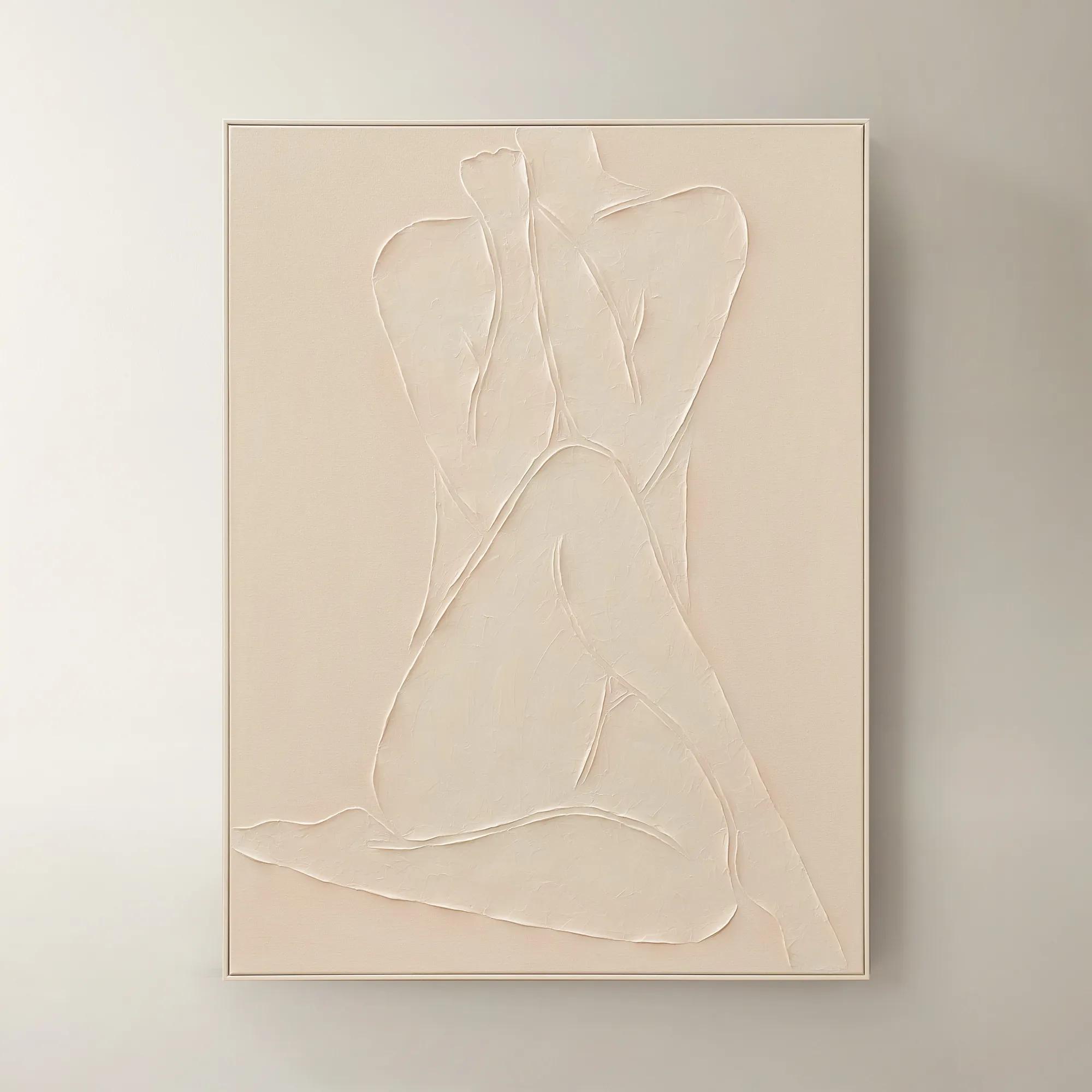
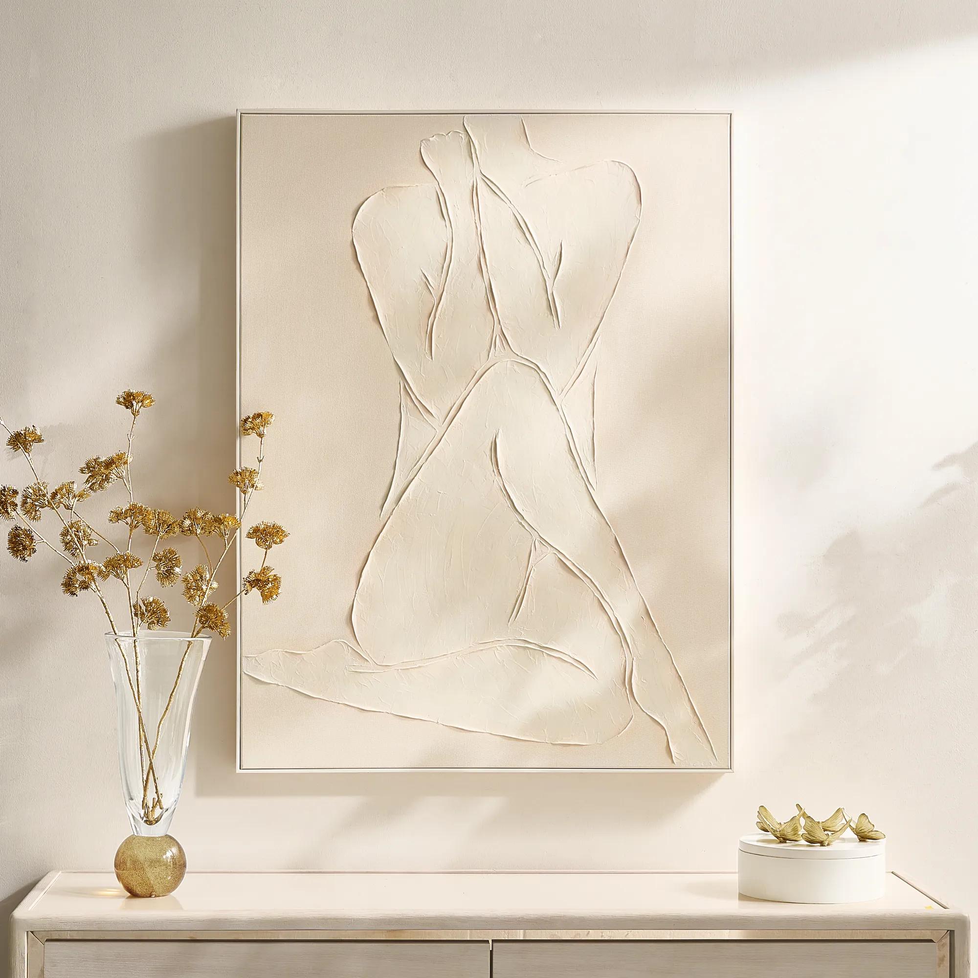 Modern Elegance Nude Ivory Framed Painted Wall Art 35.5" x 47.25"$599
A hand-painted ivory canvas in a white frame brings serene, modern artistry to any space.
Add To Cart -
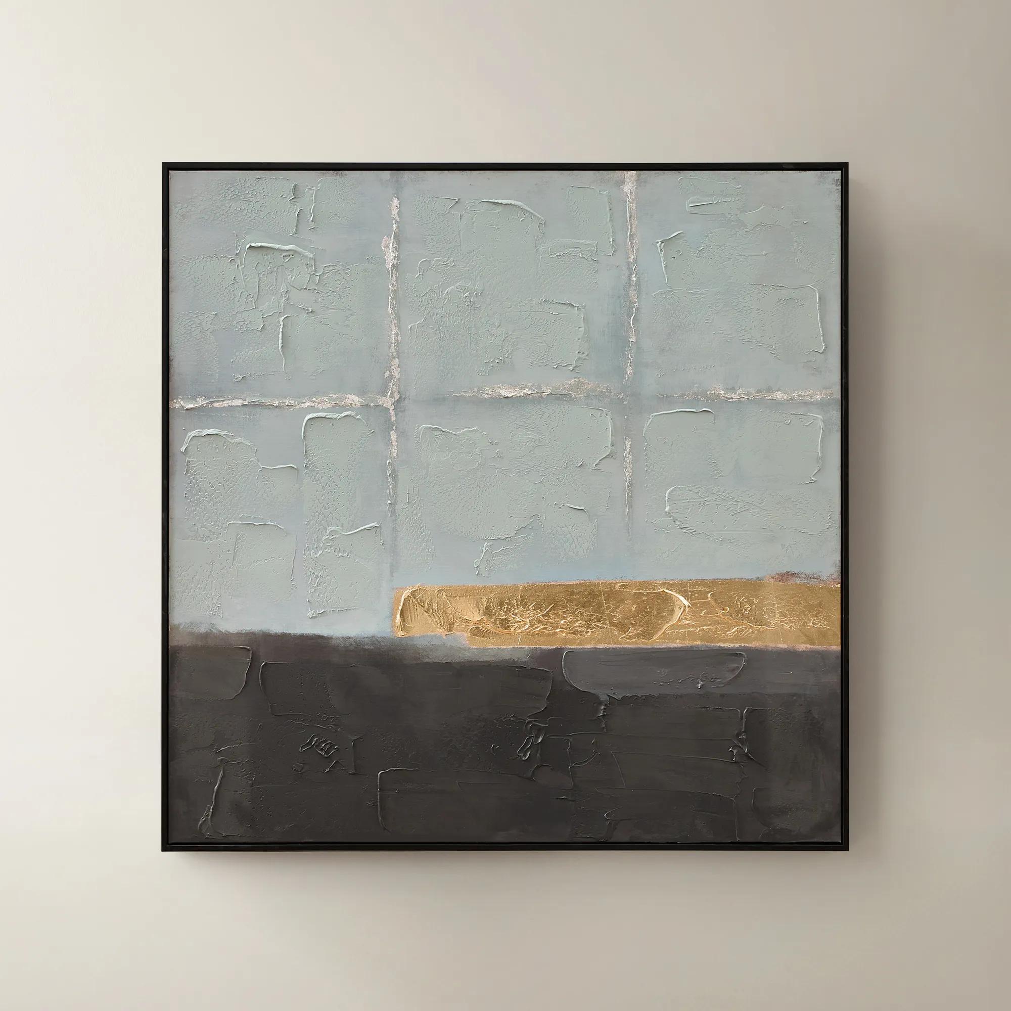
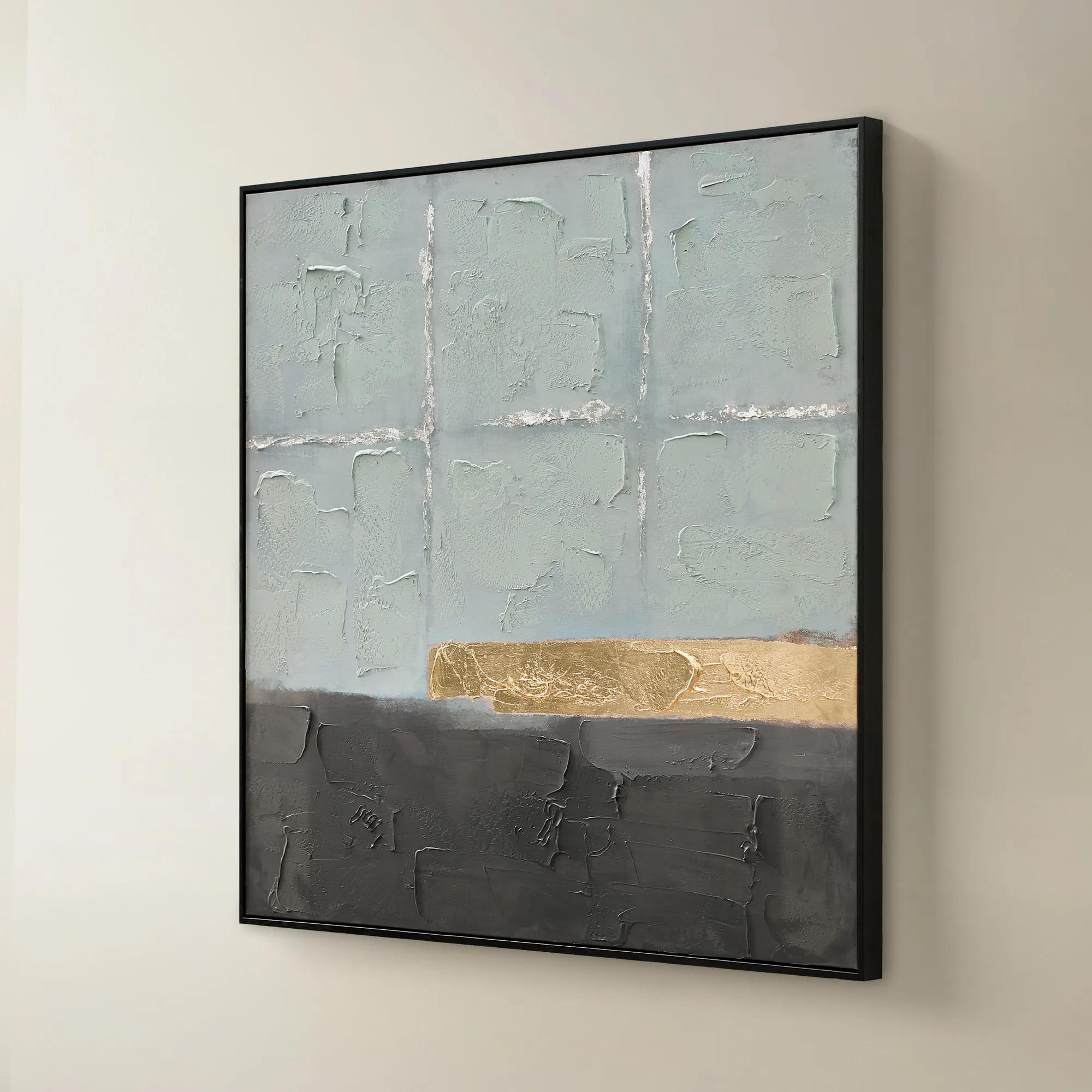 Jules Framed Gold Leaf Painted Wall Art 40" x 40"$299
A hand-painted canvas in mineral blue with gold leaf accents and a sleek black frame for modern appeal.
Add To Cart -
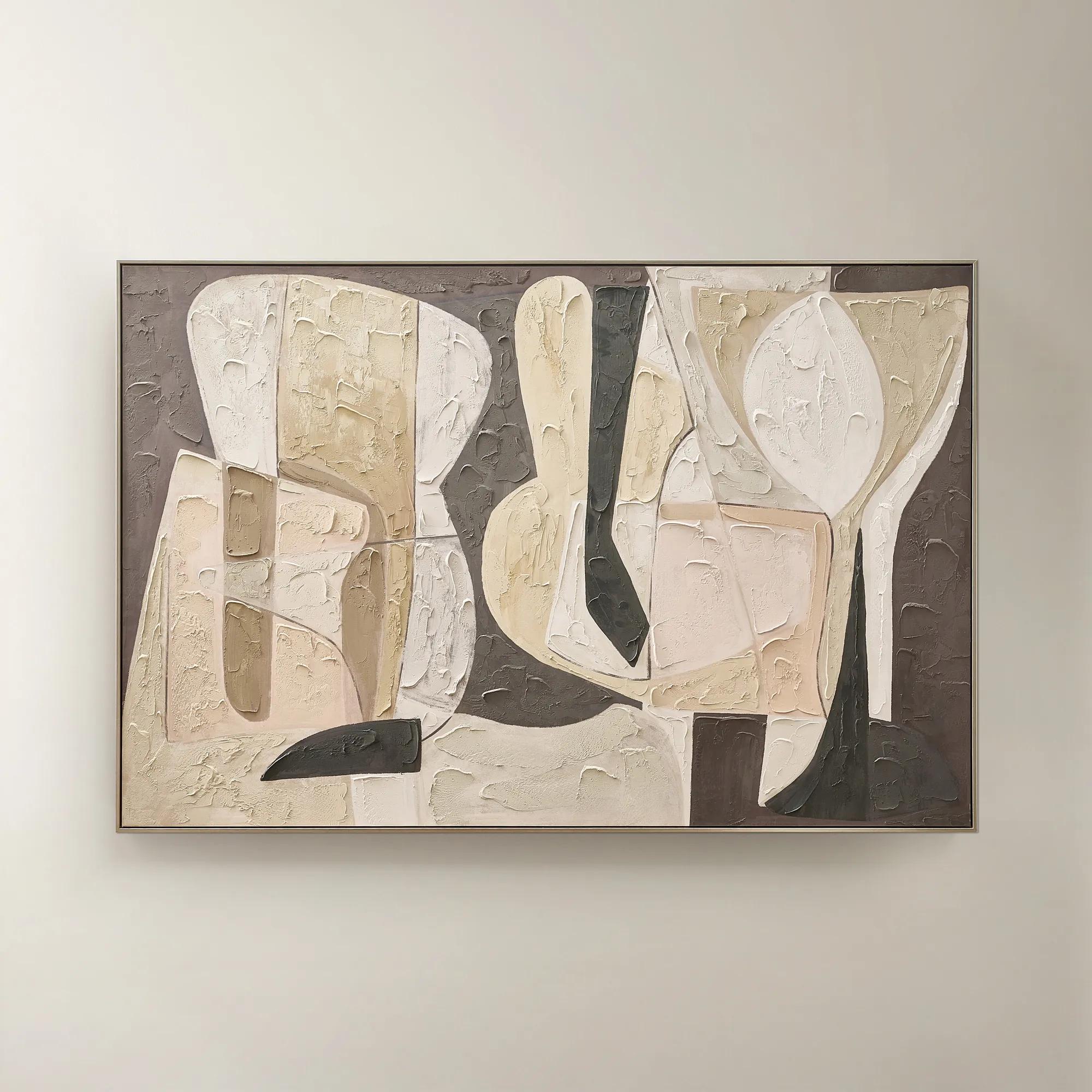 Wishful Thinking Framed Painted Wall Art 72" x 48"$599
A hand-painted abstract canvas featuring bold geometric forms and warm smoked plum, apricot, and tawny hues.
Add To Cart -

 Hint of Spring Framed Painted Wall Art 48" x 48"$599
A framed, multicolored painted canvas artwork that brings a vibrant, artistic touch to contemporary interiors.
Add To Cart -
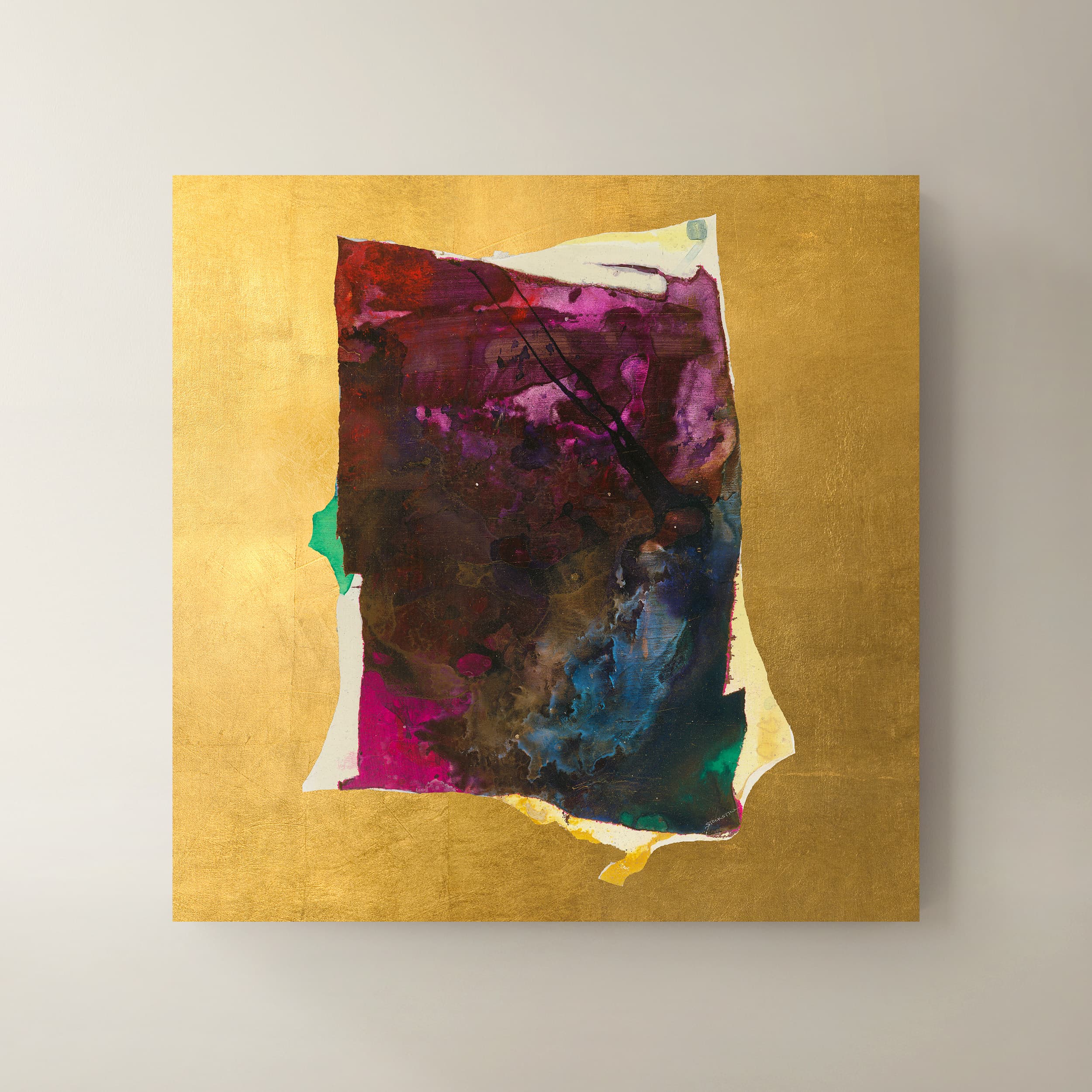 Supremo I Wall Art 40" x 40"$999
A multicolored canvas wall art piece adding contemporary visual interest to your interior.
Add To Cart -
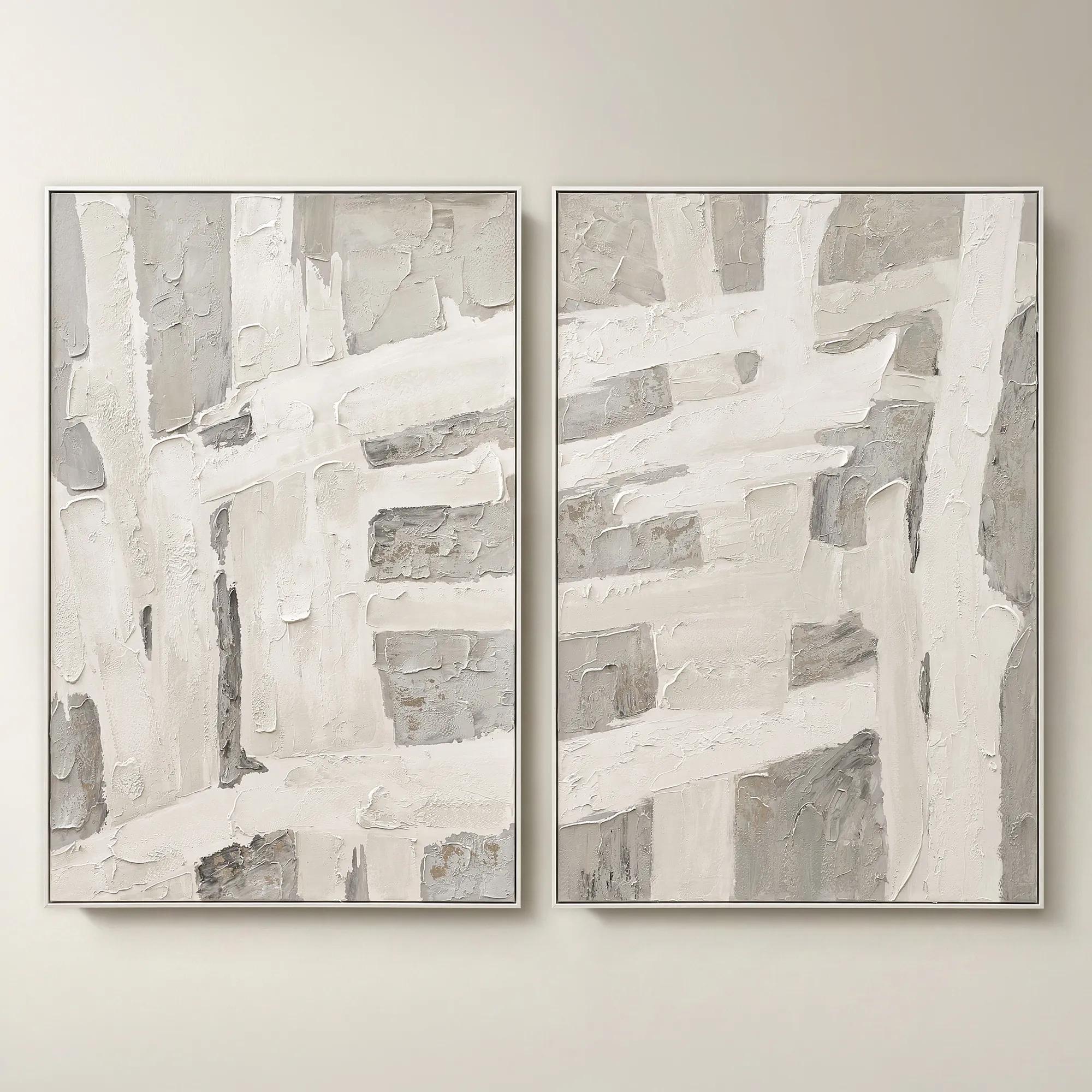 Traverse Framed Painted Wall Art 40" x 60" Set of 2$799
A hand-painted abstract diptych features champagne accents and soft grey, pearl, and alabaster tones in white frames.
Add To Cart -
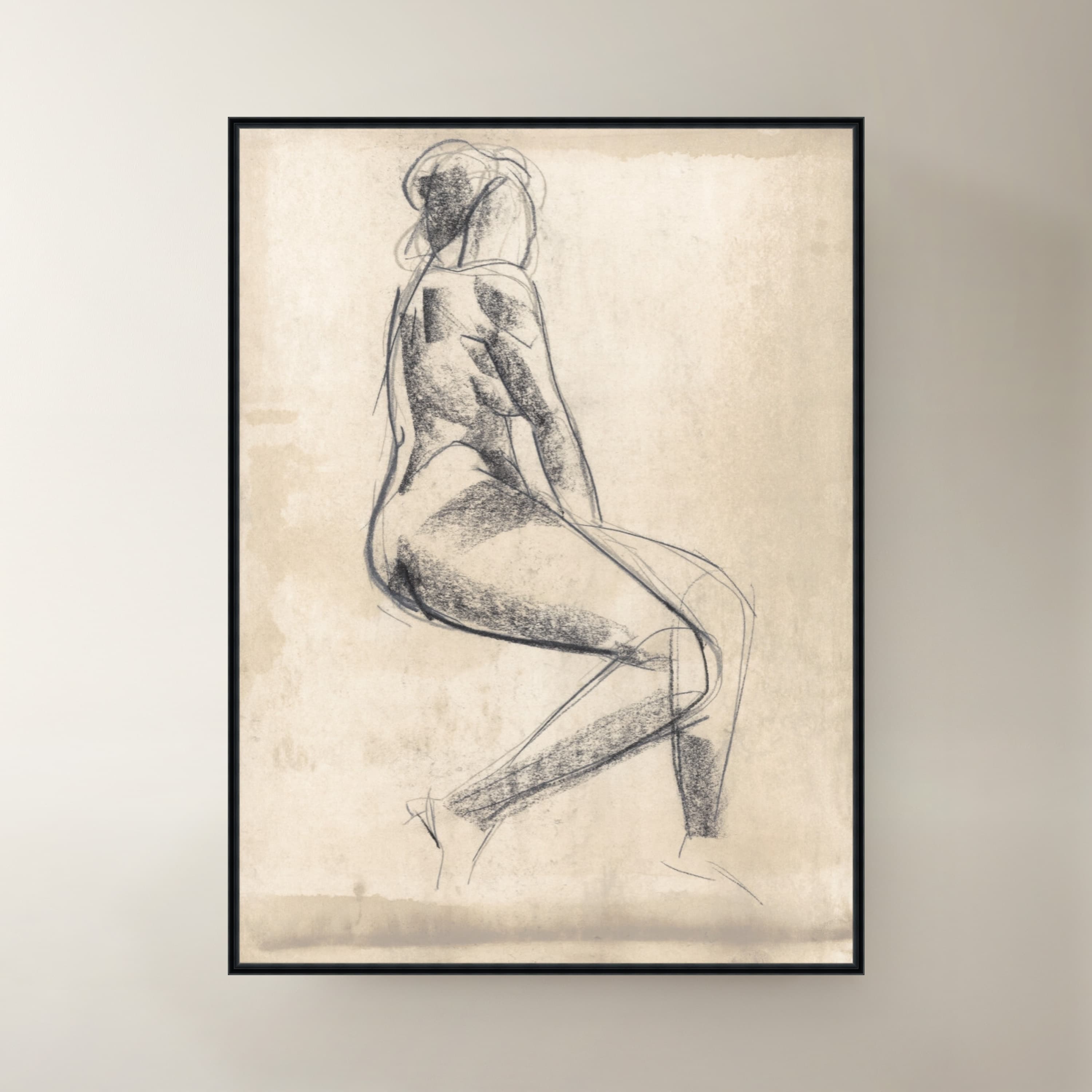
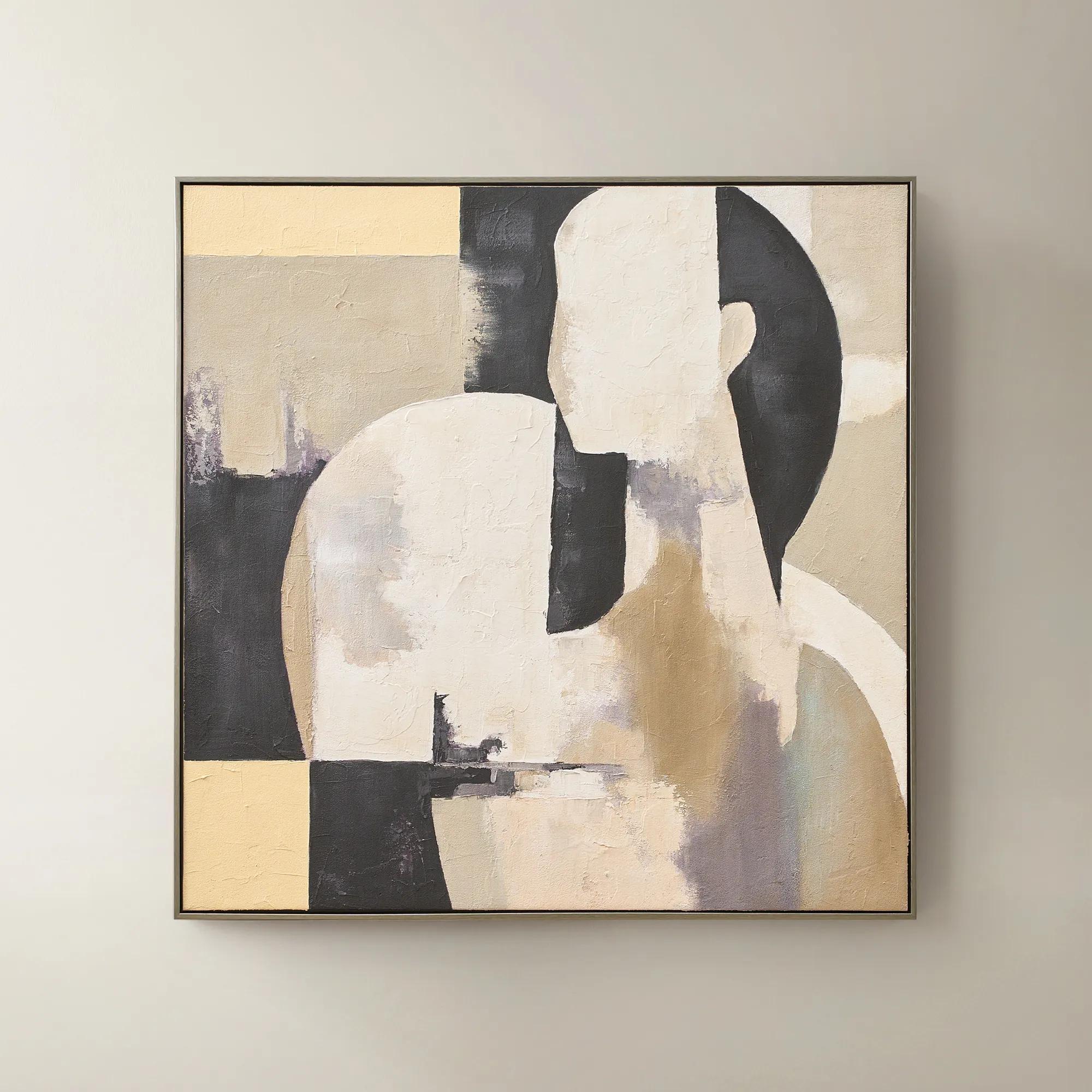 Afternoon Rest Framed Painted Wall Art 40" x 40"$399
A hand-painted abstract figure in buttercream, turtledove, and black hues framed in dark grey.
Add To Cart -
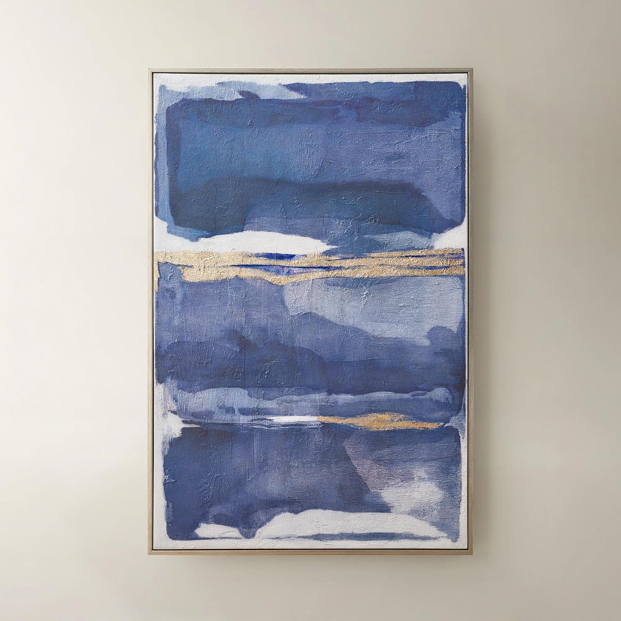
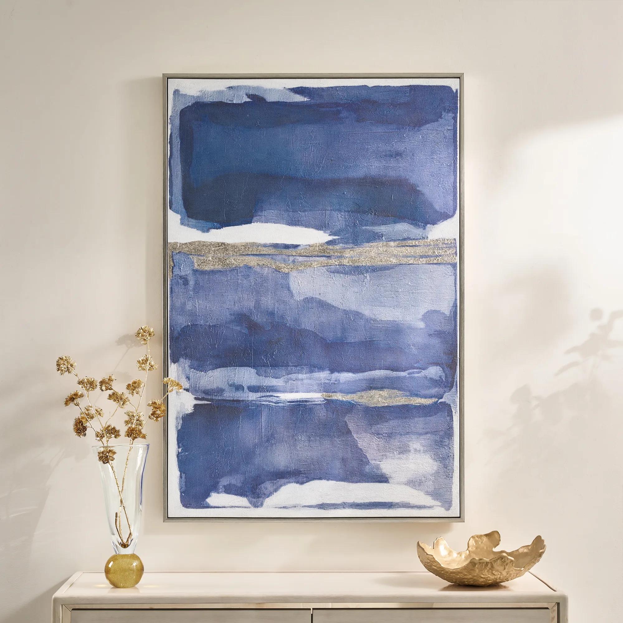 Memories in Blue Framed Painted Wall Art 40" x 60"$499
A hand-painted canvas in deep ink blue with champagne leafing for a sophisticated, gallery-inspired look.
Add To Cart -
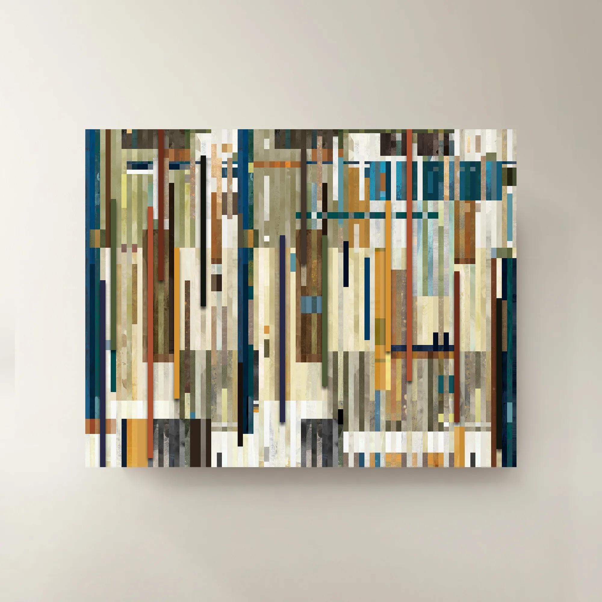
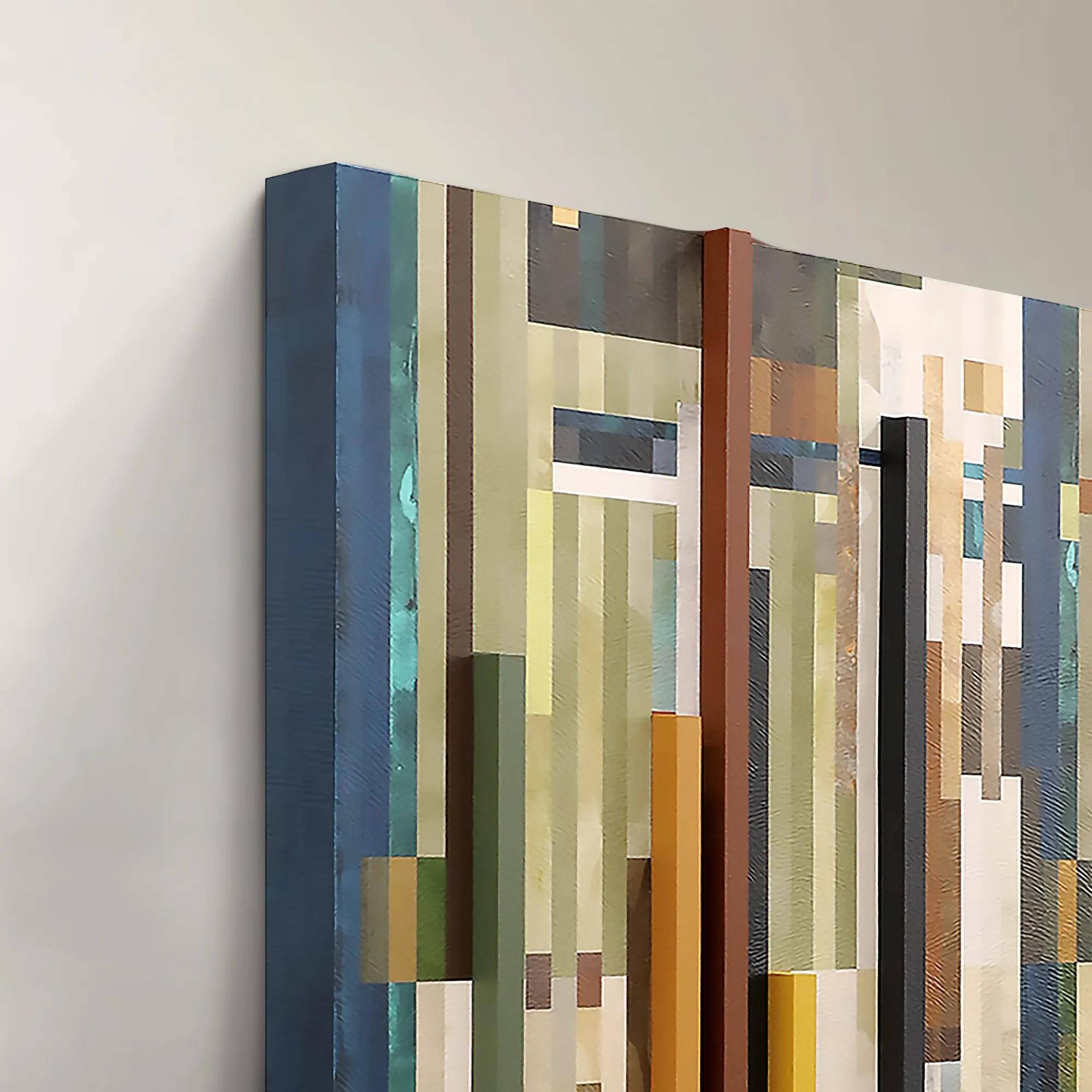 Chromatic Rhythms II Wall Art 60" x 47"$1899
A dynamic blue abstract canvas artwork featuring rhythmic geometric composition.
Add To Cart -
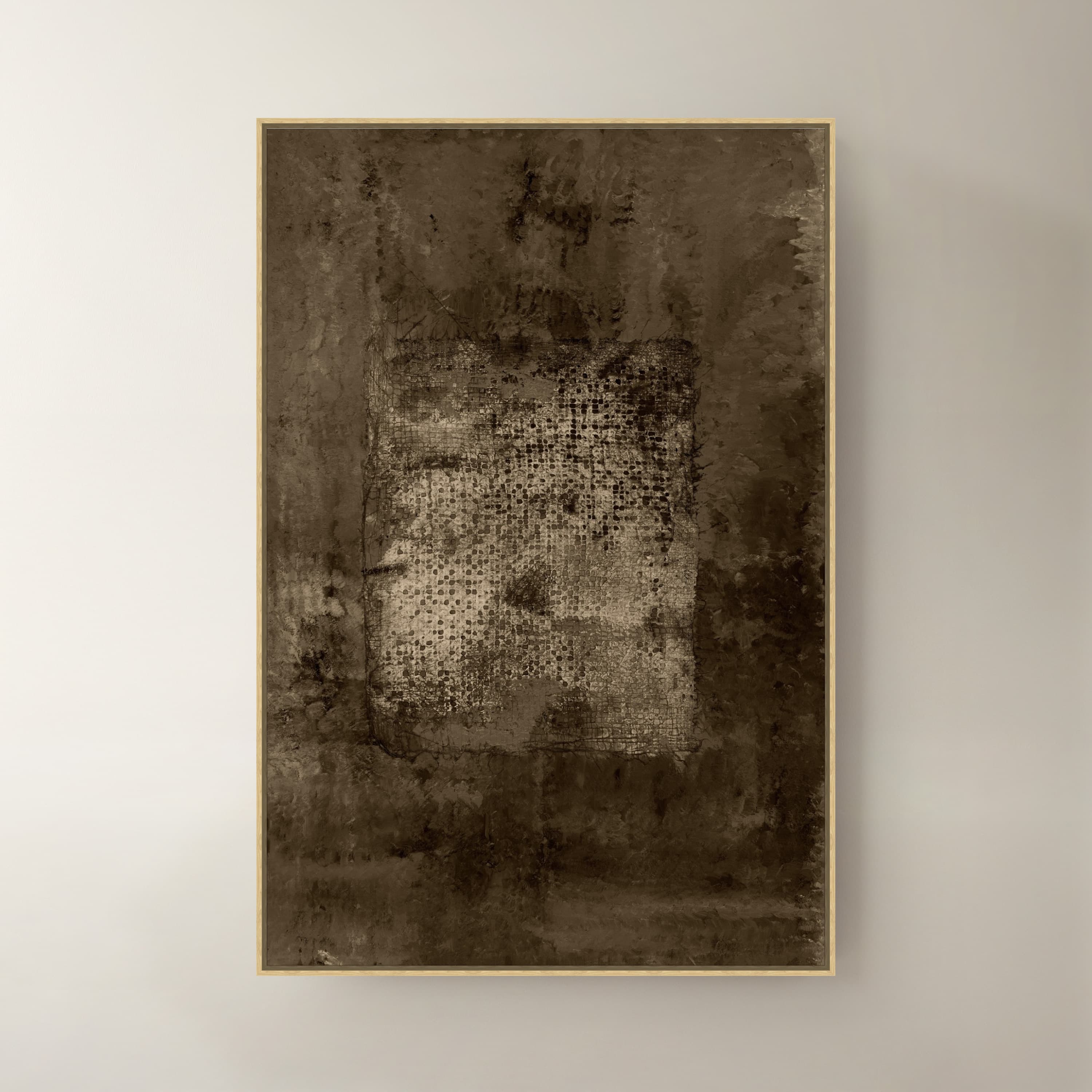
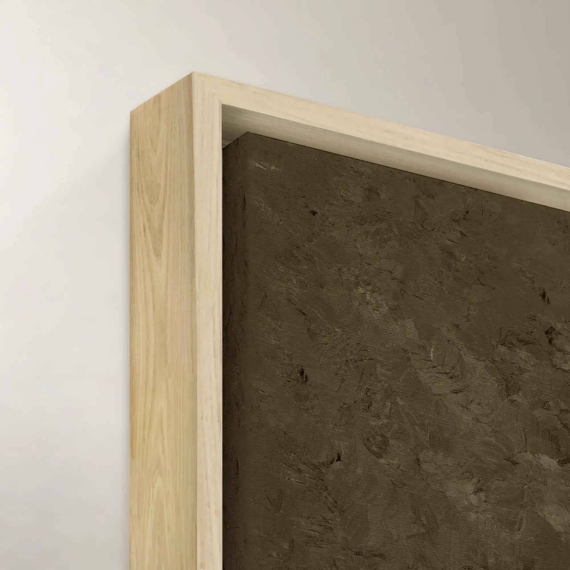 Ash IV Wall Art 40" x 60"$1399
A striking brown canvas artwork adding modern artistic depth to sophisticated interiors.
Add To Cart -
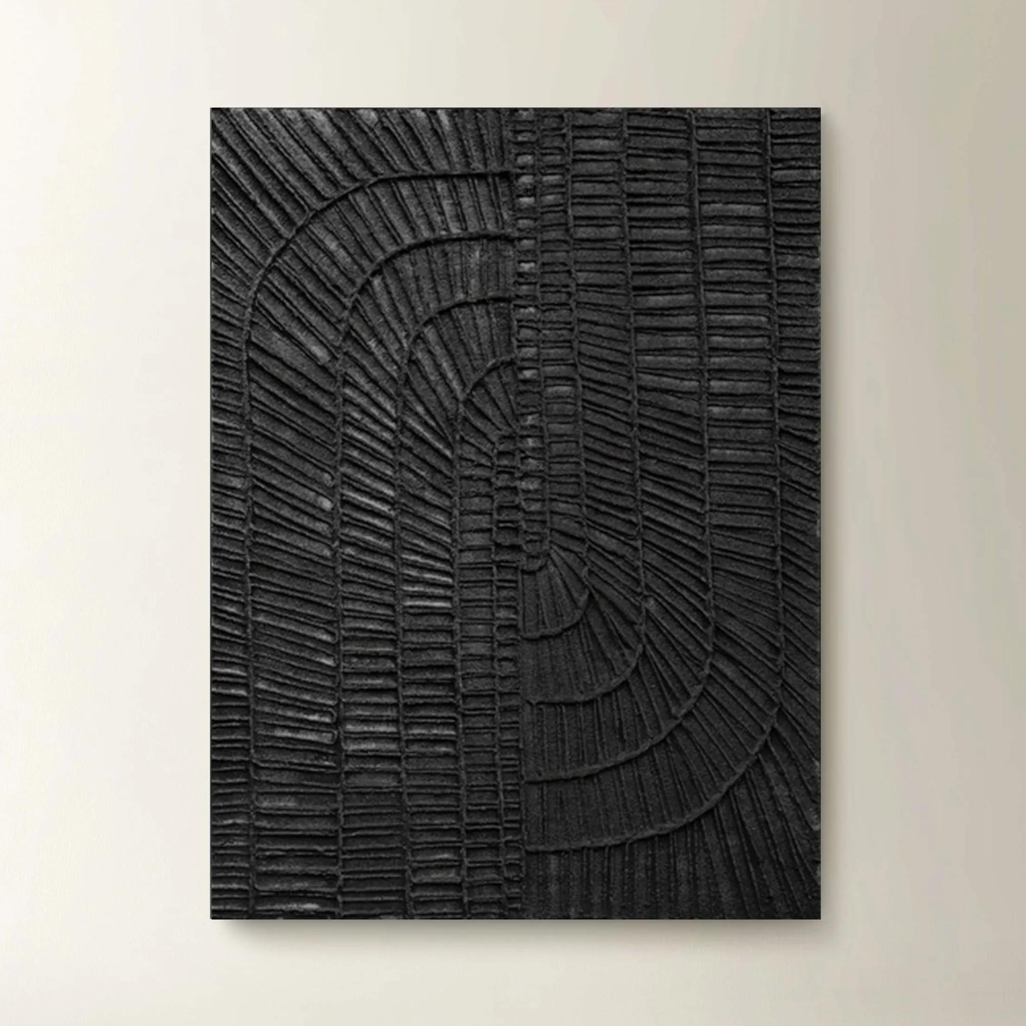
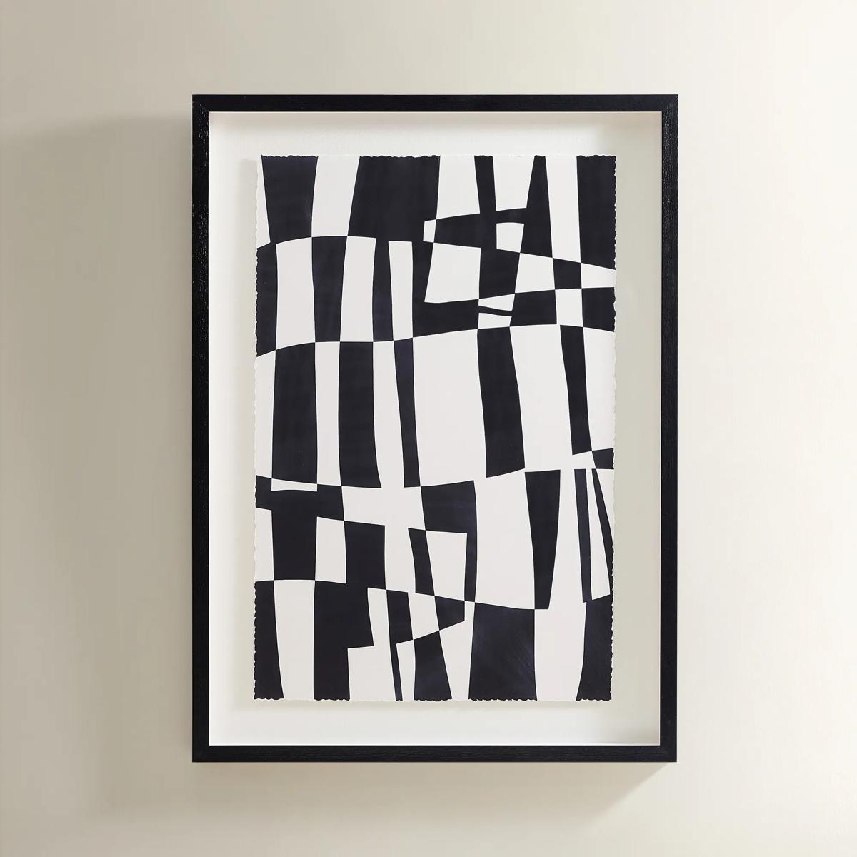 Matrix Art$369
A striking black and white abstract grid print set in a sleek black polyresin frame.
Add To Cart -
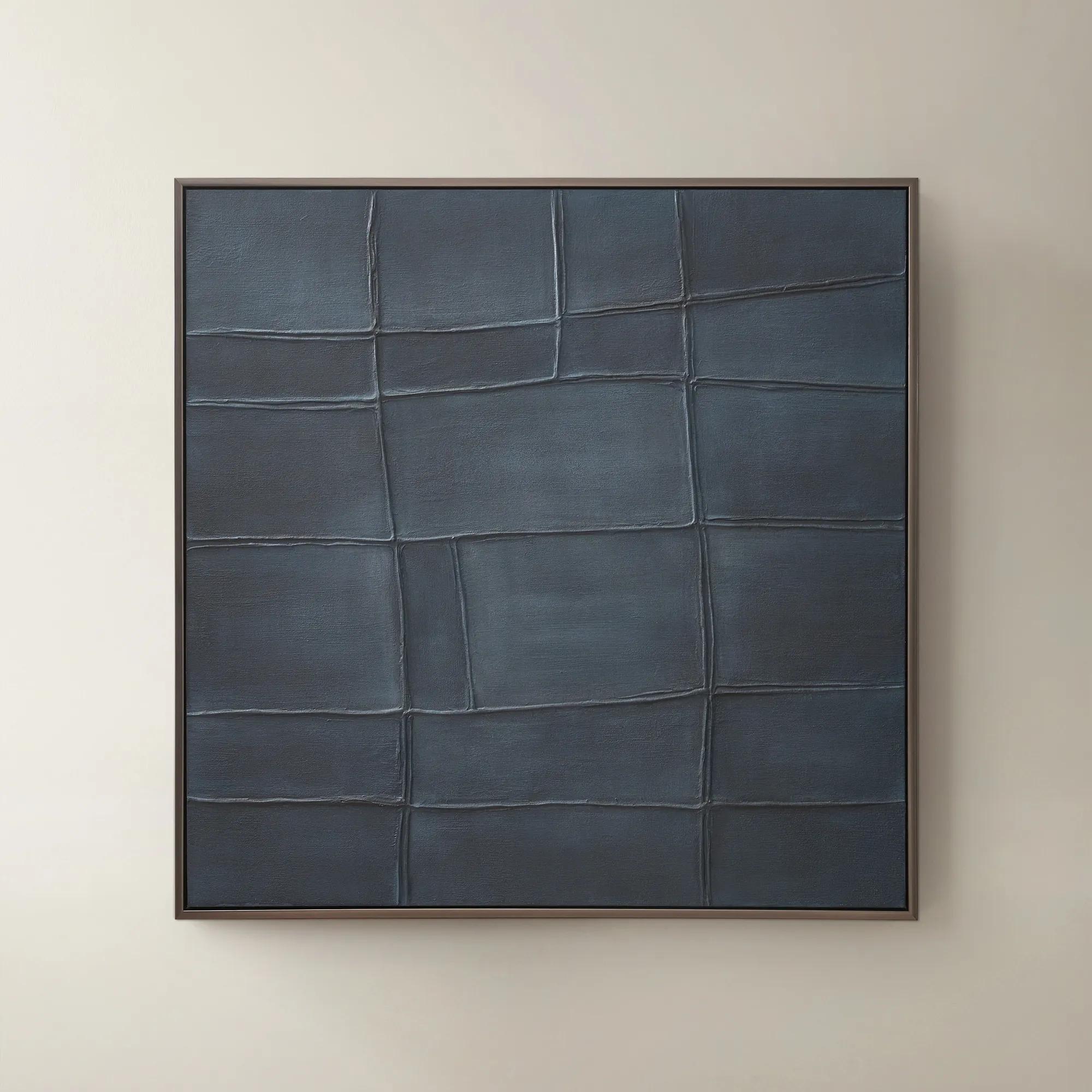
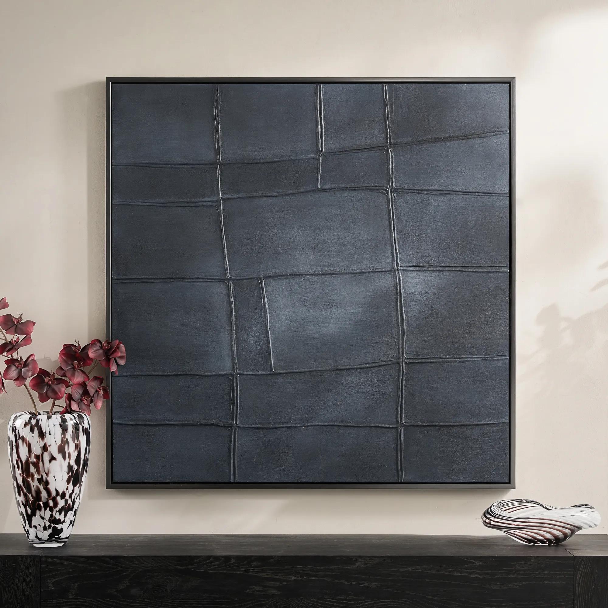 Ink Blue Interval Framed Painted Wall Art 48" x 48"$599
A hand-painted abstract canvas in deep ink blue, finished with a sleek gunmetal frame for modern appeal.
Add To Cart -
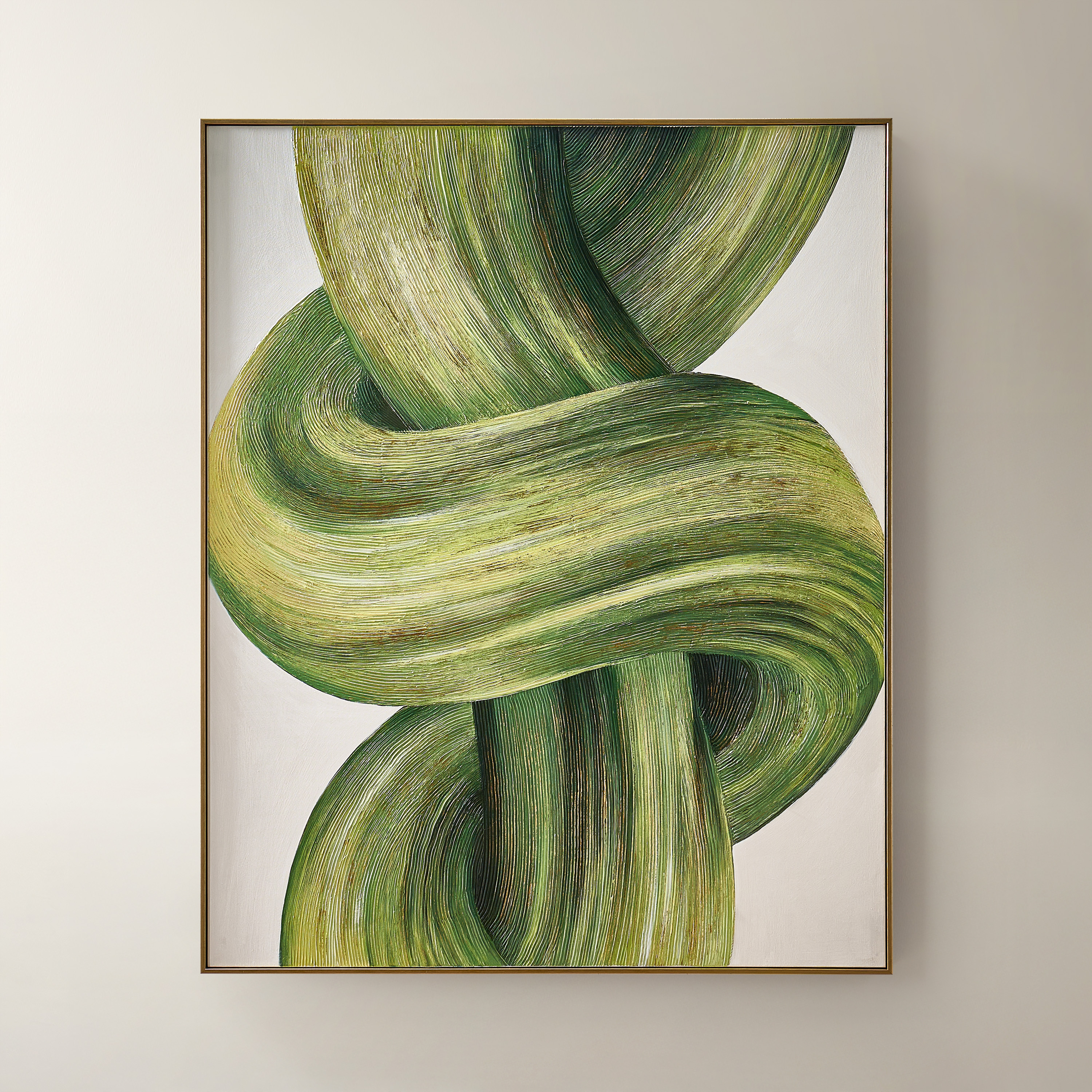
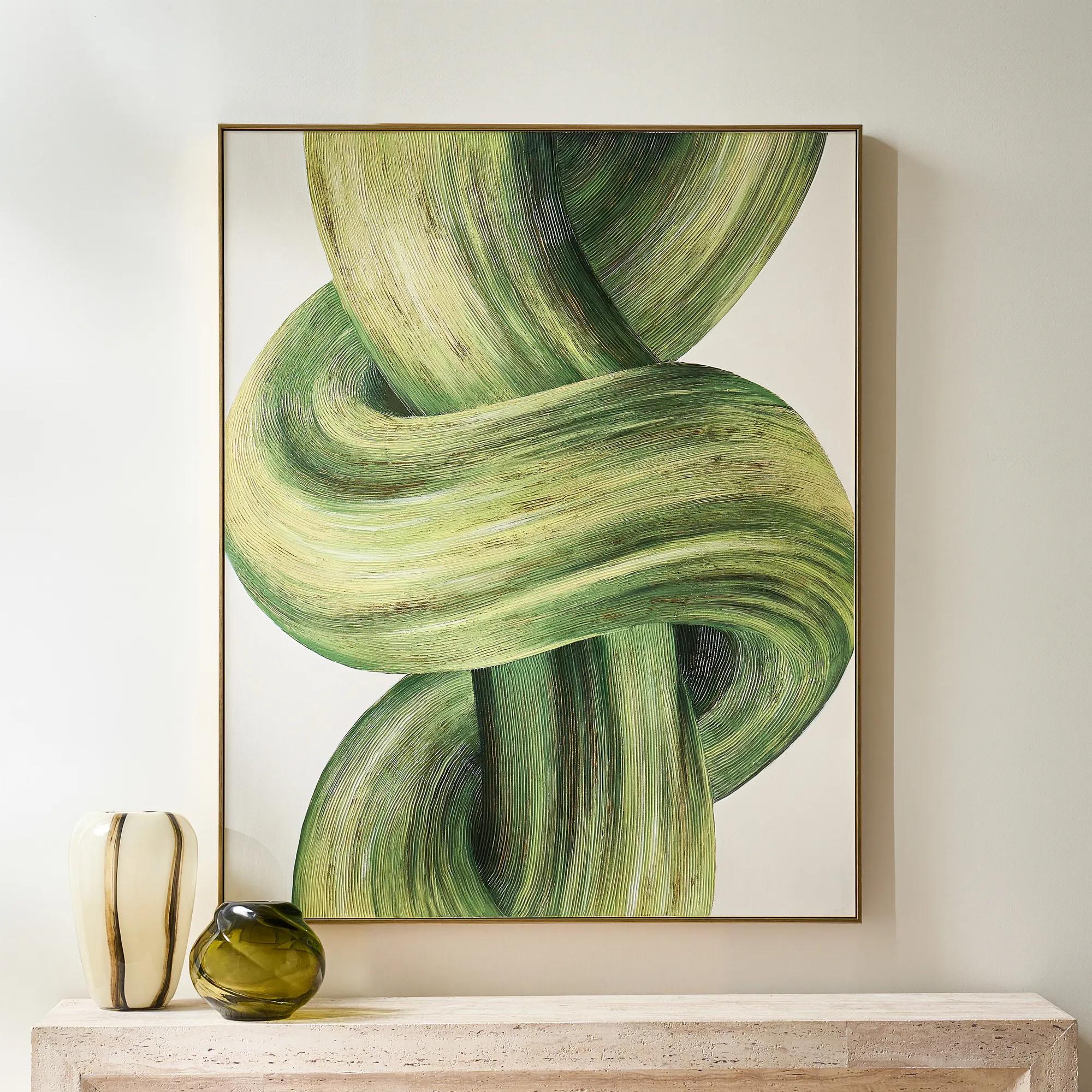 Knotted Framed Gold Leaf Painted Wall Art 40" x 50"$599
A hand-painted green and citron canvas with gold leafing, finished in a sleek PS floater frame.
Add To Cart -
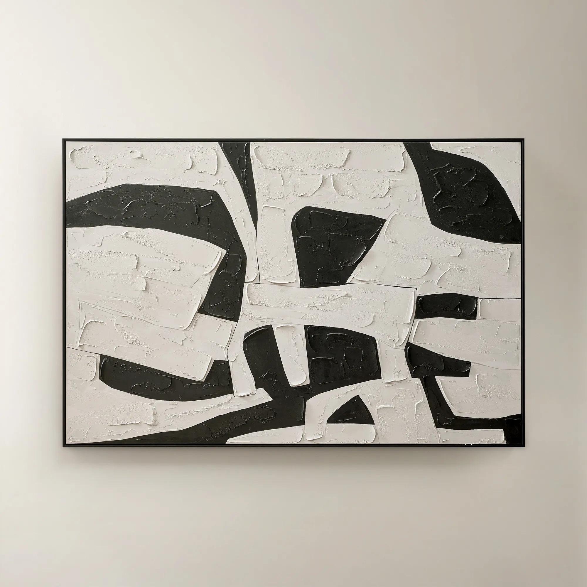 Space Between Shadows Framed Painted Wall Art 72" x 48"$799
A hand-painted abstract canvas featuring bold alabaster and black geometric forms in a sleek black frame.
Add To Cart -
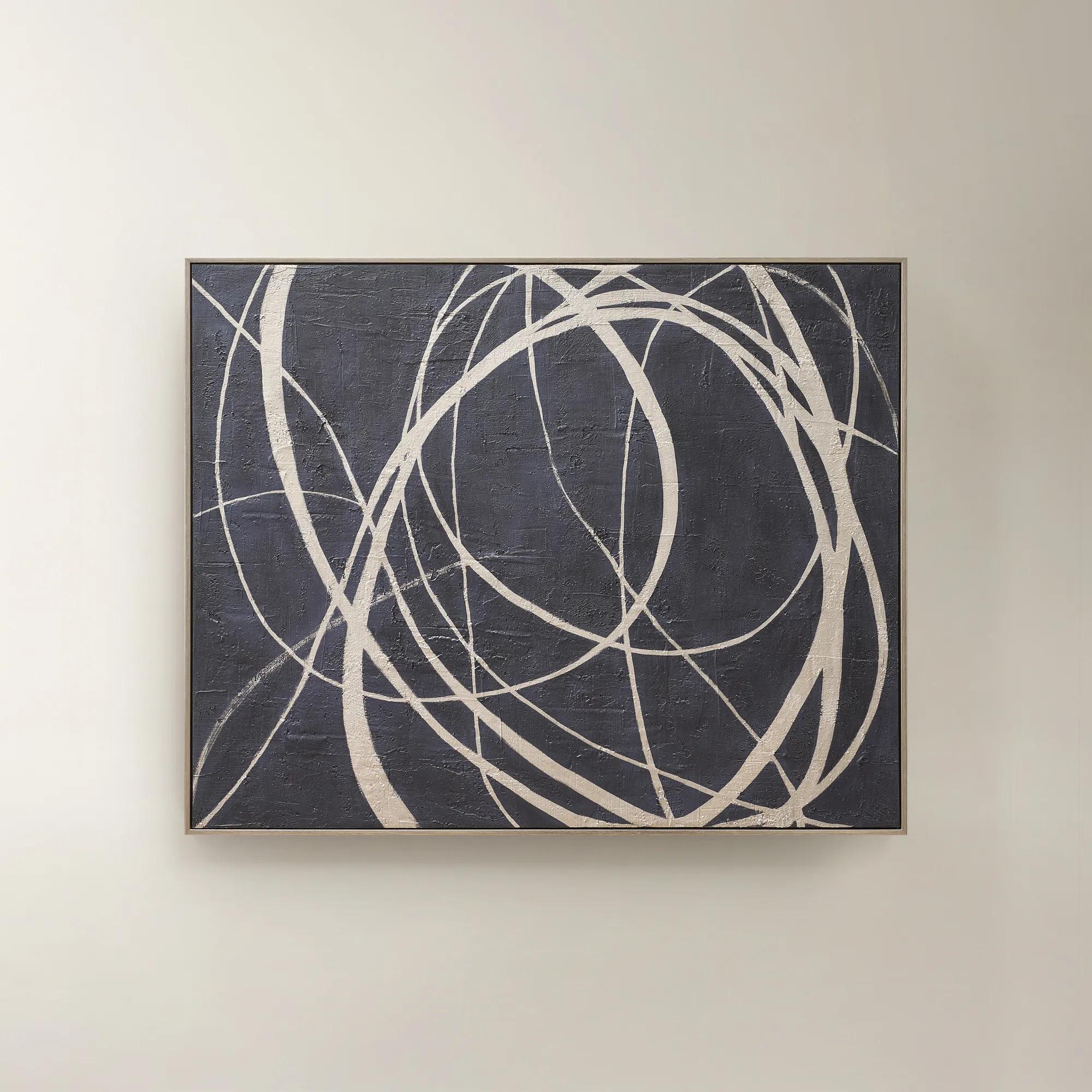 Wandering Framed Painted Wall Art 48" x 60"$699
An expressive hand-painted canvas in deep ink blue with champagne accents for a bold, sophisticated statement.
Add To Cart -
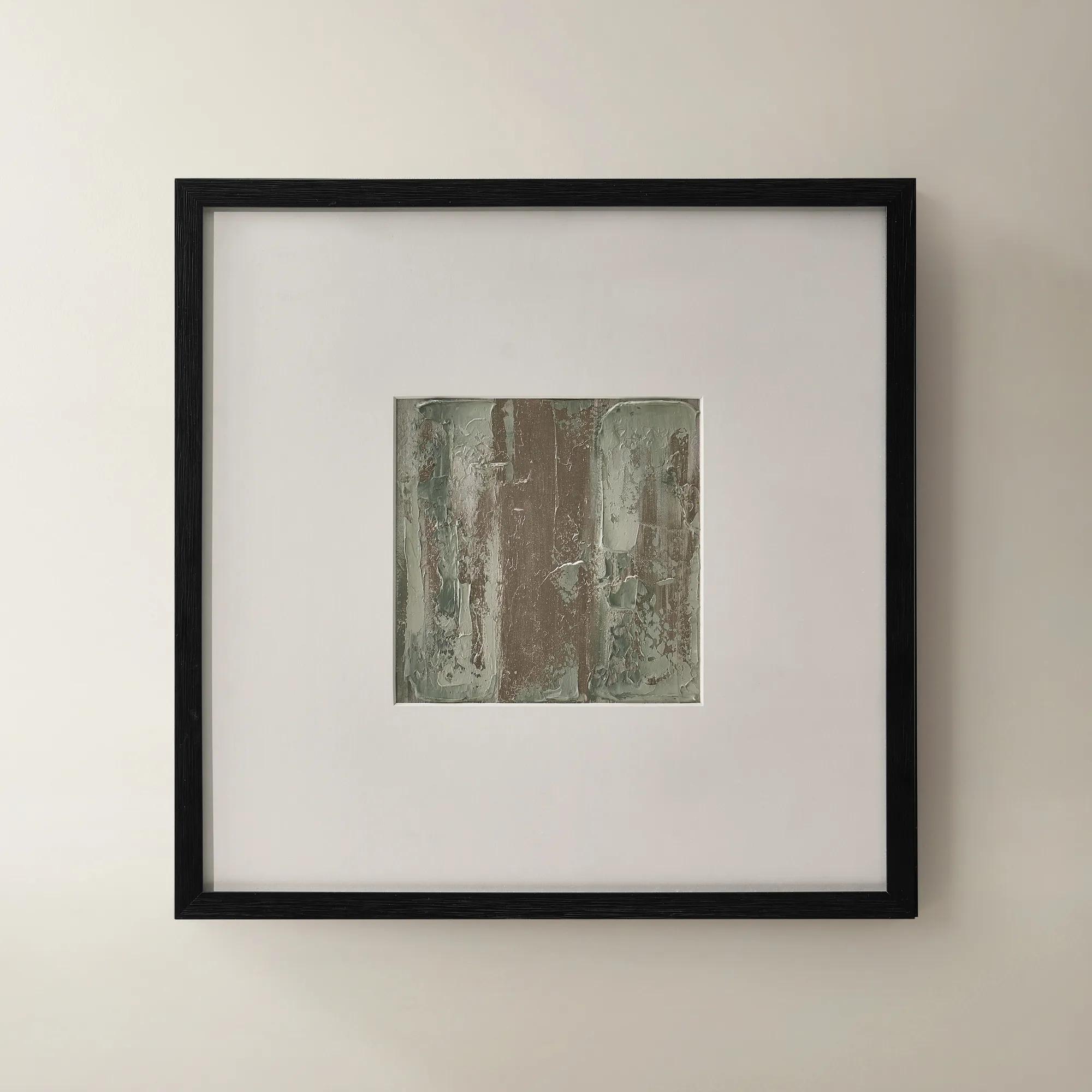
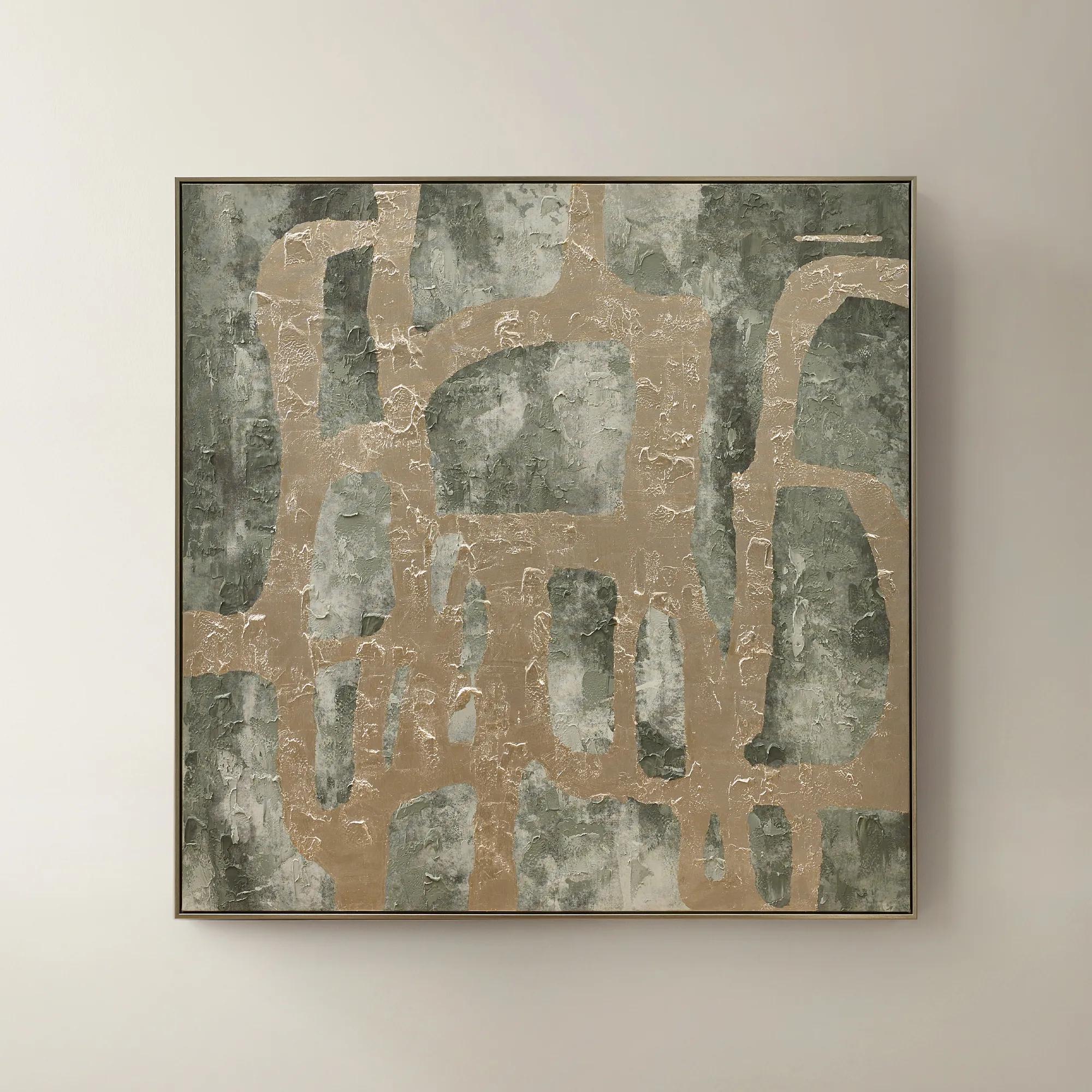 Illusions Framed Painted Wall Art 50" x 50"$599
A hand-painted canvas in sage and champagne tones with textural embellishments for modern, artful depth.
Add To Cart -
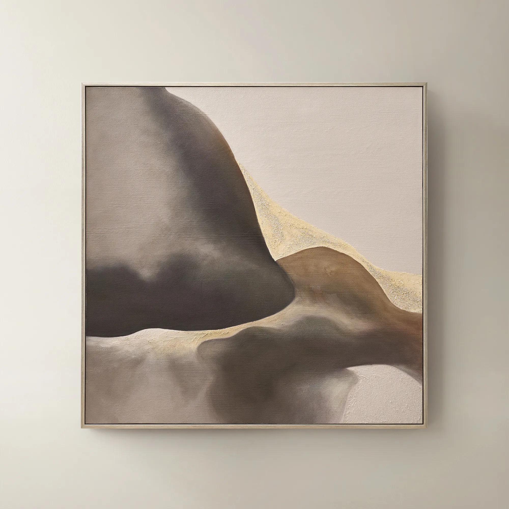 Windswept Framed Gold Leaf Painted Wall Art 50" x 50"$549
A hand-painted abstract canvas in plum truffle with gold leaf accents and a brushed champagne frame.
Add To Cart

Art For Interior Designers
Find art for interior designers that brings a distinctive point of view to client spaces. Explore wall art for dramatic focal points or thoughtfully composed gallery walls, keeping your project’s scale, palette, and furnishings in mind to choose pieces that connect the room’s details and express your design vision.
Art for interior designers brings color, proportion, texture, and emotion into a room, serving as a foundational design element rather than an afterthought. A compelling work can establish the palette for an entire interior, give an architectural feature greater presence, or introduce a deliberate contrast that makes familiar materials feel unexpected. Abstract compositions, photographic prints, dimensional wall art, and expressive works on canvas each contribute a different visual language. Sweeping gestures and saturated pigments lend energy to a gathering space; restrained tonal studies allow sculptural furnishings and richly layered textiles to command attention. For residential designers, decorators, and homeowners shaping a distinctive interior, the strongest selections connect the room’s purpose with the personality of its occupants. An expansive composition above a living room sofa can draw separate seating elements into one cohesive arrangement. A closely spaced series along a hallway creates rhythm, while a single dramatic work opposite an entry gives the home an immediate point of view. Art can also introduce a useful tension: an organic composition softens crisp architectural lines, while geometric imagery sharpens a room dressed in plush upholstery and flowing drapery. Color does not need to match every surrounding finish. Repeating one mineral blue, warm ivory, or burnished gold across artwork and textiles can create continuity without making the space feel overly coordinated. Equally compelling is an unexpected accent that interrupts a neutral palette with confidence. Considering artwork early makes these relationships more intentional, allowing furniture placement, lighting, and wall treatments to support the composition. The result is more than a decorated wall. It is a room with visual depth, where the eye has somewhere to settle and something worth returning to. Whether the setting is an intimate bedroom, an expressive dining room, or a polished reception area, thoughtfully selected art gives the interior an identity that extends beyond any single furnishing.
Scale determines how convincingly artwork inhabits its setting. Wall dimensions matter, but so do ceiling height, viewing distance, nearby doorways, and the furniture beneath the piece. Above a sofa or console, an artwork or grouping roughly two-thirds to three-quarters the width of the furniture is a useful starting point, with adjustments for architectural details and the visual weight of the composition. A narrow frame around a pale image can feel lighter than a dark, heavily textured work of the same dimensions. Generous walls often benefit from a substantial focal point, while smaller spaces can carry bold art beautifully when the surrounding arrangement has room to breathe. Groupings offer another approach, combining several works into a larger composition whose overall dimensions matter as much as the individual frames. Consistent spacing gives even an eclectic arrangement a sense of intention. The relationship between wall art and furniture deserves equal attention; exploring Furniture For Interior Designers alongside artwork helps establish complementary proportions, silhouettes, and finishes before the room is complete. Materials further shape the effect. Canvas introduces a woven surface that can soften reflected light and give printed imagery a tactile presence. Works on paper often gain definition from a mat and protective glazing, with the depth of the frame creating a subtle architectural border. Glass and acrylic glazing have different weight, handling, and scratch-resistance considerations, so the appropriate choice depends on placement and project requirements. Where light exposure is a concern, specified UV-filtering glazing can help reduce fading, though it does not eliminate the need for thoughtful positioning. Wood frames can bring warmth or a richly lacquered finish, while metal frames offer a precise outline that suits crisp compositions. Dimensional artwork adds shadows that change with the direction of light, making projection from the wall an important consideration near circulation paths. These details allow art to feel fully integrated into the interior rather than merely placed against it.
Lasting impact depends on suitability as much as appearance. In a quiet sitting room, subtle surface variation may reward close viewing; in a spacious lobby, a clearer composition and stronger contrast may read more effectively from across the room. Bedrooms often call for imagery that supports a sense of retreat, while dining spaces can accommodate greater theatricality through rich color, luminous finishes, or an unexpected arrangement. Client preferences remain central: a technically balanced selection will feel incomplete if its subject or mood has no personal resonance. Art chosen as a housewarming or milestone gift benefits from that same sensitivity, particularly when its scale and palette suit a space the recipient already loves. For frequently used interiors, frame construction, glazing, secure mounting, and access for cleaning deserve attention alongside visual appeal. Artwork weight and wall construction should determine the appropriate hanging hardware, and substantial or unusually shaped pieces may warrant professional installation. Placement away from direct sunlight, persistent moisture, and concentrated heat helps protect many common art materials. Kitchens and bathrooms require particular care because steam, splashes, and residue can affect paper, canvas, and frame finishes; suitability depends on the construction and the manufacturer’s recommendations. Routine care should remain gentle and material-specific. Frames can often be dusted with a soft, dry cloth, while glazing should be cleaned only with a compatible method, keeping liquid away from edges where it could reach the artwork. Canvas and textured surfaces need their own prescribed care rather than the same treatment used for glass. Good lighting completes the presentation, revealing tonal shifts and surface detail without creating distracting glare. Adjustable accent lighting can give a work prominence while preserving the atmosphere of the surrounding room. With proportion, material, placement, and care considered together, art becomes an enduring part of the design: a source of character, a confident focal point, and an expression of the people who inhabit the space.
FAQs
Begin with the room’s creative direction: its mood, architectural details, and defining colors. Select artwork that adds a distinct point of view rather than simply repeating the furnishings. An expressive abstract can introduce drama, while an atmospheric landscape can lend a richly layered interior a moment of quiet.
Abstract art, graphic compositions, and black-and-white photography offer compelling directions for modern interiors. Look for artwork with a confident visual language, whether that means gestural movement, striking contrast, or sculptural forms. The most captivating choice brings personality to the space without echoing every detail around it.
Artwork can connect with a room’s palette without matching it precisely. Echo an accent color for a considered composition, or introduce an unexpected hue that gives the interior a fresh creative direction. Consider undertones as well as color: warm and cool relationships can make the pairing feel intentional.
Mixing art styles creates an interior with depth and individuality. Pair expressive abstraction with figurative work, or place graphic photography alongside painterly imagery. Give the collection a connecting thread—such as a recurring color, related subject matter, or consistent framing—so the contrast feels curated rather than accidental.
Treat framing as part of the artistic composition. A dark frame can underscore graphic contrast, while a luminous finish can introduce a glamorous note. Consider both the artwork’s character and the room’s existing finishes, choosing a frame that gives the piece distinction without competing with its visual story.