Multi Colored Statement Wall Arts
Multi Colored Statement Wall Arts
-
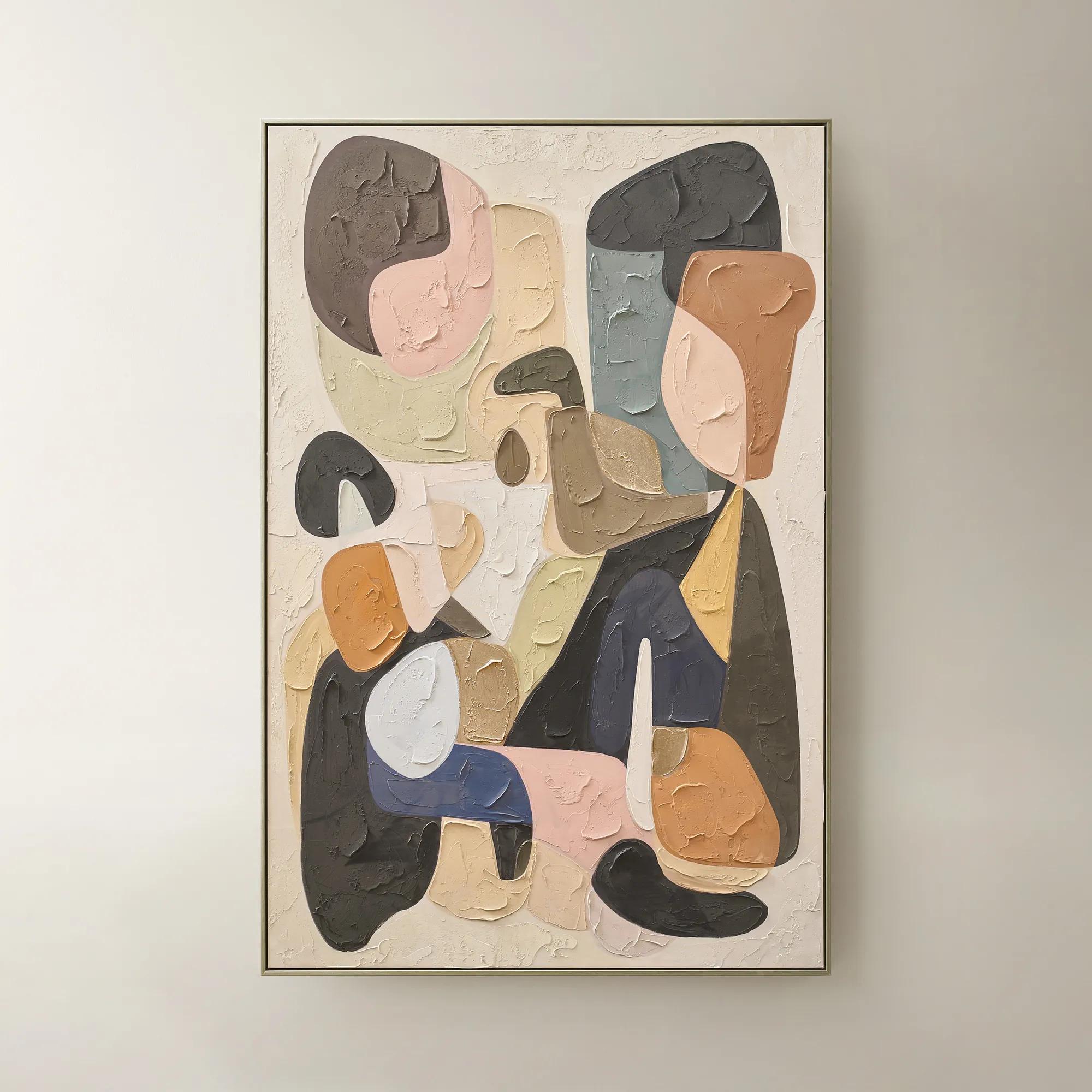 Chromatic Bloom Framed Painted Wall Art 40" x 60"$519
A hand-painted abstract canvas featuring a vibrant multi-color palette and shimmering champagne detailing.
Add To Cart -
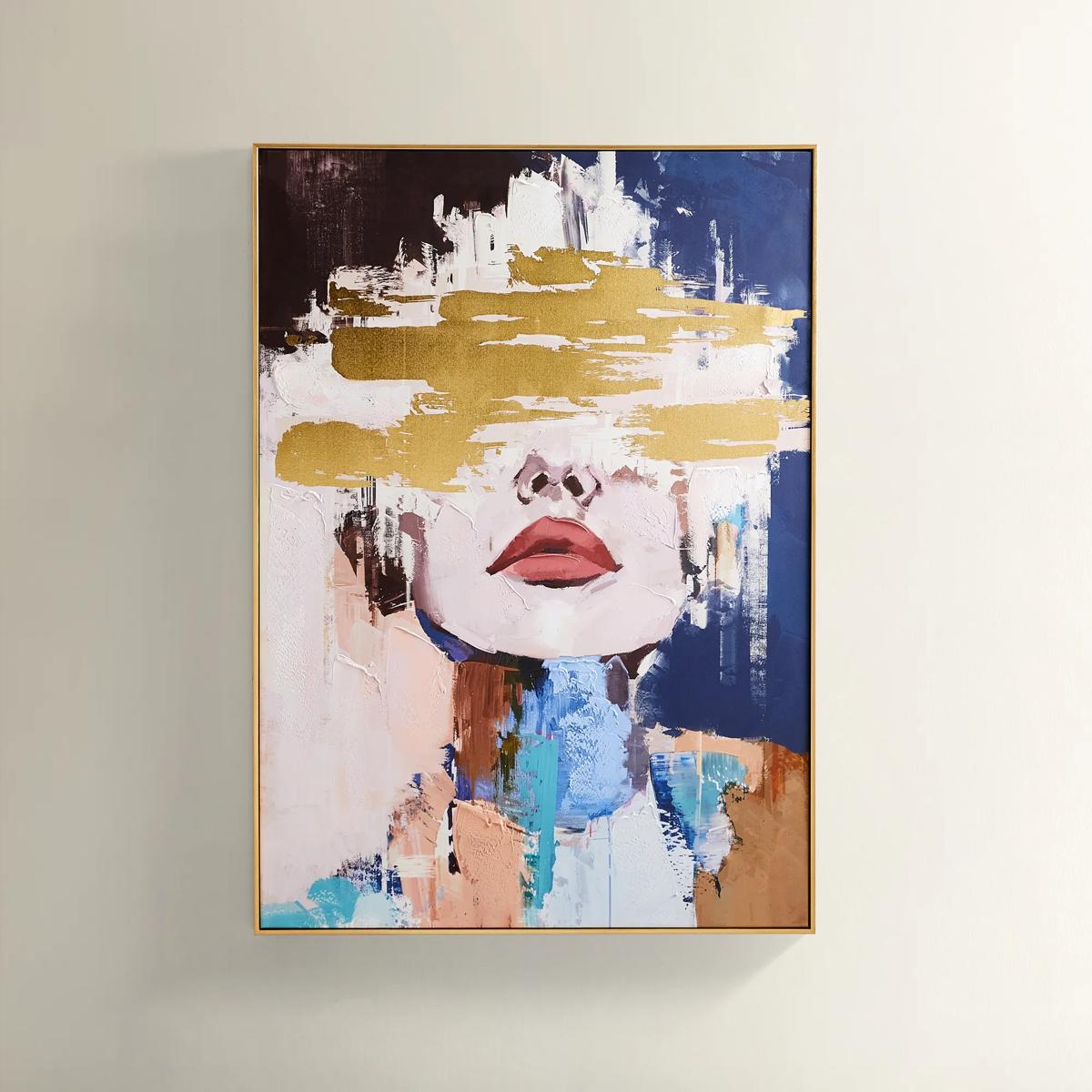
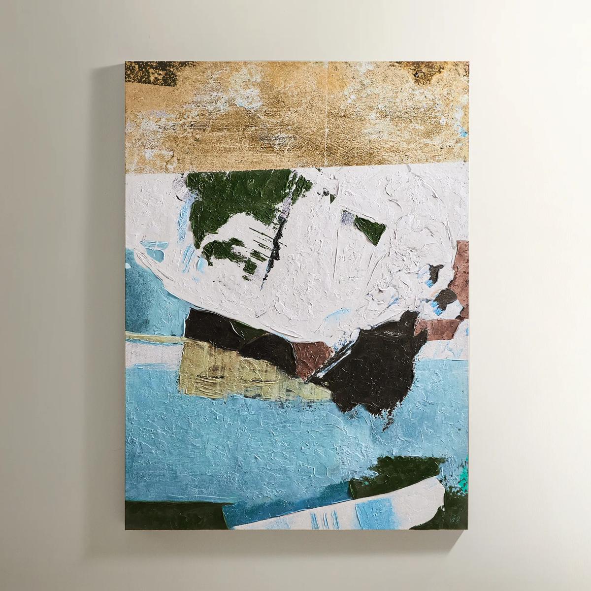
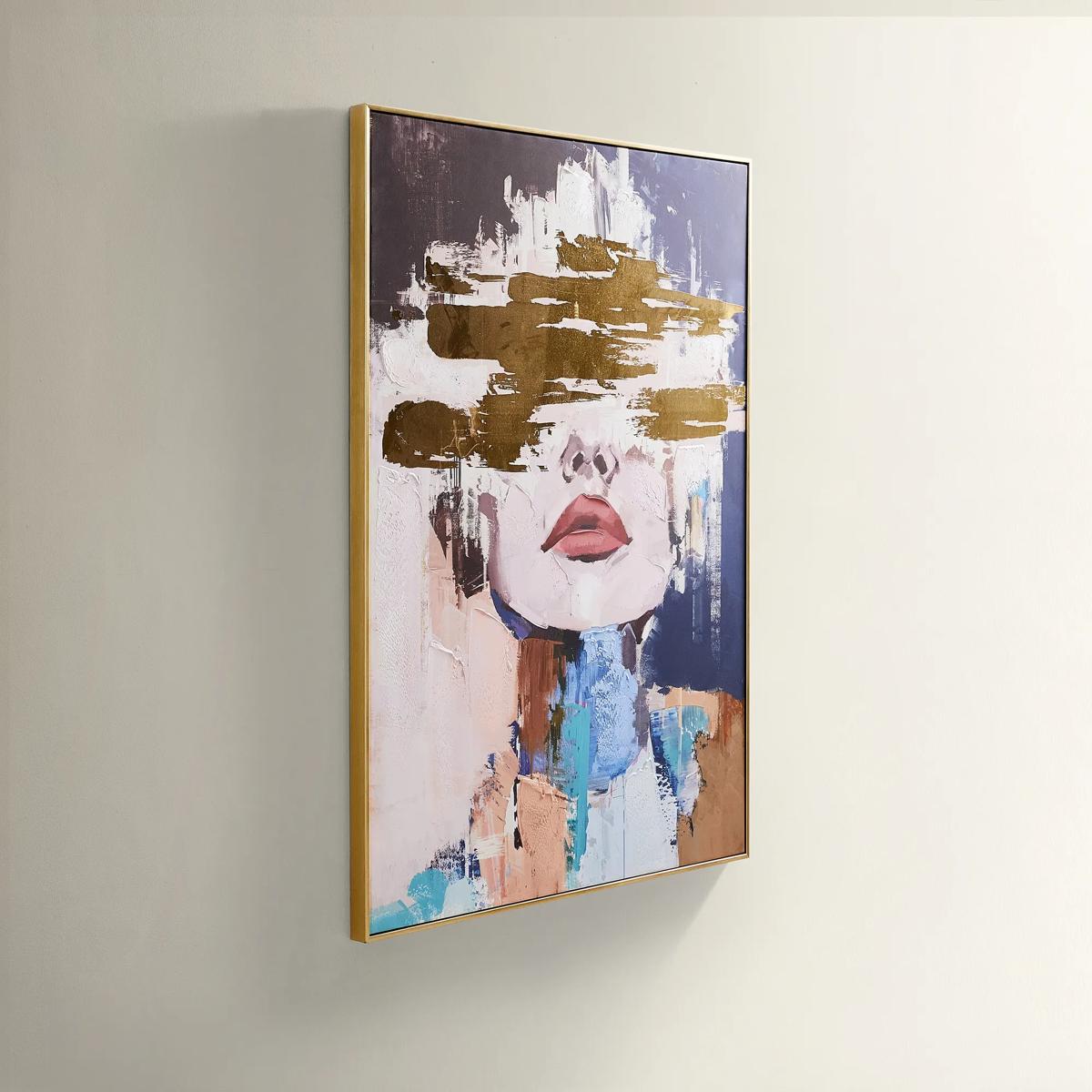 Waiting in Color Gold Foil Painted Wall Art 39.25" x 55"$499
A hand-painted abstract portrait in vivid blue, blush, and gold foil, framed in luxe gold.
Add To Cart -
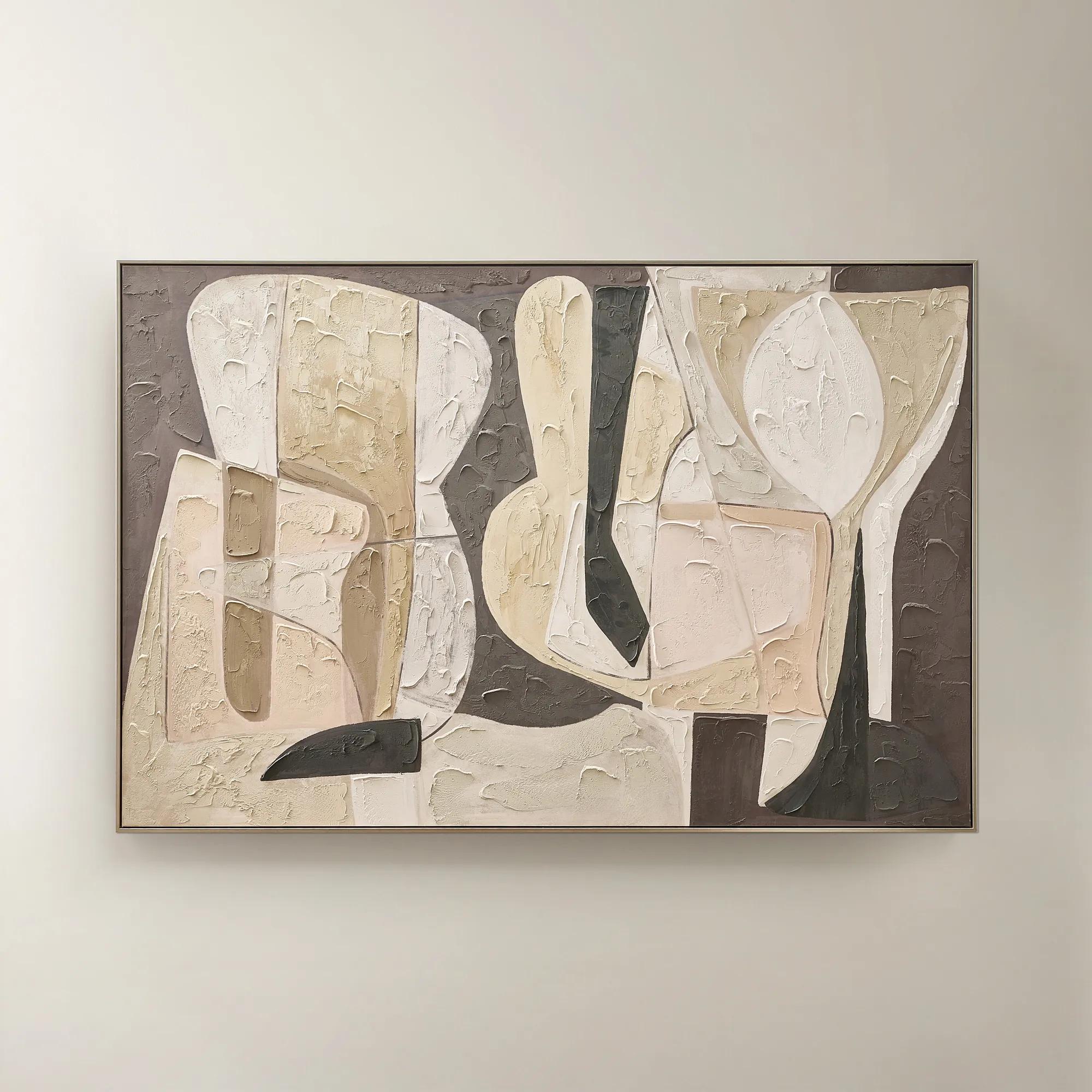 Wishful Thinking Framed Painted Wall Art 72" x 48"$599
A hand-painted abstract canvas featuring bold geometric forms and warm smoked plum, apricot, and tawny hues.
Add To Cart -

 Blooming in Her Own Time Framed Wall Art 40" x 50"$1029
A vibrant multicolored canvas wall artwork featuring an expressive botanical-inspired design in a framed presentation.
Add To Cart -
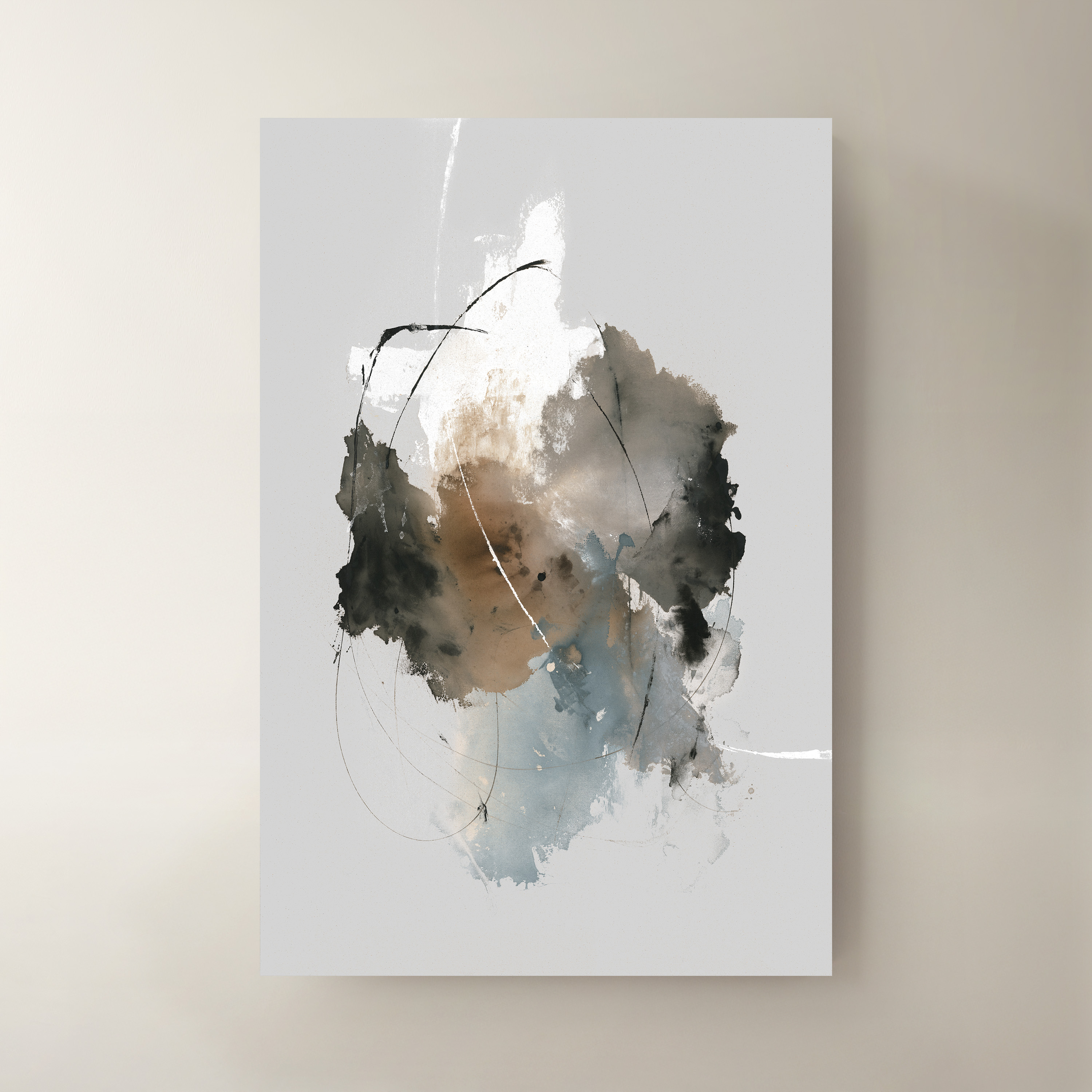
 Time IV Wall Art 40" x 60"$999
A striking multicolored canvas artwork bringing contemporary visual interest to modern interiors.
Add To Cart -
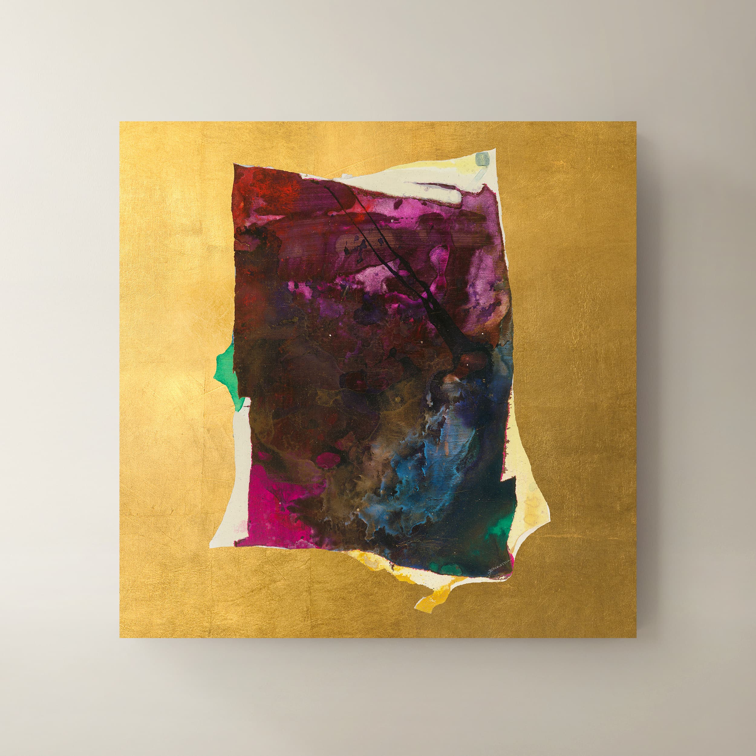 Supremo I Wall Art 40" x 40"$999
A multicolored canvas wall art piece adding contemporary visual interest to your interior.
Add To Cart -
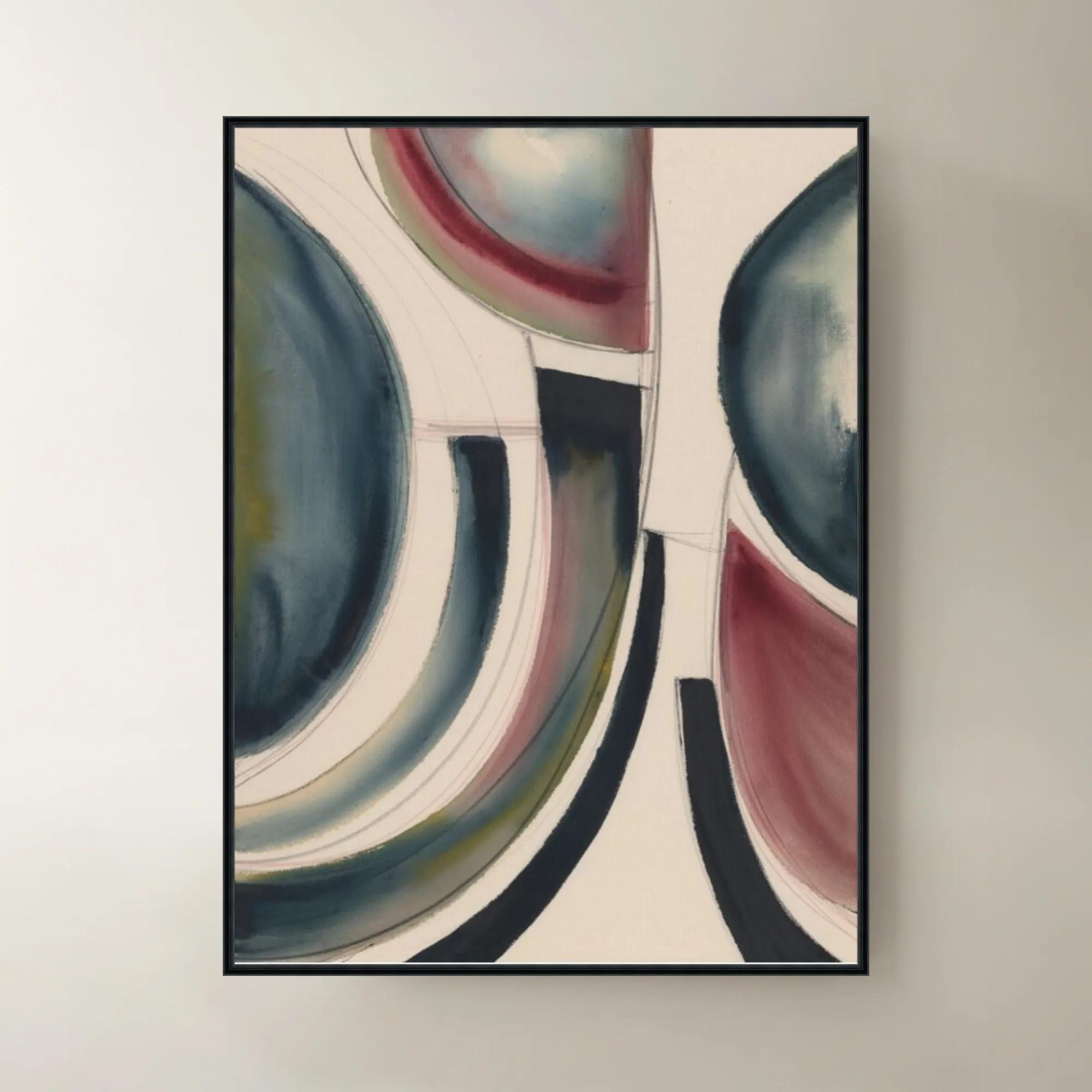
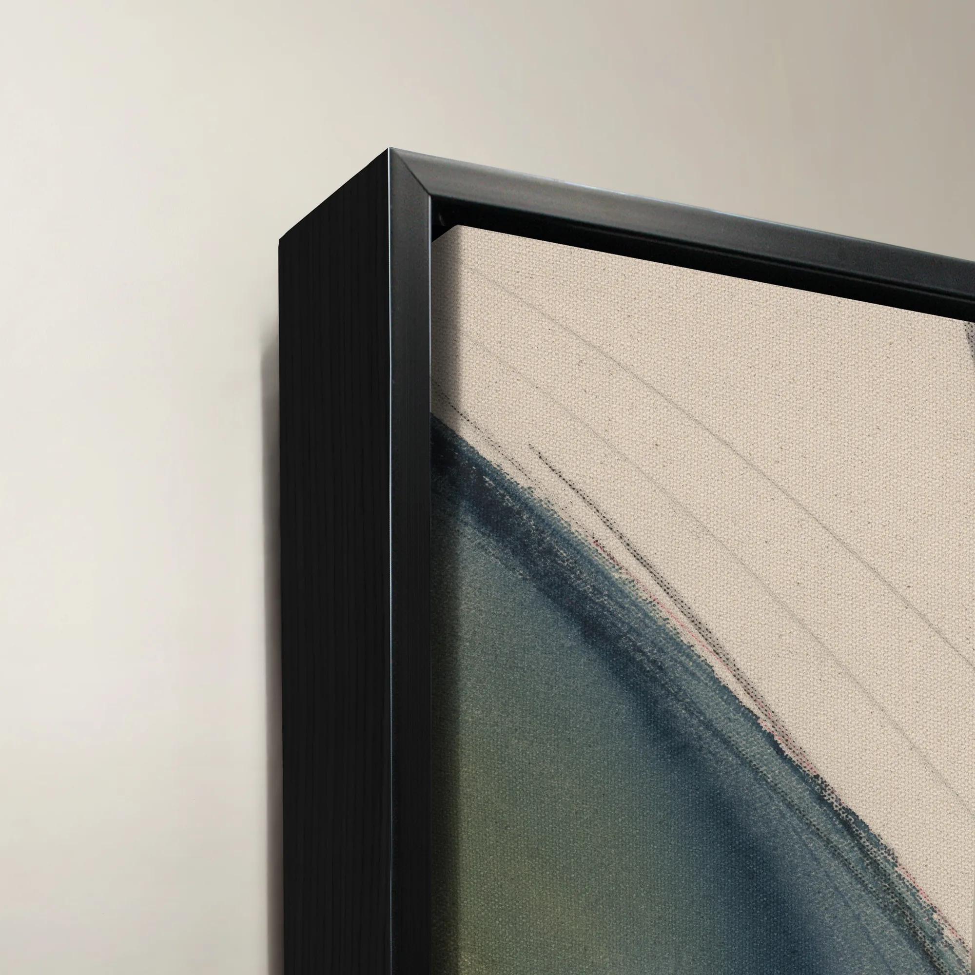 Dreamsicle Framed Wall Art 40" x 54"$1199
A vibrant multicolored canvas wall artwork presented in an elegant frame for contemporary interiors.
Add To Cart -
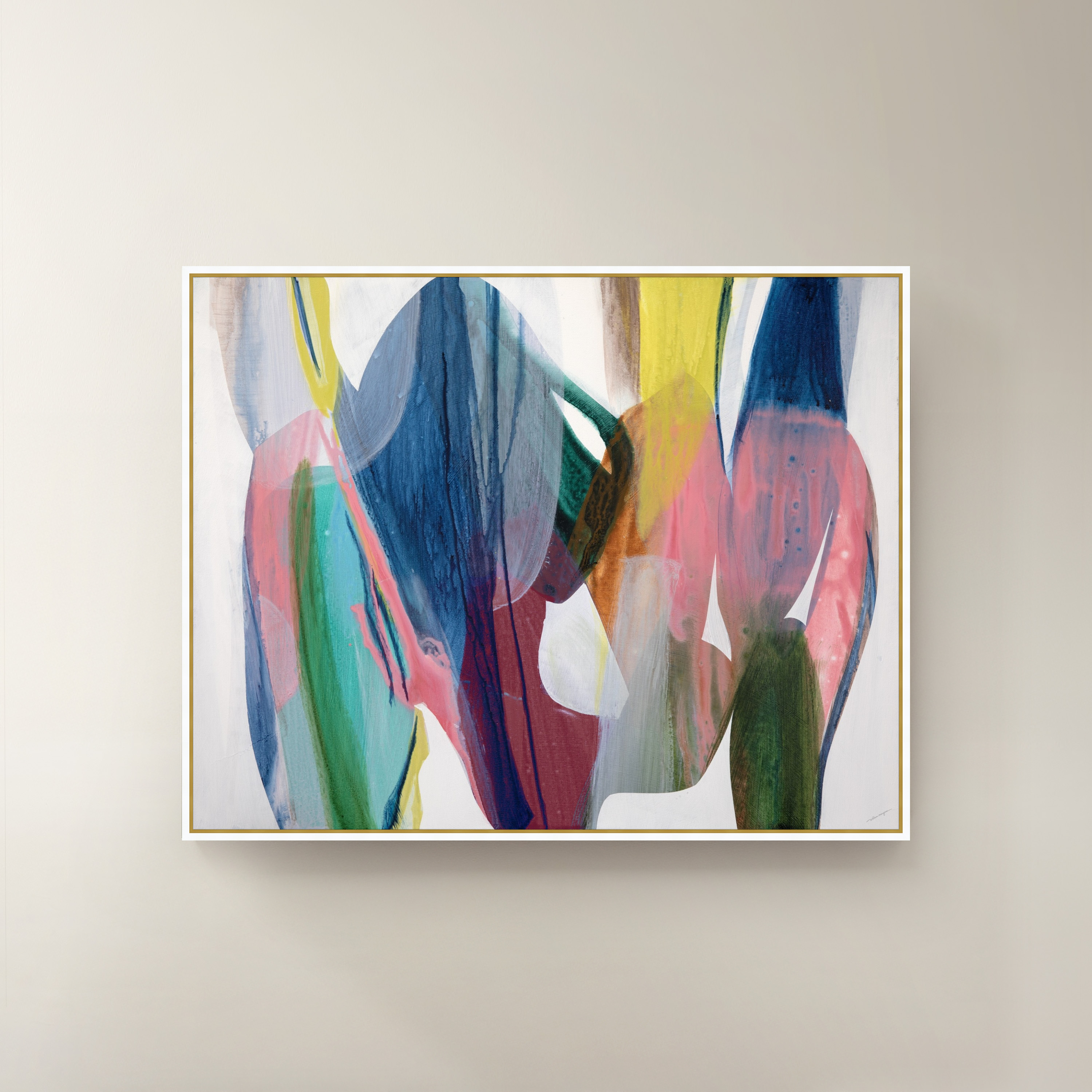
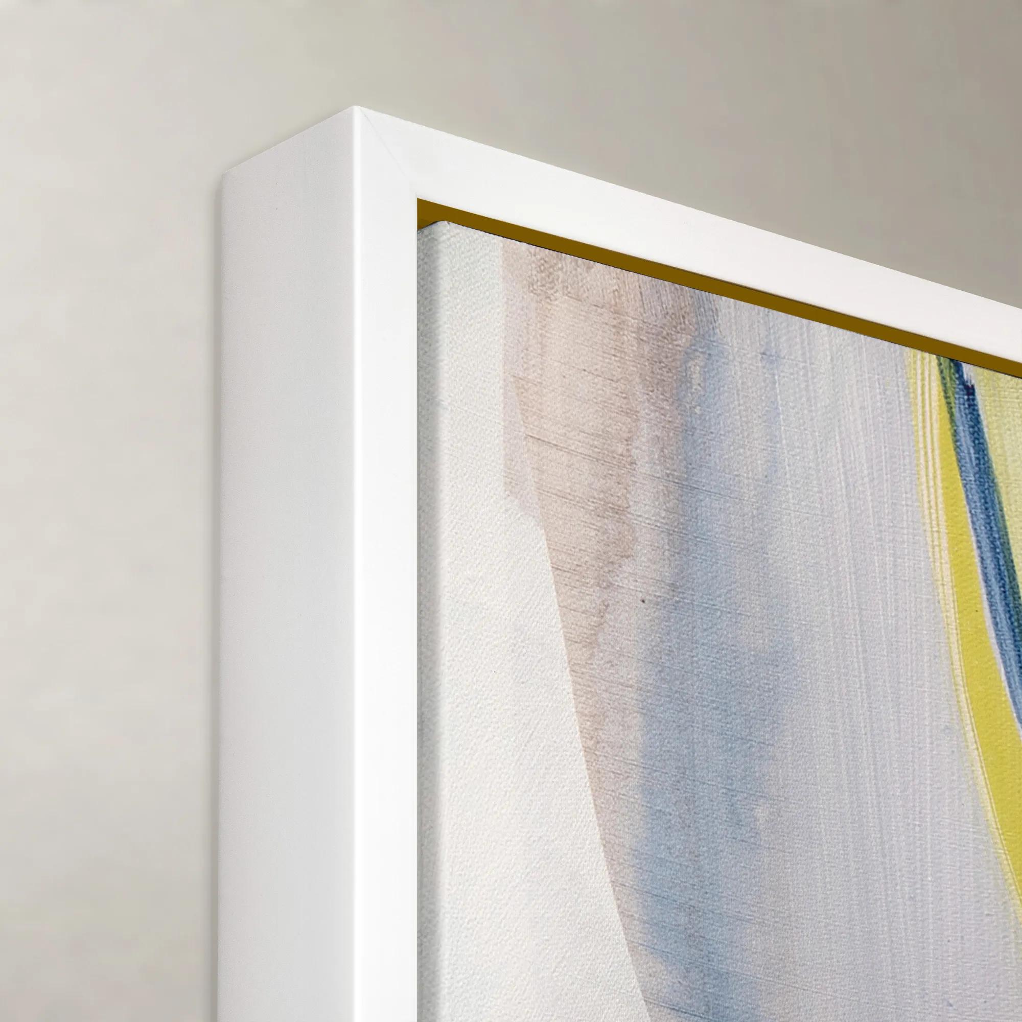 Dreams Take Flight Framed Wall Art 60" x 47"$1299
A vibrant multicolored framed canvas artwork adding expressive, contemporary style to any wall.
Add To Cart -
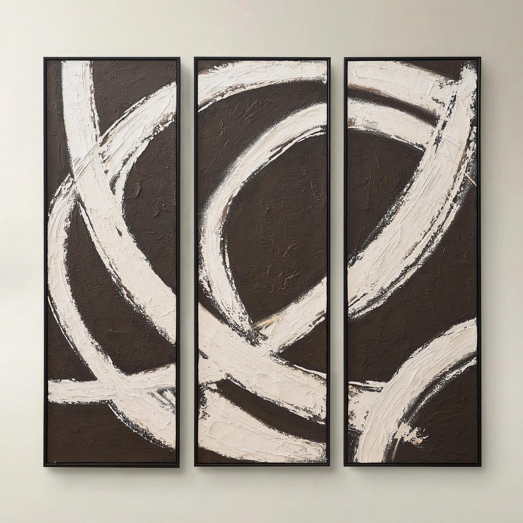
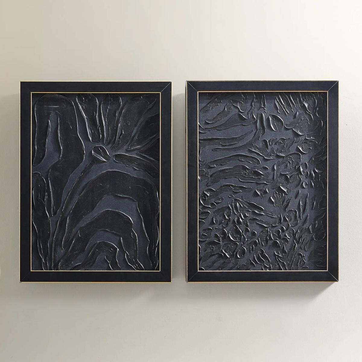
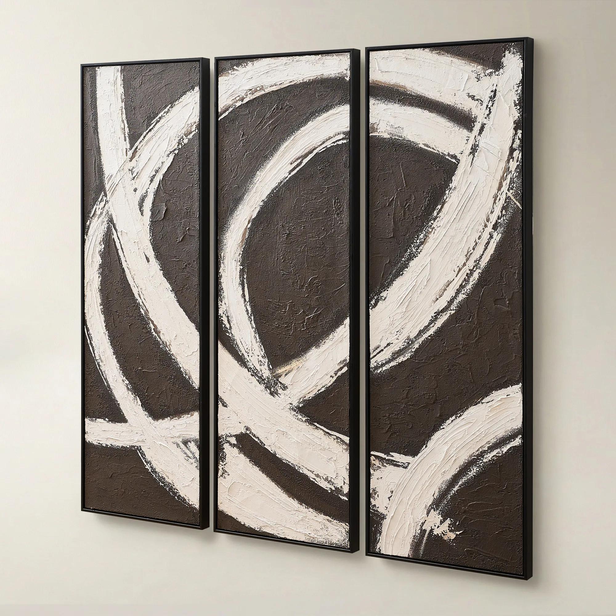 Spun in Coco Framed Painted Wall Art 20" x 60" Set of 3$499
A hand-painted triptych featuring dark chocolate and alabaster tones with rich texture and modern contrast.
Add To Cart -
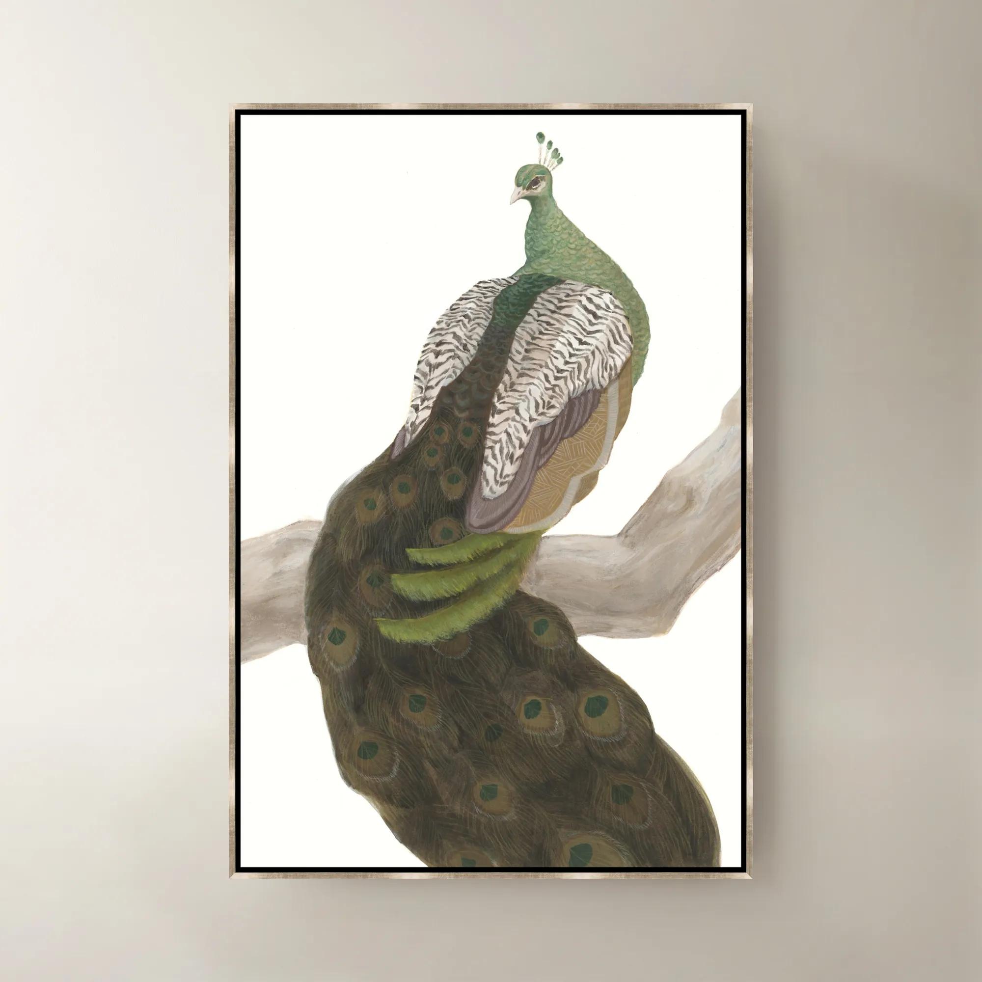 Royal Mirage Framed Wall Art 30" x 45"$799
A multicolored framed canvas artwork bringing sophisticated visual interest to contemporary interiors.
Add To Cart -
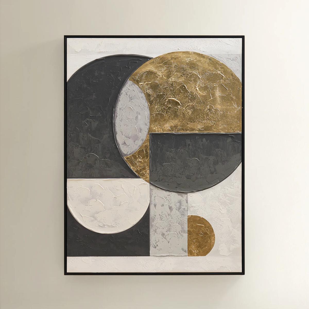
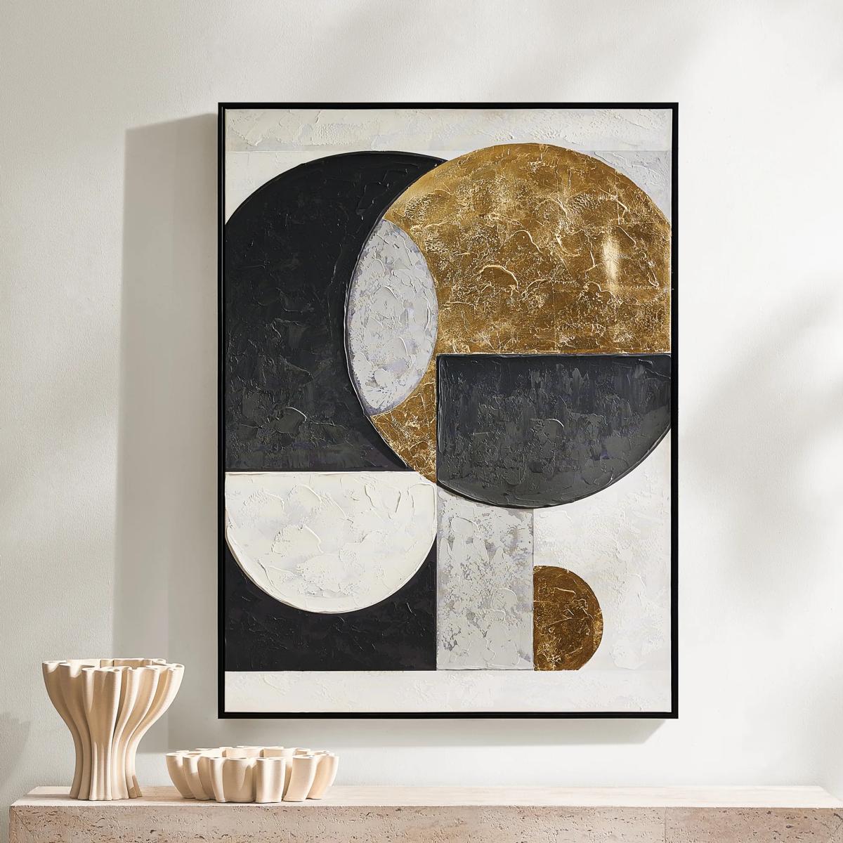 Eclipse Framed Gold Leaf Painted Wall Art 35.25" x 47.25"$449
A hand-painted canvas featuring bold black, grey, and gold geometric shapes with shimmering gold leaf accents.
Add To Cart -
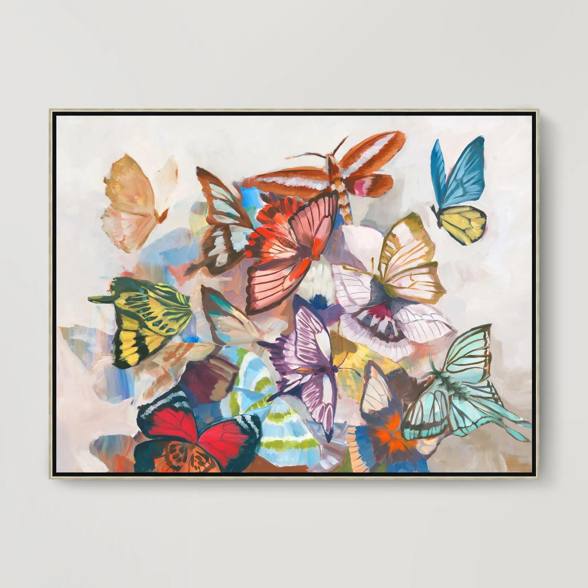 Sugar Wings Framed Wall Art 49.5" x 37.5"$799
A vibrant gallery-wrapped canvas artwork with hand-applied brush gel finish in a sleek silver floater frame.
Add To Cart -
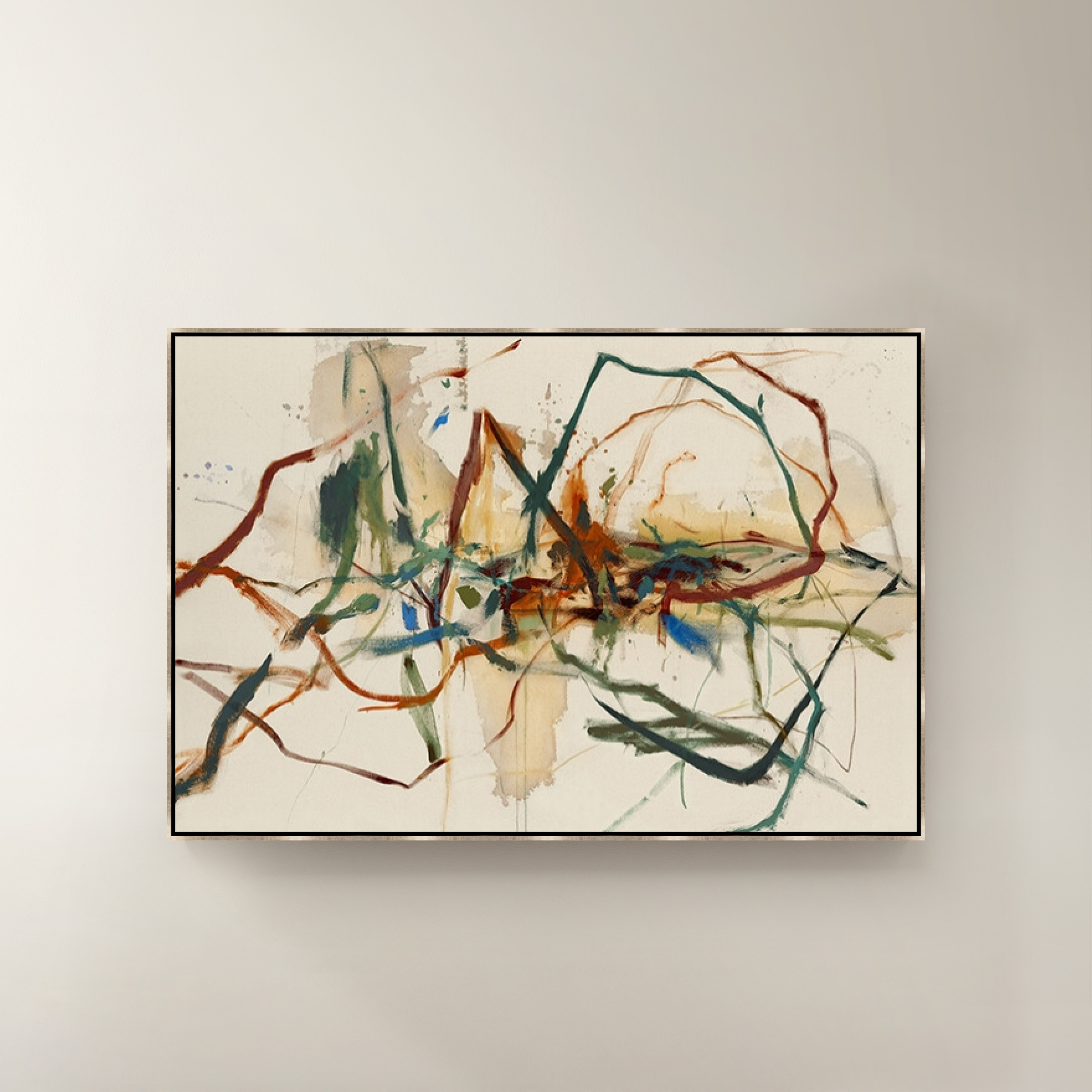
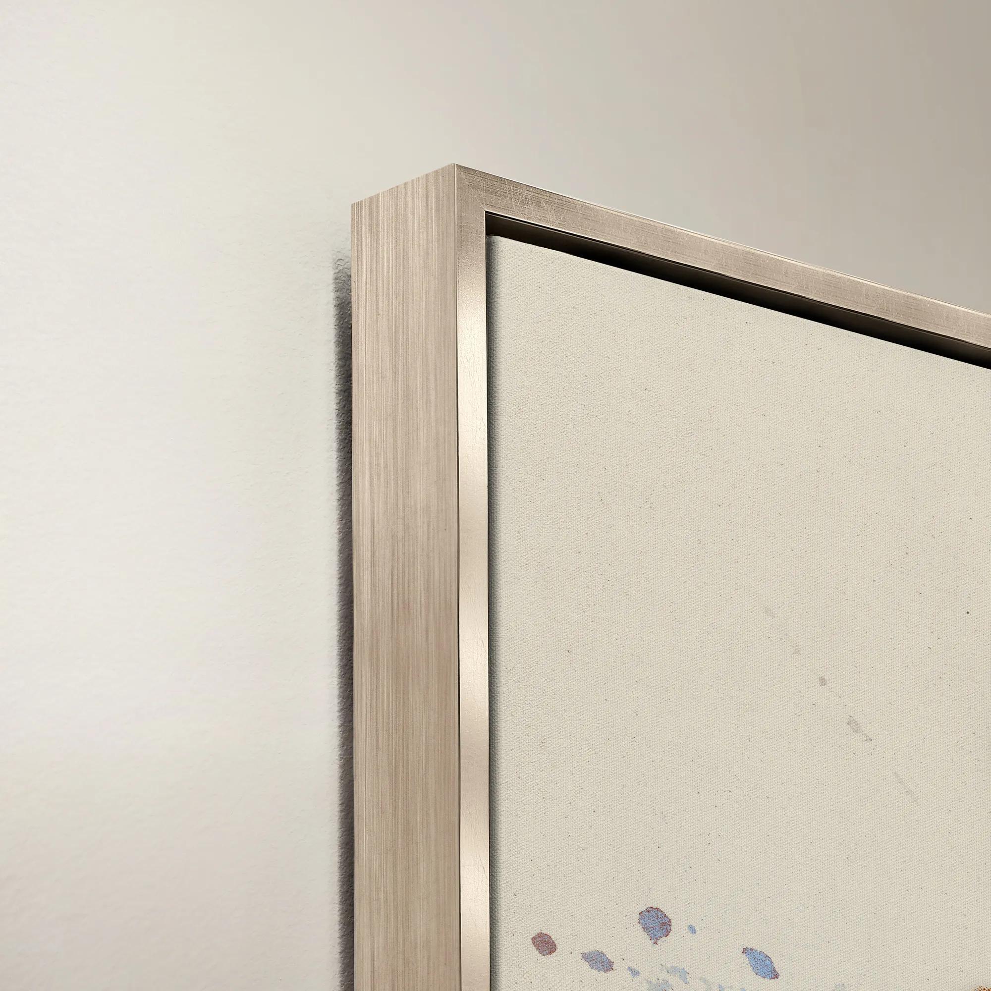 Chrono Crisis Framed Wall Art 60" x 40"$1099
A vibrant multicolored canvas wall artwork presented in a striking frame for contemporary interiors.
Add To Cart -

 Flip the Paint Buckets Framed Wall Art 40" x 60"$1899
A vibrant multicolored canvas wall artwork featuring playful paint buckets in a framed presentation.
Add To Cart -
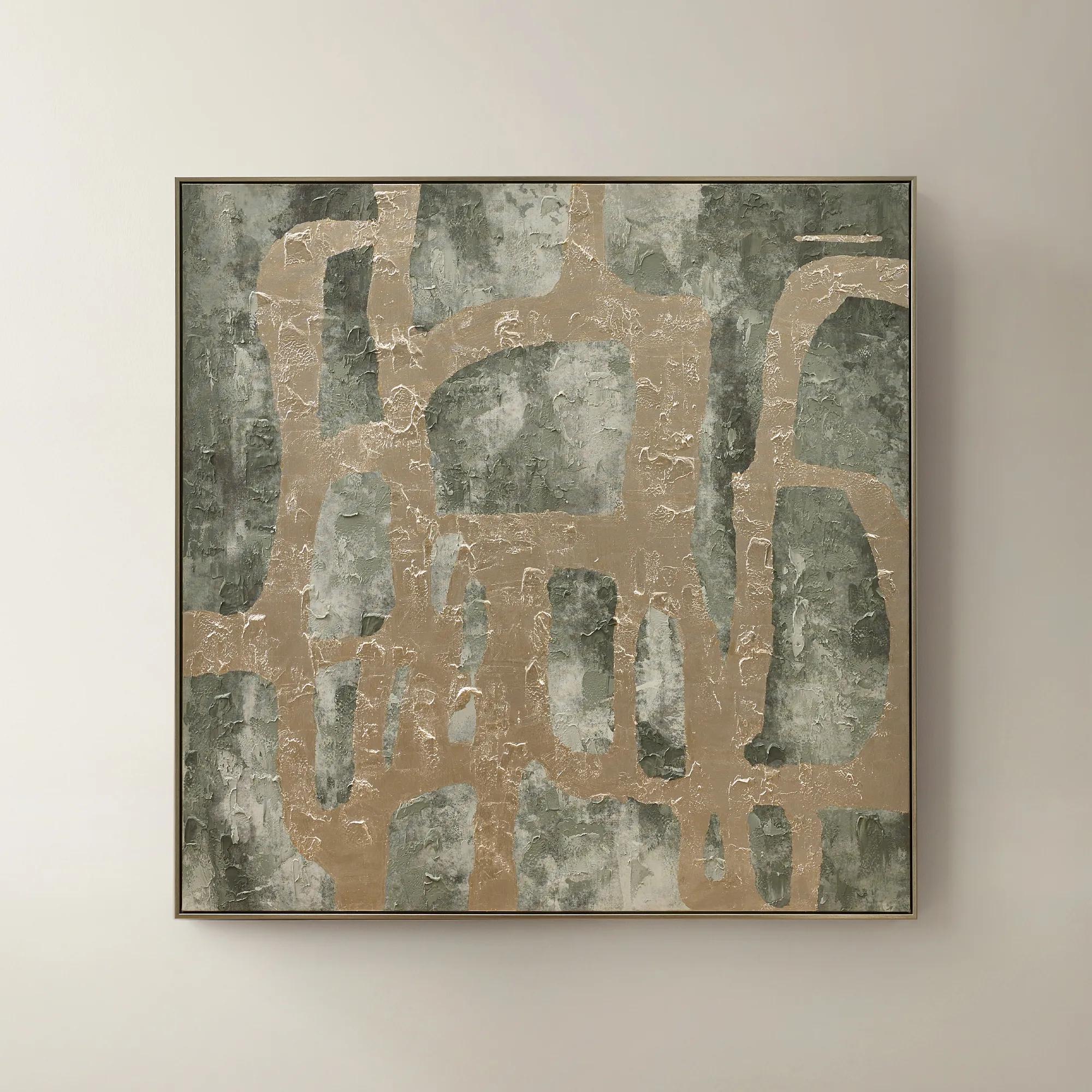 Illusions Framed Painted Wall Art 50" x 50"$599
A hand-painted canvas in sage and champagne tones with textural embellishments for modern, artful depth.
Add To Cart -
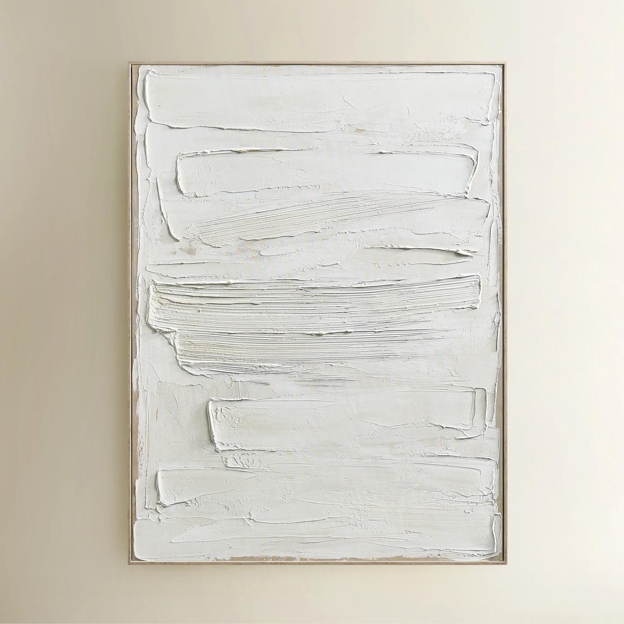
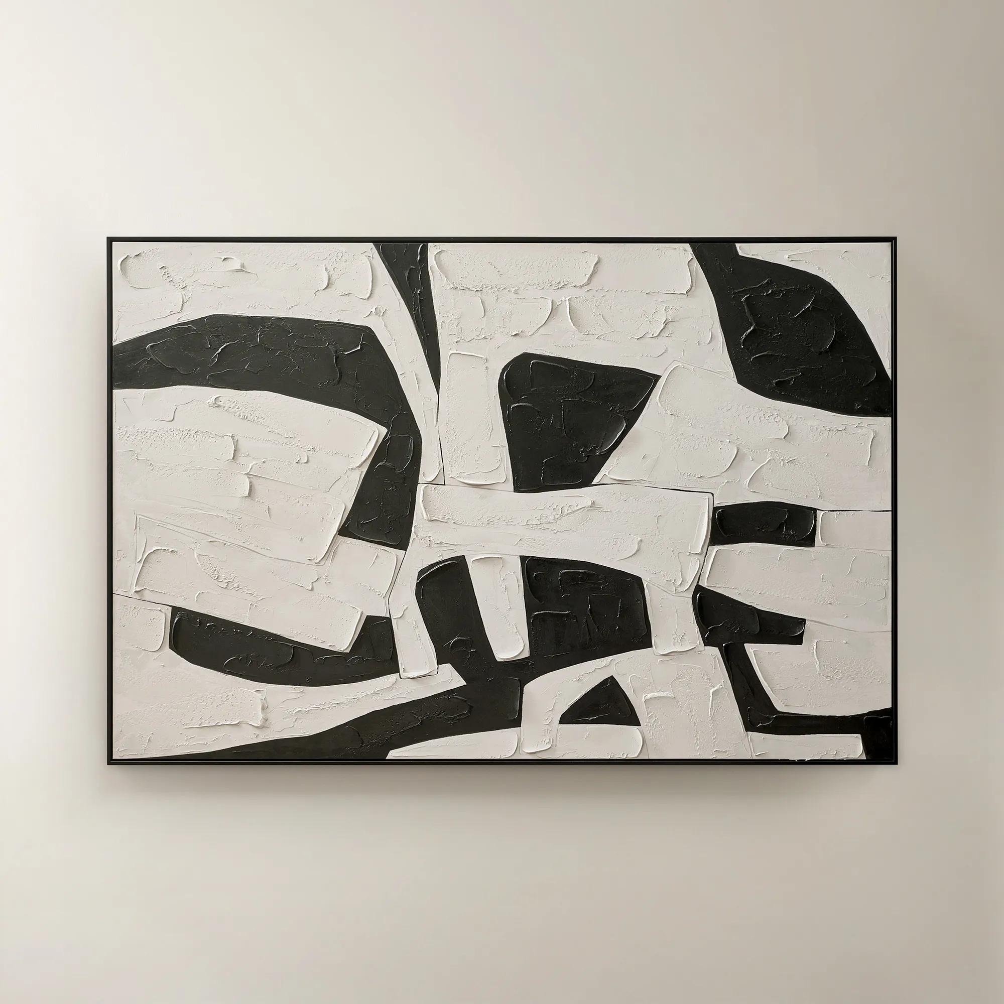 Space Between Shadows Framed Painted Wall Art 72" x 48"$799
A hand-painted abstract canvas featuring bold alabaster and black geometric forms in a sleek black frame.
Add To Cart -
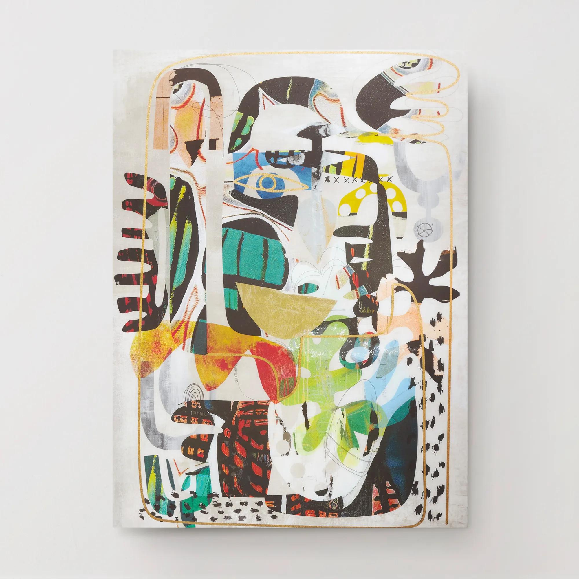
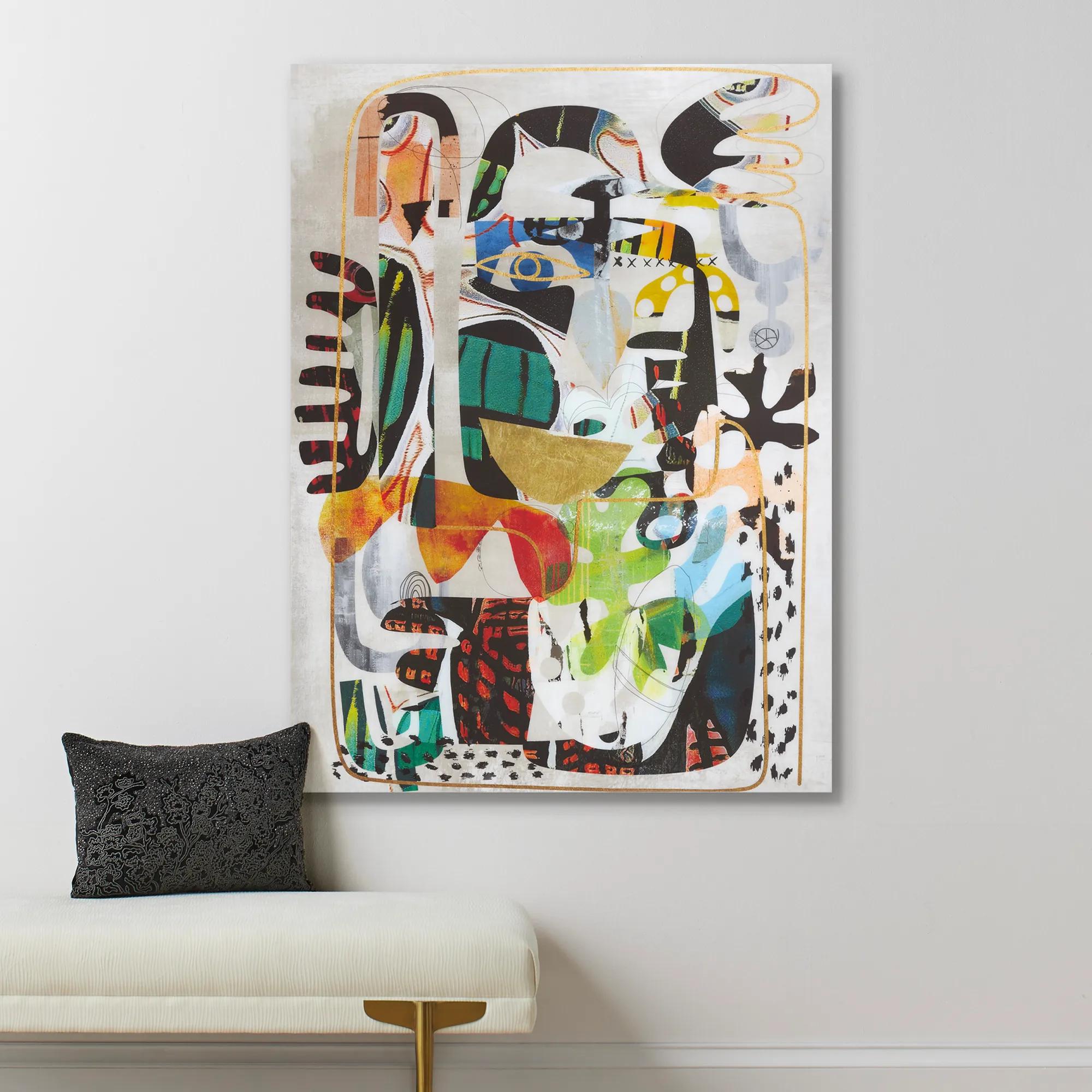 Nikki Chu Masked Wall Art 40" x 54"$899
A vibrant giclee print on canvas featuring a hand-applied glossy finish for a modern statement.
Add To Cart -
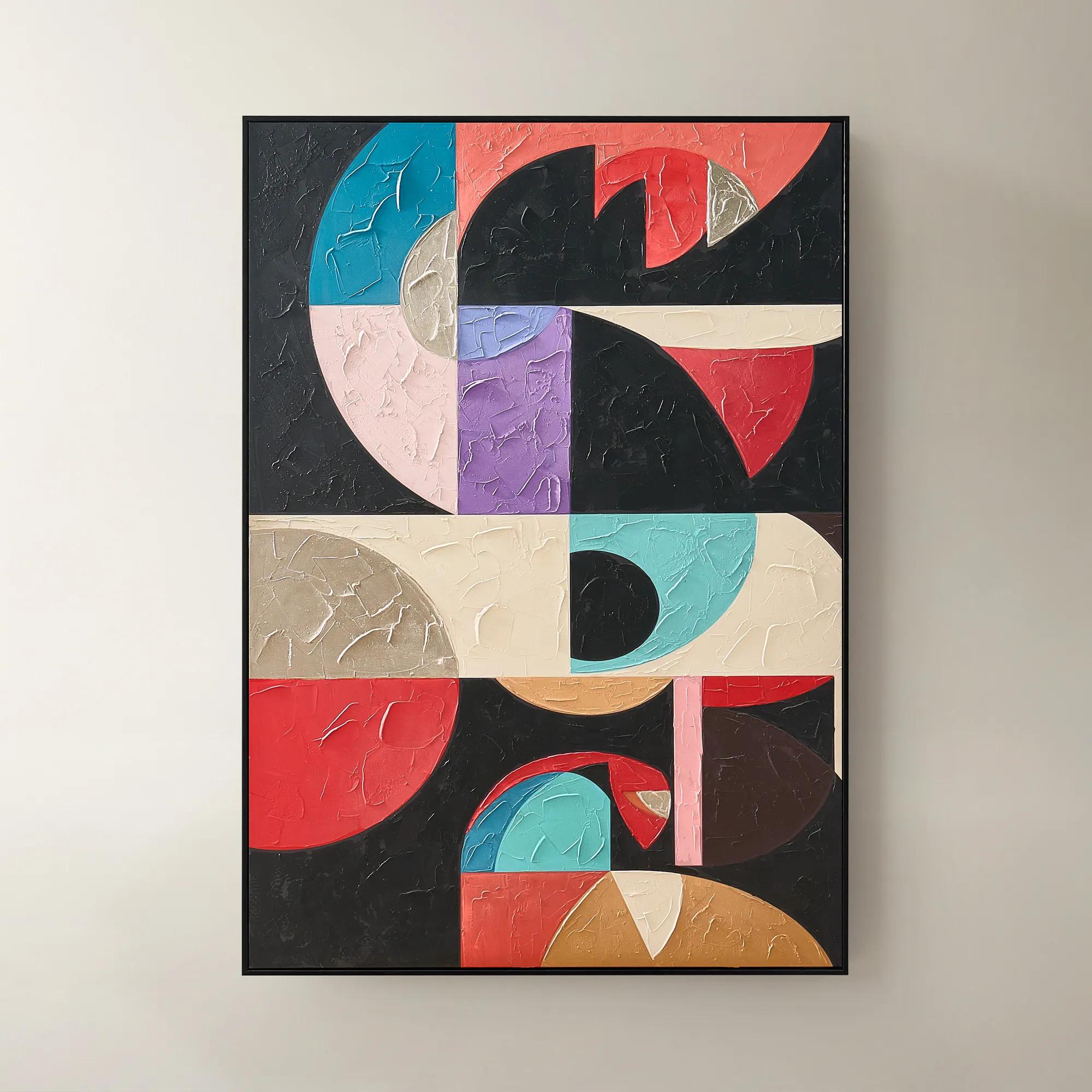
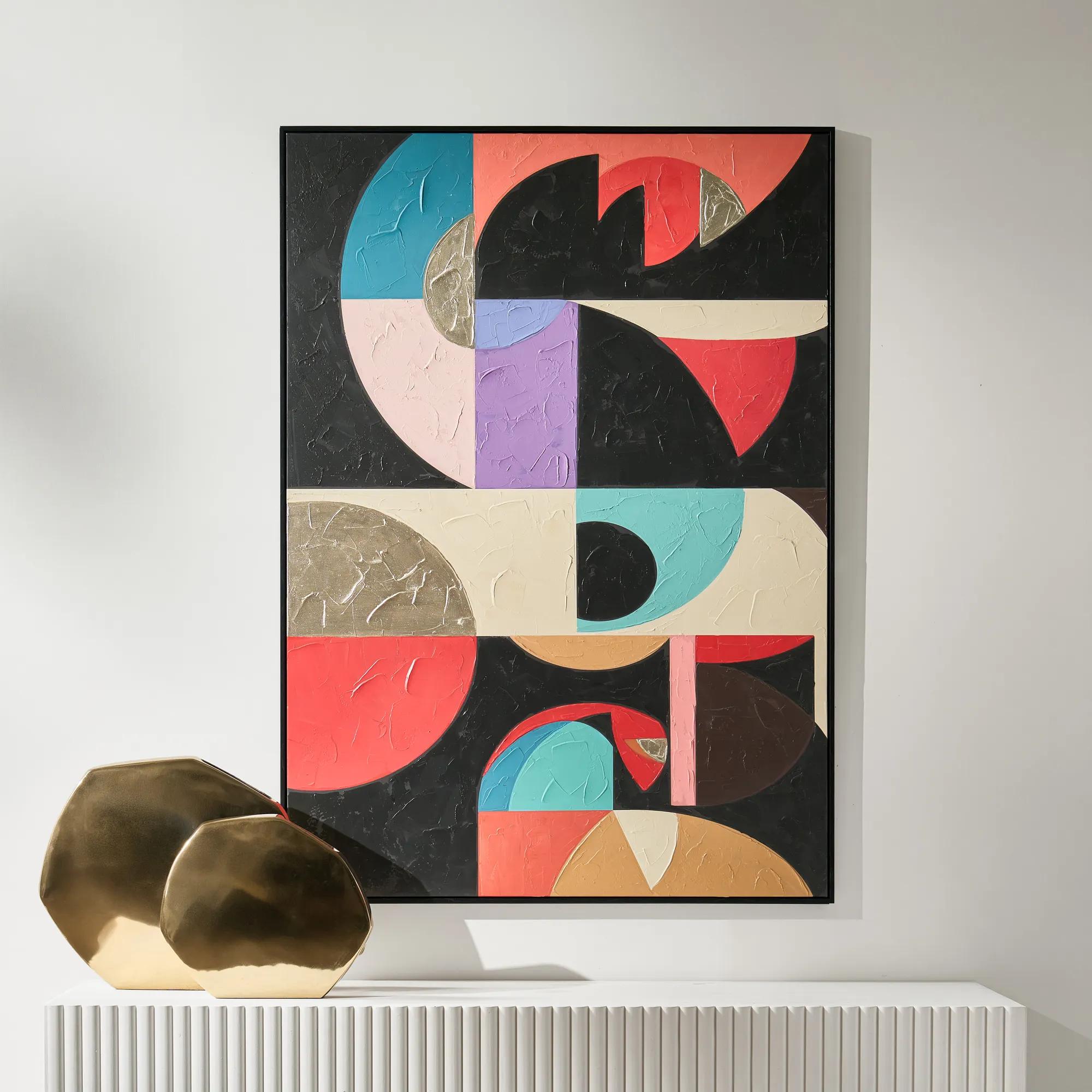 Labyrinth Art$499
A striking multicolored canvas artwork adding contemporary dimension to modern interiors.
Add To Cart -
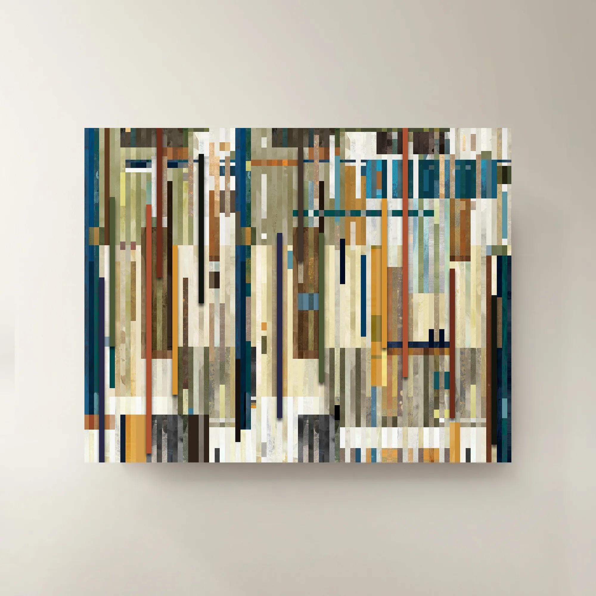
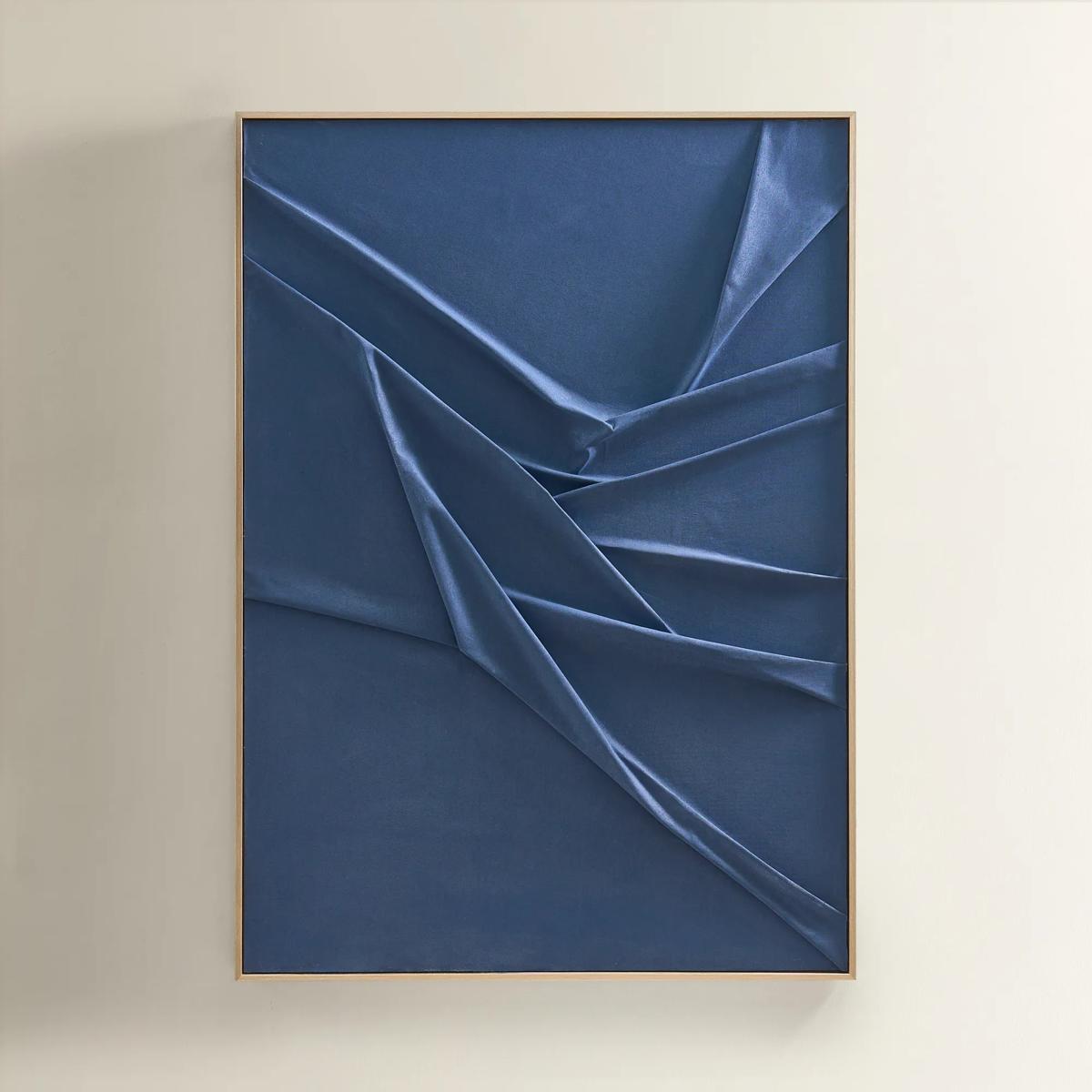
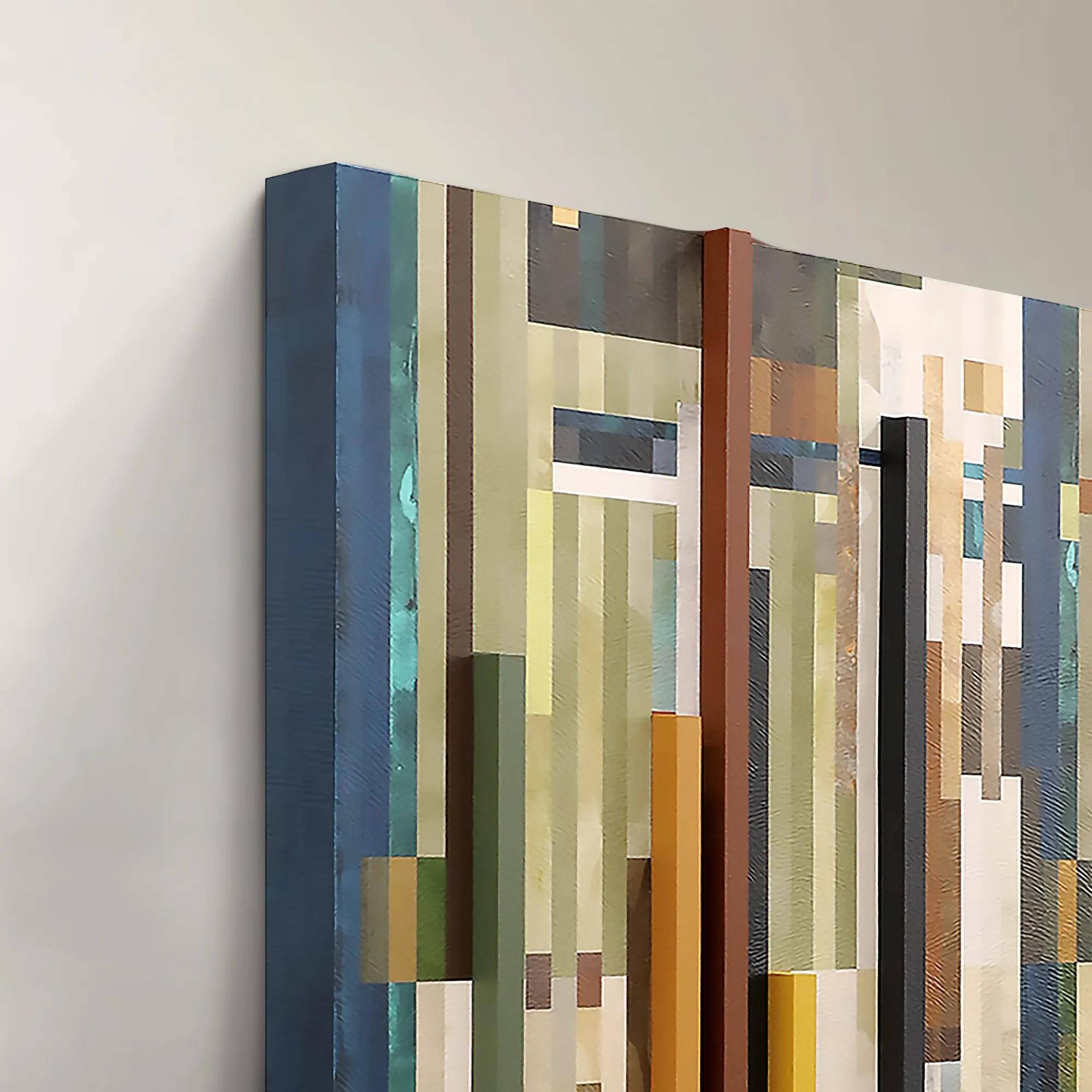 Chromatic Rhythms II Wall Art 60" x 47"$1899
A dynamic blue abstract canvas artwork featuring rhythmic geometric composition.
Add To Cart -
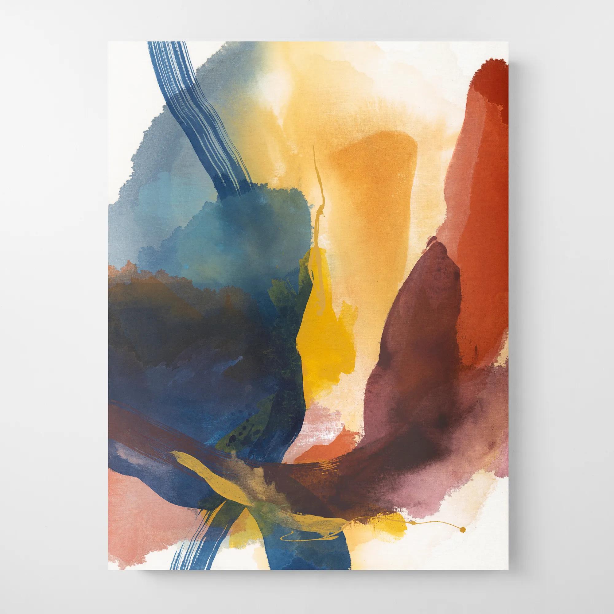
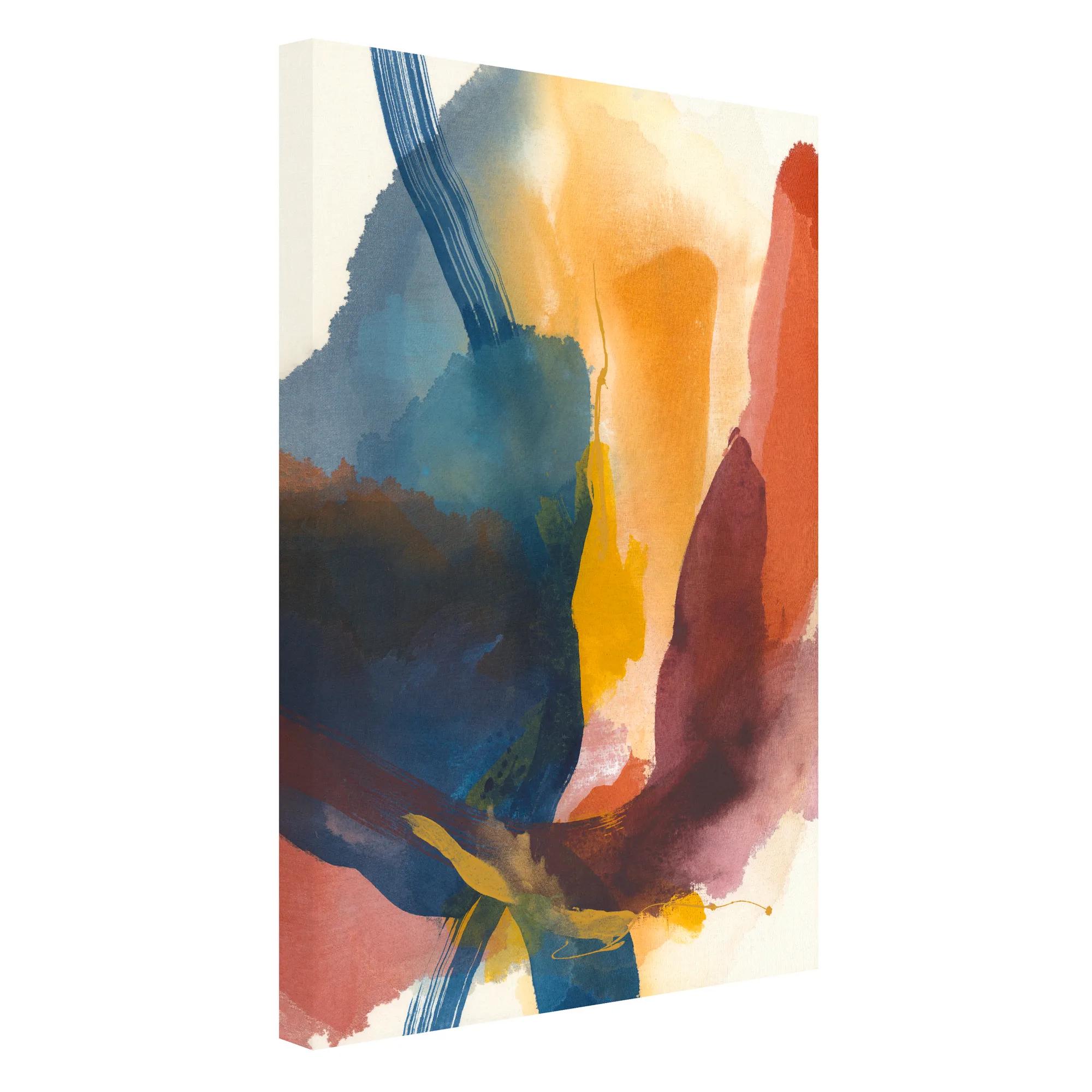 Moon Shower 1 Wall Art 30" x 40"$449
A gallery-wrapped canvas artwork featuring a hand-applied image brush gel finish for versatile display.
Add To Cart -
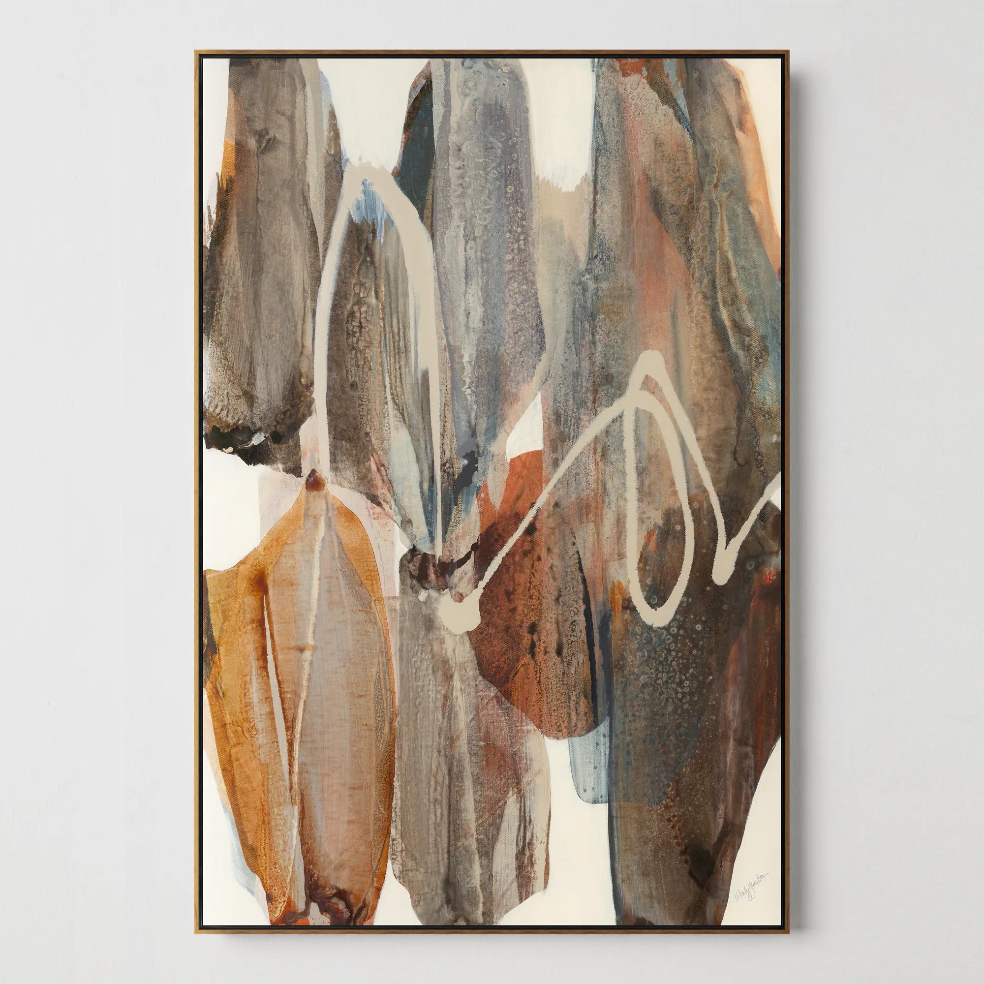
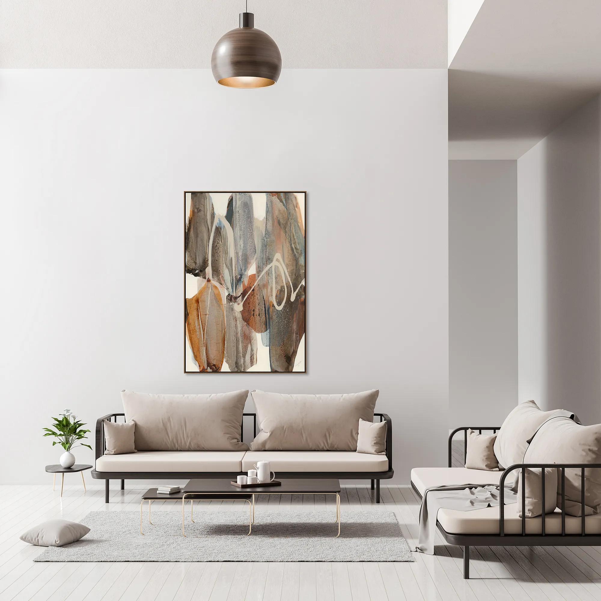 Boundless Framed Wall Art 40" x 60"$999
A gallery-wrapped canvas artwork with hand-applied brush gel finish in an oak floater frame.
Add To Cart -
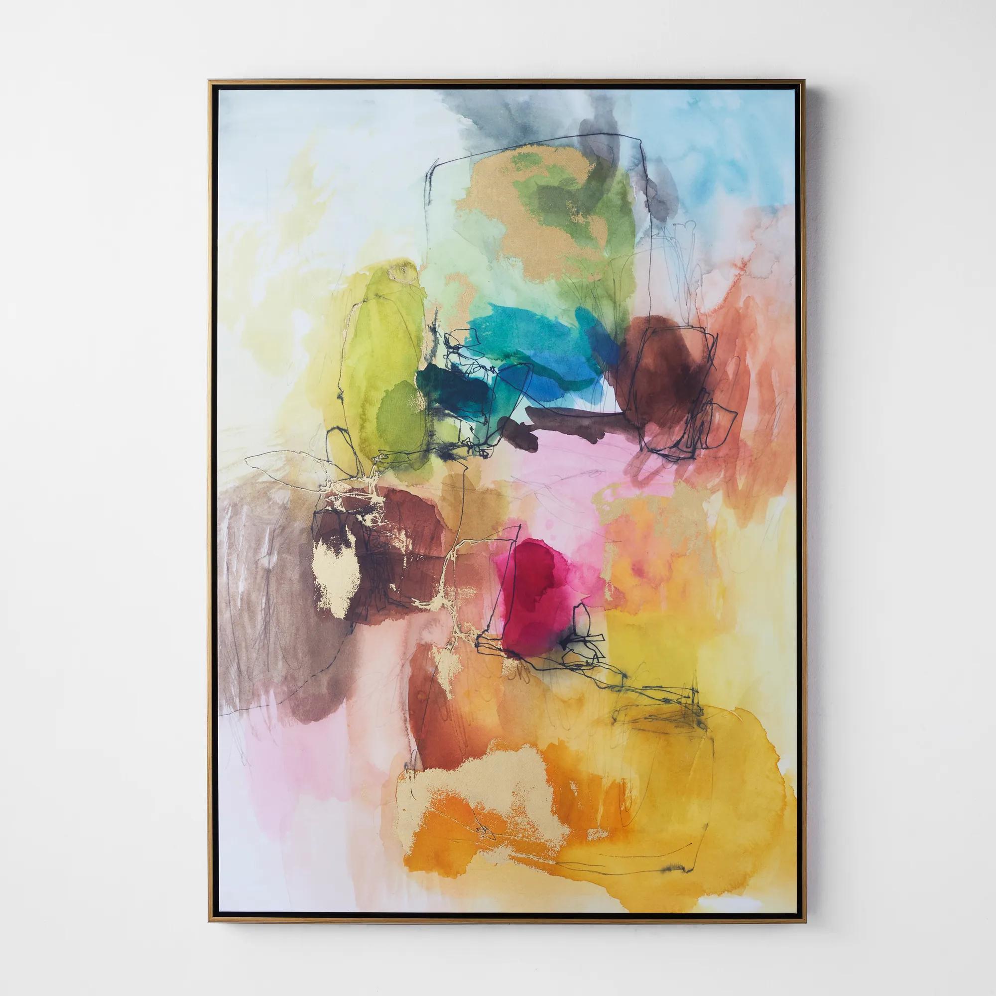 Apricity 3 Framed Wall Art 41" x 58"$899
A vibrant giclee on canvas featuring hand-applied gold gilding and a gold floater frame.
Add To Cart -
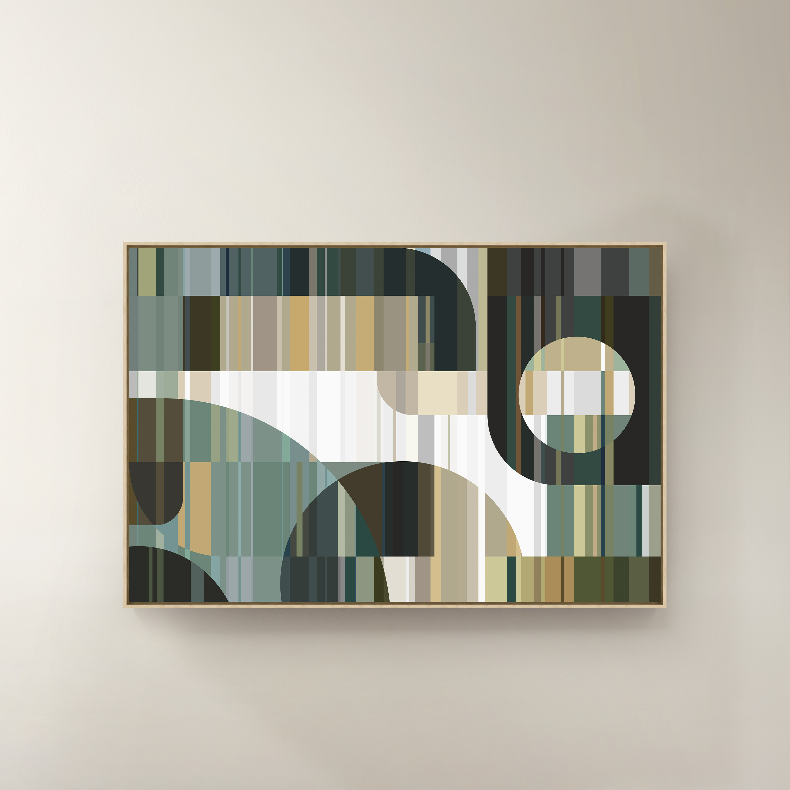
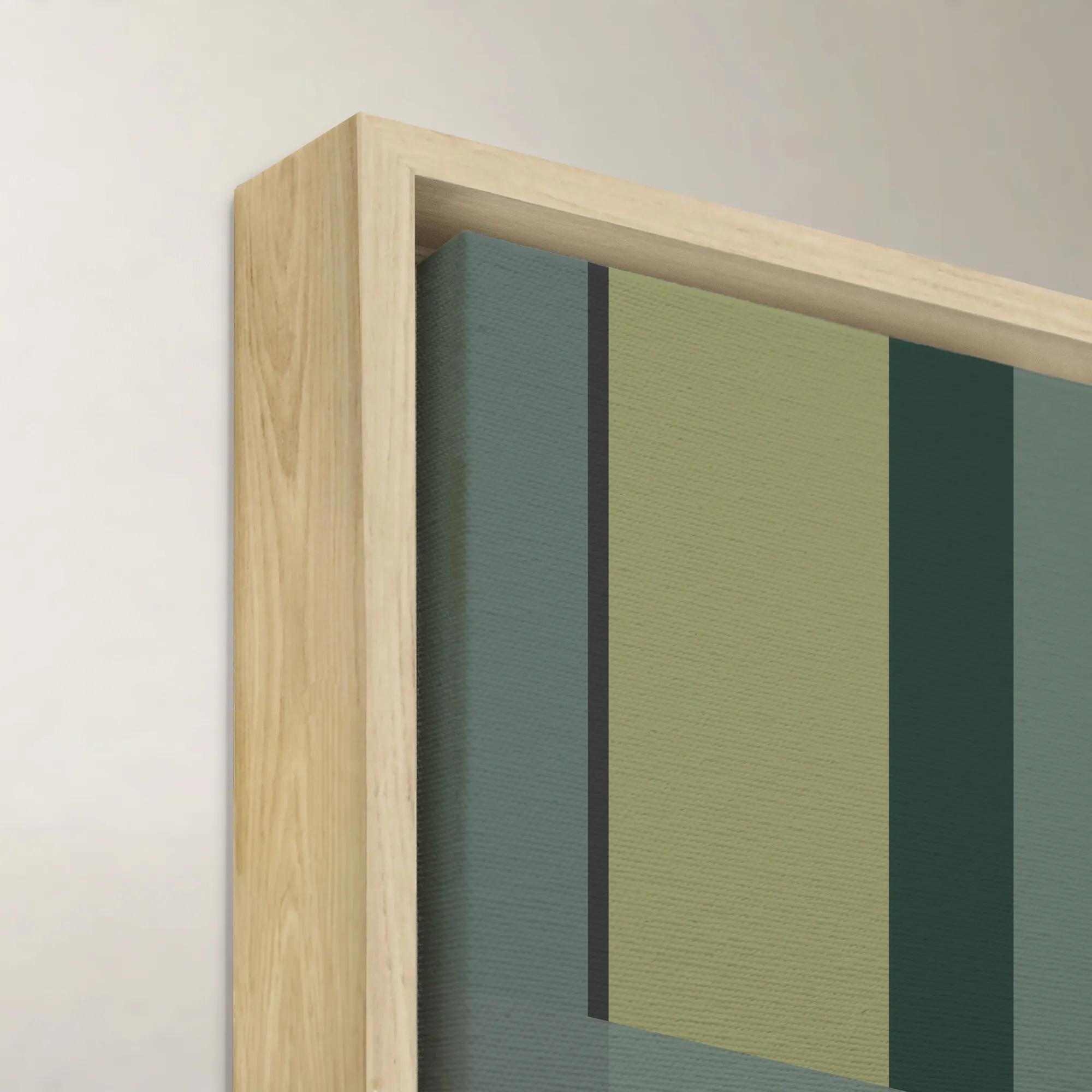 Cool Intersecting Forms II Framed Wall Art 60" x 40"$1099
A framed canvas wall artwork featuring cool-toned intersecting forms in a multicolored abstract composition.
Add To Cart -
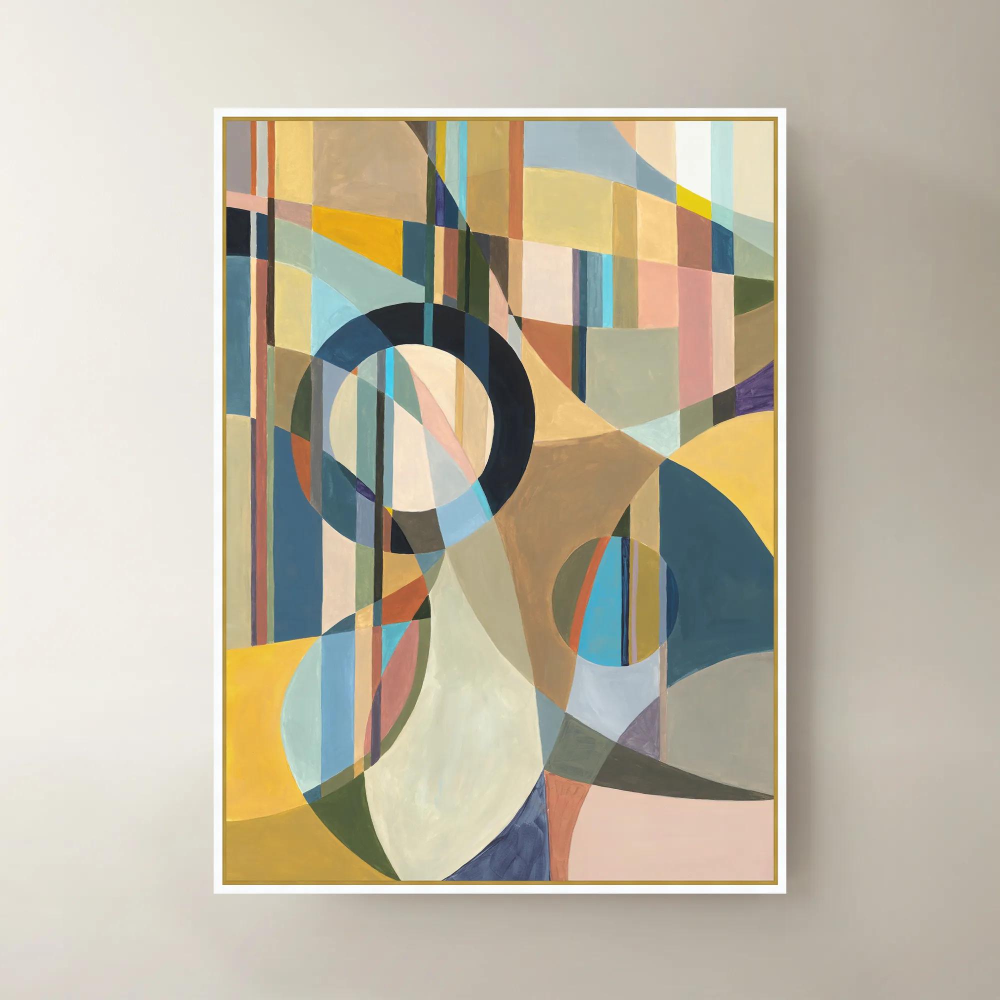
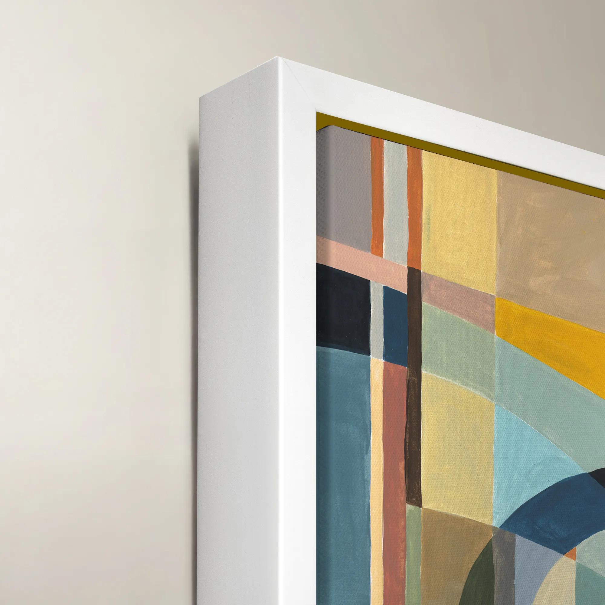 Happy Mistake Framed Wall Art 40" x 54"$1099
A vibrant multicolored framed canvas artwork adding expressive style to modern interiors.
Add To Cart

Multi Colored Statement Wall Arts
Dare to drench your walls in color and charisma with multi colored statement wall arts that captivate at every glance. These expressive masterpieces transform blank spaces into vibrant showcases, infusing each room with energy, movement, and a touch of the unexpected. From bold brushstrokes to intricate mosaics, every piece is a celebration of self-expression—inviting you to curate a gallery that’s as unique and dynamic as you are. Elevate your décor and let your walls become the most dazzling conversation starters in your home.
Multicolored statement wall art gives a room a distinct point of view through expressive color, generous scale, and compositions that command attention. Rather than disappearing into a decorating scheme, these pieces establish its visual rhythm: a sweep of cobalt beside burnt orange, a wash of rose interrupted by charcoal, or jewel-toned shapes suspended against an airy background. The effect depends as much on the relationship between colors as on their intensity. Saturated hues create energy and contrast, while softer layers of lavender, ochre, and blue can feel expansive and quietly dramatic. Abstract wall art leaves space for interpretation, geometric compositions introduce structure, and botanical or landscape-inspired imagery brings recognizable forms into a more expressive palette. Within the broader world of Statement Piece Wall Art, multicolored work offers a particularly compelling way to connect furnishings that might otherwise feel unrelated. A painting or print with traces of rust, cream, and teal can draw together a velvet sofa, a pale rug, and a sculptural accent chair without requiring an exact color match. That connection feels most natural when one or two tones reappear elsewhere in the room, leaving the remaining colors free to surprise. Above a streamlined sofa, an expansive composition introduces movement against clean upholstery. In an entryway, a vivid vertical piece creates an immediate impression without occupying floor space. A dining room can take on the atmosphere of an intimate gallery when richly colored artwork meets reflective finishes and considered lighting. Even a largely neutral bedroom can support a colorful focal point, particularly when the composition includes open space and softer transitions rather than relentless contrast. Multicolor does not have to mean maximal color everywhere; the surrounding wall, furniture silhouettes, and quiet surfaces give the artwork room to express itself. The result can be exuberant or restrained, but it should feel intentional, with color shaping the room’s character rather than simply filling an empty wall.
Materials and presentation influence how that color is experienced. Canvas has a woven surface that can lend printed or painted imagery a tactile quality, while works on paper often gain definition from a mat and frame. Stretched canvas can offer a clean, dimensional profile; a floating frame adds a narrow visual pause between the image and its outer edge. Glazing introduces another consideration, especially in rooms with substantial window light or lamps positioned opposite the artwork, where reflections may obscure delicate details. Matte surfaces generally keep attention on color and composition, while glossier finishes can heighten visual depth and make reflections more noticeable. Giclée describes an inkjet printing process used for fine-art reproductions, but long-term color stability depends on the inks, substrate, protective materials, and display conditions, not the printing term alone. Hand-applied texture, where present, adds another dimension, catching light differently across the surface and rewarding a closer look. Scale matters just as much as finish. Large multicolored wall art can anchor a substantial seating area, while a coordinated pair or multipanel arrangement creates rhythm across a wider wall. Above furniture, an overall artwork width of roughly two-thirds to three-quarters of the piece below is a useful starting proportion, adjusted for the surrounding architecture and the artwork’s visual weight. A dense, high-contrast composition may feel more substantial than a similarly sized image with broad areas of pale color. For multipanel artwork, the full arrangement includes the spaces between panels, so its total width deserves attention before hanging. Consistent spacing helps separate panels read as one composition rather than disconnected images. Viewing distance also changes the experience: broad gestures remain legible across an open living room, while fine marks and layered details invite appreciation along a hallway or beside a reading chair. Secure installation should follow the artwork’s weight, supplied instructions, and wall construction, with appropriate anchors or attachment to framing where needed. These practical details protect both the piece and the composed, gallery-like effect.
The most compelling placement reflects how a room is actually used. In a living room designed for conversation, colorful abstract wall art offers a shared focal point without demanding a single interpretation. In a home office, controlled geometry and a deliberate palette can give the space personality while preserving visual order. A bedroom may call for flowing shapes, softened edges, and colors that relate to bedding without duplicating it. Dining spaces often welcome stronger contrast, especially where artwork is viewed across a table and needs enough presence to hold its own against a chandelier or substantial furnishings. Art intended for interior display generally belongs in a dry, stable environment; bathrooms, enclosed porches, and areas near cooking surfaces require particular attention to moisture, heat, and material suitability. Durability begins with construction and continues with placement and care. Direct sunlight can fade pigments and printed colors over time, and dramatic humidity changes may affect paper, canvas, wood frames, and adhesives. UV-filtering glazing can reduce some exposure, but it does not make artwork immune to light damage. Routine care is usually restrained: gentle dusting with a clean, soft cloth for suitable frames, and surface-specific cleaning only as directed by the maker. Painted, textured, or unprotected printed surfaces should not be scrubbed or treated with household cleaners. For glazed pieces, cleaner belongs on an appropriate cloth rather than sprayed toward the frame, where liquid could reach the artwork. As a housewarming or milestone gift, multicolored statement wall art is especially personal when its palette, proportions, and subject reflect the recipient’s taste. A color-confident host may appreciate an expansive abstract composition, while someone furnishing a first home may connect with a piece that gives existing furniture a fresh sense of cohesion. Knowing the intended wall dimensions and preferred framing style makes that gesture more thoughtful. Whether chosen for a collected interior or a newly furnished room, the strongest piece offers more than a burst of color: it gives the space an expressive center, with nuances that remain engaging from across the room and up close.
FAQs
Multi colored statement wall art brings instant energy and personality to your space, acting as a dynamic focal point that draws the eye and sets the mood. Whether your style is bold and eclectic or sophisticated and modern, these vibrant pieces infuse a room with artistic flair, transforming ordinary walls into captivating showcases of self-expression.
Popular styles include abstract compositions with expressive brushstrokes, geometric patterns, nature-inspired scenes bursting with color, and mixed media works that add texture and depth. From dew shade abstract wall art to contemporary digital prints, you’ll find options that suit both classic and avant-garde tastes.
These bold pieces shine brightest in spaces where you want to create a memorable impression—think living rooms, entryways, dining areas, or even above a dramatic staircase. A well-placed statement artwork can anchor a room, define a vignette, or serve as a conversation starter for guests.
Statement wall art makes a thoughtful gift for anyone who values creativity and design—new homeowners, newlyweds, recent graduates, or anyone embarking on a fresh chapter. It’s a unique way to celebrate milestones and help loved ones express their personality through their living space.
To create a harmonious look, pair your artwork with neutral furnishings for striking contrast, or echo select hues from the piece in your textiles and accessories for a layered, cohesive effect. Don’t be afraid to mix with metallics, bold patterns, or textured accents—these pieces are designed to stand out and inspire creativity.