Home Office Wall Art Ideas
Home Office Wall Art Ideas
-
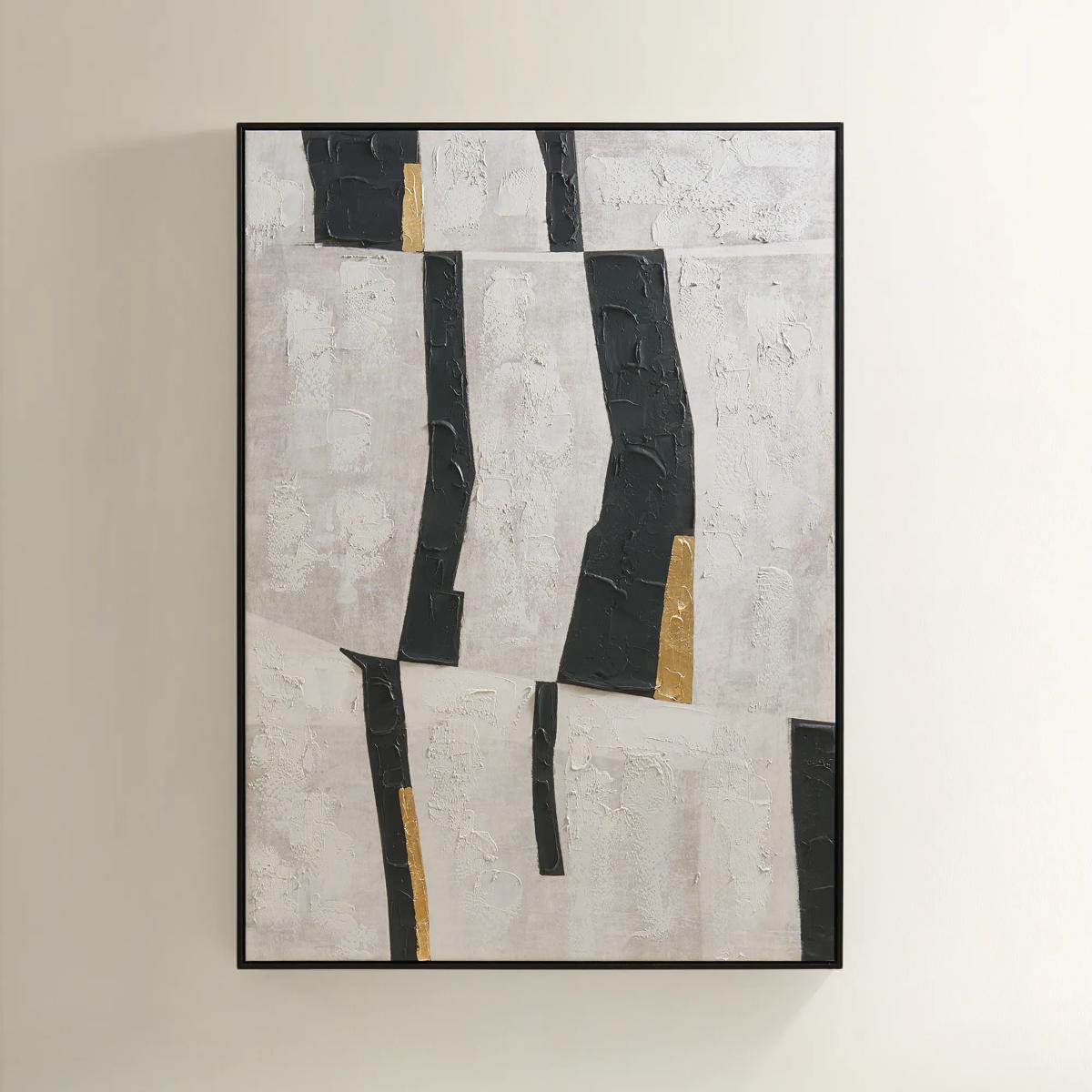
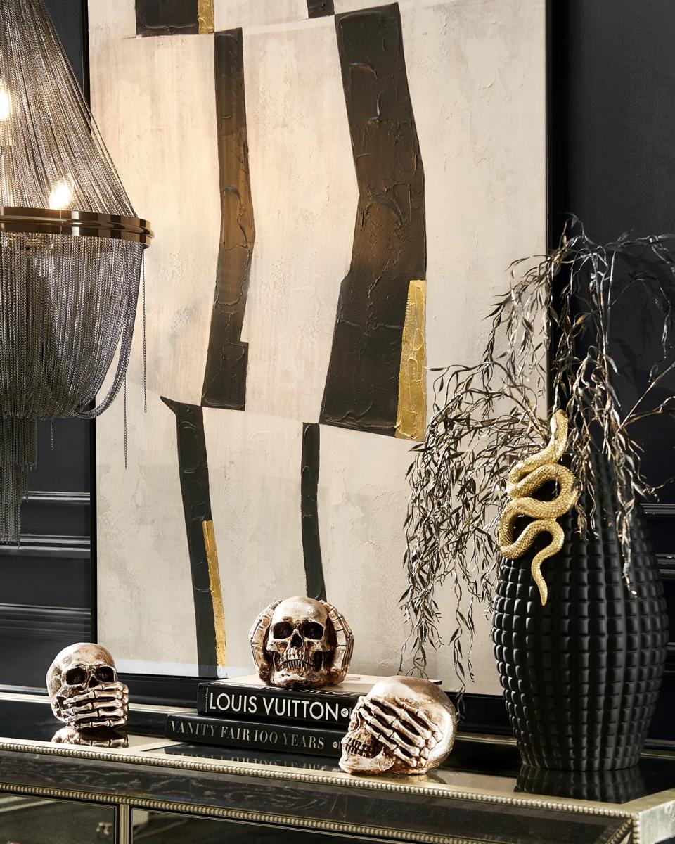 Into the Groove Painting$449
A modern abstract canvas featuring black, gray, and gold leaf accents in a sleek black floater frame.
Add To Cart -
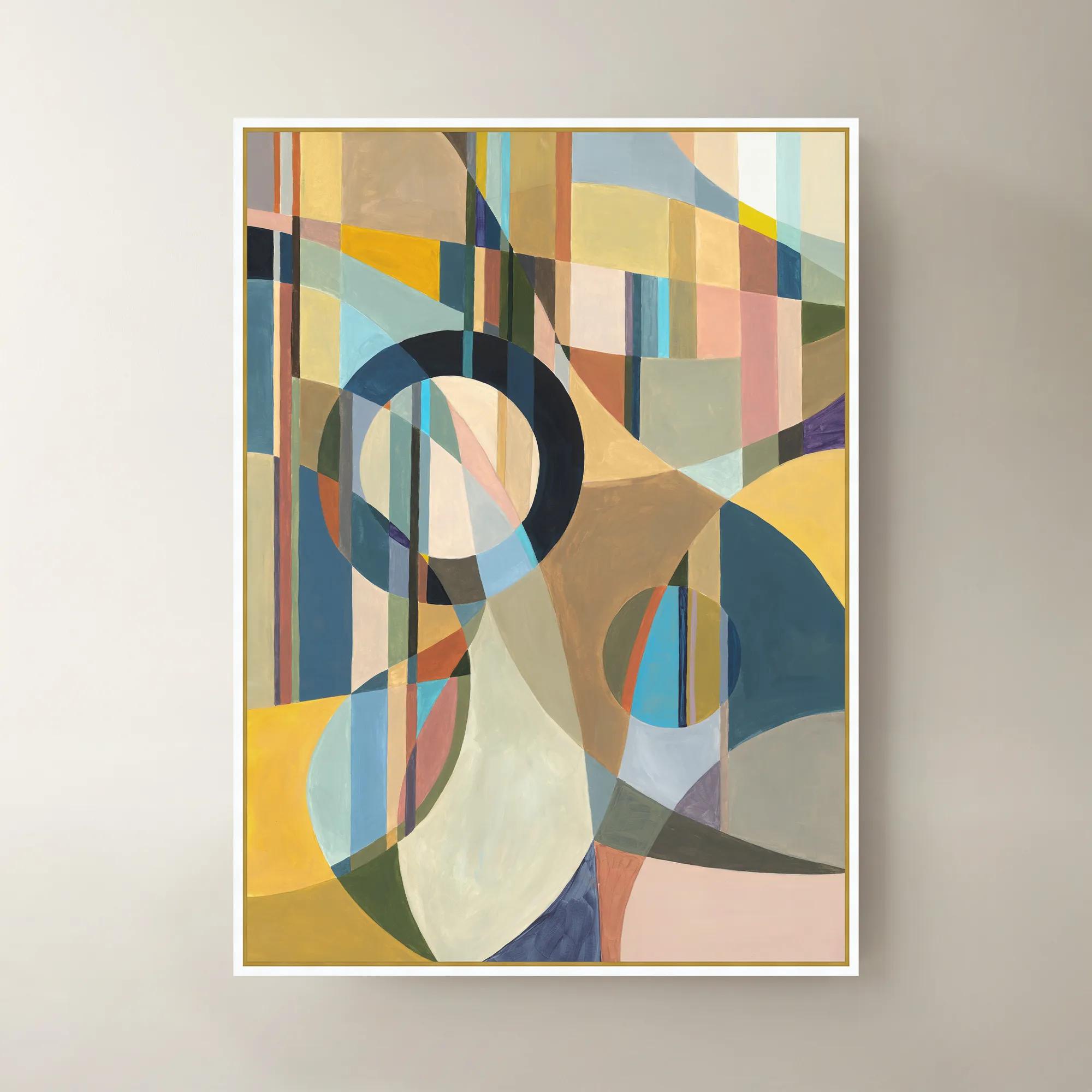
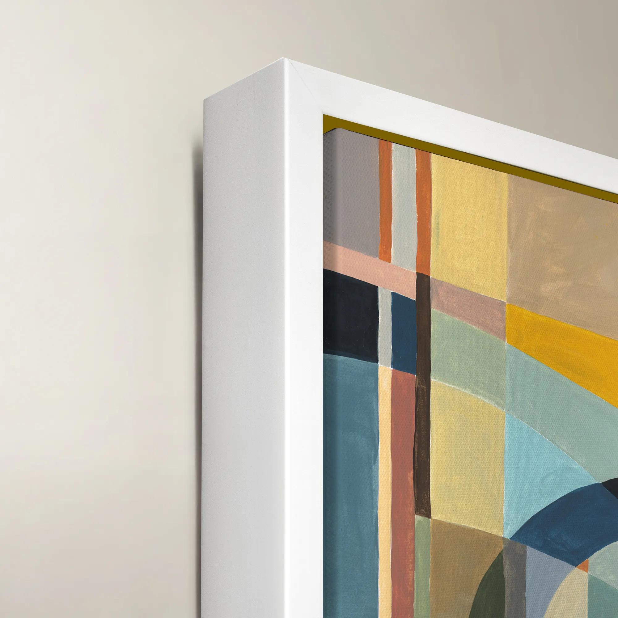 Happy Mistake Framed Wall Art 40" x 54"$1099
A vibrant multicolored framed canvas artwork adding expressive style to modern interiors.
Add To Cart -
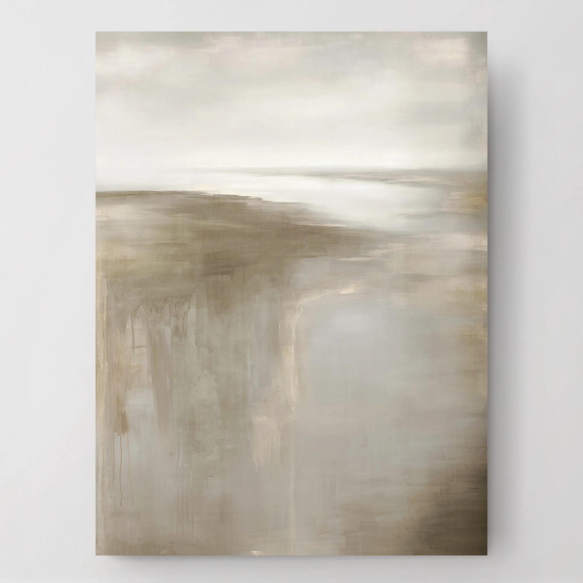
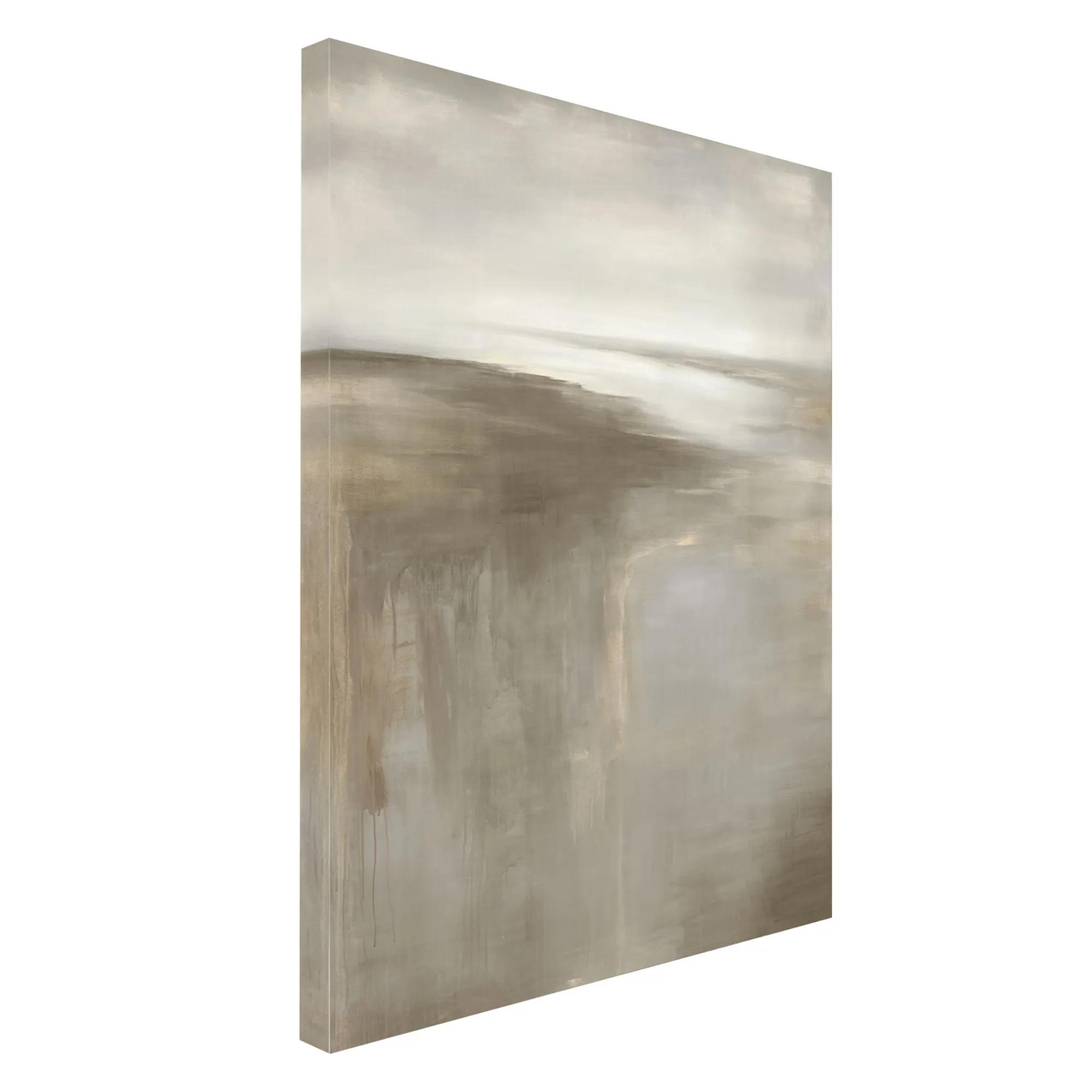 Silver Morning Wall Art 30" x 40"$449
A gallery-wrapped silver canvas artwork featuring a hand-applied image brush gel finish.
Add To Cart -
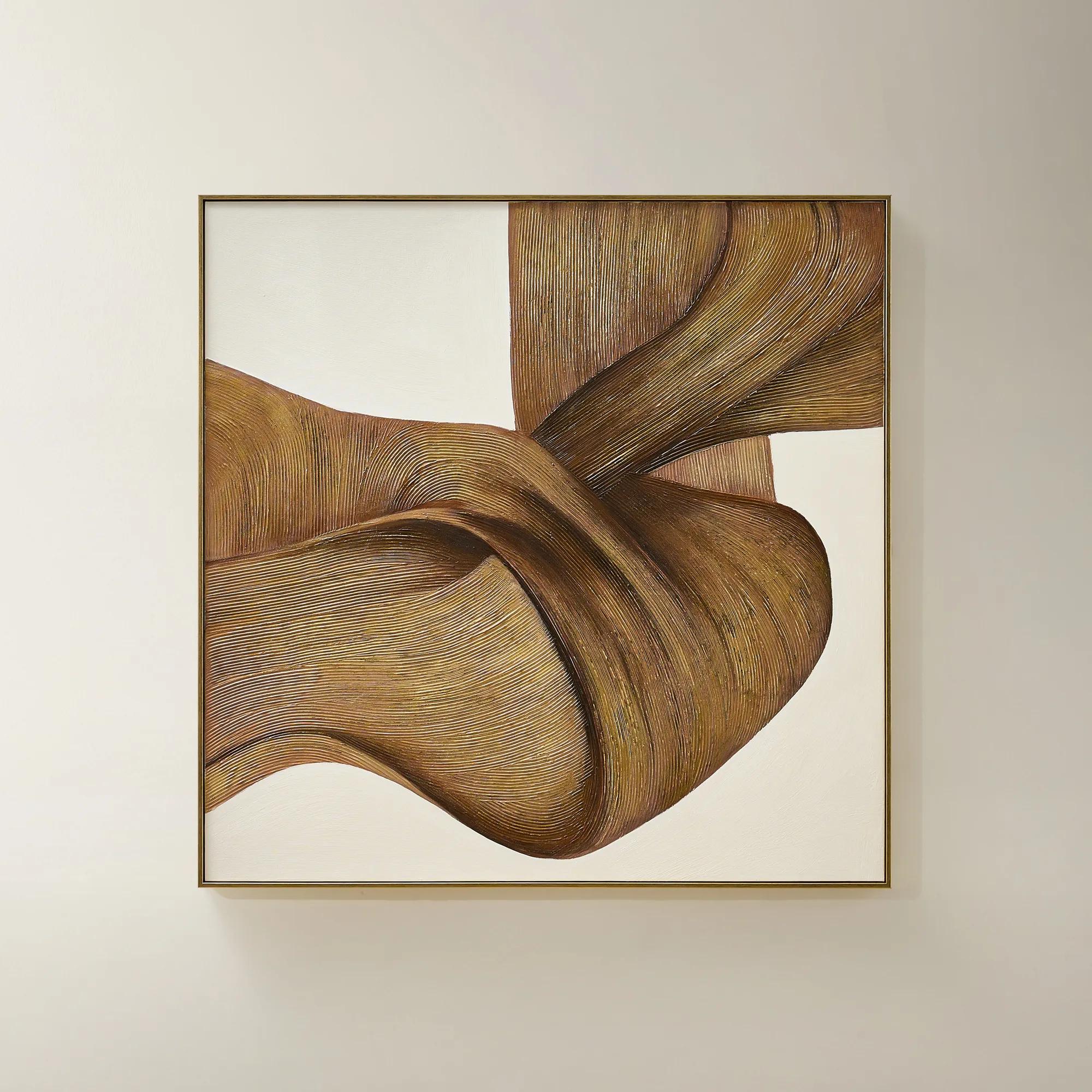
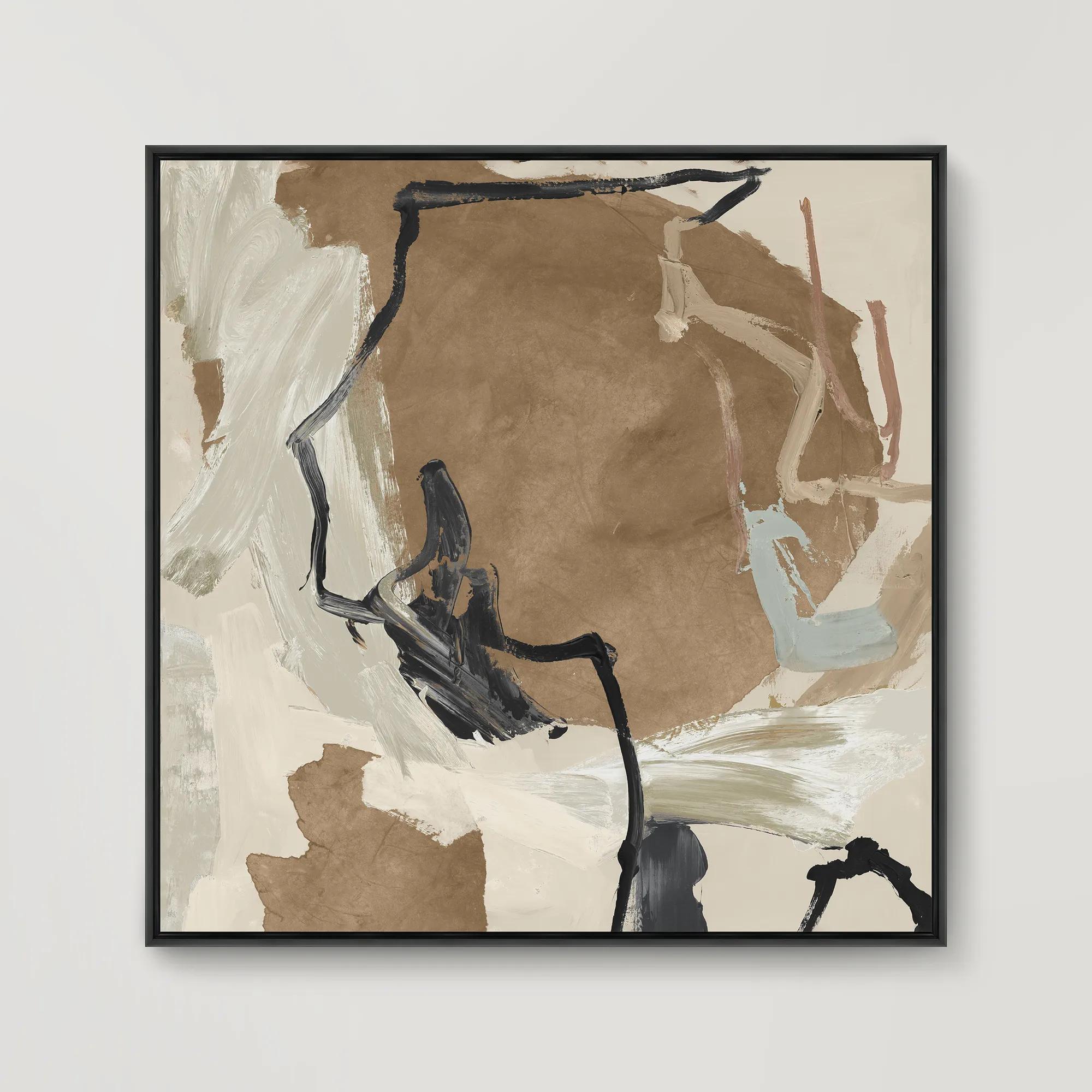
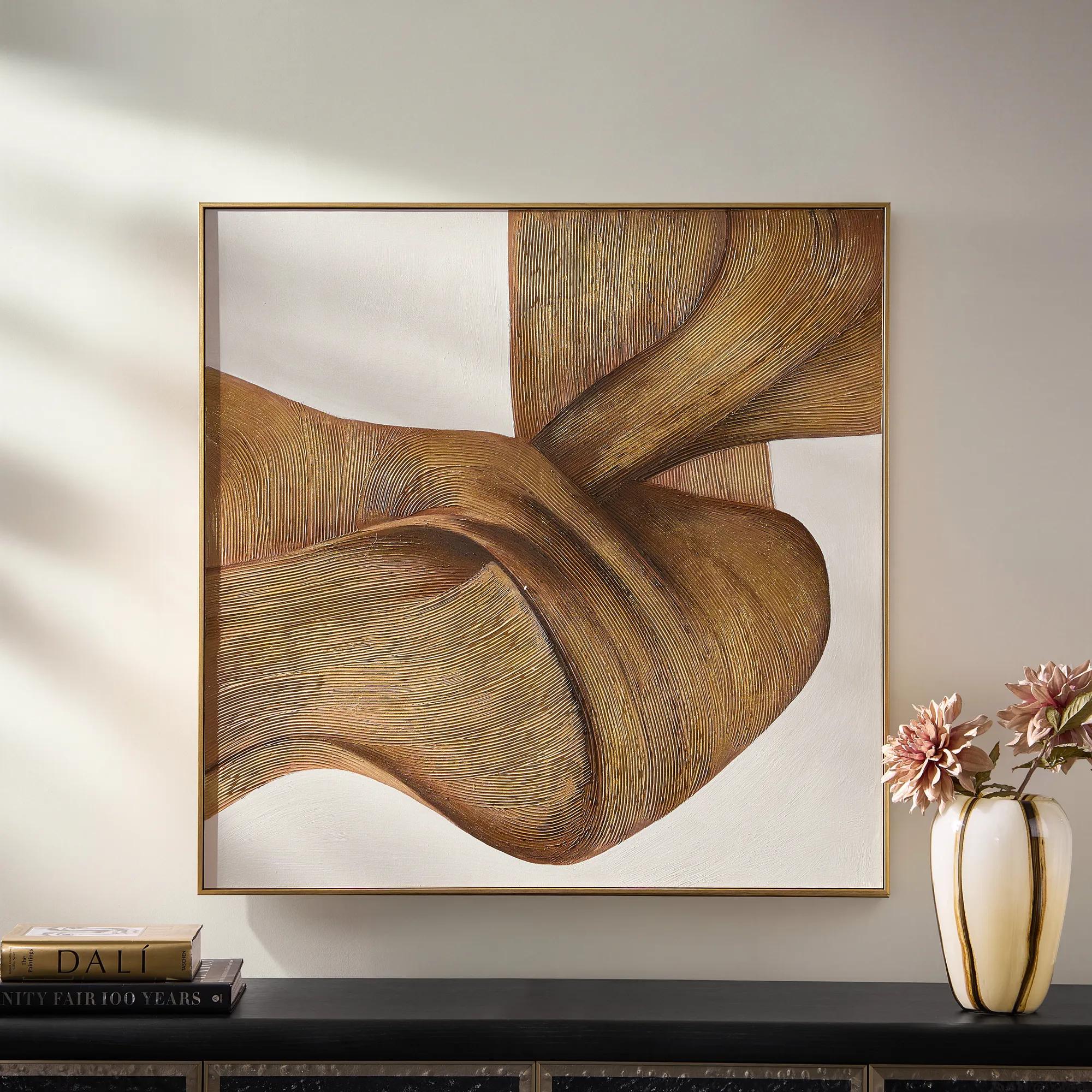 Latte Framed Gold Leaf Painted Wall Art 40" x 40"$499
A hand-painted canvas with fluid brown lines, luminous gold leafing, and a crisp black floater frame.
Add To Cart -

 Heart Dancing Framed Wall Art 51.5" x 37.5"$799
A gallery-wrapped canvas artwork with a hand-applied brush gel finish in a sleek gunmetal floater frame.
Add To Cart -
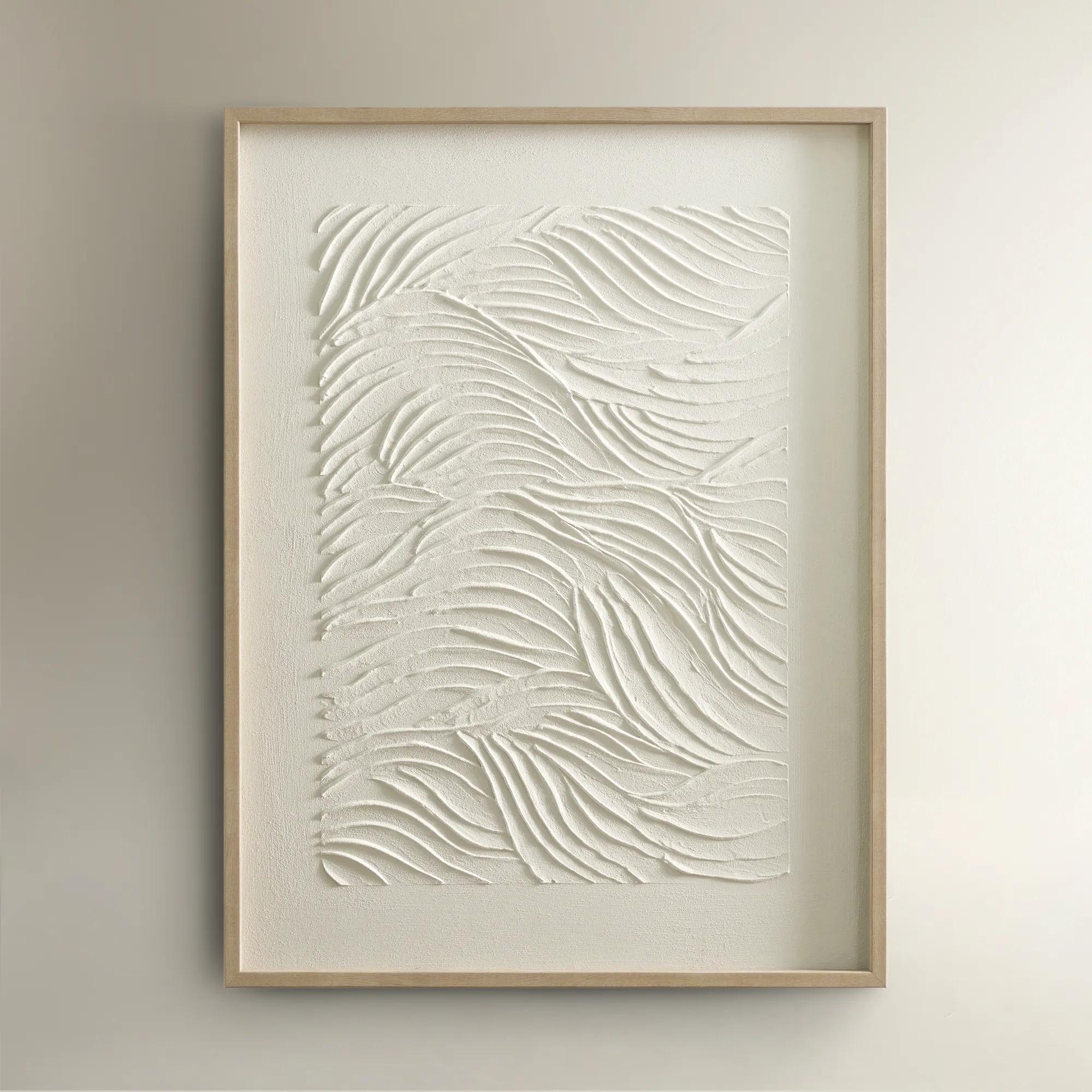
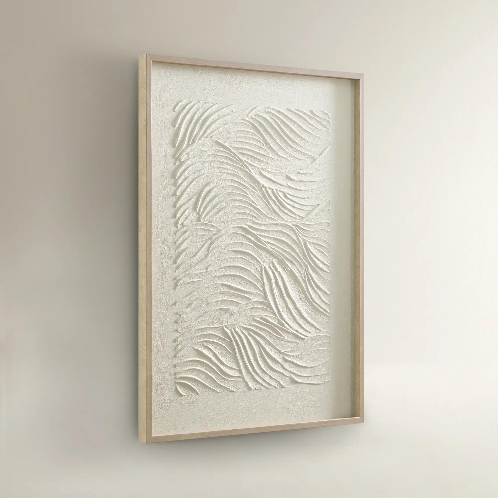 Sonnet Framed Painted Wall Art 23.5" x 31.5"$99
A hand-painted canvas featuring textured white shades and a warm blonde wood frame for elegant depth.
Add To Cart -
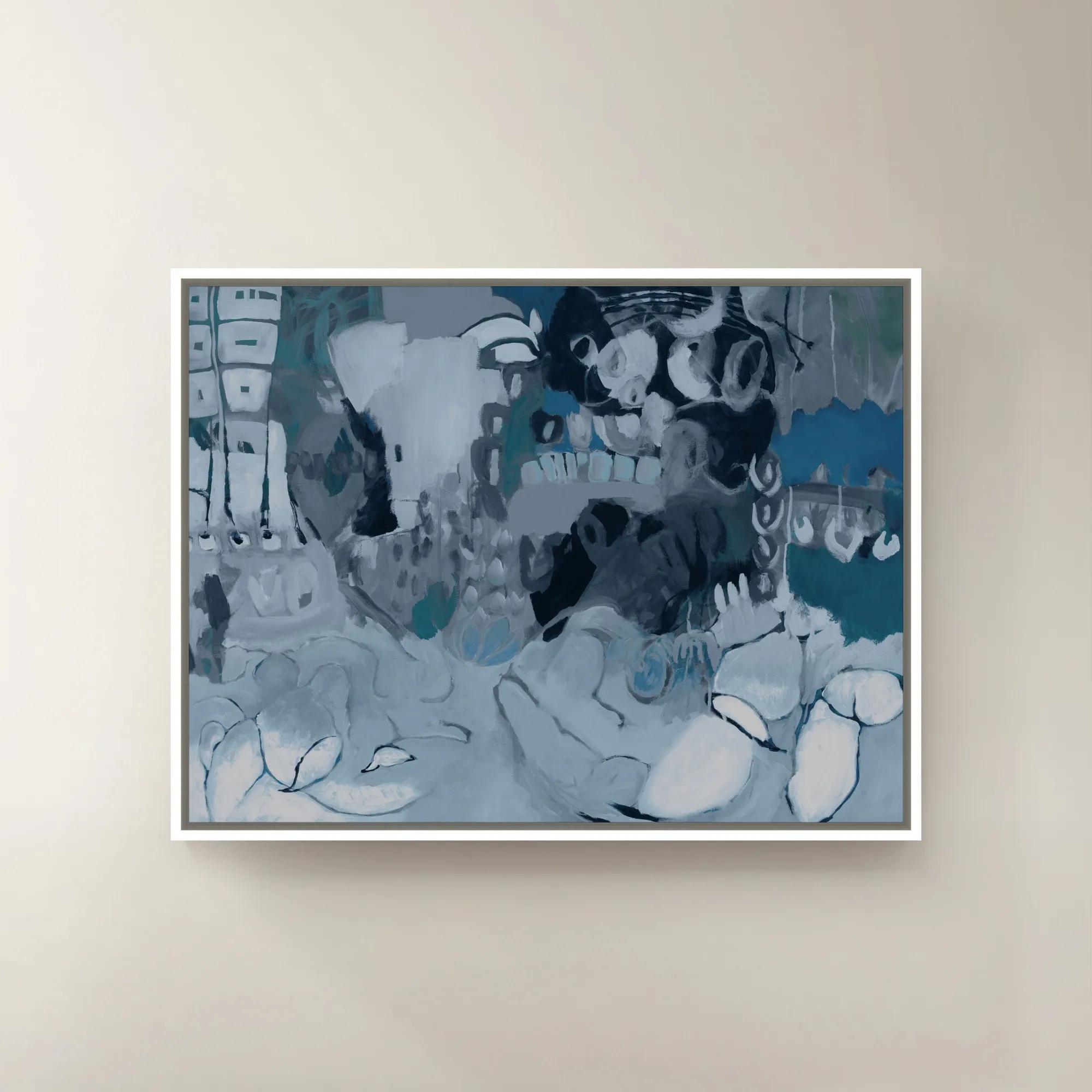
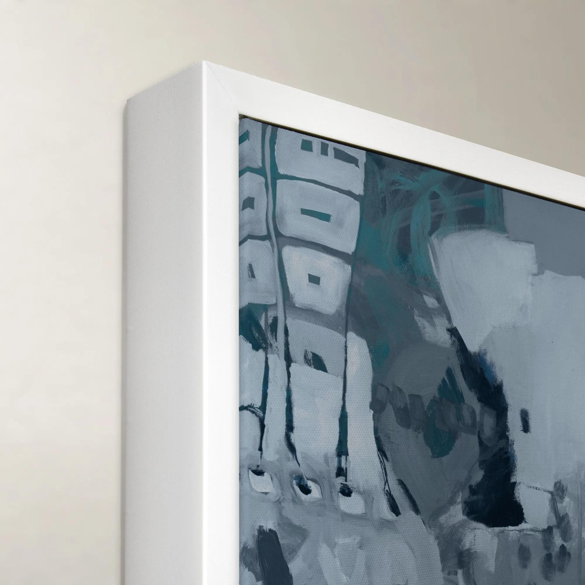 Wrap me in Forever II Framed Wall Art 40" x 30"$699
A striking blue and purple canvas wall art piece presented in a refined frame.
Add To Cart -
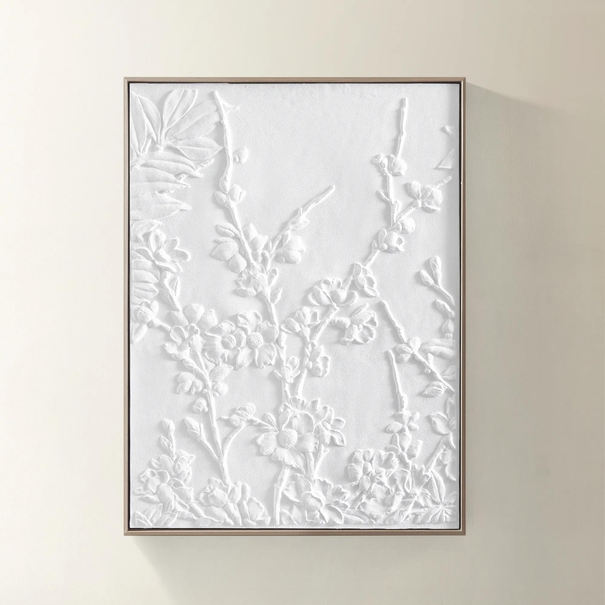
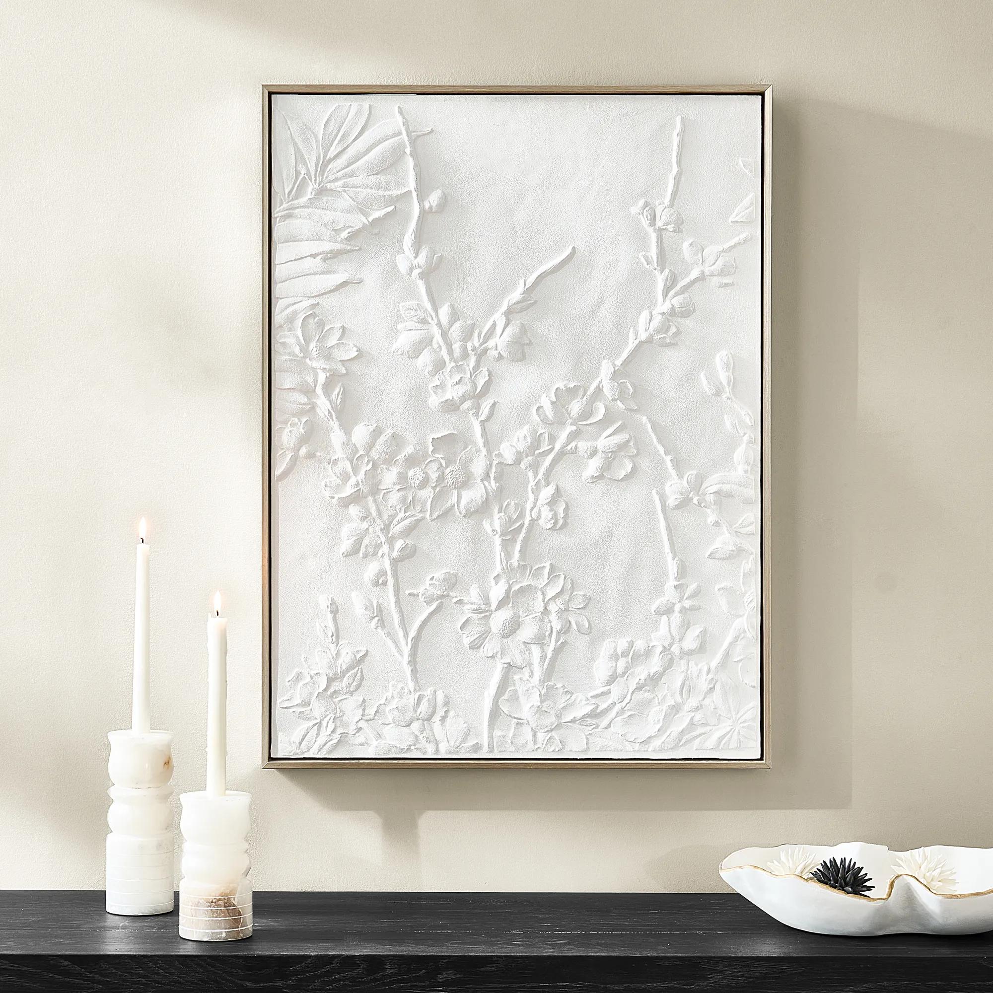 Allegro Framed Painted Wall Art 31.5" x 23.6"$109
A hand-painted canvas featuring textured floral motifs, framed in a warm champagne finish for subtle sophistication.
Add To Cart -
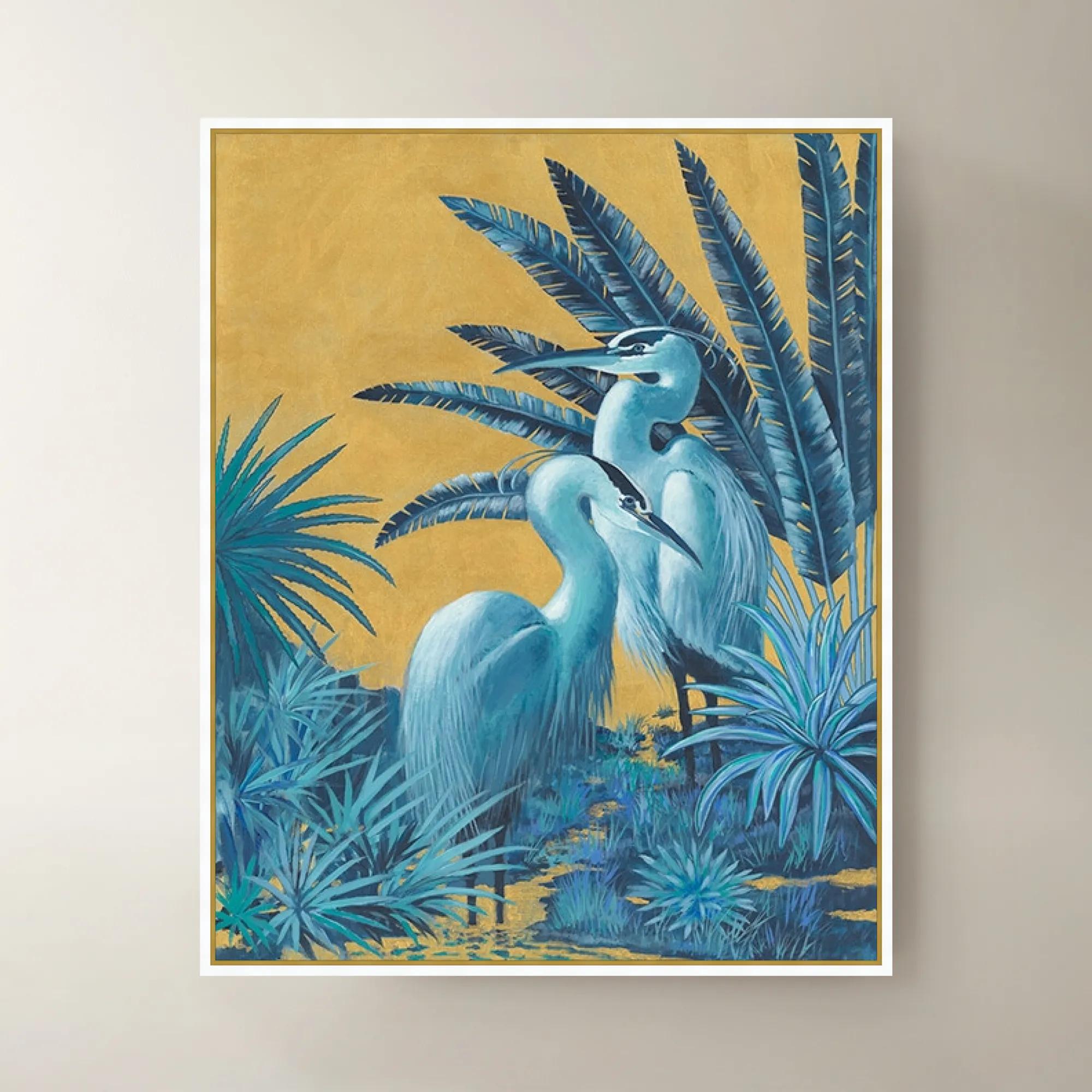
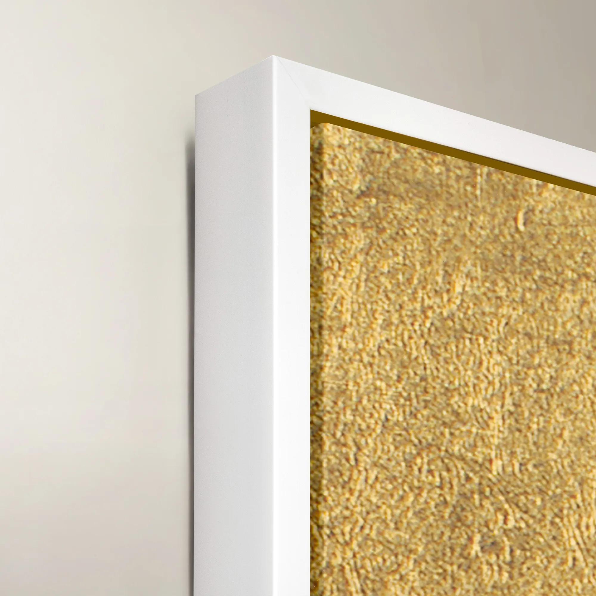 Blue Gold Herons Framed Wall Art 40" x 50"$1199
A striking blue and gold framed canvas artwork featuring elegant herons for sophisticated wall display.
Add To Cart -
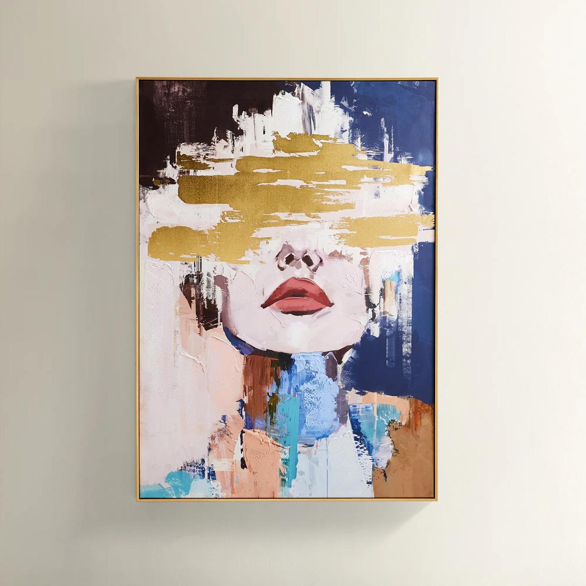
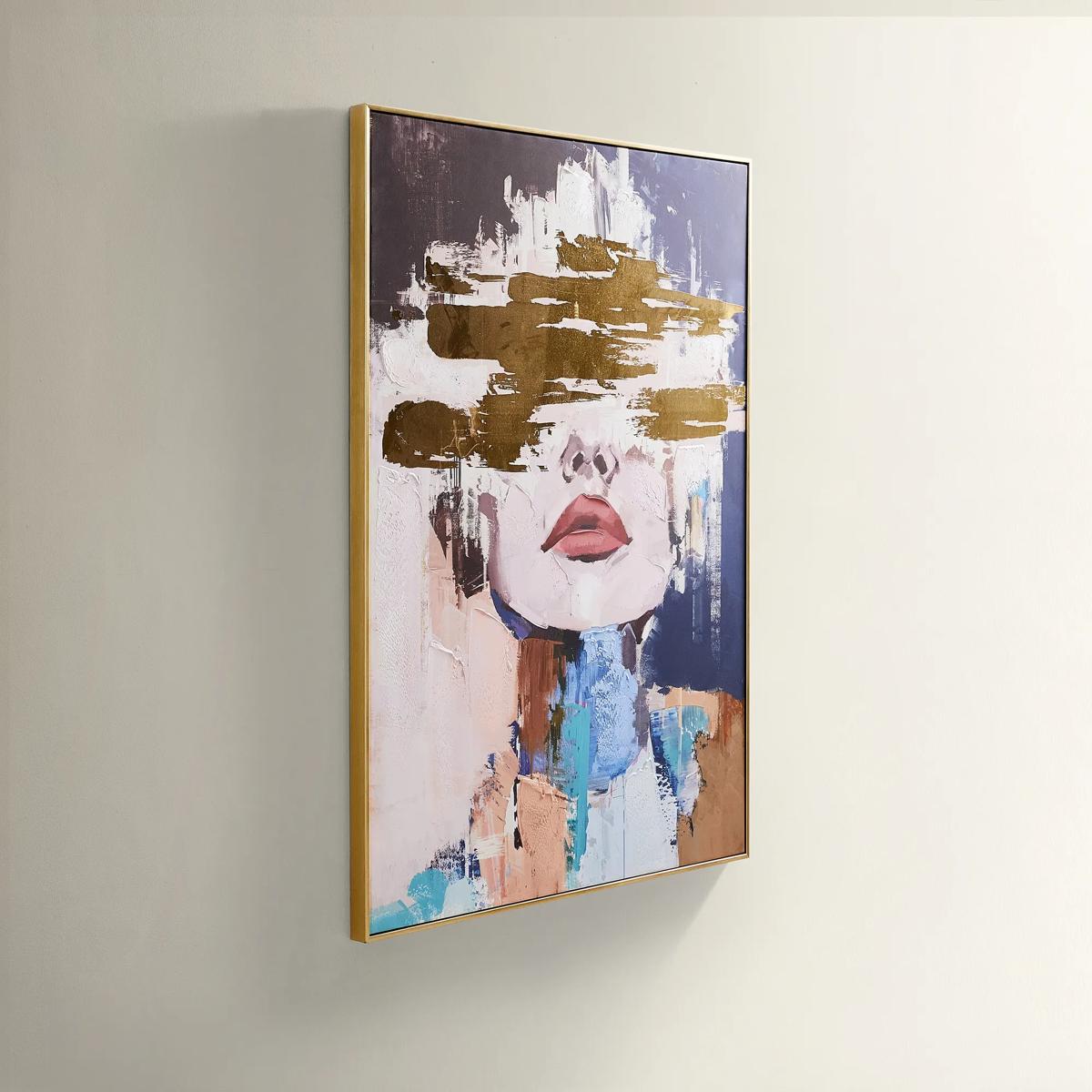 Waiting in Color Gold Foil Painted Wall Art 39.25" x 55"$499
A hand-painted abstract portrait in vivid blue, blush, and gold foil, framed in luxe gold.
Add To Cart -
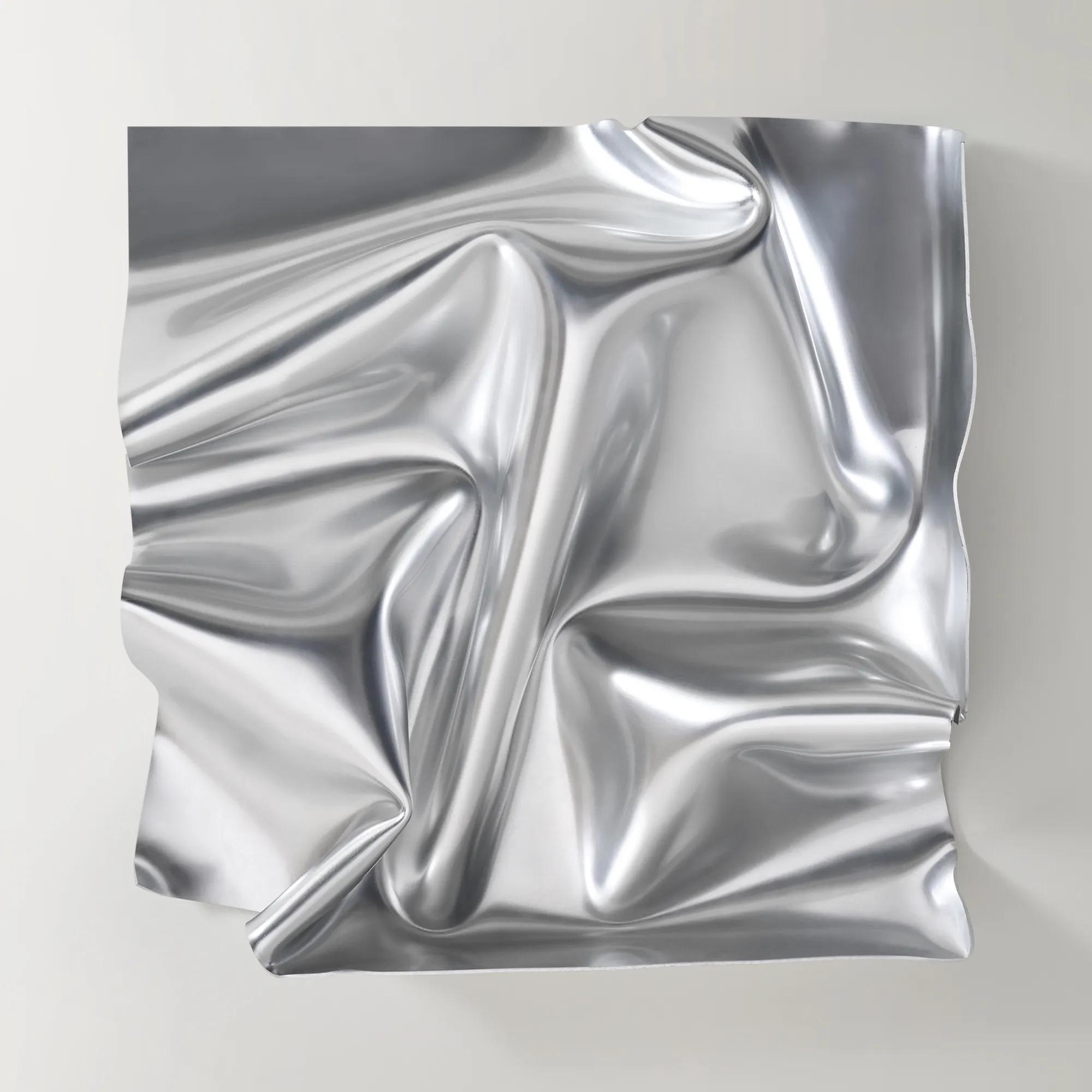
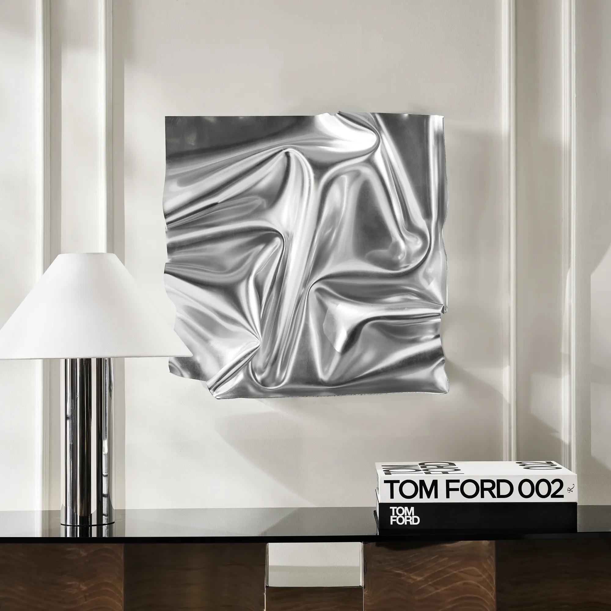 Surface Sculpted Silver Leaf Acrylic Wall Decor 23.6" x 23.6"$189
A striking acrylic wall piece featuring fluid, reflective silver shapes for dramatic, modern visual impact.
Add To Cart -
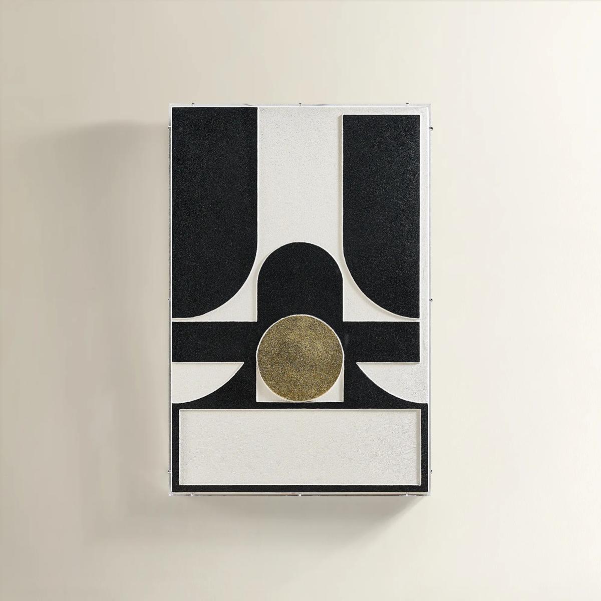
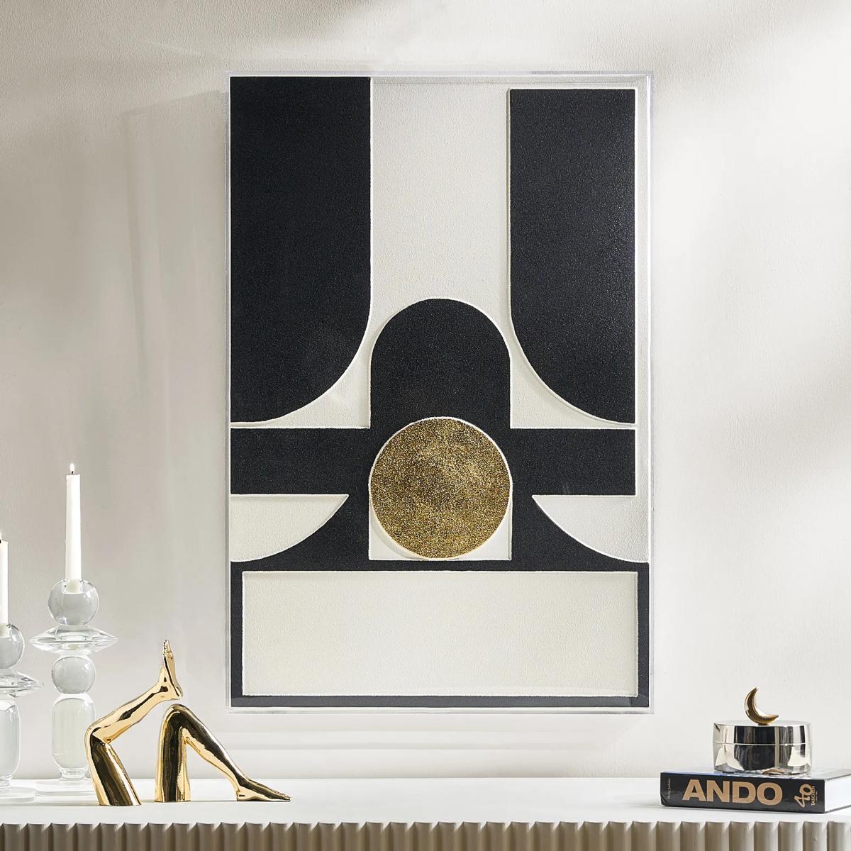 Siren Black And Gold Wall Decor in Acrylic 23.5" x 35.5"$299
A layered composition of black, ivory, and gold geometric forms set in a sleek acrylic shadow box.
Add To Cart -
 Jagged Black Leather Wall Decor in Acrylic 23.5" x 35.5"$329
A sculptural wall art piece featuring folded black leather strips encased in a clear acrylic shadow box.
Add To Cart -
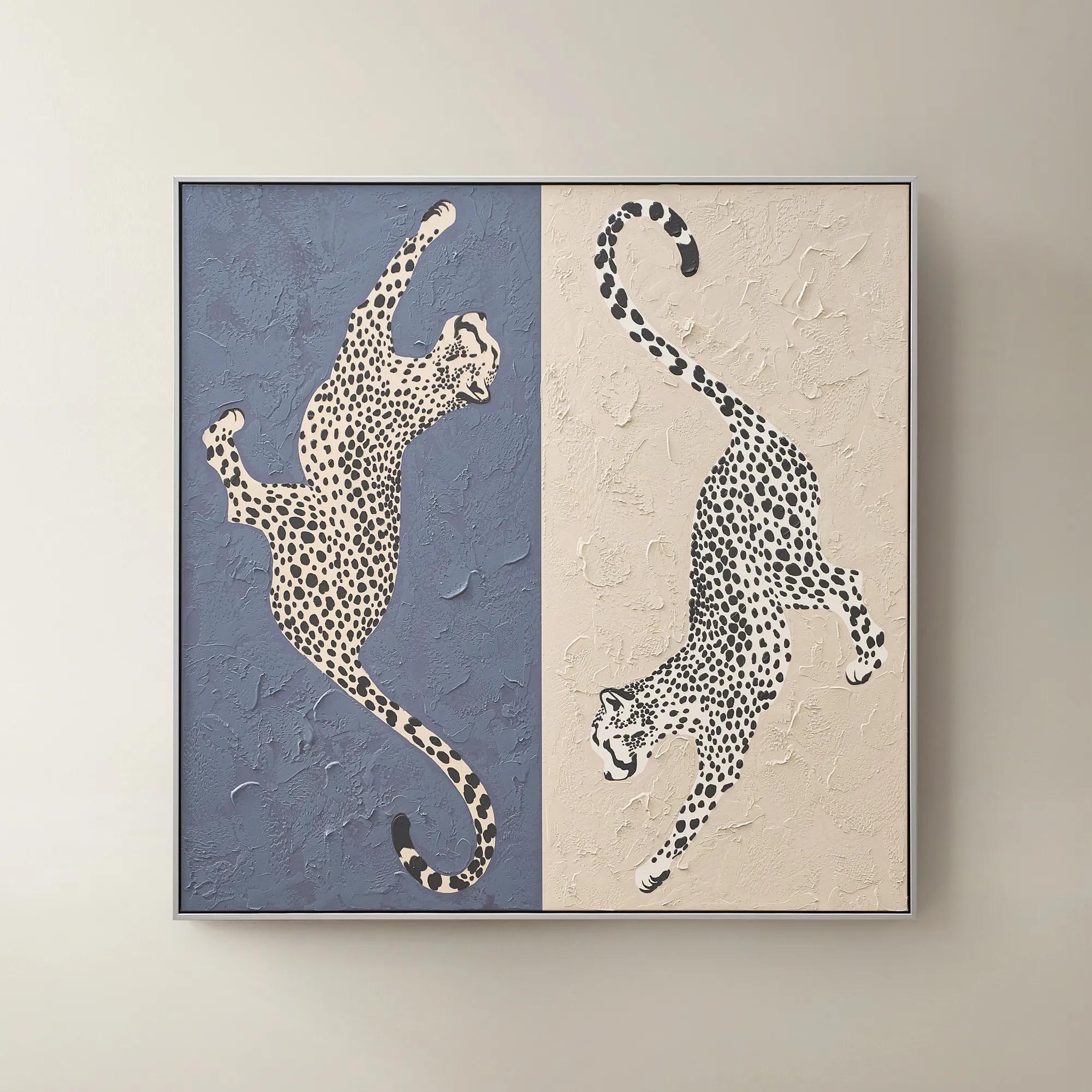 Leopard At Play Framed Painted Wall Art 40" x 40"$299
A hand-painted canvas in ink blue and taupe features playful leopard-inspired art with a silver-black frame.
Add To Cart -
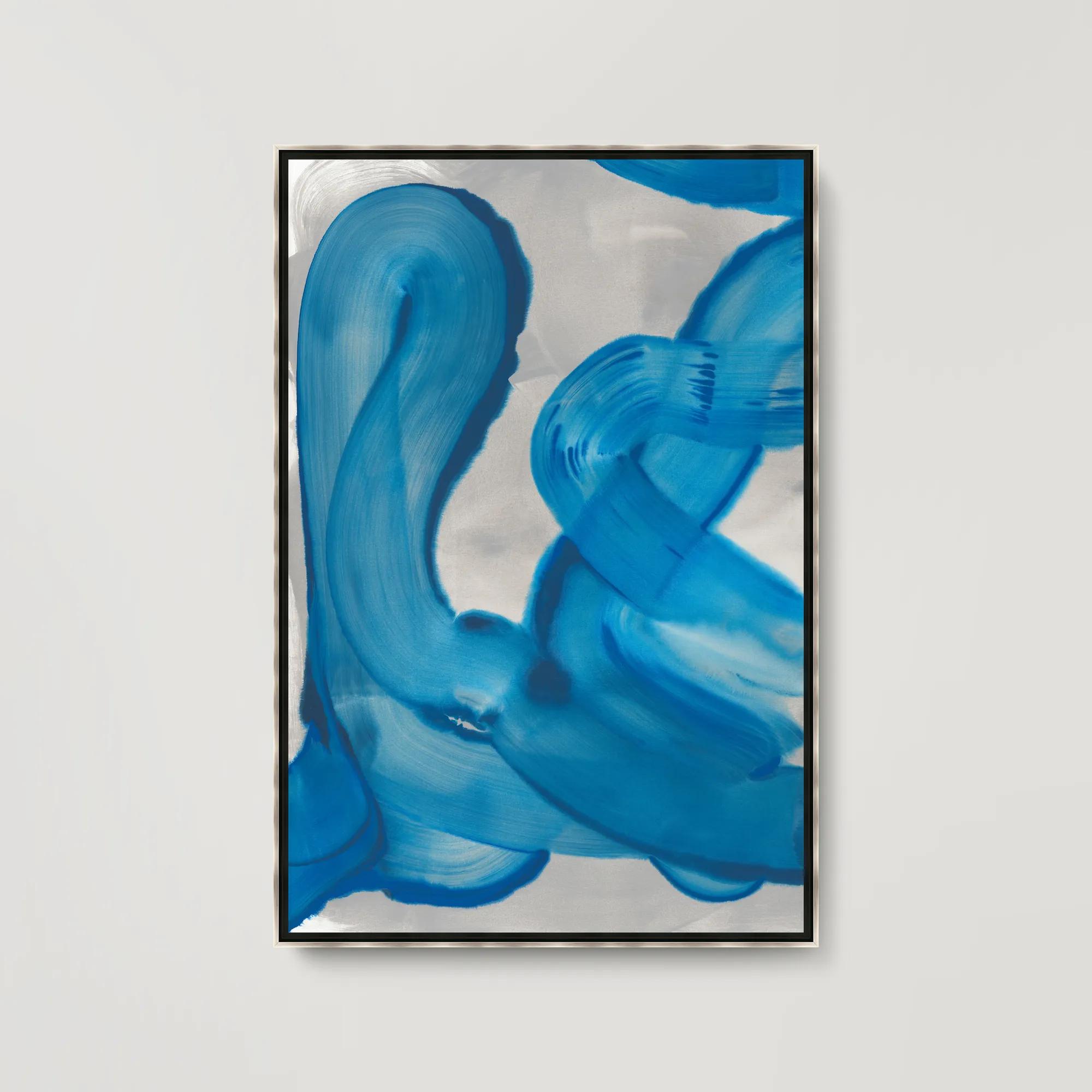 Royal Waves I Framed Wall Art 31.5" x 46.5"$699
A gallery-wrapped abstract canvas featuring hand-applied brush gel and set in a sleek silver floater frame.
Add To Cart -
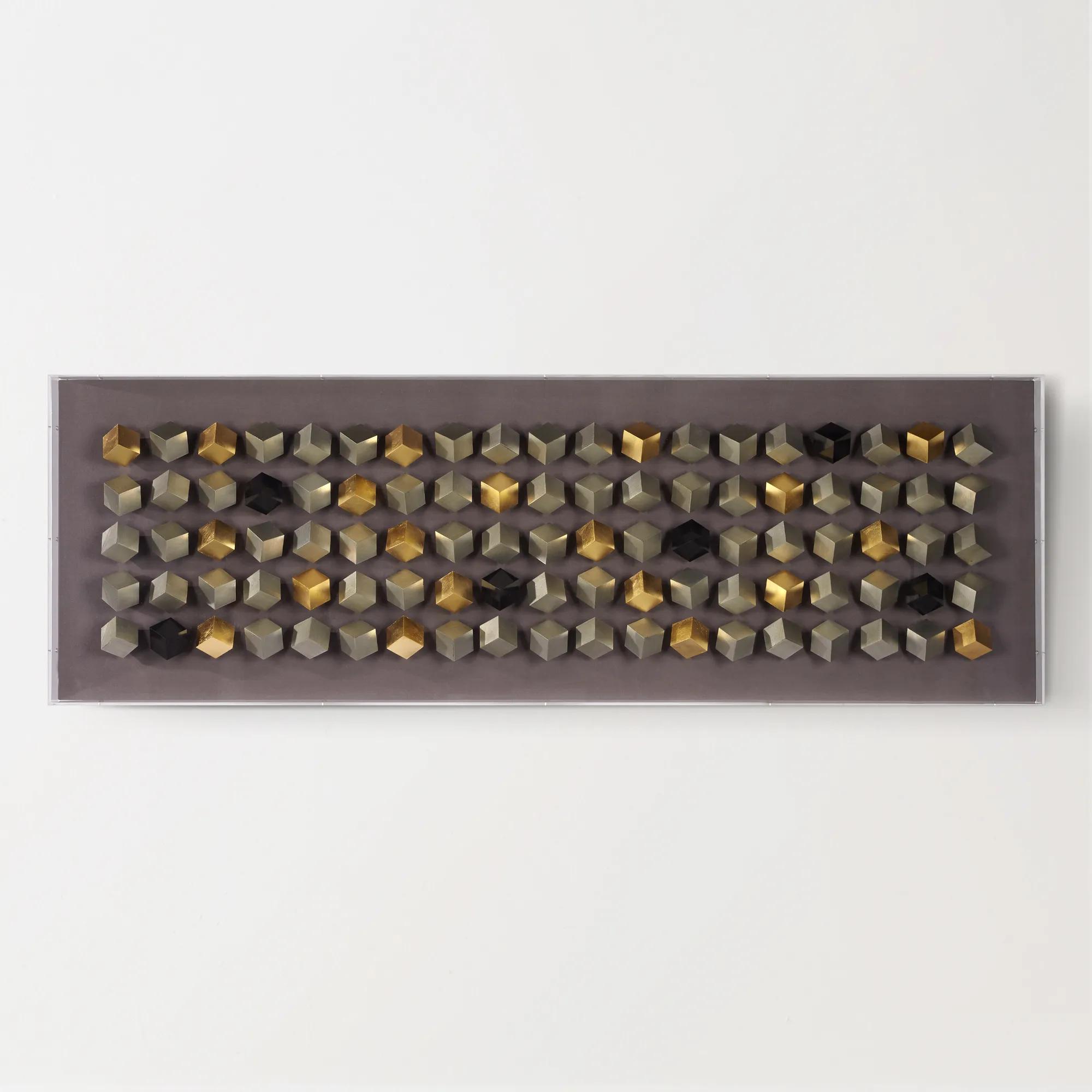
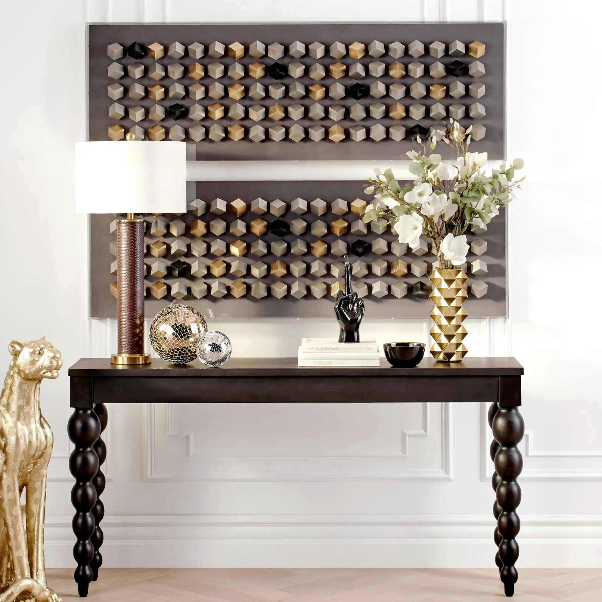 Cubic Array Dimensional Wall Decor in Acrylic 59" x 19.75"$599
A striking shadowbox wall art featuring a cubic, dimensional design with a tri-tone metallic finish.
Add To Cart -
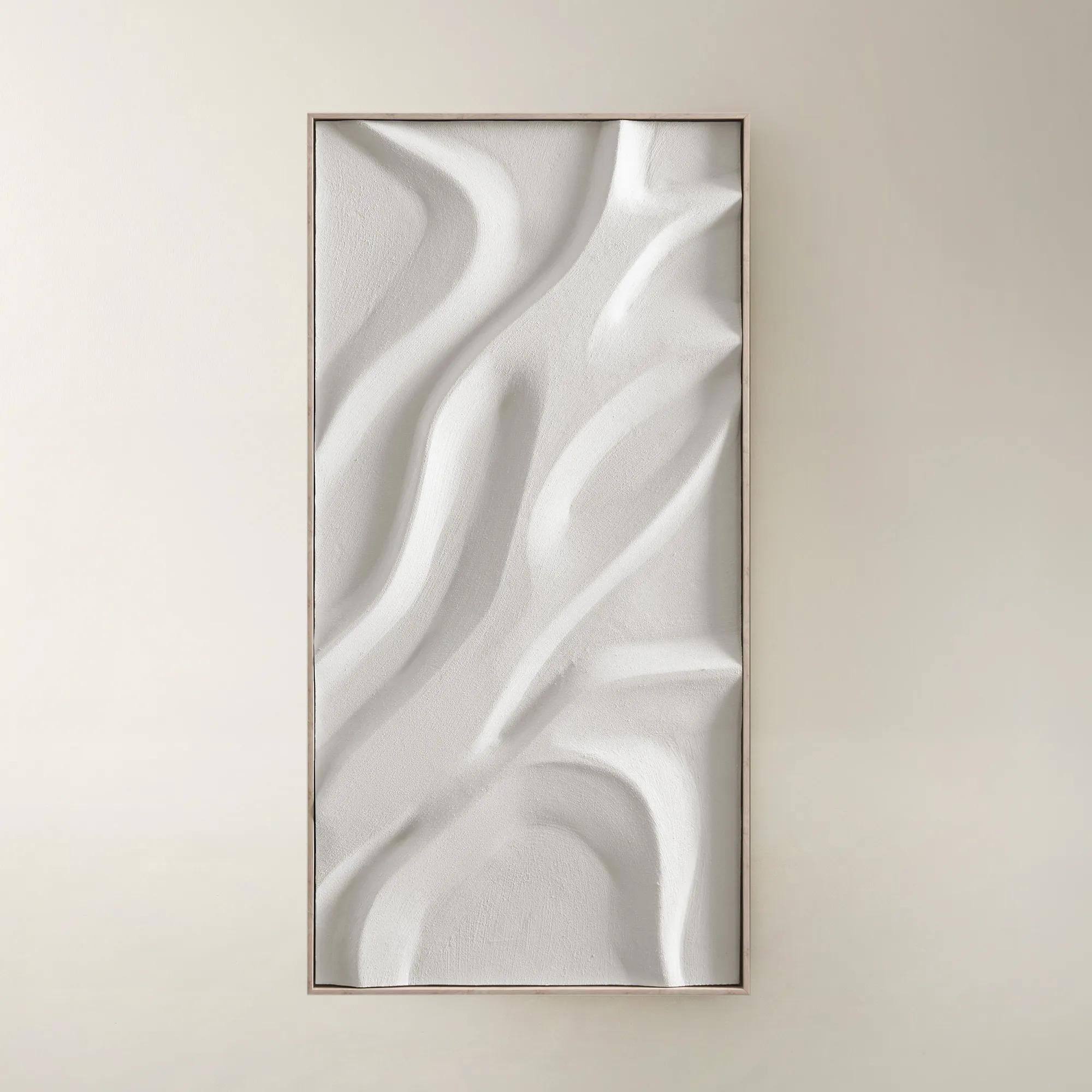
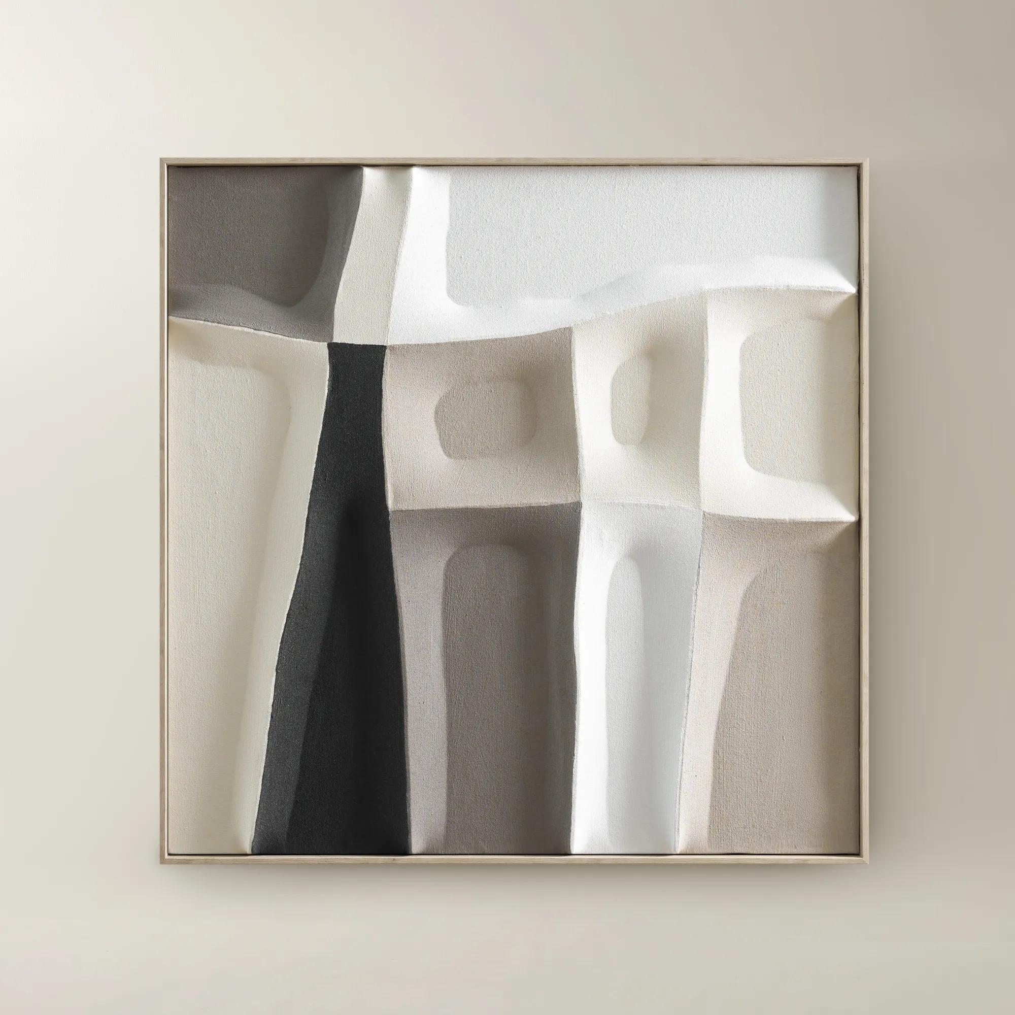
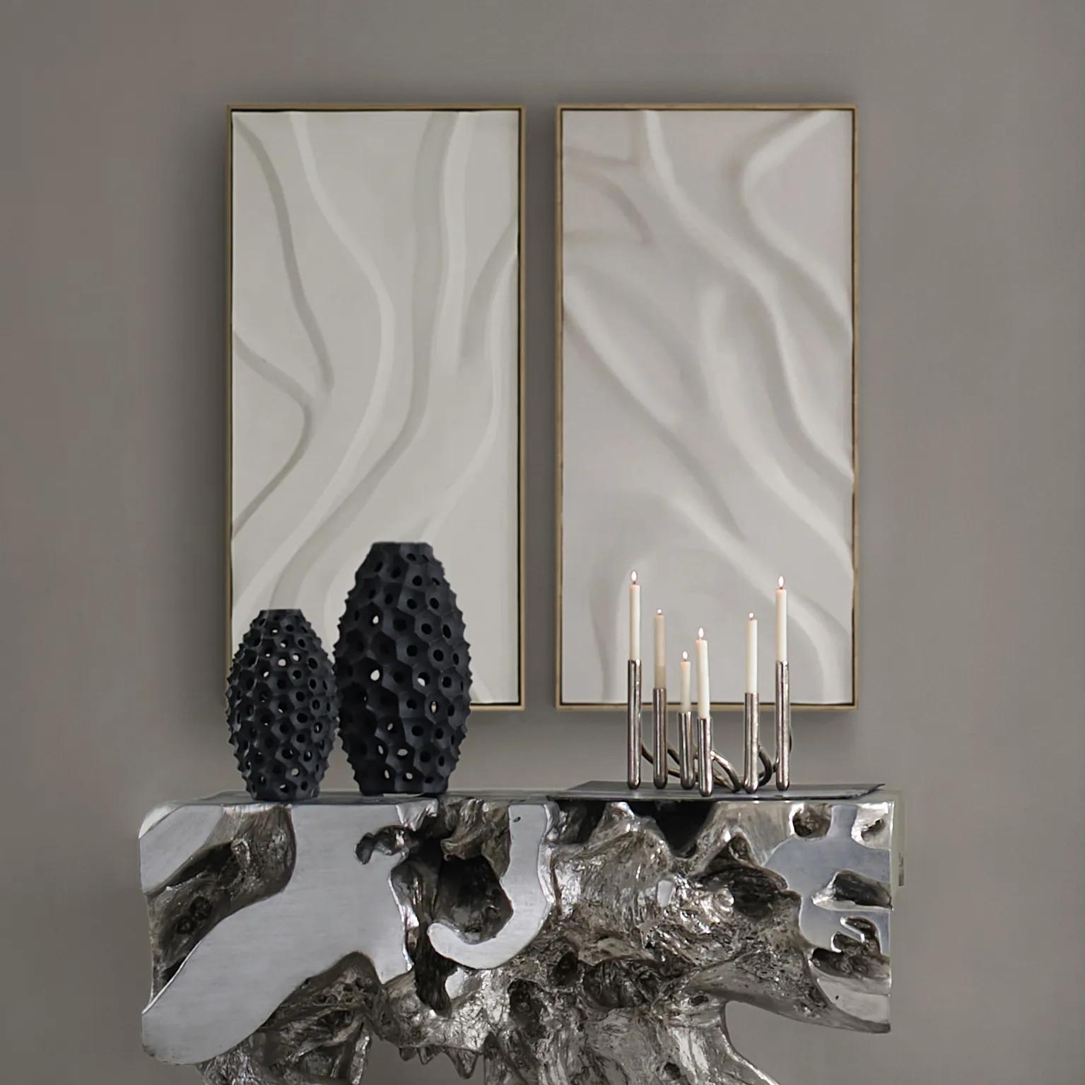 Au Lait Framed Painted Wall Art II 47.2" x 23.6"$199
A serene hand-painted canvas in beige, set in a warm whitewash floater frame for modern interiors.
Add To Cart -
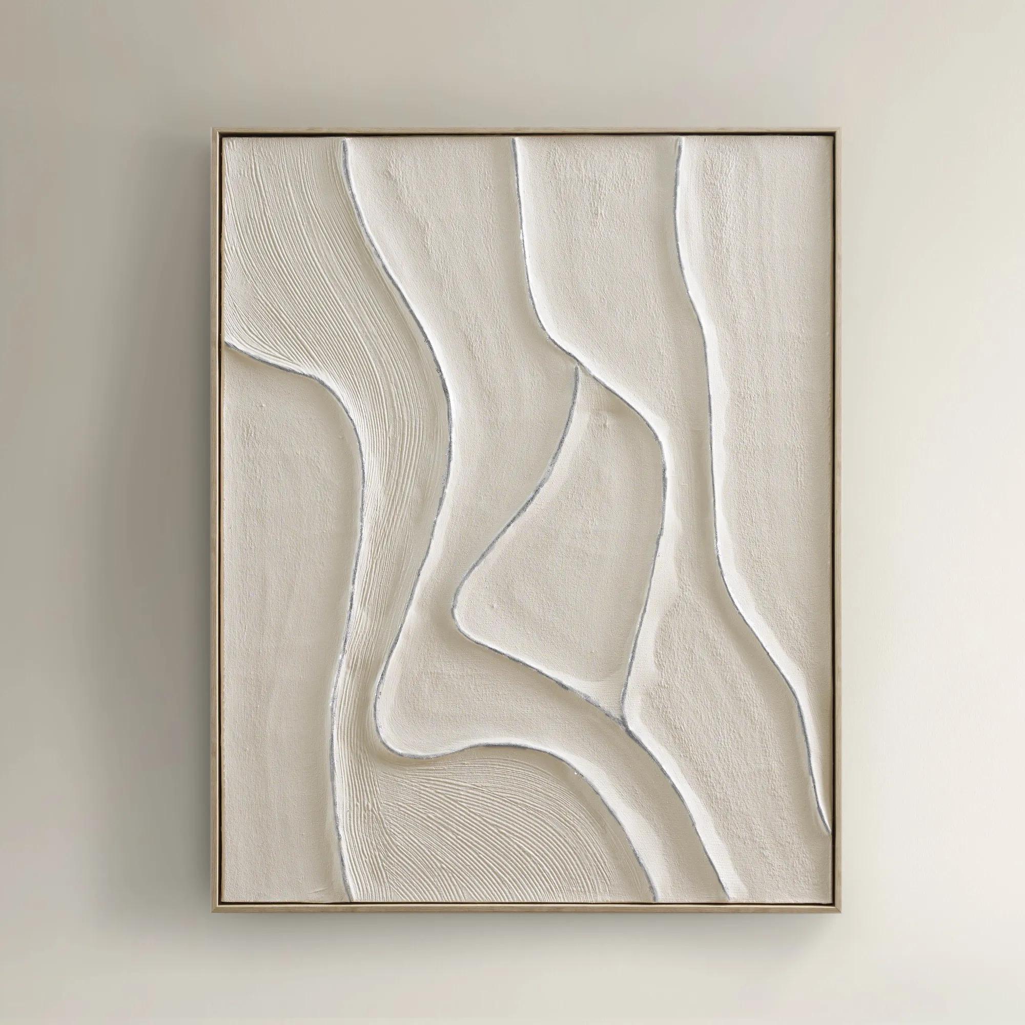
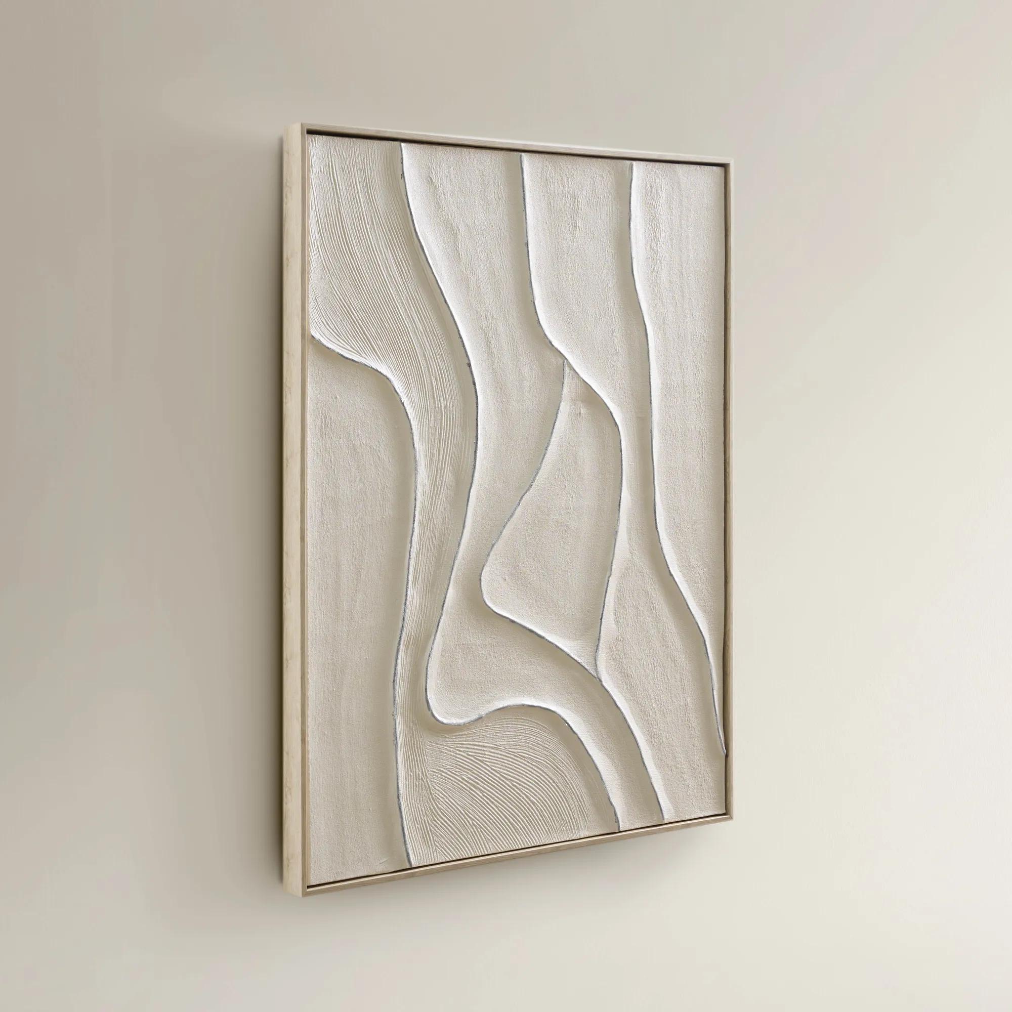 Vivre Framed Painted Wall Art 39.25" x 31.5"$199
A hand-painted canvas featuring tranquil beige hues and flowing lines in a warm whitewash floater frame.
Add To Cart -
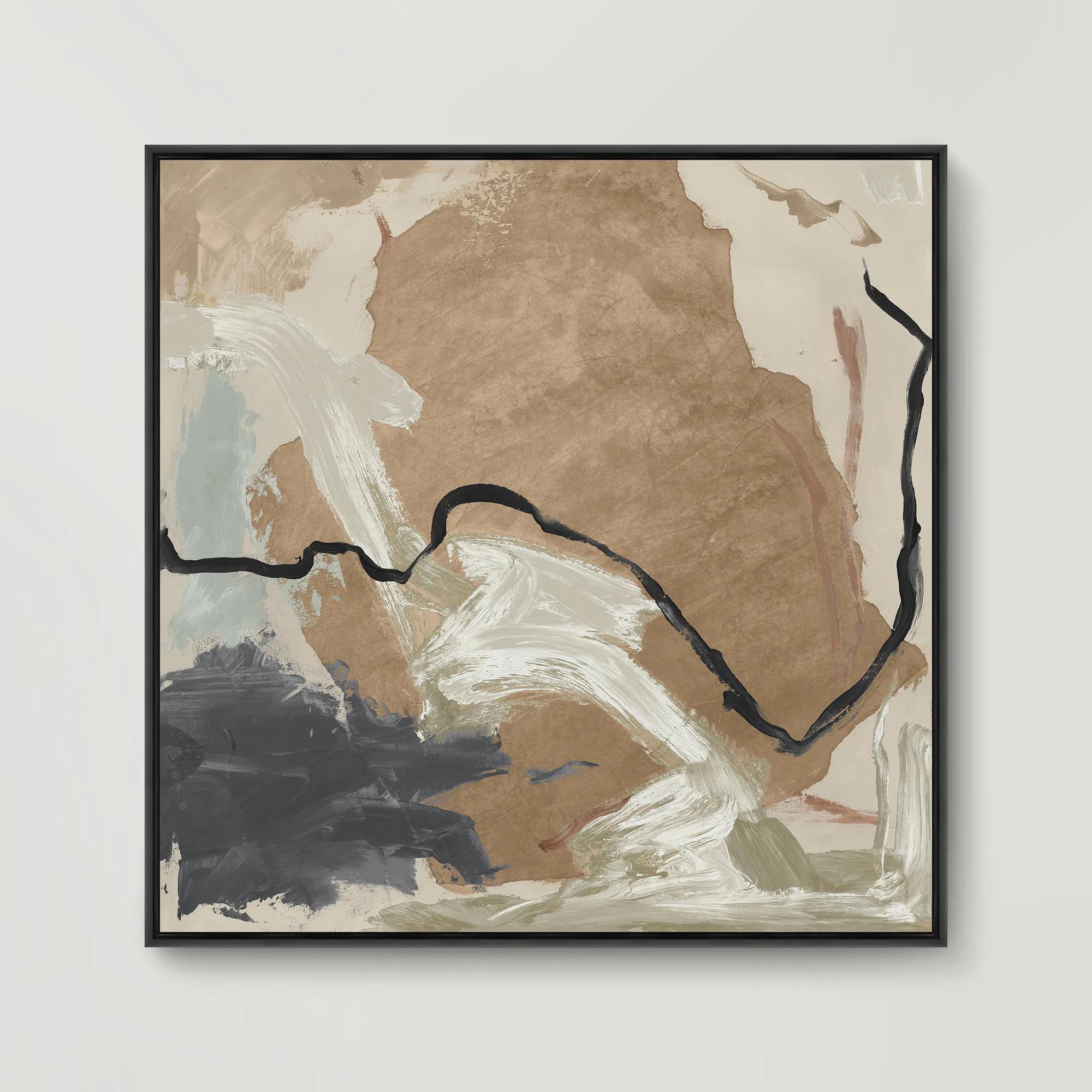 Borderlands III Framed Wall Art 31.5" x 31.5"$499
A gallery-wrapped canvas artwork with hand-applied brush gel finish, set in a sleek gray floater frame.
Add To Cart -
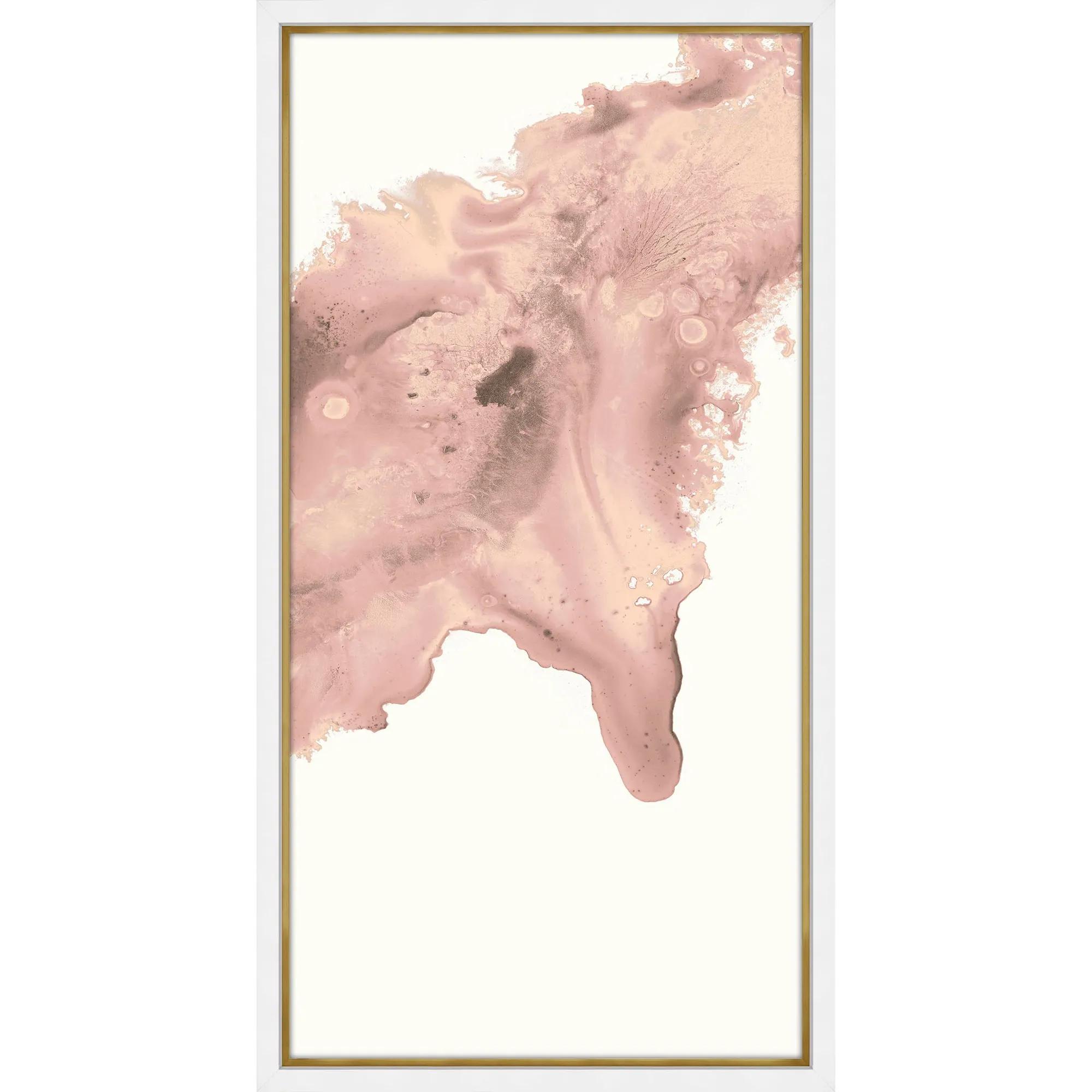
 Blush Conduit 2 Framed Wall Art 24" x 48"$849
A striking abstract print on pearl paper, elegantly framed in gold and matte white for modern appeal.
Add To Cart -
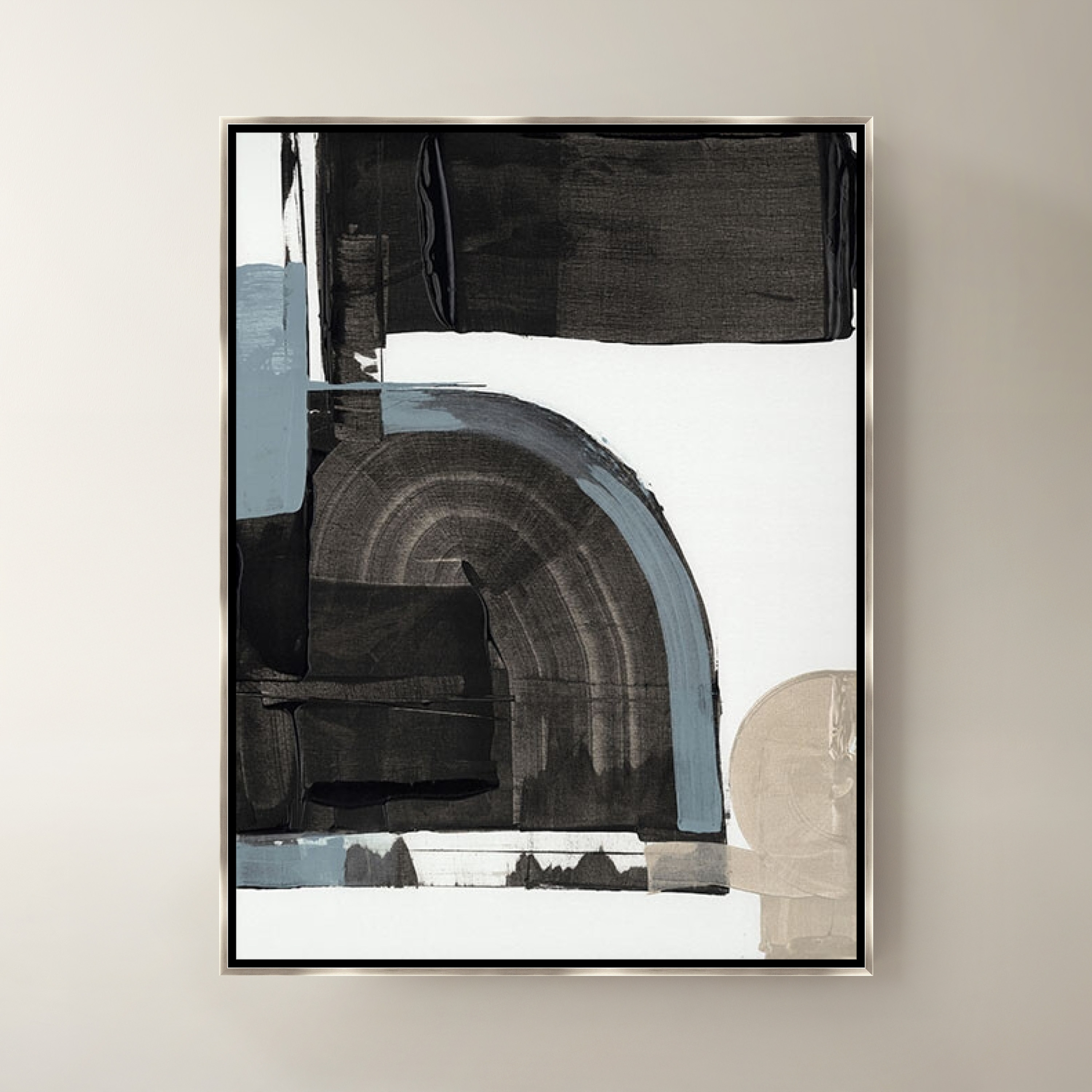
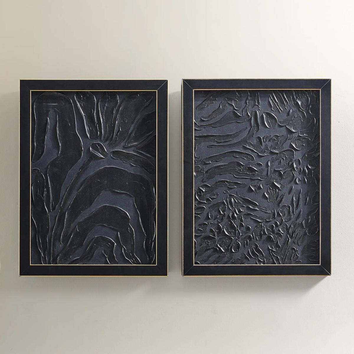
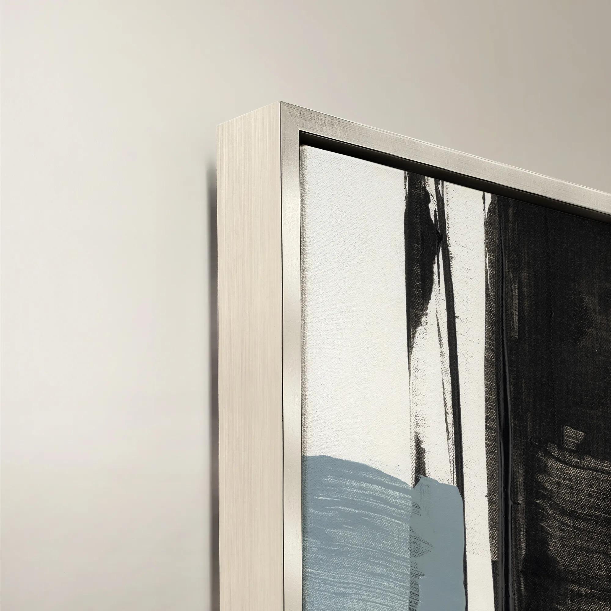 Blanc de Blancs III Framed Wall Art 24" x 30"$519
A sophisticated black canvas artwork presented in a refined frame for modern wall styling.
Add To Cart -

 Floral Jungle II Framed Wall Art 30" x 40"$799
A striking gold-framed canvas artwork depicting lush tropical foliage in an expressive botanical composition.
Add To Cart -
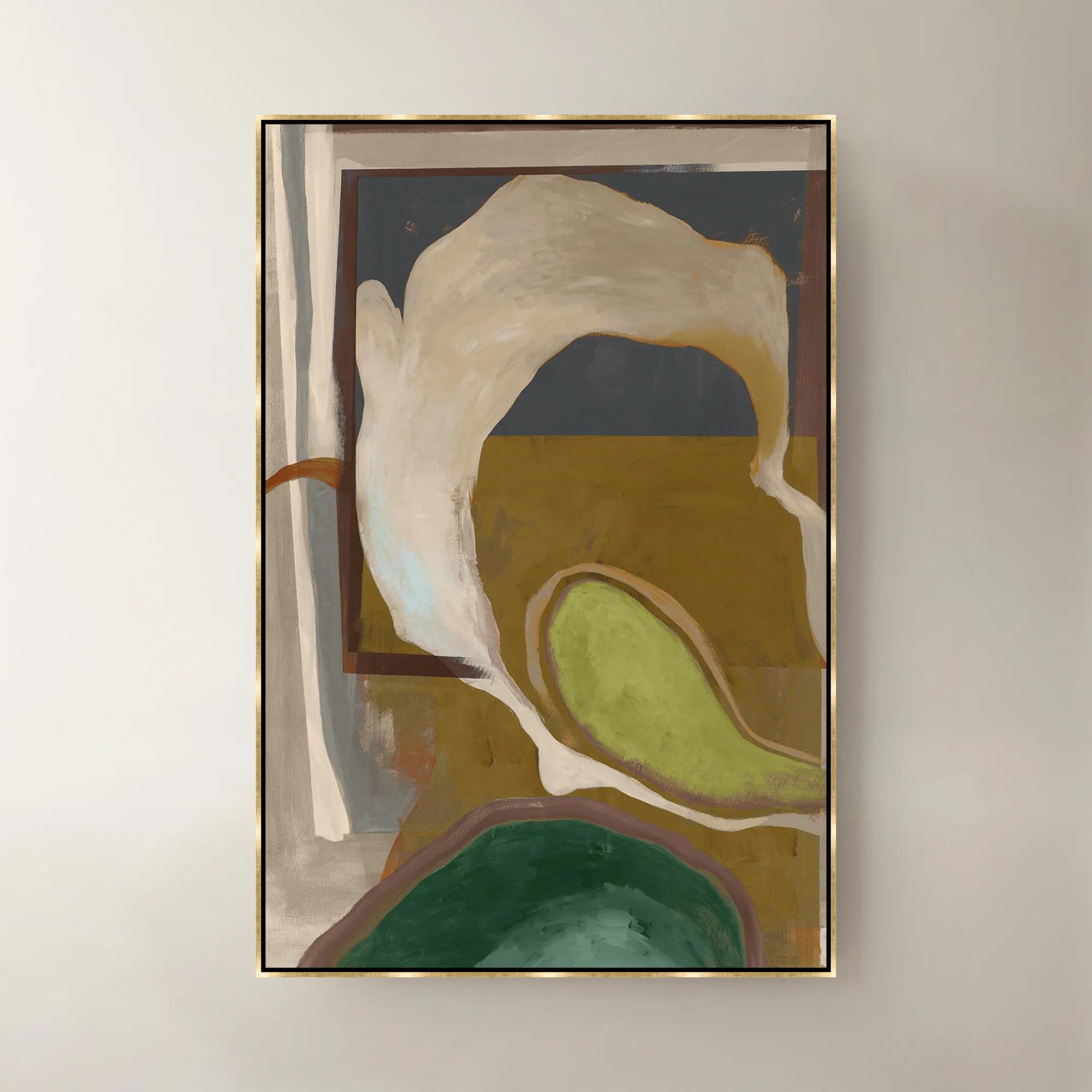 Olive Pearl Framed Wall Art 40"W x 60"$1099
A sophisticated green framed canvas artwork bringing layered color and modern elegance to your walls.
Add To Cart -
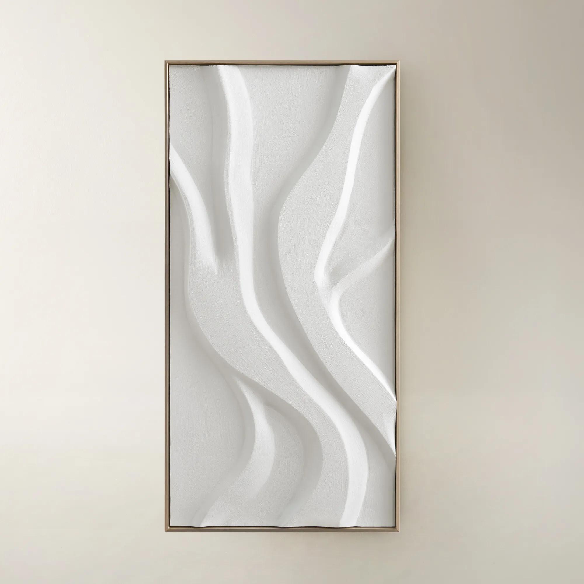
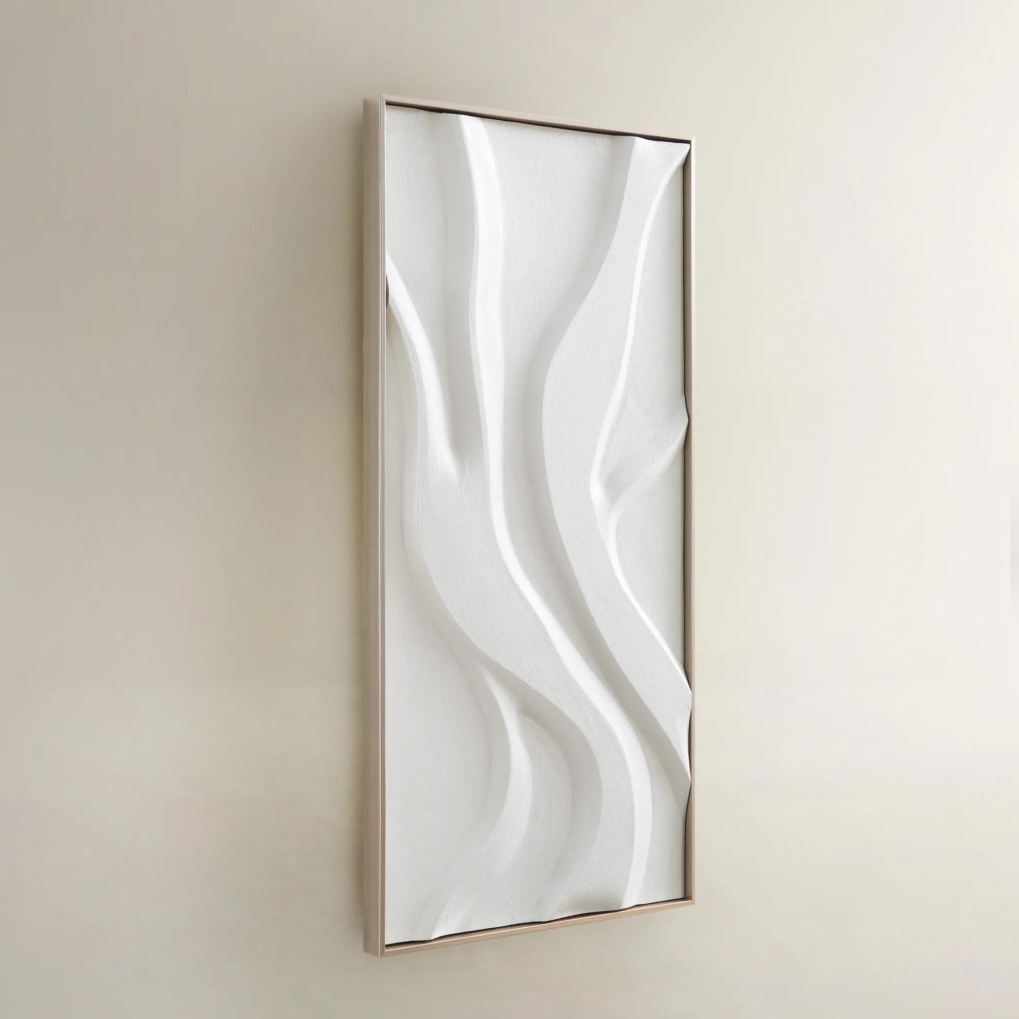 Au Lait Framed Painted Wall Art I 47.2" x 23.6"$199
An organic hand-painted canvas featuring flowing white forms in a warm champagne finish floater frame.
Add To Cart

Home Office Wall Art Ideas
Explore home office wall art ideas that give your workspace a bold, personal point of view. Browse expressive artwork with your room’s color palette and wall dimensions in mind, considering a striking focal point above your desk or a cohesive arrangement for your video-call backdrop.
Home office wall art ideas include oversized abstract artwork, framed photography, coordinated gallery walls, and dimensional wall decor, each offering a distinct way to give a workspace presence without crowding the desk. Art brings personality to a room often defined by screens, shelving, and practical furniture, turning an otherwise blank wall into a considered backdrop for the workday. Sweeping brushwork can lend movement to a tailored office, while architectural photography introduces crisp lines and a sense of perspective. A restrained composition in ivory, charcoal, and soft gray creates a quieter visual field; saturated blue, rich green, or flashes of gold make a more expressive statement. The strongest choice feels connected to the person who uses the room rather than to a generic idea of professionalism. For someone working in a visually creative field, bold color and unconventional forms may feel entirely at home. For a workspace filled with reference books, documents, and multiple monitors, a single expansive composition can offer a welcome counterpoint to all that detail. Neither approach needs to disappear into the background. A luminous metallic accent or a deeply textured surface can introduce drama without relying on a busy composition. Subject matter also shapes the atmosphere: an expansive landscape suggests openness, botanical imagery softens angular furniture, and black-and-white photography brings an editorial quality to polished cabinetry or a sculptural desk. In an office that doubles as a guest room or occupies a corner of the living area, artwork can connect the workspace to the surrounding interior through a shared palette or recurring shape. Personal meaning matters, too. Imagery that recalls a favorite destination, an architectural style, or a lifelong interest gives the room an identity beyond its function. Home office artwork should feel compelling during a quiet hour alone and equally composed when the room becomes the setting for a client conversation.
Scale and placement determine whether wall art feels integrated or merely added. Above a broad desk or low storage cabinet, a generously sized piece can establish a confident focal point, while a narrow wall beside a bookcase may suit a vertical composition. As a starting proportion, artwork spanning roughly two-thirds to three-quarters of the furniture width often feels balanced, although ceiling height, surrounding shelves, and the visual weight of the frame all influence the result. A large mat and substantial frame can give a modest image considerable presence; an unframed canvas with an open composition may read more lightly despite its dimensions. The relevant measurement is the full framed size, not just the printed image, especially where doors, sconces, or cabinet openings limit clearance. For a gallery arrangement, a shared frame finish, consistent mat color, or recurring accent hue creates cohesion without requiring every image to match. A grouping of photography, abstract prints, and drawings can feel richly collected when the spacing remains deliberate and the overall arrangement relates to the furniture below. In a compact office, fewer pieces with greater presence often feel more intentional than a scattering of small accents across every available surface. Placement should also account for how the room is actually experienced. Artwork directly beyond a monitor stays in view throughout the day, making broad shapes and a controlled palette appealing options for people who prefer less visual activity. The wall behind a desk can support a more theatrical composition, particularly when it serves as a video-call background. Reflective glazing deserves attention here, since a window or task lamp may create glare that competes with the image on camera. A seated view is as important as the view from the doorway. Explore Creative Office Wall Decor Ideas for further inspiration on giving a workspace a distinctive visual identity.
Materials and finishes add another layer of character to home office wall art, influencing both its appearance and its everyday care. Canvas lends an image a softer, more tactile presence, particularly when visible texture complements the artwork’s brushwork or tonal variation. Framed paper prints offer a crisp, tailored effect, with matting creating breathing room between the image and its frame. Wood frames can echo a desk or introduce warmth against sleek furniture, while metallic finishes catch the light and give even a restrained composition a glamorous edge. Dimensional metal wall art brings actual depth to the wall, with shadows becoming part of its appearance as interior lighting changes. These differences matter in a multifunctional room: a projecting sculpture needs clearance near a walkway, while a substantial glazed frame requires wall hardware suited to its weight and the wall’s construction. Secure installation is especially important above a desk, seating, or frequently used storage. For lasting presentation, keep artwork away from direct sunlight where possible, since prolonged exposure can fade colors, and follow the care instructions for the specific material and finish. Gentle dusting with a clean, soft cloth is often appropriate for frames, but textured artwork, canvas surfaces, and delicate embellishments may require a different method. Cleaning liquid should never be sprayed directly onto artwork; framed glazing should be cleaned only as directed, with care to prevent moisture from reaching the image or frame edges. Protective glazing and suitable framing can help shield paper artwork, though no presentation should be assumed completely fade-proof. For a new home office, a professional milestone, or a housewarming gift, art offers a personal alternative to purely functional accessories. The recipient’s taste, available wall space, and existing finishes provide better direction than a profession alone. A thoughtfully chosen piece gives the room something that equipment cannot: a point of view, expressed through color, texture, and a composition worth looking up to enjoy.
FAQs
Abstract compositions, architectural photography, and expressive line art bring distinct personalities to a modern home office. Choose sweeping gestures for drama, geometric imagery for a tailored look, or monochromatic photography for editorial polish. Let the artwork reflect your creative point of view rather than treating the office as a purely functional space.
Take your cue from the room’s defining colors, then decide whether the art should echo or interrupt them. Black-and-white imagery lends a crisp finish to richly colored furnishings, while saturated artwork introduces a bold focal point against neutral walls. Repeat an accent color in a nearby decorative object for a deliberate connection.
Build your gallery around a shared visual thread, such as a color story, subject, or artistic style. Combine gestural abstracts with photography or line drawings, then use related frame finishes to bring the collection together. The result should feel personally collected, with enough contrast to give each piece its own presence.
Consider the wall beside a reading chair, above a console, or opposite the office entrance. Each location offers an opportunity to create a distinctive vignette. A striking composition near a lounge chair gives that corner its own identity, while artwork above a console creates a polished introduction to the room.
Let the artwork establish the mood, then draw out its colors and shapes through sculptural objects, expressive lighting, and decorative bookends. Pair fluid compositions with curved accents, or contrast graphic artwork with organic silhouettes. Give each element a distinct role so the arrangement feels layered and intentional rather than overly matched.