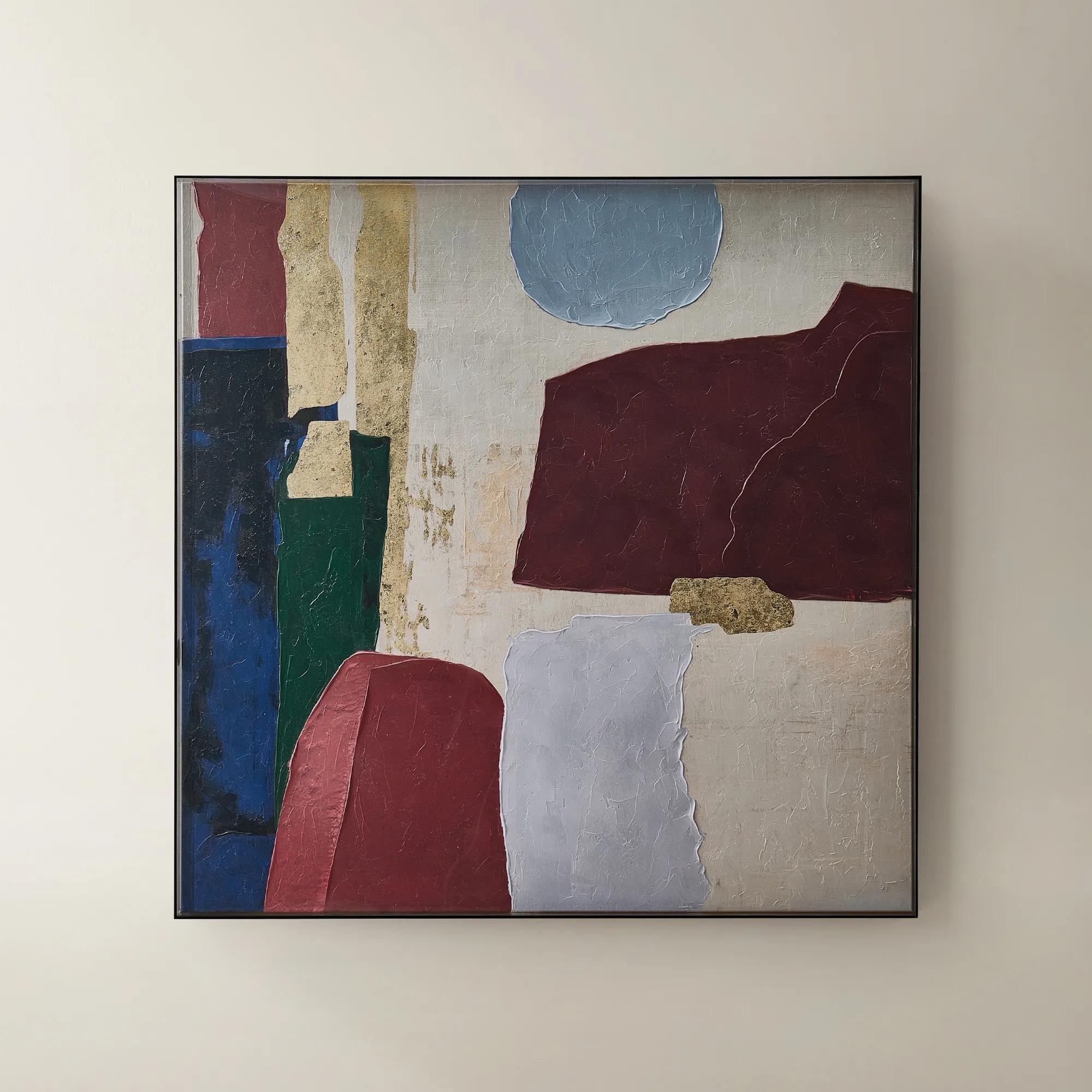
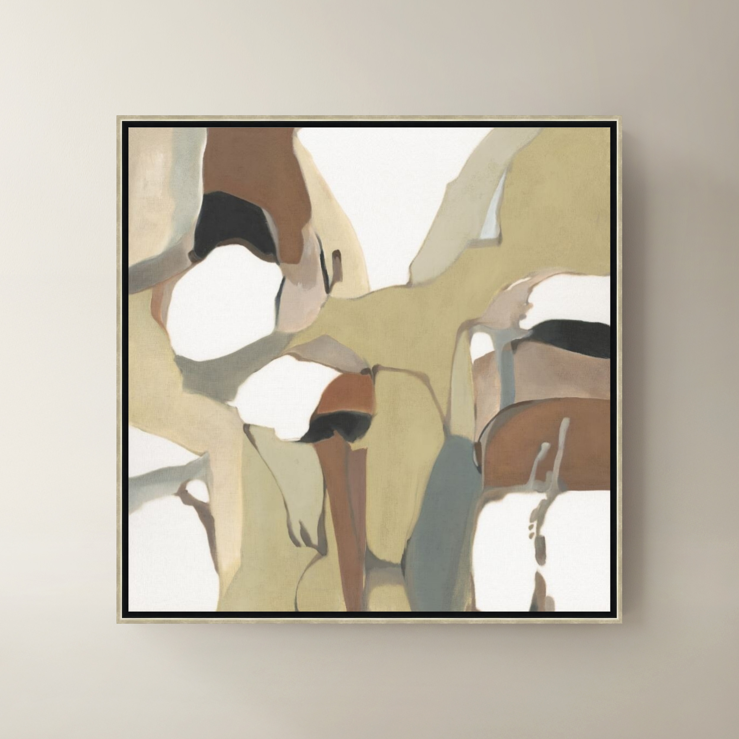
Abstract Wall Arts For Dining Rooms
Abstract Wall Arts For Dining Rooms
-
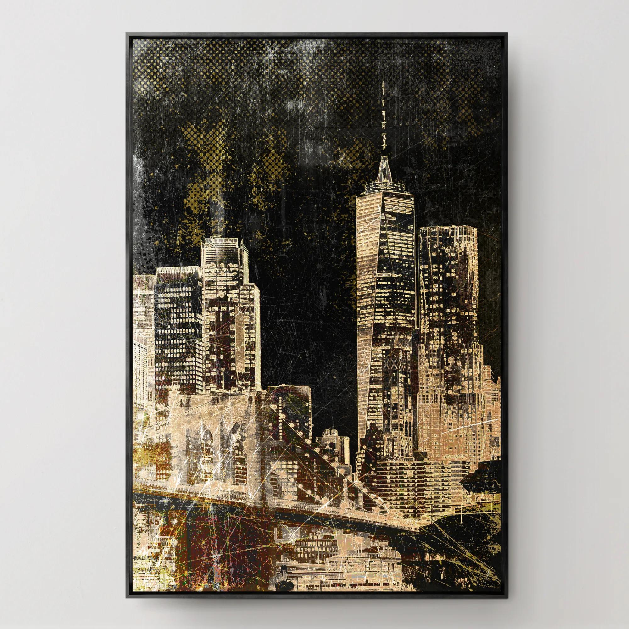
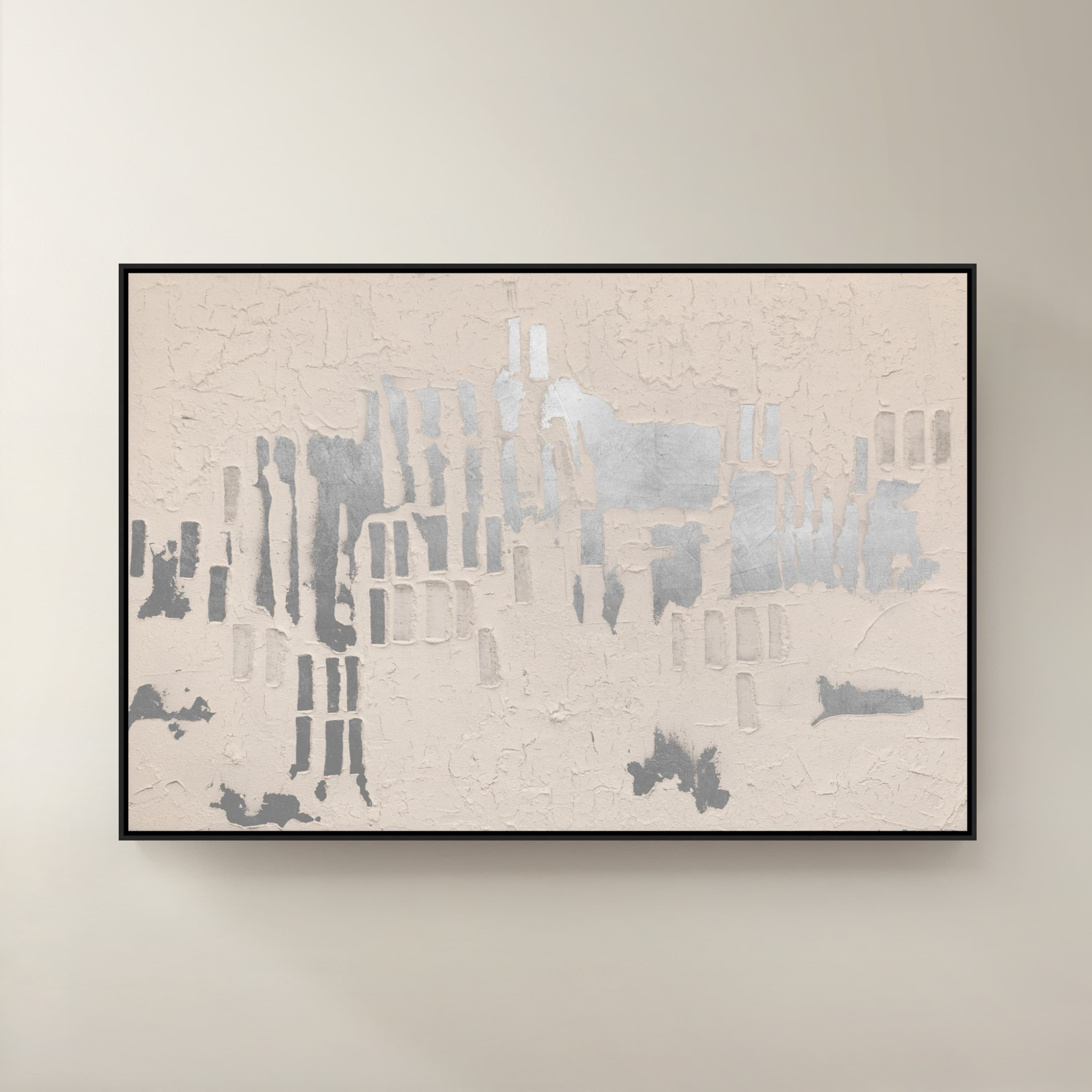
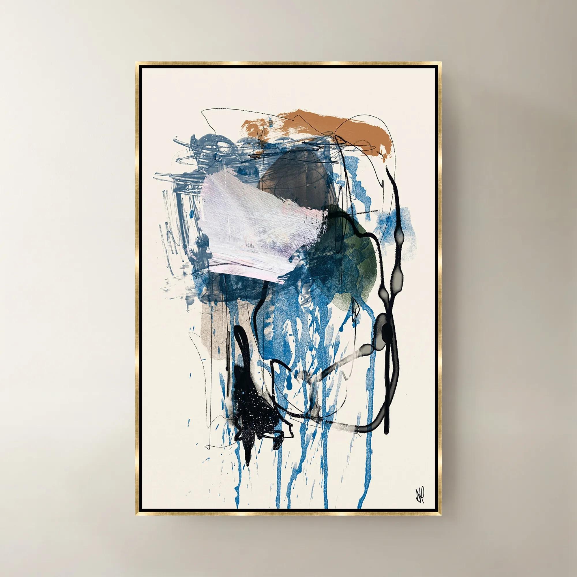
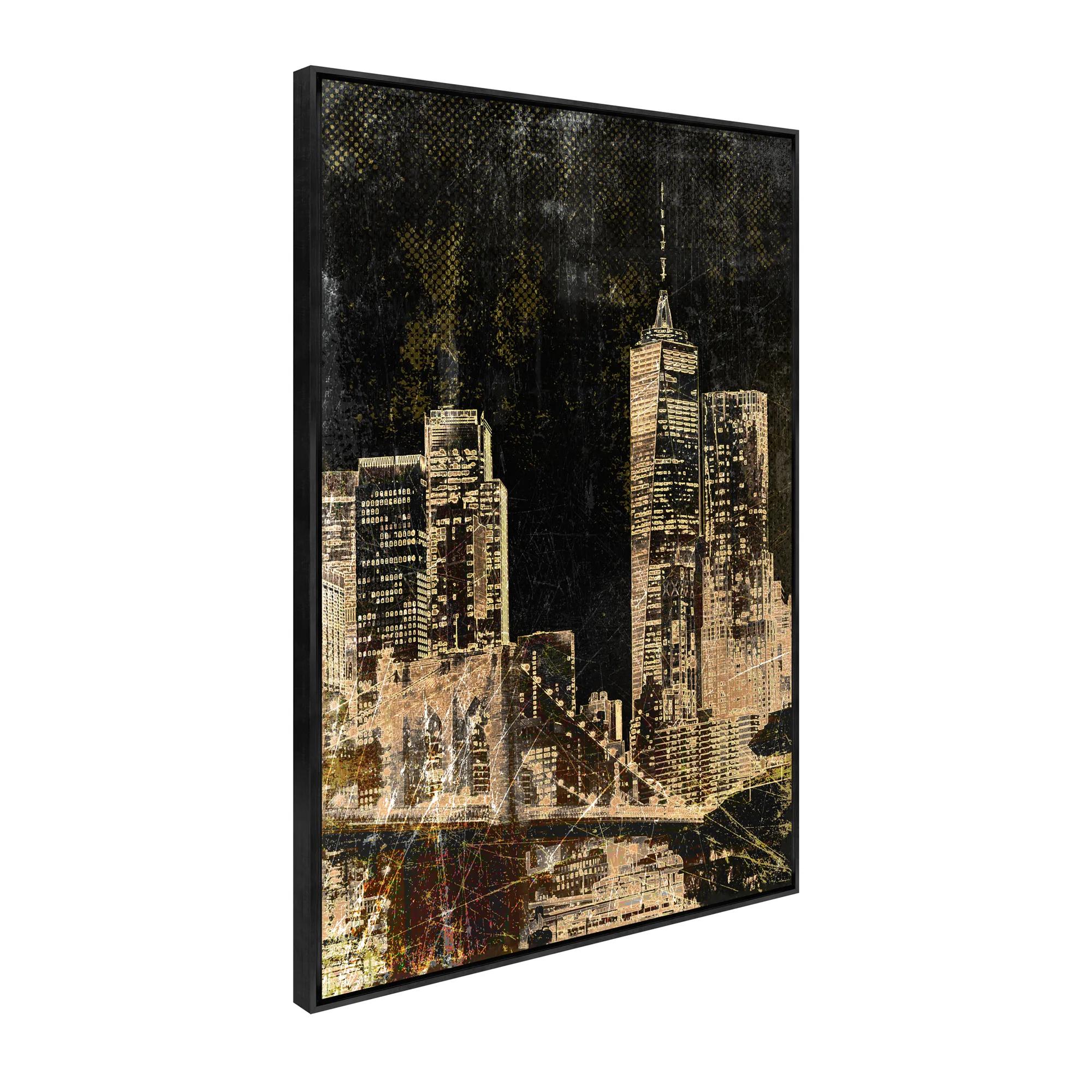 New York Lights Framed Wall Art 30" x 45"$649
A gallery-wrapped canvas artwork featuring a hand-applied gel finish and sleek black floater frame.
Add To Cart -
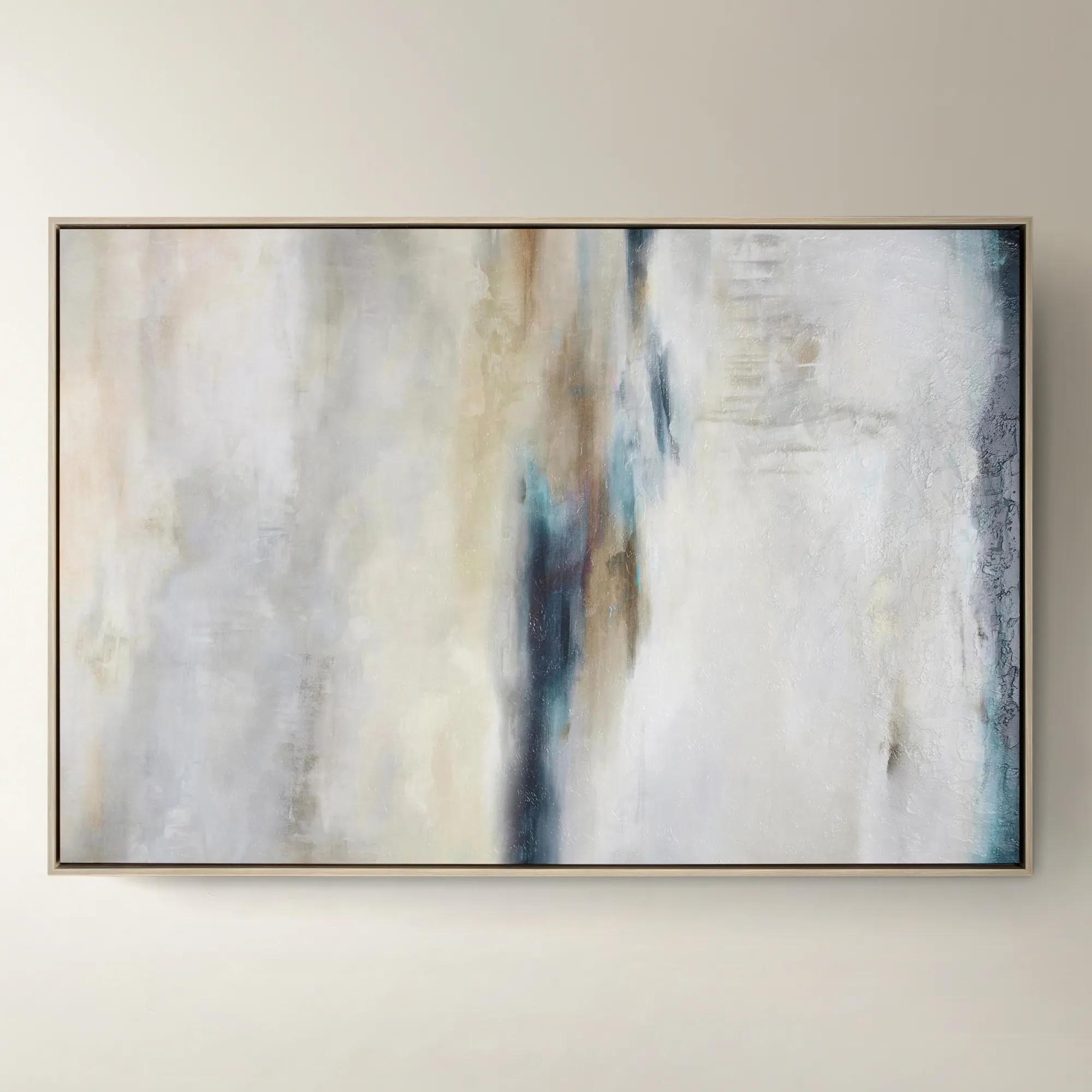
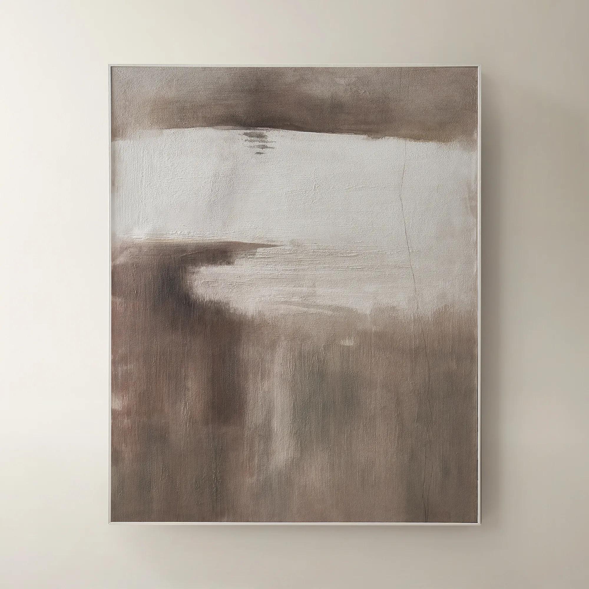
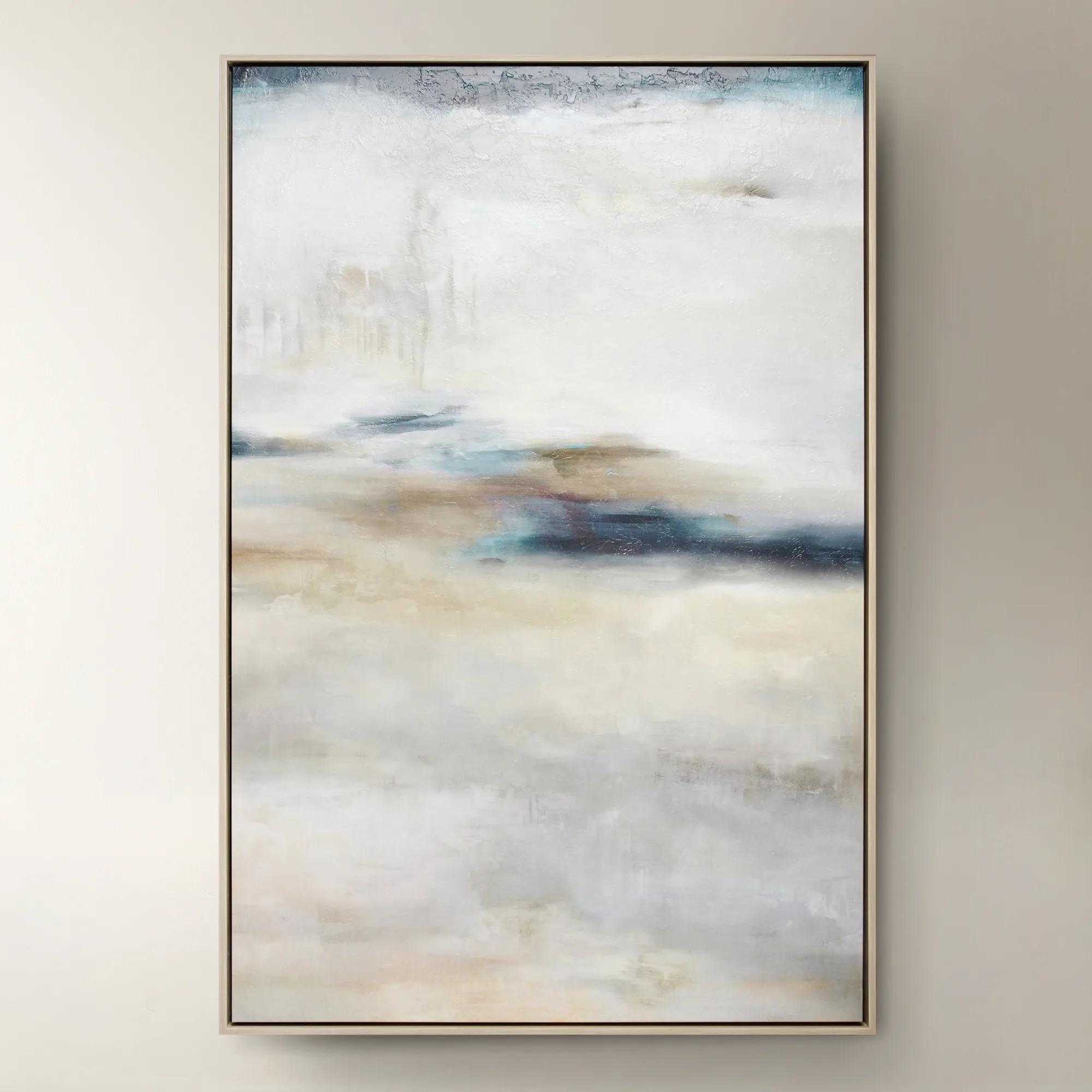 Forward Looking$1299
A softly layered abstract canvas print with a gel finish, set in a natural-hued floater frame.
Add To Cart -
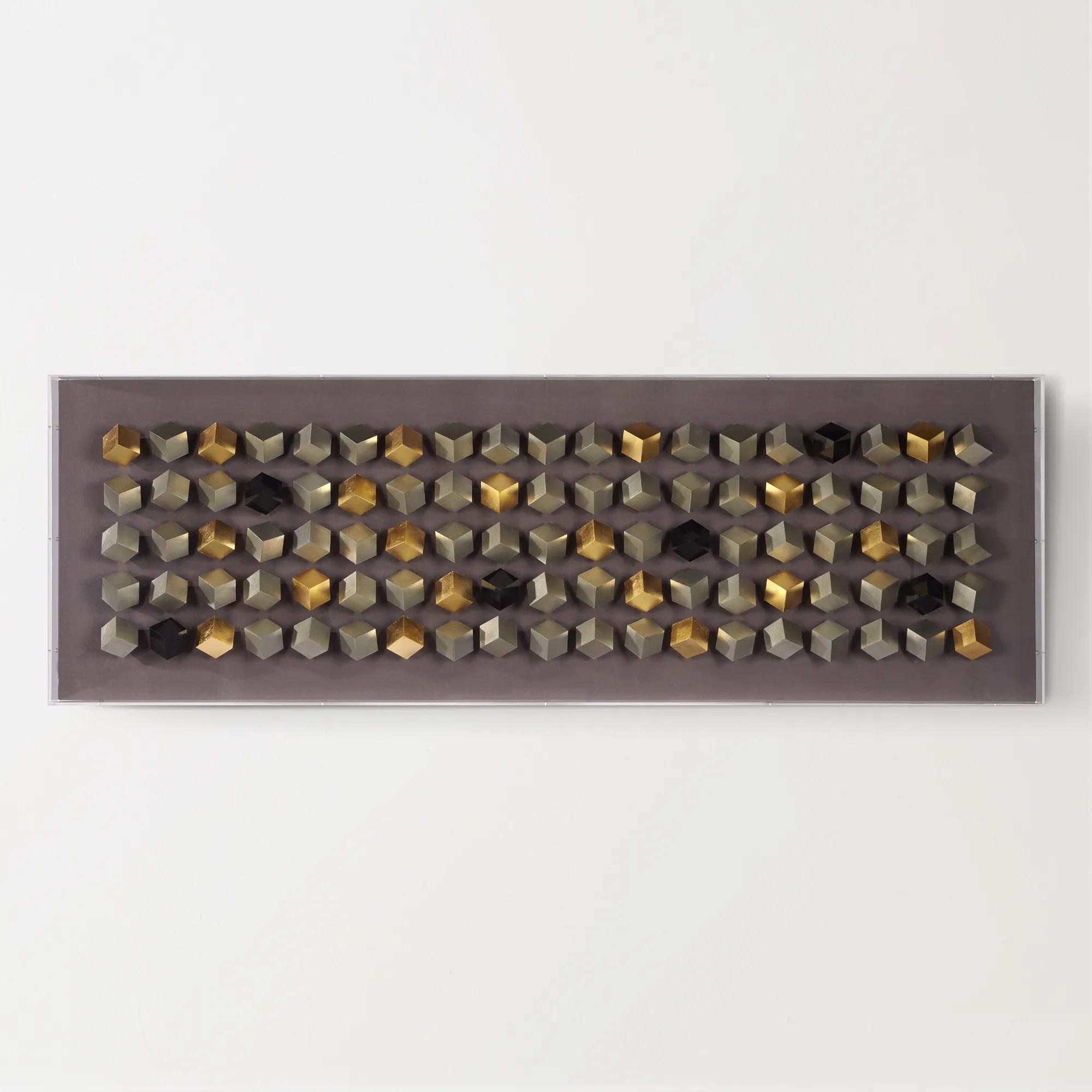
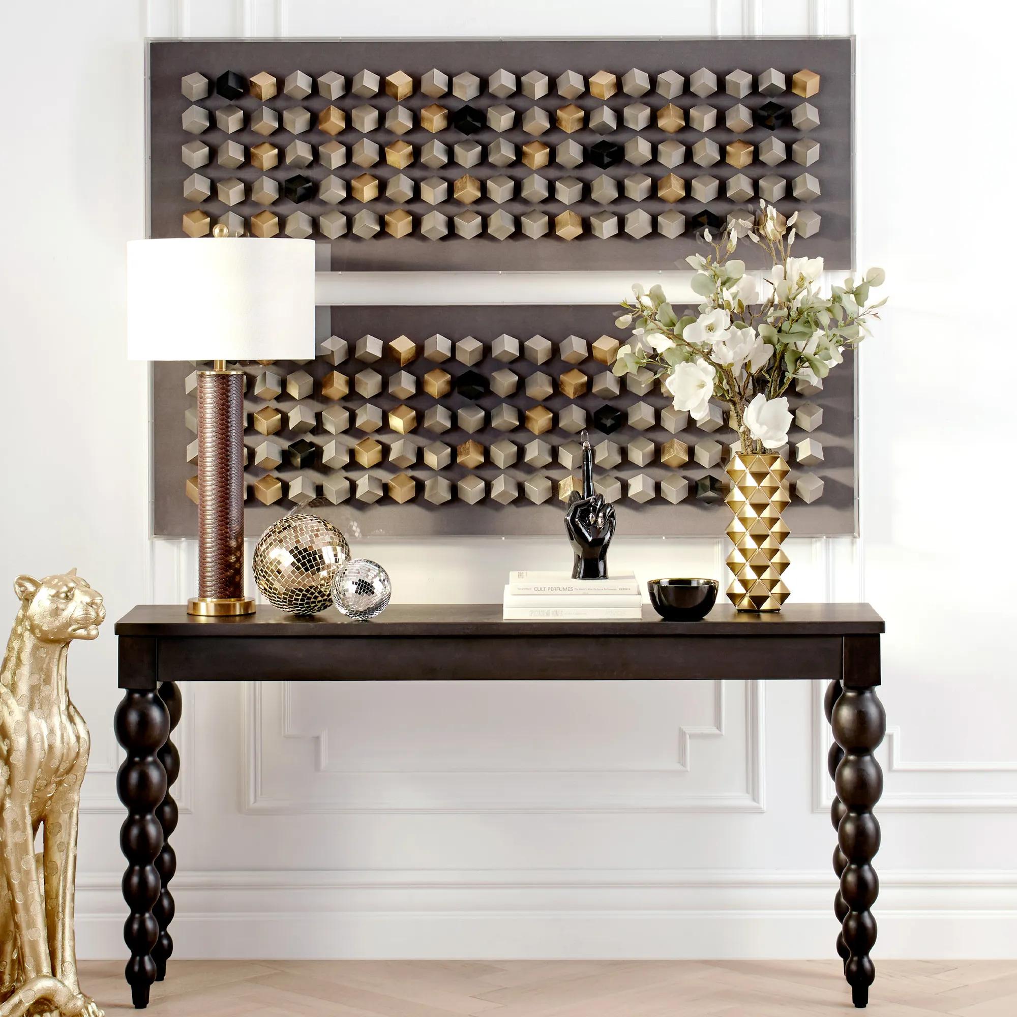 Cubic Array Dimensional Wall Decor in Acrylic 59" x 19.75"$599
A striking shadowbox wall art featuring a cubic, dimensional design with a tri-tone metallic finish.
Add To Cart -
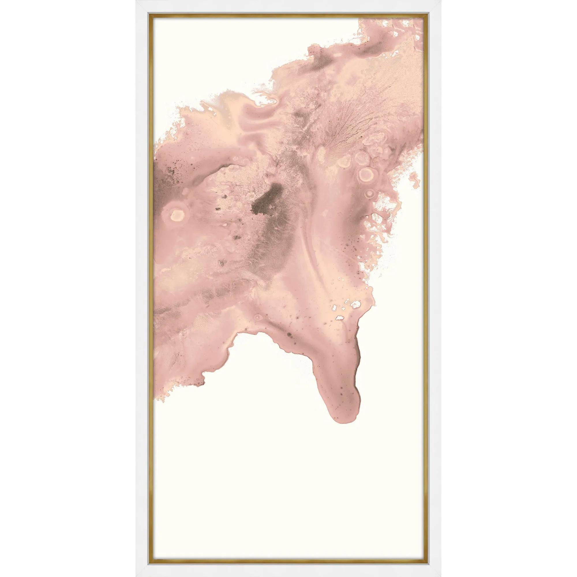
 Blush Conduit 2 Framed Wall Art 24" x 48"$849
A striking abstract print on pearl paper, elegantly framed in gold and matte white for modern appeal.
Add To Cart -
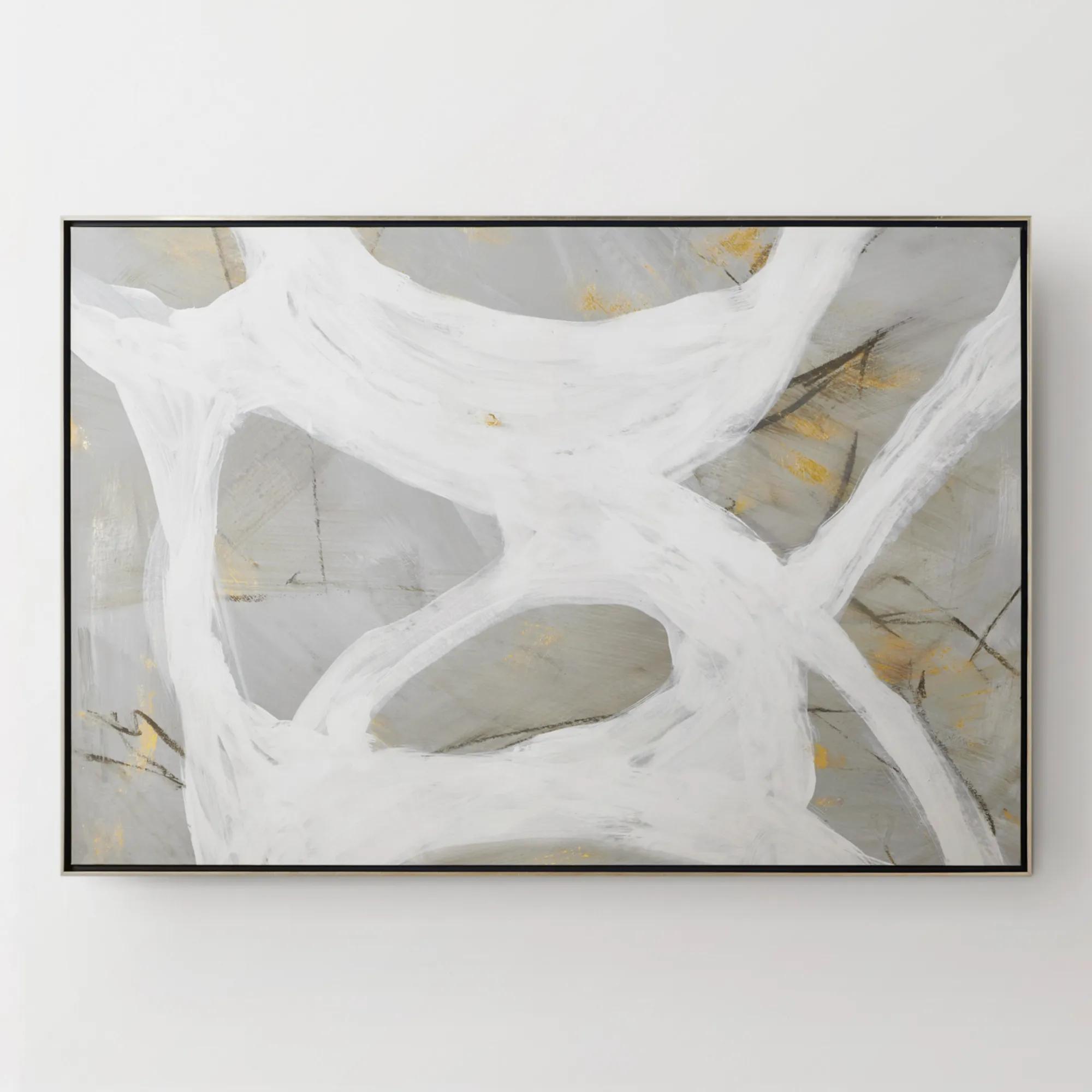
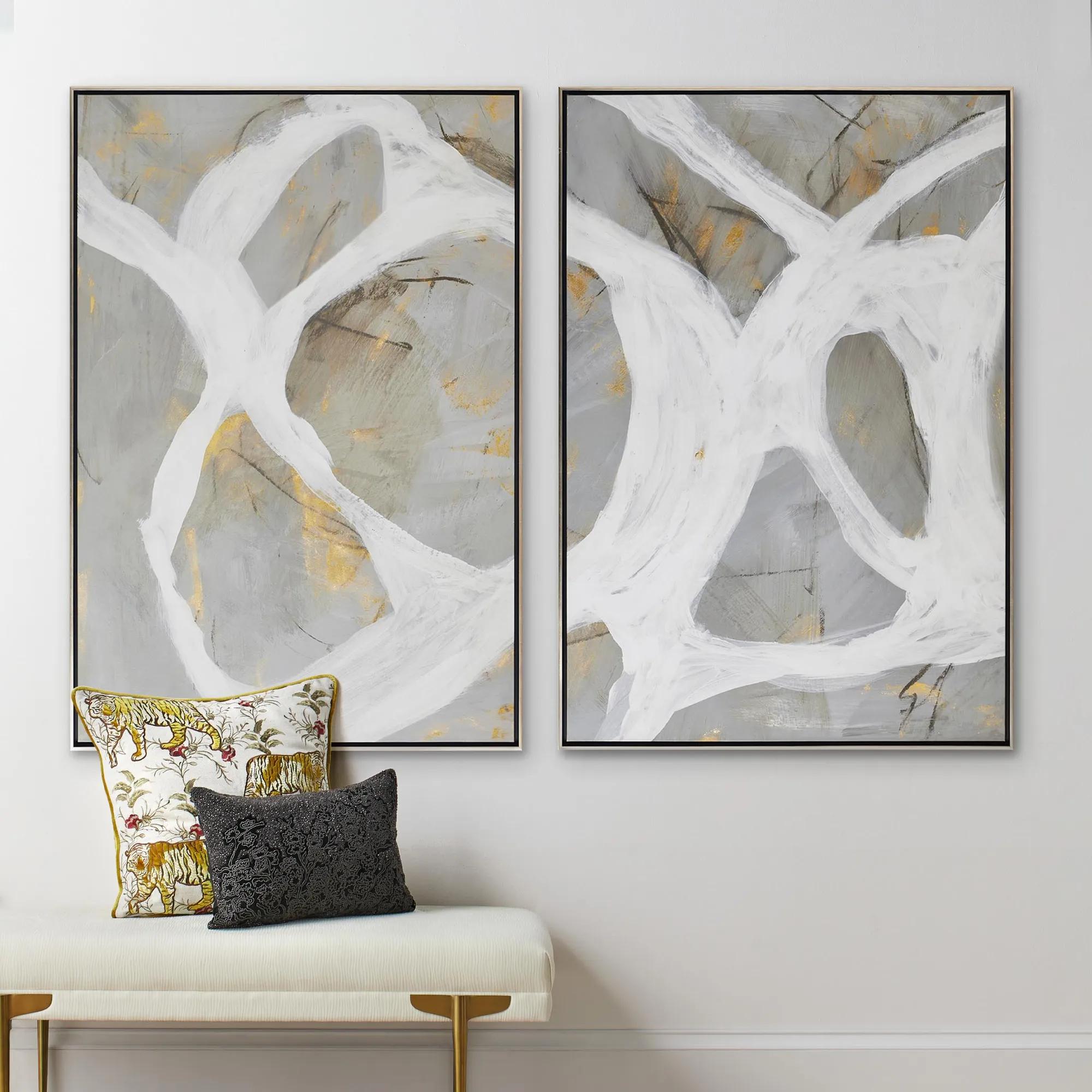 Les Series Framed Painted Wall Art II 61" x 41"$1099
An abstract canvas artwork featuring bold brushstrokes, hand-applied gold accents, and a silver floater frame.
Add To Cart -
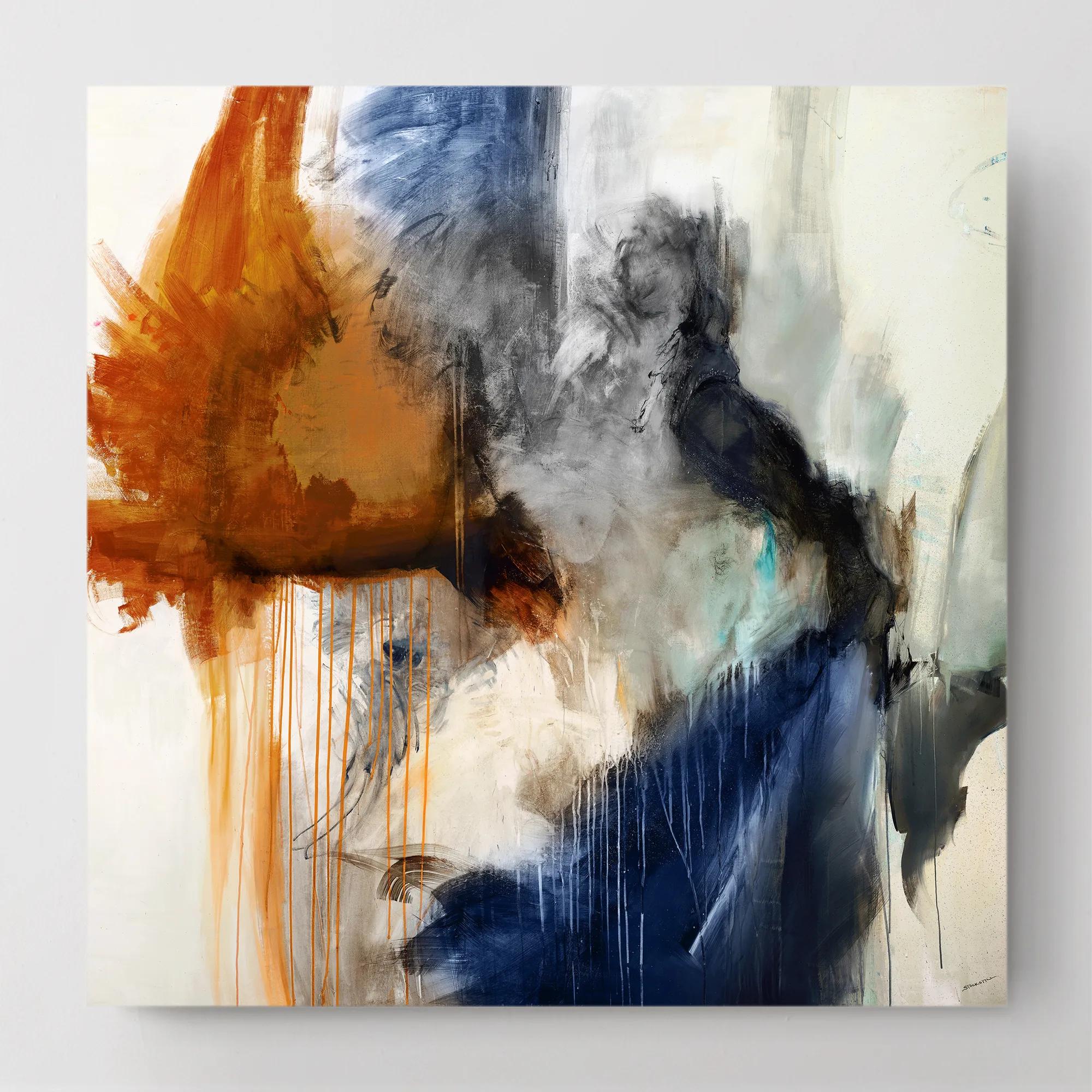
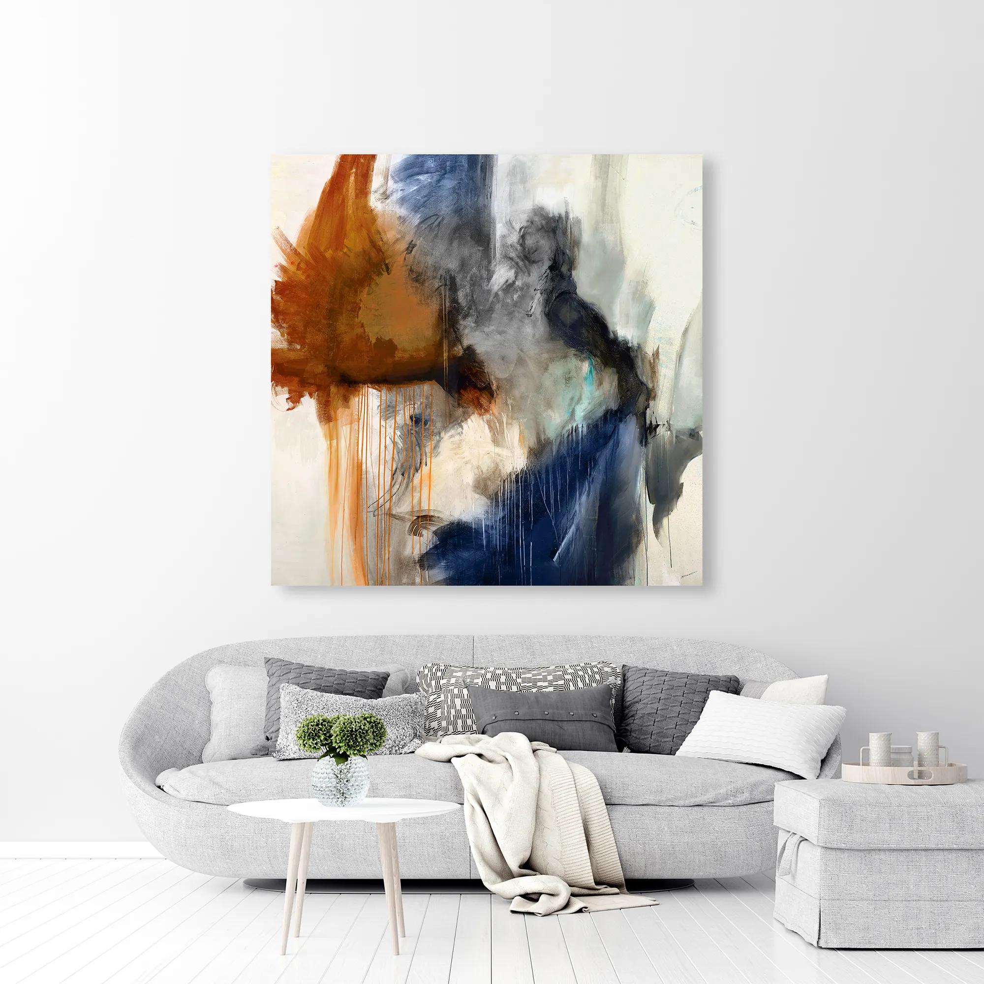 Swoon 6 Wall Art 54" x 54"$899
A gallery-wrapped canvas featuring a hand-applied image brush gel finish for a textured, artistic look.
Add To Cart -
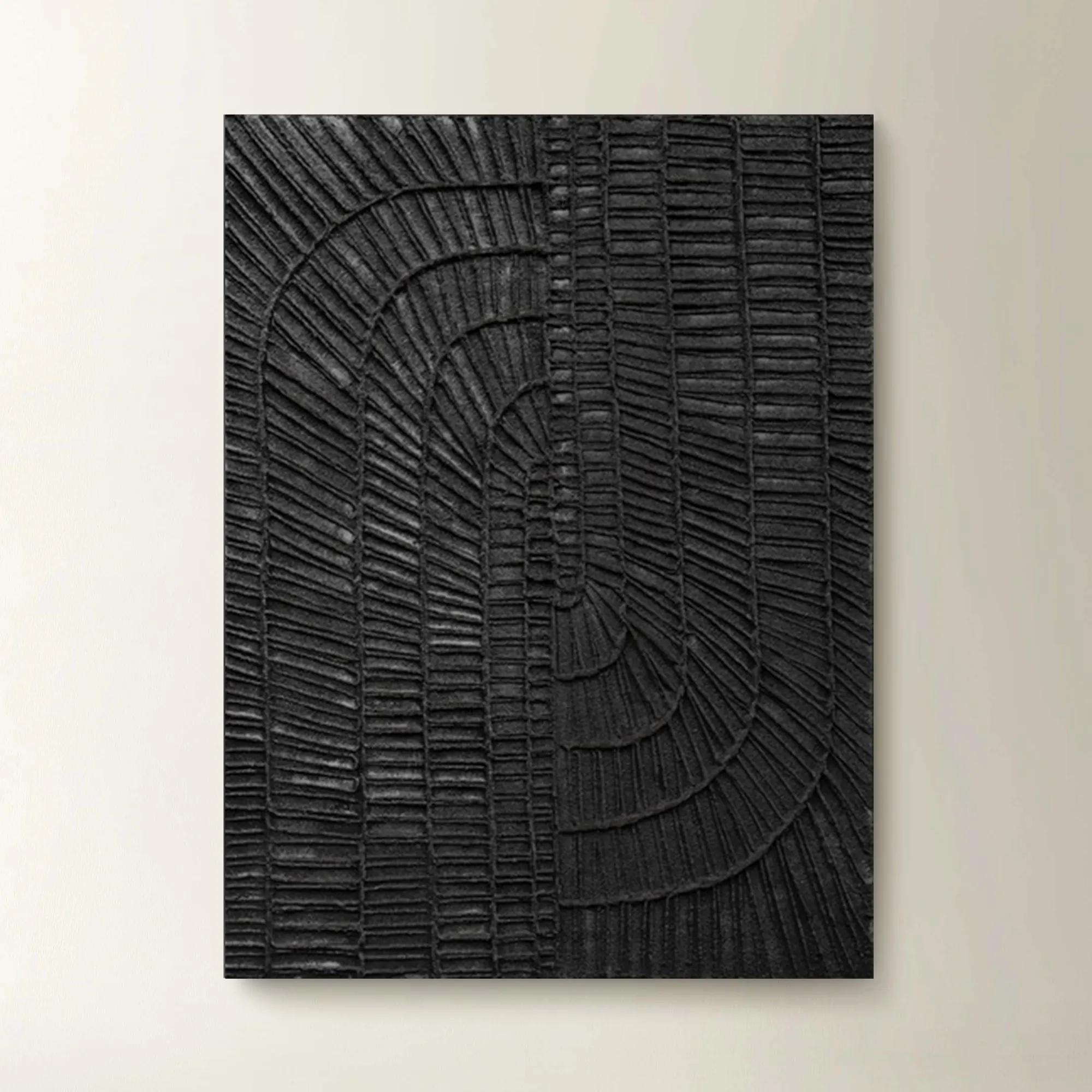 Textured Haze Black II Painted Wall Art 26" x 35"$499
A striking hand-painted black artwork featuring textured details for versatile vertical or horizontal display.
Add To Cart -
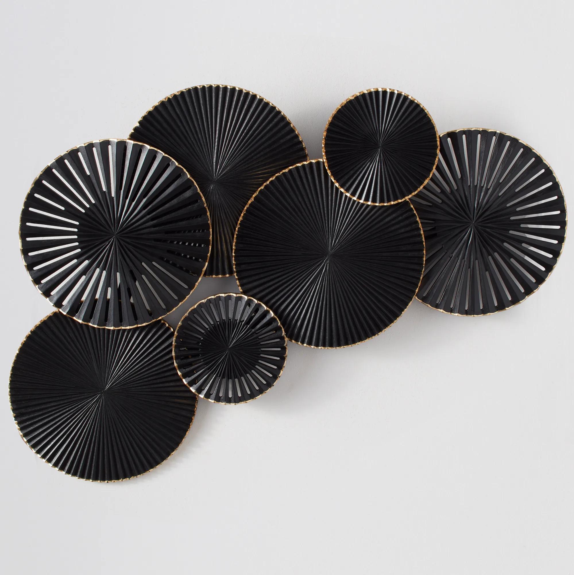
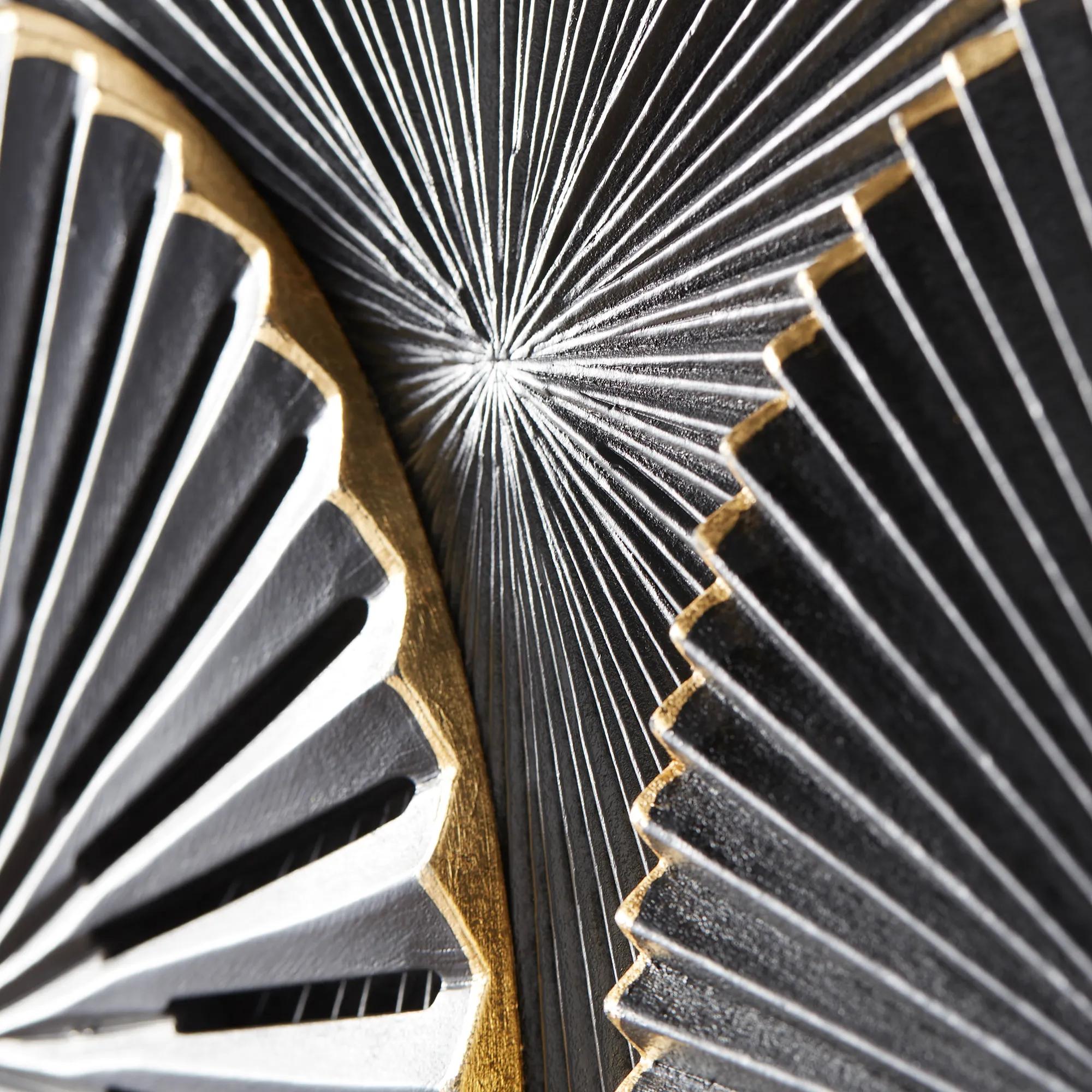 Circa Black Carved Wood Dimensional Wall Panel 47.25" x 27.5"$499
A carved wood wall art panel in black and gold that adds abstract intrigue to any room.
Add To Cart -
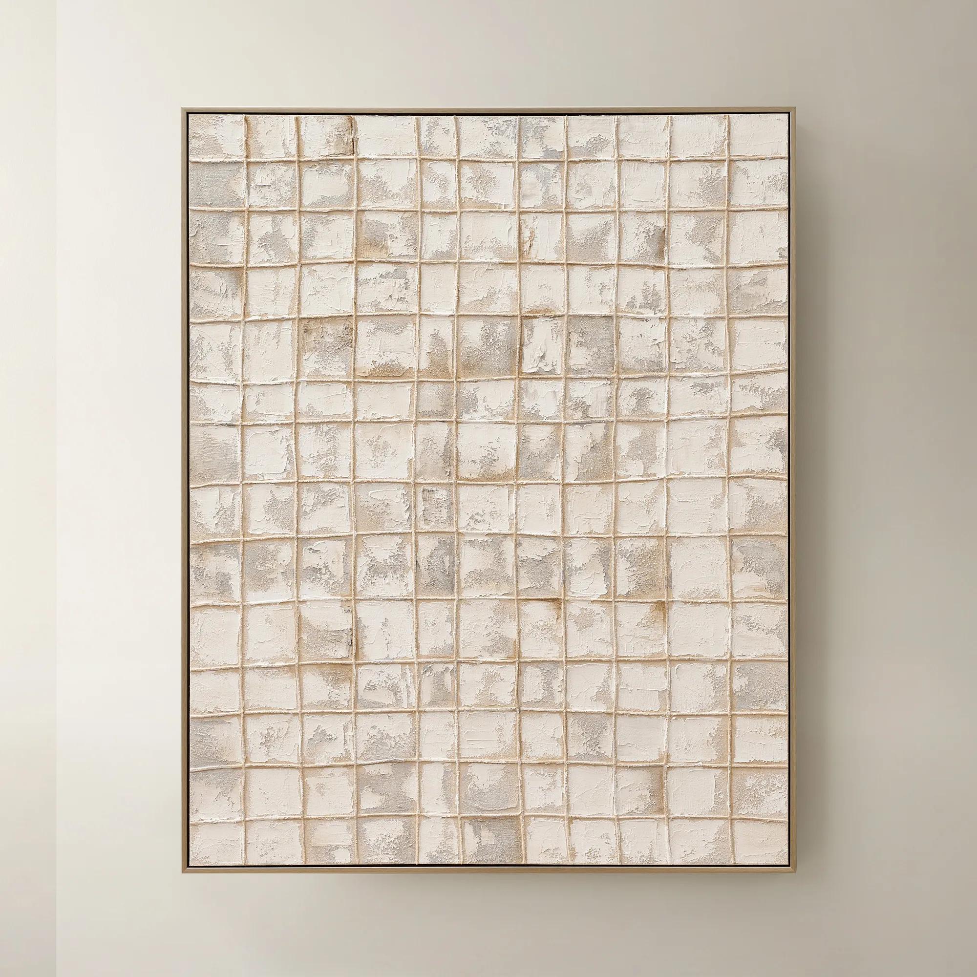
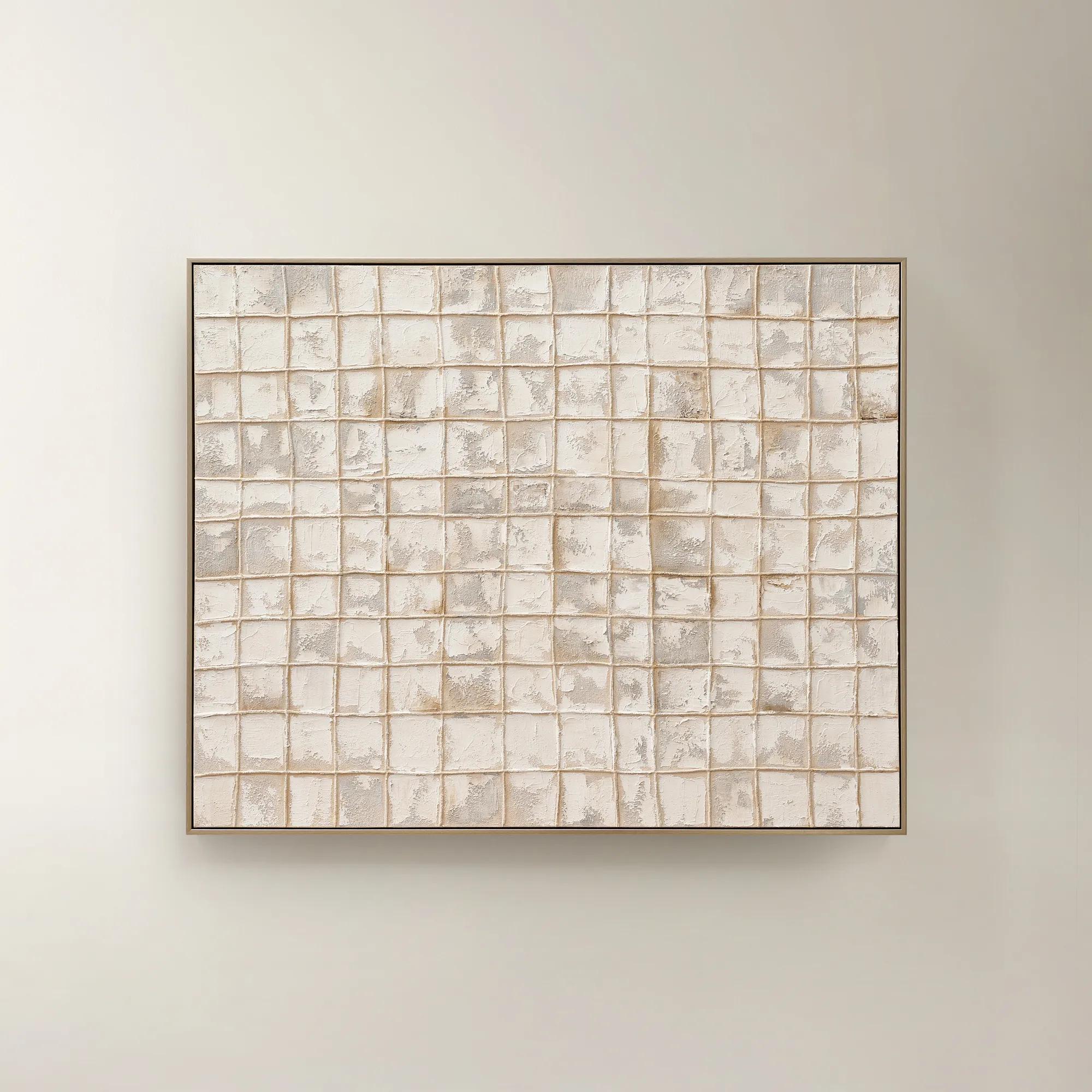 Painted Echos Framed Gold Leaf Wall Art 60" x 48"$699
A hand-painted abstract canvas with gold leaf accents and a champagne frame for modern, versatile display.
Add To Cart -
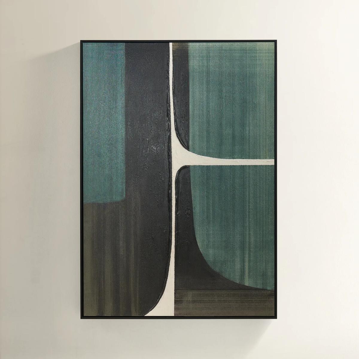 Plains Framed Painted Wall Art 39.25" x 55"$499
A hand-painted abstract canvas in forest green, ivory, and black with a sleek black floater frame.
Add To Cart -
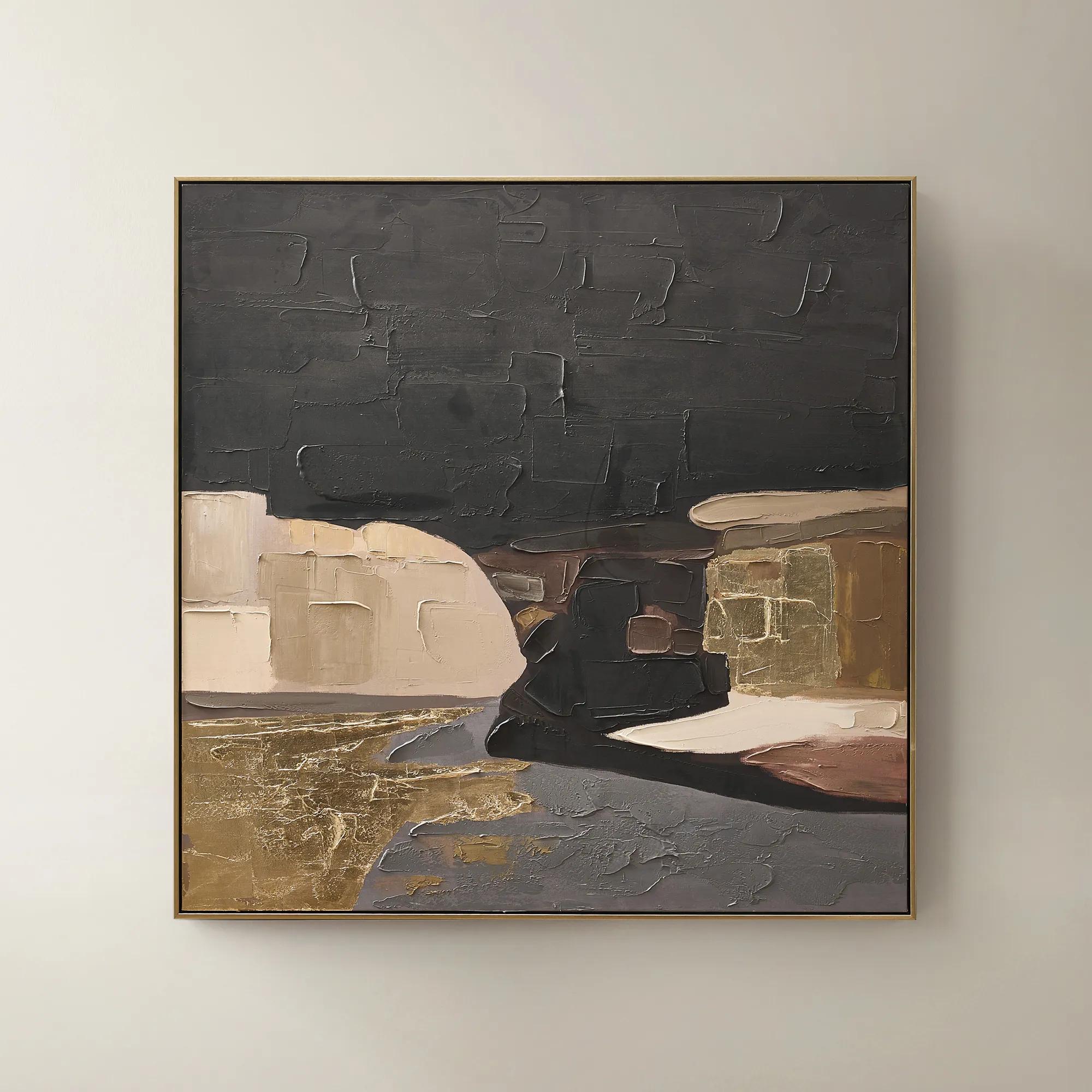 Obscured Light Framed Gold Leaf Painted Wall Art 48" x 48"$499
A hand-painted canvas with gold leaf accents and a black-gold frame in dramatic neutral tones.
Add To Cart -
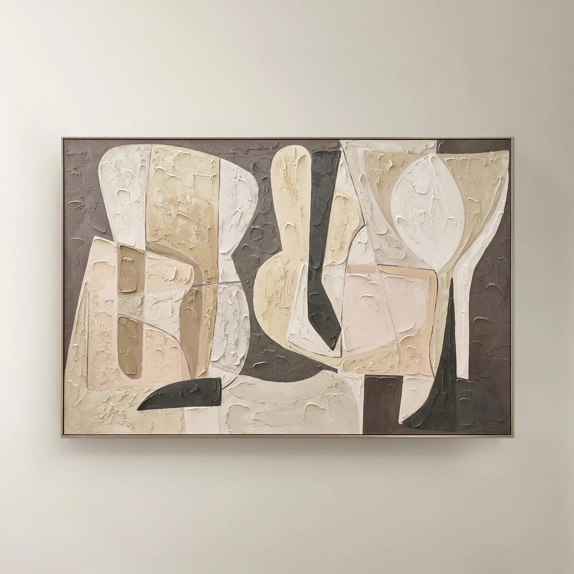 Wishful Thinking Framed Painted Wall Art 72" x 48"$599
A hand-painted abstract canvas featuring bold geometric forms and warm smoked plum, apricot, and tawny hues.
Add To Cart -
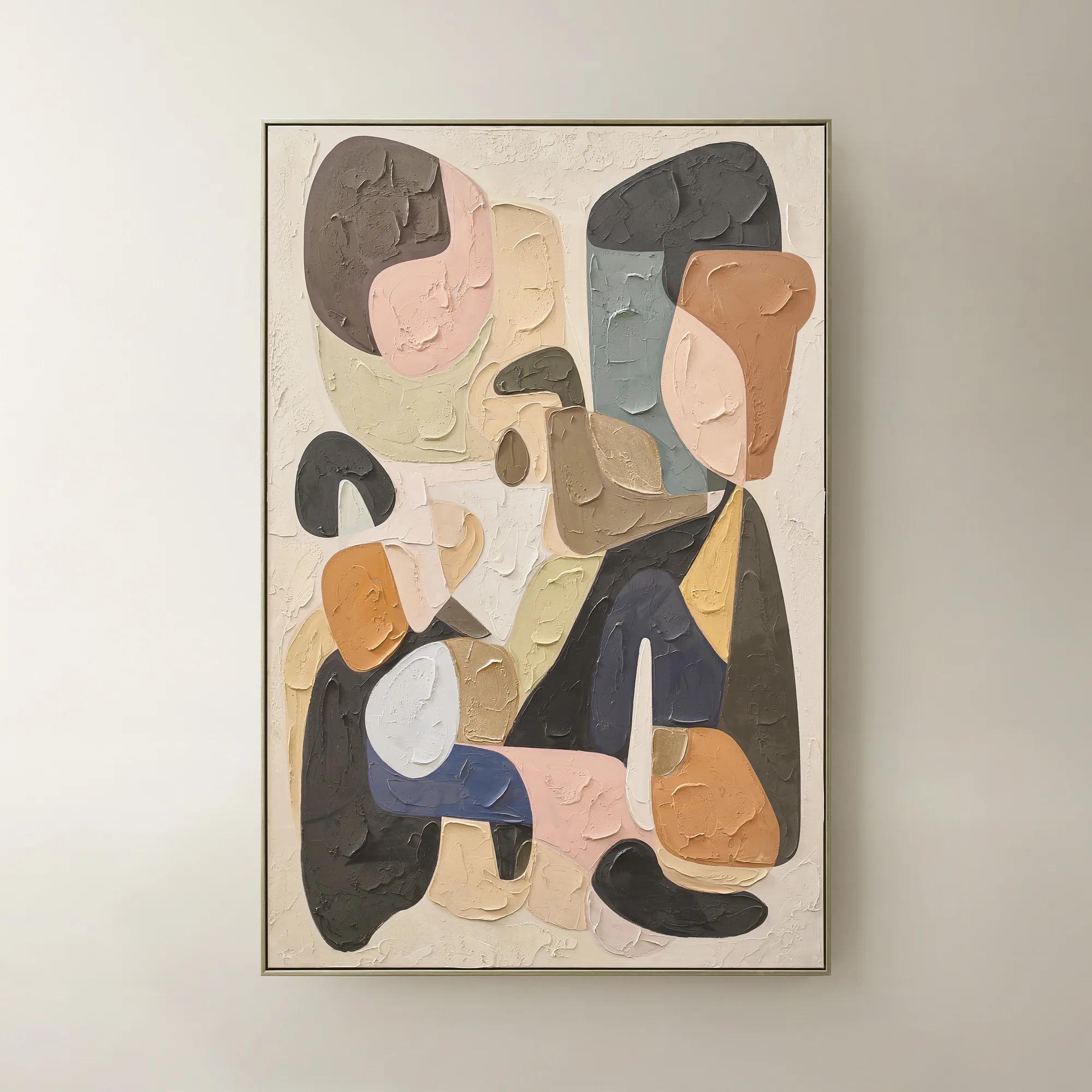 Chromatic Bloom Framed Painted Wall Art 40" x 60"$519
A hand-painted abstract canvas featuring a vibrant multi-color palette and shimmering champagne detailing.
Add To Cart -
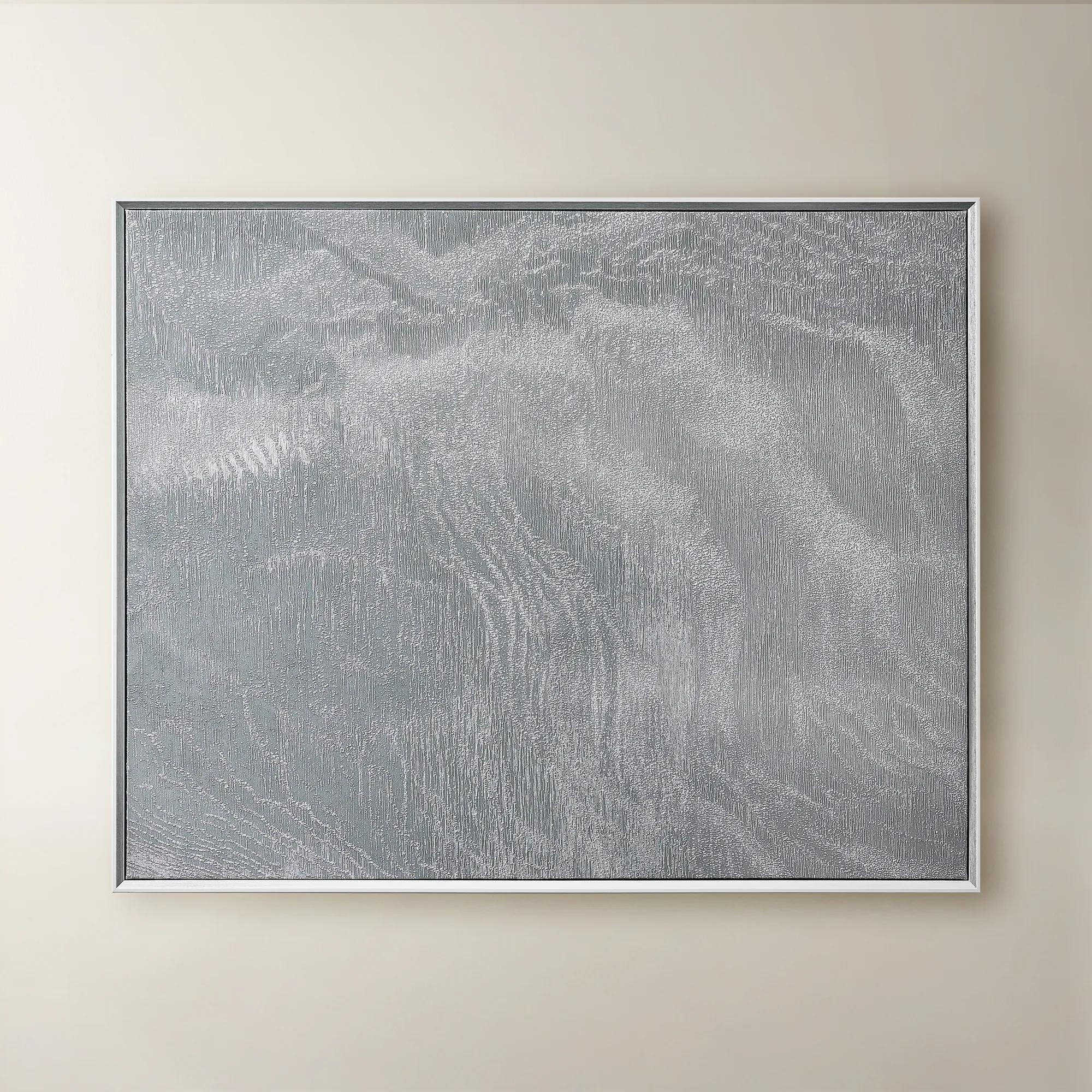 Slow Blue Morning Framed Silver Foil Wall Art 48" x 60"$599
A serene powder blue abstract canvas with silver foil accents, framed in silver and white for modern elegance.
Add To Cart -
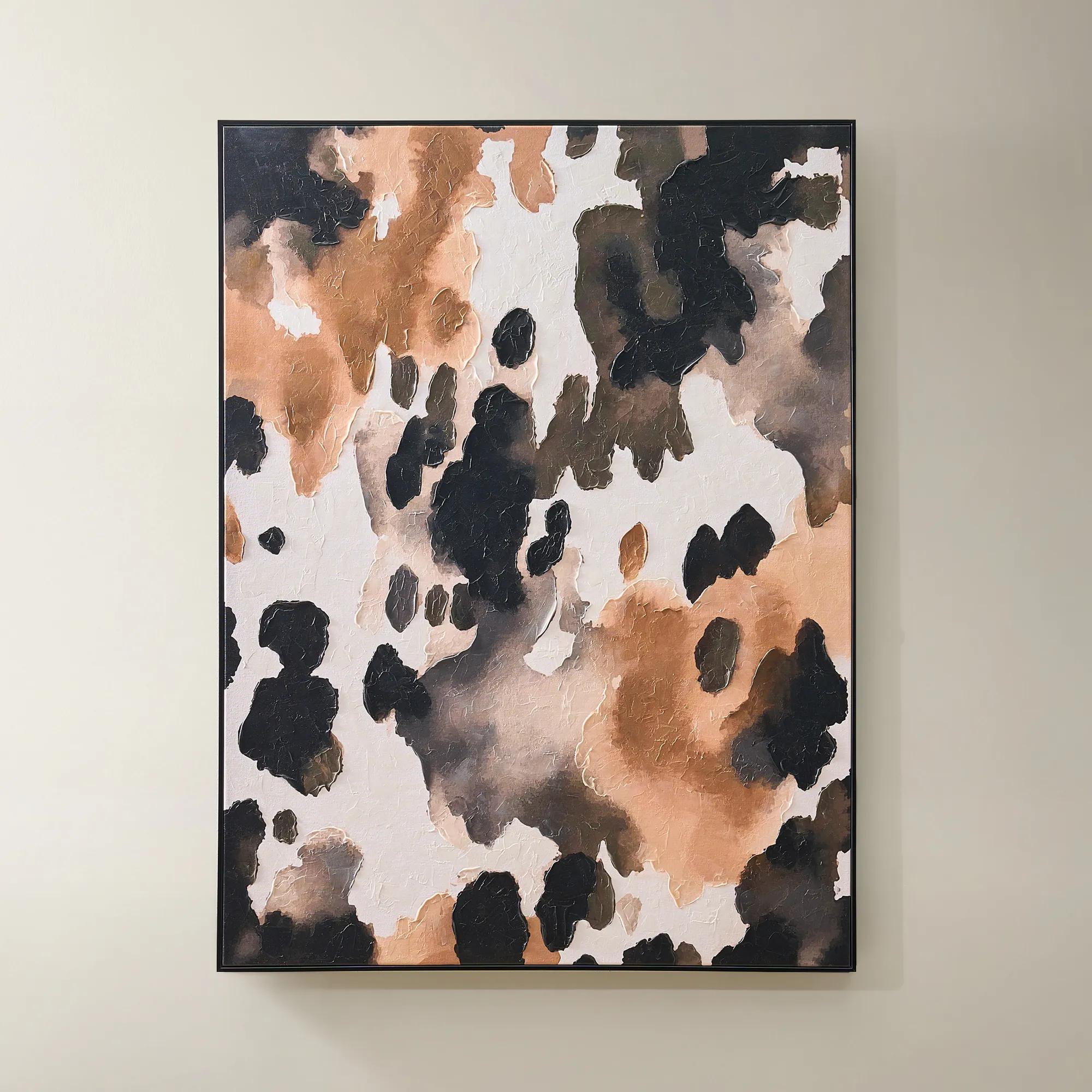
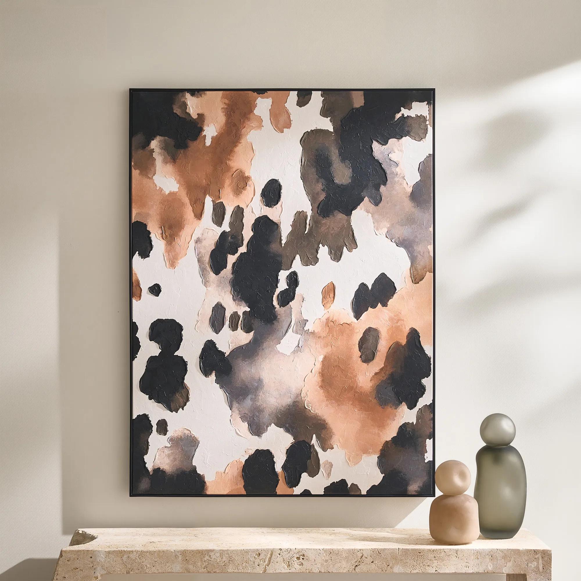 Wilder Framed Painted Wall Art 36" x 48"$499
An abstract hand-painted canvas featuring inky black, taupe, ivory, and coral hues in a sleek black frame.
Add To Cart -
 Quiet Pose Framed Painted Wall Art 36" x 48"$499
A hand-painted canvas in taupe and champagne tones features textural details and shimmering champagne leafing.
Add To Cart -
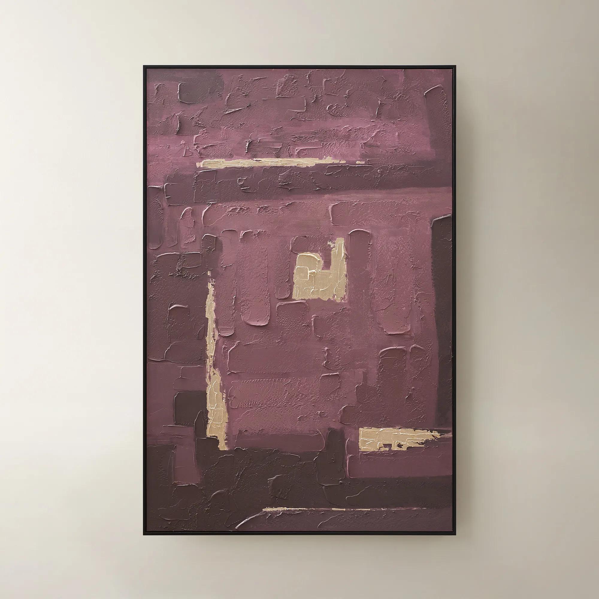
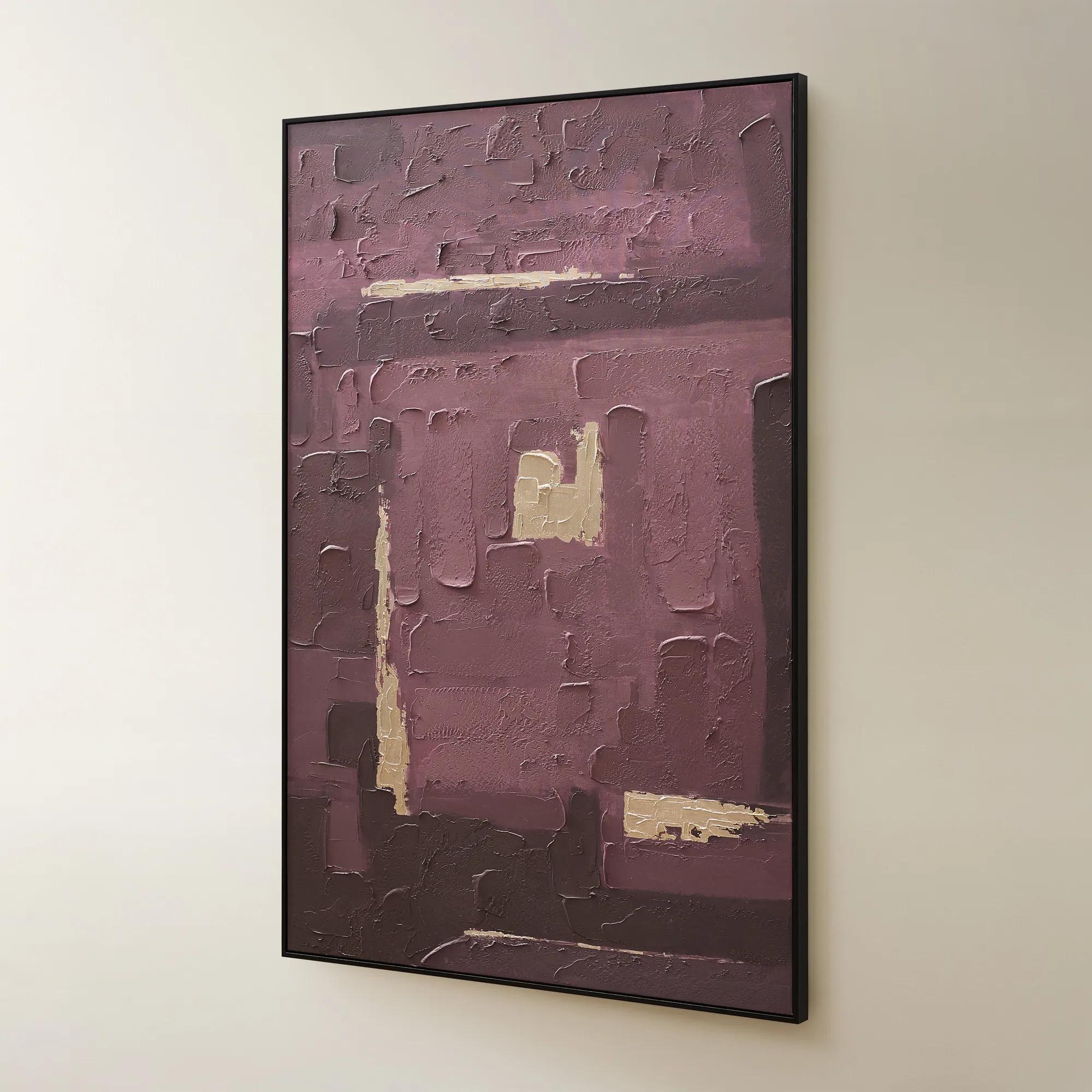 Fallback Framed Painted Wall Art 60" x 40"$499
A hand-painted abstract canvas in rich fig hues with champagne accents, set in a sleek black frame.
Add To Cart -
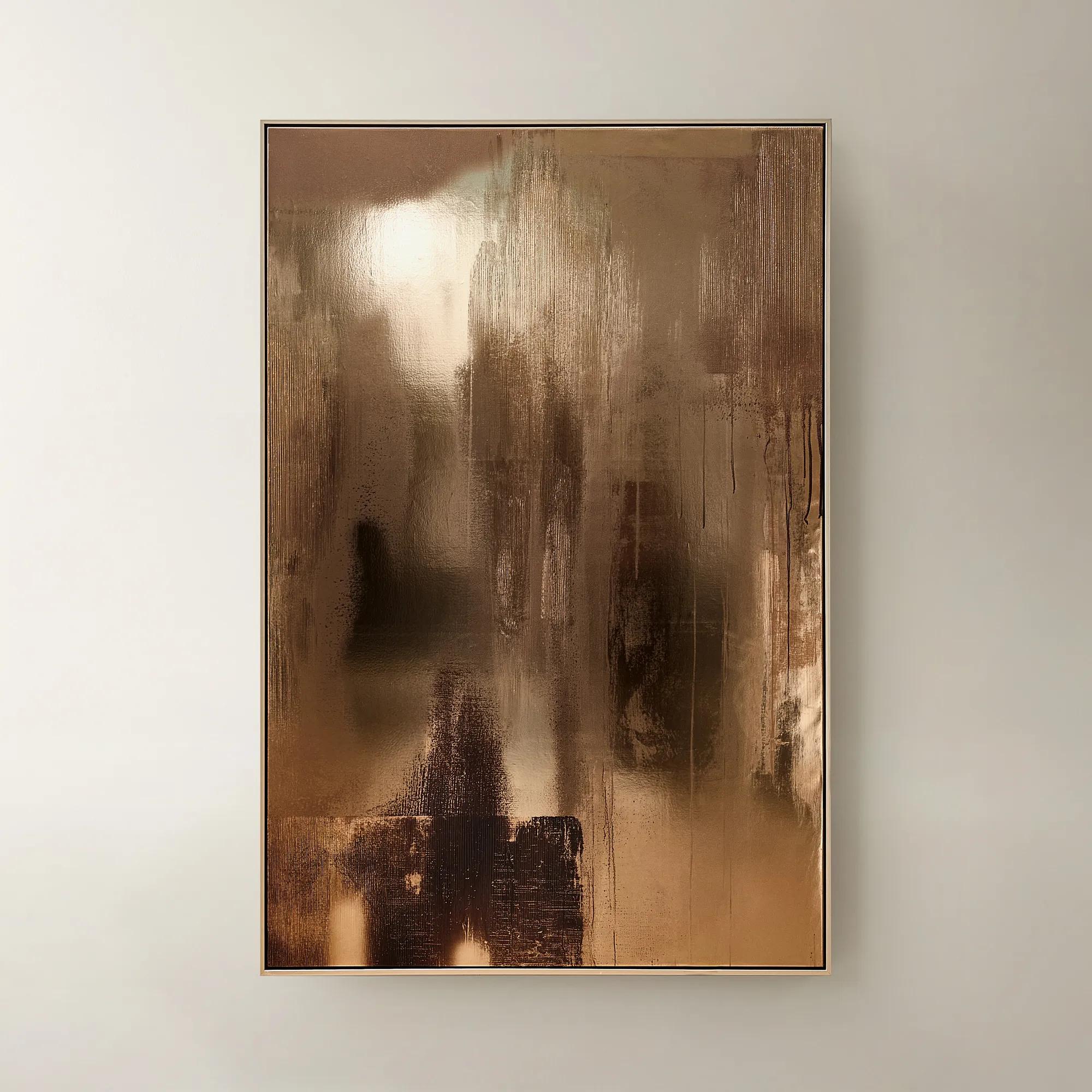
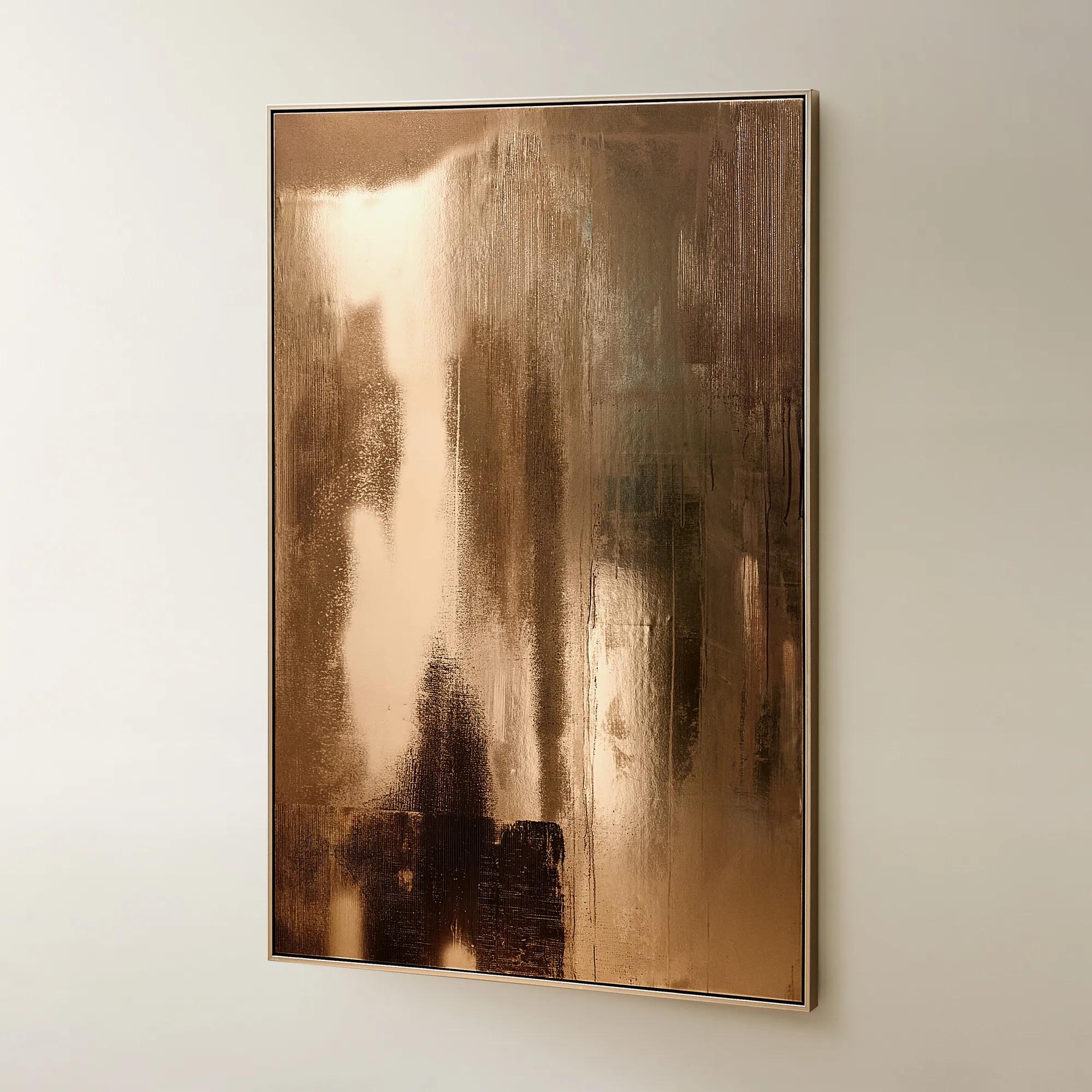 Bronze Reflective Framed Leather Painted Wall Art 40" x 60"$799
A hand-painted abstract wall art featuring reflective bronze faux leather and a warm champagne metallic frame.
Add To Cart -
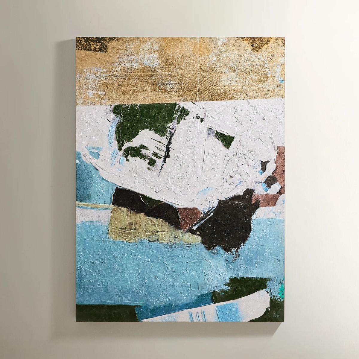 Cadence Painting$599
A hand-embellished canvas artwork featuring textured olive, gold, and ivory strokes in a black and gold frame.
Add To Cart -
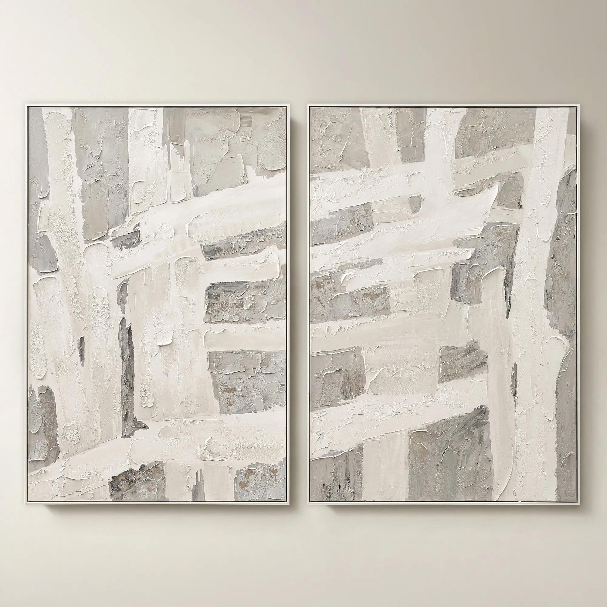 Traverse Framed Painted Wall Art 40" x 60" Set of 2$799
A hand-painted abstract diptych features champagne accents and soft grey, pearl, and alabaster tones in white frames.
Add To Cart -
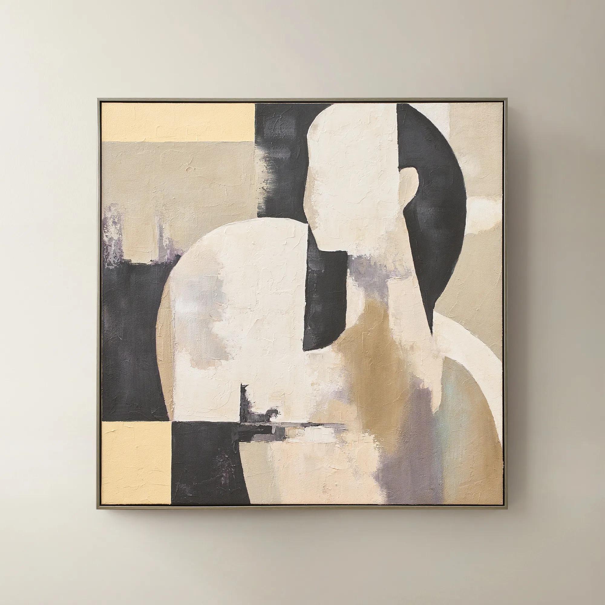 Afternoon Rest Framed Painted Wall Art 40" x 40"$399
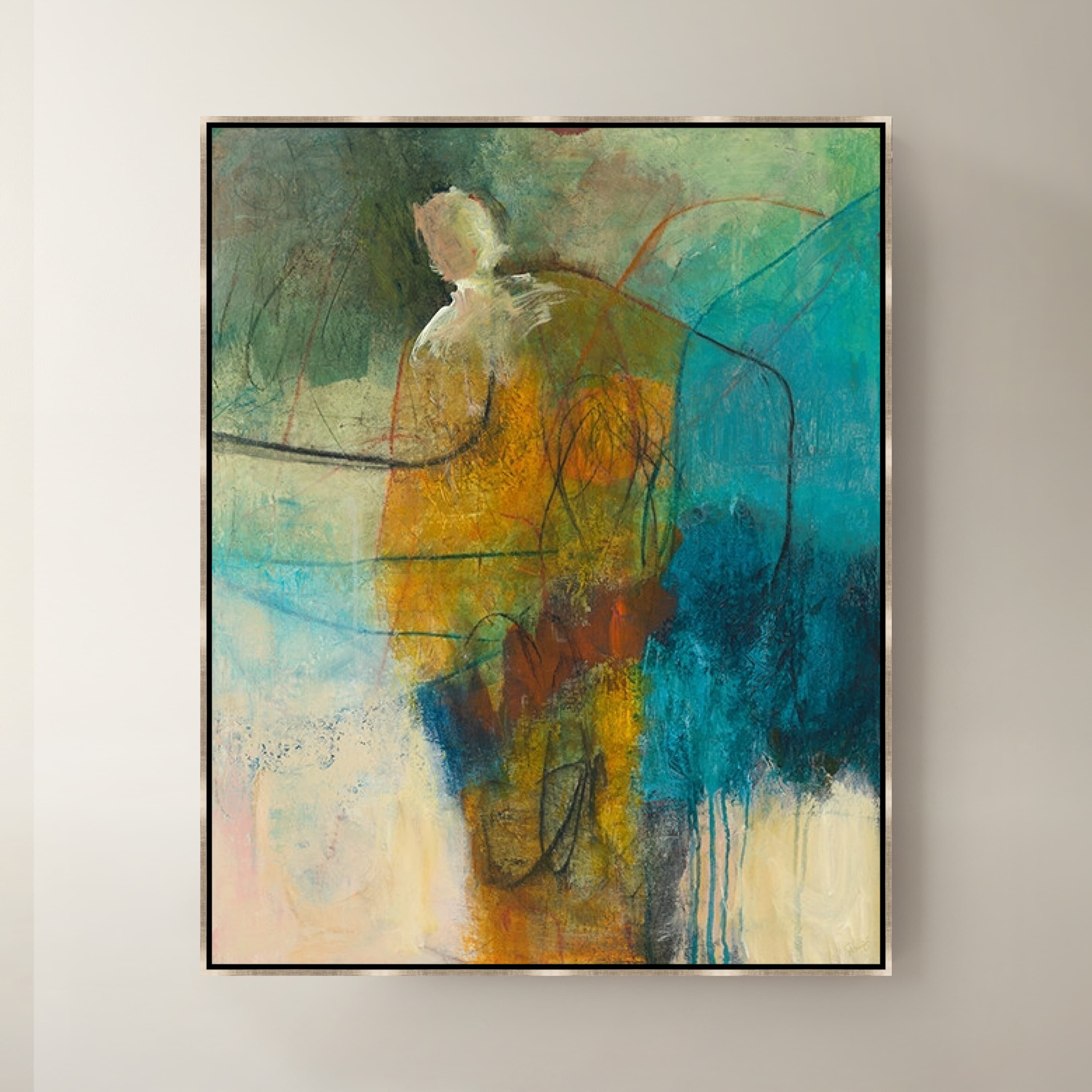
A hand-painted abstract figure in buttercream, turtledove, and black hues framed in dark grey.
Add To Cart -
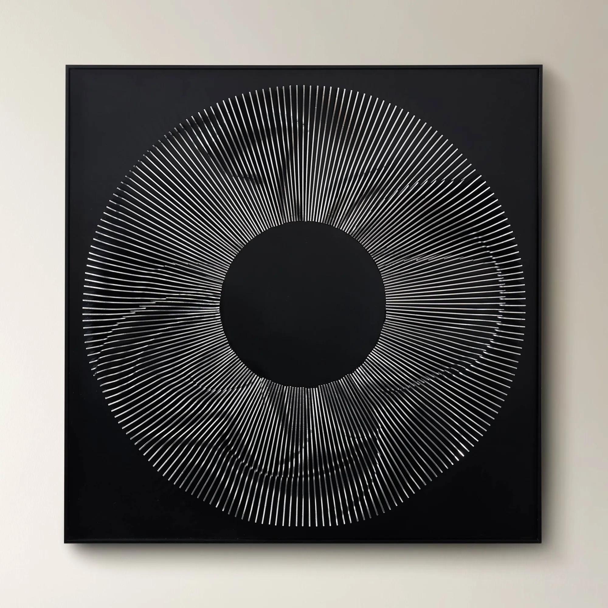 Efflorescence Wood Carving$799
A three-dimensional pine wood panel features a flowing carved motif in a striking silver finish.
Add To Cart -
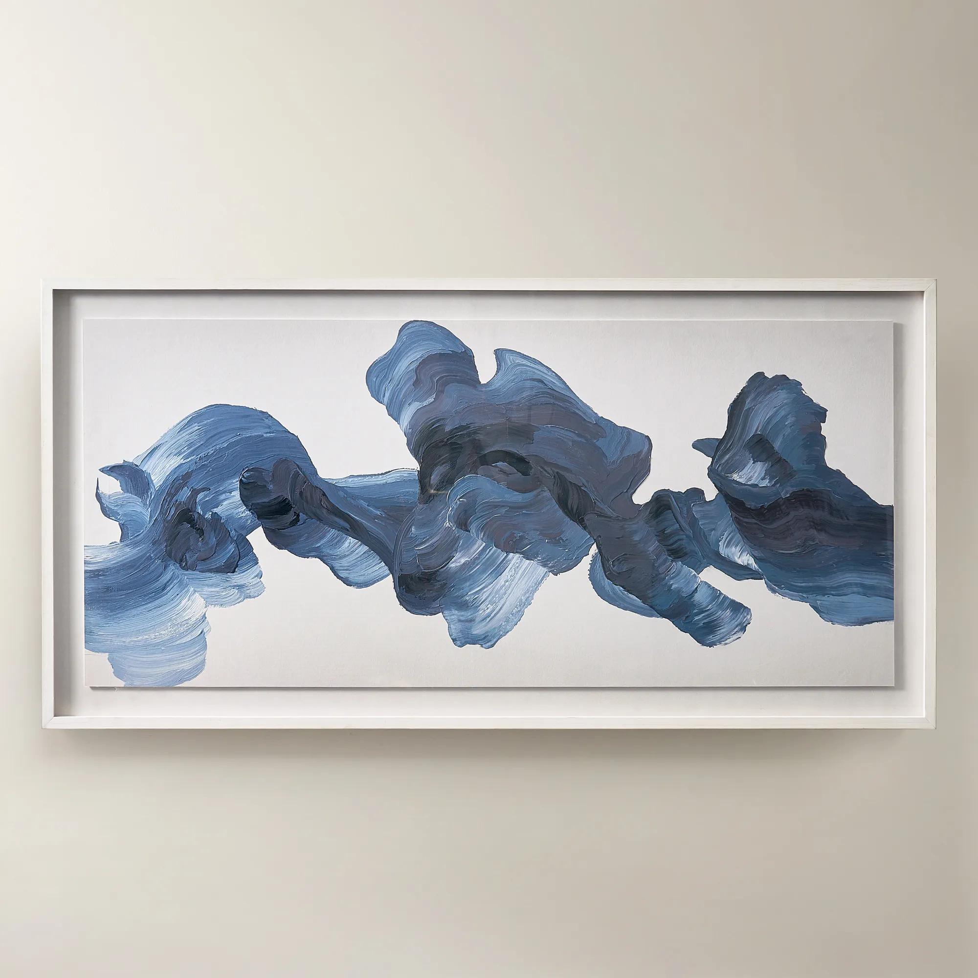
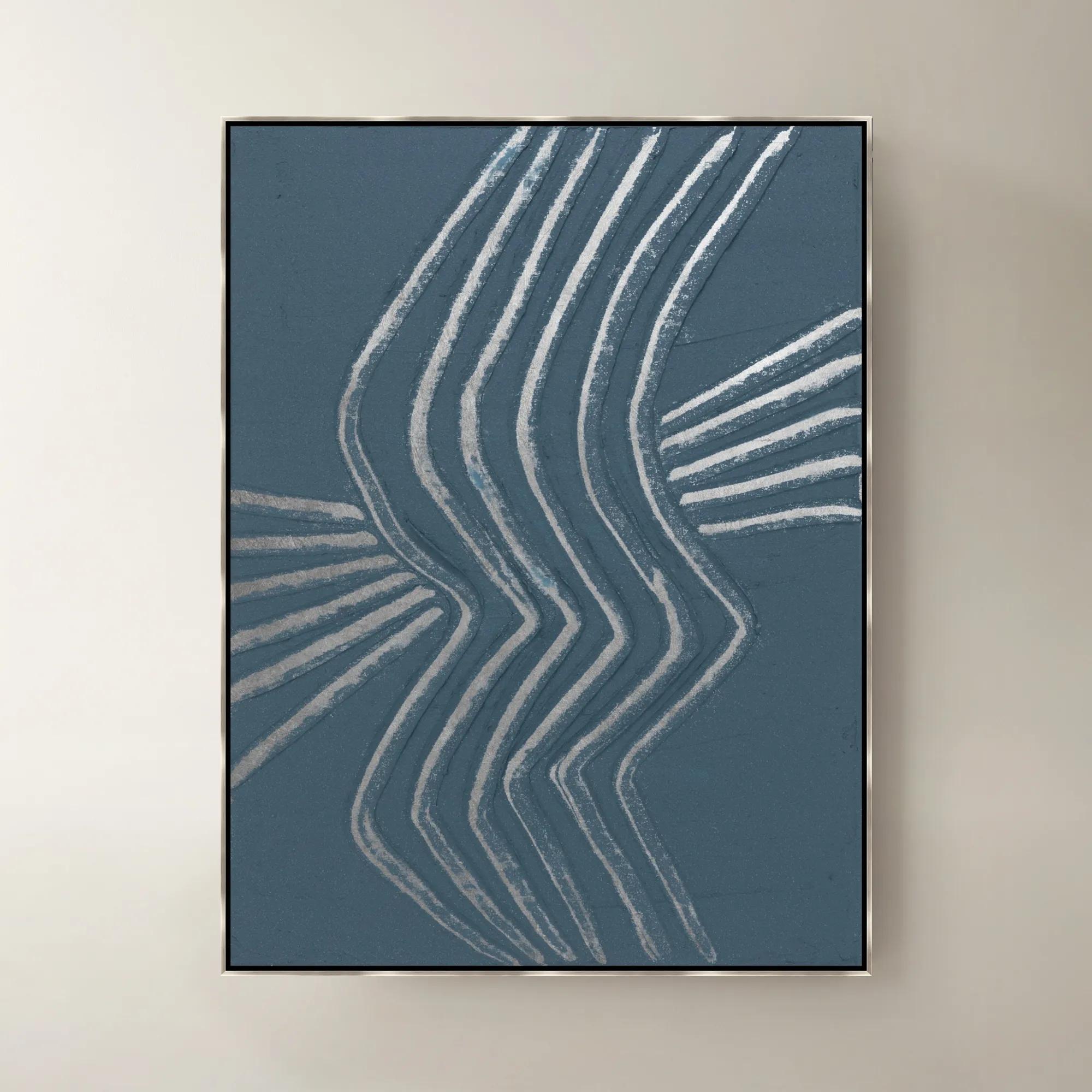
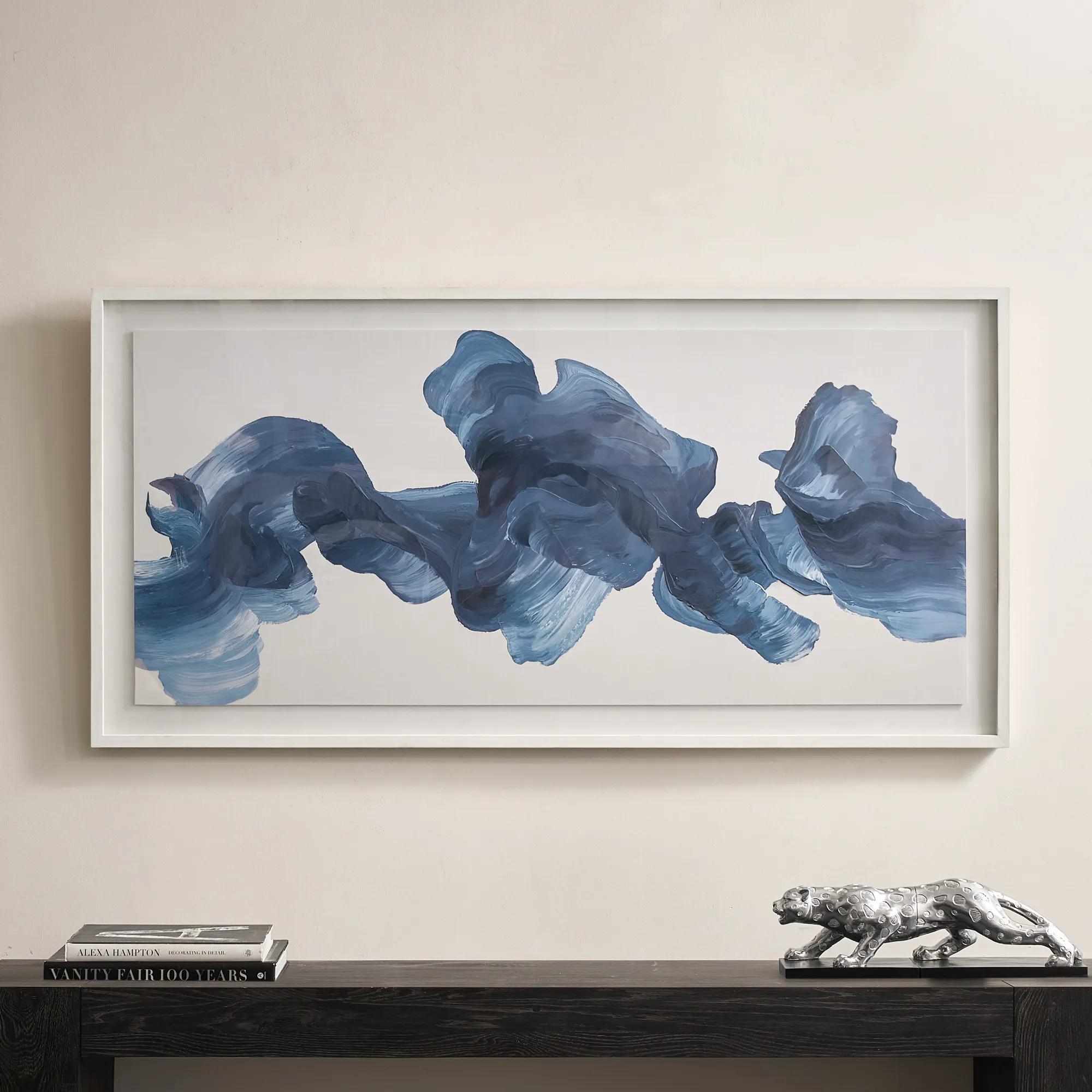 Blue Theory Framed Painted Wall Art in Acrylic 60" x 30"$499
A hand-painted canvas in deep ink blue, framed under acrylic with a whitewashed wood frame.
Add To Cart -
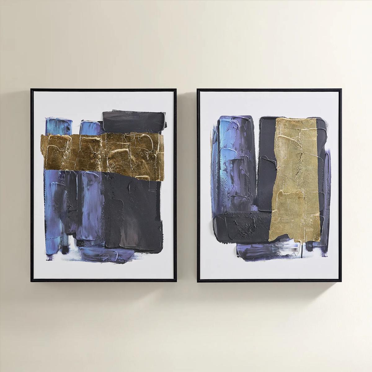
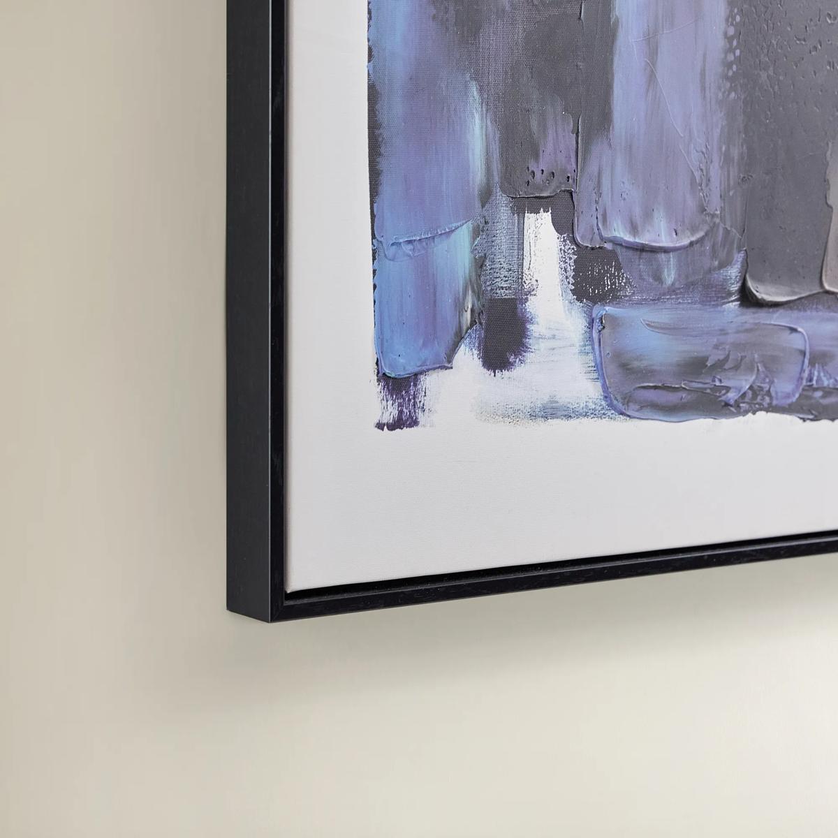 Deep Thoughts Gold Leaf Painted Wall Art Set of 2$199
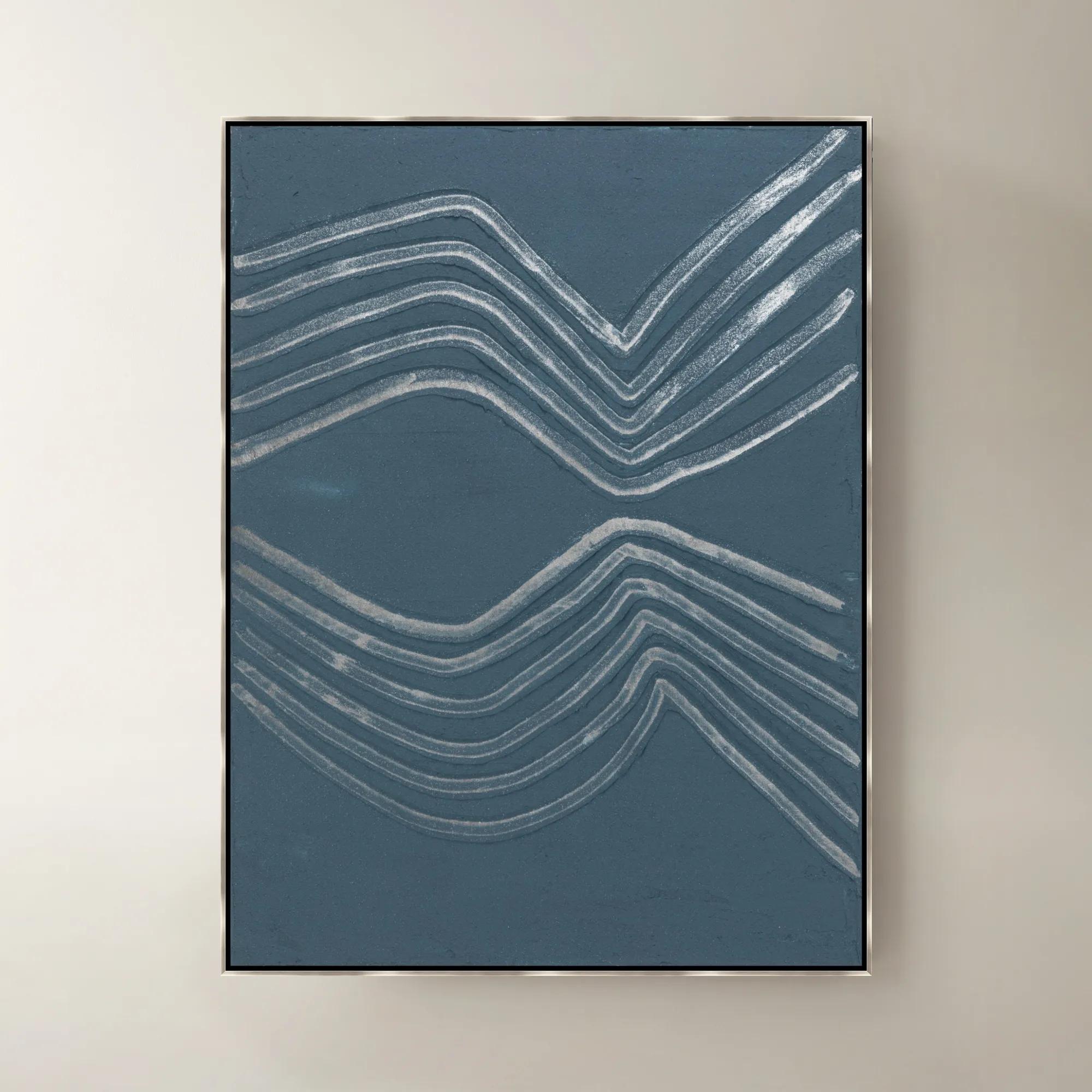
A set of two hand-painted abstract canvases in blue and gold leaf, framed in sleek black.
Add To Cart

Abstract Wall Arts For Dining Rooms
Abstract wall arts for dining rooms transform every meal into a curated experience, infusing your space with an air of intrigue and expressive sophistication. Each piece is a visual feast—bold brushstrokes, sweeping forms, and unexpected color palettes invite conversation and spark imagination. Whether you’re hosting a lavish dinner party or savoring quiet moments, these captivating works turn your dining room into a gallery of modern artistry, reflecting your taste for the extraordinary and elevating every gathering with creative energy.
Abstract wall art for dining rooms gives the setting a distinct point of view, bringing color, movement, and visual depth to the place where conversation unfolds. Unlike representational artwork, abstract compositions rely on gesture, shape, line, and tonal contrast rather than a recognizable subject. That freedom makes them especially expressive above a sideboard, along a dining room wall, or within an open-plan entertaining space. A sweeping charcoal stroke across an ivory field can lend architectural presence to a room with upholstered chairs and a polished table, while layers of blue, plum, or ocher introduce a richer, more enveloping mood. The strongest connection is not always an exact color match. A painting that picks up the smoky undertone of glassware or the warm metallic finish of a chandelier can make the entire setting feel considered without looking prescribed. Neutral abstract wall art offers its own kind of drama: cream against graphite, sand against bronze, or translucent washes interrupted by a decisive dark line. These compositions leave room for expressive dinnerware and sculptural centerpieces while giving the wall a presence of its own. More saturated artwork can become the room’s defining accent, particularly when the surrounding furniture has restrained silhouettes. Geometric abstracts establish rhythm and structure; fluid brushwork brings a sense of motion; compositions with generous open space allow elaborate furnishings to breathe. In a formal dining room, a framed abstract canvas can create an elegant counterpoint to tufted seating or a gleaming console. In a breakfast area, a smaller composition can give an intimate table the same sense of occasion. Abstract dining room wall decor also works beautifully in homes where the dining area shares a sightline with the living room, carrying a recurring color or shape between the two spaces. Its appeal lies in that range: bold enough to anchor a gathering, yet open-ended enough to invite a different impression every time someone takes a seat.
Scale and placement shape how abstract artwork feels within the dining room as much as the composition itself. For art centered above a buffet or sideboard, a total width of roughly two-thirds to three-quarters of the furniture’s width is a useful starting point, with adjustments for wall size, nearby windows, and the visual weight of the frame. A 72-inch sideboard, for example, often pairs comfortably with an artwork or grouping approximately 48 to 54 inches wide. When the art relates visually to the dining table instead, the table’s width can offer a similar reference, but the wall and surrounding architecture should determine the final proportions. A single expansive canvas creates an uninterrupted focal point, while a diptych or triptych introduces measured pauses between connected forms. For broad walls and substantial furniture, Oversized Wall Art For Dining Rooms offers a natural direction when a smaller composition would lose its presence. Multi-panel arrangements should be considered as one complete silhouette, including the spaces between panels. Consistent spacing helps the eye follow the composition rather than the gaps. Horizontal artwork often echoes the length of a rectangular table or credenza; a vertical piece can emphasize height on a narrow wall without crowding adjacent millwork. A center point around 57 to 60 inches from the floor is a common gallery-height starting point, not a universal seated-eye-level measurement. Dining rooms deserve a check from both standing and seated positions, especially where tall chair backs, lamps, or floral arrangements might interrupt the view. Above a sideboard, approximately 6 to 10 inches of clearance can help connect the artwork to the furniture, provided decorative objects do not obscure it. The most successful placement feels integrated rather than isolated: the frame has room to breathe, the composition remains visible during dinner, and the artwork holds its own without competing with a chandelier. In a compact dining space, one confidently scaled piece can feel more composed than several small works scattered across the wall.
Materials and finishes add another layer to the experience, especially in a dining room where artwork is often viewed at close range for an entire evening. Stretched canvas brings a woven surface and a less reflective presentation, allowing painterly marks and tonal layers to remain prominent under ambient light. Printed canvas translates an abstract image onto that textured support, while hand-applied embellishments, when specified, can add raised accents and subtle variations. A reproduction of thick brushwork does not necessarily have a raised surface, so medium descriptions and detail views matter when texture is part of the desired effect. Framed works on paper offer crisp definition and a tailored presentation, with matting creating a quiet border between the image and the frame. Glass or acrylic glazing protects the paper from direct contact, though reflections may become noticeable opposite windows or beneath bright fixtures. Acrylic glazing is generally lighter than glass but can scratch more easily, making the stated care instructions important. Dimensional metal wall art introduces sculptural depth, and metallic accents can catch chandelier light with a restrained shimmer or a more theatrical gleam, depending on their surface and placement. Frame finishes contribute just as much character: black sharpens a graphic composition, warm metallic tones enrich a luminous palette, and wood introduces a grounding contrast to polished furnishings. Long-term durability depends on the complete construction, including the support, frame, hanging hardware, and exposure conditions, rather than on the medium alone. Indoor artwork belongs away from direct splashes, cooking residue, excessive moisture, and prolonged direct sunlight, which can affect color and materials over time. Gentle dusting with a clean, soft, dry cloth is appropriate for many frames, while painted, embellished, and metallic surfaces may require more specific handling; cleaners should never be sprayed directly onto artwork. Secure mounting hardware suited to the piece’s weight and the wall material is essential above furniture used for serving. For expressive hosts, design-minded homeowners, or a housewarming recipient whose taste and wall dimensions are well understood, abstract art offers a personal finishing gesture. It gives the dining room something beyond decoration: a compelling visual presence that belongs as naturally to a quiet meal as to a beautifully dressed table surrounded by guests.
FAQs
Abstract wall art brings a sense of artistry and intrigue to your dining room, setting a mood that elevates every gathering. Whether you seek a vibrant splash of color to energize lively dinner parties or a serene composition for intimate meals, abstract pieces create a dynamic focal point and reflect your unique sense of style.
Dining room abstract wall art is crafted from a variety of luxurious materials, including oil and acrylic paints on canvas, mixed media with metallic accents, and textured finishes that add depth and dimension. Each material offers a distinct sensory experience, allowing you to choose a piece that resonates with your desired ambiance.
Absolutely. Abstract art dining room selections can be tailored to any aesthetic, from sleek modern interiors to richly layered traditional spaces. The key is to select artwork that either complements your existing decor or provides a striking contrast, infusing the room with personality and visual interest.
Abstract dining room wall art makes a thoughtful and memorable gift for housewarmings, weddings, anniversaries, or milestone celebrations. Its expressive nature allows the recipient to interpret and enjoy the piece in their own way, making it a lasting symbol of creativity and connection.
Consider the mood you wish to evoke and the existing colors in your dining room. Bold, saturated hues can create drama and energy, while softer tones offer tranquility and elegance. Look for artwork dining room pieces that harmonize with your furnishings or introduce an unexpected accent for a curated, designer-inspired effect.