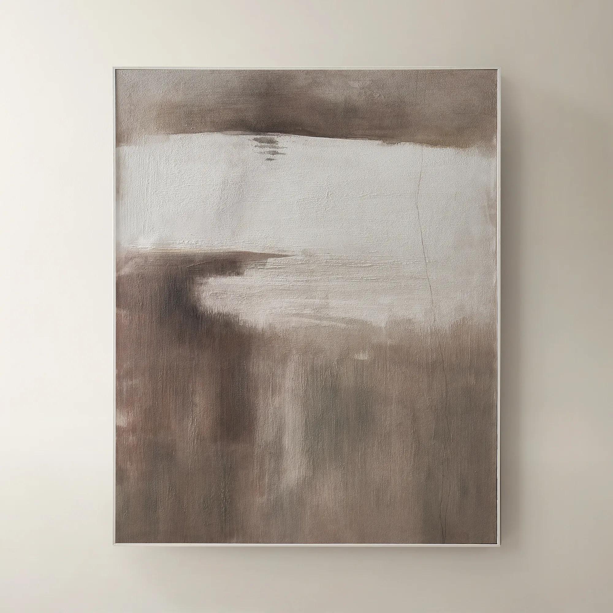
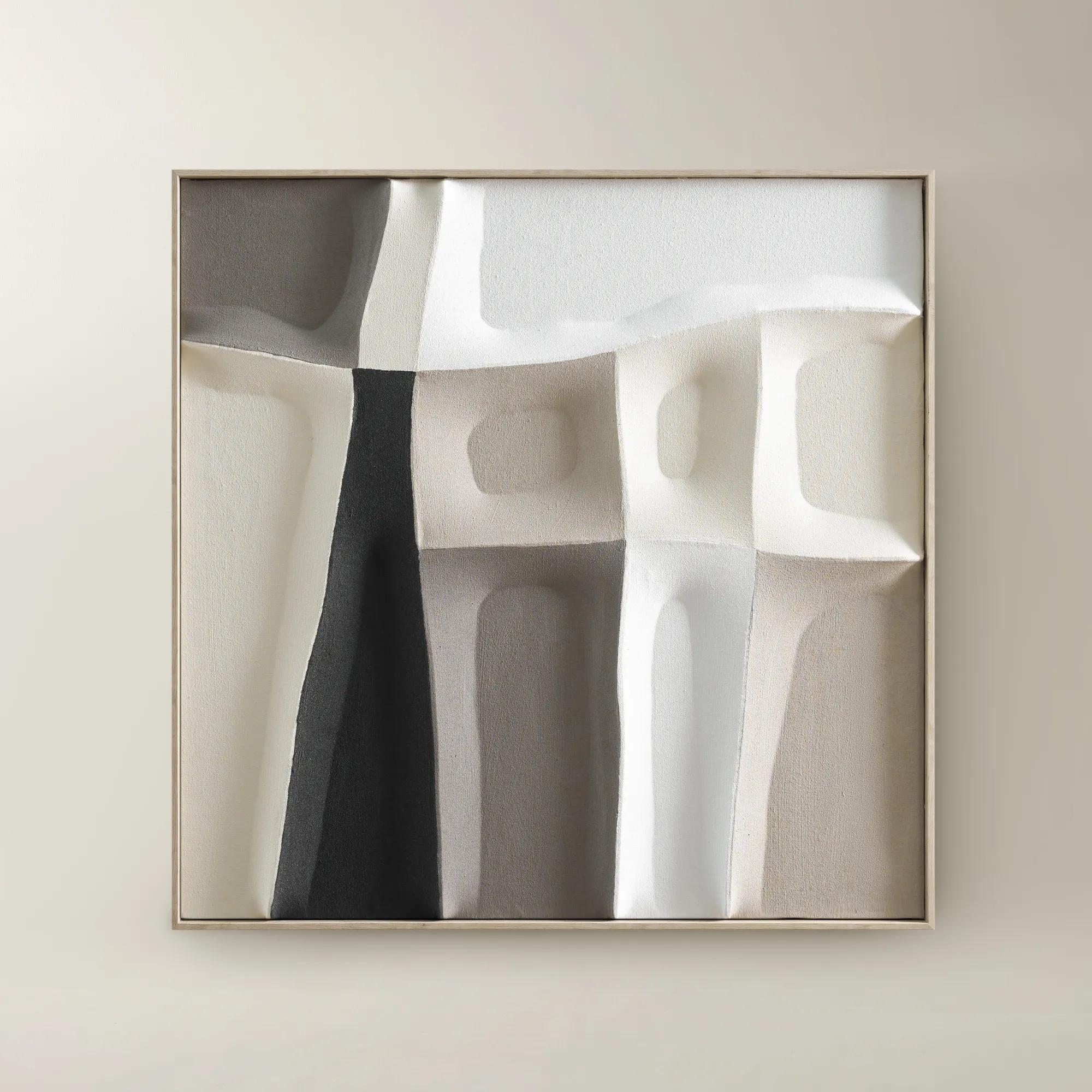
Neutral Tone Wall Art Sets
Neutral Tone Wall Art Sets
-
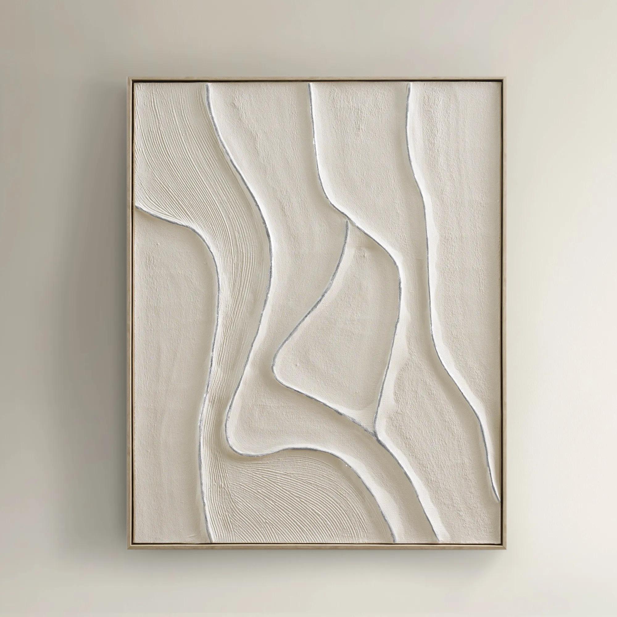
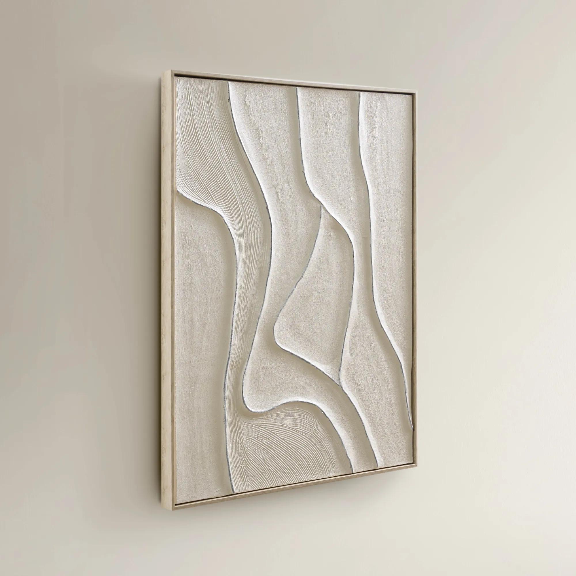 Vivre Framed Silver Leaf Painted Wall Art 39.25" x 31.5"$199
A hand-painted canvas wall art featuring flowing linework, beige tones, and a whitewash floater frame.
Add To Cart -
 Relic Framed Painted Triptych Wall Art Set of 3$399
A hand-painted abstract triptych in deep navy and neutral tones, set in sleek black floater frames.
Add To Cart -
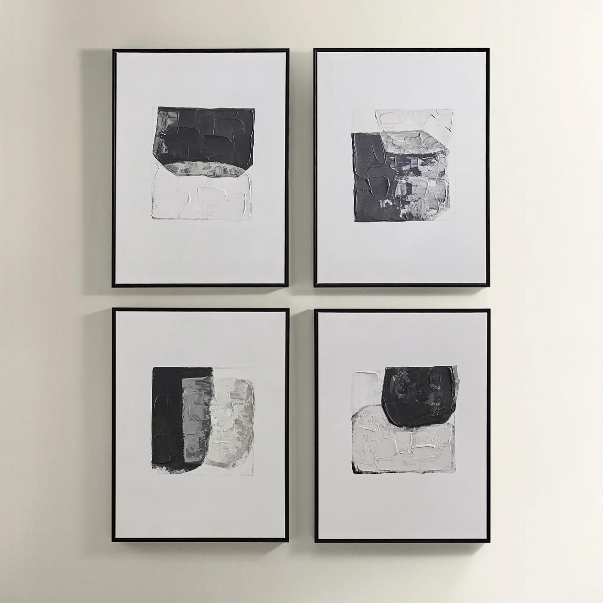
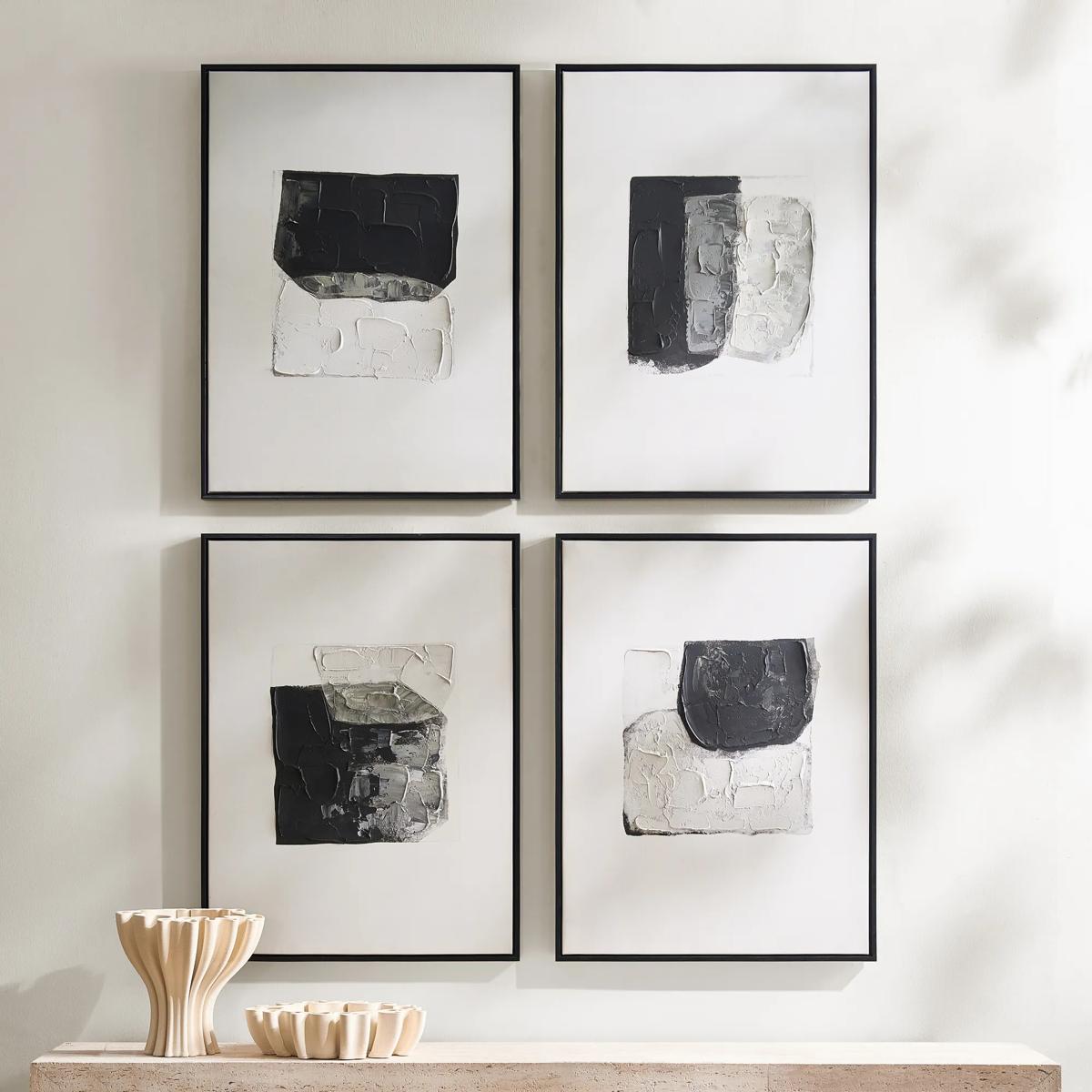 Shadows Framed Painted Wall Art Set of 4$299
A set of four hand-painted abstract canvases featuring black, white, and gold accents in black frames.
Add To Cart -
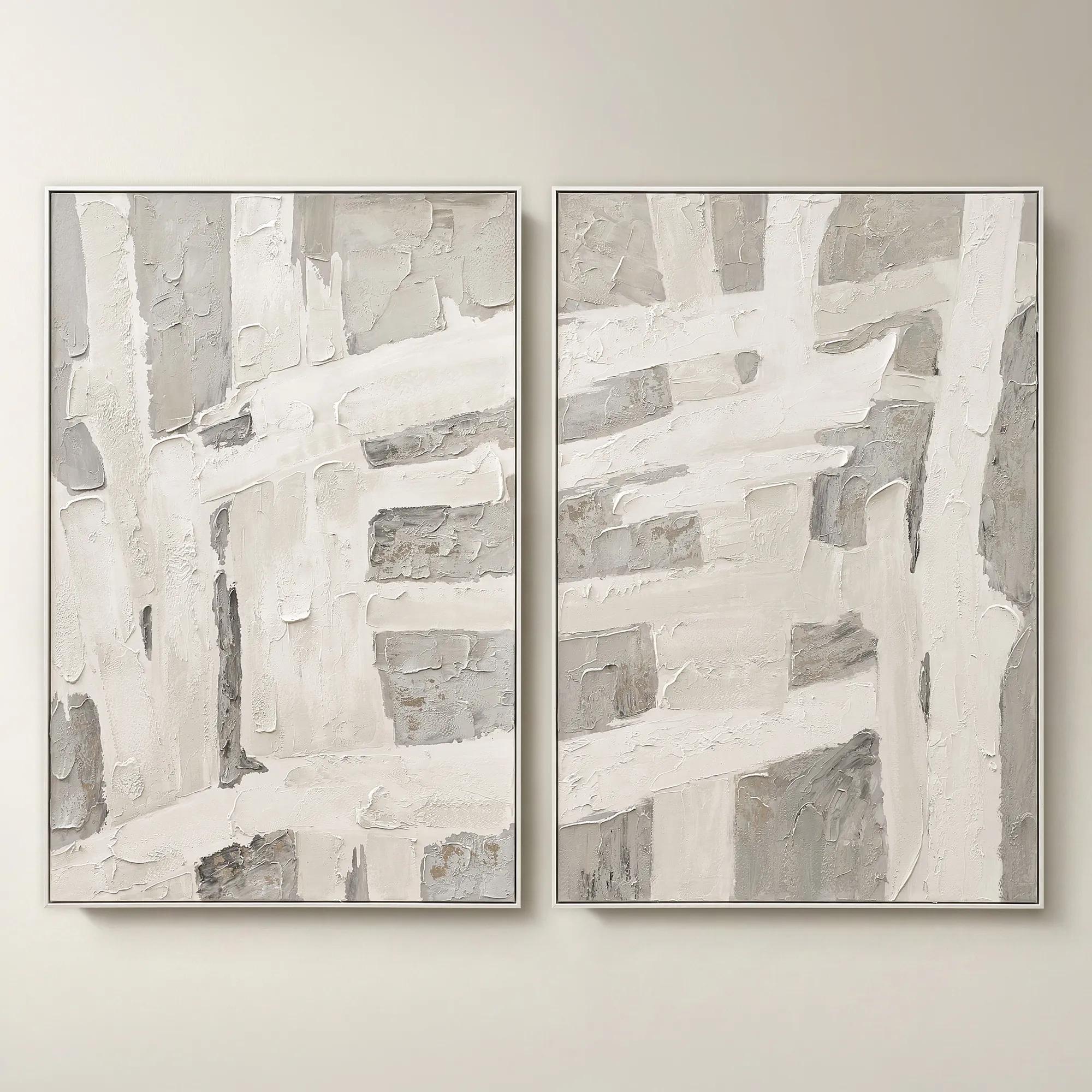 Traverse Framed Painted Wall Art 40" x 60" Set of 2$799
A hand-painted abstract diptych features champagne accents and soft grey, pearl, and alabaster tones in white frames.
Add To Cart -

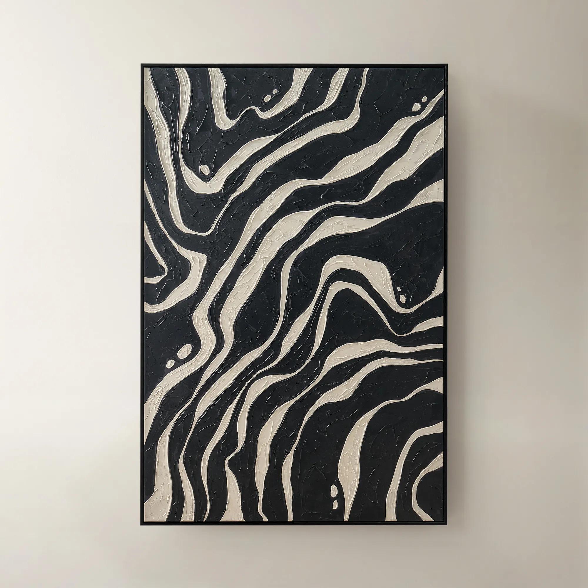
 Shift Framed Painted Wall Art 39.4" x 59"$499
A hand-painted canvas featuring bold black and beige contrasts with textured layers in a sleek black frame.
Add To Cart -
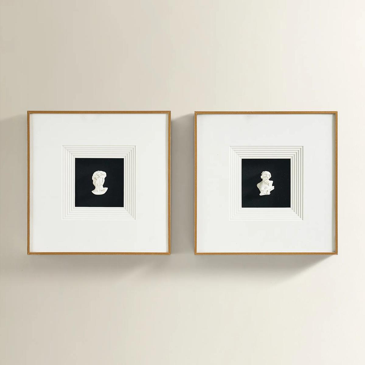
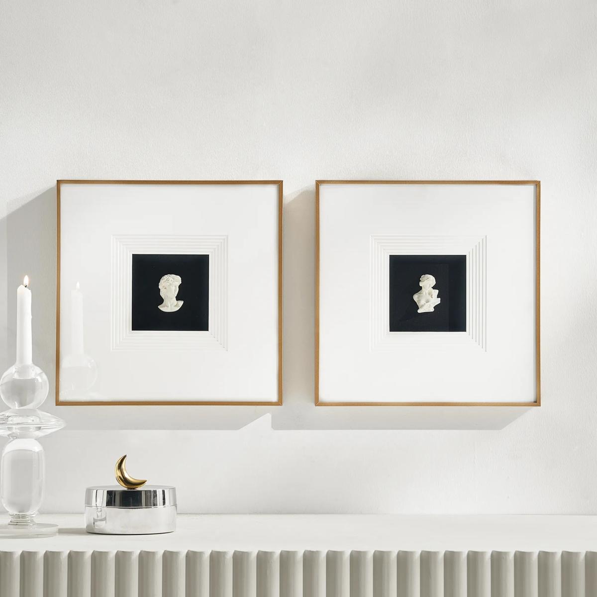 Classics Framed Plaster Wall Decor Set of 2$149
A set of two plaster portrait wall art pieces in black and ivory with sleek aluminum frames.
Add To Cart -
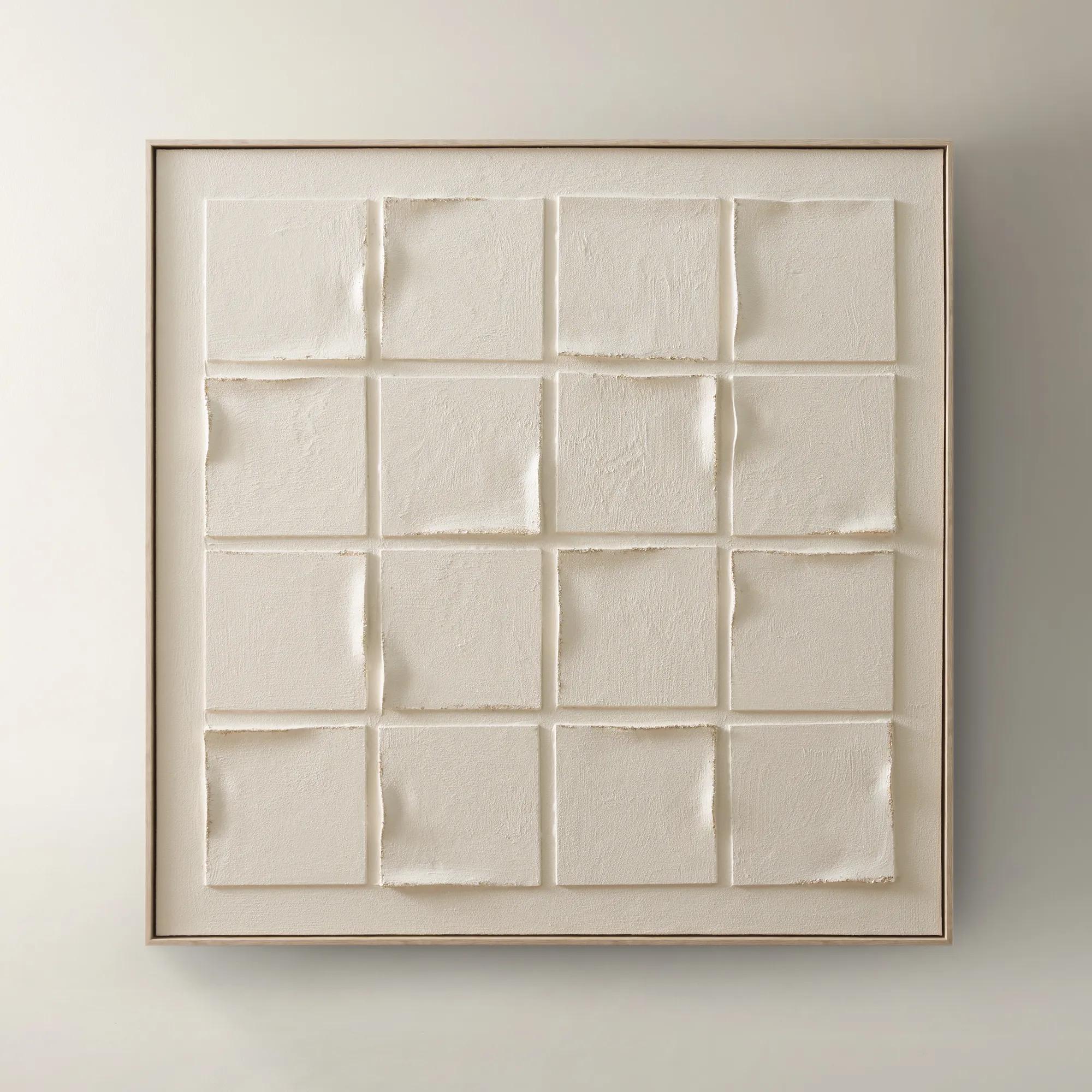 Gaze Framed Painted Wall Art 39.4" x 40"$329
A hand-painted canvas featuring subtle beige tones and textured depth in a warm whitewash floater frame.
Add To Cart -
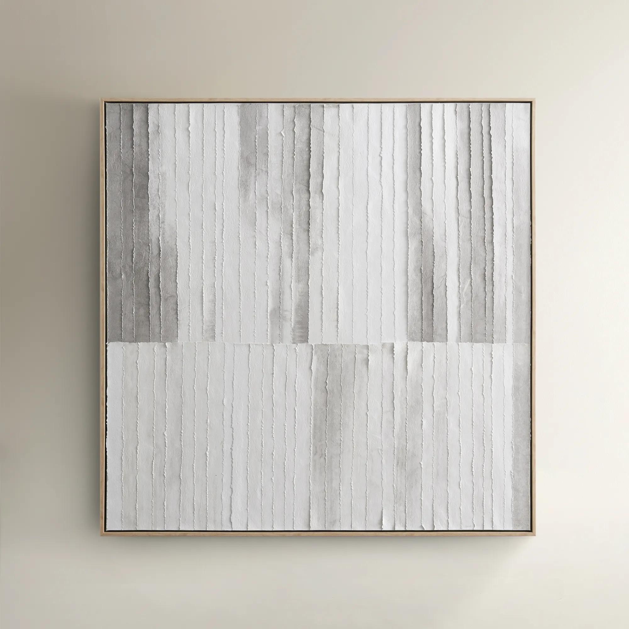
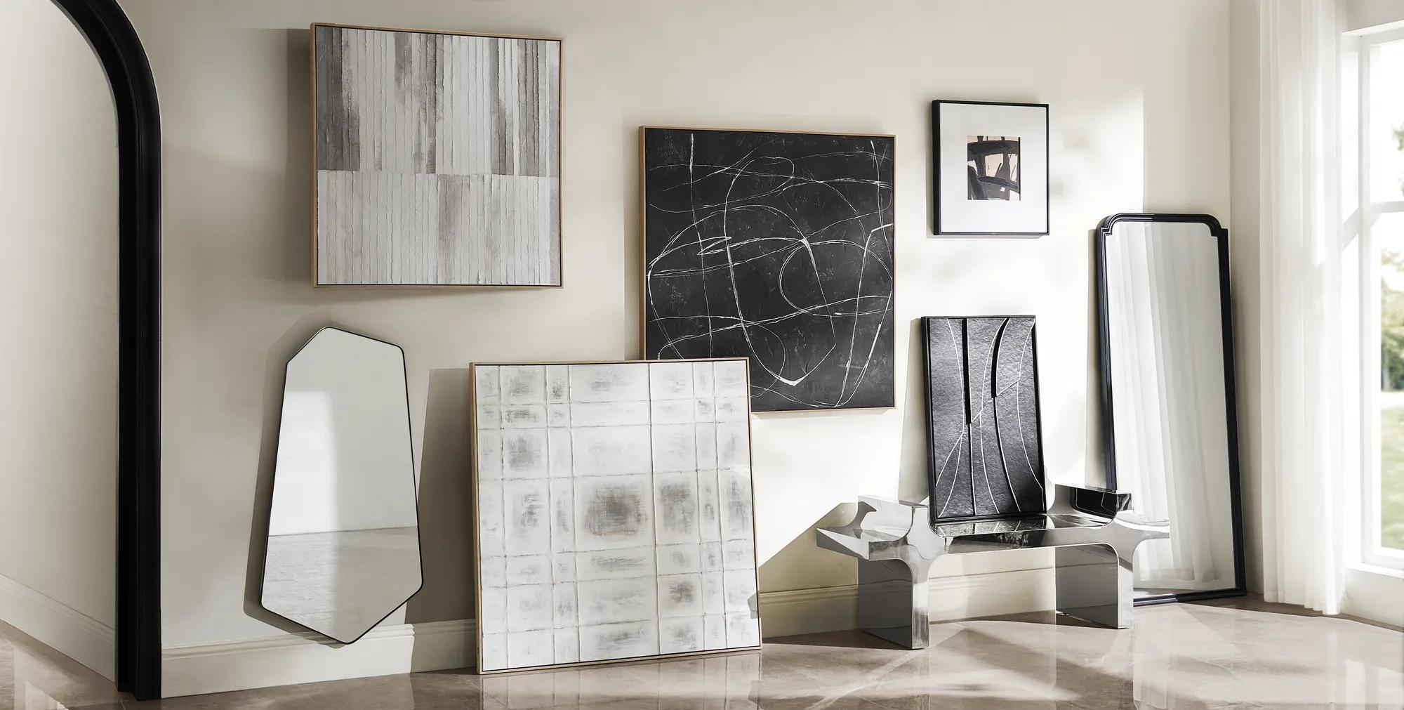 Morning Mist Paper Art$329
A hand-painted canvas featuring rhythmic grey lines in a textured, whitewashed floater frame for serene style.
Add To Cart -
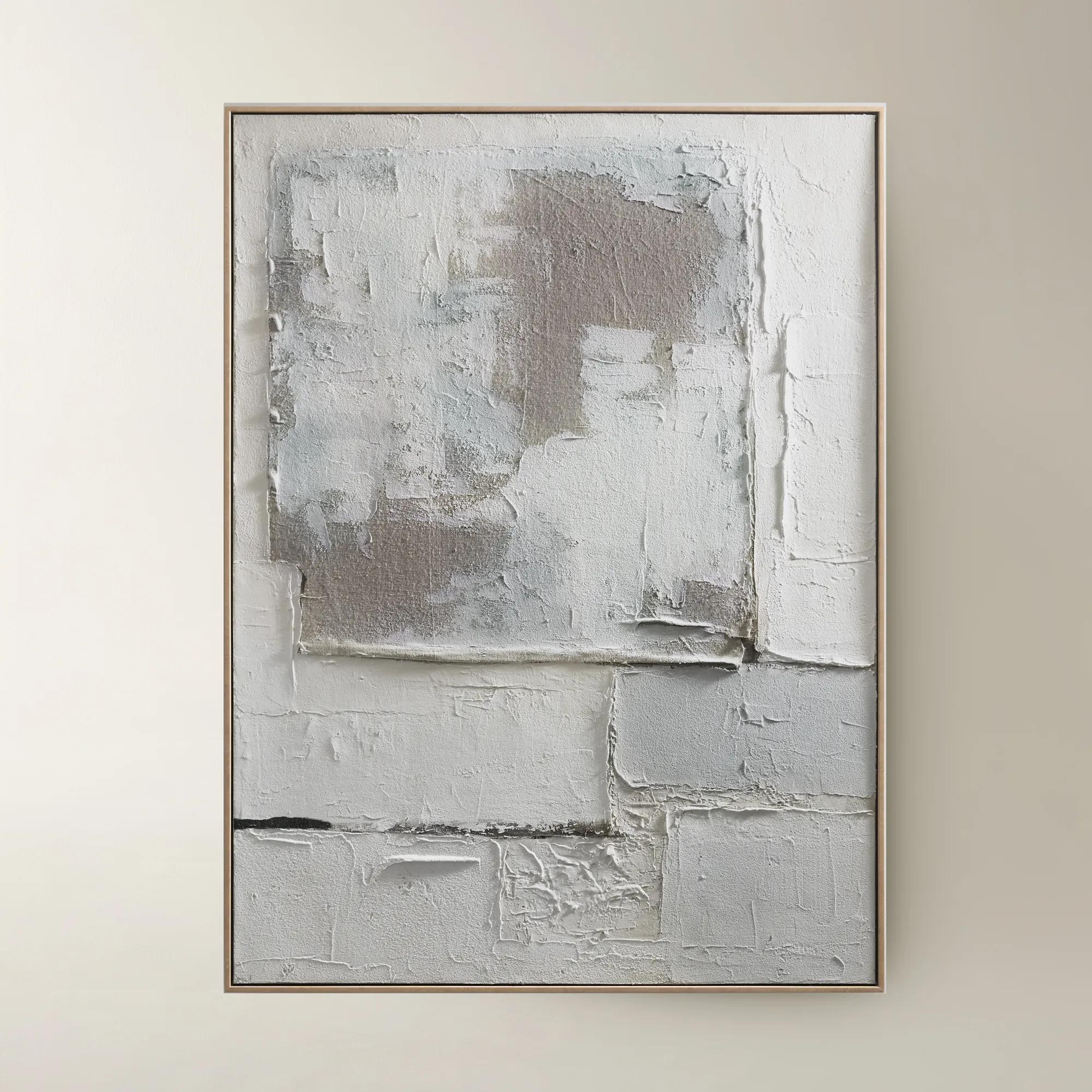
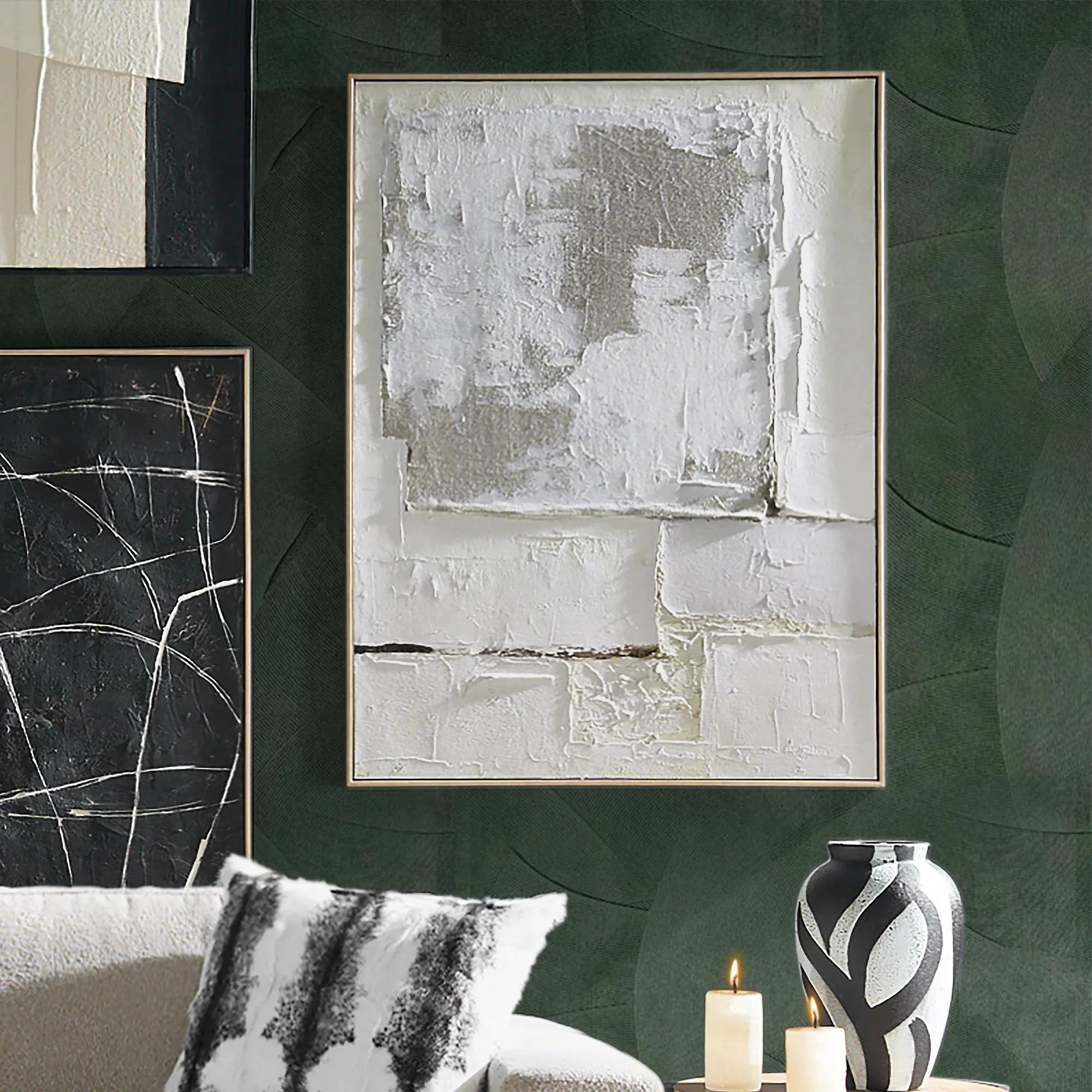 Marrow Painting$399
A hand-painted abstract canvas in subtle beige hues, elegantly framed in a warm beech wood floater.
Add To Cart -
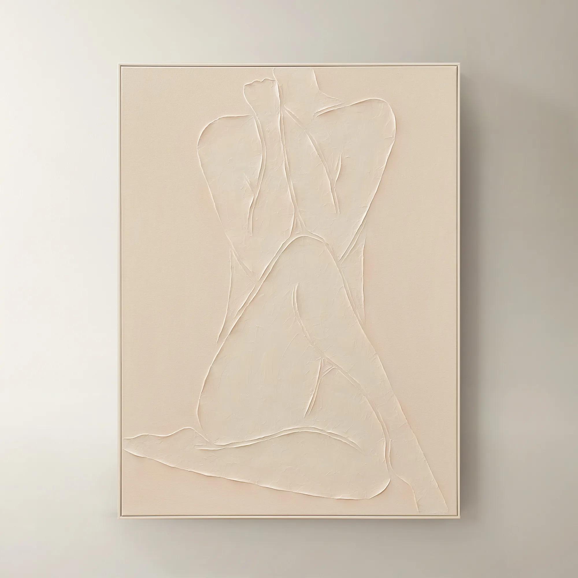
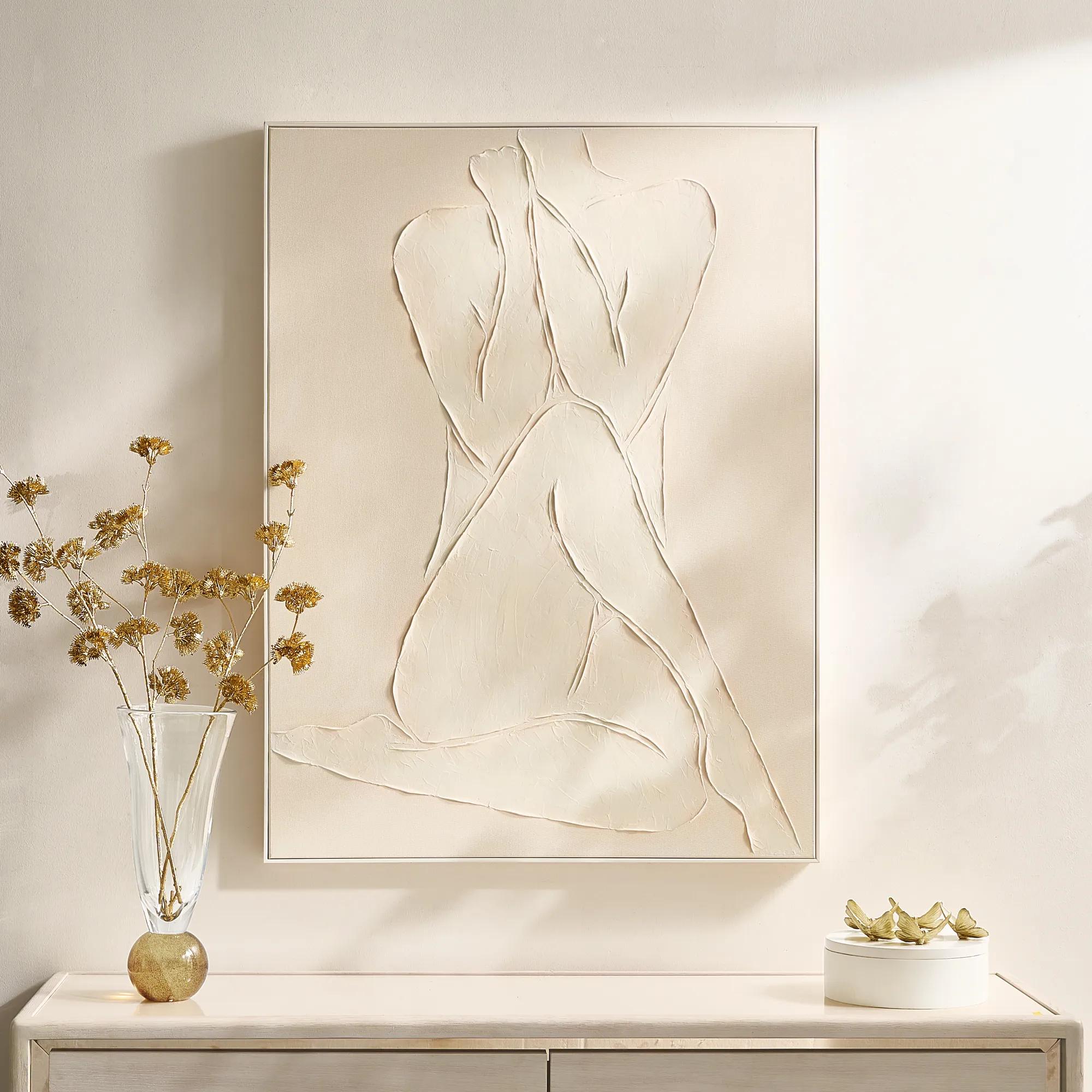 Modern Elegance Nude Ivory Framed Painted Wall Art 35.5" x 47.25"$599
A hand-painted ivory canvas in a white frame brings serene, modern artistry to any space.
Add To Cart -
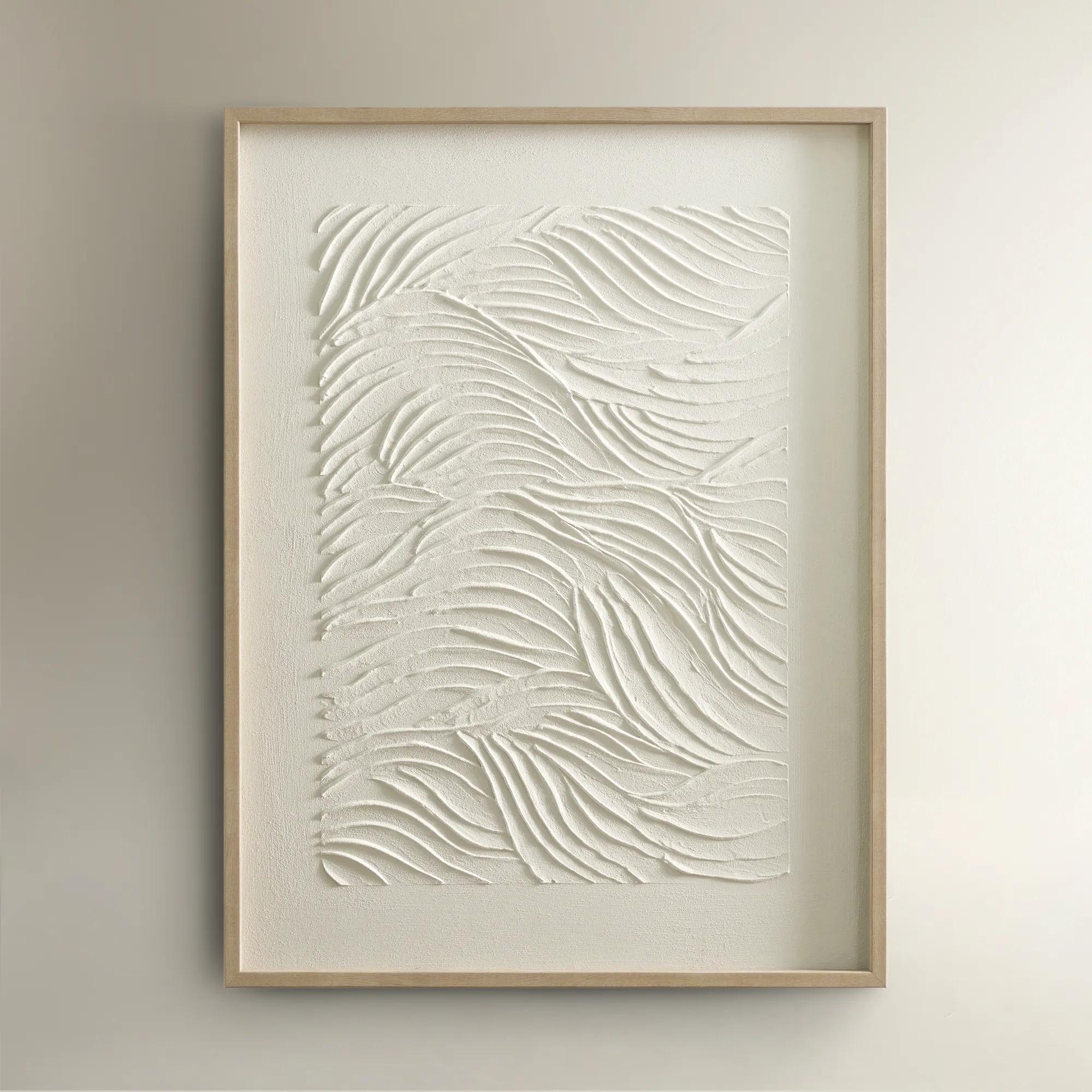
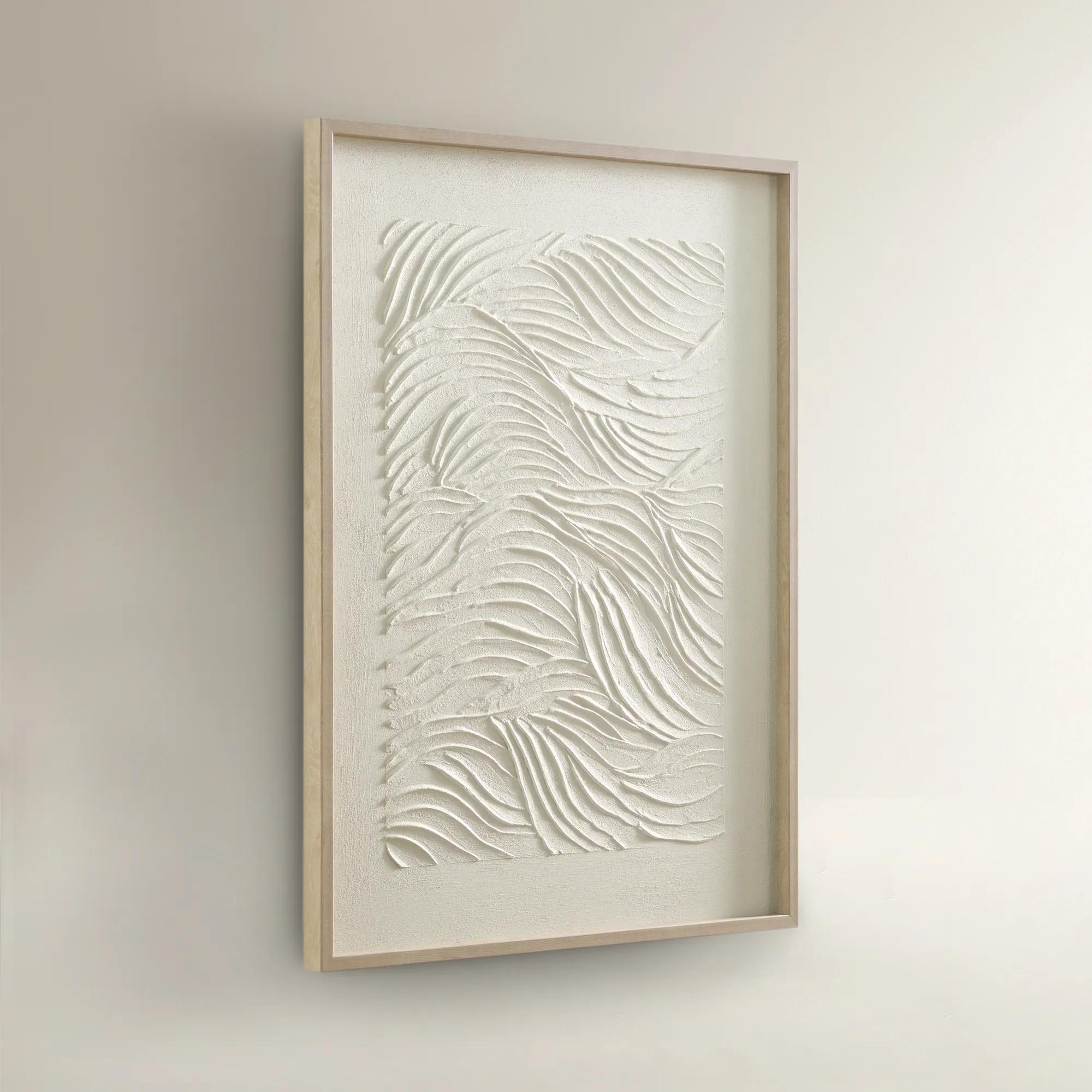 Sonnet Framed Painted Wall Art 23.5" x 31.5"$99
A hand-painted canvas featuring textured white shades and a warm blonde wood frame for elegant depth.
Add To Cart -
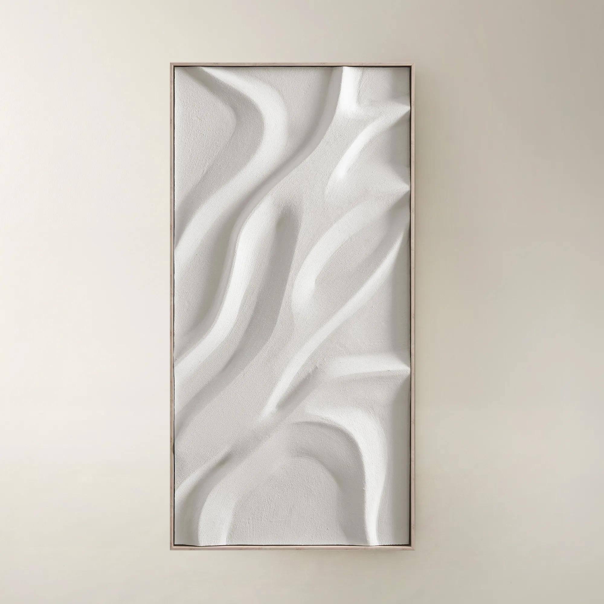
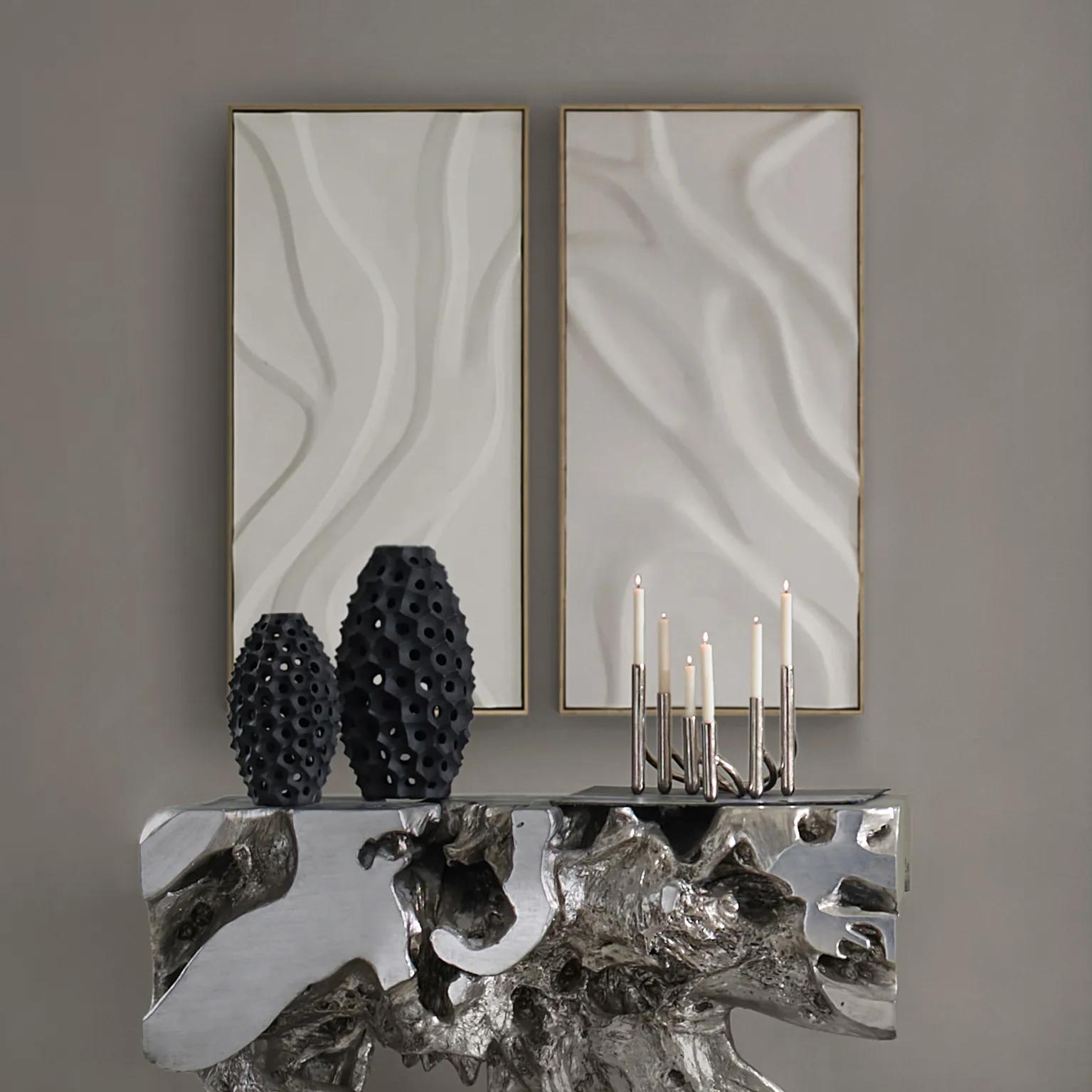 Au Lait Framed Painted Wall Art II 47.2" x 23.6"$199
A serene hand-painted canvas in beige, set in a warm whitewash floater frame for modern interiors.
Add To Cart -
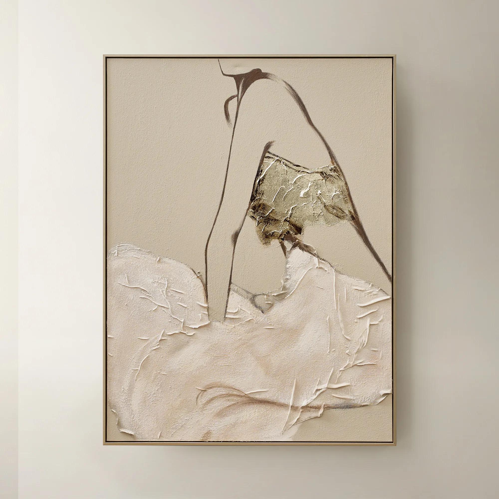 Quiet Pose Framed Painted Wall Art 36" x 48"$499
A hand-painted canvas in taupe and champagne tones features textural details and shimmering champagne leafing.
Add To Cart -
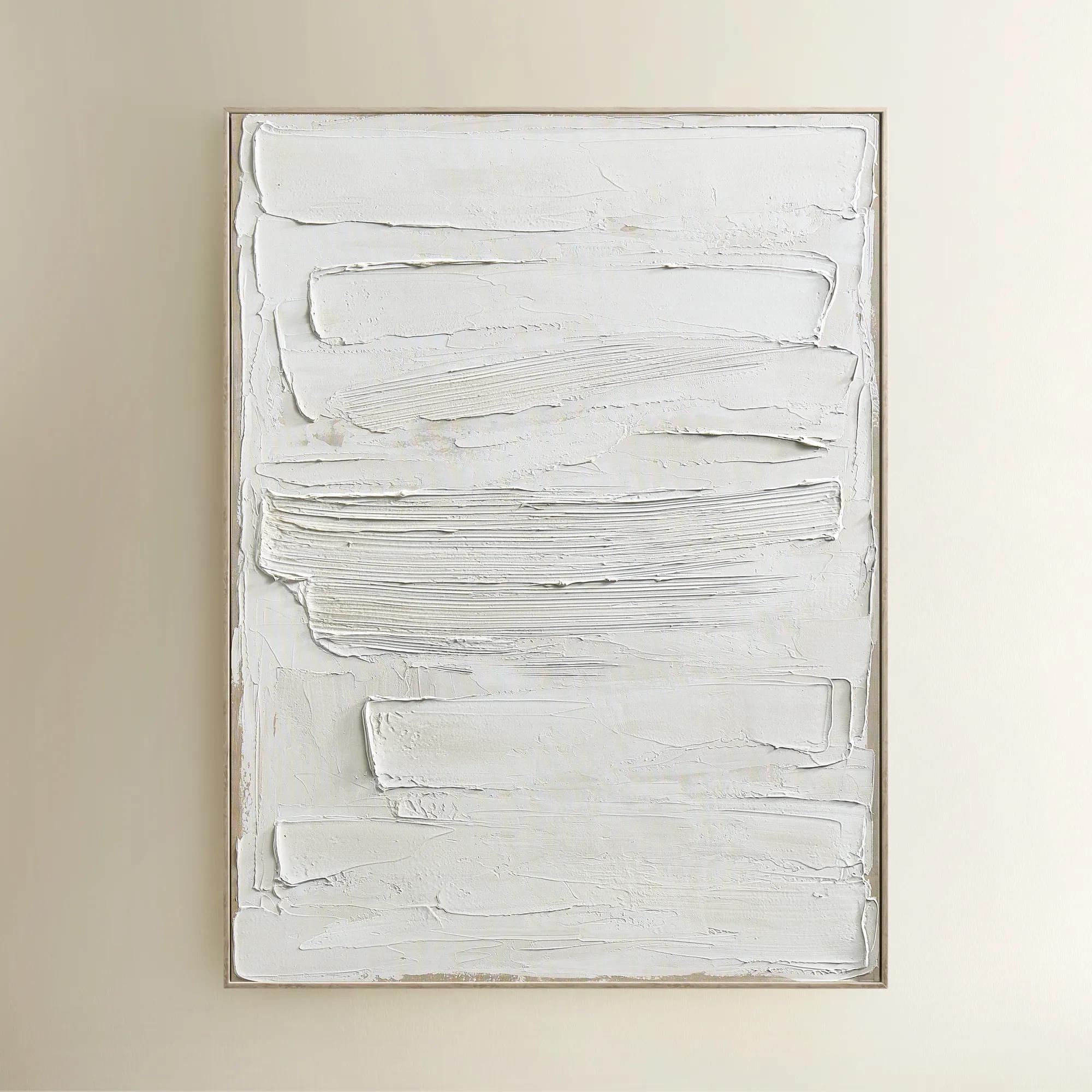
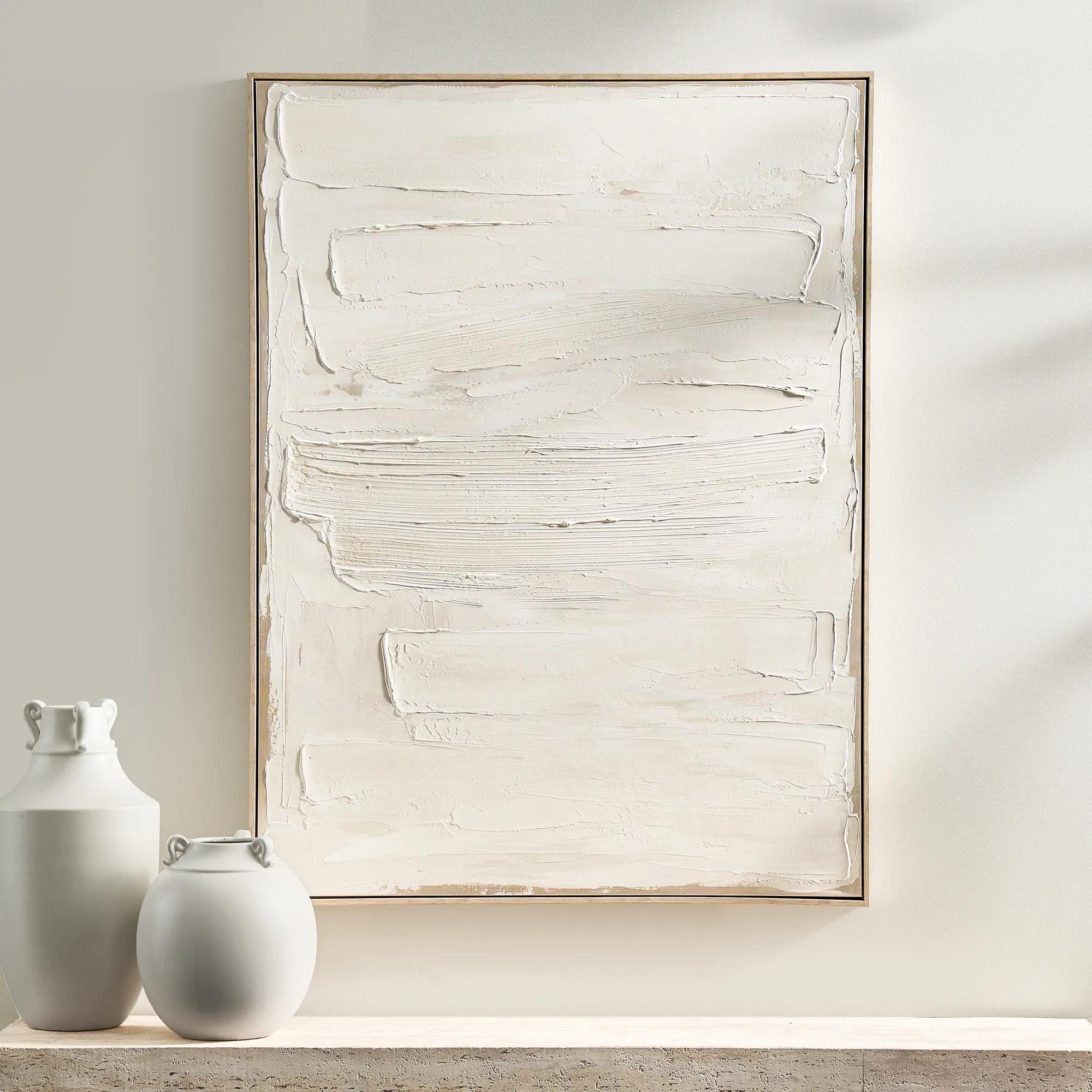 Monotype Canvas 1$399
A hand-painted abstract canvas featuring layered white tones and textured paint in a whitewashed wood frame.
Add To Cart -
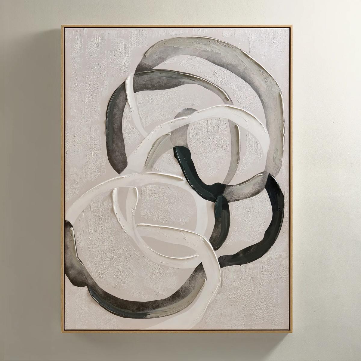
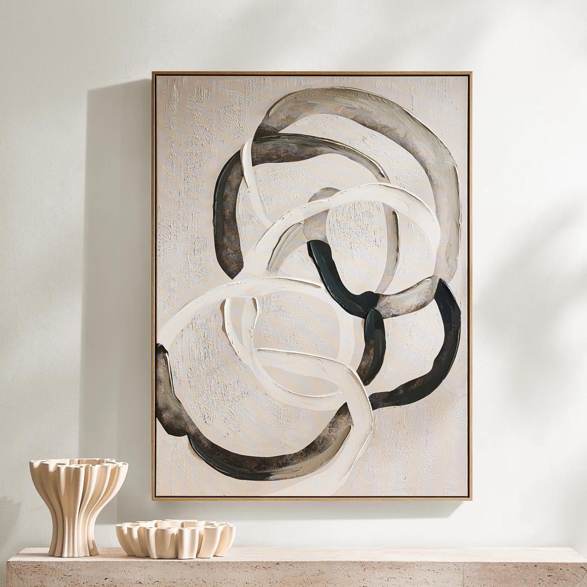 Round About Framed Painted Wall Art 35.25" x 47.25"$349
An abstract hand-painted canvas with tonal whites, charcoals, and taupes in a light wood floater frame.
Add To Cart -

 Hint of Spring Framed Painted Wall Art 48" x 48"$599
A framed, multicolored painted canvas artwork that brings a vibrant, artistic touch to contemporary interiors.
Add To Cart -
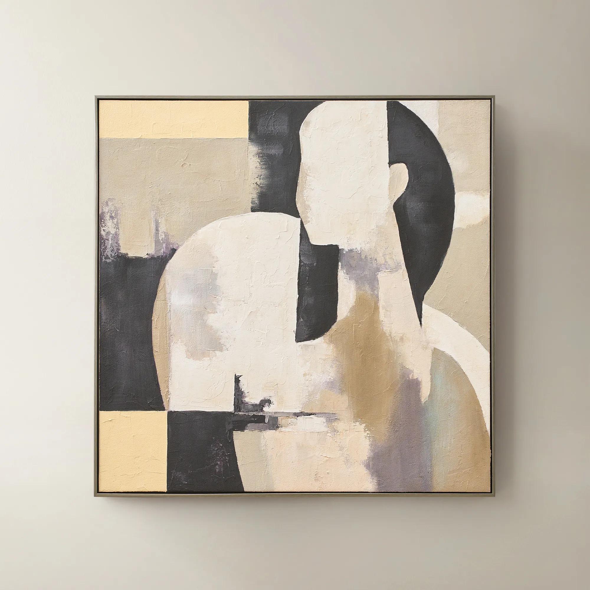 Afternoon Rest Framed Painted Wall Art 40" x 40"$399
A hand-painted abstract figure in buttercream, turtledove, and black hues framed in dark grey.
Add To Cart -
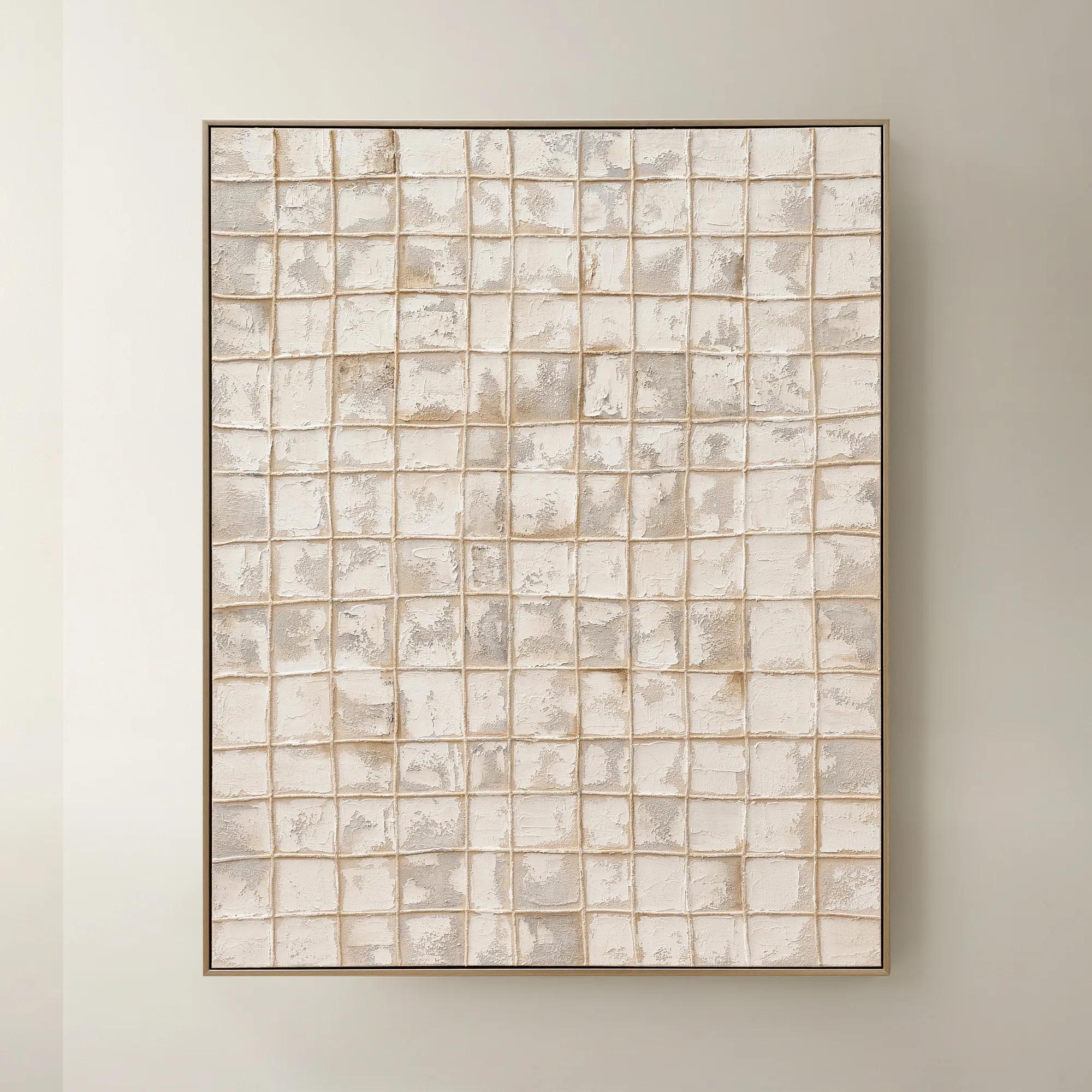
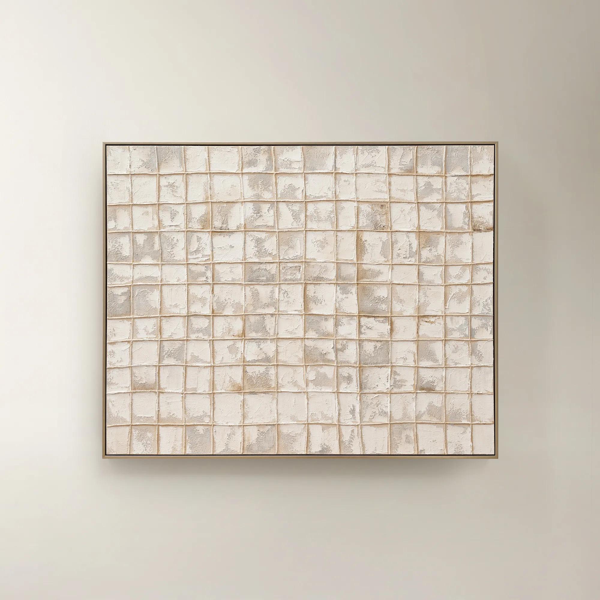 Painted Echos Framed Gold Leaf Wall Art 60" x 48"$699
A hand-painted abstract canvas with gold leaf accents and a champagne frame for modern, versatile display.
Add To Cart -
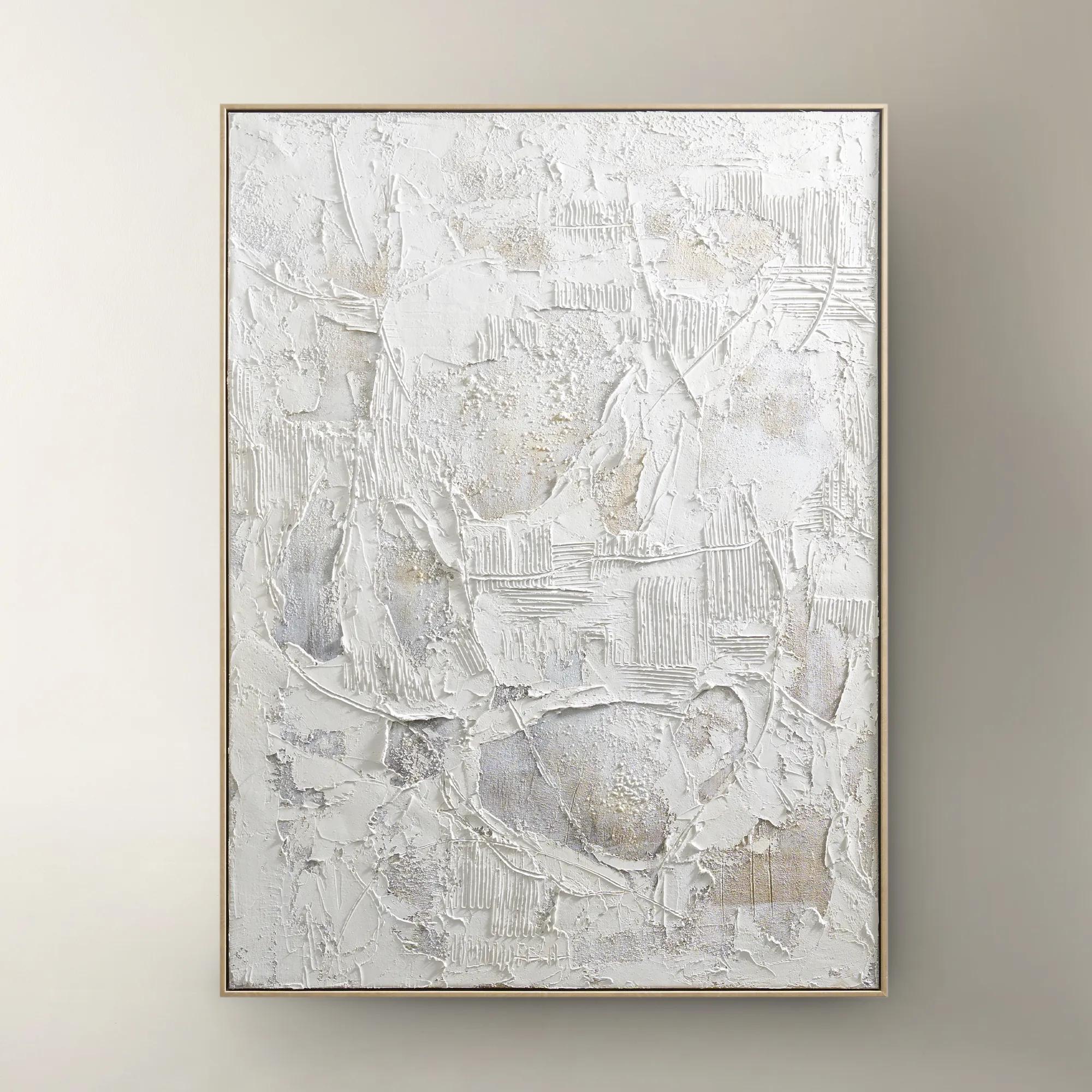 Stone Heritage Painting$399
A hand-painted canvas featuring textured white tones, elegantly framed in warm beech wood for refined appeal.
Add To Cart -
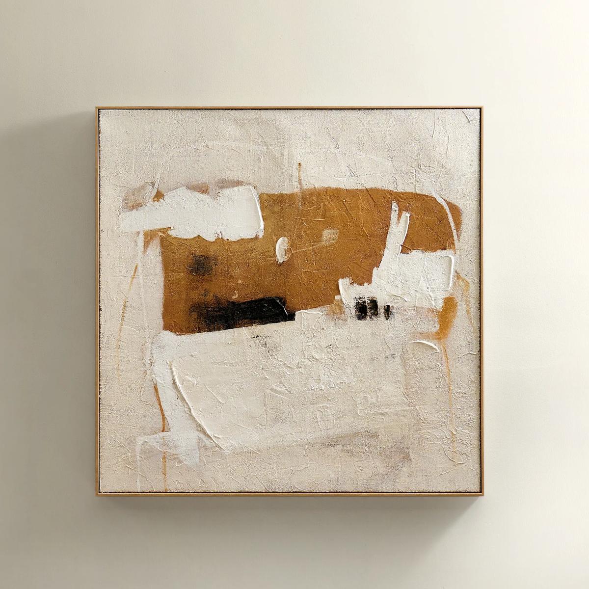 Instinct Framed Painted Wall Art 39.25" x 39.25"$349
An abstract hand-painted artwork featuring warm neutrals and black strokes on hessian with a light natural frame.
Add To Cart -

 Bronze Spheres Stainless Steel Wall Decor Set of 3$129
A set of three polished bronze stainless steel spheres adds modern, sculptural shine to any wall.
Add To Cart -
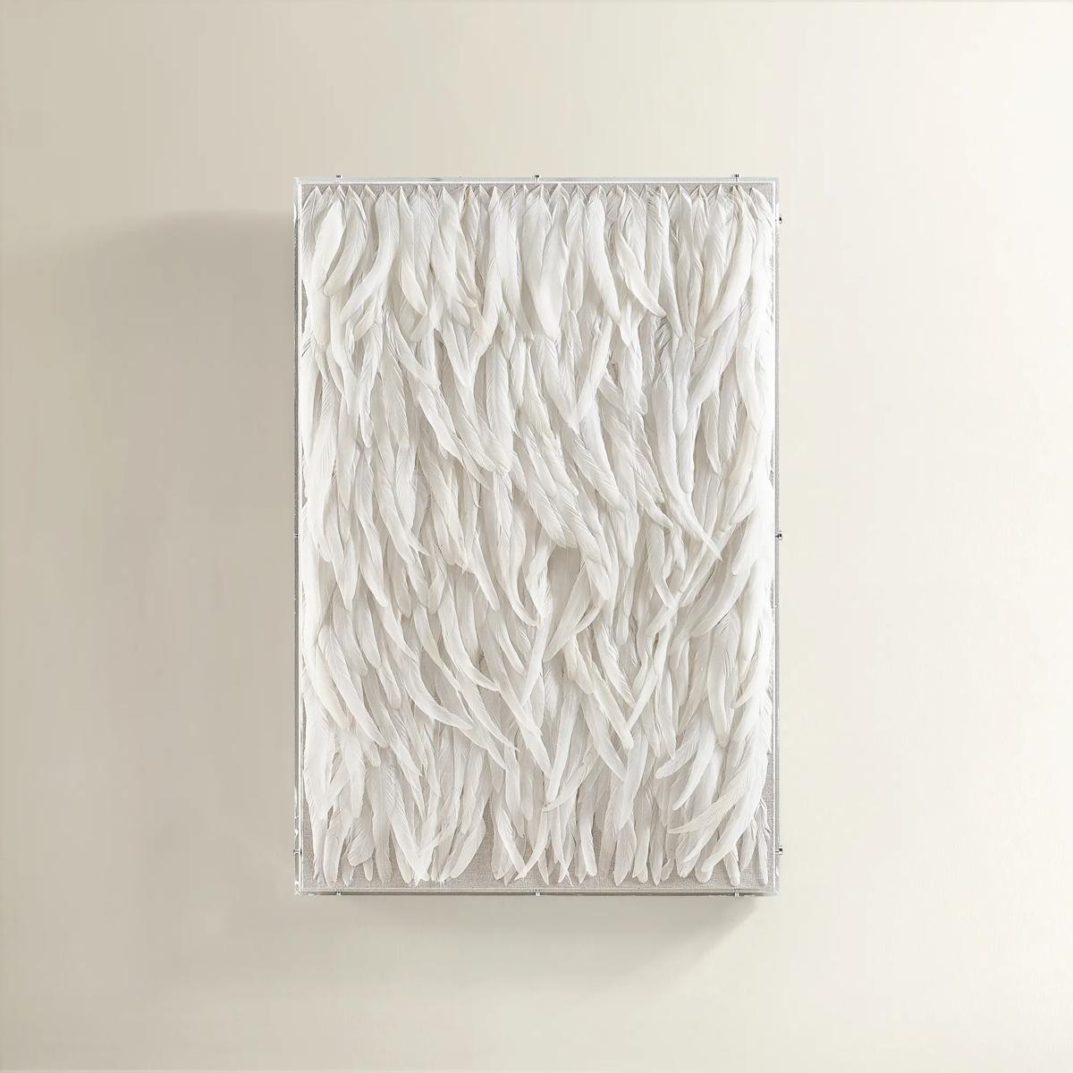 Swoon White Feather Wall Decor in Acrylic 23.5" x 35.5"$399
An ethereal wall art piece featuring layered white feathers encased in a crystal-clear acrylic shadow box.
Add To Cart -
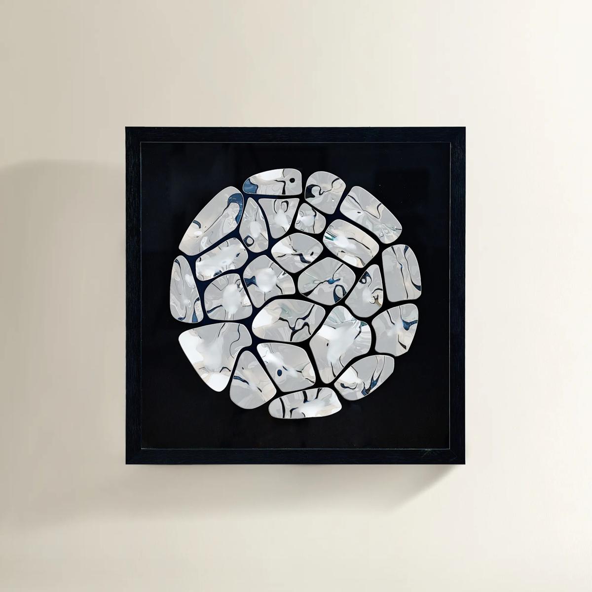
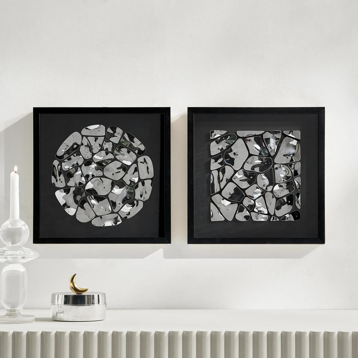 Reflect Silver And Black Shadowbox Art II$189
A dimensional metal wall art piece featuring polished silver and black forms in a sleek black frame.
Add To Cart -
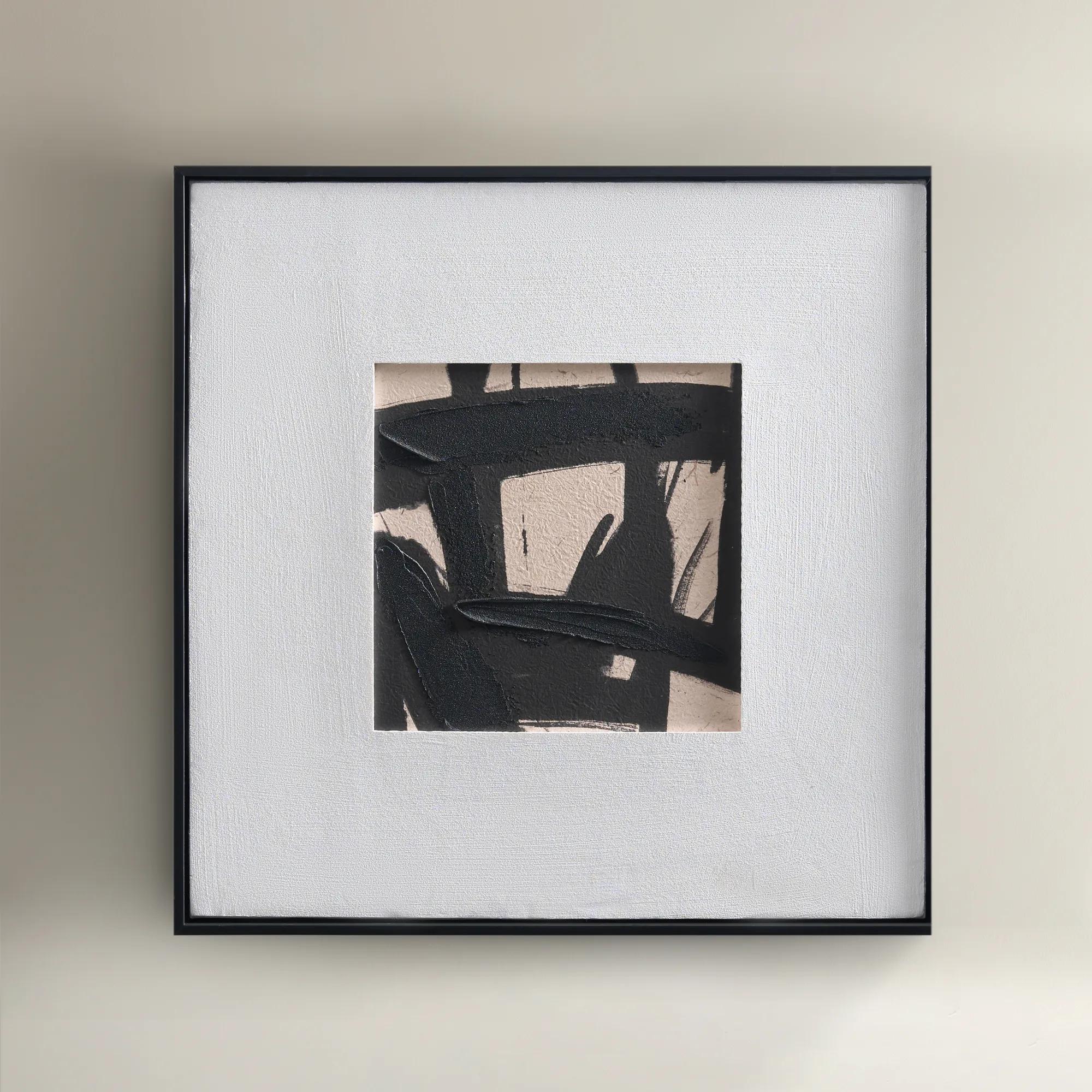
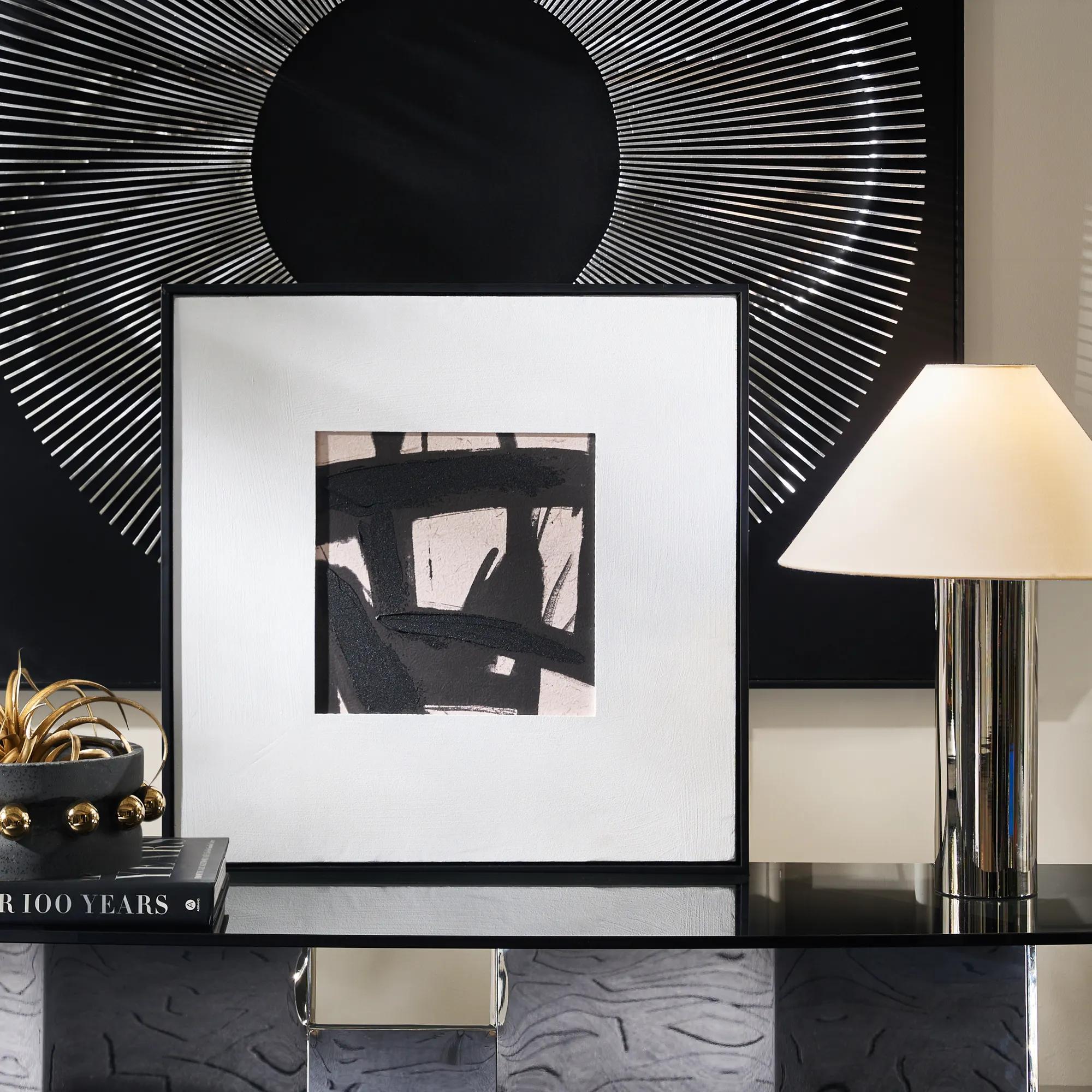 Ink Maze Painting$89
A hand-painted canvas featuring bold black and beige contrasts, set in a sleek black floater frame.
Add To Cart

Neutral Tone Wall Art Sets
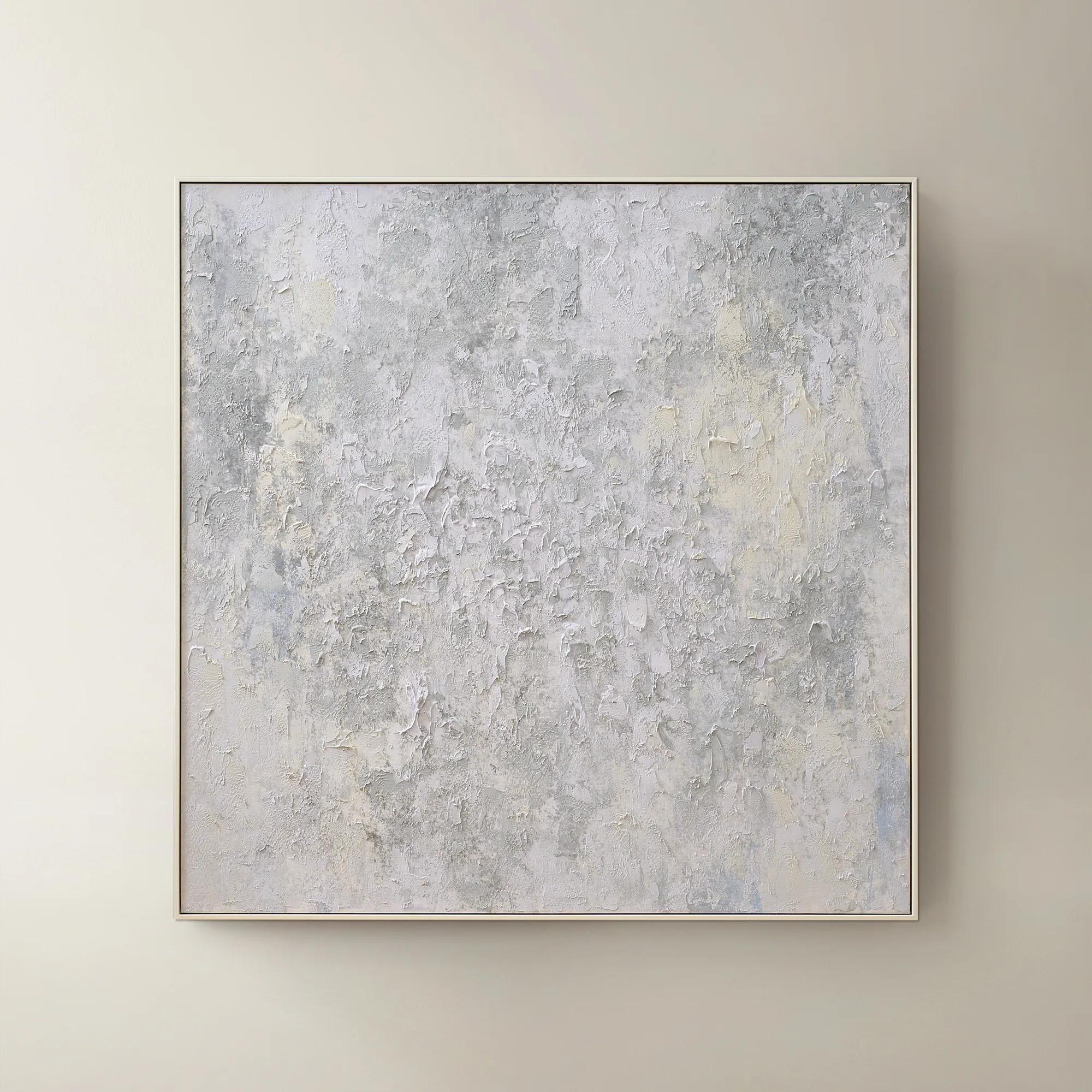
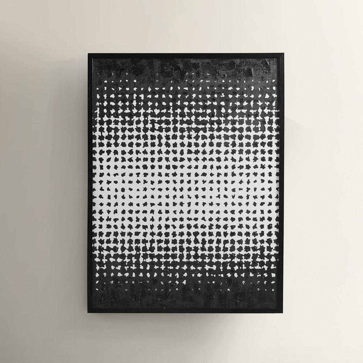
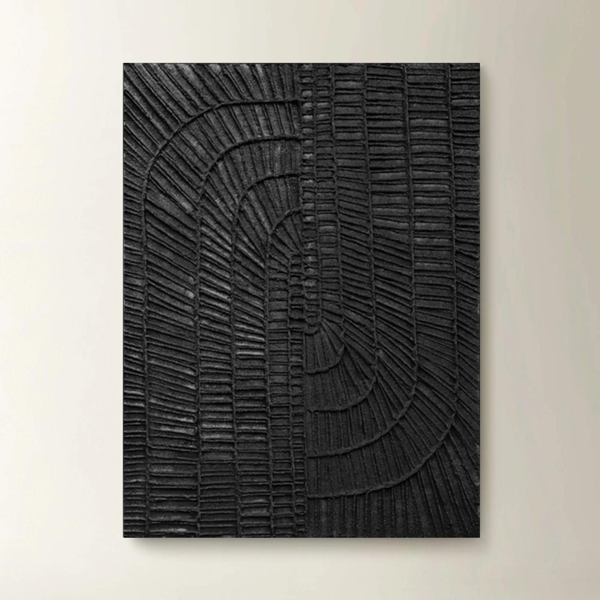
Elevate your sanctuary with neutral tone wall art sets that whisper sophistication and serenity in every brushstroke. Each curated composition transforms blank walls into a gallery of quiet luxury, inviting calm and balance while leaving room for your personal narrative to shine. Layered hues of ivory, taupe, and soft greige create a harmonious backdrop for bold living—an understated canvas that celebrates texture, artistry, and the timeless allure of subtlety. With neutral tone wall art sets, every room becomes a masterpiece in restraint and refinement, ready to anchor your most expressive moments.
Neutral tone wall art sets are coordinated groups of artwork that bring visual continuity to a room through shades such as beige, cream, ivory, taupe, greige, and soft charcoal. Often arranged as pairs, triptychs, or larger groupings, these sets create a composed focal point without relying on saturated color. Their appeal lies in the details: a sweeping brushstroke across an ivory field, smoky layers that suggest distant horizons, or sculptural shapes defined by the space between them. A restrained palette can still deliver extraordinary presence, especially when generous scale, tonal contrast, and expressive mark-making share the composition. Warm sand and caramel tones lend richness to rooms with natural wood and brass accents, while cooler gray and stone shades complement chrome, glass, and crisp upholstery. Creamy whites can soften a dramatic interior without diminishing its personality; charcoal passages add definition where an all-pale arrangement might otherwise disappear against the wall. For living rooms, bedrooms, dining spaces, and entryways, neutral wall art sets offer a way to introduce artistry while keeping furnishings and architectural details in conversation. Abstract compositions feel particularly expressive above a tailored sofa, while atmospheric landscapes can establish a more contemplative mood near a reading chair. Botanical silhouettes and organic forms bring another kind of movement, balancing strong furniture profiles with fluid lines. The result need not feel spare or understated. Against a richly upholstered headboard or a console styled with gleaming objects, neutral artwork can be the element that makes every surrounding finish appear more deliberate. Coordinated pieces also give a wall a sense of rhythm: one image may carry a darker gesture, another a lighter field, and the relationship between them creates the drama. For interiors that already feature patterned textiles or statement lighting, this tonal approach offers cohesion without competing for attention. For quieter rooms, it introduces depth, character, and a distinctly personal point of view.
The impact of a neutral art set depends as much on proportion and materials as on its palette. A broad wall above a sofa can accommodate a generous pair or three-panel composition, while a narrow entry wall may suit a vertically arranged set that draws the eye upward. The full arrangement matters more than the dimensions of any single piece: frame widths and the spaces between panels all contribute to its finished footprint. As a general visual reference, an arrangement spanning roughly two-thirds to three-quarters of the furniture beneath it often feels connected rather than adrift, though architectural features and the artwork’s composition may call for a different balance. Consistent spacing helps separate pieces read as one statement, while sufficient clearance above furniture keeps the setting from feeling crowded. Materials contribute their own expression. Printed canvas can introduce a visible weave and a softer, less reflective surface; artwork on paper may emphasize delicate lines, tonal washes, or finely rendered detail, particularly when framed with a mat. A linen-look image and an actual textured surface are not interchangeable, so material descriptions and close-up views are useful when the desired effect depends on dimension. Raised embellishments, where present, can cast subtle shadows that change with the direction of light. Framing adds another layer: slender black profiles sharpen pale compositions, wood tones reinforce an organic mood, and metallic finishes introduce a luminous accent. Protective glazing can help shield paper artwork from dust and incidental contact, although its glare and weight vary by material. In a dining room with a chandelier or a living room opposite large windows, reflections may influence where glazed pieces look best. Wall color matters, too. Beige art against a beige wall can feel richly layered when the undertones align, while an ivory mat or contrasting frame can give the composition a clearer boundary. These relationships allow neutral wall decor to feel integrated without fading into the background.
Designed primarily for decorative display indoors, neutral tone wall art sets suit spaces where visual atmosphere matters as much as function. A home office can benefit from coordinated imagery that lends polish behind a desk without creating a busy backdrop. In a bedroom, softly graduated tones can complement sumptuous bedding, while a more graphic arrangement brings definition to a hallway or an open-plan seating area. Their longevity depends on both construction and placement. Frame joinery, secure backing, appropriate hanging hardware, and the stability of any applied surface are worth considering alongside the image itself. Hardware should suit the combined weight of each framed piece and the wall material; a large composition deserves secure support, not simply an attractive position. Prolonged direct sunlight can alter colors or affect certain materials, and persistent humidity may be unsuitable for paper, canvas, or some frame finishes unless the artwork is specifically intended for those conditions. Routine care is generally gentle: a soft, dry cloth can remove dust from frames, while artwork surfaces and glazing should be maintained according to their individual care instructions. Spraying cleaner directly onto a framed piece risks moisture reaching its edges, and textured or embellished areas may need especially light handling. With thoughtful placement, a coordinated set can remain part of a room as upholstery, accessories, and accent colors evolve. That flexibility also makes neutral artwork a considered housewarming or wedding gift when the recipient’s taste, available wall space, and preferred scale are known. Related neutral tone circular wall arts offer another expression of the palette, introducing rounded silhouettes that can soften angular furnishings or complement a curved console. Whether the composition feels atmospheric, architectural, or boldly abstract, its distinction comes from the interplay of tone, form, and finish. Neutrality becomes an expressive choice: nuanced enough to live with every day, yet commanding enough to give the room its defining moment.
FAQs
Neutral tone wall art sets bring a sense of calm and understated elegance to any room. Their soothing palettes create a harmonious backdrop, allowing other design elements to shine while adding depth and texture. The subtle interplay of tones and materials can make a space feel more inviting, balanced, and thoughtfully curated.
Absolutely. Neutral art sets are incredibly versatile, seamlessly integrating into both modern and traditional spaces. Their timeless hues and refined textures can soften contemporary lines or add a fresh, sophisticated touch to classic decor, making them a favorite among designers for a wide range of aesthetics.
For a striking effect, consider arranging your neutral wall art in a gallery-style display above a sofa, bed, or dining table, allowing each piece to complement the others. Play with spacing and alignment, mixing horizontal and vertical orientations, or combine with sculptural accents to create a dynamic, layered look that feels curated but effortless.
Yes, neutral tone wall art makes an exceptional gift for housewarmings, weddings, or milestone celebrations. Its universal appeal ensures it will complement any recipient's decor, while the sophisticated artistry and serene palette convey a sense of lasting elegance and personal thoughtfulness.
To keep your neutral wall art looking pristine, dust gently with a soft, dry cloth and avoid direct sunlight to preserve the integrity of the colors and materials. For canvas or textured pieces, a light feather duster works beautifully to maintain their tactile allure without compromising the finish.