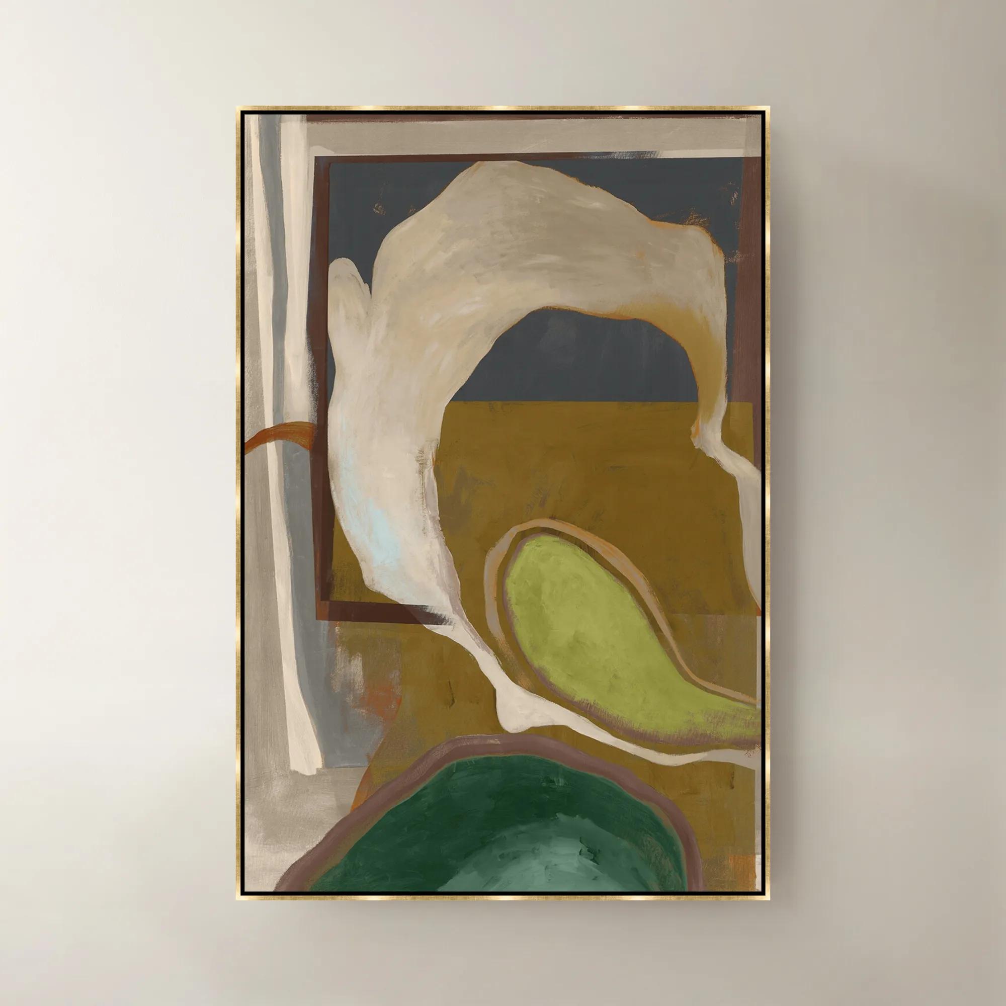
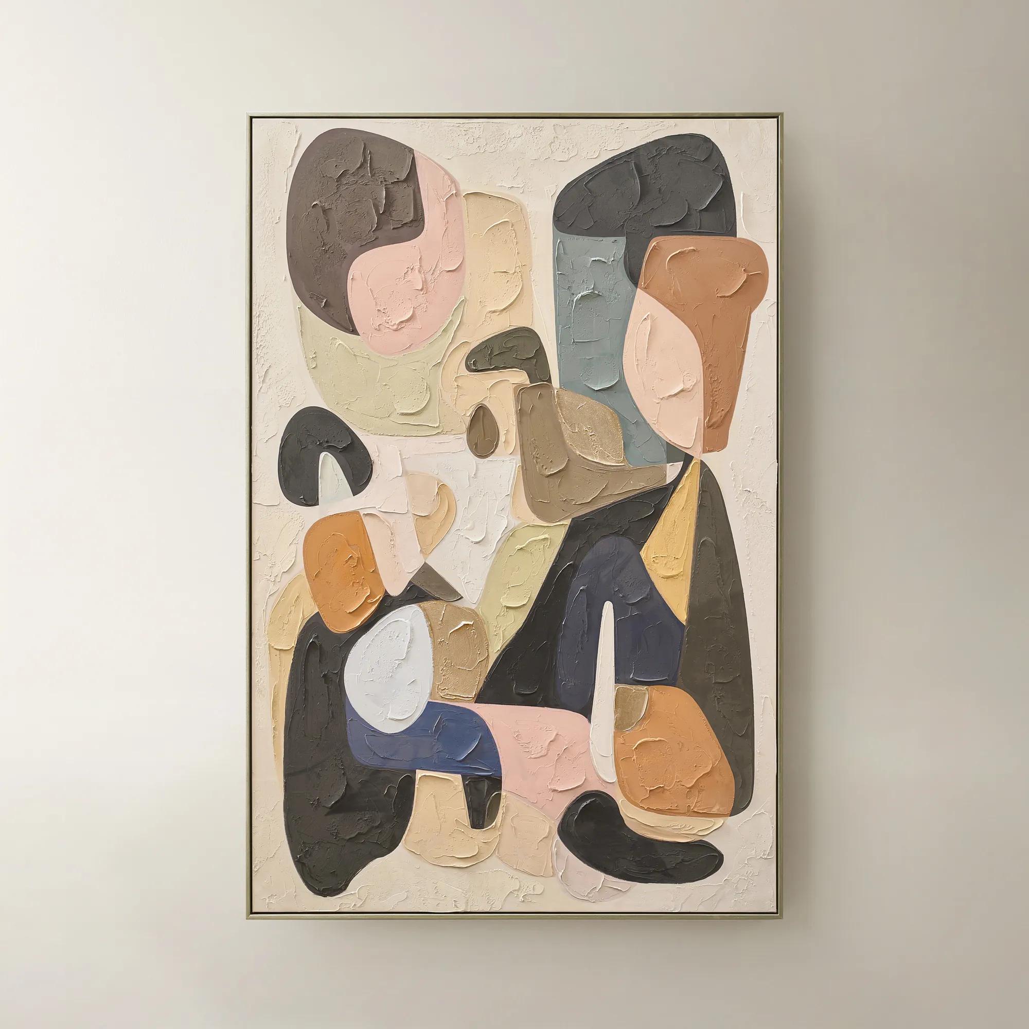
Neutral Tone Abstract Art Sets
Neutral Tone Abstract Art Sets
-
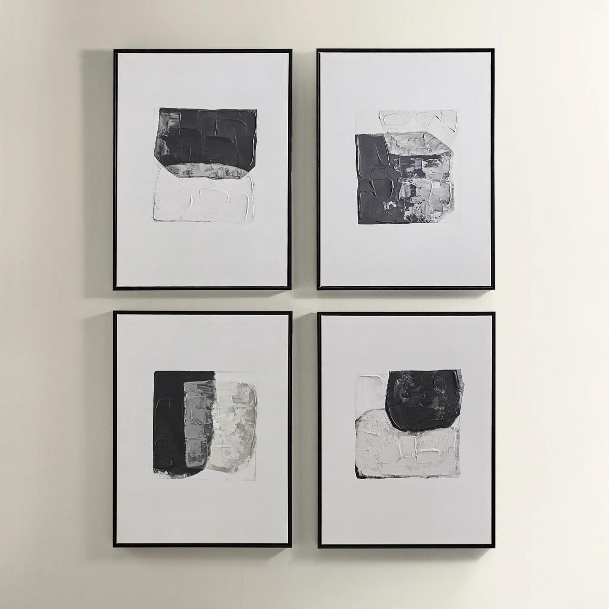
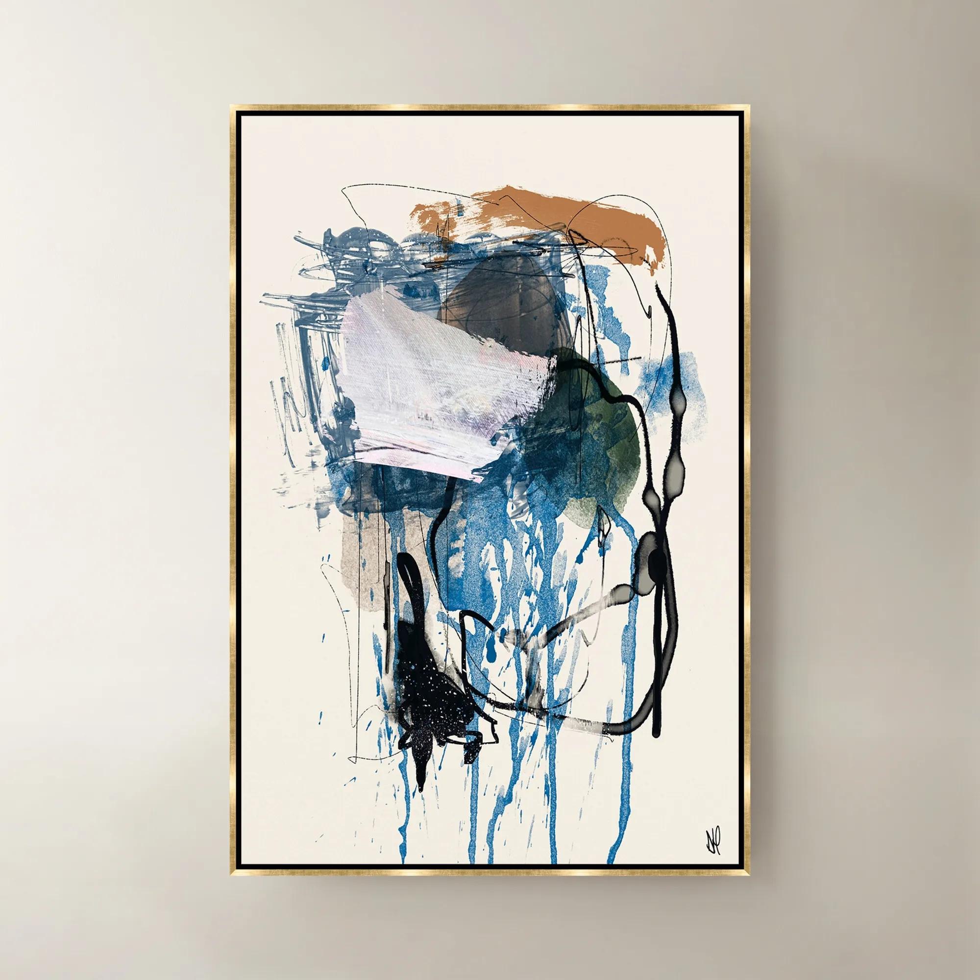
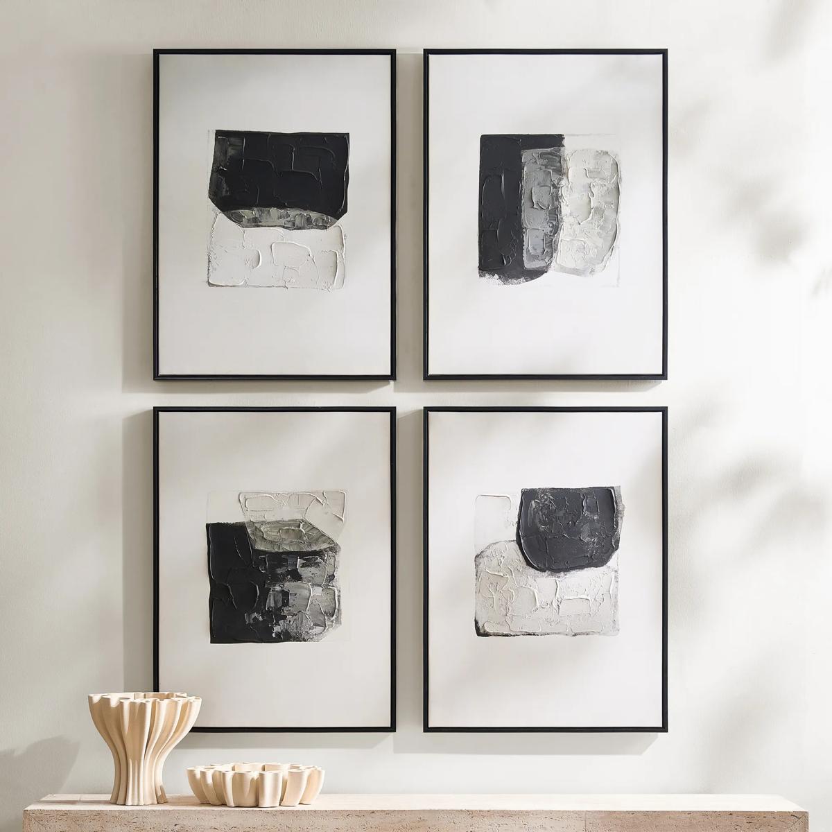 Shadows Framed Painted Wall Art Set of 4$299
A set of four hand-painted abstract canvases featuring black, white, and gold accents in black frames.
Add To Cart -
 Relic Framed Painted Triptych Wall Art Set of 3$399
A hand-painted abstract triptych in deep navy and neutral tones, set in sleek black floater frames.
Add To Cart -
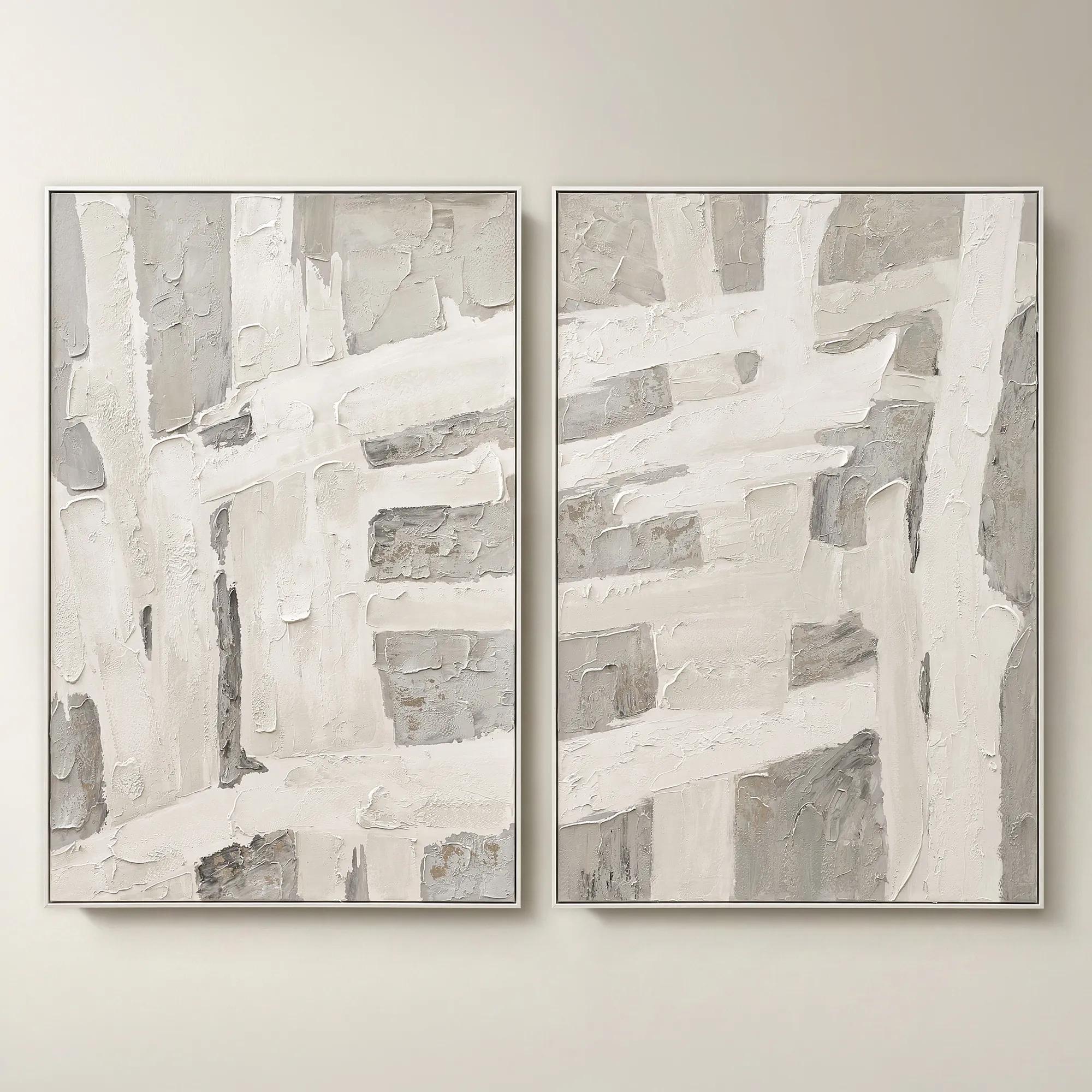 Traverse Framed Painted Wall Art 40" x 60" Set of 2$799
A hand-painted abstract diptych features champagne accents and soft grey, pearl, and alabaster tones in white frames.
Add To Cart -
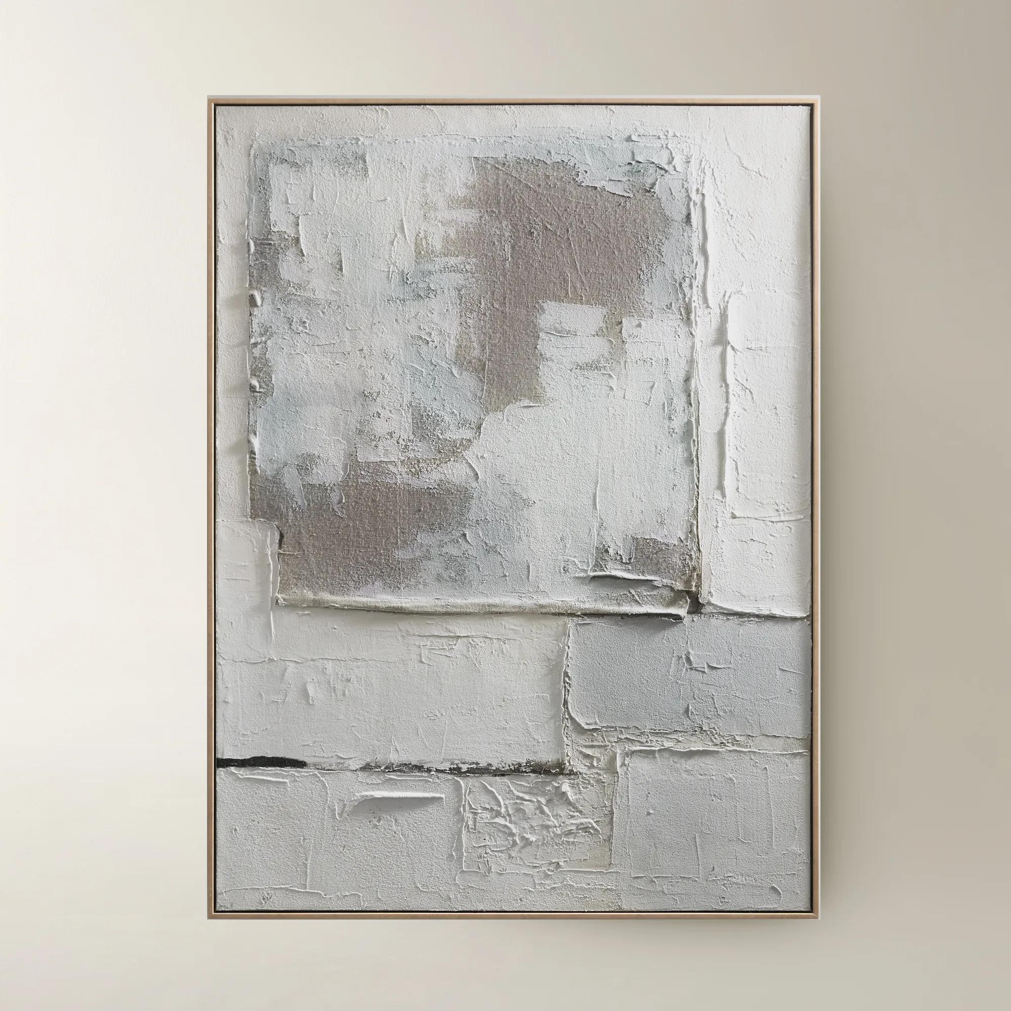
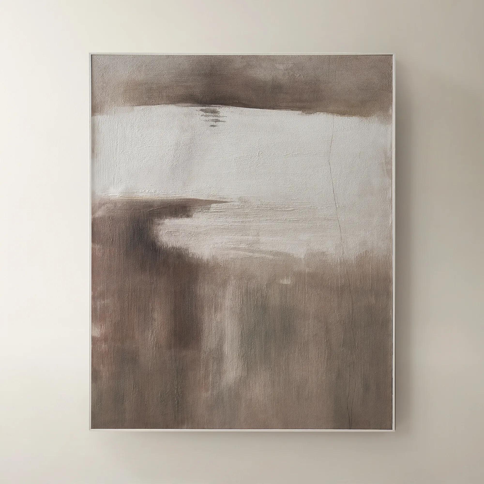
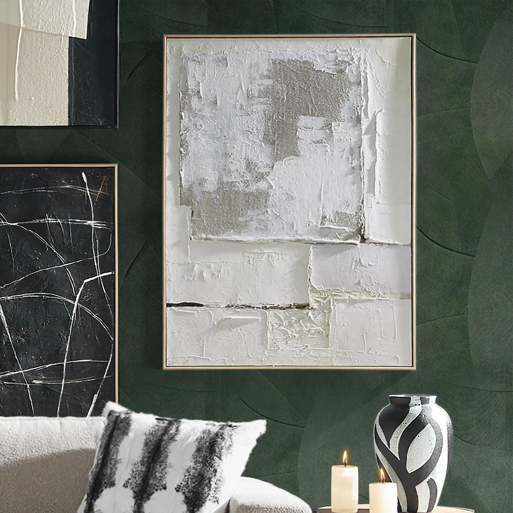 Marrow Painting$399
A hand-painted abstract canvas in subtle beige hues, elegantly framed in a warm beech wood floater.
Add To Cart -
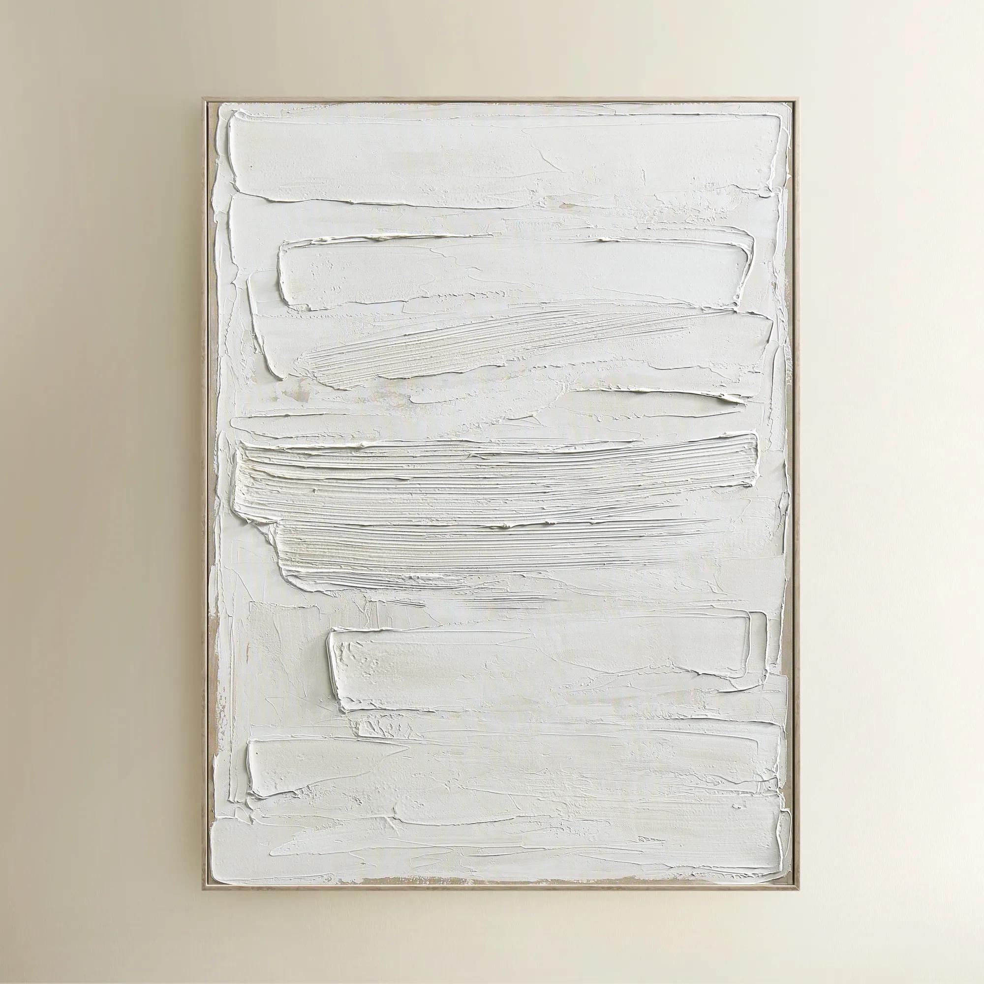
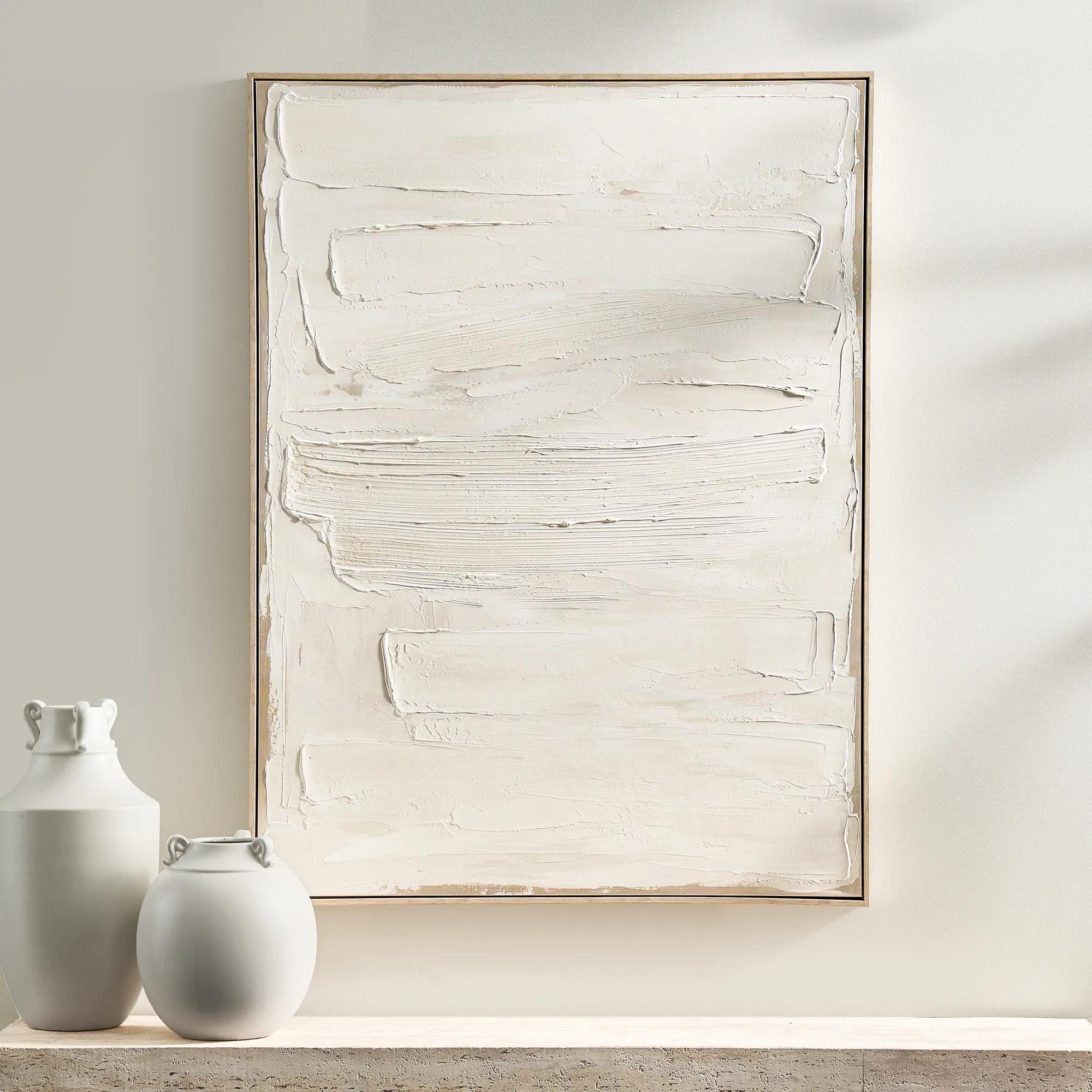 Monotype Canvas 1$399
A hand-painted abstract canvas featuring layered white tones and textured paint in a whitewashed wood frame.
Add To Cart -

 Shift Framed Painted Wall Art 39.4" x 59"$499
A hand-painted canvas featuring bold black and beige contrasts with textured layers in a sleek black frame.
Add To Cart -
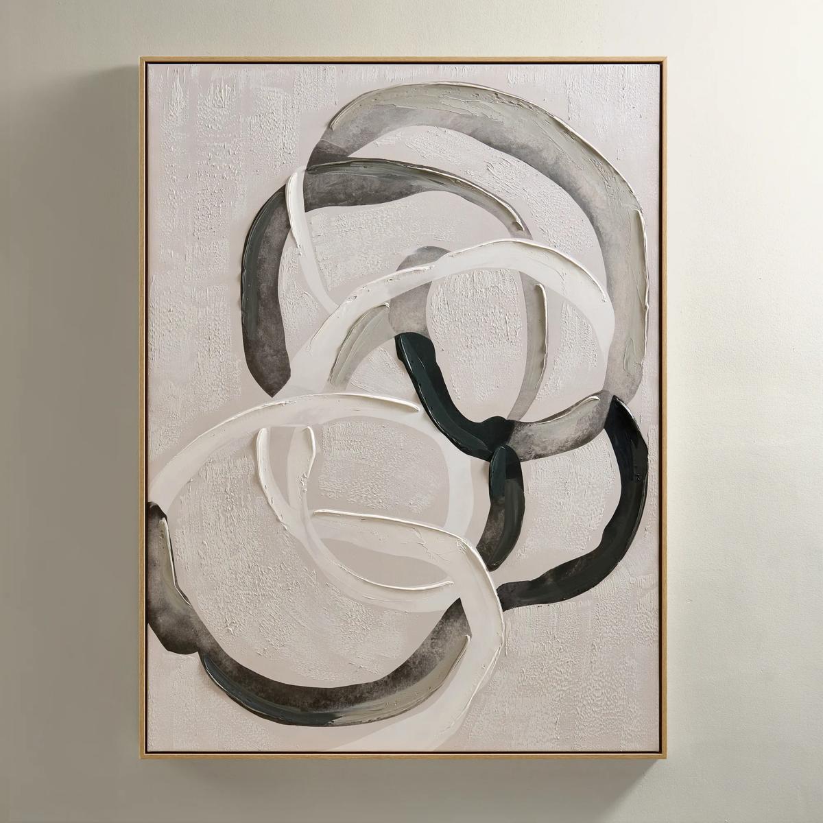
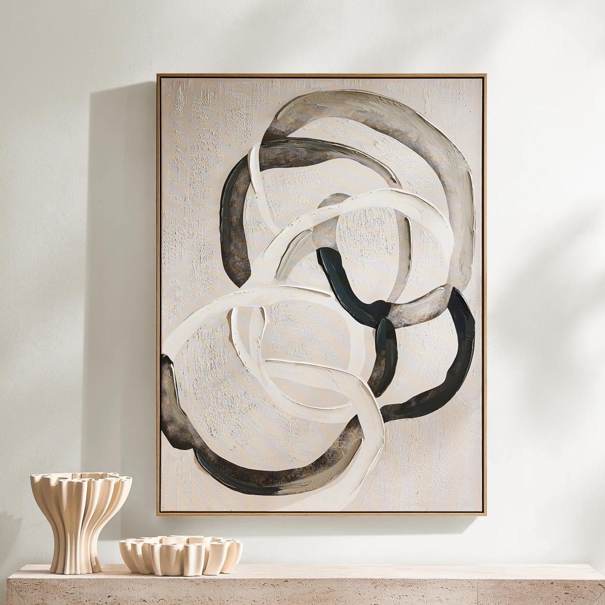 Round About Framed Painted Wall Art 35.25" x 47.25"$349
An abstract hand-painted canvas with tonal whites, charcoals, and taupes in a light wood floater frame.
Add To Cart -
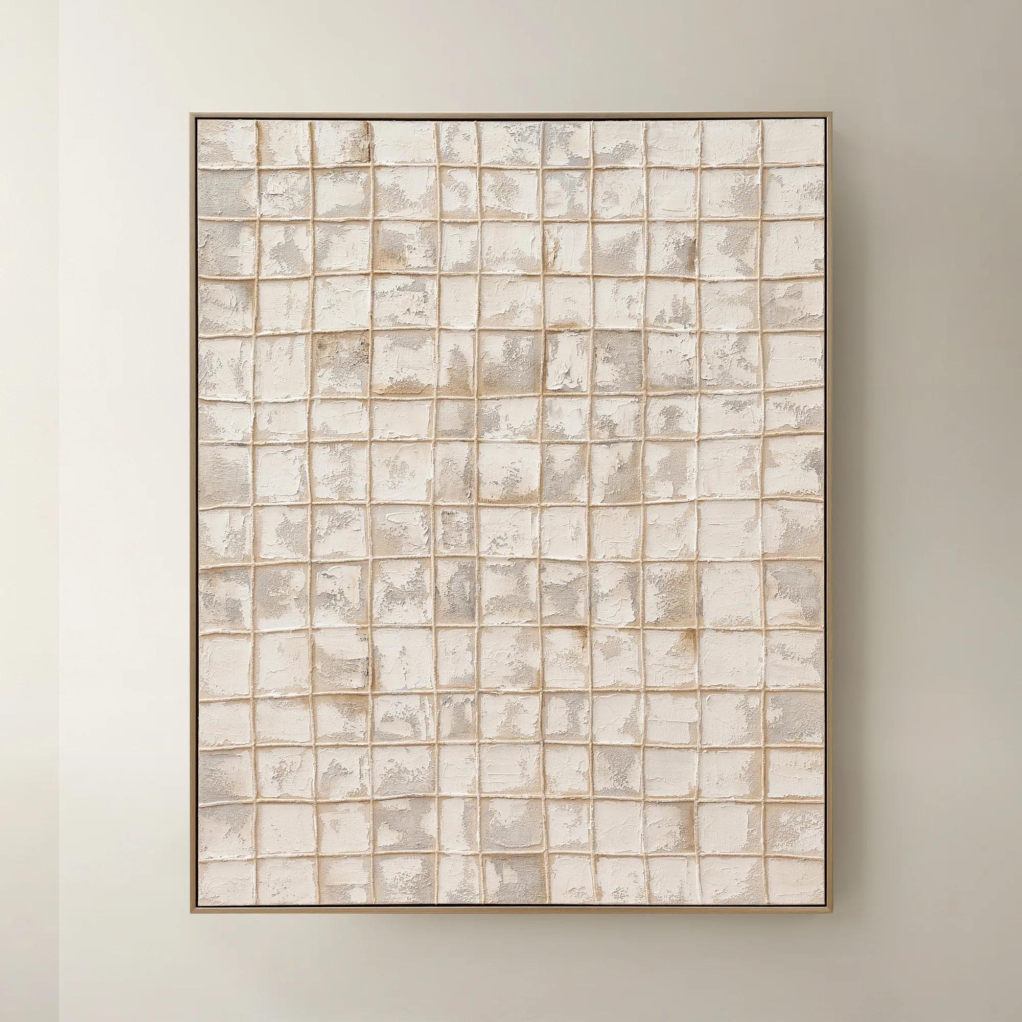
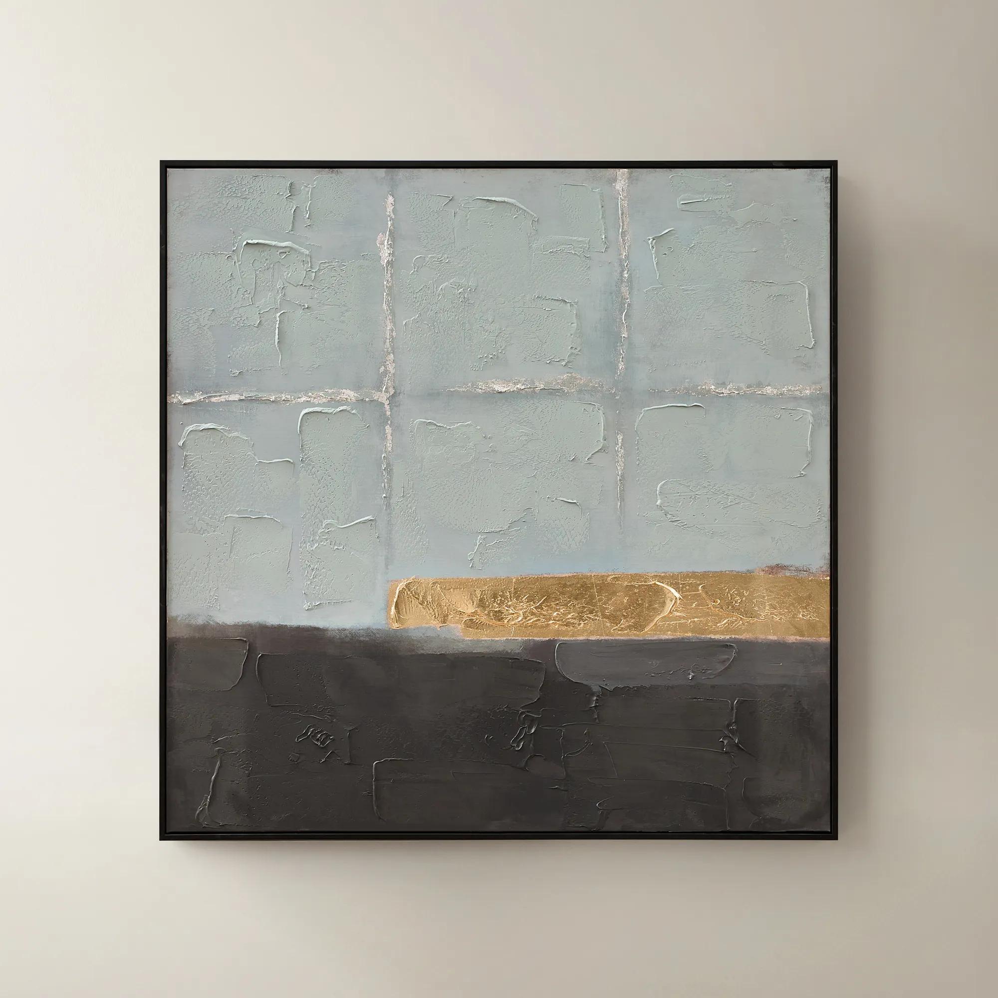
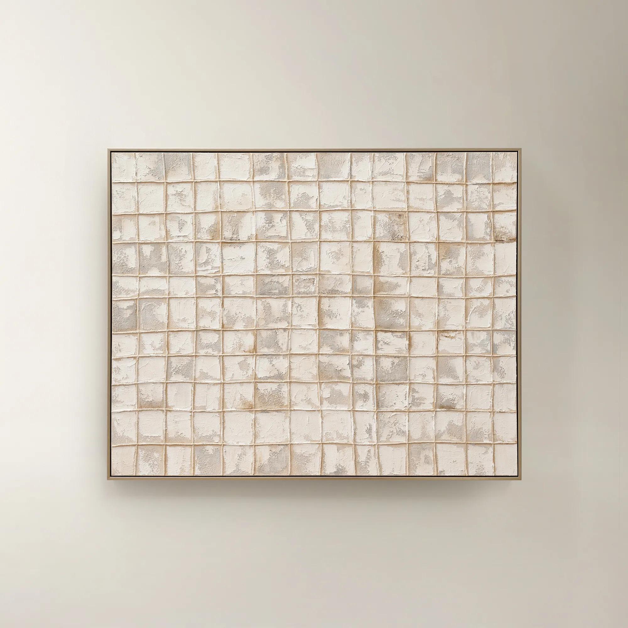 Painted Echos Framed Gold Leaf Wall Art 60" x 48"$699
A hand-painted abstract canvas with gold leaf accents and a champagne frame for modern, versatile display.
Add To Cart -
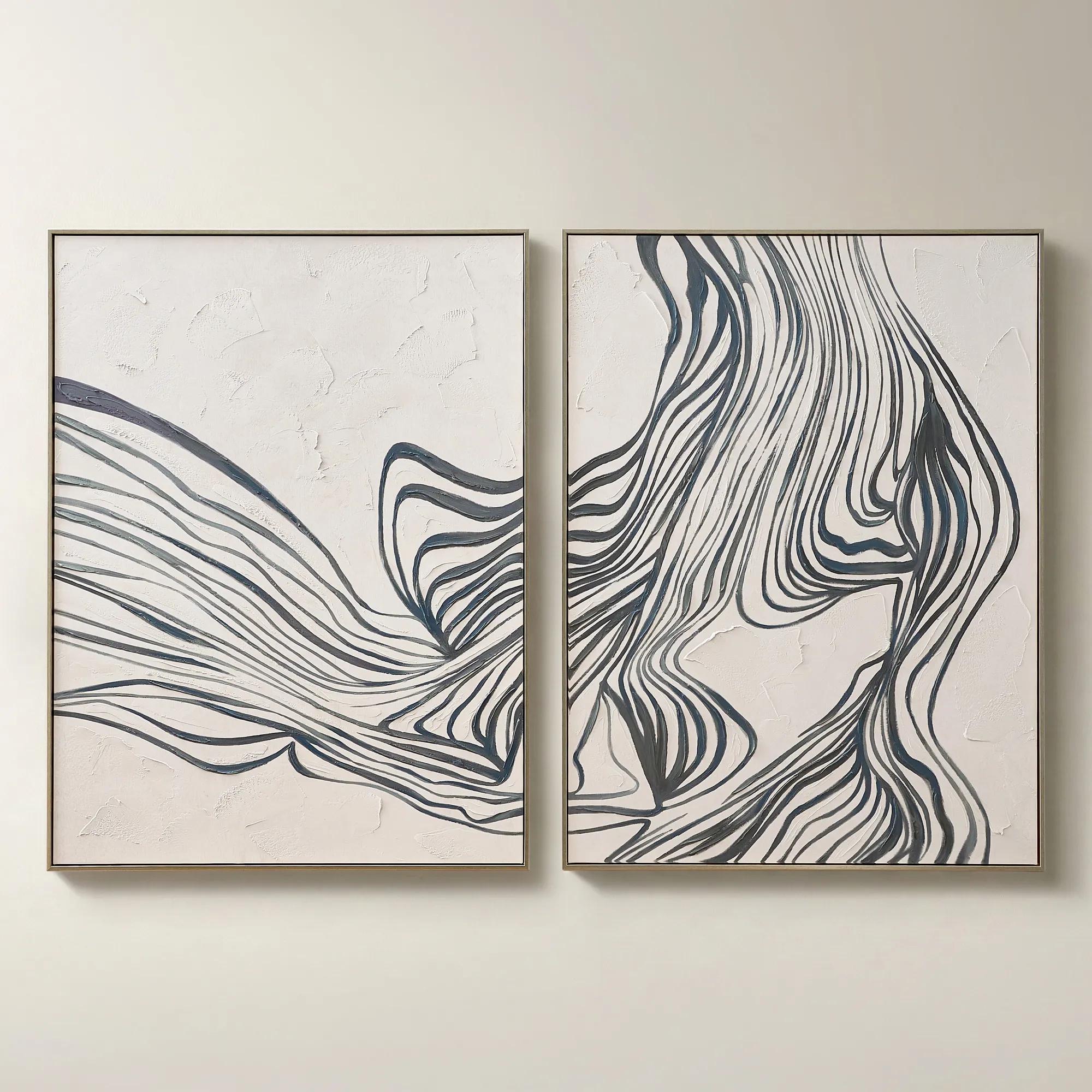
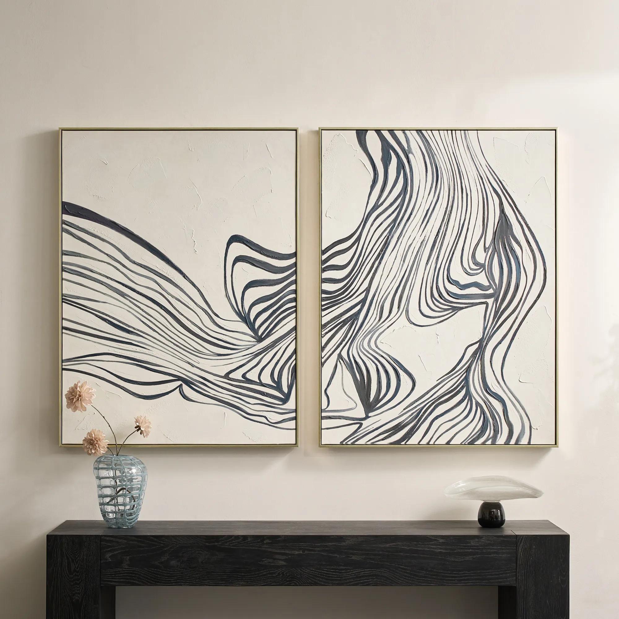 Rhythmic Framed Painted Wall Art 36" x 48" Set of 2$599
A hand-painted diptych featuring bold abstract stripes in dark slate and dusty blue with champagne frames.
Add To Cart -
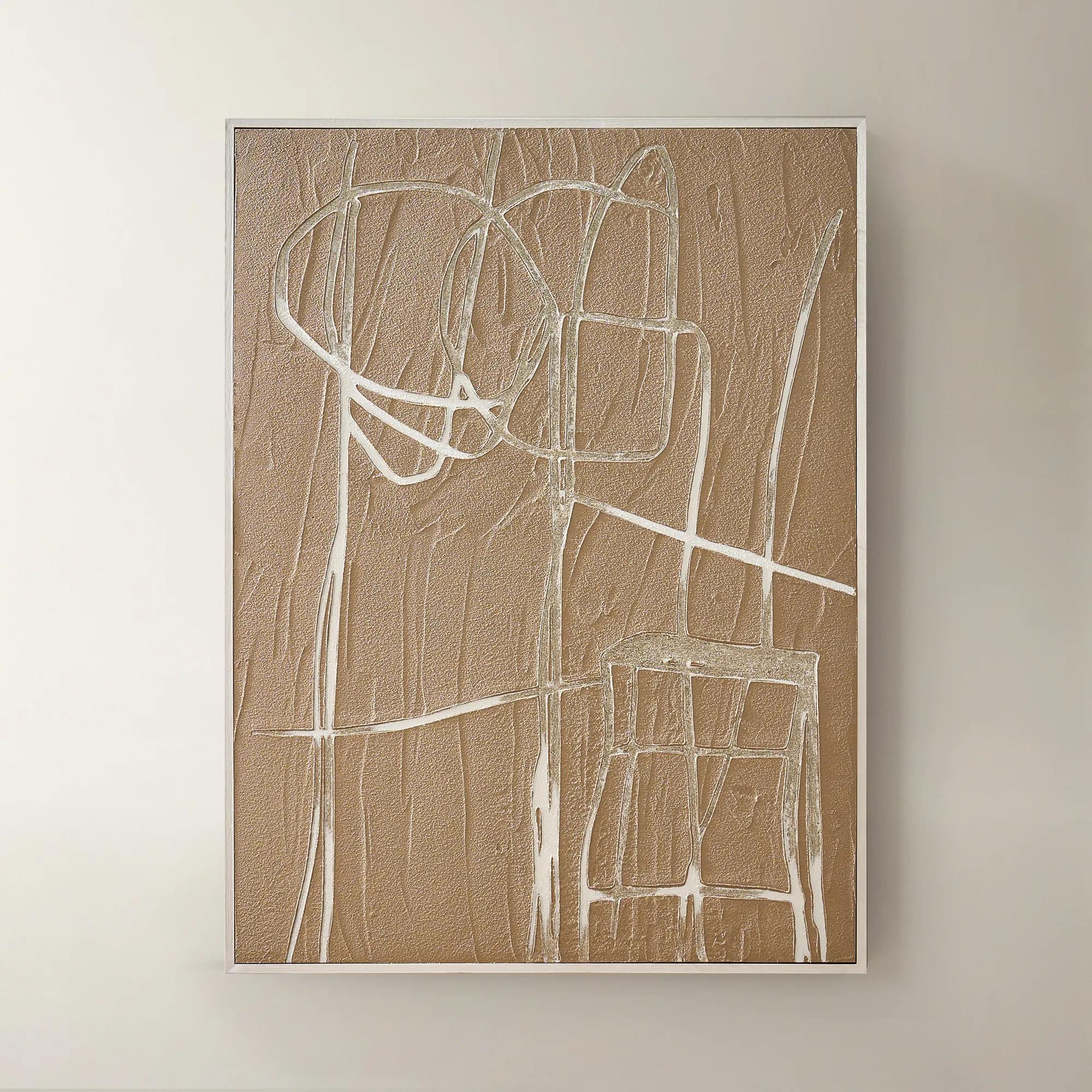
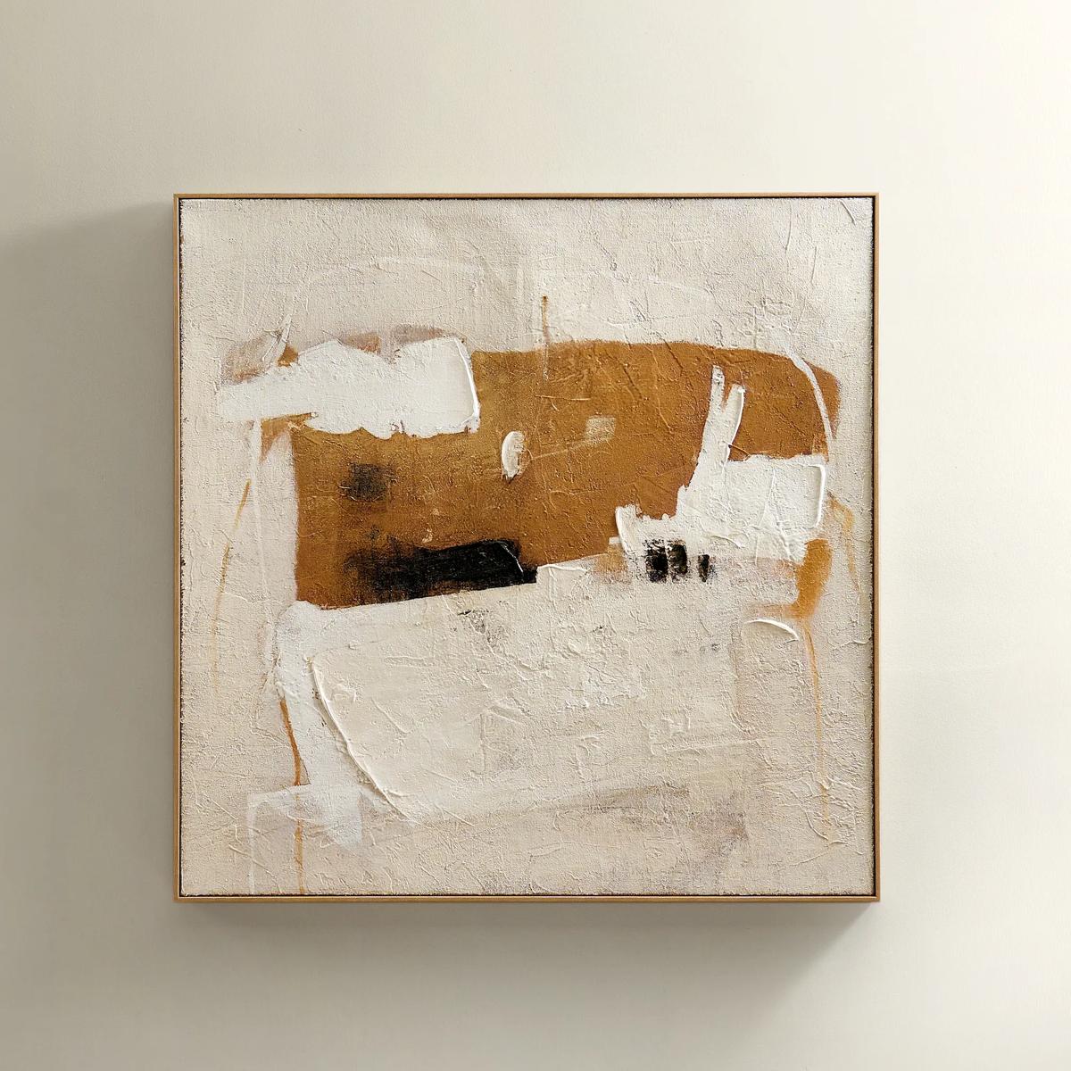 Instinct Framed Painted Wall Art 39.25" x 39.25"$349
An abstract hand-painted artwork featuring warm neutrals and black strokes on hessian with a light natural frame.
Add To Cart -
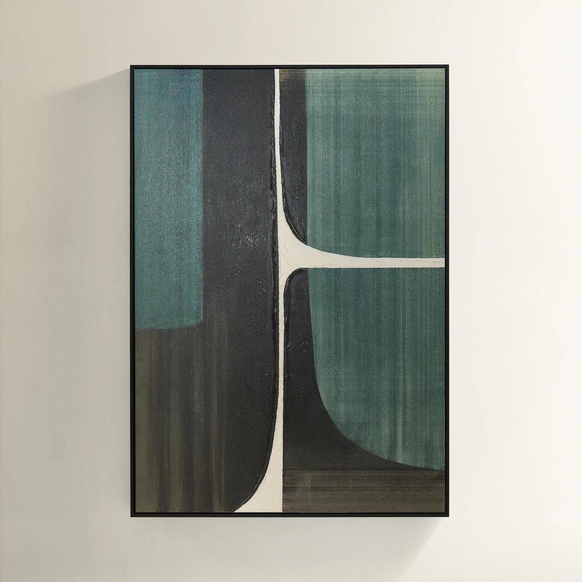 Plains Framed Painted Wall Art 39.25" x 55"$499
A hand-painted abstract canvas in forest green, ivory, and black with a sleek black floater frame.
Add To Cart -
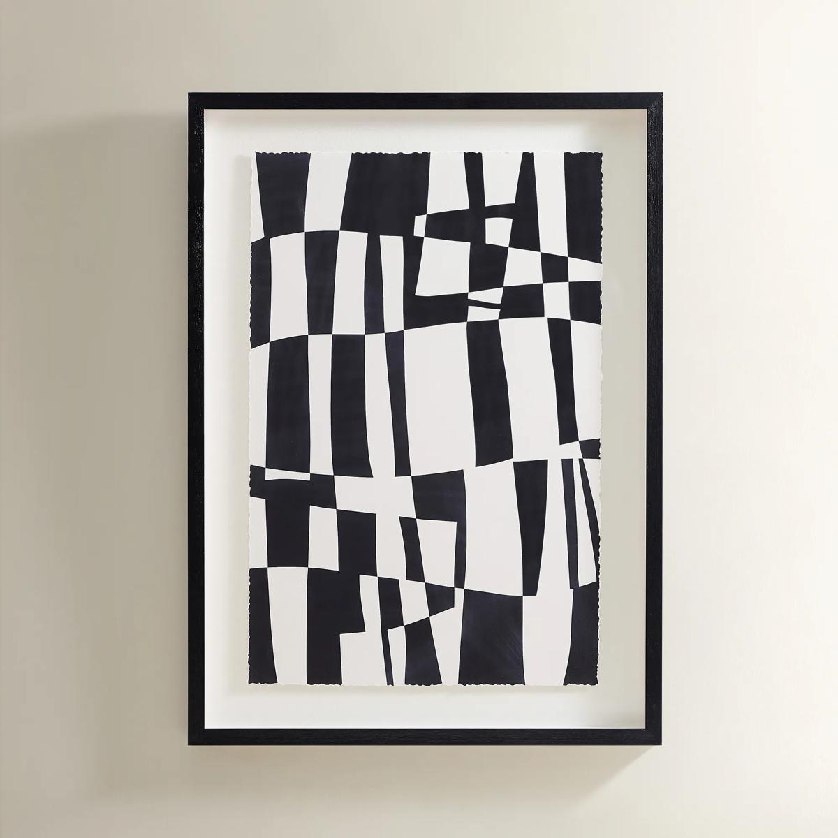 Matrix Art$369
A striking black and white abstract grid print set in a sleek black polyresin frame.
Add To Cart -
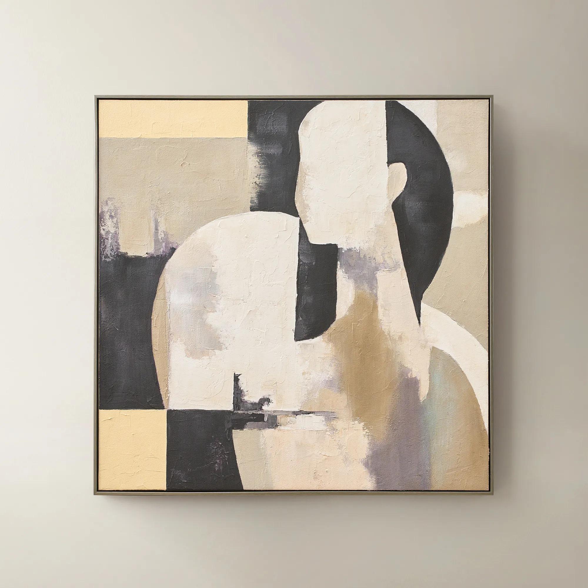 Afternoon Rest Framed Painted Wall Art 40" x 40"$399
A hand-painted abstract figure in buttercream, turtledove, and black hues framed in dark grey.
Add To Cart -
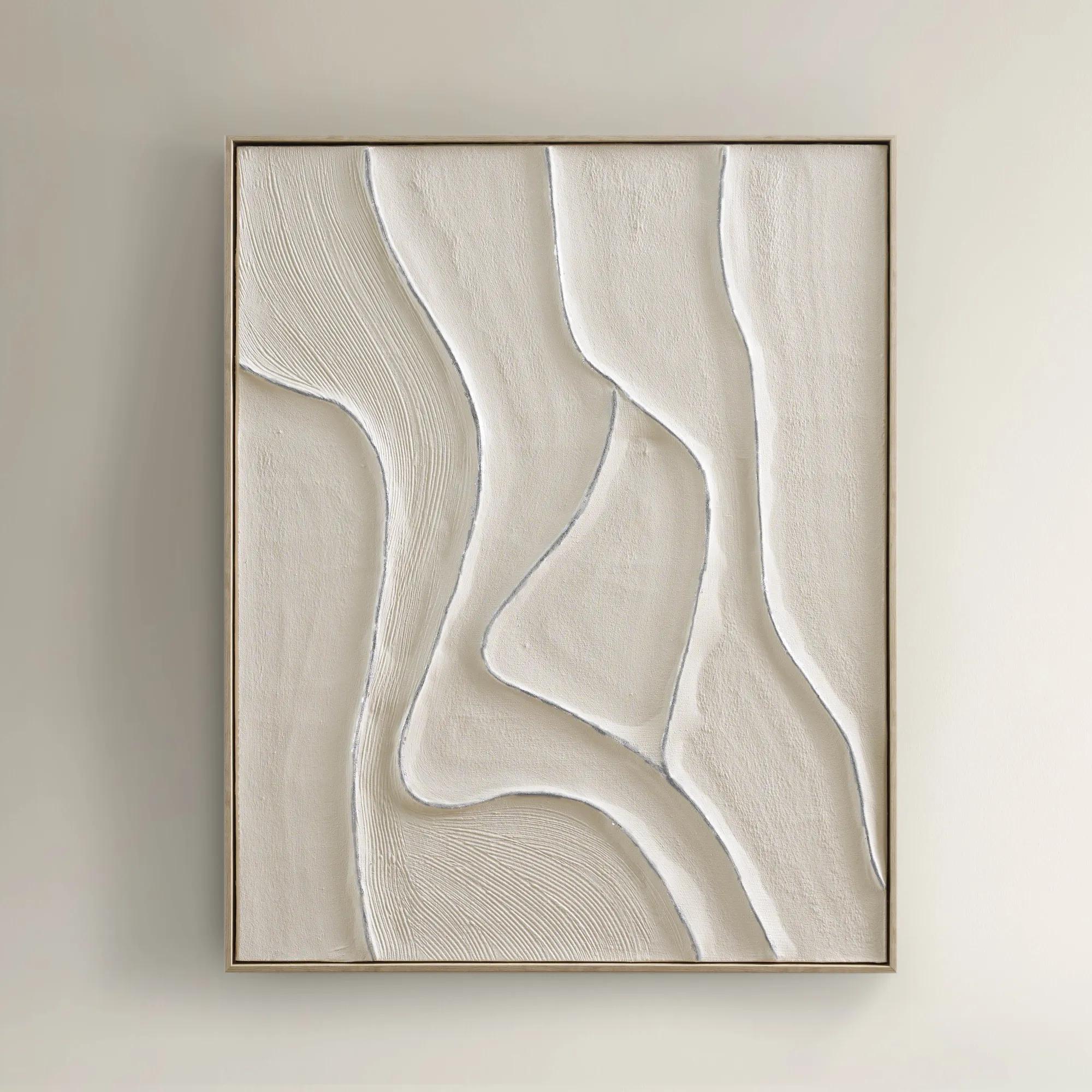
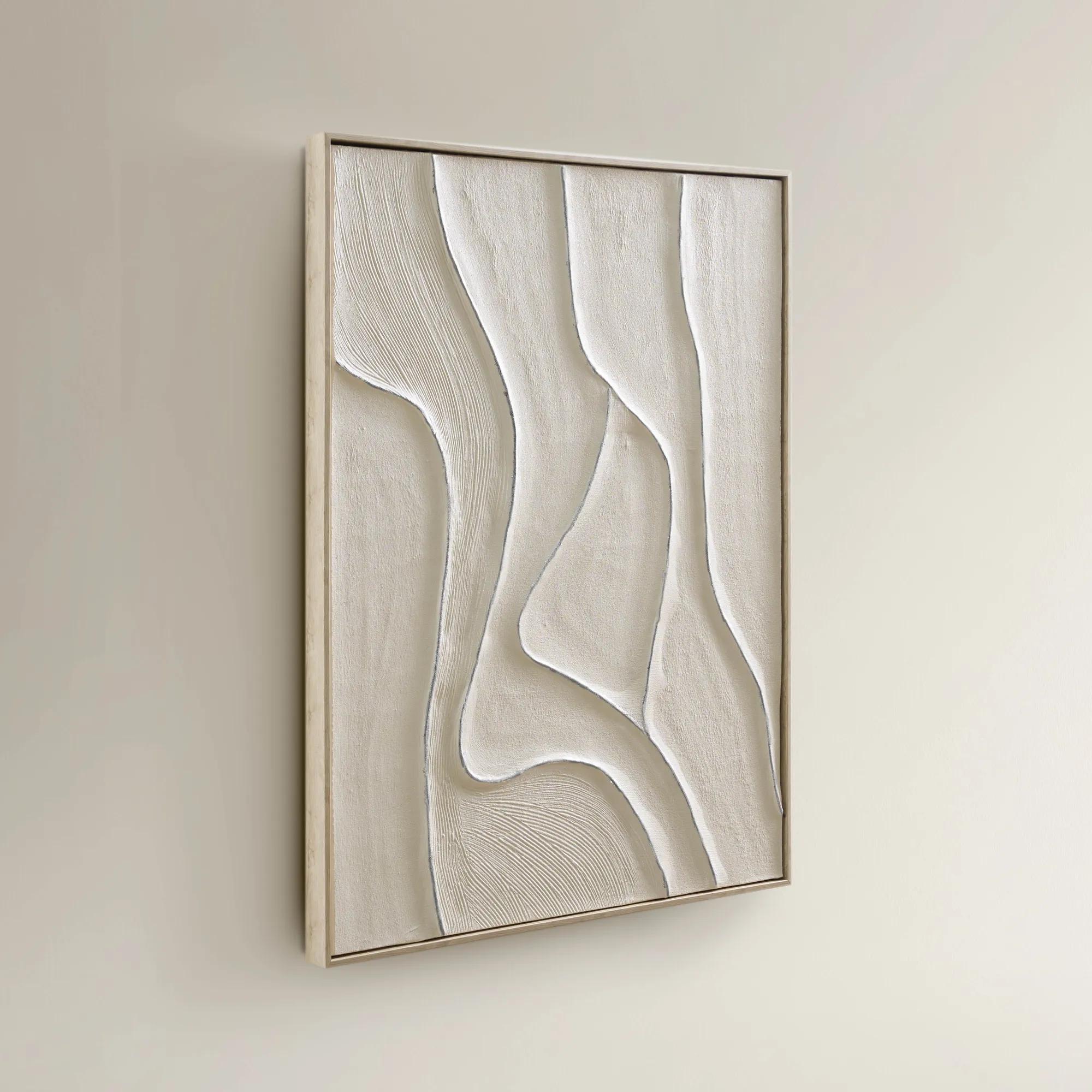 Vivre Framed Painted Wall Art 39.25" x 31.5"$199
A hand-painted canvas featuring tranquil beige hues and flowing lines in a warm whitewash floater frame.
Add To Cart -
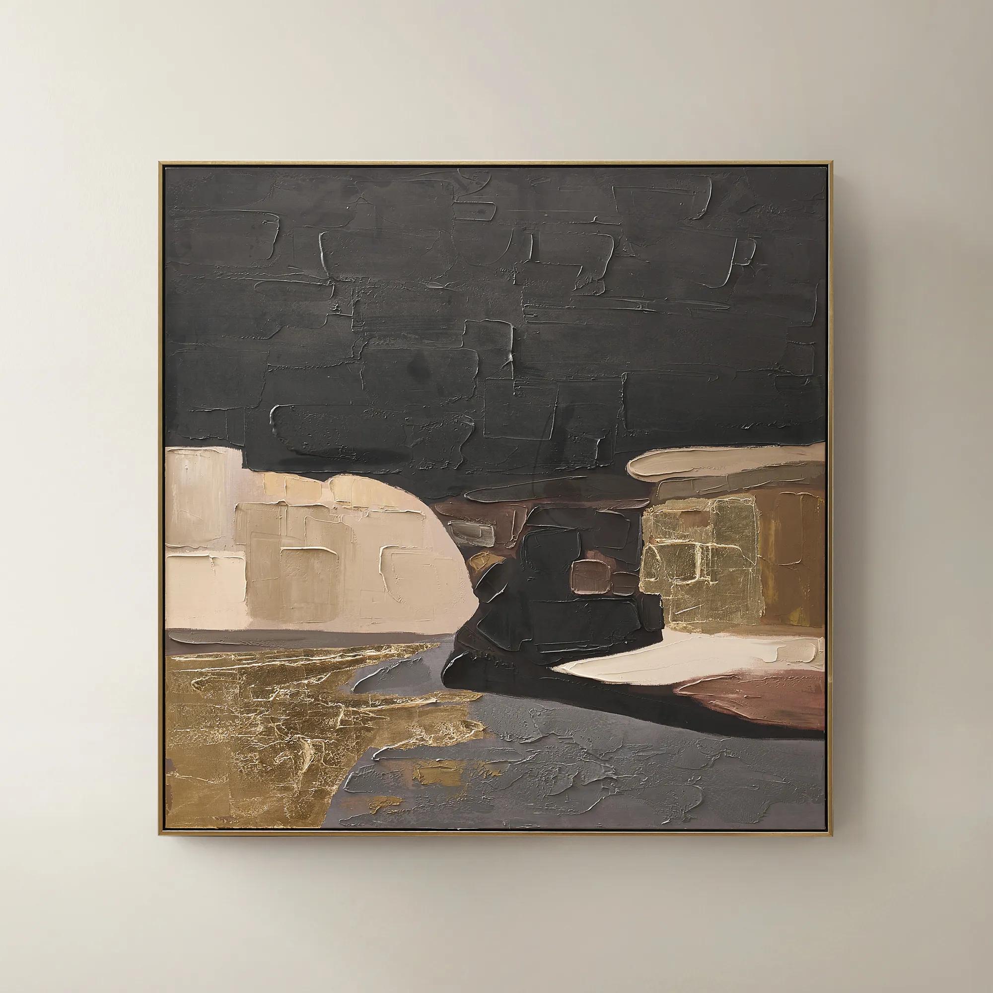 Obscured Light Framed Gold Leaf Painted Wall Art 48" x 48"$499
A hand-painted canvas with gold leaf accents and a black-gold frame in dramatic neutral tones.
Add To Cart -
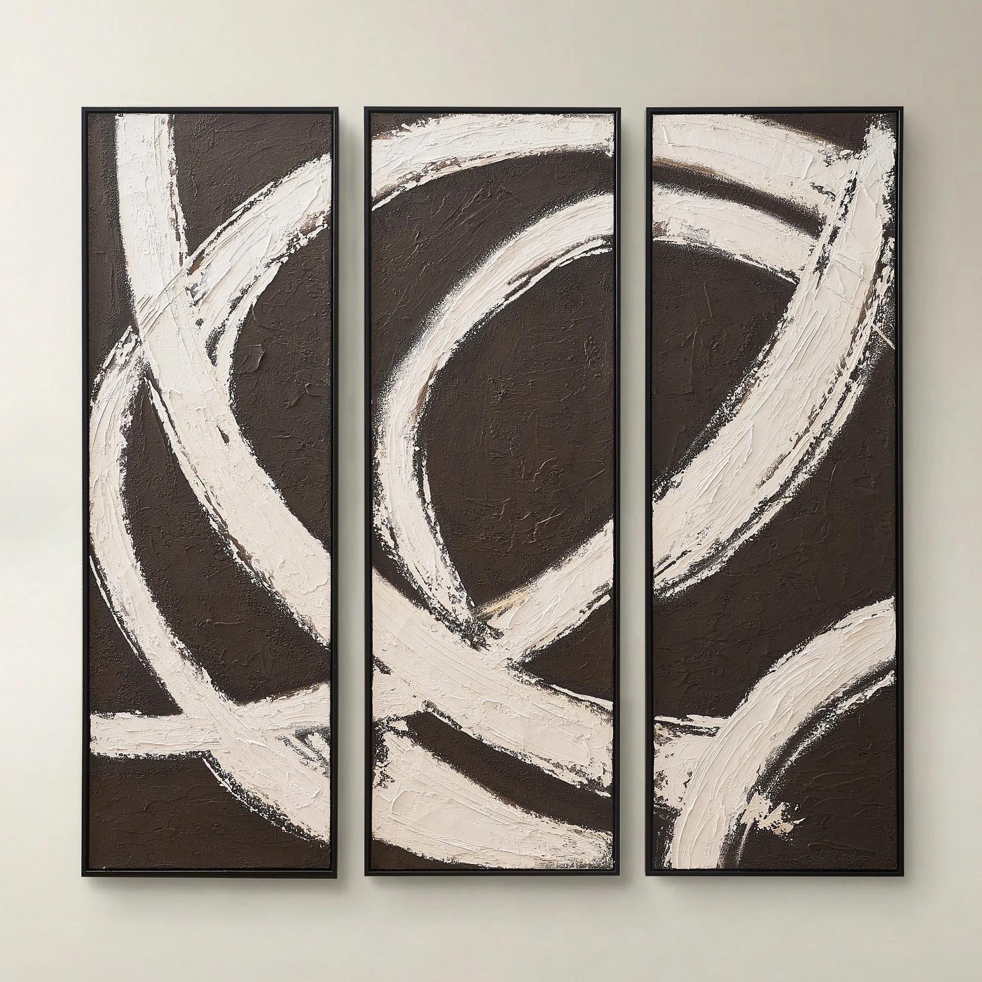
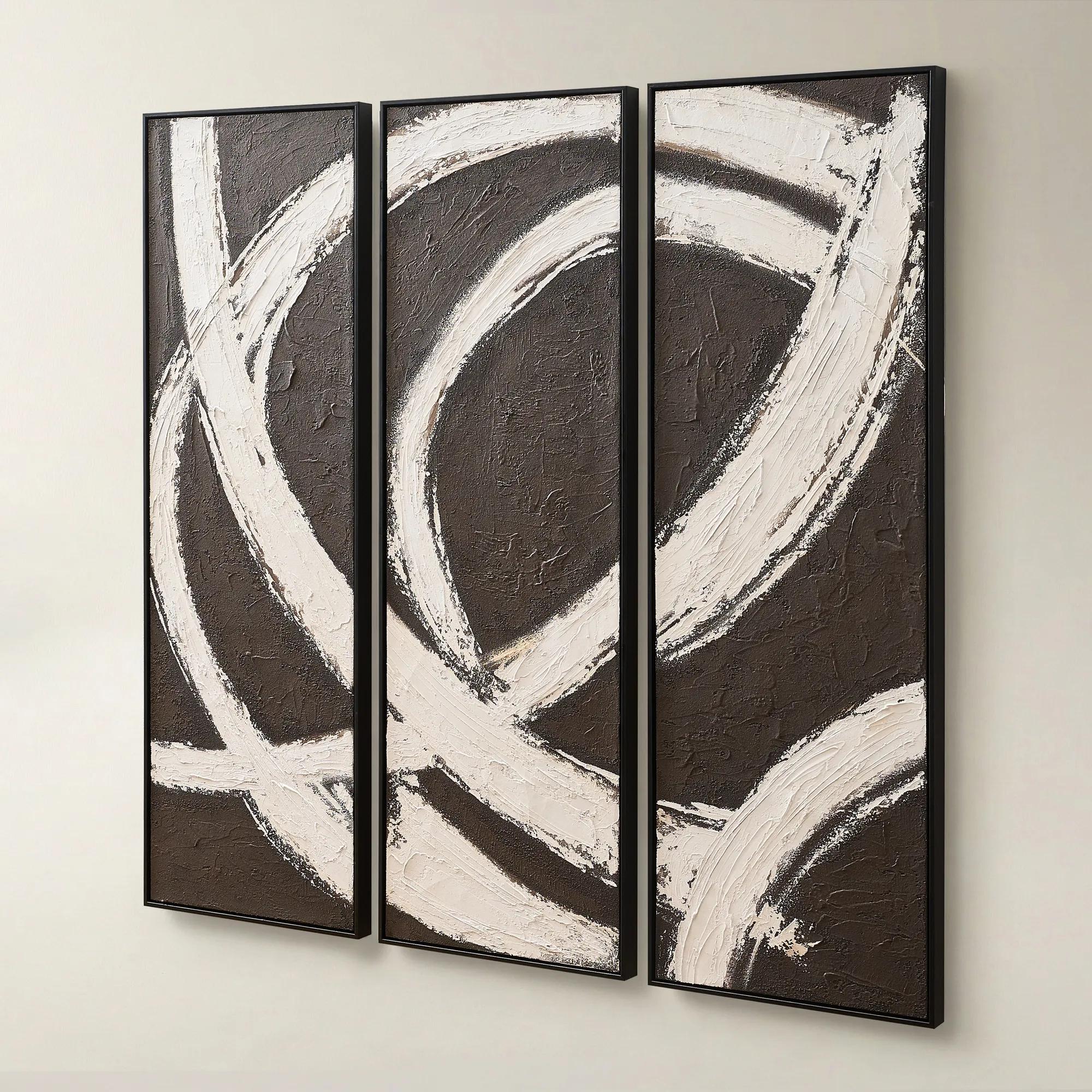 Spun in Coco Framed Painted Wall Art 20" x 60" Set of 3$499
A hand-painted triptych featuring dark chocolate and alabaster tones with rich texture and modern contrast.
Add To Cart -
 Espresso Framed Painted Wall Art 31.5" x 31.5"$149
A bold abstract artwork featuring rich brown hues on hand-painted canvas in a light wood floater frame.
Add To Cart -
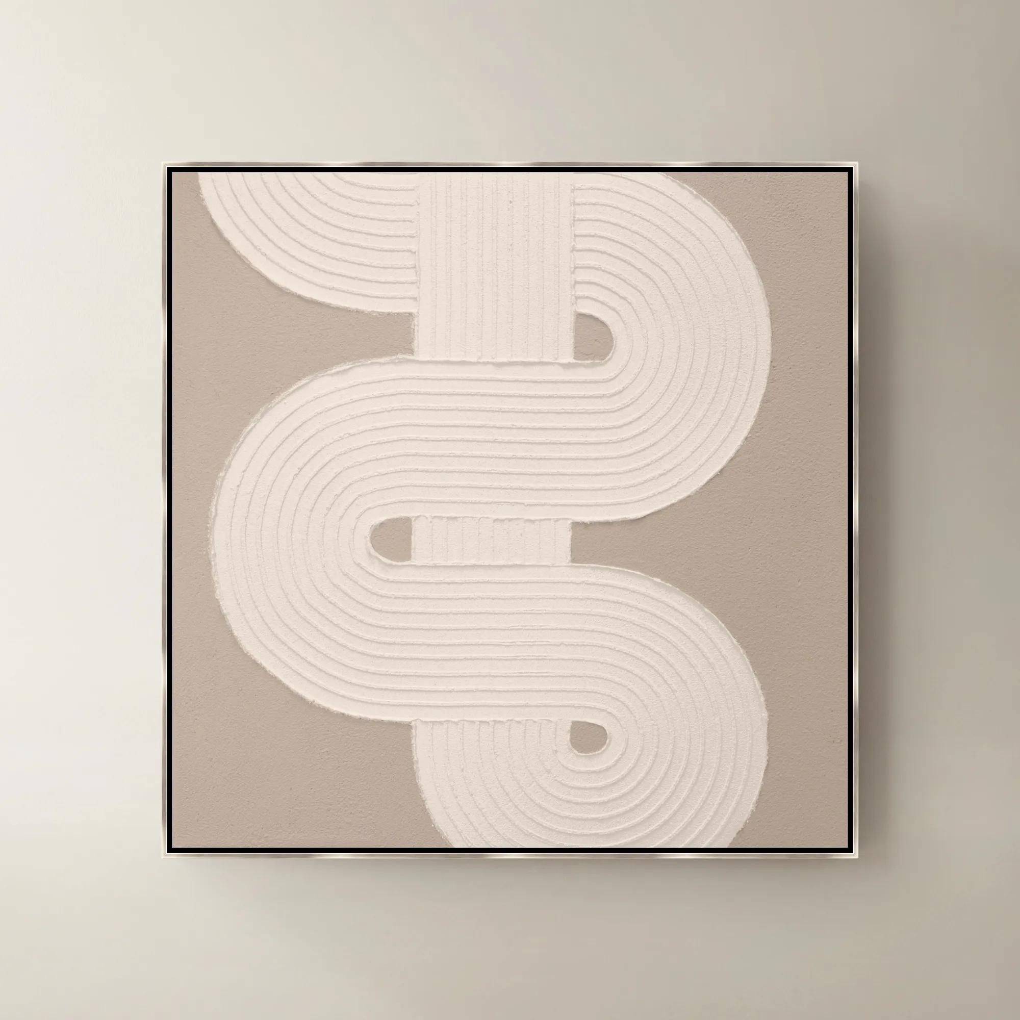
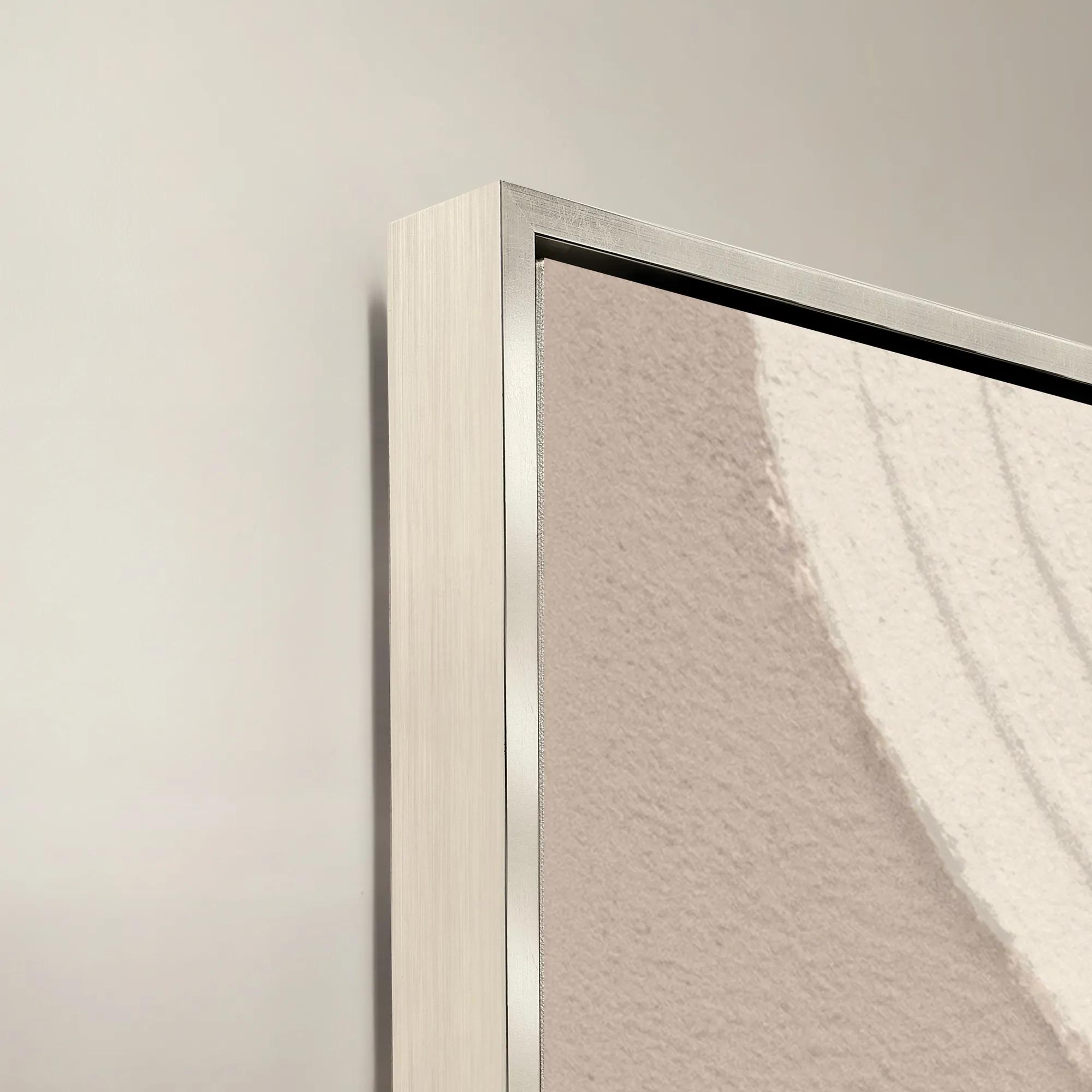 Sacred Geometry V Framed Painted Wall Art 40" x 40"$1099
A striking abstract art piece featuring bold geometric patterns for a modern, sophisticated touch.
Add To Cart -
 Shadow Painting 2$179
A hand-painted abstract canvas featuring bold textures and brown hues in a warm whitewash floater frame.
Add To Cart -
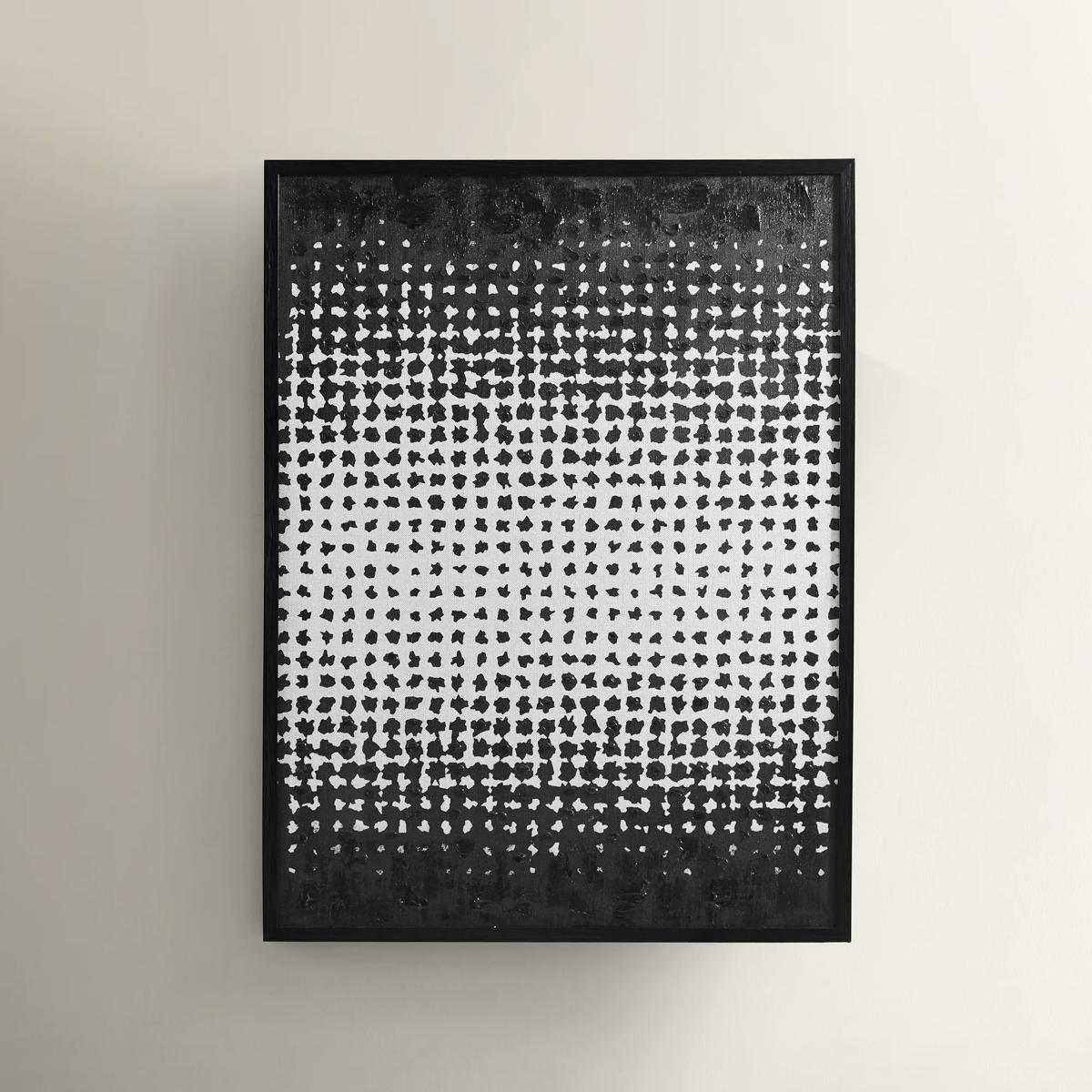
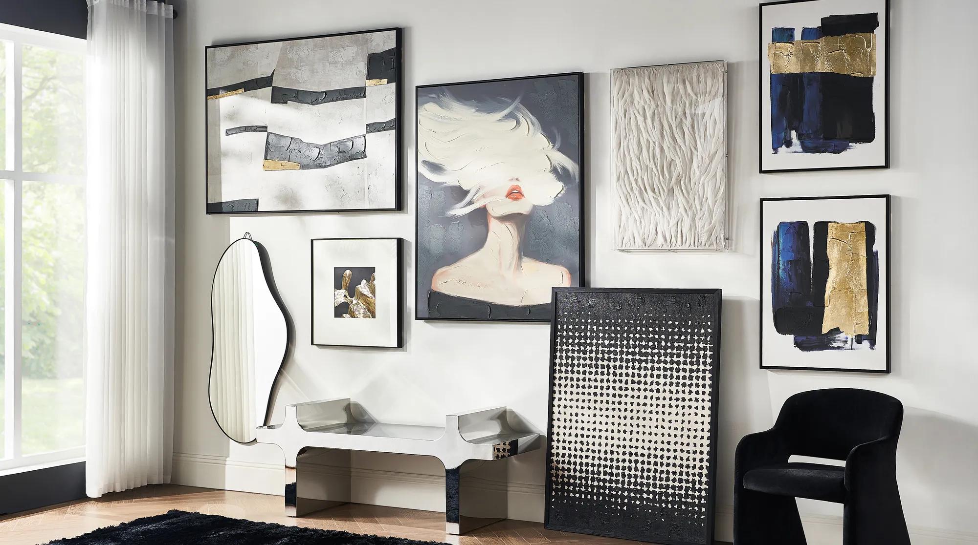 In Time Painting$399
A hand-painted linen canvas featuring cream and black dots in a modern, minimalist geometric pattern.
Add To Cart -
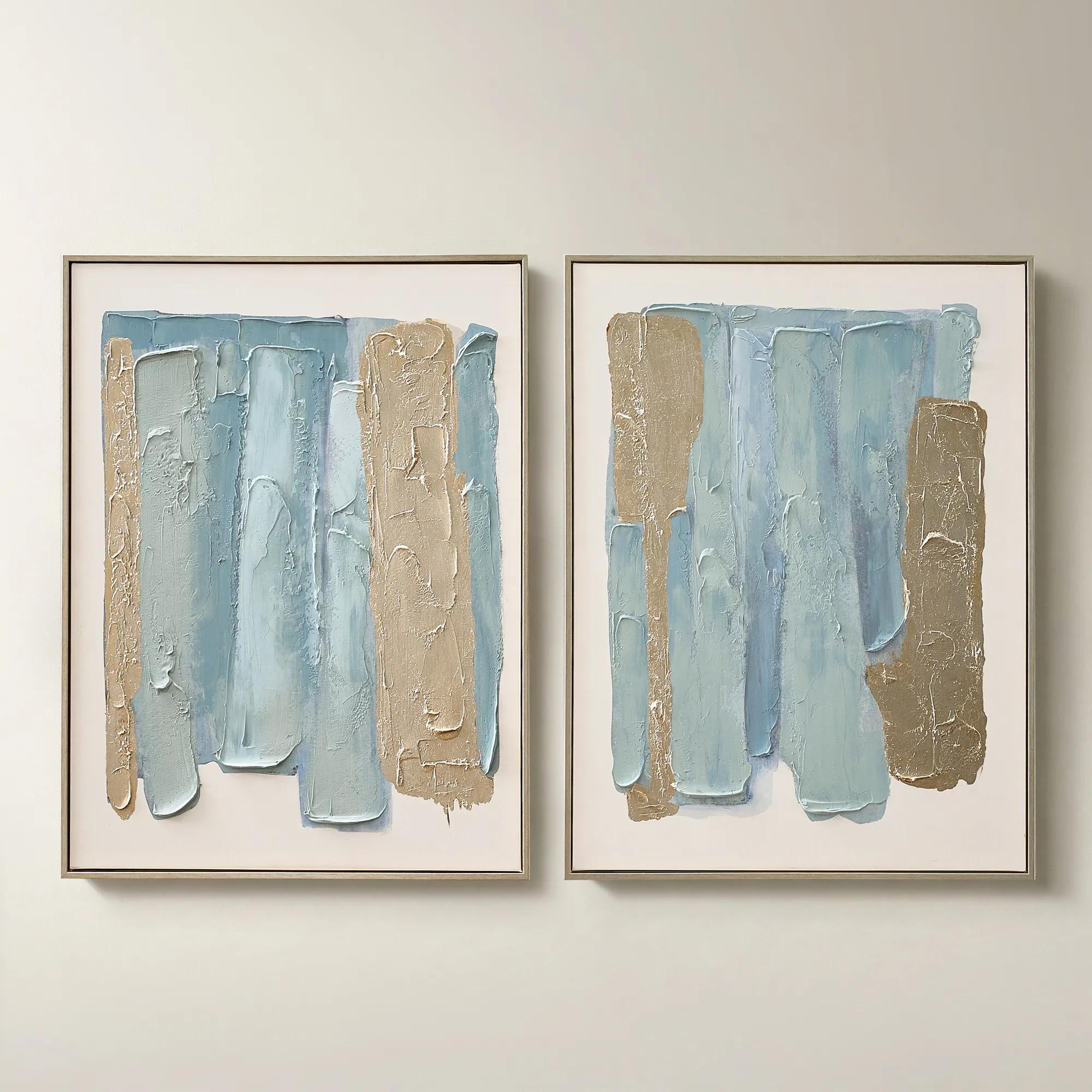
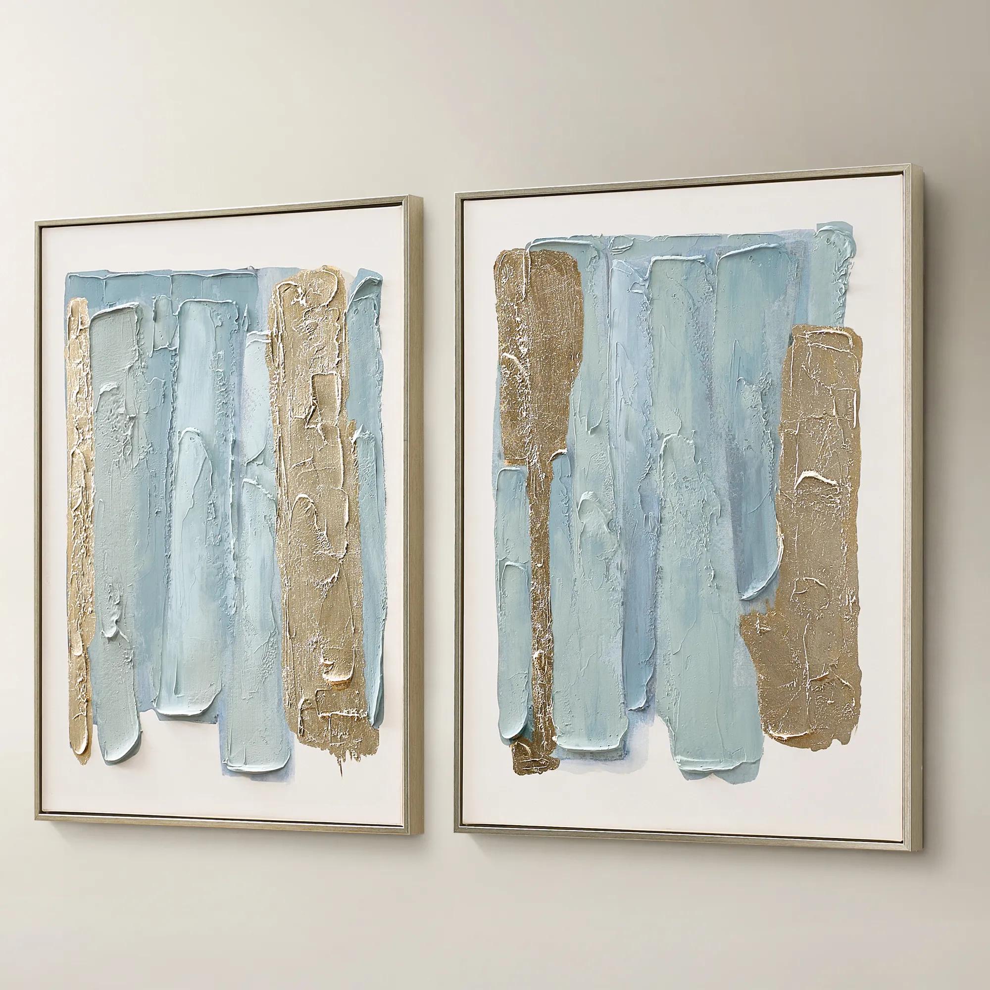 Blue Drift Framed Champagne Painted Wall Art 24" x 32" Set of 2$199
A set of two hand-painted canvases in dusty blue with champagne leafing and modern abstract movement.
Add To Cart -
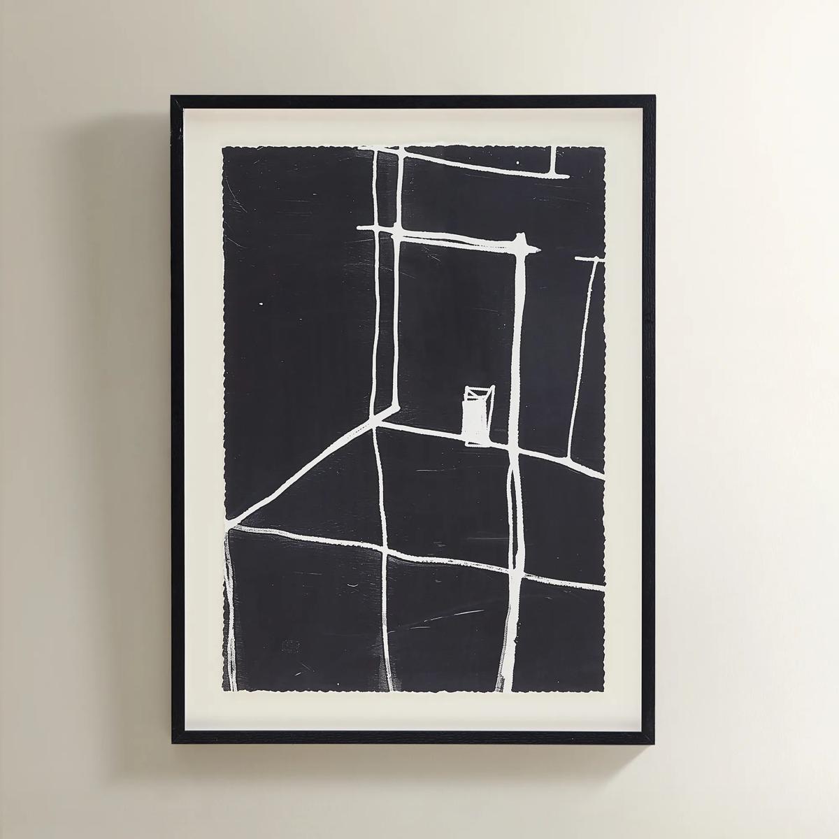 Solitude Art$269
A minimalist black-and-white abstract print featuring bold white lines in a sleek black polyresin frame.
Add To Cart -
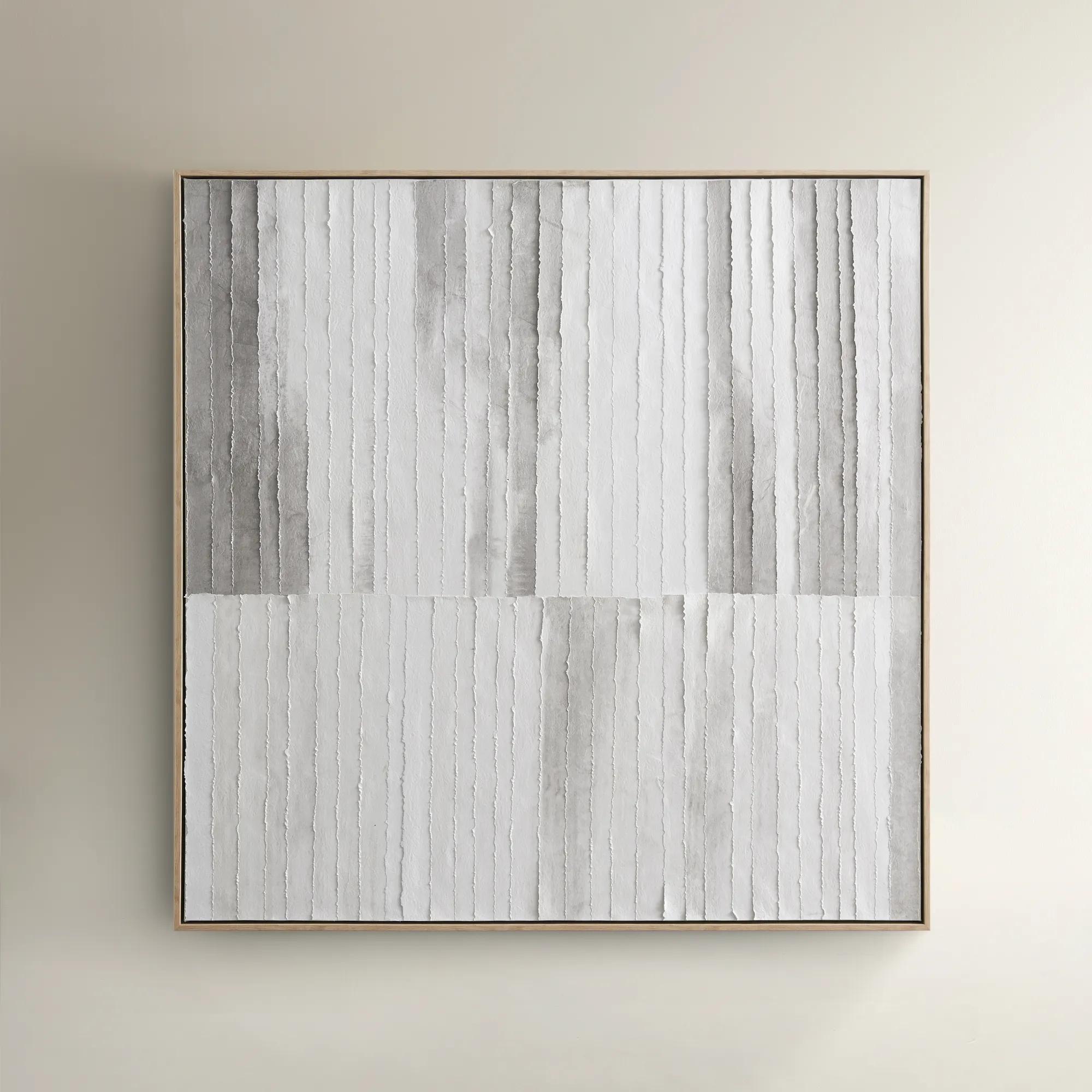
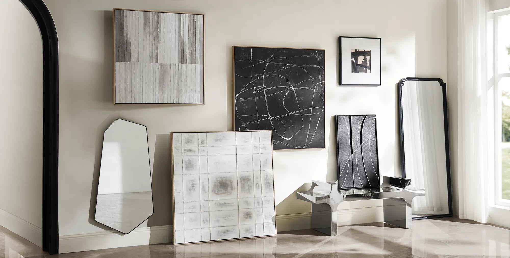 Morning Mist Paper Art$329
A hand-painted canvas featuring rhythmic grey lines in a textured, whitewashed floater frame for serene style.
Add To Cart -
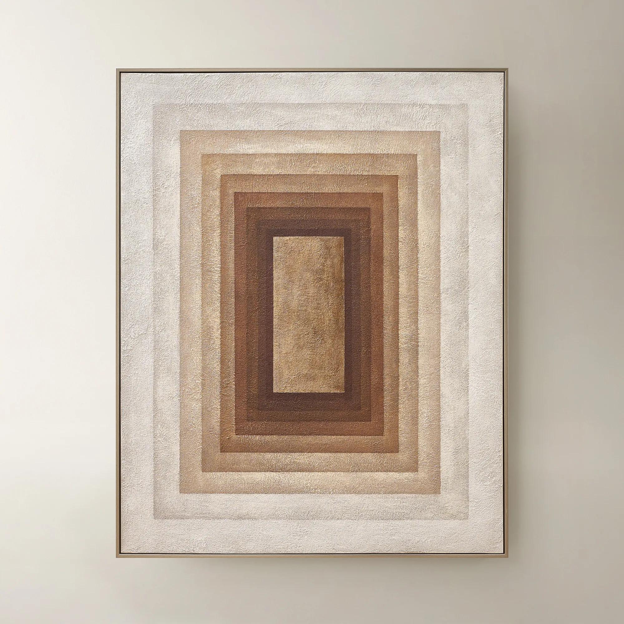 Monochrome Drift Framed Painted Wall Art 60" x 48"$699
A hand-painted abstract canvas with champagne leafing, featuring cocoa and gold tones in modern geometric design.
Add To Cart

Neutral Tone Abstract Art Sets
Neutral tone abstract art sets invite tranquility and sophistication into every room, transforming blank walls into curated galleries of subtle intrigue. Each composition whispers elegance, layering gentle creams, soft taupes, and warm sands in mesmerizing patterns that evoke both serenity and depth. These works strike a harmonious balance—bold enough to command attention, yet restrained in palette for effortless versatility. With neutral tone abstract art sets, your space becomes a sanctuary of elevated calm—a canvas where artistry and ambiance entwine in perfect harmony.
Neutral tone abstract art sets are coordinated groups of two or more artworks that use shades such as beige, cream, taupe, soft gray, and warm white to create a cohesive wall display. Their appeal lies in the interplay of restrained color and expressive form: a sweeping charcoal gesture against ivory, sand-colored fields interrupted by a delicate line, or overlapping shapes that suggest stone, mist, and movement without depicting a literal scene. A diptych pairs two compositions, while a triptych brings three panels into conversation; larger groupings can create a broader rhythm across a wall. Some sets carry one continuous composition across multiple pieces, while others connect through shared colors, gestures, or proportions. That distinction changes the mood. A continuous image feels expansive and deliberate, while related individual compositions offer a more collected, gallery-like effect. Neutral abstract wall art can complement interiors ranging from tailored contemporary rooms to richly layered spaces with sculptural furniture and gleaming accents. The palette may be quiet, but the presence need not be. Broad brushwork, deep espresso markings, and dramatic areas of open space can give pale artwork considerable visual strength. Warm neutrals with creamy or earthy undertones sit comfortably beside natural wood, camel upholstery, and brass details. Cooler grays and chalky whites create a different dialogue with polished chrome, smoky glass, and silver finishes. Neither approach requires a perfectly matched room. A trace of taupe can connect an artwork to a rug, while a dark line can echo the silhouette of a nearby console. The result feels intentional rather than overly coordinated. For interiors already rich in velvet, reflective surfaces, or patterned textiles, neutral tone abstract art sets provide a composed backdrop that still rewards a closer look. In a more restrained setting, their scale and movement can become the room’s defining expression, bringing depth to a wall without introducing another strong color.
Scale and arrangement give a coordinated art set its architectural presence. Above a sofa, a generously proportioned grouping can anchor the seating area, with the combined width of the artwork and the spaces between panels considered as one composition. A useful starting point is a grouping roughly two-thirds to three-quarters the width of the furniture beneath it, adjusted for ceiling height, nearby lighting, and the visual weight of the frames. Smaller pieces can feel intimate above a narrow console or writing desk, while larger panels allow subtle tonal changes to remain visible across an open living area. Consistent gaps help related works read as a set; uneven spacing can interrupt a continuous image or make balanced compositions feel unsettled. Paper templates offer a practical way to judge the full arrangement before hanging, especially where a tall headboard, wall sconces, or decorative molding affects the available space. In a dining room, abstract shapes can lend movement above a sideboard without competing with an expressive chandelier. Along an entry wall, a paired composition creates a sense of arrival, establishing the home’s palette before the adjoining rooms come into view. In a bedroom, neutral tone abstract art for bedrooms can extend the softness of upholstered furniture and layered bedding, particularly when gentle transitions between cream, gray, and taupe carry more emphasis than sharp contrast. A home office may benefit from a more graphic interpretation, with defined strokes that bring character to the background without overwhelming the workspace. Hanging height should respond to how the room is used: artwork above a low sofa is experienced differently from a grouping viewed while walking through a hallway. Lighting matters just as much. Warm bulbs can make ivory appear richer and beige more golden, while cooler illumination may emphasize gray undertones. Seeing the palette alongside the room’s finishes helps preserve the desired balance between serenity and drama.
Materials, surface treatments, and framing influence how neutral abstract art looks at a distance and how it reveals itself up close. Canvas can offer a softly textured foundation that complements gestural marks and broad washes of color; stretched formats also introduce depth through their edges. Art printed on paper can emphasize fine lines and nuanced tonal transitions, with a mat adding space between the image and its frame. Where dimensional media or hand-applied embellishments are specified, raised details may catch light and create shifting shadows, giving a restrained palette added richness. An image that depicts texture, however, does not necessarily have a textured surface, so the stated medium and finish are important distinctions. Frame profiles further shape the effect. Slender dark borders sharpen pale compositions, light wood introduces warmth, and metallic finishes can connect the artwork with other luminous details in the room. Glazing may help protect paper-based artwork from dust and contact, although reflections should be considered opposite windows or prominent light sources. Long-term appearance depends on construction, display conditions, and appropriate care rather than color palette alone. Acid-free mats and backing can help protect paper artwork, while glazing with specified UV protection can reduce light exposure without eliminating the need for thoughtful placement. Prolonged direct sunlight, excessive humidity, and frequent temperature fluctuations are best avoided. Routine care generally calls for gentle dusting with a clean, soft cloth, following the artwork’s instructions; cleaning liquids should not be sprayed directly onto frames or glazing, and unprotected printed or painted surfaces should not be wiped with moisture unless expressly permitted. Secure hardware suited to the artwork’s weight and the wall material helps keep a multi-piece display aligned and safely supported. These sets can also make considered housewarming or wedding gifts when the recipient’s palette, wall dimensions, and taste are known. Their lasting appeal comes from the balance they strike: enough restraint to live comfortably among treasured furnishings, and enough artistic presence to make the room feel unmistakably personal.
FAQs
Neutral tone abstract art sets are remarkably versatile, complementing a wide spectrum of interior styles. They seamlessly enhance modern, transitional, and contemporary spaces, but also add a sophisticated contrast to traditional or eclectic décors. Their subtle palette and abstract forms make them ideal for layering with both bold statement pieces and understated furnishings, allowing you to curate a look that is uniquely yours.
To evoke a sense of tranquility, place neutral abstract art in areas dedicated to relaxation, such as bedrooms, reading nooks, or serene living spaces. The gentle gradations and soft forms found in tonal abstract art encourage a restful ambiance, especially when paired with plush textiles and warm lighting. These artworks act as visual breathers, inviting moments of quiet reflection and calm.
Absolutely. Neutral tone abstract art sets make thoughtful gifts for housewarmings, weddings, anniversaries, or milestone celebrations. Their timeless appeal and adaptability ensure they will complement the recipient’s evolving style, serving as a meaningful foundation for new beginnings and cherished spaces.
When arranging multiple pieces, consider the flow of color, shape, and negative space. Group artworks with similar undertones or complementary forms to create a harmonious visual rhythm. Vary the spacing and orientation to add interest, while maintaining a unifying element—such as a consistent palette or frame finish—to tie the collection together.
Yes, these art sets are a sophisticated way to draw attention to architectural details. Hang them above a mantel, along a staircase, or within alcoves to accentuate the lines and textures of your space. Their understated elegance enhances both grand and subtle features, allowing the architecture and art to elevate each other in perfect balance.