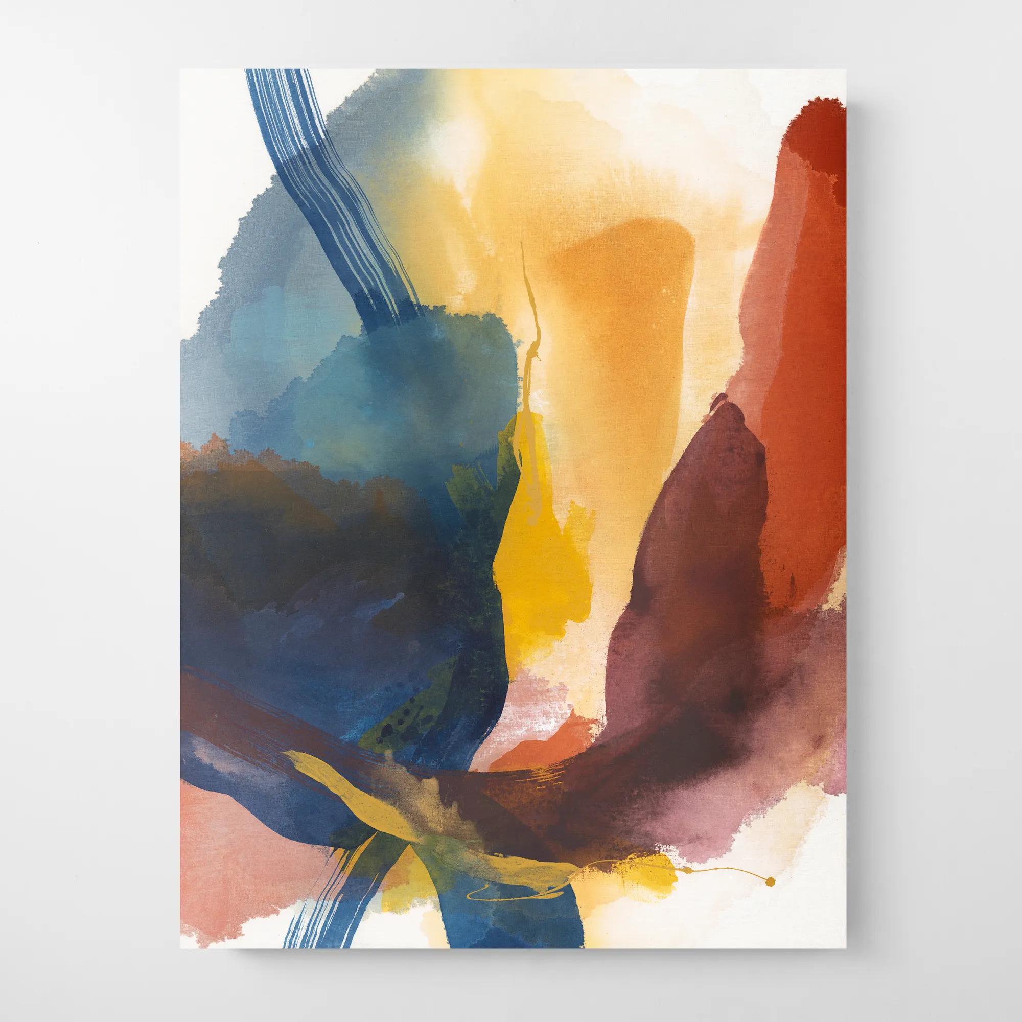
Neutral Summer Wall Arts
Neutral Summer Wall Arts
-
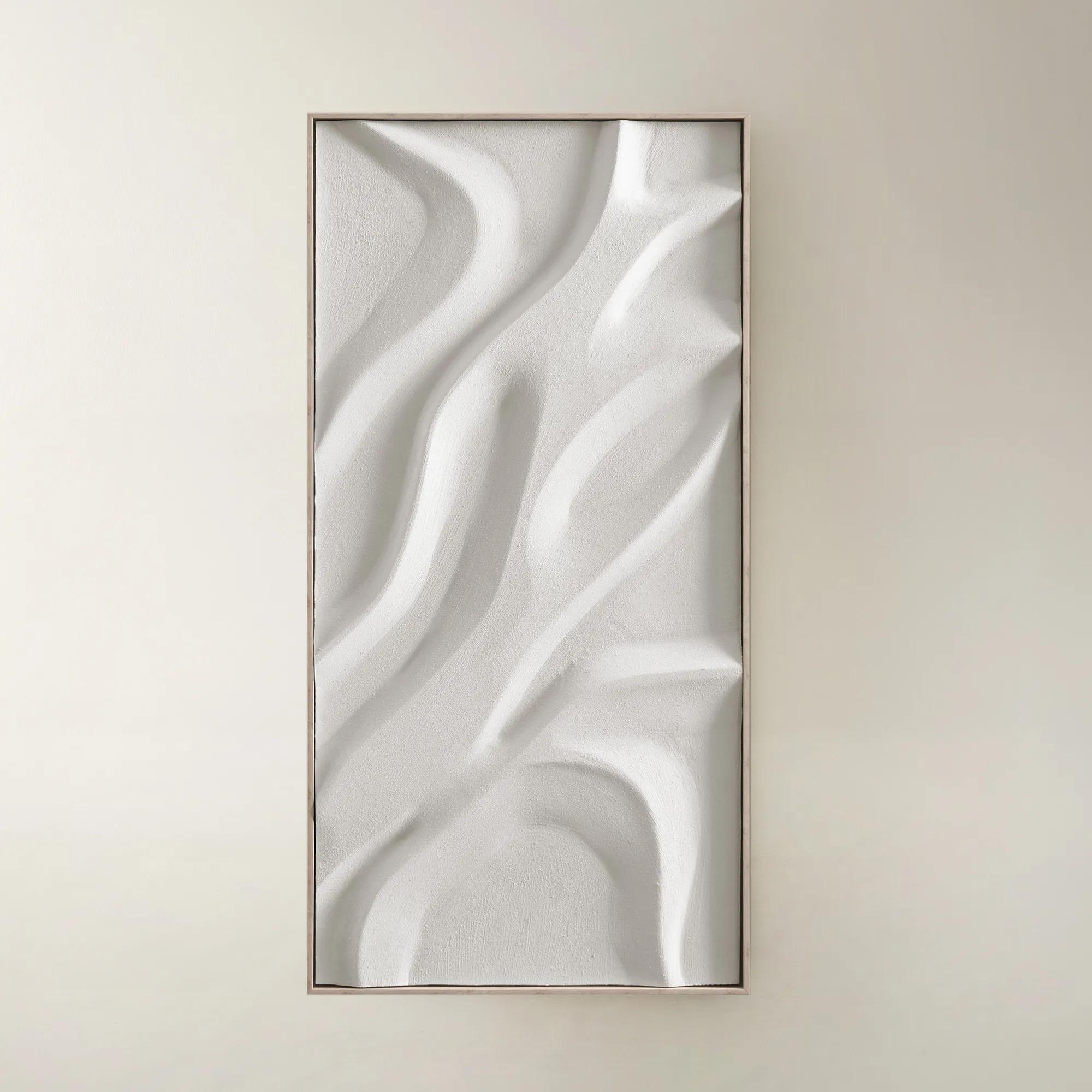
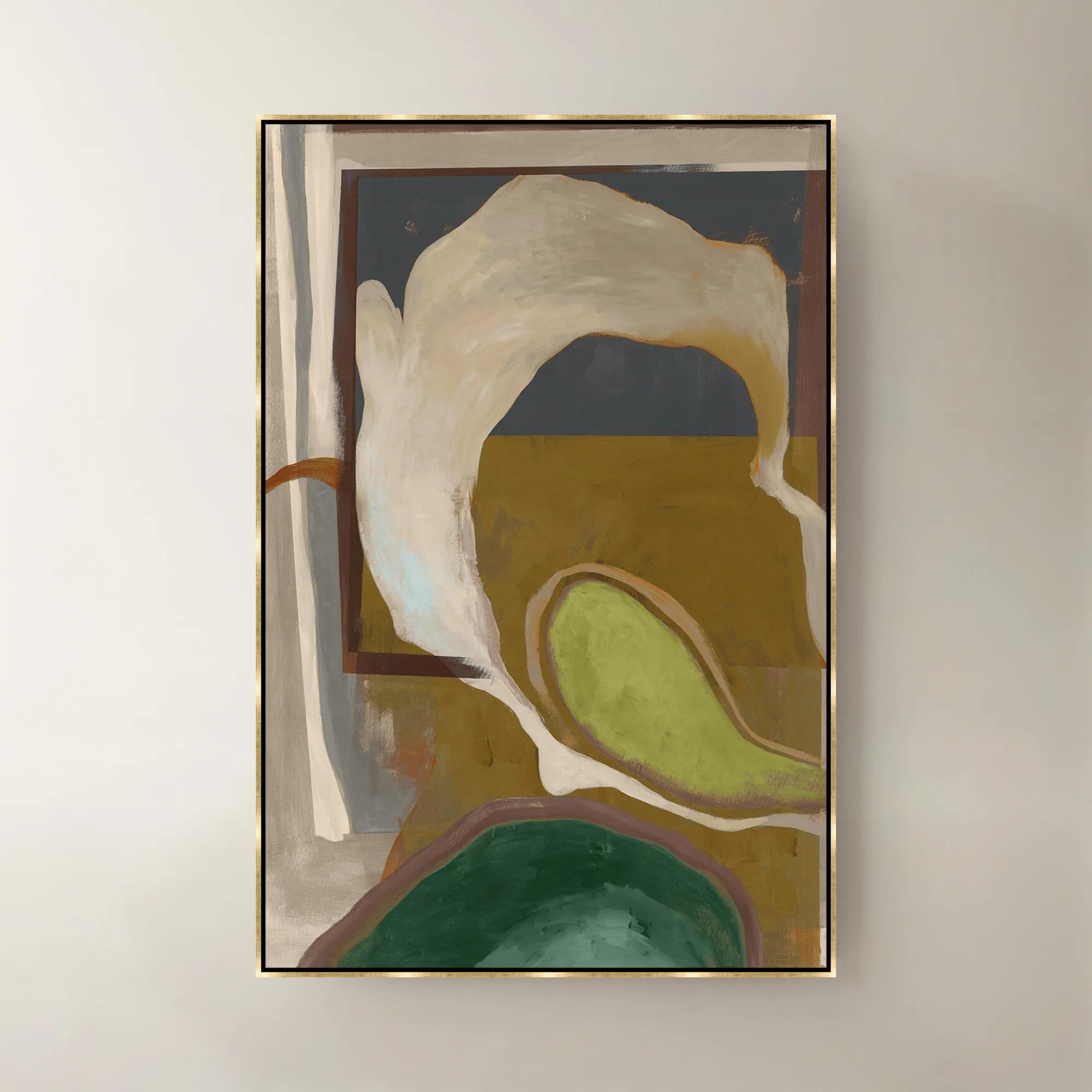
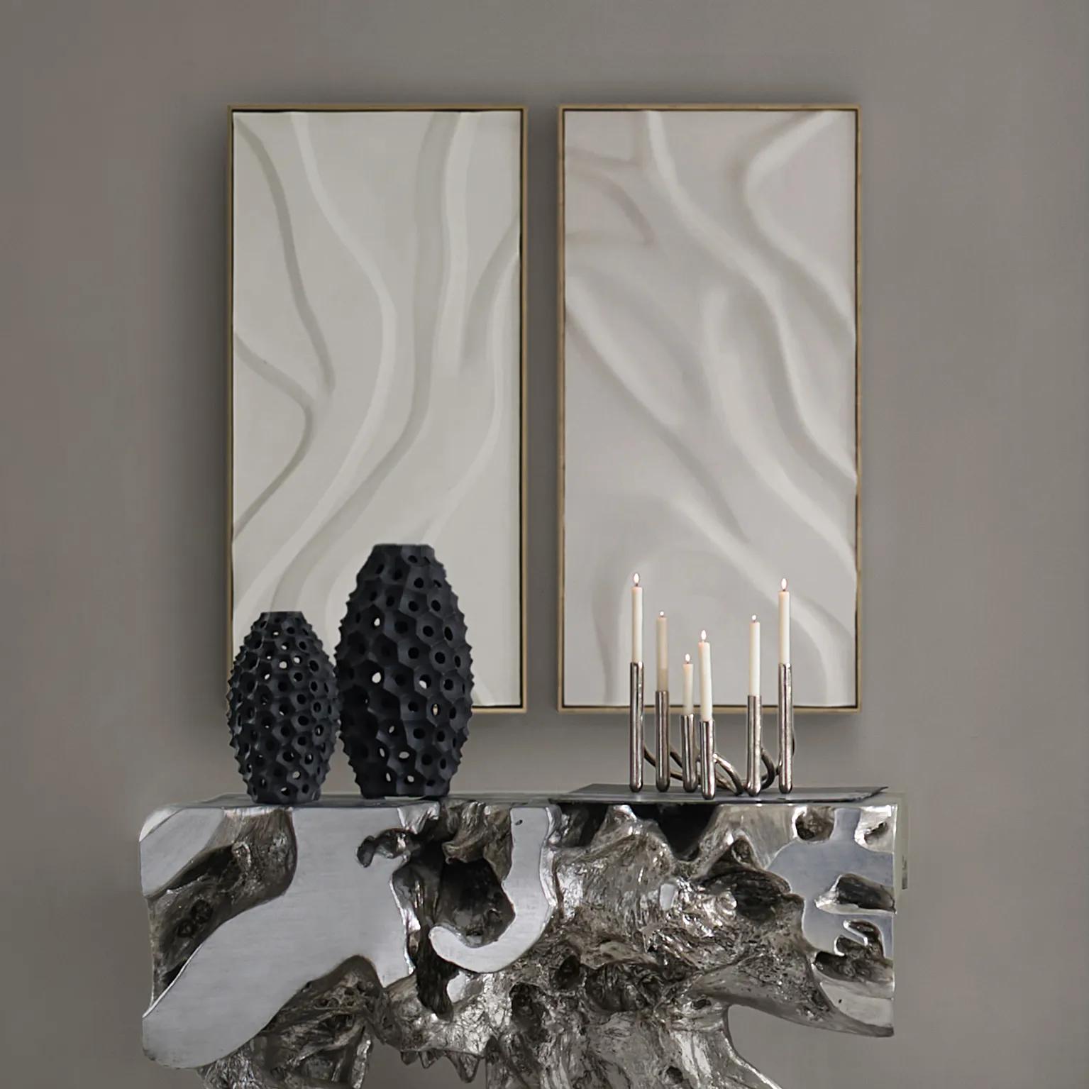 Au Lait Framed Painted Wall Art II 47.2" x 23.6"$199
A serene hand-painted canvas in beige, set in a warm whitewash floater frame for modern interiors.
Add To Cart -
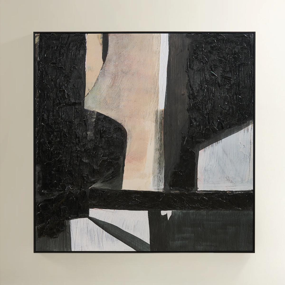 Grounded Painting$699
A hand-painted abstract canvas featuring black, cream, and earth tones in a sleek black floater frame.
Add To Cart -
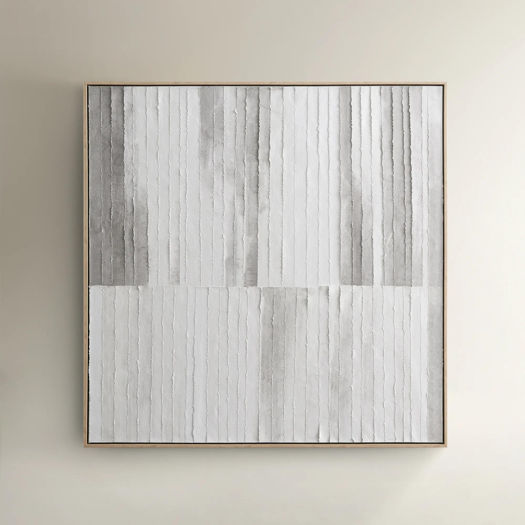
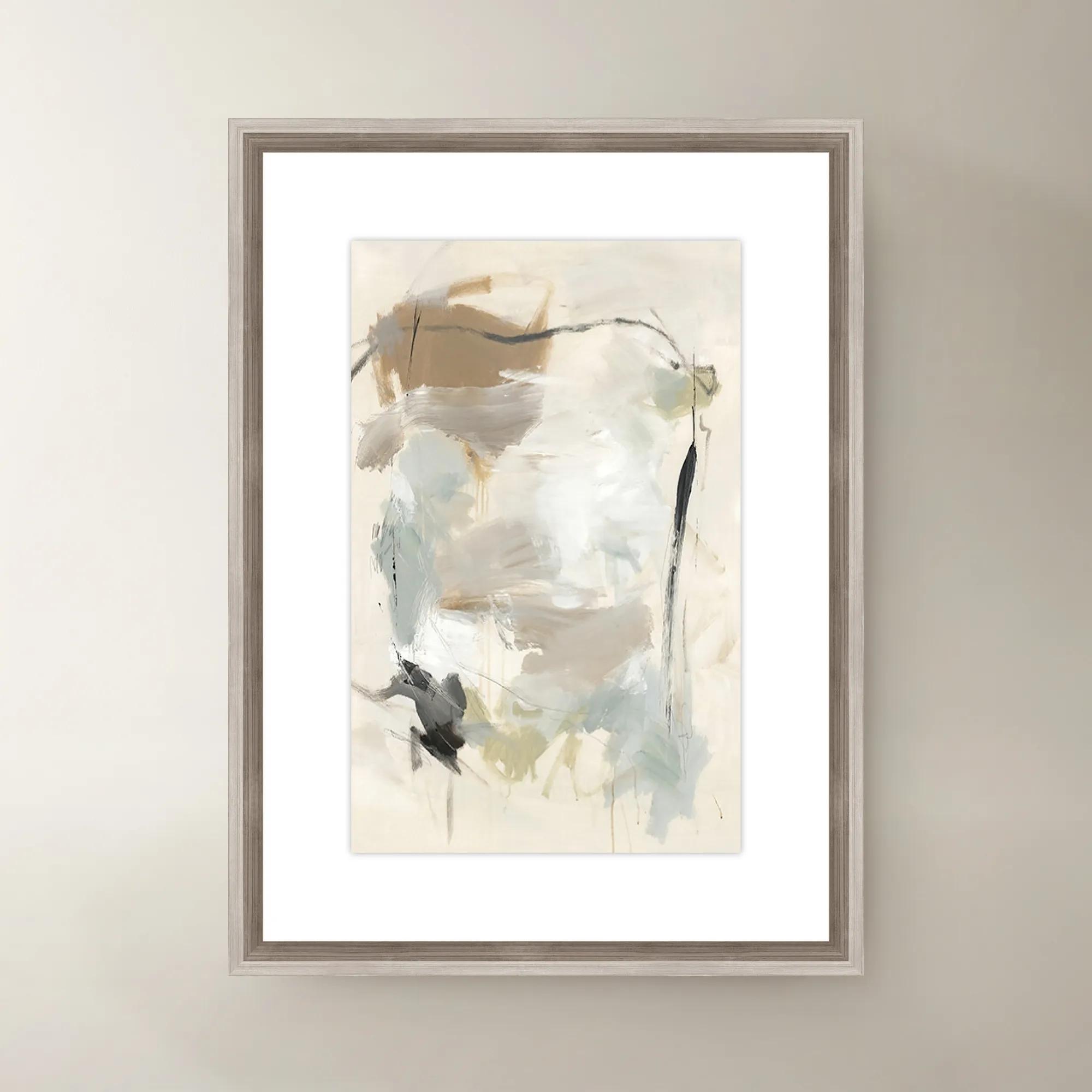
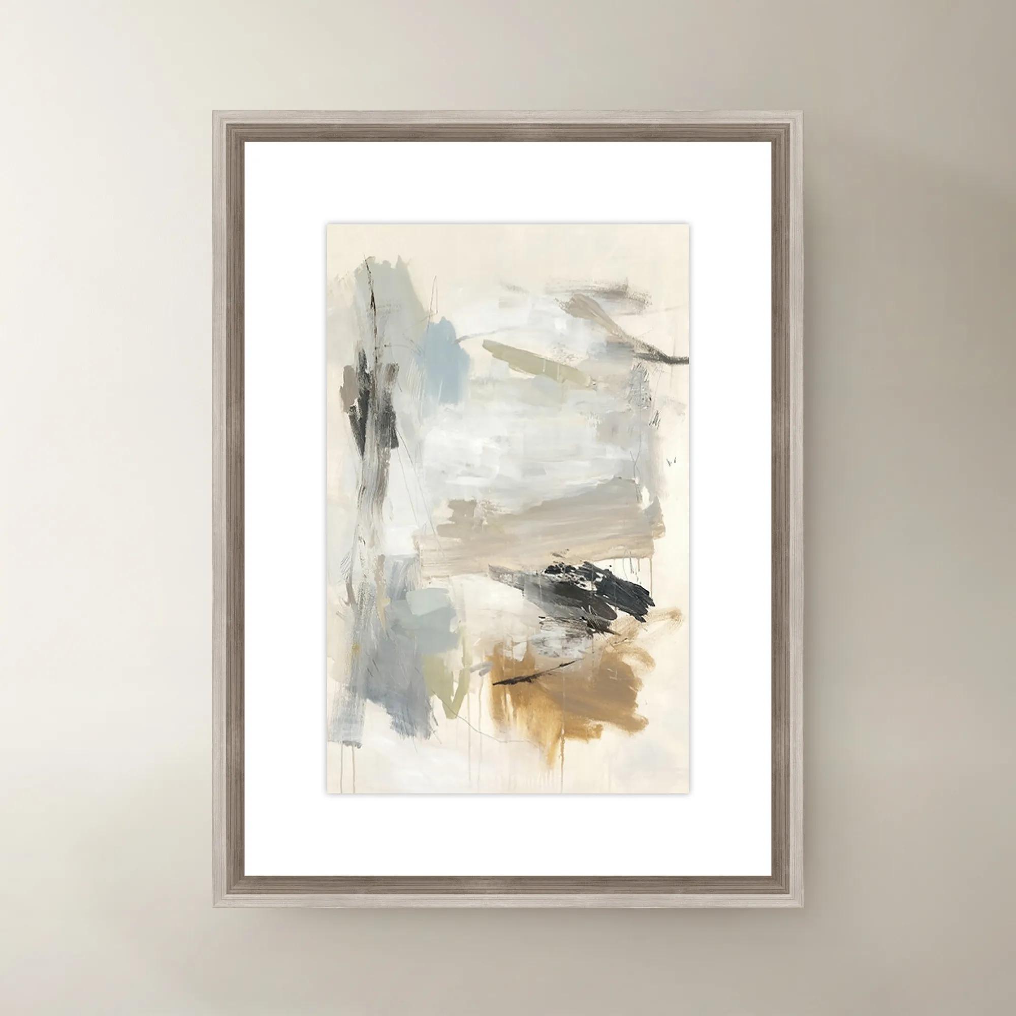
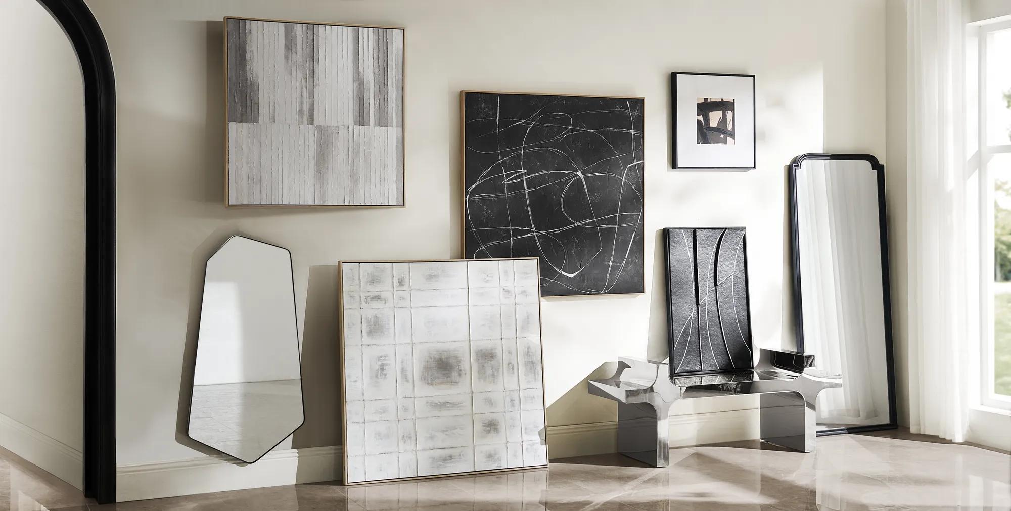 Morning Mist Paper Art$329
A hand-painted canvas featuring rhythmic grey lines in a textured, whitewashed floater frame for serene style.
Add To Cart -
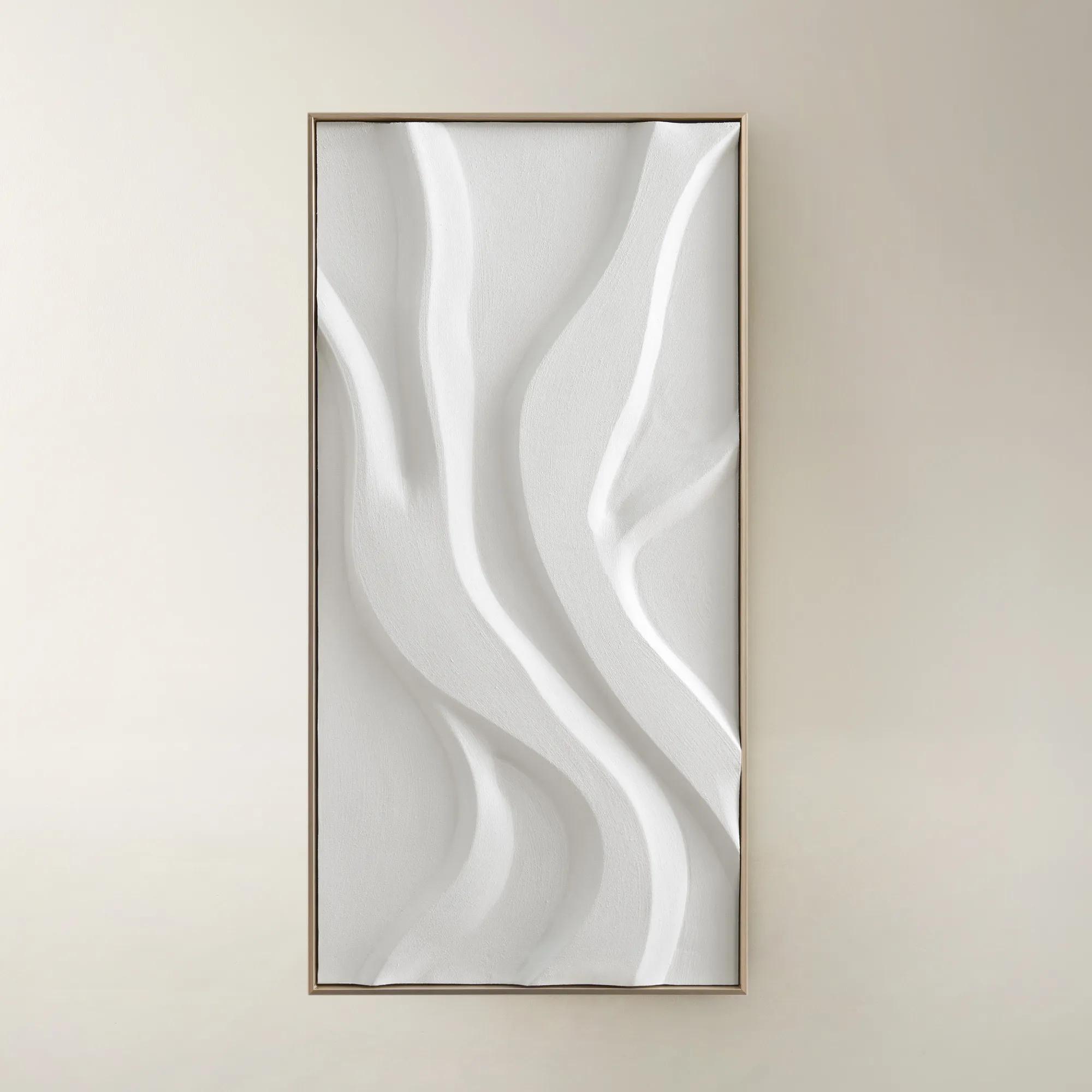
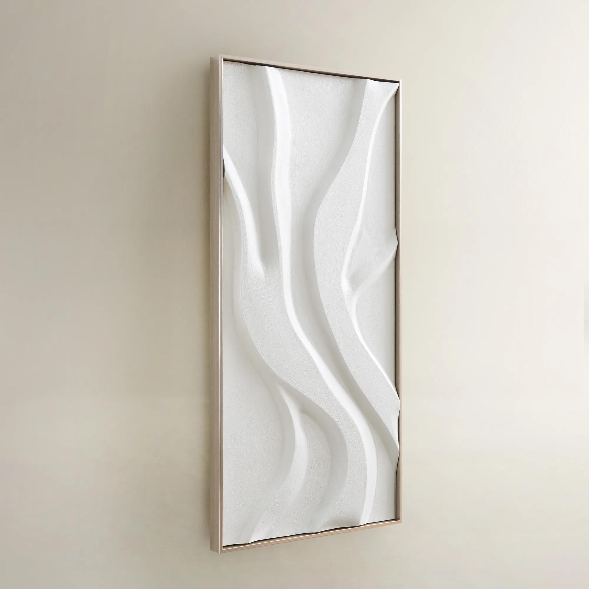 Au Lait Framed Painted Wall Art I 47.2" x 23.6"$199
An organic hand-painted canvas featuring flowing white forms in a warm champagne finish floater frame.
Add To Cart -
-0.jpeg?w=1200&h=1200)
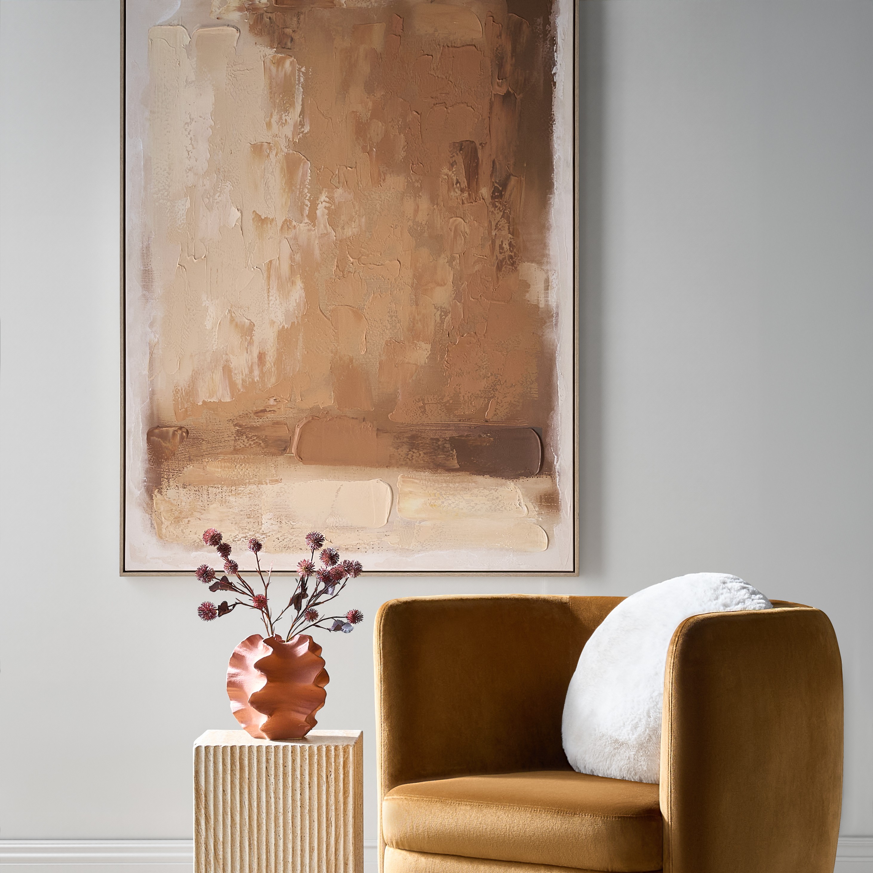 Ember Glow Framed Painted Wall Art 39.25" x 55"$499
A hand-painted abstract canvas blending ochre, terracotta, and golden clay hues in a light natural frame.
Add To Cart -
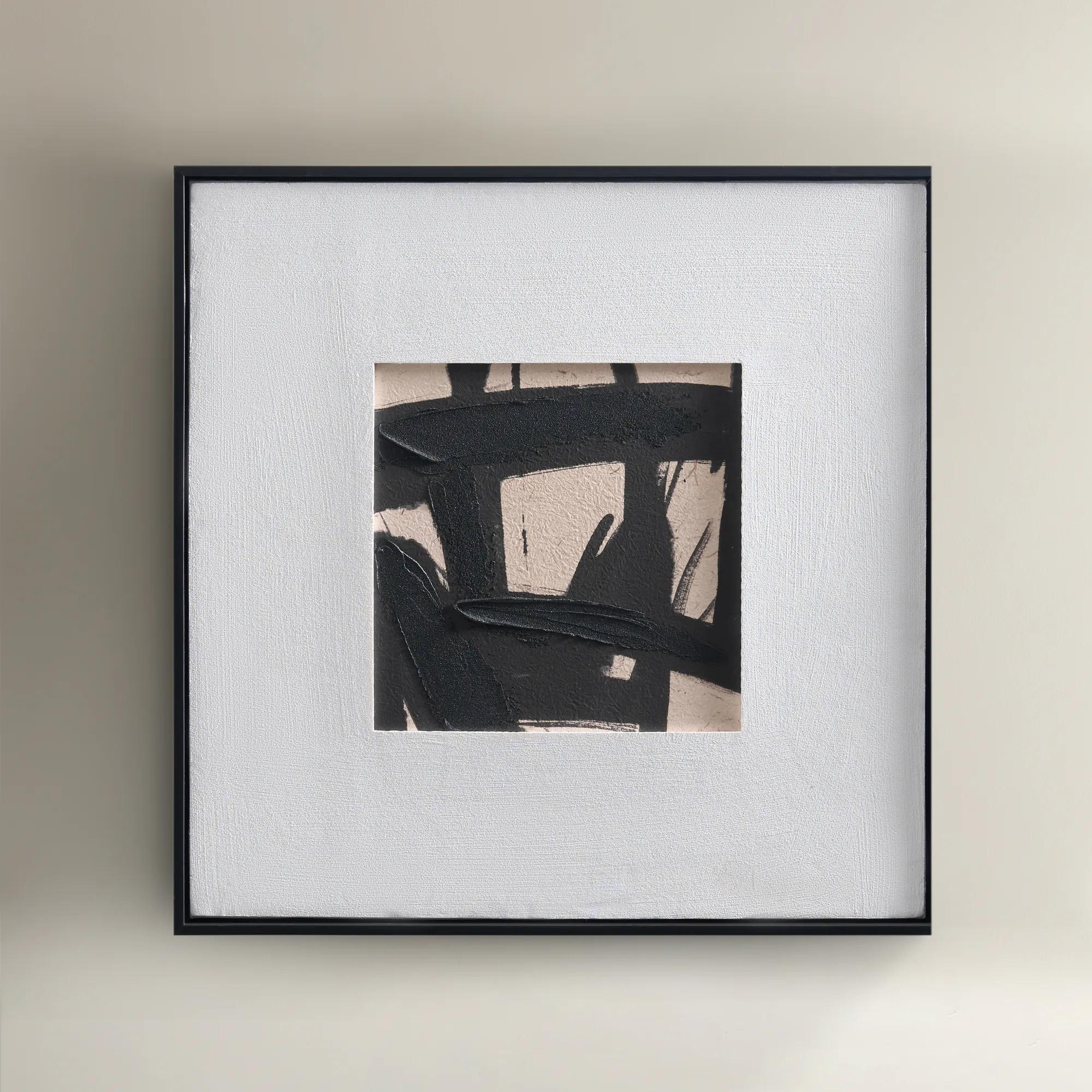
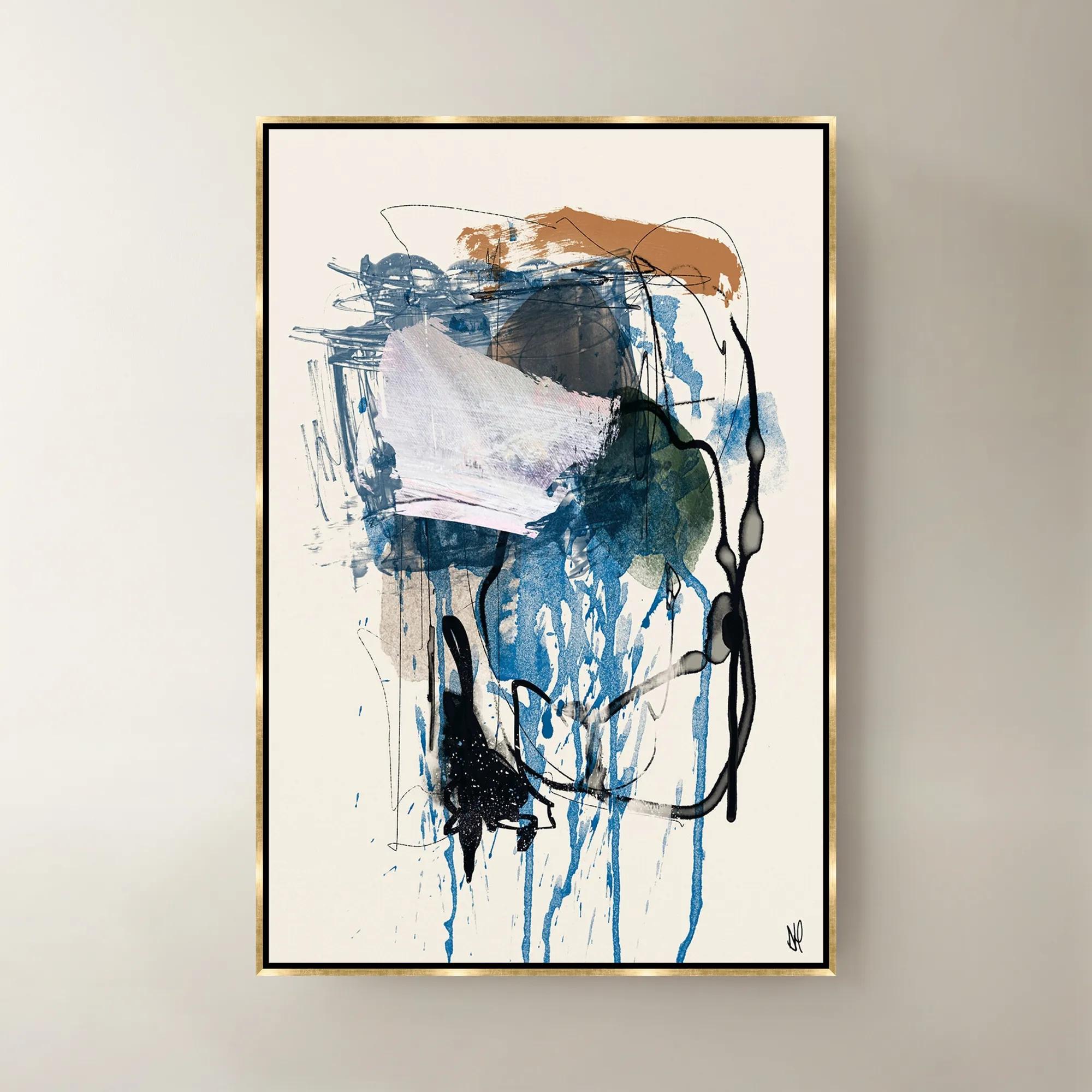
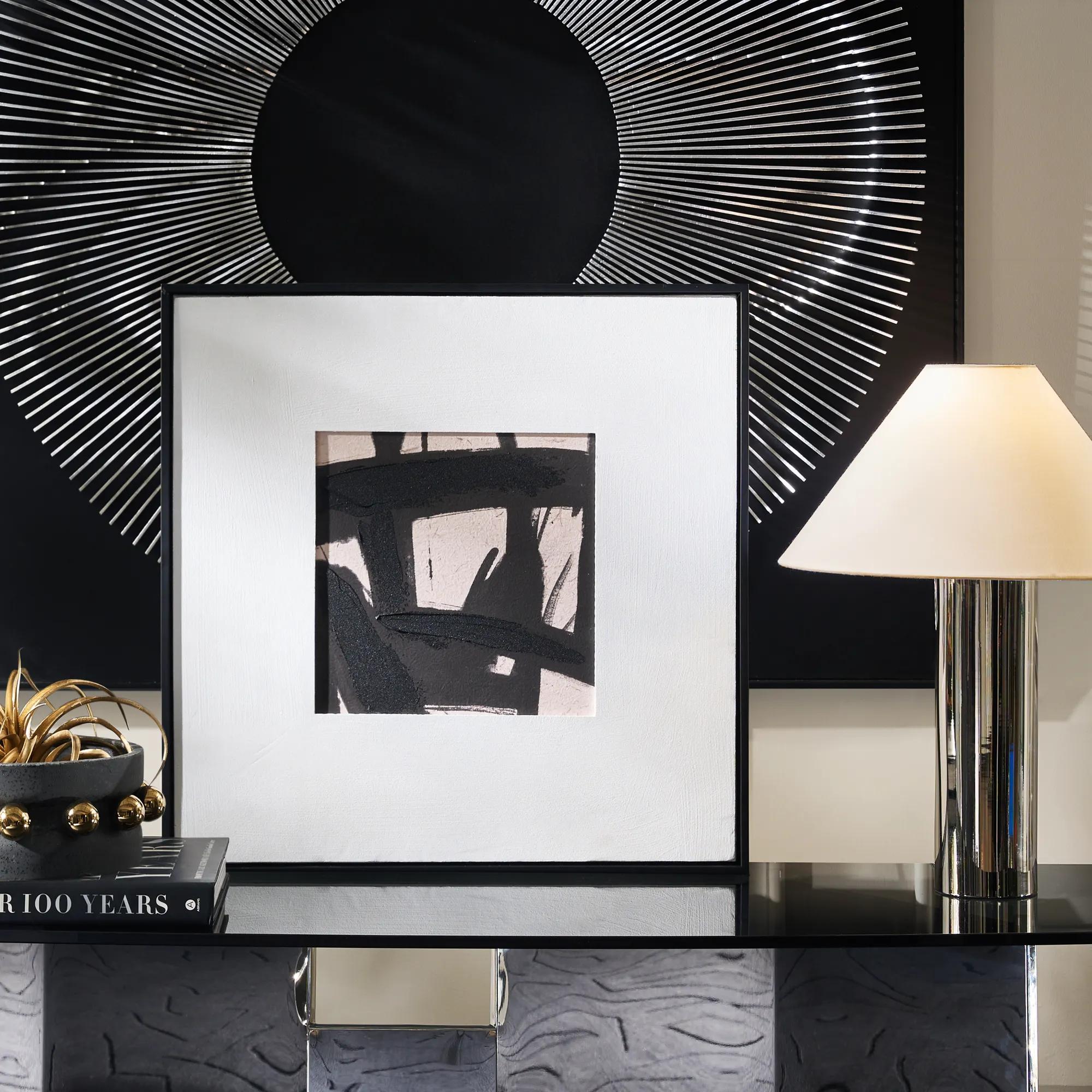 Ink Maze Painting$89
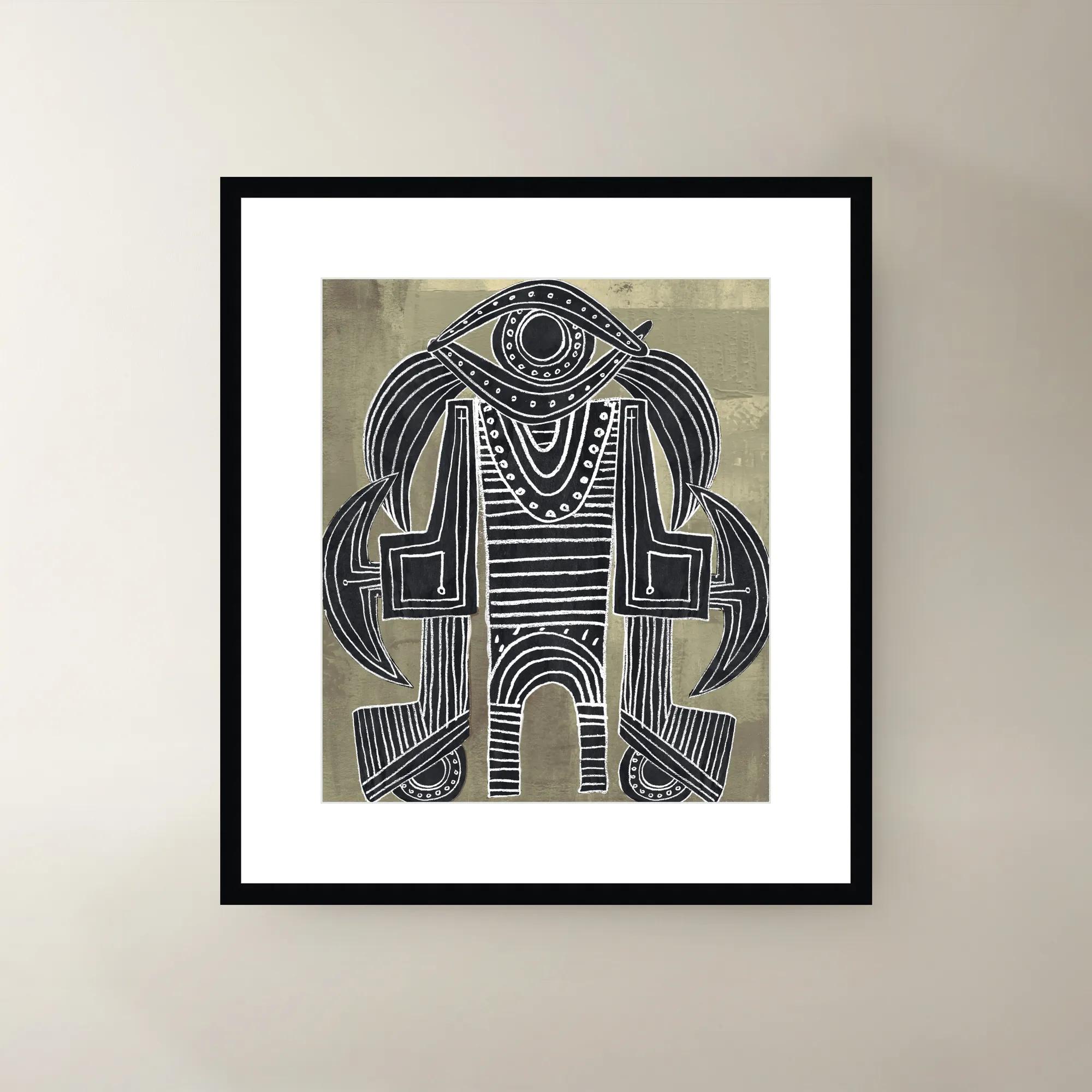
A hand-painted canvas featuring bold black and beige contrasts, set in a sleek black floater frame.
Add To Cart -
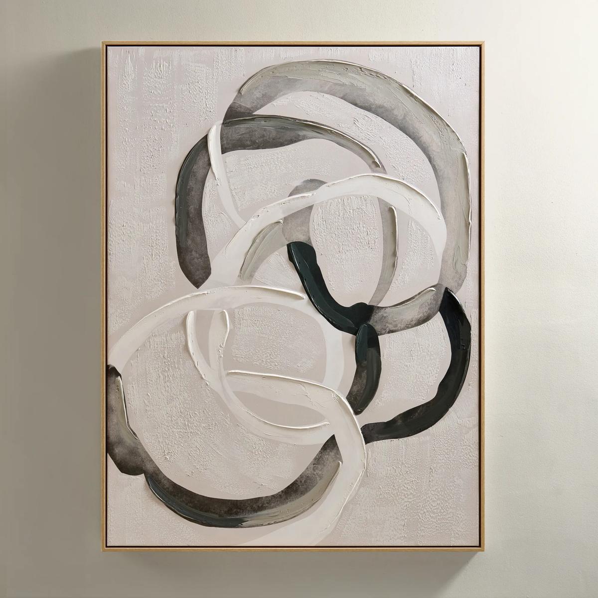
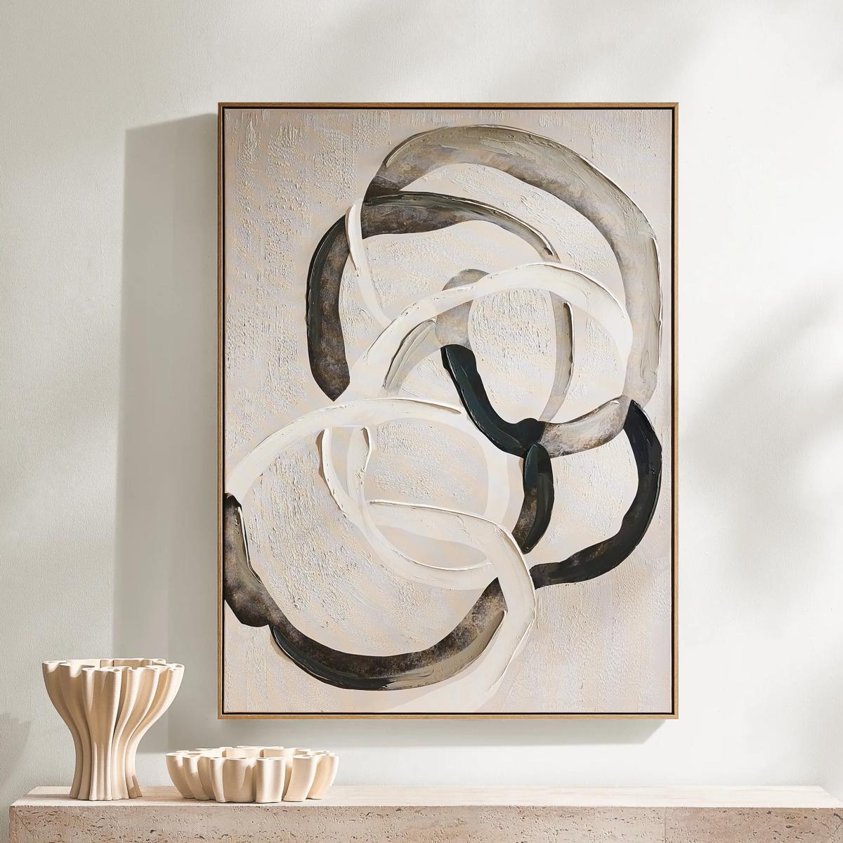 Round About Framed Painted Wall Art 35.25" x 47.25"$349
An abstract hand-painted canvas with tonal whites, charcoals, and taupes in a light wood floater frame.
Add To Cart -
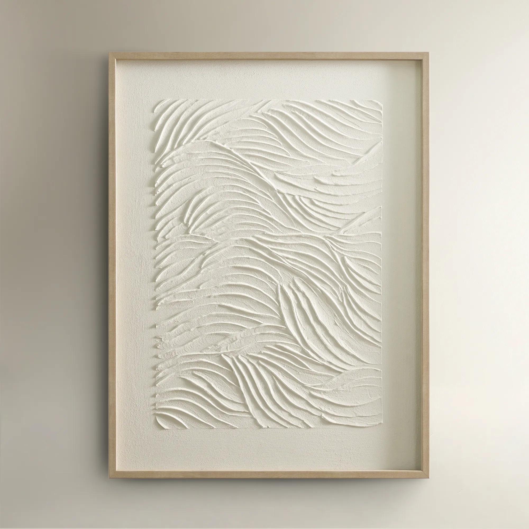
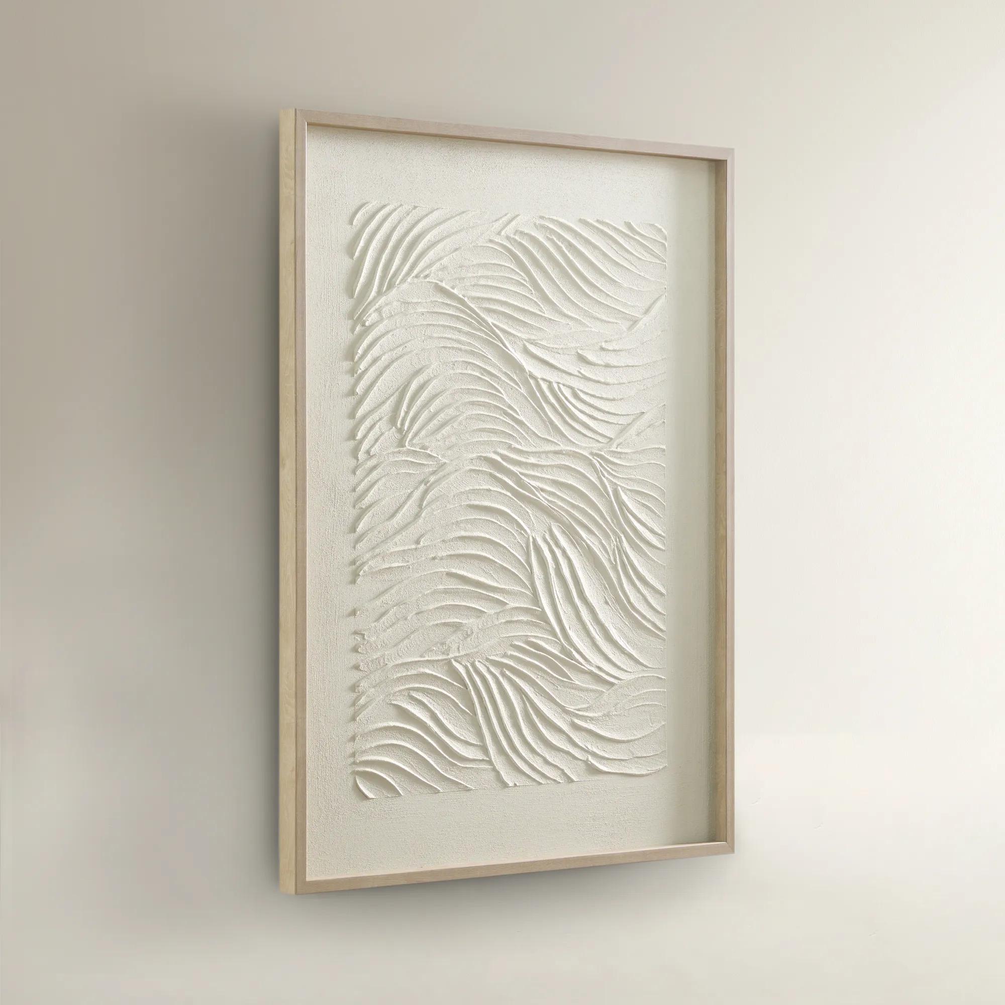 Sonnet Framed Painted Wall Art 23.5" x 31.5"$99
A hand-painted canvas featuring textured white shades and a warm blonde wood frame for elegant depth.
Add To Cart -
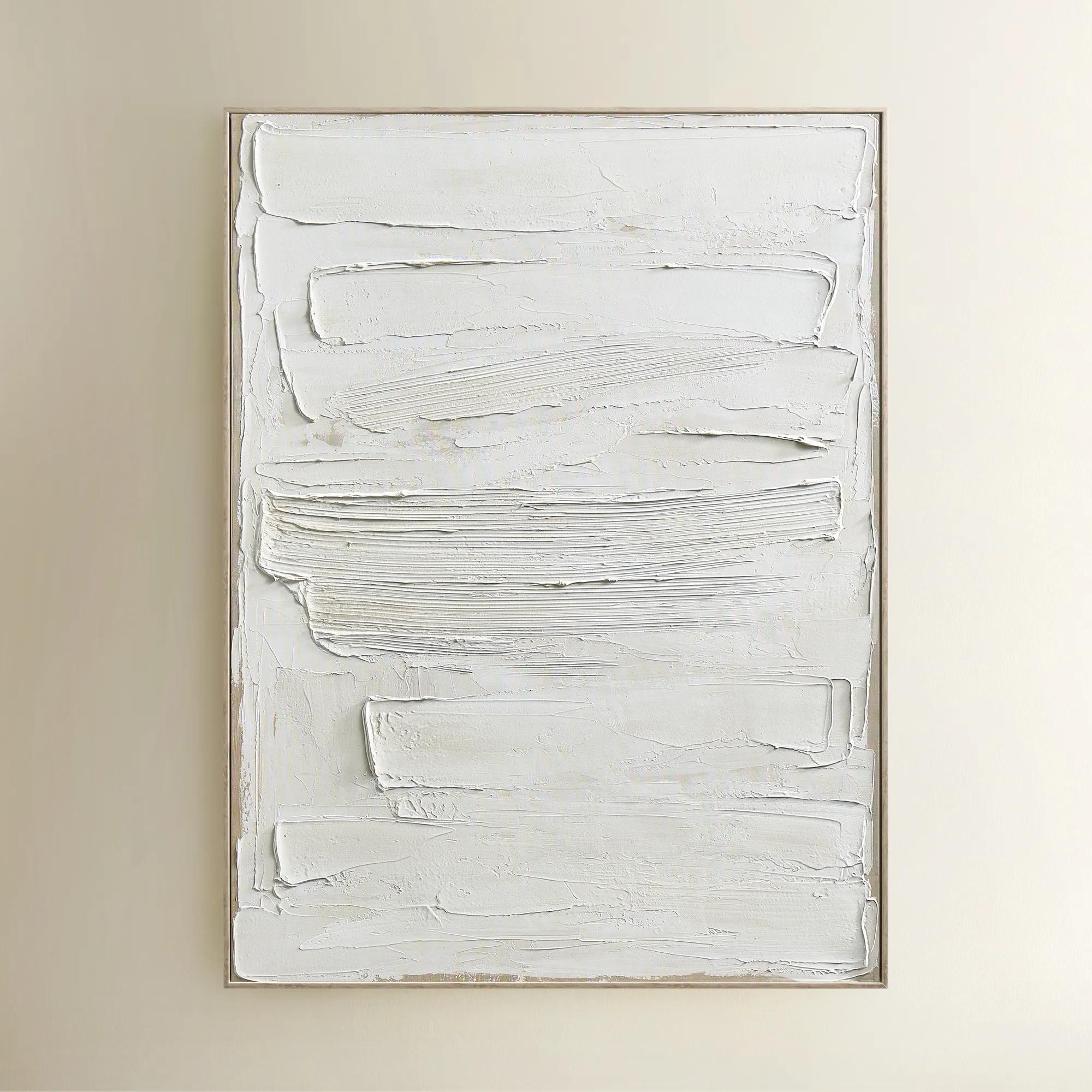
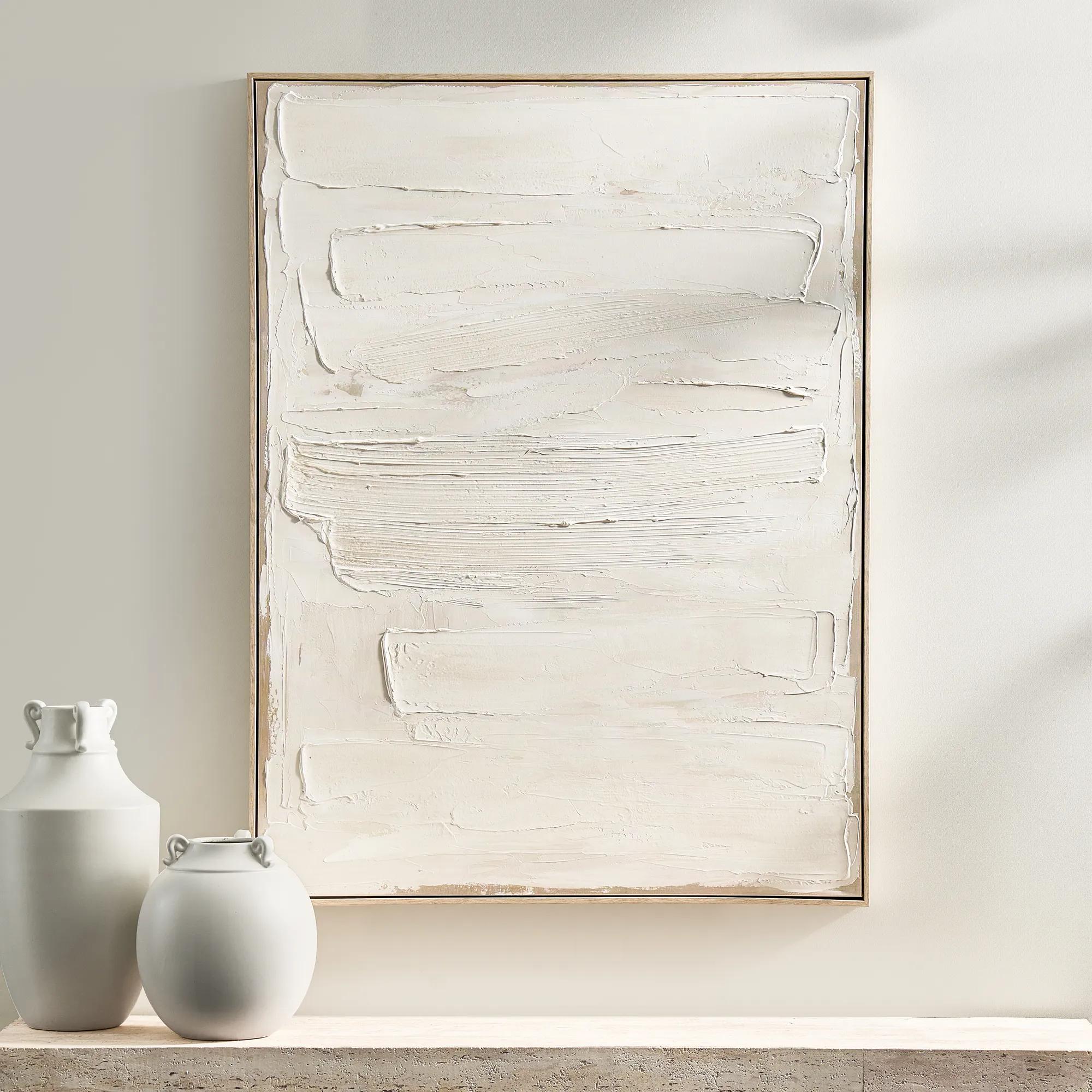 Monotype Canvas 1$399
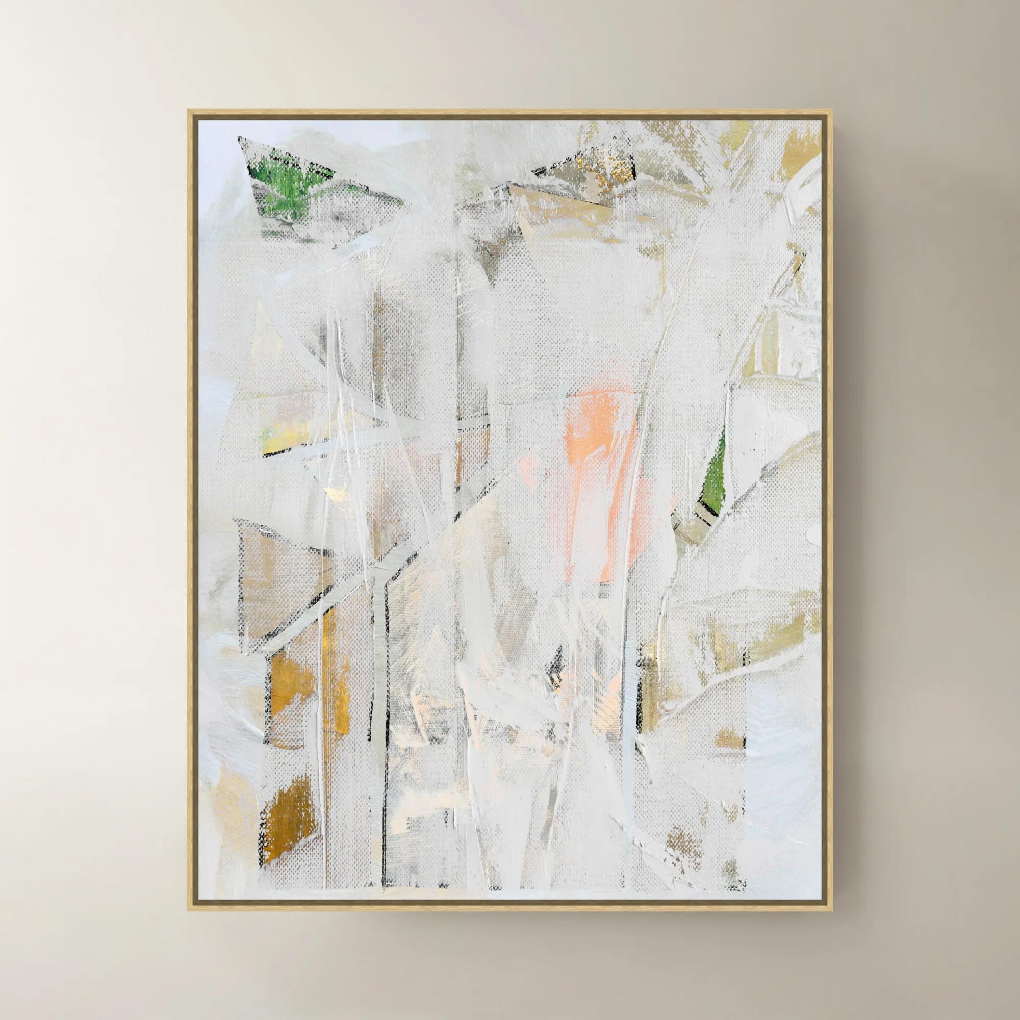
A hand-painted abstract canvas featuring layered white tones and textured paint in a whitewashed wood frame.
Add To Cart -
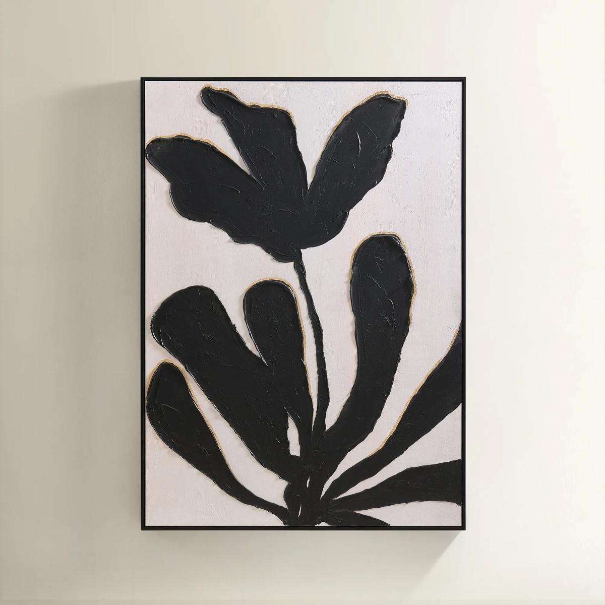
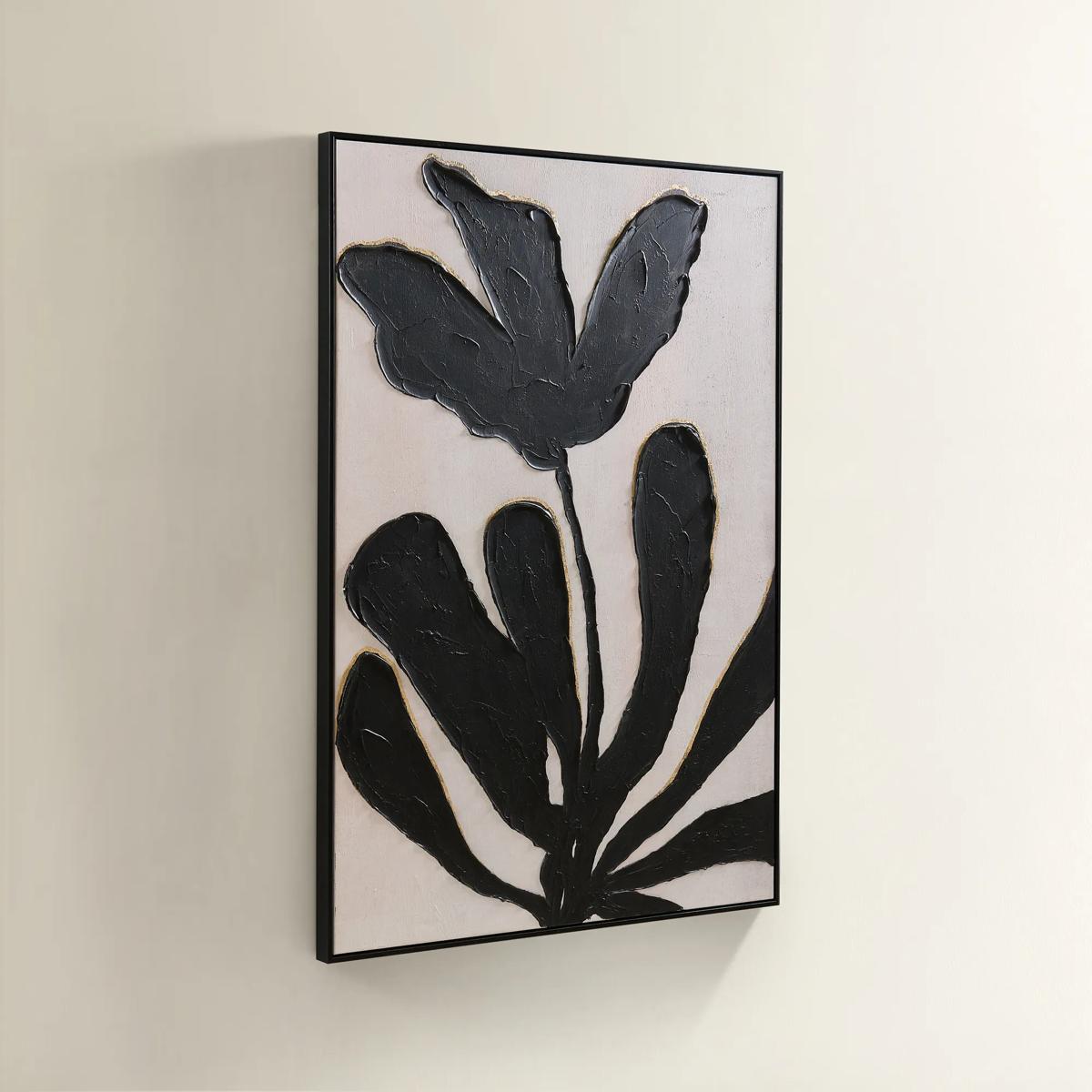 First Bloom Framed Painted Wall Art 39.25" x 55"$499
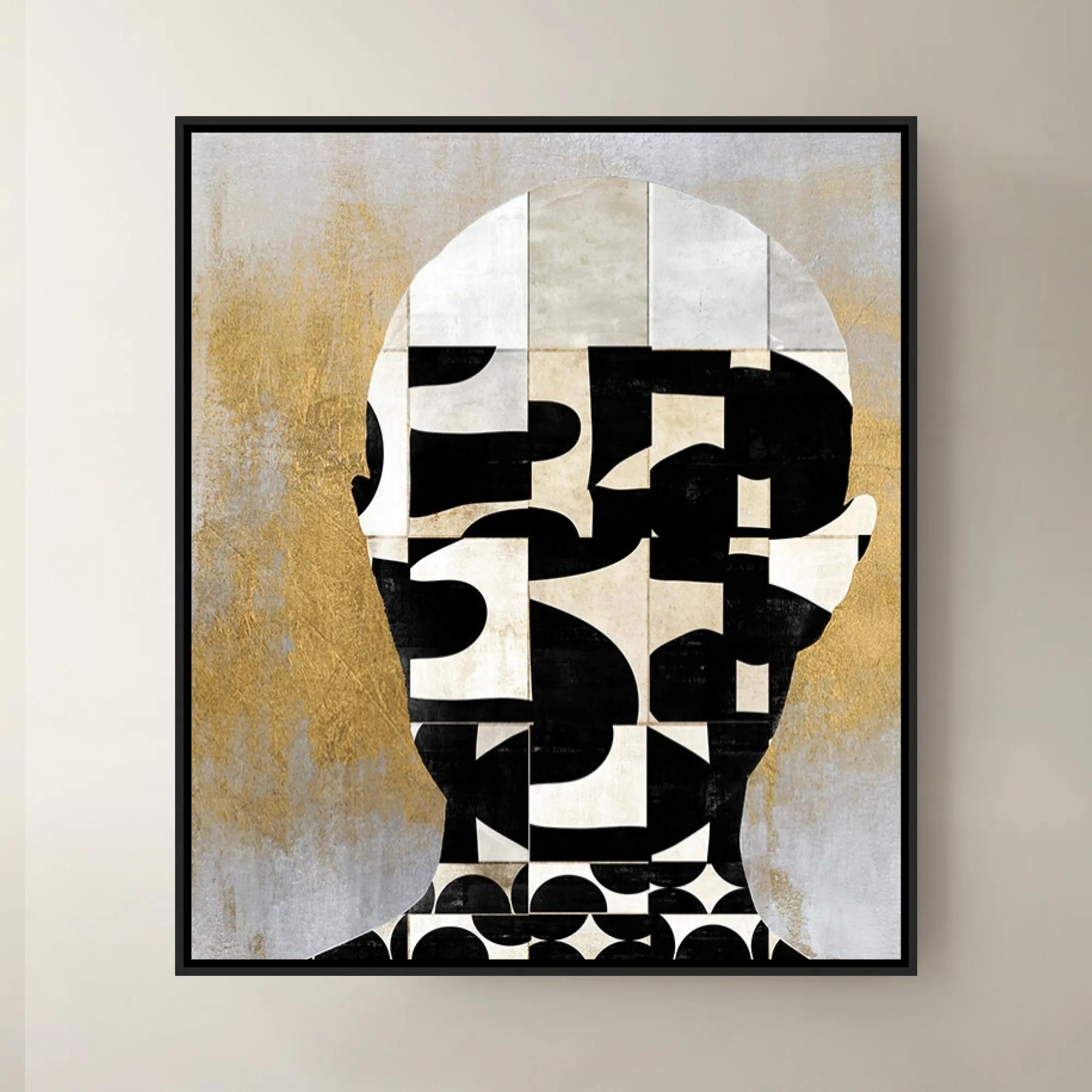
A hand-painted canvas featuring black abstract leaves and gold leafing on an ivory background in a black frame.
Add To Cart -
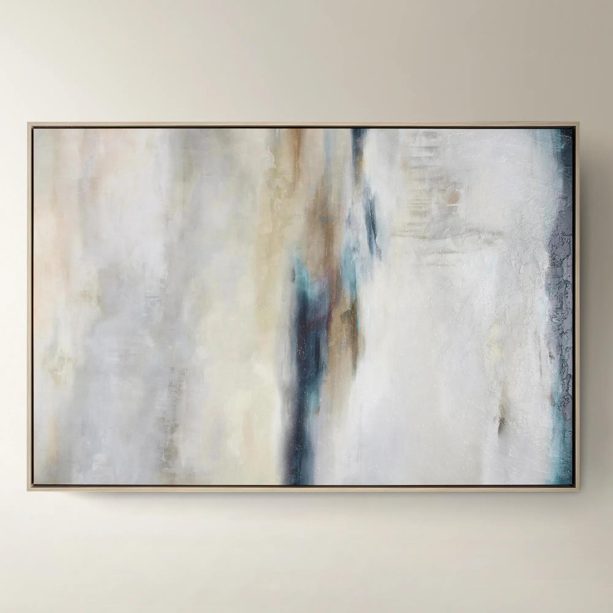
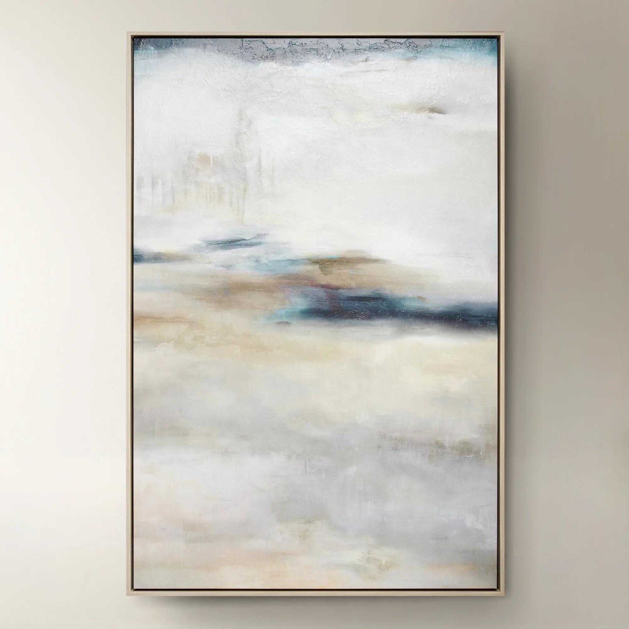 Forward Looking$1299
A softly layered abstract canvas print with a gel finish, set in a natural-hued floater frame.
Add To Cart -
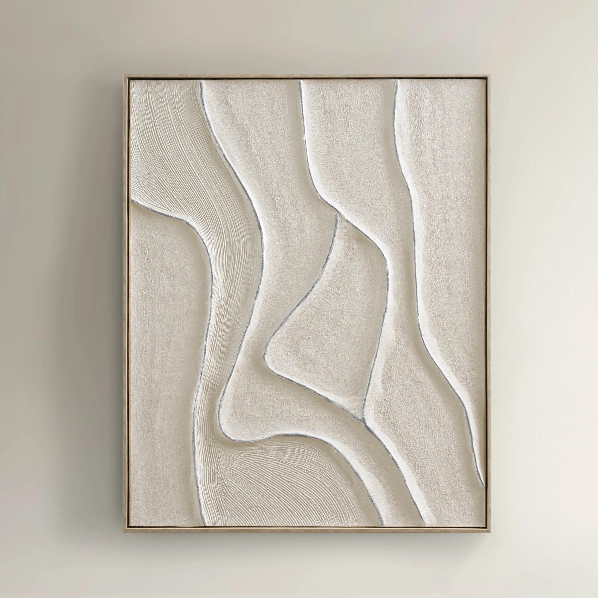
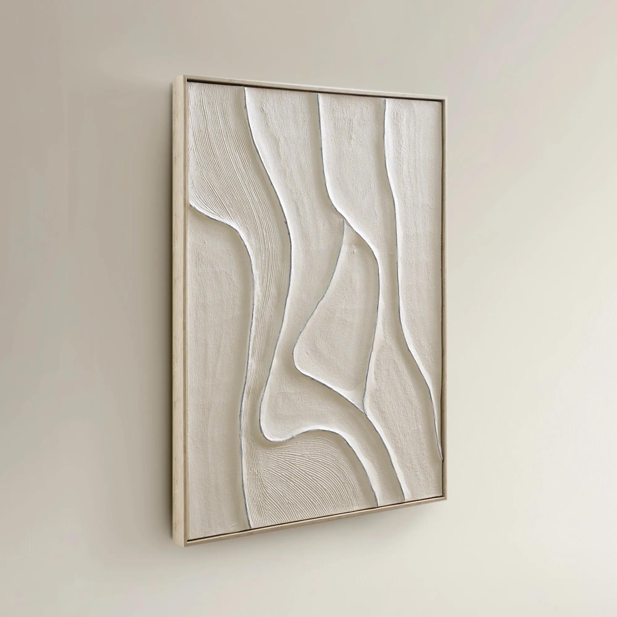 Vivre Framed Painted Wall Art 39.25" x 31.5"$199
A hand-painted canvas featuring tranquil beige hues and flowing lines in a warm whitewash floater frame.
Add To Cart -
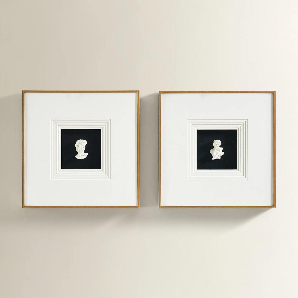
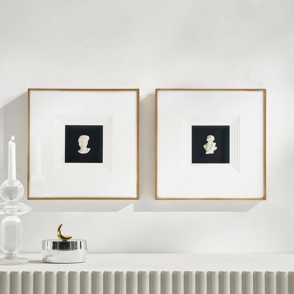 Classics Framed Plaster Wall Decor Set of 2$149
A set of two plaster portrait wall art pieces in black and ivory with sleek aluminum frames.
Add To Cart -
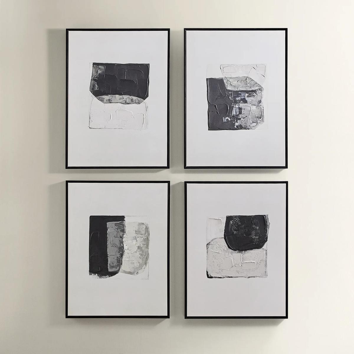
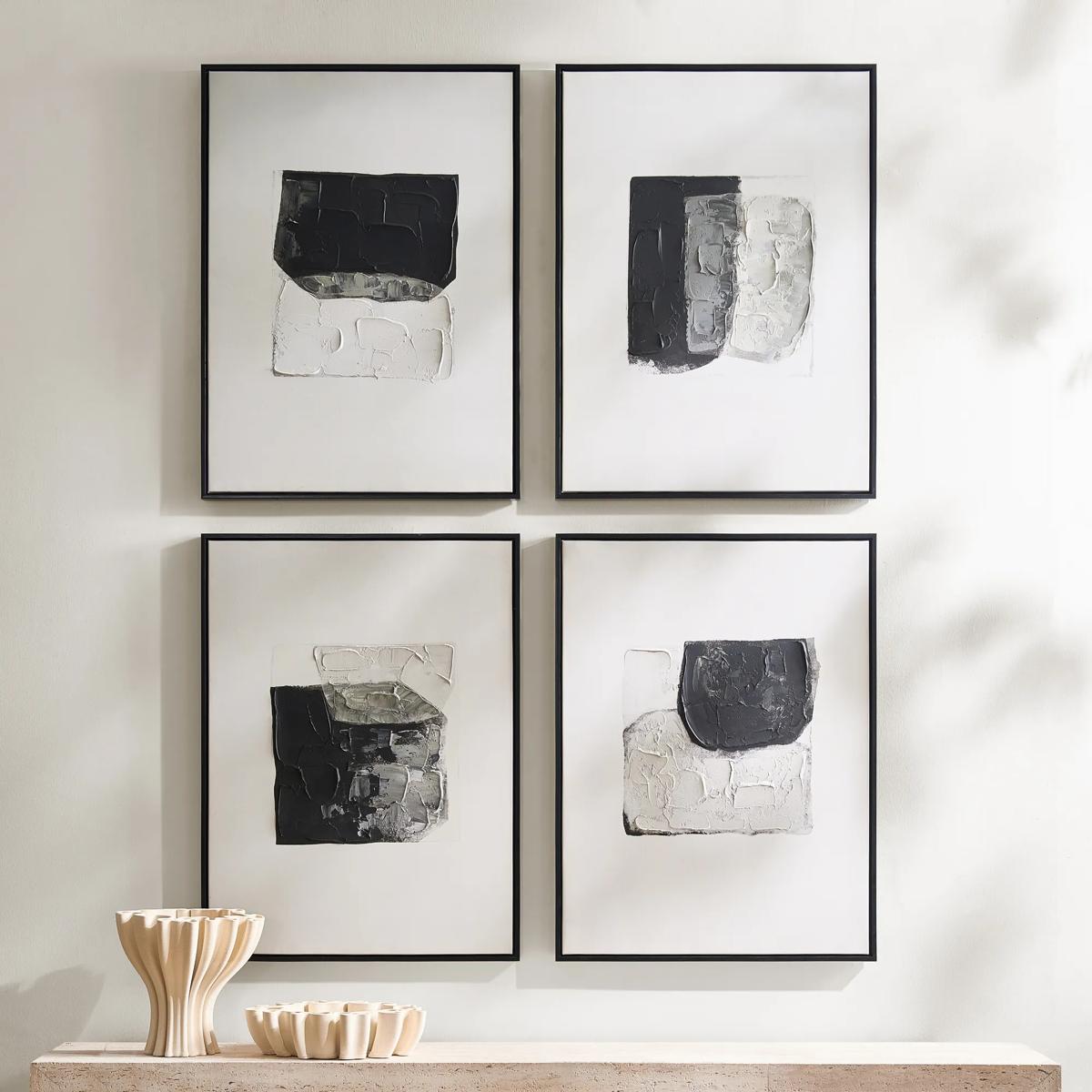 Shadows Framed Painted Wall Art Set of 4$299
A set of four hand-painted abstract canvases featuring black, white, and gold accents in black frames.
Add To Cart -
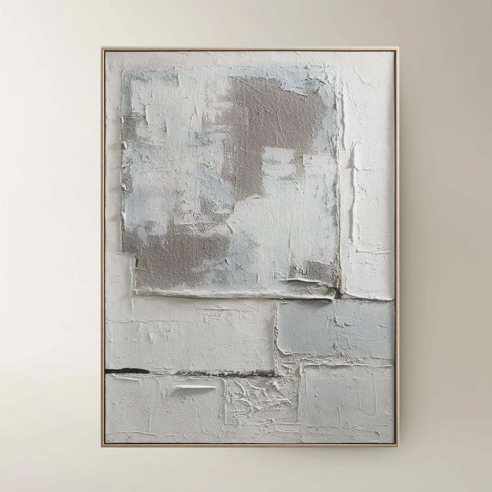
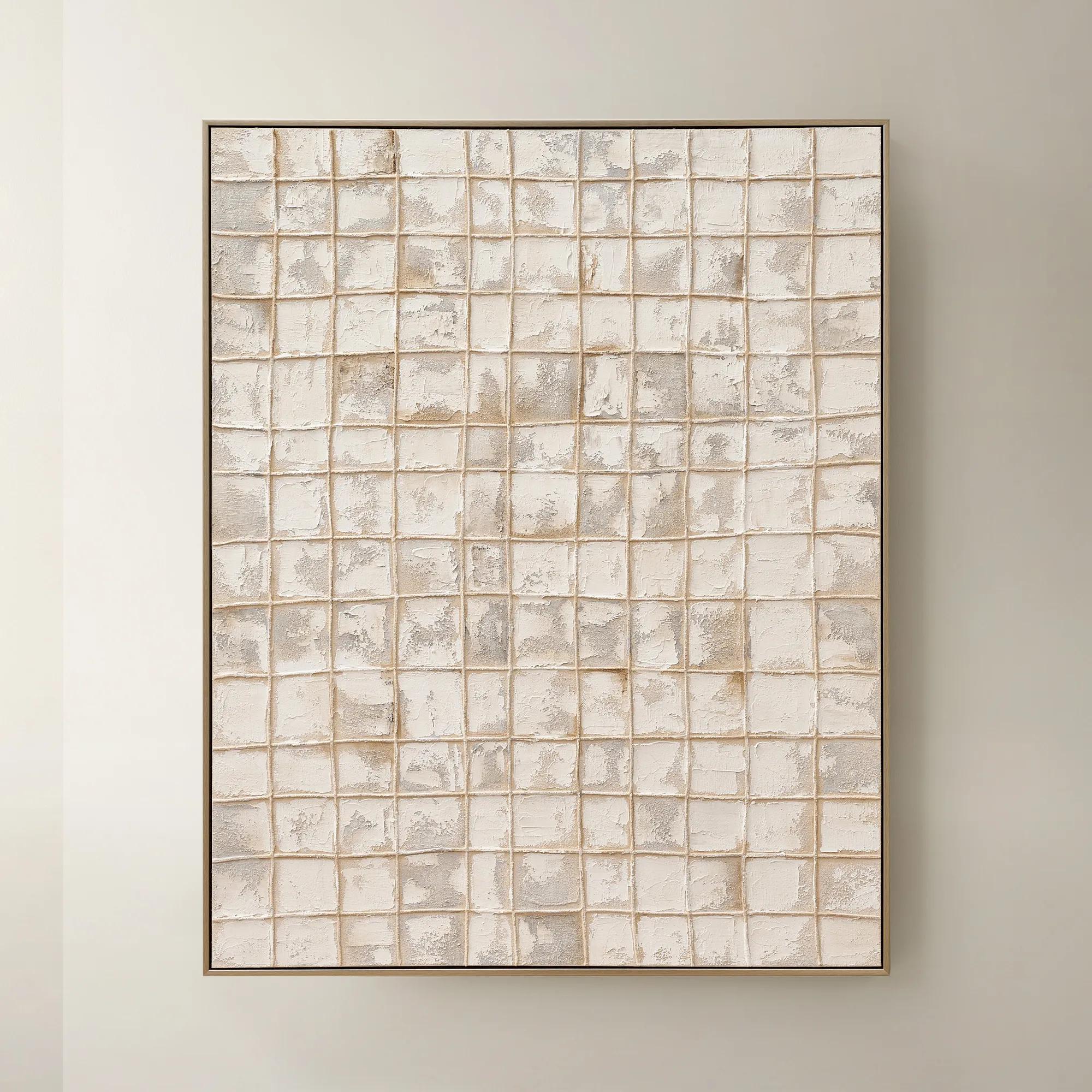
 Marrow Painting$399
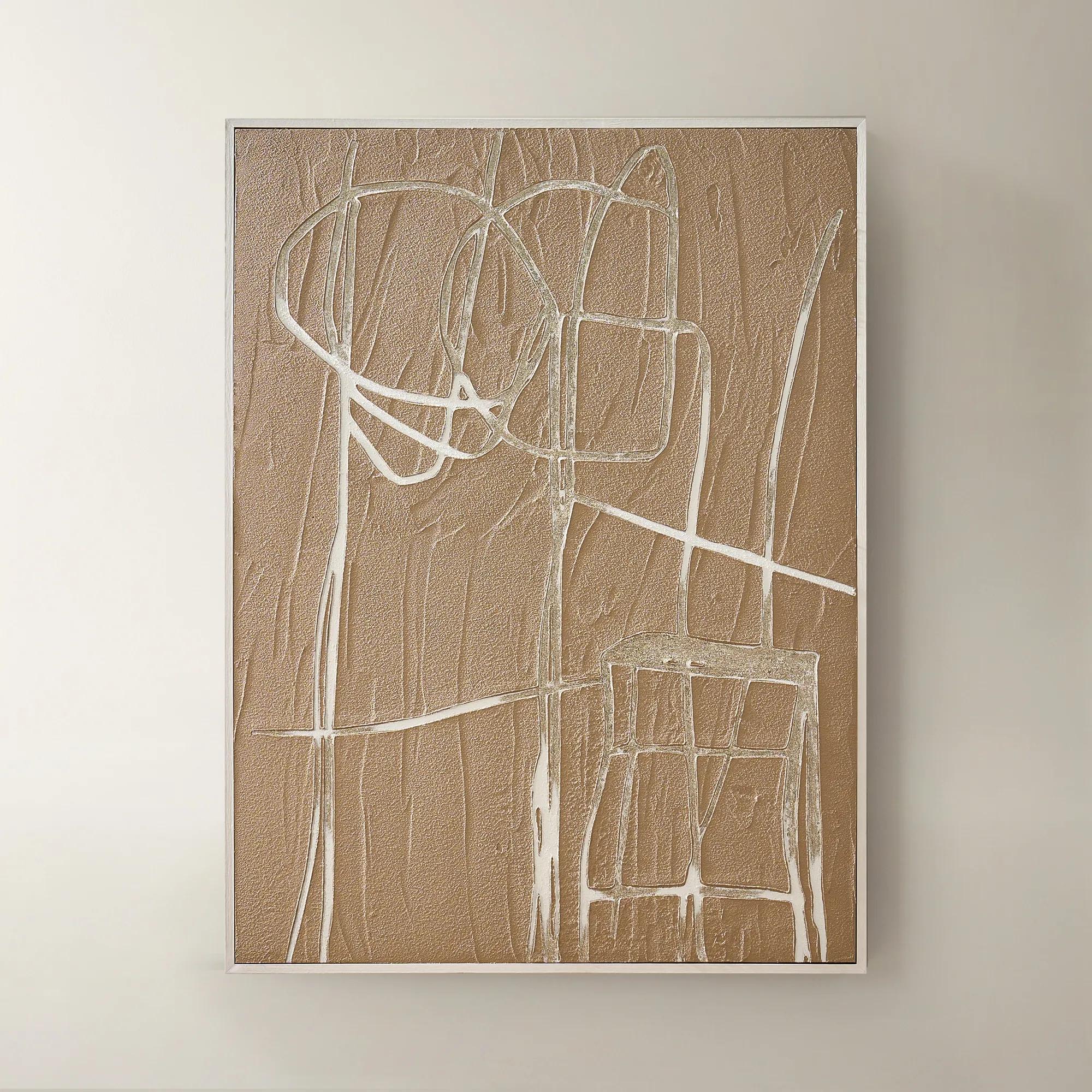
A hand-painted abstract canvas in subtle beige hues, elegantly framed in a warm beech wood floater.
Add To Cart -
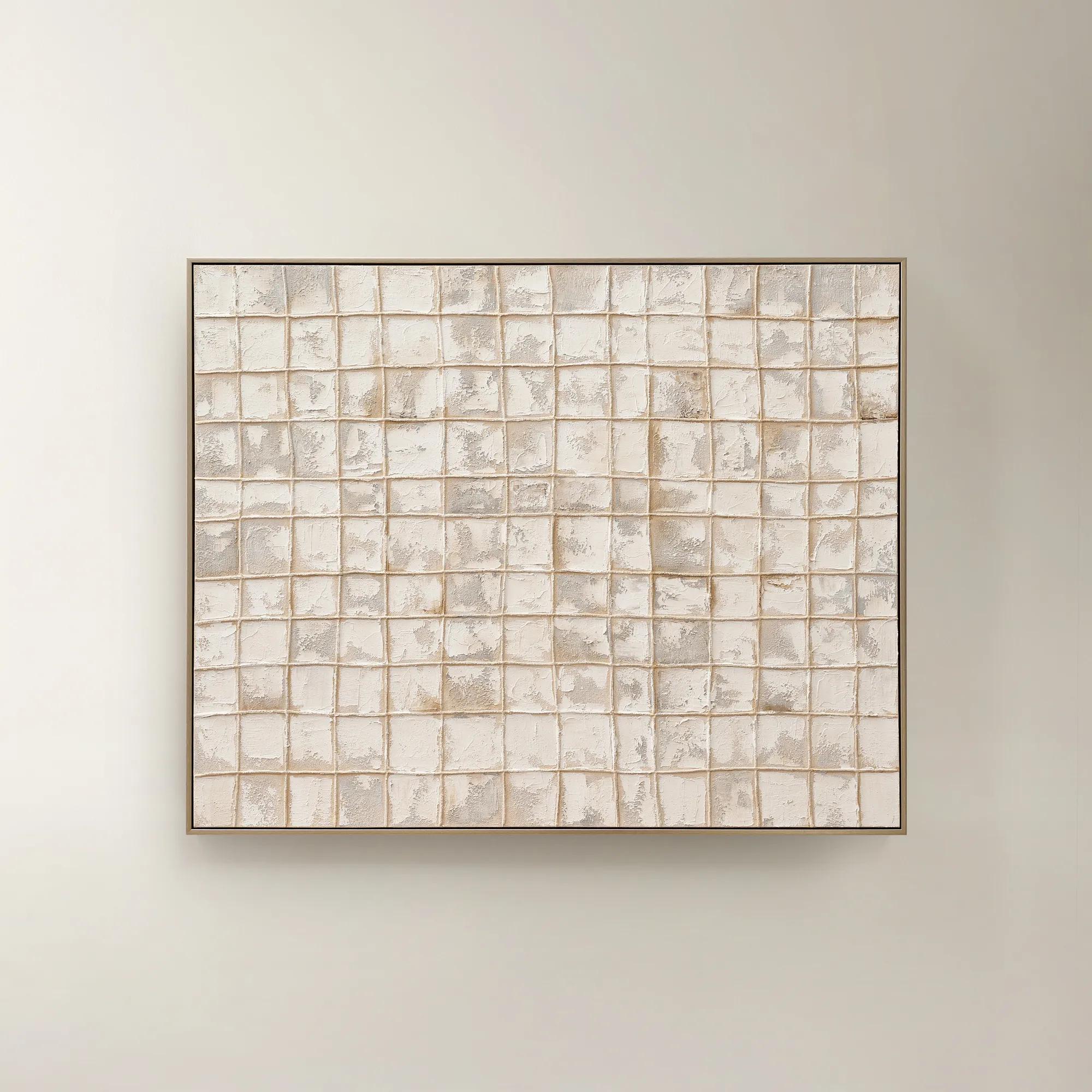 Painted Echos Framed Gold Leaf Wall Art 60" x 48"$699
A hand-painted abstract canvas with gold leaf accents and a champagne frame for modern, versatile display.
Add To Cart -
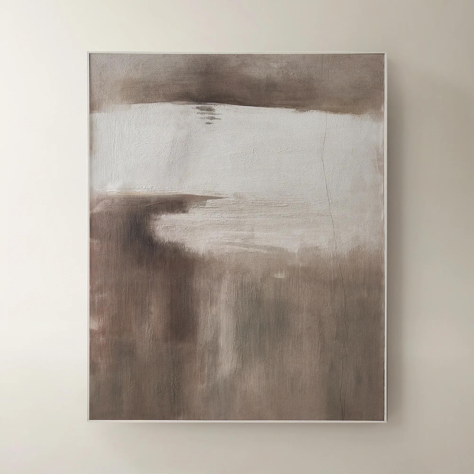 Desert Wind Art$599
A richly hued brown canvas artwork bringing warm, desert-inspired movement to modern interiors.
Add To Cart -
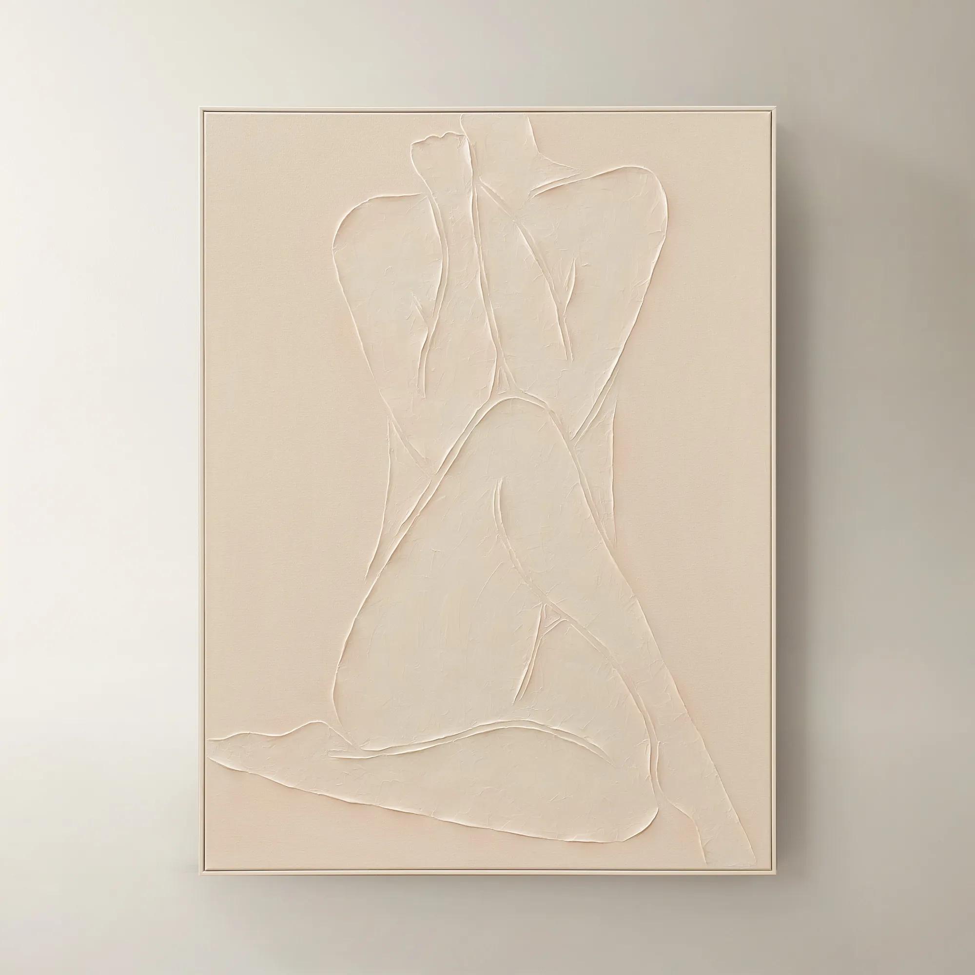
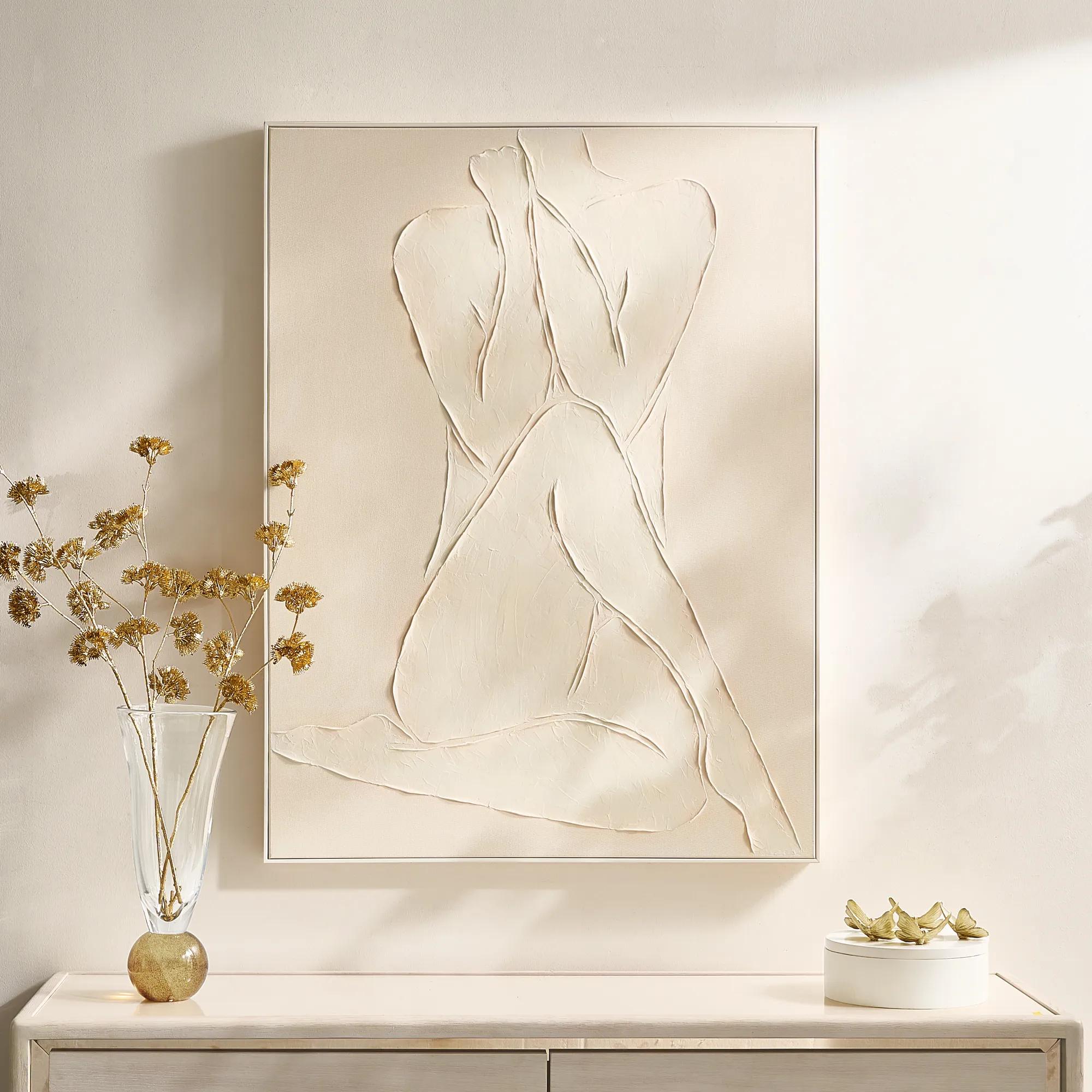 Modern Elegance Nude Ivory Framed Painted Wall Art 35.5" x 47.25"$599
A hand-painted ivory canvas in a white frame brings serene, modern artistry to any space.
Add To Cart -
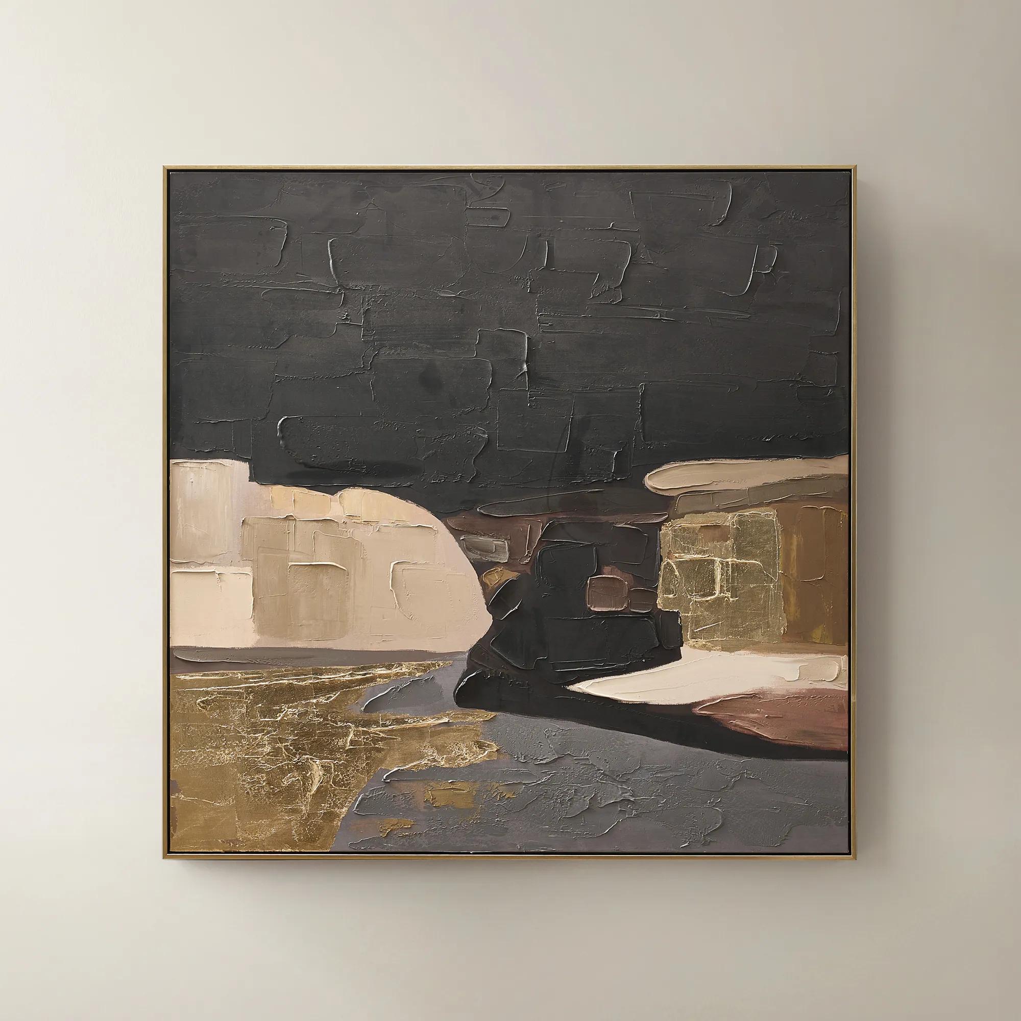 Obscured Light Framed Gold Leaf Painted Wall Art 48" x 48"$499
A hand-painted canvas with gold leaf accents and a black-gold frame in dramatic neutral tones.
Add To Cart -
 Quiet Pose Framed Painted Wall Art 36" x 48"$499
A hand-painted canvas in taupe and champagne tones features textural details and shimmering champagne leafing.
Add To Cart -
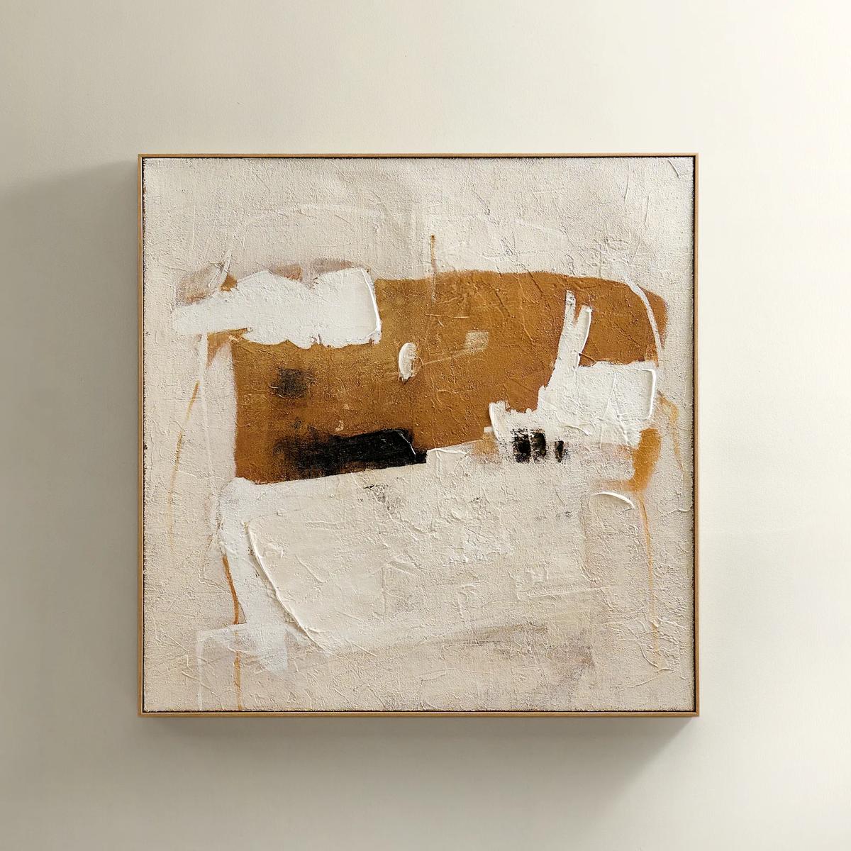 Instinct Framed Painted Wall Art 39.25" x 39.25"$349
An abstract hand-painted artwork featuring warm neutrals and black strokes on hessian with a light natural frame.
Add To Cart -
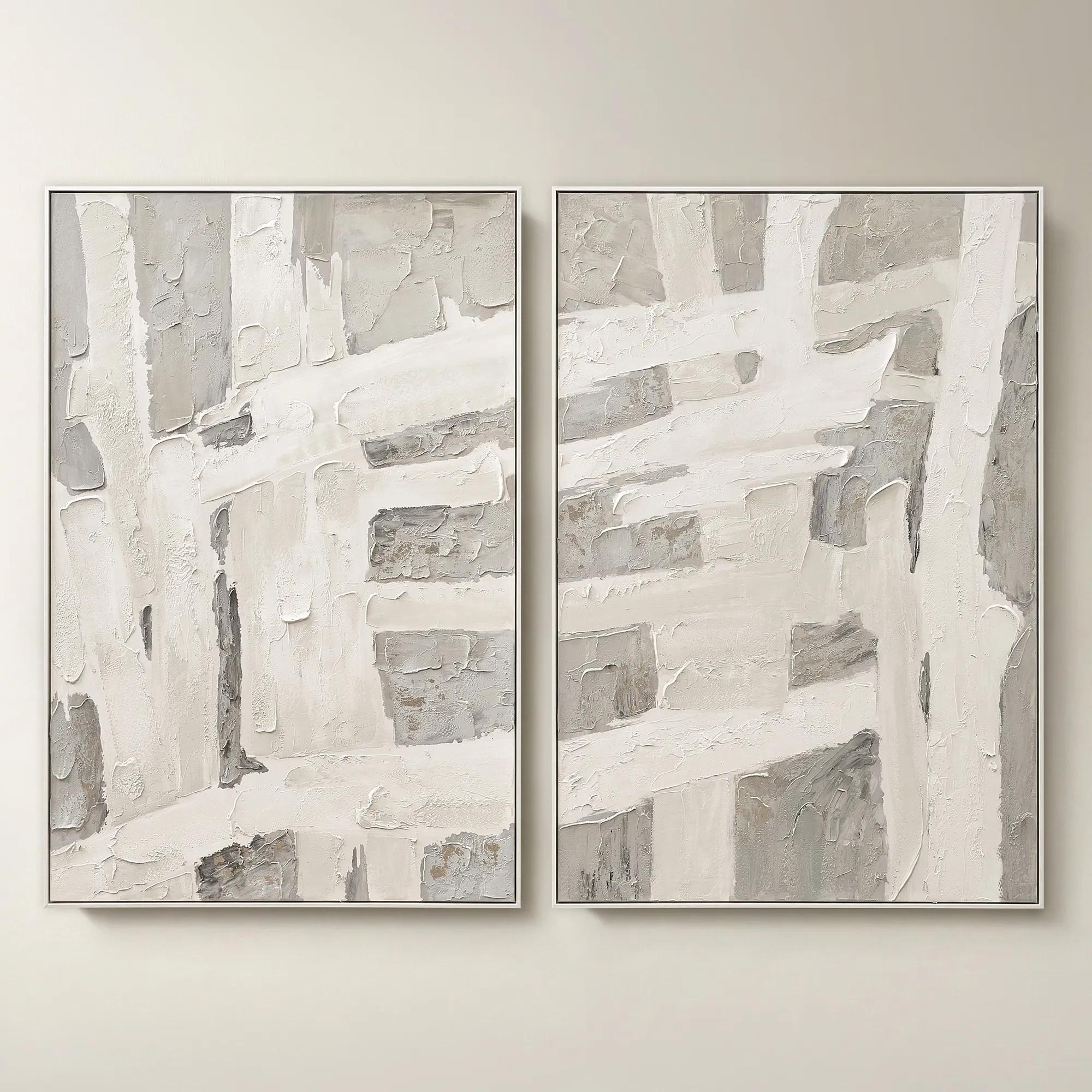 Traverse Framed Painted Wall Art 40" x 60" Set of 2$799
A hand-painted abstract diptych features champagne accents and soft grey, pearl, and alabaster tones in white frames.
Add To Cart -
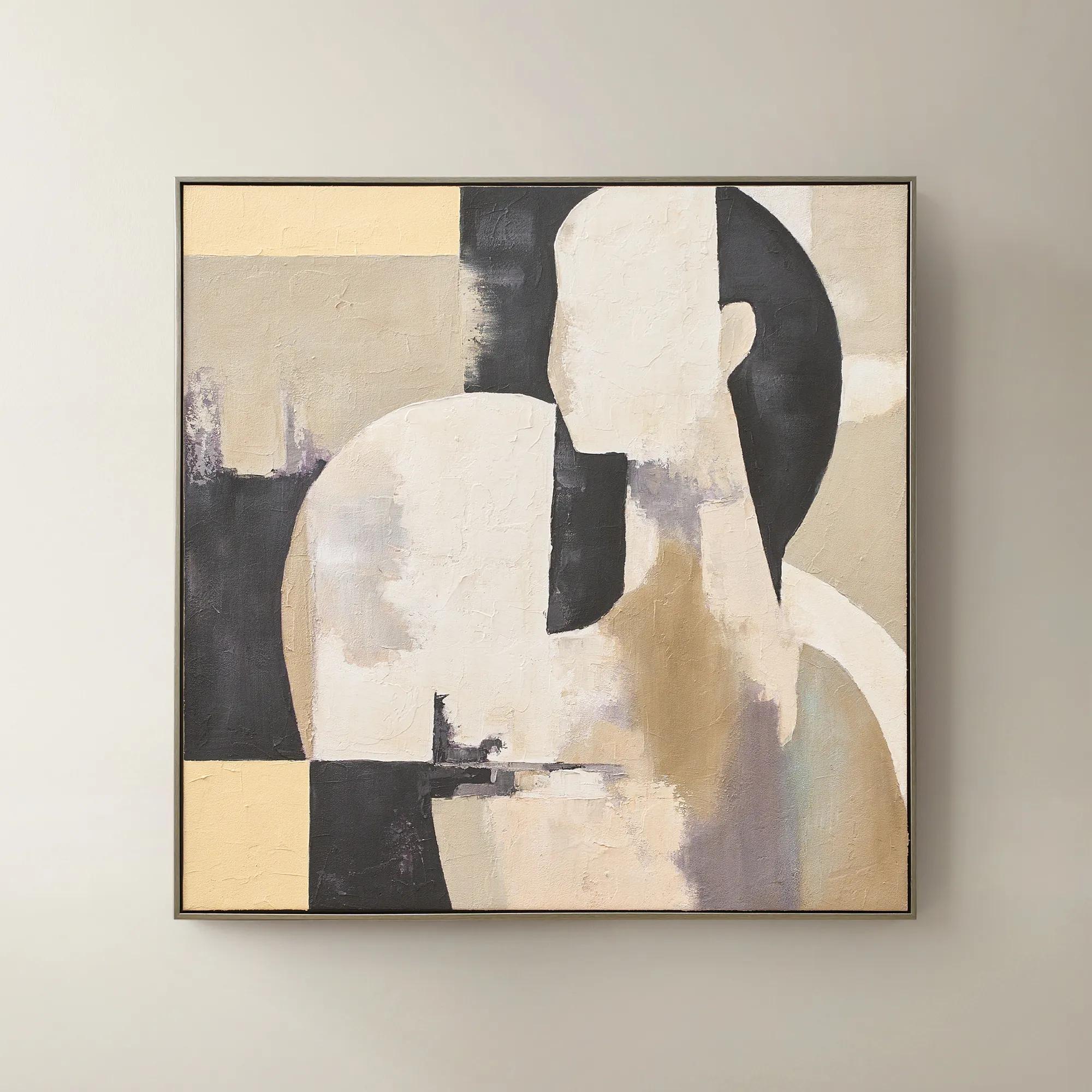 Afternoon Rest Framed Painted Wall Art 40" x 40"$399
A hand-painted abstract figure in buttercream, turtledove, and black hues framed in dark grey.
Add To Cart -
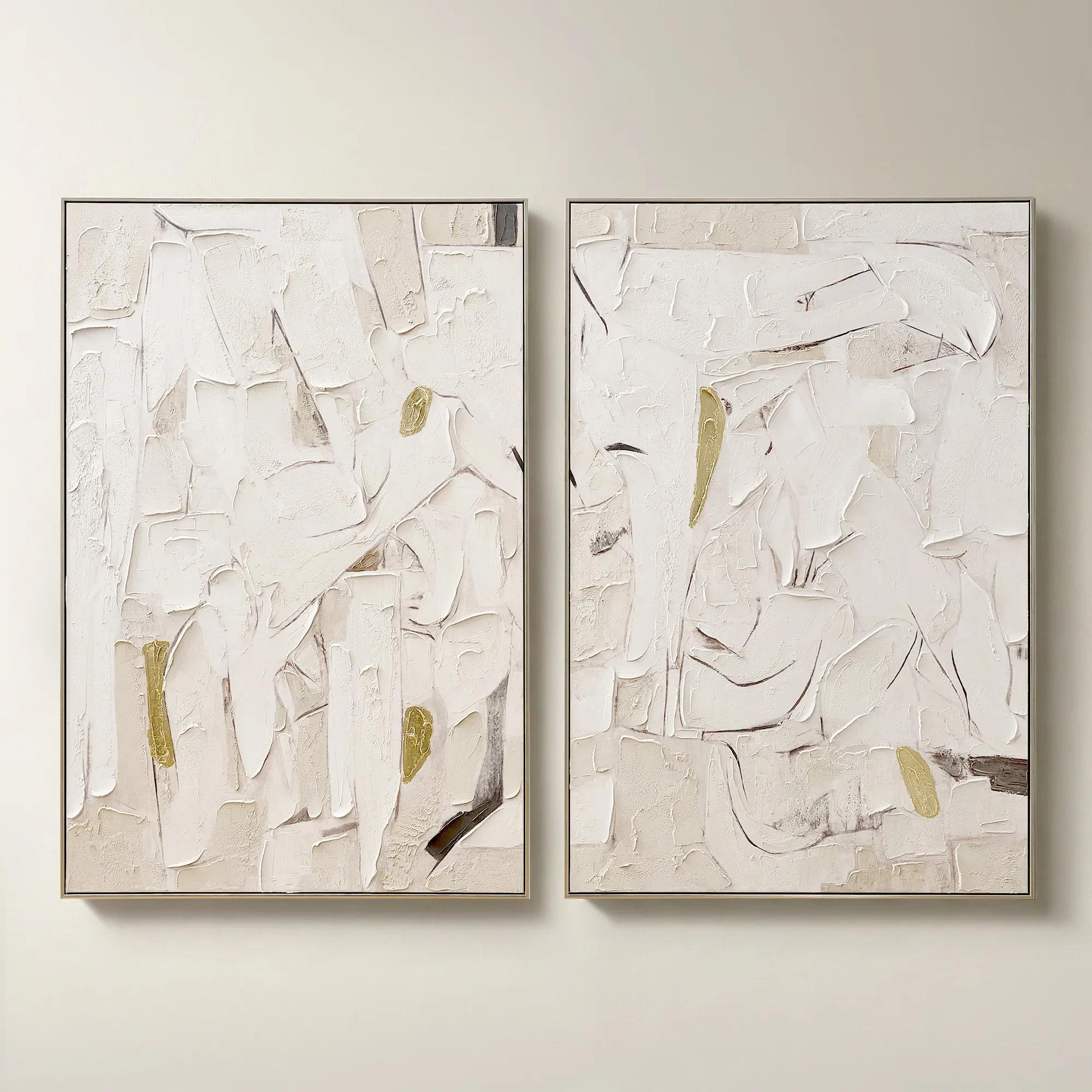 Beneath the Surface Framed Gold Leaf Painted Wall Art 40" x 60" Set of 2$799
A hand-painted abstract diptych featuring gold detailing and layered texture in alabaster and tawny hues.
Add To Cart

Neutral Summer Wall Arts
Bask in the effortless allure of neutral summer wall arts—where sun-drenched serenity meets gallery-worthy sophistication. Each piece whispers of tranquil afternoons and breezy escapes, casting a luminous calm across your space. With palettes inspired by sand, stone, and soft linen, these artworks invite you to curate a sanctuary that feels both timeless and refreshingly modern. Transform blank walls into a canvas for understated elegance, letting every brushstroke echo the gentle promise of summer’s embrace.
Neutral summer wall art captures the atmosphere of sunlit landscapes through soft, earthy colors, open compositions, and expressive natural detail. Cream, ivory, beige, sand, taupe, and pale stone form the foundation, often enriched by muted sage, weathered gray, or a trace of soft blue. The effect is luminous rather than stark: artwork that suggests a distant shoreline, the silhouette of a meadow stem, or light moving across linen. Coastal scenes, botanical studies, and textured abstracts are especially suited to this palette, each offering a distinct way to bring warmth and visual breathing room to an interior. A hazy seascape introduces depth without the literal language of nautical decor, while a finely drawn botanical gives a room an intimate, collected character. Abstract compositions translate the same mood into sweeping gestures, organic lines, and layered fields of color. Even within a restrained palette, contrast matters. A charcoal mark against an ivory background can feel as commanding as a saturated painting, and a richly textured surface can hold attention through shadow alone. These qualities make neutral summer artwork appealing well beyond a single season. Its sunwashed character remains inviting during the cooler months, especially alongside sumptuous upholstery, warm wood, and sculptural lighting. In a living room, an expansive composition can establish a serene focal point above a sofa; in a bedroom, a softly rendered landscape can support a more enveloping mood. An entryway gains polish from artwork with a decisive silhouette or an unexpected frame finish, giving the first view of the home a sense of intention. For interiors that already feature mirrored surfaces, metallic accents, or dramatic furnishings, neutral art offers balance without disappearing. The most compelling arrangements allow quiet color and expressive detail to coexist, making the wall an active part of the room’s design rather than an empty space to fill.
Material, finish, and scale shape how neutral wall art feels in person as much as its subject does. Canvas has a woven surface that can soften the appearance of printed imagery and lend broad brushwork a tactile quality. Works on paper can emphasize delicate linework, subtle tonal shifts, and the generous negative space surrounding a botanical or coastal study. Matting adds another layer of proportion, giving a small image a more substantial presence while keeping fine details visually distinct from the frame. Textured artwork introduces actual relief, which differs from a printed image of texture; checking the material description helps clarify whether those dimensional strokes and ridges are physical or depicted. Side lighting can reveal raised surfaces beautifully, while strong light directed at glazing may create reflections that compete with the image. Frame finishes also influence the palette. Pale wood adds warmth, a slender dark frame defines an airy composition, and a metallic finish brings a measured gleam to soft sand and cream tones. For a complementary emphasis on presentation, Neutral Color Framed Wall Arts offers another way to explore the relationship between a restrained palette and a defined border. Size deserves equal attention: consider the outer framed dimensions, not just the image measurements, and compare them with the furniture and open wall surrounding the intended placement. Above a wide sofa, one generous piece often feels more assured than a small image floating alone. A coordinated pair can bring rhythm to a long console, while a vertical composition can draw the eye upward in a narrow entry. Paper templates make these relationships easier to judge before hanging. Leave enough separation from furniture for the arrangement to breathe, but keep the artwork visually connected to the vignette below. Undertones matter, too. Cream artwork against a cool white wall creates a different effect than the same piece against warm greige; viewing the surrounding finishes in both daylight and lamplight helps establish whether the combination feels harmonious or deliberately contrasting.
Neutral summer wall decor is particularly versatile in homes where furnishings evolve but the desire for an expressive, cohesive interior remains. A sand-toned abstract can sit comfortably beside ivory bouclé, then take on greater drama when the room gains chocolate velvet pillows or a deep bronze accent. A muted botanical can soften the architecture of a home office without making the workspace feel overly decorative, and an atmospheric shoreline can bring a sense of distance to a compact dining area. Repeating one or two colors from the artwork in nearby textiles helps connect the composition to the room without matching every element. For a gallery arrangement, a shared undertone or consistent frame finish can unify different subjects; varied imagery then feels collected rather than repetitive. Everyday conditions should inform placement, especially when preserving pale colors, paper surfaces, and textured finishes. Unless a piece is specifically rated for another setting, treat decorative wall art as intended for indoor use in a dry, reasonably stable environment. Avoid prolonged direct sunlight, which can contribute to fading, and keep artwork away from steam, splashes, and heating vents. A bathroom with frequent condensation or a spot directly above a working fireplace may expose materials to unnecessary stress. Durability depends on the substrate, printing or painting process, framing, and handling, so follow the care instructions supplied with the artwork rather than assuming every finish can be cleaned alike. Frames can generally be dusted gently with a soft, dry cloth when their finish permits; unglazed paper and delicate raised surfaces require particular restraint. Never spray cleaning liquid directly onto framed art, and use only methods approved for its glazing and finish. Secure installation matters as well: choose hardware appropriate to the artwork’s weight and the wall construction. As a housewarming or wedding gift, neutral artwork can be a thoughtful choice for someone drawn to luminous interiors, provided its dimensions and visual character suit the recipient’s space. Whether selected for a new home or an established room, its lasting appeal lies in the interplay of atmosphere and artistry: soft color with presence, natural inspiration with polish, and details that reward a closer look.
FAQs
Neutral summer wall art often draws inspiration from coastal minimalism, abstract landscapes, and organic textures. You’ll find tranquil beach scenes, soft botanical motifs, and abstract interpretations of sunlight and sand, all rendered in a palette of creams, taupes, and gentle earth tones. These styles are designed to evoke a sense of calm and effortless sophistication, perfect for creating a serene summer atmosphere in any room.
The beauty of neutral summer wall art lies in its versatility. It seamlessly enhances a range of interior styles, from modern and contemporary to coastal, bohemian, or transitional spaces. Its understated tones act as a harmonious backdrop, allowing vibrant furnishings or metallic accents to shine, while textured pieces add depth and dimension to minimalist settings.
Neutral summer wall art makes a thoughtful gift for those who appreciate timeless design and understated elegance. It’s especially well-suited for new homeowners, newlyweds, or anyone embarking on a fresh chapter. Its universal appeal and tranquil palette ensure it will be cherished by recipients with varied tastes, making it an inspired choice for housewarmings, anniversaries, or birthdays.
Neutral summer wall art is crafted using a variety of materials, including fine art paper, stretched canvas, natural fibers, and textured textiles. Some pieces incorporate mixed media elements like wood, linen, or metallic accents, which add tactile interest and elevate the overall aesthetic. These materials are chosen for their quality and ability to capture the subtle nuances of light and texture.
Neutral summer wall art has the power to infuse a space with tranquility and refined warmth. By introducing soft, sun-washed hues and organic forms, these pieces create an inviting, restful ambiance—ideal for living rooms, bedrooms, or entryways. The serene palette and gentle motifs encourage relaxation and reflection, making every day feel like a retreat.