Living Room Blue Wall Arts
Living Room Blue Wall Arts
-
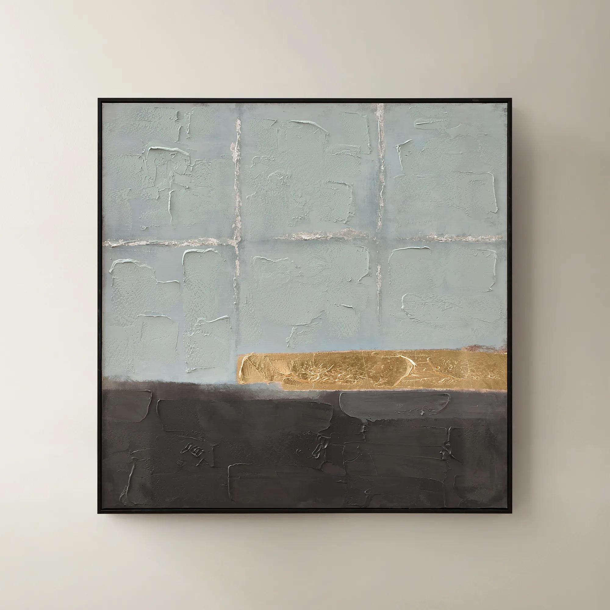
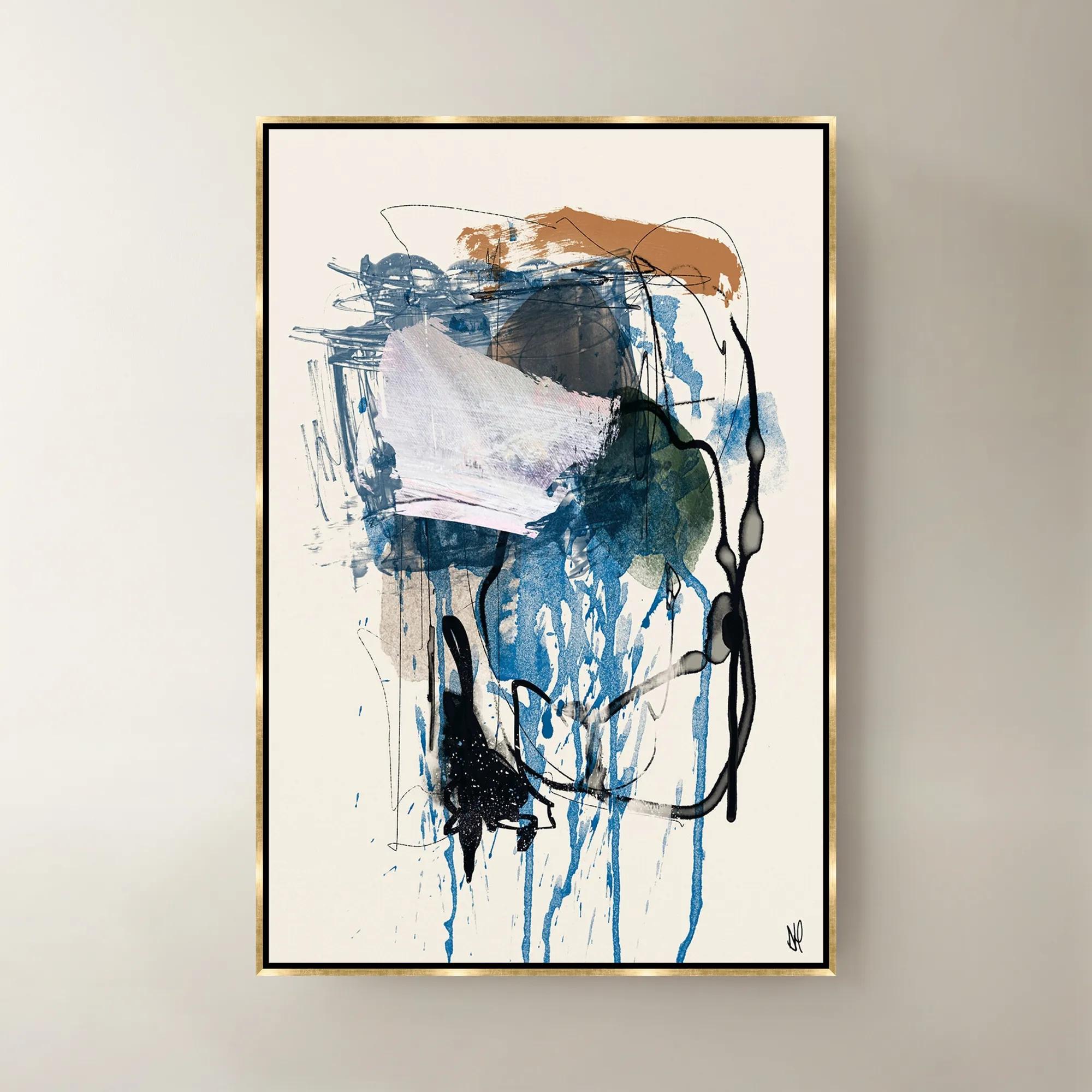
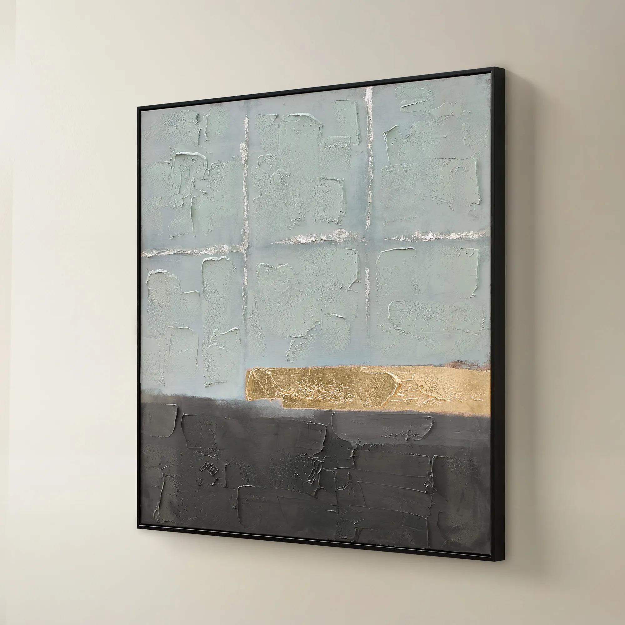 Jules Framed Gold Leaf Painted Wall Art 40" x 40"$299
A hand-painted canvas in mineral blue with gold leaf accents and a sleek black frame for modern appeal.
Add To Cart -
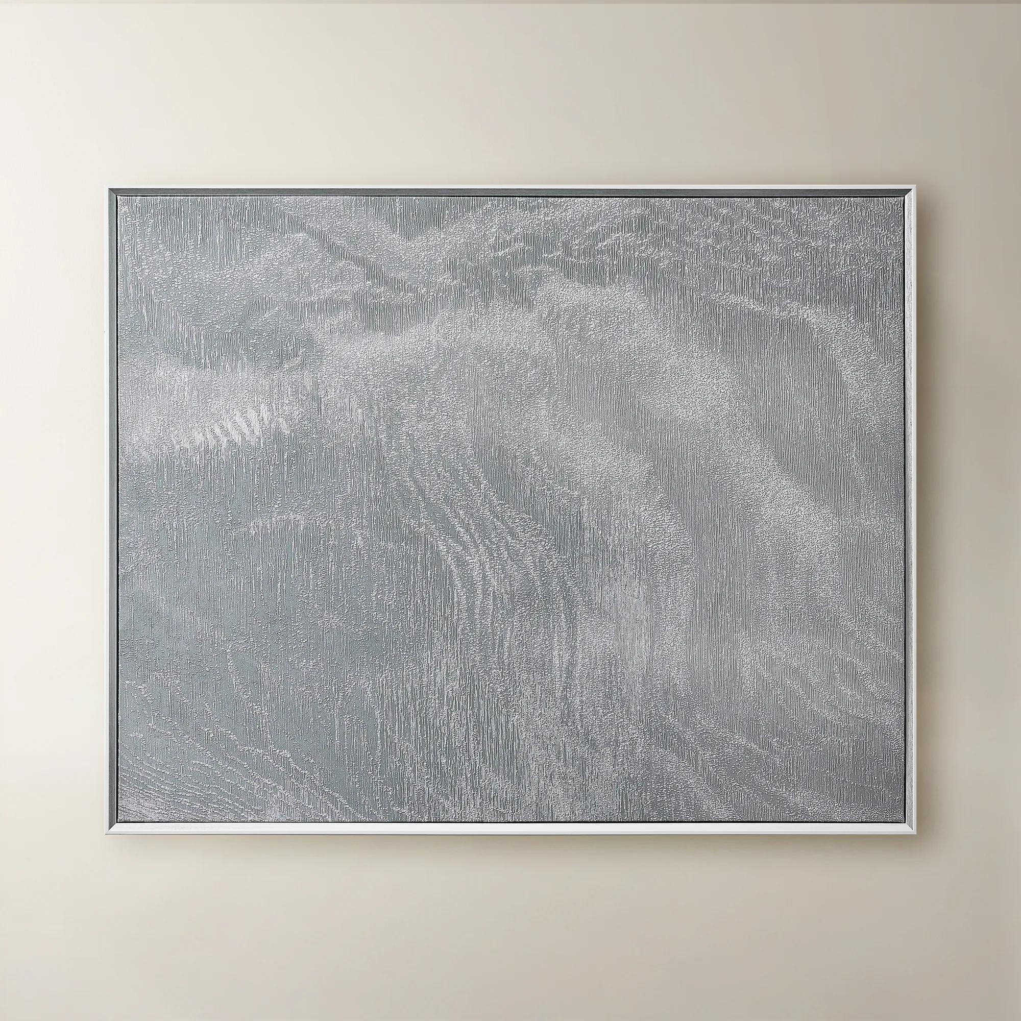 Slow Blue Morning Framed Silver Foil Wall Art 48" x 60"$599
A serene powder blue abstract canvas with silver foil accents, framed in silver and white for modern elegance.
Add To Cart -
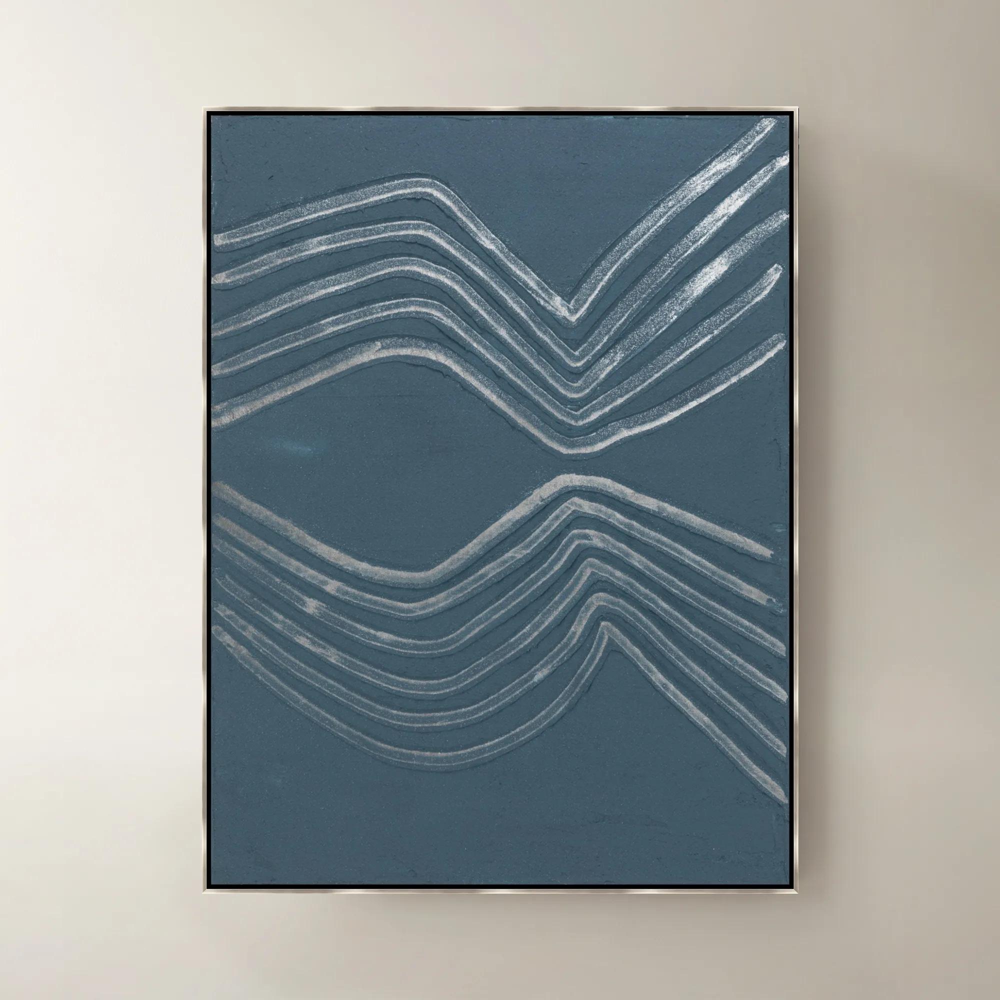
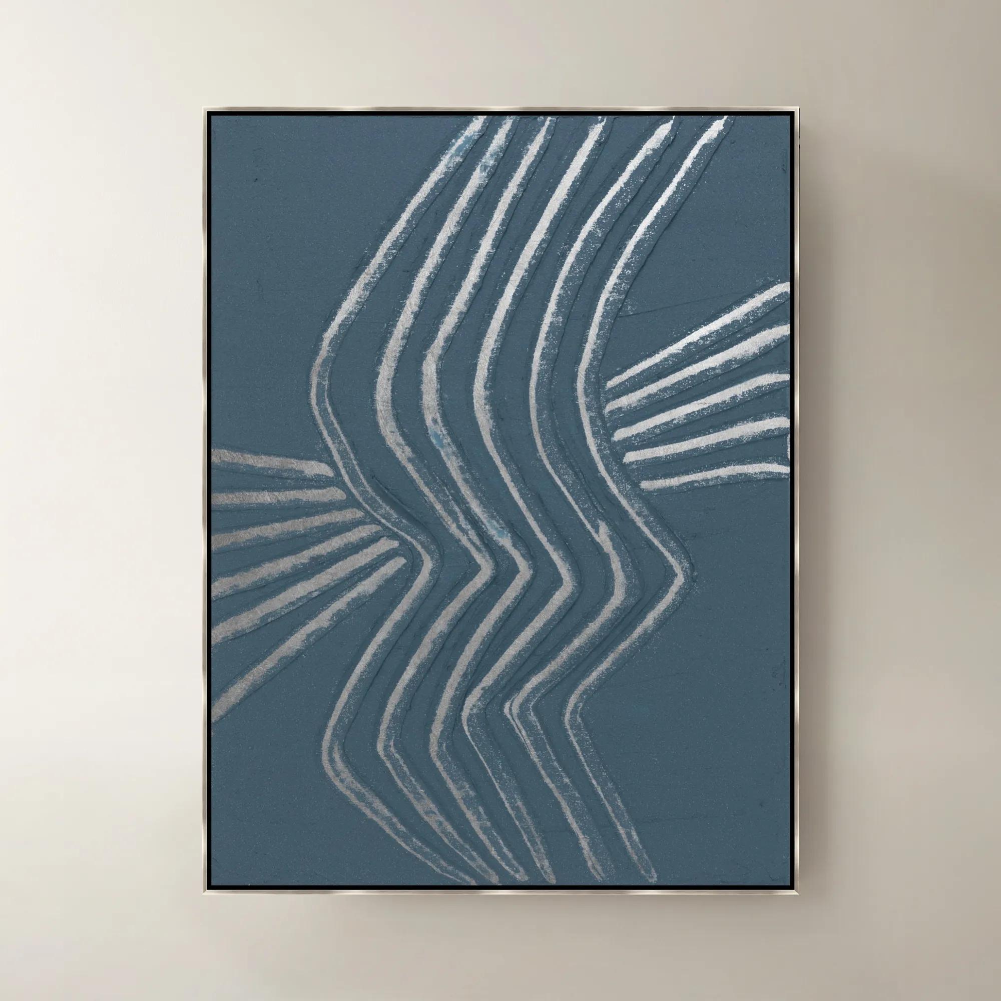
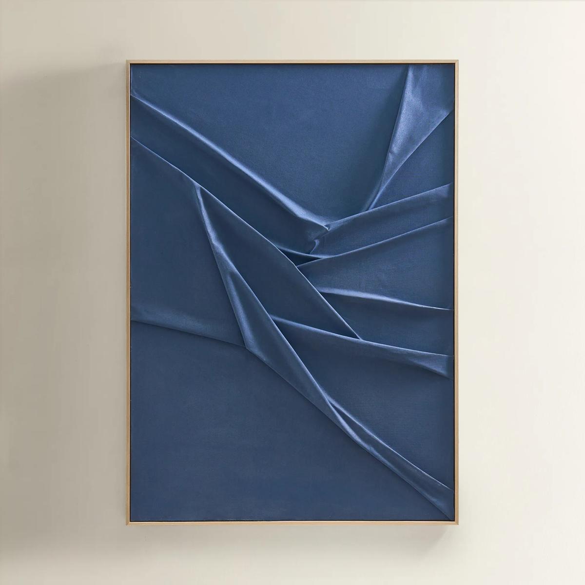 Deep Sea Painting$599
A hand-sculpted navy canvas with dimensional folds, framed in soft champagne for modern, serene elegance.
Add To Cart -
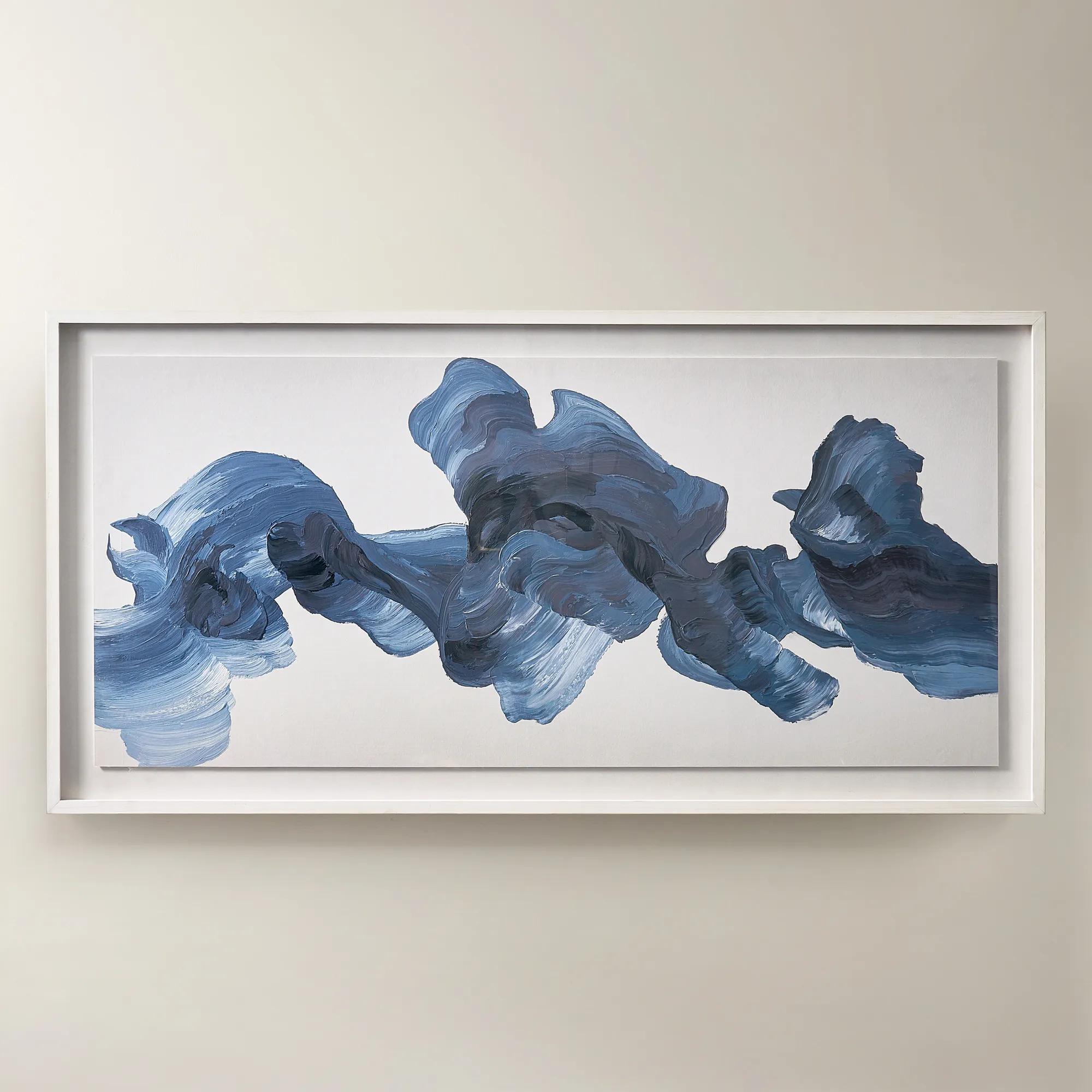
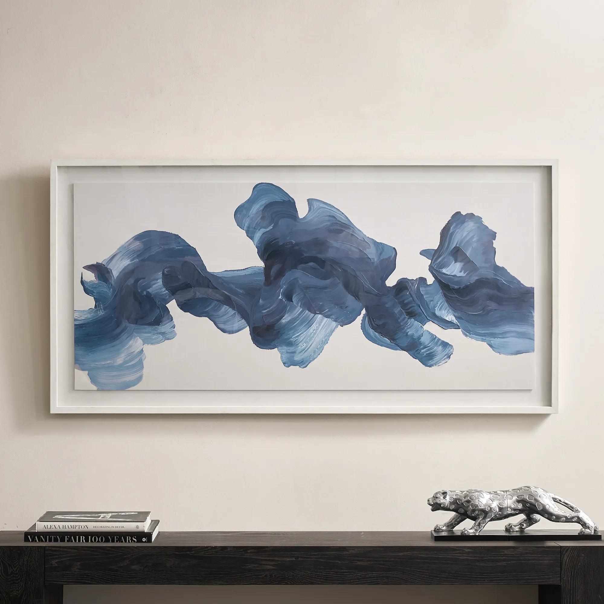 Blue Theory Framed Painted Wall Art in Acrylic 60" x 30"$499
A hand-painted canvas in deep ink blue, framed under acrylic with a whitewashed wood frame.
Add To Cart -
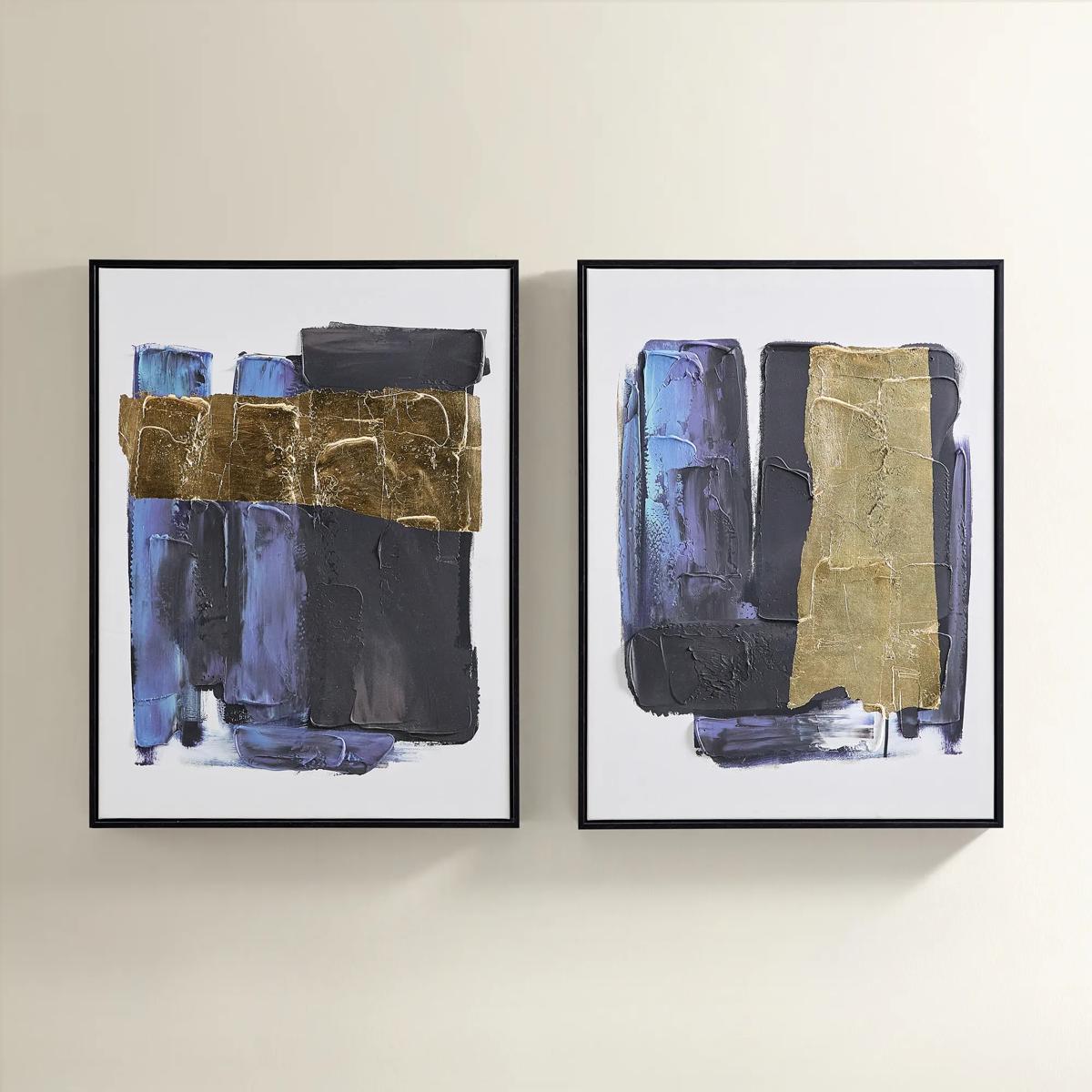
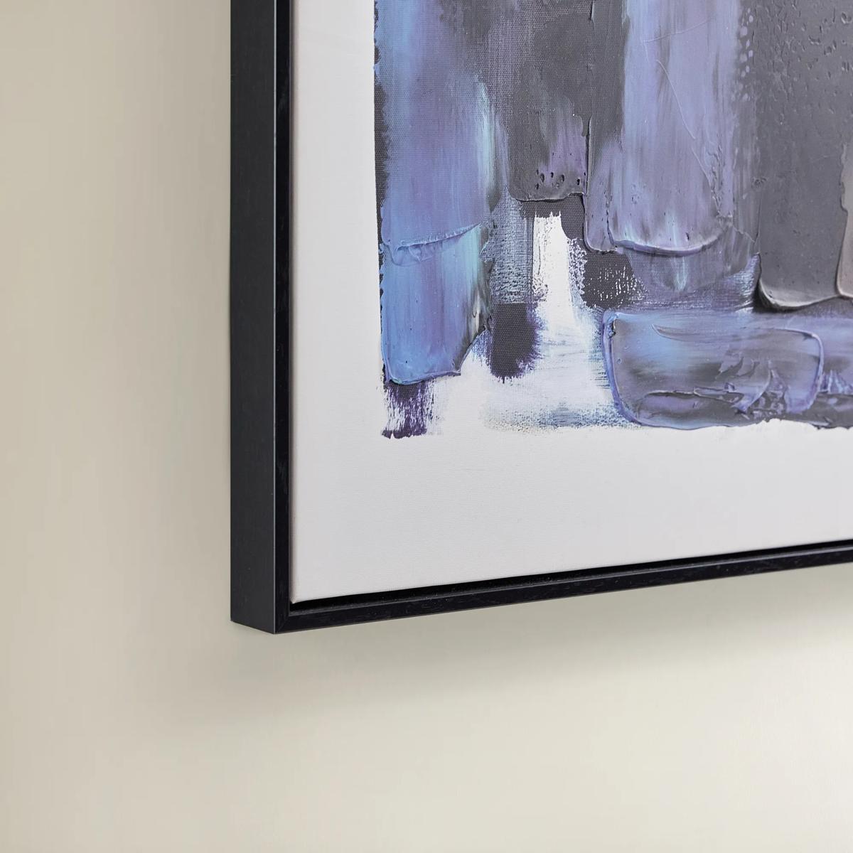 Deep Thoughts Gold Leaf Painted Wall Art Set of 2$199
A set of two hand-painted abstract canvases in blue and gold leaf, framed in sleek black.
Add To Cart -
.jpeg?w=1200&h=1200)
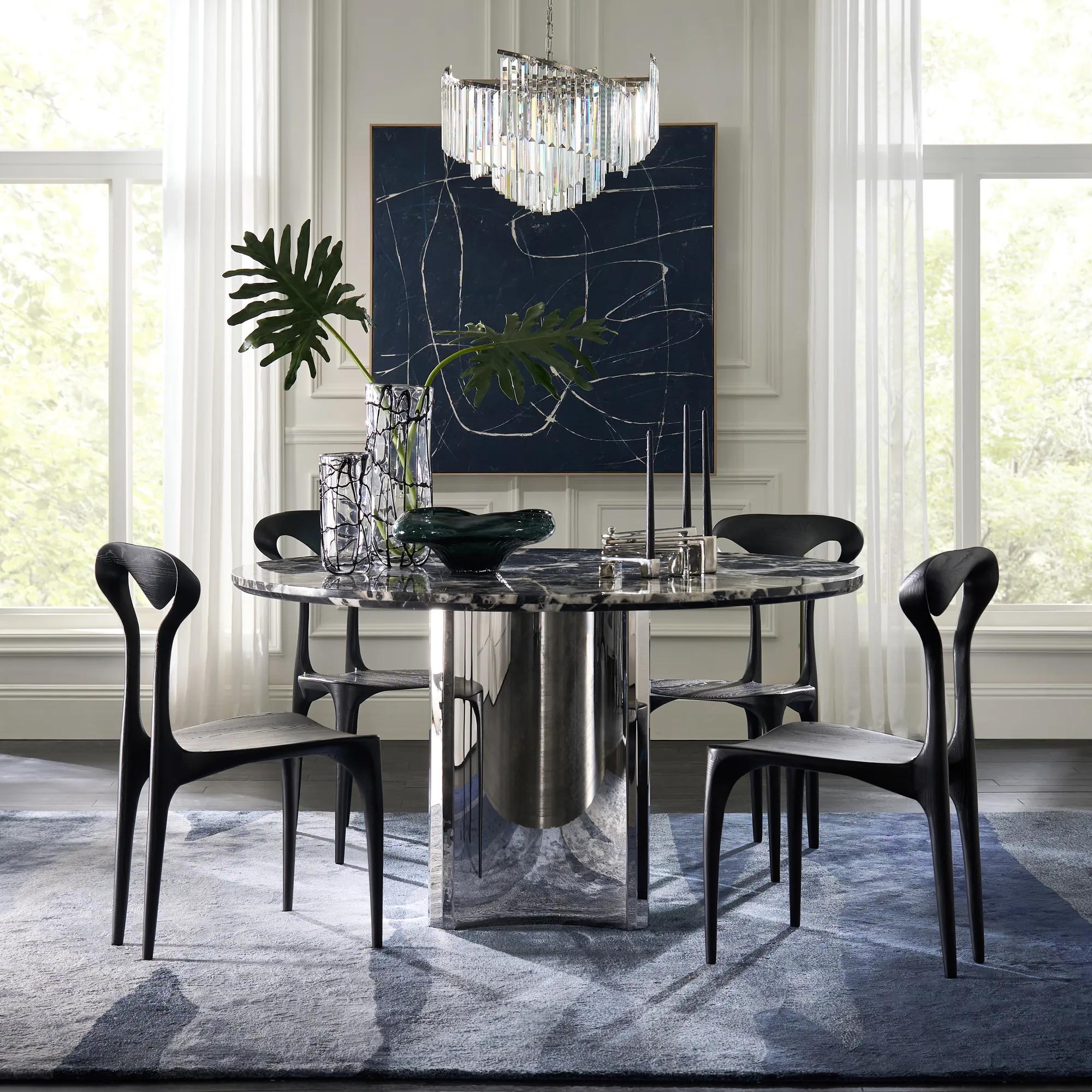 Almost Midnight Painting - Blue$439
A hand-painted canvas featuring bold blue and black tones with delicate white lines in a light wood frame.
Add To Cart -
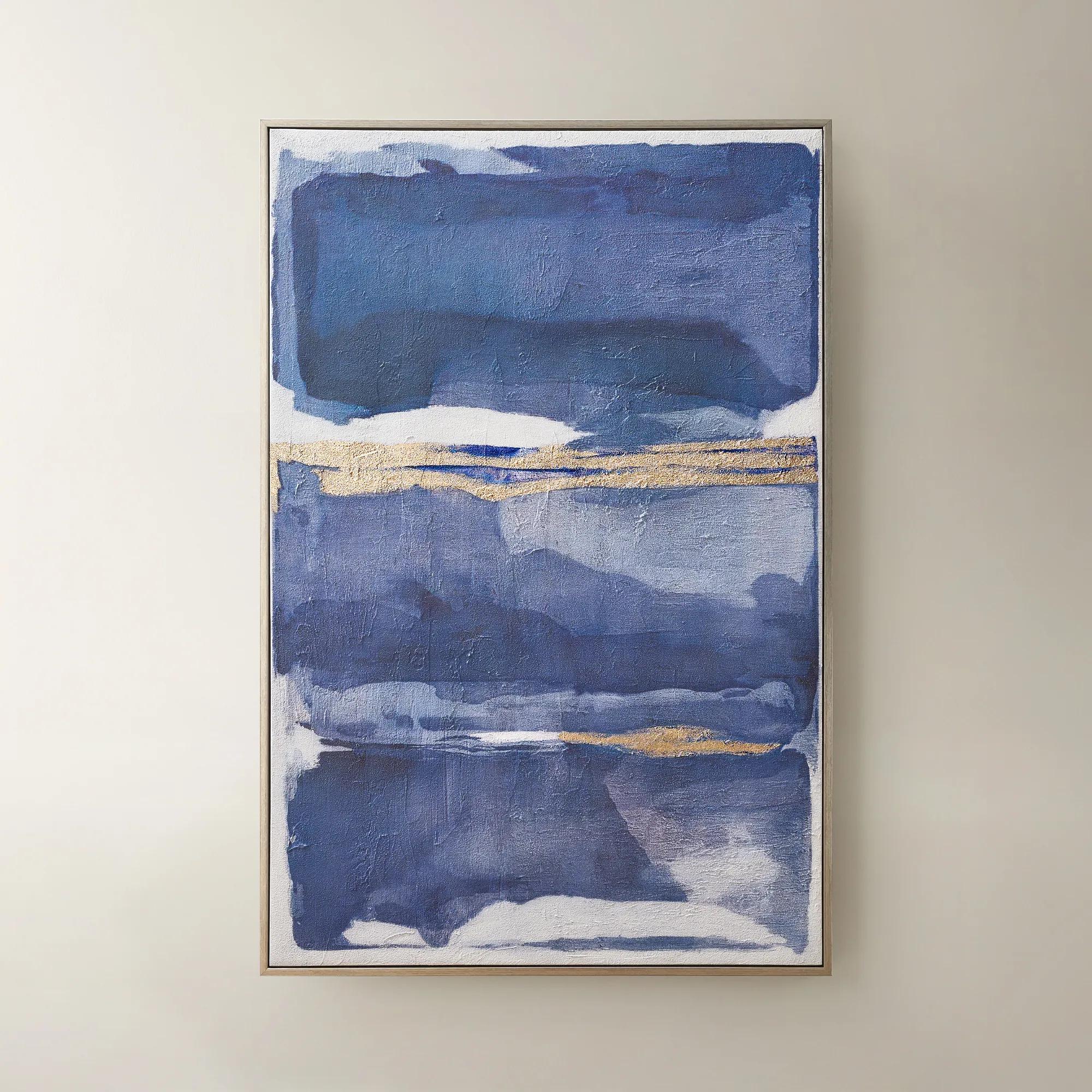
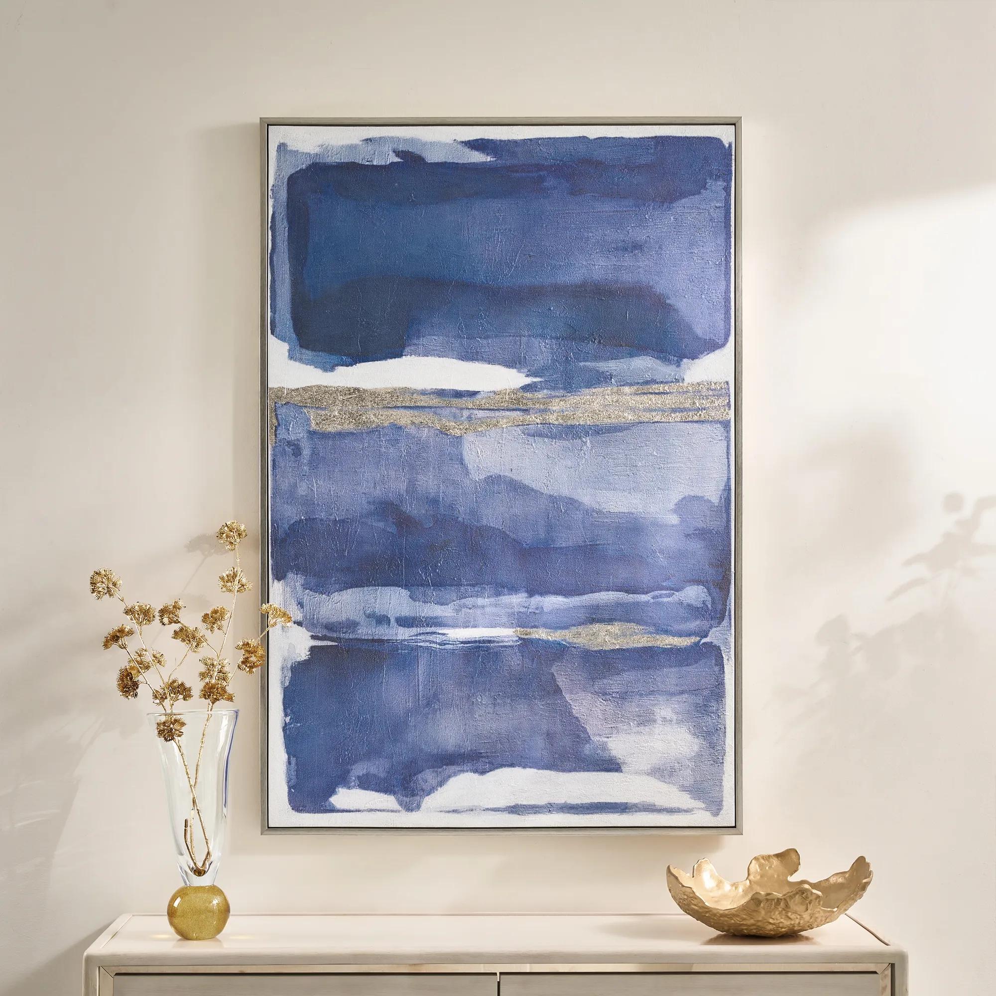 Memories in Blue Framed Painted Wall Art 40" x 60"$499
A hand-painted canvas in deep ink blue with champagne leafing for a sophisticated, gallery-inspired look.
Add To Cart -
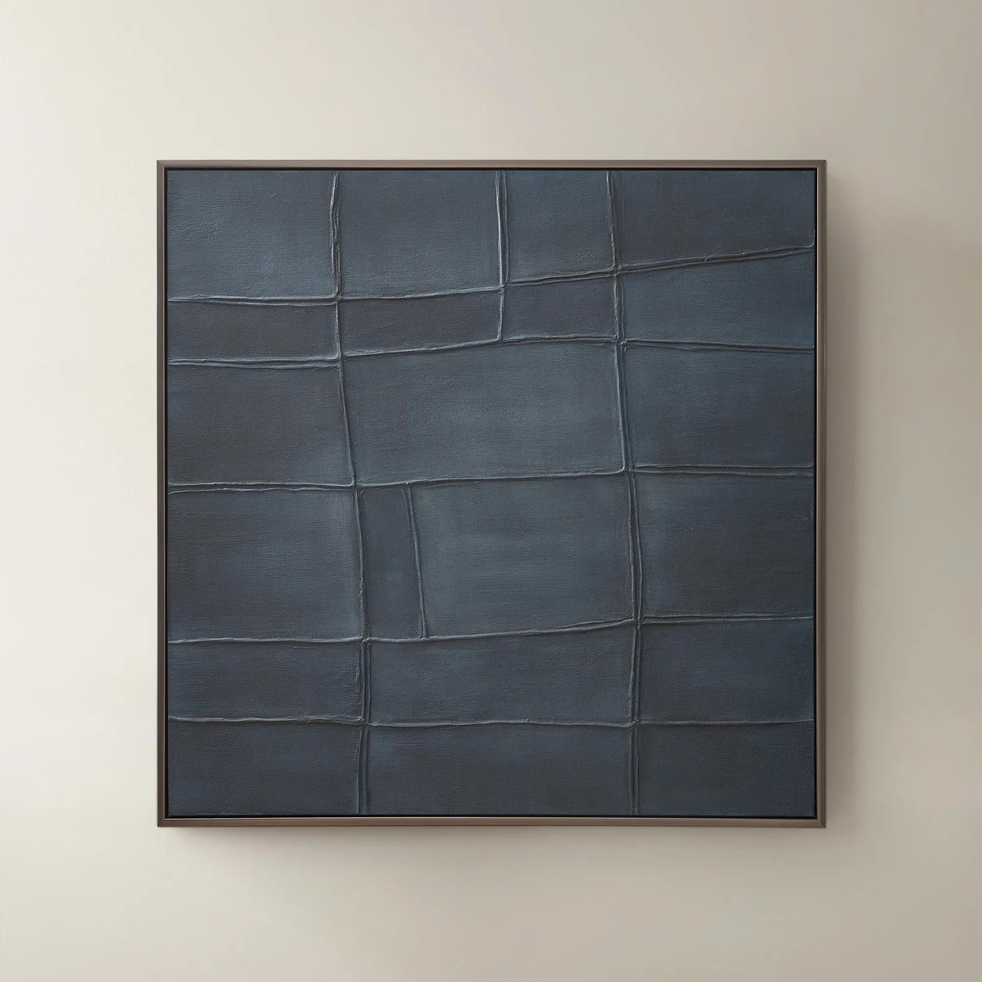
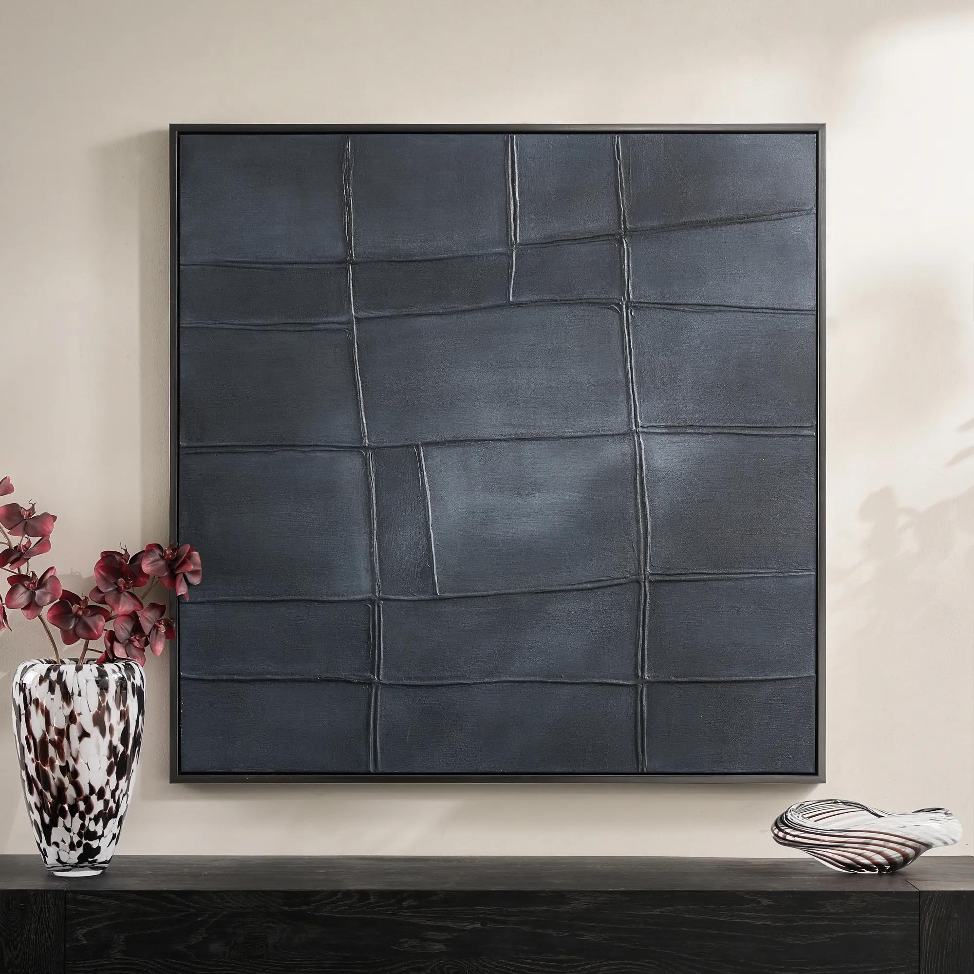 Ink Blue Interval Framed Painted Wall Art 48" x 48"$599
A hand-painted abstract canvas in deep ink blue, finished with a sleek gunmetal frame for modern appeal.
Add To Cart -
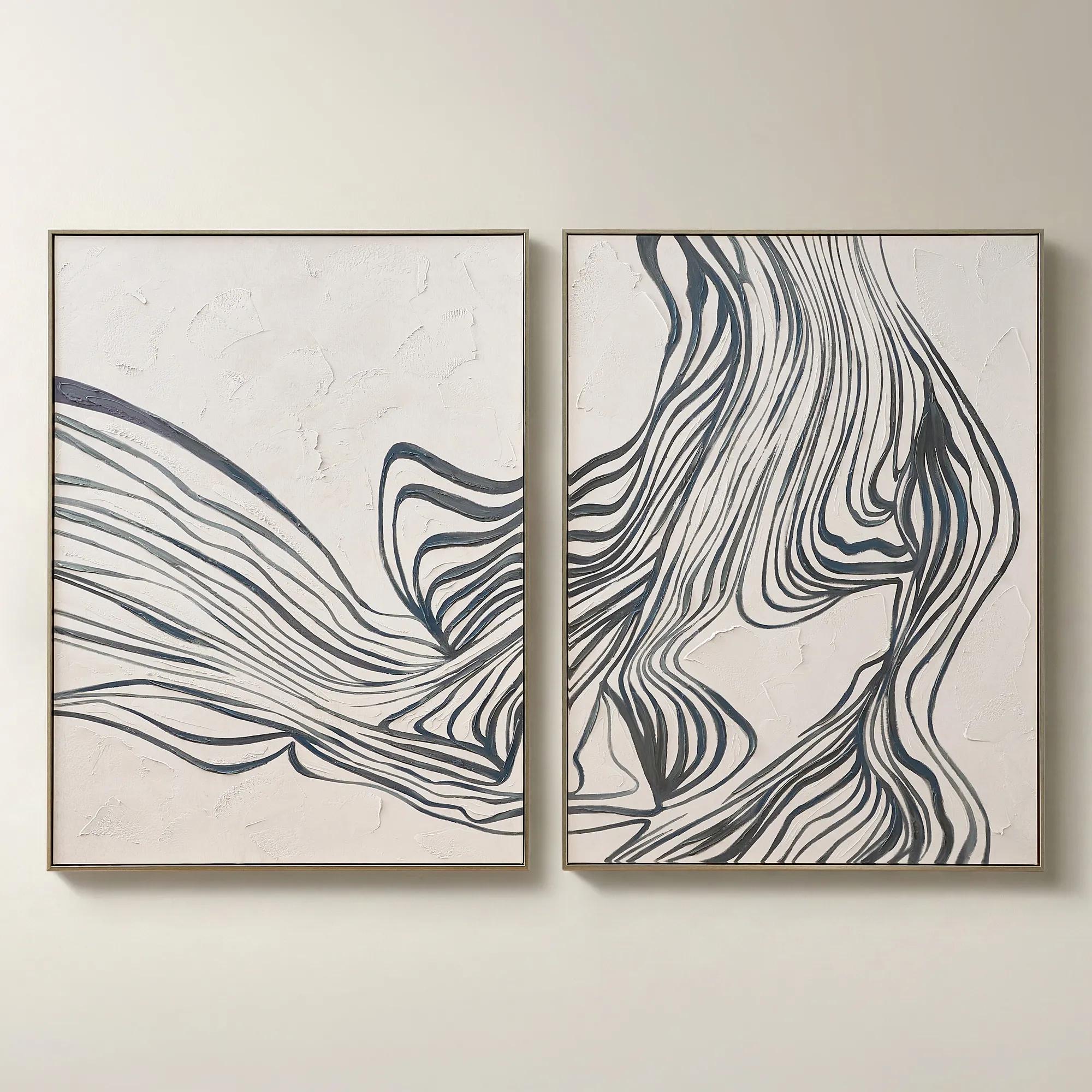
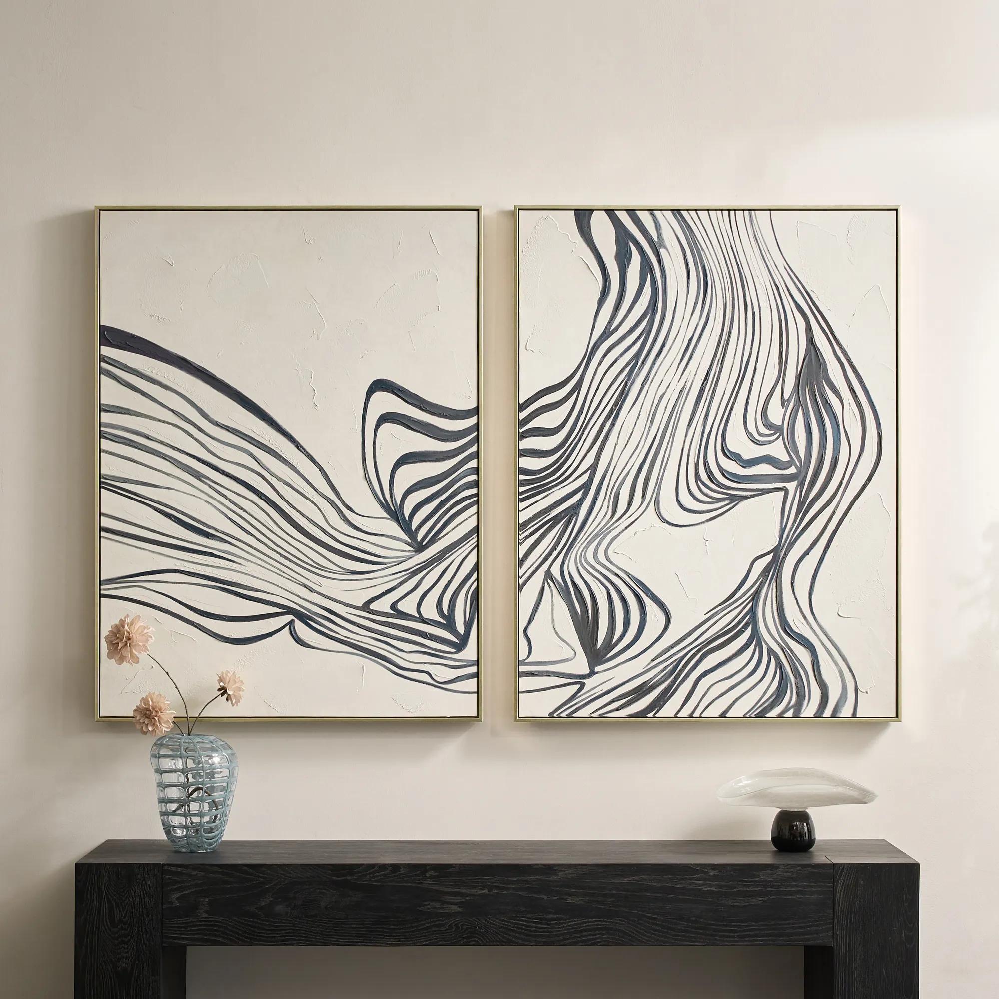 Rhythmic Framed Painted Wall Art 36" x 48" Set of 2$599
A hand-painted diptych featuring bold abstract stripes in dark slate and dusty blue with champagne frames.
Add To Cart -
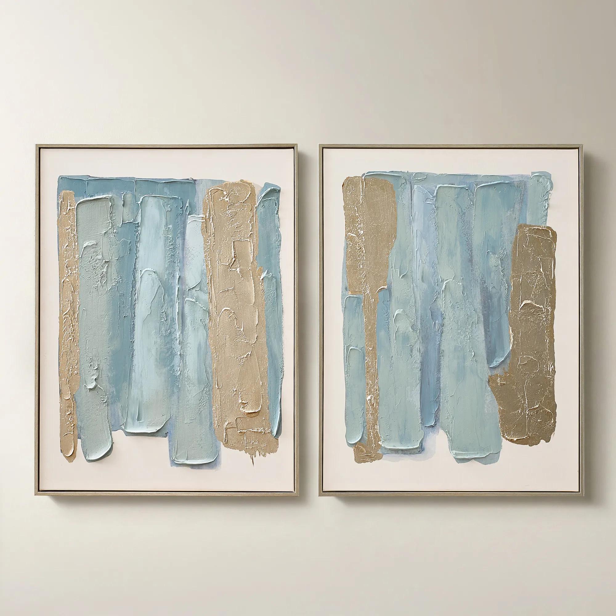
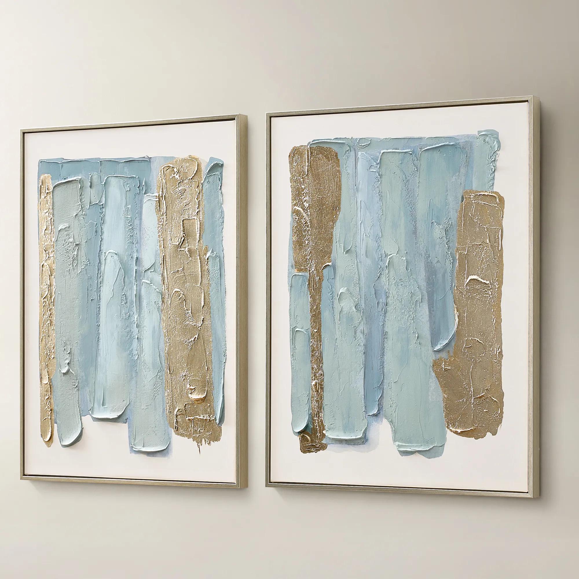 Blue Drift Framed Champagne Painted Wall Art 24" x 32" Set of 2$199
A set of two hand-painted canvases in dusty blue with champagne leafing and modern abstract movement.
Add To Cart -
.jpeg?w=1200&h=1200) Relic Framed Painted Triptych Wall Art Set of 3$399
Relic Framed Painted Triptych Wall Art Set of 3$399A hand-painted abstract triptych in deep navy and neutral tones, set in sleek black floater frames.
Add To Cart -
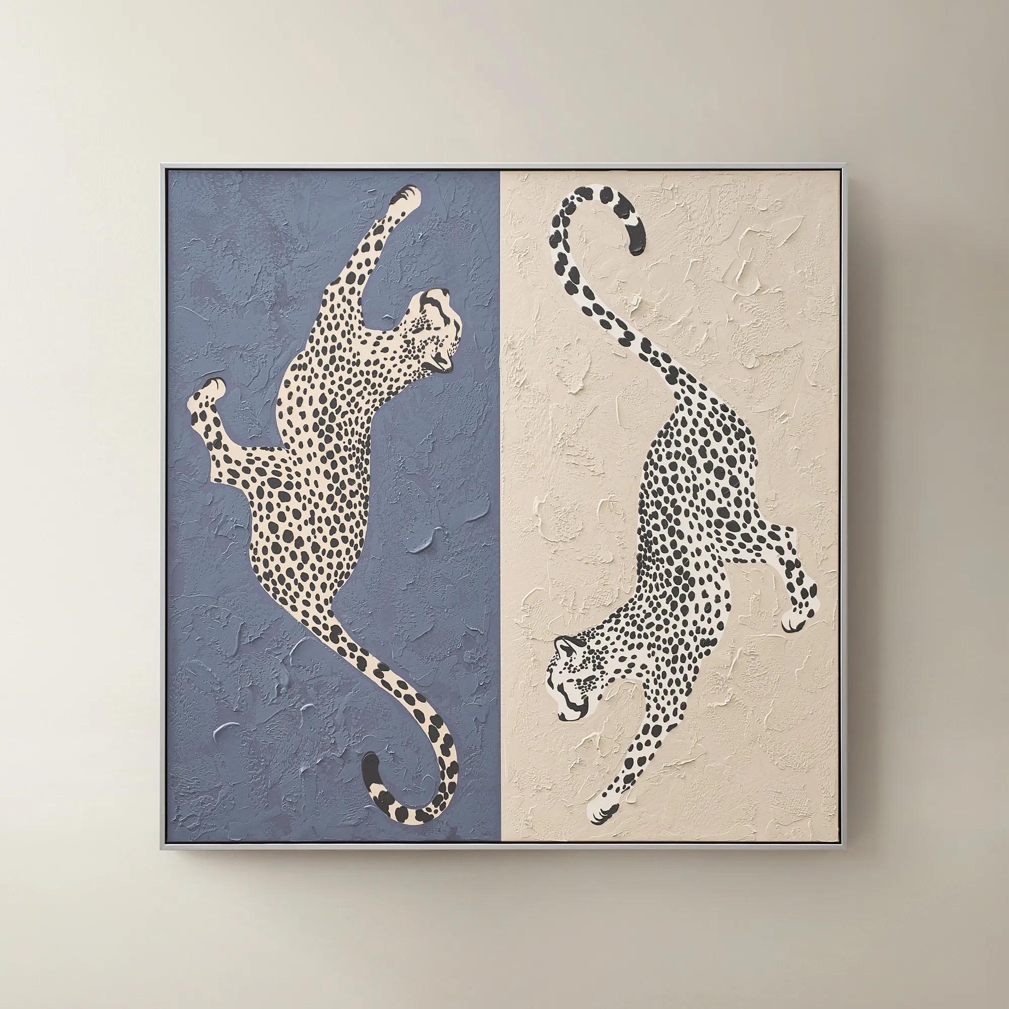 Leopard At Play Framed Painted Wall Art 40" x 40"$299
A hand-painted canvas in ink blue and taupe features playful leopard-inspired art with a silver-black frame.
Add To Cart -
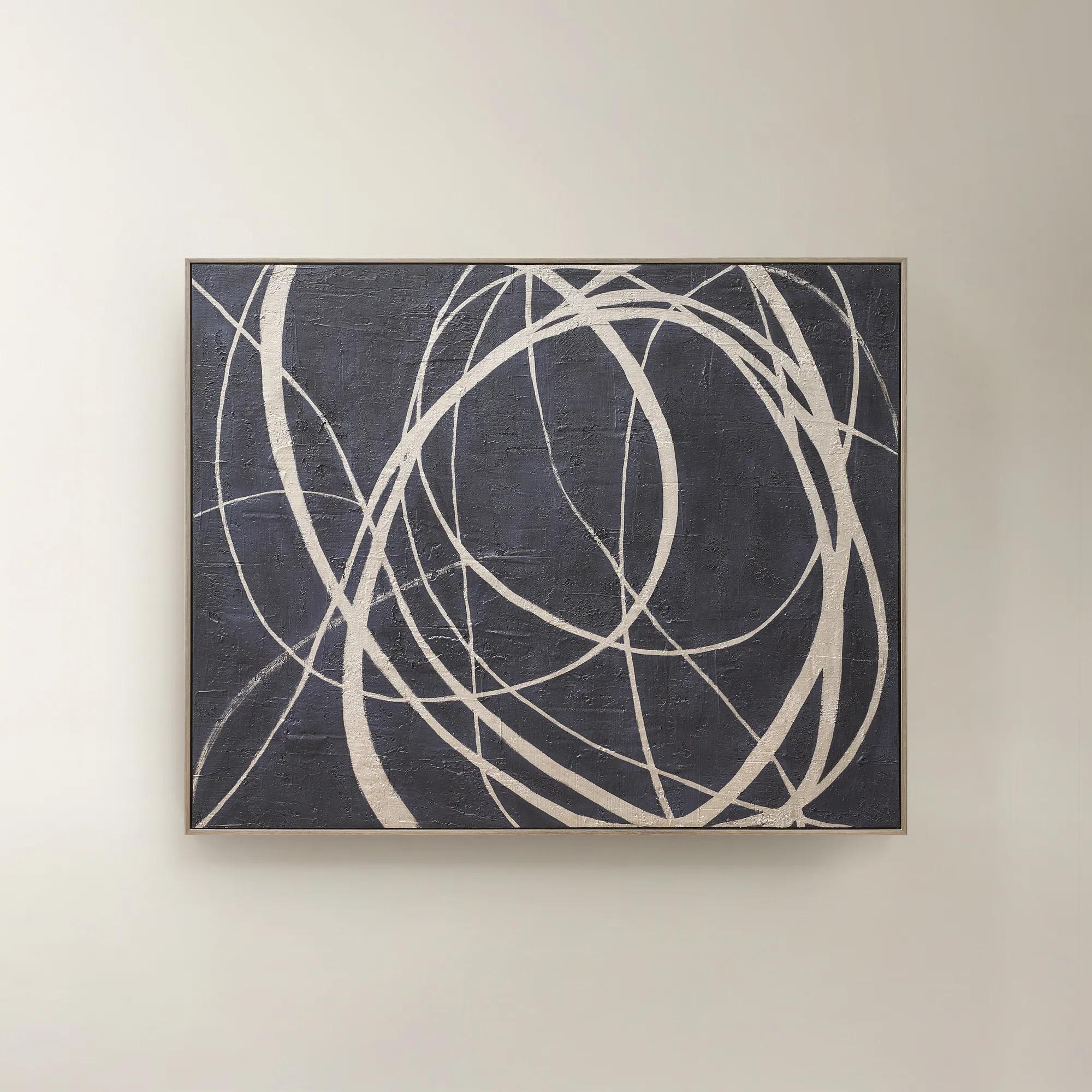 Wandering Framed Painted Wall Art 48" x 60"$699
An expressive hand-painted canvas in deep ink blue with champagne accents for a bold, sophisticated statement.
Add To Cart -
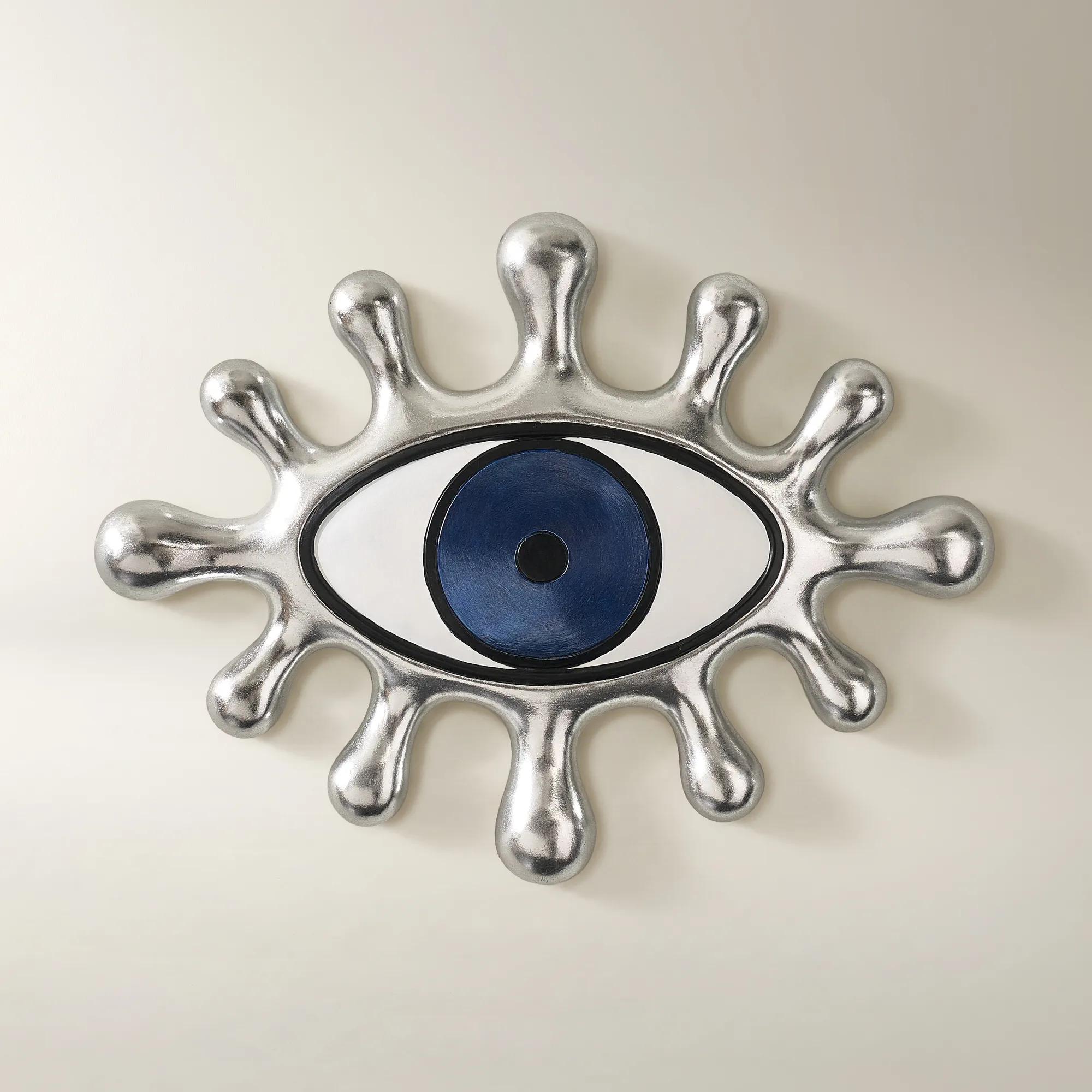 Grand Eye Ink Blue And Silver Resin Wall Decor 18" x 13.5"$79
An exaggerated eye motif in ink blue and silver brings playful, sculptural texture to any wall.
Add To Cart -
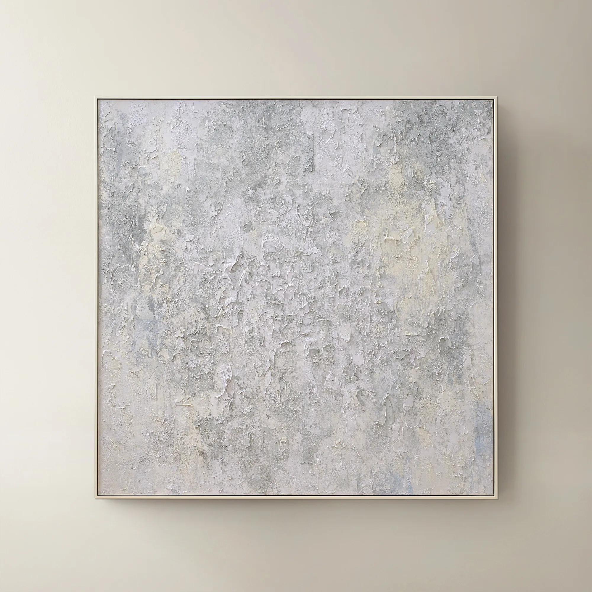 Breathe of Fresh Air Framed Painted Wall Art 50" x 50"$499
A hand-painted abstract canvas in dusty blue hues, elegantly framed in white for a serene, modern accent.
Add To Cart -
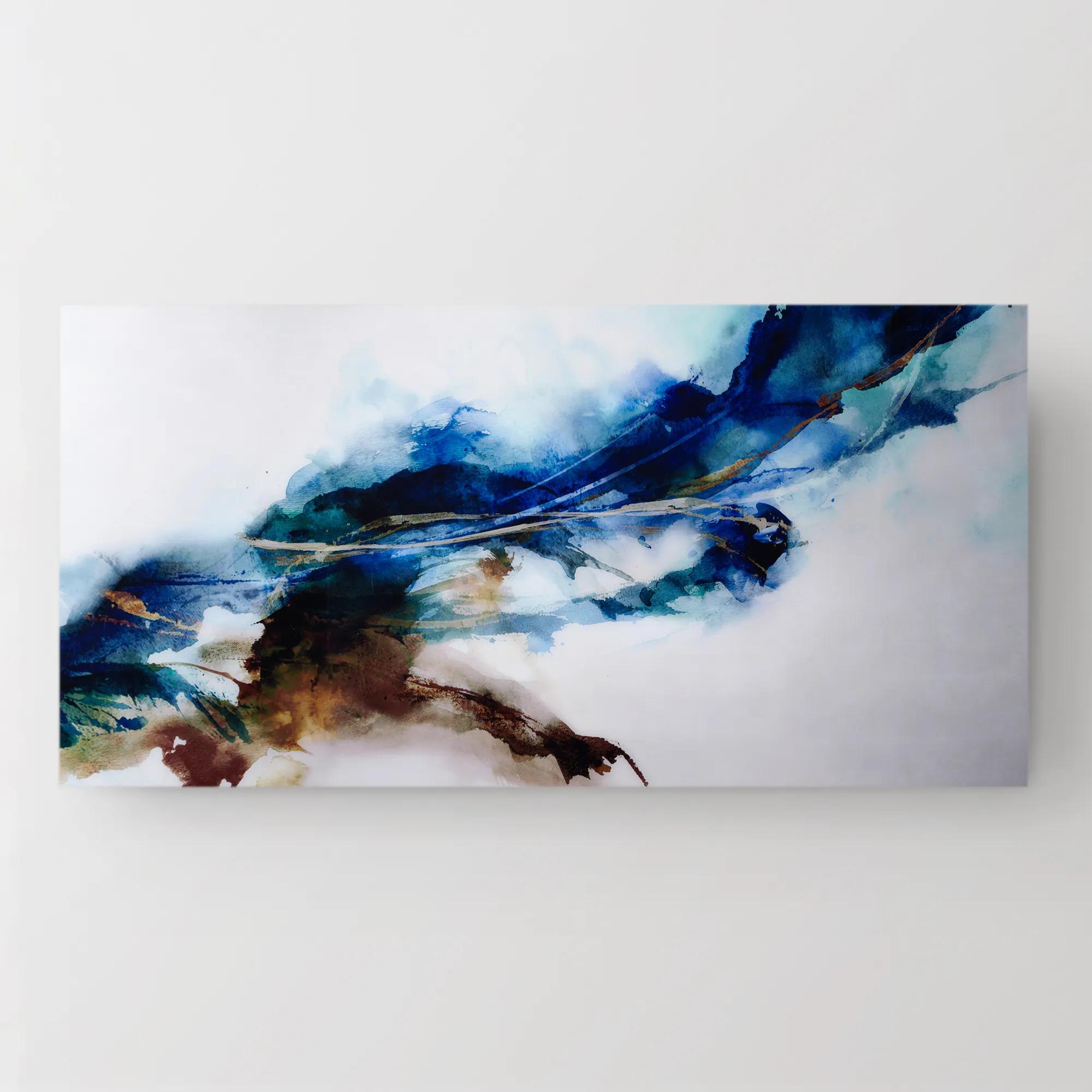 Cerulean Movement Acrylic Art 72" x 36"$1299
A vibrant abstract artwork printed on high-gloss acrylic, infusing your space with dynamic energy and movement.
Add To Cart -
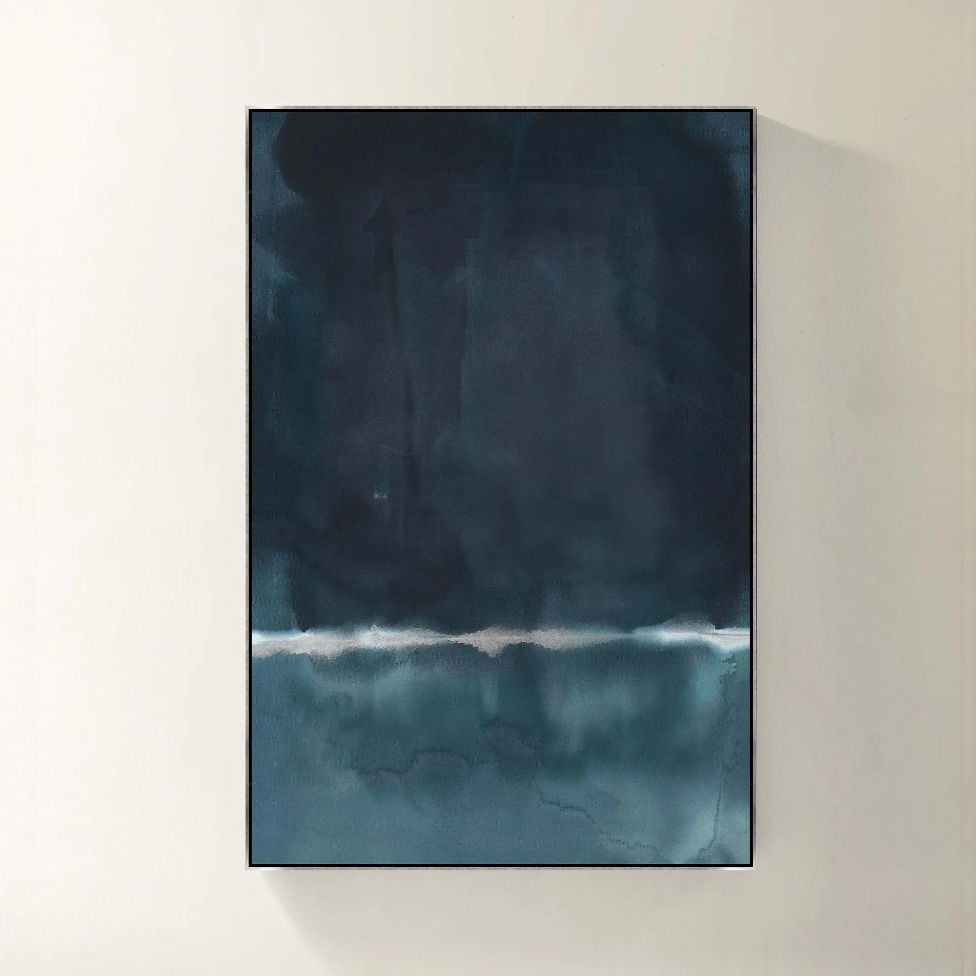 Blue Monday Framed Wall Art 40" x 60"$1119
A gallery-wrapped blue canvas with hand-embellished silver accents in a sleek silver floater frame.
Add To Cart -
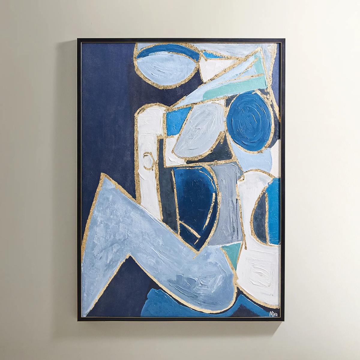
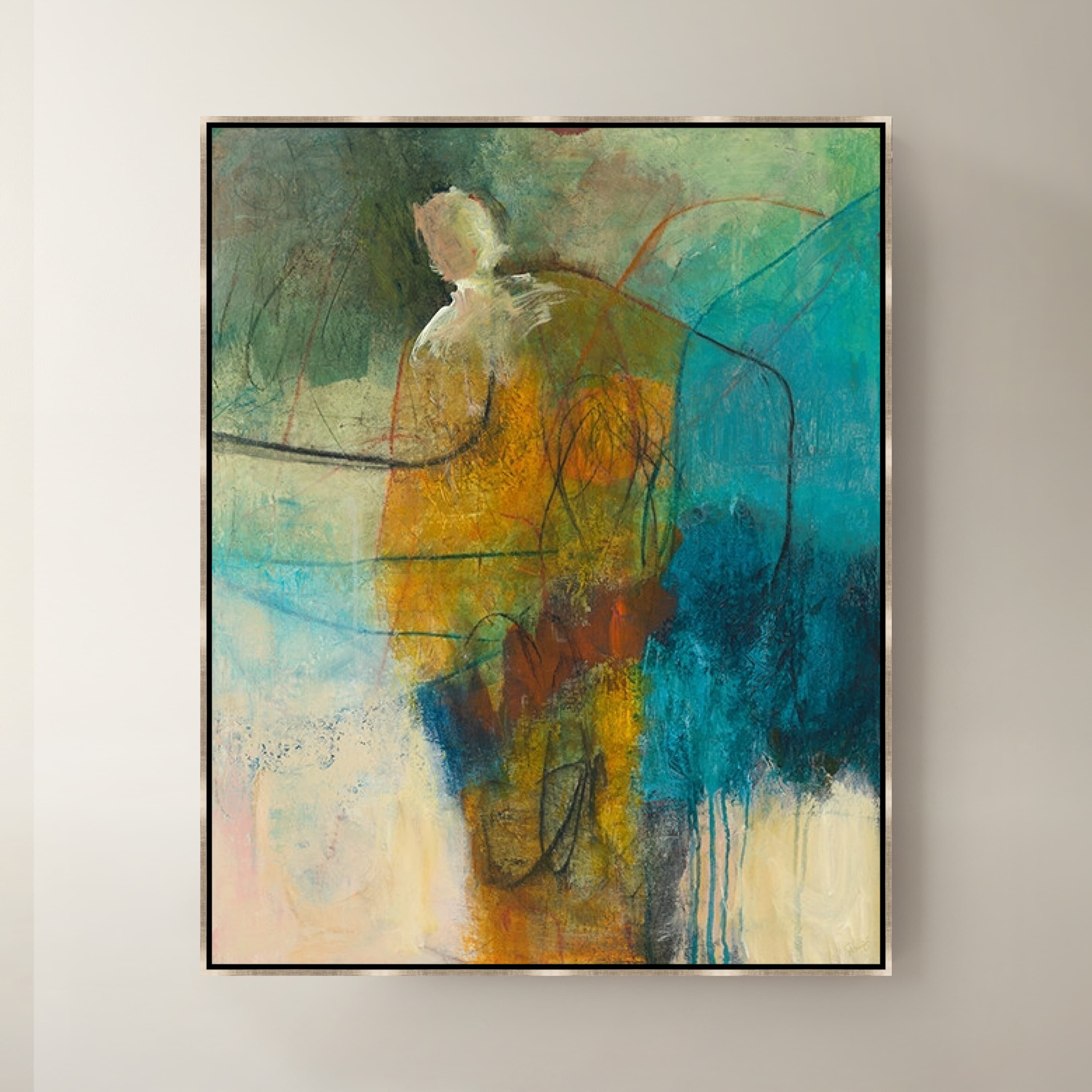
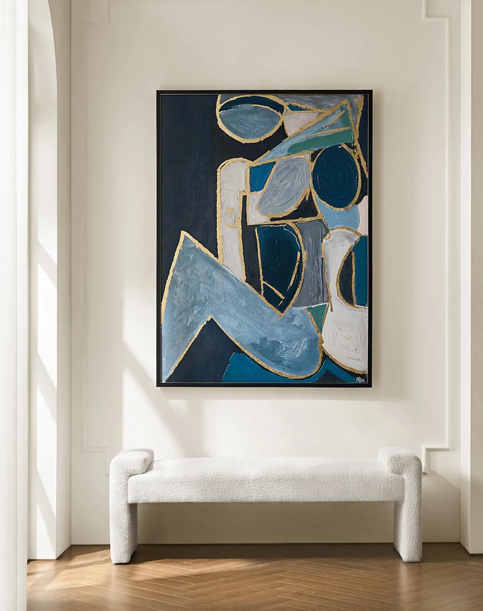 Figure in Cubism Painting$599
A hand-embellished canvas artwork featuring blue, gold, and white hues with elegant silver foil accents.
Add To Cart -
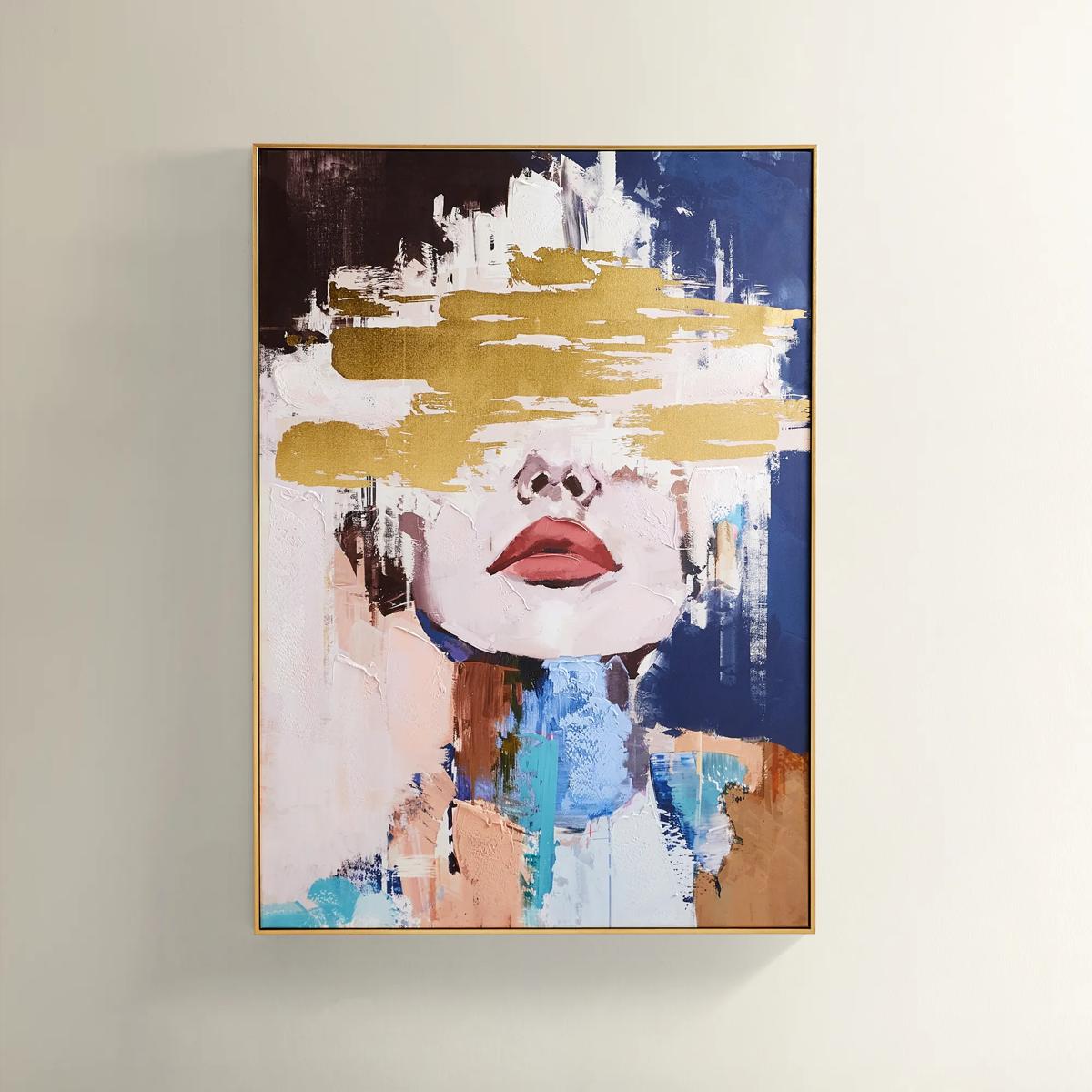
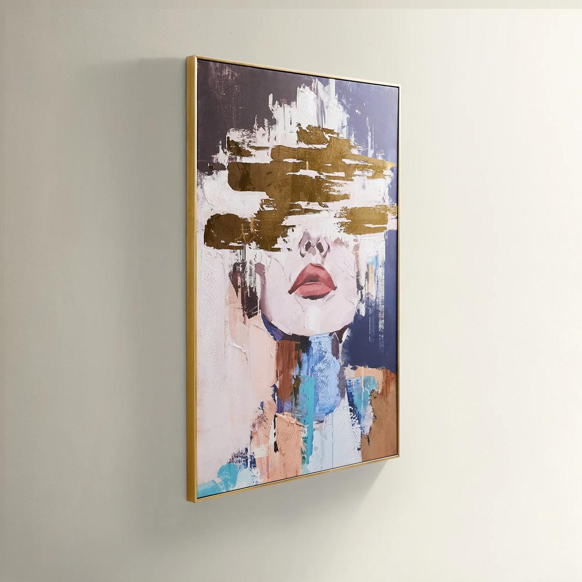 Waiting in Color Gold Foil Painted Wall Art 39.25" x 55"$499
A hand-painted abstract portrait in vivid blue, blush, and gold foil, framed in luxe gold.
Add To Cart -
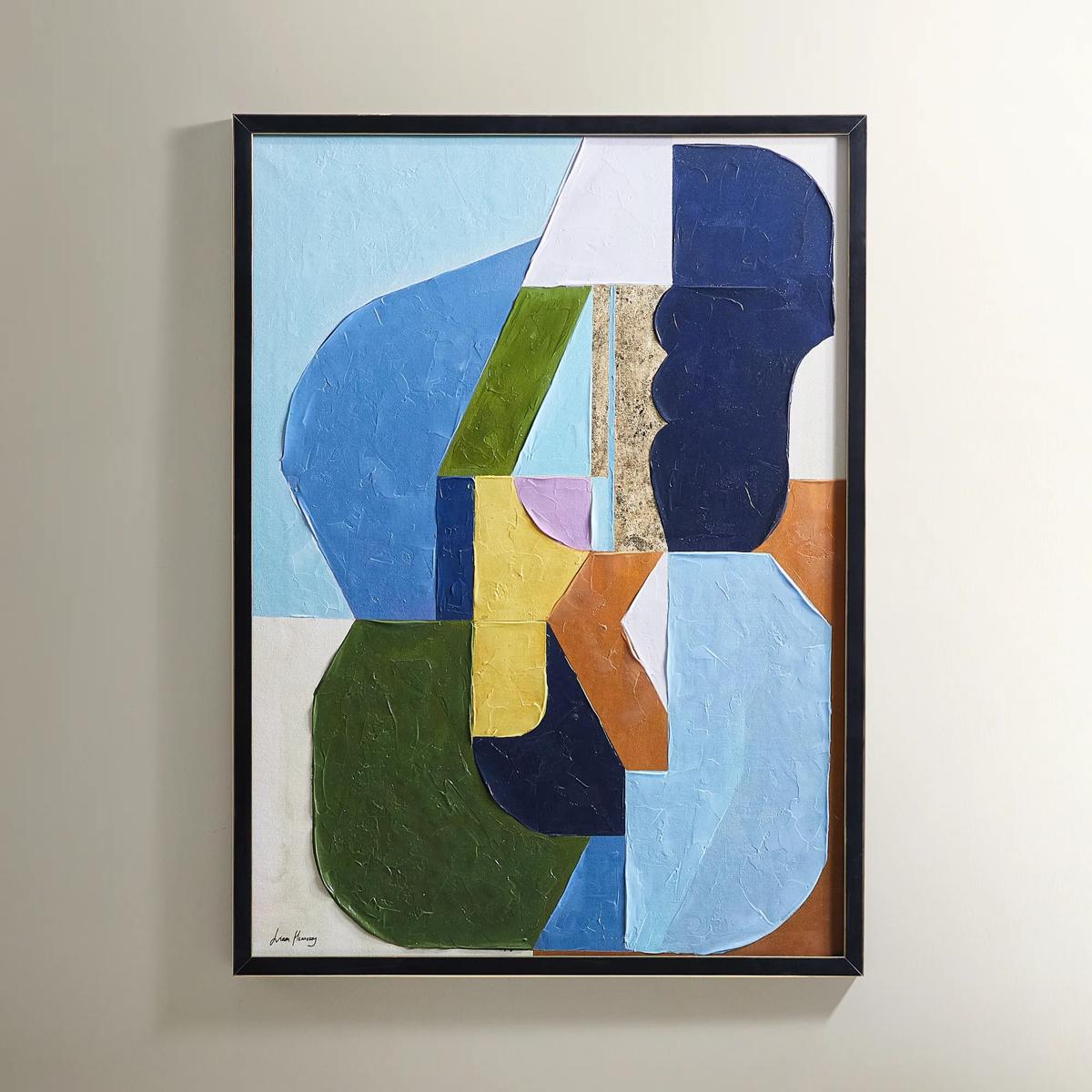
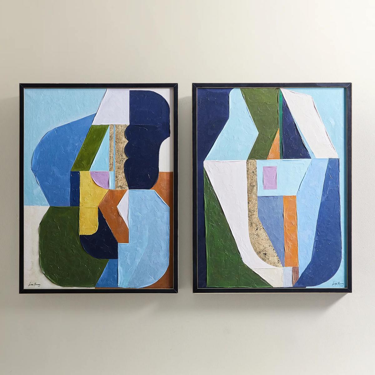 Thought Provoking Painting 1$249
A hand-embellished canvas artwork featuring textured strokes in deep blue, olive green, and gold accents.
Add To Cart -
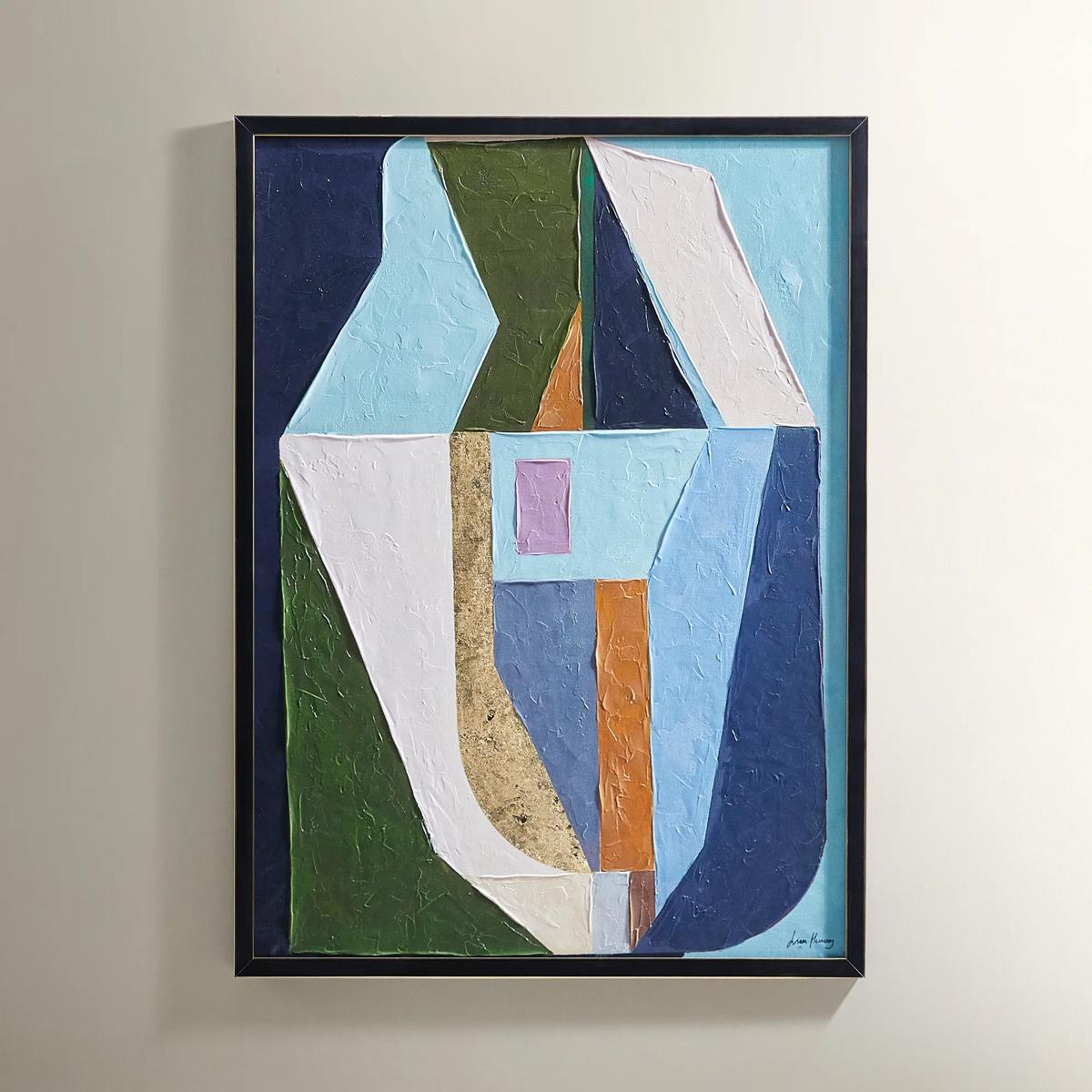 Thought Provoking Painting 2$249
A hand-embellished canvas artwork featuring textured strokes in deep blue, olive green, and gold accents.
Add To Cart -
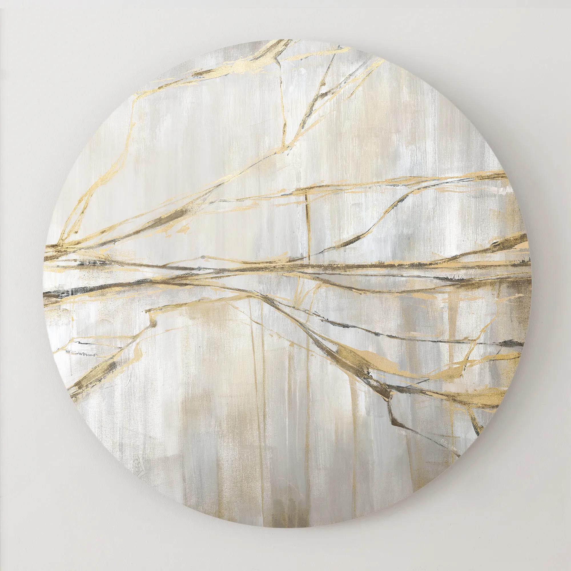
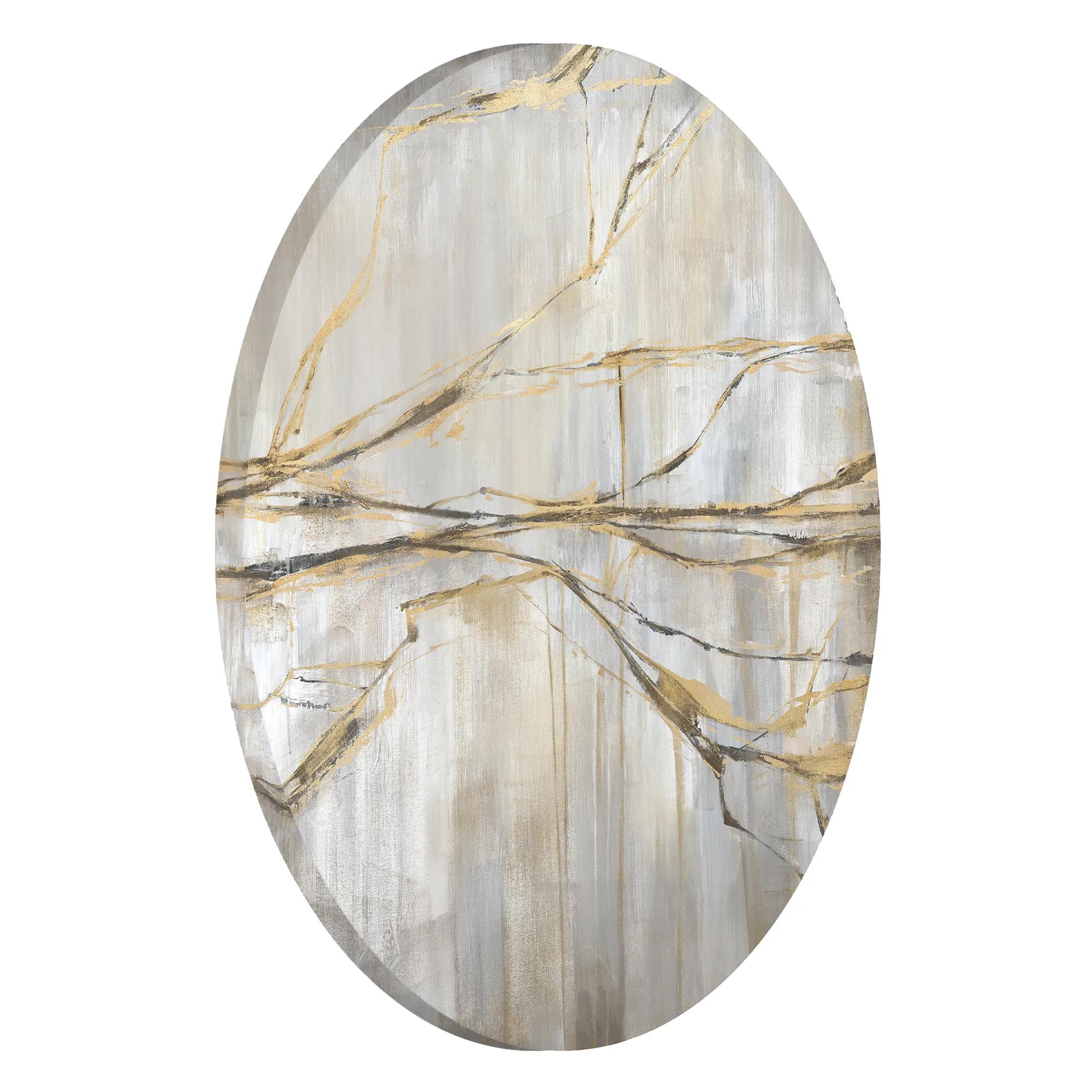 Lightening Crashes Round Wall Art 30"$899
A hand-textured circular linen canvas featuring a gallery-wrapped design for versatile wall display.
Add To Cart -
.jpg?w=1200&h=1200) Calla Mouth Blown Blue Glass Decorative Bowl 15.35" x 5.7"$79
Calla Mouth Blown Blue Glass Decorative Bowl 15.35" x 5.7"$79A handblown blue glass bowl featuring unique curves and translucent artistry for striking decorative appeal.
Add To Cart -
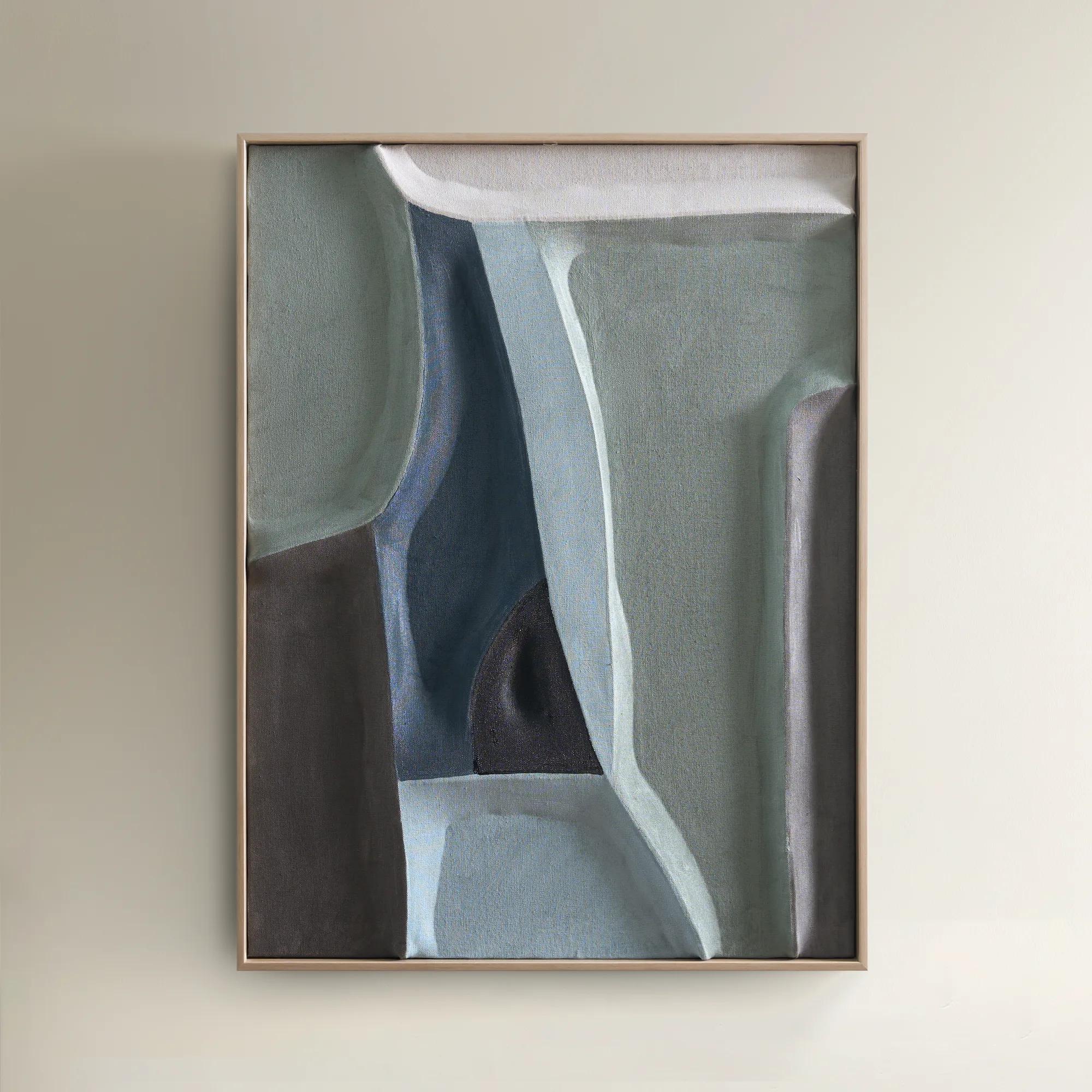
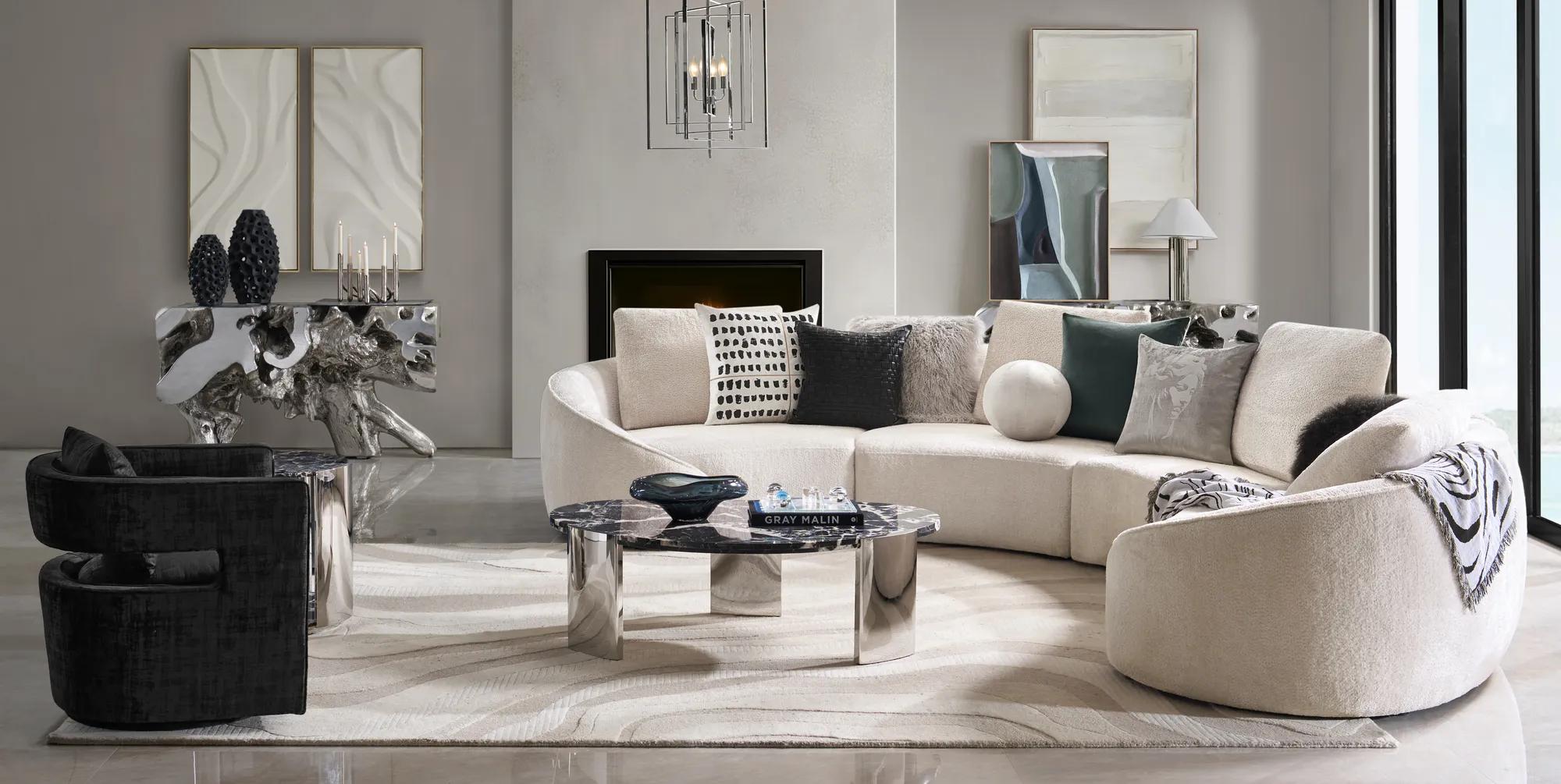 Patina Painting$119
An abstract hand-painted canvas in rich greens and blues, framed in a warm white oak floater.
Add To Cart

Living Room Blue Wall Arts
Living room blue wall arts transform everyday spaces into captivating galleries, inviting serenity and intrigue with every brushstroke. From deep sapphire abstracts to ethereal cobalt landscapes, these works channel the boundless energy of blue—evoking calm, confidence, and a touch of mystery. Whether you crave a dramatic focal point or a whisper of color that ties your room together, living room blue wall arts offer endless possibilities for self-expression. Elevate your space with artistry that dazzles, delights, and dares you to dream beyond the ordinary.
Blue wall art for living rooms creates a focal point with remarkable range, from the quiet luminosity of pale sky tones to the saturated drama of cobalt, indigo, and navy. Its appeal lies in that tension: blue can feel composed without disappearing, expressive without overwhelming the furniture and objects around it. A sweeping abstract above a sofa introduces movement through layered brushwork, while a botanical composition or an atmospheric landscape brings recognizable forms into a more painterly setting. Geometric designs offer sharper rhythm, particularly alongside curved seating or richly textured upholstery. The shade of blue matters as much as the subject. Inky navy lends visual weight to ivory walls and pale furnishings; smoky slate connects naturally with charcoal, silver, and stone; turquoise and teal introduce green undertones that feel especially vivid beside warm woods. For a living room with a cream sofa and brass accents, a composition mixing blue with parchment and restrained gold details can draw those finishes into a cohesive arrangement. In a space already rich with pattern, broad fields of blue give the eye somewhere to settle without sacrificing presence. Blue abstract wall art is especially versatile because it suggests a mood rather than prescribing a theme, leaving room for personal interpretation as the surrounding furnishings evolve. Soft washes can lend an expansive quality to an intimate sitting area, while dense pigments and decisive marks create the intensity of a private gallery. Nature-inspired imagery offers another expression, with botanical silhouettes, distant horizons, and fluid forms adding depth without requiring an entirely coastal interior. These works suit spaces made for conversation, entertaining, reading, or simply enjoying a beautifully considered room. The strongest connection often comes from a small existing detail: a blue thread in a rug, the glaze on a ceramic vessel, or the cool undertone of a favorite chair. Artwork can amplify that note, giving it a more deliberate and commanding place in the room.
Scale, proportion, and surface give living room blue wall art its architectural presence. A generous horizontal composition can anchor a long sofa, while a vertical format draws attention to height beside a console or within a narrow stretch of wall. As a starting point, artwork above a sofa often looks balanced when its overall width measures about two-thirds to three-quarters of the furniture below it. For a grouping, that measurement includes the spaces between frames. The relationship matters more than a rigid formula: an expansive wall may welcome a broader arrangement, while sconces, windows, or decorative molding can call for a more contained silhouette. Leaving roughly six to eight inches between the sofa back and the bottom of the frame often keeps the composition visually connected to the seating, with adjustments for unusually tall furniture or the proportions of the artwork. A single oversized canvas gives the room a clear center of gravity; a diptych or triptych creates a measured cadence across the wall. Closely related pieces can also form a gallery arrangement, with repeated blue tones providing continuity even when the imagery varies. Materials influence the effect at close range. Canvas brings a visible woven surface that can complement expressive brushwork and layered color, while paper-based prints often benefit from matting that creates breathing room around the image. A float frame adds a shadow line around a canvas, emphasizing its depth rather than enclosing it tightly. Slender metal frames introduce a crisp outline, wood frames add warmth or contrast, and sculpted profiles contribute a more decorative presence. Glass or acrylic glazing can help protect paper artwork from dust and incidental contact, although reflections vary with the glazing and lighting. Acrylic is generally lighter and more resistant to shattering than glass, but its surface can scratch more easily. In a room facing large windows, placement away from direct glare helps preserve the visibility of subtle blue gradients. Lighting that renders color accurately also allows the distinction between violet-leaning indigo and green-leaning teal to remain part of the composition rather than getting lost.
The lasting appeal of blue living room wall decor depends on both its visual character and the way it fits everyday life. In an active family room, a securely mounted framed work can bring polish above the main seating area without occupying a tabletop or competing with the objects used throughout the day. In a formal sitting room, an expansive abstract can serve as the principal gesture, with sculptural lamps and sumptuous textiles supporting rather than repeating its drama. Homes with open living and dining areas often benefit from blue appearing in different intensities across adjoining walls, creating continuity without making every composition look alike. That approach can extend into private spaces through bedroom blue abstract wall art, where related hues establish a connection while a different scale or composition gives the room its own identity. Practical details help protect the effect over time. Dimensions should account for the full frame, not only the image, and installation hardware should suit both the artwork’s weight and the wall material. Heavy or oversized pieces may require appropriate anchors or professional installation, especially above seating. Direct sunlight can fade pigments and discolor paper, so a position outside prolonged sun exposure is preferable; UV-filtering glazing may reduce exposure but does not make artwork immune to fading. Consistent indoor conditions also help protect paper, canvas, and frames from the stresses of excess humidity. Care should follow the maker’s instructions: frames generally need gentle dusting, unglazed surfaces should not be scrubbed, and cleaning liquid should never be sprayed directly onto artwork. For glazed pieces, a suitable cleaner applied sparingly to a soft cloth helps avoid moisture reaching the edges. As a housewarming or wedding gift, blue artwork can be a thoughtful choice when the recipient’s taste, wall dimensions, and preferred framing are already known. Whether chosen for a first carefully furnished living room or an established collection, the most compelling work feels personal: a confident field of color, a memorable gesture, and a reason to linger.
FAQs
Blue wall art is remarkably versatile and can complement a range of interior styles. In modern or contemporary settings, abstract blue pieces add a sophisticated edge, while in coastal or transitional spaces, lighter blue tones evoke a sense of calm and openness. Glamorous interiors benefit from blue art with metallic accents, and eclectic rooms come alive with layered blue hues and bold compositions. The key is to select artwork that resonates with your personal style and enhances the mood you wish to create.
Blue wall art has a unique ability to shape the ambiance of your living room. Lighter shades introduce tranquility and airiness, ideal for creating a serene retreat, while deeper blues bring drama and depth, perfect for a more intimate, cocooning effect. The right blue artwork can also reflect natural light, making the space feel more expansive, or serve as a striking focal point that draws the eye and anchors the room’s design.
Absolutely. Blue wall art makes a thoughtful and enduring gift for housewarmings, weddings, anniversaries, or milestone celebrations. Its universal appeal and calming presence make it suitable for a wide range of tastes, and it’s a meaningful way to help loved ones create a home that feels both personal and inspired.
To seamlessly incorporate blue wall art into your living room, consider the existing color palette and textures. Blue art pairs beautifully with metallic finishes, neutral furnishings, and rich textiles like velvet or silk. Layer your art with complementary accessories—think throw pillows, vases, or rugs in similar or contrasting hues—to create a cohesive, curated look that feels intentional and elevated.
Z Gallerie wall decor is distinguished by its bold artistry, luxurious materials, and dramatic flair. Each piece is designed to make a statement, transforming living rooms into galleries of self-expression. Whether it’s a shimmering abstract or a serene blue landscape, Z Gallerie’s collection celebrates individuality and elevates the everyday with unmistakable style.