Blue And Gold Abstract Paintings
Blue And Gold Abstract Paintings
-
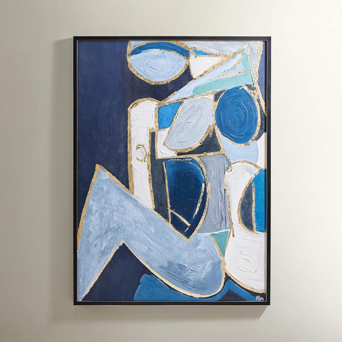
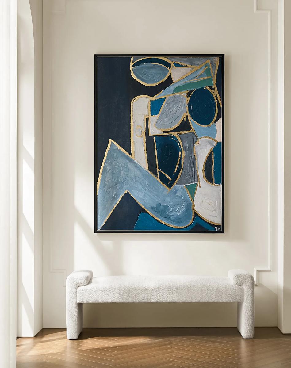 Figure in Cubism Painting$599
A hand-embellished canvas artwork featuring blue, gold, and white hues with elegant silver foil accents.
Add To Cart -
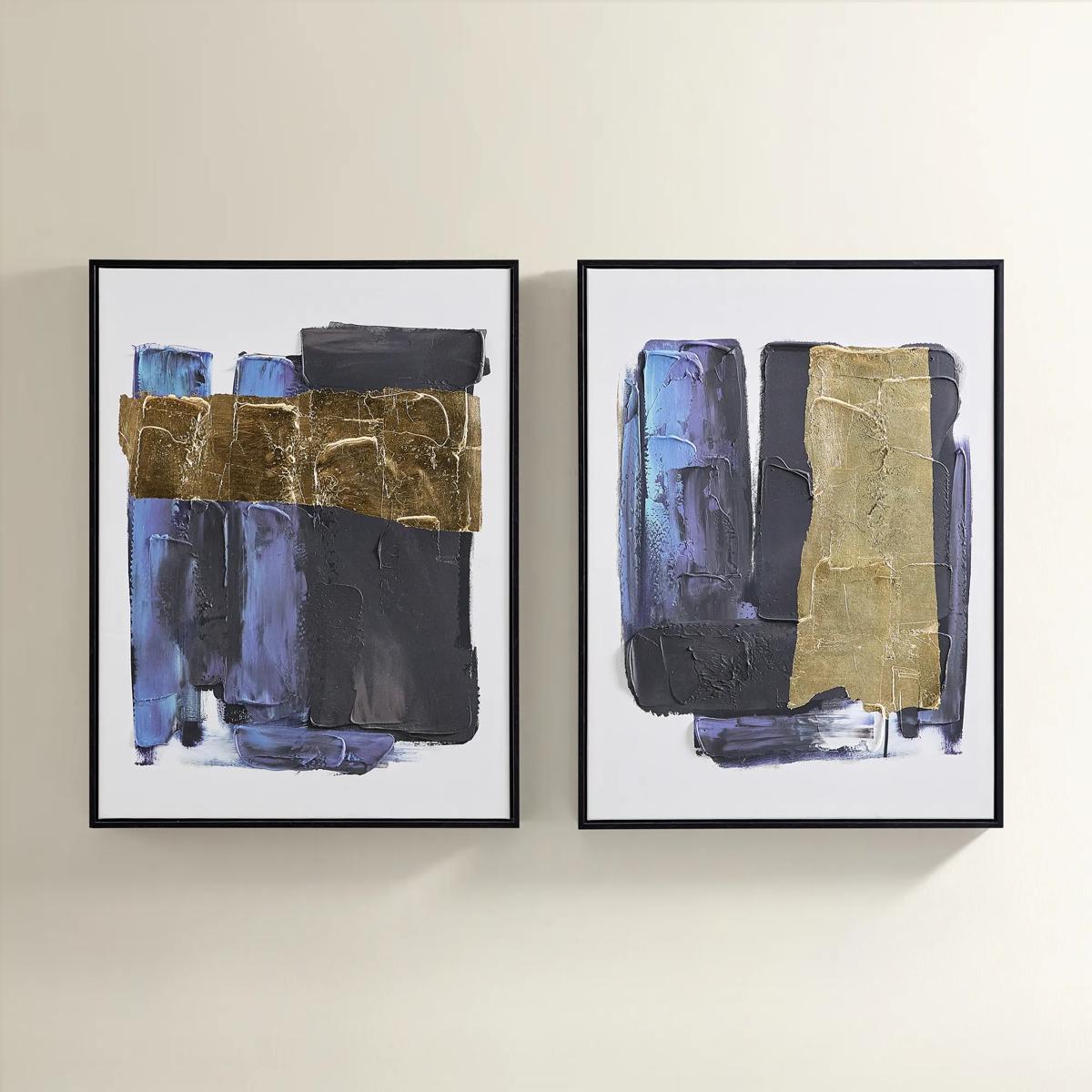
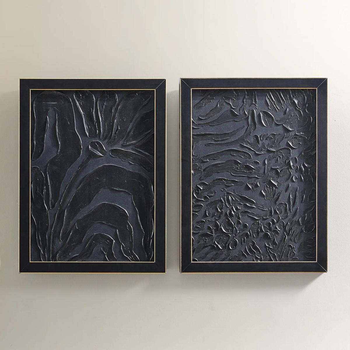
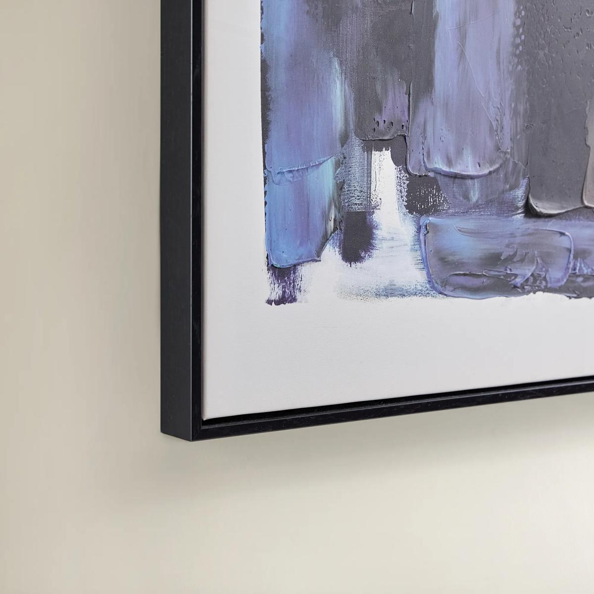 Deep Thoughts Gold Leaf Painted Wall Art Set of 2$199
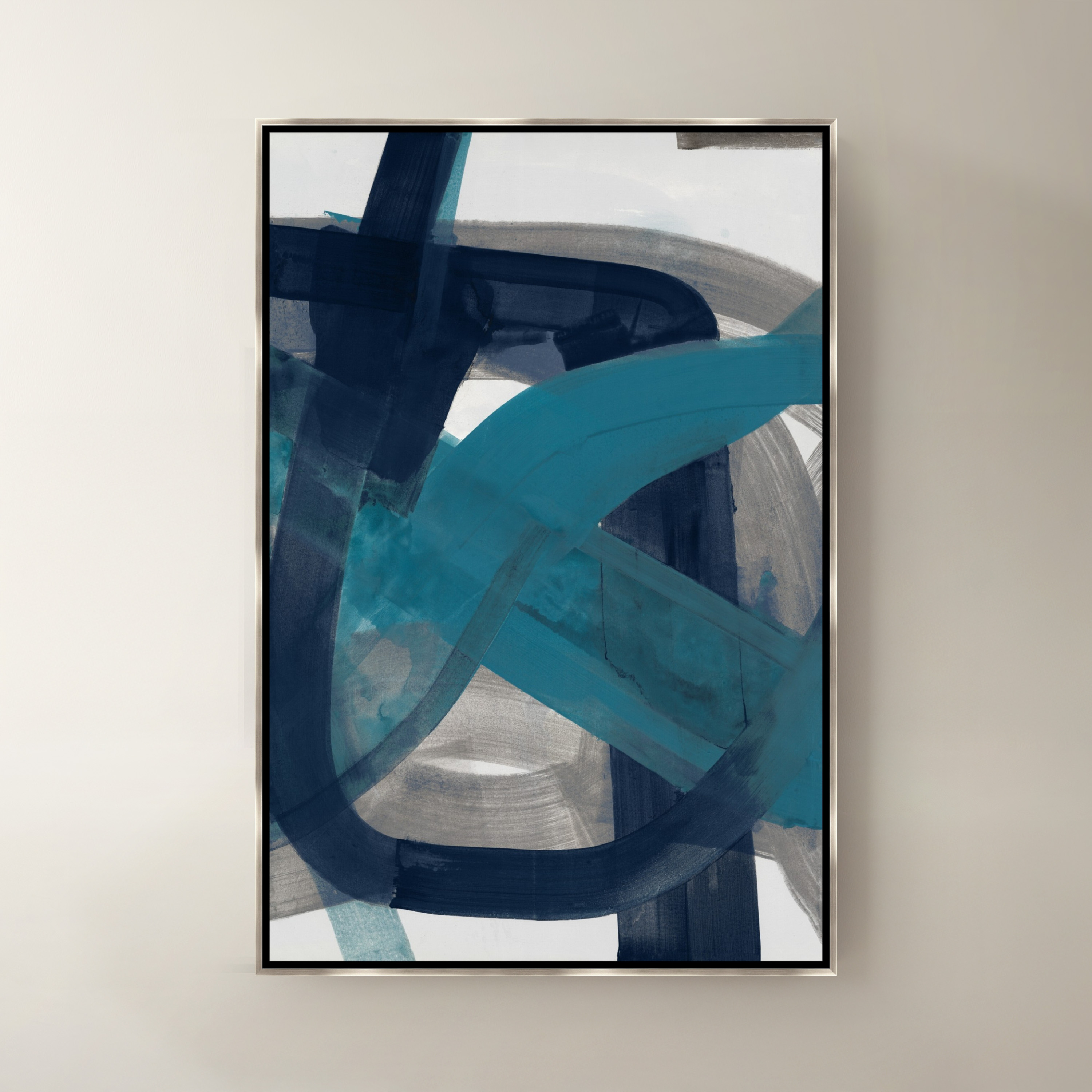
A set of two hand-painted abstract canvases in blue and gold leaf, framed in sleek black.
Add To Cart -
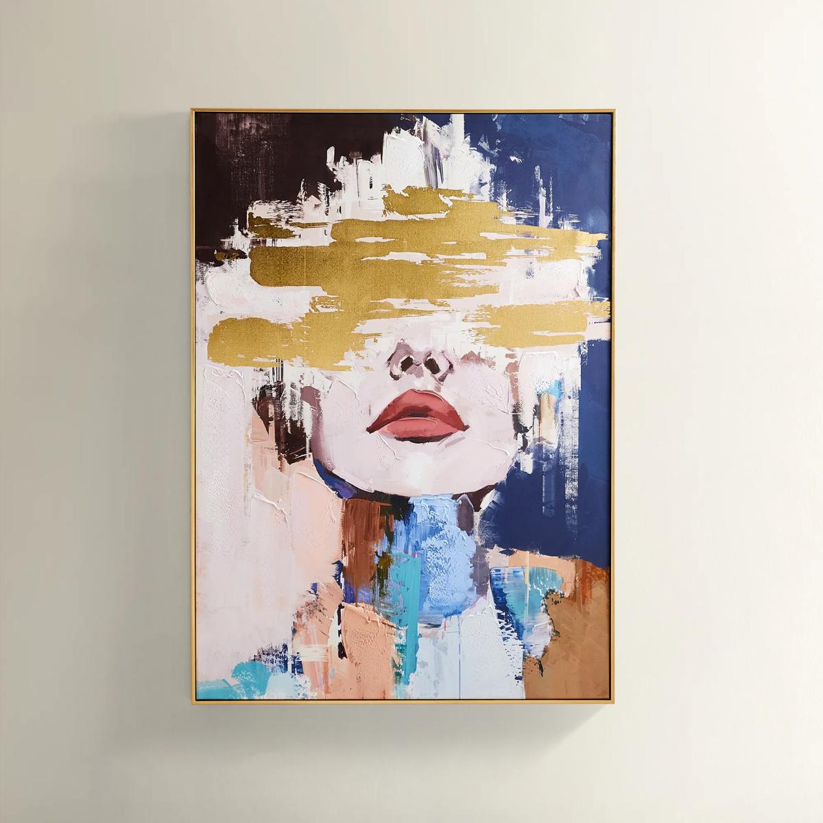
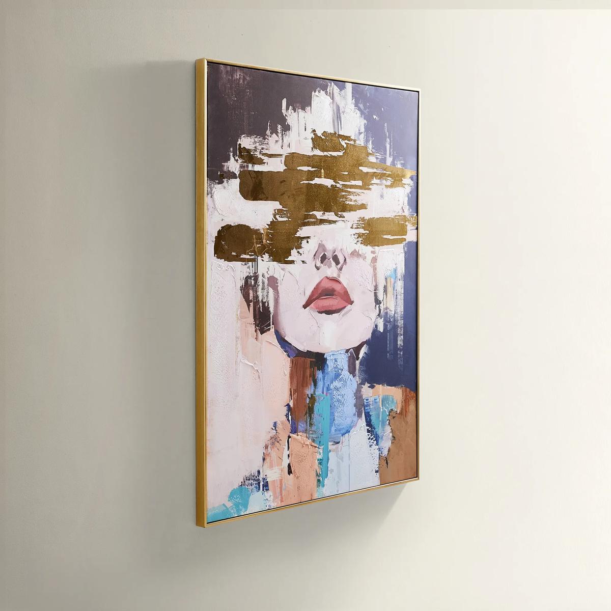 Waiting in Color Gold Foil Painted Wall Art 39.25" x 55"$499
A hand-painted abstract portrait in vivid blue, blush, and gold foil, framed in luxe gold.
Add To Cart -
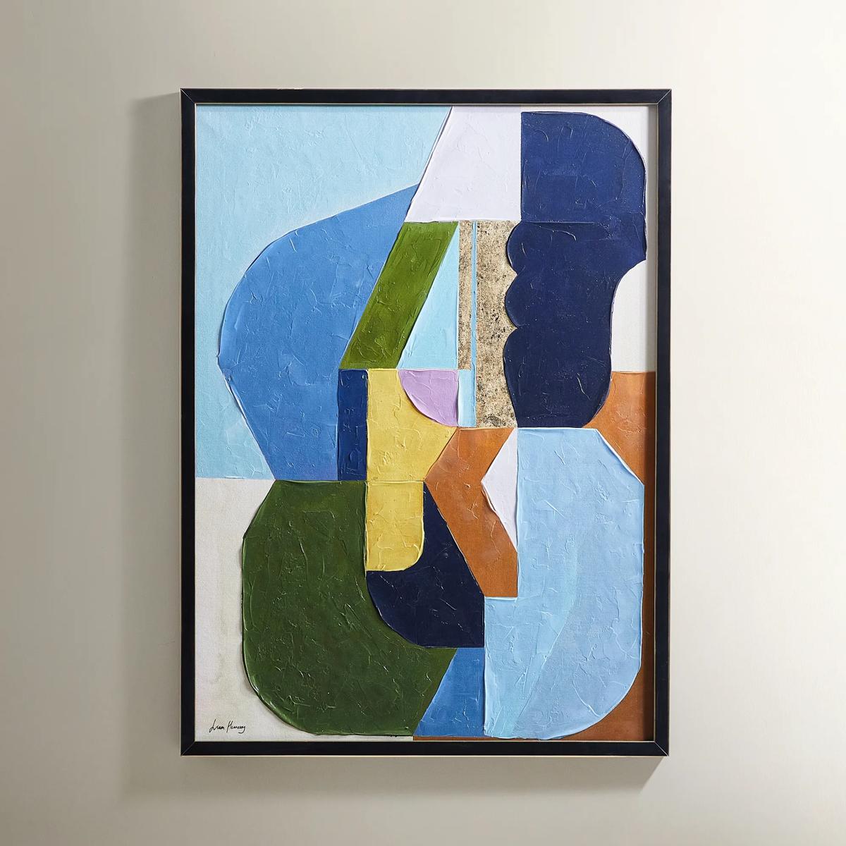
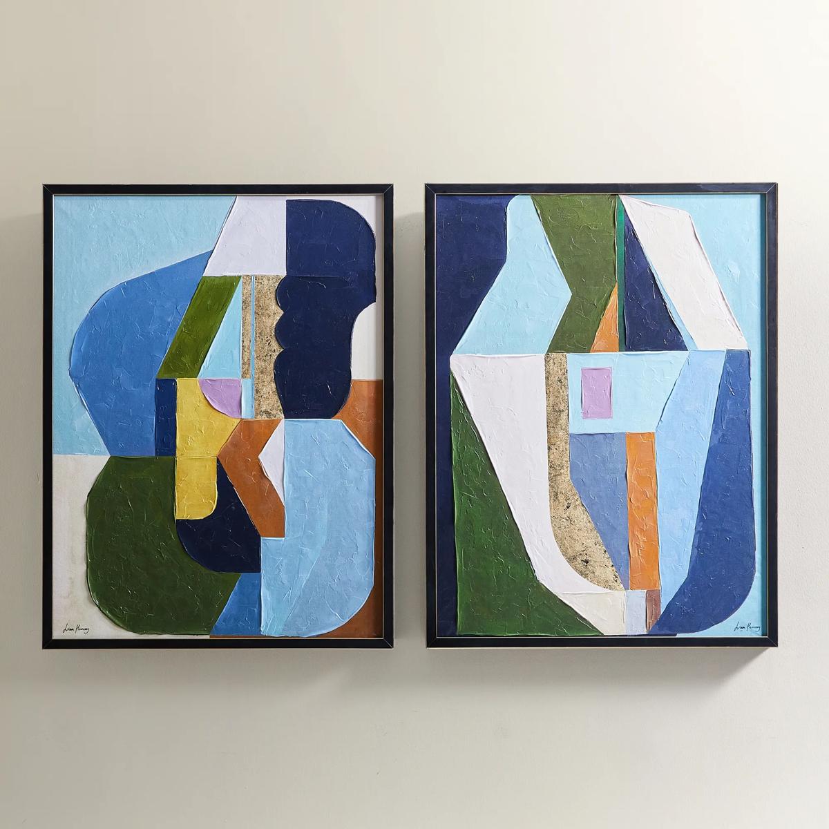 Thought Provoking Painting 1$249
A hand-embellished canvas artwork featuring textured strokes in deep blue, olive green, and gold accents.
Add To Cart

Blue And Gold Abstract Paintings
Blue and gold abstract paintings invite a sense of grandeur and intrigue into any space, transforming walls into captivating works of art. The interplay of deep sapphire hues and radiant golden accents conjures an atmosphere that is both serene and striking, infusing rooms with a touch of modern opulence. Each piece becomes a bold gesture—a celebration of color, movement, and expressive design—perfect for those who believe their home should dazzle as much as they do. Discover how blue and gold abstract paintings can elevate your interiors, turning everyday moments into extraordinary visual experiences.
Blue and gold abstract paintings pair the depth of blue with the warmth of gold, creating wall art that feels expressive, polished, and rich in contrast. Navy, cobalt, teal, and softer blue-gray tones each establish a different mood, while golden accents can introduce anything from a delicate glimmer to a sweeping visual gesture. The appeal lies in that interplay: blue gives the composition depth and atmosphere, and gold draws the eye toward a particular line, shape, or passage of texture. Unlike representational artwork, abstract paintings do not depend on a recognizable subject. Their impact comes from color, movement, proportion, and the relationship between open space and concentrated detail. A composition with flowing blue washes and fine gold veins may suggest polished stone or an imagined horizon; bold geometric forms create a more architectural impression. Layered brushwork and raised surfaces add another dimension, allowing shadows to become part of the artwork’s presence. Depending on the piece, these effects may be created with acrylic paint, fluid painting techniques, textured mediums, metallic pigments, or applied leaf. Reproductions can capture the appearance of those details, although a printed gold tone does not necessarily have the reflective quality of metallic paint or foil. That distinction matters when the desired effect is a luminous surface rather than a golden color alone. Some compositions hold their drama in a nearly uninterrupted field of navy, punctuated by a restrained gold accent. Others bring together turquoise, cream, charcoal, and gold for a more intricate visual rhythm. Neither approach requires a room filled with matching colors. A painting can introduce the palette on its own, or echo smaller accents already present in upholstery, lighting, and decorative objects. For interiors built around sculptural furniture, sumptuous textiles, or gleaming finishes, blue and gold abstract wall art offers a compelling balance of artistic freedom and visual structure, giving the room a focal point without prescribing every surrounding detail.
Scale and placement shape how blue and gold abstract paintings become part of an interior. A large horizontal composition above a sofa can connect the seating area, especially when its proportions relate to the furniture beneath it rather than the entire width of the wall. Artwork spanning roughly two-thirds to three-quarters of a sofa’s width often feels balanced, although the surrounding architecture, frame, and arrangement of nearby objects can change that relationship. A tall, narrow painting can give an entryway a confident vertical accent, while a broader canvas above a dining room sideboard establishes a backdrop for sculptural vessels and reflective accessories. In a bedroom, misty blues and softly dispersed gold may create a composed atmosphere; in a living room or office, saturated navy and decisive metallic gestures can deliver greater visual energy. These are differences in composition, not fixed rules about which colors belong in which rooms. A densely layered painting can feel intimate in a quiet reading corner, and a restrained abstract can command a generous wall when its scale is substantial. Viewing distance is equally important. Fine brushwork, delicate veining, and subtle texture reward closer attention, while larger color fields and emphatic marks remain legible across an open living area. Frames help define the relationship between the art and its surroundings. A slender gold-toned frame can echo the painting’s warmer accents, black can sharpen its outline, and a gallery-wrapped canvas can keep the emphasis on the image and its finished edges. With multiple paintings, consistent spacing and a shared color relationship create cohesion without requiring identical compositions. Lighting adds another layer: diffuse illumination reveals color evenly, while angled light can emphasize relief and reflective passages. Strong reflections may obscure an image behind glazing, so the position of windows and lamps deserves consideration. Against ivory walls, the palette feels crisp and luminous; against deep charcoal or blue, it becomes more immersive. The most convincing setting gives the artwork room to command attention while allowing furniture, textiles, and decorative finishes to support its character.
Materials and construction influence both the appearance and long-term care of blue and gold abstract artwork. Painted canvas brings the weave of the fabric into the visual experience, and a stretched canvas depends on a sound support structure to hold its shape. Works on wood panels offer a firmer surface, while art on paper typically benefits from appropriate framing and protection. Hand-painted compositions may reveal individual brush marks, irregular edges, and variations in applied texture; printed artwork translates a finished image onto another surface, with results influenced by the printing process and substrate. The painterly character of Hand Painted Blue Abstract Arts offers a related expression for interiors where layered color and visible brushwork are central to the mood. When evaluating an artwork’s dimensions, the full framed measurement, canvas depth, and overall weight matter alongside the image size. A deep frame projects farther from the wall, and substantial pieces require hanging hardware suited to both their weight and the wall construction. Durable display also depends on the environment. Prolonged direct sunlight can affect pigments and printed colors, while moisture and significant humidity fluctuations can compromise canvas, paper, wood, or framing materials. A well-ventilated interior location away from splashes and direct heat is generally more suitable than a damp bathroom or a position immediately above a working fireplace. Care should follow the instructions provided for the particular materials and finish. Frames can often be dusted gently with a soft, dry cloth, but painted surfaces, metallic leaf, and raised textures may require a different approach; household sprays, abrasive wiping, and pressure can damage delicate details. Protective glazing, when present, should be cleaned without allowing liquid to seep toward the artwork. Beyond their decorative role, these paintings can make thoughtful housewarming, wedding, or anniversary gifts for someone drawn to expressive interiors. Familiarity with the recipient’s wall space, preferred blue tones, and taste in framing makes the choice more personal. Whether anchoring a formal entertaining space or bringing artistic distinction to a private retreat, a blue and gold abstract painting offers lasting visual interest through the details that emerge with repeated viewing: an unexpected line, a layered shade, a gold passage that catches the light.
FAQs
Blue and gold abstract paintings are remarkably versatile, elevating a range of interiors from opulent, traditional spaces to sleek, contemporary environments. Their rich color palette and dynamic composition complement both minimalist settings—where they serve as a bold focal point—and more eclectic rooms layered with textures and patterns. Whether featured in a glamorous living room, a serene bedroom retreat, or a sophisticated office, these artworks add depth, drama, and a refined sense of artistry.
To showcase the luminous gold details in your abstract painting, consider placing the artwork where it can catch natural or accent lighting. Positioning it opposite a window or beneath a picture light will enhance the metallic sheen, allowing the gold to shimmer and shift throughout the day. Pairing the painting with metallic accessories or warm-hued furnishings can also amplify the radiant effect and unify the space.
Absolutely. Blue and gold abstract paintings make memorable, meaningful gifts for art lovers, newlyweds, new homeowners, or anyone celebrating a milestone. Their universal appeal and emotive color palette transcend trends and personal styles, making them a thoughtful choice for those who appreciate expressive, statement-making décor.
Blue and gold abstract paintings create a harmonious interplay of calm and opulence. The blue tones evoke tranquility, contemplation, and depth, while the gold accents infuse the room with warmth, energy, and a touch of luxury. Together, they set a mood that is both serene and invigorating, perfect for spaces designed for relaxation, inspiration, or entertaining.
To preserve the beauty of your abstract painting, display it away from direct sunlight and excessive humidity, which can affect colors and finishes over time. Dust the surface gently with a soft, dry cloth—avoid using cleaning sprays or water. If your piece features heavy texture or gold leaf, take extra care not to snag or rub the surface. With mindful placement and gentle care, your artwork will remain a stunning focal point for years to come.