Bold Blue Abstract Arts
Bold Blue Abstract Arts
-
.jpeg?w=1200&h=1200)
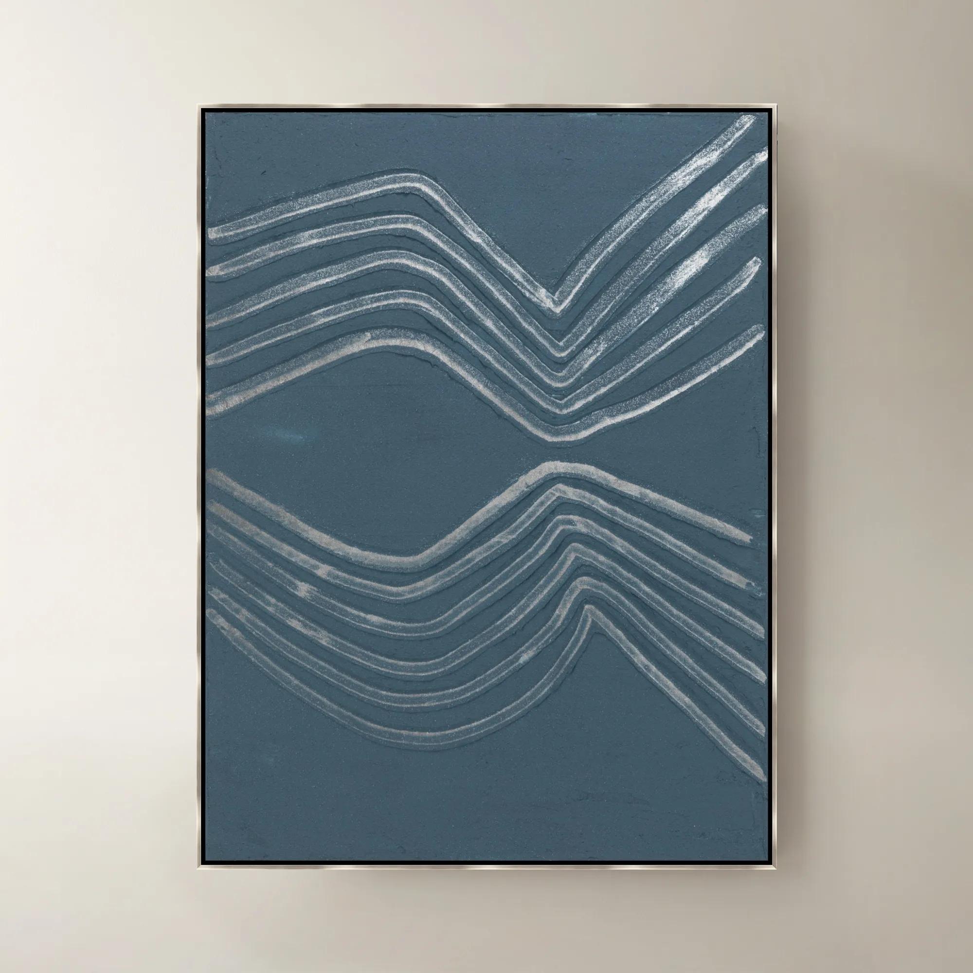
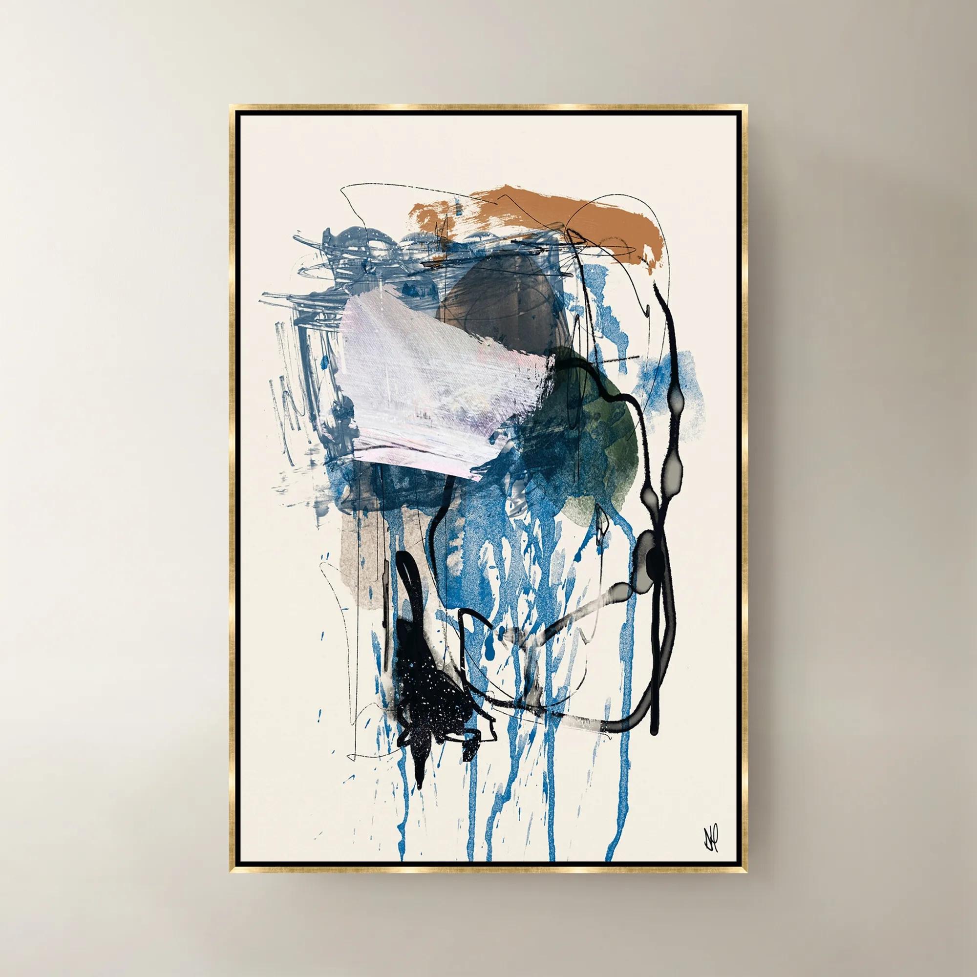
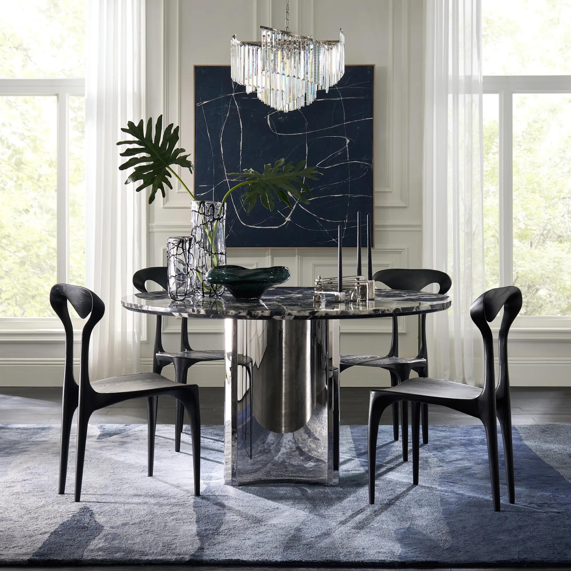 Almost Midnight Painting - Blue$439
A hand-painted canvas featuring bold blue and black tones with delicate white lines in a light wood frame.
Add To Cart -
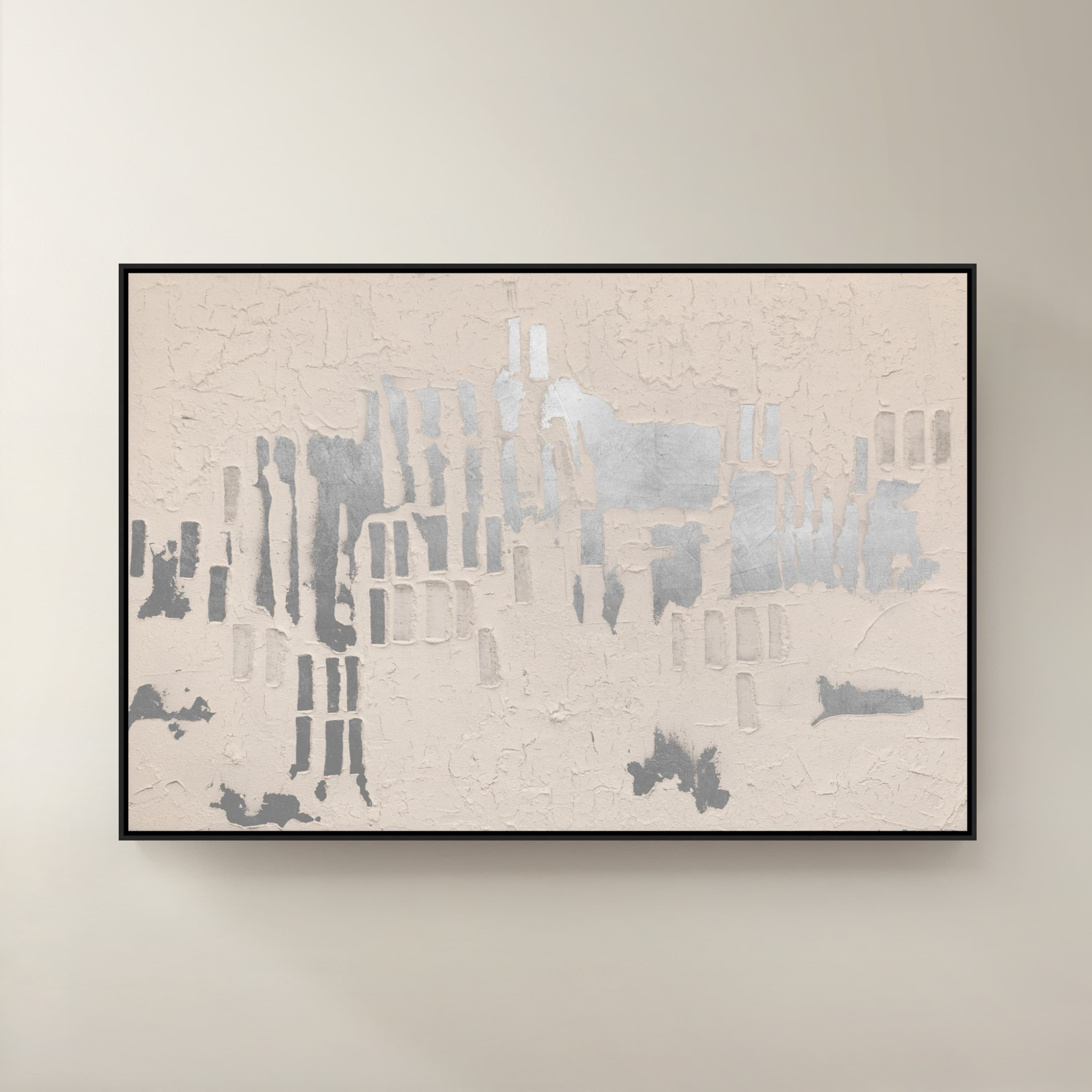
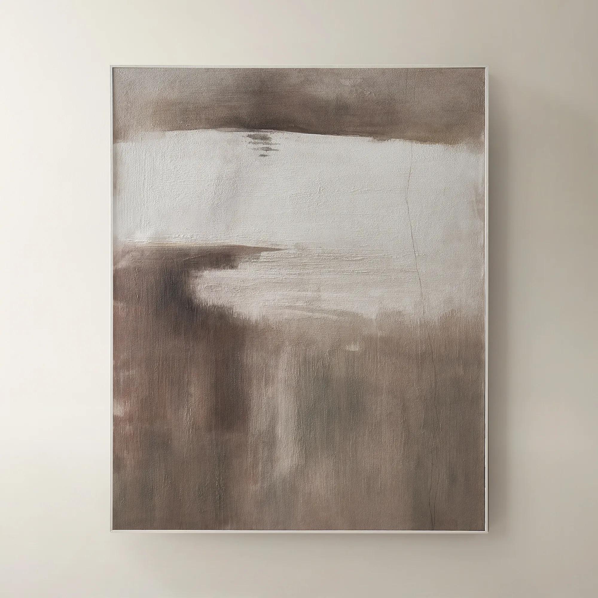
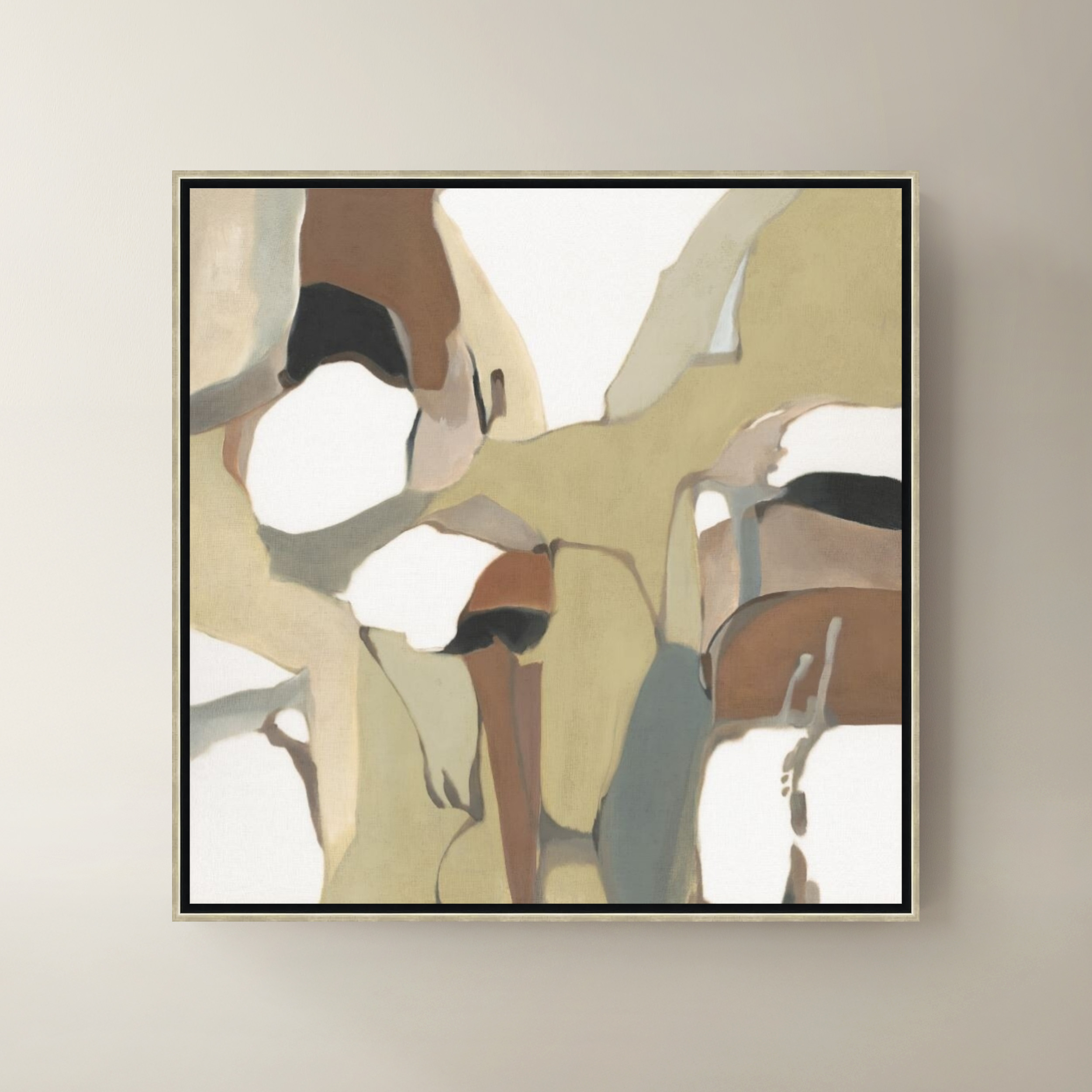
.jpeg?w=1200&h=1200) Relic Framed Painted Triptych Wall Art Set of 3$399
Relic Framed Painted Triptych Wall Art Set of 3$399A hand-painted abstract triptych in deep navy and neutral tones, set in sleek black floater frames.
Add To Cart -
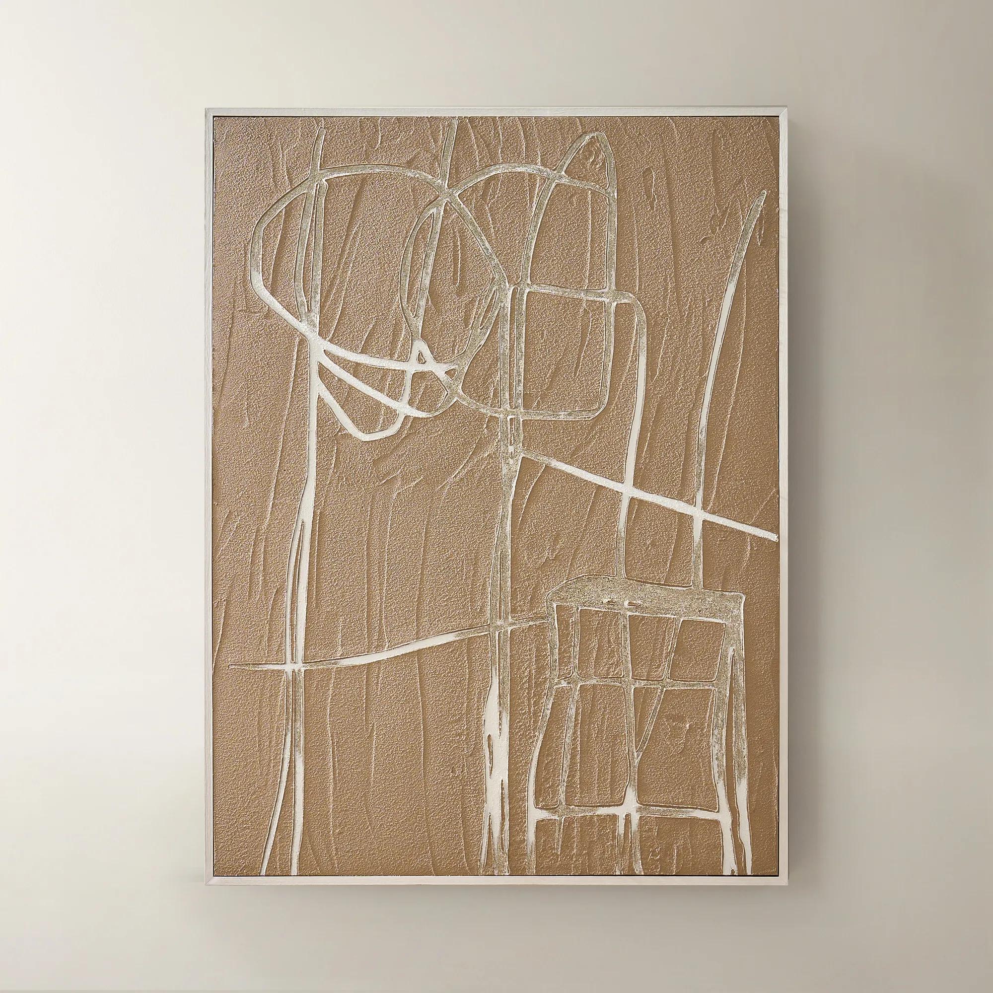
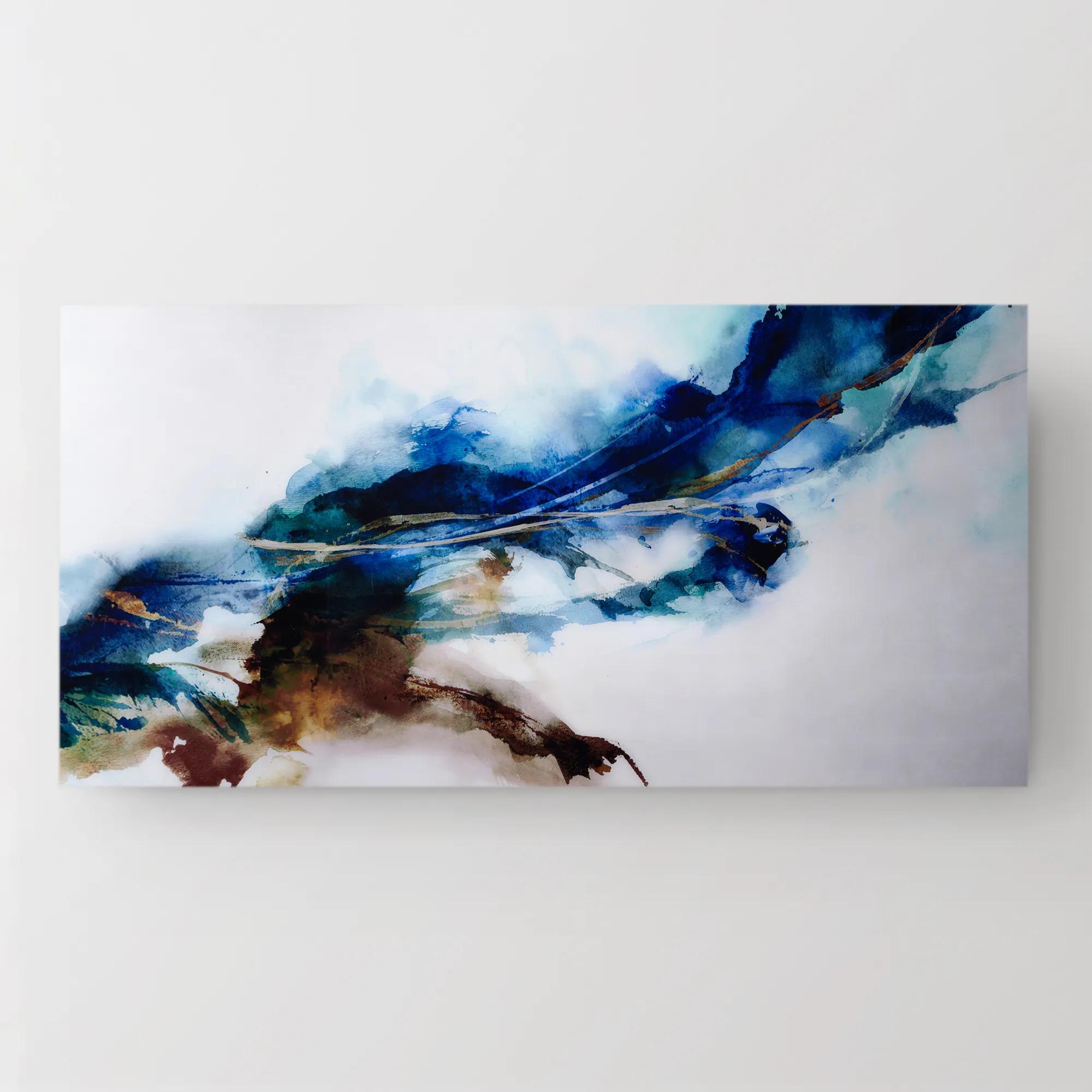 Cerulean Movement Acrylic Art 72" x 36"$1299
A vibrant abstract artwork printed on high-gloss acrylic, infusing your space with dynamic energy and movement.
Add To Cart -
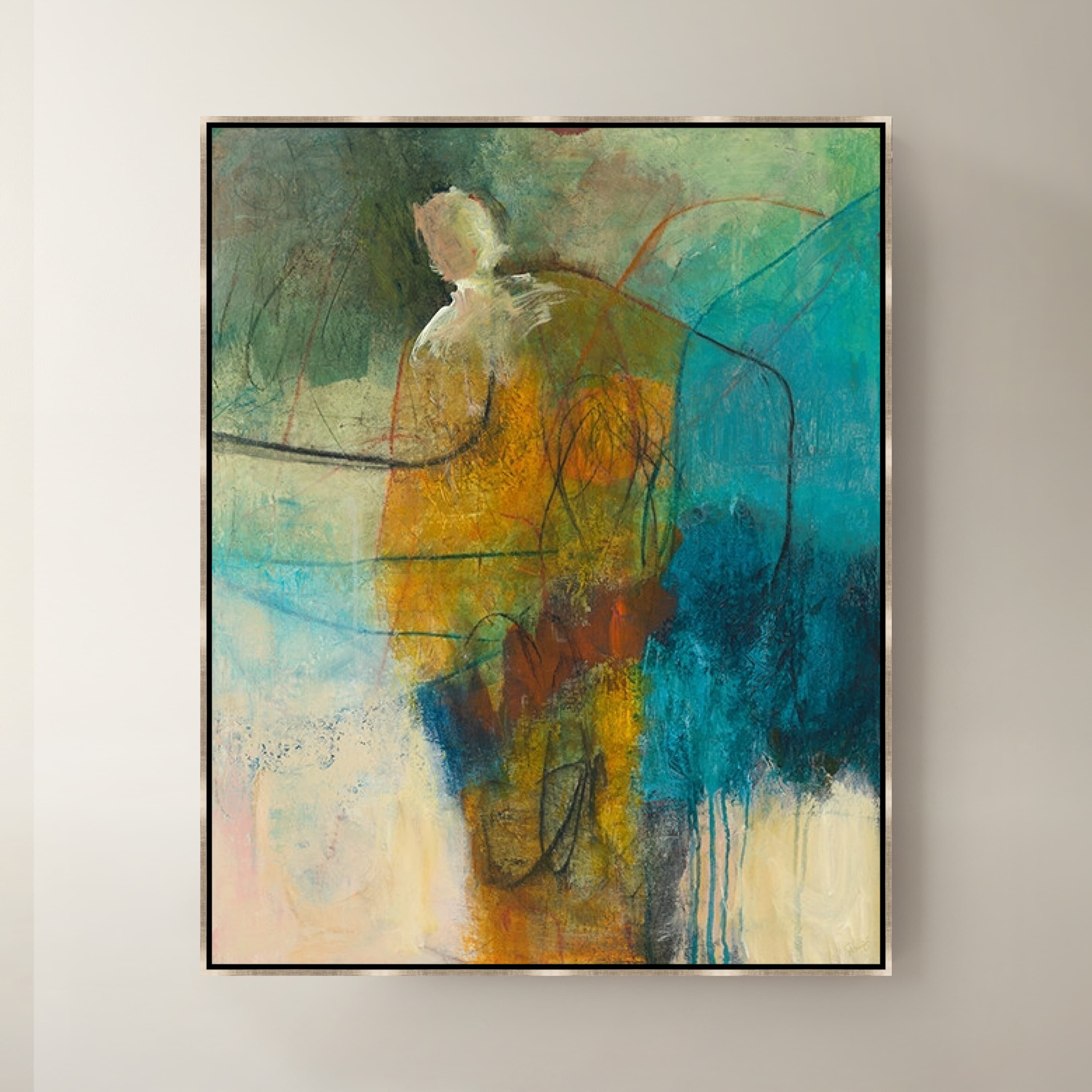
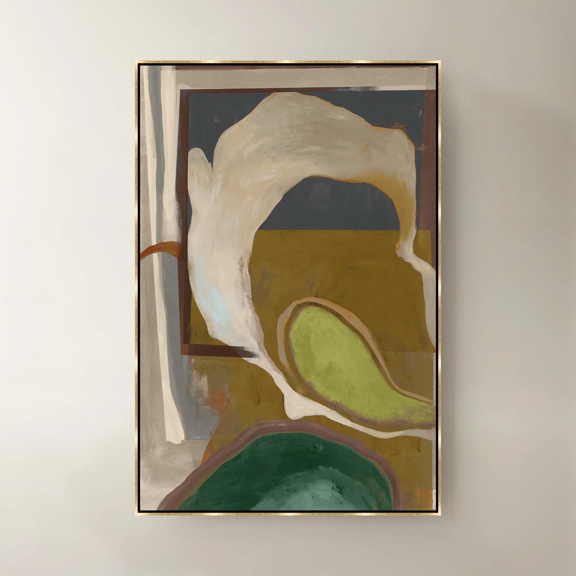
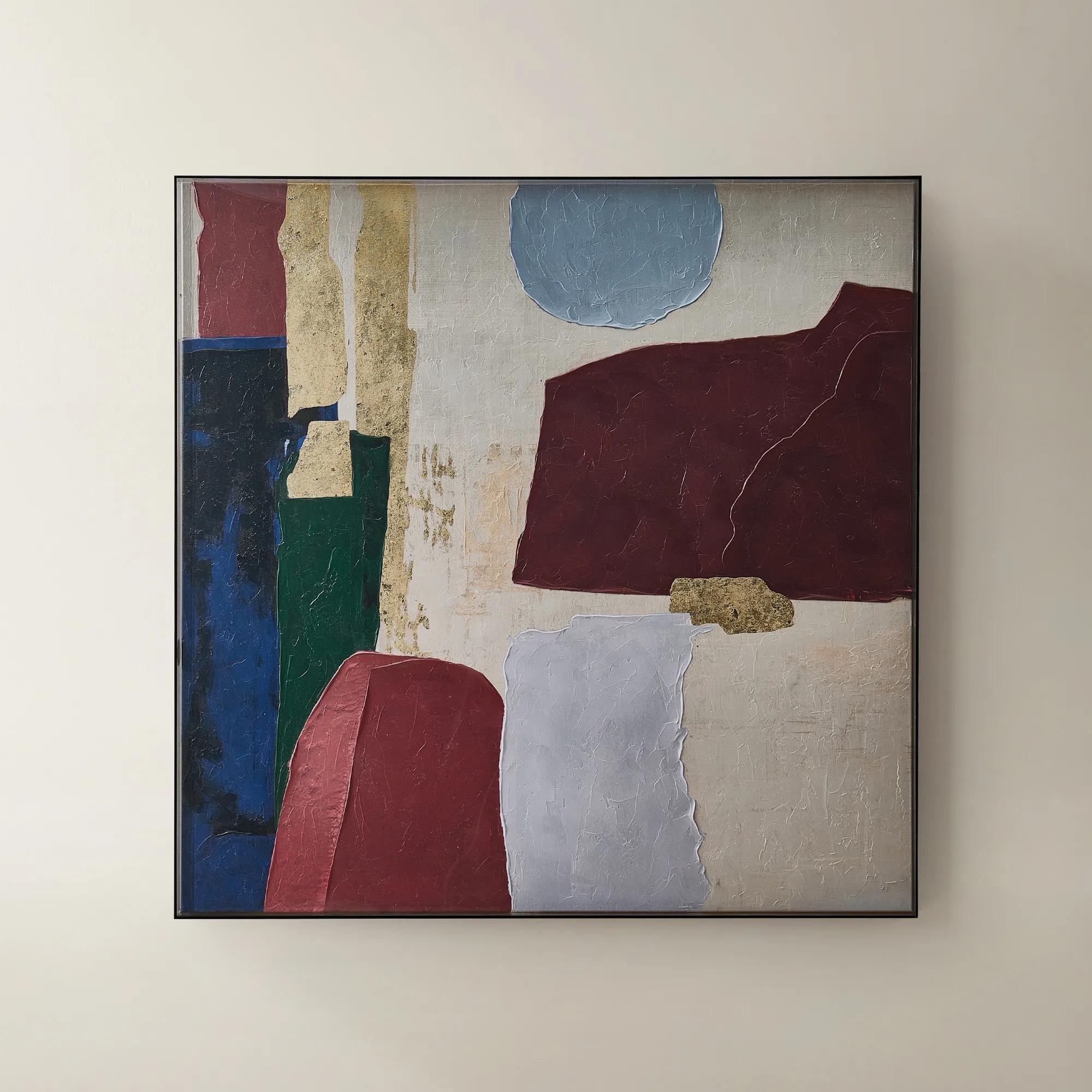
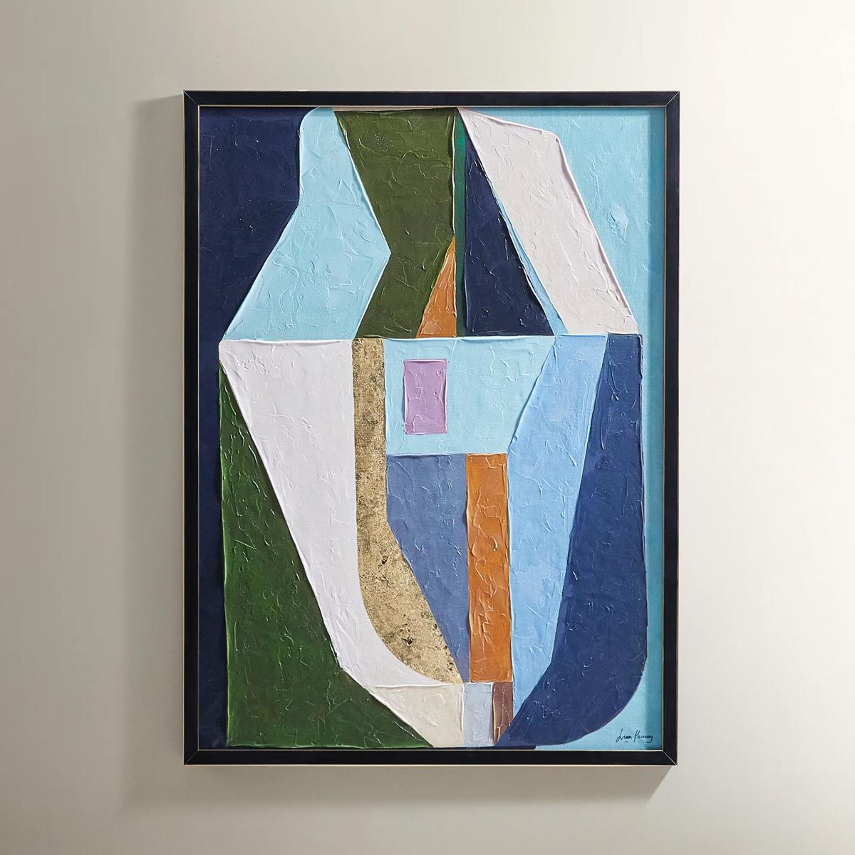 Thought Provoking Painting 2$249
A hand-embellished canvas artwork featuring textured strokes in deep blue, olive green, and gold accents.
Add To Cart -
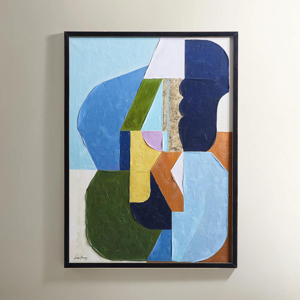
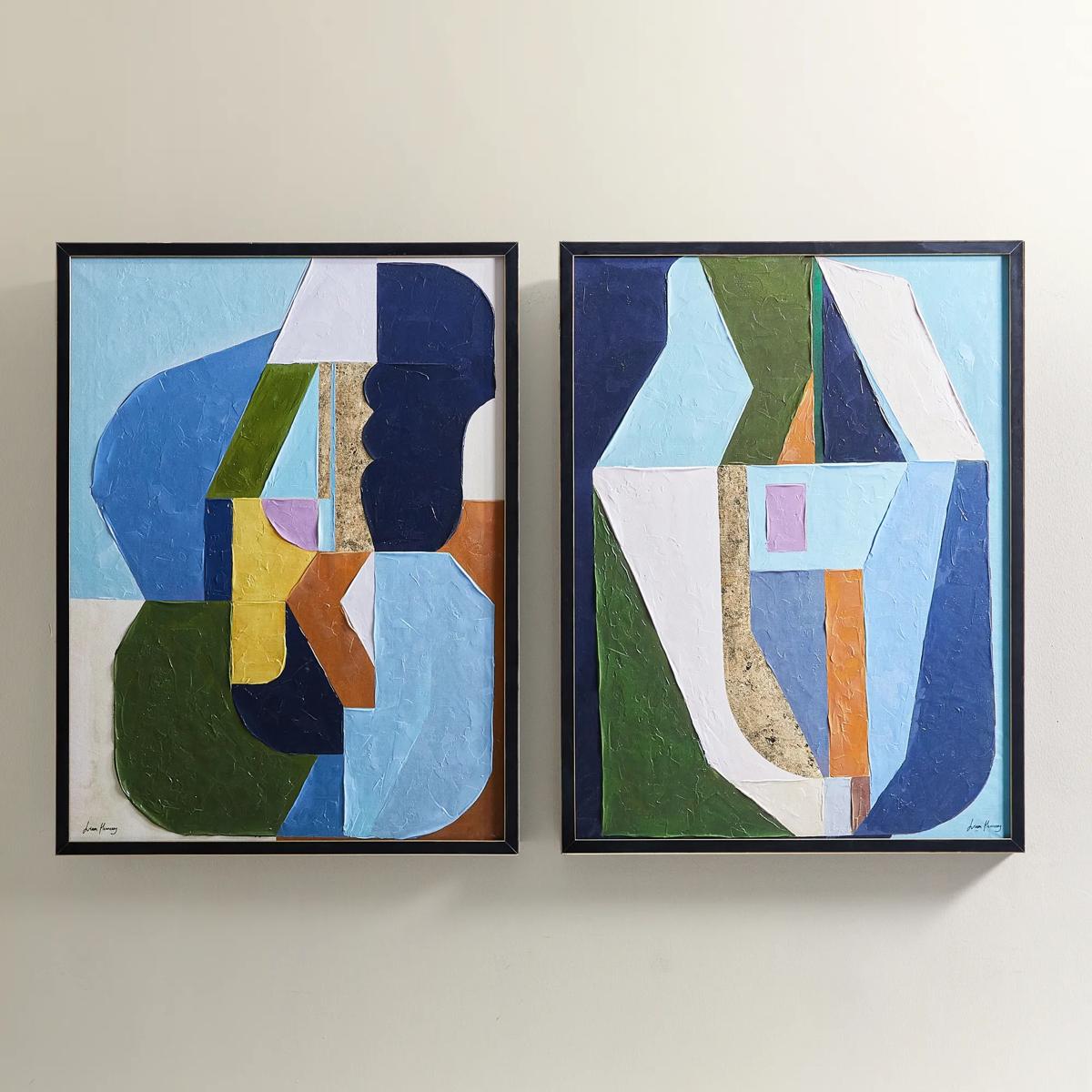 Thought Provoking Painting 1$249
A hand-embellished canvas artwork featuring textured strokes in deep blue, olive green, and gold accents.
Add To Cart -
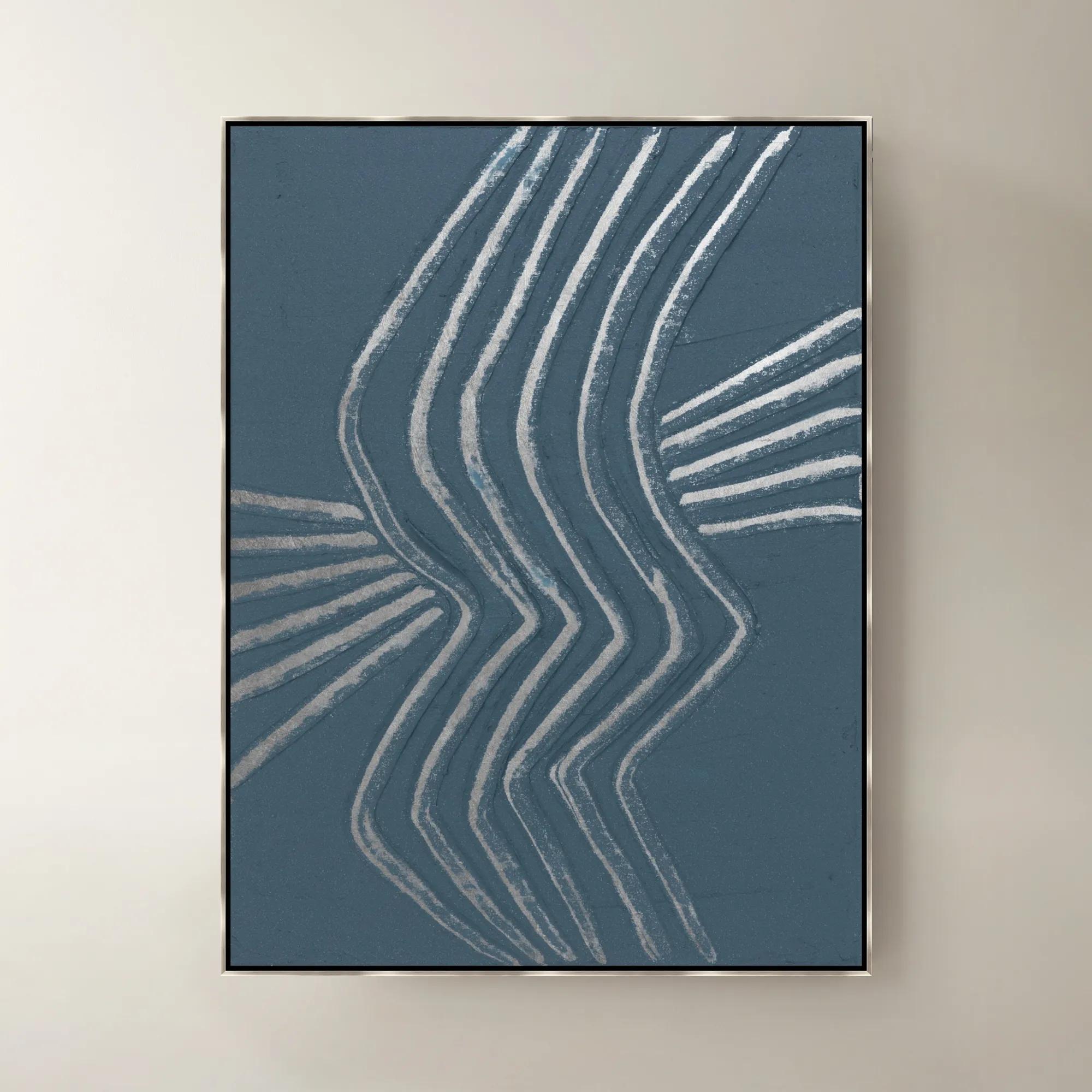
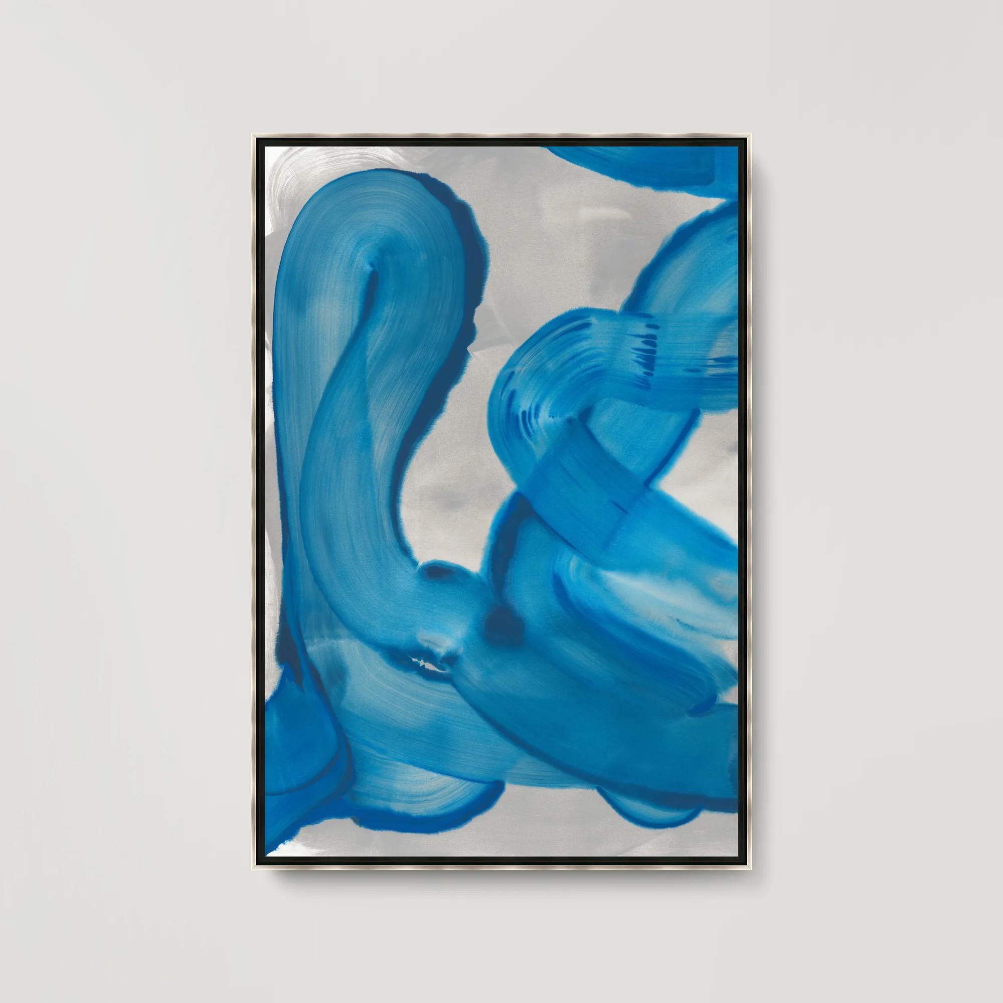 Royal Waves I Framed Wall Art 31.5" x 46.5"$699
A gallery-wrapped abstract canvas featuring hand-applied brush gel and set in a sleek silver floater frame.
Add To Cart -
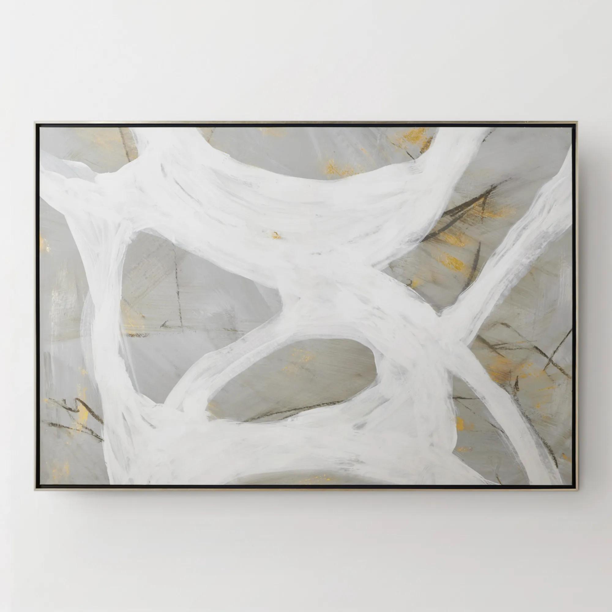
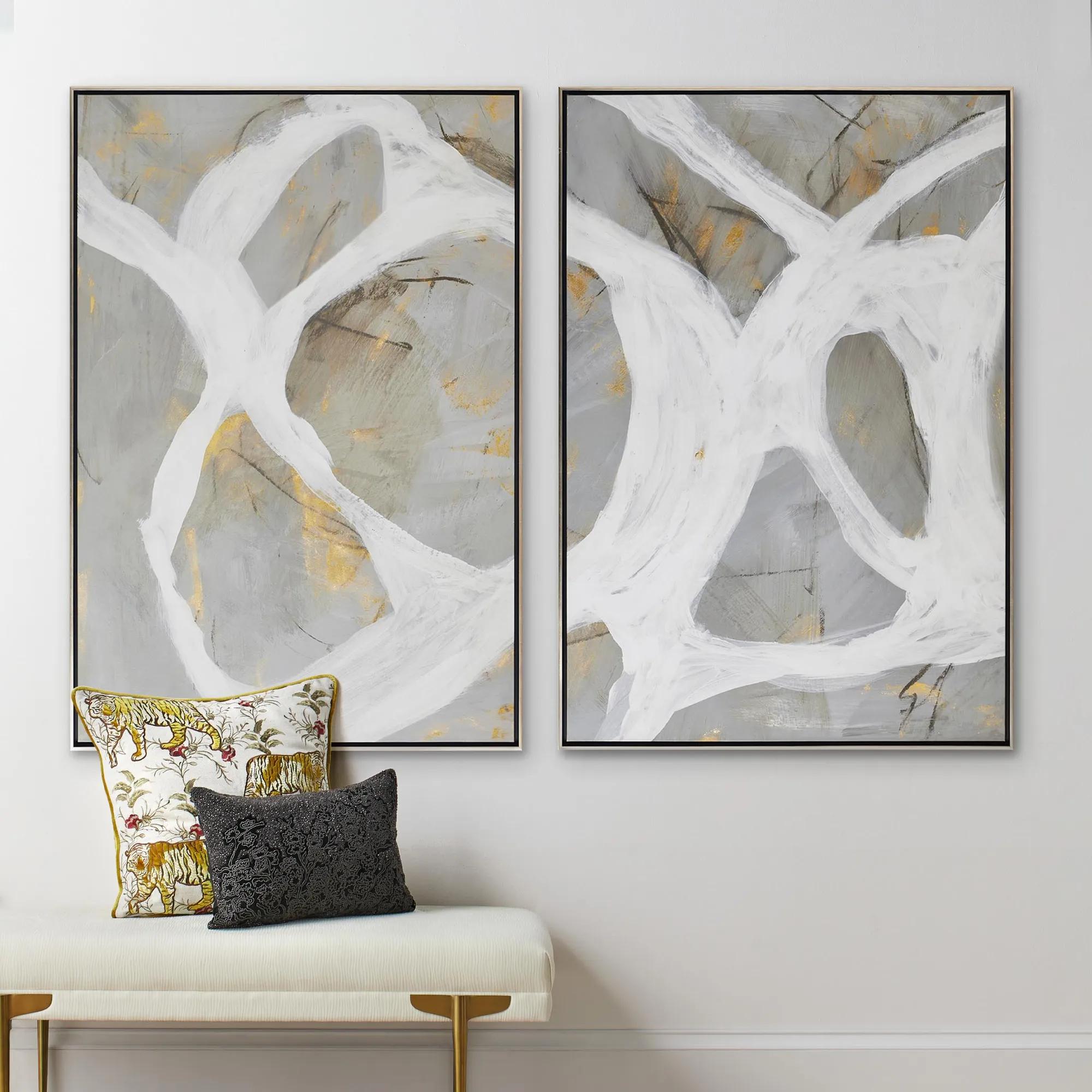 Les Series Framed Painted Wall Art II 61" x 41"$1099
An abstract canvas artwork featuring bold brushstrokes, hand-applied gold accents, and a silver floater frame.
Add To Cart

Bold Blue Abstract Arts
Dive into a world where color commands attention and artistry knows no restraint—bold blue abstract arts transform any room into a gallery of imagination. Saturated sapphire, electric cobalt, and deep indigo collide in expressive forms, inviting you to embrace the extraordinary. Each piece is a visual crescendo, capturing movement, emotion, and the magnetic allure of blue at its most daring. Let your walls tell a story of confidence and creativity, where every brushstroke is a celebration of individuality and every glance inspires wonder.
Bold blue abstract art brings dynamic energy, visual depth, and a striking focal point to modern interiors, using color and movement rather than literal imagery to set the mood. Cobalt can feel electric against a pale wall; navy lends a room a more enveloping atmosphere; washes of azure and indigo suggest water, sky, or shadow without resolving into a single scene. That openness is part of the appeal. An expressive sweep of pigment can read differently across the room than it does up close, giving the eye somewhere to wander and the space a sense of discovery. Blue abstract wall art ranges from fluid, atmospheric compositions to sharply defined geometric arrangements and vigorous, gestural brushwork. Each has a distinct presence: broad fields of color establish a measured rhythm, while layered marks and high-contrast passages introduce tension and drama. For interiors built around ivory upholstery, glass, and polished metal, a saturated blue composition adds a decisive note of color without requiring every accessory to follow suit. Against walnut furniture or warm, sandy textiles, blue creates a rich cool-to-warm contrast that makes both elements more expressive. Gold accents can bring warmth to an inky palette, while silver and chrome emphasize its crisp, luminous character. Black details give pale blues definition; touches of cream soften a composition without diminishing its impact. The result can be glamorous, serene, architectural, or deliberately exuberant, depending on the artwork’s scale and visual rhythm. A living room designed for conversation benefits from a piece that rewards a second look, while a bedroom may call for softer transitions between blue, gray, and white. In a home office, a confident cobalt gesture can give the wall behind a desk a considered, creative identity. The strongest connection is personal: art that recalls the sweep of a coastline, the energy of a city, or simply a color that feels unmistakably right belongs in a home shaped by individual expression.
Material and presentation influence how that color lives in a room. Canvas has a woven surface that can lend printed imagery a tactile quality, while works on paper often gain definition from a mat and frame. Depending on the medium, blue abstract artwork may feature visible brushwork, applied texture, or a smooth printed surface; these are different visual experiences, and a photograph of texture does not necessarily mean the surface is physically raised. Details about the medium, finish, and construction help establish what to expect at close range. A gallery-wrapped canvas carries the image or a finished edge around its sides for a dimensional presentation, while a floating frame introduces a narrow shadow line that gives the artwork a distinct boundary. Framed paper art offers another kind of polish, with the space around the image allowing delicate marks or saturated color fields to breathe. Glazing can help shield paper from dust and incidental contact, though reflections deserve consideration in a room with large windows or prominent lamps. Matte surfaces generally scatter light more softly, while glossy finishes may produce stronger reflections that shift with the viewing angle. Placement has an equally important effect on presence. Above a sofa, artwork roughly two-thirds to three-quarters of the furniture’s width often feels connected to the seating arrangement rather than isolated on the wall. That proportion is a starting point, not a rule: an airy composition may need more scale to hold its own, while a dense, dark piece can feel substantial at a smaller size. Overall framed dimensions matter more than image dimensions when assessing fit, especially above a headboard, between windows, or along a narrow entryway. A vertical composition can emphasize ceiling height, while a horizontal format echoes the generous lines of a sofa or sideboard. Related expressions within modern blue abstract wall art offer another perspective on how this versatile palette can shape a contemporary room, from restrained tonal movement to sweeping, color-rich gestures.
Blue statement art feels most persuasive when the surrounding room gives it room to be seen. A large composition above a low console can establish the entire vignette, with a sculptural vessel and a single metallic accent providing enough companionship without obscuring the image. In a dining room, layered navy and cobalt can lend depth to pale upholstery and catch the changing character of light as daylight gives way to evening. For a more collected arrangement, several works can share a blue undertone while differing in mark, proportion, or intensity; consistent spacing or related frames can create cohesion without making every piece match. Keeping the strongest contrast within the artwork lets quieter furnishings support its presence, while repeating a small trace of blue in a pillow or decorative object draws the palette through the room. Long-term enjoyment also depends on thoughtful installation and care. Wall hardware should suit both the artwork’s weight and the wall construction, with manufacturer instructions guiding placement and support. Heavy framed art requires appropriately rated anchors or attachment to suitable structural support rather than an improvised hanging solution. Direct sunlight can contribute to fading, and excessive humidity or temperature changes may affect paper, canvas, and frames, so a dry interior wall away from heat sources is generally a more protective setting than a steamy bathroom or an exposed outdoor area. Protective glazing may reduce some light-related damage, but it does not make artwork immune to prolonged sun exposure. For routine care, frame edges can usually be dusted gently with a clean, soft cloth; artwork surfaces, textured finishes, and glazing should be treated according to their specific care instructions. Spraying cleaning liquid directly onto framed art risks moisture reaching the image or frame joints. As a housewarming or wedding gift, abstract blue art can be deeply thoughtful when the recipient’s taste, available wall space, and preferred framing are known. For an expressive decorator or someone bringing a new home into focus, its enduring appeal lies in the balance it offers: color with confidence, movement with depth, and a daily encounter with something that remains open to interpretation.
FAQs
Bold blue abstract art thrives in a variety of interiors, from contemporary lofts to classic homes with a modern twist. Its vibrant hues and expressive forms complement minimalist spaces by adding a pop of color, while also enhancing maximalist rooms layered with luxe textures and statement pieces. The key is to let the art take center stage, allowing its dynamic energy to elevate the overall design narrative.
To curate a harmonious display, consider mixing different shades of blue and varying the composition styles—pair fluid, organic shapes with bold, geometric forms for visual intrigue. Maintain balance by spacing out the artwork and incorporating complementary elements such as metallic frames or textured furnishings. This approach creates a gallery-like atmosphere that feels curated yet effortless.
Absolutely. Blue abstract art makes a memorable gift for housewarmings, weddings, or milestone celebrations. Its universal appeal and emotional resonance ensure it will be cherished for years to come, making it a thoughtful choice for anyone who values creativity and artistic expression in their home.
Lighting plays a transformative role in showcasing blue abstract art. Natural daylight enhances the depth and vibrancy of blue tones, while warm artificial lighting can evoke a sense of intimacy and luxury. Consider spotlighting or picture lights to draw attention to key details, allowing the artwork to shift and come alive throughout the day.
Yes, blue abstract art is incredibly versatile and can elevate a variety of spaces, including dining rooms, entryways, home offices, and even bathrooms. Its striking presence brings character and sophistication wherever it is displayed, turning unexpected corners of your home into moments of visual delight.