Blue Abstract Paintings For Entryways
Blue Abstract Paintings For Entryways
-
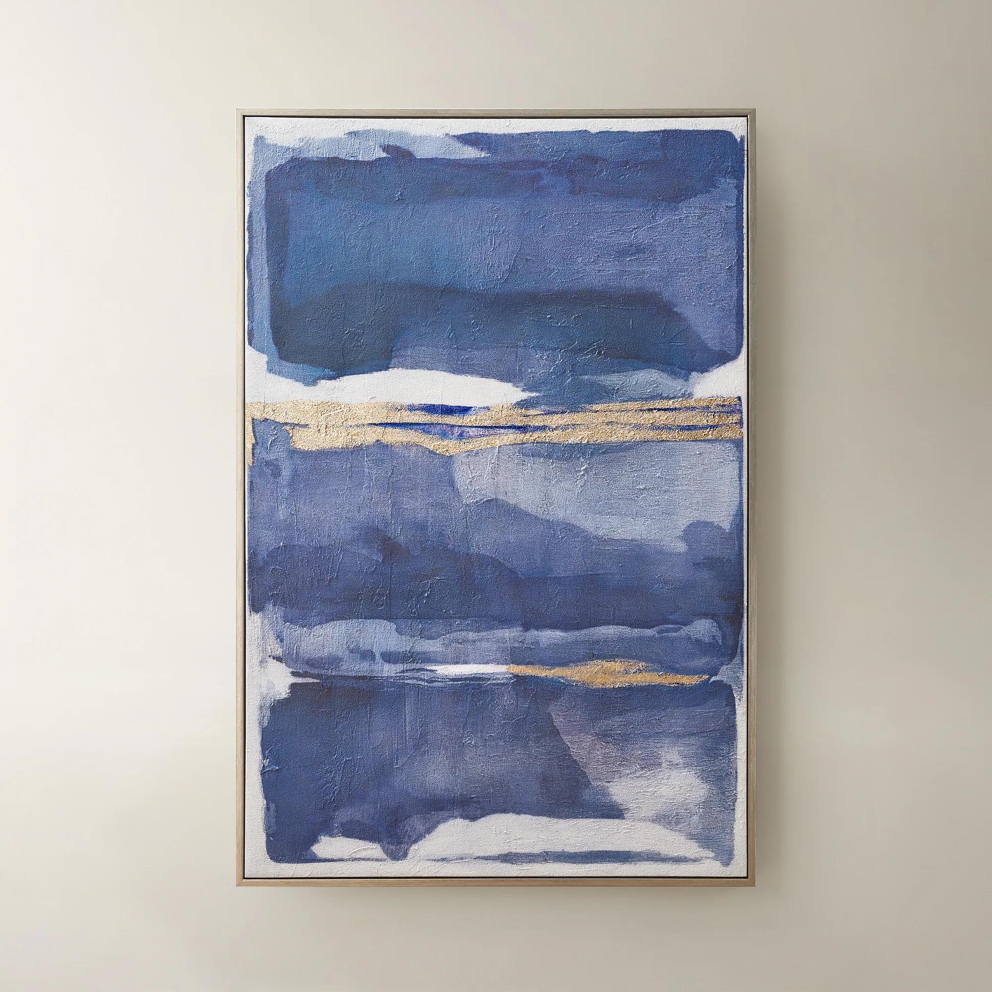
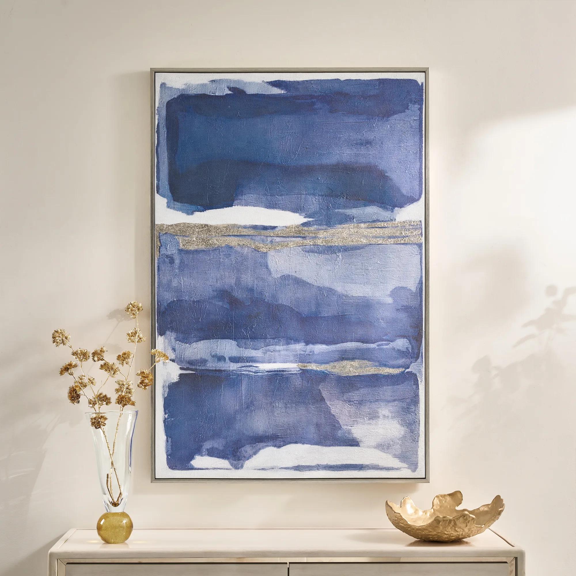 Memories in Blue Framed Painted Wall Art 40" x 60"$499
A hand-painted canvas in deep ink blue with champagne leafing for a sophisticated, gallery-inspired look.
Add To Cart -
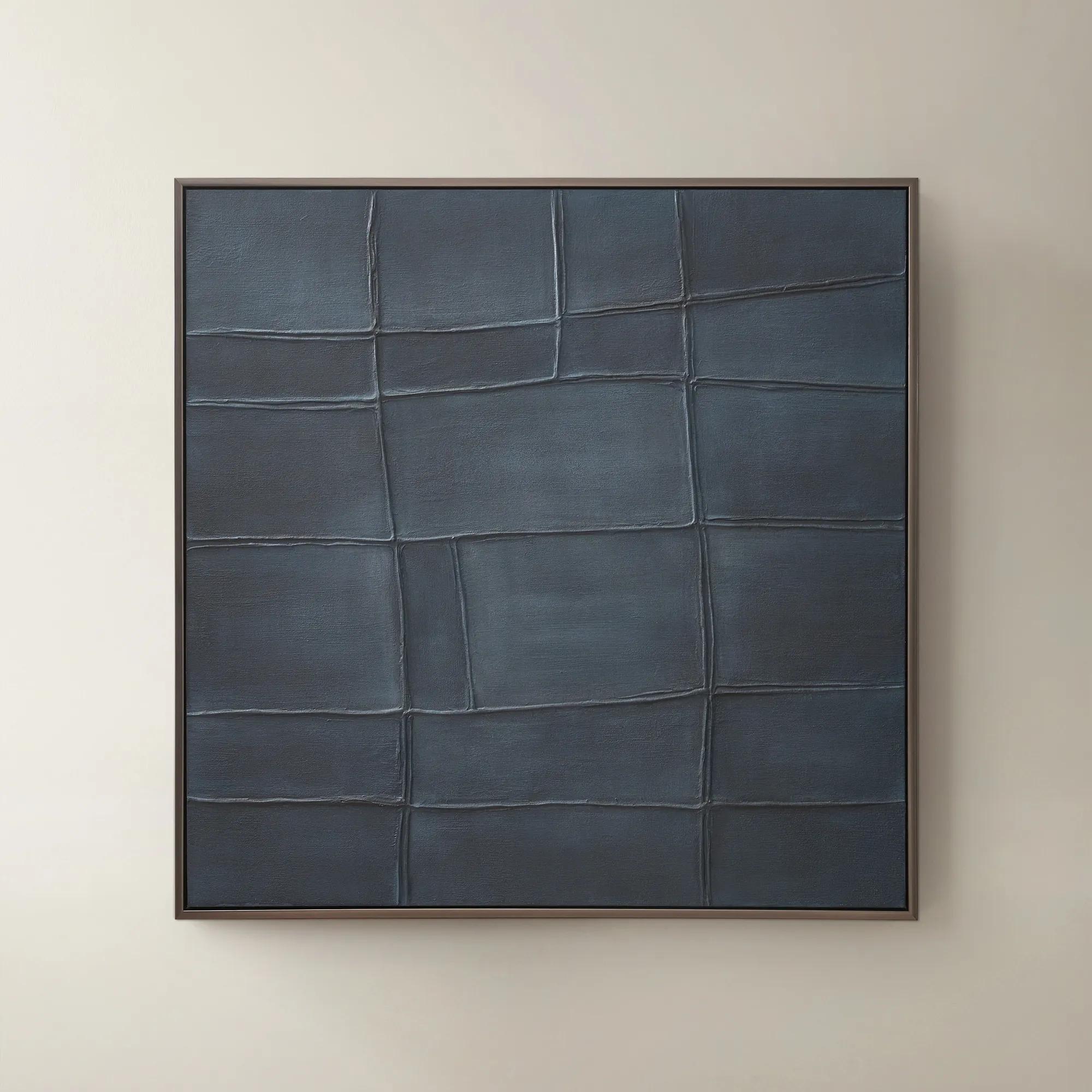
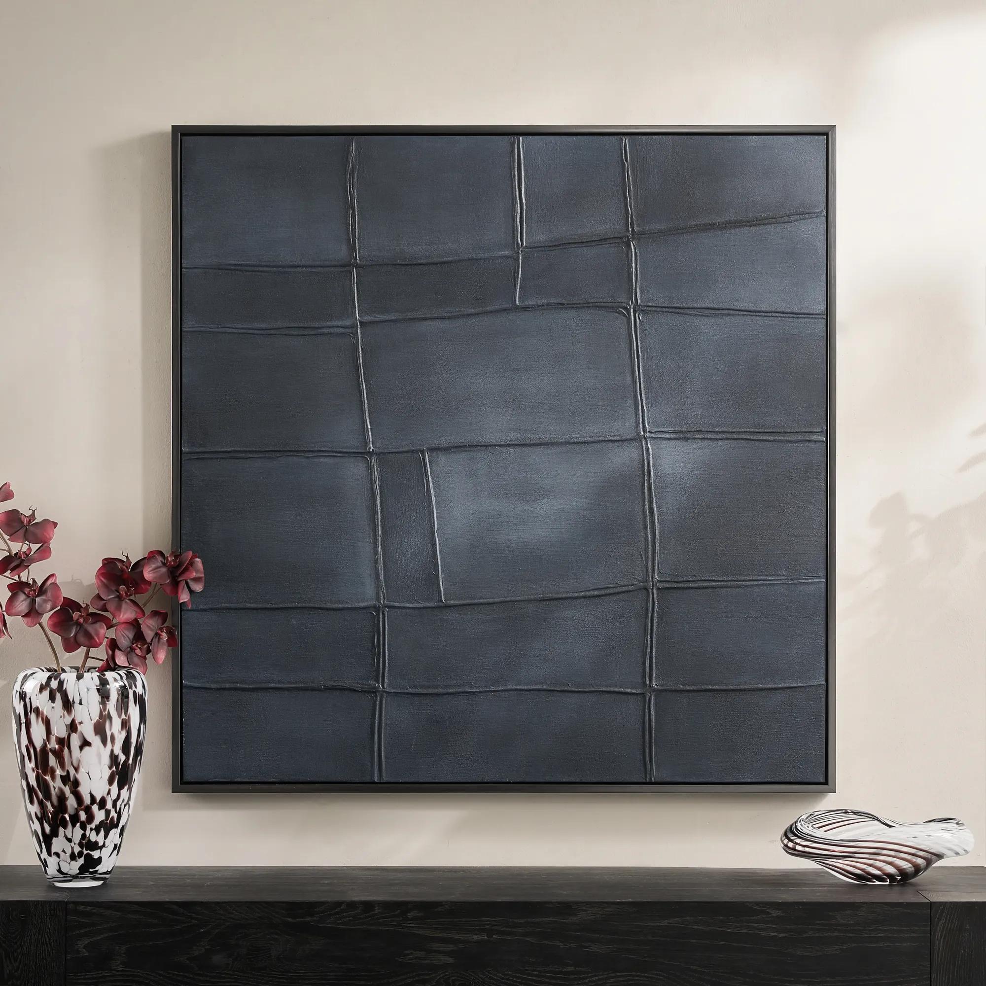 Ink Blue Interval Framed Painted Wall Art 48" x 48"$599
A hand-painted abstract canvas in deep ink blue, finished with a sleek gunmetal frame for modern appeal.
Add To Cart -
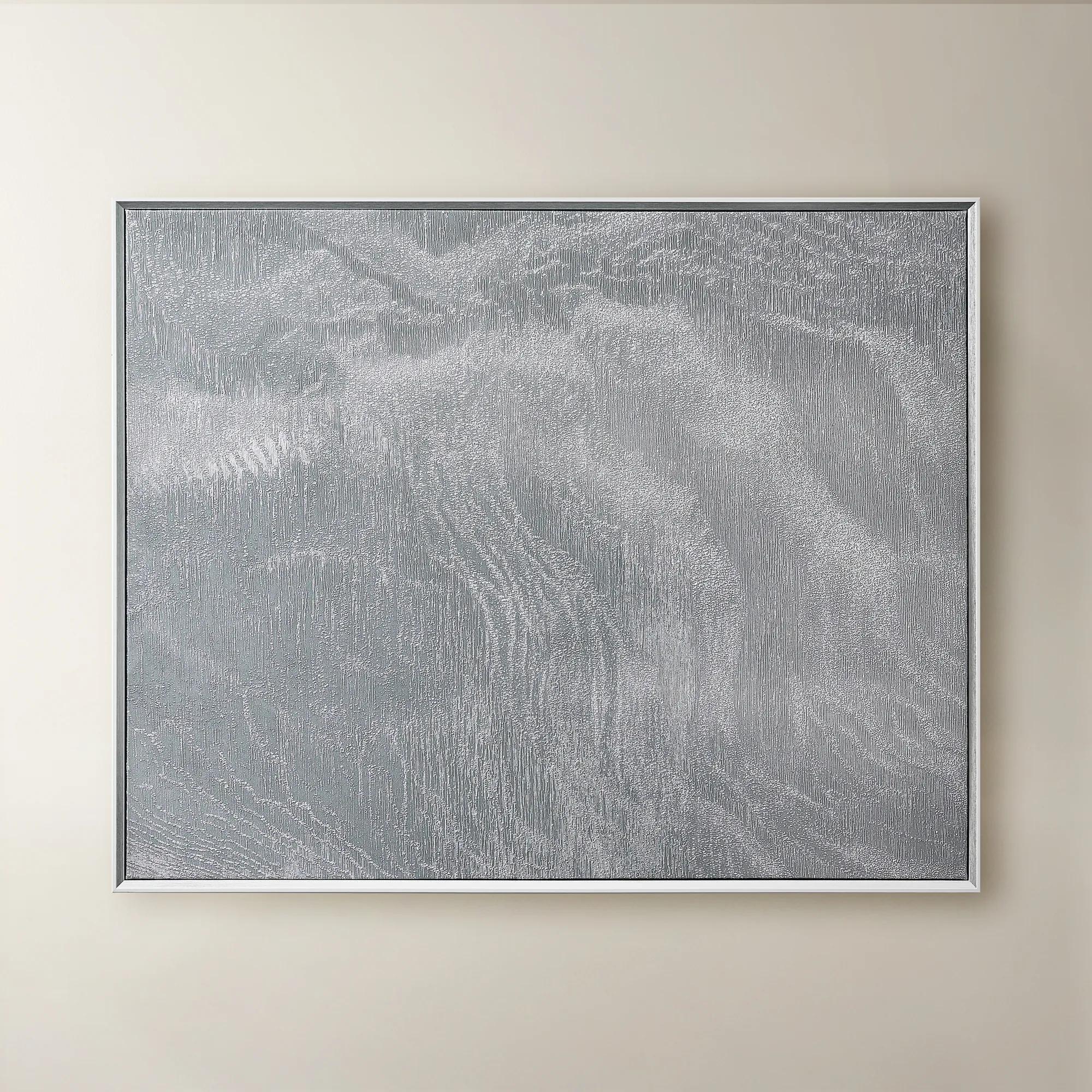 Slow Blue Morning Framed Silver Foil Wall Art 48" x 60"$599
A serene powder blue abstract canvas with silver foil accents, framed in silver and white for modern elegance.
Add To Cart -
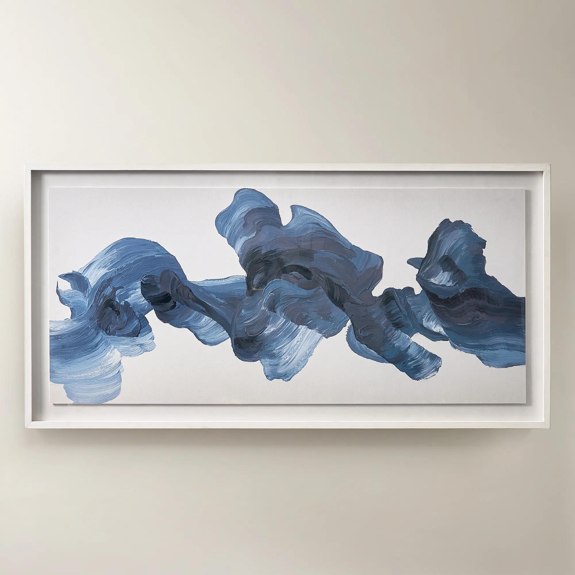
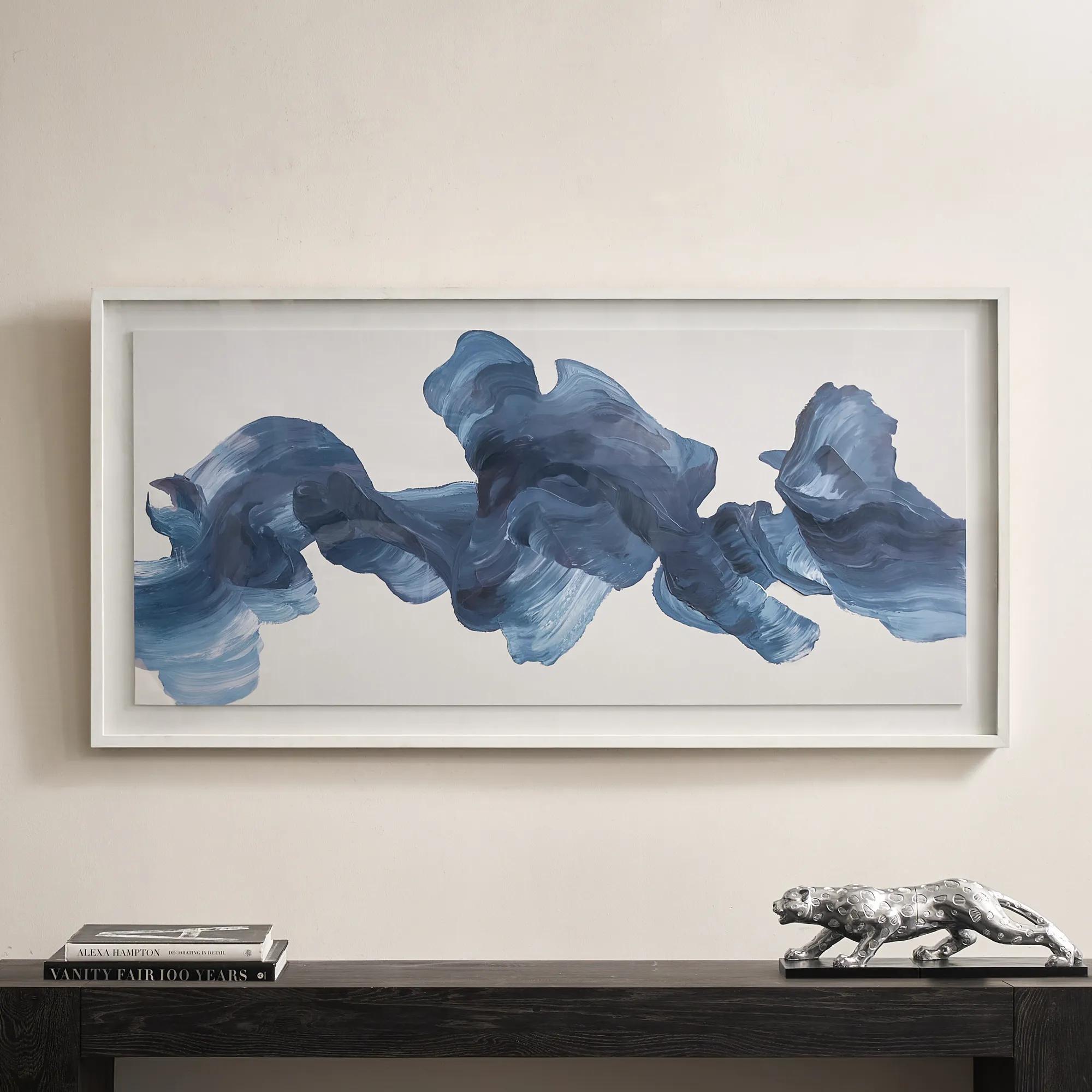 Blue Theory Framed Painted Wall Art in Acrylic 60" x 30"$499
A hand-painted canvas in deep ink blue, framed under acrylic with a whitewashed wood frame.
Add To Cart -
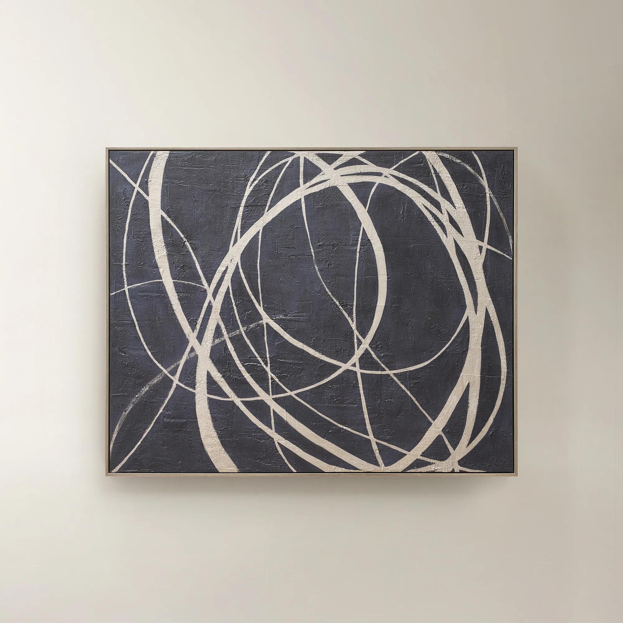 Wandering Framed Painted Wall Art 48" x 60"$699
An expressive hand-painted canvas in deep ink blue with champagne accents for a bold, sophisticated statement.
Add To Cart -
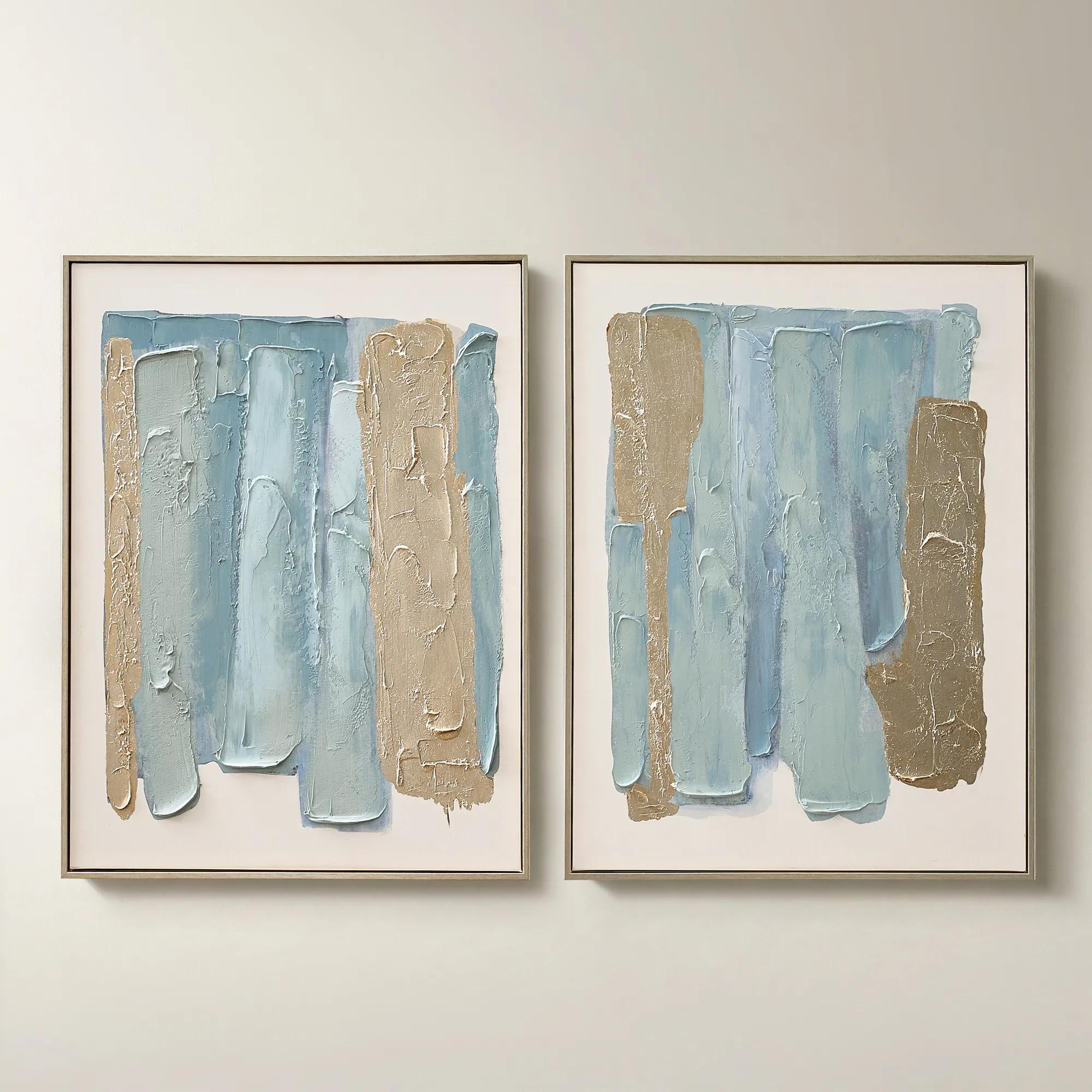
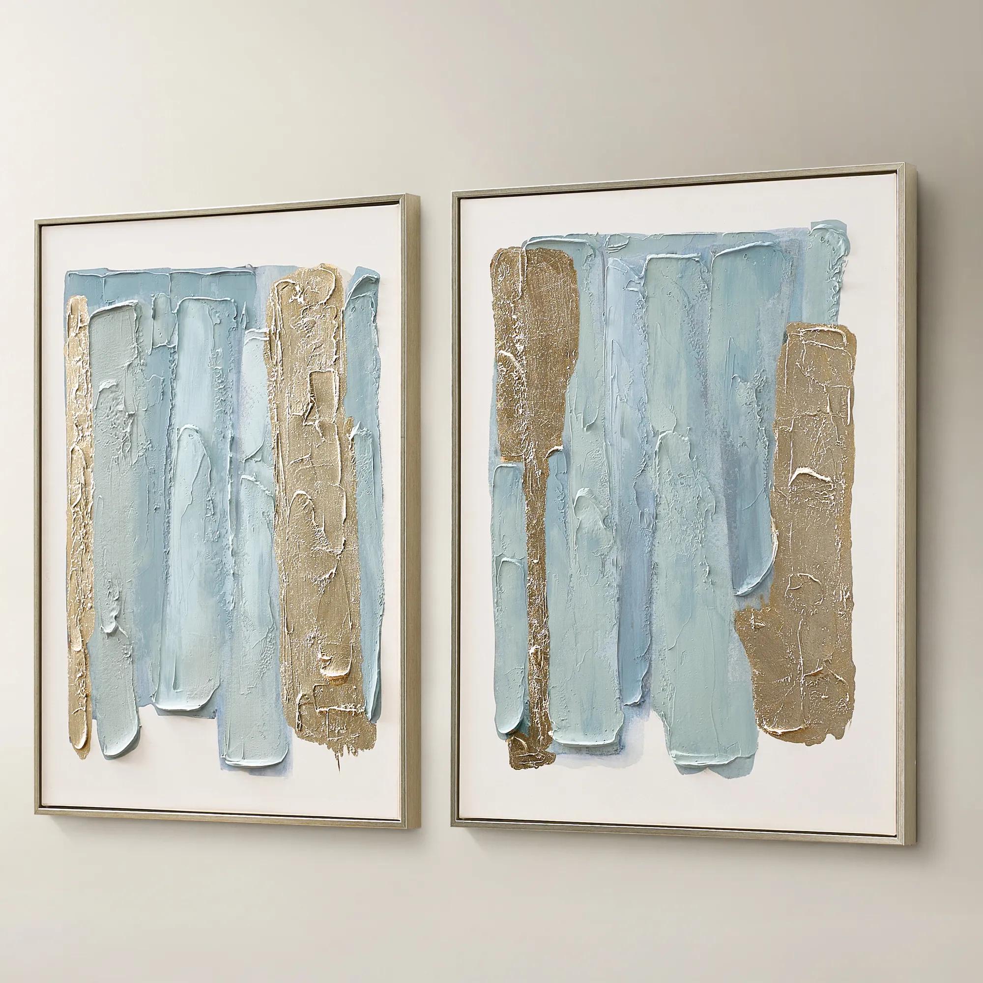 Blue Drift Framed Champagne Painted Wall Art 24" x 32" Set of 2$199
A set of two hand-painted canvases in dusty blue with champagne leafing and modern abstract movement.
Add To Cart -
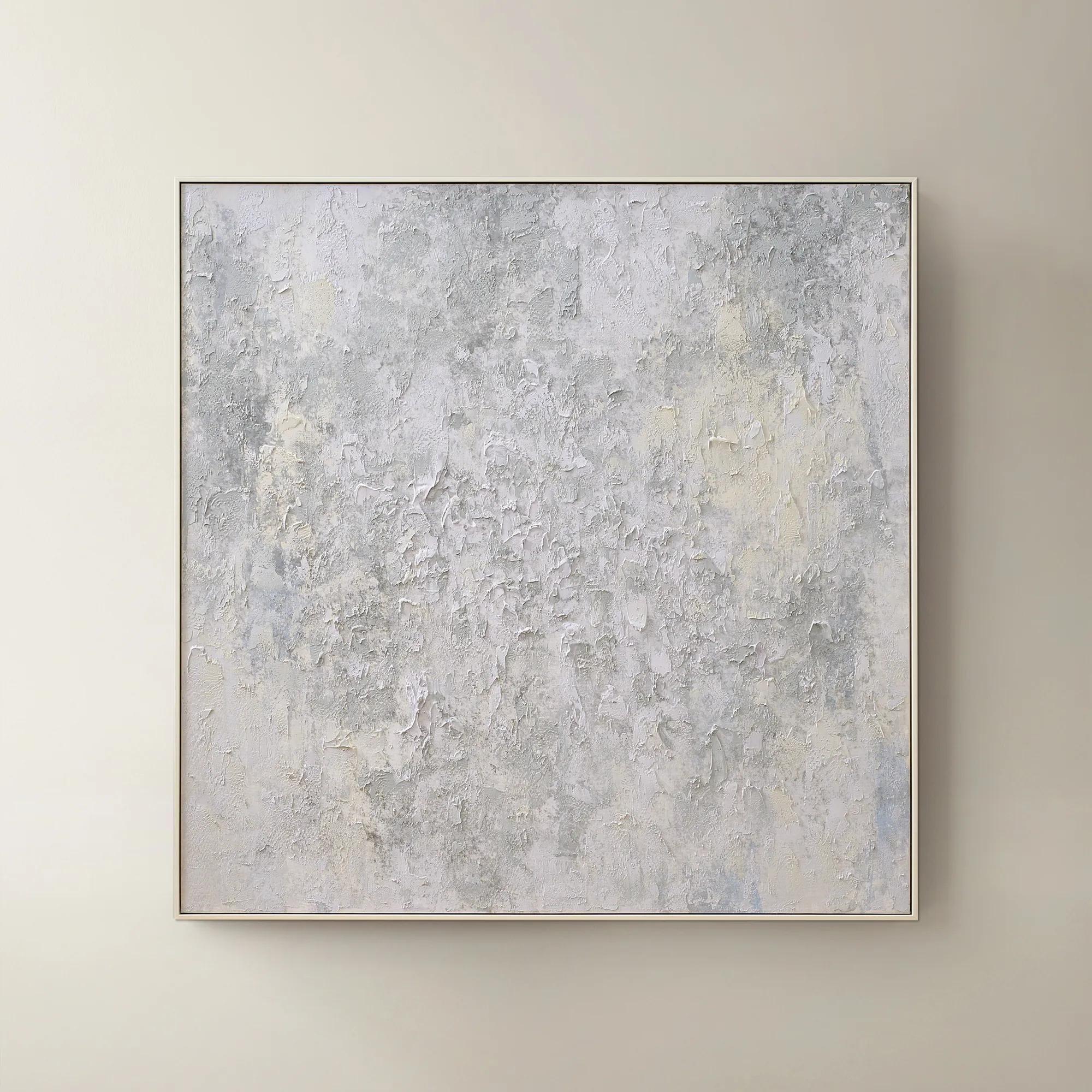 Breathe of Fresh Air Framed Painted Wall Art 50" x 50"$499
A hand-painted abstract canvas in dusty blue hues, elegantly framed in white for a serene, modern accent.
Add To Cart -
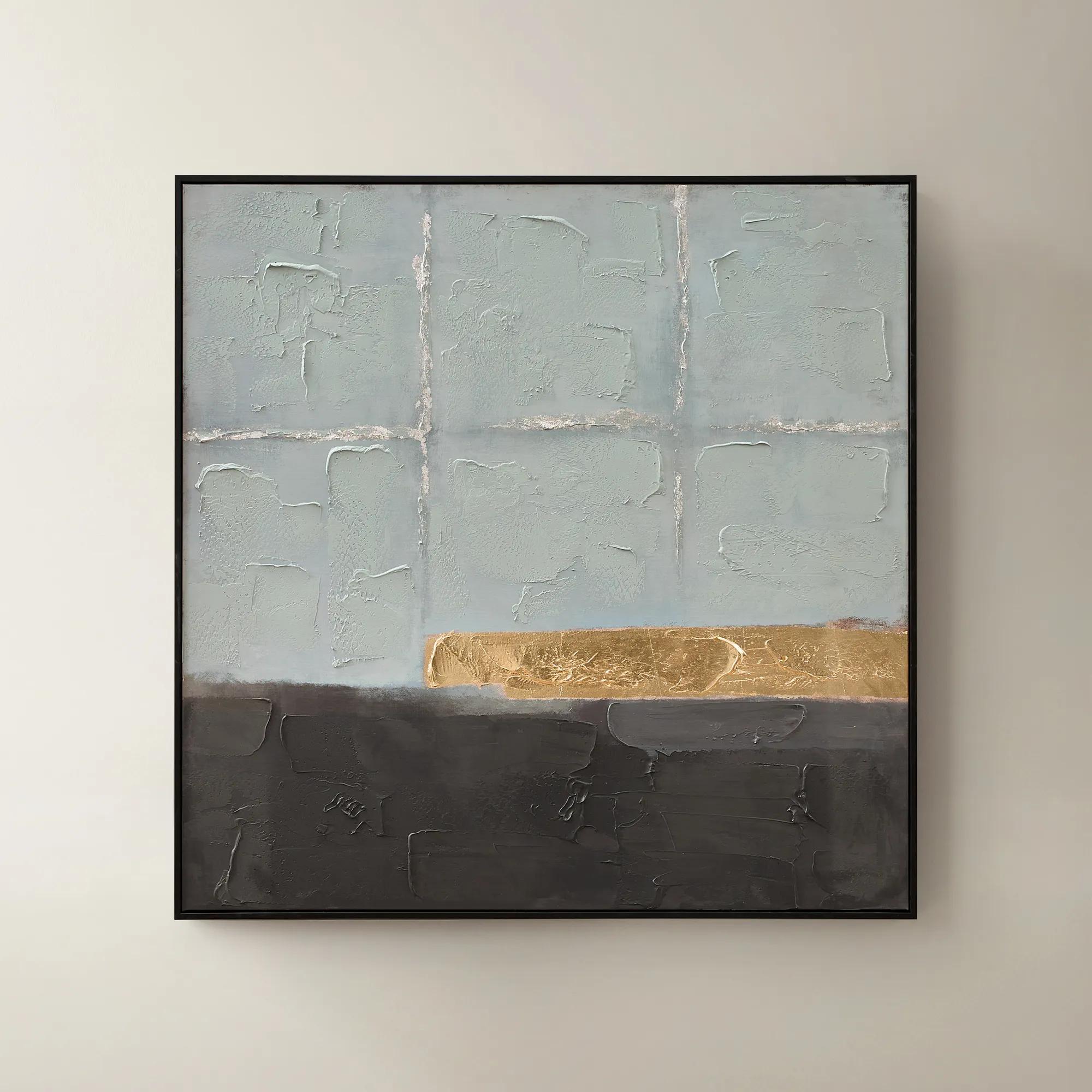
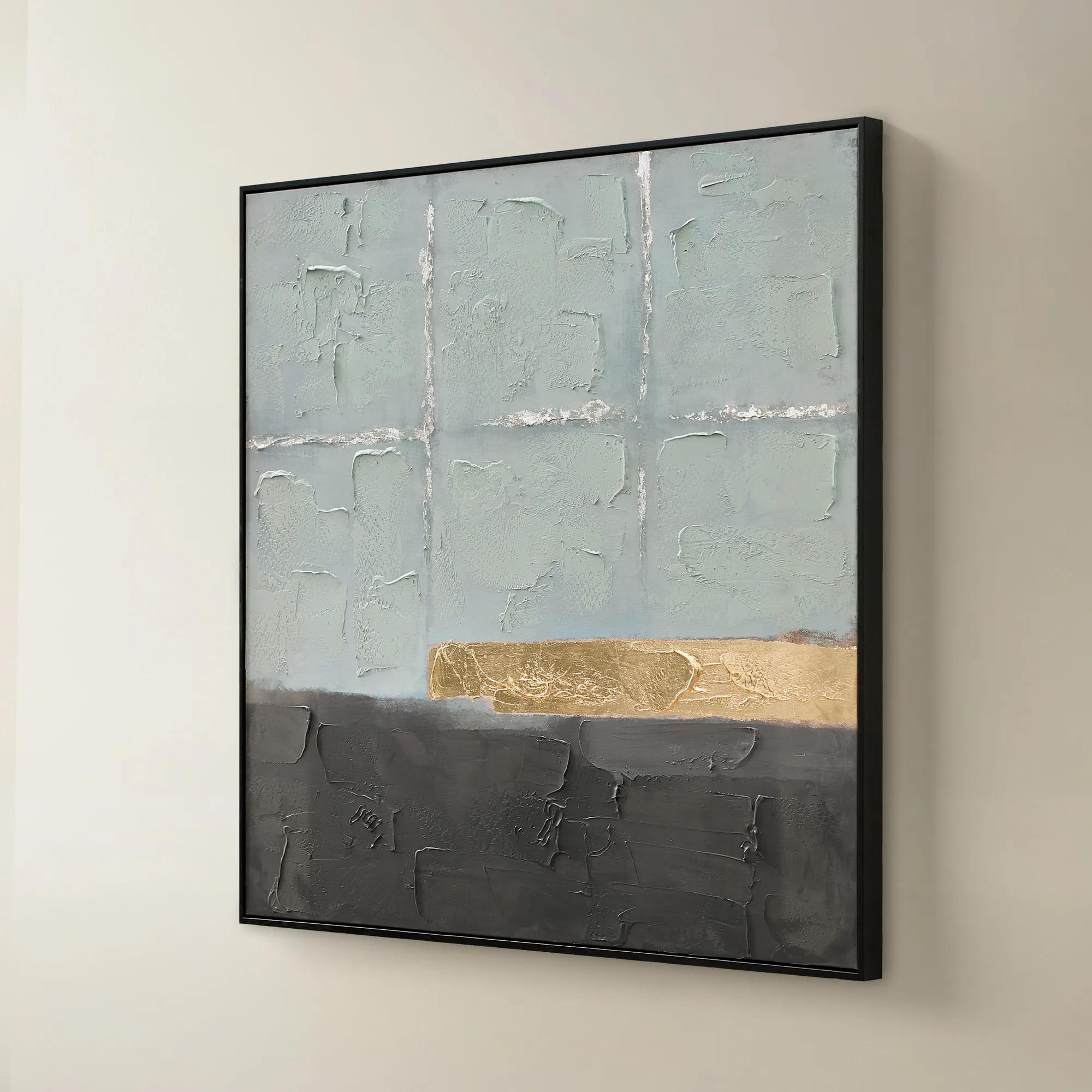 Jules Framed Gold Leaf Painted Wall Art 40" x 40"$299
A hand-painted canvas in mineral blue with gold leaf accents and a sleek black frame for modern appeal.
Add To Cart -
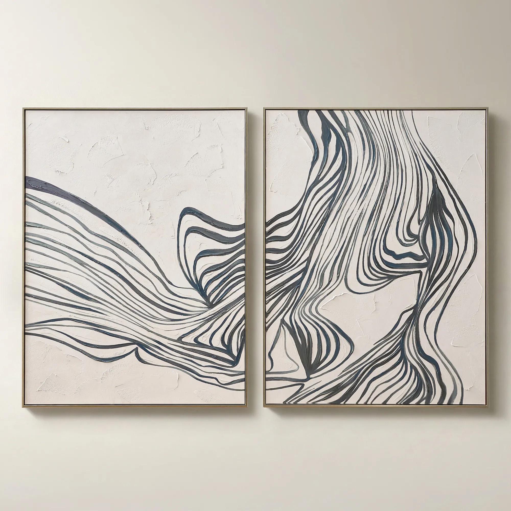
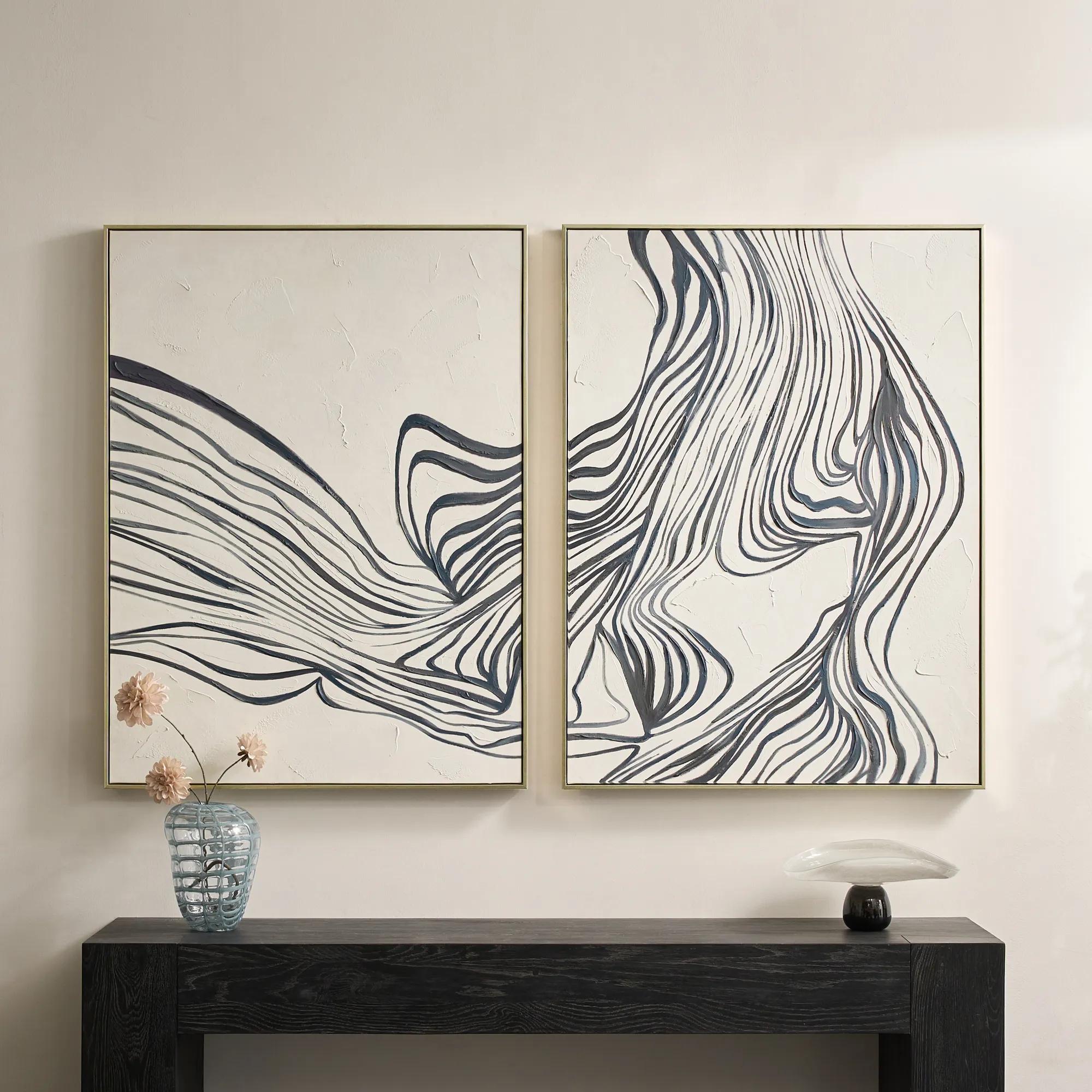 Rhythmic Framed Painted Wall Art 36" x 48" Set of 2$599
A hand-painted diptych featuring bold abstract stripes in dark slate and dusty blue with champagne frames.
Add To Cart -
 Relic Framed Painted Triptych Wall Art Set of 3$399
A hand-painted abstract triptych in deep navy and neutral tones, set in sleek black floater frames.
Add To Cart -
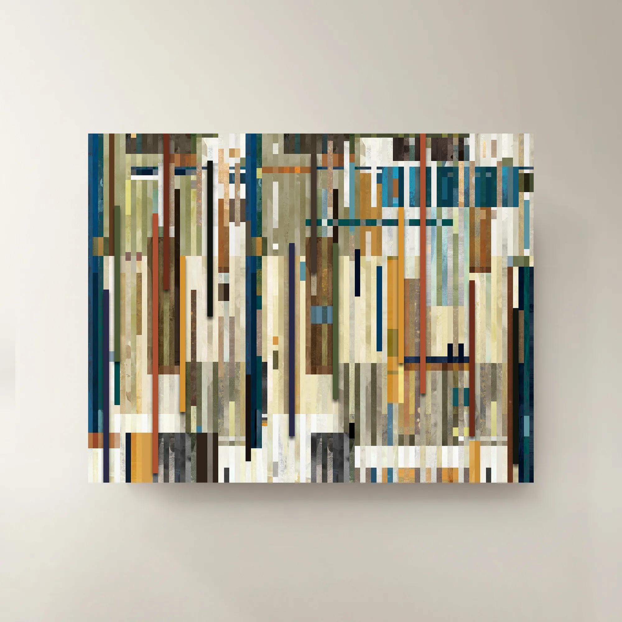
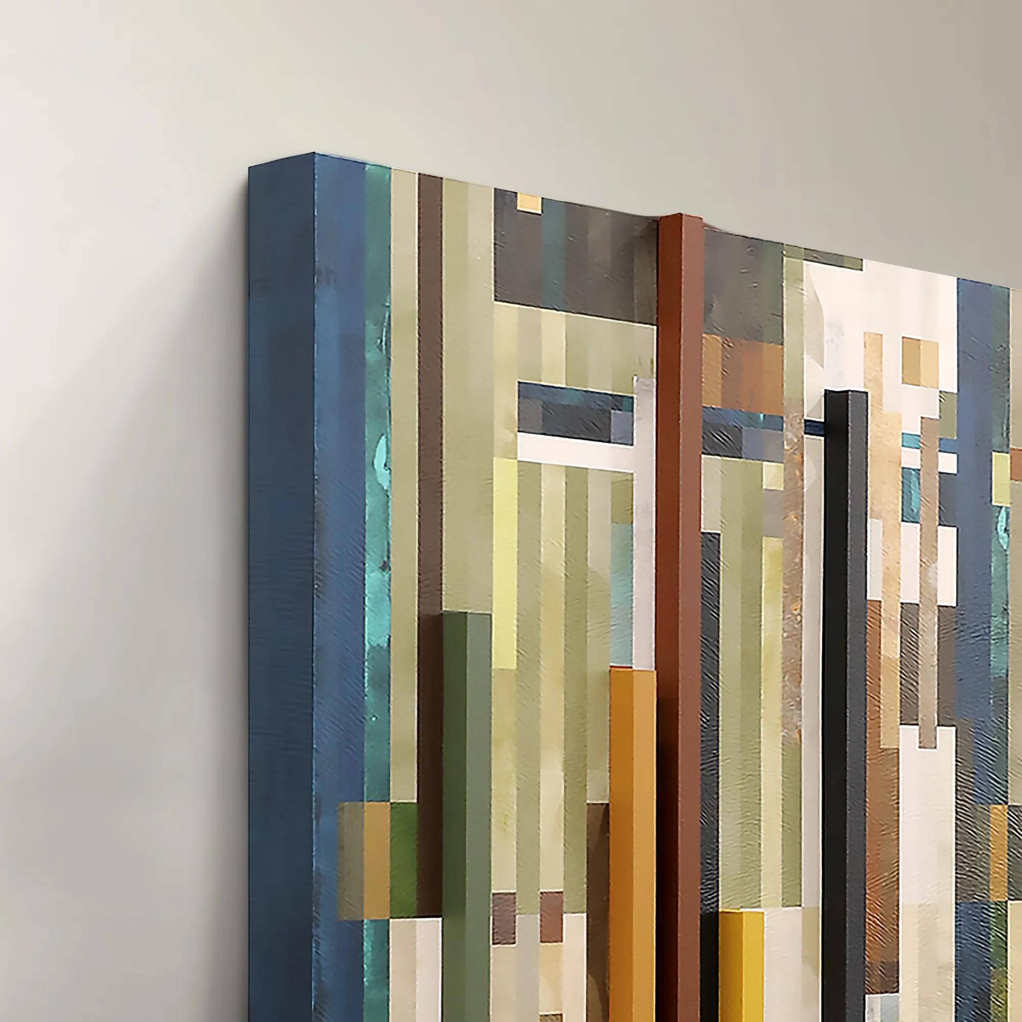 Chromatic Rhythms II Wall Art 60" x 47"$1899
A dynamic blue abstract canvas artwork featuring rhythmic geometric composition.
Add To Cart -
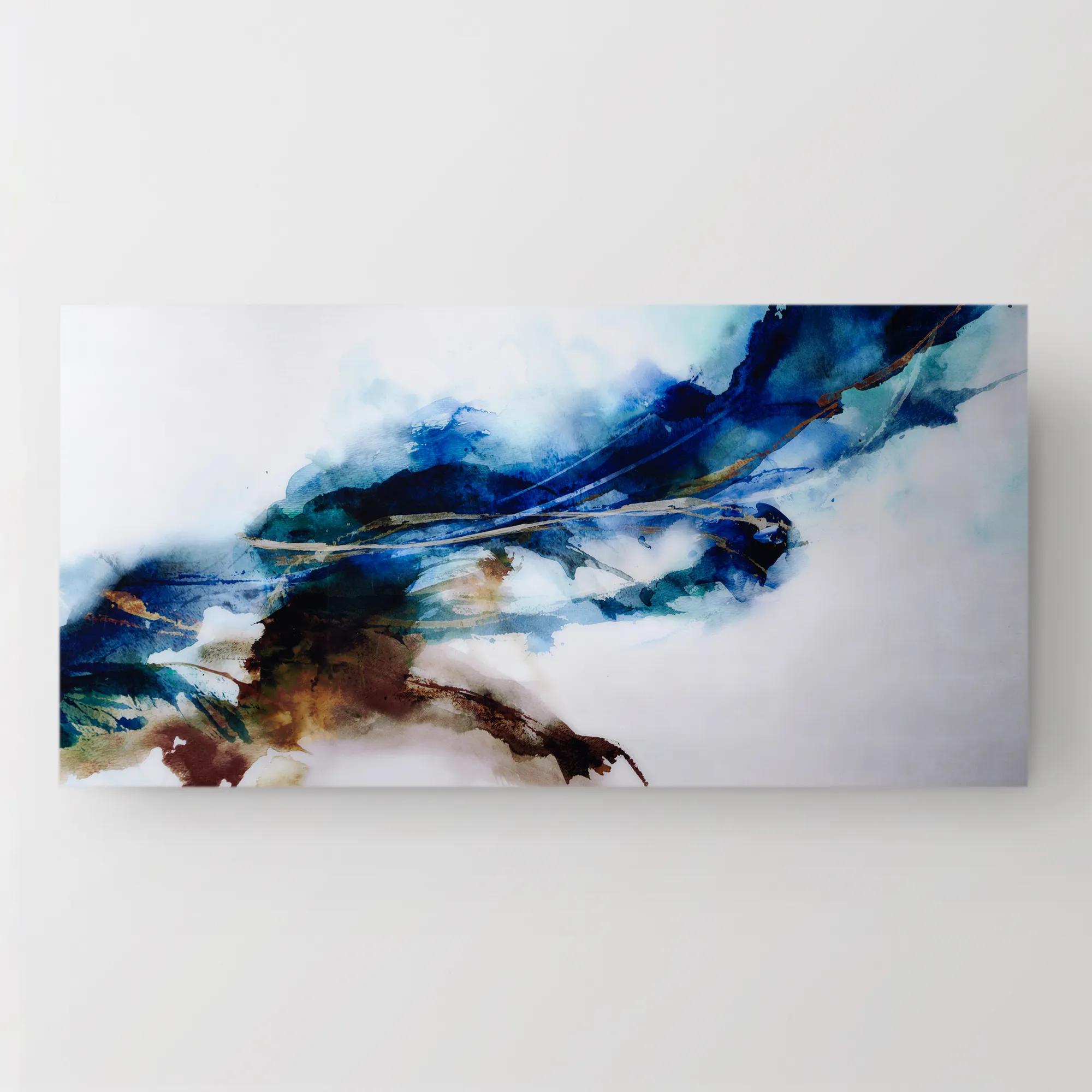 Cerulean Movement Acrylic Art 72" x 36"$1299
A vibrant abstract artwork printed on high-gloss acrylic, infusing your space with dynamic energy and movement.
Add To Cart -
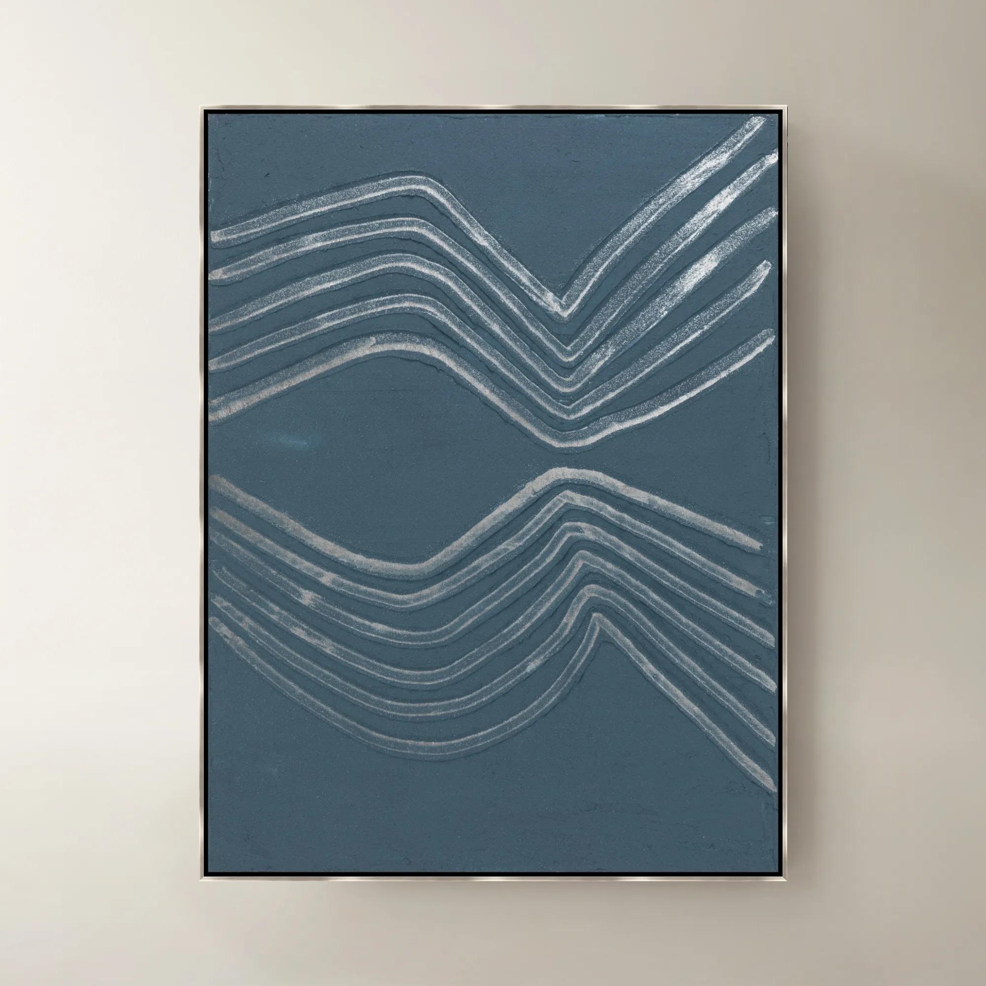
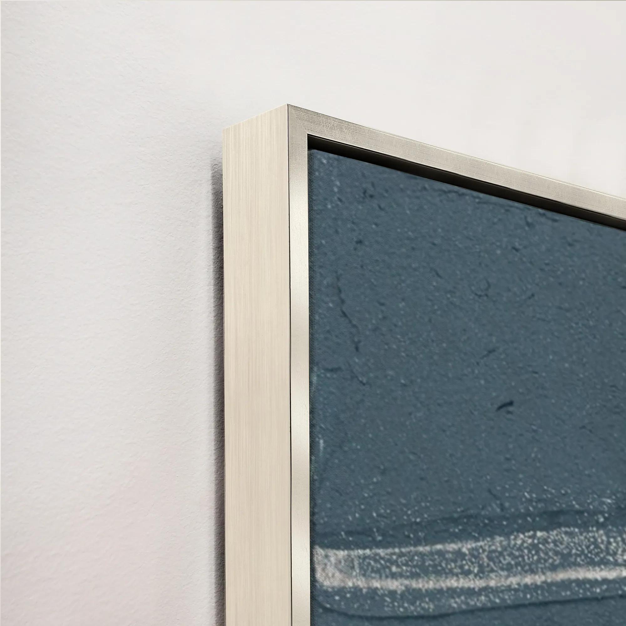 Gilded Waves VI Framed Painted Wall Art 40" x 53"$1399
A framed painted canvas artwork featuring sweeping gilded waves in rich blue and purple tones.
Add To Cart -

 Escape Path III Framed Wall Art 30" x 50"$799
A captivating blue and purple canvas artwork adding contemporary movement and layered dimension to your walls.
Add To Cart -
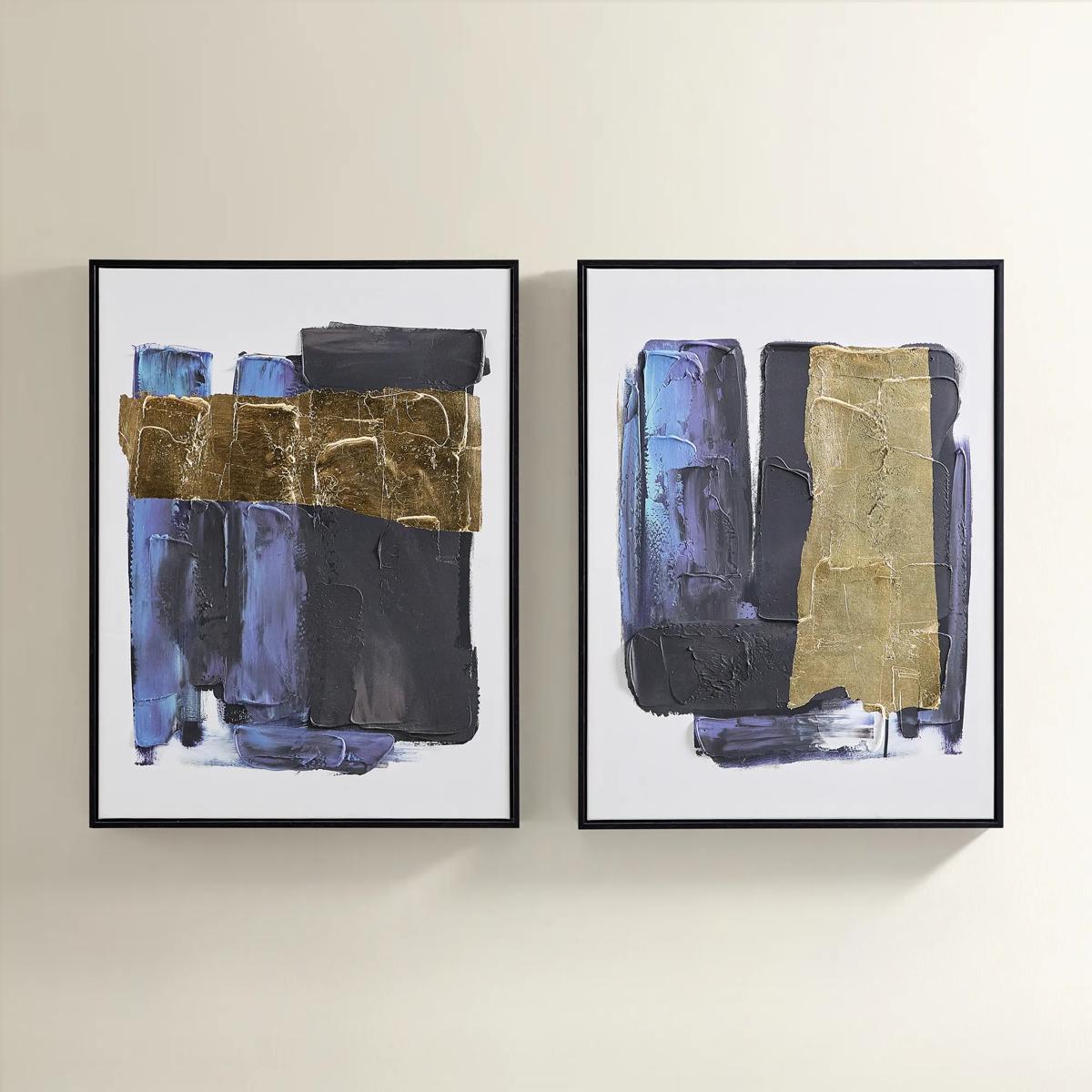
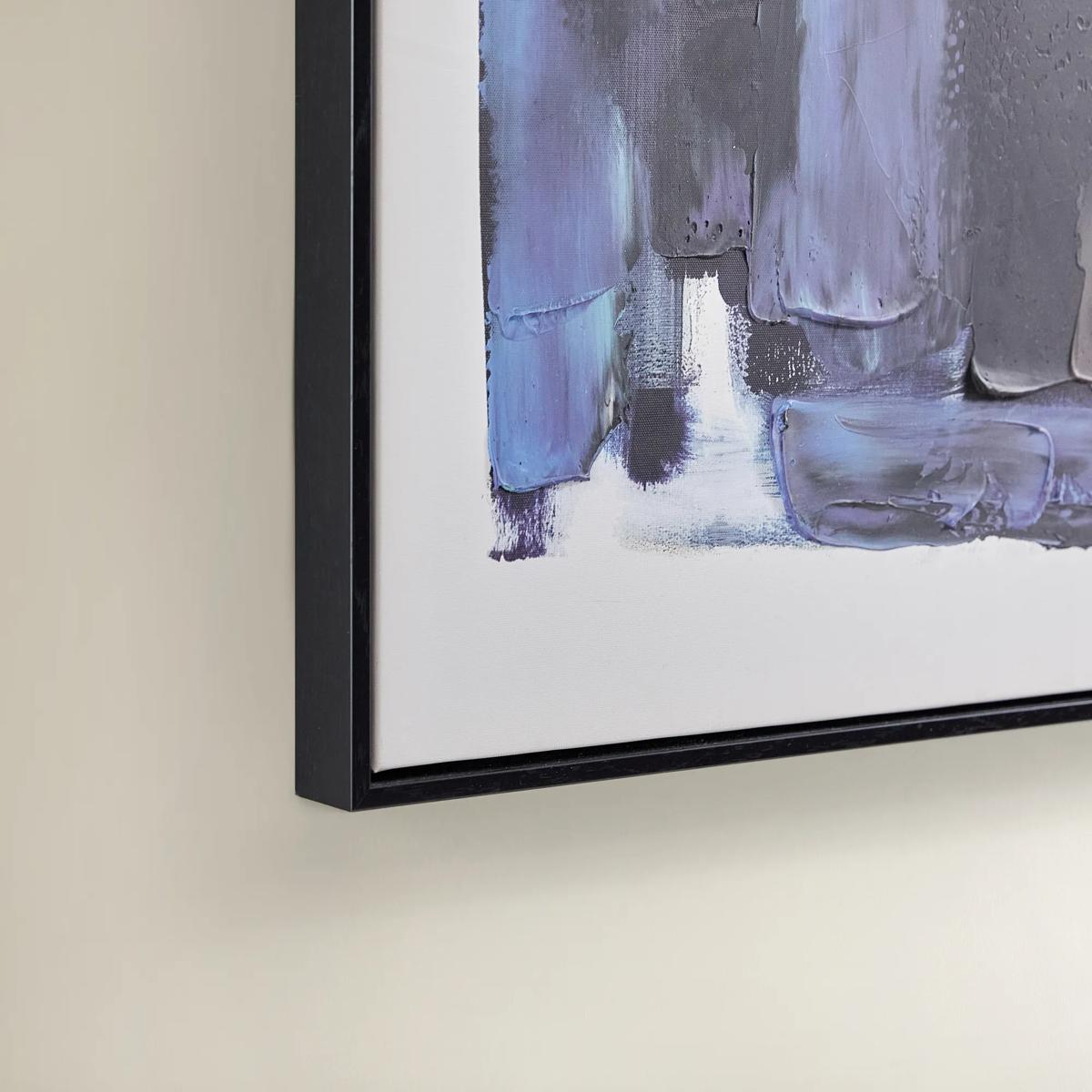 Deep Thoughts Gold Leaf Painted Wall Art Set of 2$199
A set of two hand-painted abstract canvases in blue and gold leaf, framed in sleek black.
Add To Cart -
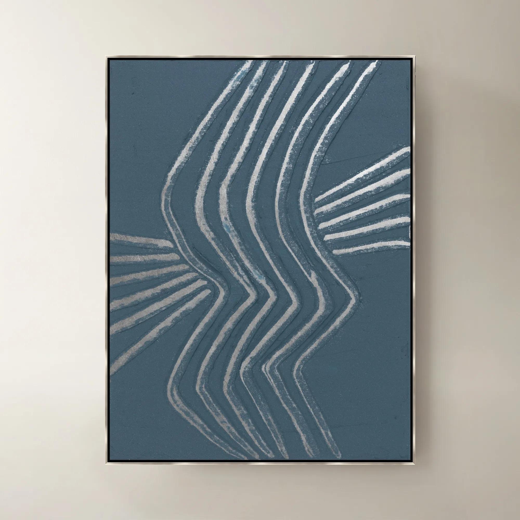
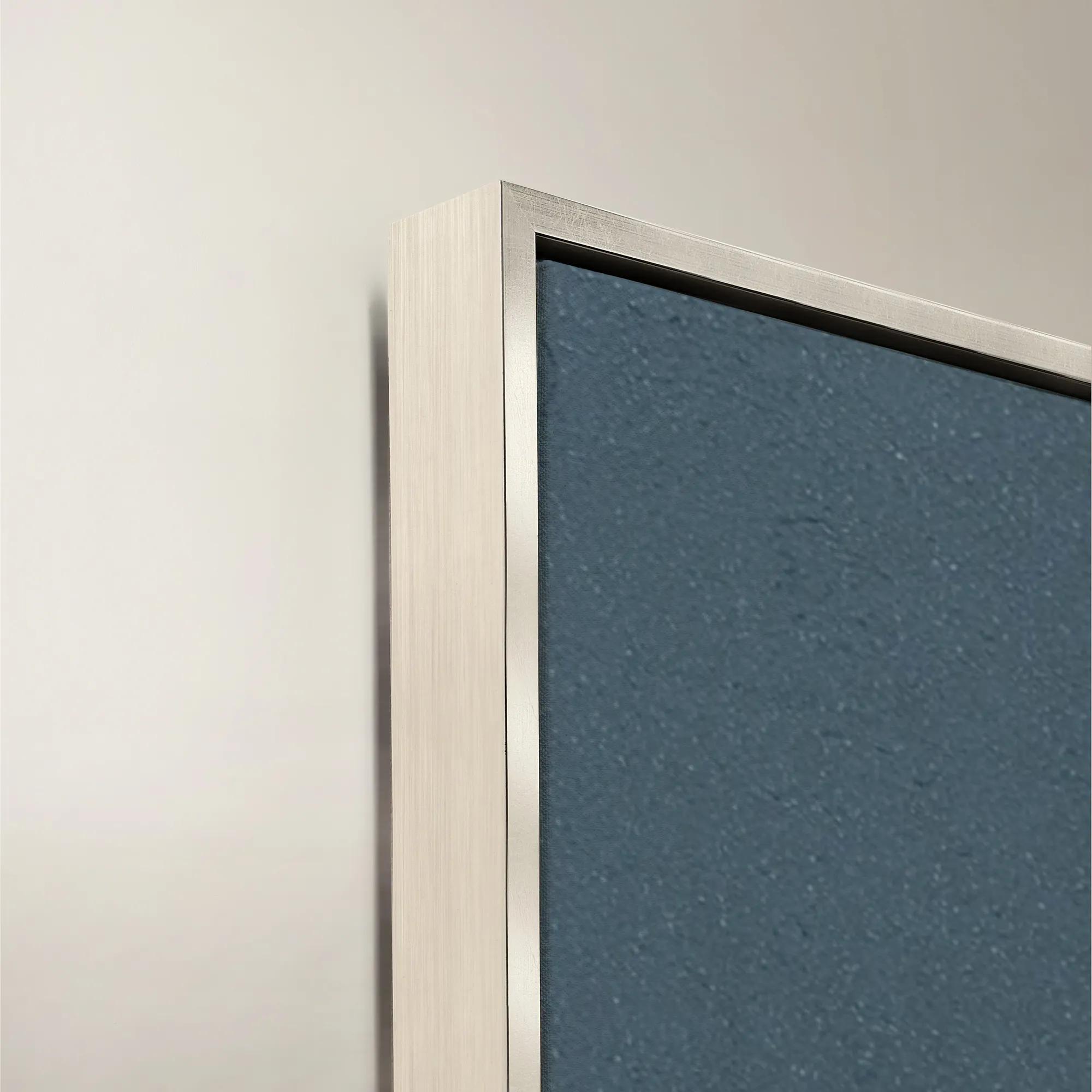 Gilded Waves IV Framed Painted Wall Art 40" x 53"$1399
A framed painted canvas artwork featuring flowing gilded waves in soothing blue and purple tones.
Add To Cart -
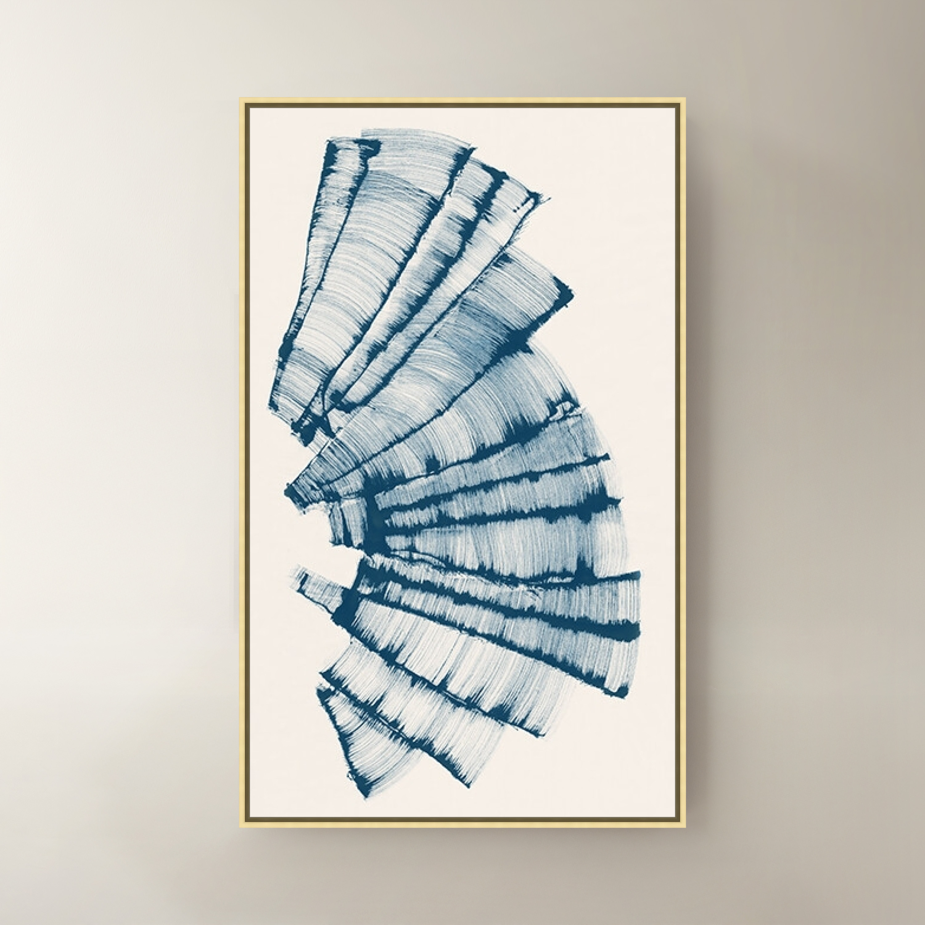
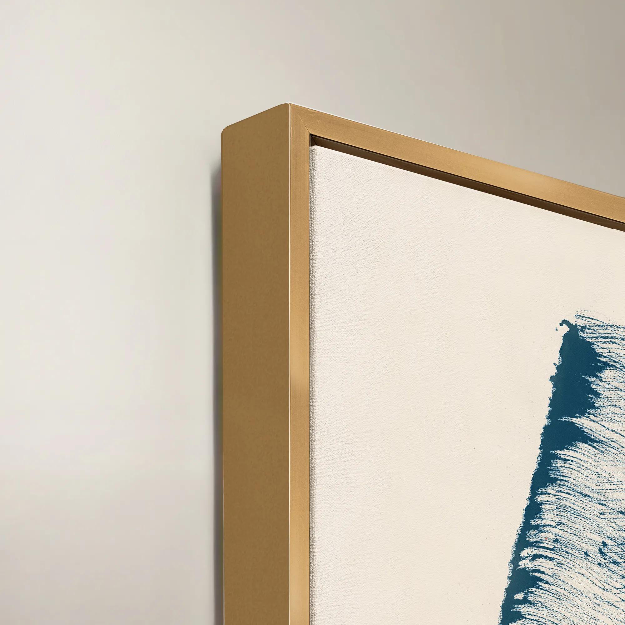 Escape Path IV Framed Wall Art 30" x 50"$799
A blue and purple canvas wall artwork presented in a sophisticated frame for modern interiors.
Add To Cart -

 Twin Abstract 1 Framed Wall Art 30" x 45"$699
A captivating abstract canvas artwork featuring layered blue and purple tones in a sophisticated framed presentation.
Add To Cart -
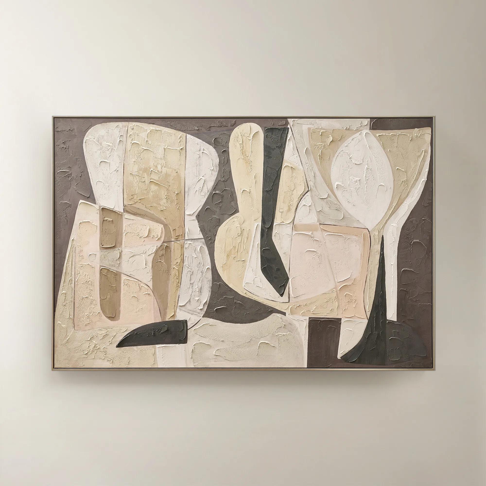 Wishful Thinking Framed Painted Wall Art 72" x 48"$599
A hand-painted abstract canvas featuring bold geometric forms and warm smoked plum, apricot, and tawny hues.
Add To Cart -

 Fractured Currents II Framed Wall Art 24" x 36"$499
A framed canvas wall artwork featuring dynamic blue and purple tones for a modern, expressive accent.
Add To Cart -
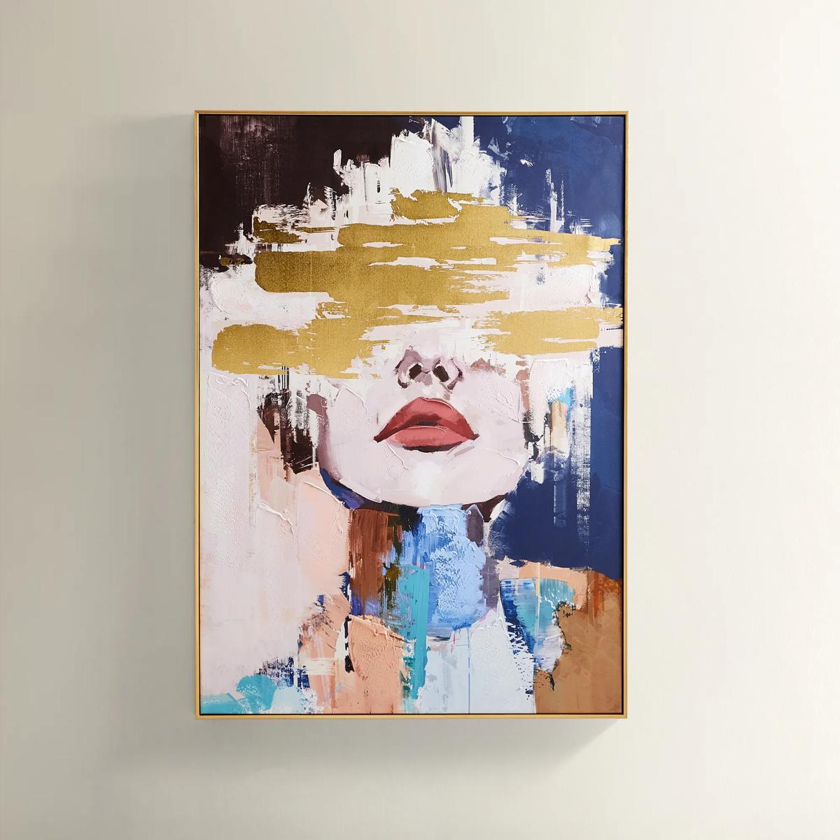
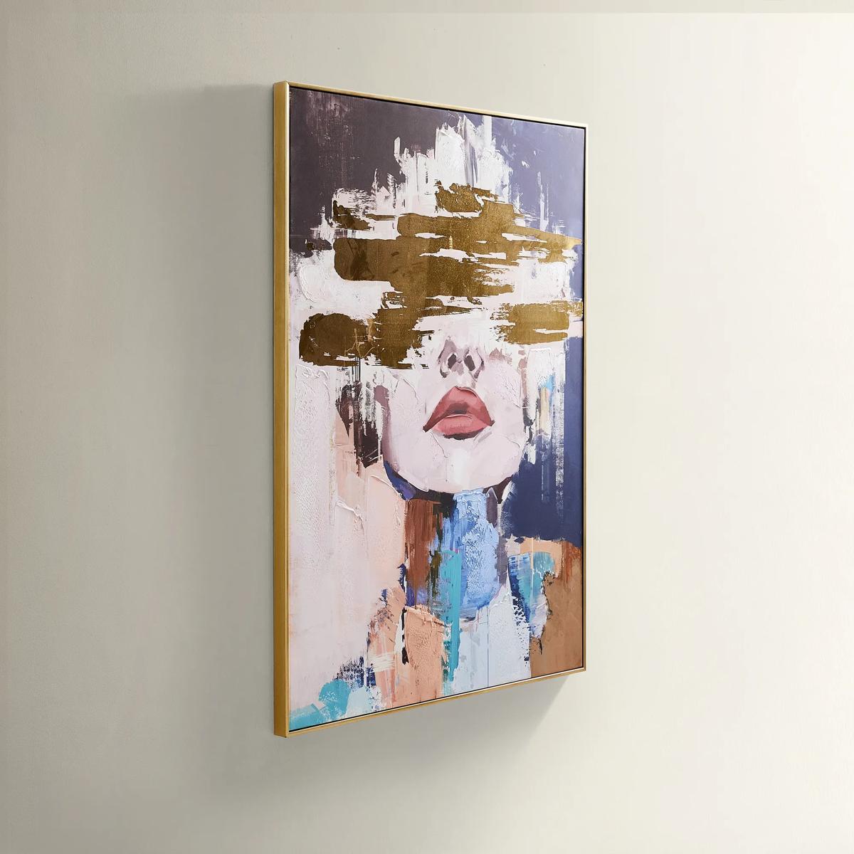 Waiting in Color Gold Foil Painted Wall Art 39.25" x 55"$499
A hand-painted abstract portrait in vivid blue, blush, and gold foil, framed in luxe gold.
Add To Cart -
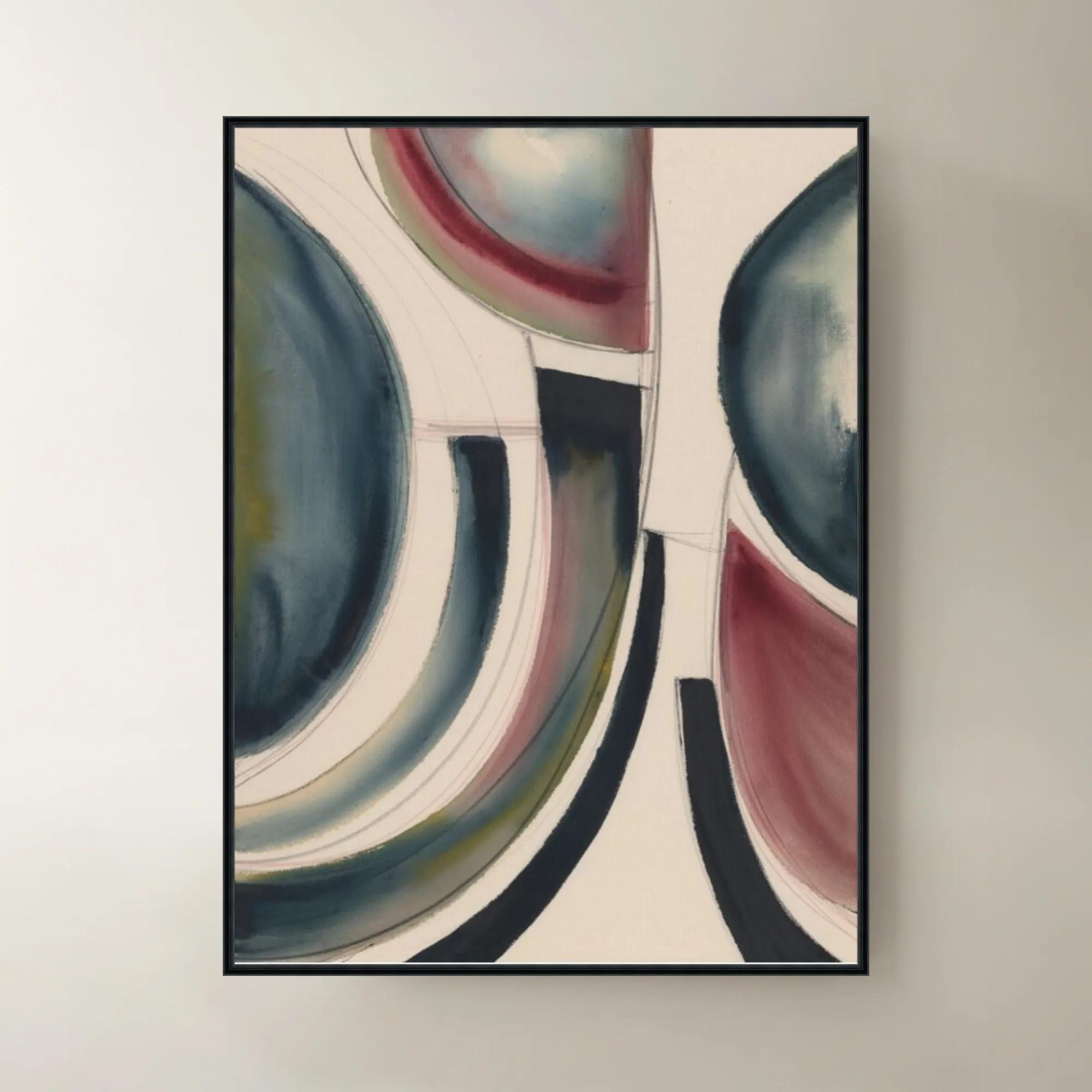
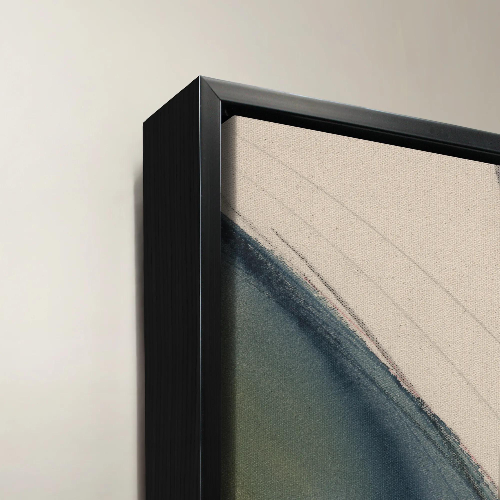 Dreamsicle Framed Wall Art 40" x 54"$1199
A vibrant multicolored canvas wall artwork presented in an elegant frame for contemporary interiors.
Add To Cart -
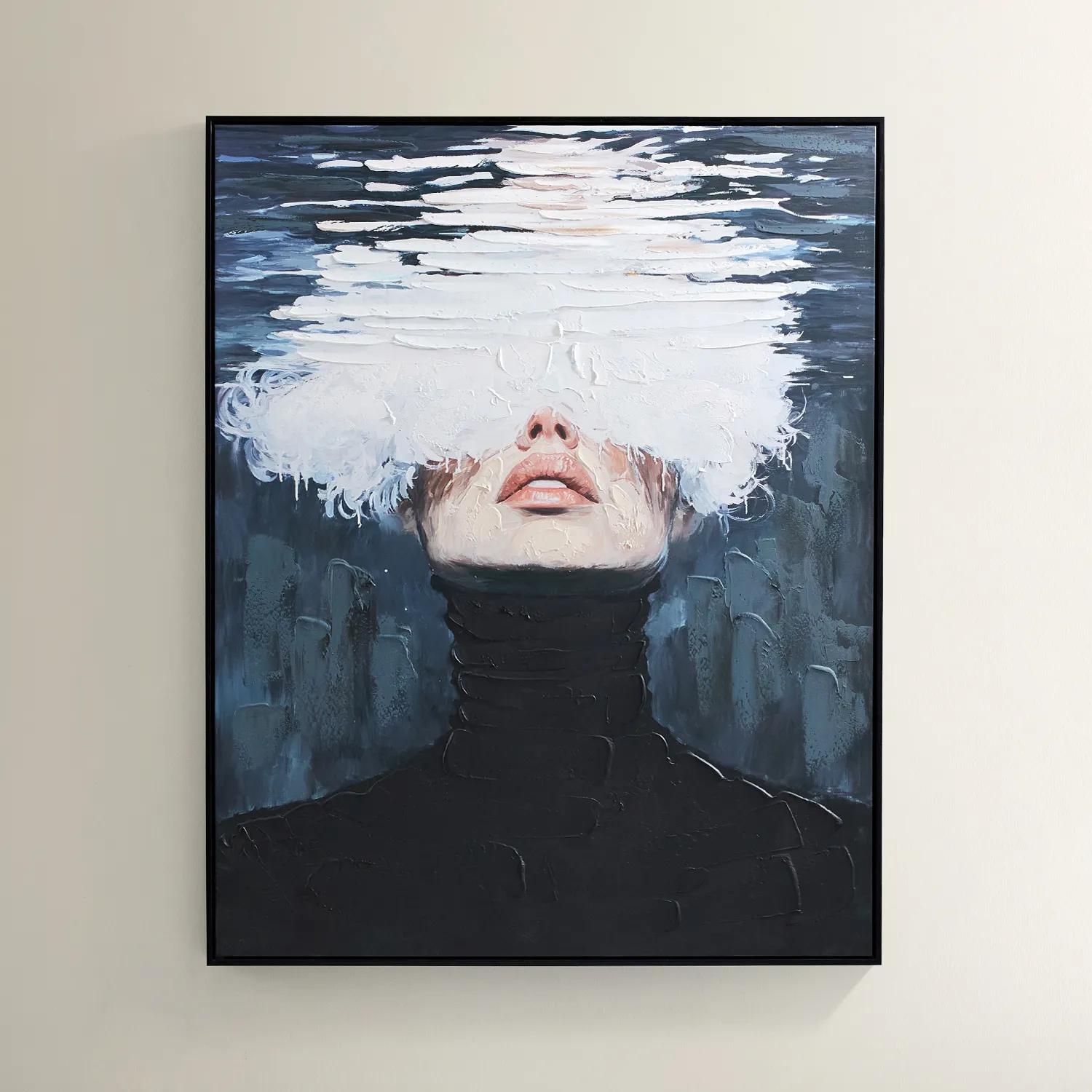
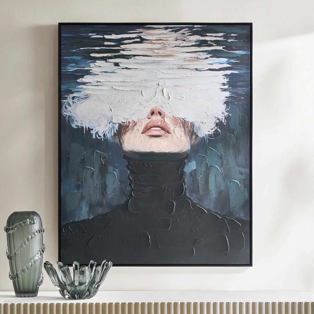 Submerged Framed Painted Wall Art 40" x 50"$599
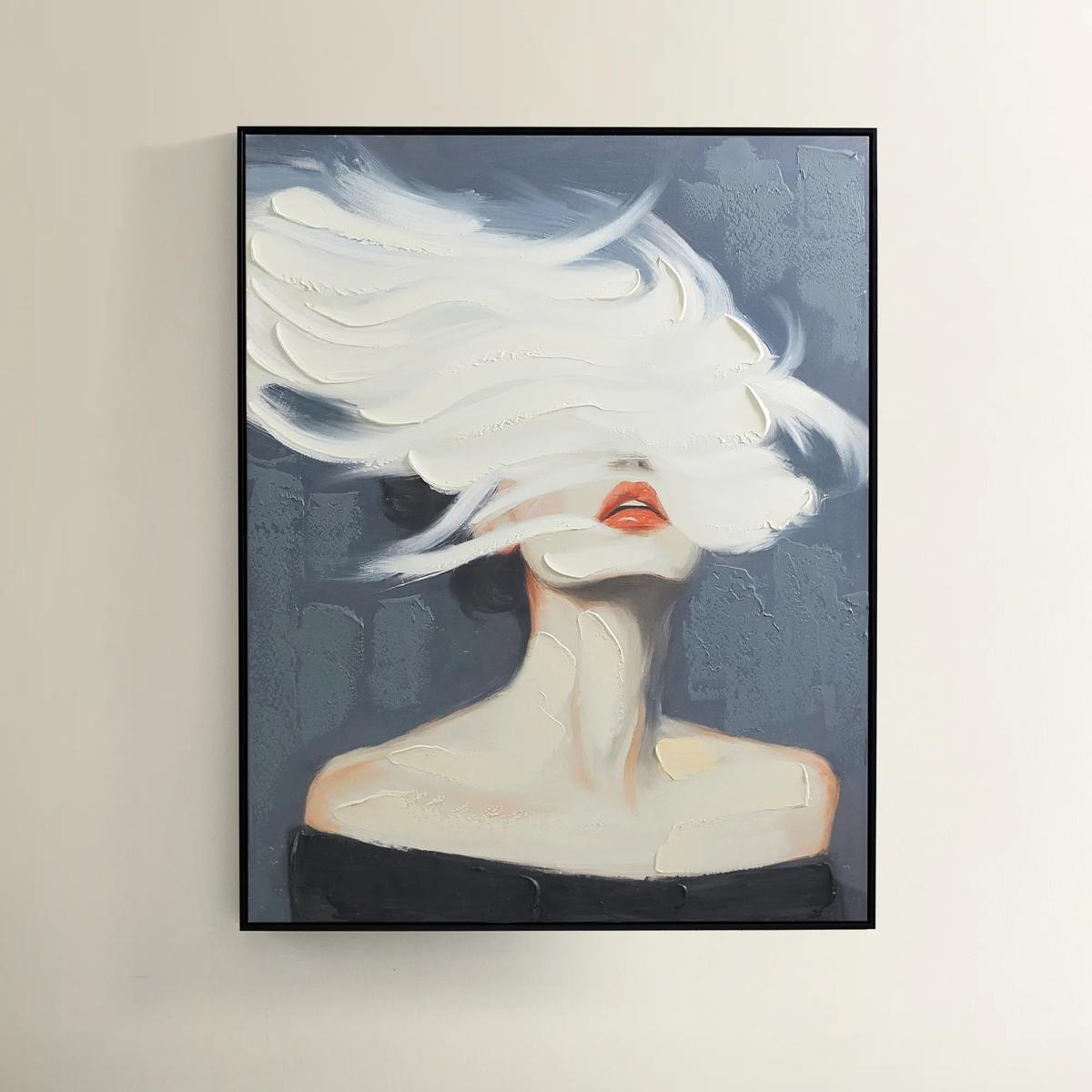
A hand-painted canvas featuring a surreal portrait in black, blue, and white with a black floater frame.
Add To Cart -
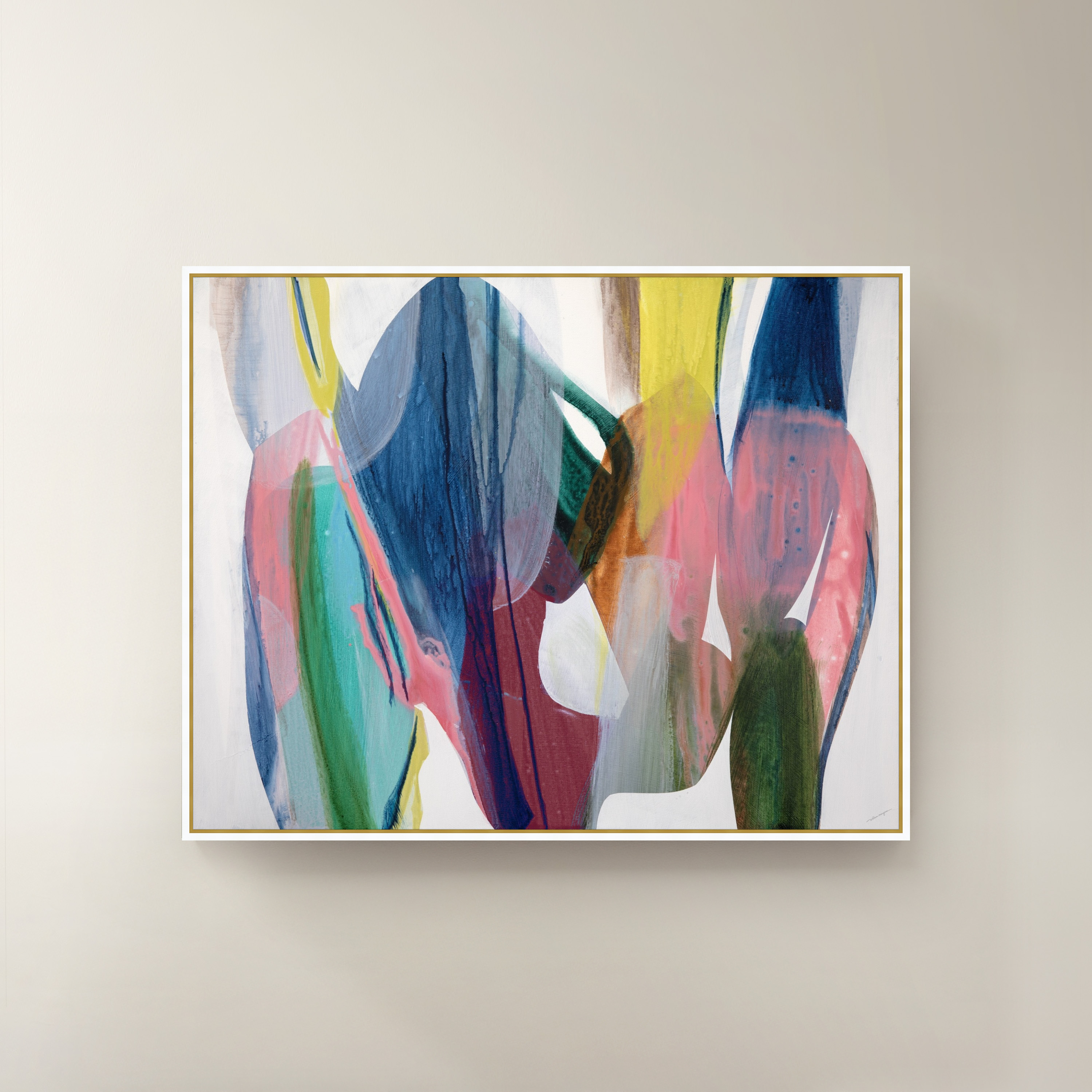
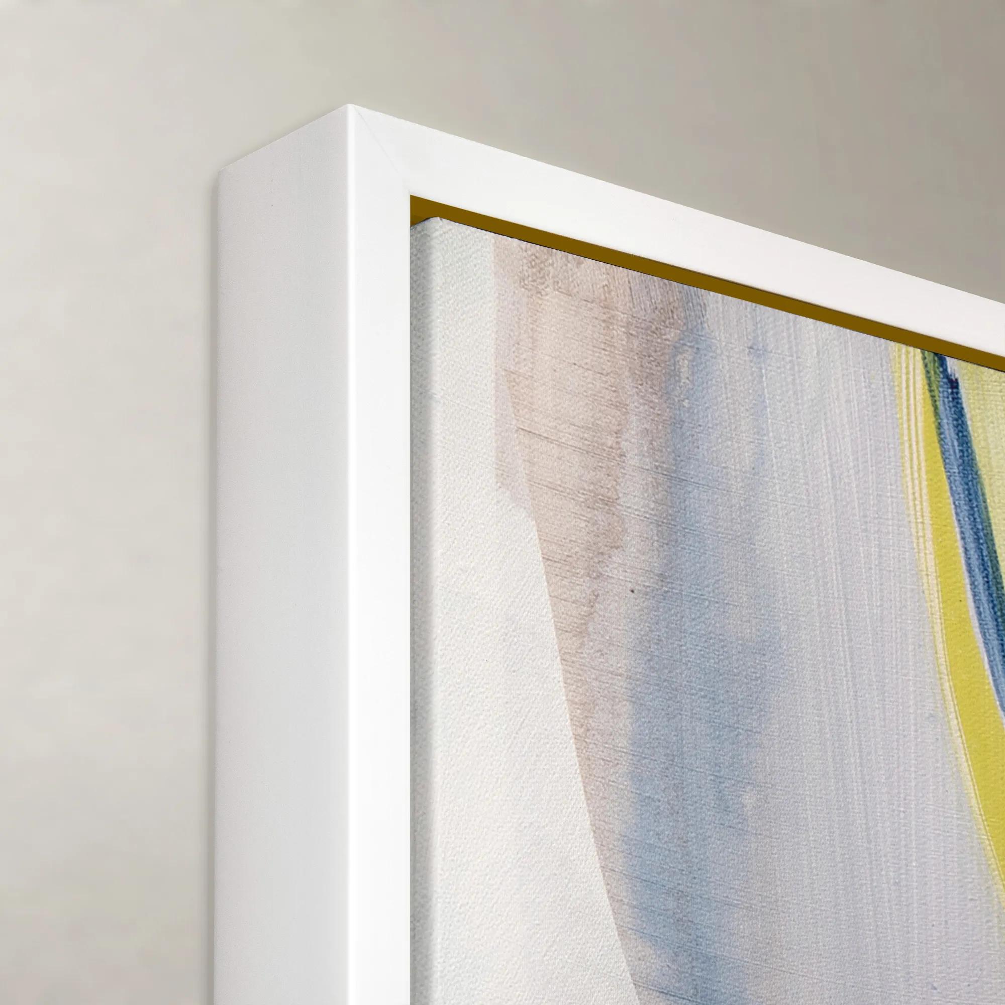 Dreams Take Flight Framed Wall Art 60" x 47"$1299
A vibrant multicolored framed canvas artwork adding expressive, contemporary style to any wall.
Add To Cart

Blue Abstract Paintings For Entryways
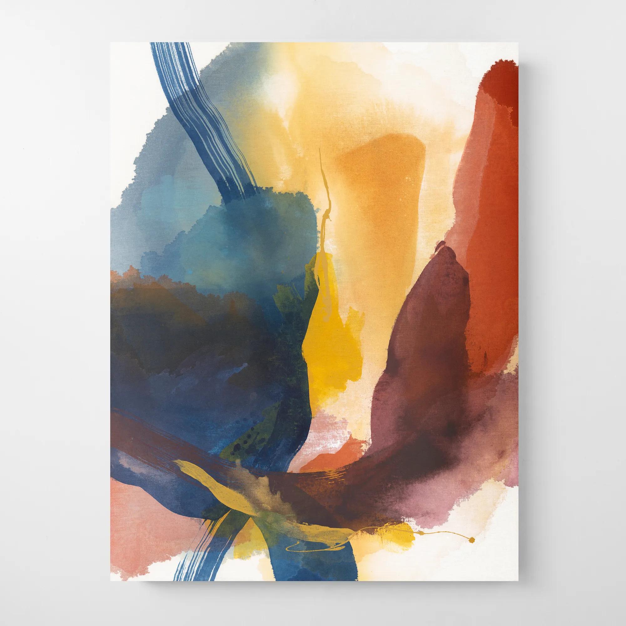
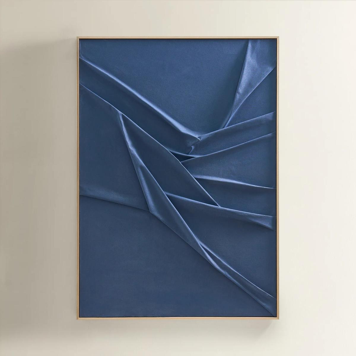
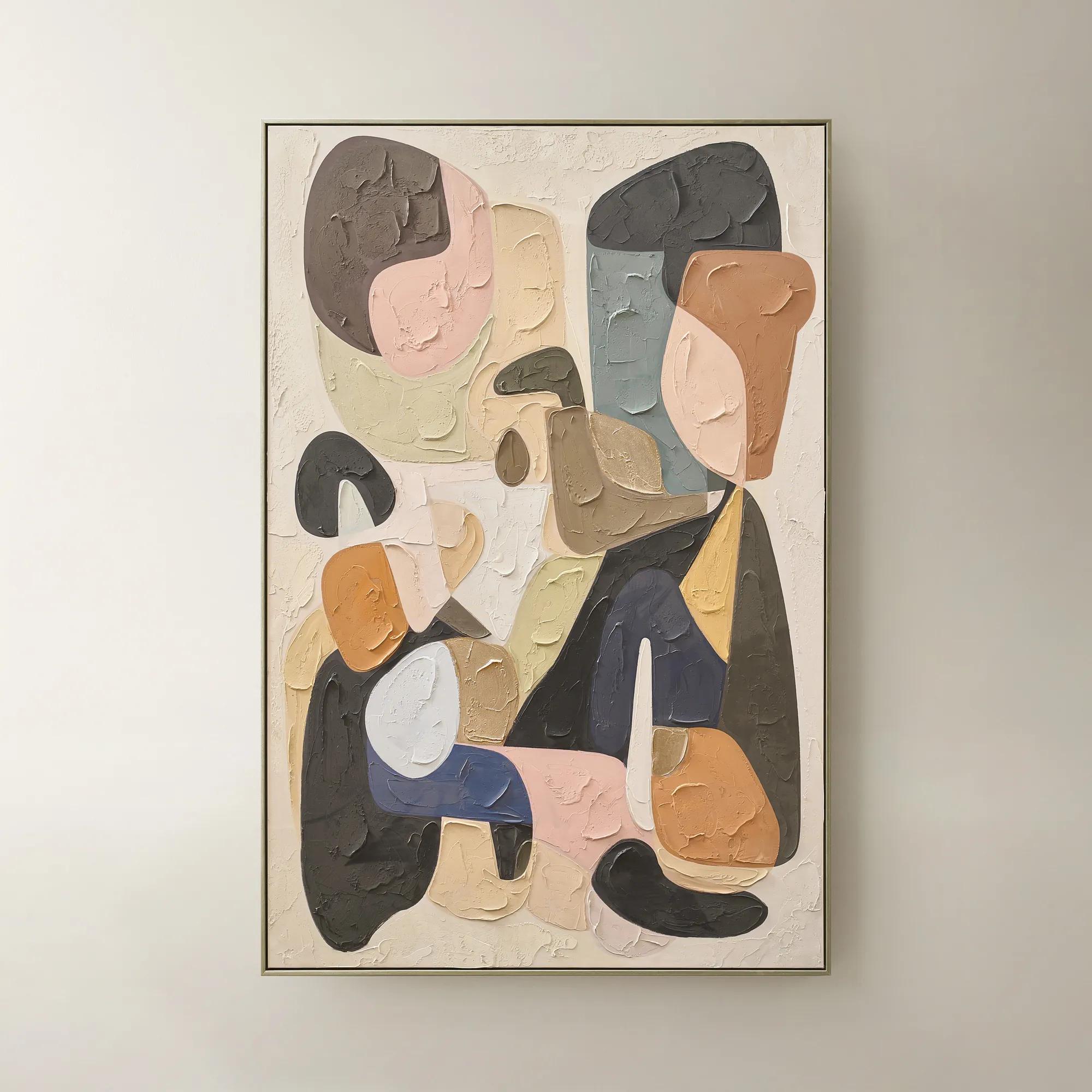
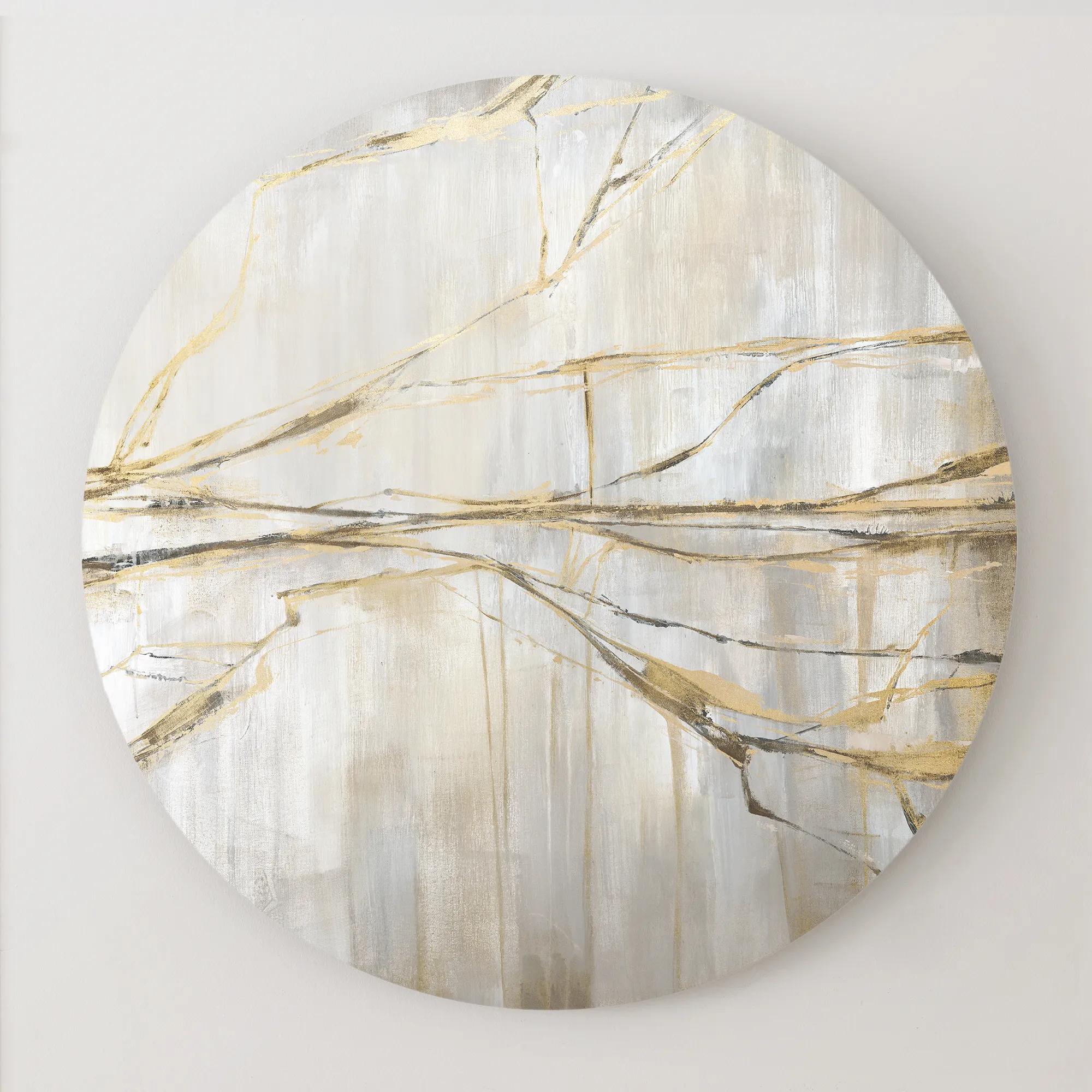
Blue abstract paintings for entryways transform first impressions into unforgettable statements, infusing your home’s threshold with a sense of intrigue and artistry. Each canvas beckons with swirling cerulean hues and bold, expressive forms—inviting guests to step into a world where imagination reigns. These captivating works do more than adorn a wall; they set the tone for your entire space, casting an air of sophistication and serenity that lingers long after arrival. With blue abstract paintings for entryways, the ordinary becomes extraordinary, and every entrance is elevated to an experience worthy of admiration.
Blue abstract paintings give an entryway a point of view before the rest of the home comes into sight. A sweep of cobalt across an ivory ground brings a flash of color to a pared-back foyer, while layered ink and midnight tones lend depth to a room with dark millwork and a gleaming brass pendant. Without a recognizable subject to take in at a glance, the eye follows the movement of a brushstroke, the edge of a color field, or the fine line where two blues meet. Broad gestures make their presence felt from the doorway; fine scratches, translucent washes, and passages of raised paint reward a closer look. That change in perspective feels especially at home in an entry, where a painting may be glimpsed in passing one day and studied while greeting a guest the next. The undertones can do as much for the room as the composition. Teal-leaning blue brings out the warmth of walnut, slate blue has a quiet affinity with veined stone, and ultramarine makes a striking companion to lacquer and polished metal. A console, runner, and painting need not share an exact shade to feel connected. In a foyer with a patterned floor, a painting with broad, open areas of color can give the eye somewhere to rest. Against a plain wall and a dark console, an unruly sweep of blue can provide nearly all the ornament the room needs. A frame adds another line to the composition: warm wood makes the transition from blue to a neutral wall feel softer, while a narrow black profile gives an airy wash of color a more defined edge. For an entrance that calls for a stronger graphic contrast rather than a wash of color, Black Abstract Art For Entryways offers a darker counterpart with a different kind of presence.
Scale determines whether that presence reads as an intimate detail or a grand gesture. In a narrow vestibule, a tall canvas can give a slim stretch of wall a sense of height without crowding the door trim. Its surface will be seen at close range, where a dry brush mark or a thin veil of pigment can carry more weight than an intricate arrangement of shapes. A wide foyer with a long console can accommodate a horizontal painting whose color travels across the wall, echoing the sweep of the furniture below. Leaving visible wall space around the frame helps the composition hold its own beside substantial pieces like a sculptural lamp or a deep ceramic vessel. The view from the open door matters as much as the straight-on view: a large painting that looks balanced on an empty wall can feel hemmed in once a door swings across it, and deep frames are better suited to walls outside the path of bags and shoulders. Over a console, the painting should feel connected to the furniture without sitting so low that keys, trays, or tall branches compete with its lower edge. In an entry that opens directly into a living or dining room, the artwork can establish a visual link between the spaces. A trace of smoky blue might pick up the sheen of velvet farther inside without repeating the same color at full strength. Lighting changes that relationship, too. A softly lit canvas can reveal the difference between a blue that leans gray and one with a violet cast, while clear glazing opposite a bright sidelight may reflect the doorway more strongly than it reveals the art. Offsetting the piece from the brightest reflection or opting for low-reflection glazing can preserve the subtler marks that make a composition worth lingering over.
Materials shape both the look of abstract art and how comfortably it lives in a busy entrance. The weave of canvas gives thin areas of color a visible grain, while a smooth panel makes a crisp edge or an uninterrupted field of blue feel especially deliberate. Paper can bring out the delicacy of washes and drawing marks; a frame with a mat or spacer keeps the surface away from the glazing. Protective glazing is useful for works on paper, and UV-filtering options can help limit light exposure, though no frame makes a painting immune to fading in prolonged direct sun. An unglazed canvas avoids reflections and lets raised brushwork show in relief, but its surface and corners benefit from a position clear of umbrella stands, coat hooks, and the frequent swing of a door. Hanging hardware should suit the weight of the framed work and the wall material, particularly in a passage where an accidental knock is more likely. For routine upkeep, a soft, dry cloth is generally enough for the frame; painted surfaces and glazing should be cared for according to their finish rather than treated with an all-purpose spray. Alongside those practical details, the pleasure of blue abstract art lies in how personal it can feel without prescribing a scene or a story. It suits a collector drawn to expressive mark-making as readily as someone furnishing a first home who wants one decisive note of color at the entrance. As a housewarming gift, it feels most considered when the palette reflects a color the recipient already loves and the format fits a wall with room to spare. A compact composition can give an apartment entry a distinct identity, while a broad, deeply layered canvas can hold the first sightline in an expansive foyer, setting a tone that carries well beyond the front door.
FAQs
Blue abstract paintings infuse entryways with a sense of calm sophistication and visual intrigue. The color blue evokes tranquility and confidence, while abstract forms introduce movement and energy, creating a welcoming focal point that sets the tone for the rest of the home.
Blue abstract art complements a wide range of interior styles, from modern and contemporary to transitional and glam. Its versatility allows it to harmonize with metallic finishes, glass accents, and bold furnishings, making it an ideal choice for expressive, layered spaces.
Absolutely. Blue abstract art is a thoughtful and enduring gift for housewarmings, weddings, anniversaries, or milestone celebrations. Its timeless appeal and ability to elevate any space make it a memorable gesture for art lovers and design enthusiasts alike.
For maximum impact, hang blue abstract paintings at eye level and allow for ample negative space around the piece. Pair them with complementary accents such as metallic trays, sculptural vases, or statement lighting to create a cohesive and dramatic vignette.
Yes, blue abstract art can be beautifully mixed with other colors and styles to create a dynamic gallery wall. Pairing blue pieces with contrasting hues, such as black or gold, or with varied textures and frames, adds depth and visual interest to the entryway.