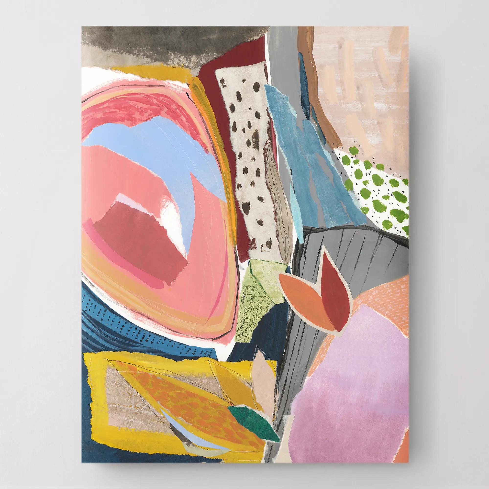
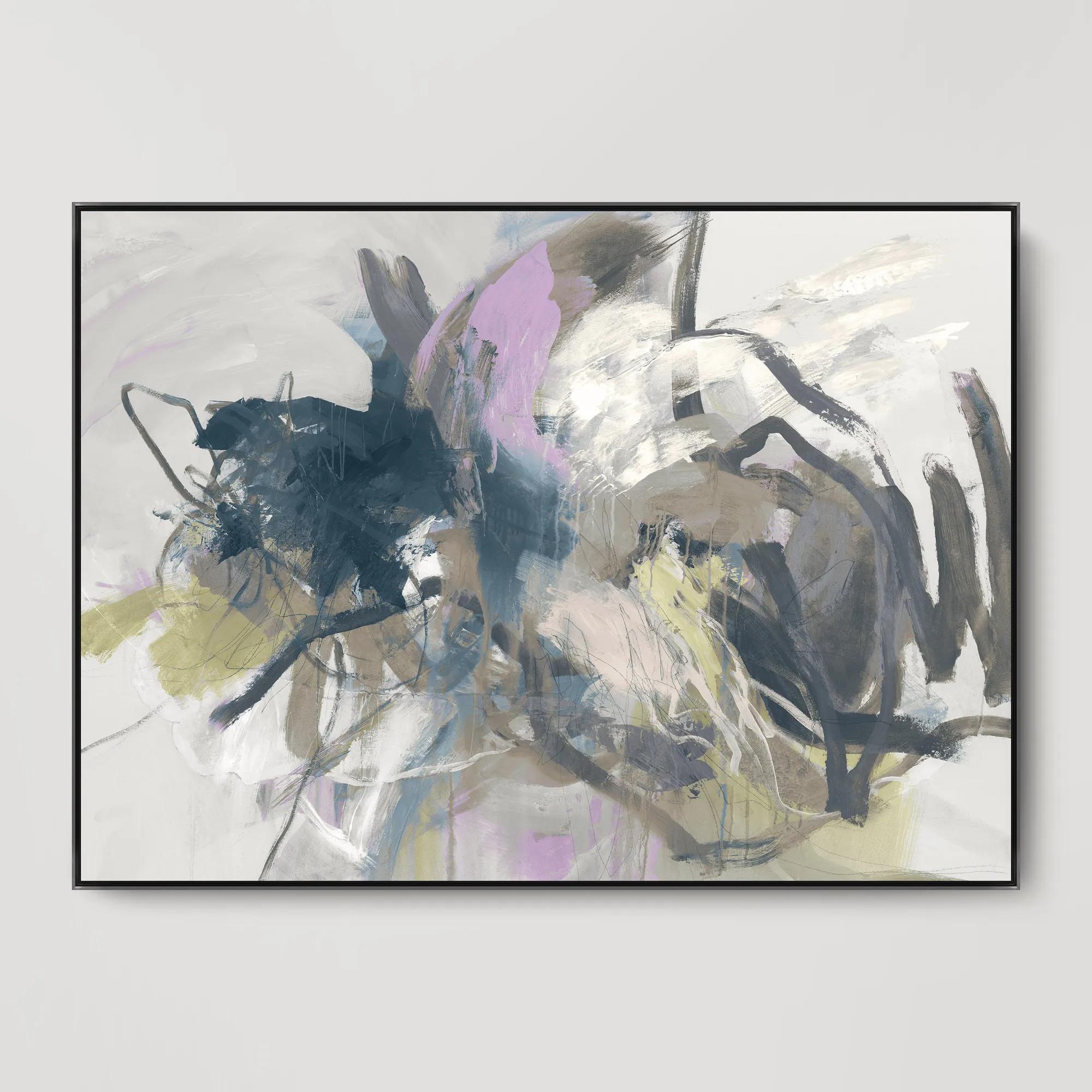
Abstract Wall Art For Summer Trends
Abstract Wall Art For Summer Trends
-
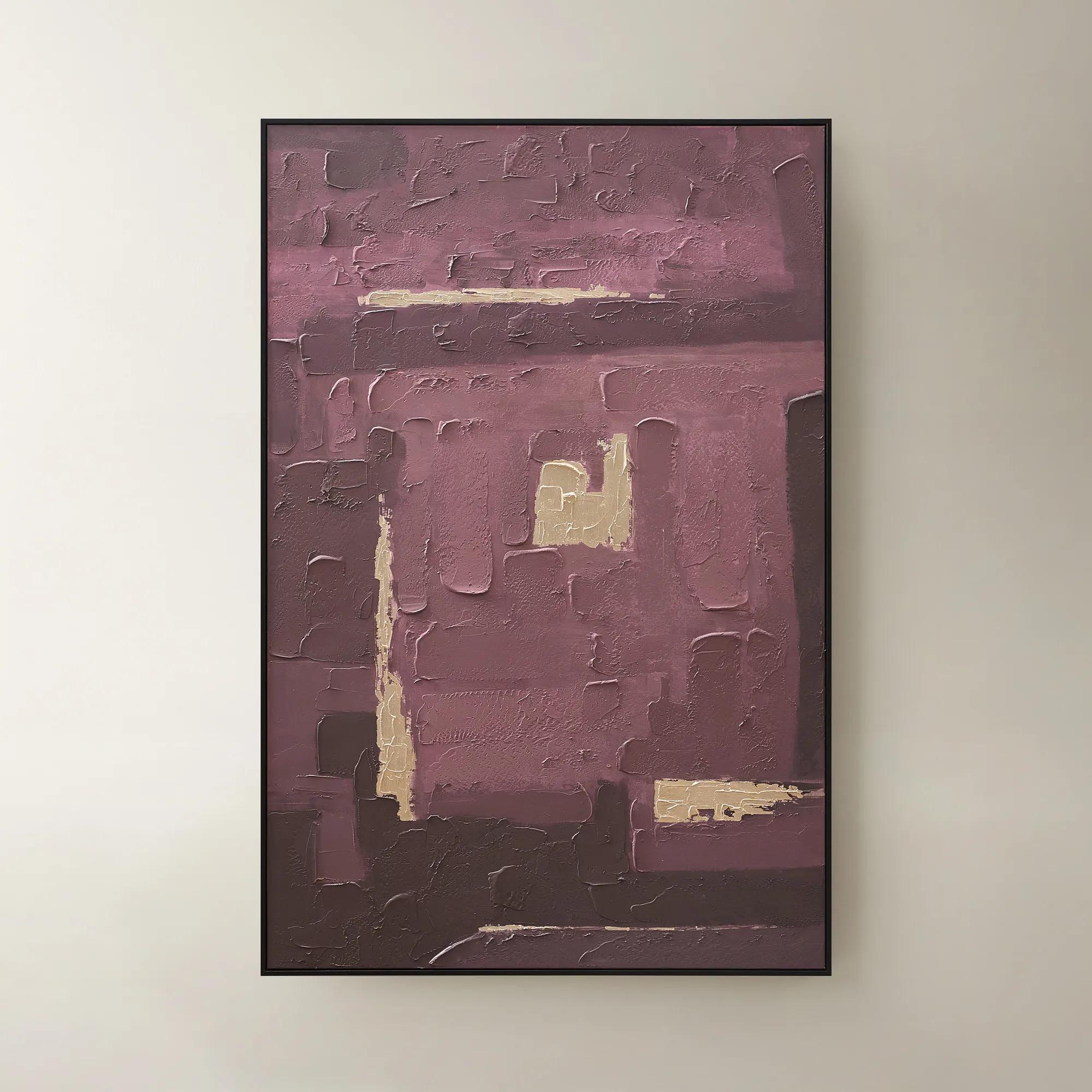
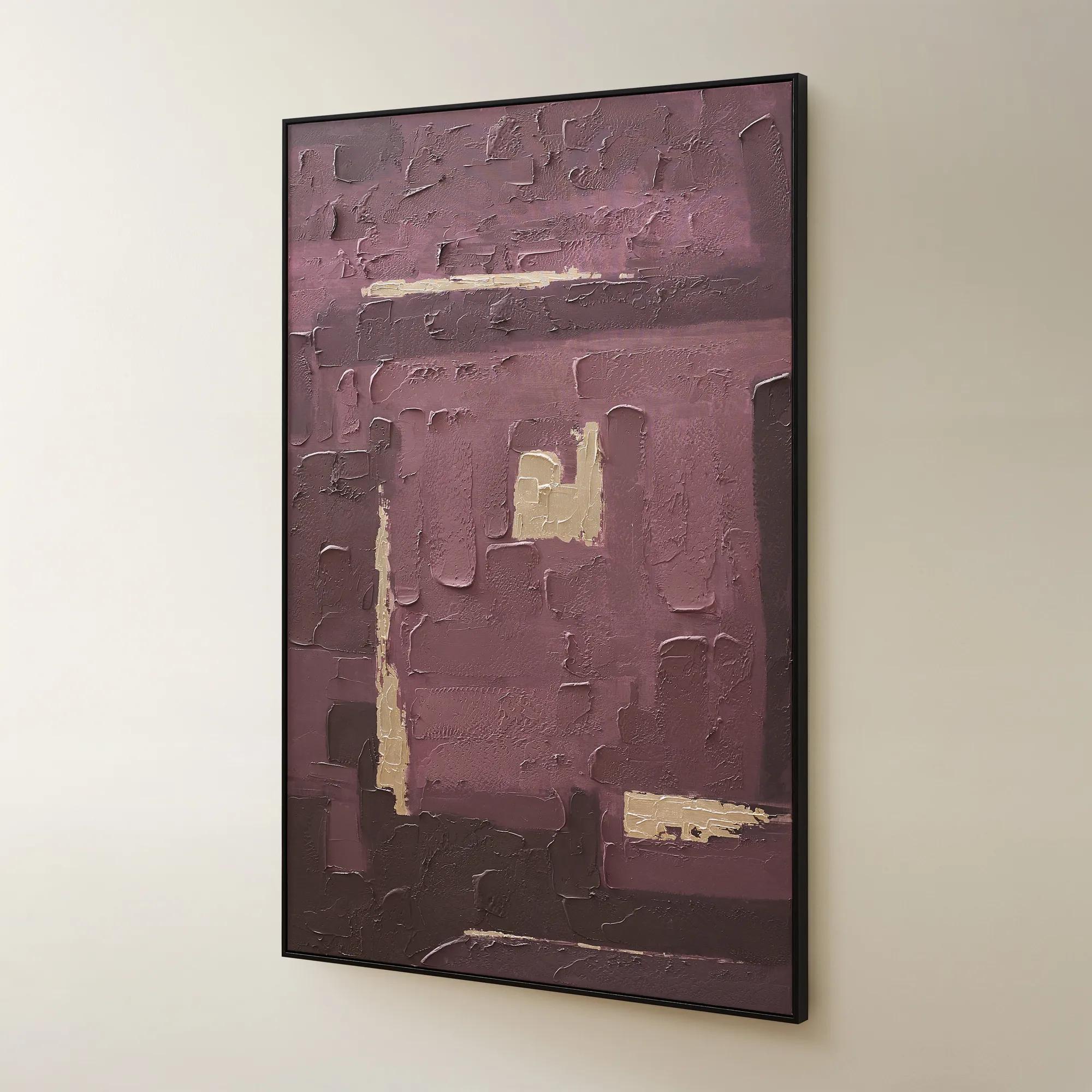 Fallback Framed Painted Wall Art 60" x 40"$499
A hand-painted abstract canvas in rich fig hues with champagne accents, set in a sleek black frame.
Add To Cart -
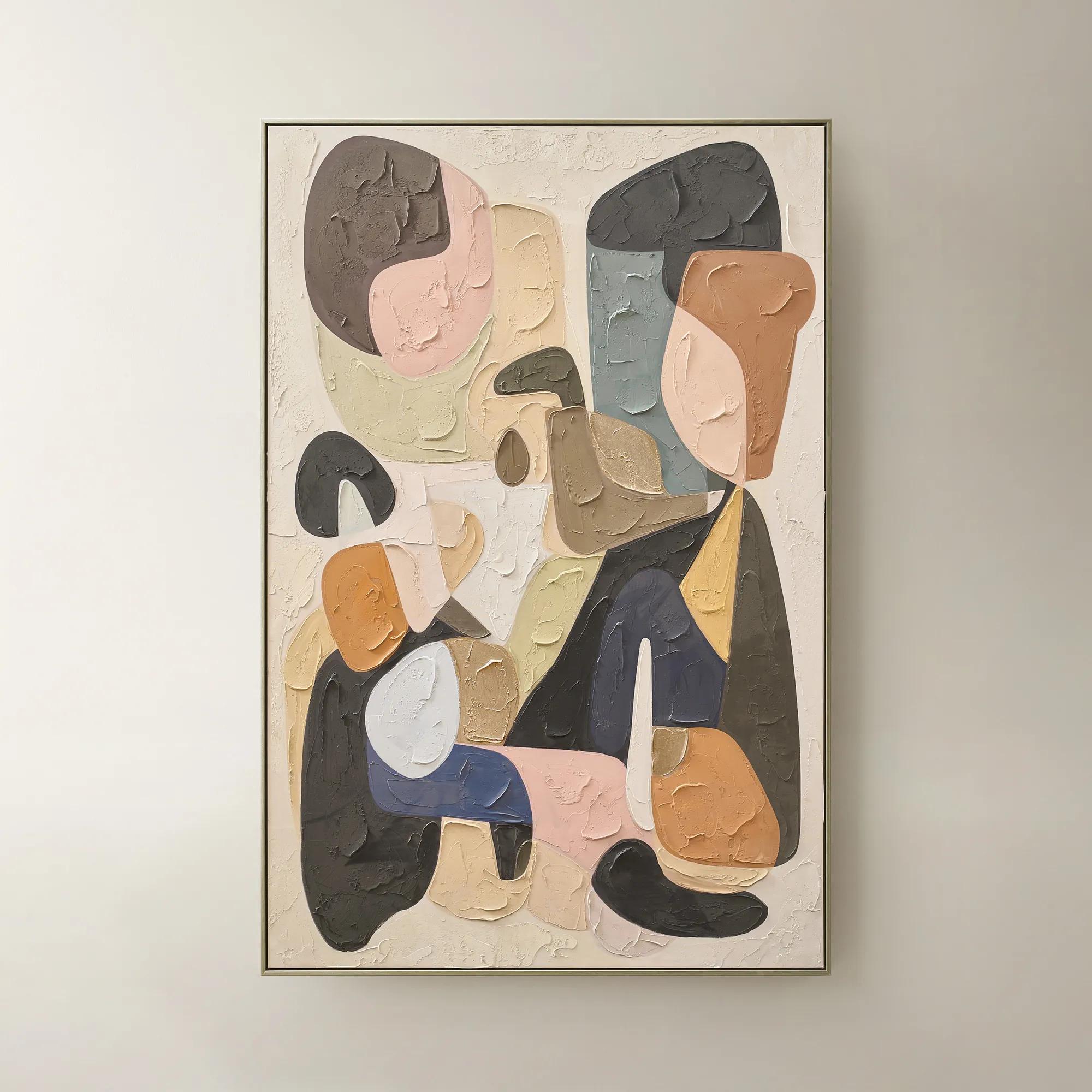 Chromatic Bloom Framed Painted Wall Art 40" x 60"$519
A hand-painted abstract canvas featuring a vibrant multi-color palette and shimmering champagne detailing.
Add To Cart -

 Twin Abstract 1 Framed Wall Art 30" x 45"$699
A captivating abstract canvas artwork featuring layered blue and purple tones in a sophisticated framed presentation.
Add To Cart -
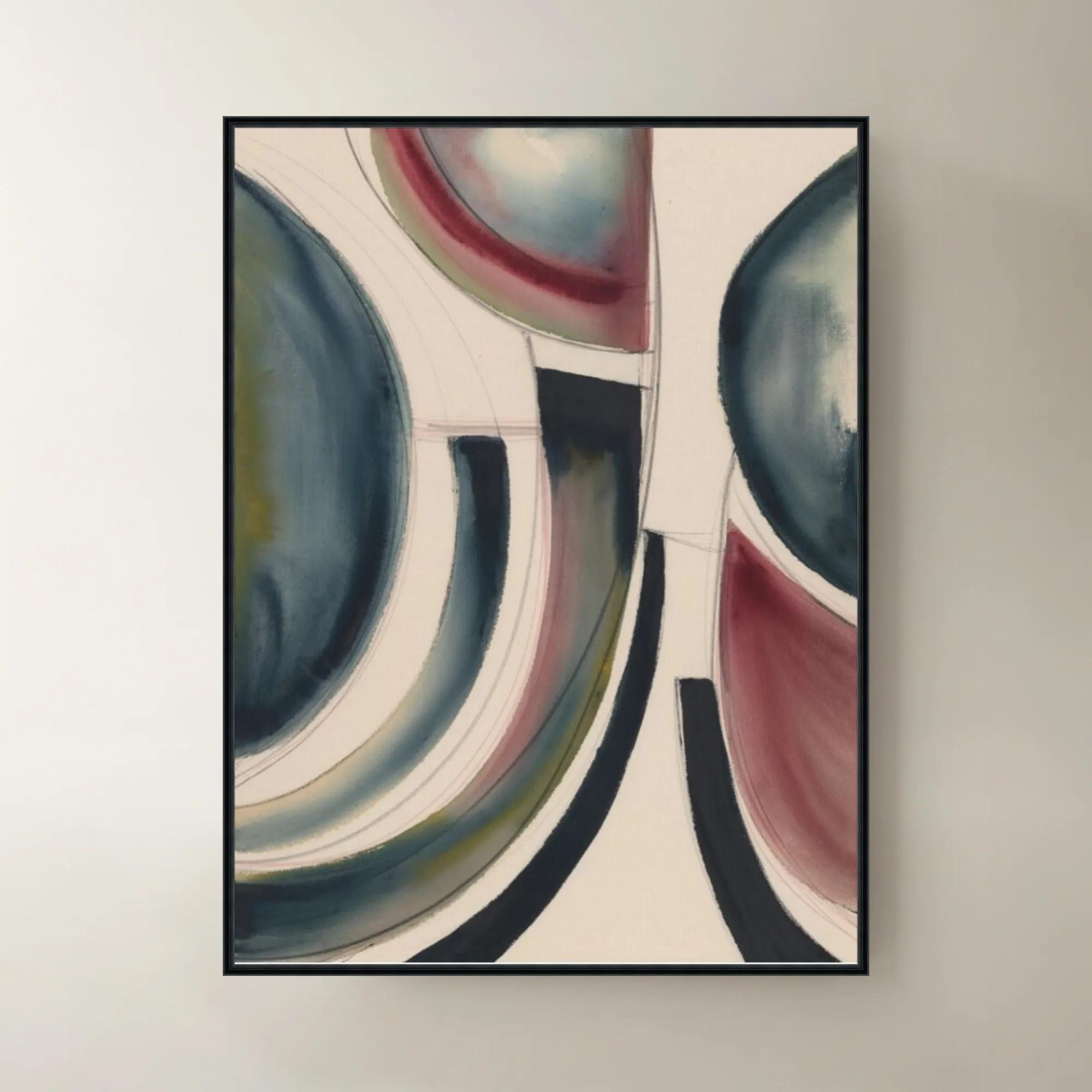
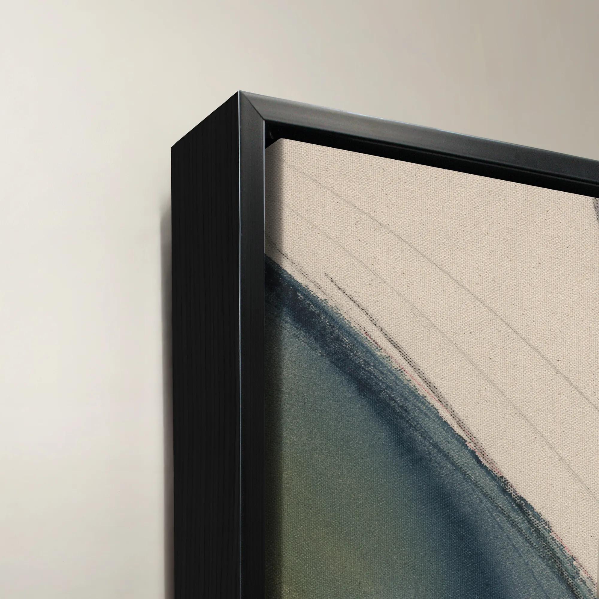 Dreamsicle Framed Wall Art 40" x 54"$1199
A vibrant multicolored canvas wall artwork presented in an elegant frame for contemporary interiors.
Add To Cart -
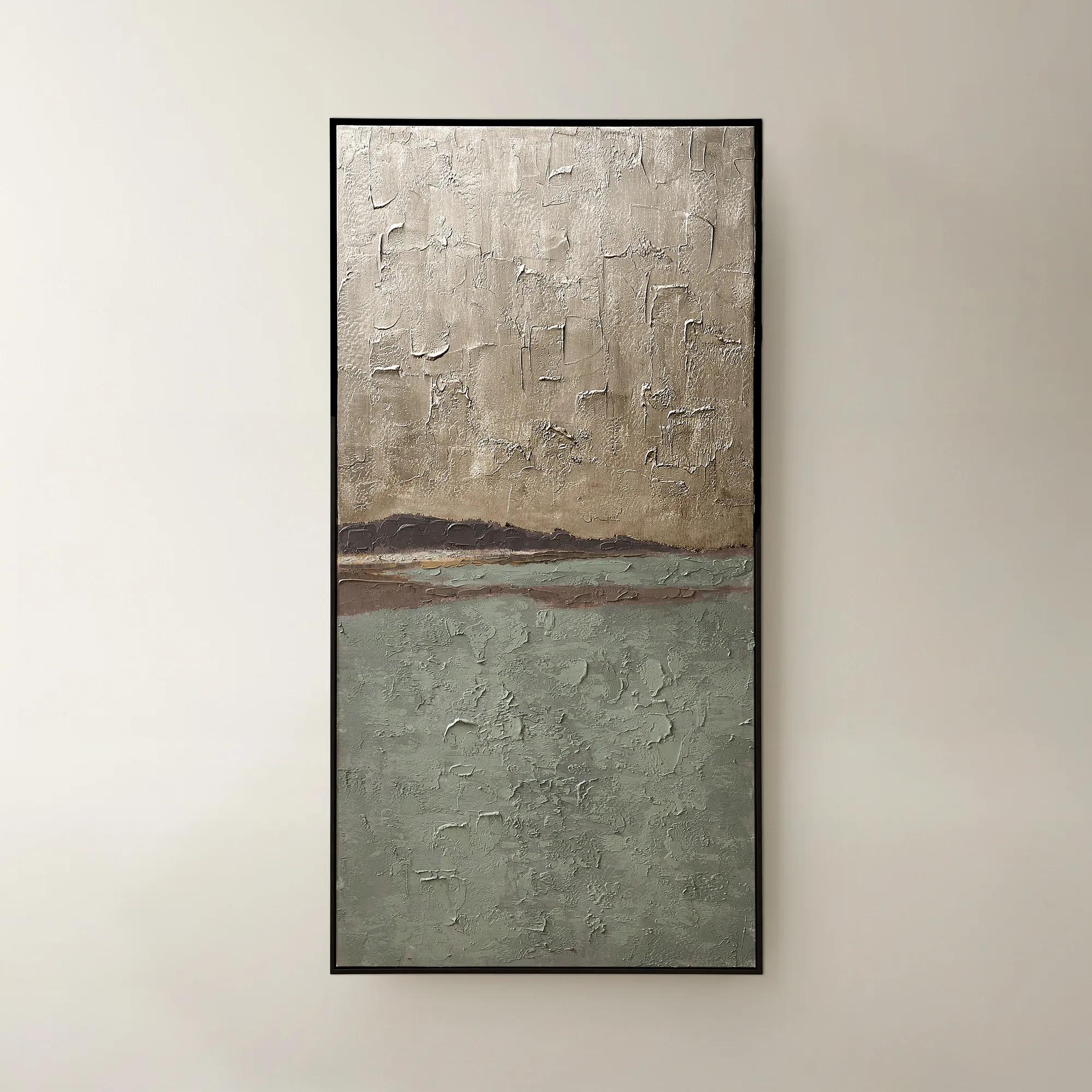
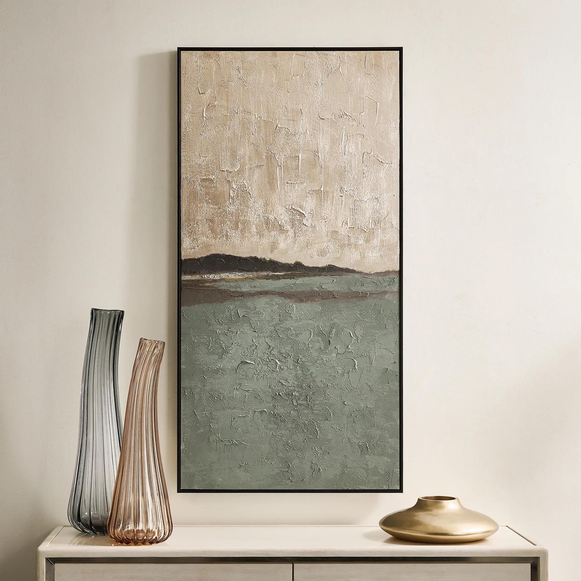 Fields of Gold Framed Painted Wall Art 60" x 30"$399
A hand-painted sage and champagne abstract canvas with a black frame, offering versatile vertical or horizontal display.
Add To Cart -
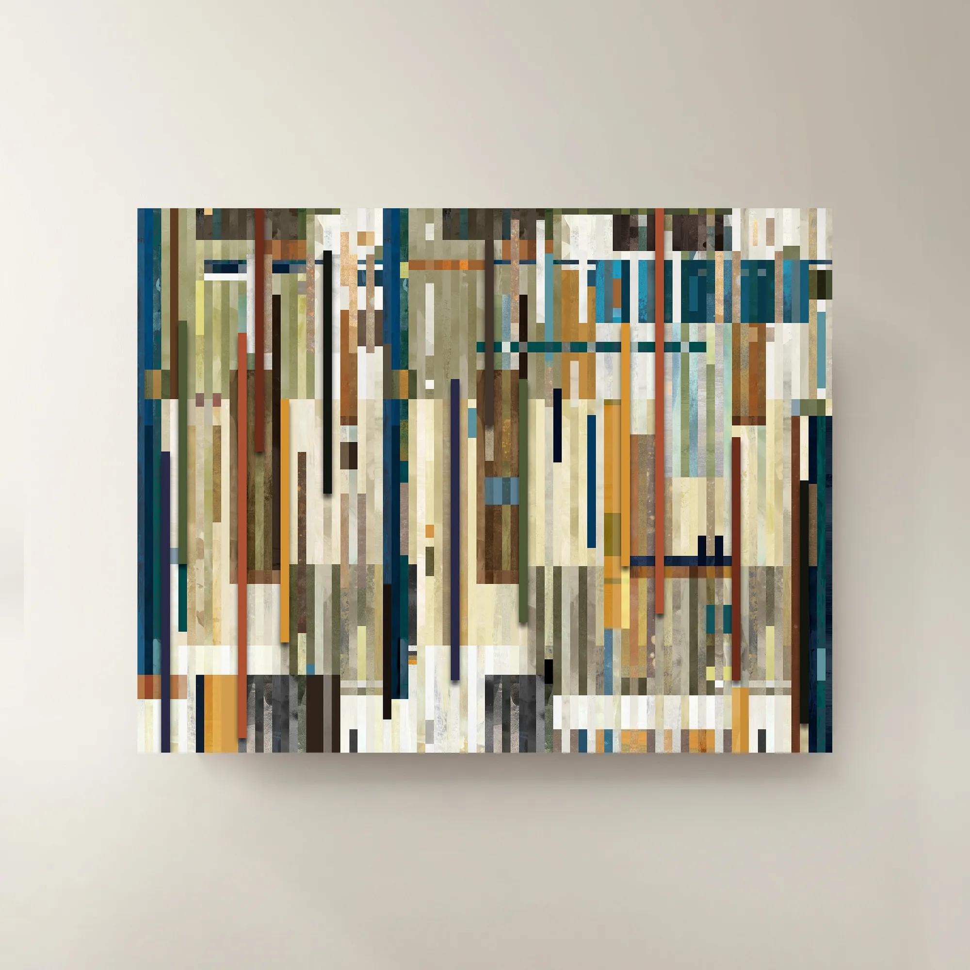
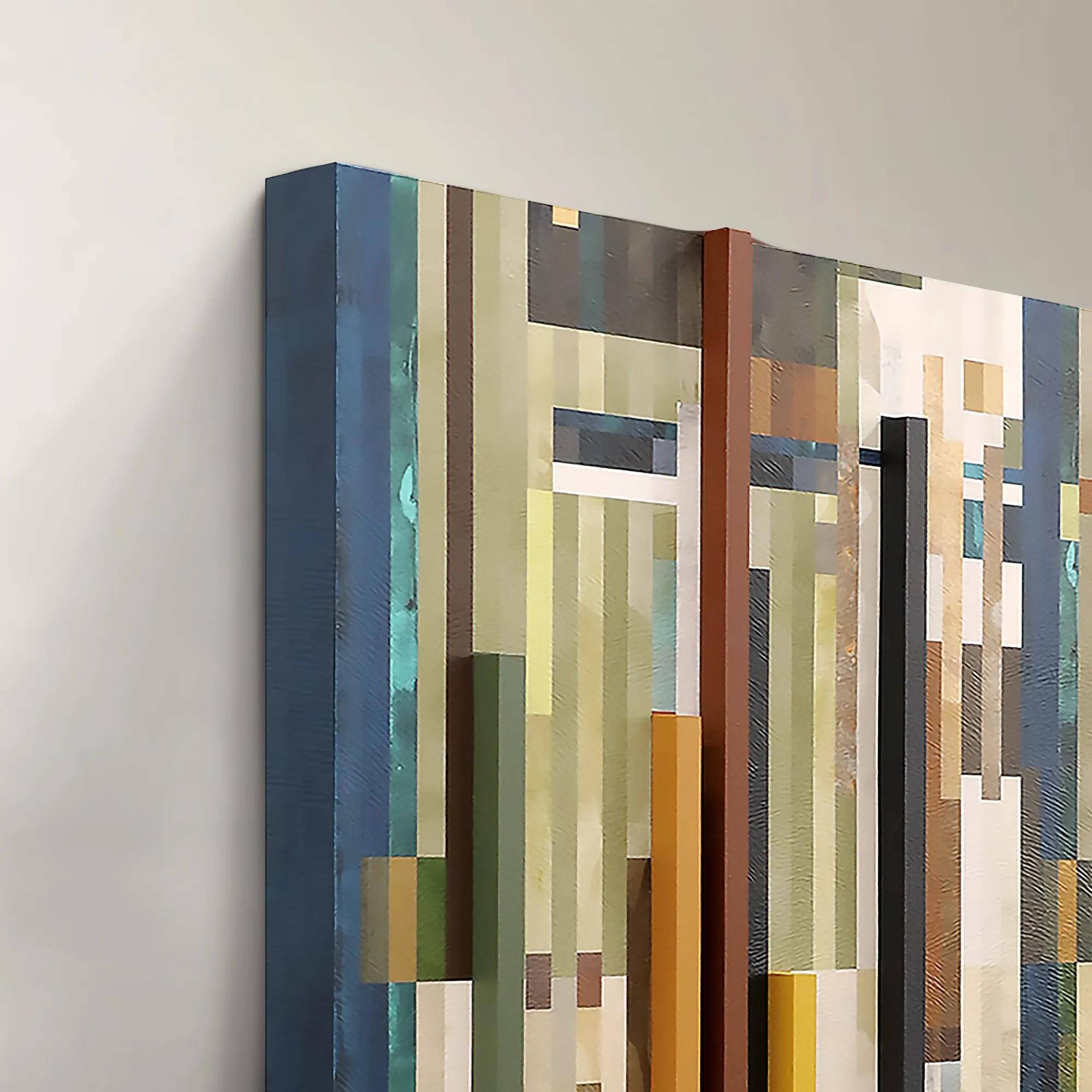 Chromatic Rhythms II Wall Art 60" x 47"$1899
A dynamic blue abstract canvas artwork featuring rhythmic geometric composition.
Add To Cart -
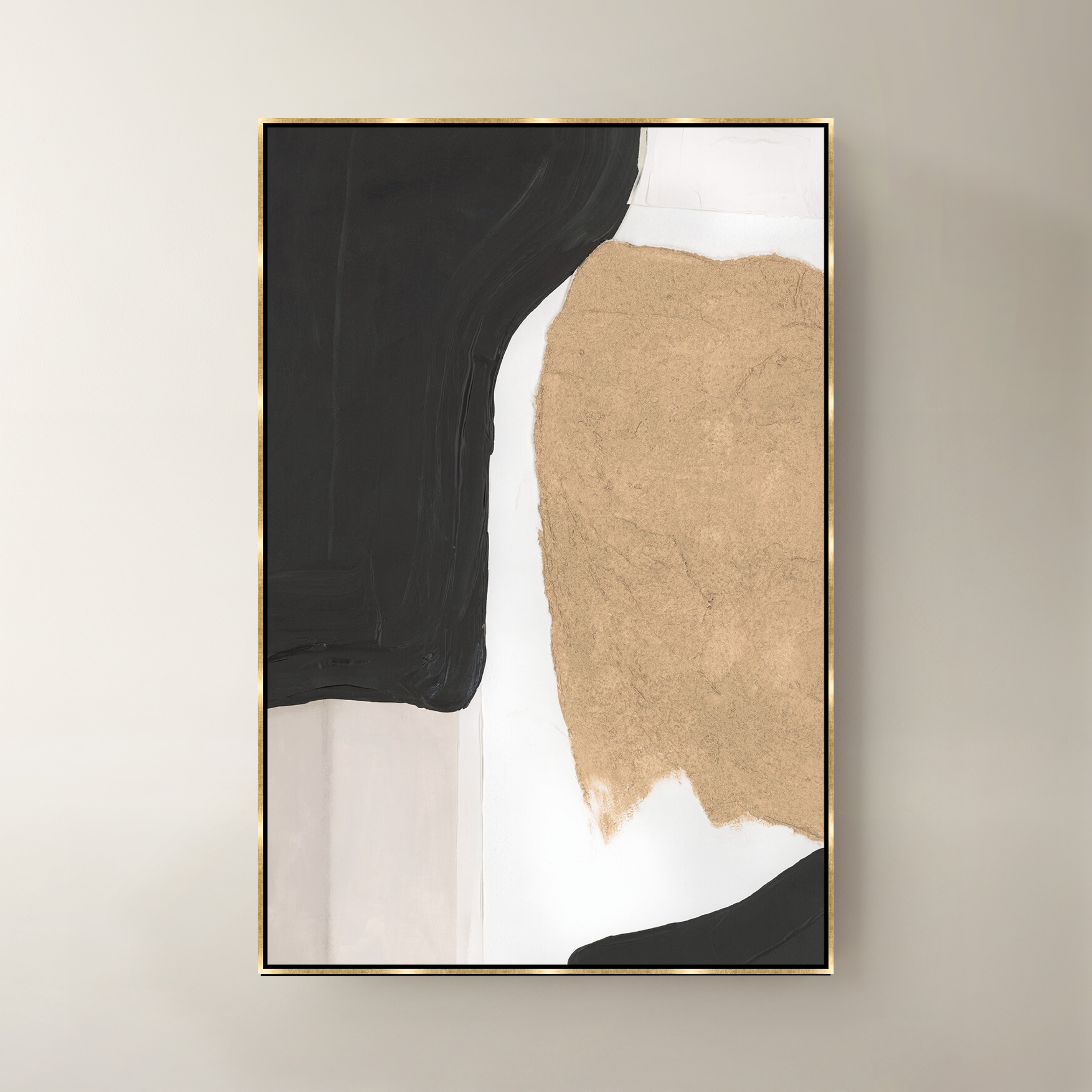
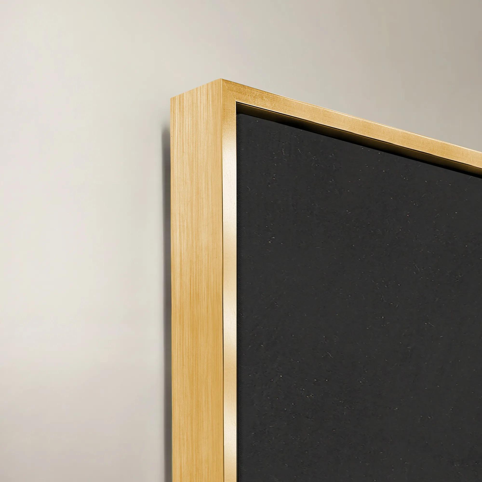 Noir I Framed Wall Art 40" x 60"$1299
A multicolored canvas wall artwork presented in a striking frame for modern interior styling.
Add To Cart -
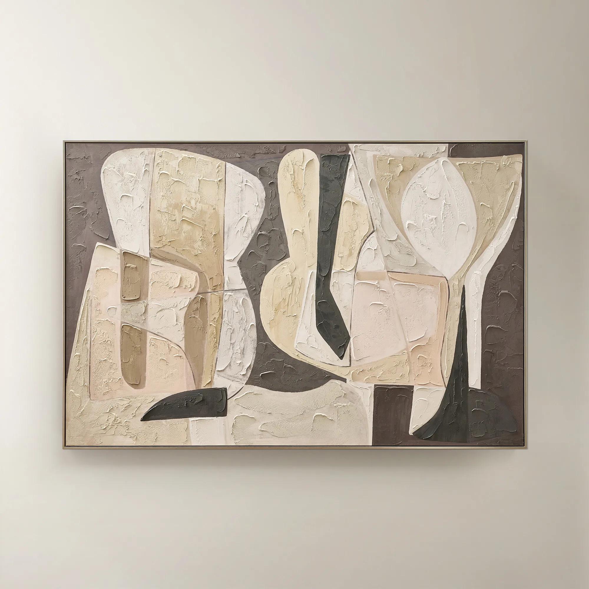 Wishful Thinking Framed Painted Wall Art 72" x 48"$599
A hand-painted abstract canvas featuring bold geometric forms and warm smoked plum, apricot, and tawny hues.
Add To Cart -
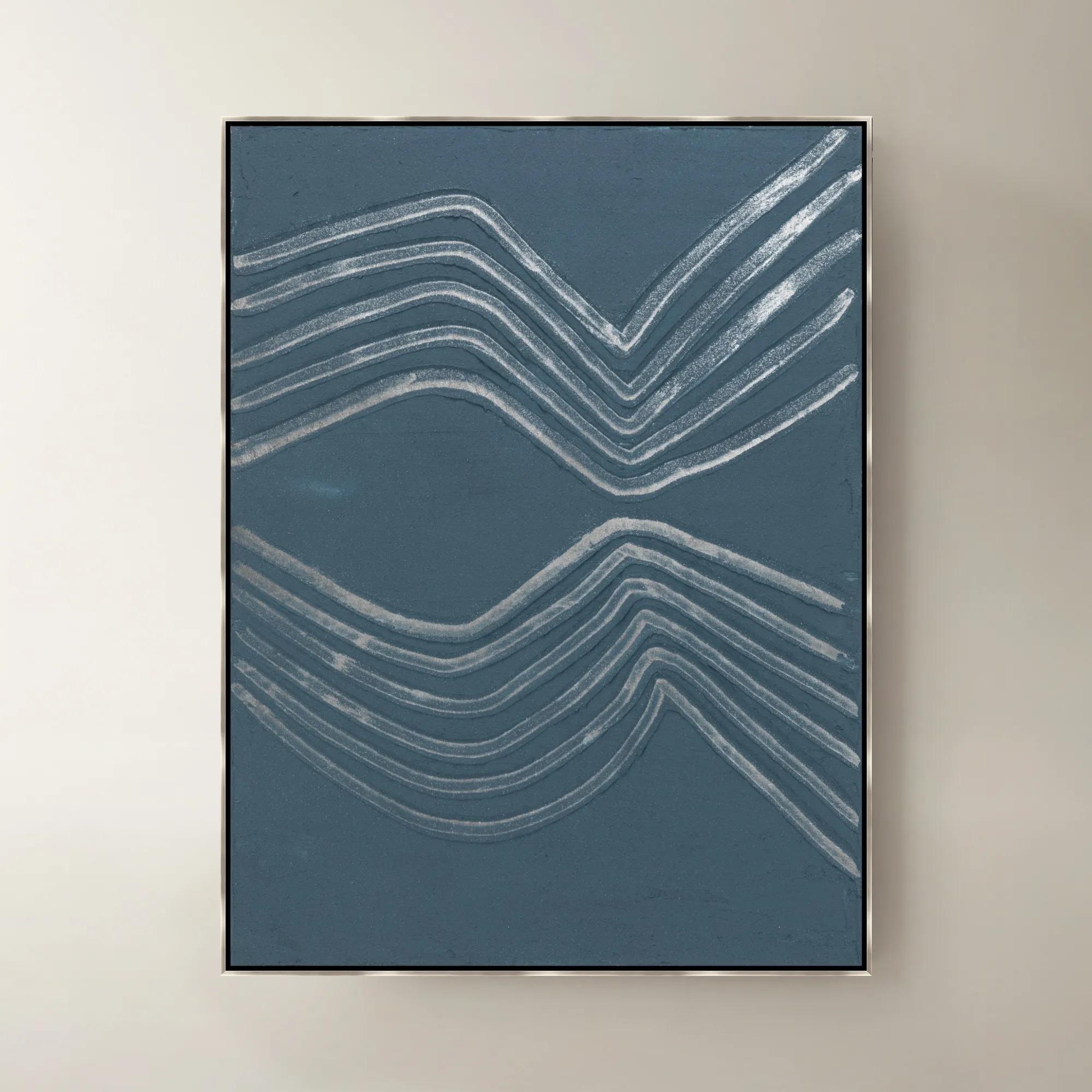
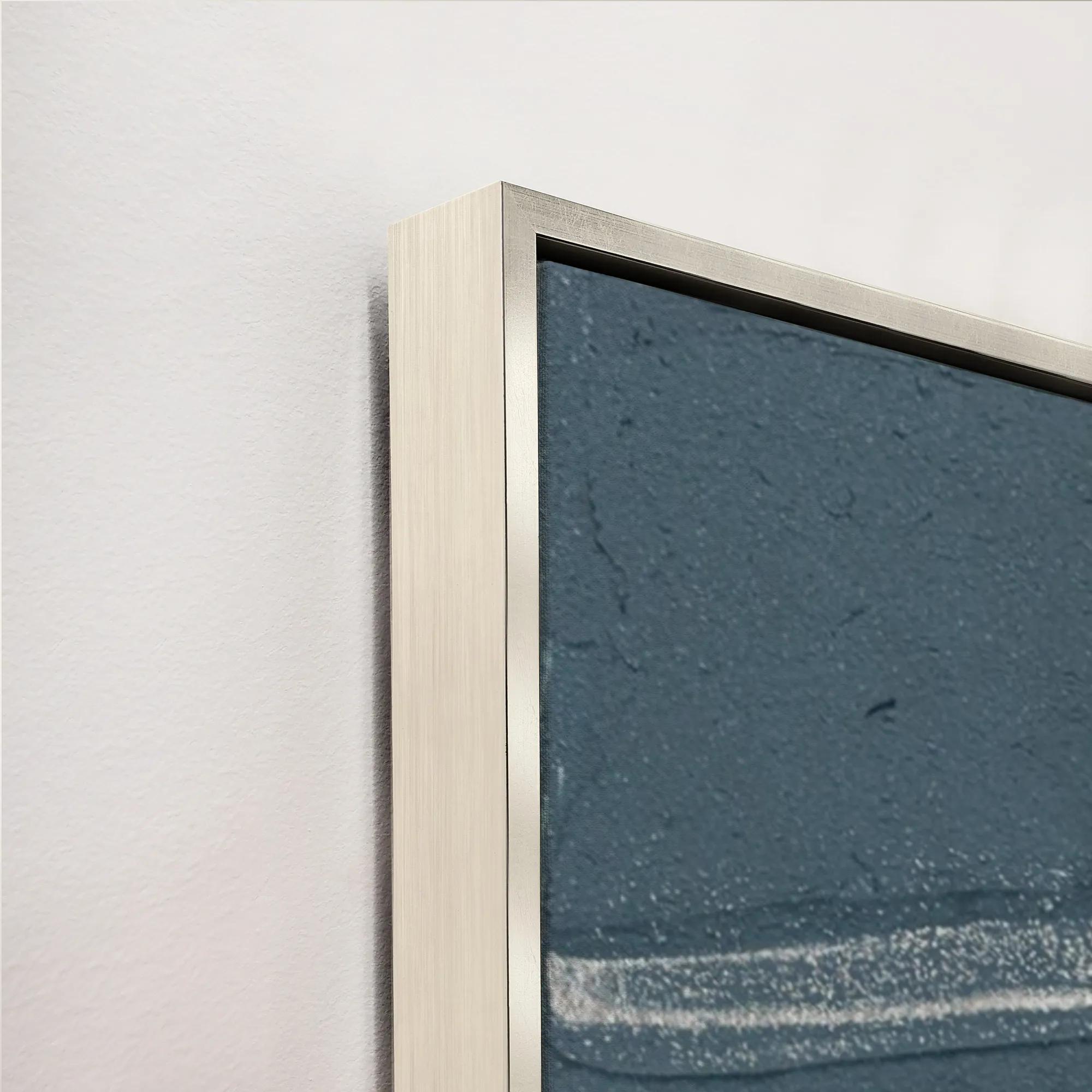 Gilded Waves VI Framed Painted Wall Art 40" x 53"$1399
A framed painted canvas artwork featuring sweeping gilded waves in rich blue and purple tones.
Add To Cart -
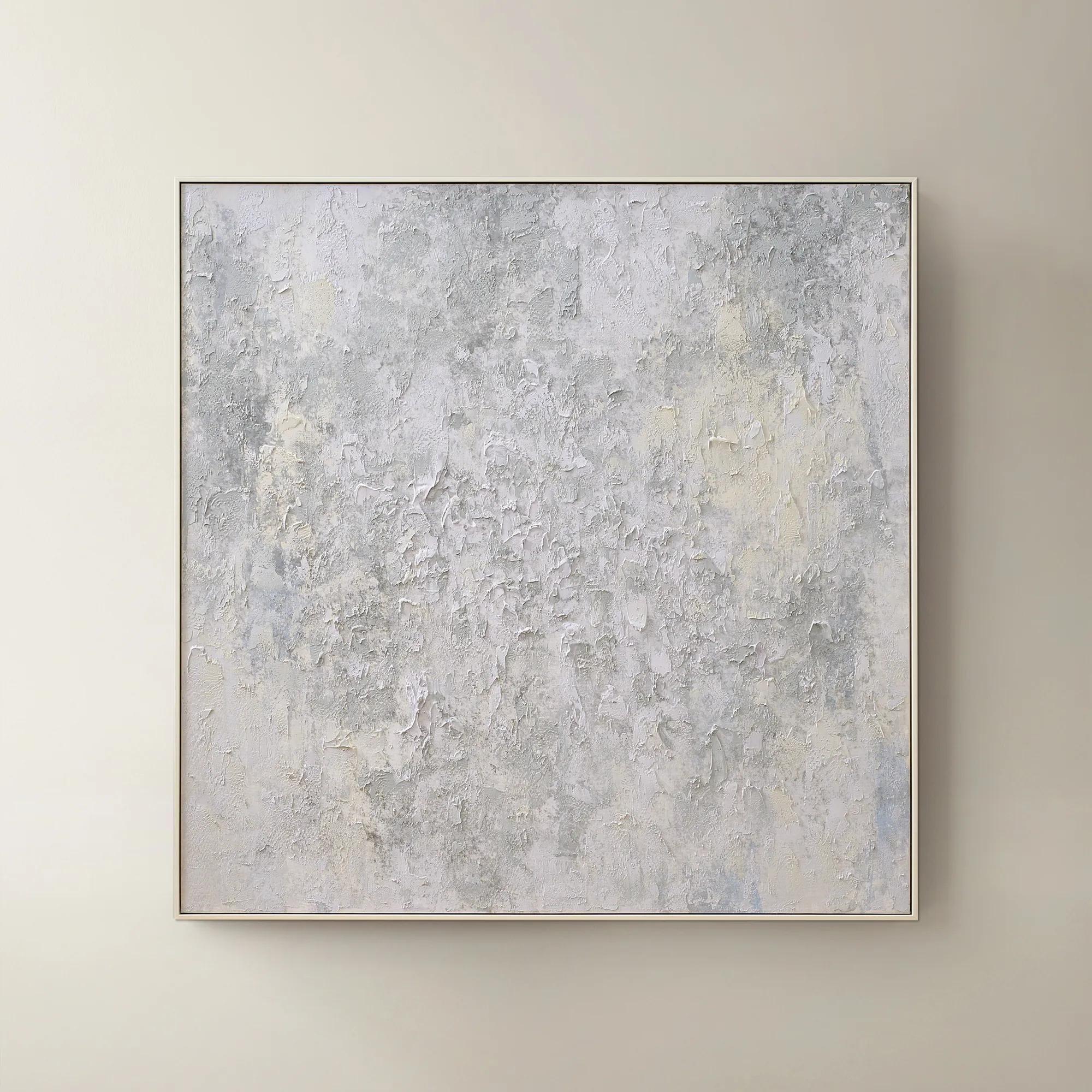 Breathe of Fresh Air Framed Painted Wall Art 50" x 50"$499
A hand-painted abstract canvas in dusty blue hues, elegantly framed in white for a serene, modern accent.
Add To Cart -
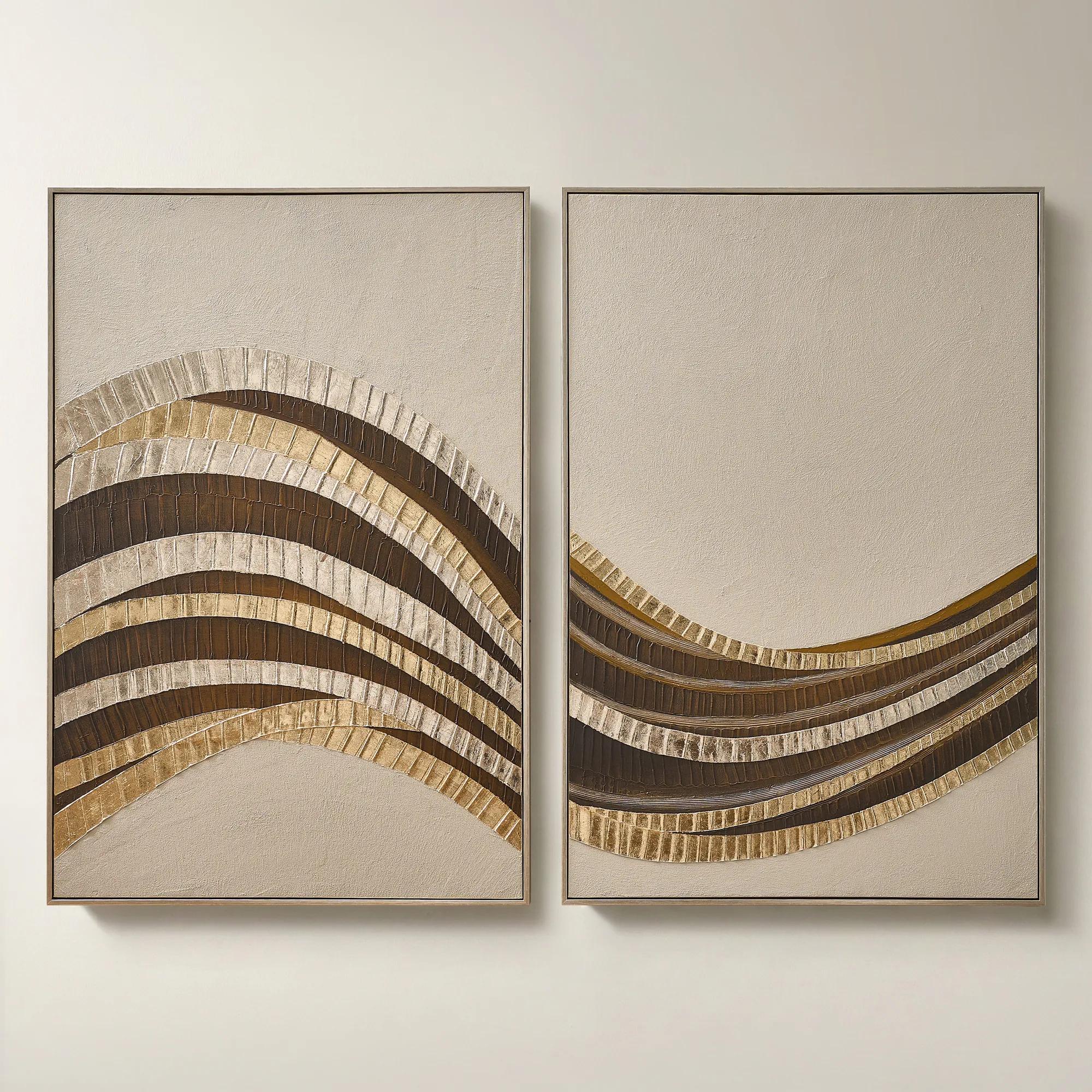 Stillness in Motion Framed Gold Leaf Painted Wall Art 40" x 60" Set of 2$899
A hand-painted abstract diptych with gold leaf accents, textured surface, and brushed champagne frames.
Add To Cart -
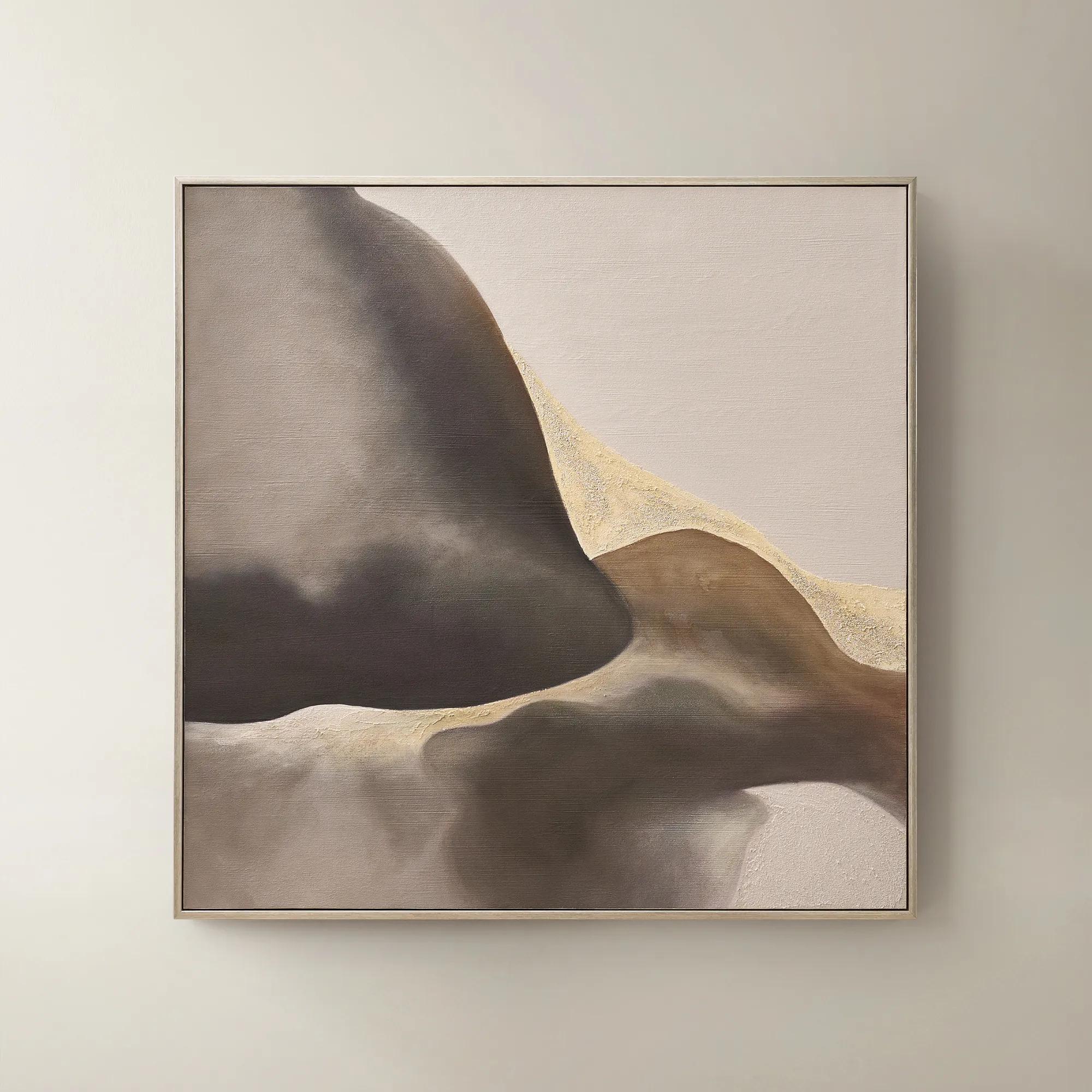 Windswept Framed Gold Leaf Painted Wall Art 50" x 50"$549
A hand-painted abstract canvas in plum truffle with gold leaf accents and a brushed champagne frame.
Add To Cart -
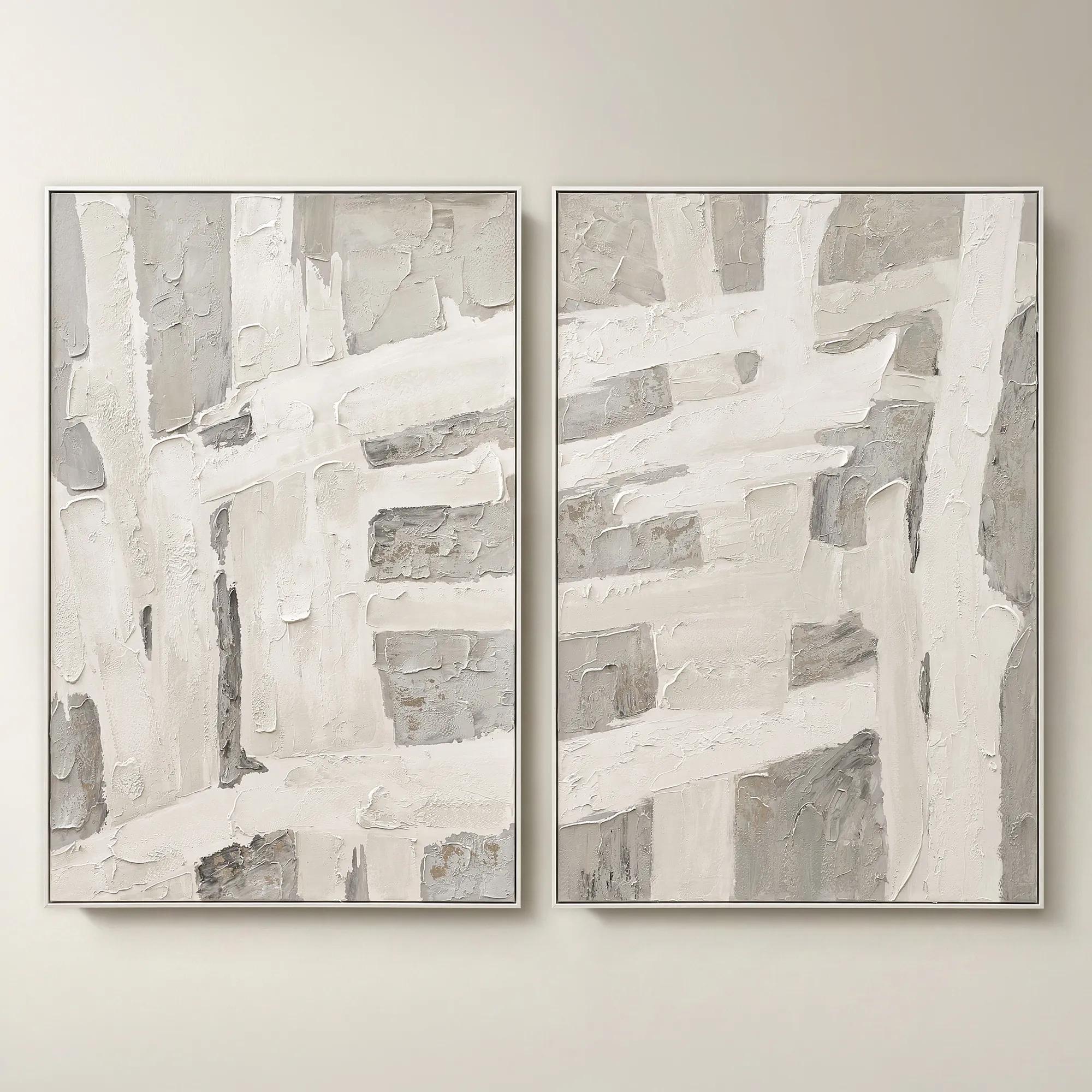 Traverse Framed Painted Wall Art 40" x 60" Set of 2$799
A hand-painted abstract diptych features champagne accents and soft grey, pearl, and alabaster tones in white frames.
Add To Cart -
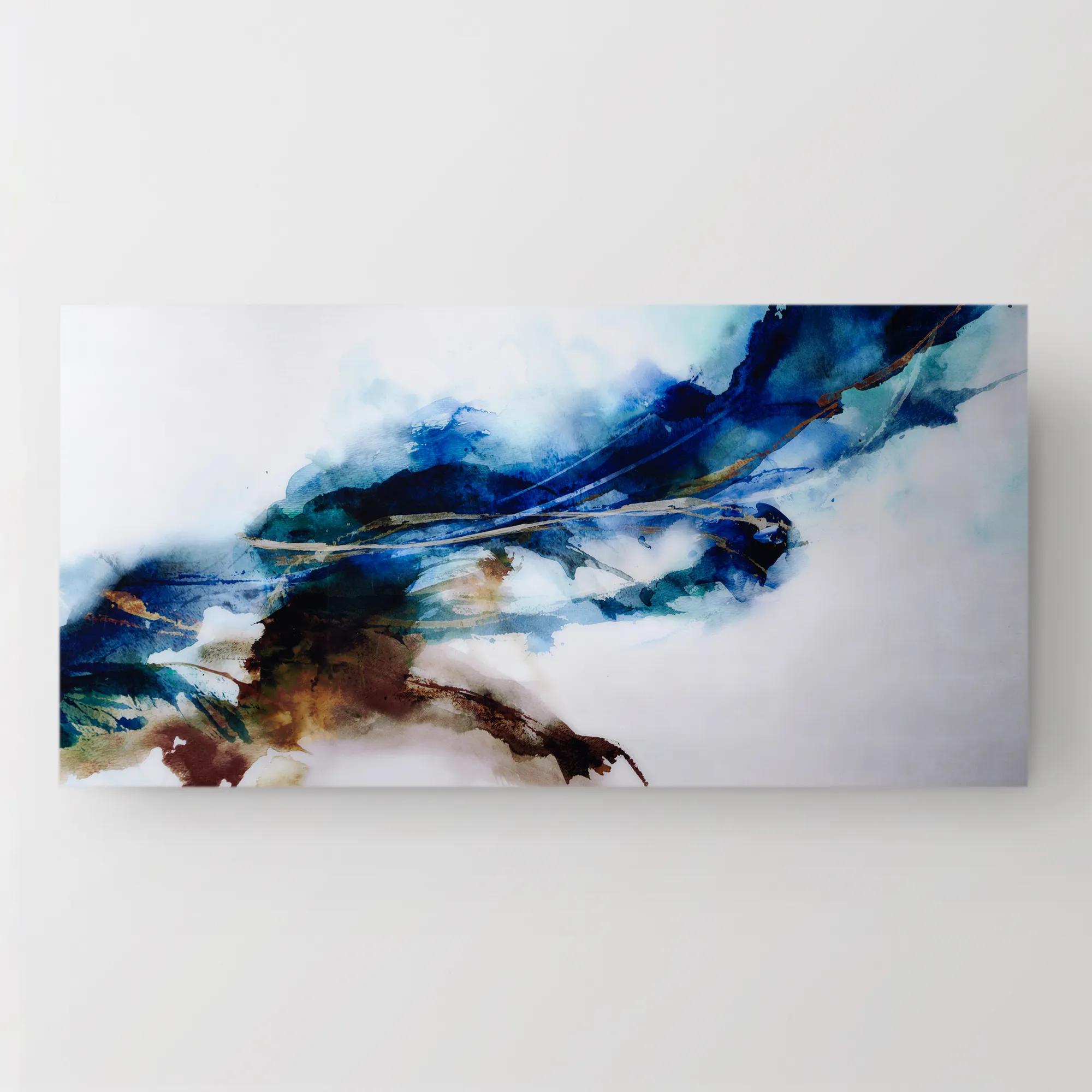 Cerulean Movement Acrylic Art 72" x 36"$1299
A vibrant abstract artwork printed on high-gloss acrylic, infusing your space with dynamic energy and movement.
Add To Cart -
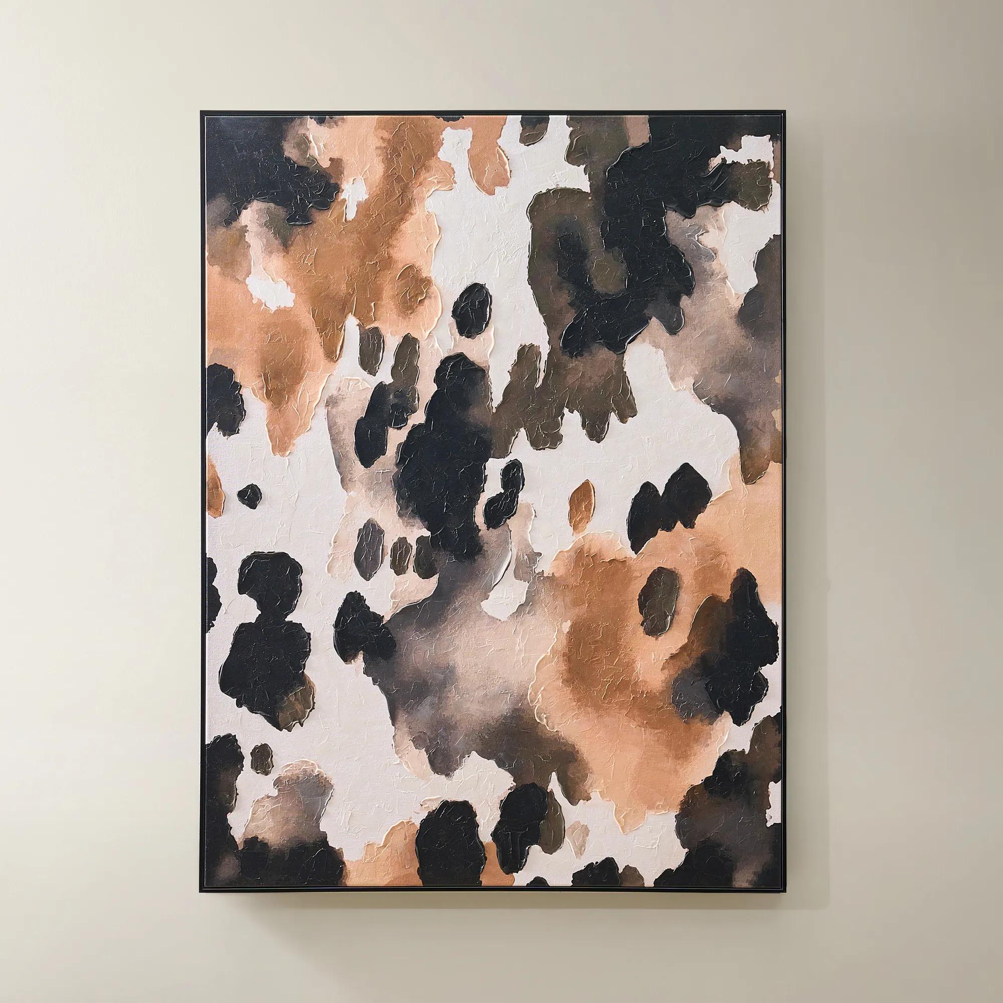
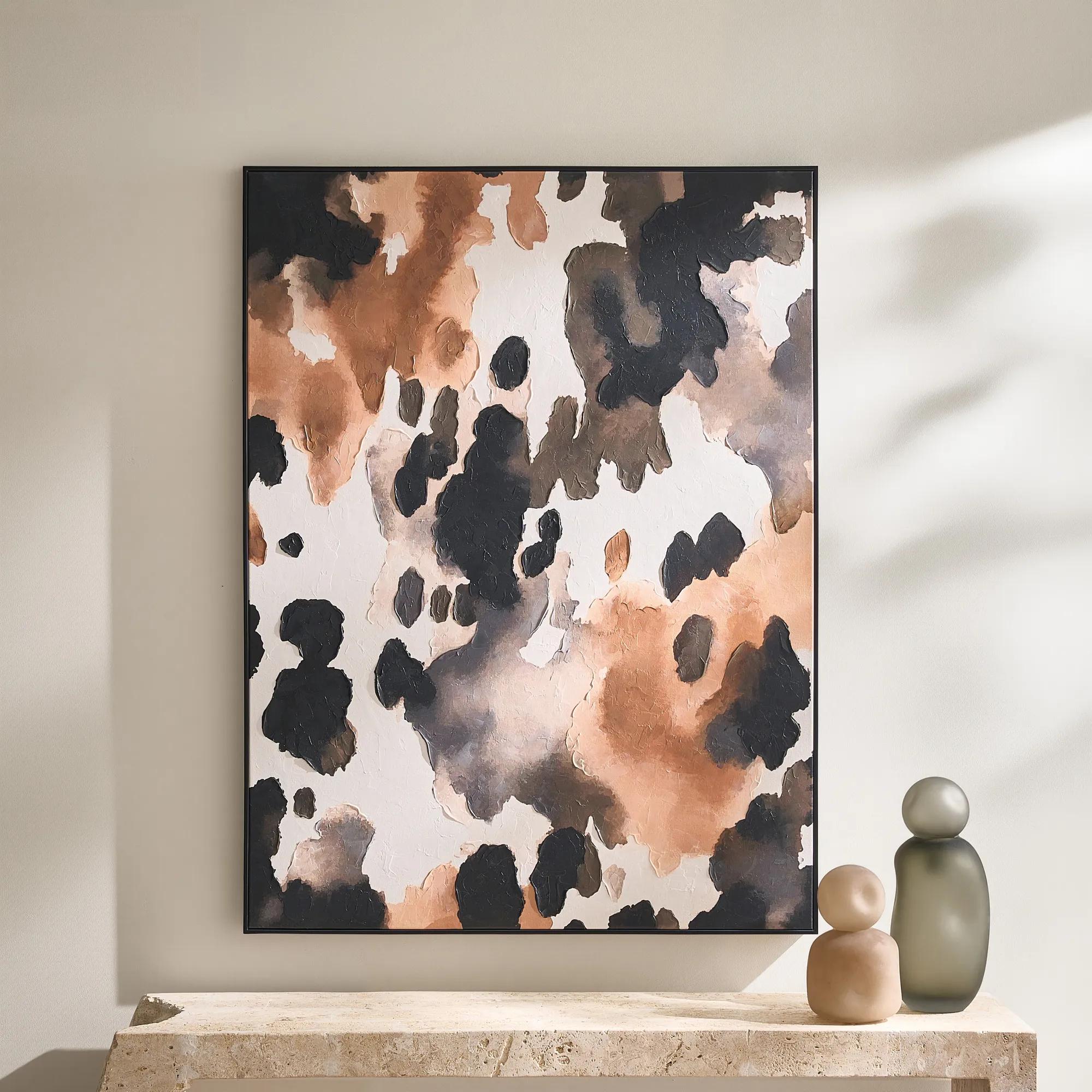 Wilder Framed Painted Wall Art 36" x 48"$499
An abstract hand-painted canvas featuring inky black, taupe, ivory, and coral hues in a sleek black frame.
Add To Cart -
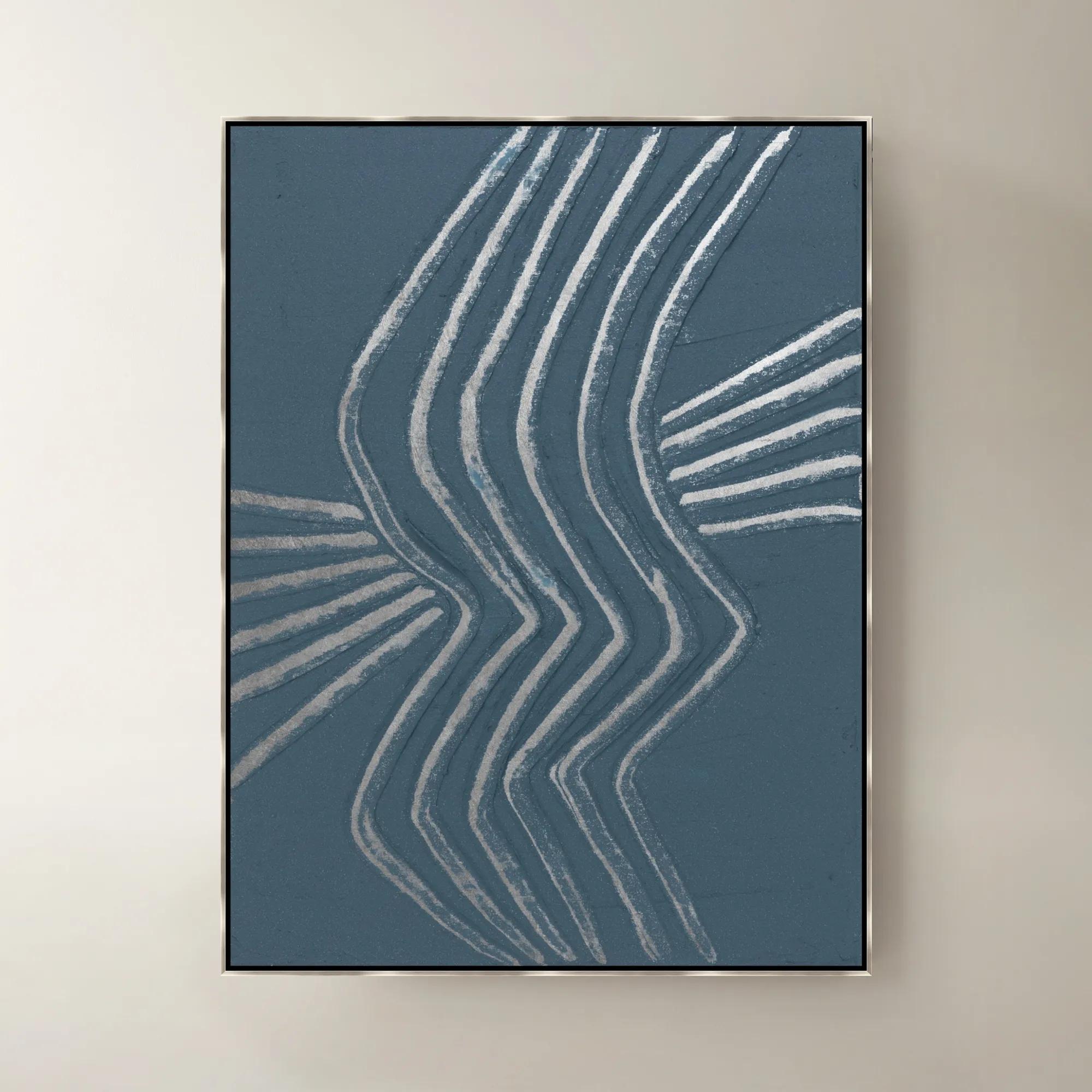
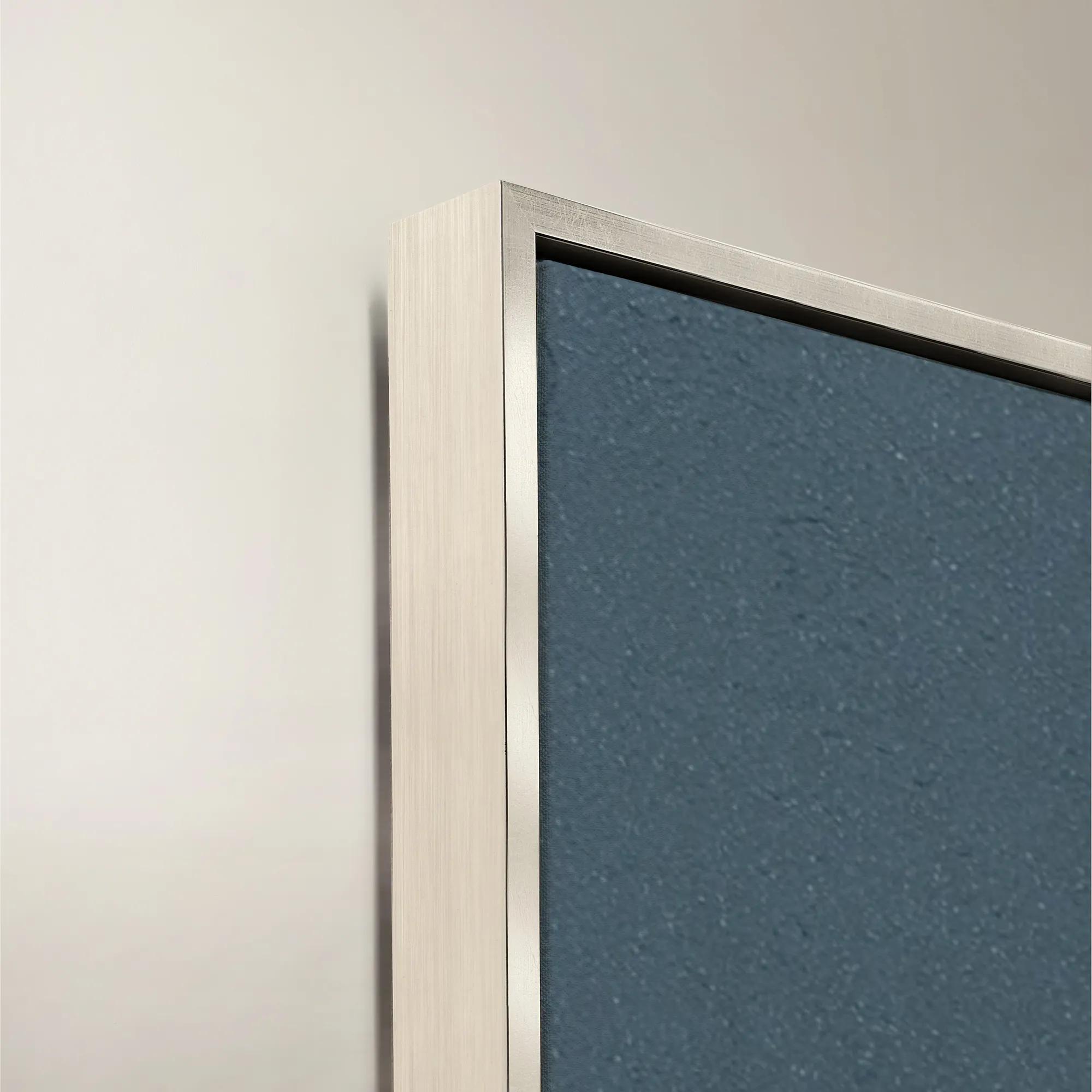 Gilded Waves IV Framed Painted Wall Art 40" x 53"$1399
A framed painted canvas artwork featuring flowing gilded waves in soothing blue and purple tones.
Add To Cart -
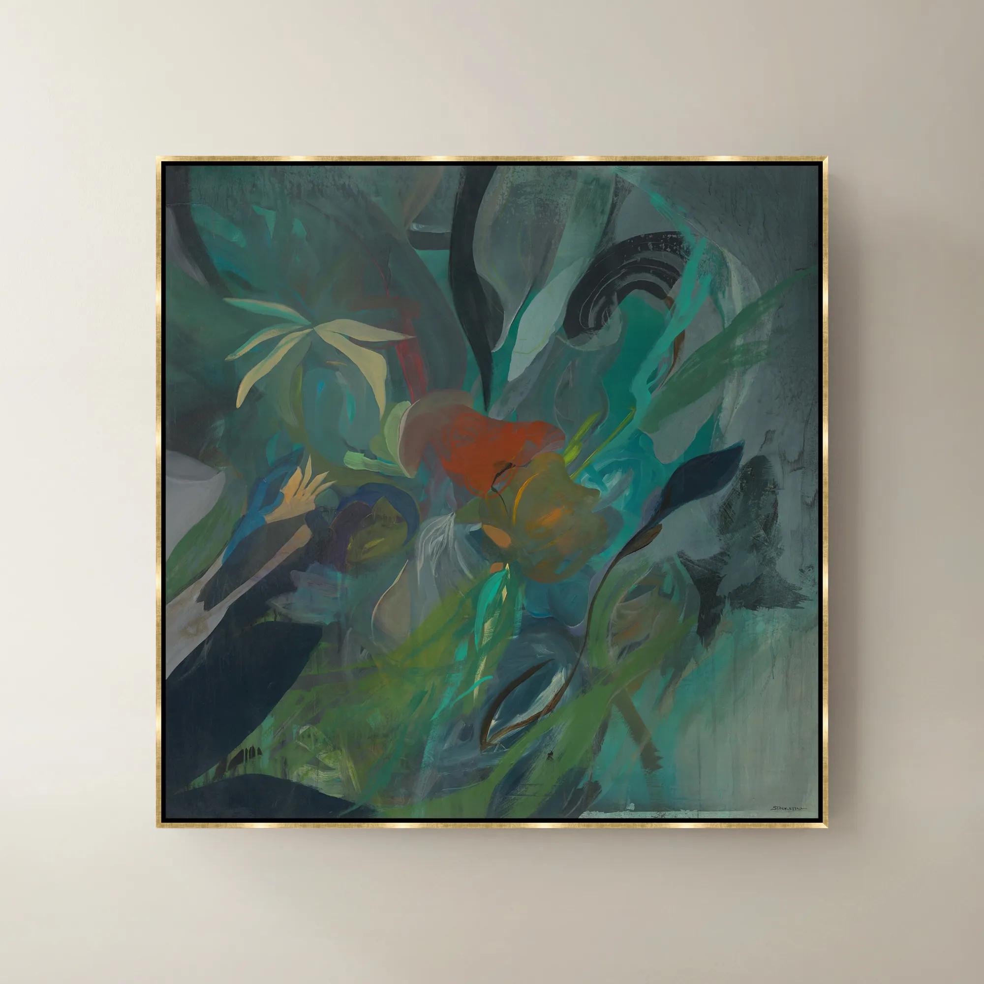
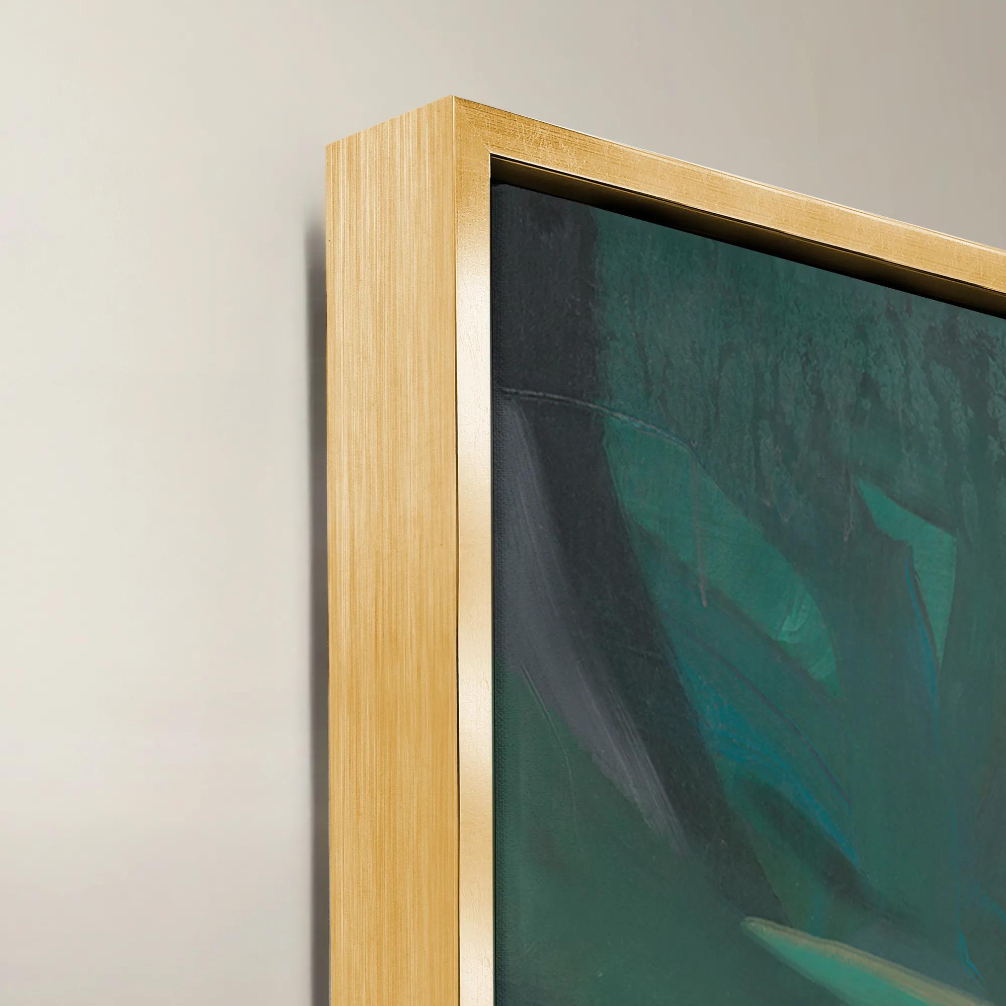 Fresh Places Framed Wall Art 47" x 47"$1199
A vibrant green canvas wall artwork with a sophisticated framed finish, bringing contemporary character to interiors.
Add To Cart -
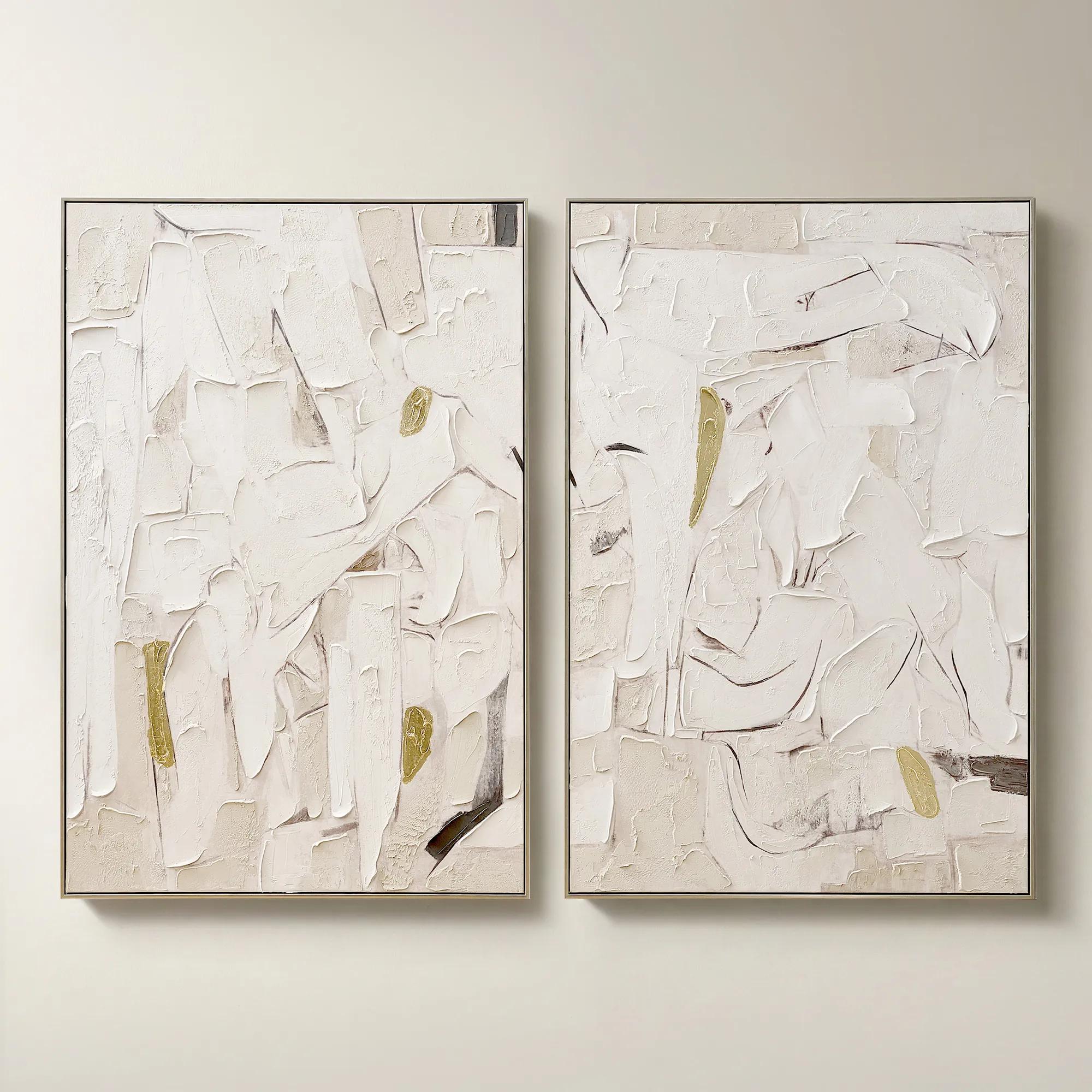 Beneath the Surface Framed Gold Leaf Painted Wall Art 40" x 60" Set of 2$799
A hand-painted abstract diptych featuring gold detailing and layered texture in alabaster and tawny hues.
Add To Cart -
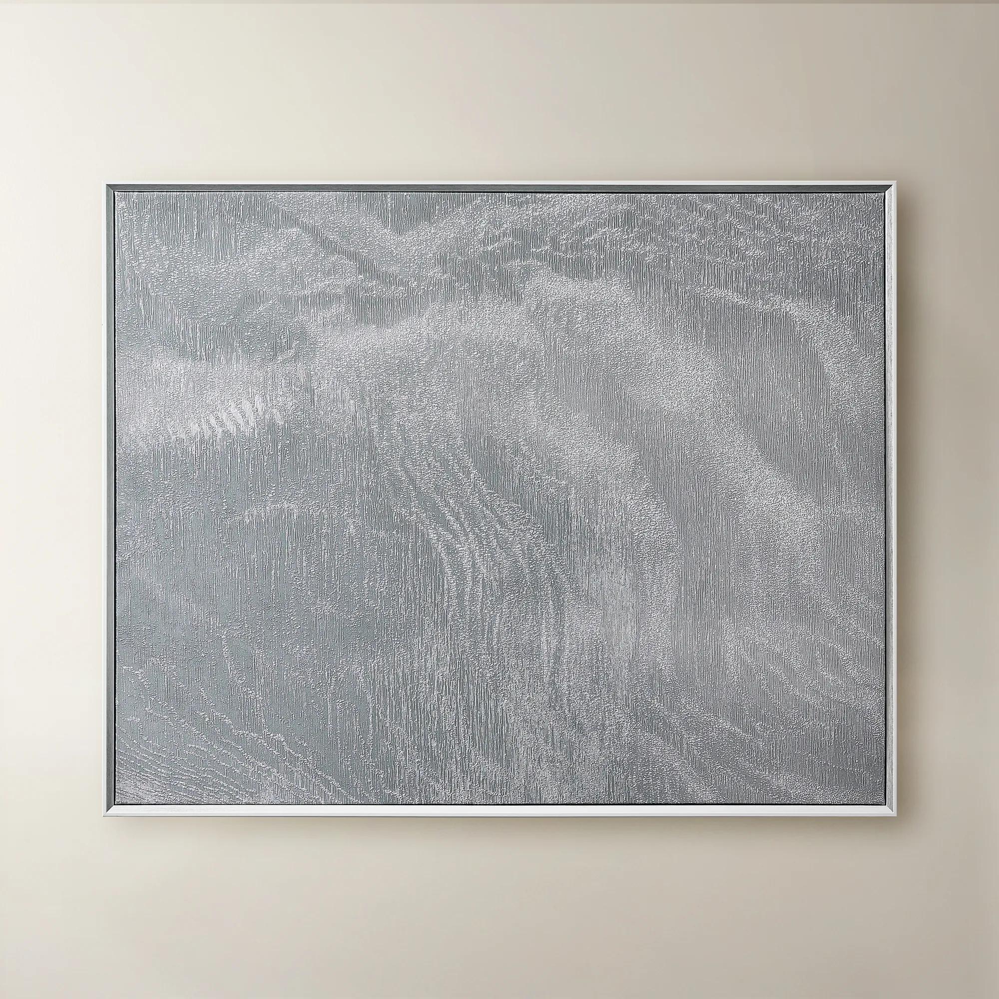 Slow Blue Morning Framed Silver Foil Wall Art 48" x 60"$599
A serene powder blue abstract canvas with silver foil accents, framed in silver and white for modern elegance.
Add To Cart -
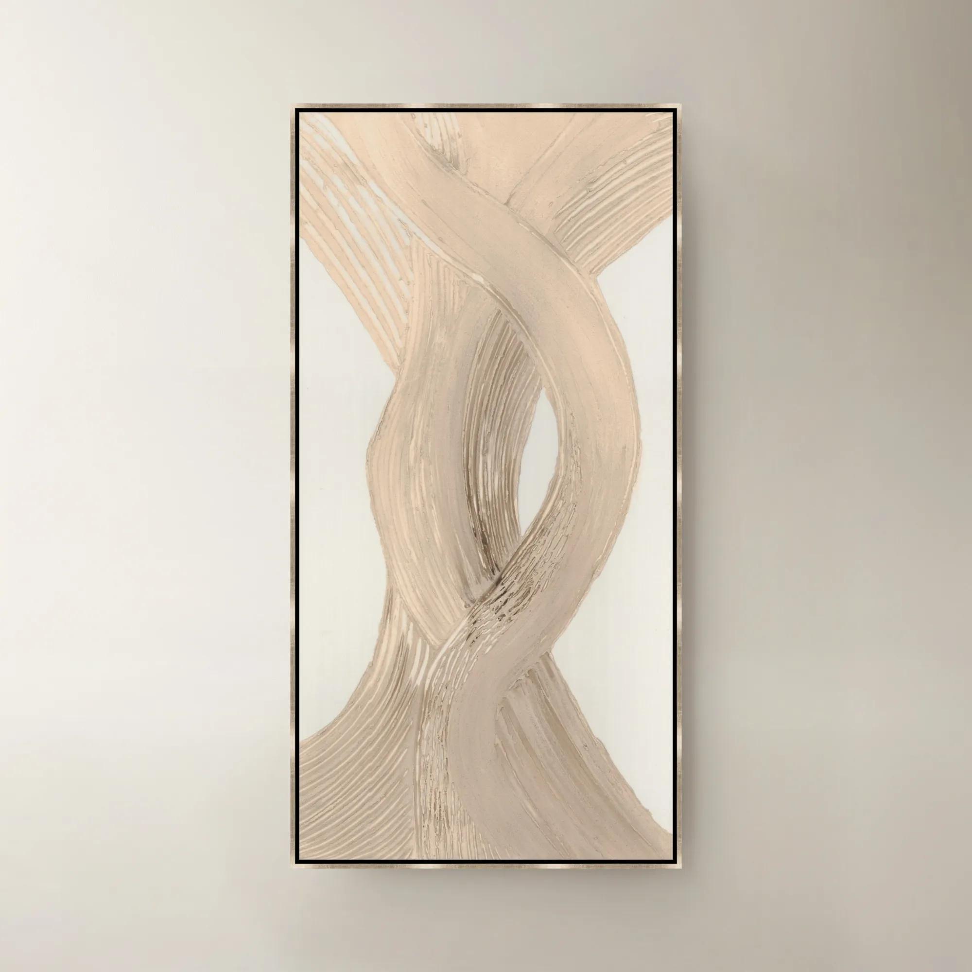
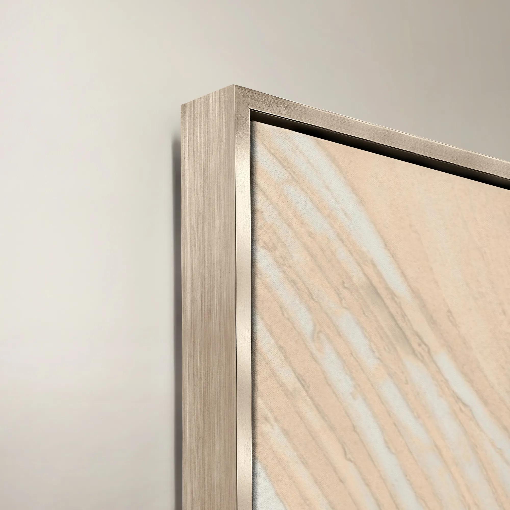 Rosy Sentiments Framed Painted Wall Art 30" x 60"$1199
A romantic painted canvas artwork in rosy hues, presented in an elegant gold frame.
Add To Cart -

 Escape Path III Framed Wall Art 30" x 50"$799
A captivating blue and purple canvas artwork adding contemporary movement and layered dimension to your walls.
Add To Cart -
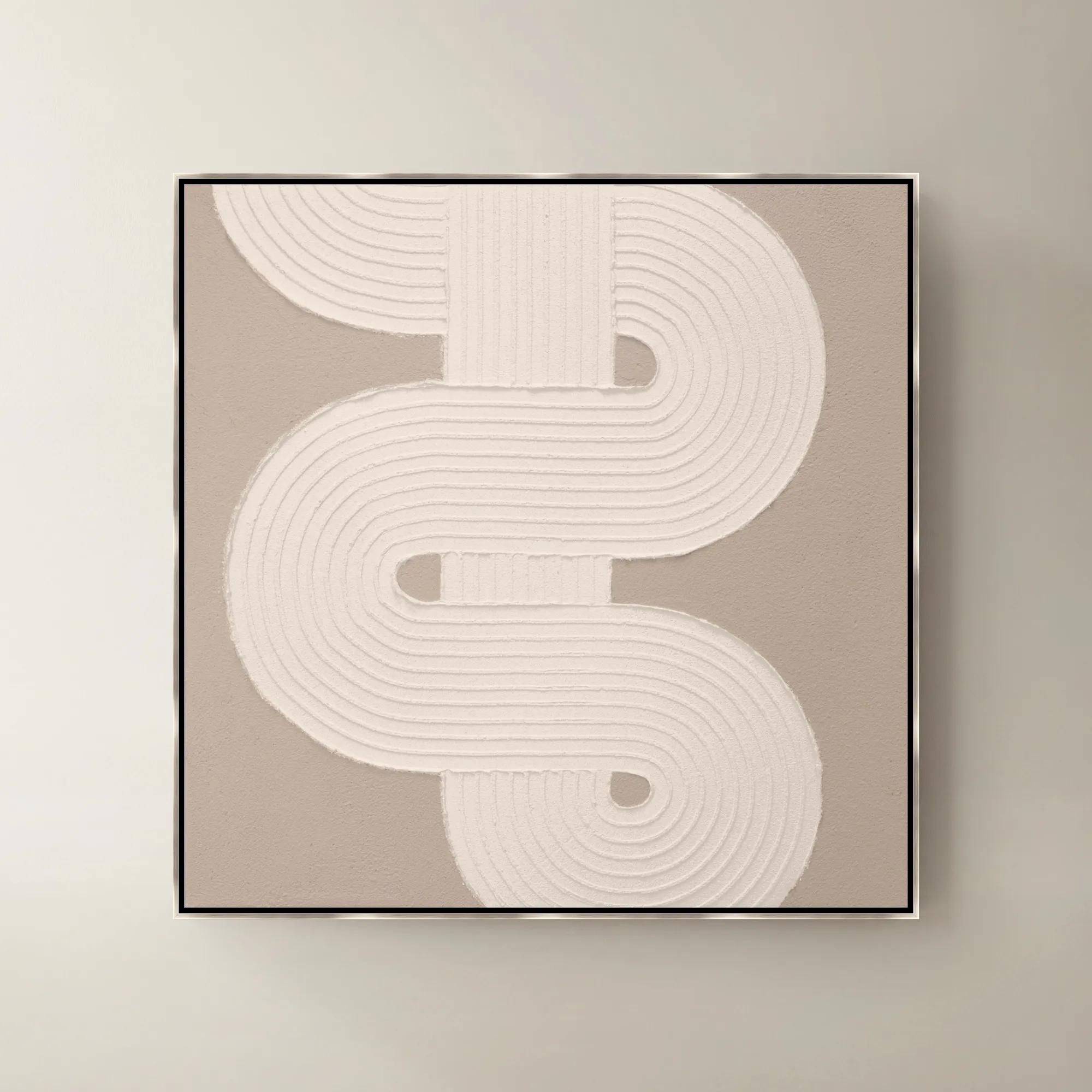
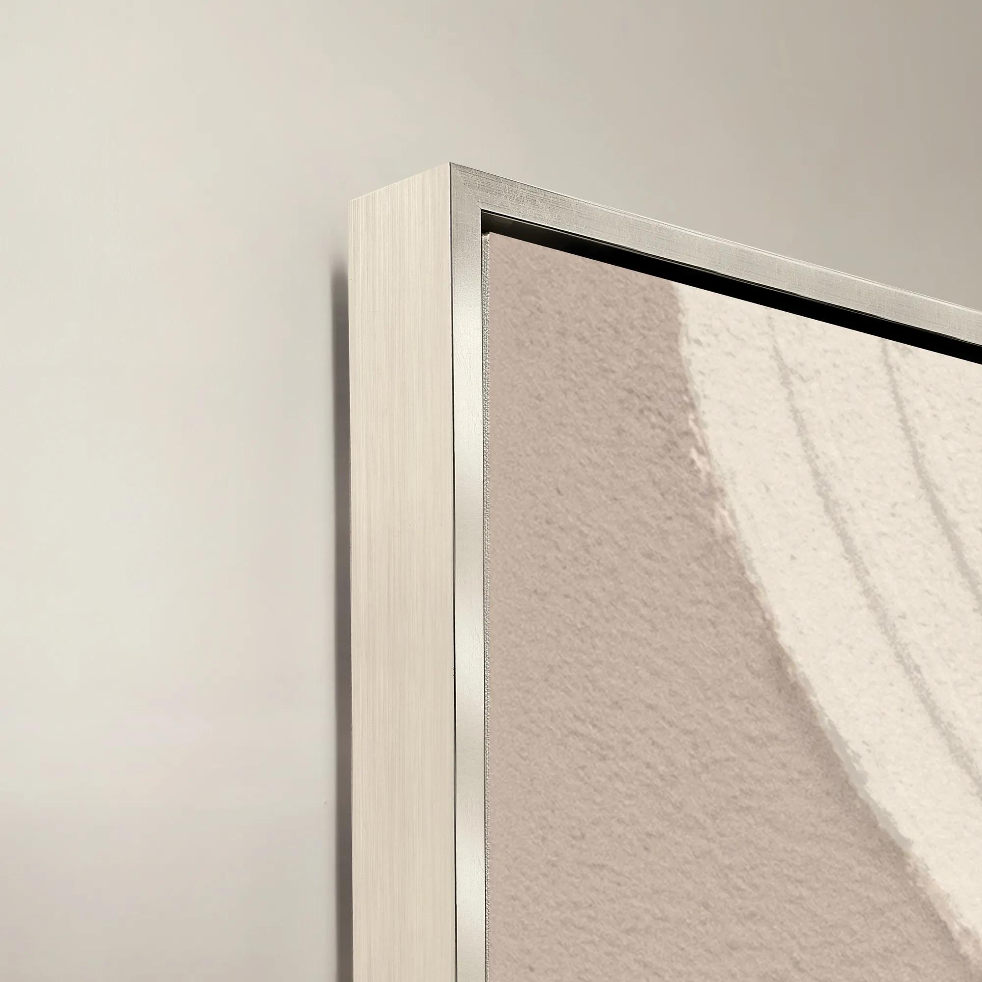 Sacred Geometry V Framed Painted Wall Art 40" x 40"$1099
A striking abstract art piece featuring bold geometric patterns for a modern, sophisticated touch.
Add To Cart -
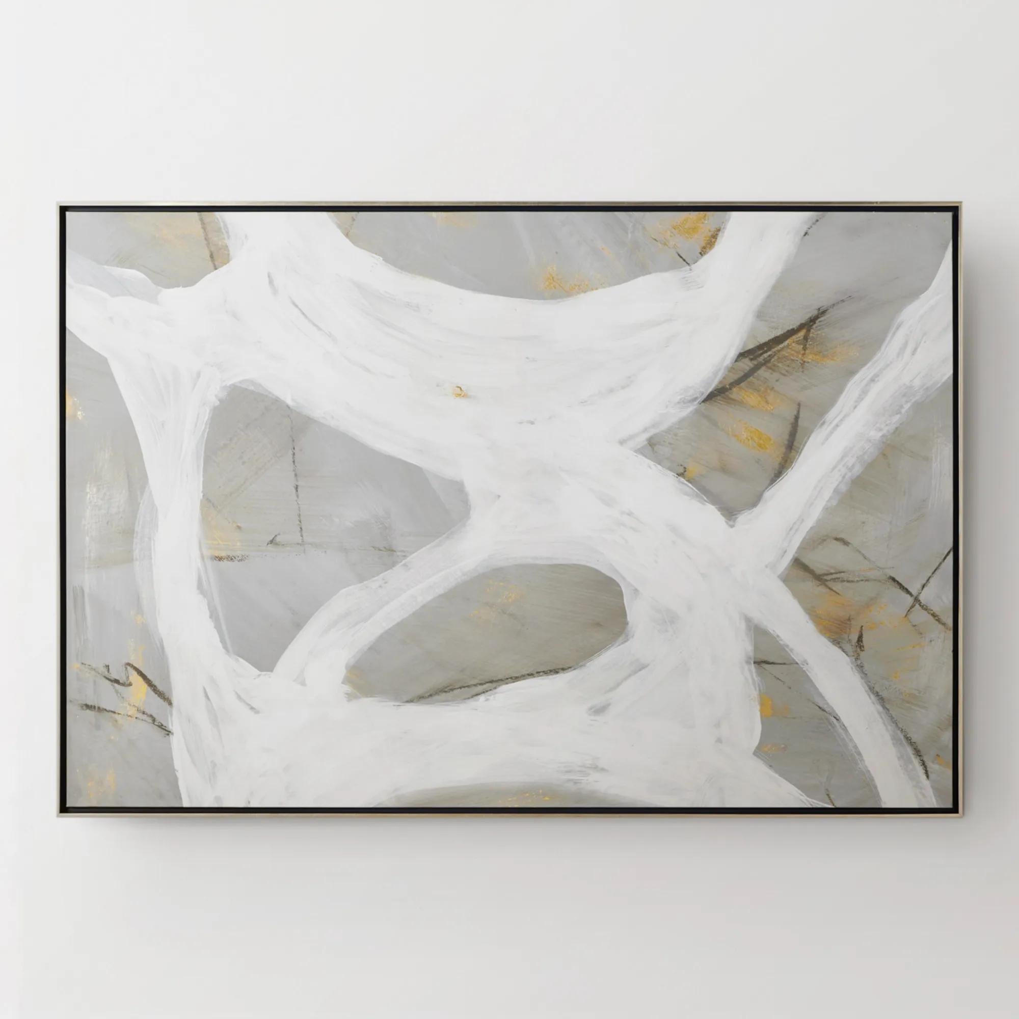
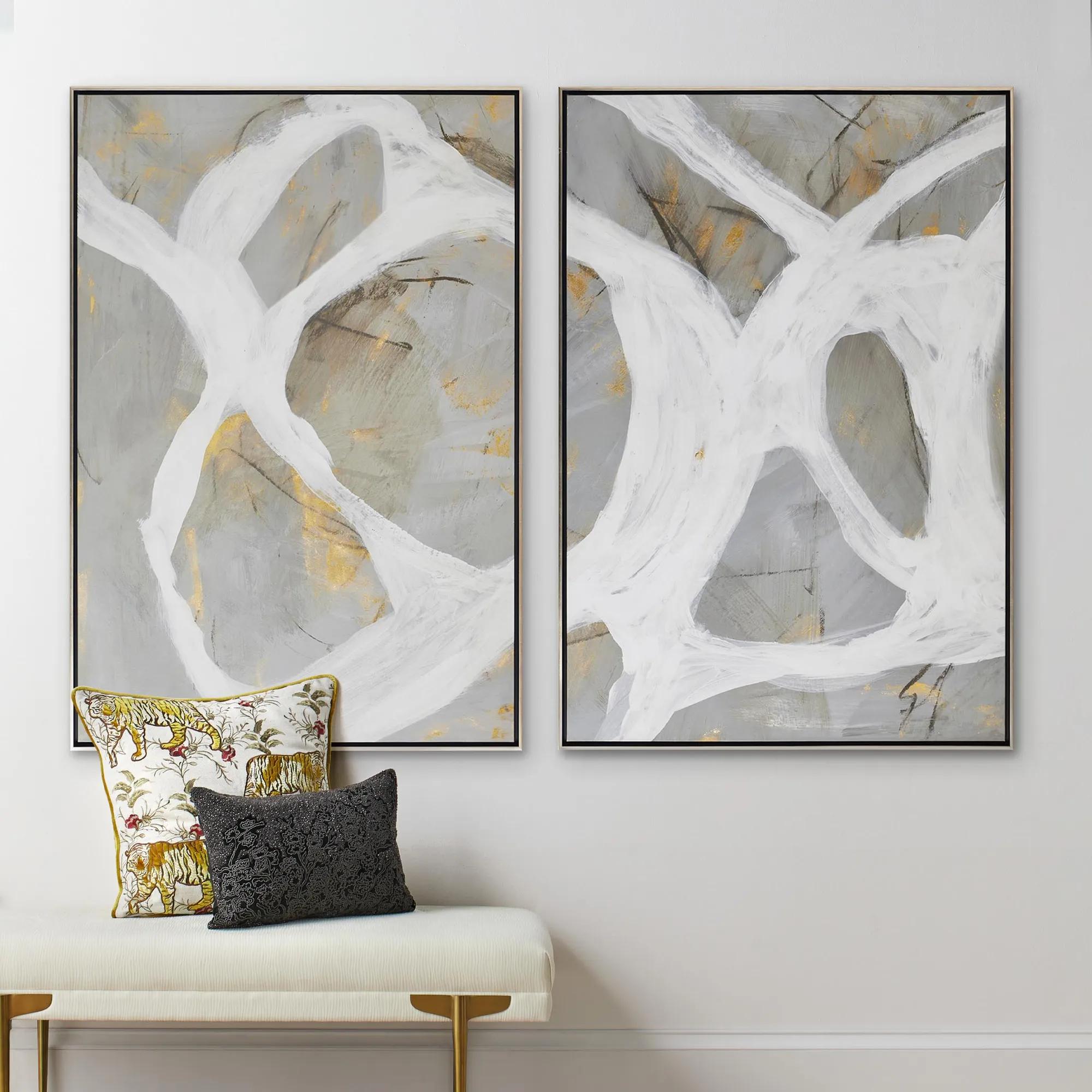 Les Series Framed Painted Wall Art II 61" x 41"$1099
An abstract canvas artwork featuring bold brushstrokes, hand-applied gold accents, and a silver floater frame.
Add To Cart -

 Rosebud Framed Painted Wall Art 40" x 60"$1599
A framed painted canvas artwork featuring elegant gold tones for sophisticated modern interiors.
Add To Cart

Abstract Wall Art For Summer Trends
Dare to let your walls steal the spotlight with abstract wall art for summer trends—a curated celebration of color, movement, and imagination. This season, transform blank spaces into bold expressions of personality, where sunlit brushstrokes and daring compositions evoke the energy of endless summer days. Each piece invites you to break free from the ordinary, infusing your home with a sense of wonder and creative vitality. Elevate your sanctuary with art that doesn’t just decorate—it dazzles, capturing the very essence of summer’s spirited allure.
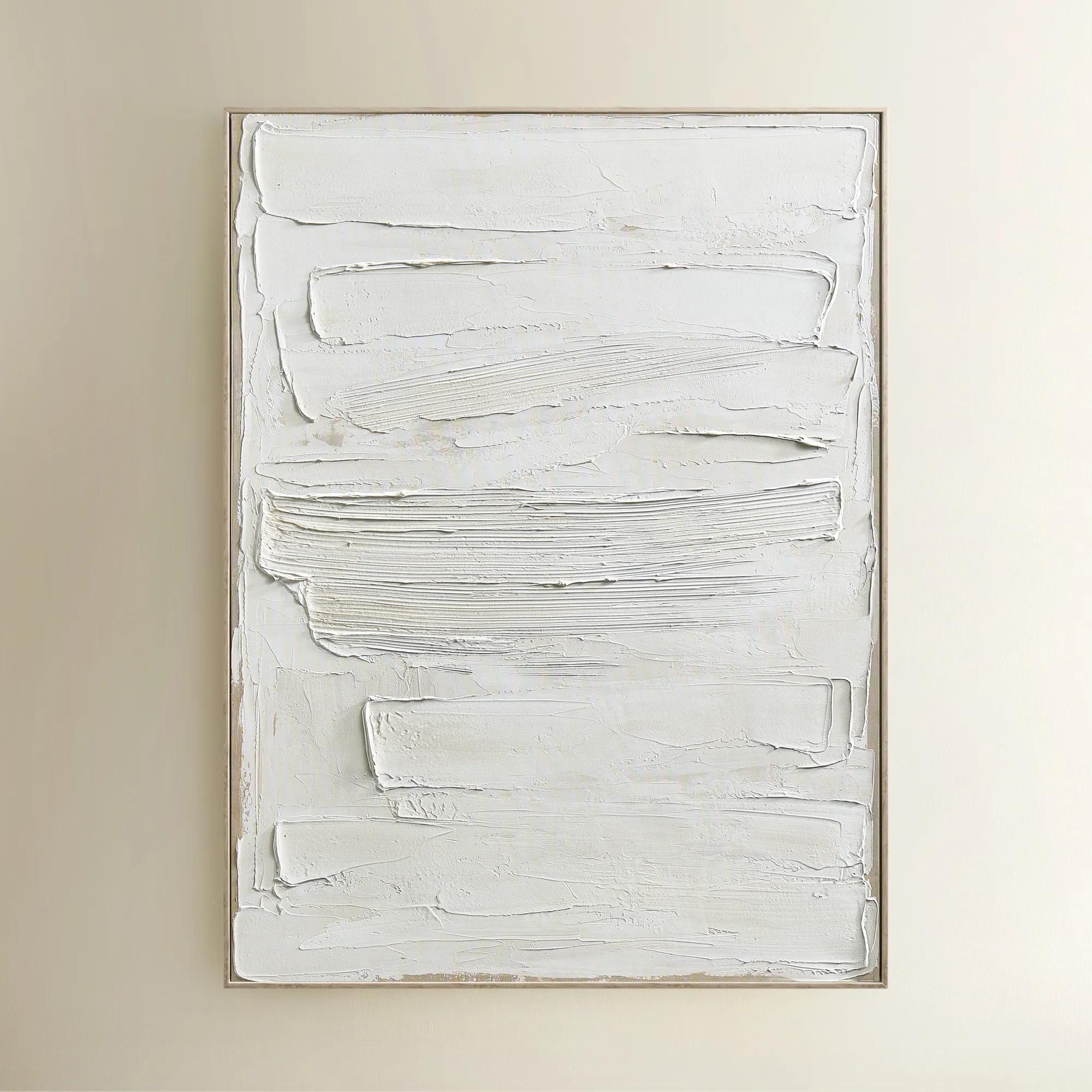
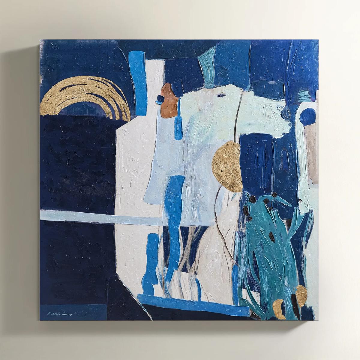
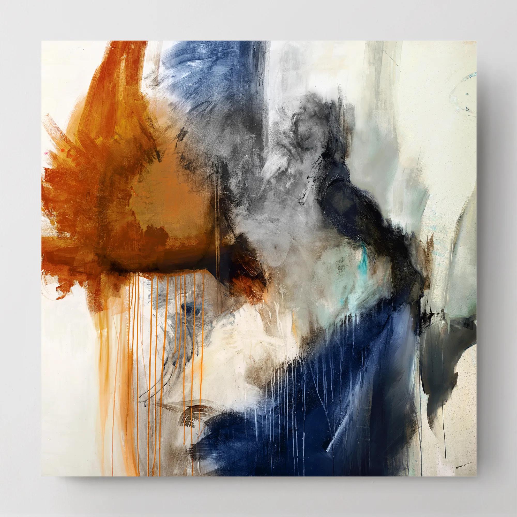
Abstract wall art for summer brings together warm earth tones, ocean-inspired color, expressive brushwork, and tactile surfaces that give a room depth without weighing it down. These summer trends translate the feeling of sunlit landscapes and coastal escapes into shape, movement, and atmosphere rather than literal scenery. Sweeps of ivory and sand can suggest an open shoreline; terracotta, ocher, and clay introduce the richness of sunbaked architecture; cobalt and turquoise create a more saturated, dramatic interpretation of water and sky. The appeal lies in that freedom of expression. A composition of blurred horizons may feel serene above a tailored sofa, while a field of energetic marks lends an otherwise restrained dining room an unmistakable artistic charge. Negative space matters just as much as color: generous areas of pale canvas allow a bold gesture to command attention without competing with every object nearby. For interiors built around cream upholstery, warm wood, and gleaming metallic accents, an earthy abstract can draw those finishes into a cohesive palette. In a room with lacquered furniture or sculptural lighting, a stronger contrast of blue, white, and charcoal creates a crisp focal point with presence. Coastal influence need not mean shells, sailboats, or overt beach imagery. Fluid lines, translucent washes, and mineral tones convey the same sense of escape with a more sophisticated vocabulary. The palette explored in Blue Wall Art for Summer Decor offers another expression of this mood, from misty blue passages to deep, inky gestures. Paired with a sand-colored rug or a porcelain vessel, those shades can establish a summer-inspired setting that remains compelling beyond a single season. Abstract artwork is especially versatile because its meaning is not fixed; the same sweeping curve might suggest a wave, a breeze, or simply the pleasure of color in motion. That openness makes it a natural choice for homes where personal interpretation is part of the design.
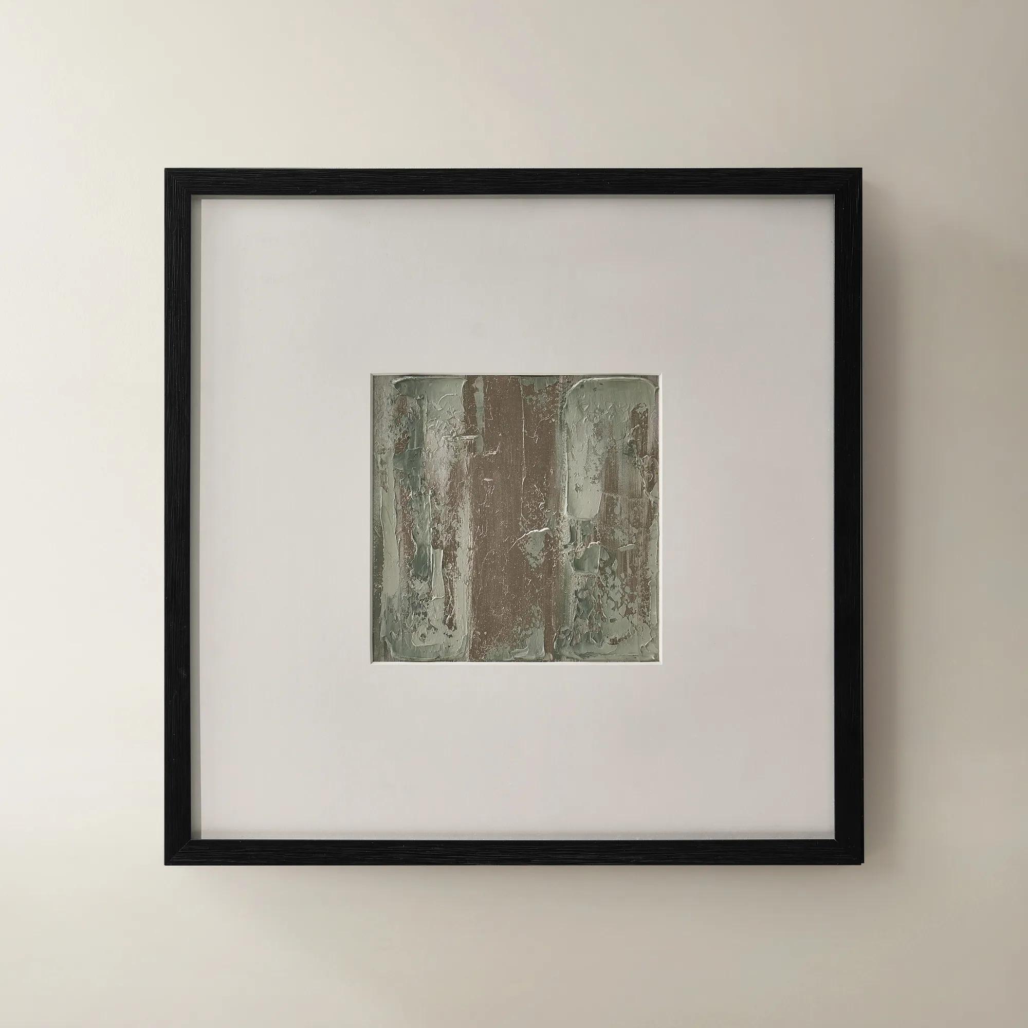
Scale, surface, and framing determine how that artistic energy lives within a room. Oversized abstract wall art gives a broad living room wall a deliberate center of gravity, especially when the composition has enough visual space to be appreciated from across the seating area. A smaller framed work can bring equal intention to a reading corner, a bedroom dresser, or the wall above a narrow entry console. As a starting proportion, artwork spanning roughly two-thirds to three-quarters of the furniture beneath it often feels balanced, though the weight of the frame and the openness of the composition can change that relationship. A pale, expansive canvas may carry a larger footprint gracefully, while a dense arrangement of dark marks can make a modest piece feel commanding. Diptychs and coordinated groupings introduce rhythm, with the spaces between panels becoming part of the composition. Consistent spacing and a shared centerline help those arrangements feel considered rather than crowded. Materials add another dimension to the effect. Canvas brings a visible weave and a softer, less reflective presence; works on paper can gain definition from generous matting and a finely proportioned frame. Layered paint, raised applications, and mixed-media elements create shadows that change with the direction of light, giving tactile abstract art its sculptural appeal. Printed imagery can offer intricate tonal transitions, while the substrate, print process, and protective finish influence both its appearance and care requirements. Glass or acrylic glazing can help protect paper-based artwork, but reflections deserve consideration in rooms with large windows or bright lamps. A slender metallic frame draws out luminous accents, a dark frame sharpens pale washes, and a natural wood finish adds warmth to cool blue compositions. Before selecting a size, account for the full framed dimensions, adjacent sconces, nearby doorways, and the distance from which the artwork will usually be seen. The strongest fit respects the architecture while giving the art enough room to make its statement.
Summer-inspired abstract art suits spaces designed for both retreat and connection. In a living room, sweeping forms can soften the geometry of a sectional and anchor a conversation area without introducing another busy pattern. Above a dining sideboard, richly layered color provides a striking backdrop for candlelight and reflective serving pieces. A bedroom may call for gentler transitions, with ivory, muted aqua, and warm beige creating atmosphere without a hard visual edge. For a home office, a confident composition can offer an expressive counterpoint to shelves and screens, particularly when its colors echo one or two existing details rather than every accessory. Repeating a single tone in a cushion, vase, or throw is often enough to connect the artwork to the room; surrounding it with too many matching accents can diminish its individuality. Placement also influences longevity. Direct sunlight can fade pigments and paper over time, and glazing labeled for UV protection reduces exposure without eliminating every risk. Interior walls away from moisture, cooking residue, and frequently splashed surfaces generally offer a more suitable setting than humid or heavily used utility areas. Follow the artwork’s care instructions, dust frames gently, and avoid applying household cleaners directly to painted, printed, or textured surfaces. When cleaning glazing is permitted, apply the recommended cleaner to a cloth rather than spraying toward the frame. Secure hanging hardware should suit both the wall construction and the weight of the finished piece, especially for large framed arrangements. For a housewarming or wedding gift, abstract wall art can feel deeply personal when its palette reflects the recipient’s home and its dimensions suit a known space. Smaller formats offer flexibility for someone still shaping an interior, while a substantial composition is best chosen with an established wall in mind. Whether the preference is luminous coastal color, earthy texture, or a daring sweep of pigment, the lasting appeal comes from artwork that feels expressive, thoughtfully placed, and distinctly connected to the people who live with it.
FAQs
This summer, abstract wall art is defined by vibrant color palettes, oversized canvases, and tactile, textured finishes. Trending styles include energetic expressionism with bold brushstrokes, serene coastal-inspired compositions in tranquil blues and whites, and mixed-media pieces that add depth and intrigue to any room. Organic shapes, sunlit hues, and layered patterns are especially popular for creating a lively, inviting atmosphere.
Abstract wall art has the power to instantly refresh a room, infusing it with energy, warmth, and personality. Vibrant, sun-soaked colors and fluid forms evoke the carefree spirit of summer, while textured surfaces catch the light beautifully throughout the day. Whether you seek a dramatic focal point or a calming retreat, abstract art allows you to set the emotional tone and transform the ambiance of your home.
Abstract wall art makes a thoughtful and versatile gift for anyone who appreciates artistic expression or is looking to refresh their home. It’s especially meaningful for new homeowners, newlyweds, or anyone celebrating a milestone. Because abstract art is open to interpretation, it offers the recipient a chance to make it their own and weave it into their personal story.
To make the most of abstract wall art, consider anchoring a room with an oversized canvas or creating a curated gallery wall with a mix of smaller pieces. Layering textured paintings with digital prints or photography adds visual interest and depth. For a breezy, coastal vibe, choose art in blue and white tones and display it where natural light can enhance its luminosity.
Start by considering the existing palette and mood of your space. For a lively, energetic look, opt for bold hues like sunny yellows, burnt oranges, or vibrant blues. If you prefer a calming, coastal-inspired retreat, select art with soft pastels or cool neutrals. Mixing textures and shapes—such as organic curves or geometric lines—can also create a dynamic yet harmonious effect that elevates your summer decor.