Muted Color Landscape Wall Arts
Muted Color Landscape Wall Arts
-
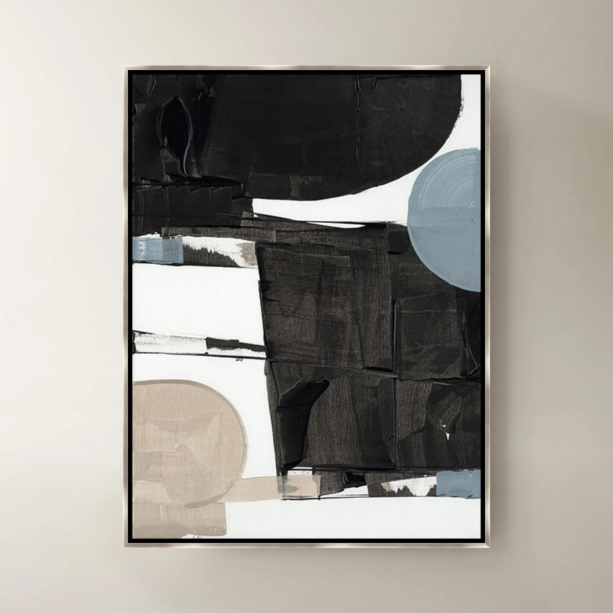
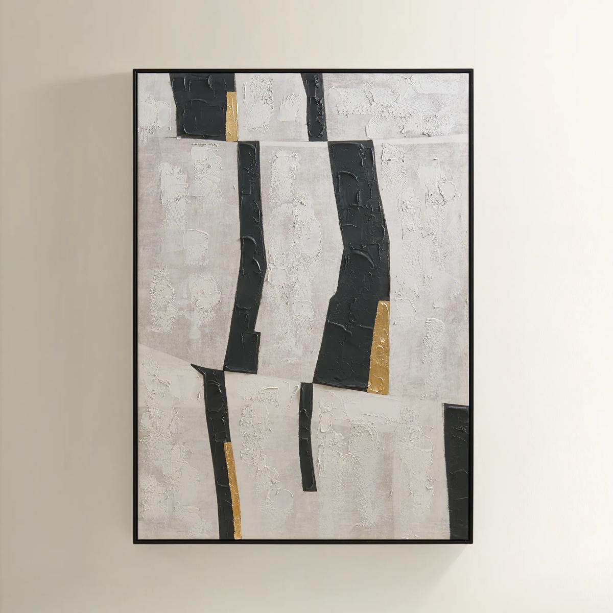
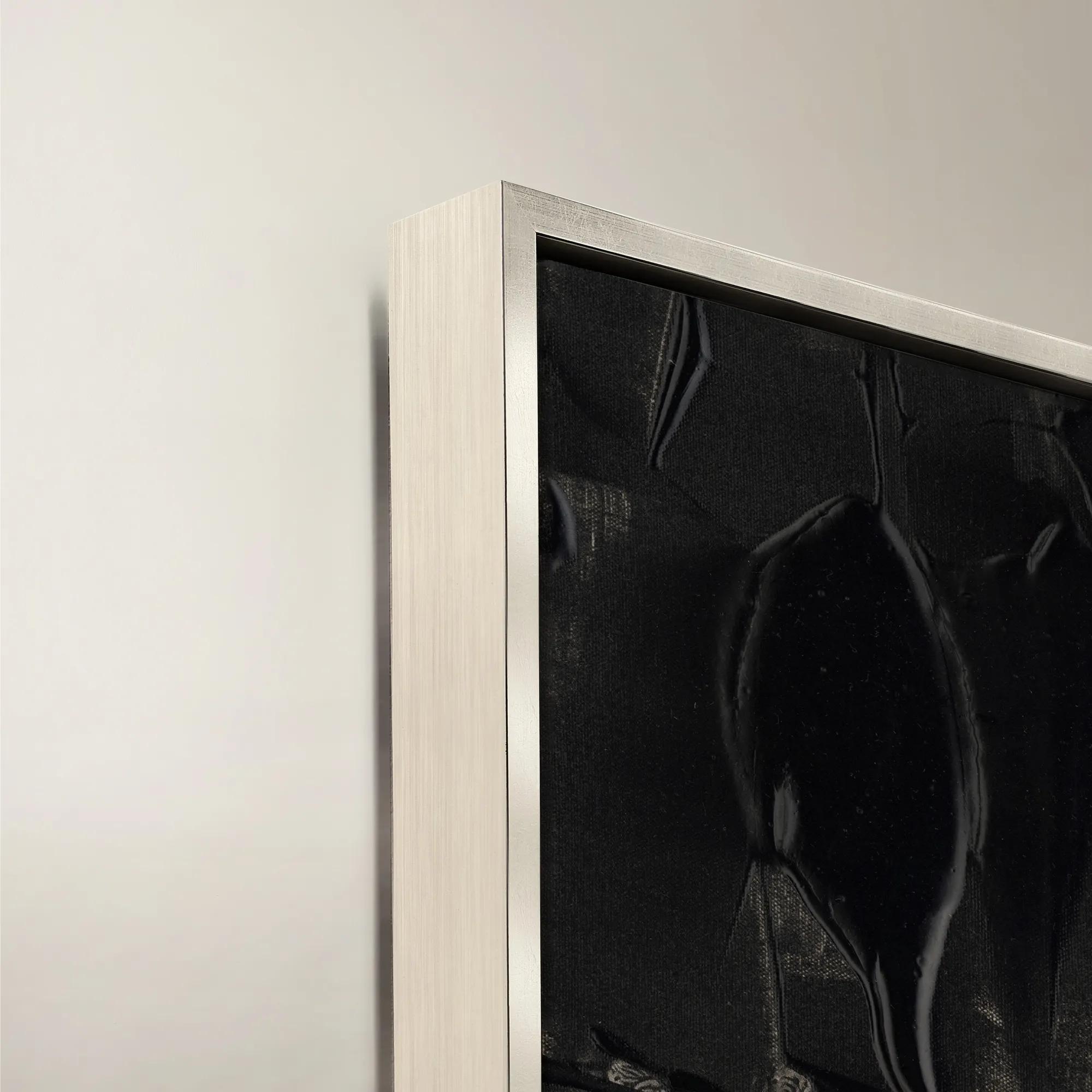 Blanc de Blancs II Framed Wall Art 24" x 30"$519
A sophisticated black canvas artwork presented in a refined frame, bringing modern elegance to your walls.
Add To Cart -
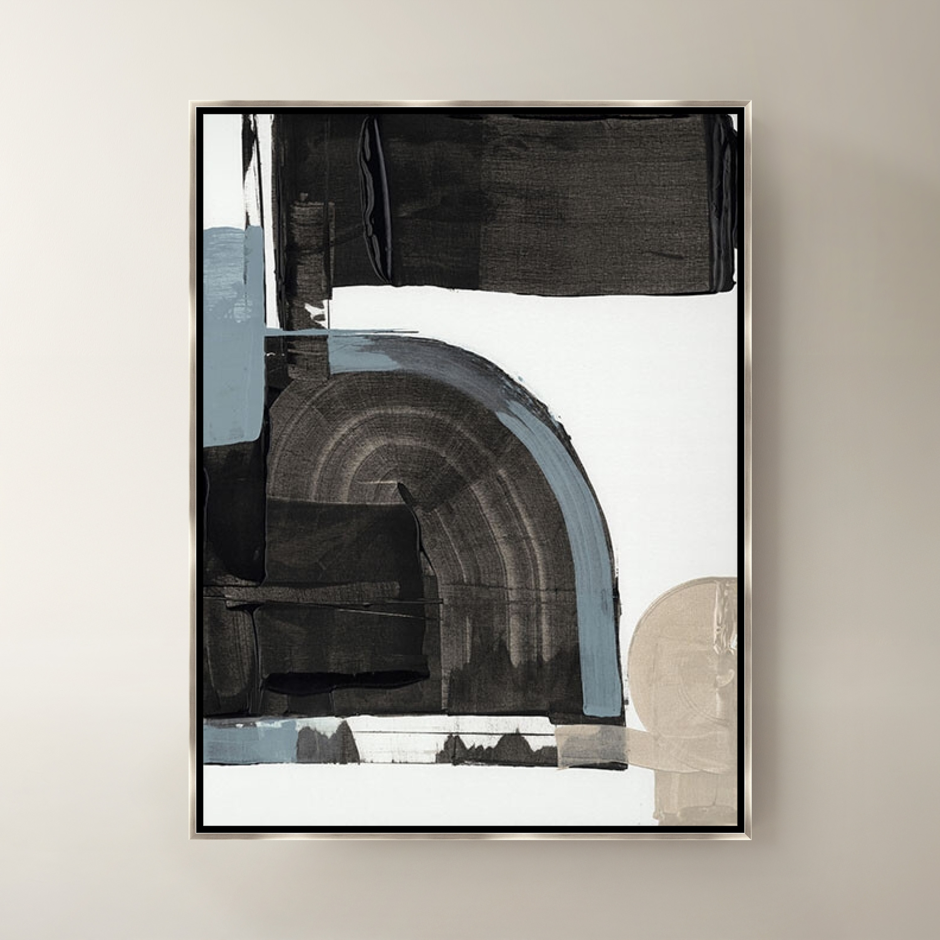
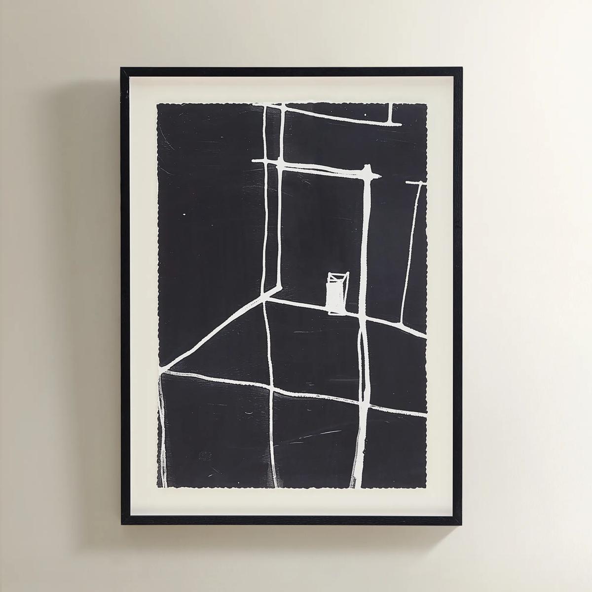
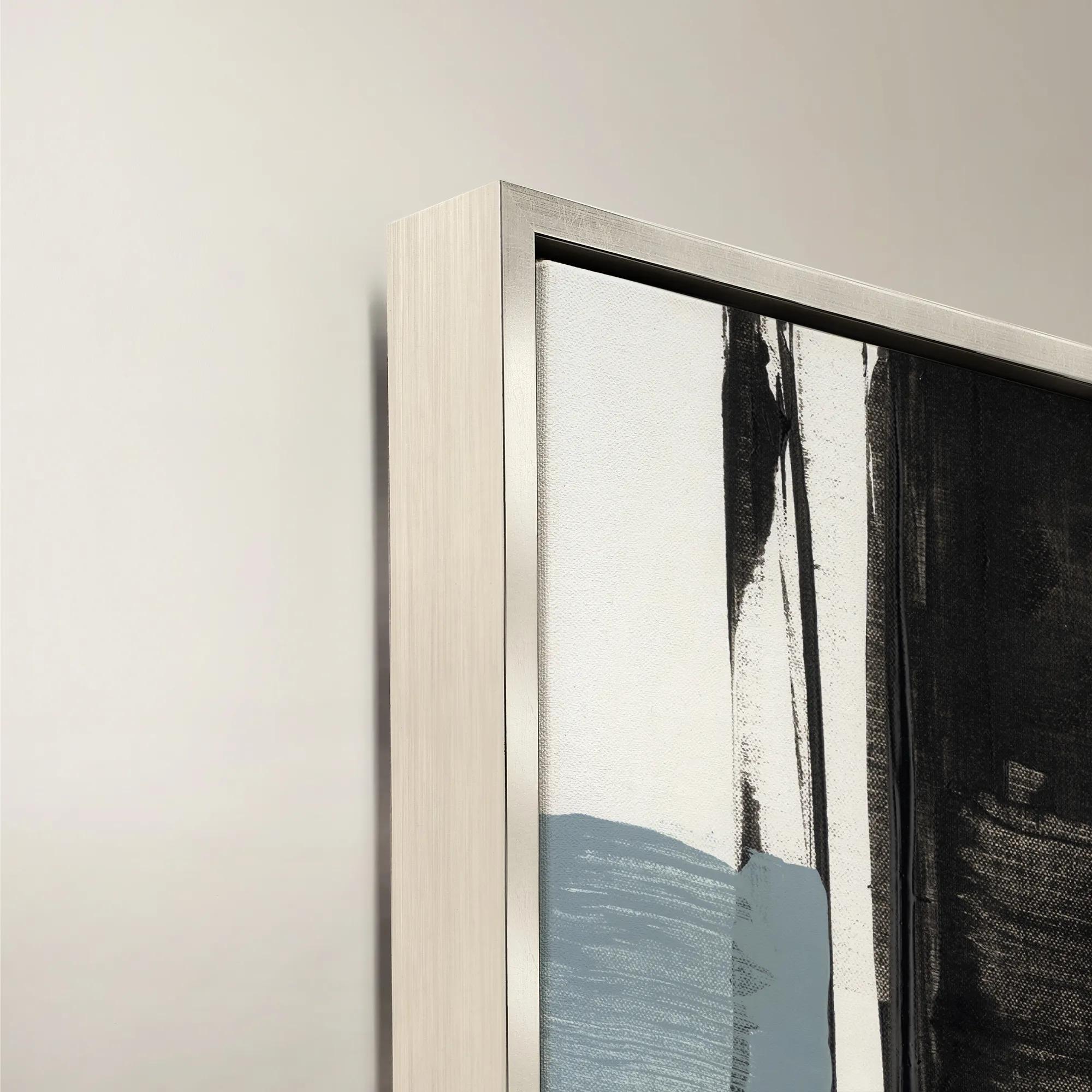 Blanc de Blancs III Framed Wall Art 24" x 30"$519
A sophisticated black canvas artwork presented in a refined frame for modern wall styling.
Add To Cart -
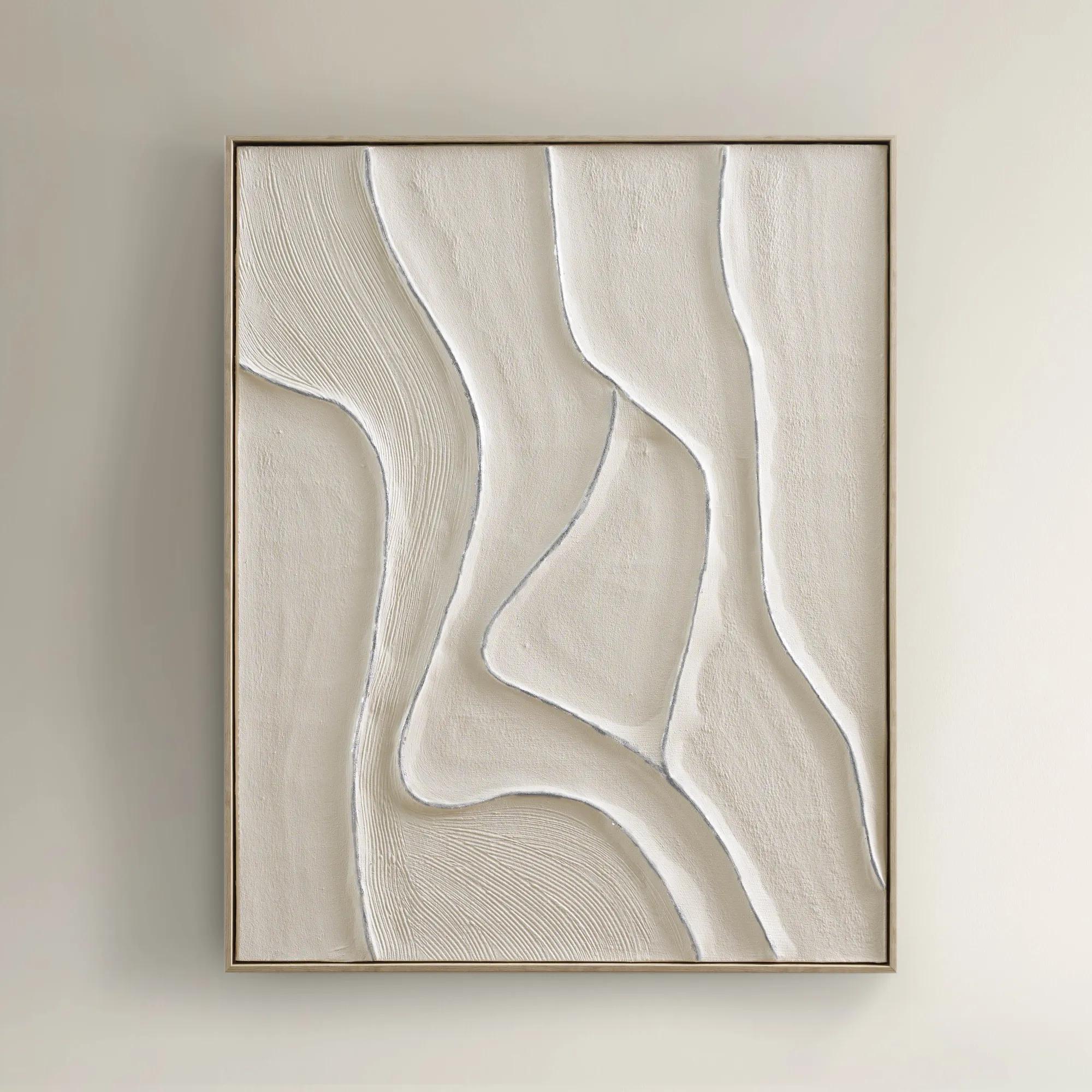
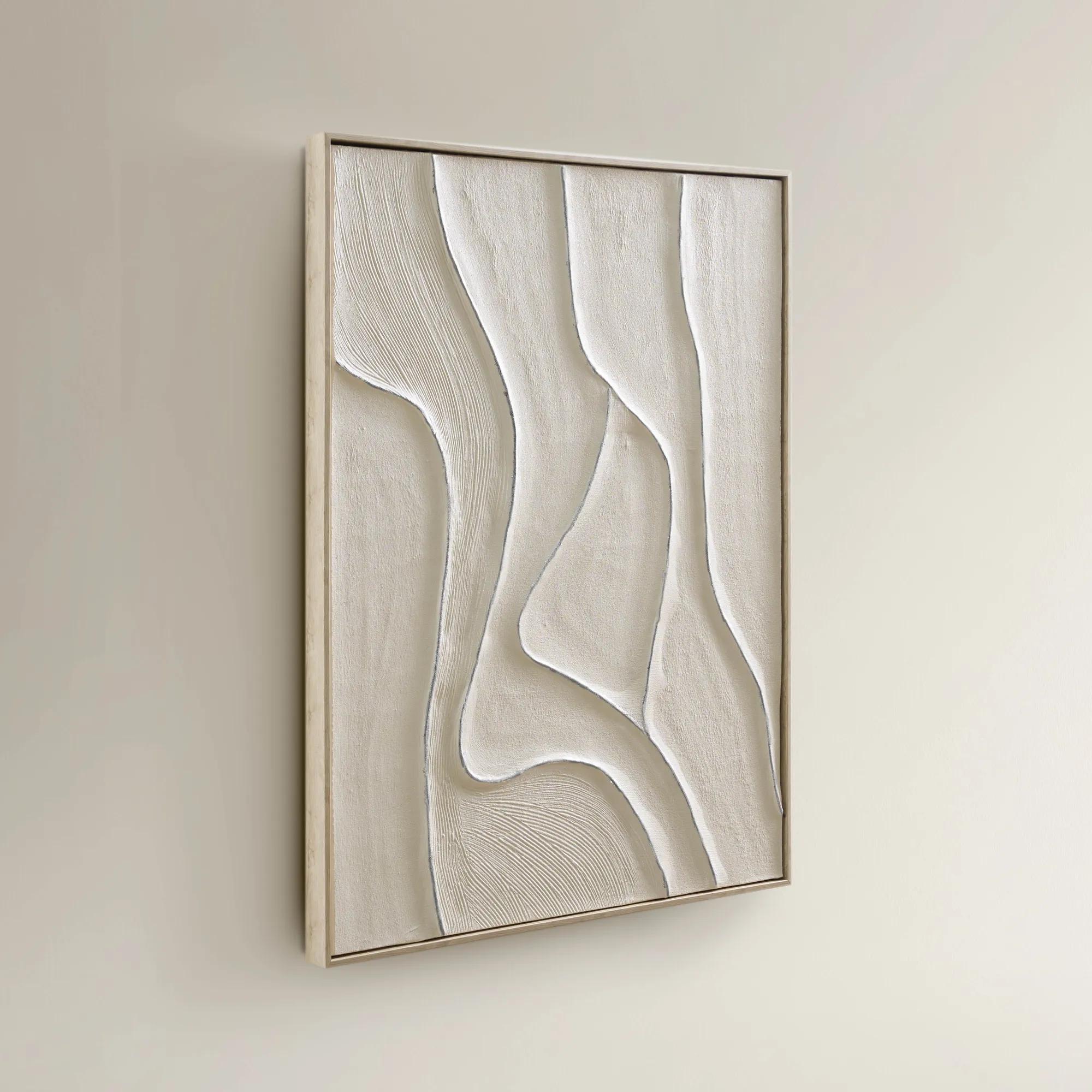 Vivre Framed Painted Wall Art 39.25" x 31.5"$199
A hand-painted canvas featuring tranquil beige hues and flowing lines in a warm whitewash floater frame.
Add To Cart -
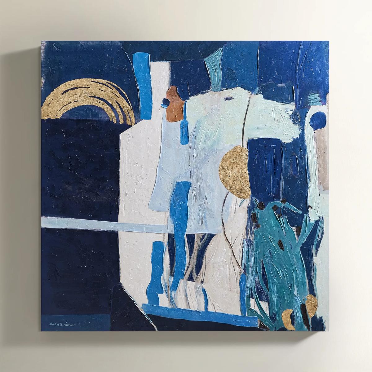
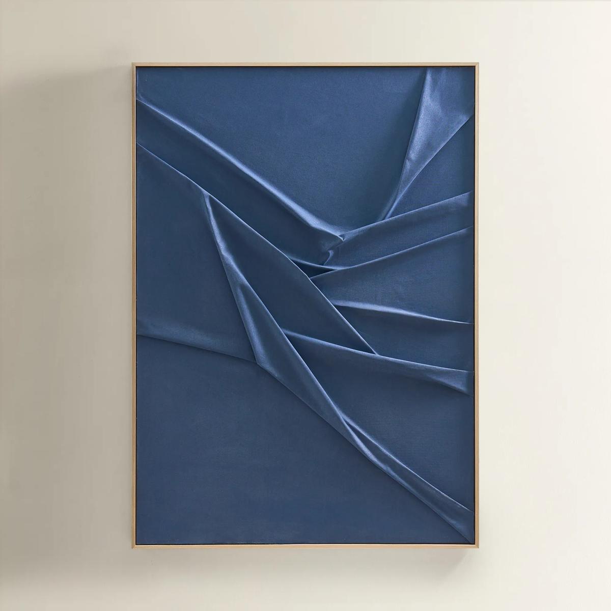 Deep Sea Painting$599
A hand-sculpted navy canvas with dimensional folds, framed in soft champagne for modern, serene elegance.
Add To Cart -
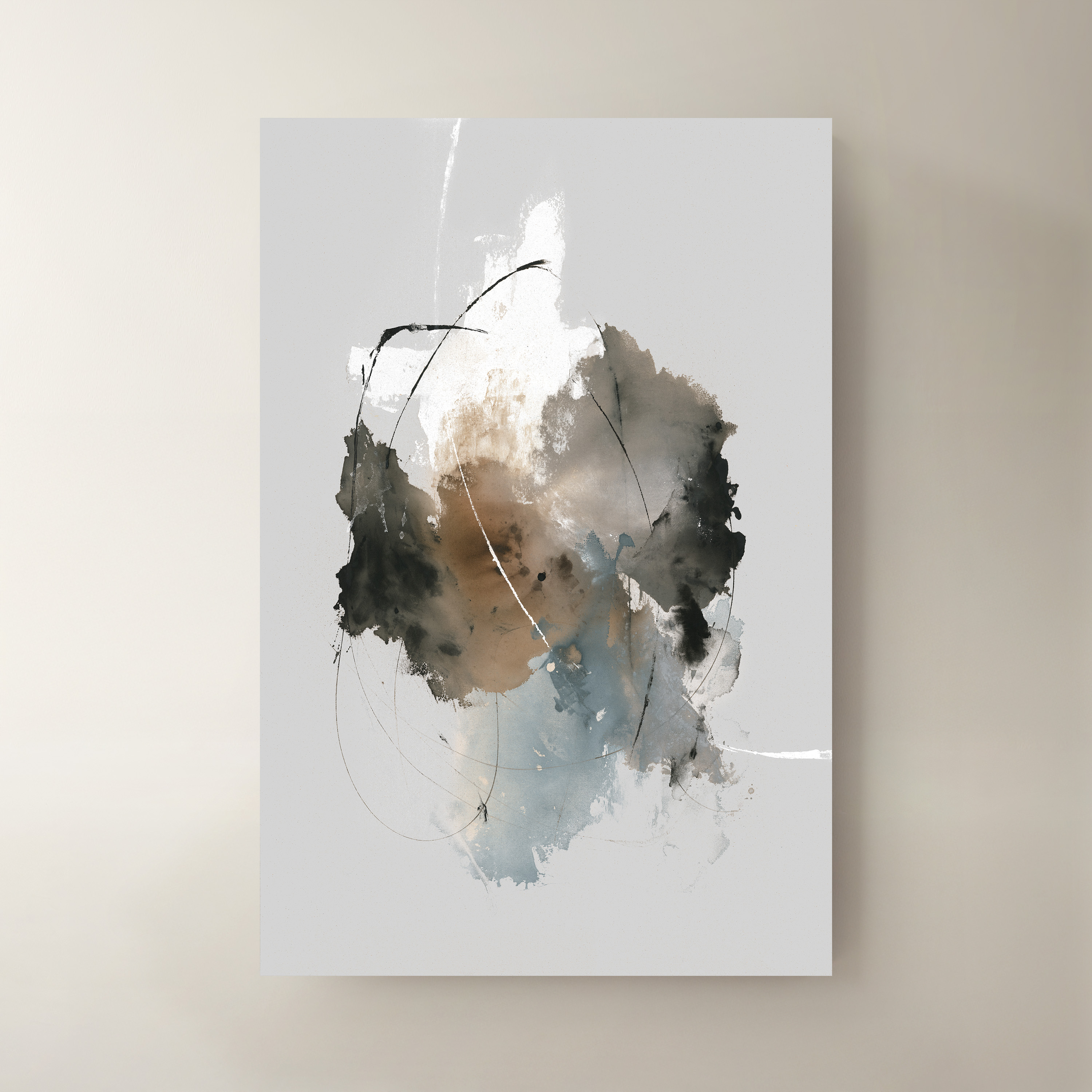
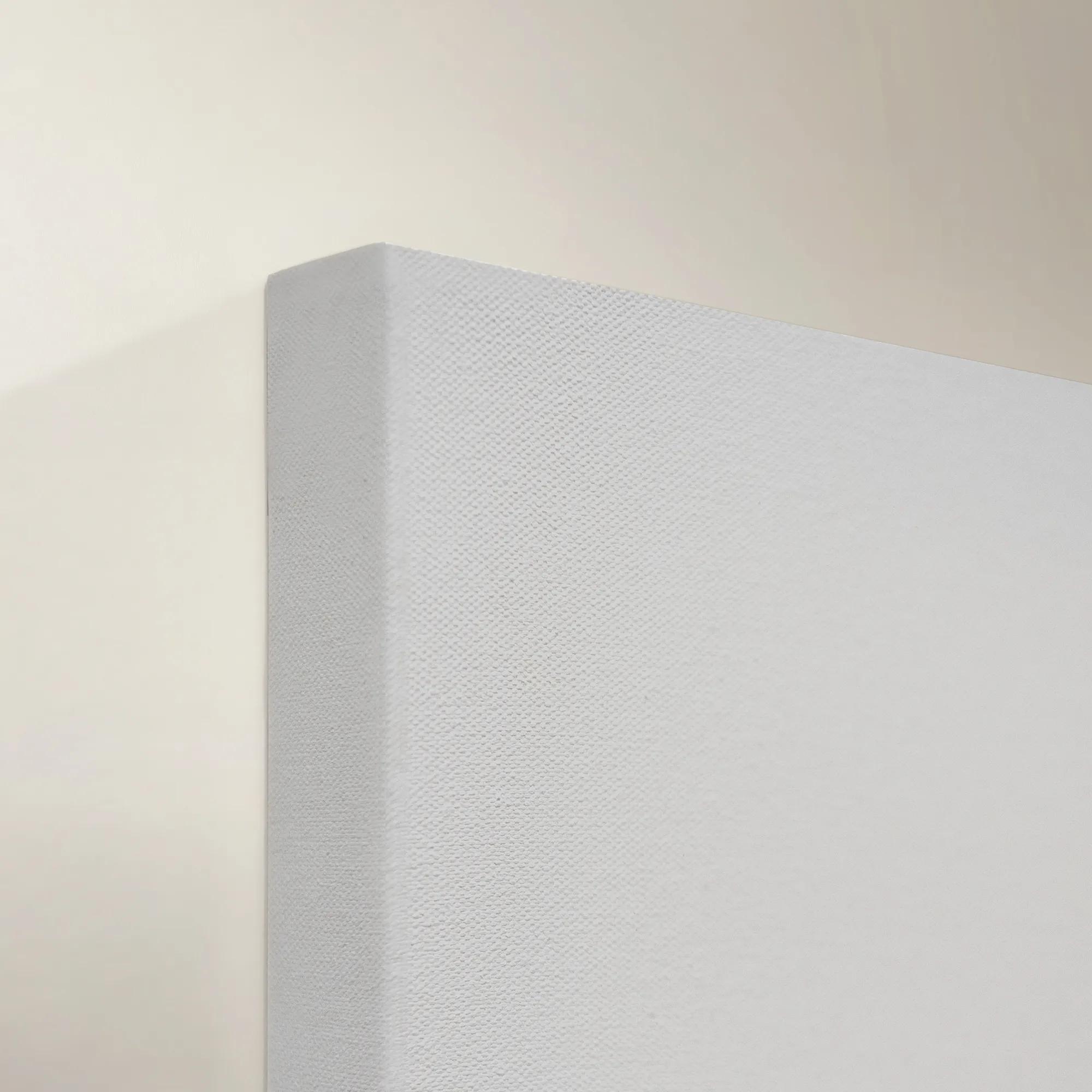 Time IV Wall Art 40" x 60"$999
A striking multicolored canvas artwork bringing contemporary visual interest to modern interiors.
Add To Cart -
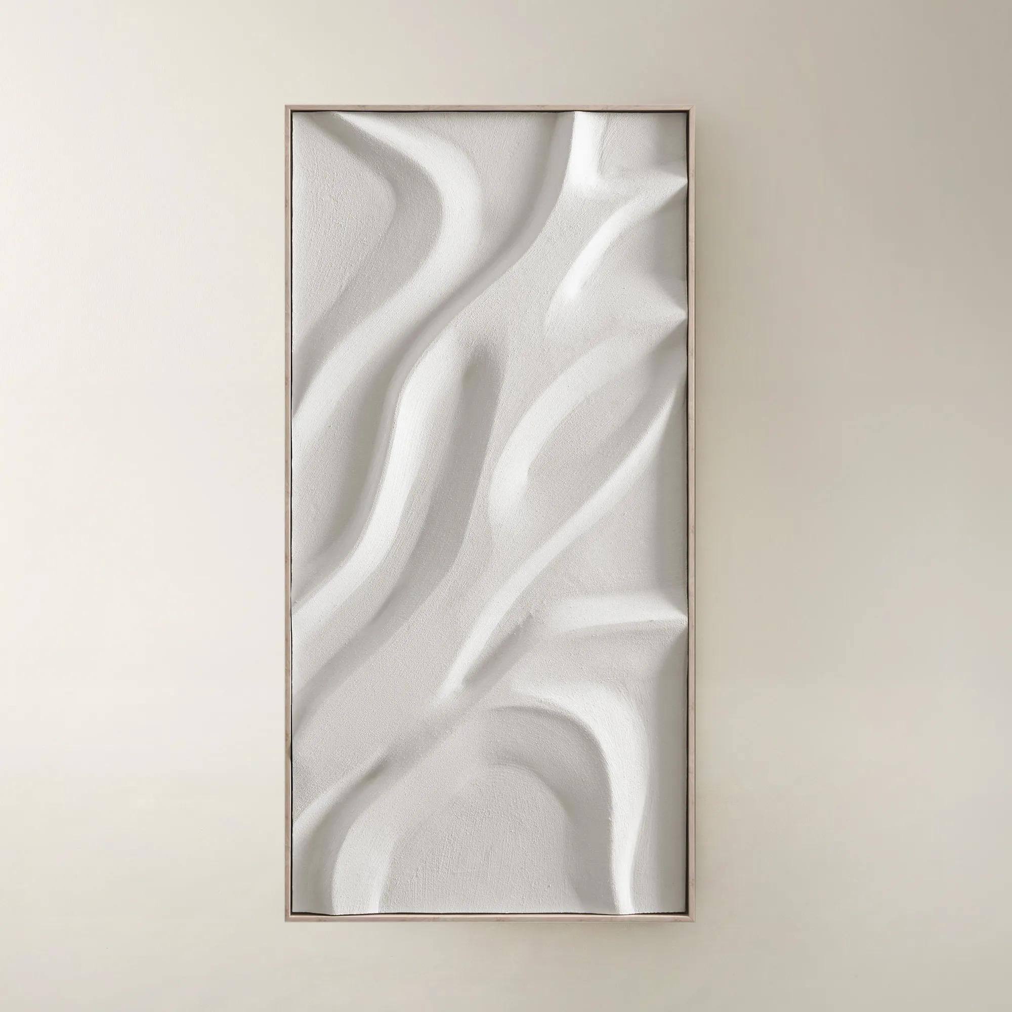
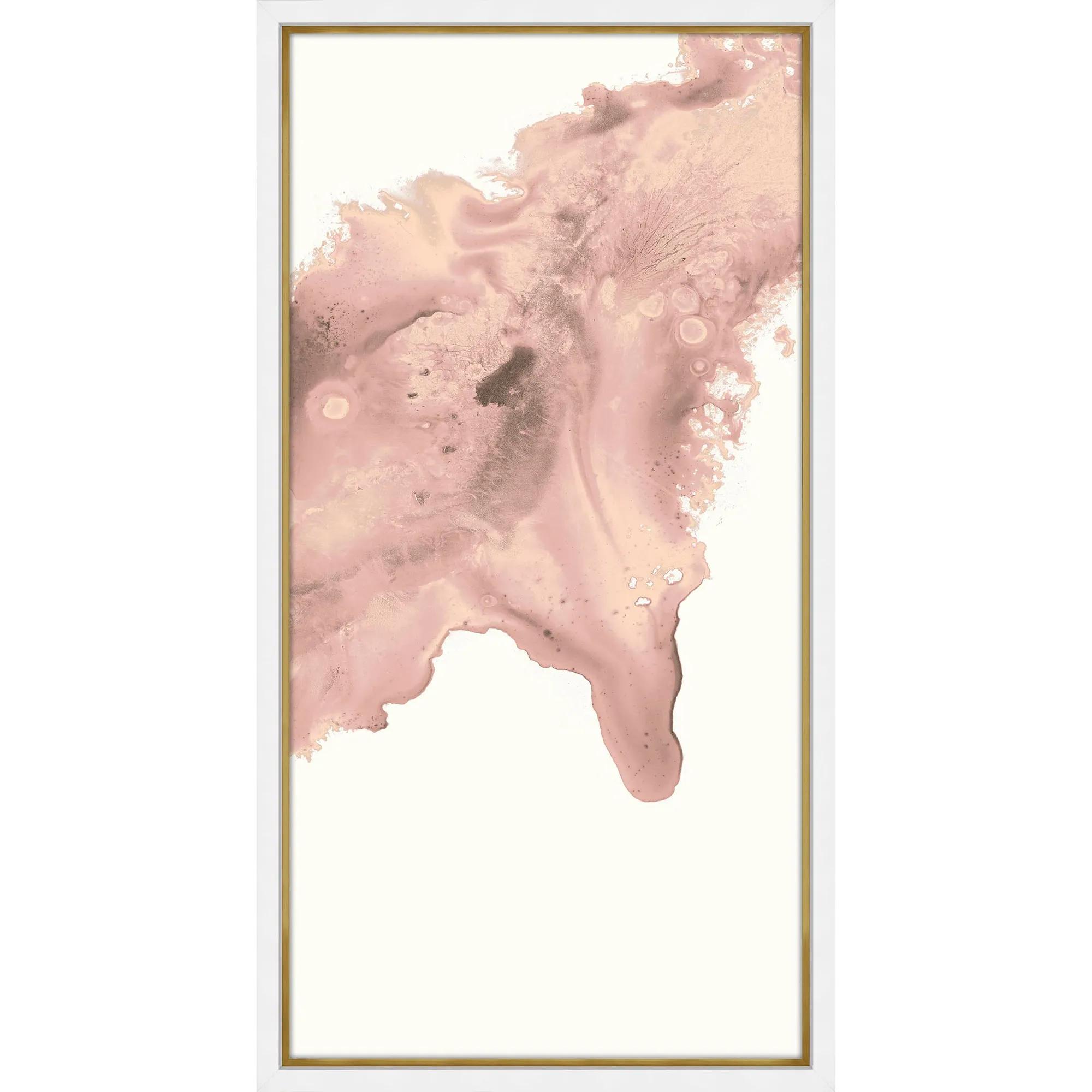
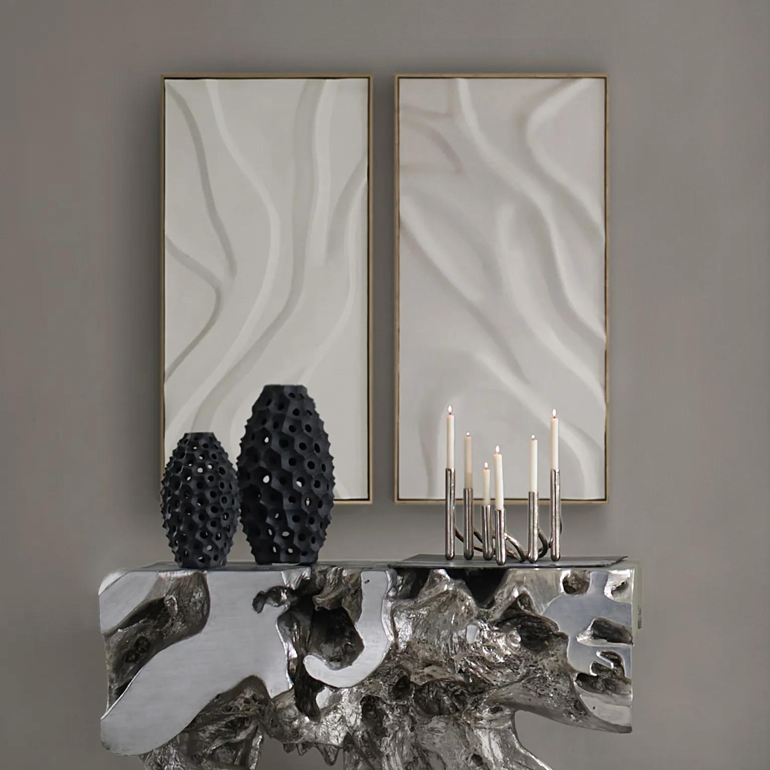 Au Lait Framed Painted Wall Art II 47.2" x 23.6"$199
A serene hand-painted canvas in beige, set in a warm whitewash floater frame for modern interiors.
Add To Cart -

 Hint of Spring Framed Painted Wall Art 48" x 48"$599
A framed, multicolored painted canvas artwork that brings a vibrant, artistic touch to contemporary interiors.
Add To Cart -
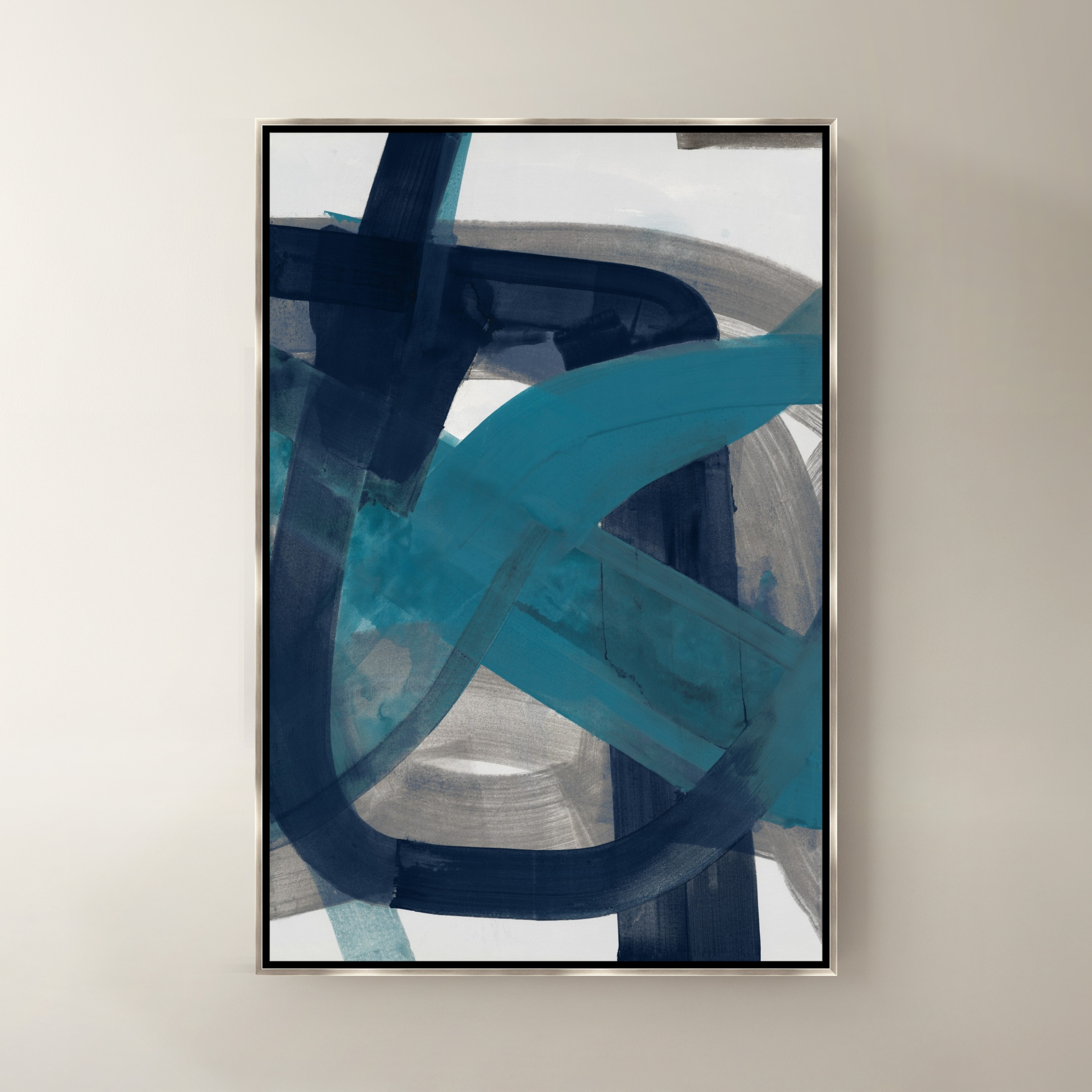
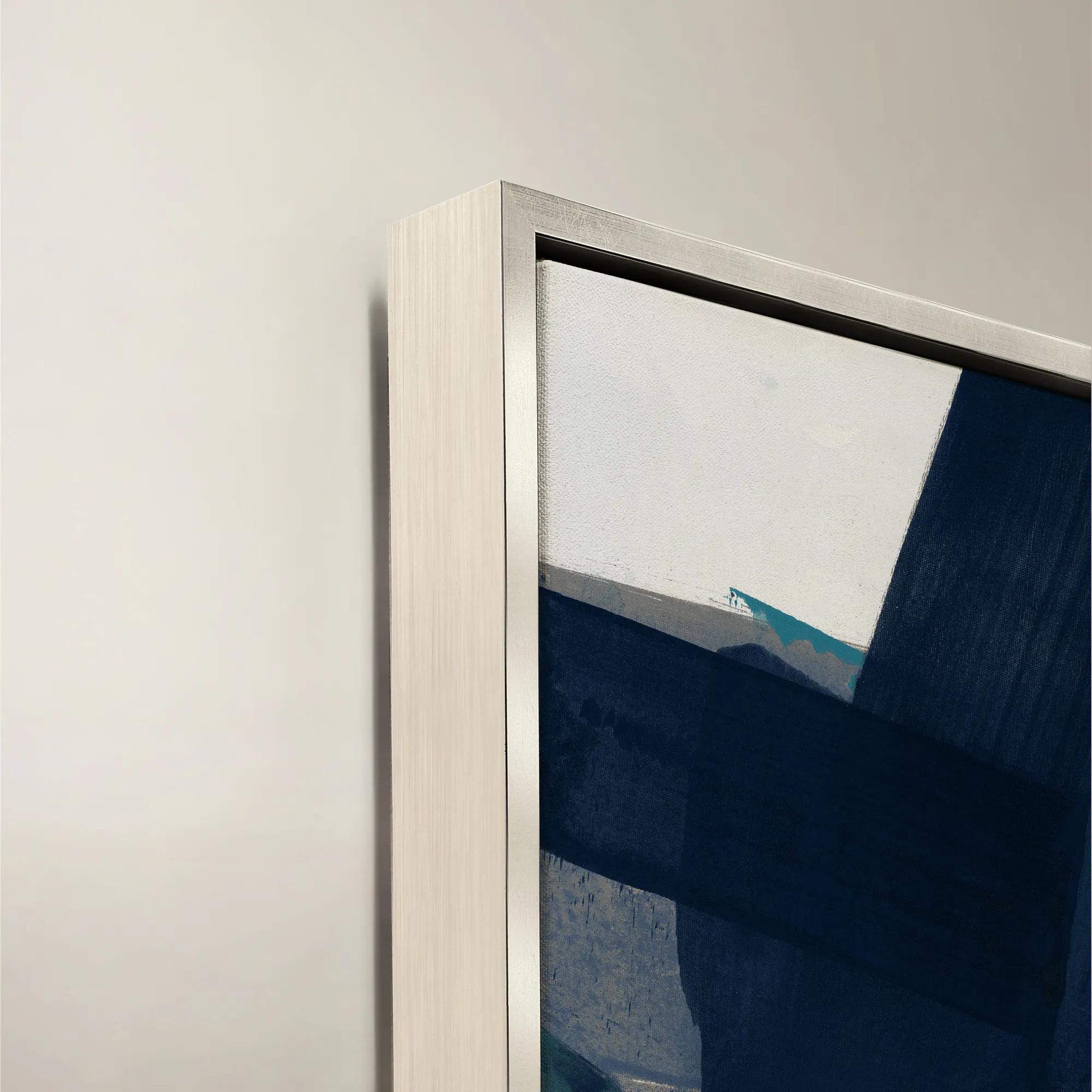 Fractured Currents II Framed Wall Art 24" x 36"$499
A framed canvas wall artwork featuring dynamic blue and purple tones for a modern, expressive accent.
Add To Cart -
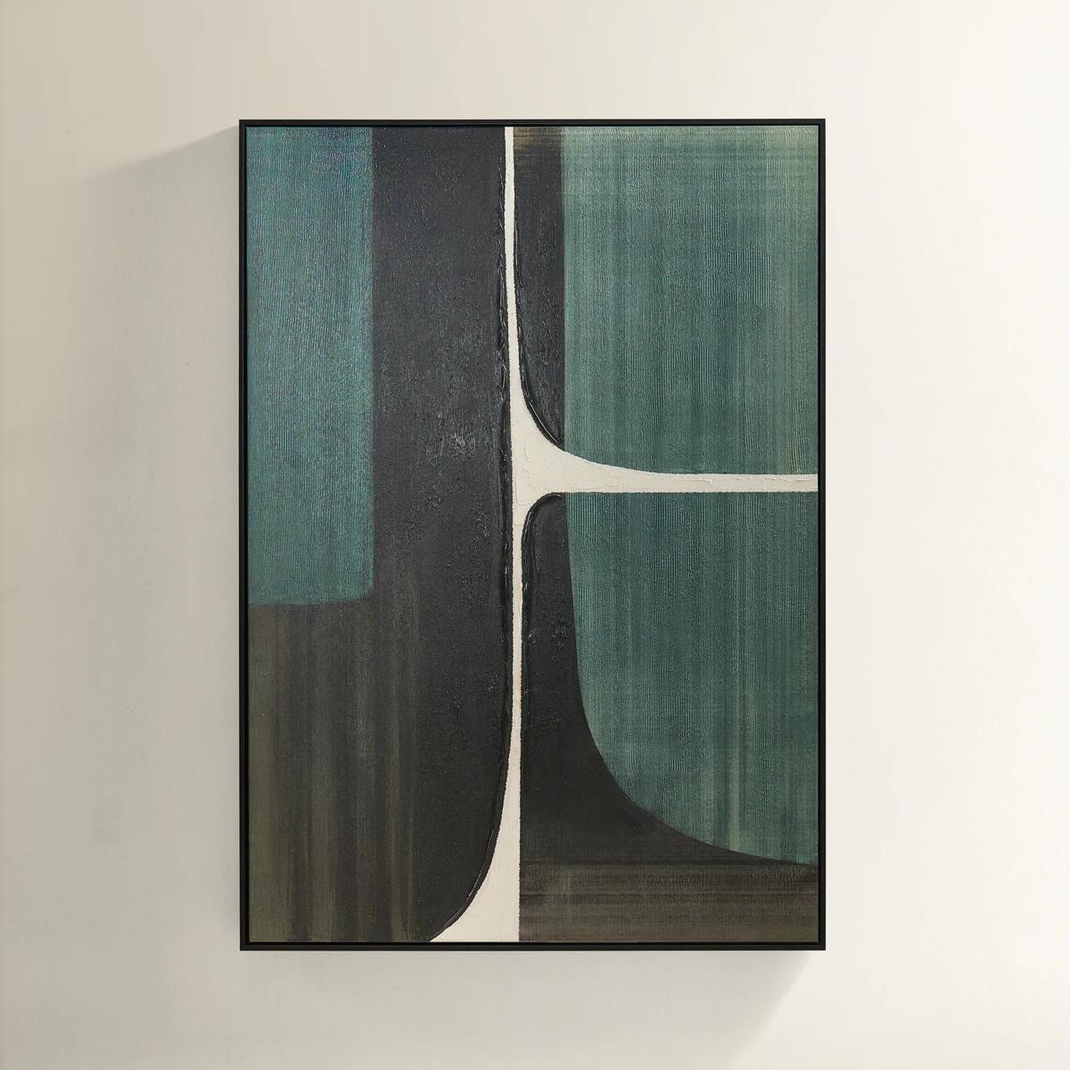 Plains Framed Painted Wall Art 39.25" x 55"$499
A hand-painted abstract canvas in forest green, ivory, and black with a sleek black floater frame.
Add To Cart -
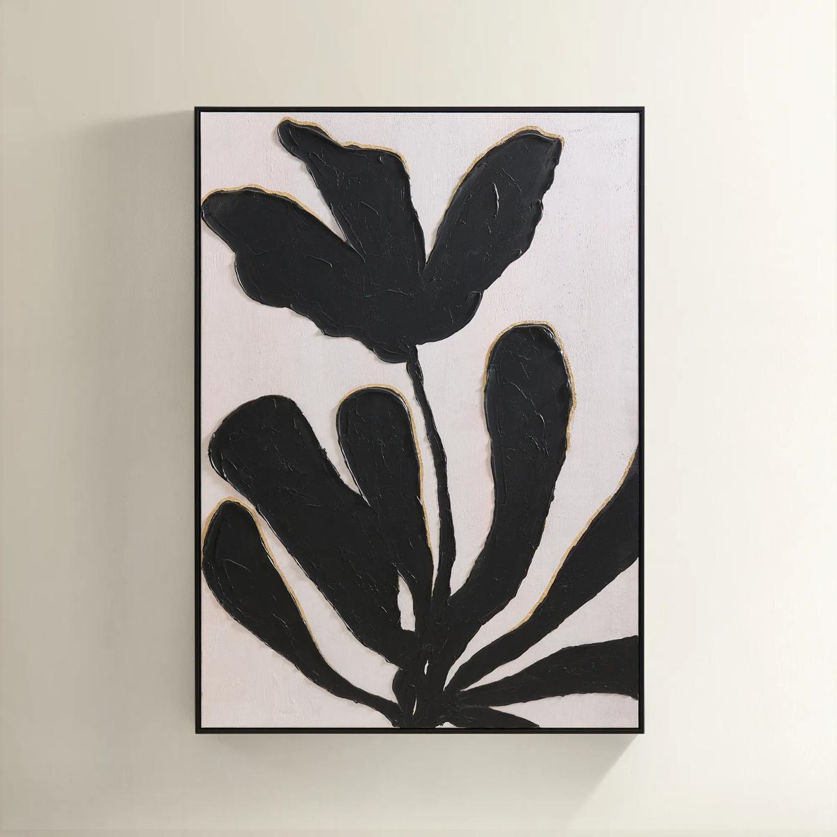
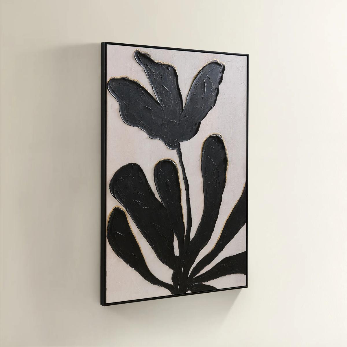 First Bloom Framed Painted Wall Art 39.25" x 55"$499
A hand-painted canvas featuring black abstract leaves and gold leafing on an ivory background in a black frame.
Add To Cart -
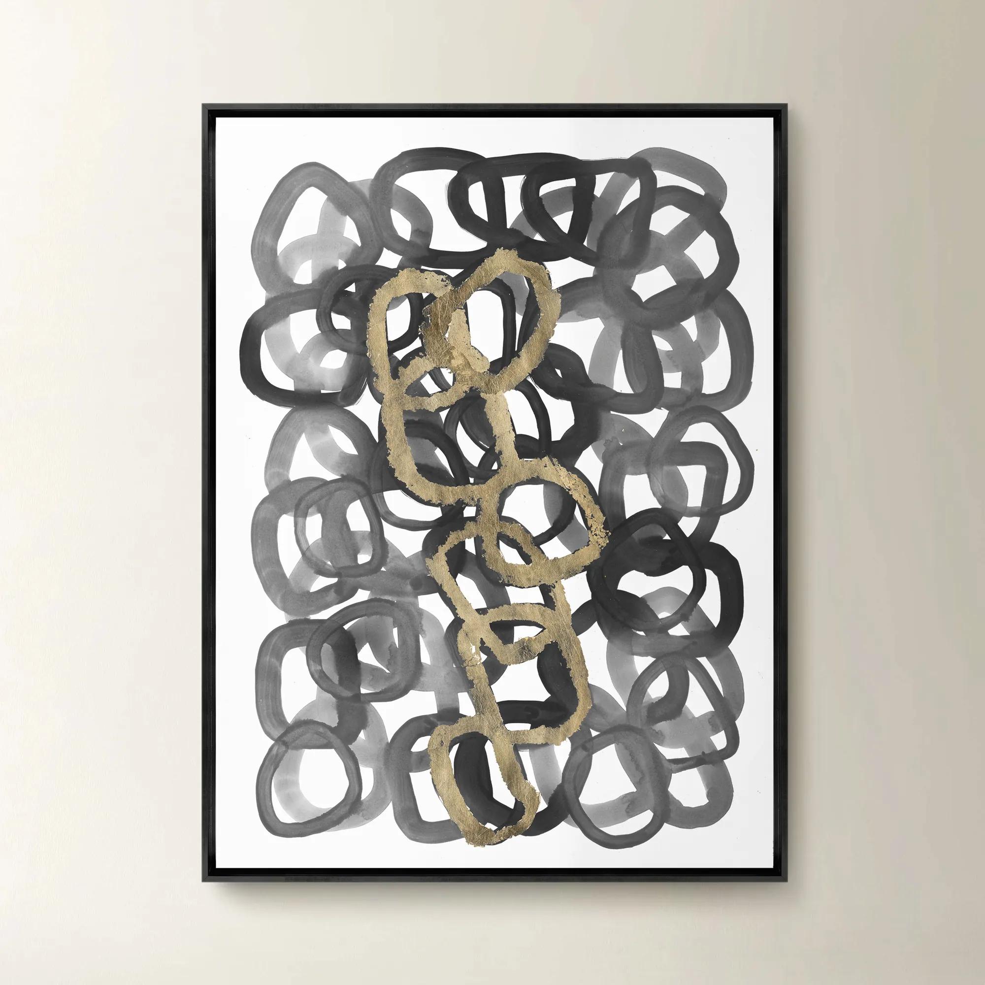
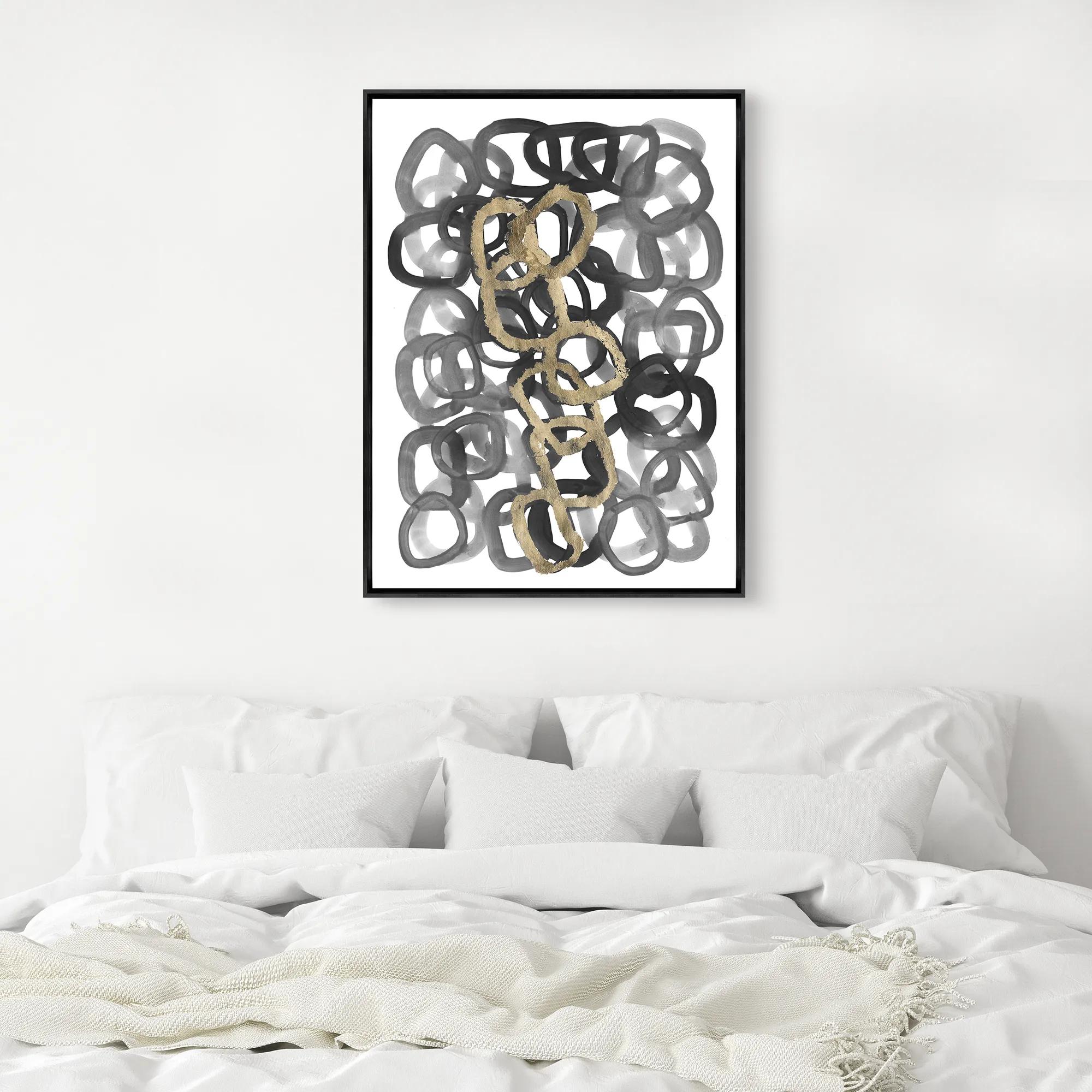 Unbroken Framed Wall Art 26" x 35"$499
A gallery-wrapped canvas artwork with a hand-applied gel finish, set in a sleek black floater frame.
Add To Cart -

 Saeng Myeong-Ui II Framed Wall Art 30" x 30"$699
A sophisticated green canvas wall artwork presented in a refined frame for contemporary interiors.
Add To Cart -
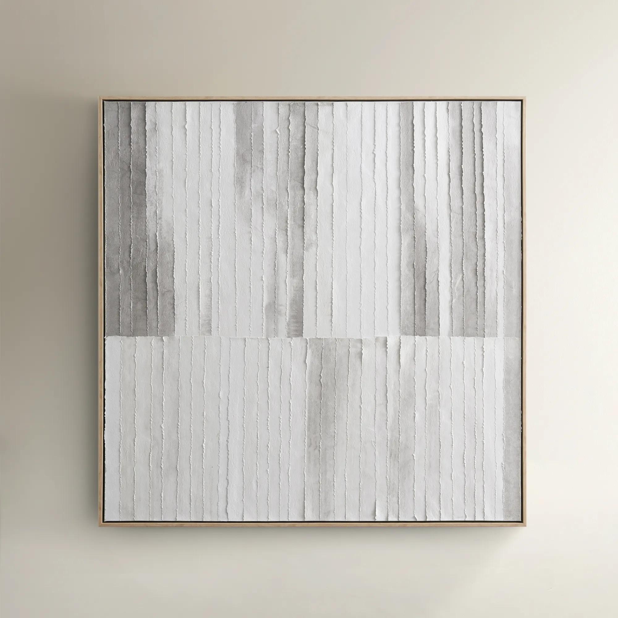
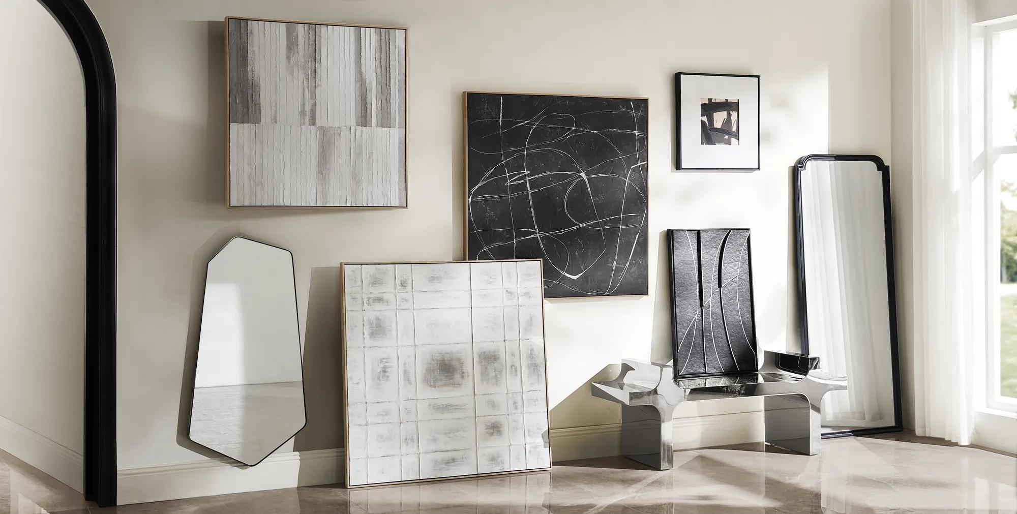 Morning Mist Paper Art$329
A hand-painted canvas featuring rhythmic grey lines in a textured, whitewashed floater frame for serene style.
Add To Cart -
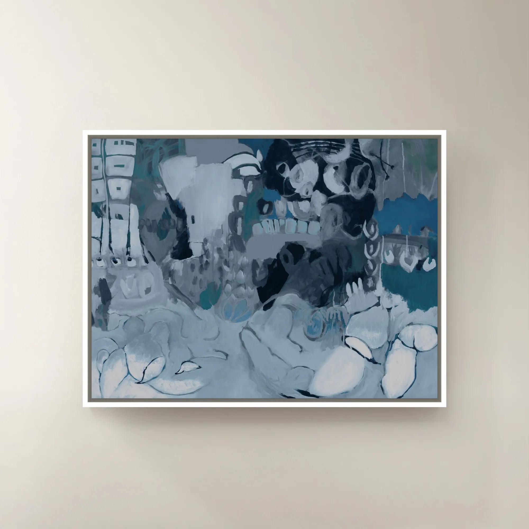
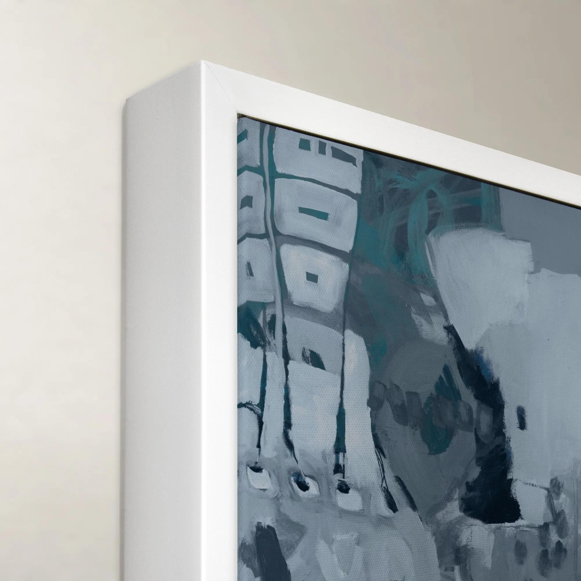 Wrap me in Forever II Framed Wall Art 40" x 30"$699
A striking blue and purple canvas wall art piece presented in a refined frame.
Add To Cart -
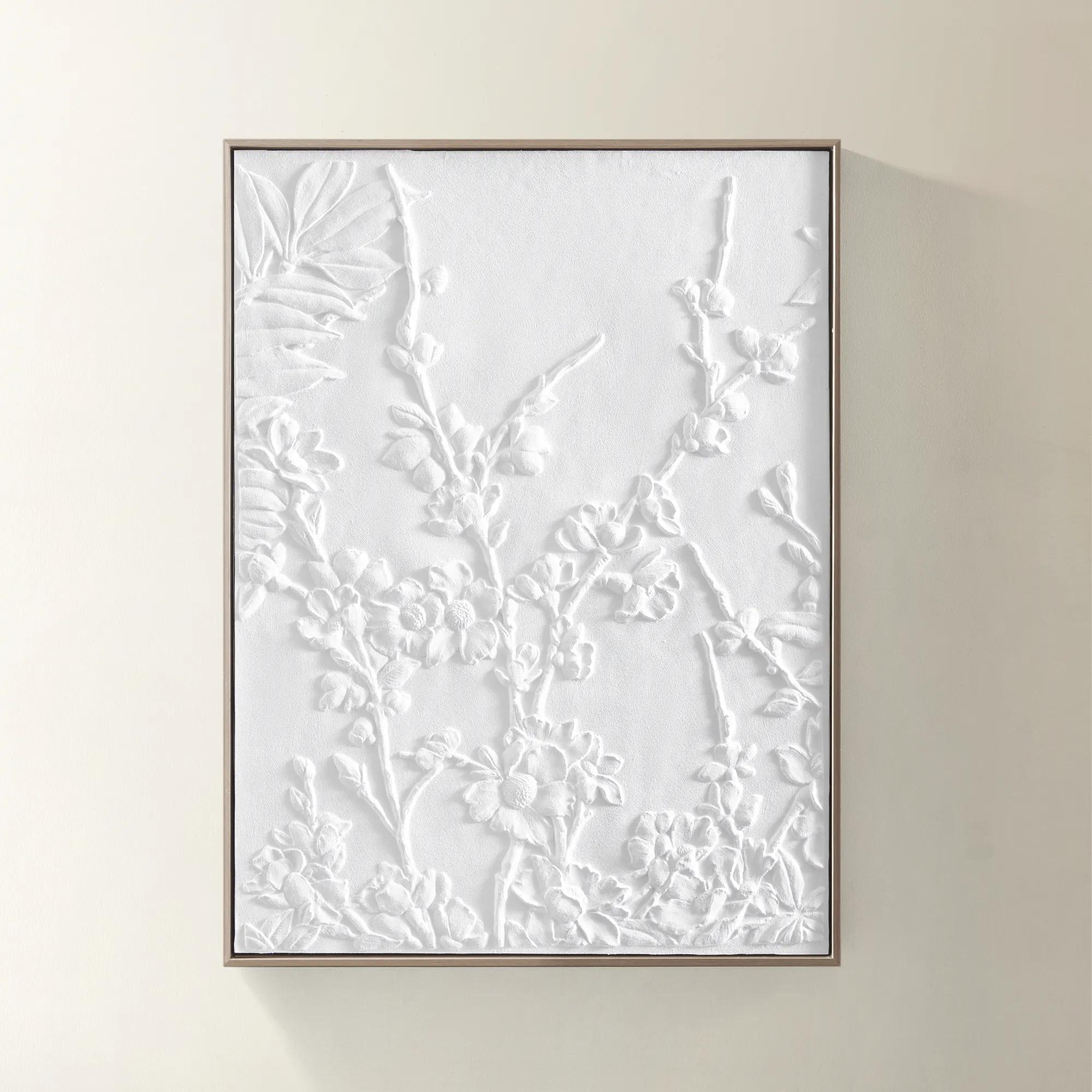
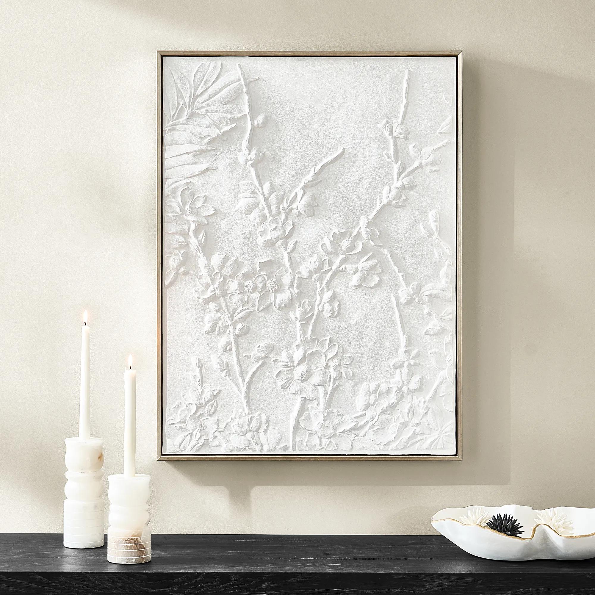 Allegro Framed Painted Wall Art 31.5" x 23.6"$109
A hand-painted canvas featuring textured floral motifs, framed in a warm champagne finish for subtle sophistication.
Add To Cart -
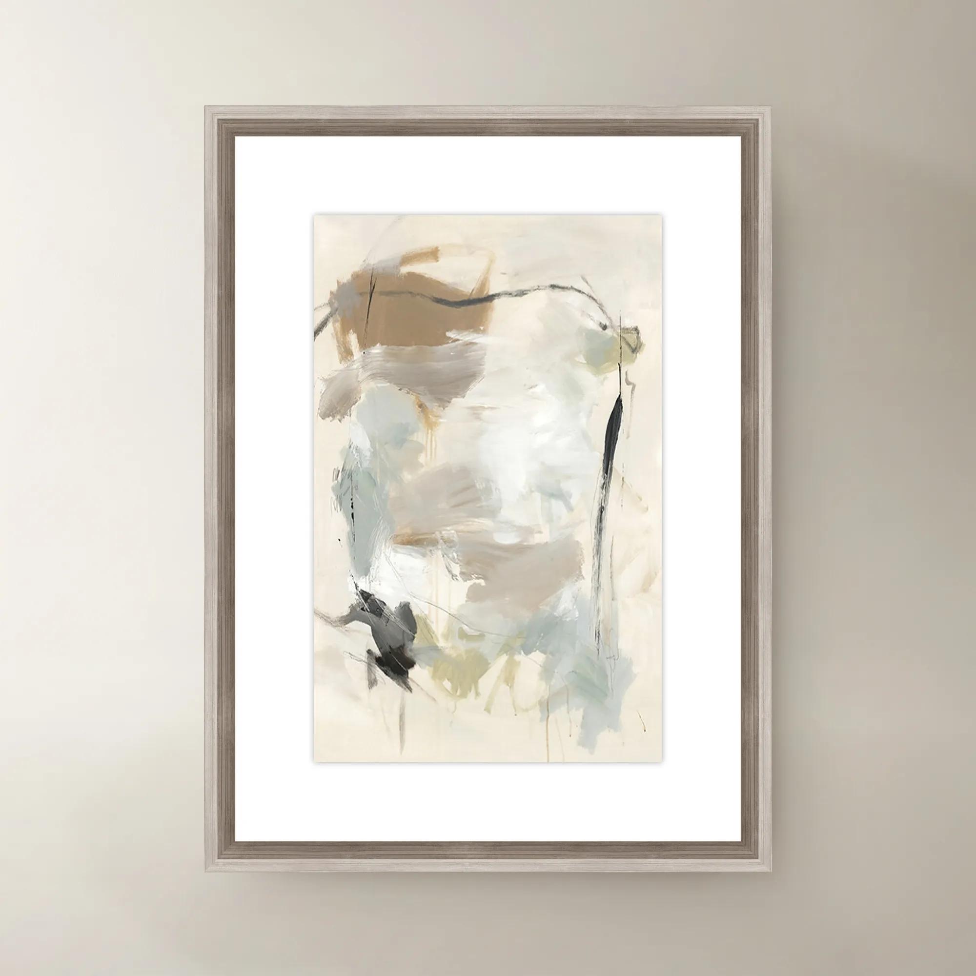
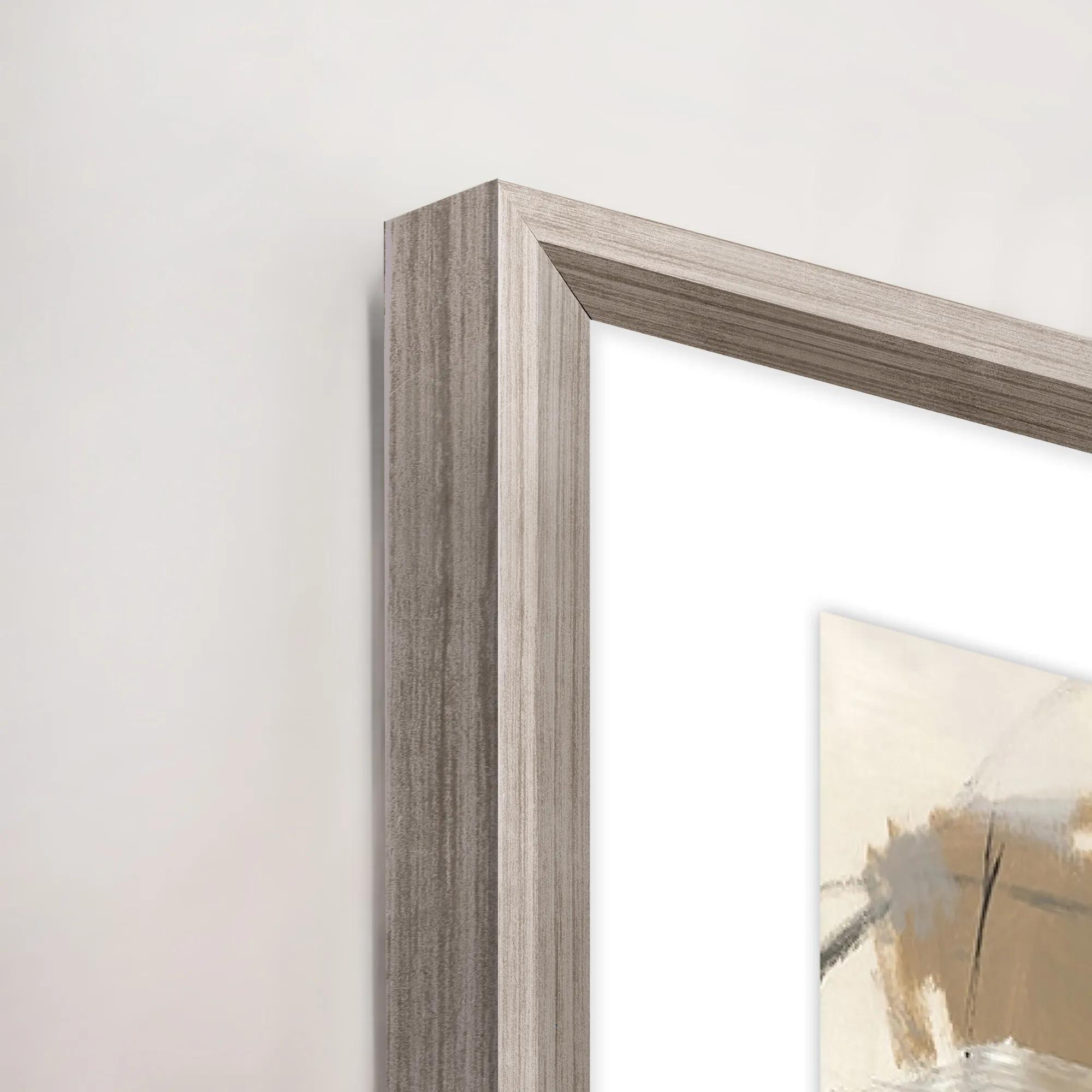 French Bakery I Framed Wall Art 20" x 30"$419
A multi-colored canvas wall artwork in a framed presentation, inspired by a charming French bakery.
Add To Cart -
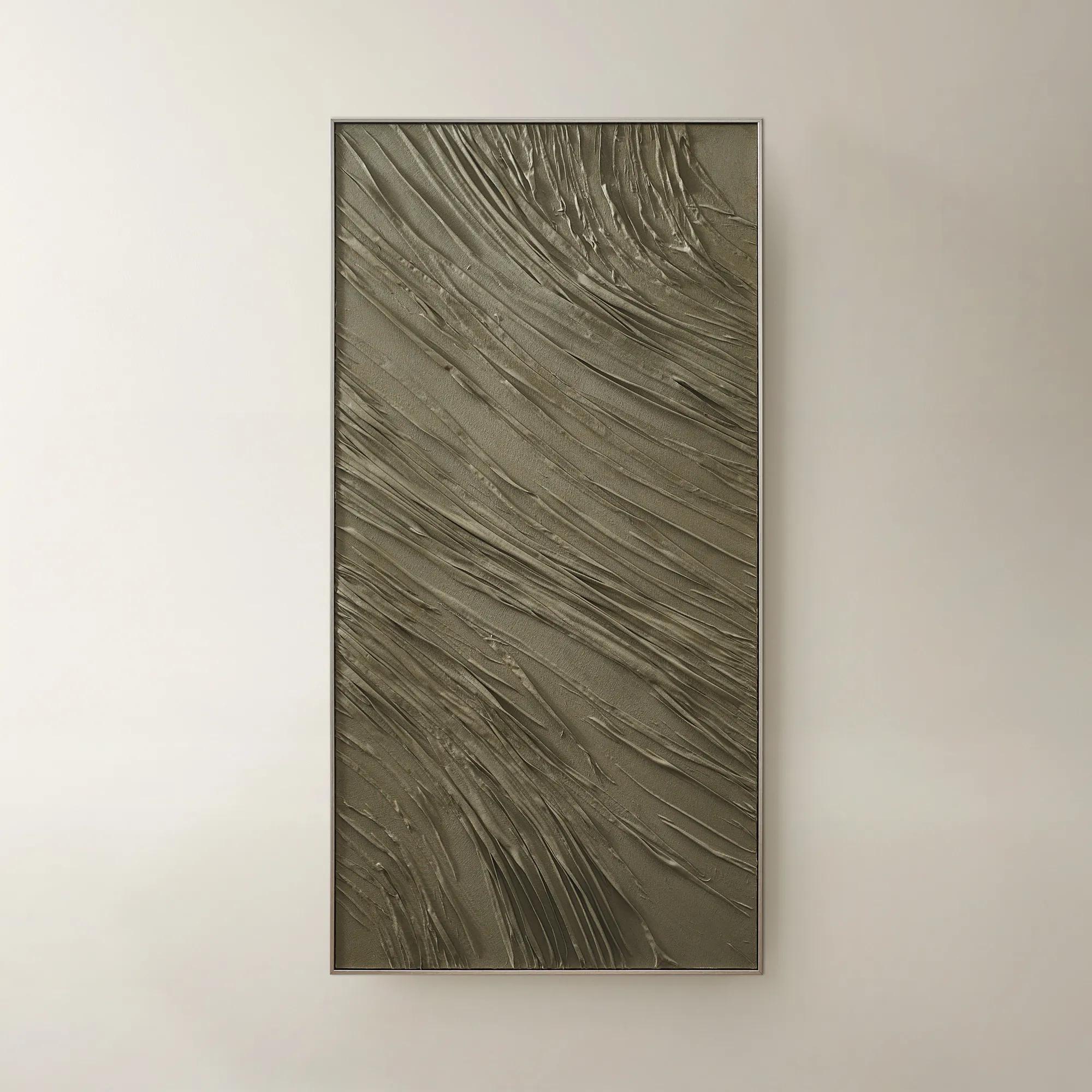
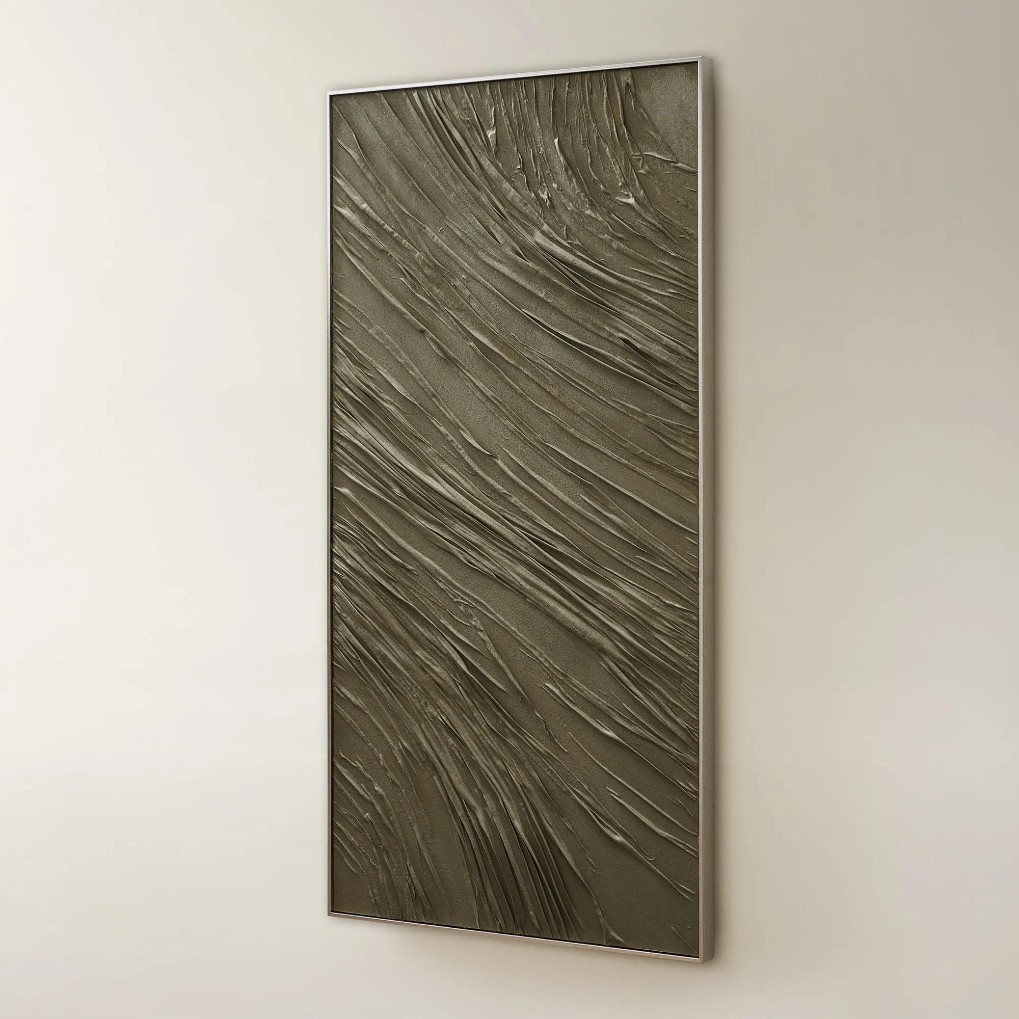 Grove Framed Hand-crafted Folded Fabric Wall Art 60" x 30"$349
A hand-crafted folded canvas in deep olive with a champagne frame for sculptural, modern wall art.
Add To Cart -
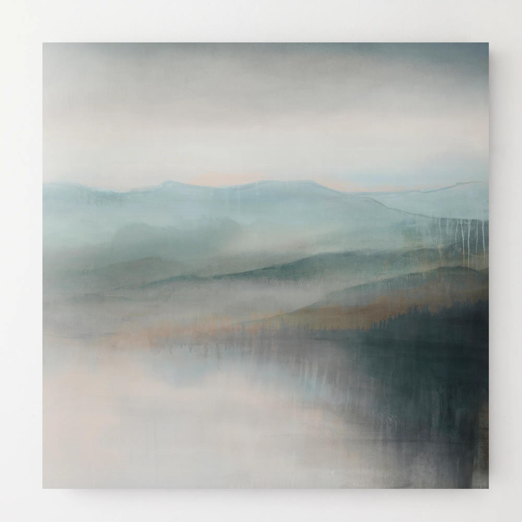
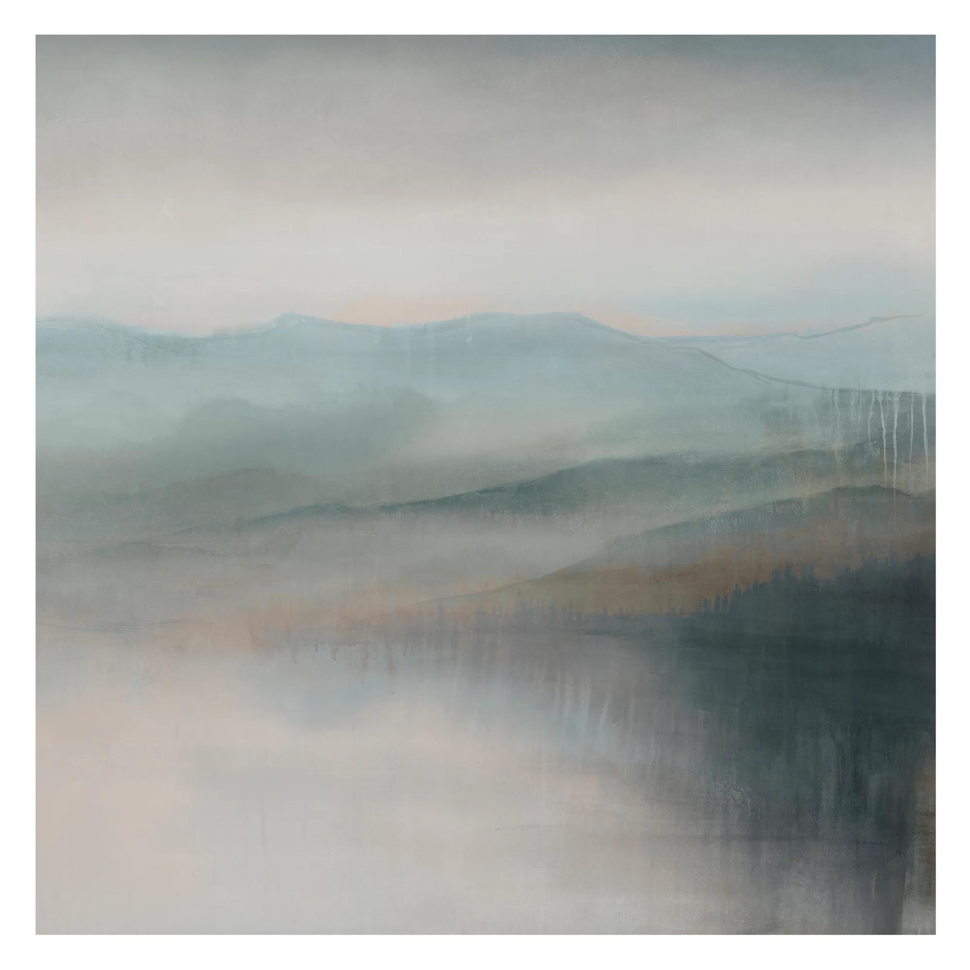 Morning Lift Wall Art 30" x 30"$399
A gallery-wrapped canvas artwork featuring a hand-applied image brush gel finish for added texture and depth.
Add To Cart -
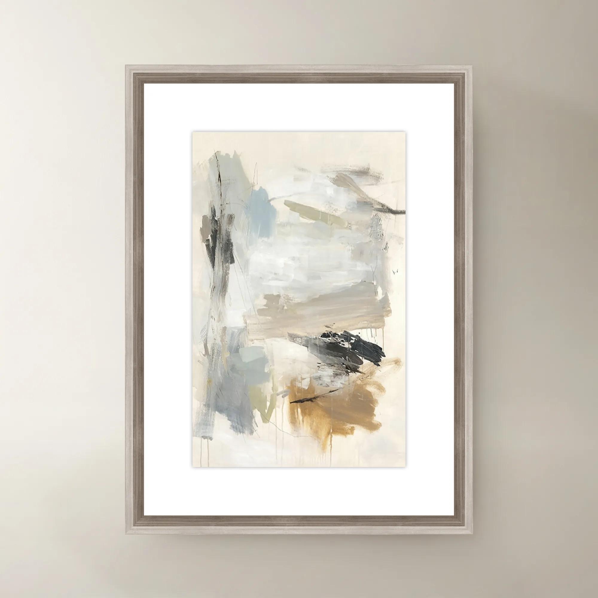
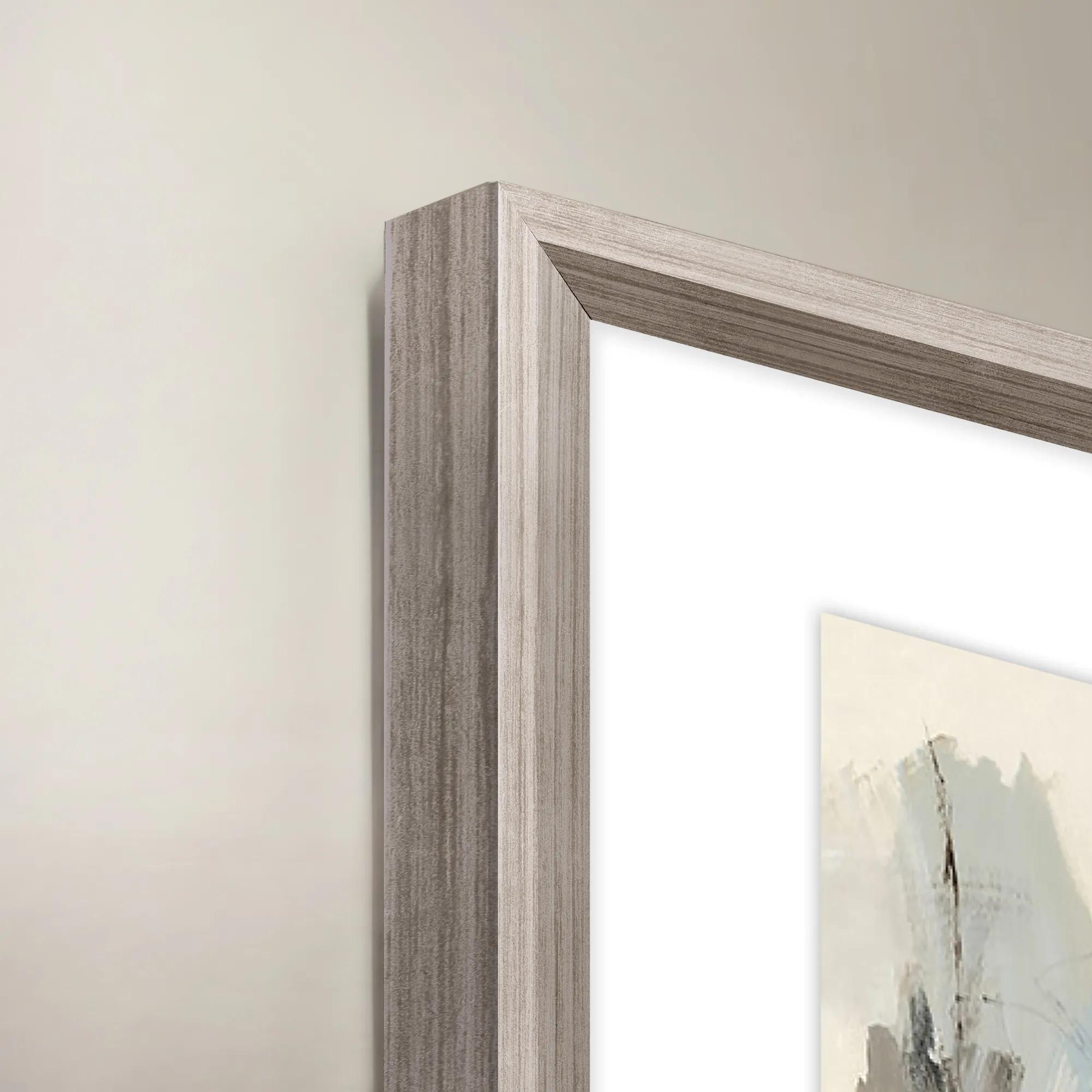 French Bakery II Framed Wall Art 20" x 30"$419
A colorful canvas wall art piece featuring a charming French bakery scene in a decorative frame.
Add To Cart -
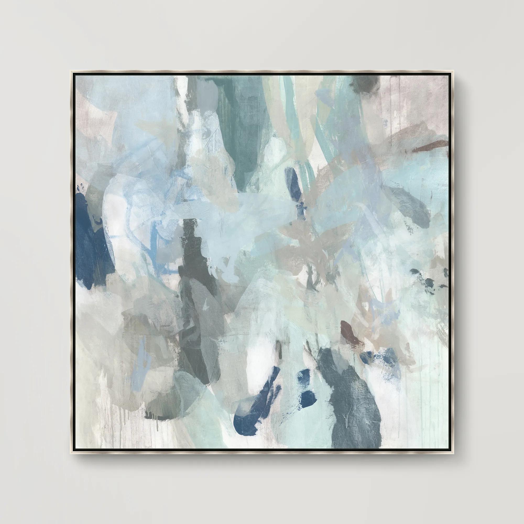
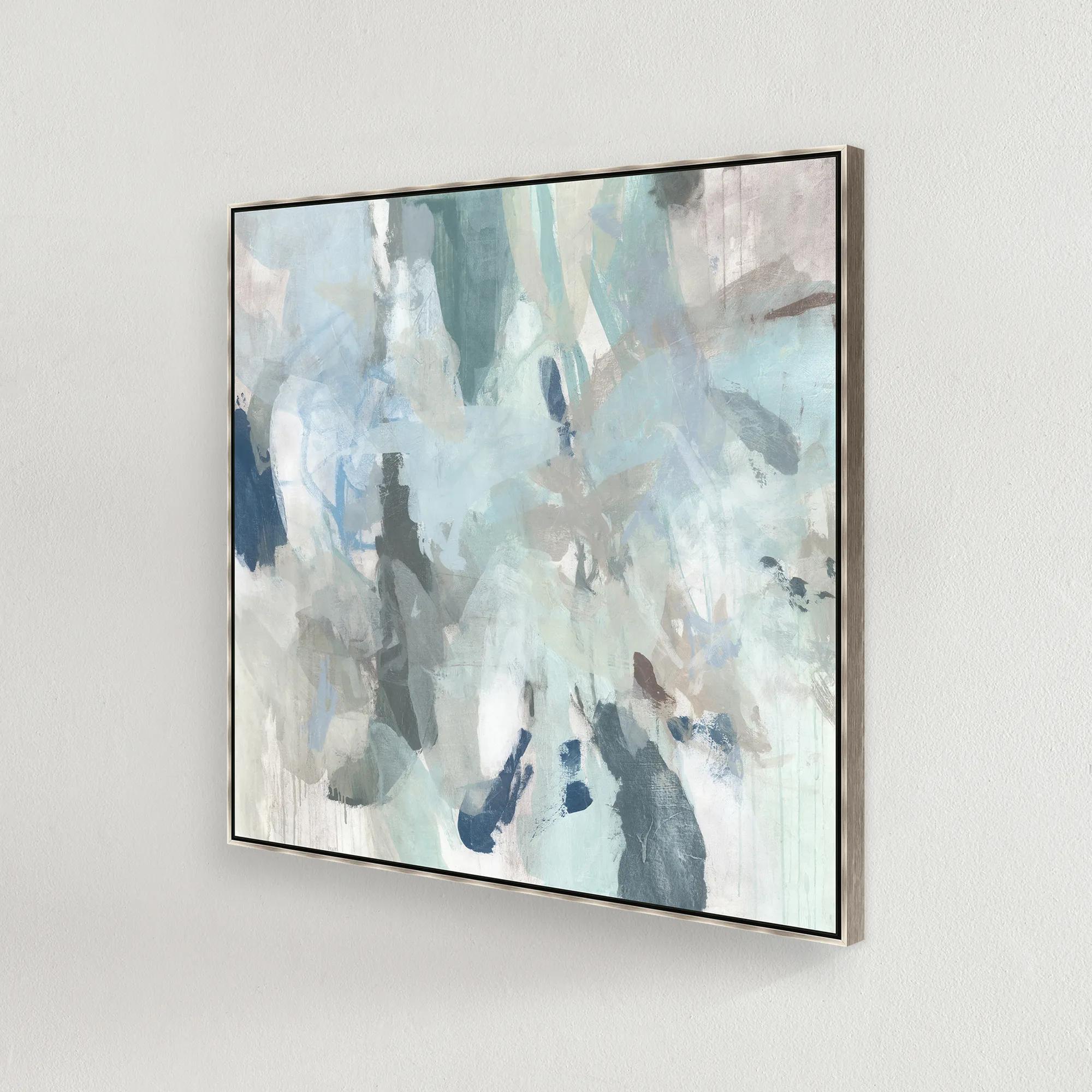 Sage Honey Dew I Framed Wall Art 41.5" x 41.5"$749
A gallery-wrapped abstract canvas featuring hand-applied gel finish in a silver floater frame.
Add To Cart -
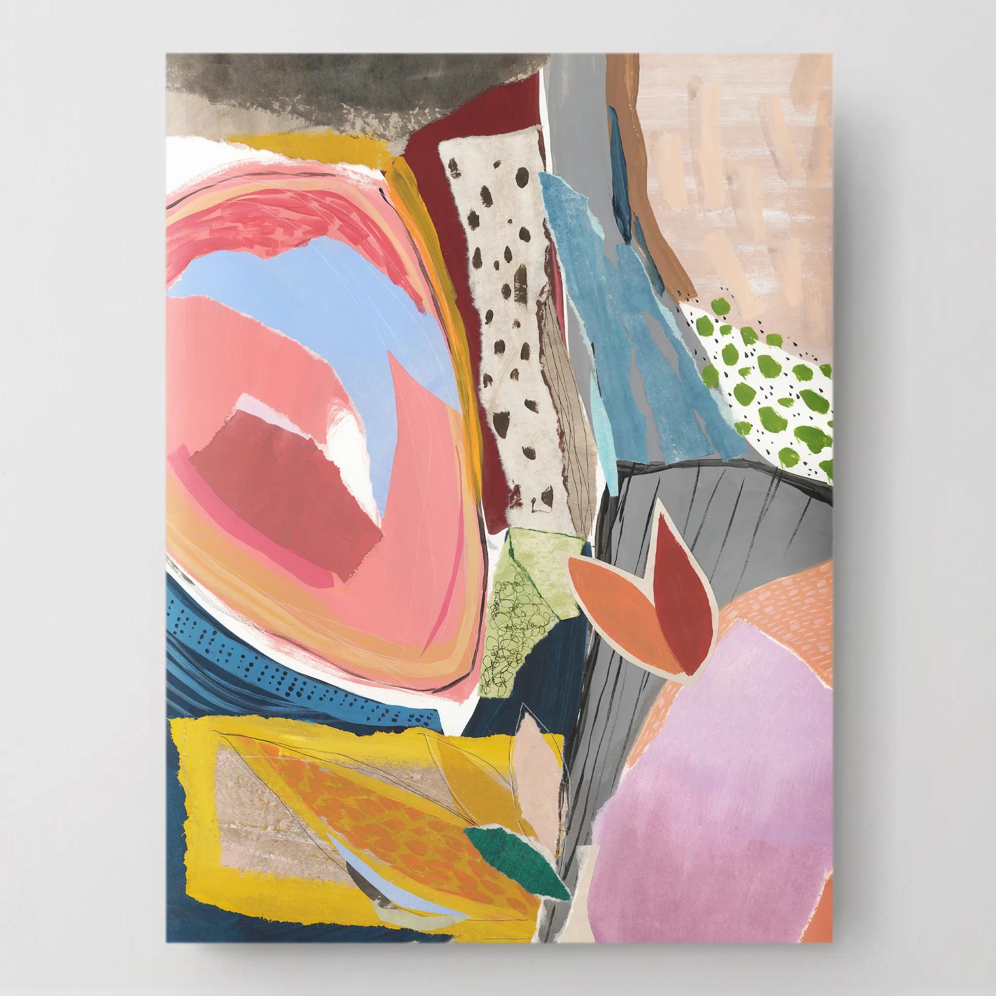
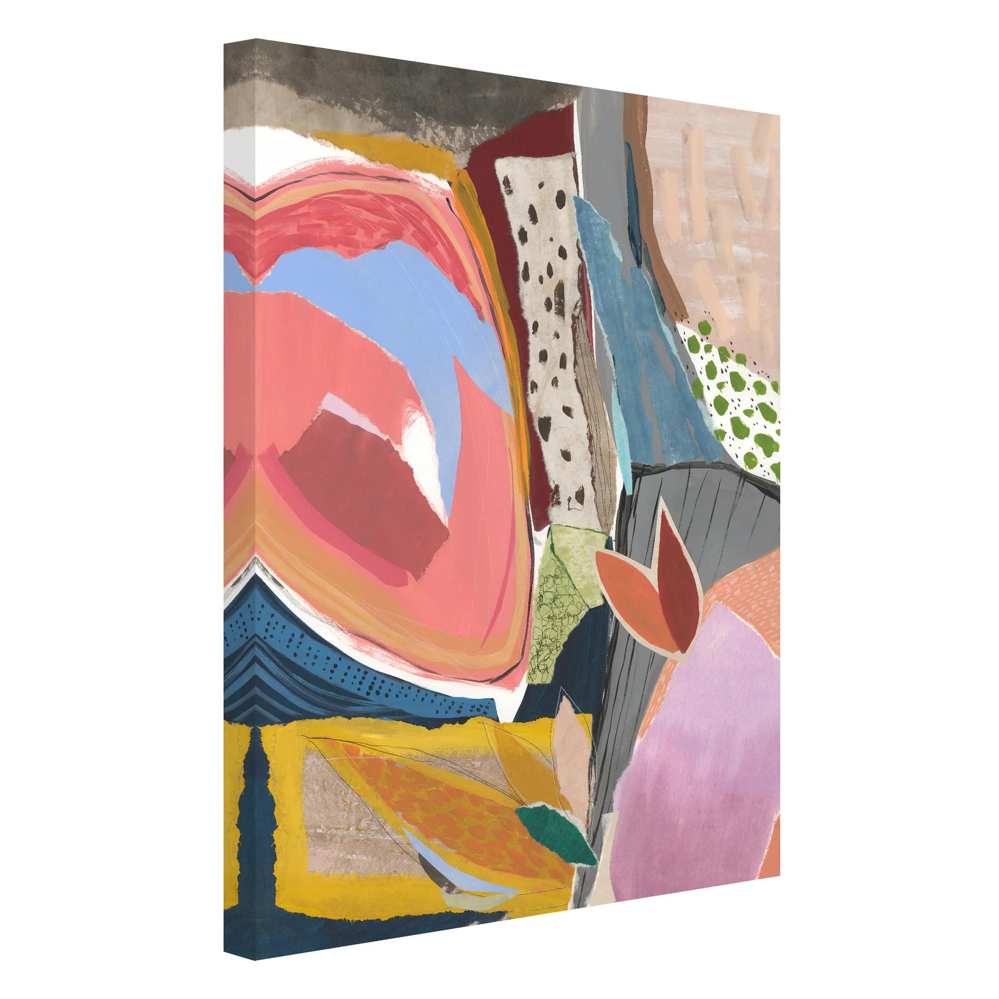 Sunday Vibes 1 Wall Art 30" x 40"$449
A gallery-wrapped canvas artwork featuring a hand-applied image brush gel finish for a textured look.
Add To Cart -
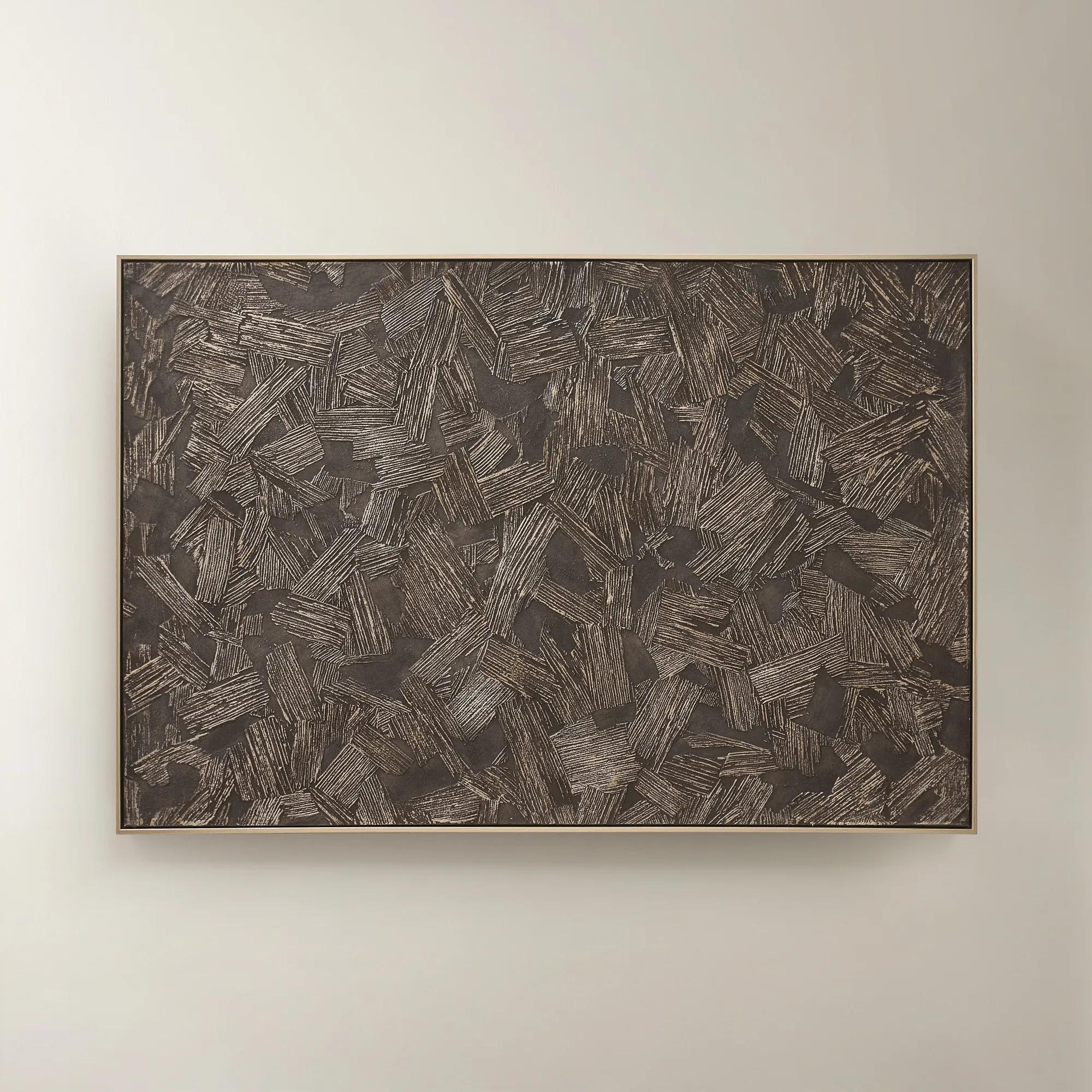
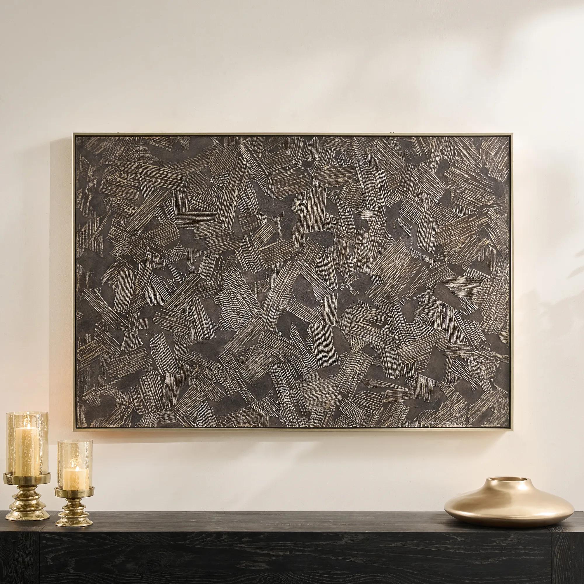 Etched in Darkness Dark Chocolate Wall Panel 53.5" x 36"$329
A hand-painted wrapped canvas features moody dark chocolate hues with champagne accents and a layered, textural finish.
Add To Cart -
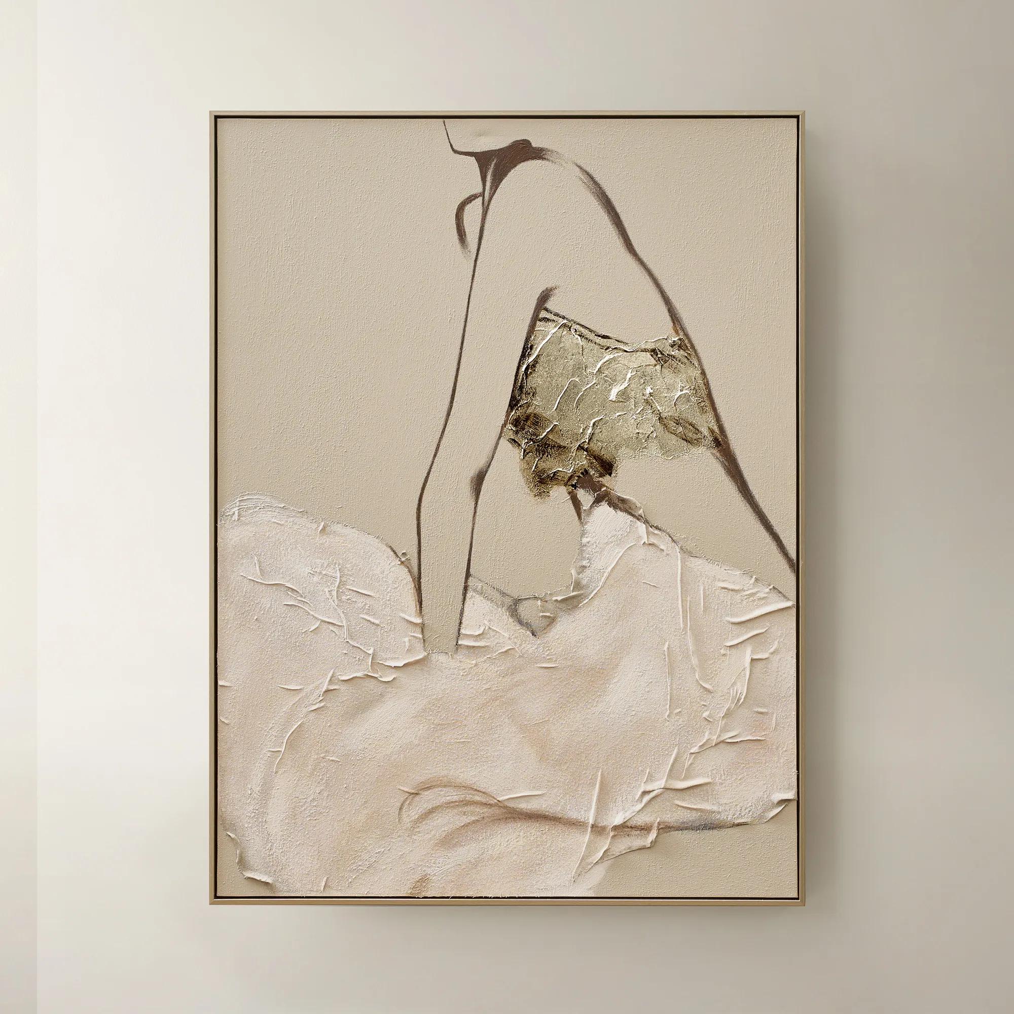 Quiet Pose Framed Painted Wall Art 36" x 48"$499
A hand-painted canvas in taupe and champagne tones features textural details and shimmering champagne leafing.
Add To Cart -
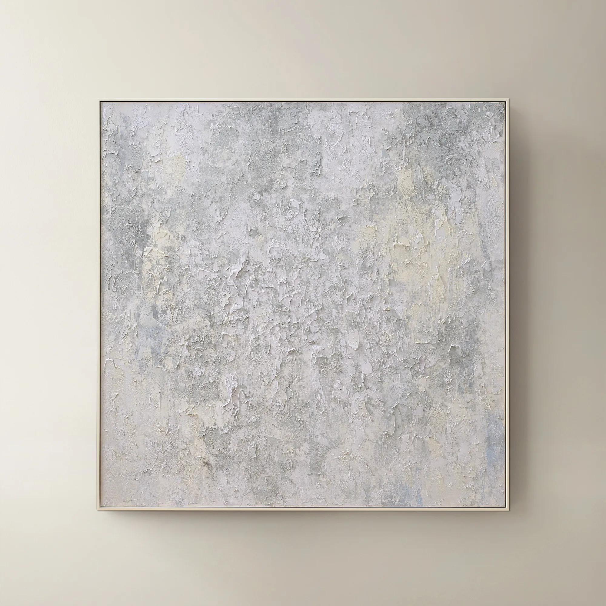 Breathe of Fresh Air Framed Painted Wall Art 50" x 50"$499
A hand-painted abstract canvas in dusty blue hues, elegantly framed in white for a serene, modern accent.
Add To Cart

Muted Color Landscape Wall Arts
Muted color landscape wall arts invite a sense of tranquility and refined sophistication into your space, transforming walls into poetic vistas awash in gentle hues. These evocative masterpieces capture the serenity of nature through a palette of soft, nuanced tones—each brushstroke whispering calm and understated elegance. Perfect for those who appreciate artistry that soothes as much as it inspires, muted color landscape wall arts create an atmosphere where every glance feels like a quiet escape. Let your home become a gallery of subtle drama, where every room is elevated by the allure of serene horizons and painterly restraint.
Muted color landscape wall art captures the beauty of natural scenery through softened, desaturated hues rather than vivid contrasts. Sage green, dusty blue, warm gray, sand, taupe, and pale ochre give hills, shorelines, fields, and distant mountains a measured elegance. The result is landscape art with presence: expressive enough to anchor a room, yet restrained enough to let sculptural furniture, lustrous finishes, and richly textured fabrics share the composition. Muted does not mean colorless. A narrow band of clay against a gray horizon or a wash of olive beneath an ivory sky can introduce remarkable depth without overwhelming the surrounding palette. These quieter relationships make neutral landscape wall art especially compelling in living rooms, bedrooms, dining areas, and home offices, where a sense of visual spaciousness can be as valuable as a dramatic focal point. Recognizable scenery offers a connection to the natural world, while softened edges and loosely rendered forms leave room for personal interpretation. A distant coastline might recall a meaningful journey; an open expanse of land can lend a city apartment a feeling of generous proportion. Styles range from delicately layered watercolor effects and traditional painterly vistas to abstract landscapes built from broad horizontal bands. Each approaches scenery differently, but all can create a composed backdrop for an expressive interior. Against a charcoal wall, a pale landscape has a luminous, almost architectural quality. Above an ivory sofa, earthy shades draw attention to the weave of the upholstery and the silhouettes of nearby accents. In a dining room with polished metal details, softly blended terrain provides a counterpoint to gleaming surfaces. The appeal lies in that balance: a landscape can bring softness to a bold room without diminishing its confidence. For interiors with several statement elements, a restrained scenic composition gives the eye somewhere to rest while preserving the sense that every detail has been deliberately chosen.
Scale, orientation, and framing determine how muted landscape art relates to the room as much as the image itself. A wide horizontal composition echoes the lines of a sofa, bed, or sideboard, allowing the depicted horizon to extend the visual breadth of the furniture below. A vertical landscape suits a narrow wall or the space beside a tall cabinet, drawing attention upward without requiring an expansive footprint. Two- and three-panel arrangements can carry a scene across a larger wall, with consistent spacing keeping the composition connected. For artwork above furniture, an overall width of roughly two-thirds to three-quarters of the furniture’s width is a useful starting point, adjusted for nearby windows, lighting, and architectural details. A frame positioned about six to ten inches above a sofa often feels connected to the seating rather than suspended apart from it, although tall cushions and unusual wall proportions may call for a different placement. These relationships matter particularly with low-contrast imagery, whose subtleties deserve enough scale and breathing room to register. Frame finishes offer another layer of expression. Slender black frames define pale scenery with a crisp outline; warm wood emphasizes earth-toned passages; metallic finishes introduce a tailored gleam alongside brass accents or mirrored furniture. A floating frame can give canvas a sculptural edge, while a generous mat lends a paper print a gallery-like presentation. Color coordination works best through undertones rather than exact matching. A gray landscape with a violet cast feels different beside warm beige upholstery than a gray with green undertones, and room lighting can make those distinctions more noticeable. Repeating one quiet shade in a pillow, rug, or decorative vessel establishes continuity without turning the room into a matching set. For a more interpretive treatment of scenery, Modern Abstract Landscape Wall Decor explores the relationship between recognizable terrain and expressive shape. Those softened boundaries are especially striking where curved seating, angular tables, and textured textiles create their own interplay of forms.
Materials and surface treatments influence both the character of muted landscape wall art and the care it requires. Canvas introduces a visible weave that can complement painterly brushwork and broad tonal transitions, while fine-art paper can emphasize delicate line, subtle washes, and crisp detail. Original painted surfaces may have raised passages or variations in sheen; reproductions differ according to their printing process, substrate, and finish. Product details should establish the medium, dimensions, framing, and hanging requirements rather than appearance alone. Glazing over paper helps protect the image from dust and incidental contact, and UV-filtering glazing can reduce exposure-related fading, though no protective treatment makes artwork immune to prolonged direct sunlight. Canvas should not be assumed to be moisture-resistant or washable simply because it has no glass covering. For lasting beauty, indoor placement away from direct sun, heating vents, and persistent humidity is generally preferable, with care instructions taking priority for the specific medium. A clean, soft, dry cloth is often suitable for dusting a frame; painted surfaces, textured embellishments, and unglazed prints may need different handling. Cleaning liquid should never be sprayed directly onto artwork or allowed to seep beneath a frame. Secure installation is equally important: hardware and wall anchors need to suit the artwork’s weight and the wall material, especially above seating or a bed. Thoughtful placement preserves the experience of the piece as well as its condition. Indirect illumination reveals tonal layers without the glare that can obscure a softly rendered scene, and a position outside a busy passage reduces accidental contact. Muted landscape artwork also makes a considered housewarming or wedding gift when the recipient’s palette, wall space, and taste are known. A familiar setting or meaningful region can make the gesture feel personal without relying on overt sentiment. Whether chosen for a restful bedroom, a welcoming entry, or a richly layered living space, subdued scenery offers enduring visual flexibility: furnishings can change around it while the landscape continues to give the room depth, distinction, and a compelling sense of place.
FAQs
Muted color landscape wall art harmonizes beautifully with a range of interior styles, from modern glam and transitional to Scandinavian and rustic chic. Its understated palette and gentle forms bring a sense of calm and sophistication, allowing it to complement both richly layered rooms and minimalist spaces. The versatility of these pieces makes them ideal for creating serene focal points or for layering into gallery walls with bolder statement art.
Muted landscape art evokes a sense of tranquility and gentle drama, offering a visual retreat from the bustle of everyday life. The soft, atmospheric tones help to create a calming ambiance, making them perfect for bedrooms, living rooms, and entryways where you want to encourage relaxation and reflection. These artworks invite the eye to linger and the mind to wander, subtly transforming the mood of the entire space.
Absolutely. Muted color landscape wall art makes a thoughtful and timeless gift for weddings, housewarmings, anniversaries, or milestone celebrations. Their universal appeal and soothing presence suit a variety of tastes and spaces, making them cherished additions to any home. Gifting a landscape is like offering a window to serenity—a gesture that feels both personal and enduring.
Muted landscape wall art is often crafted using premium materials such as archival-quality canvas, textured paper, and gleaming metallic accents. Many pieces feature hand-applied embellishments or subtle brushwork that add dimension and artistry. Framing options range from sleek metallics to softly finished woods, each enhancing the artwork’s understated elegance.
Yes, muted color landscapes are effortlessly versatile and can be mixed with a variety of wall decor styles. They pair elegantly with abstract pieces, metallic mirrors, sculptural objects, or bold graphic prints, providing a grounding element that ties a gallery wall together. Their subtle tones act as a canvas for creative expression, allowing you to build a layered, curated look that reflects your personal style.