Ivory And Gold Abstract Wall Art
Ivory And Gold Abstract Wall Art
-
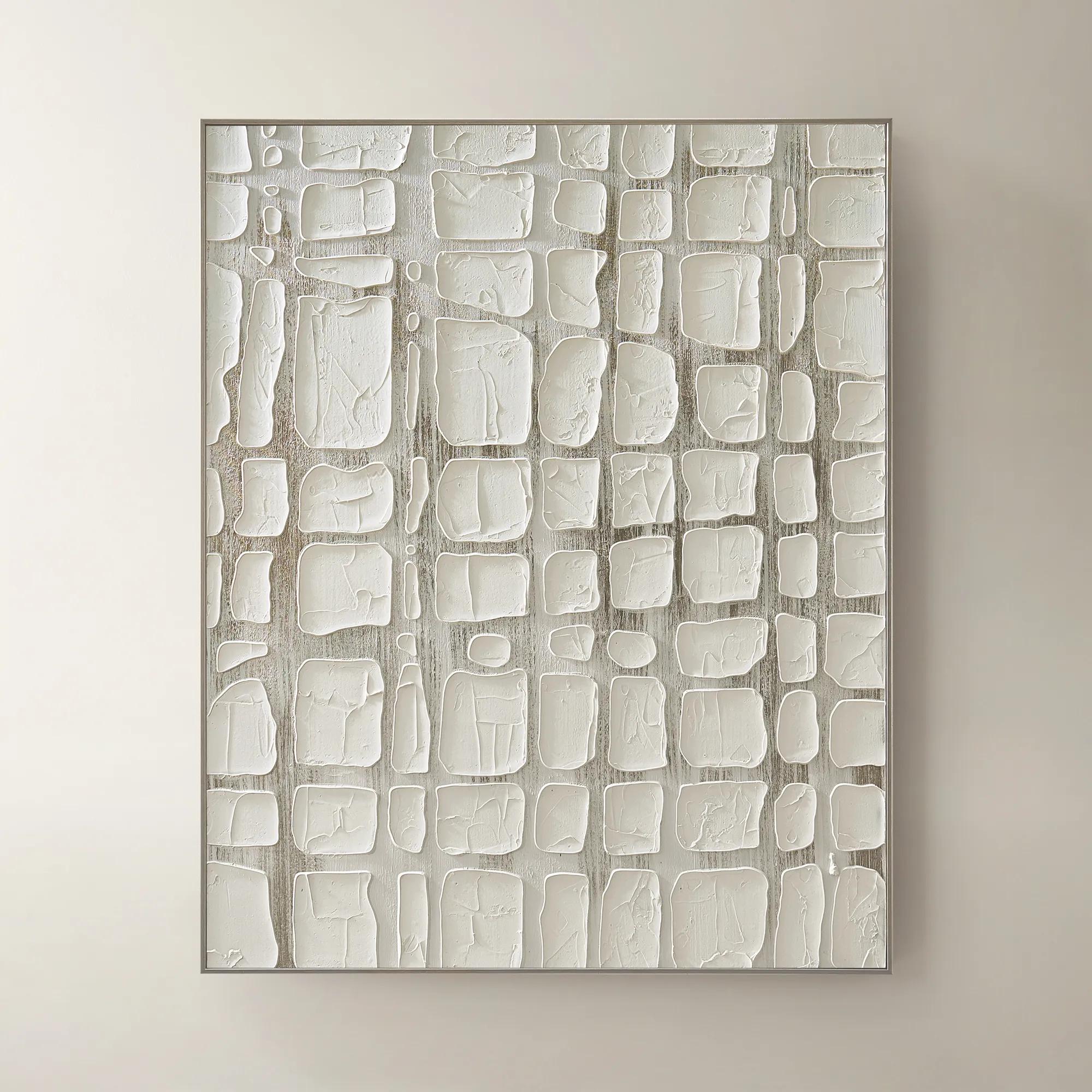
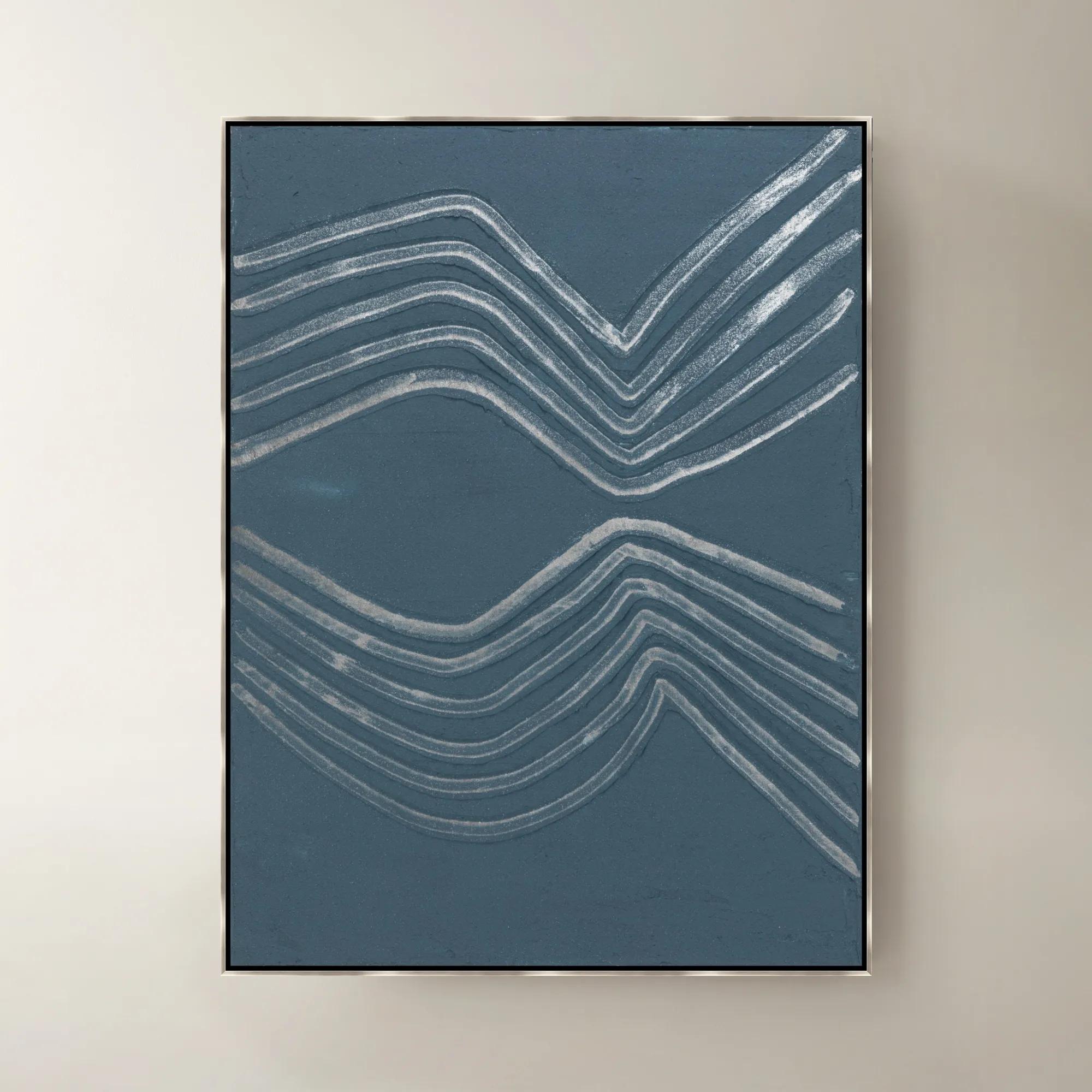
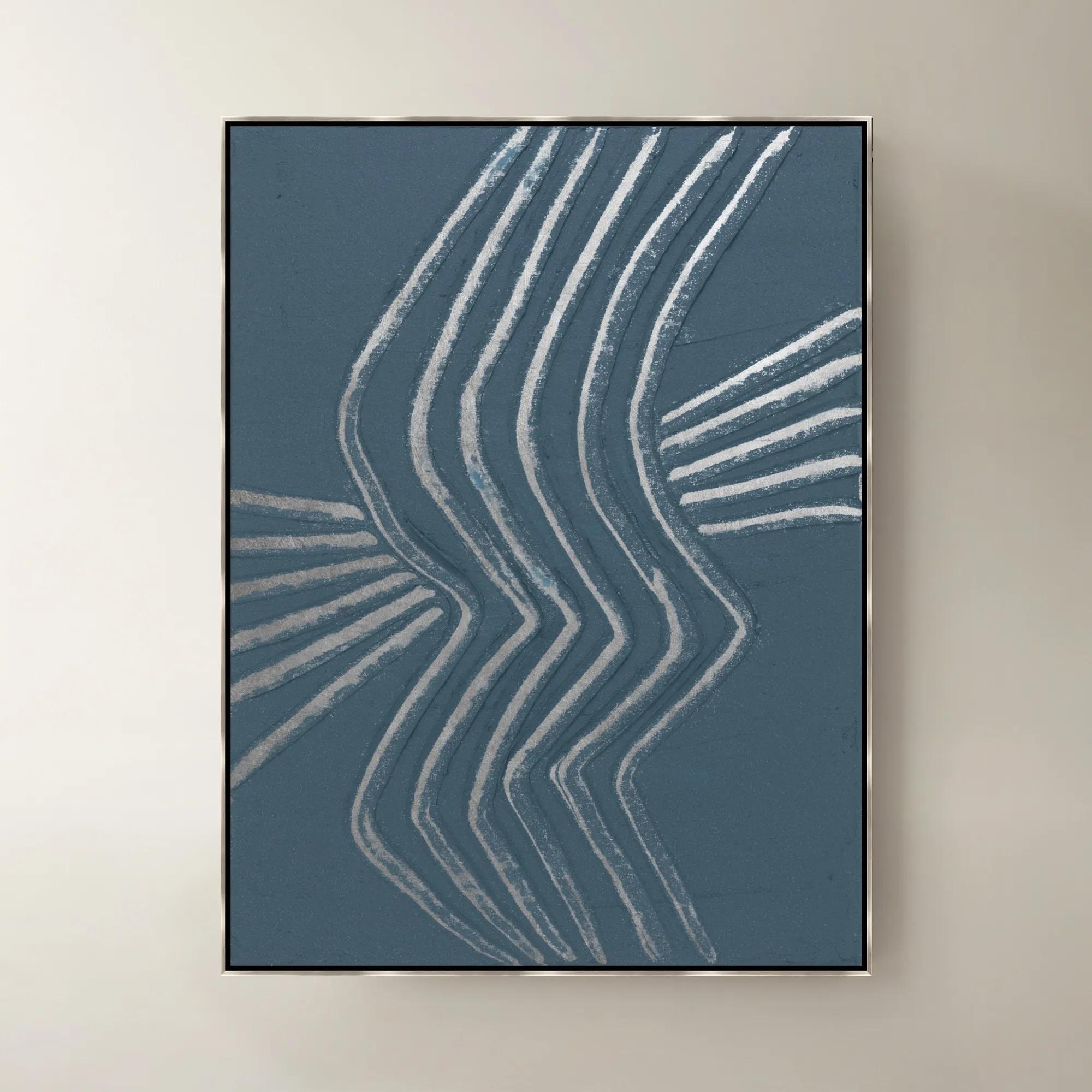
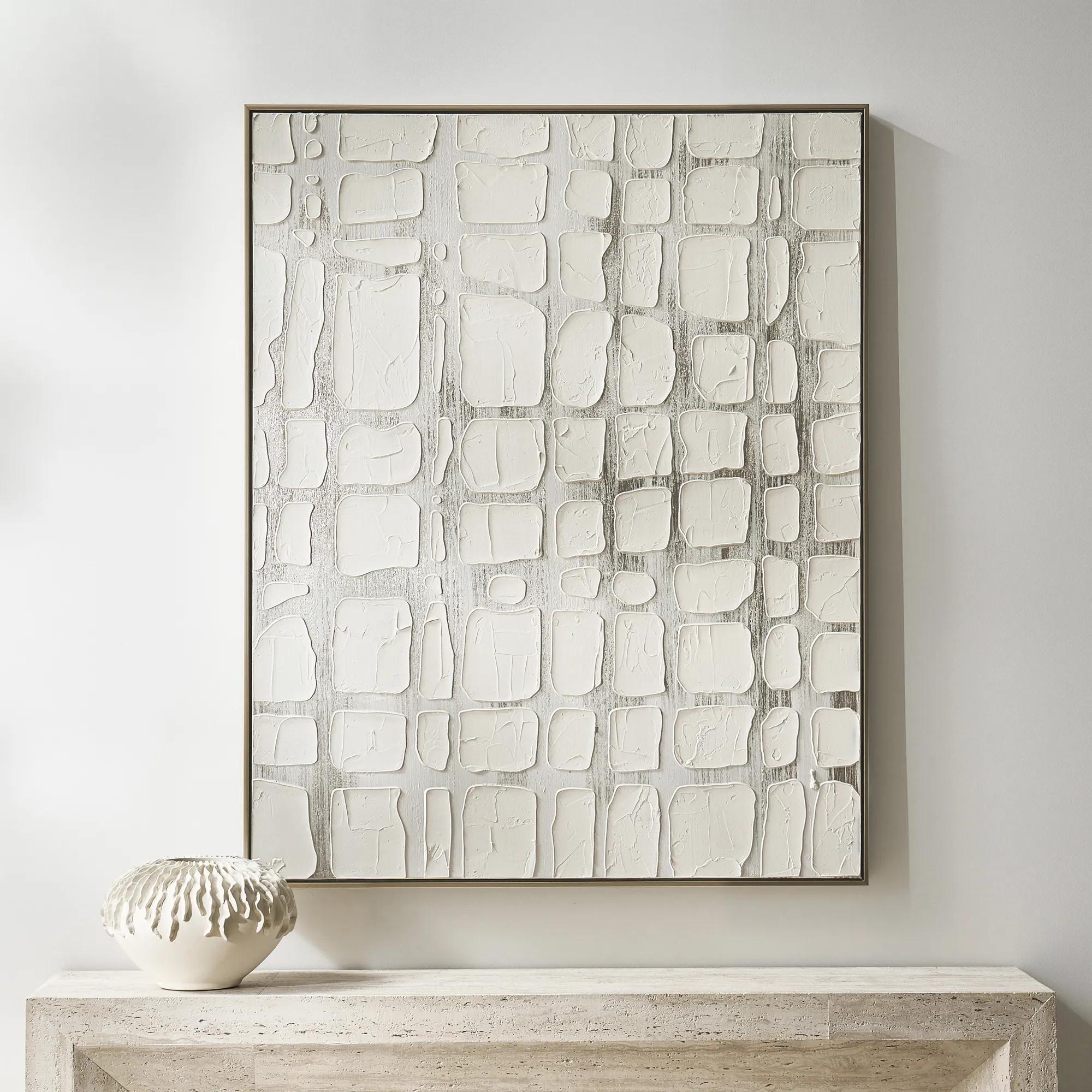 Vanish Framed Painted Wall Art 40" x 50"$499
A hand-painted canvas with raised white forms over champagne metallic ground in a refined floater frame.
Add To Cart -

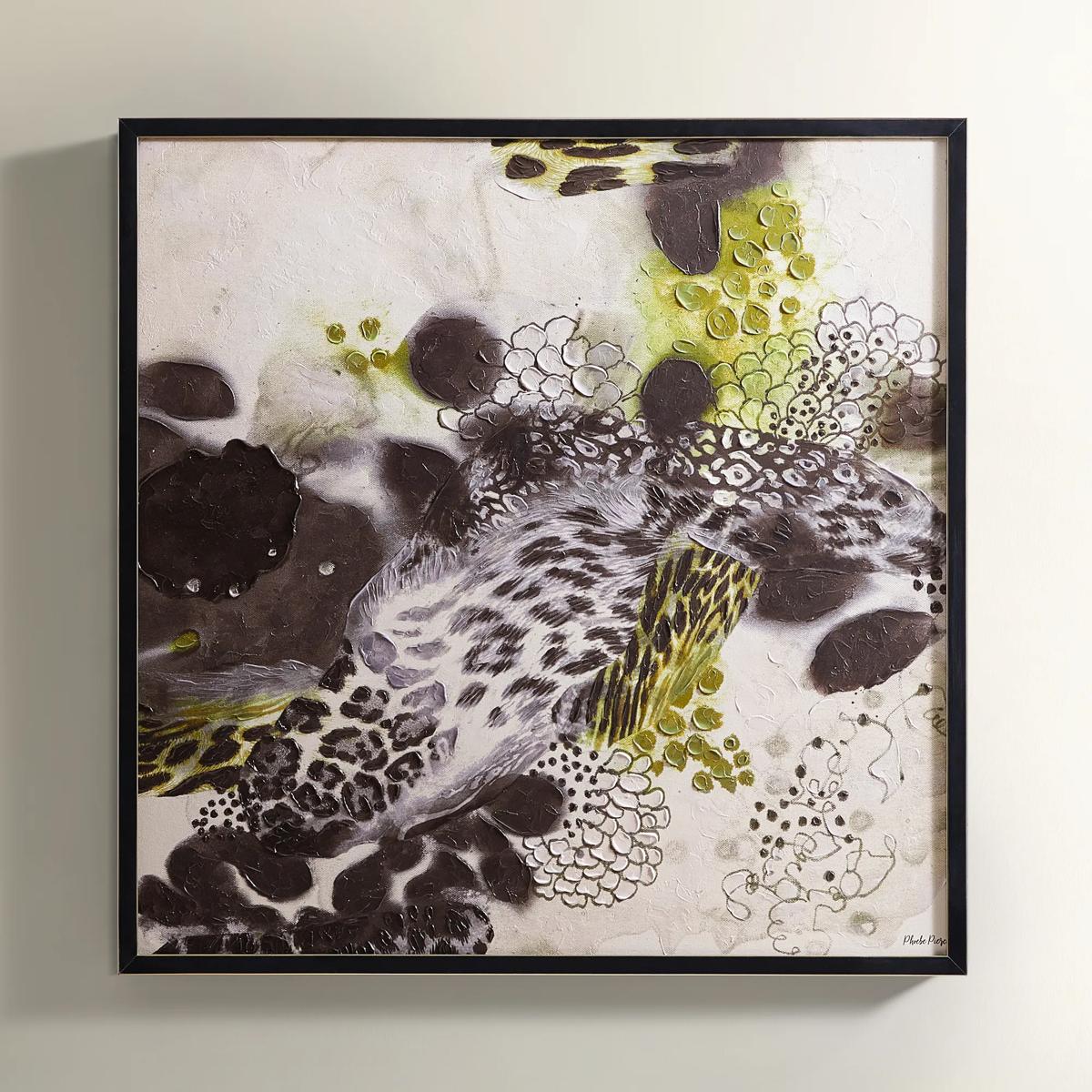
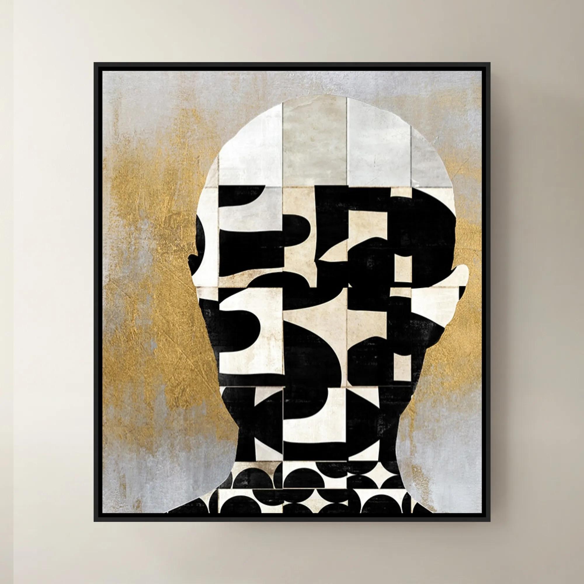
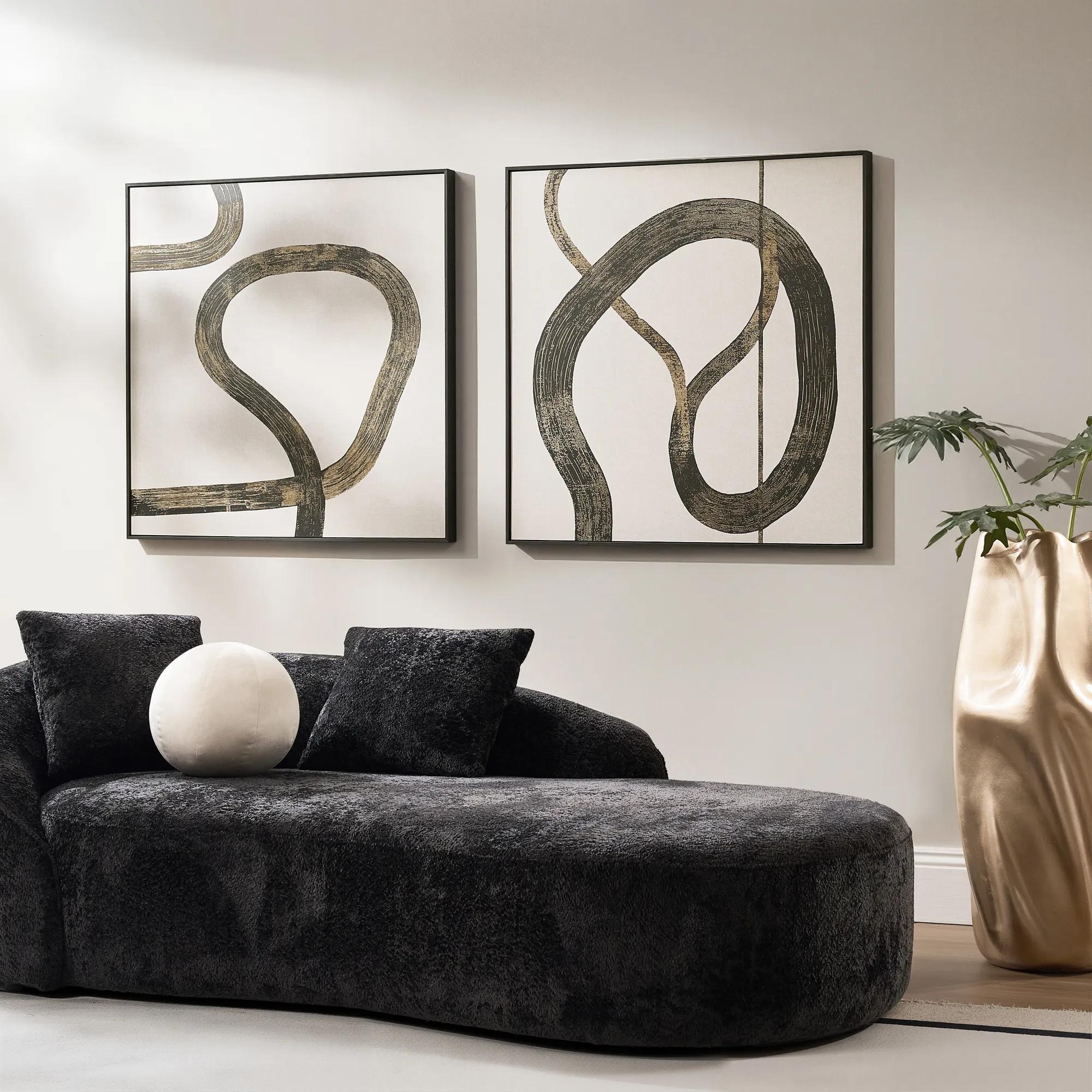 Live Wire Framed Gold Foil Painted Wall Art II 39" x 39"$349
A framed wall artwork featuring gold foil-painted detailing for glamorous modern display.
Add To Cart -
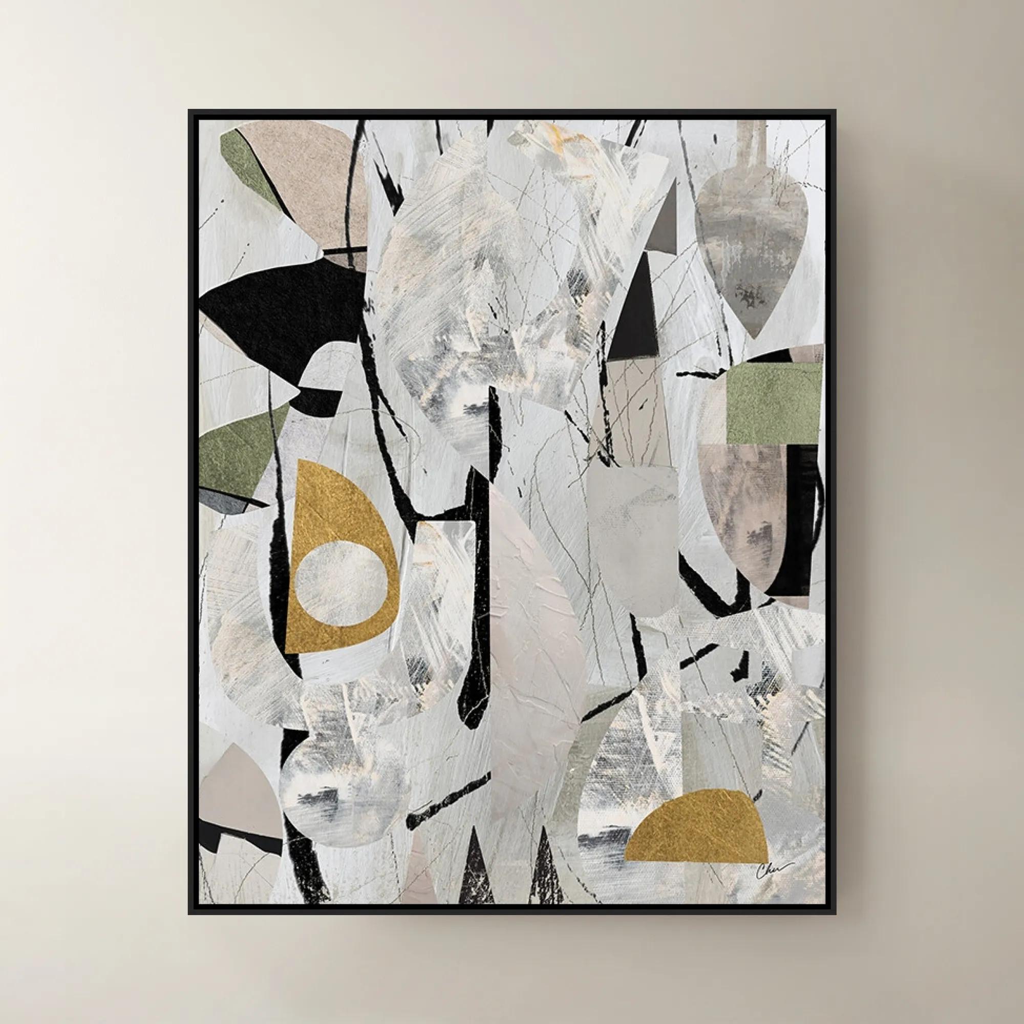
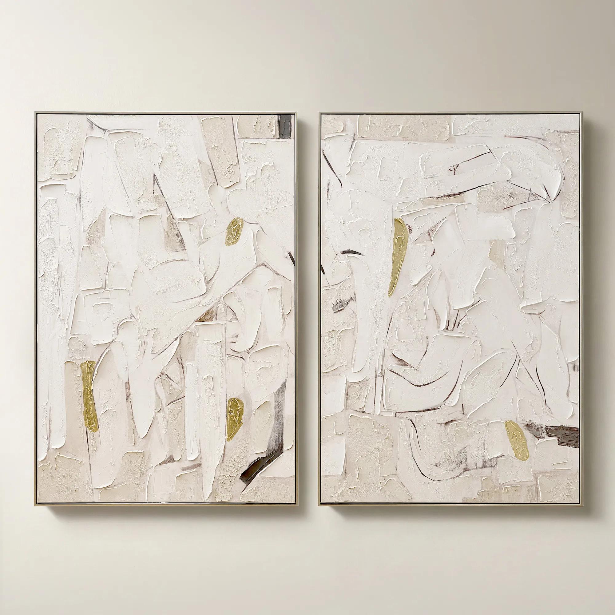 Beneath the Surface Framed Gold Leaf Painted Wall Art 40" x 60" Set of 2$799
A hand-painted abstract diptych featuring gold detailing and layered texture in alabaster and tawny hues.
Add To Cart -
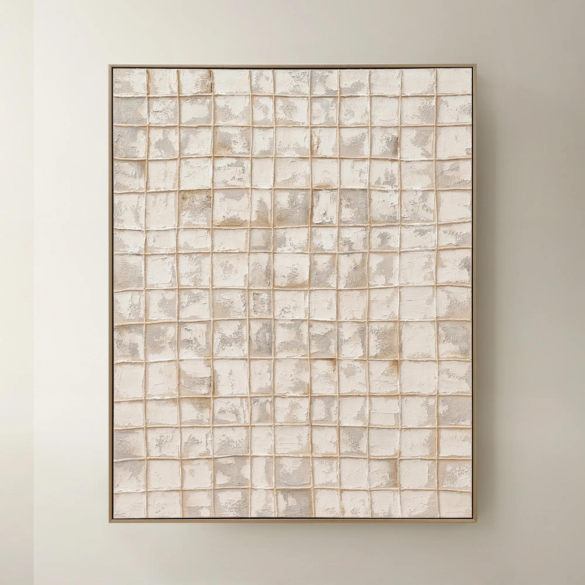
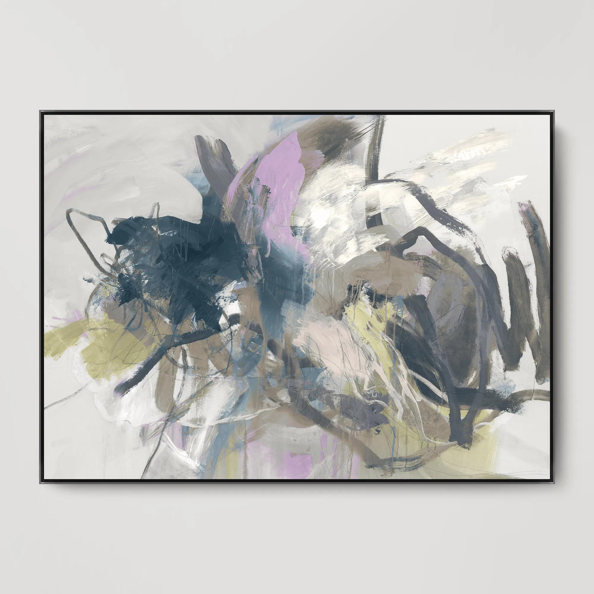
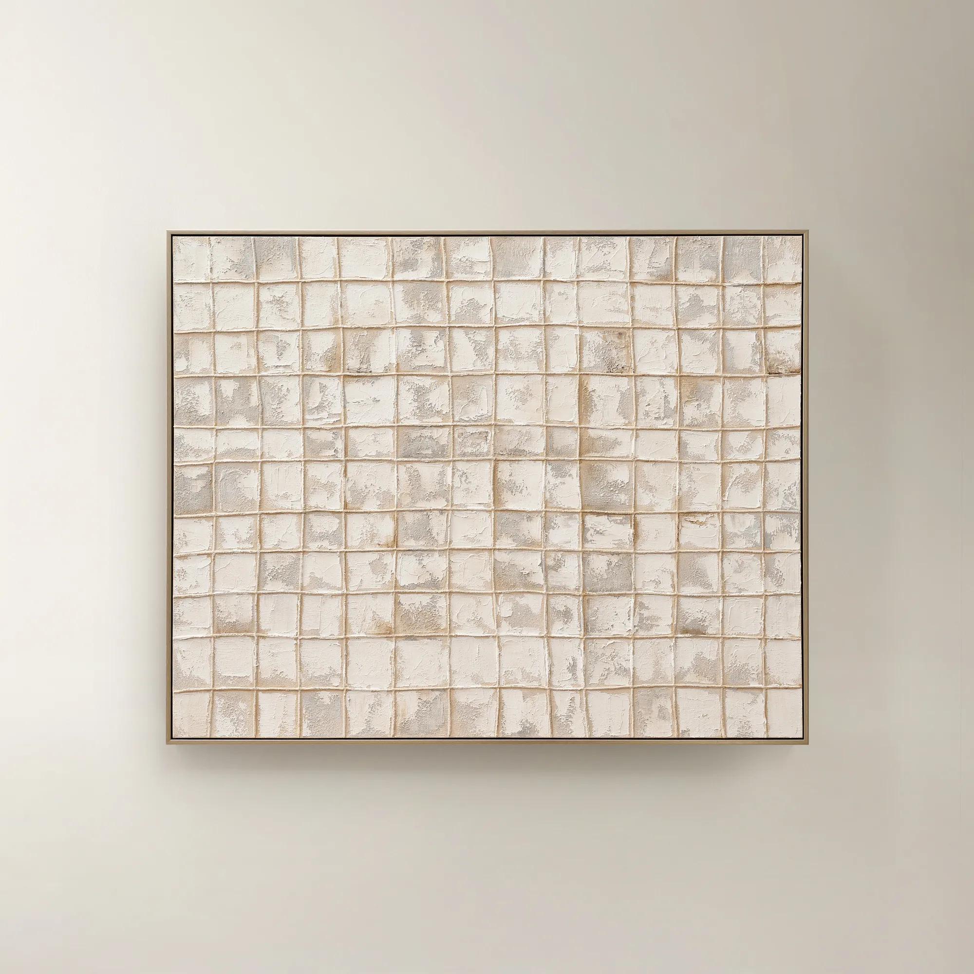 Painted Echos Framed Gold Leaf Wall Art 60" x 48"$699
A hand-painted abstract canvas with gold leaf accents and a champagne frame for modern, versatile display.
Add To Cart -
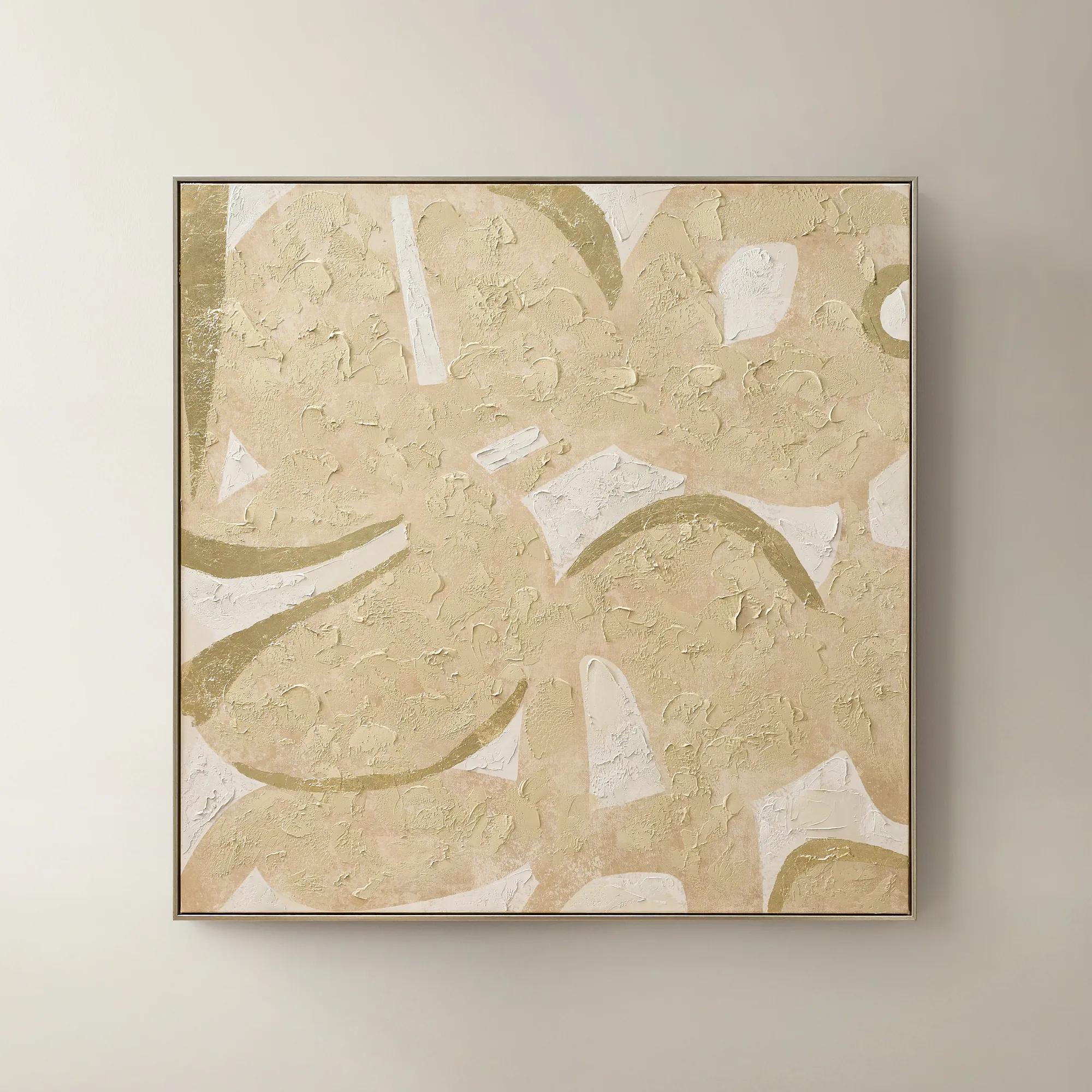
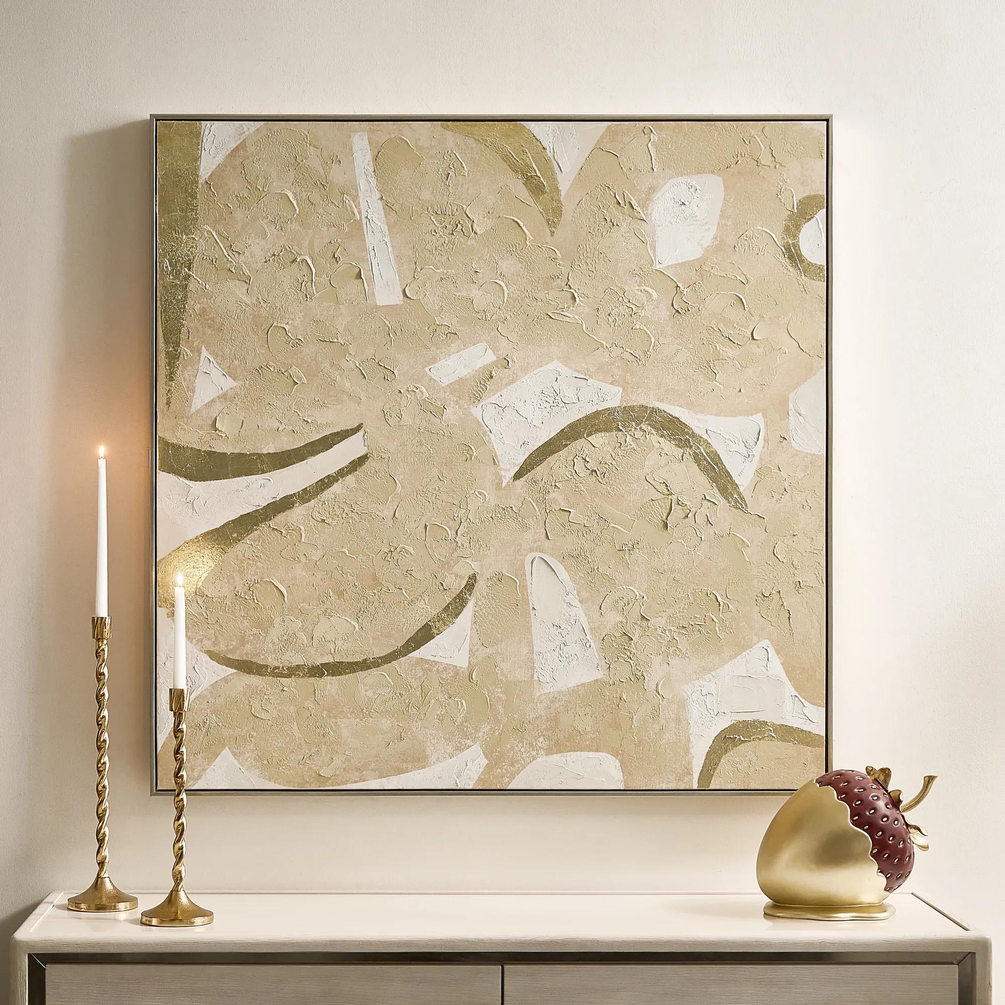 Golden Maize Framed Painted Wall Art 48" x 48"$399
A hand-painted canvas with champagne leafing and butter cream tones adds warmth and modern sophistication.
Add To Cart

Ivory And Gold Abstract Wall Art
Cream and gold abstract art gives a neutral living room an expressive focal point. Explore ivory, soft-white, and warm-neutral compositions with gold or champagne details that connect beautifully with pale upholstery and warm metallic furnishings. Choose flowing forms for softness, graphic patterns for definition, or restrained dark linework for a more dramatic contrast.
Let the artwork’s undertones guide the mood of your room. Butter-cream and beige notes lend warmth, while soft-white passages create a lighter counterpoint to gold and champagne accents. Compare those tones with your upholstery and wall color rather than expecting every neutral to match exactly; subtle variation gives an ivory living room depth. Composition matters just as much as color. Open areas allow the eye to rest, sweeping gestures introduce movement, and structured patterns bring architectural definition. Consider the surface, too: painted canvas can emphasize tactile dimension, while artwork on paper board with foil accents offers a different expression of line and shimmer. Read each piece’s description to distinguish its materials and decorative finish. Give your chosen artwork a deliberate relationship to the furniture beneath it. Above a sofa or sideboard, consider the full framed dimensions and any permitted hanging orientation, then leave enough surrounding wall space for the composition to feel intentional. A richly textured abstract can command attention against restrained upholstery, while a quieter composition can balance sculptural furniture and gleaming accents. Repeat a warm metallic note elsewhere in the room without matching every surface, and use pillows or decorative objects to echo a secondary tone from the artwork. For a cohesive setting, explore ivory and gold living room furnishings, allowing the art to provide the expressive gesture that unites the space.
FAQs
Compare the artwork’s undertones with your walls and upholstery. Cream often reads warmer, while soft white can create a clearer contrast. Ivory offers a nuanced middle ground. These color names can vary, so consider the pictured palette and written color description together.
No. Gold leaf, gold foil accents, and champagne metallic finishes are distinct decorative treatments. A gold-toned palette describes an appearance, not necessarily a material. Check each artwork’s description to understand how its metallic effect is created.
Yes. Restrained black linework can sharpen a pale composition and give it graphic energy without overwhelming the neutral palette. Echo that dark note sparingly elsewhere in the room to make the contrast feel deliberate.
Gold, brass, and champagne tones can work beautifully together when they share a warm character. Let one finish lead and use the others as accents. Variation in sheen adds dimension, so every metallic detail does not need to be identical.
Use a shared palette or recurring visual element to connect the pieces. A fluid abstract can sit alongside a more structured composition if both repeat an ivory tone or warm metallic accent. Give one work visual priority so the arrangement feels curated rather than competitive.