Horizontal Blue Wall Art Above Beds
Horizontal Blue Wall Art Above Beds
-
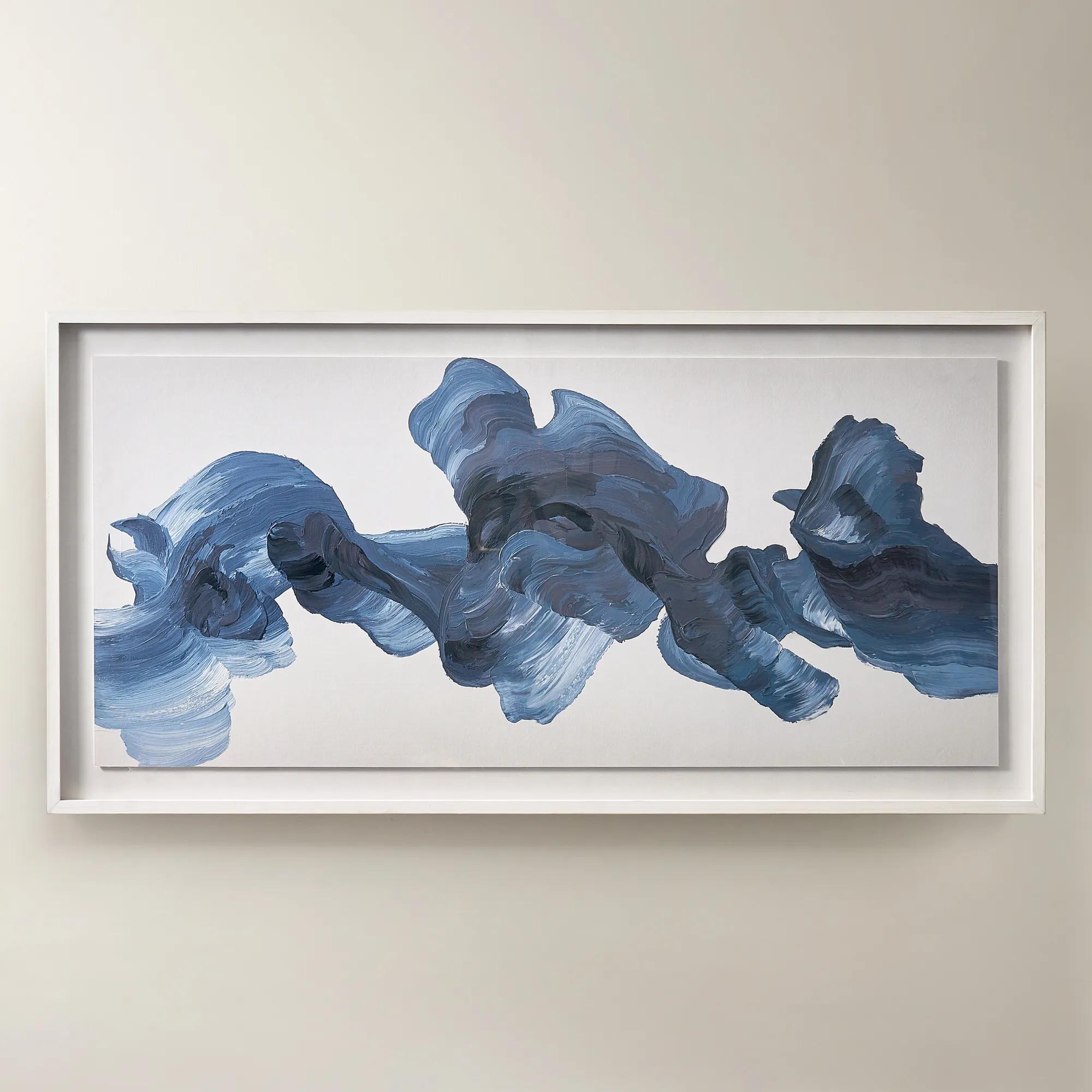
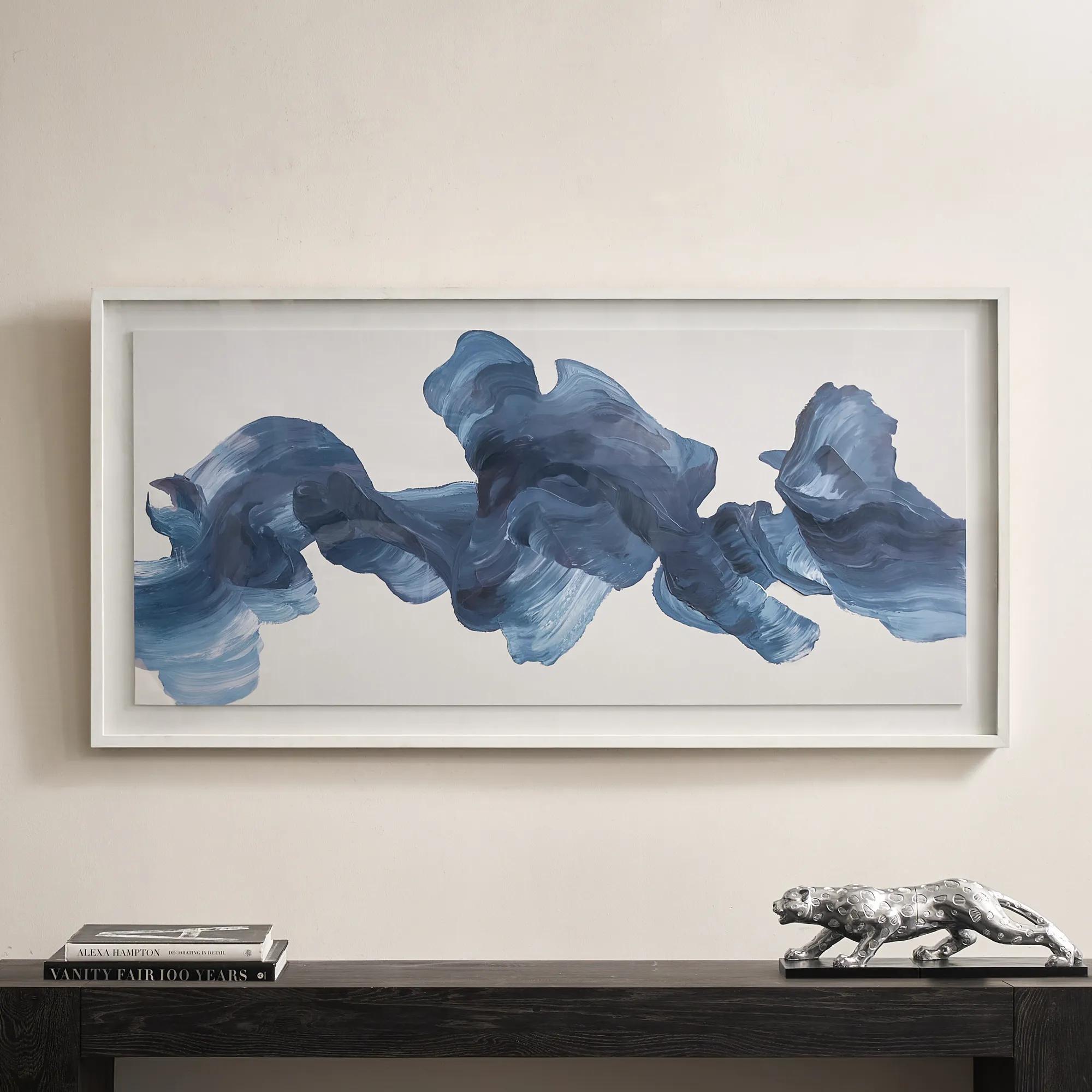 Blue Theory Framed Painted Wall Art in Acrylic 60" x 30"$499
A hand-painted canvas in deep ink blue, framed under acrylic with a whitewashed wood frame.
Add To Cart -
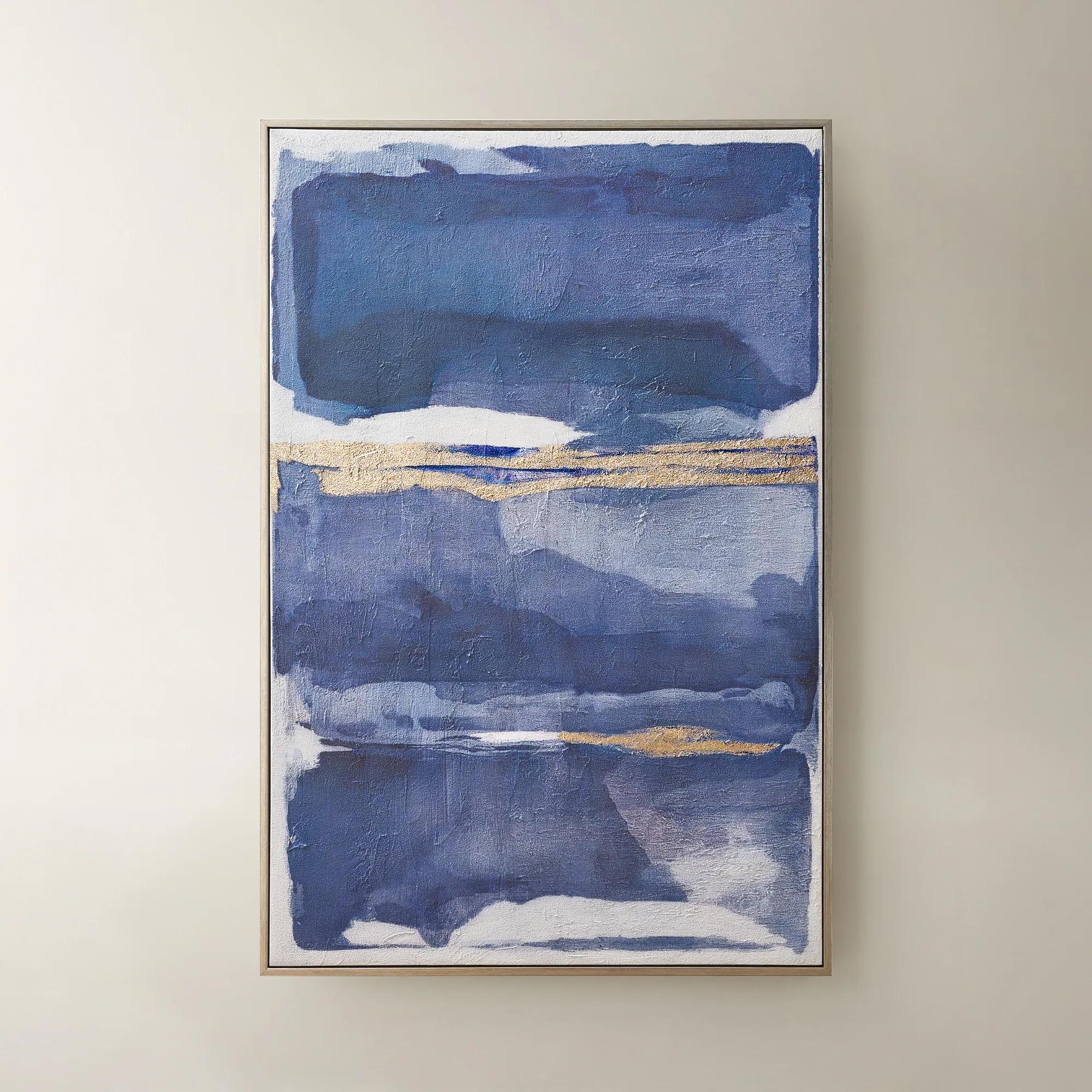
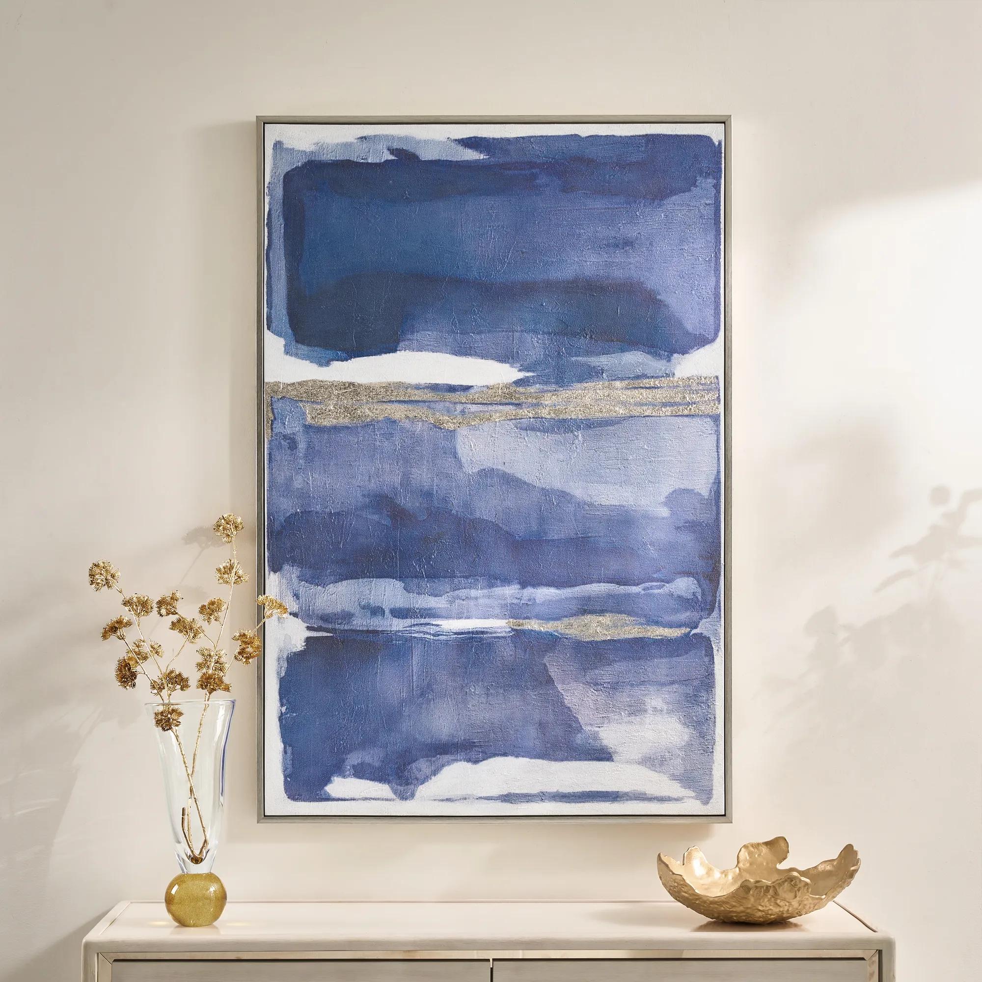 Memories in Blue Framed Painted Wall Art 40" x 60"$499
A hand-painted canvas in deep ink blue with champagne leafing for a sophisticated, gallery-inspired look.
Add To Cart -
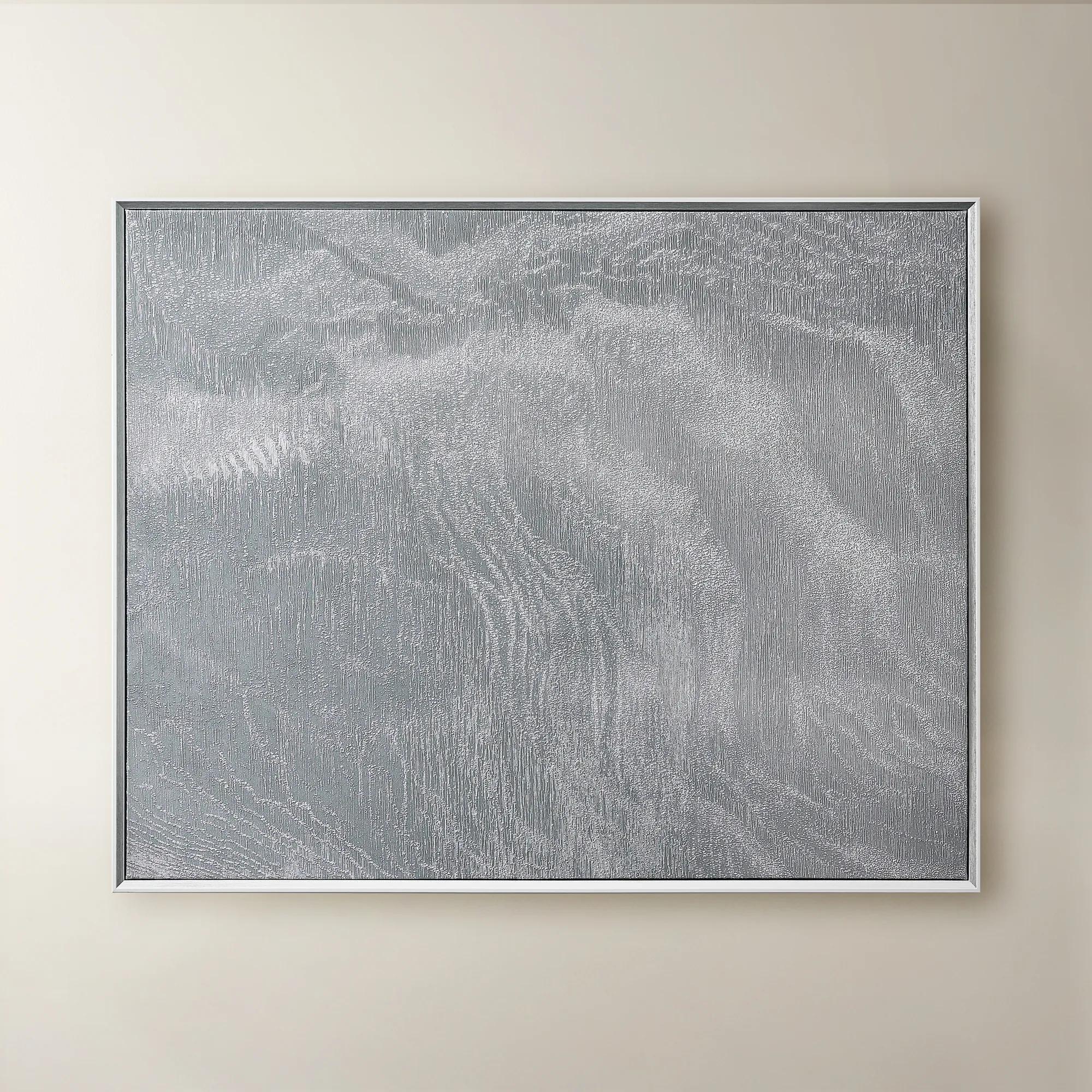 Slow Blue Morning Framed Silver Foil Wall Art 48" x 60"$599
A serene powder blue abstract canvas with silver foil accents, framed in silver and white for modern elegance.
Add To Cart

Horizontal Blue Wall Art Above Beds
Horizontal blue wall art transforms the space above a bed into an expressive focal point, bringing a sweep of color to a welcoming bedroom. Explore compositions designed or explicitly approved for horizontal display, choosing a palette that complements your bedding and a proportion that balances the headboard below.
A horizontal composition draws the eye across the bed, giving the room a gallery-inspired focal point. Begin with the relationship between the artwork, headboard, and surrounding wall rather than assuming every wide piece will suit the space. Compare the overall framed dimensions with the available area, accounting for bedside lighting and other architectural details. Check the approved display orientation, too: artwork pictured vertically is not necessarily intended to hang horizontally. For a piece explicitly approved for both orientations, width and height switch if the listed measurements describe its vertical presentation. Confirm the intended horizontal dimensions and follow the supplied hanging instructions before committing to above-bed placement. Let the artwork establish the bedroom’s blue palette without asking every accent to match it exactly. Softer blues can lend an airy quality to ivory bedding, while deeper tones introduce a more enveloping, dramatic note. Consider the composition as well as its color: gentle transitions suggest quiet movement, while bold contrasts give the wall greater visual energy. A frame finish can echo nearby metallic or wood details without duplicating every finish in the room. Carry a secondary shade into blue pillows for guest rooms, then vary the textures for a sumptuous, layered effect. The result feels welcoming and personal, with the artwork—not a perfectly matched decorating scheme—setting the mood.
FAQs
Consider the atmosphere you want guests to experience. Pale, softened blues suggest an airy retreat, while inky tones bring depth and intimacy. Look at the artwork alongside your wall color and bedding so its undertones feel intentional within the room.
Silver-toned finishes emphasize blue’s cool elegance, while champagne or gold tones introduce warmth and contrast. Wood finishes can soften the composition. Choose a finish that relates to another detail in the room without requiring every accent to match.
Yes—give the artwork and upholstery distinct visual roles. A richly patterned headboard can pair beautifully with a composition featuring broader passages of color. If the artwork is intricate, quieter bedding helps preserve a clear focal point.
An exact match is not necessary. Repeating an undertone or a secondary color can create cohesion while allowing the artwork to retain its own character. Layering different shades of blue often feels more expressive than repeating a single shade throughout.
Treat blue as an artistic color story rather than a seaside reference. Abstract forms, tailored bedding, sculptural accents, and considered metallic finishes can create a sophisticated bedroom. Favor expressive composition over literal coastal motifs for a gallery-inspired mood.