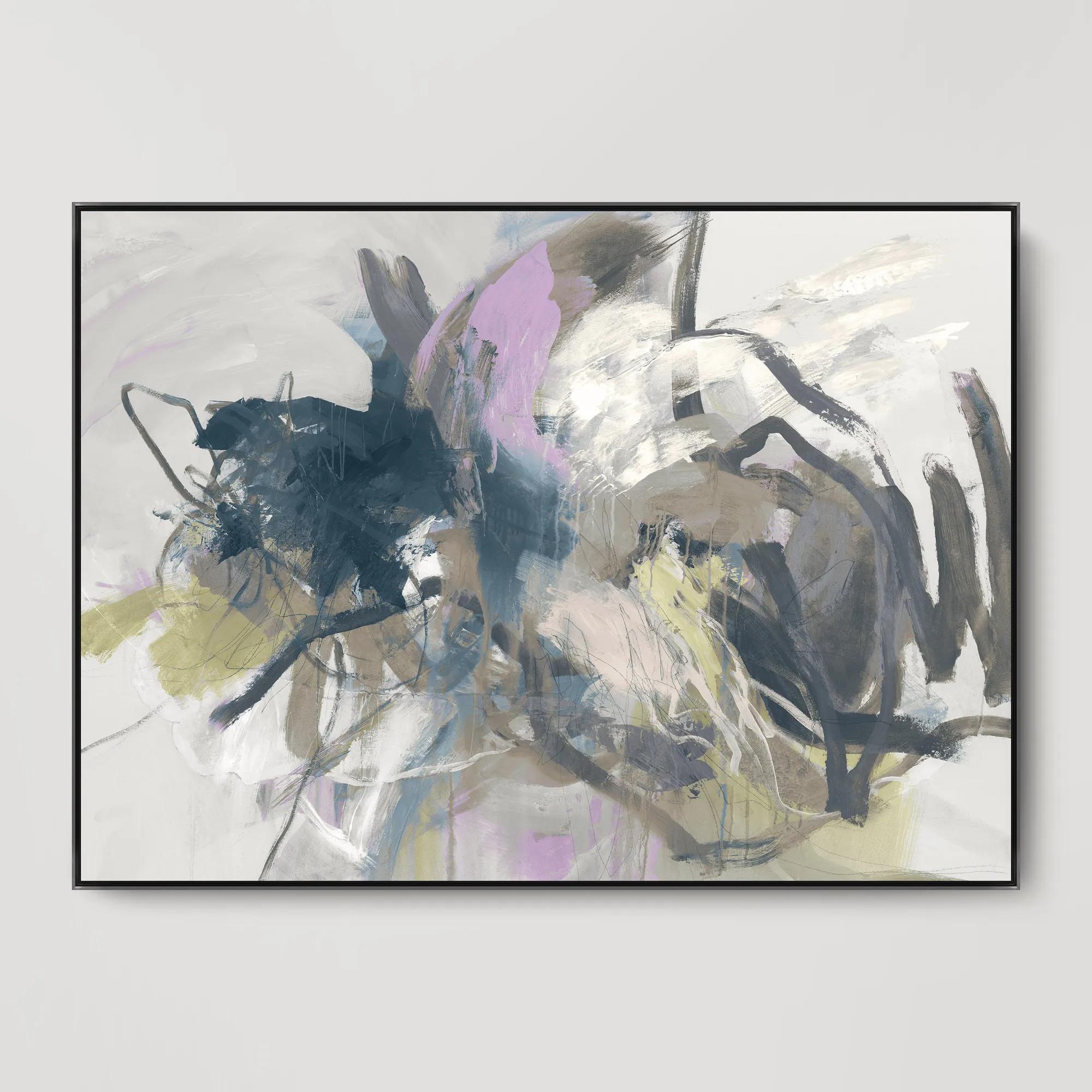
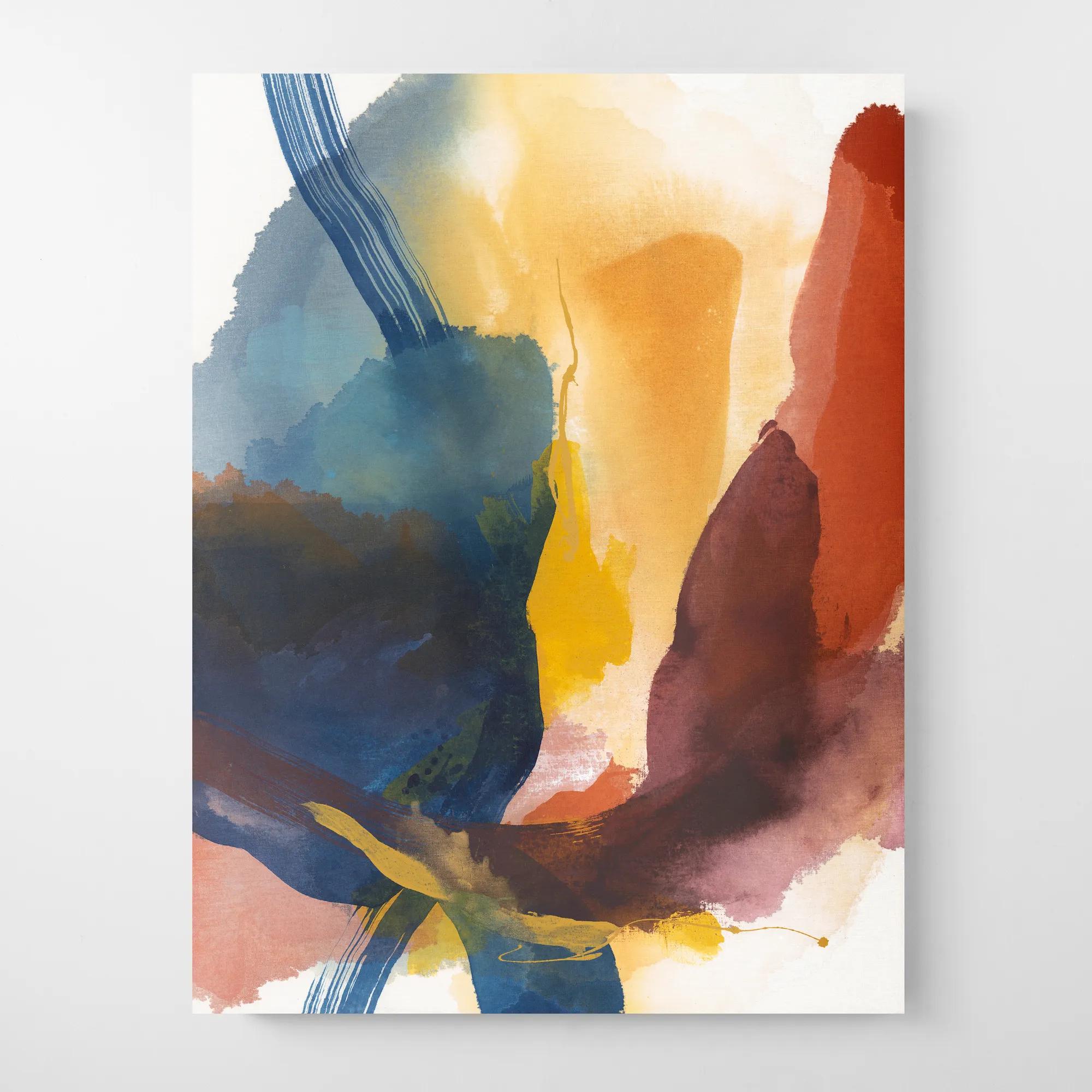
Beige And White Abstract Art
Beige And White Abstract Art
-
 Painted Echos Framed Gold Leaf Wall Art 60" x 48"$699
A hand-painted abstract canvas with gold leaf accents and a champagne frame for modern, versatile display.
Add To Cart -
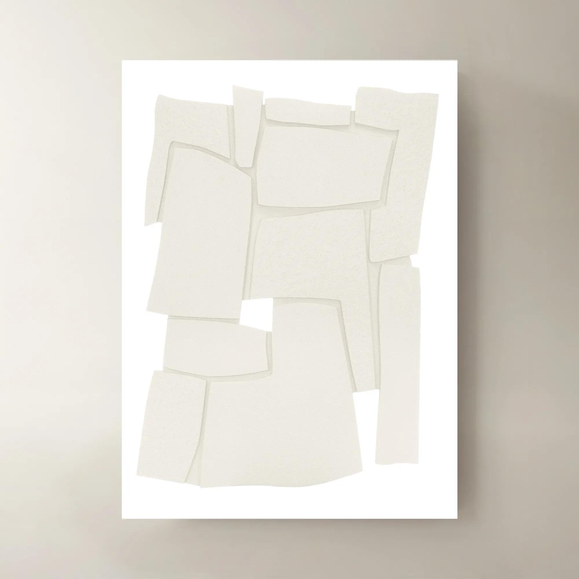
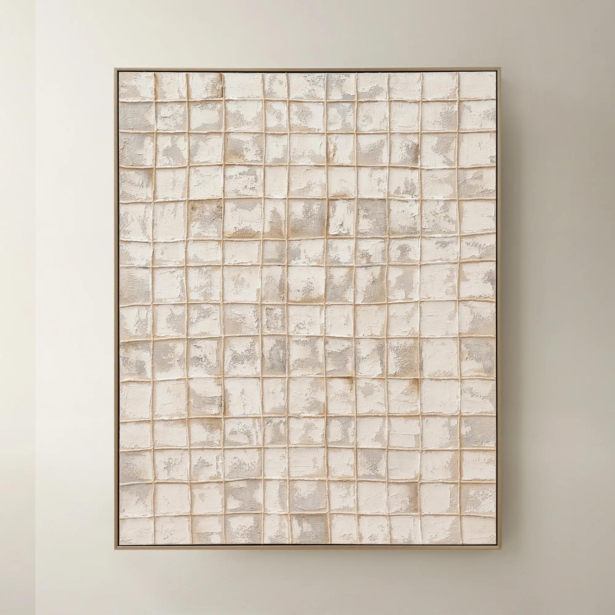
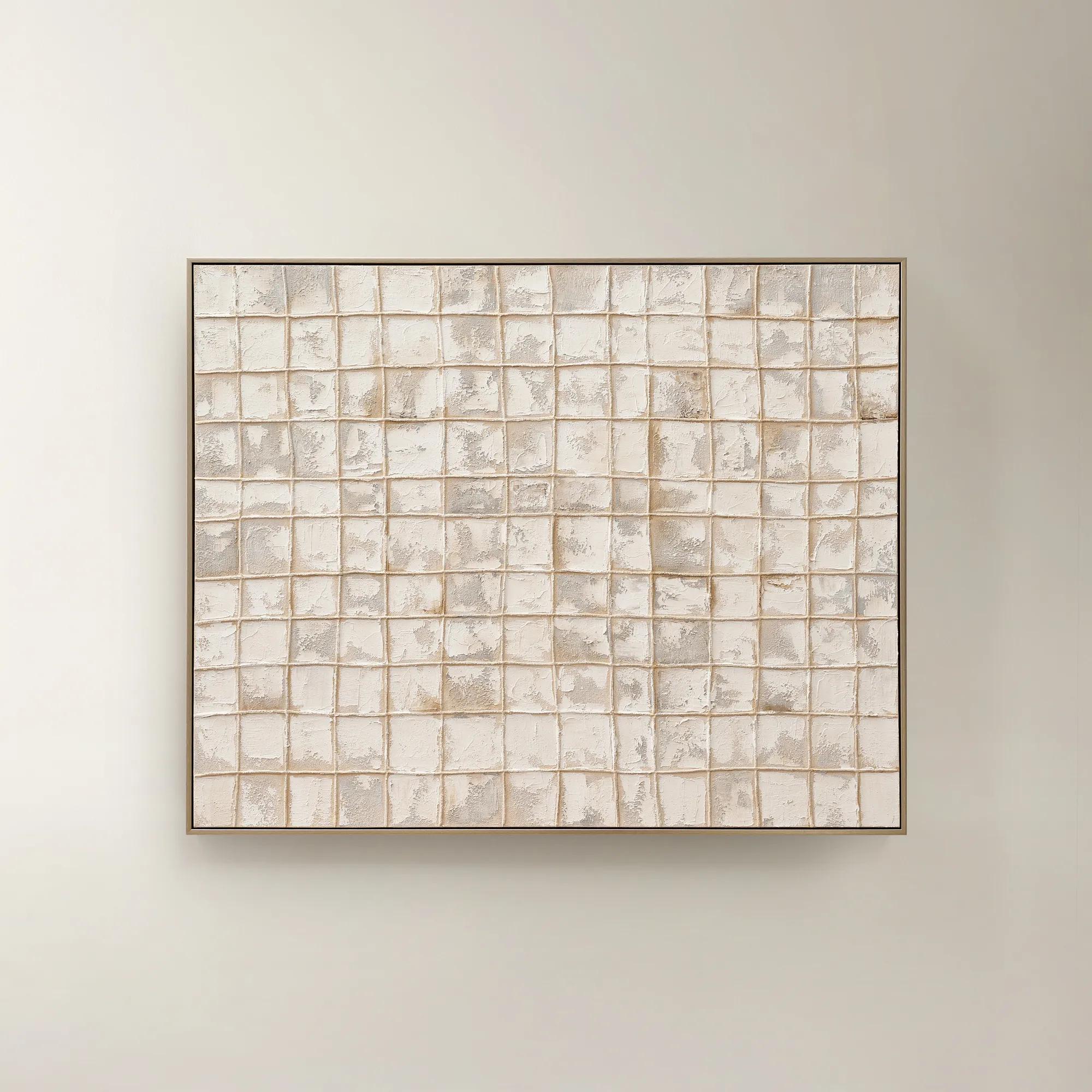
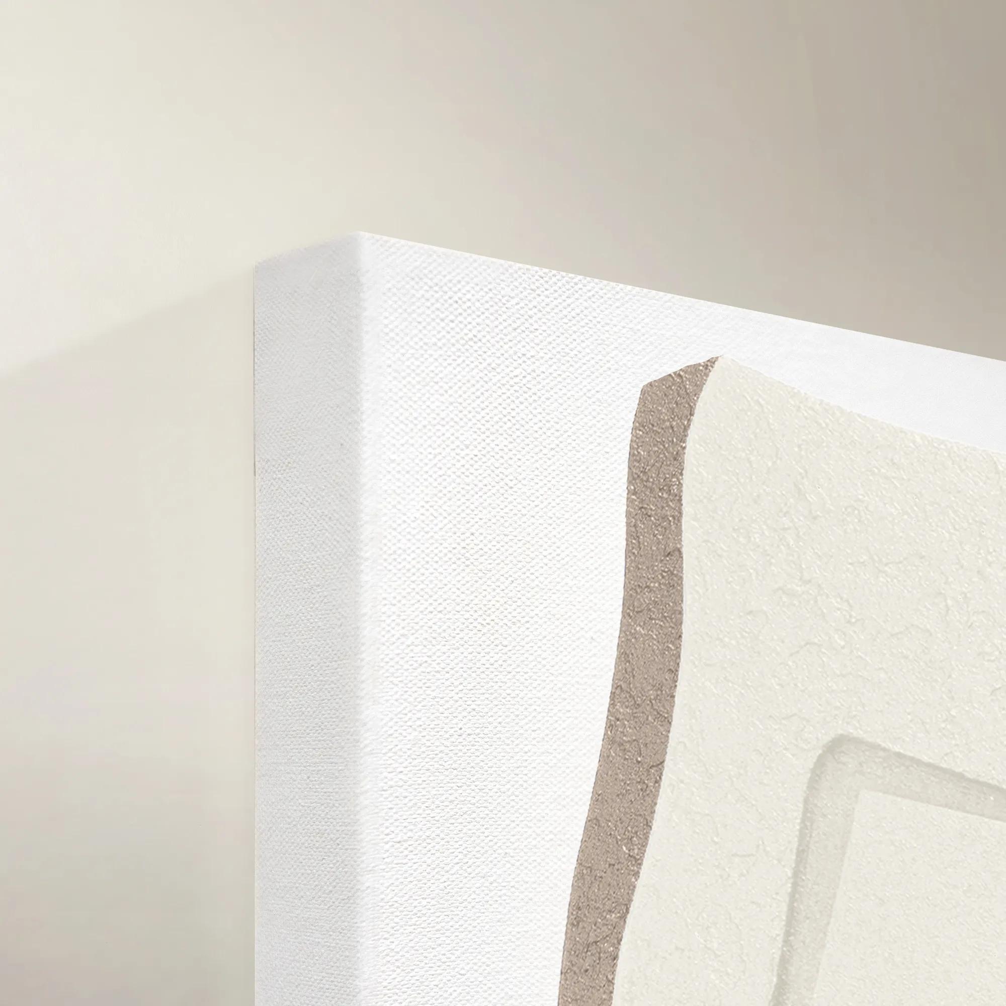 Wonder Maze III Wall Art 40" x 55"$1699
A contemporary canvas wall art piece featuring an intriguing abstract maze-inspired design.
Add To Cart -

 Shift Framed Painted Wall Art 39.4" x 59"$499
A hand-painted canvas featuring bold black and beige contrasts with textured layers in a sleek black frame.
Add To Cart -
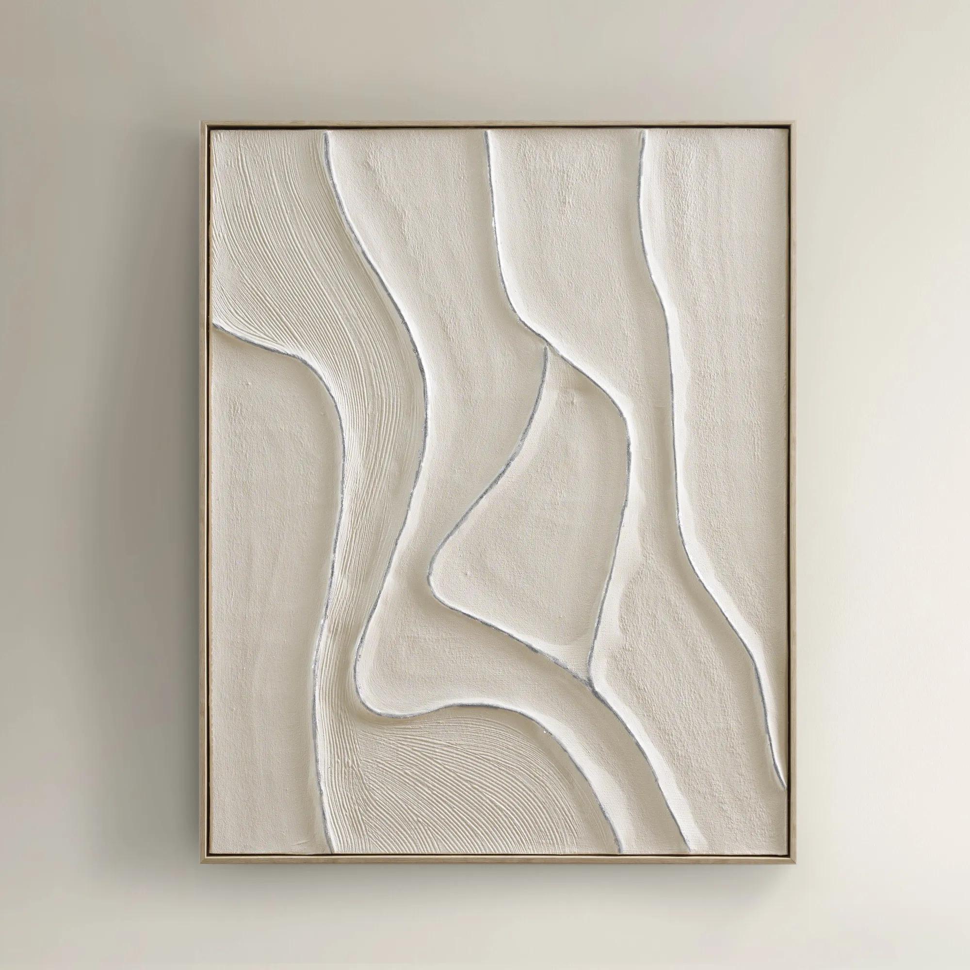
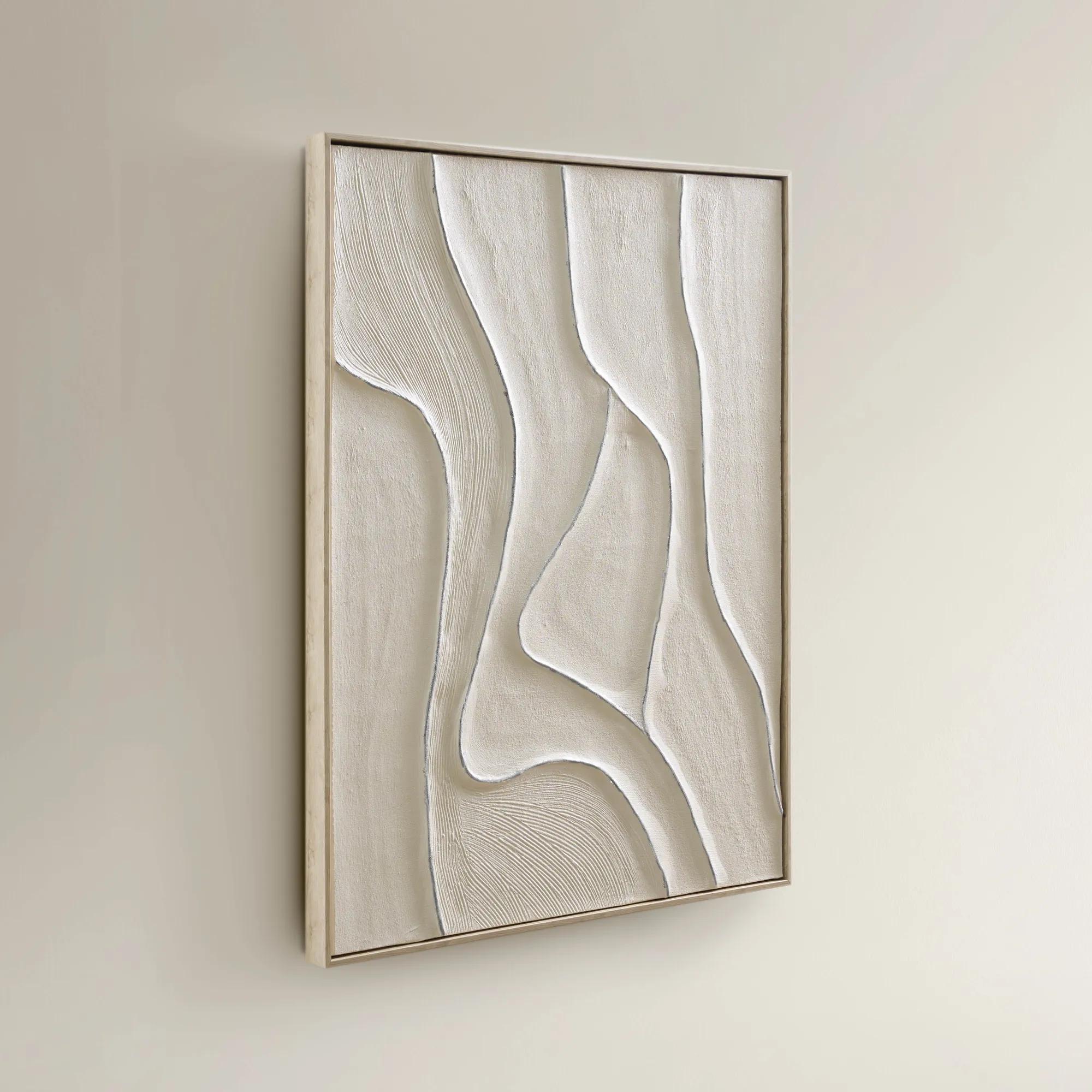 Vivre Framed Painted Wall Art 39.25" x 31.5"$199
A hand-painted canvas featuring tranquil beige hues and flowing lines in a warm whitewash floater frame.
Add To Cart -
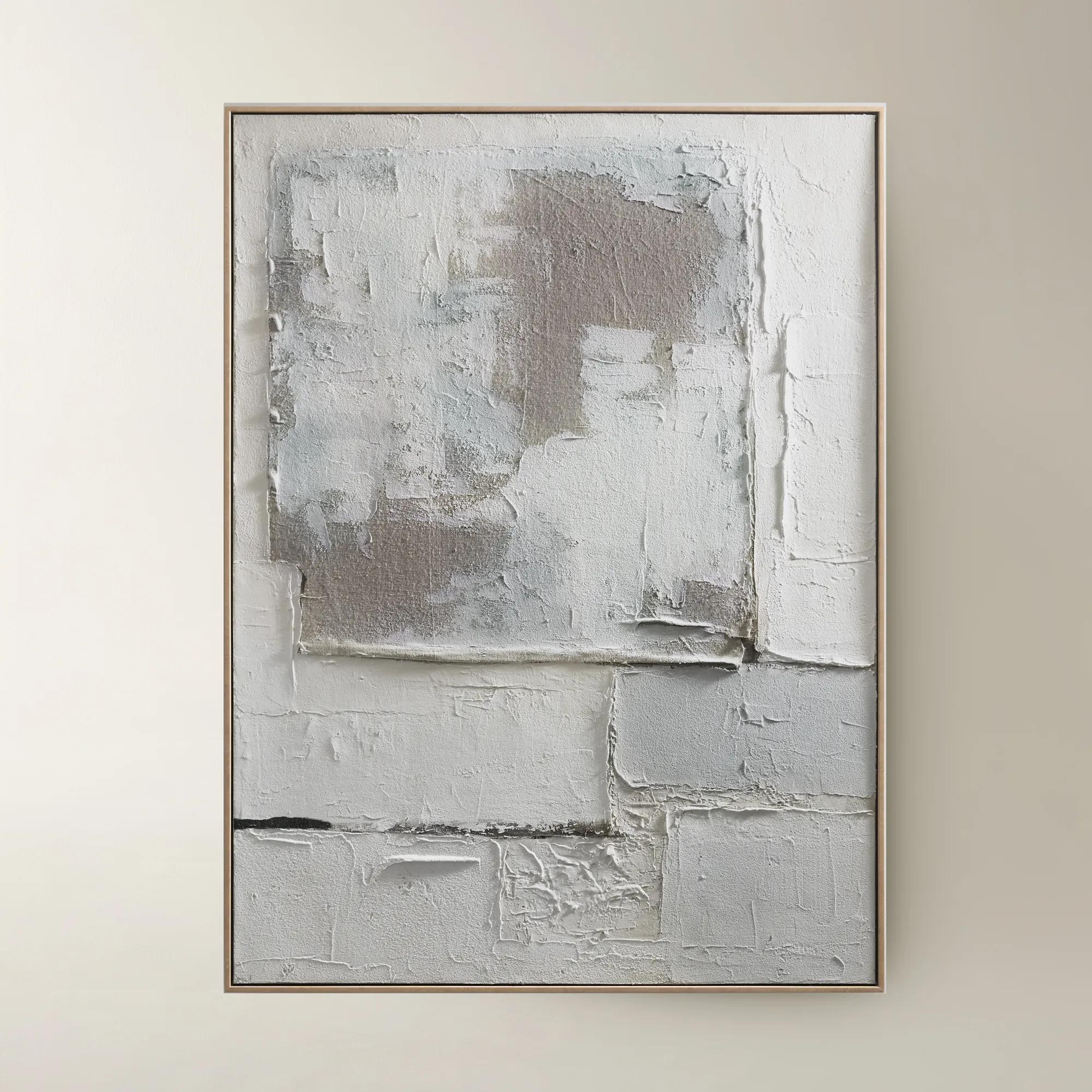
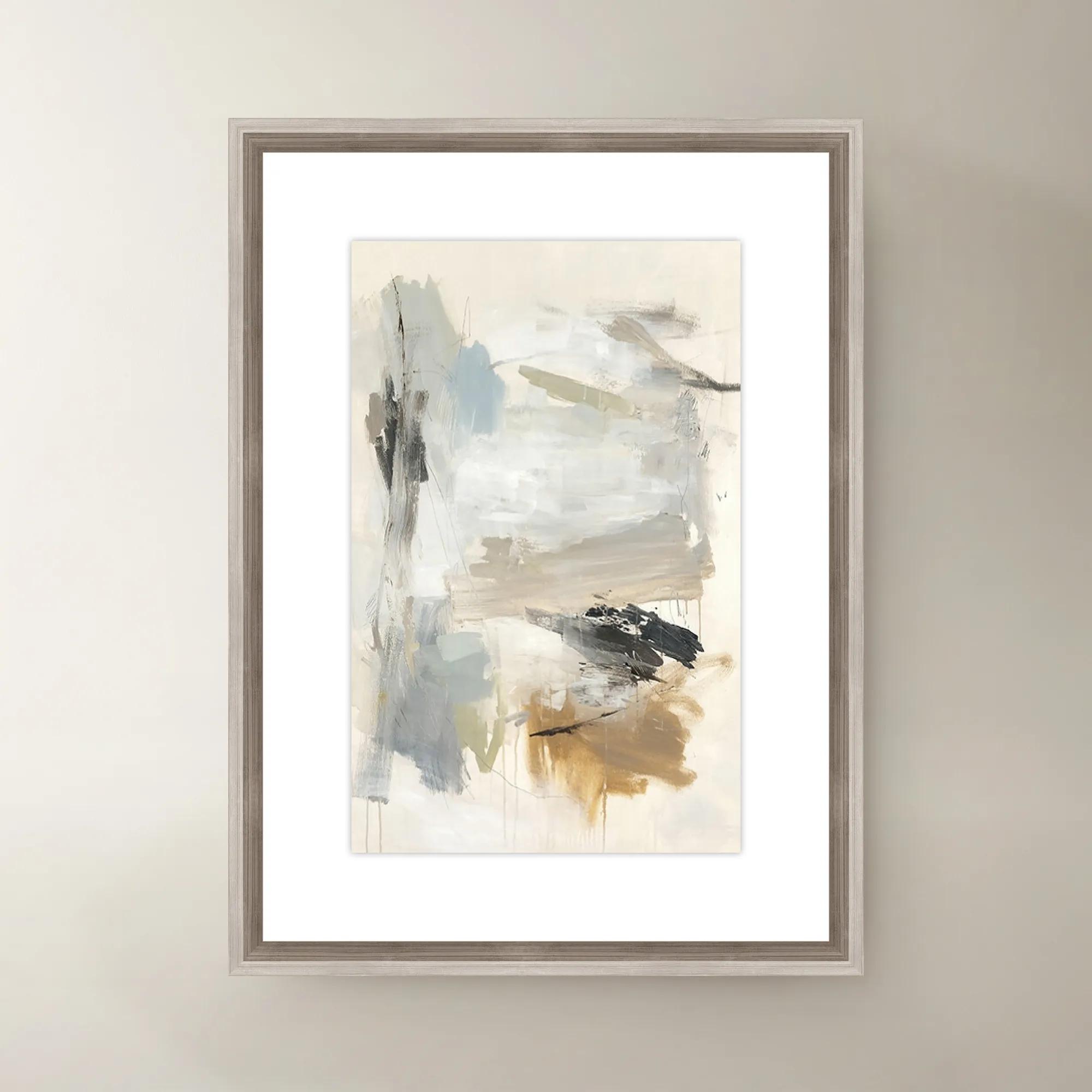
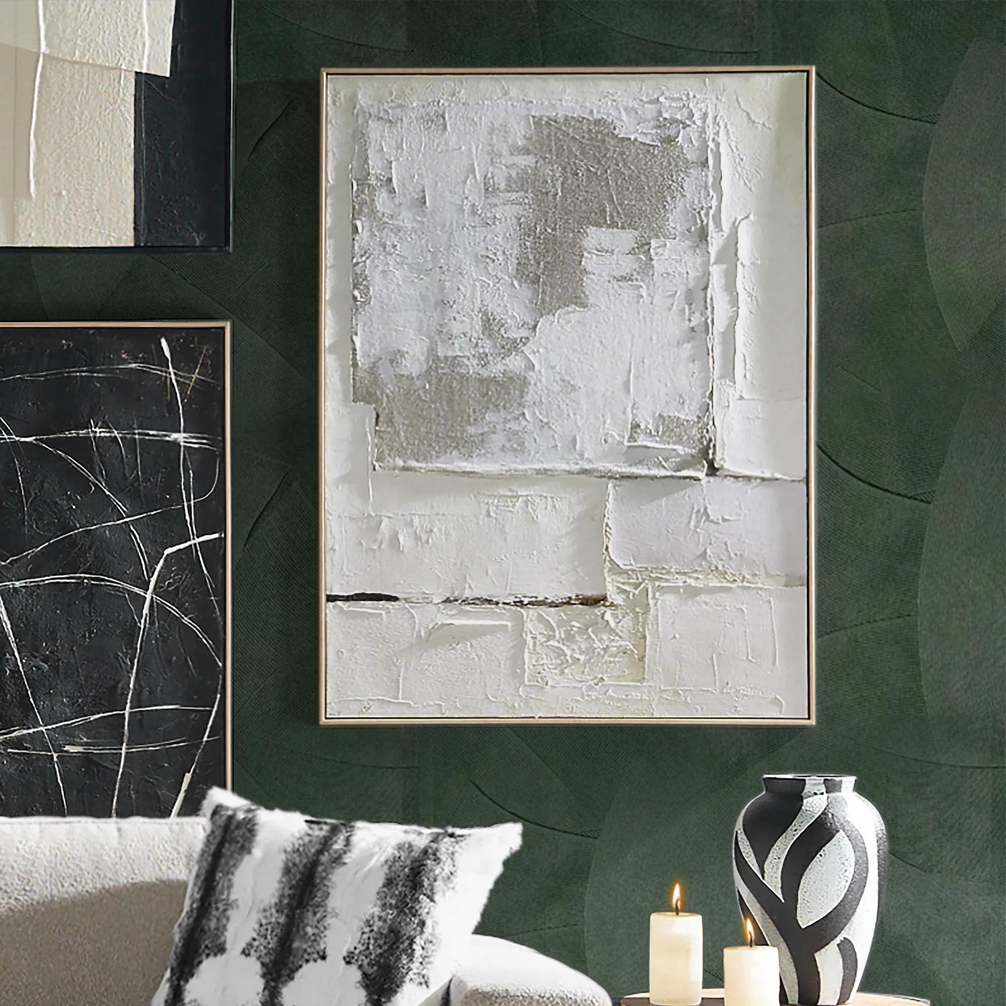 Marrow Painting$399
A hand-painted abstract canvas in subtle beige hues, elegantly framed in a warm beech wood floater.
Add To Cart -
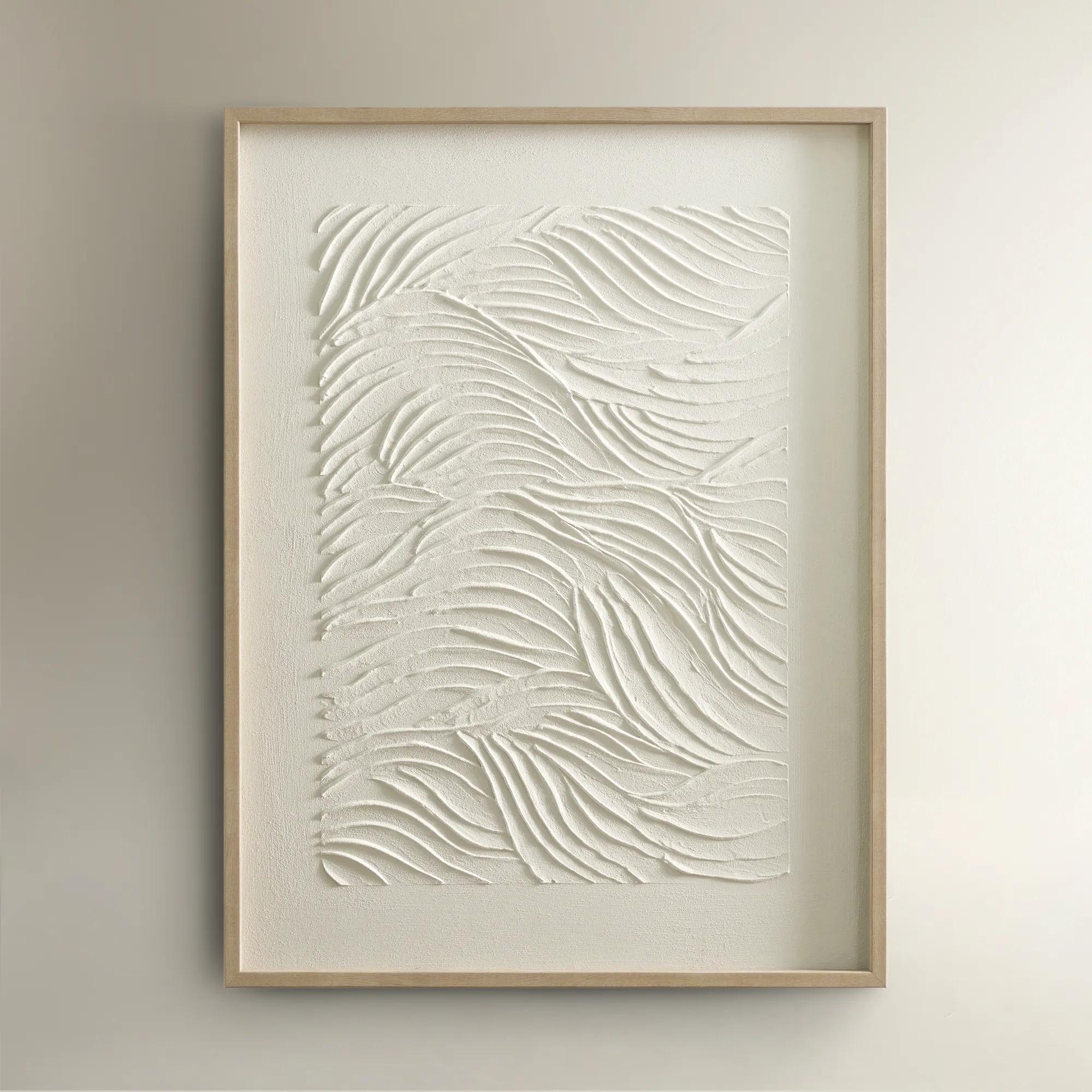
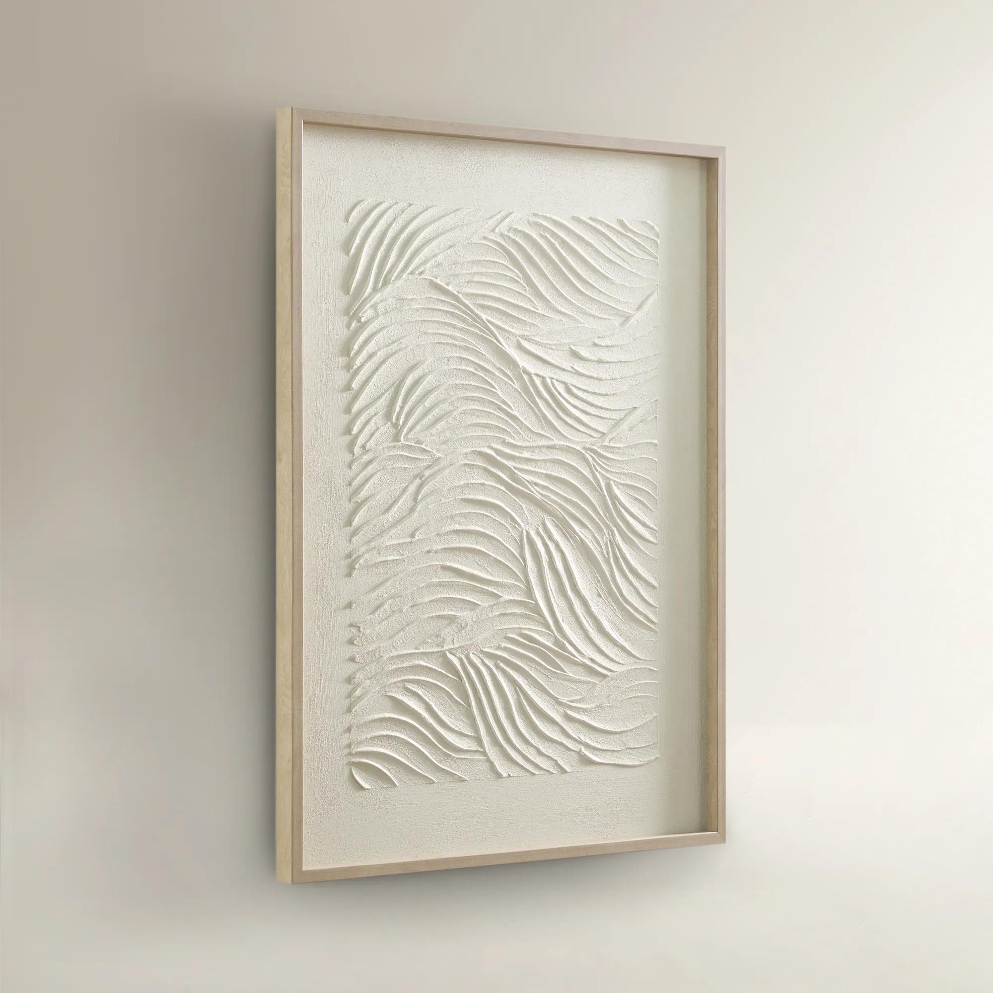 Sonnet Framed Painted Wall Art 23.5" x 31.5"$99
A hand-painted canvas featuring textured white shades and a warm blonde wood frame for elegant depth.
Add To Cart -
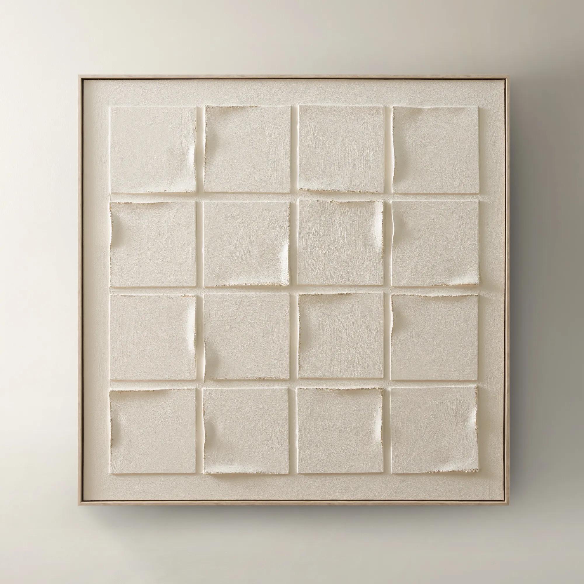 Gaze Framed Painted Wall Art 39.4" x 40"$329
A hand-painted canvas featuring subtle beige tones and textured depth in a warm whitewash floater frame.
Add To Cart -
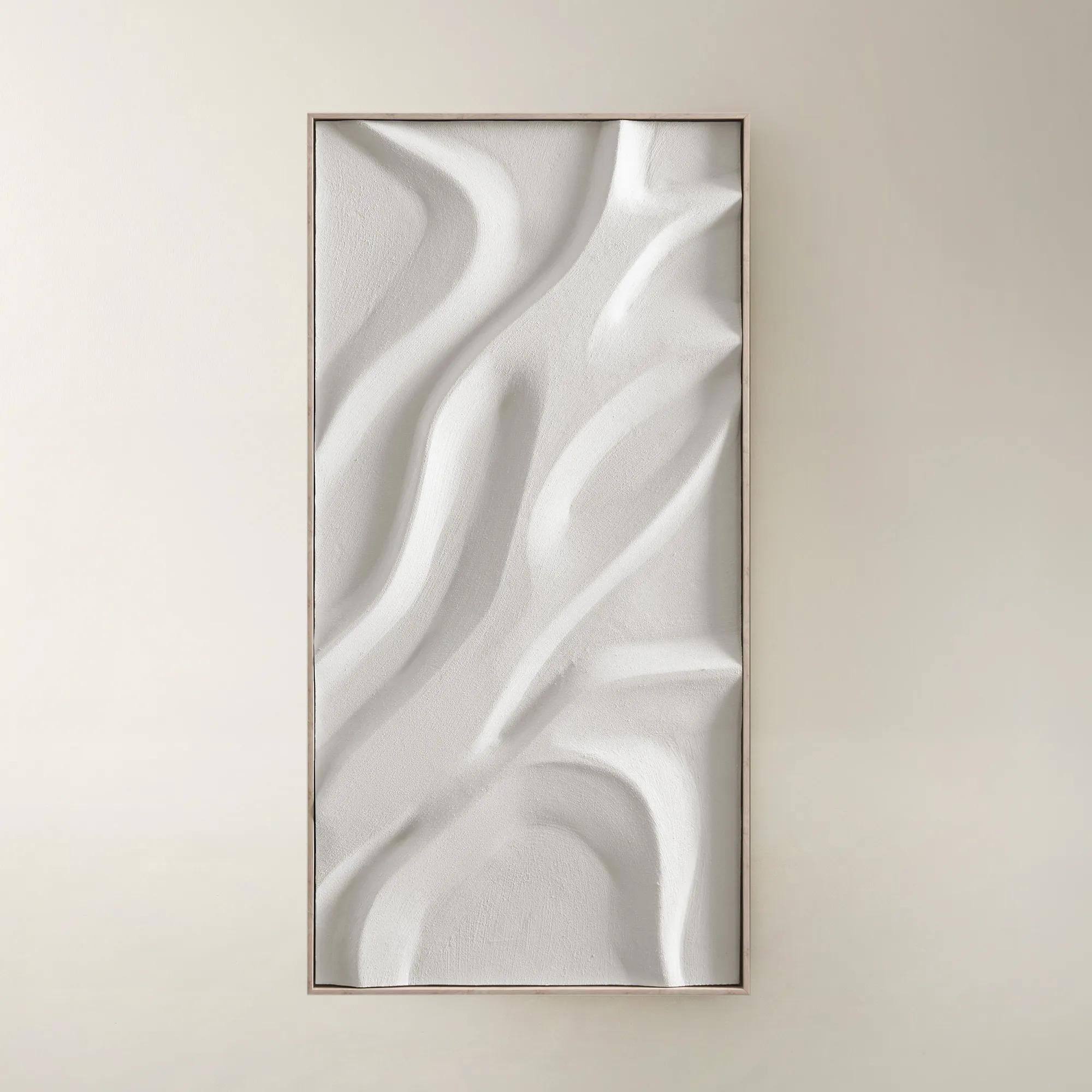
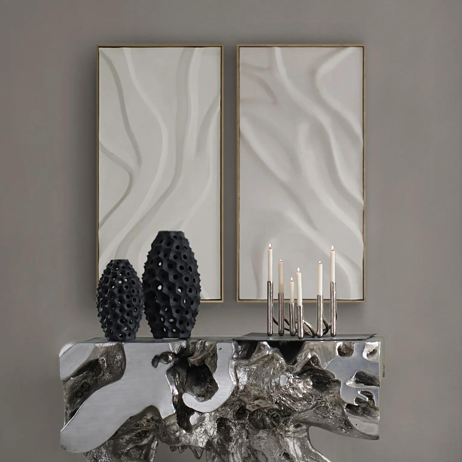 Au Lait Framed Painted Wall Art II 47.2" x 23.6"$199
A serene hand-painted canvas in beige, set in a warm whitewash floater frame for modern interiors.
Add To Cart -
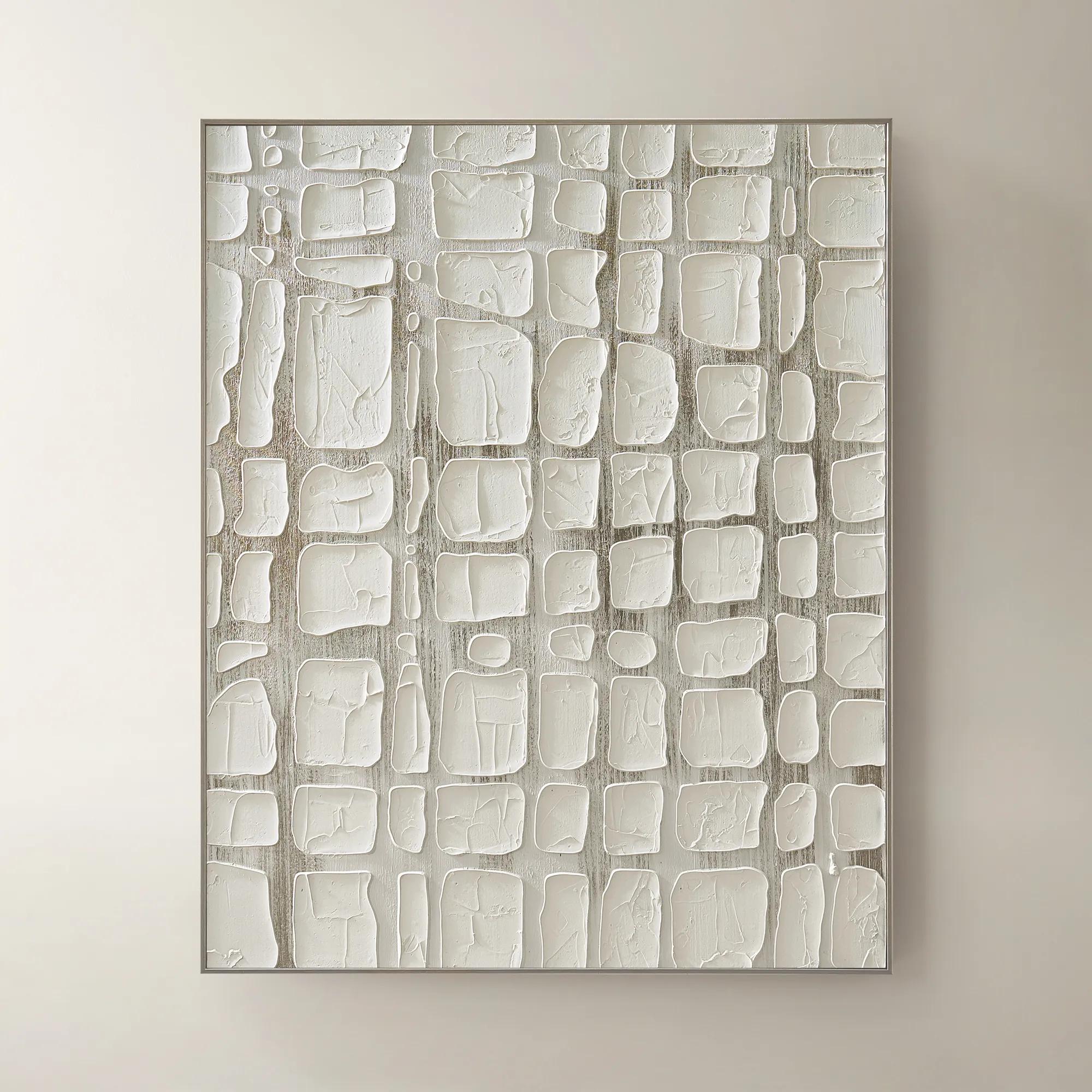
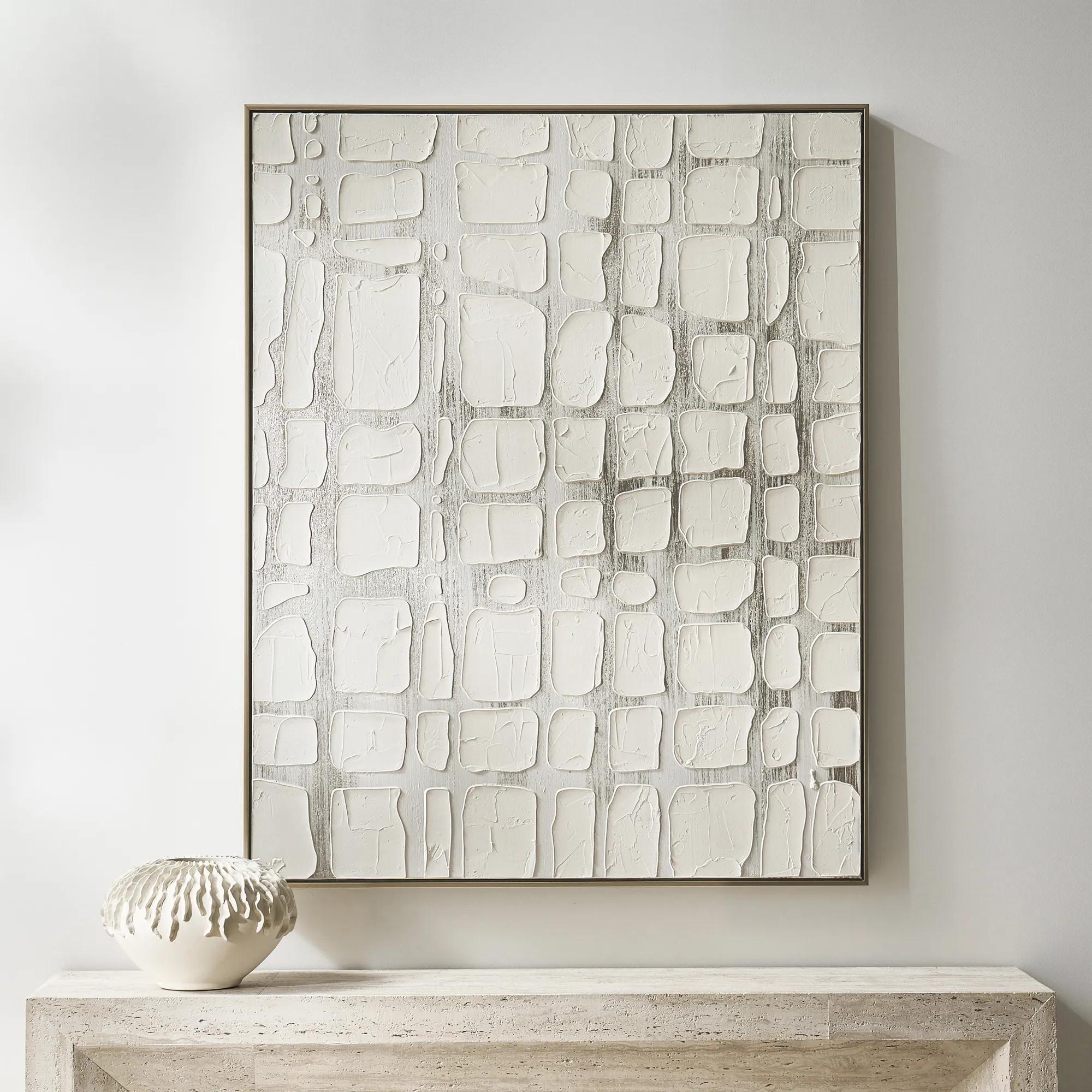 Vanish Framed Painted Wall Art 40" x 50"$499
A hand-painted canvas with raised white forms over champagne metallic ground in a refined floater frame.
Add To Cart -
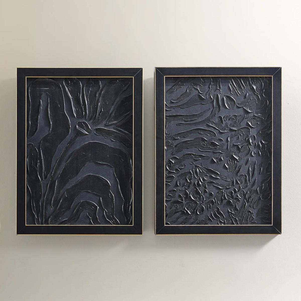
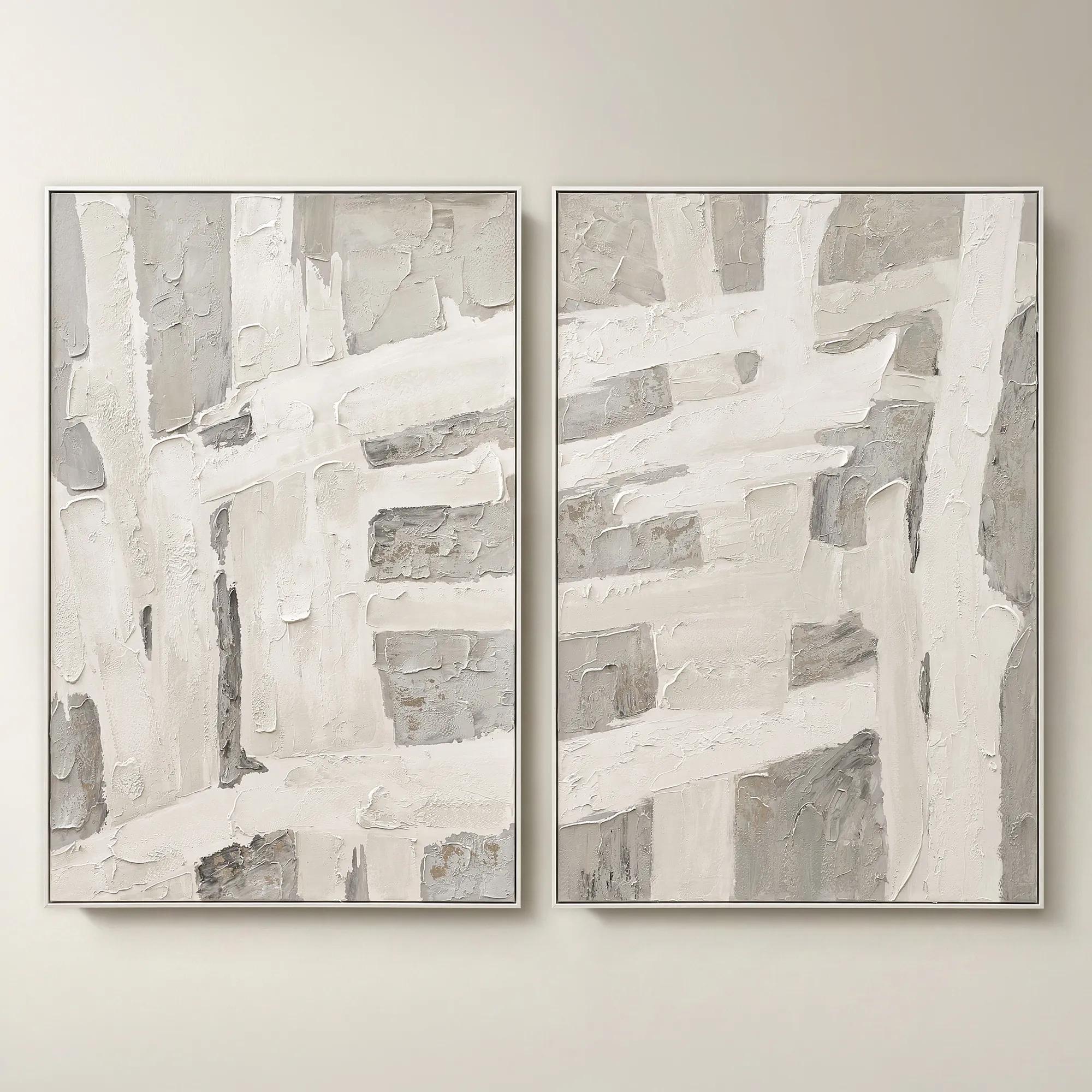 Traverse Framed Painted Wall Art 40" x 60" Set of 2$799
A hand-painted abstract diptych features champagne accents and soft grey, pearl, and alabaster tones in white frames.
Add To Cart -
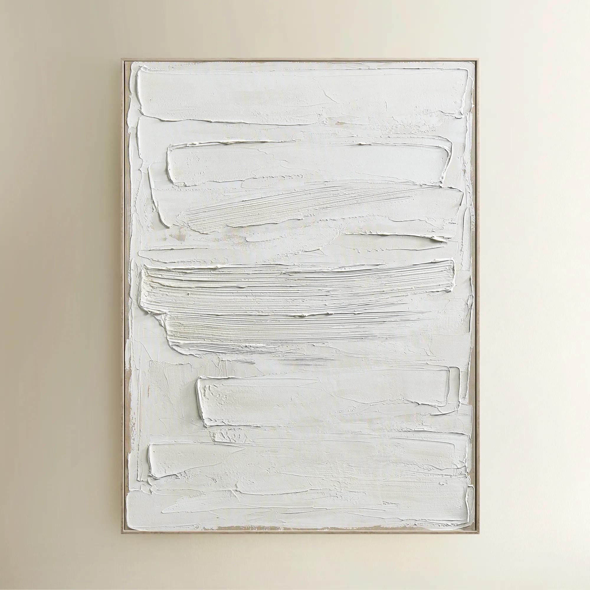
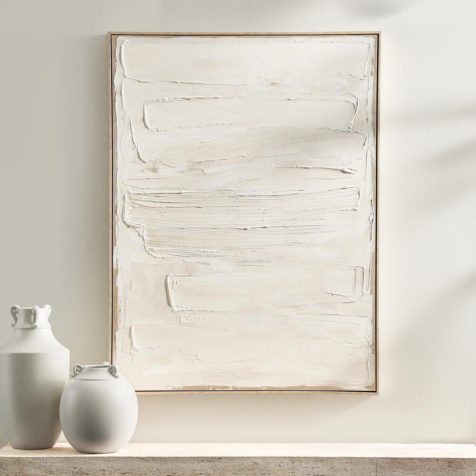 Monotype Canvas 1$399
A hand-painted abstract canvas featuring layered white tones and textured paint in a whitewashed wood frame.
Add To Cart -
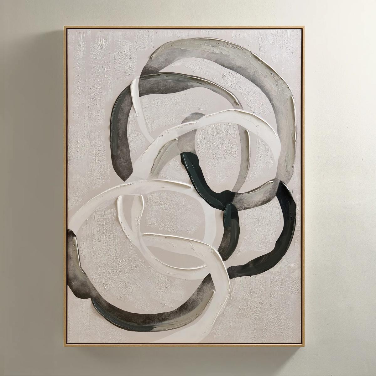
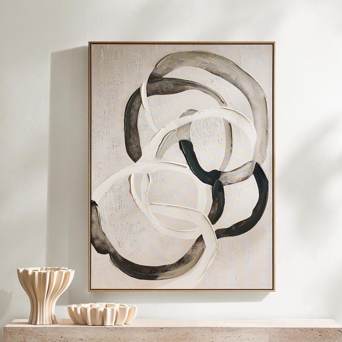 Round About Framed Painted Wall Art 35.25" x 47.25"$349
An abstract hand-painted canvas with tonal whites, charcoals, and taupes in a light wood floater frame.
Add To Cart -
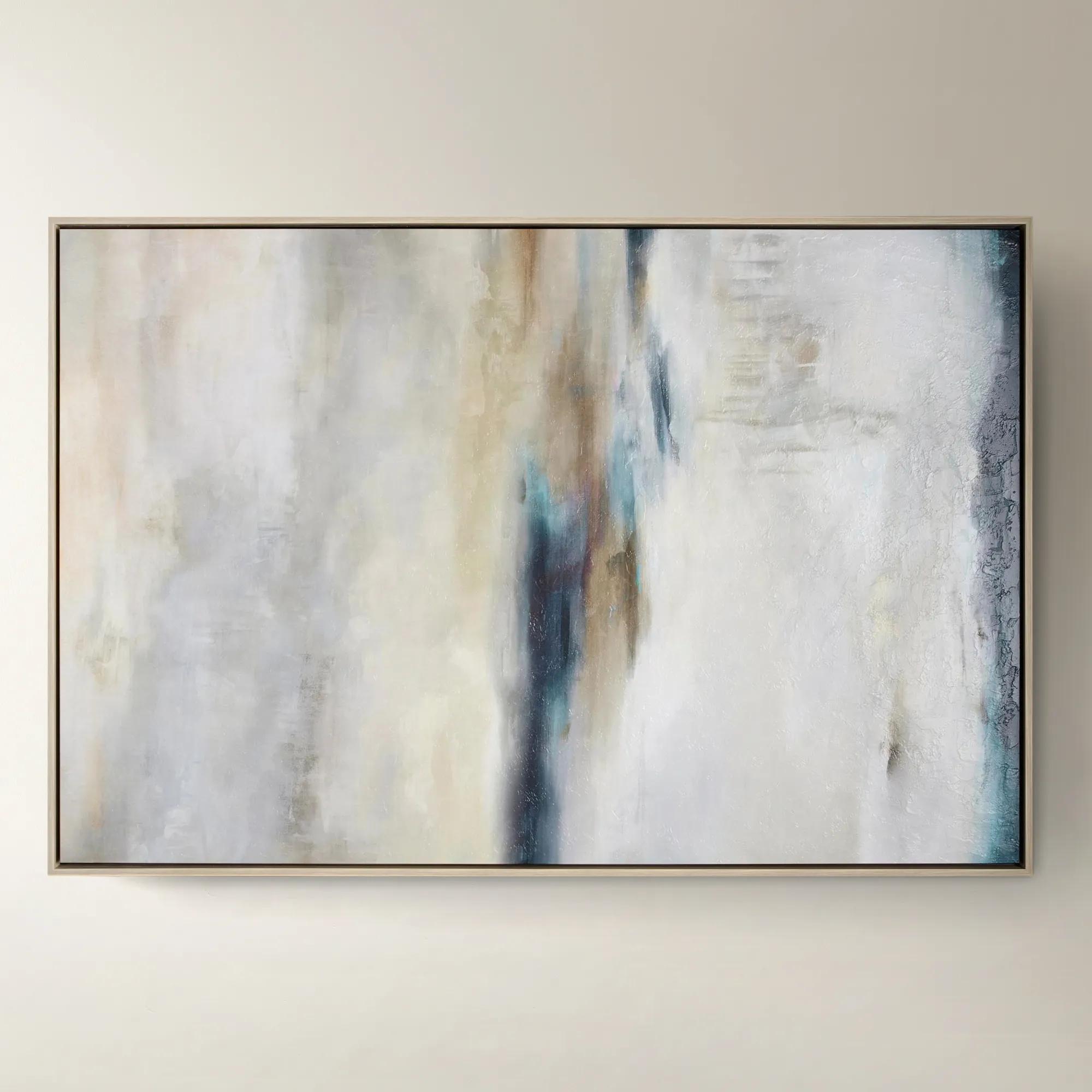
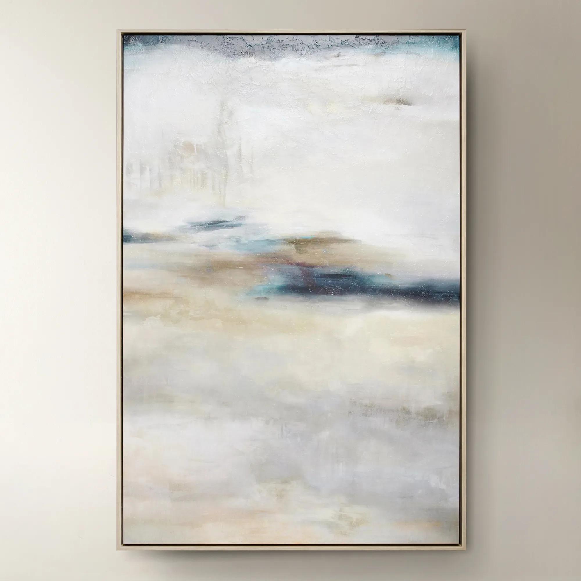 Forward Looking$1299
A softly layered abstract canvas print with a gel finish, set in a natural-hued floater frame.
Add To Cart -
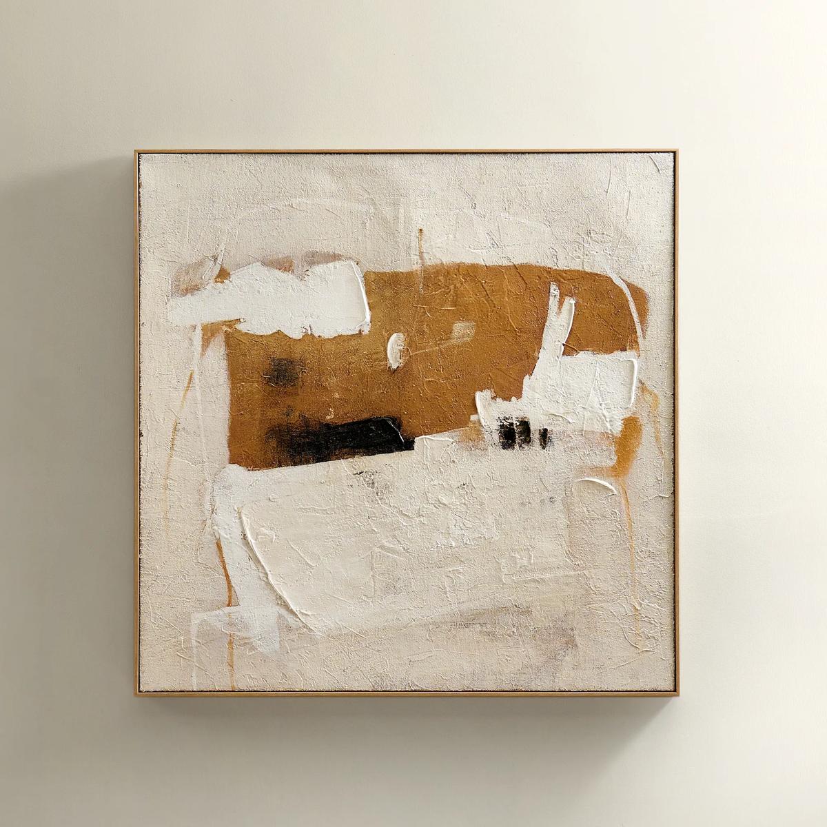 Instinct Framed Painted Wall Art 39.25" x 39.25"$349
An abstract hand-painted artwork featuring warm neutrals and black strokes on hessian with a light natural frame.
Add To Cart -
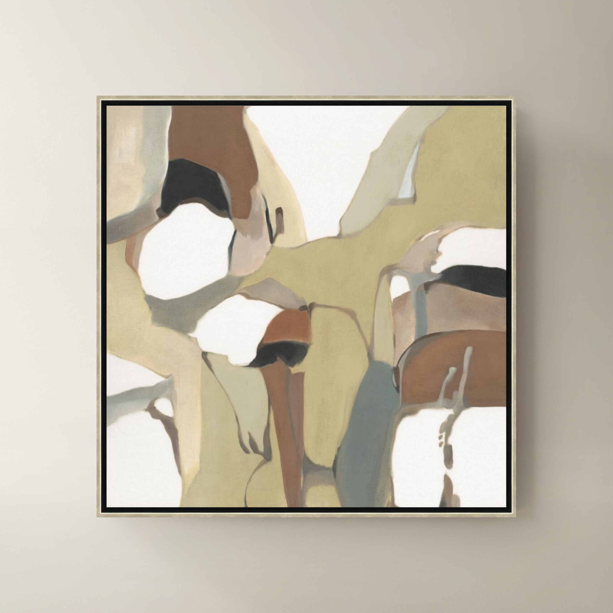
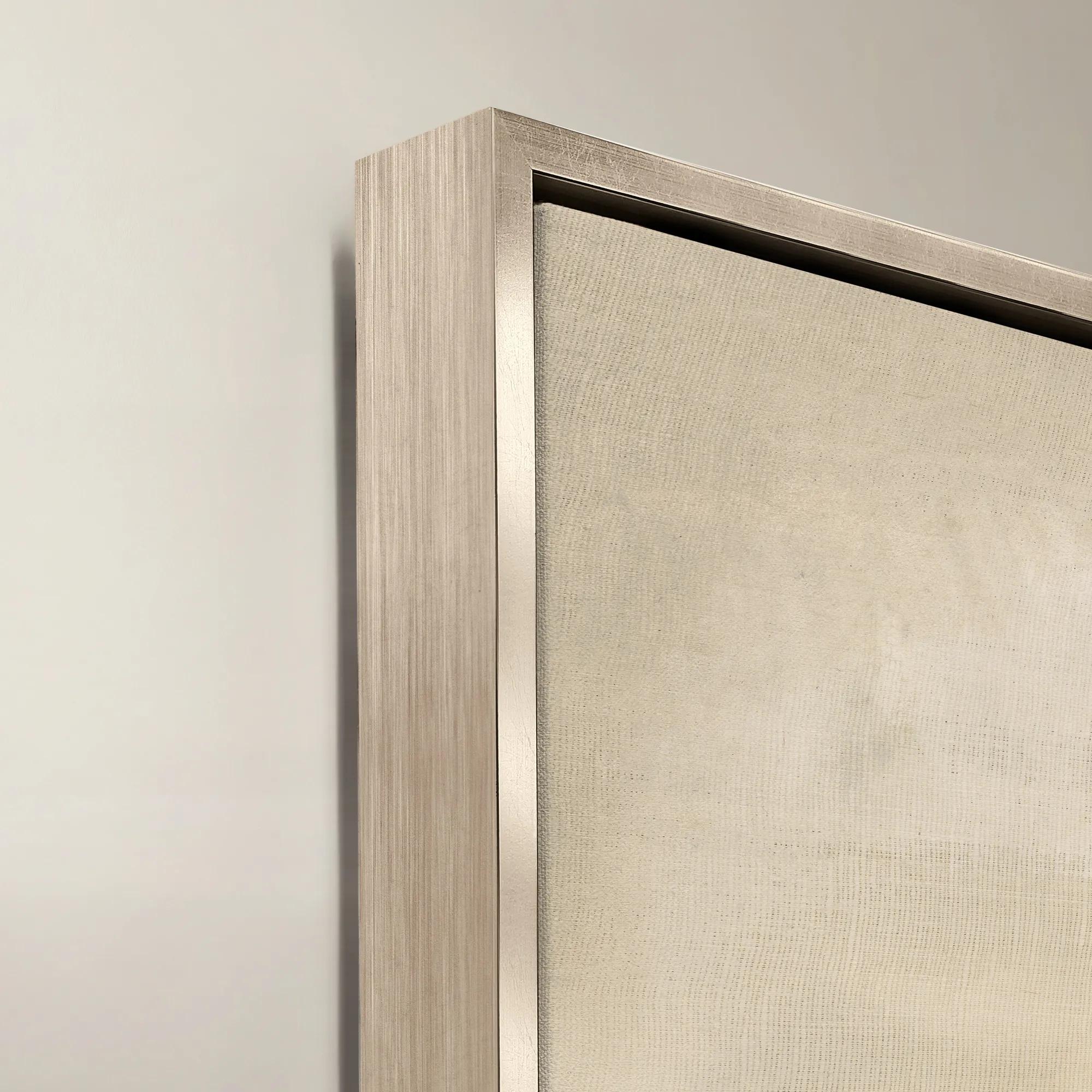 Organic Shape Framed Wall Art 47" x 47"$1099
A framed canvas artwork featuring an organic shape in rich brown tones.
Add To Cart -
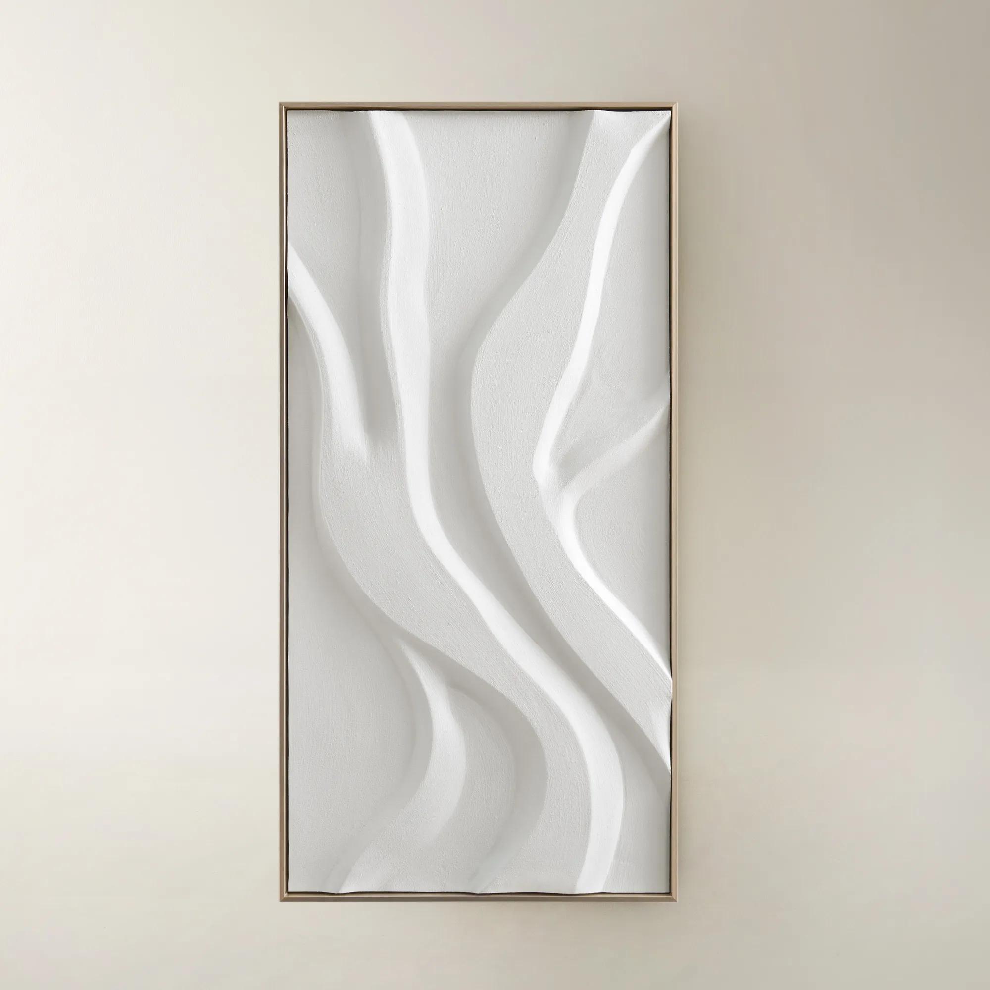
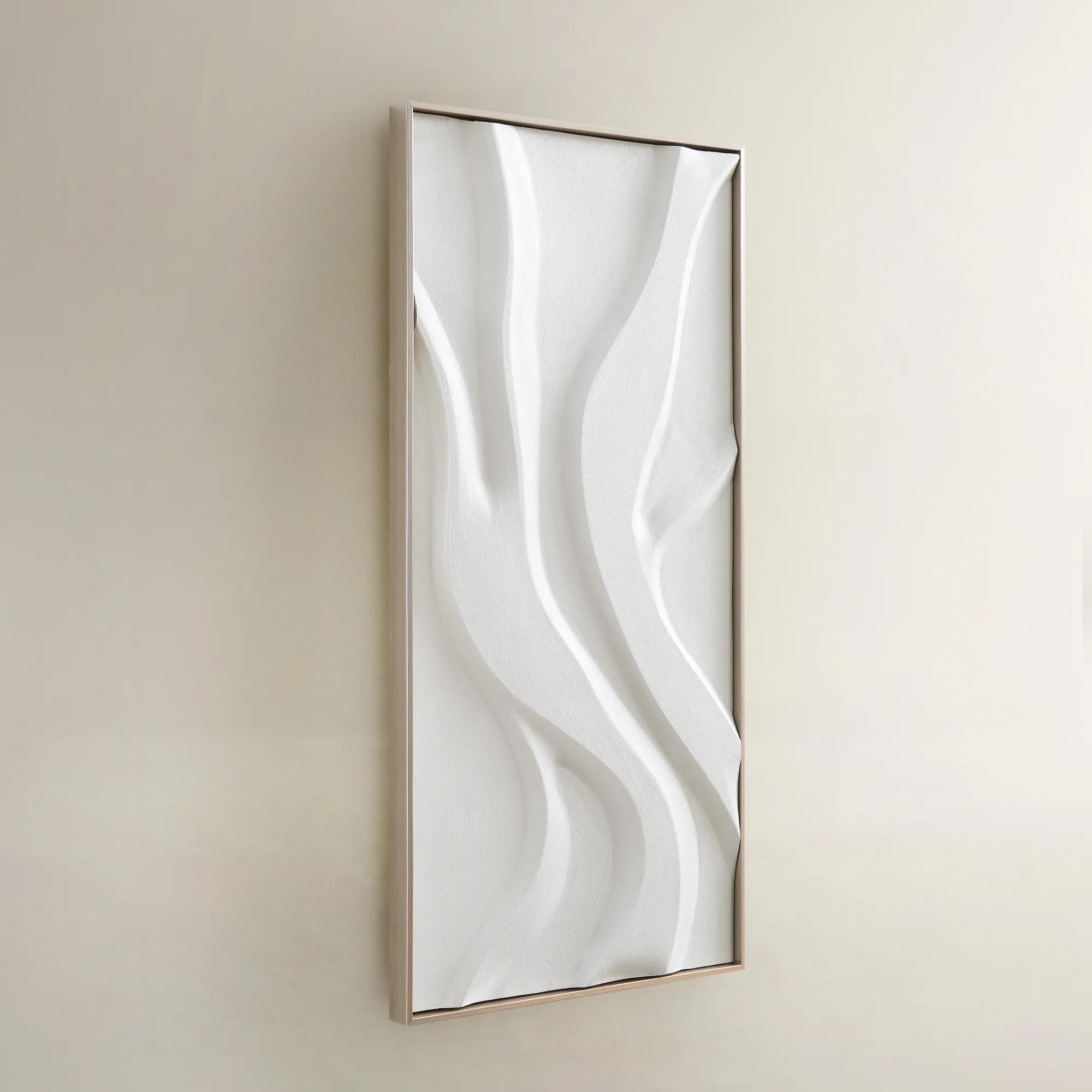 Au Lait Framed Painted Wall Art I 47.2" x 23.6"$199
An organic hand-painted canvas featuring flowing white forms in a warm champagne finish floater frame.
Add To Cart -
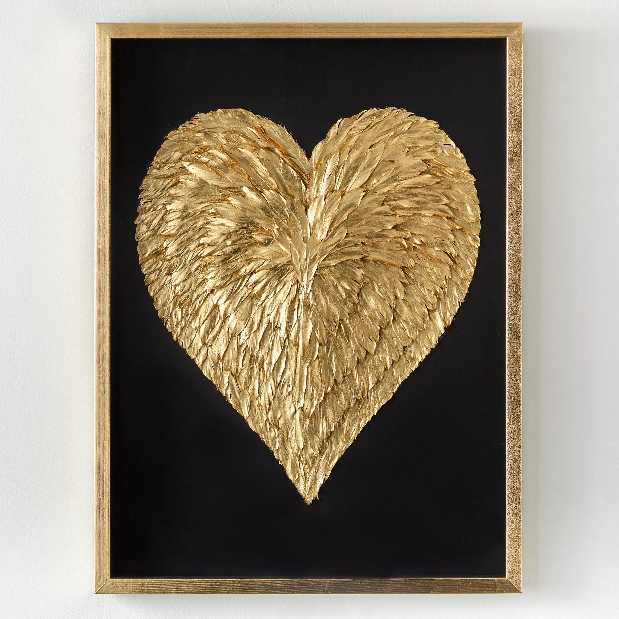
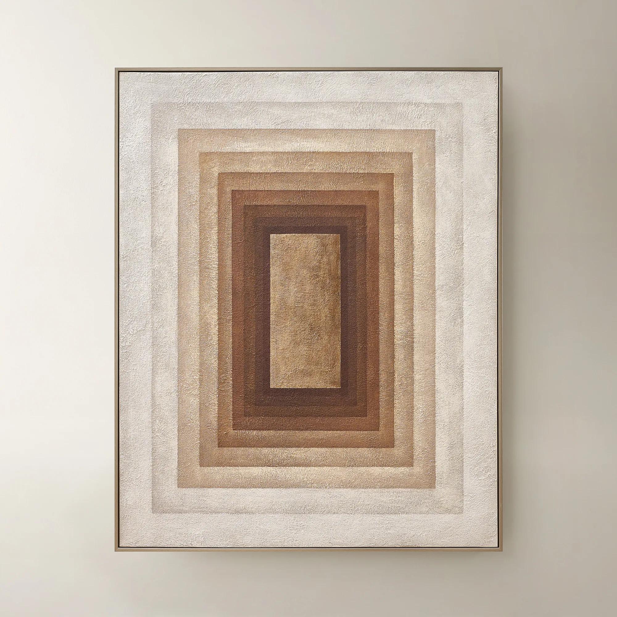 Monochrome Drift Framed Painted Wall Art 60" x 48"$699
A hand-painted abstract canvas with champagne leafing, featuring cocoa and gold tones in modern geometric design.
Add To Cart -
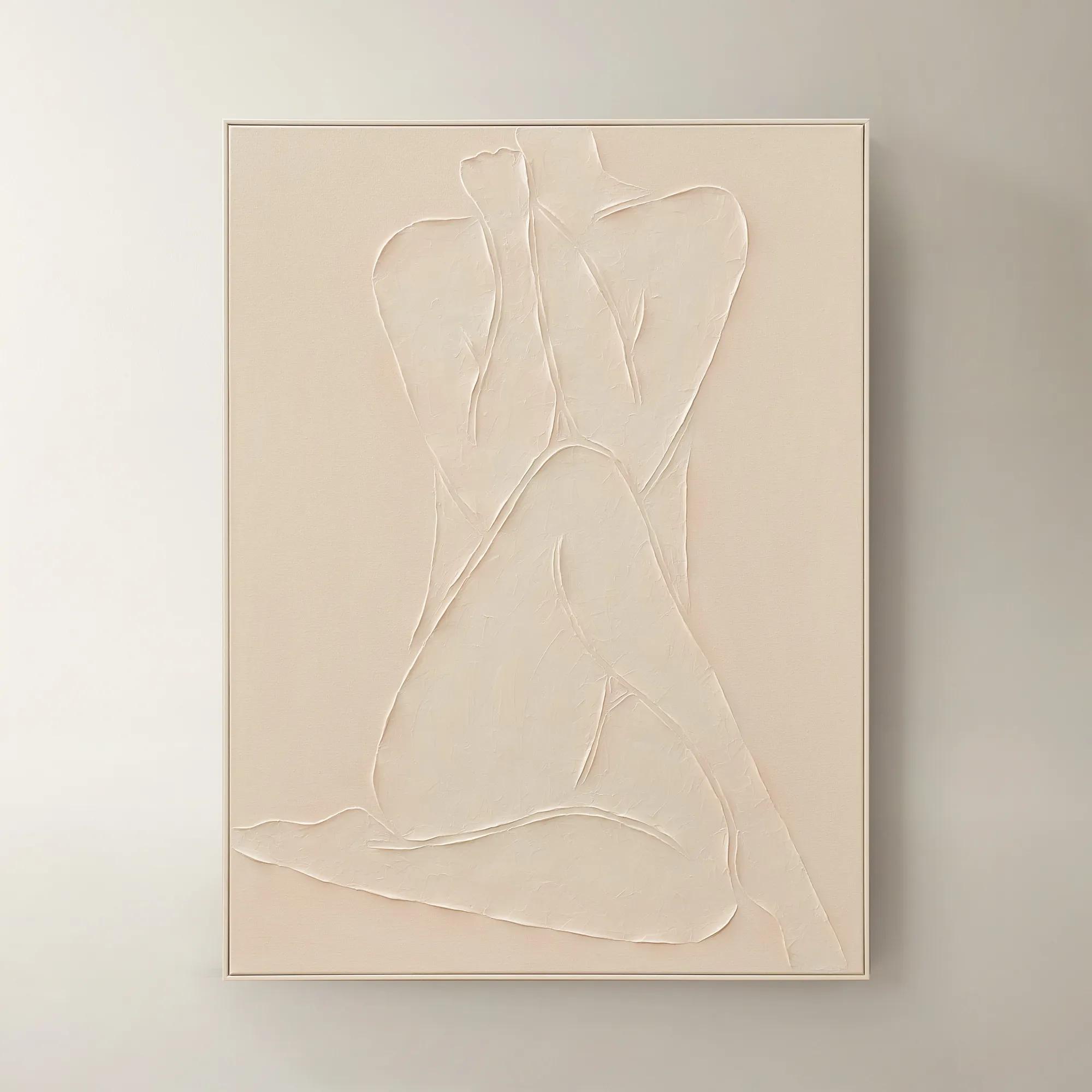
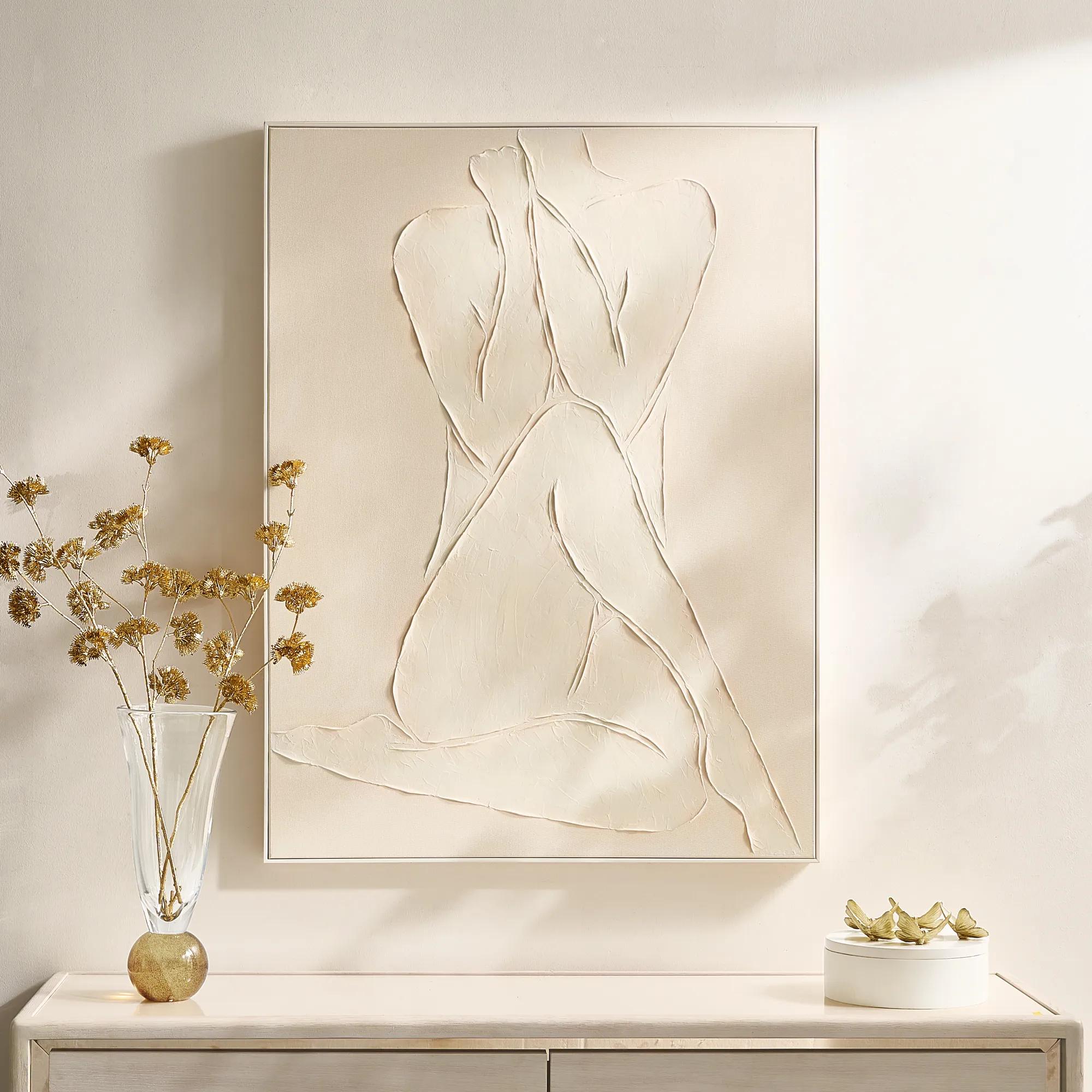 Modern Elegance Nude Ivory Framed Painted Wall Art 35.5" x 47.25"$599
A hand-painted ivory canvas in a white frame brings serene, modern artistry to any space.
Add To Cart -
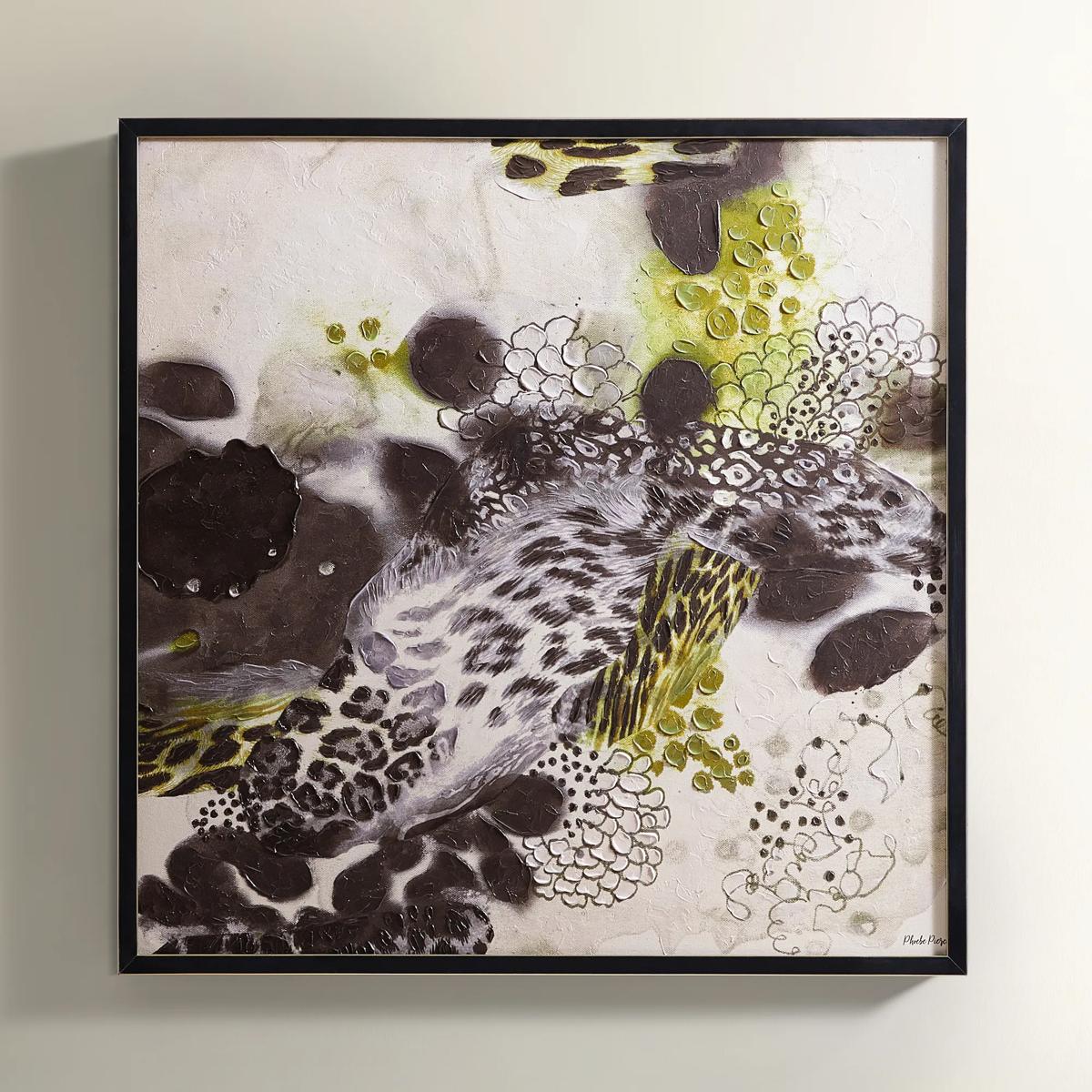
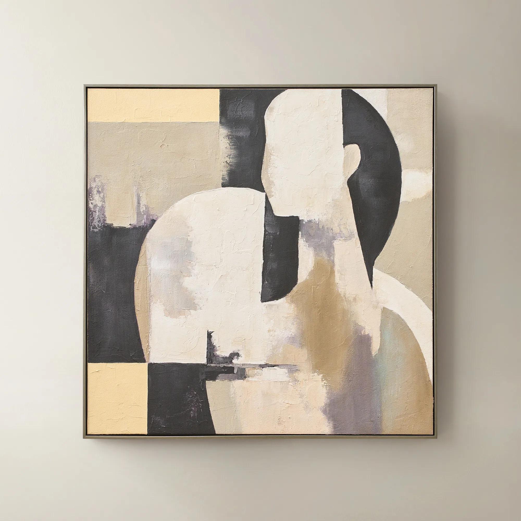 Afternoon Rest Framed Painted Wall Art 40" x 40"$399
A hand-painted abstract figure in buttercream, turtledove, and black hues framed in dark grey.
Add To Cart -
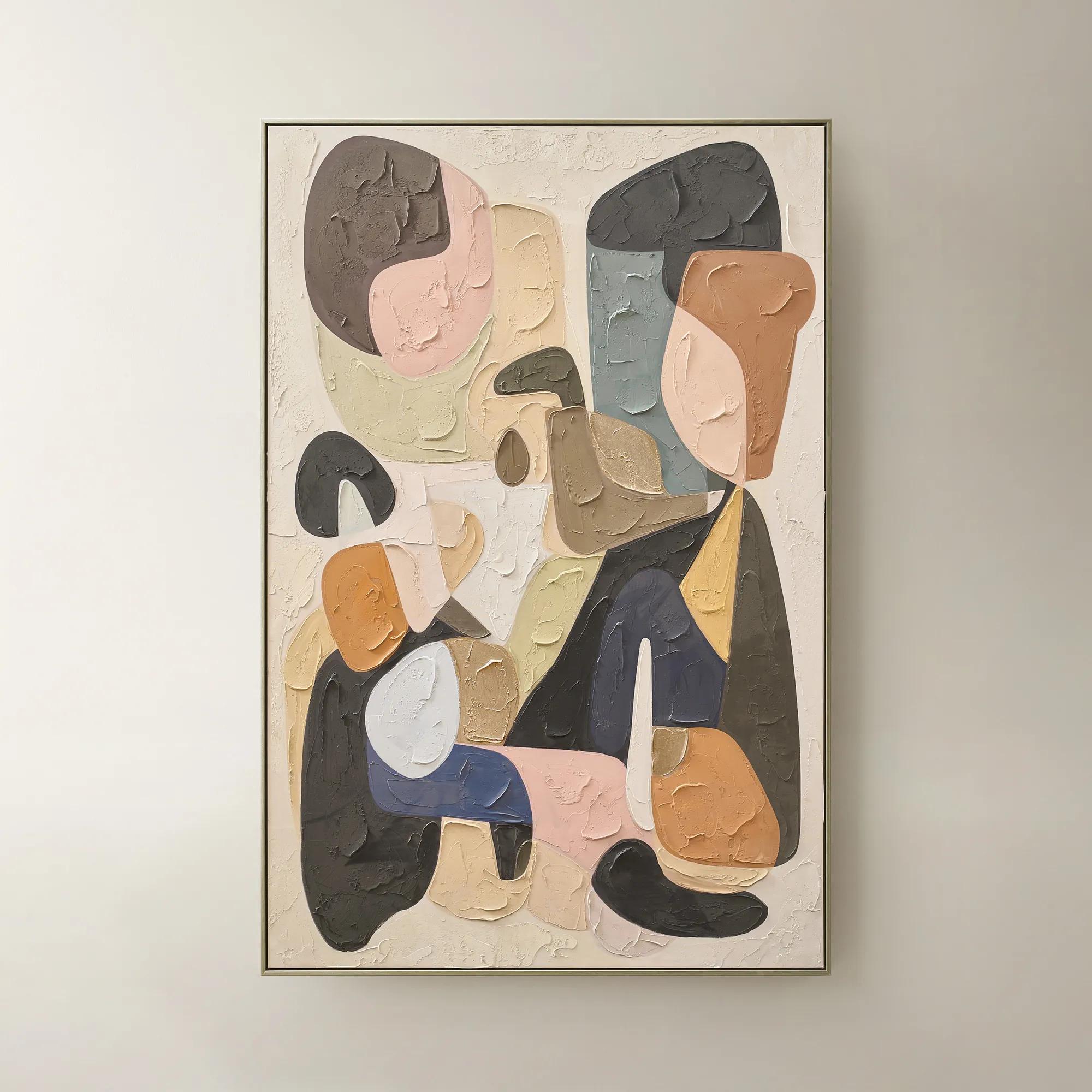 Chromatic Bloom Framed Painted Wall Art 40" x 60"$519
A hand-painted abstract canvas featuring a vibrant multi-color palette and shimmering champagne detailing.
Add To Cart -
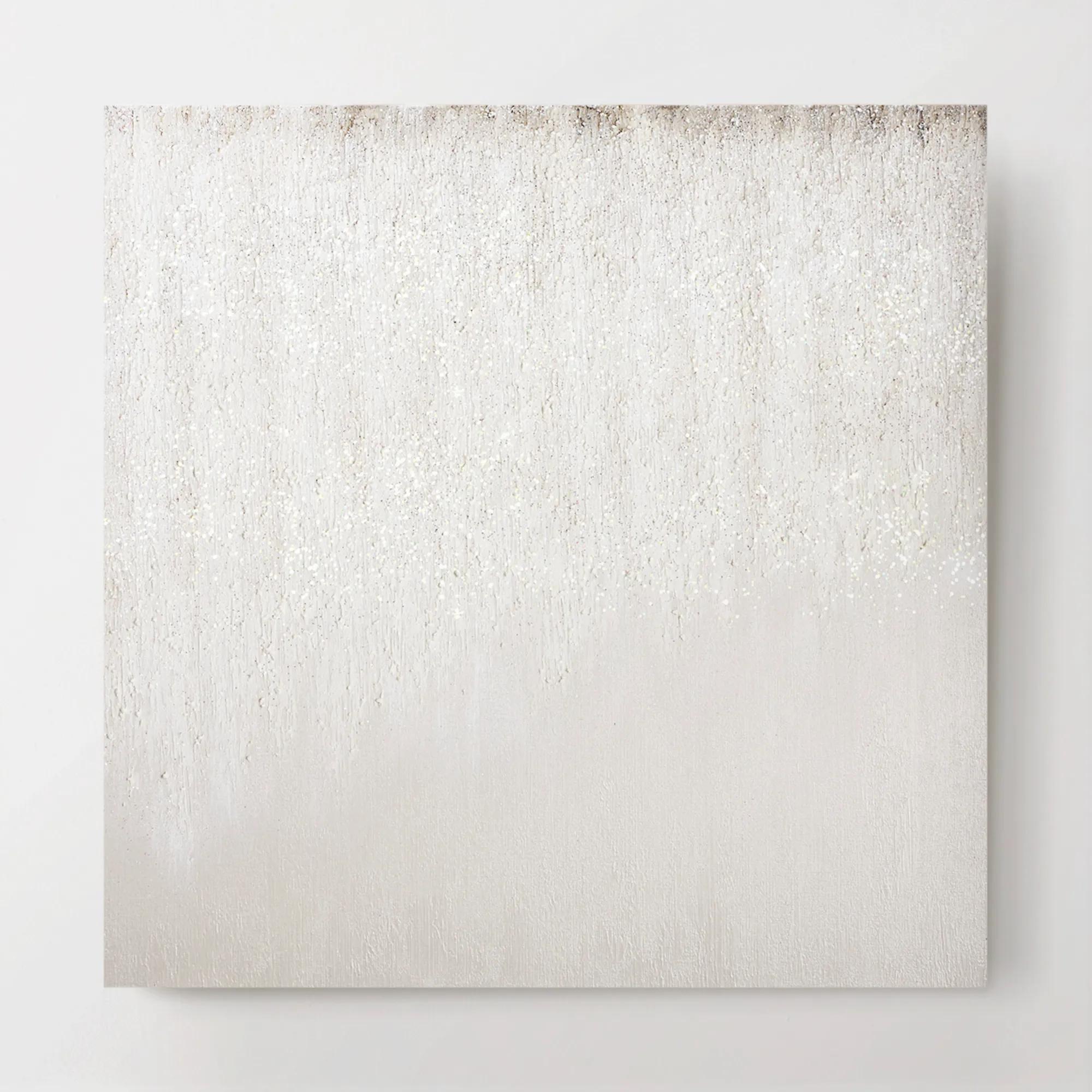 Je T'aime Glitter Painted Wall Art 30" x 30"$499
A hand-painted canvas artwork featuring ethereal hazy brushstrokes and subtle glitter embellishments.
Add To Cart -
 Shadow Painting 2$179
A hand-painted abstract canvas featuring bold textures and brown hues in a warm whitewash floater frame.
Add To Cart -
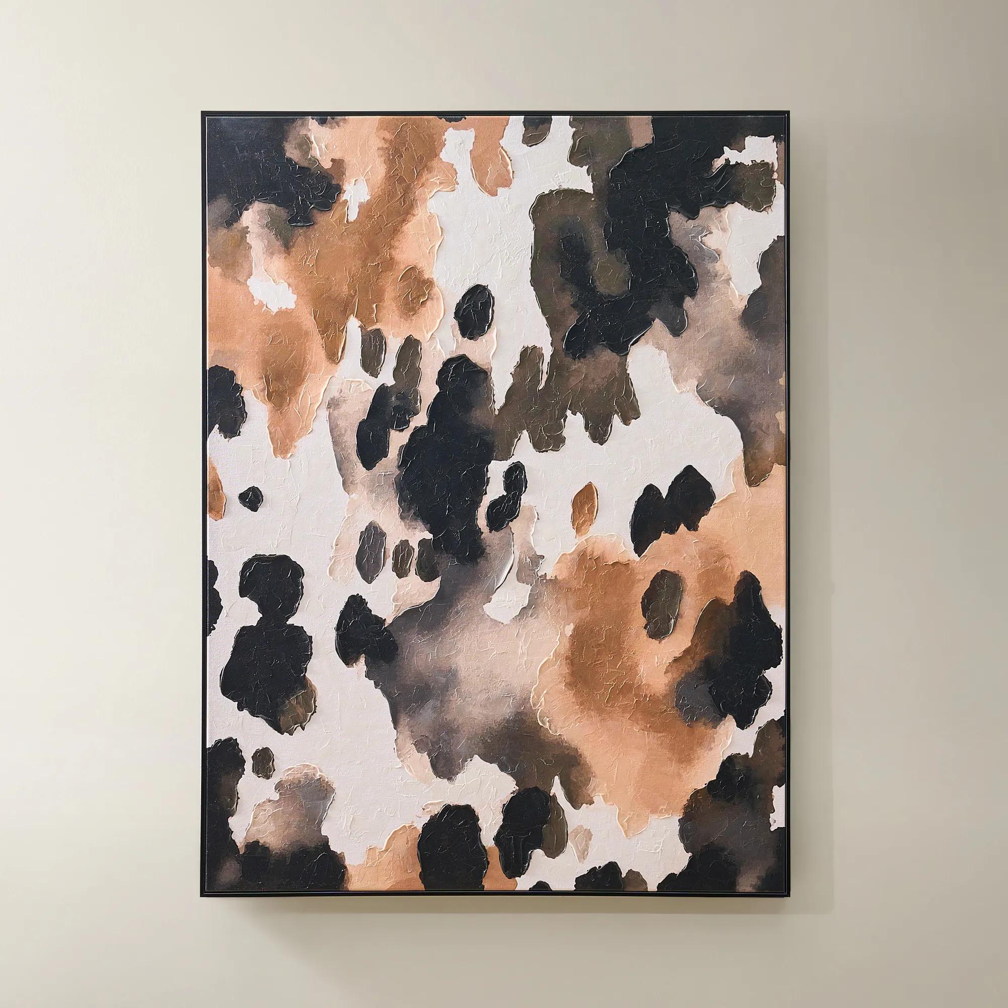
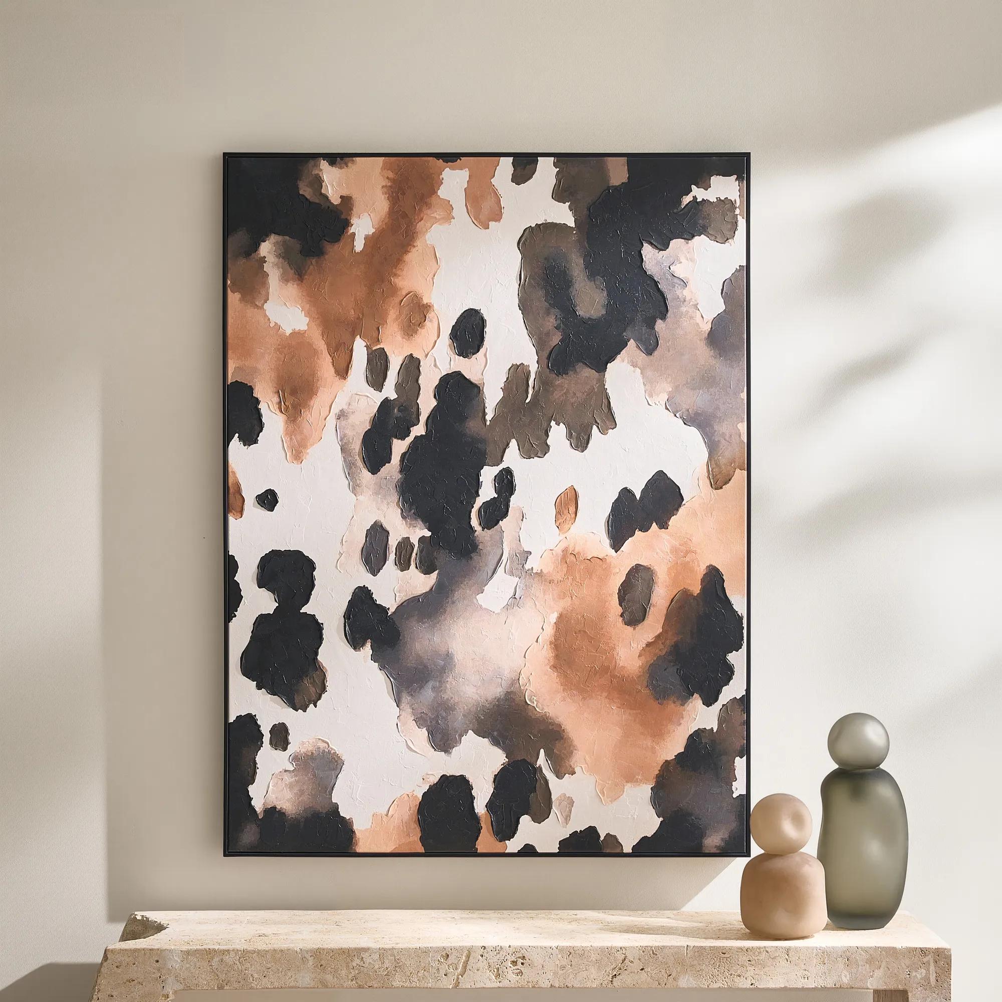 Wilder Framed Painted Wall Art 36" x 48"$499
An abstract hand-painted canvas featuring inky black, taupe, ivory, and coral hues in a sleek black frame.
Add To Cart -
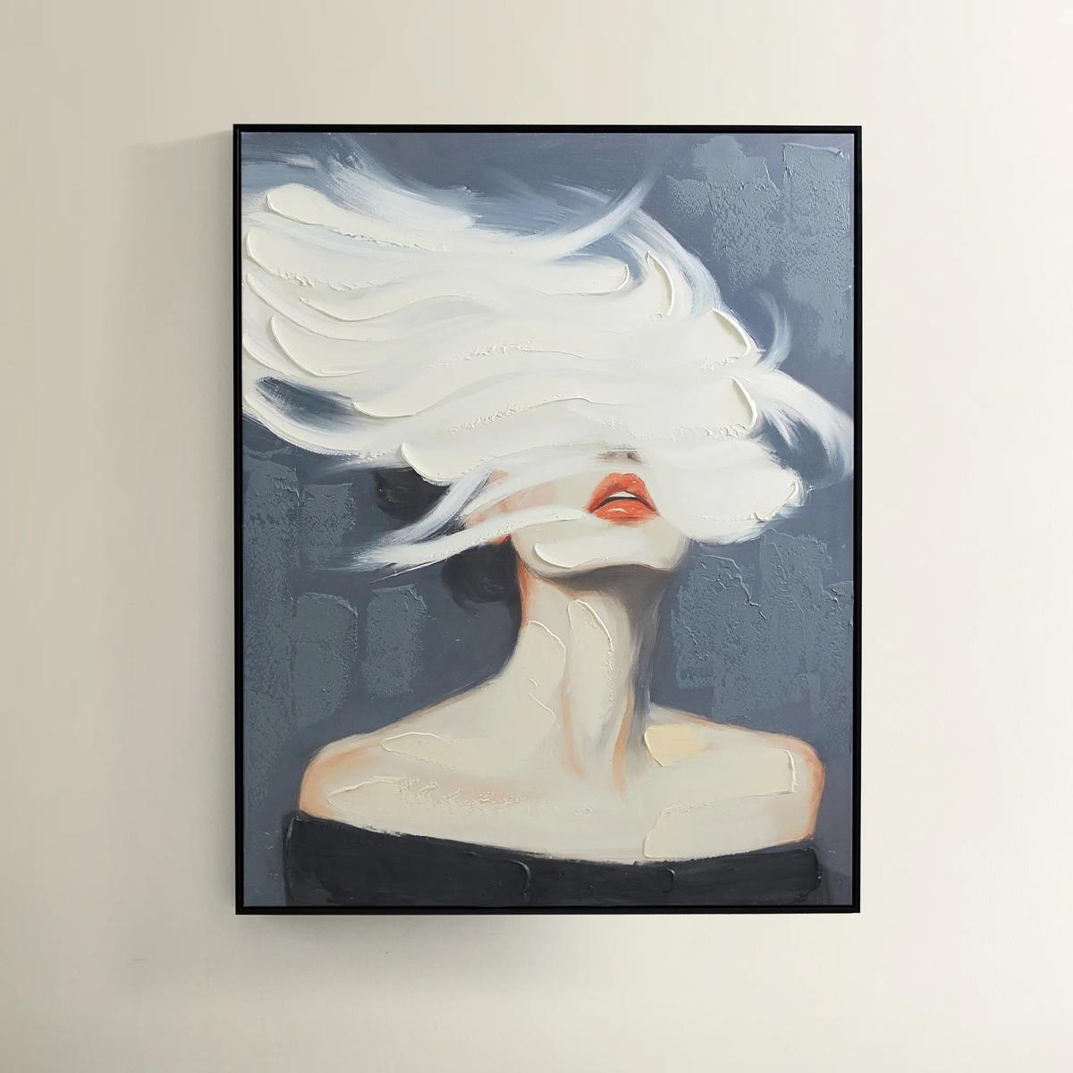
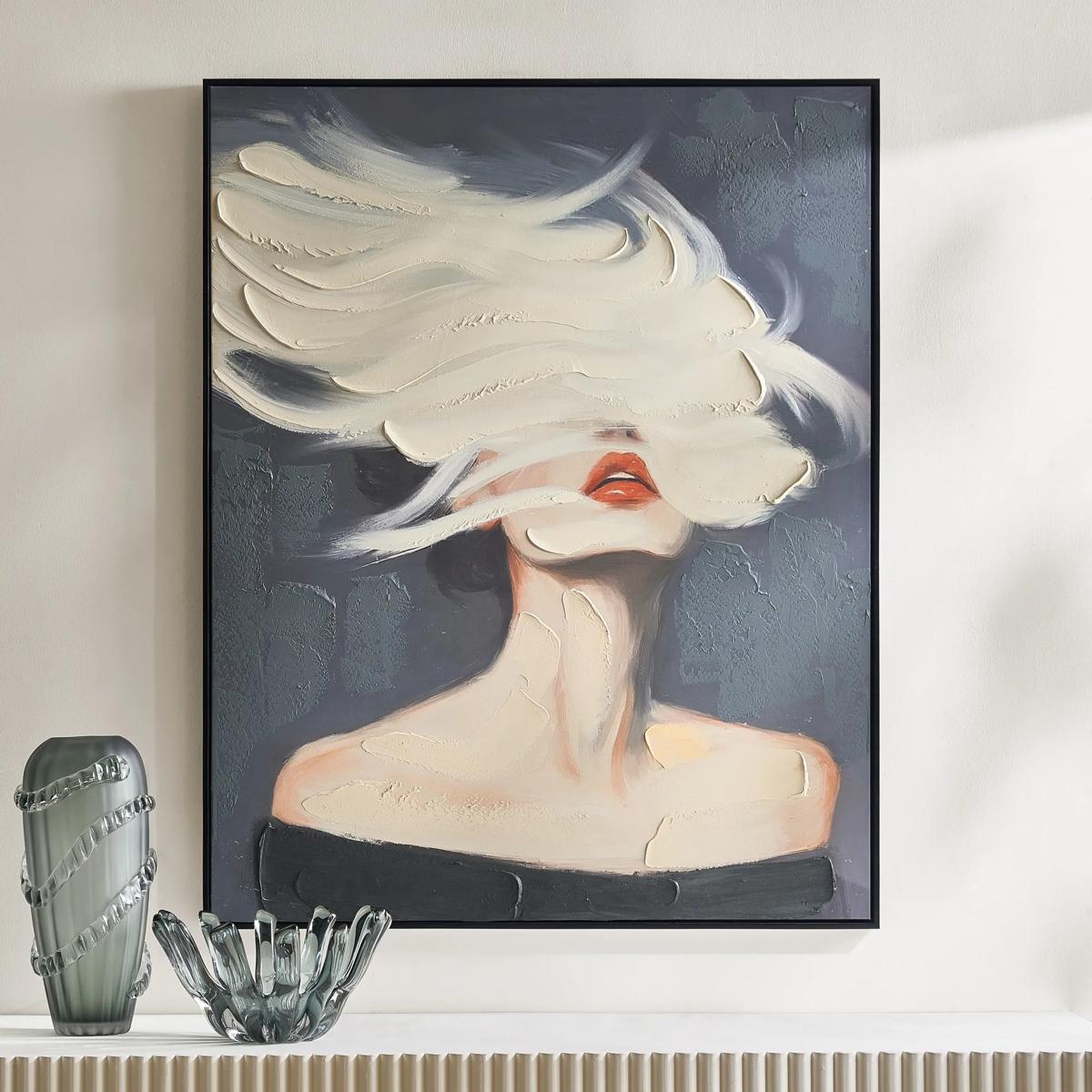 Daydreamer Painting$599
A hand-painted canvas portrait with sculptural white brushstrokes, bold red lips, and a sleek black frame.
Add To Cart

Beige And White Abstract Art
Beige and white abstract art transforms the everyday into an extraordinary visual symphony, where subtlety meets sophistication in every brushstroke. These evocative compositions invite a sense of calm grandeur, layering your walls with gentle whispers of texture and tone. Whether casting a serene glow in a minimalist sanctuary or elevating a dramatic gallery wall, beige and white abstract art offers a refined canvas for artistic expression—effortlessly balancing modern elegance with timeless allure. Let each piece become the backdrop to your most inspired moments, enveloping your space in an atmosphere of understated opulence.
Beige and white abstract art pairs warm, earth-toned neutrals with luminous whites in compositions defined by shape, gesture, and texture rather than recognizable subjects. The palette may be restrained, but its presence can be commanding: broad ivory fields, sweeping sand-colored strokes, and sculptural ridges bring depth to a wall without relying on saturated color. These works suit interiors where furnishings, finishes, and art share the spotlight, from a living room layered with velvet and polished metal to a bedroom dressed in linen and plush upholstery. Beige introduces warmth; white opens the composition and gives each movement room to register. Within that relationship, subtle differences matter. A sandy beige reads differently beside a yellow-based cream than it does against a crisp white, while a gray-leaning neutral can lend a more architectural character. The surrounding wall color also changes the effect. Against white walls, beige forms become more pronounced; against taupe or deeper neutral walls, pale passages can appear especially luminous. Abstract arrangements range from sweeping organic forms and overlapping washes to precise geometry and finely drawn lines. Some suggest stone, drifting sediment, or weathered plaster without depicting any of them literally. Others create drama through a single oversized gesture or a sharp division between light and shade. This versatility makes neutral abstract wall art a compelling choice for both richly layered rooms and more edited spaces. Above a curved sofa, fluid marks can echo the upholstery’s silhouette; beside a rectangular console, rounded forms introduce a pleasing counterpoint. A large composition can establish the mood of an entire seating area, while a smaller work offers an intimate focal point beside a reading chair. The strongest connection is often a shared detail rather than an exact color match: a pale brushstroke that recalls a marble tabletop, a warm undertone that complements wood, or a fine dark accent that relates to the room’s metalwork. The result feels considered without making every surface look coordinated.
Materials and construction give beige and white abstract wall art much of its individual character. A work on stretched canvas has a woven surface that can soften edges and lend printed imagery a painterly appearance, while art paper can capture delicate tonal shifts and fine linear detail. Hand-applied paint, modeling paste, or other dimensional mediums may create genuine relief, allowing raised areas to catch light and cast small shadows. A printed image of textured brushwork offers visual depth, but it does not necessarily have a raised surface; descriptions and close-up images help distinguish the two. Heavily textured artwork also changes with its lighting. Gentle illumination from the side can reveal ridges and valleys that appear quieter under even, frontal light. Framing adds another layer of expression. A slender metallic frame can introduce a gleaming outline, a wood frame can emphasize earthy undertones, and a floating frame can give canvas edges a deliberate sense of separation. For works on paper, a mat creates breathing room between the image and frame, while appropriate glazing helps protect the surface. Scale deserves the same attention as finish. Artwork above a sofa or sideboard generally feels more connected when it occupies a substantial portion of the furniture’s width without extending beyond it; the outer frame, not just the image, counts toward that measurement. On a narrow wall, a vertical format draws the eye upward, while a horizontal composition can reinforce the generous proportions of a long seating arrangement. Paired works and coordinated groupings offer another way to create breadth, provided the spacing feels intentional and the compositions have room to breathe. Measuring the available wall area and outlining the overall dimensions before hanging helps reveal whether a piece will feel intimate, balanced, or deliberately monumental. For interiors that favor an even softer transition between warm neutrals, Beige and Cream Wall Art Pieces offers a related direction to explore. Across these closely connected palettes, variations in surface, proportion, and framing keep a neutral room from becoming visually uniform.
The appeal of beige and white abstract art extends beyond a particular decorating style. In an entryway, a striking composition gives the first view into a home an assured focal point; in a dining room, layered whites and warm beige can complement reflective tableware without competing for attention. A bedroom benefits from broad, flowing passages that feel expansive rather than visually crowded, while a home office can gain definition from more structured geometry. These works also make thoughtful housewarming or wedding gifts for recipients drawn to art, interiors, and expressive neutrals, especially when the dimensions and framing suit a known space. For lasting enjoyment, the setting and care should reflect the artwork’s actual materials. Direct sunlight can fade pigments and discolor paper over time, so a wall away from prolonged exposure is generally preferable. UV-filtering glazing can help reduce exposure for compatible framed works, though it does not eliminate the need for thoughtful placement. Areas near steam, splashing water, fireplaces, or strong heating and cooling airflow may be unsuitable for sensitive paper, canvas, and textured finishes. Routine care is best kept gentle: dust frames with a soft, dry cloth, avoid spraying cleaner directly onto glazing, and follow the stated care instructions for the artwork itself. Raised or loosely bound surfaces may require specialist advice rather than brushing or wiping. Sound framing, secure hanging hardware, and wall anchors appropriate to the wall material and the artwork’s weight support both presentation and longevity. Canvas should remain taut and protected from pressure, while paper benefits from suitable backing and conservation-minded framing materials. These details preserve the nuances that make the palette so compelling: the distinction between chalky white and creamy ivory, the shadow beneath a sculpted line, the warmth of beige against a gleaming frame. With those relationships intact, neutral abstraction delivers something more expressive than a finishing touch—a distinctive visual rhythm that gives the entire room greater depth.
FAQs
Beige and white abstract art is remarkably versatile, complementing a wide range of interior styles. It brings effortless elegance to modern, transitional, and contemporary spaces, and it can soften the edges of industrial or minimalist rooms. In traditional settings, these artworks add a fresh, serene counterpoint to ornate details, while in bohemian or eclectic homes, they ground bolder patterns and colors with a sense of calm sophistication.
Beige and white artwork infuses a space with tranquility and light, creating a soothing atmosphere that encourages relaxation and contemplation. The gentle contrast and fluid forms found in abstract pieces help to visually expand a room, making it feel more open and inviting. This palette also reflects and diffuses natural light, enhancing the overall ambiance and making the space feel warm and welcoming year-round.
Beige and white paintings can be displayed as a dramatic focal point above a mantel, layered with mirrors and metallic accents for added dimension. They also shine in gallery walls, where their subtle hues create visual balance among more colorful or textured pieces. For a curated look, try leaning a large canvas against a wall atop a console table or pairing a series of smaller works along a hallway for a sophisticated, artful journey.
Absolutely. The timeless appeal and serene palette of beige and white abstract art make it a meaningful gift for housewarmings, weddings, anniversaries, or milestone celebrations. Its versatility ensures it will suit a variety of tastes and spaces, while its calming presence serves as a daily reminder of beauty and intention—a gift that continues to inspire long after it’s unwrapped.
Beige abstract paintings act as a sophisticated anchor in layered decor schemes. Pair them with plush textiles like velvet or faux fur, sculptural vases, and gleaming metallics to create a tactile, visually rich environment. The neutral tones allow you to experiment with bold accent colors or dramatic lighting, ensuring every element stands out while maintaining a cohesive, harmonious look.