Soft Pastel Area Rugs
Soft Pastel Area Rugs
-
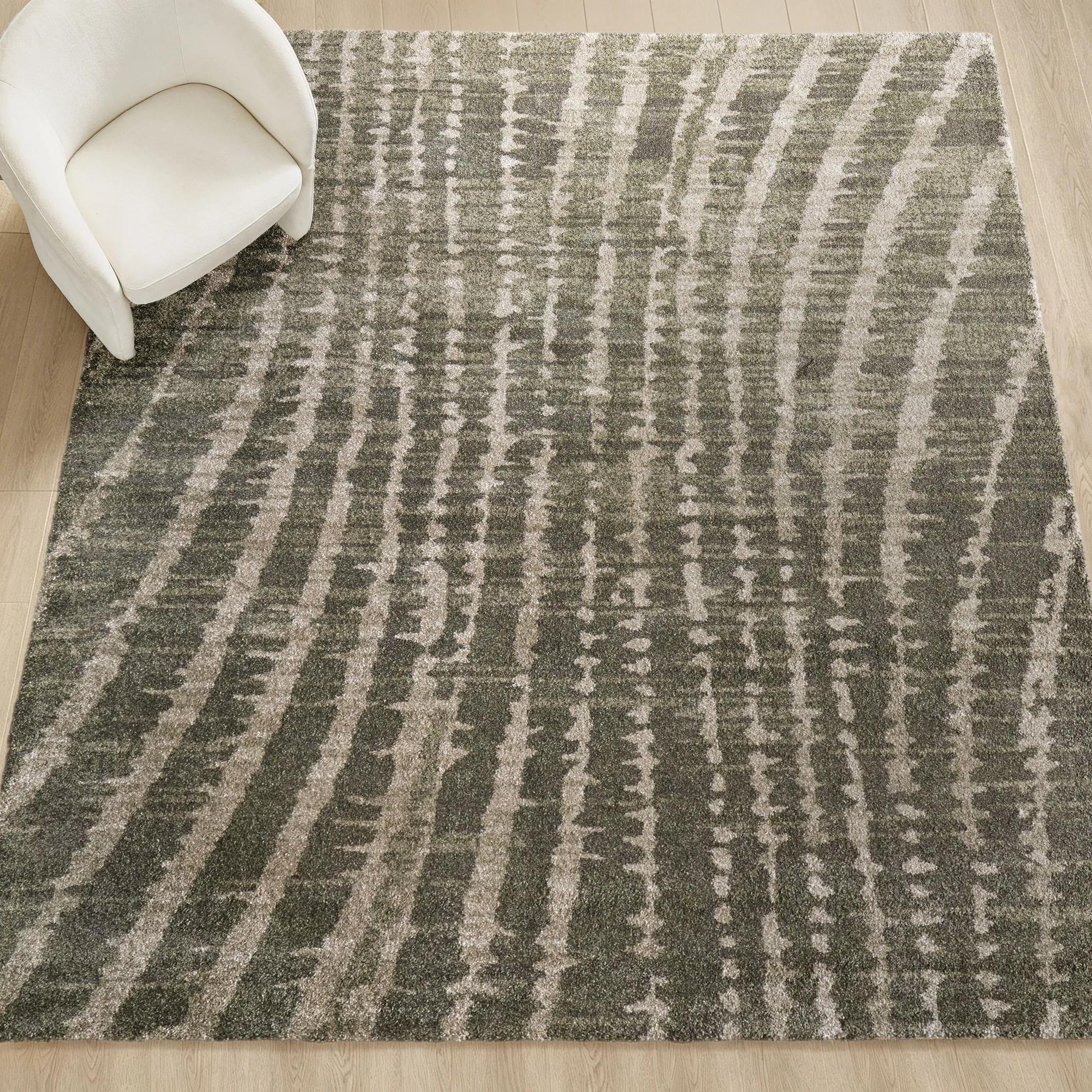
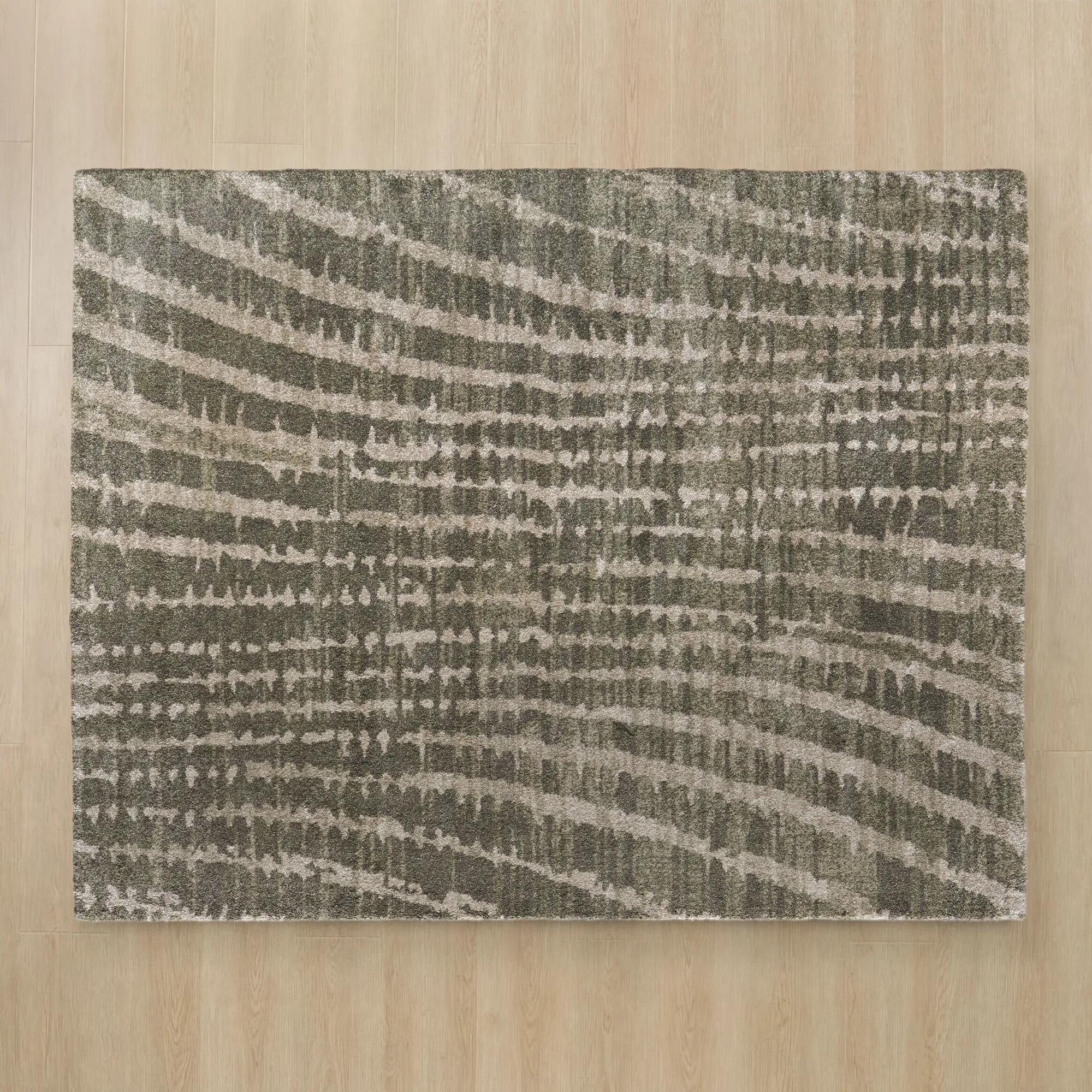 Tempo Green/Grey/Beige Performance Power Loomed Rug$1649
An abstract charcoal grey and beige rug with plush cut pile and durable, stain-resistant polypropylene-polyester construction.
Add To Cart -
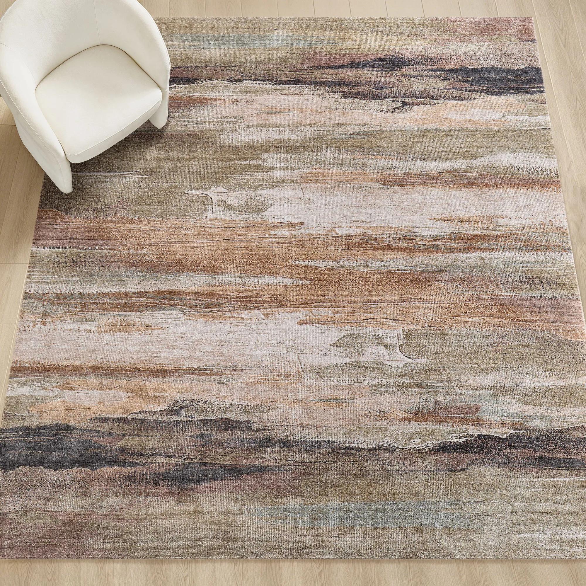
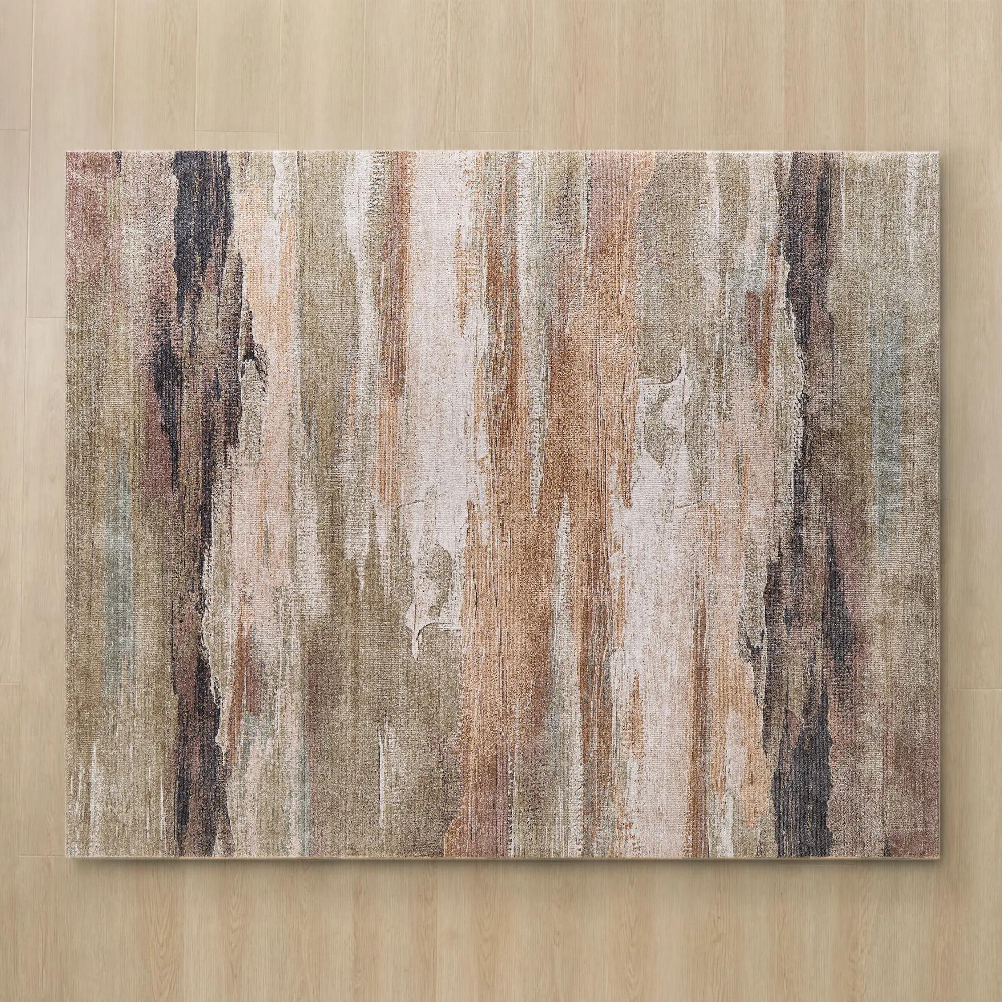 Sedona Rust/Beige/Moss Green/Charocal/Blue Performance Power Loomed Rug$1999
A power-loomed polyester rug featuring a rich abstract pattern in rust, beige, moss green, charcoal, and blue.
Add To Cart -
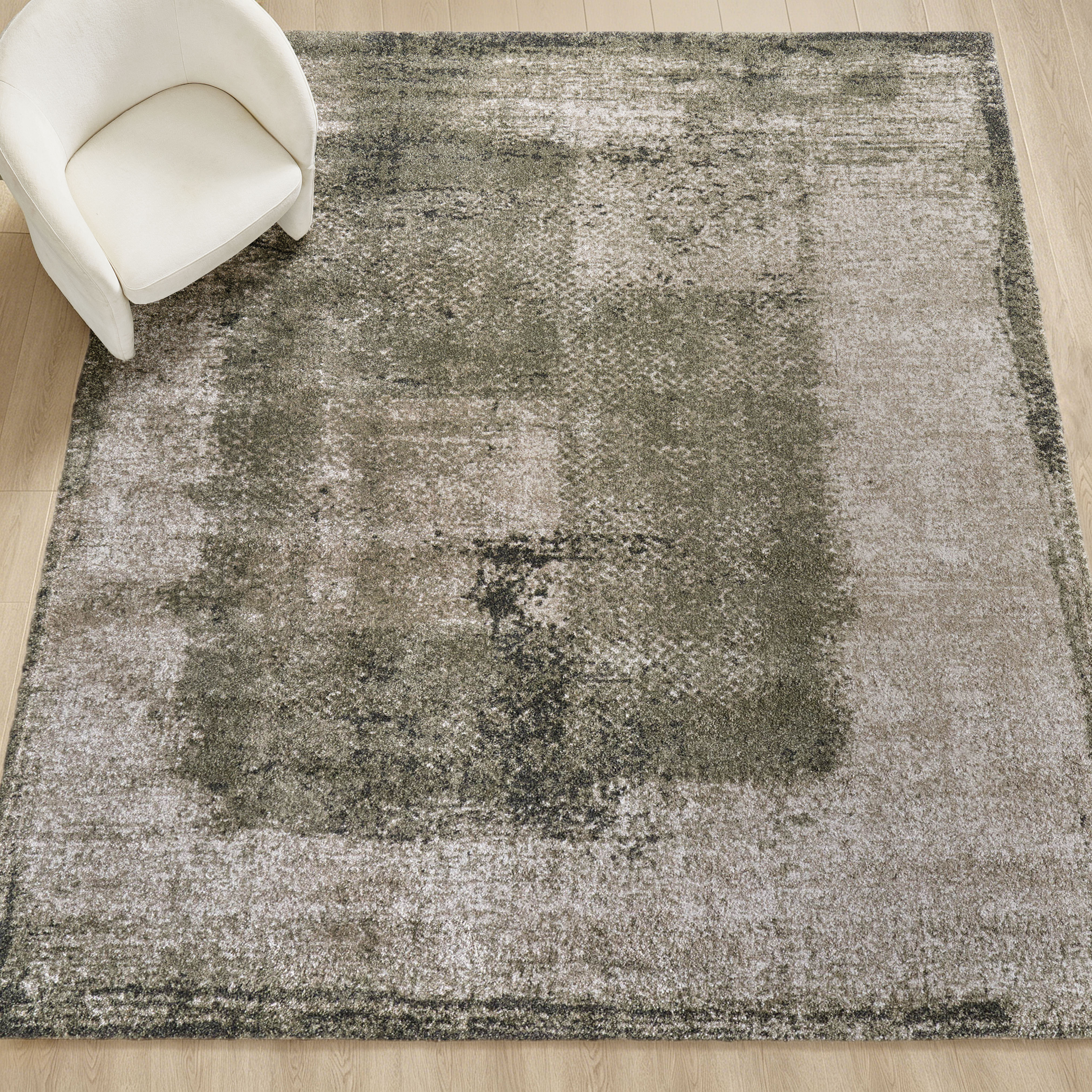
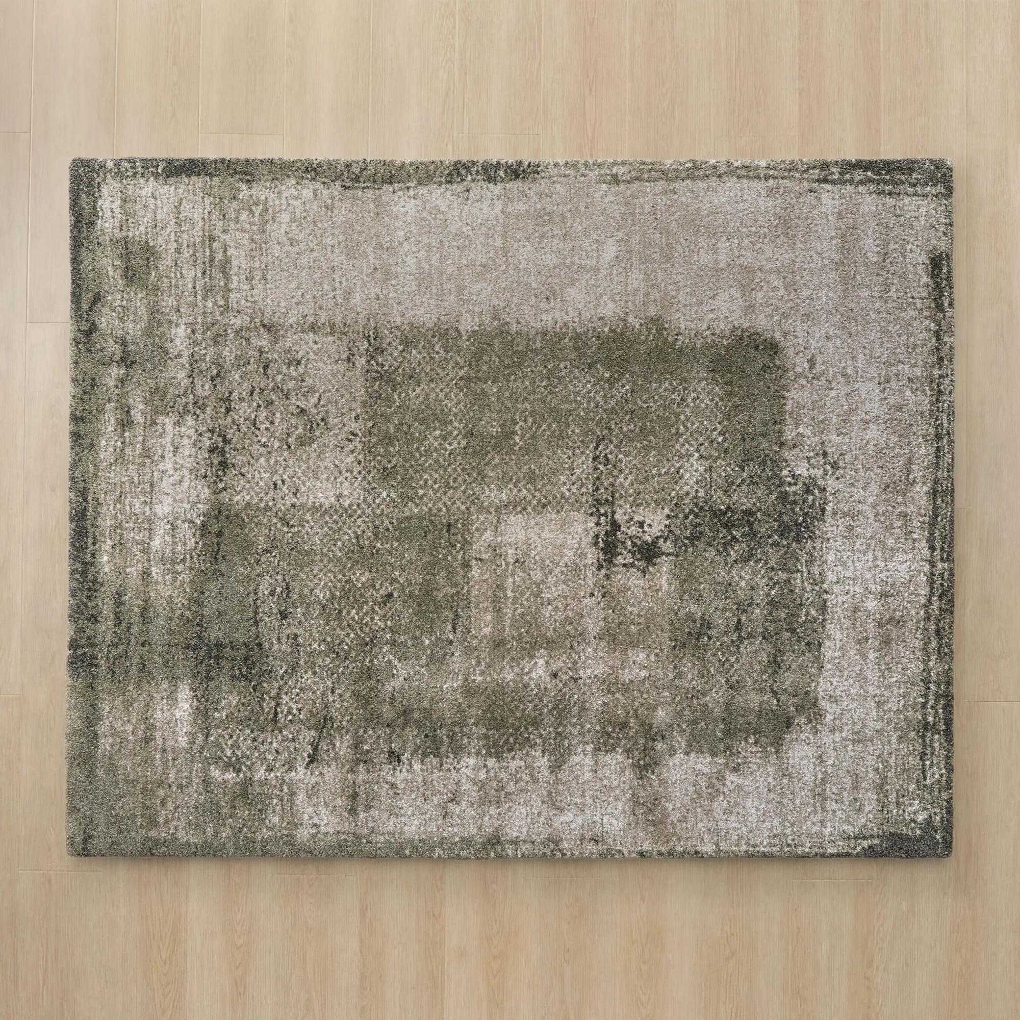 Irving Abstract Moss Green/Beige/Grey Performance Power Loomed Rug$1649
An abstract rug in moss green, beige, and grey with plush, durable polypropylene and polyester construction.
Add To Cart -
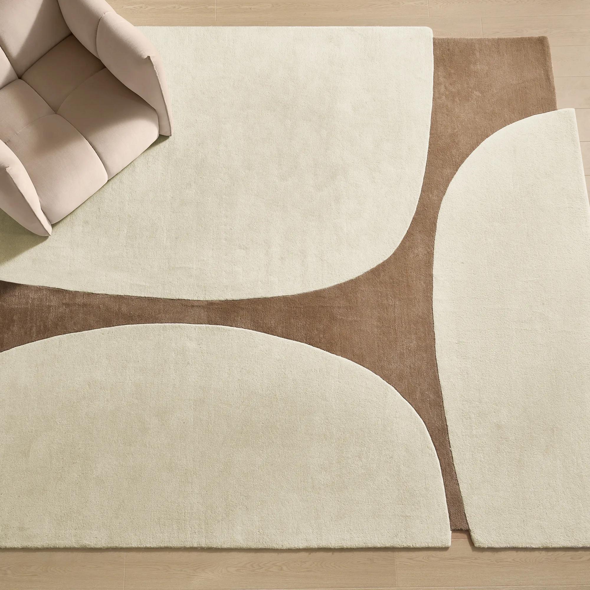
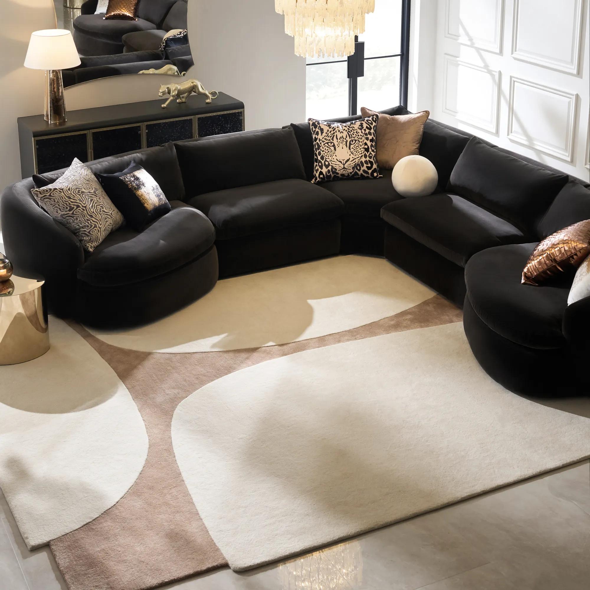 Contour Hand-Tufted Ivory/Ginger Root Wool Blend Rug$1499
A hand-tufted wool rug featuring an ivory and ginger root palette with a contoured, modern design.
Add To Cart -
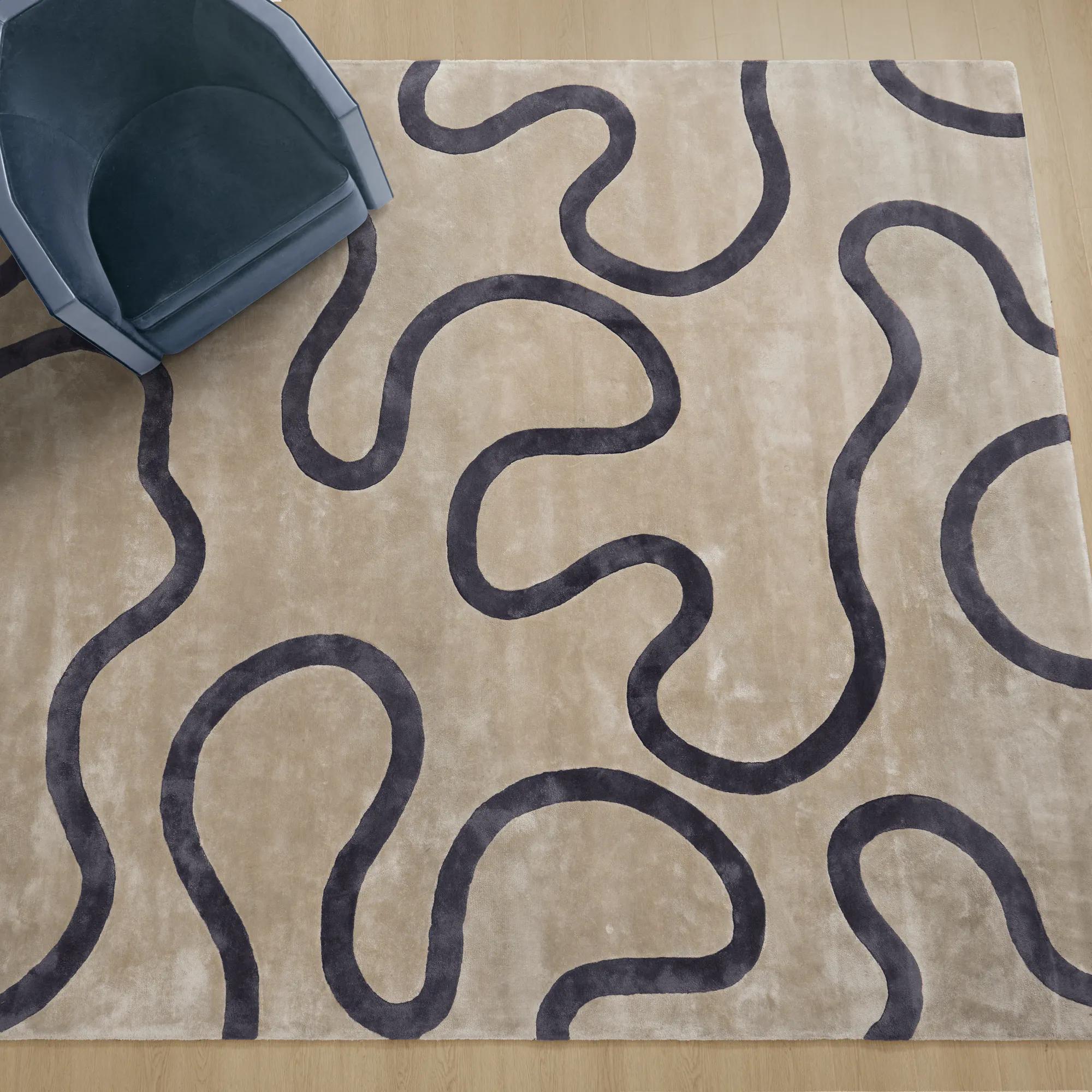 Seraphine Hand-Tufted Smoked Pearl/Taupe Viscose Loop Rugs$1799
A hand-tufted viscose rug in smoked pearl and taupe with bold Deco-inspired loop patterns and subtle sheen.
Add To Cart -
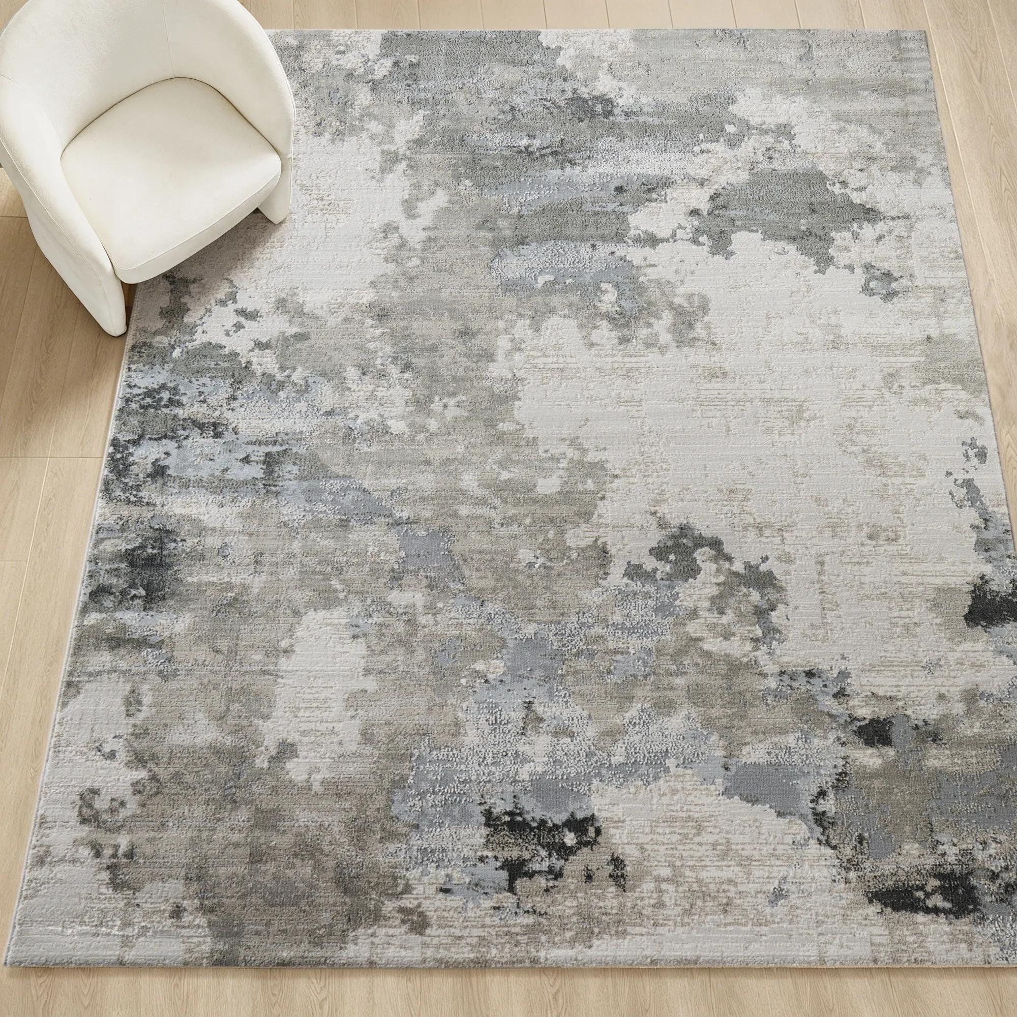 Alarion Abstract Grey/Muted Blue/Ivory Performance Power Loomed Rug$1499
A power-loomed rug featuring a distressed abstract pattern in grey, muted blue, and ivory with stain resistance.
Add To Cart -
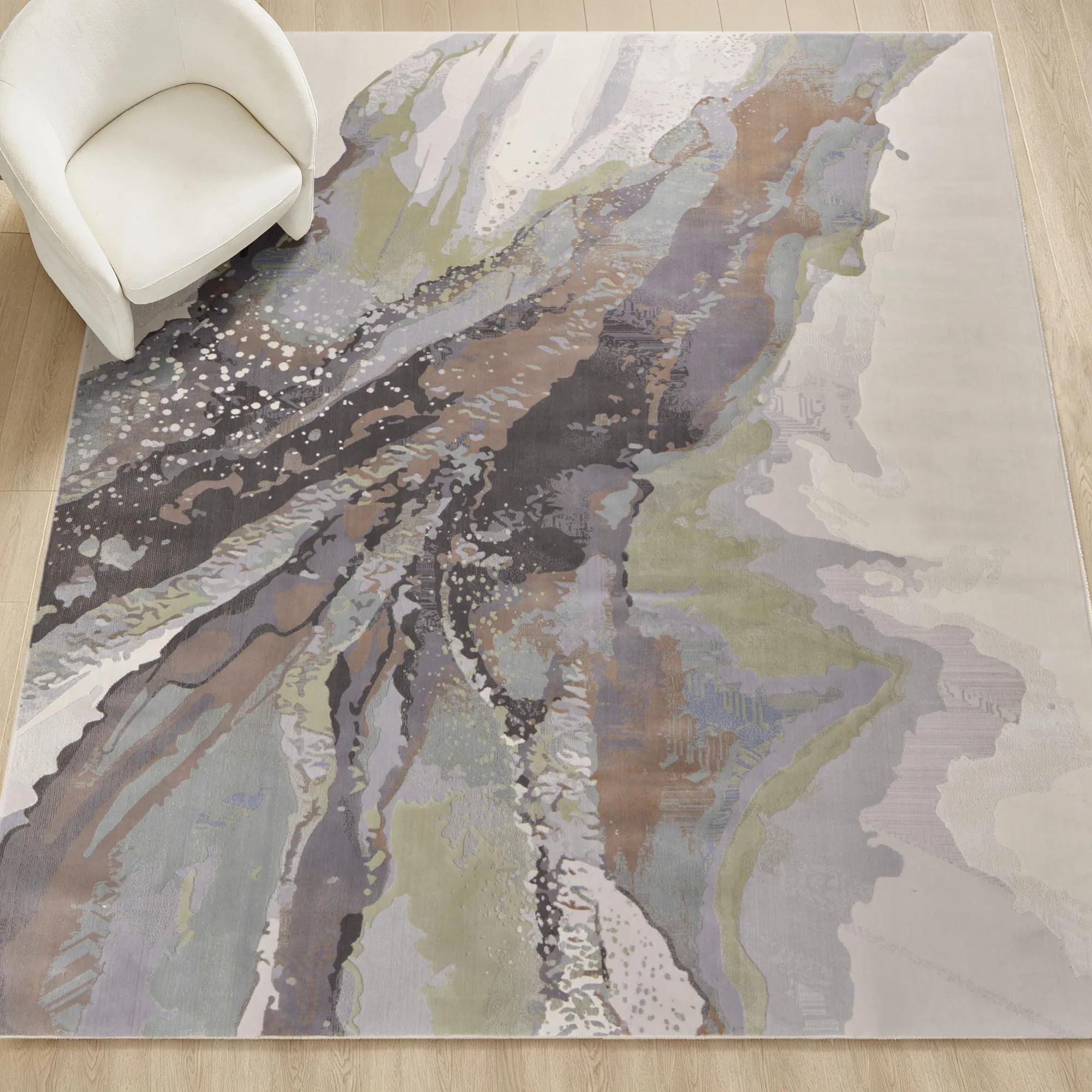
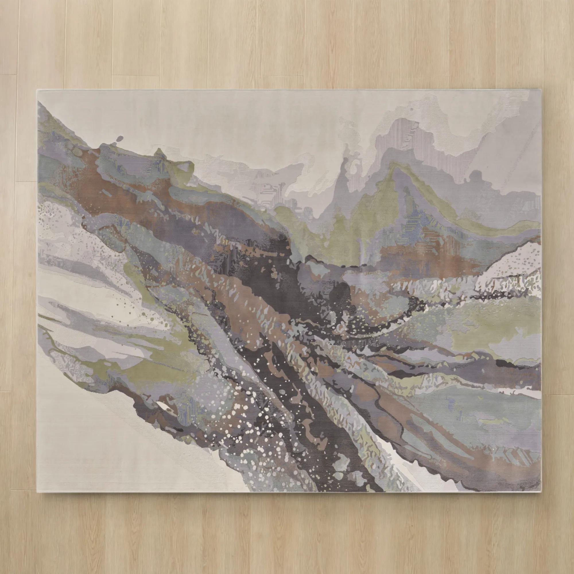 Nerissa Abstract Ivory/Grey/Blue/Green Performance Power Loomed Rug$449
An abstract rug in ivory, grey, blue, and green with a textured, stain-resistant polypropylene-polyester blend.
Add To Cart -
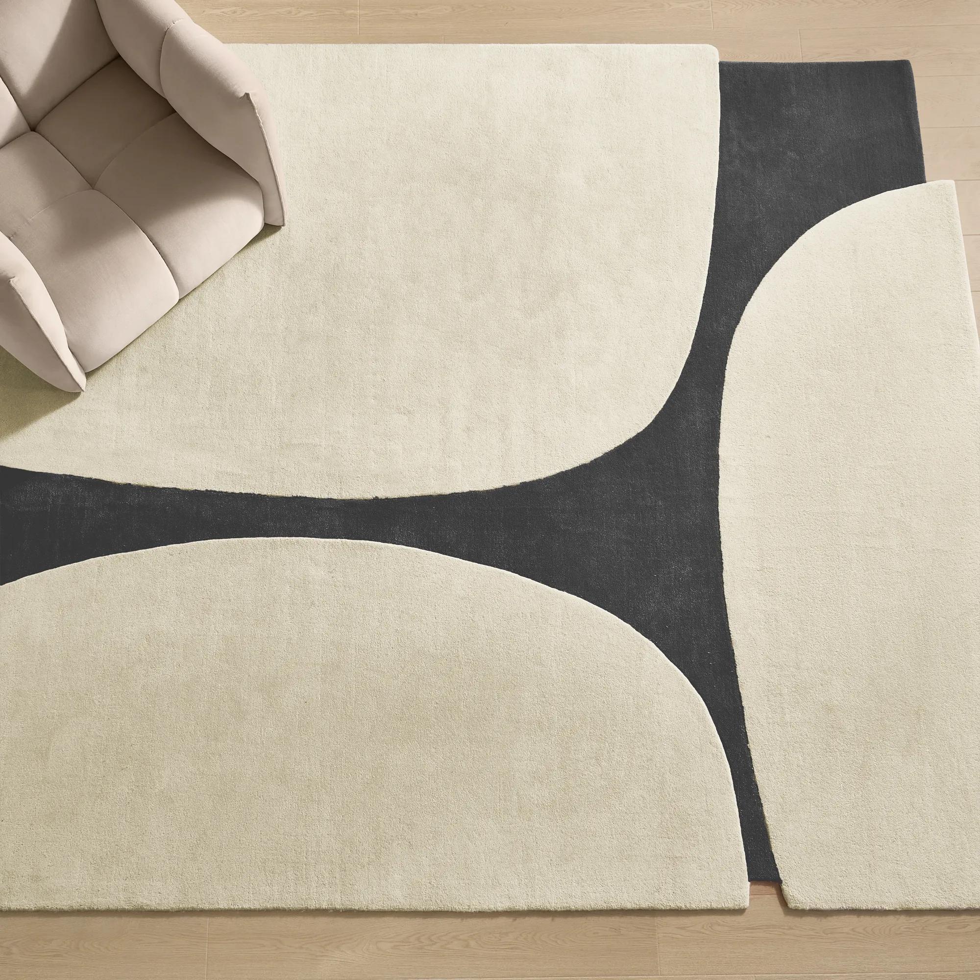 Contour Hand-Tufted Ivory/Charcoal Wool & Viscose Rugs$1499
An artfully shaped hand-tufted rug featuring high-low texture in warm ivory and charcoal wool-viscose blend.
Add To Cart -
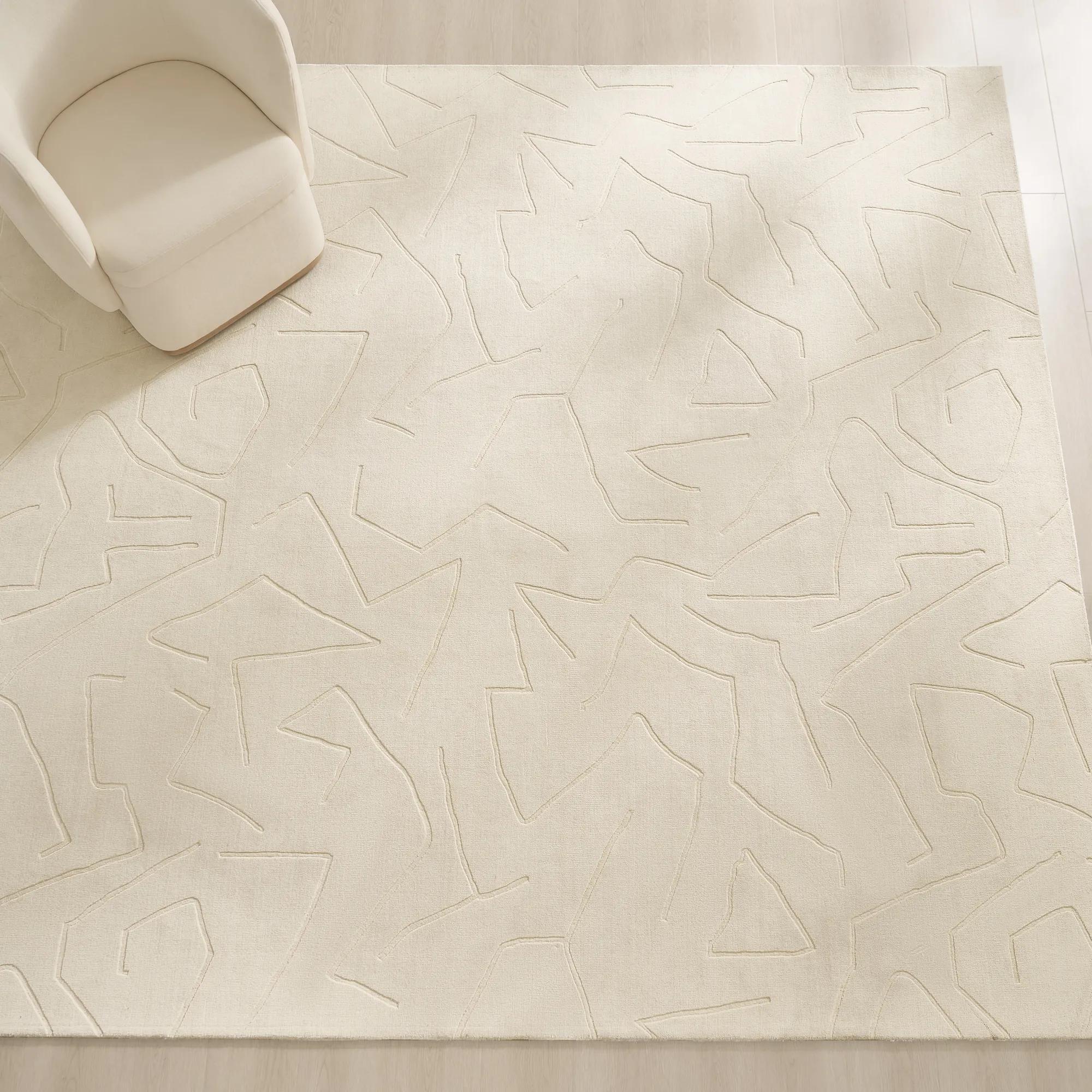 Carved Maze Ivory Hand-Loomed Wool Blend Rug$1399
A hand-loomed ivory wool-blend rug featuring a carved maze pattern for modern textural appeal.
Add To Cart -
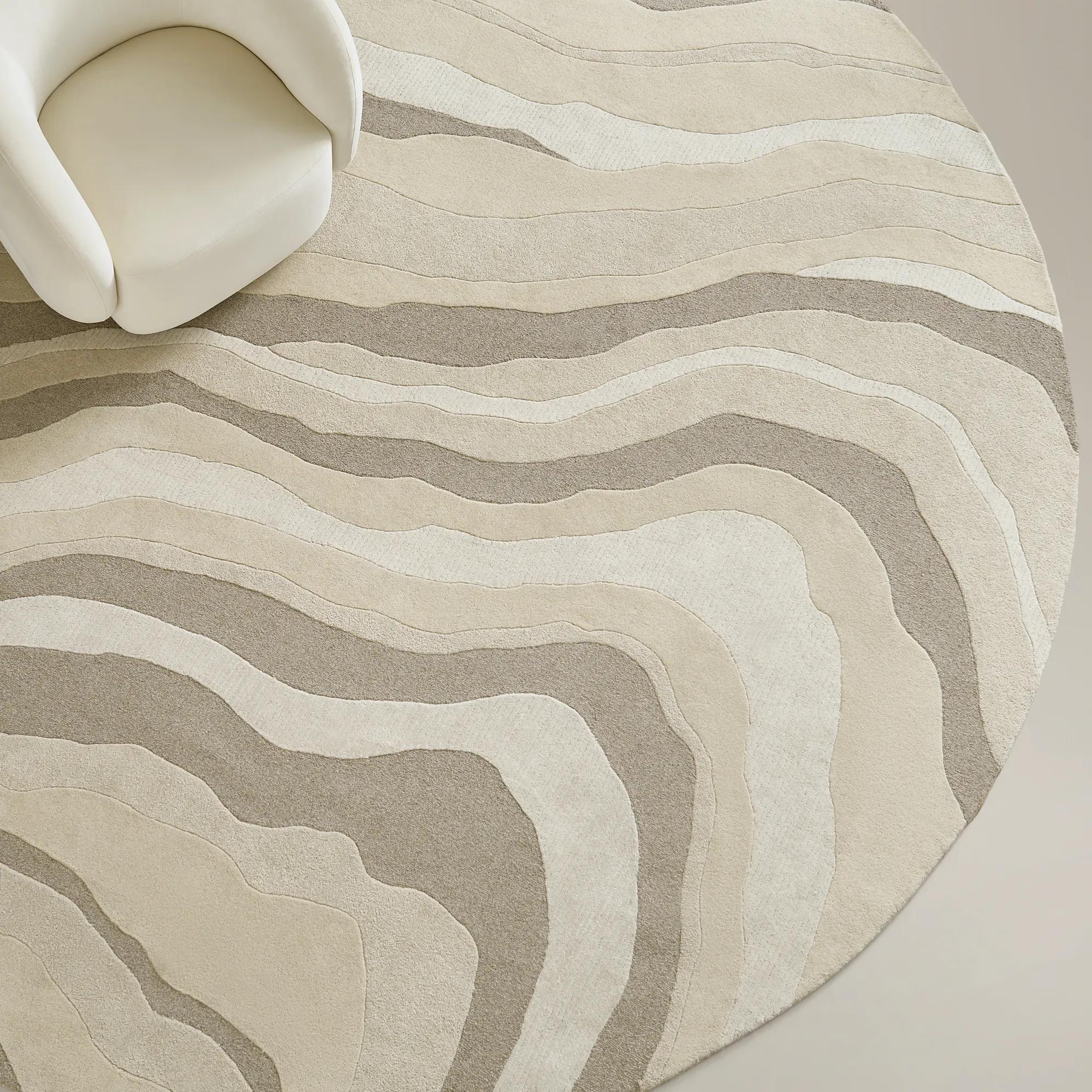 Kadence Hand-Tufted White/Ivory/Tan Wool Round Rug 12"$1799
A hand-tufted round rug in white, ivory, and tan, crafted from 100% wool for natural warmth.
Add To Cart -
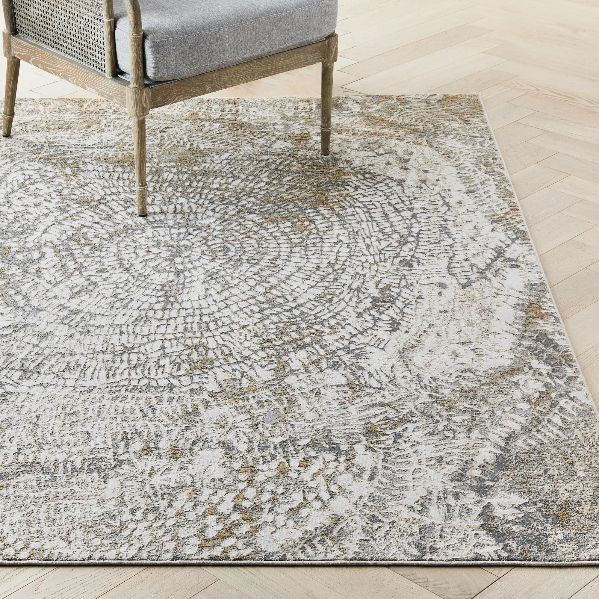 Nautilus Power-Loomed Silver/Grey/Natural Rug$999
A machine-woven ivory rug featuring subtle tonal variations and a durable polypropylene blend construction.
Add To Cart -
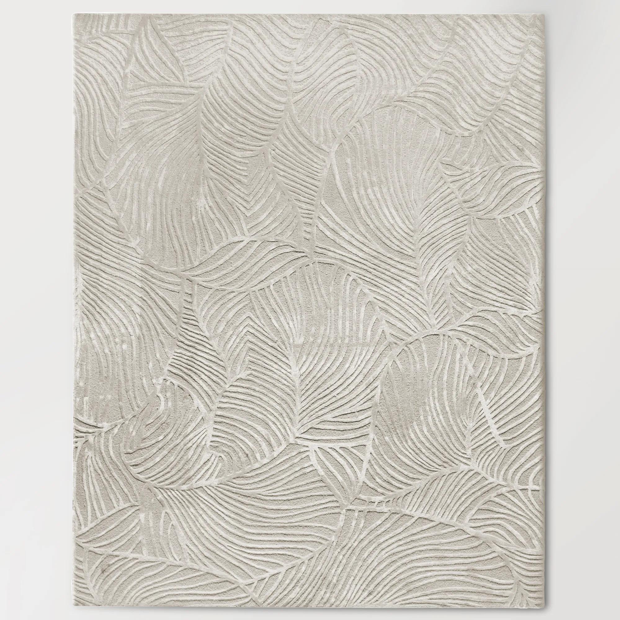 Palm Hand-Tufted Ivory Wool Blend Rug$1499
An ivory rug featuring a dynamic palm-leaf design with high-low pile in viscose and wool.
Add To Cart -
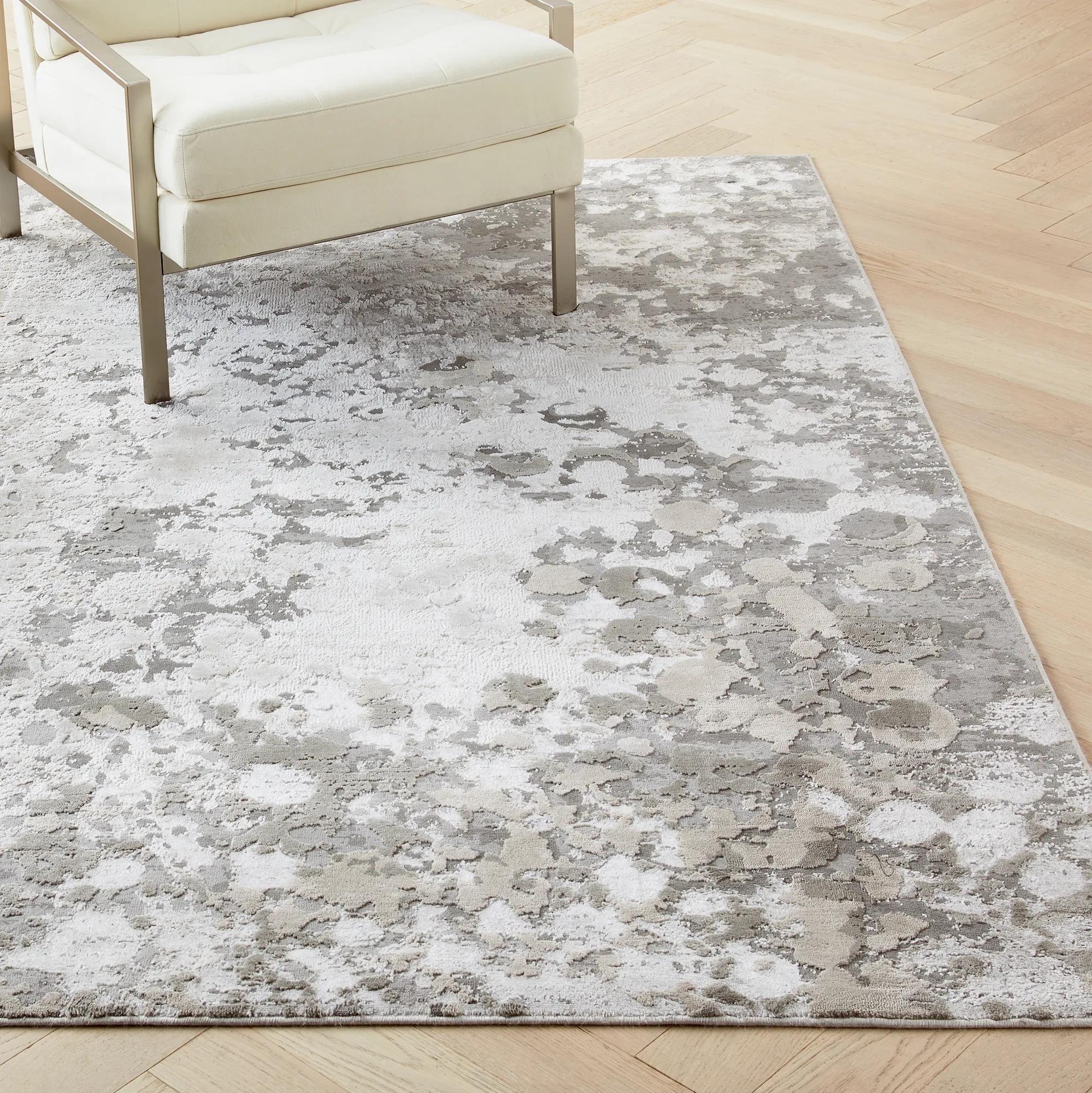 Mercury Power-Loomed Silver/Grey/Beige Rug$449
A neutral floor covering featuring a silver, grey, and beige palette with a soft, textured polyester blend.
Add To Cart -
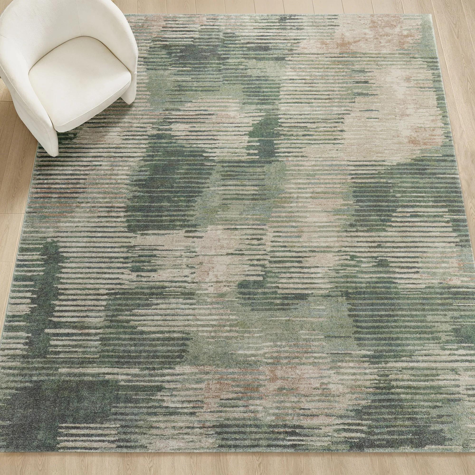
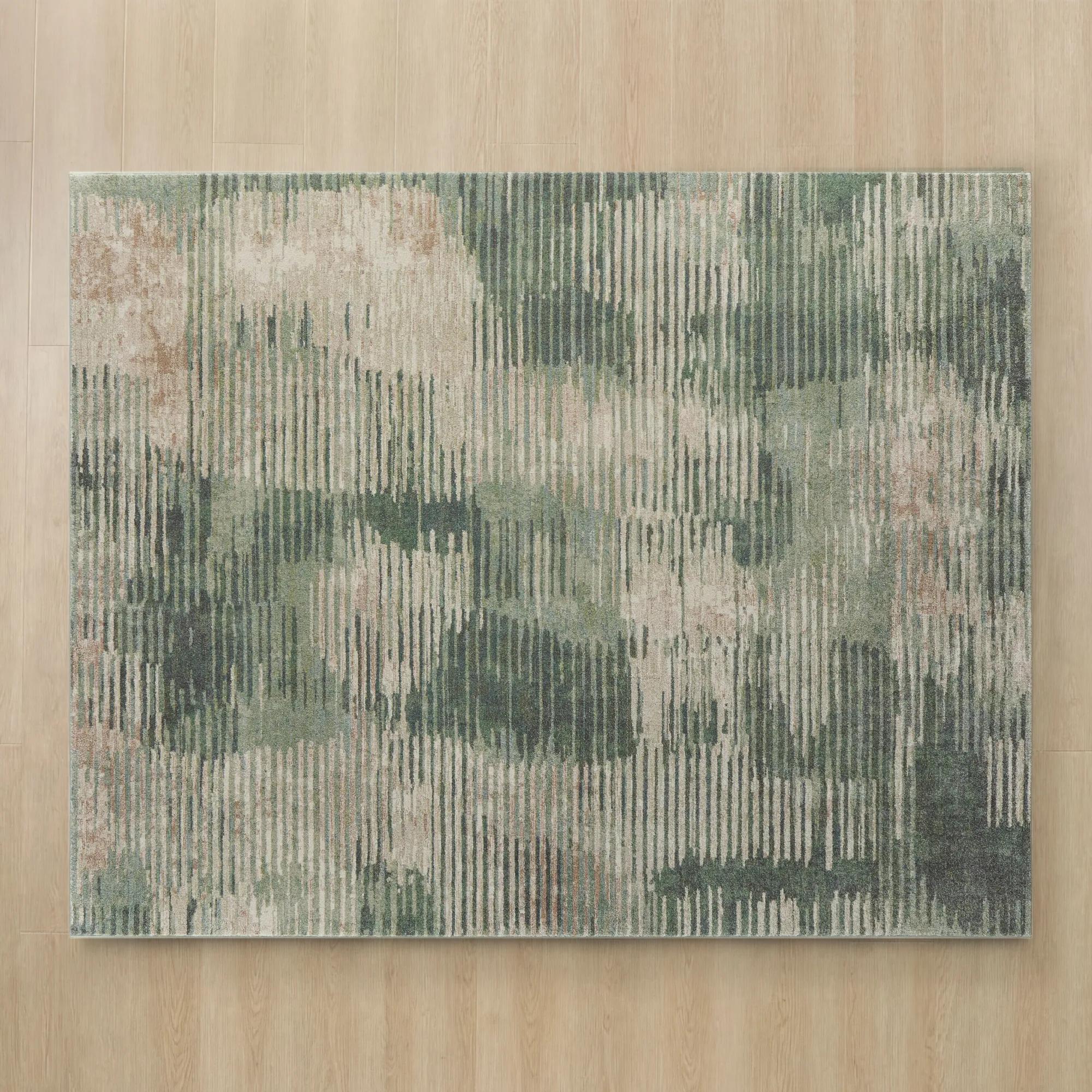 Sylvan Green/Beige Power Loomed Rug$1349
A power-loomed polypropylene rug featuring a contemporary organic pattern in smoked olive green and beige.
Add To Cart -
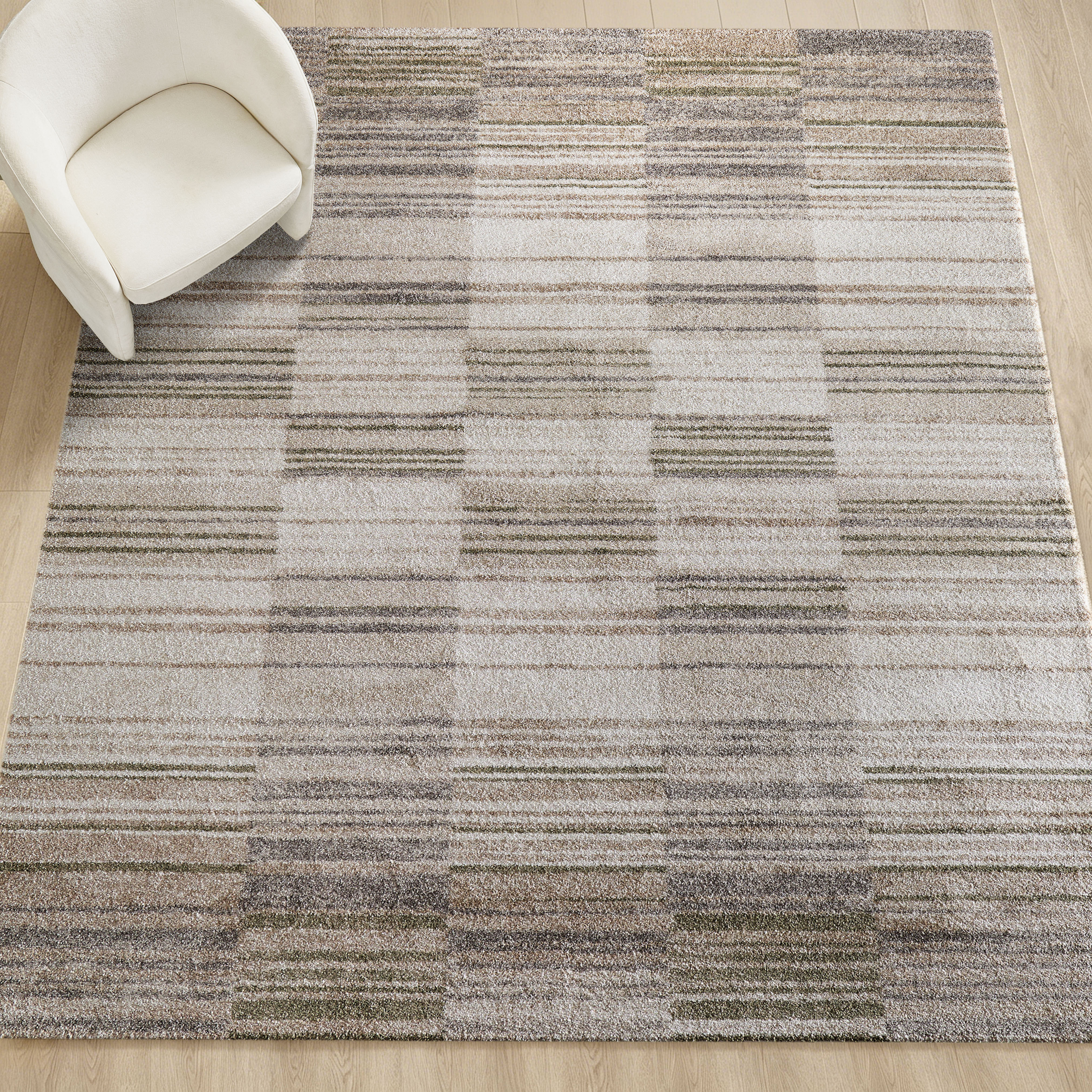
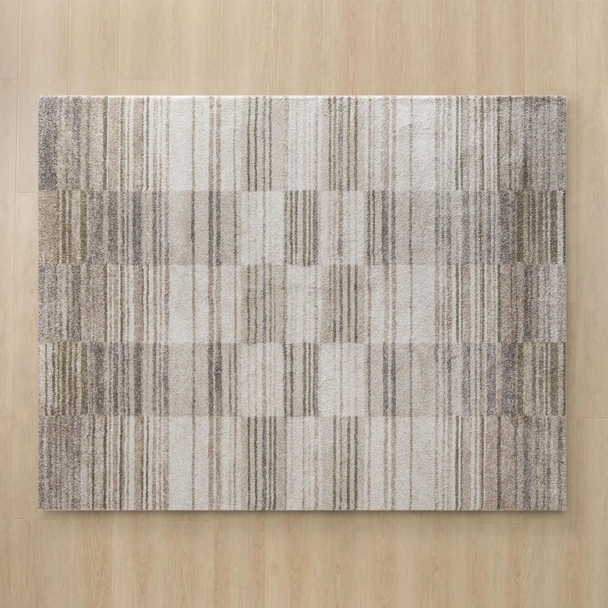 Checka Grey/Tan/Ivory/Soft Green Performance Power Loomed Rug$1649
A plush, power-loomed rug featuring a soft check pattern in grey, tan, ivory, and green.
Add To Cart -
 Fiona Hand-Tufted Ivory/Beige/Black Border Fringe Rug$1099
A hand-tufted ivory, beige, and black rug featuring a framed border and decorative fringe.
Add To Cart -
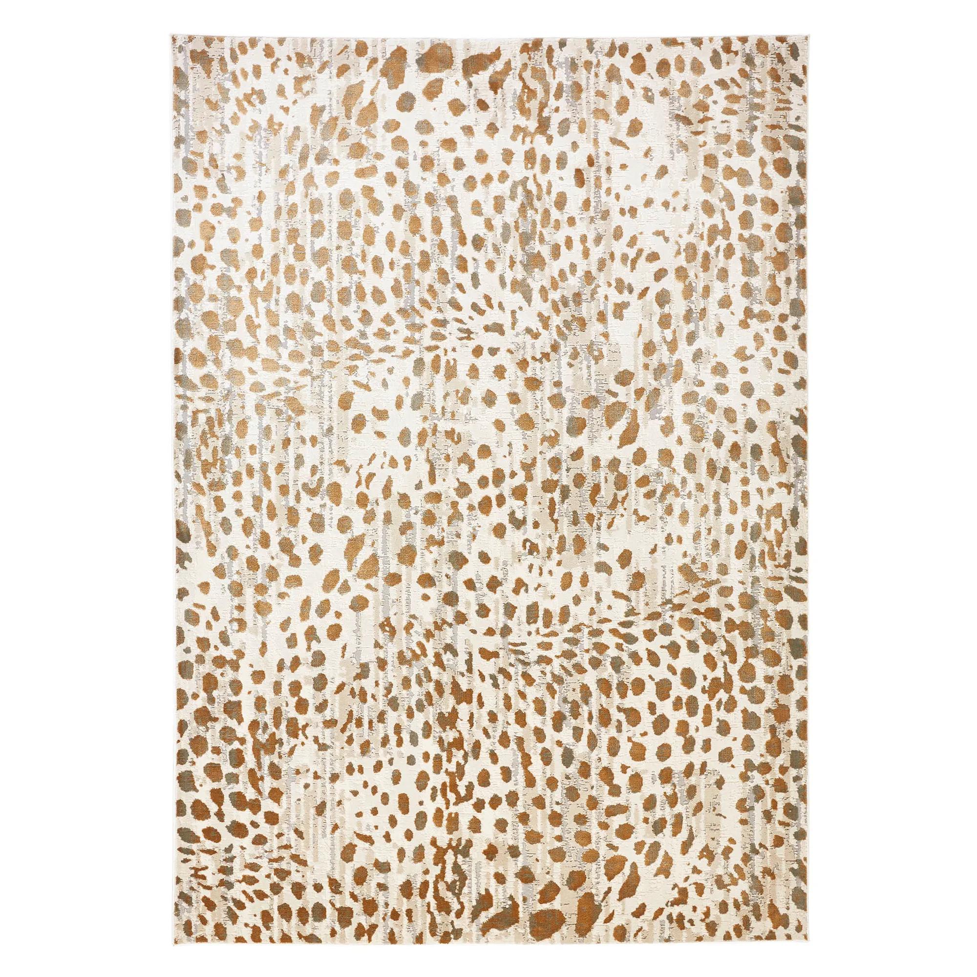
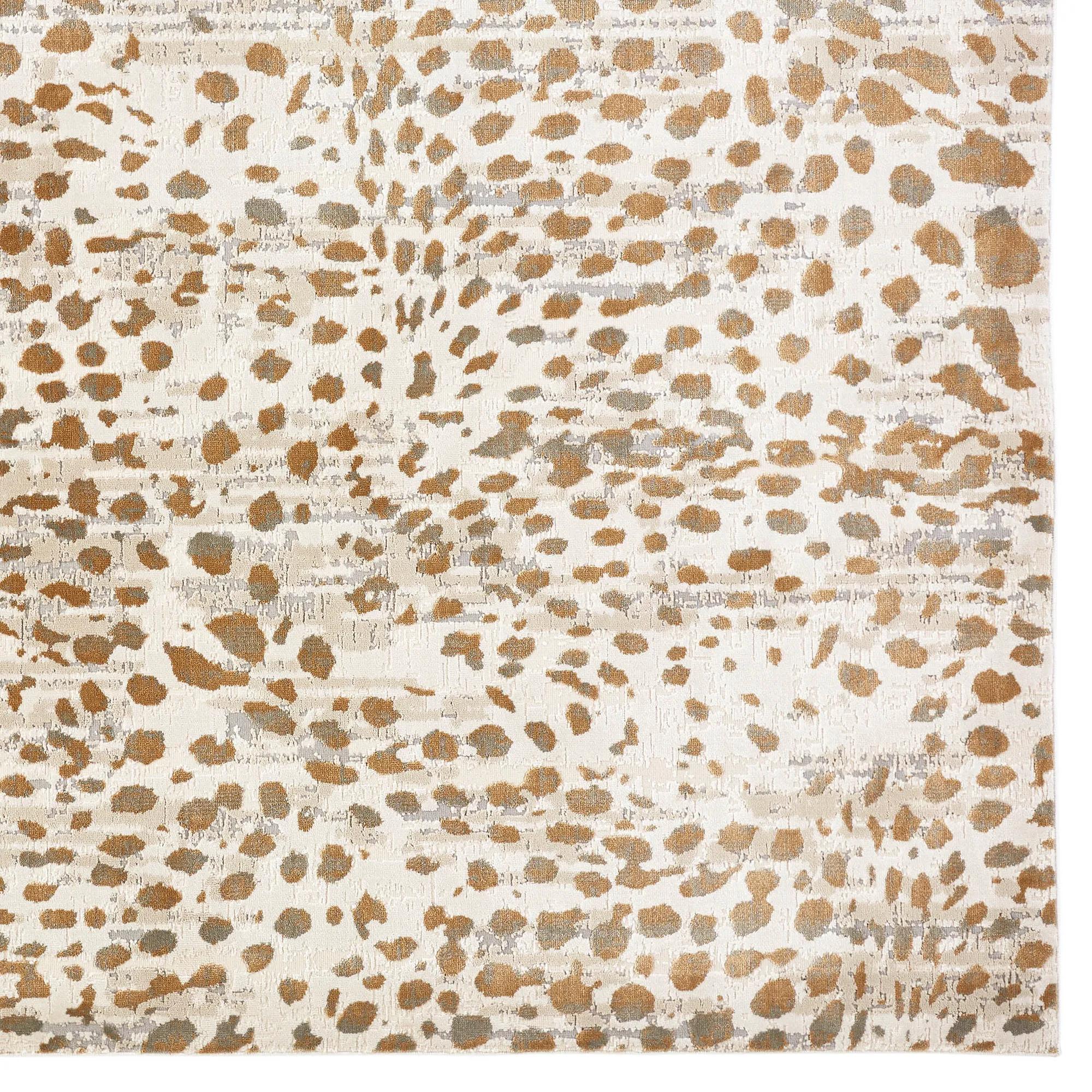 Amur Ivory/Natural Animal Print Power-Loomed Rug$399
A hand-tufted wool and viscose rug featuring a gold chain link design on neutral grey.
Add To Cart -
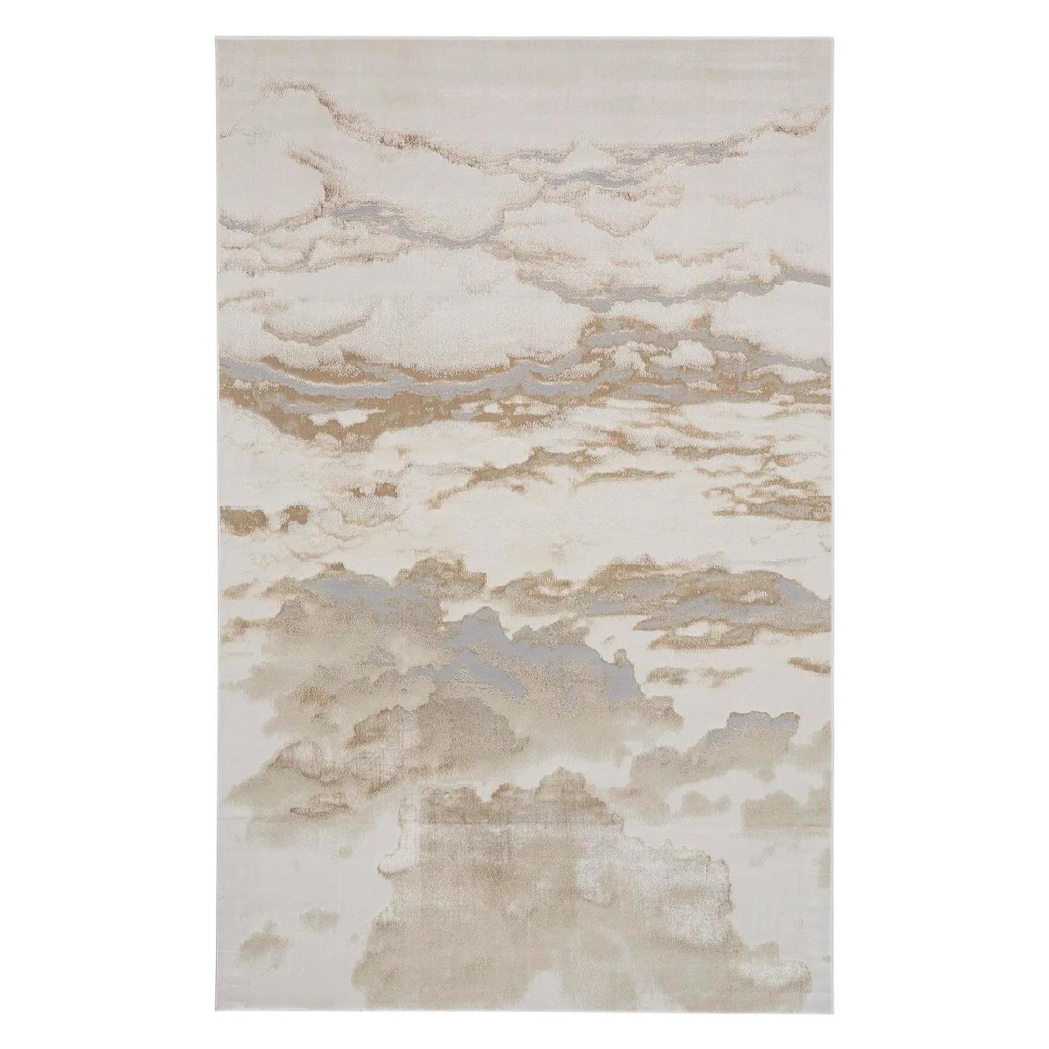
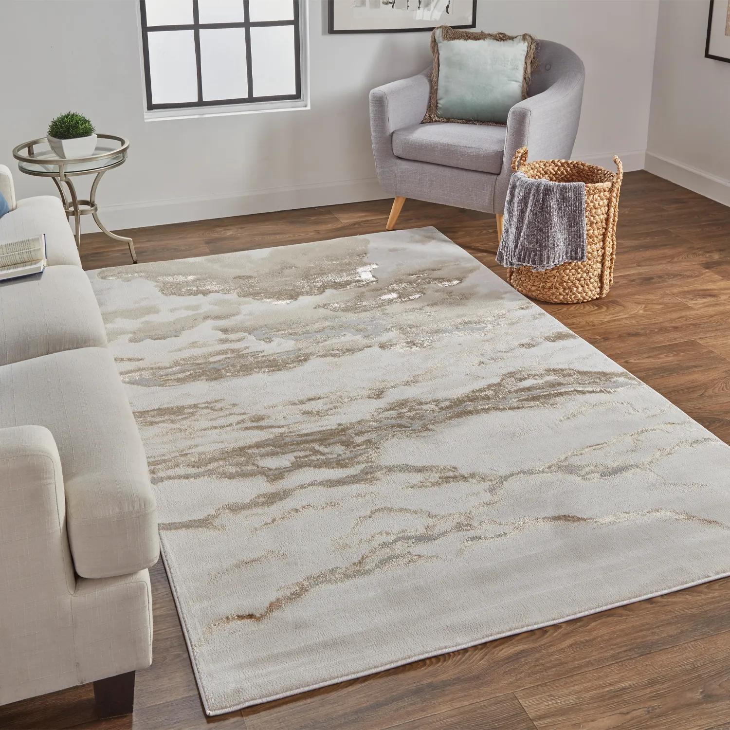 Tide Power-Loomed Beige/Gold/Ivory Rug$449
A machine-made rug in beige and gold, crafted from ultra-soft polyester and polypropylene for elegant appeal.
Add To Cart -
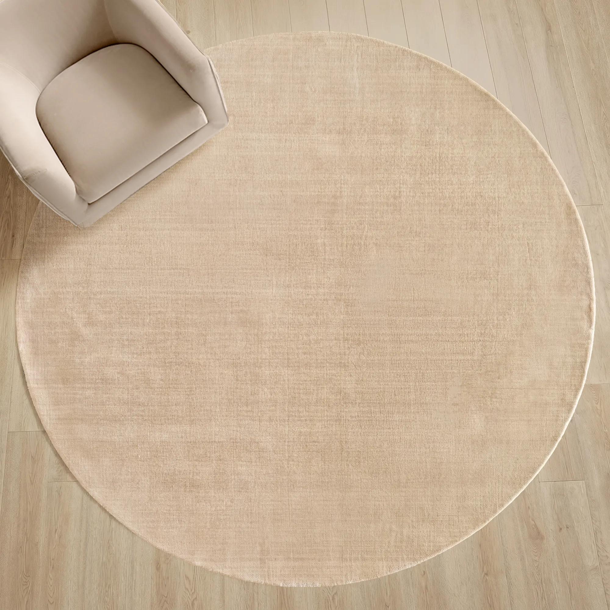 Juni Hand Woven Heathered Warm Beige Round Rug$1399
A handwoven round wool rug in heathered warm beige, offering refined texture and everyday durability.
Add To Cart -
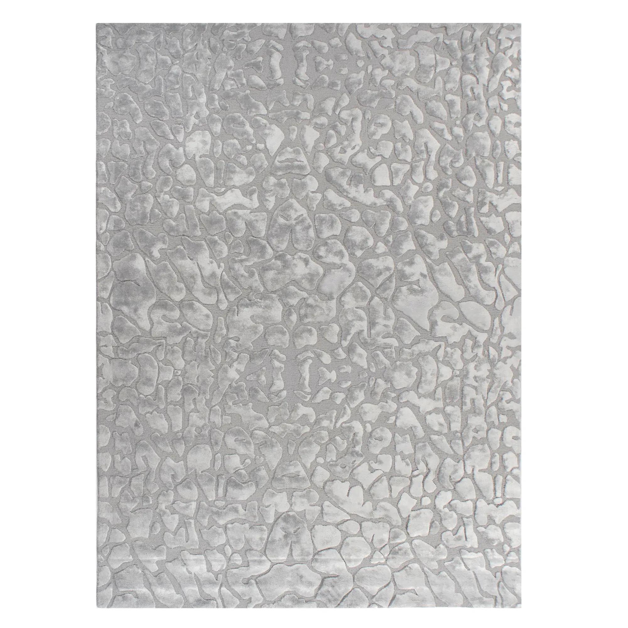
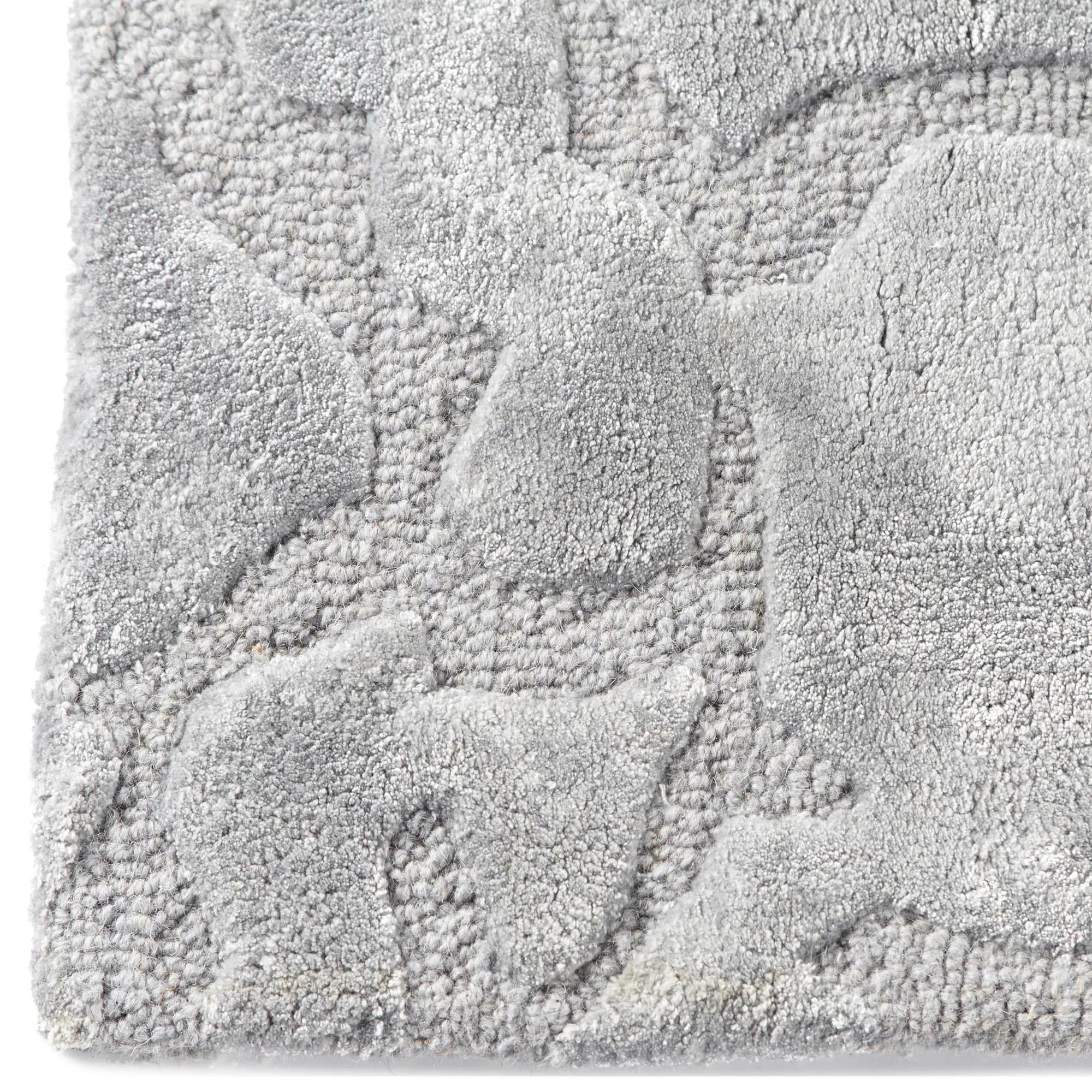 Nola Hand-Tufted Cool Grey Wool Blend Rug$849
A hand-tufted silver rug with contrasting pile heights, crafted from wool and viscose for plush texture.
Add To Cart -
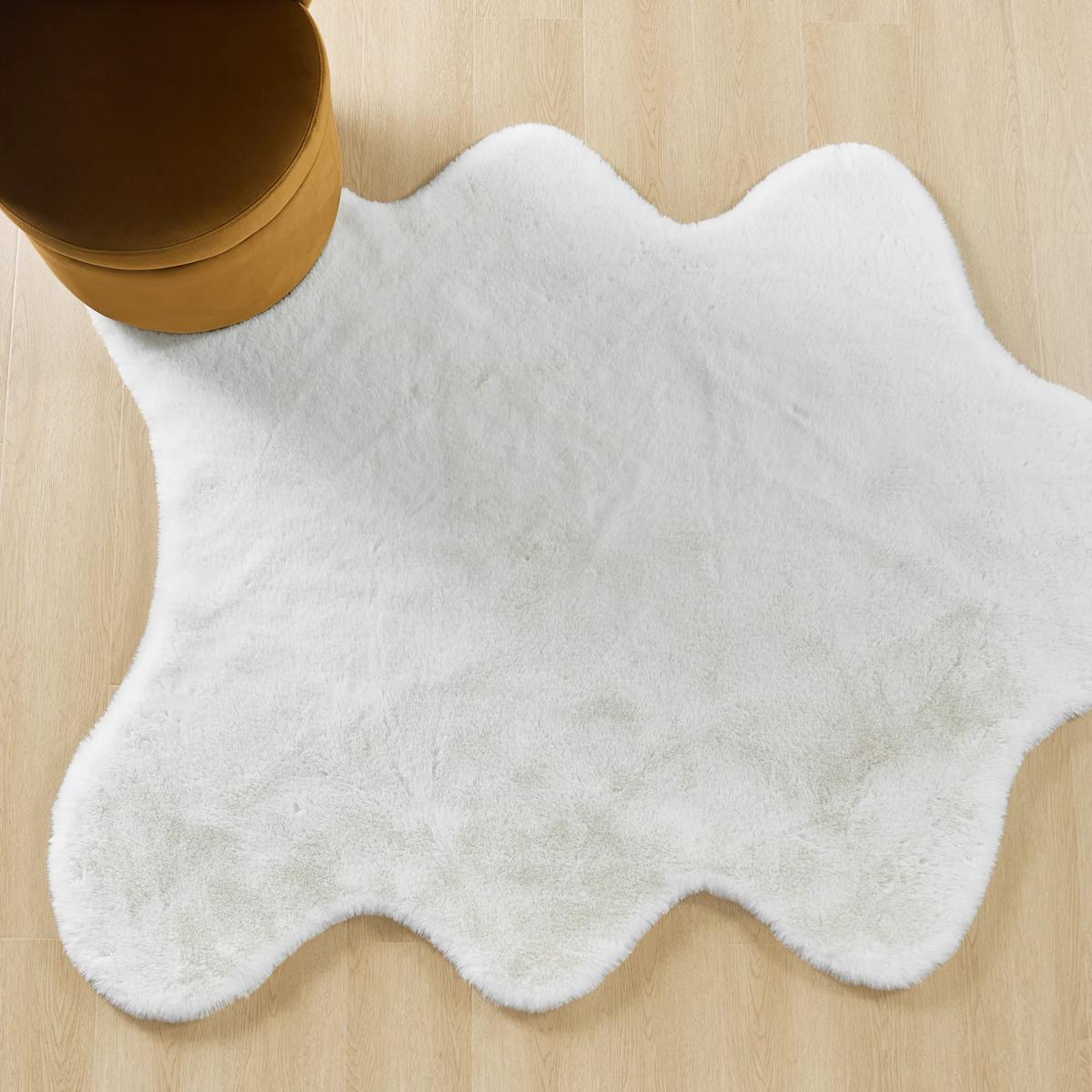
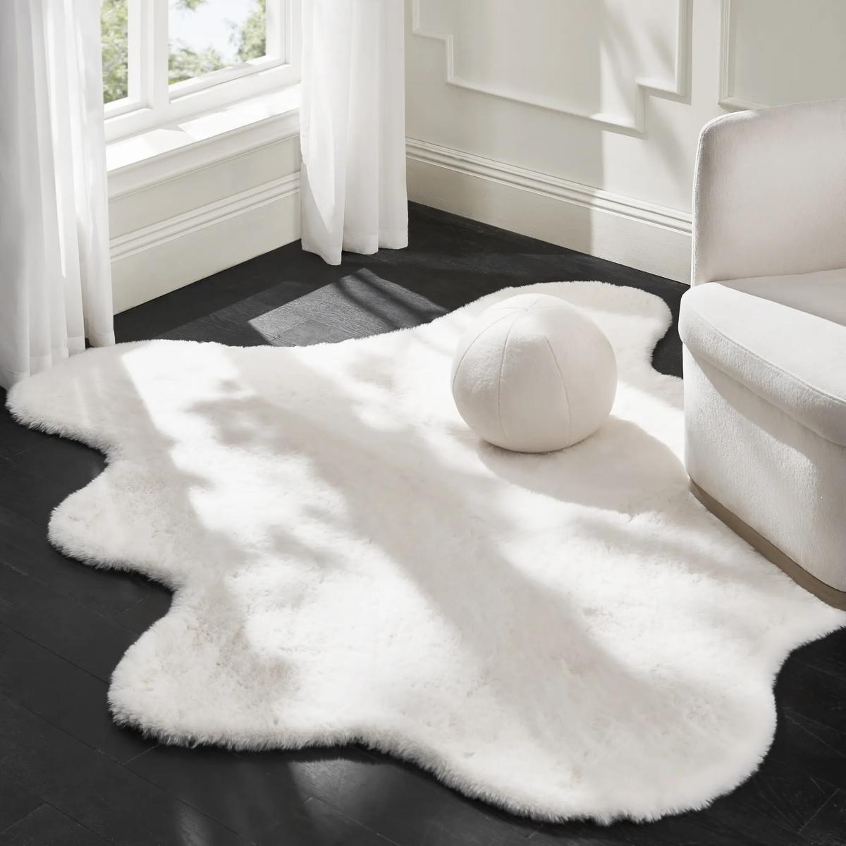 Odin Faux Fur White Shaped Rug 5' x 6'$249
A plush, cloud-shaped white rug with ultra-soft polyester pile and a practical non-slip backing.
Add To Cart -
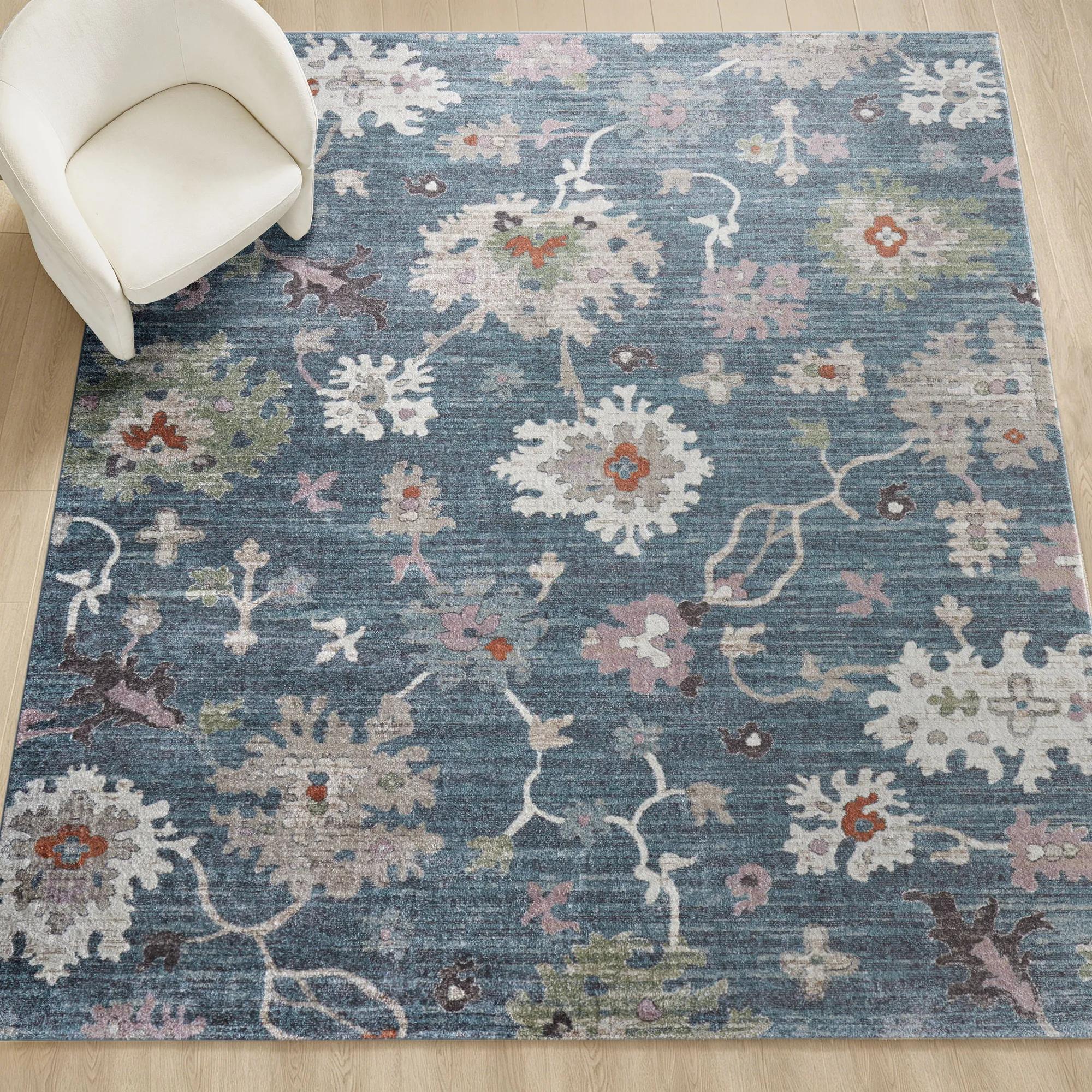
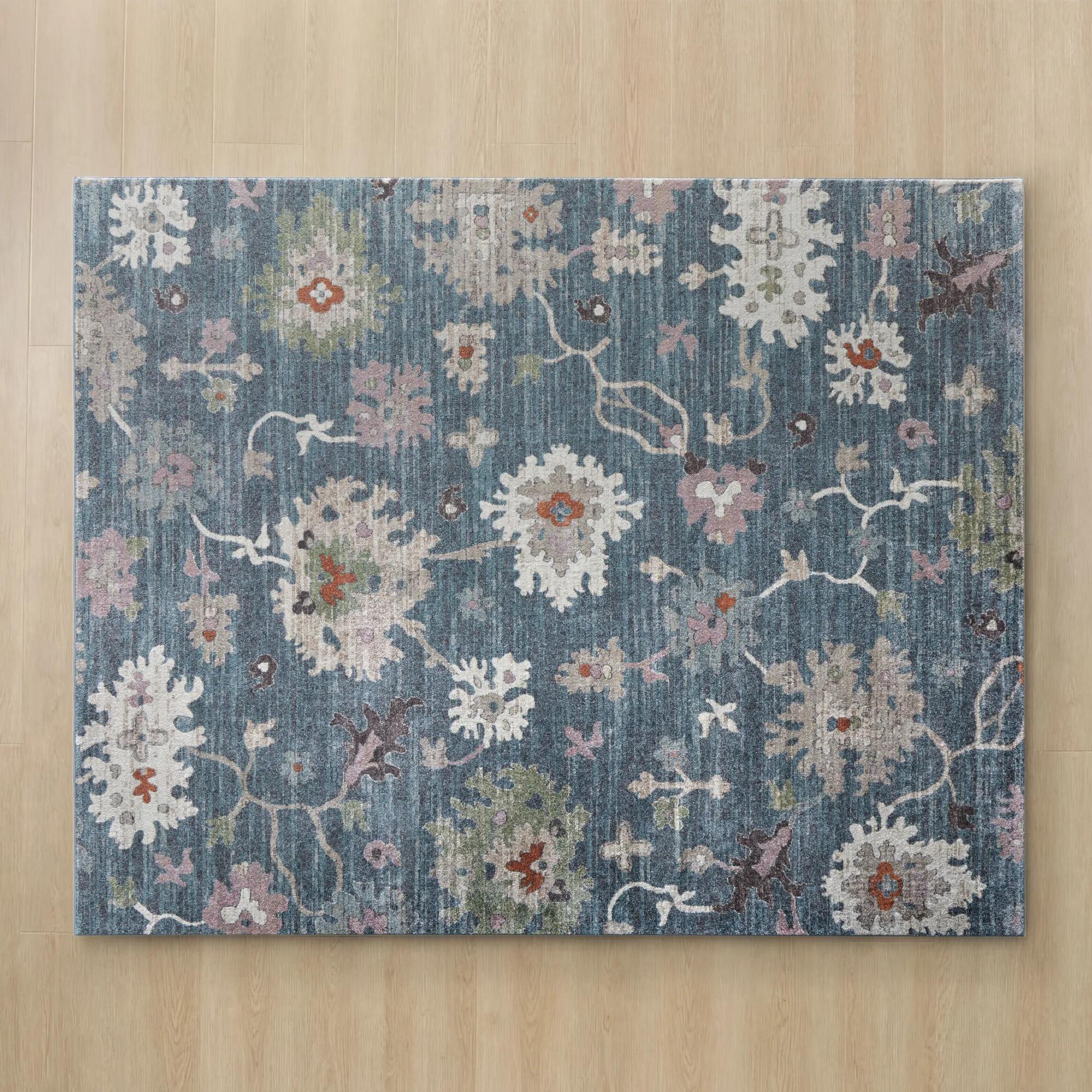 Ariella Floral Blue/Ivory/Beige/Green/Rose Dust Performance Power Loomed Rug$1499
A Persian-inspired rug in blue, ivory, beige, green, and rose dust with plush, stain-resistant polypropylene.
Add To Cart -
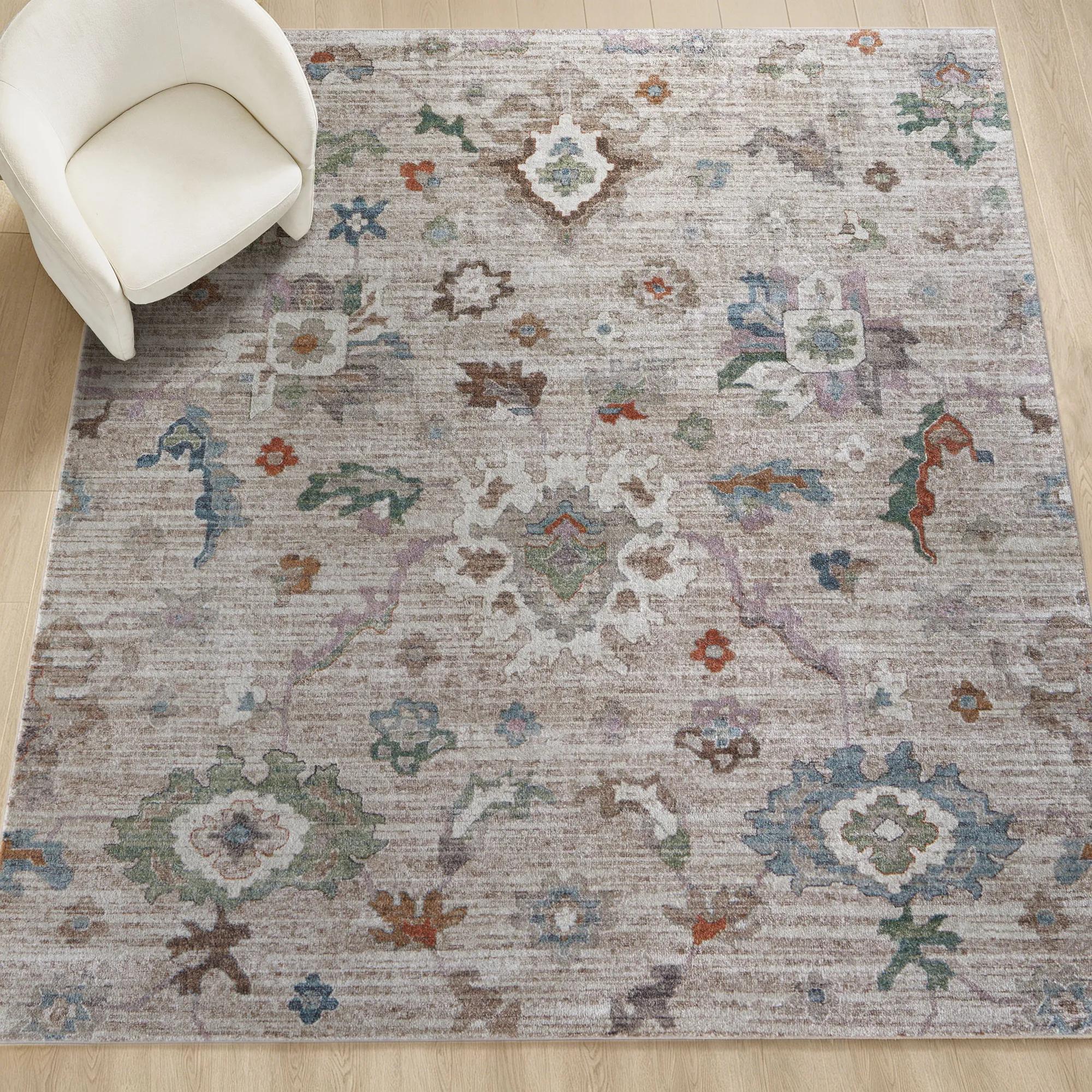
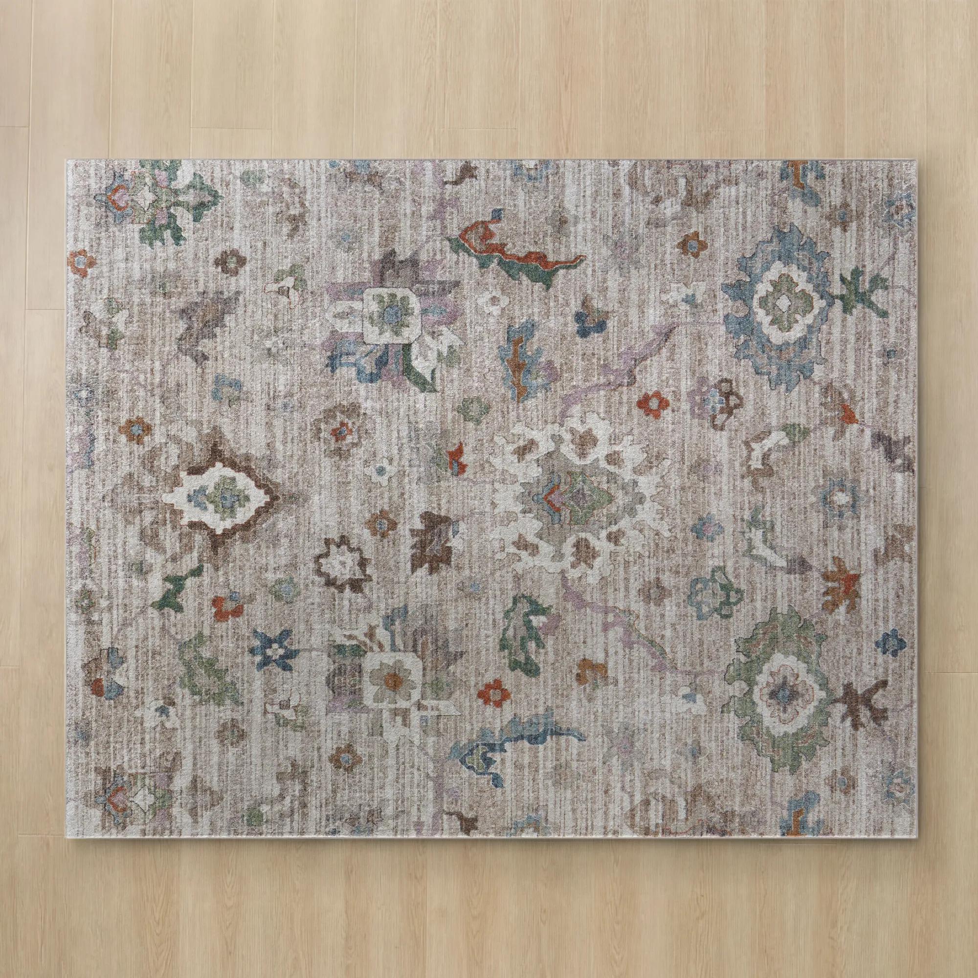 Ariella Floral Taupe/Ivory/Beige/Blue/Green Performance Power Loomed Rug$1499
A Persian-inspired rug in taupe, ivory, beige, blue, and green with a plush, power-loomed polypropylene pile.
Add To Cart -
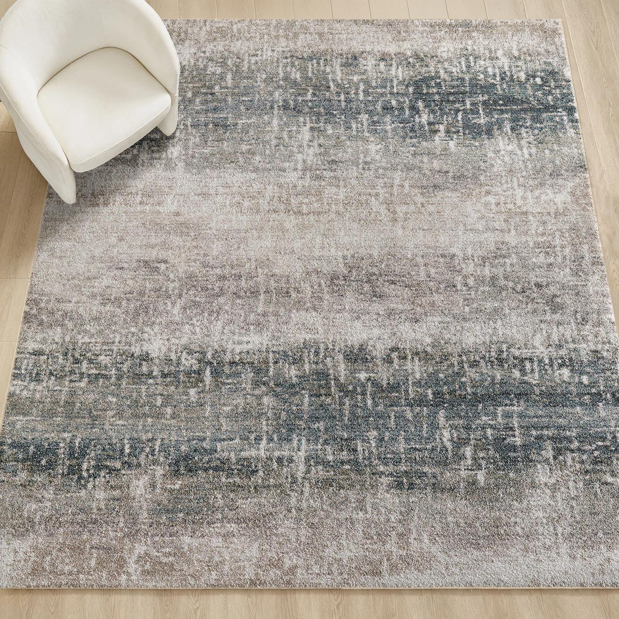
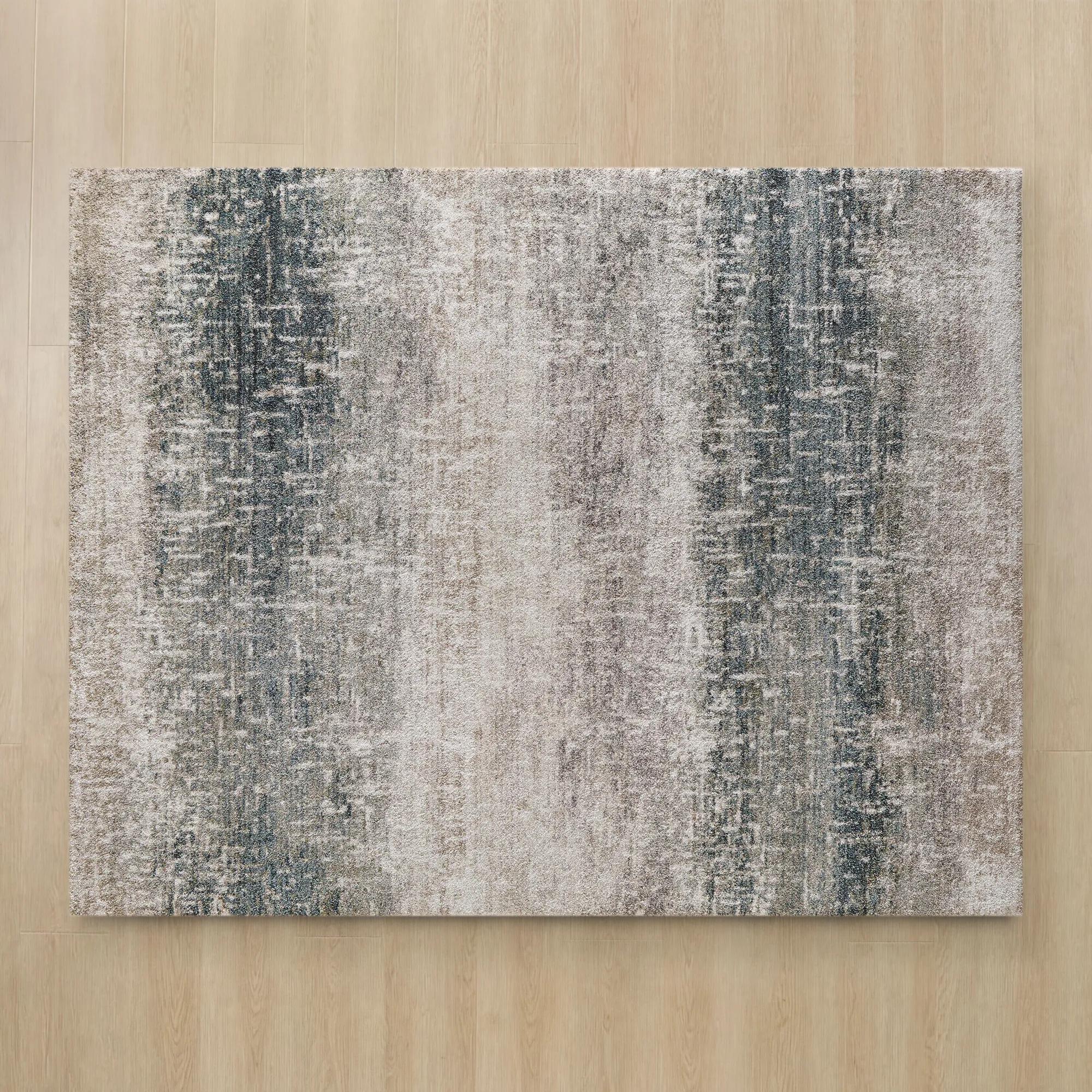 Collier Taupe/Grey/Blue/Green Performance Power Loomed Rug$1649
An abstract rug in taupe, grey, blue, and green with a plush pile and durable, easy-care blend.
Add To Cart

Soft Pastel Area Rugs
Explore soft pastel area rugs to ground your room in delicate color without overpowering statement furniture or art. Pale, muted tones can soften bold accents or add subtle depth to a tonal living room or bedroom. Consider your furniture layout and rug dimensions to choose a size that frames your seating area or anchors your bed.
Soft pastel area rugs bring gentle color and expressive texture to a room, grounding furniture in shades such as blush, powder blue, lavender, pale sage, and creamy ivory. Their appeal lies in the balance between visual softness and decorative presence: a washed rose pattern can lend romance to a bedroom, while a silvery blue abstract design can give a living room the atmosphere of a contemporary gallery. Pastel describes the color palette, not a particular material or construction, so these rugs can range from smooth, low-profile weaves to sculpted surfaces and deep, sumptuous piles. That distinction makes room for different kinds of luxury, whether the desired effect is tailored and serene or richly layered. A pale rug beneath a curved sofa creates an elegant foundation without competing with sculptural furniture; beneath a glass coffee table, its pattern becomes part of the composition rather than disappearing from view. Tonal designs offer subtle movement, while faded medallions, fluid brushstroke effects, and restrained geometric motifs introduce more definition. The surrounding finishes influence how the color reads. Blush beside warm brass feels luminous, muted lilac against dark wood gains depth, and misty green paired with ivory upholstery creates a composed backdrop for statement art. Pale colors need not make a room feel delicate or overly sweet. A charcoal accent chair, a lacquered console, or a dramatic mirror can give a pastel foundation a confident edge. For bedrooms, nurseries, sitting rooms, and thoughtfully layered living spaces, this palette offers color that remains atmospheric rather than insistent. It also gives decorative details room to shine: the gleam of a metallic tray, the folds of velvet drapery, or the silhouette of an oversized vase. The result is a room with softness in its palette and unmistakable intention in its design.
Material and construction determine how a pastel rug feels underfoot, how clearly its pattern appears, and how comfortably it fits into everyday life. Wool is valued for its natural resilience and substantial hand, making it a compelling choice for living areas where texture matters as much as appearance. Some shedding is normal, particularly with new wool rugs, and regular care helps manage loose fibers. Cotton can create a lighter, more relaxed surface, although washability depends on the complete construction, including the backing, rather than the fiber alone. Synthetic fibers such as polyester and polypropylene can offer practical stain resistance and easy-care characteristics, with performance varying by weave, finish, and manufacturer instructions. Viscose lends a luminous sheen that can make pale colors appear almost liquid as the light changes, but it is more sensitive to moisture and abrasion and generally suits gentler settings. Blended fibers combine different qualities, so the full material description matters more than a single appealing term. Texture deserves equal attention. A dense, low pile allows dining chairs to move more freely and is often easier to vacuum than a long, loose pile. Higher piles create a more enveloping sensation beside a bed or within a quiet reading nook, though they can hold more debris and require different vacuum settings. For rooms where tactile comfort leads the design, soft plush area rugs emphasize that cushioned, indulgent feeling; a pastel palette and a plush surface are complementary qualities, not interchangeable ones. In family rooms or homes with pets, tightly constructed surfaces may be more practical than open loops that can catch claws. A nursery or child’s bedroom may benefit from a smooth, comfortable rug with a stable edge and a care routine suited to frequent spills. No pale shade or fiber is automatically child-friendly, pet-proof, or washable. Those qualities depend on the individual construction and care specifications, allowing beauty and practicality to be considered together rather than treated as opposites.
Scale gives soft color its architectural presence. In a living room, an area rug generally feels more connected to the furniture when it extends beneath at least the front legs of the sofa and surrounding chairs, creating a shared foundation for conversation. Common dimensions such as 8 by 10 feet or 9 by 12 feet can suit many seating arrangements, but the furniture footprint and room proportions should determine the final fit. A narrow strip floating between substantial pieces can make even a luxurious texture feel disconnected. Beneath a dining table, enough rug should remain behind the chairs when they are pulled out; approximately 24 to 30 inches beyond the tabletop on each side is a useful starting point, adjusted for chair depth and the surrounding space. In a bedroom, a generous border beside the bed lets the color frame the furniture and gives bare feet a softer landing. Door clearance, floor vents, and the thickness of both rug and pad also influence placement. A pad compatible with the rug backing and flooring can help limit movement, add cushioning, and reduce friction underneath, without substituting for proper positioning. Pale surfaces tend to reveal dark debris and some spills readily, so routine care protects their visual clarity. Vacuum according to the care label, avoiding aggressive brush settings where the construction calls for gentler treatment, and blot spills promptly with a clean, undyed cloth rather than rubbing them into the fibers. Cleaning products should be approved for the material and tested discreetly; delicate fibers may require professional attention. Machine washing is appropriate only when expressly permitted, and larger washable rugs must also fit the recommended equipment. Periodic rotation helps distribute wear and light exposure, especially where one end sits near a window or a favorite chair. With thoughtful proportions and care matched to the material, a pastel rug becomes more than a pale accent. It draws furniture, art, and texture into a cohesive setting, giving a room a graceful foundation with enough character to hold its own.
FAQs
Soft pastel area rugs feature delicate hues such as blush pink, powder blue, pale lavender, mint, and buttery yellow. These colors bring a whisper of color to an interior. Choose one shade as your focal point, or explore blended pastels for a more painterly foundation.
Let a soft pastel area rug anchor a composition of expressive shapes and luminous accents. Pair blush with sculptural brass details, or frame powder blue with silver-toned finishes and ivory upholstery. A few darker accents give the palette definition, balancing delicate color with confident drama.
A solid pastel rug creates a serene visual foundation, giving statement furniture and artwork room to command attention. A patterned pastel rug introduces movement and artistry. Consider abstract motifs for a painterly mood or geometric designs for a more structured composition, especially alongside curved furniture.
Warm white and ivory walls let pastel hues take the spotlight, while pale gray creates a cooler backdrop. For a more enveloping look, echo the rug’s dominant color on the walls in a subtly different shade. Deep charcoal or navy offers a dramatic contrast to blush, lavender, or pale blue.
Soft pastel area rugs can provide an elegant counterpoint to saturated artwork and sculptural accessories. Repeat one of the rug’s hues in the art or decorative accents to connect the composition. Then introduce a richer note, such as plum against lavender or emerald against blush, for expressive contrast.