Navy Blue Abstract Art For Homes
Navy Blue Abstract Art For Homes
-

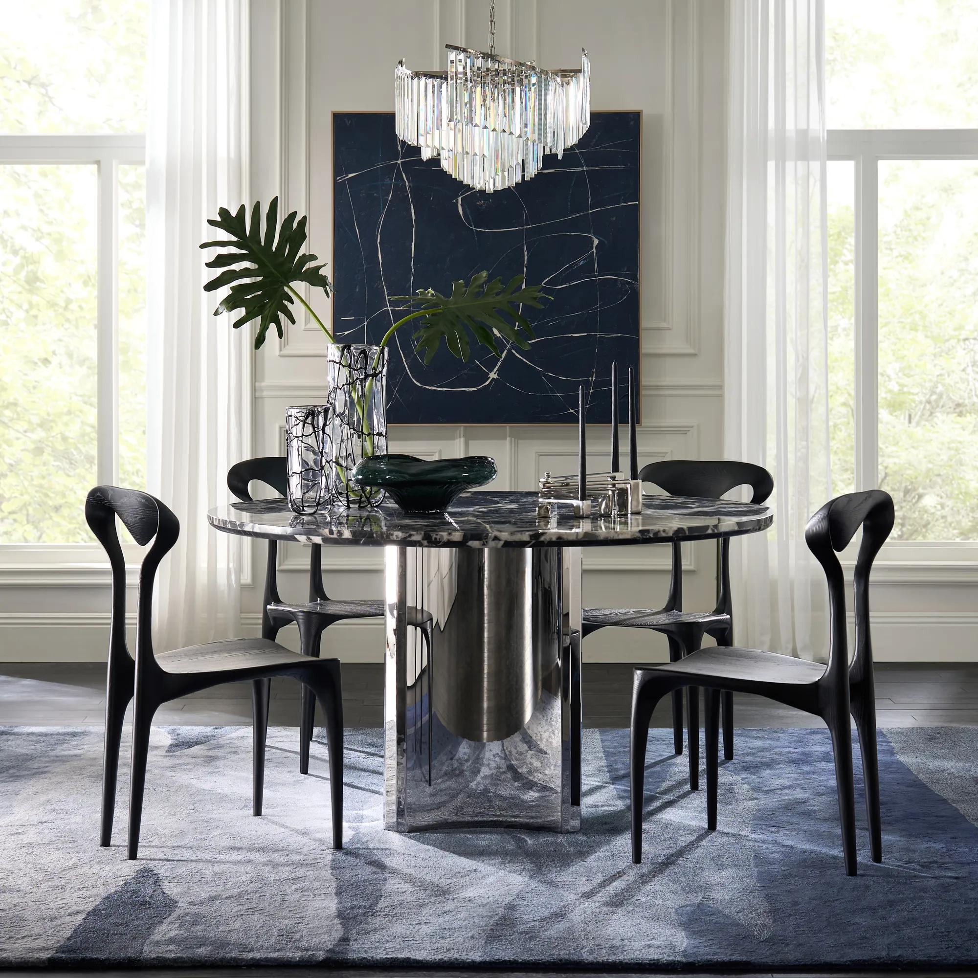 Almost Midnight Painting - Blue$439
A hand-painted canvas featuring bold blue and black tones with delicate white lines in a light wood frame.
Add To Cart -
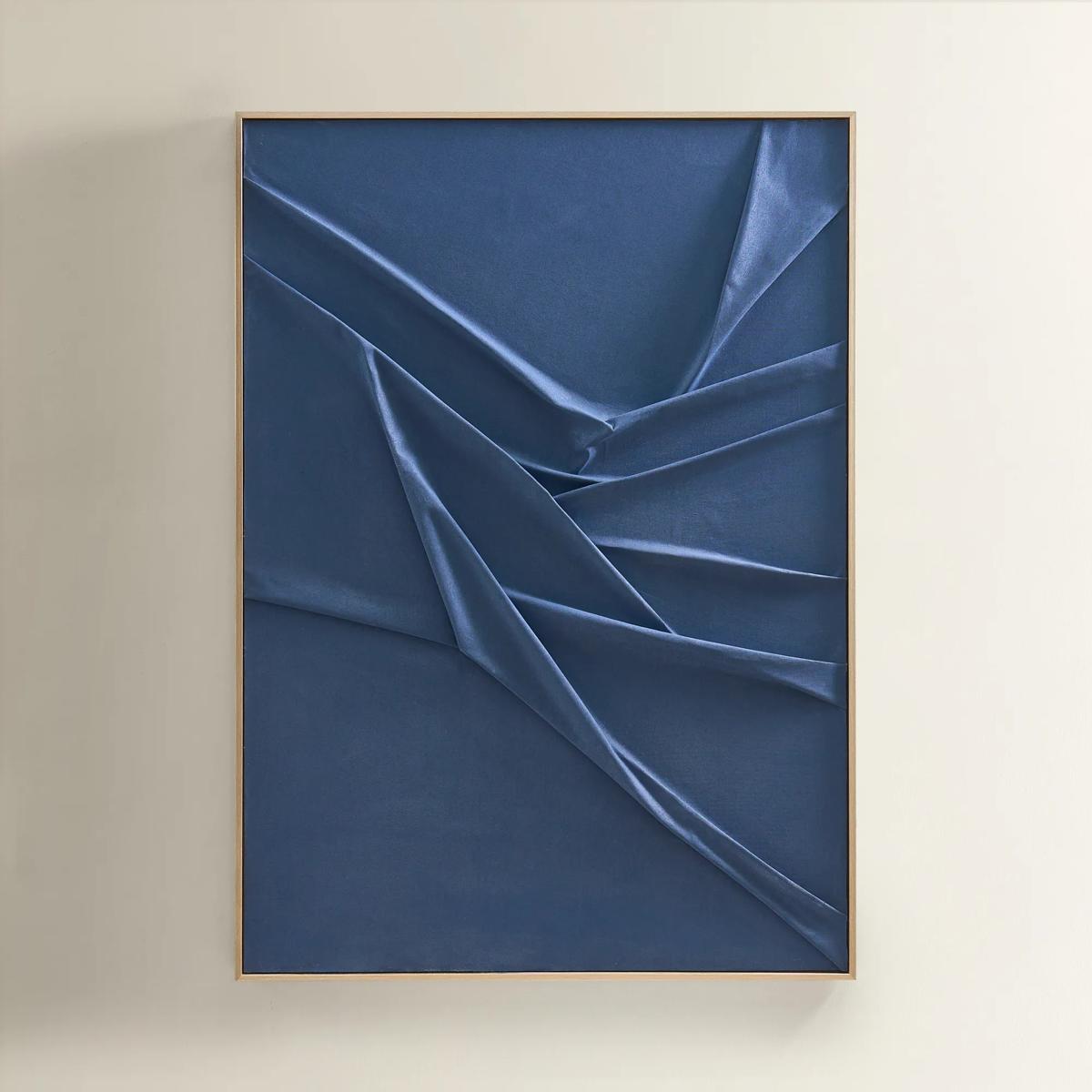 Deep Sea Painting$599
A hand-sculpted navy canvas with dimensional folds, framed in soft champagne for modern, serene elegance.
Add To Cart -
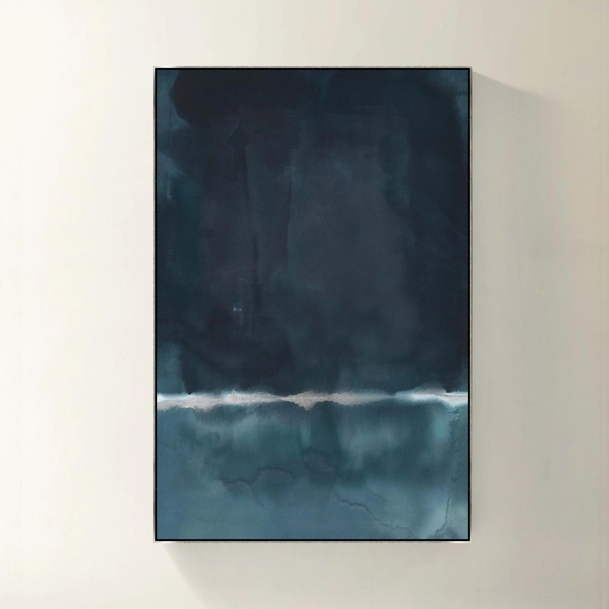 Blue Monday Framed Wall Art 40" x 60"$1119
A gallery-wrapped blue canvas with hand-embellished silver accents in a sleek silver floater frame.
Add To Cart -
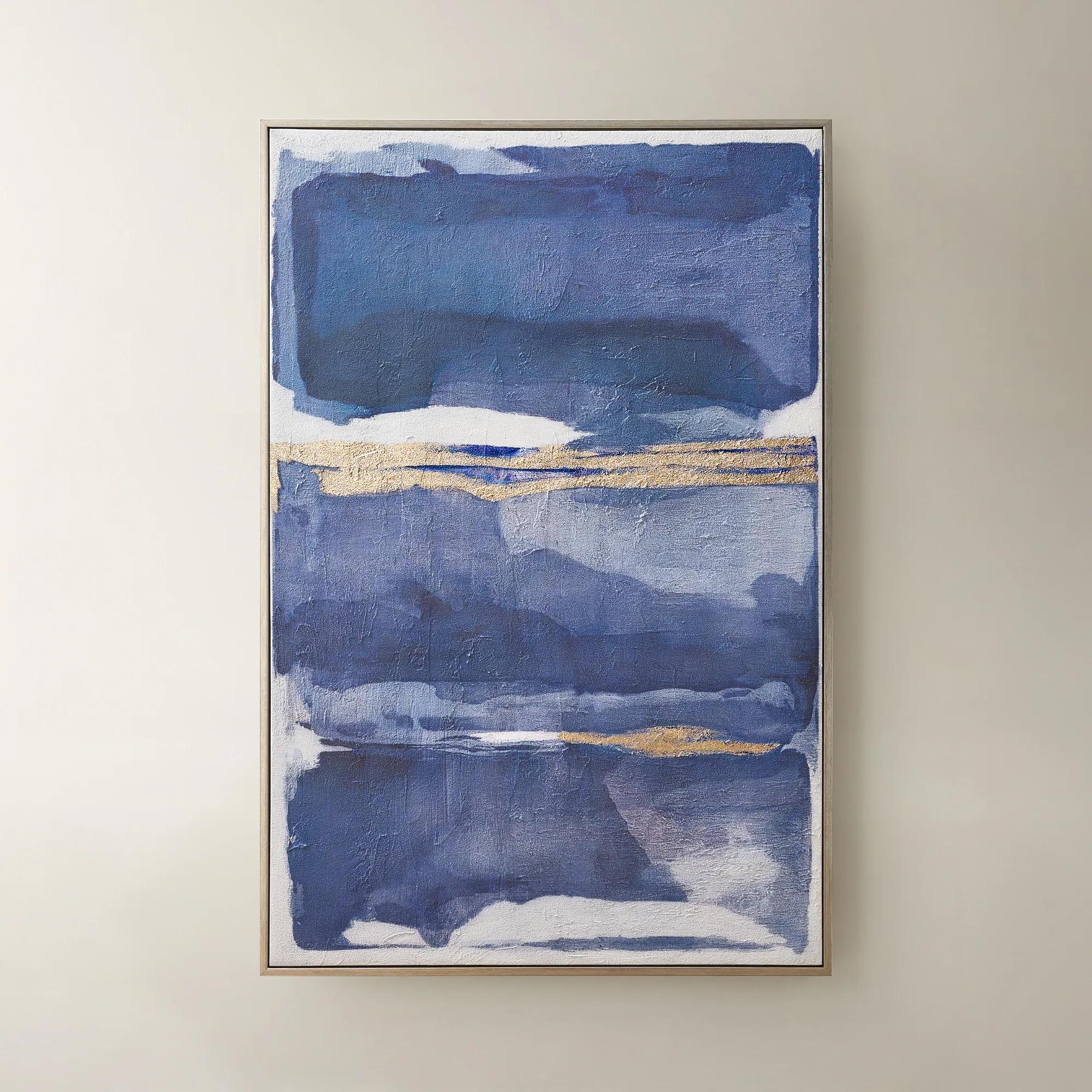
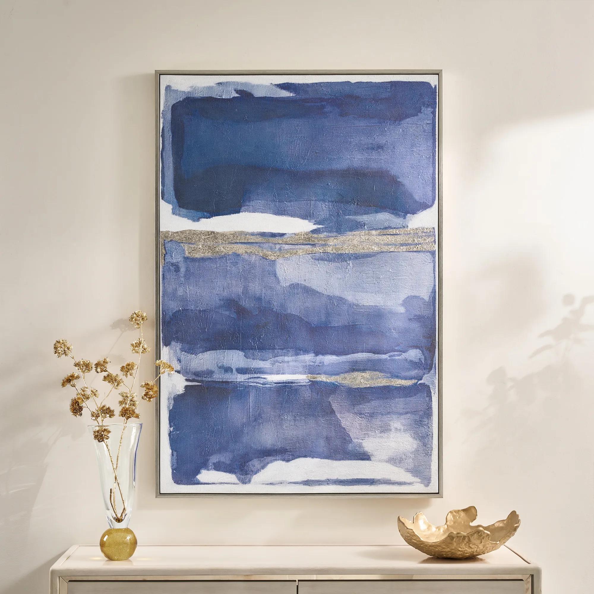 Memories in Blue Framed Painted Wall Art 40" x 60"$499
A hand-painted canvas in deep ink blue with champagne leafing for a sophisticated, gallery-inspired look.
Add To Cart -
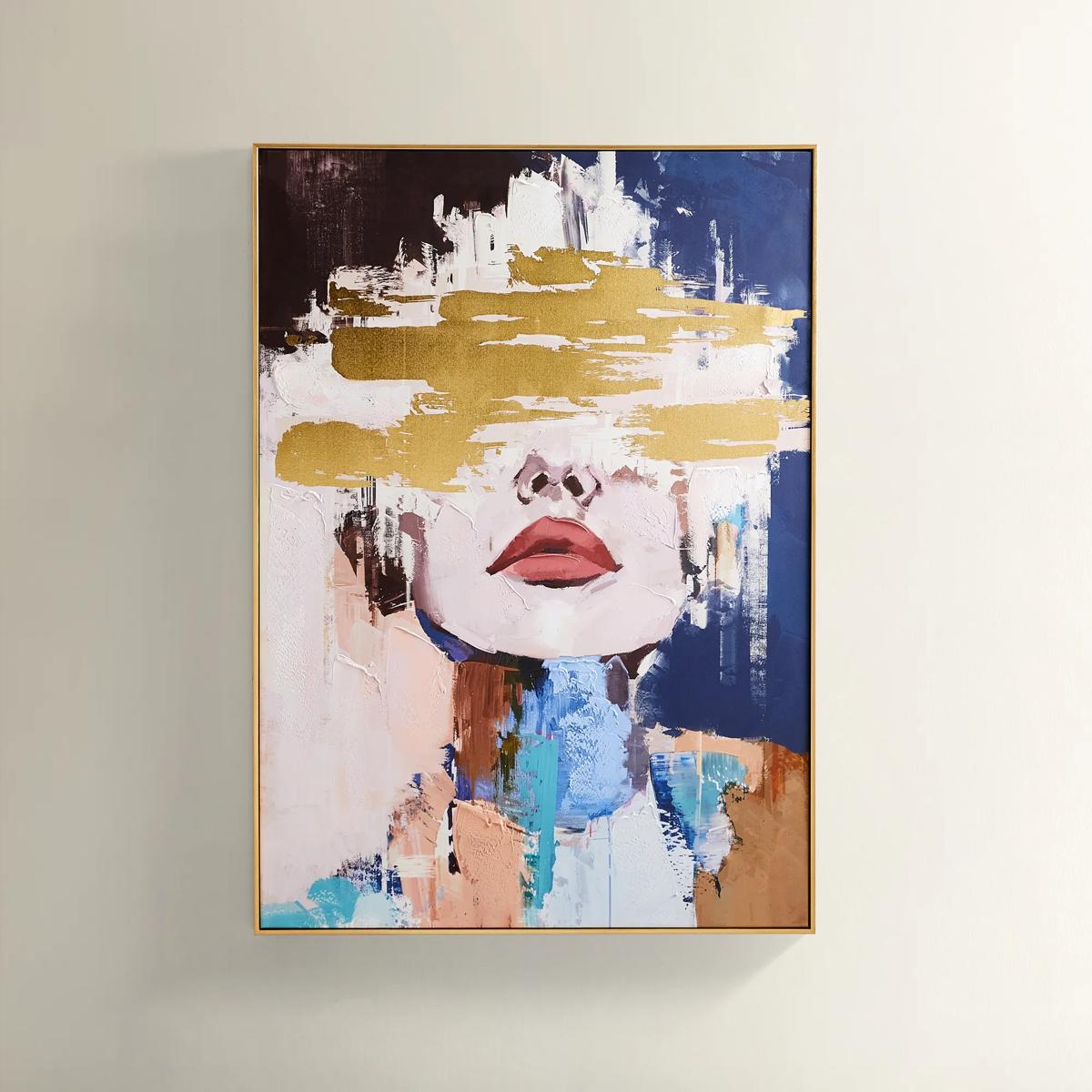
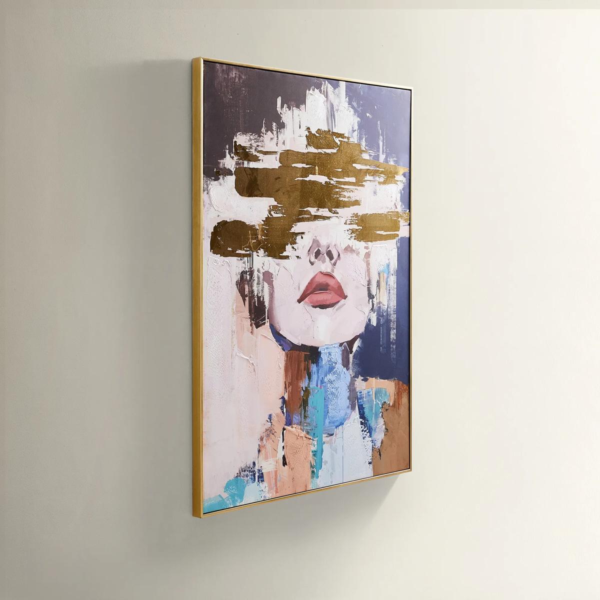 Waiting in Color Gold Foil Painted Wall Art 39.25" x 55"$499
A hand-painted abstract portrait in vivid blue, blush, and gold foil, framed in luxe gold.
Add To Cart -
 Relic Framed Painted Triptych Wall Art Set of 3$399
A hand-painted abstract triptych in deep navy and neutral tones, set in sleek black floater frames.
Add To Cart -
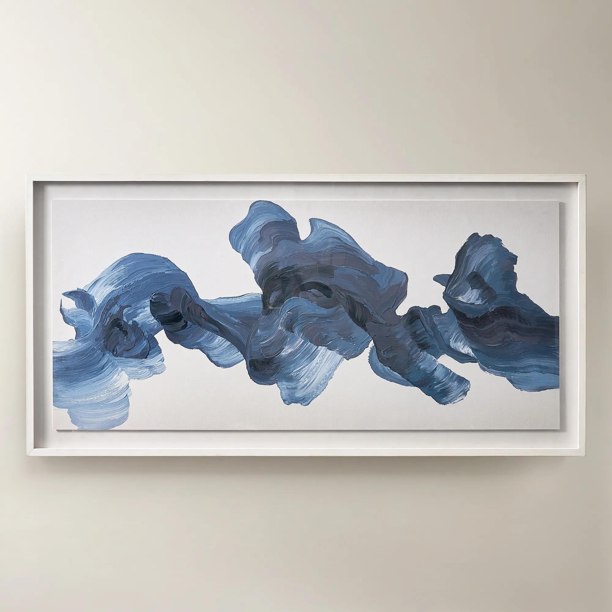
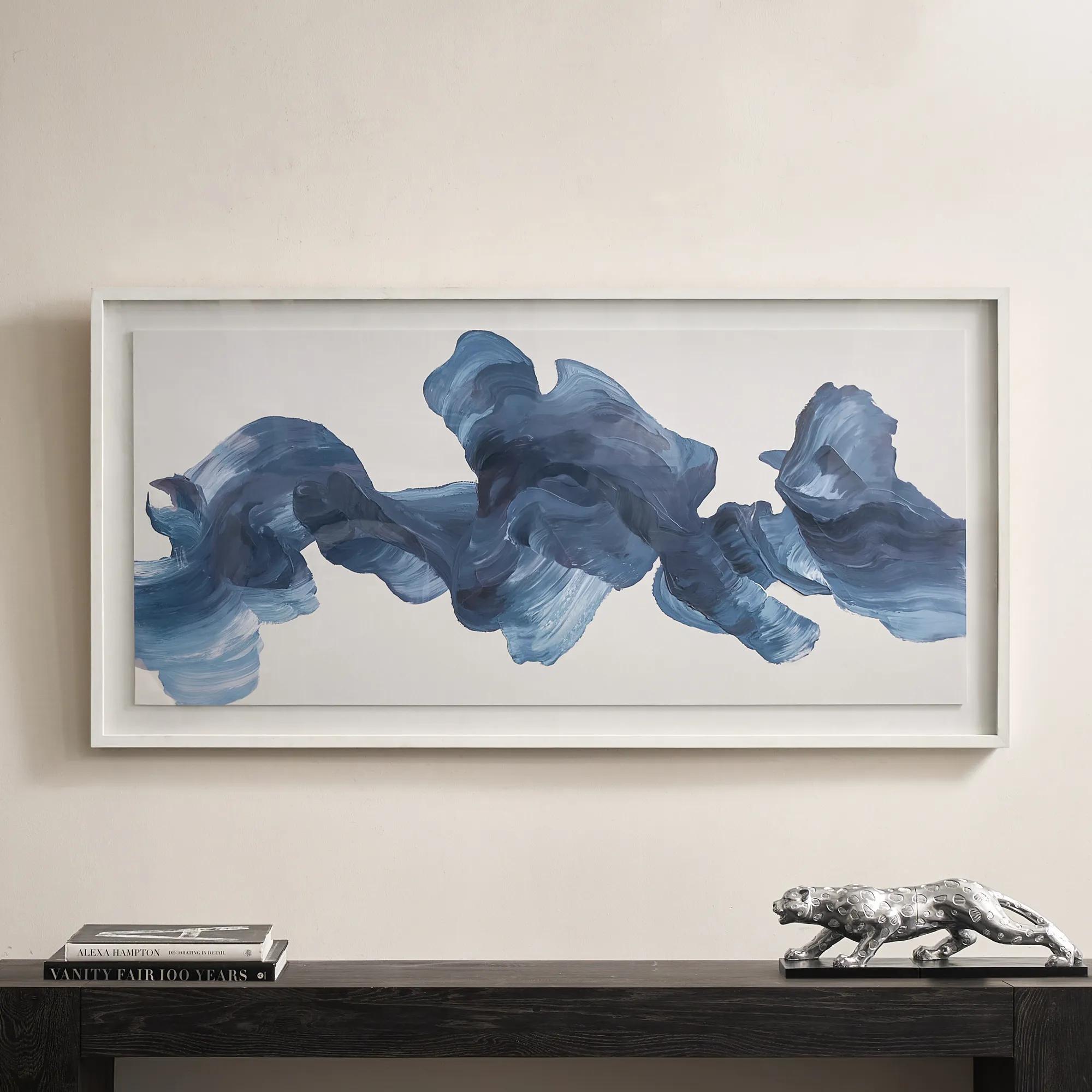 Blue Theory Framed Painted Wall Art in Acrylic 60" x 30"$499
A hand-painted canvas in deep ink blue, framed under acrylic with a whitewashed wood frame.
Add To Cart -
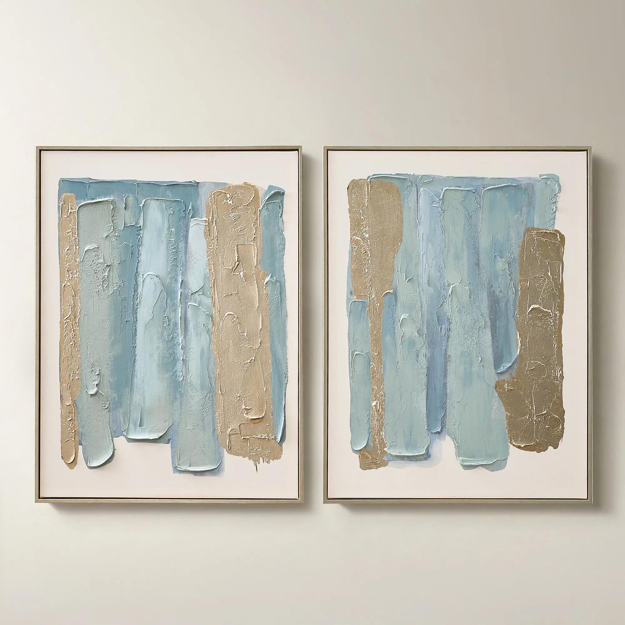
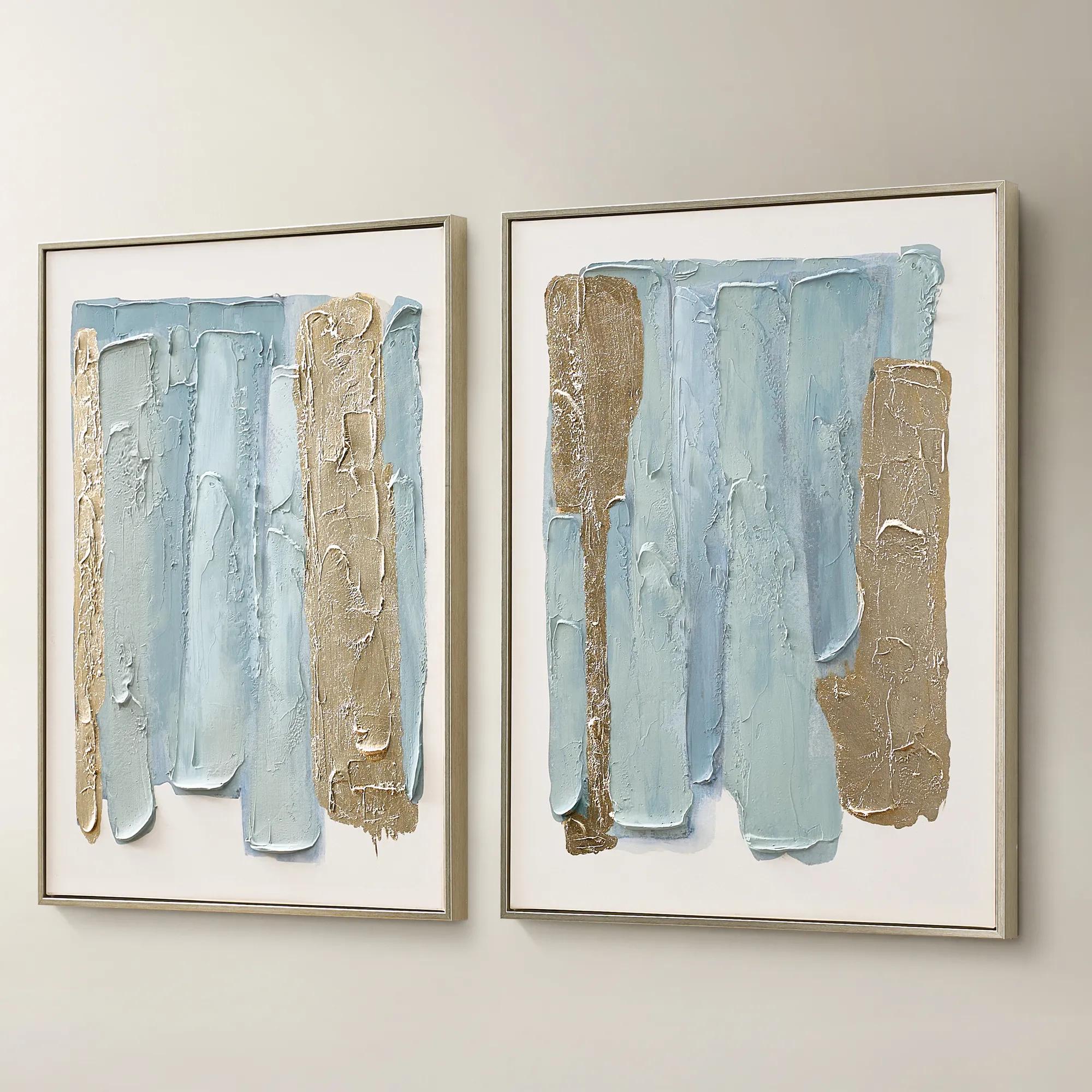 Blue Drift Framed Champagne Painted Wall Art 24" x 32" Set of 2$199
A set of two hand-painted canvases in dusty blue with champagne leafing and modern abstract movement.
Add To Cart -
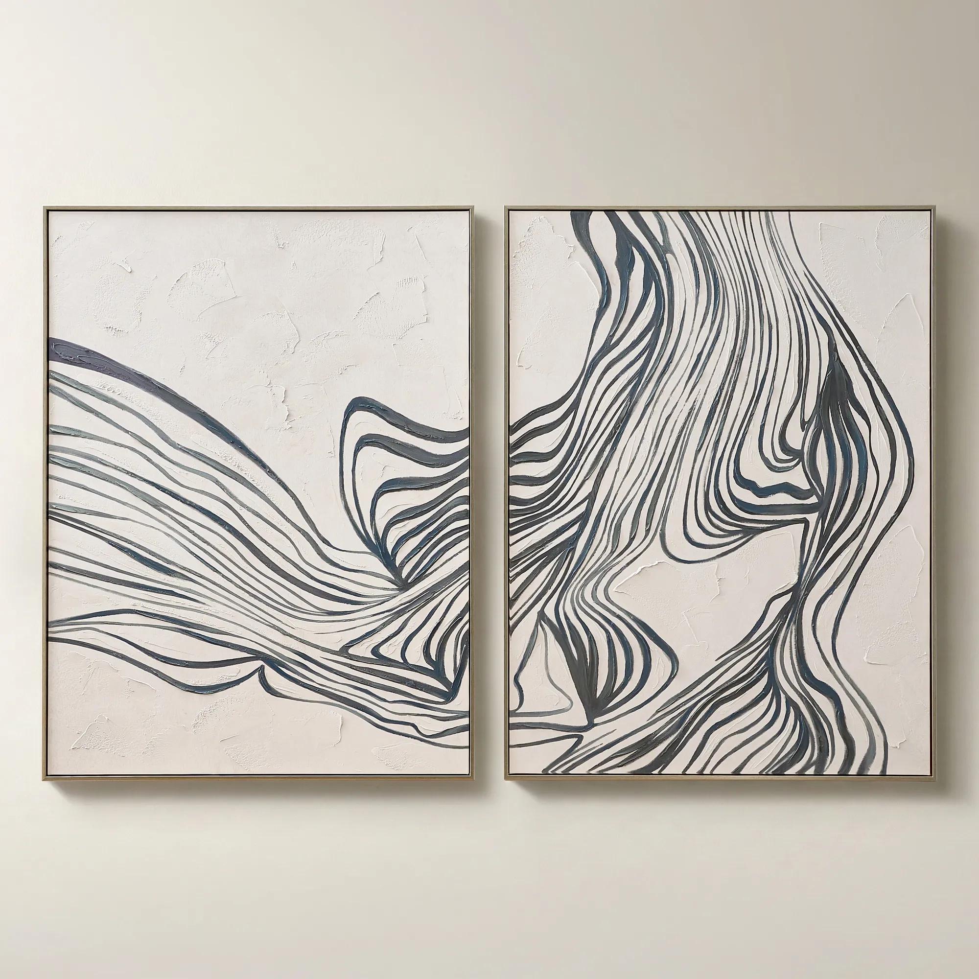
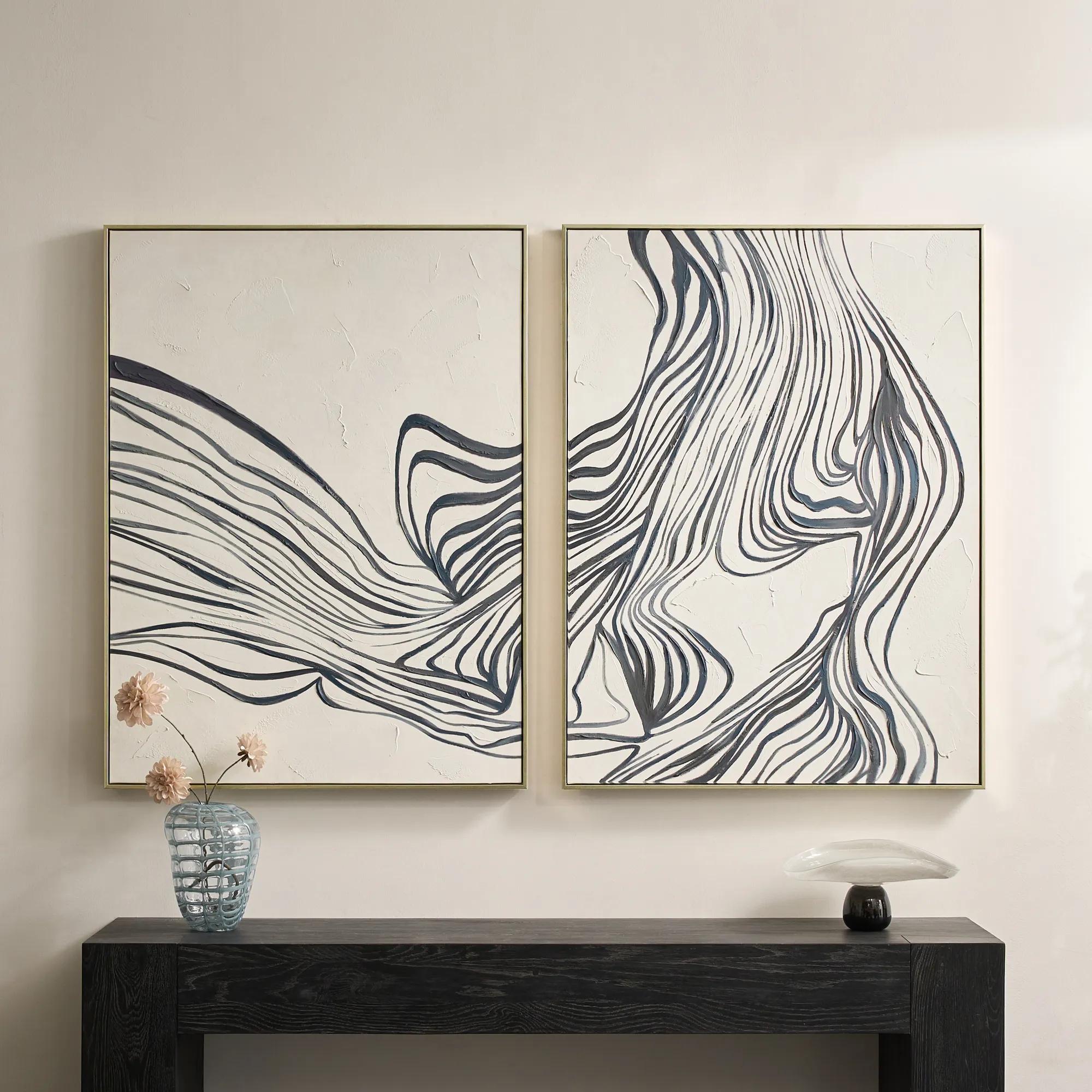 Rhythmic Framed Painted Wall Art 36" x 48" Set of 2$599
A hand-painted diptych featuring bold abstract stripes in dark slate and dusty blue with champagne frames.
Add To Cart -
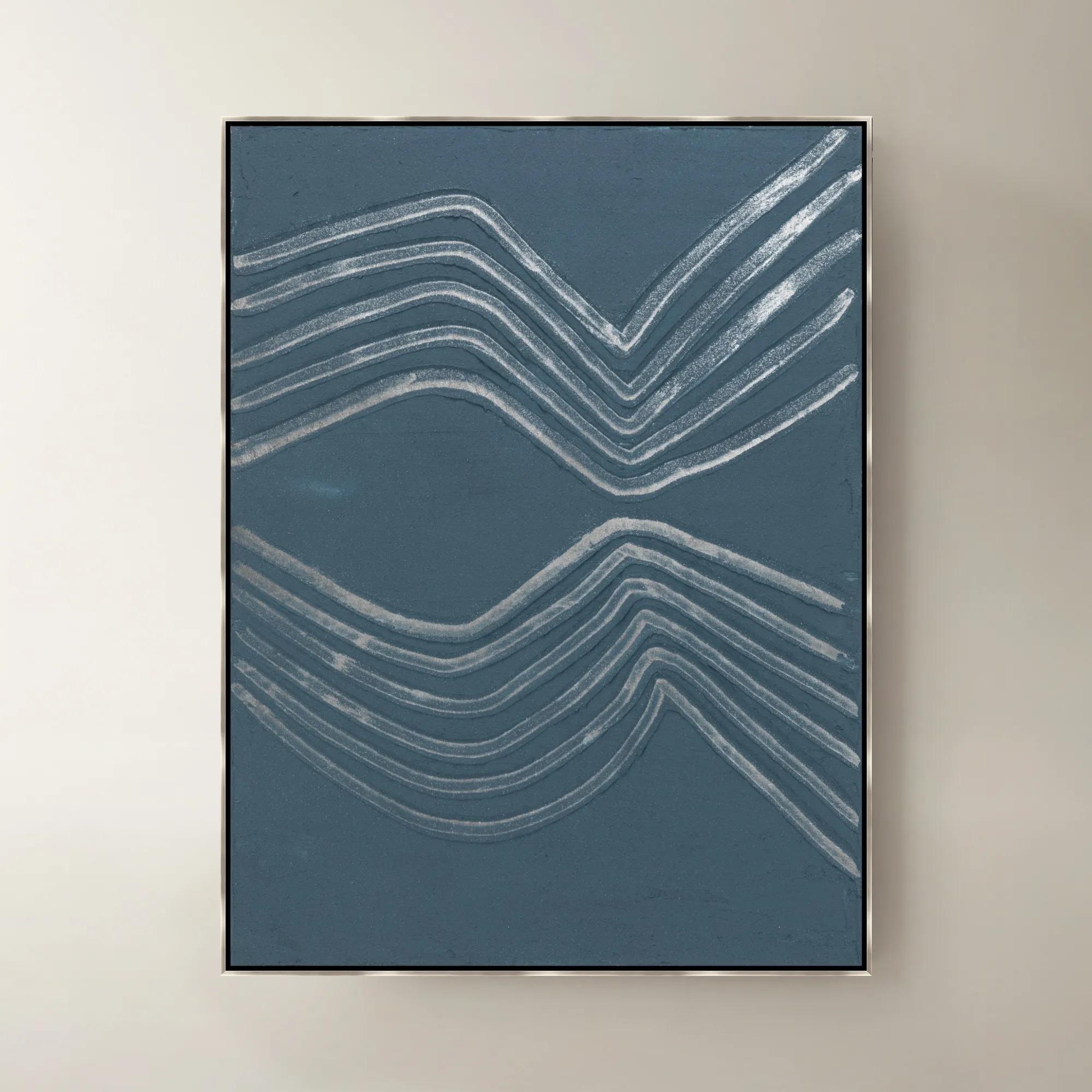
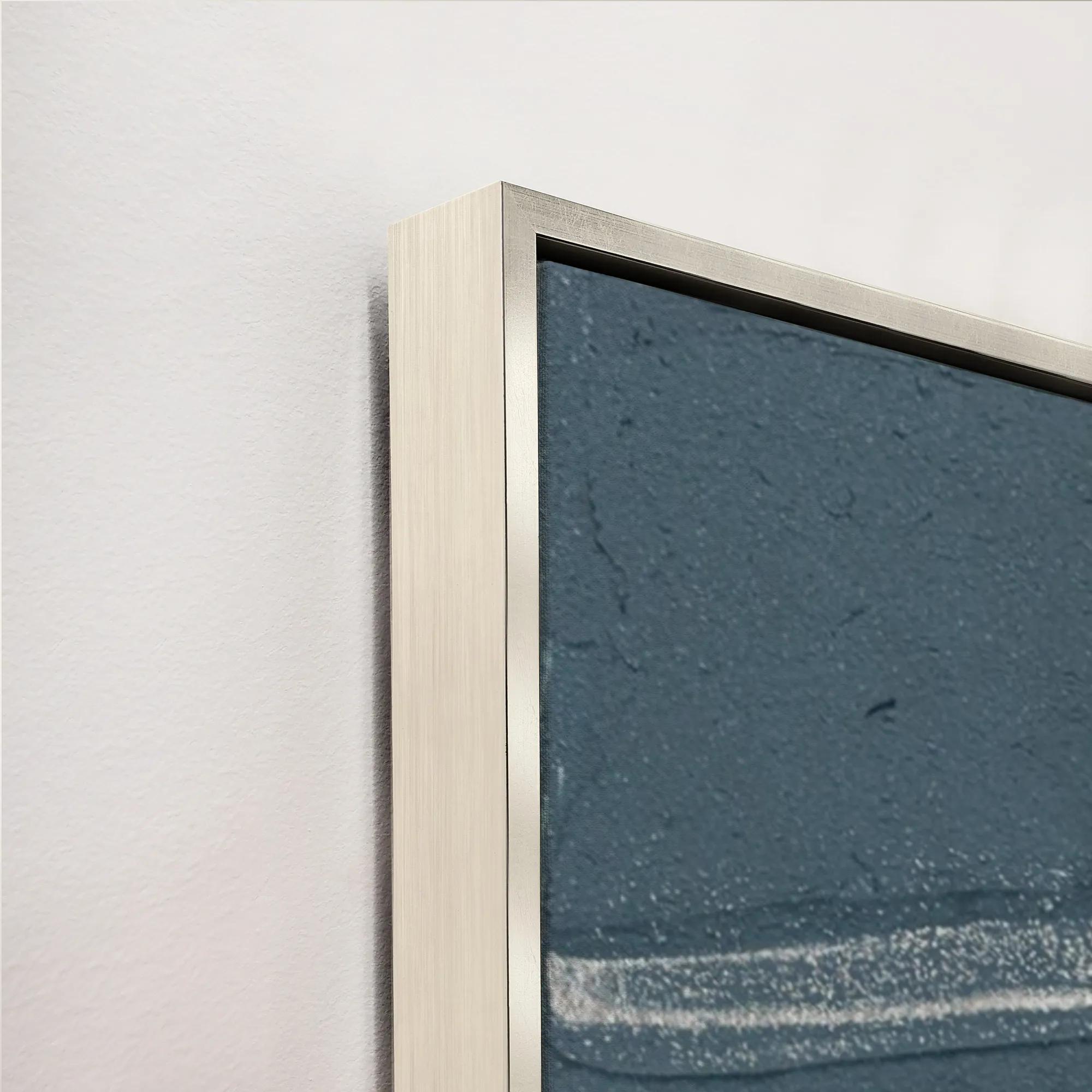 Gilded Waves VI Framed Painted Wall Art 40" x 53"$1399
A framed painted canvas artwork featuring sweeping gilded waves in rich blue and purple tones.
Add To Cart -
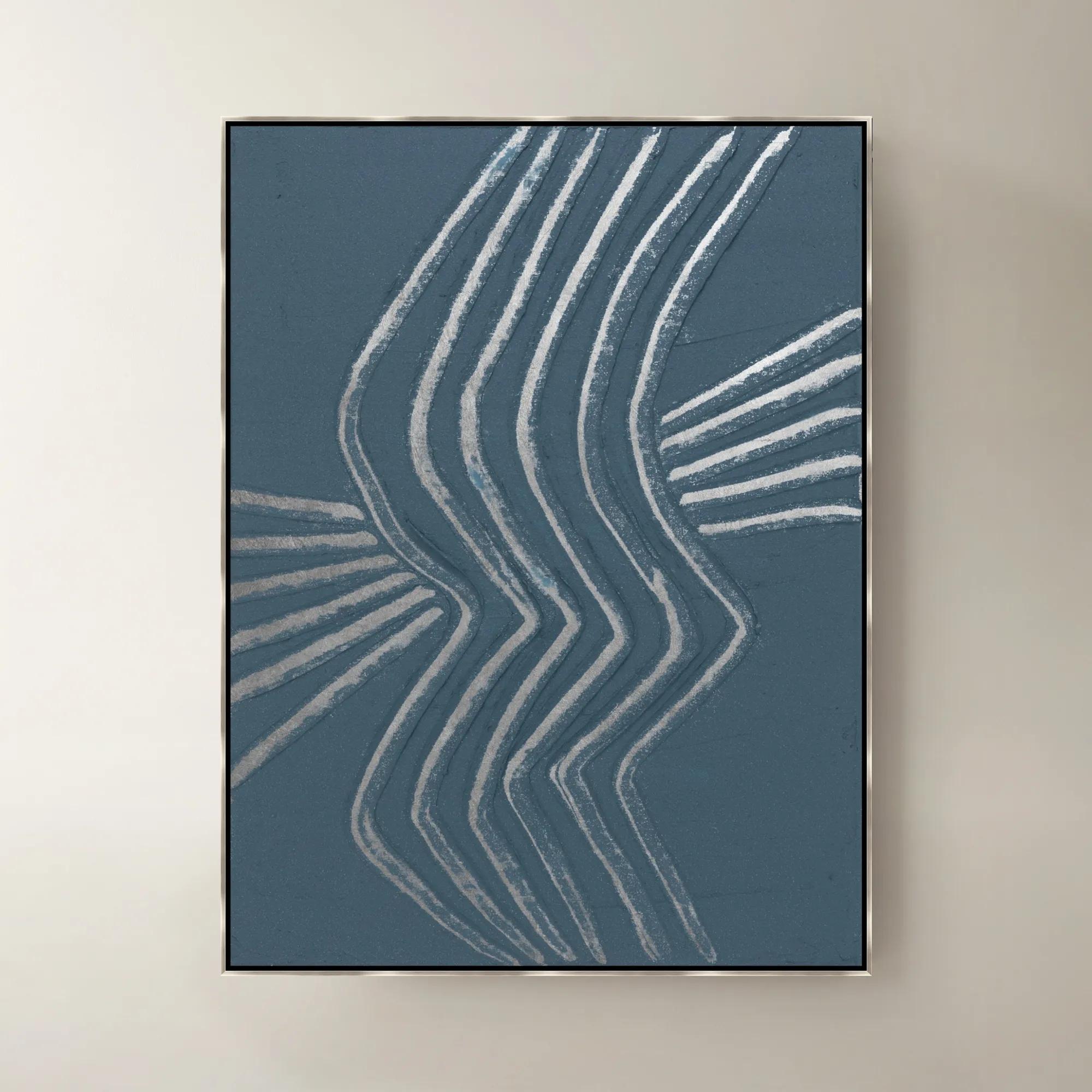
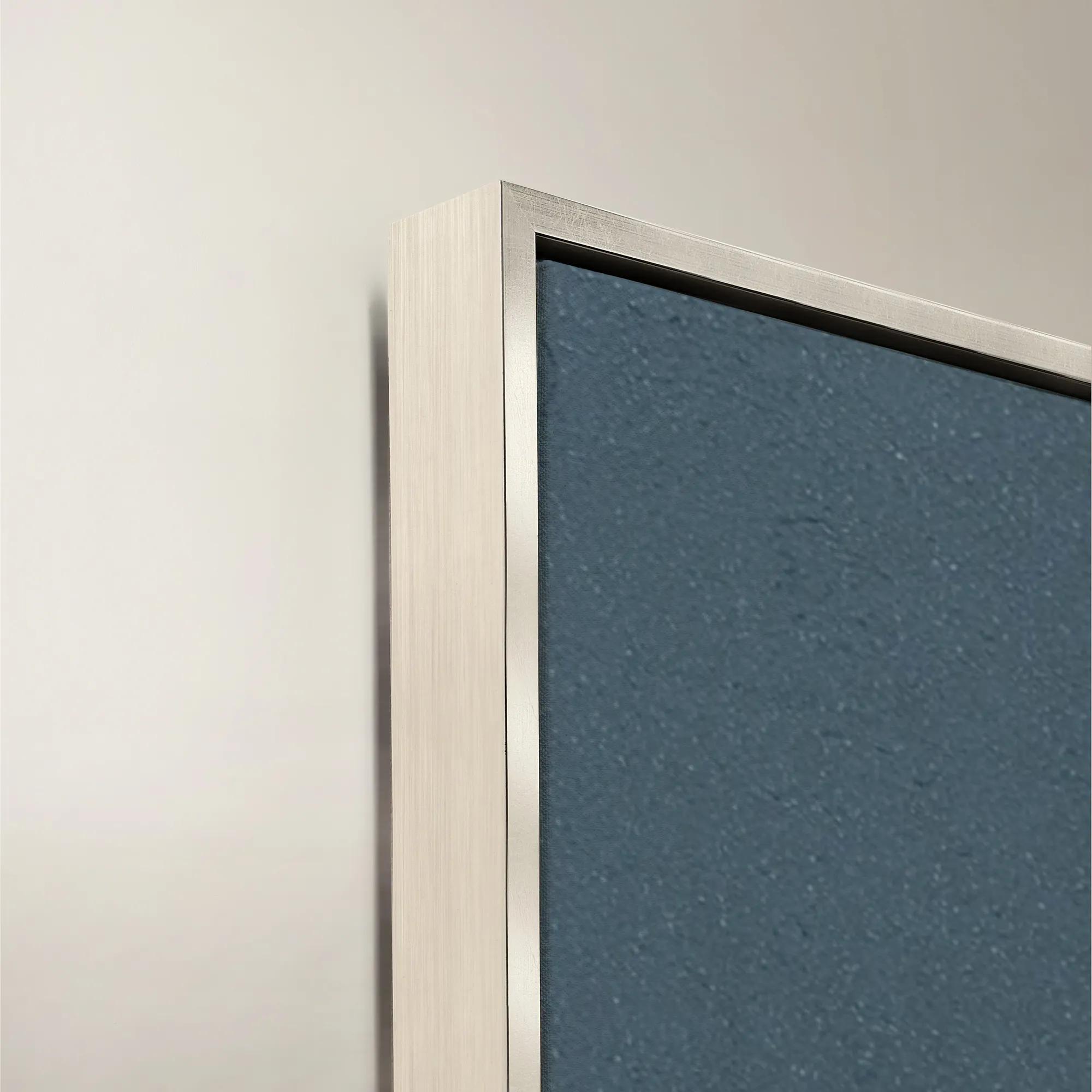 Gilded Waves IV Framed Painted Wall Art 40" x 53"$1399
A framed painted canvas artwork featuring flowing gilded waves in soothing blue and purple tones.
Add To Cart -
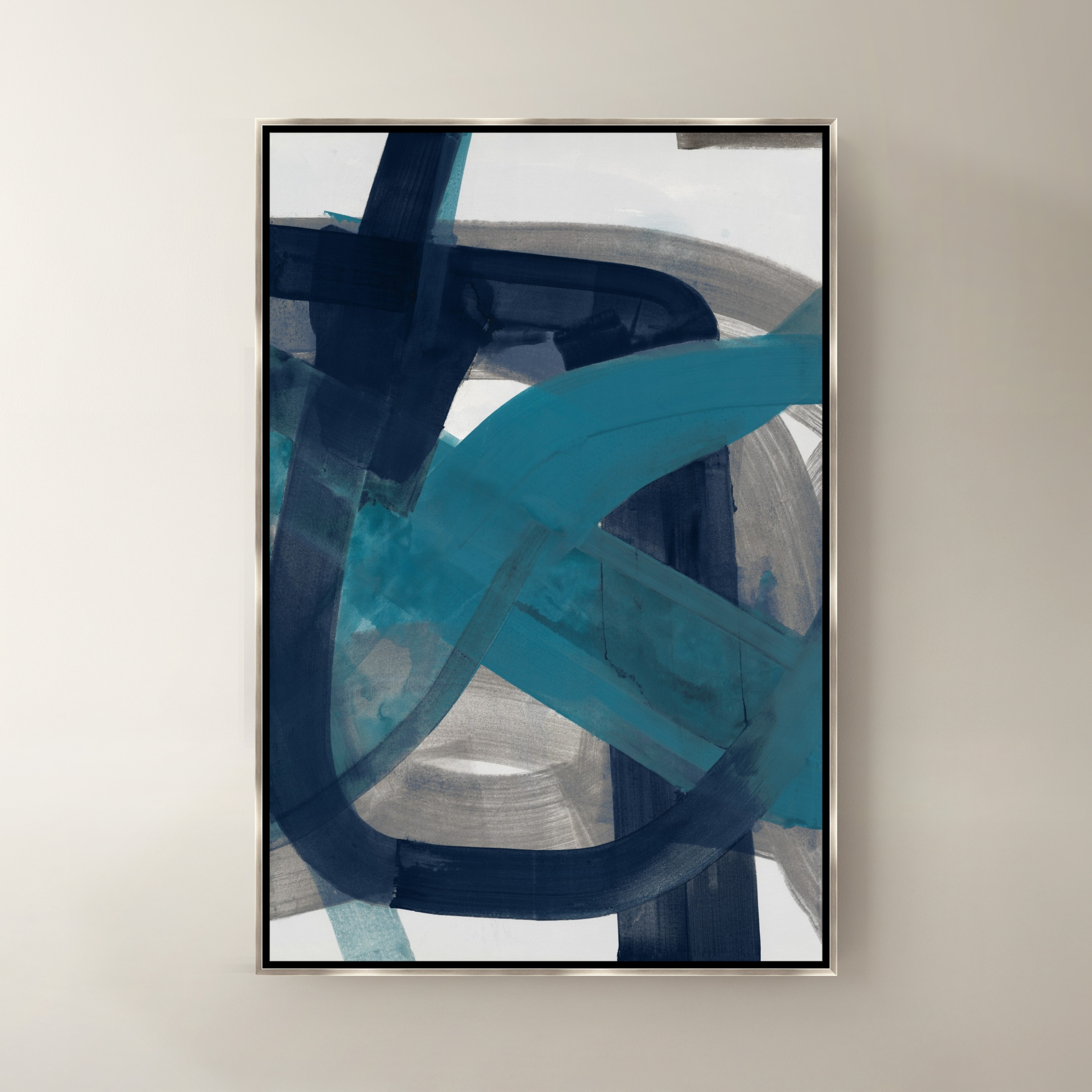
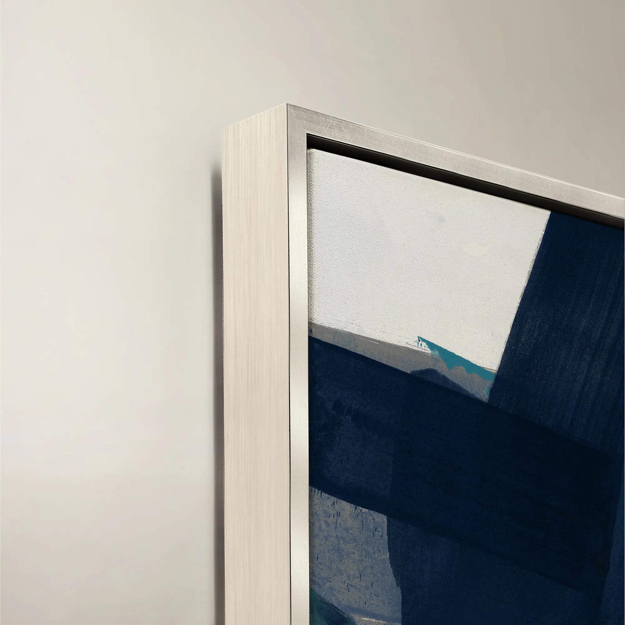 Fractured Currents II Framed Wall Art 24" x 36"$499
A framed canvas wall artwork featuring dynamic blue and purple tones for a modern, expressive accent.
Add To Cart -
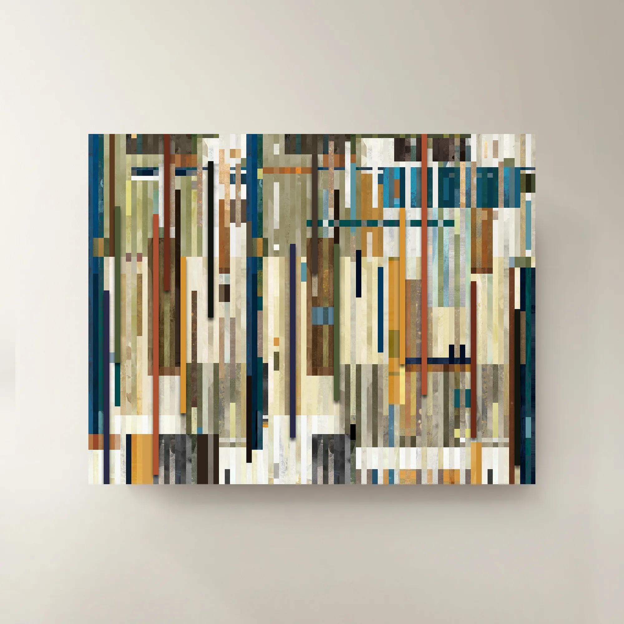
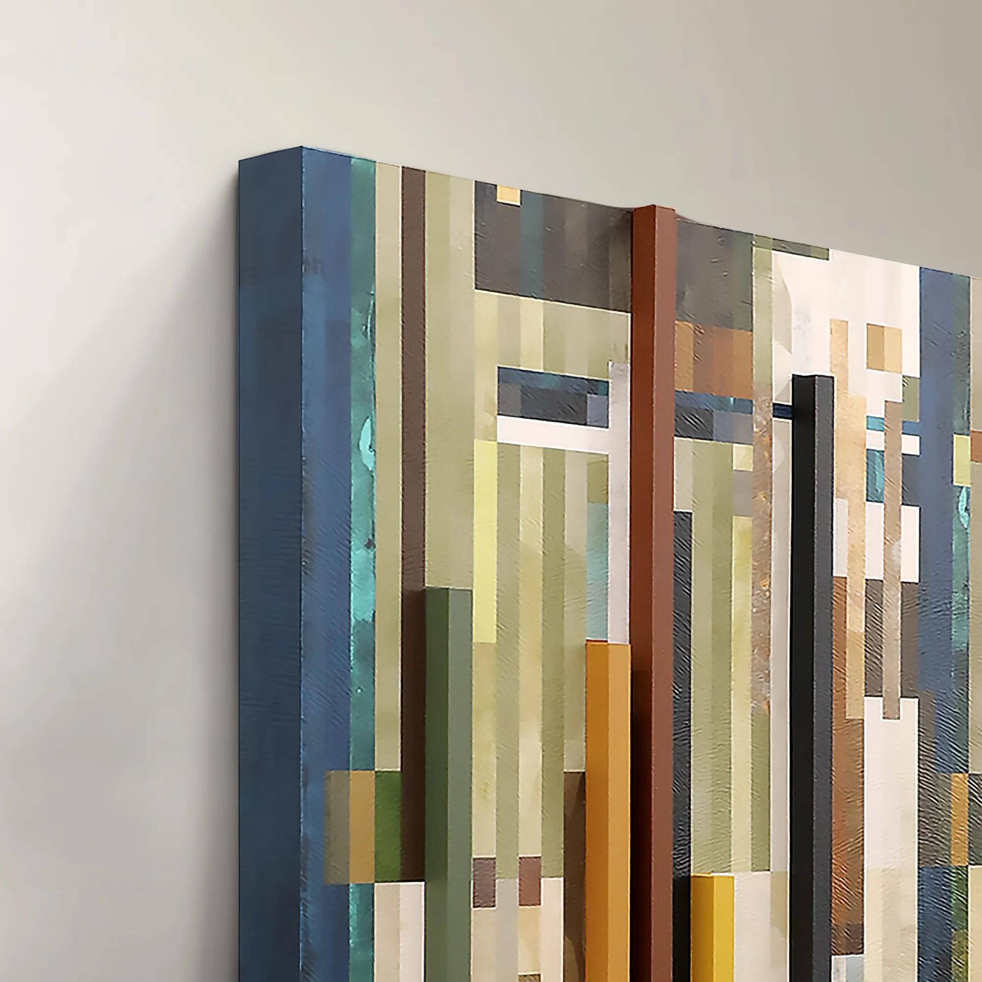 Chromatic Rhythms II Wall Art 60" x 47"$1899
A dynamic blue abstract canvas artwork featuring rhythmic geometric composition.
Add To Cart -
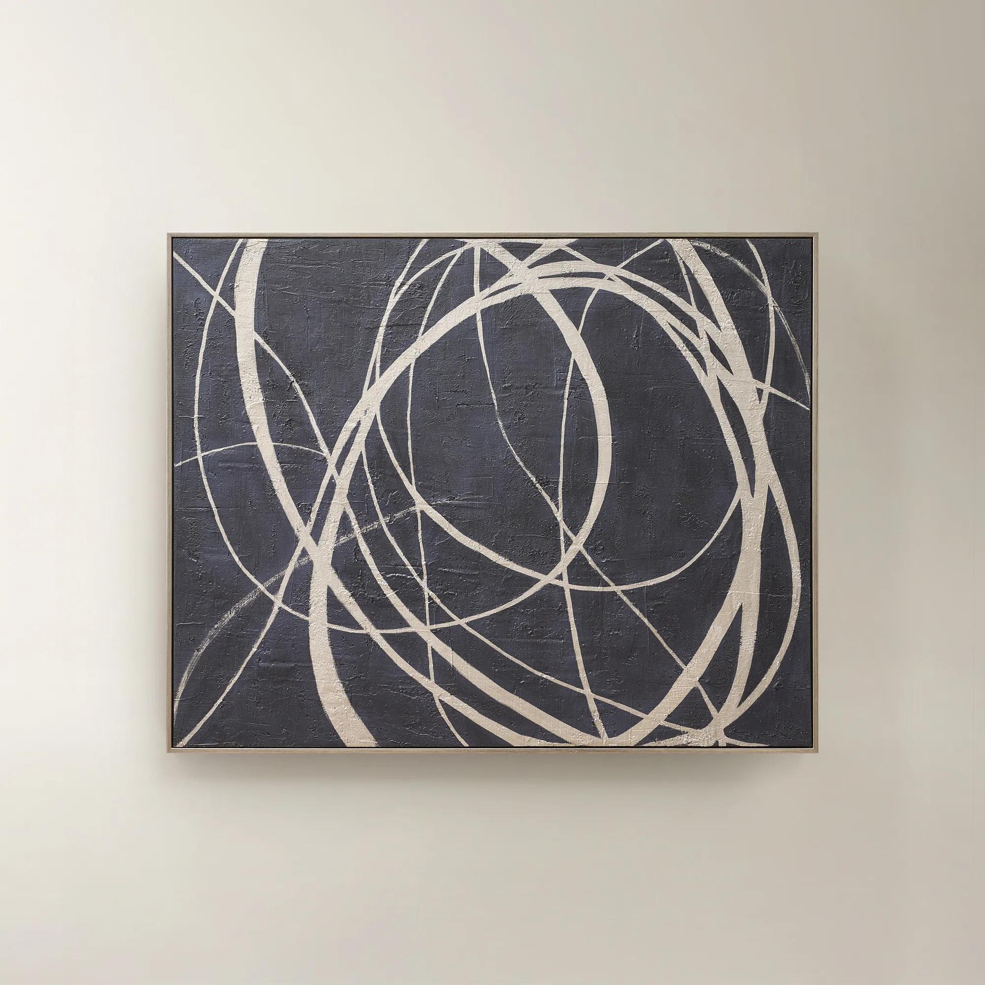 Wandering Framed Painted Wall Art 48" x 60"$699
An expressive hand-painted canvas in deep ink blue with champagne accents for a bold, sophisticated statement.
Add To Cart -
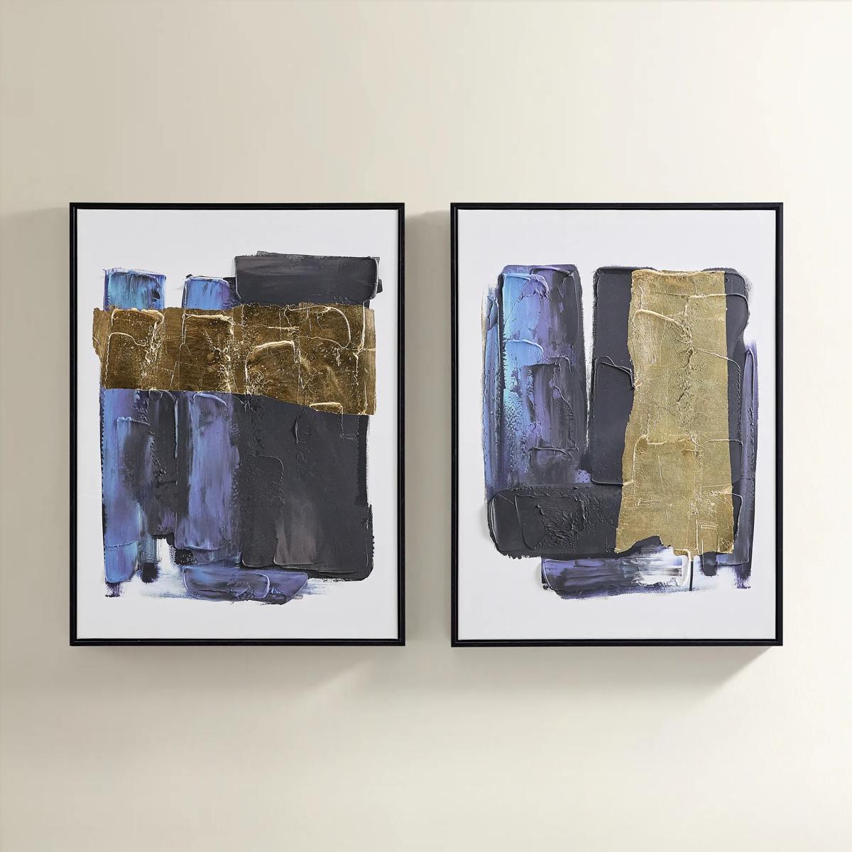
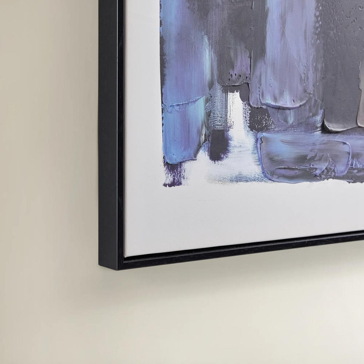 Deep Thoughts Gold Leaf Painted Wall Art Set of 2$199
A set of two hand-painted abstract canvases in blue and gold leaf, framed in sleek black.
Add To Cart -
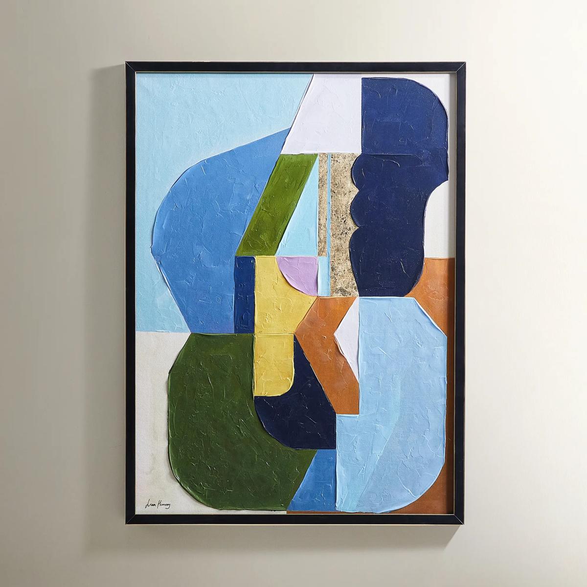
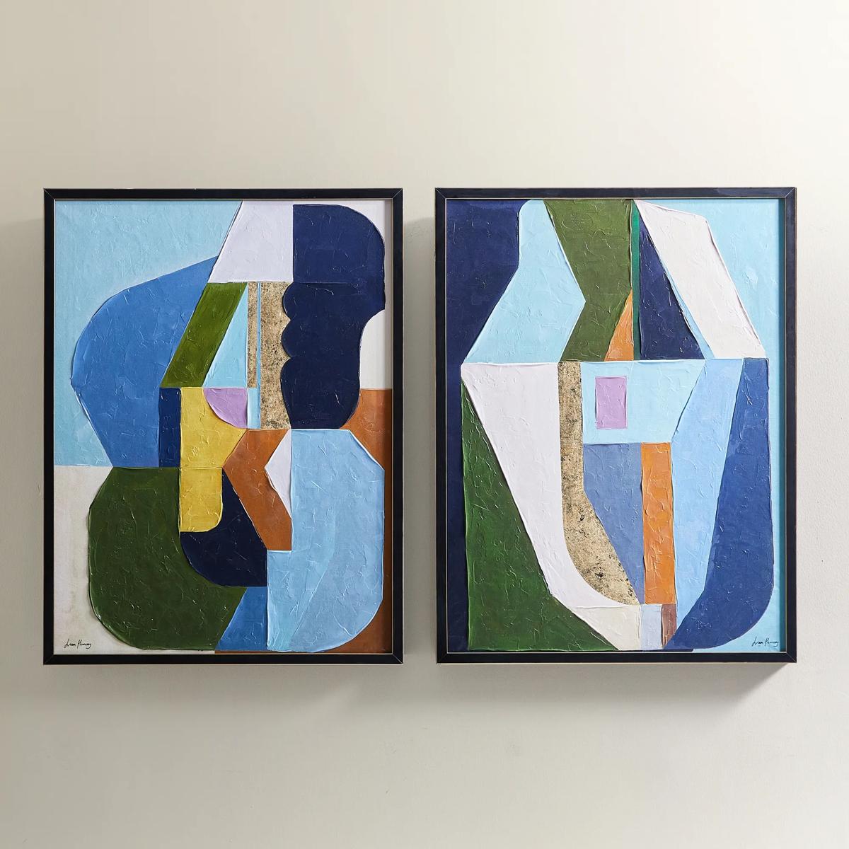 Thought Provoking Painting 1$249
A hand-embellished canvas artwork featuring textured strokes in deep blue, olive green, and gold accents.
Add To Cart -
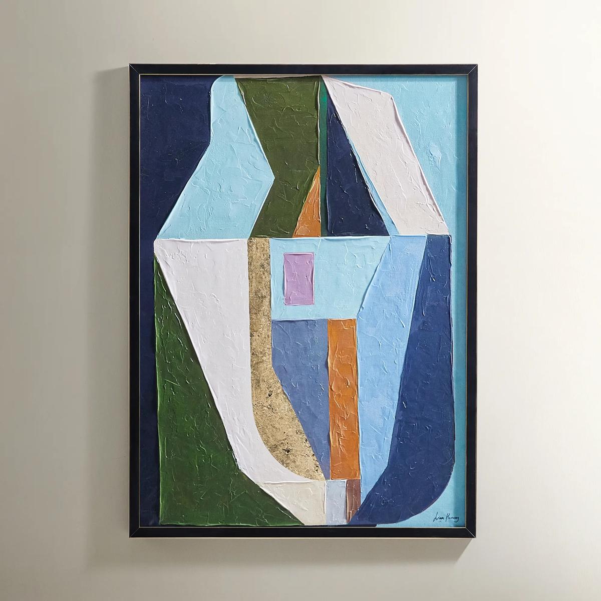 Thought Provoking Painting 2$249
A hand-embellished canvas artwork featuring textured strokes in deep blue, olive green, and gold accents.
Add To Cart -
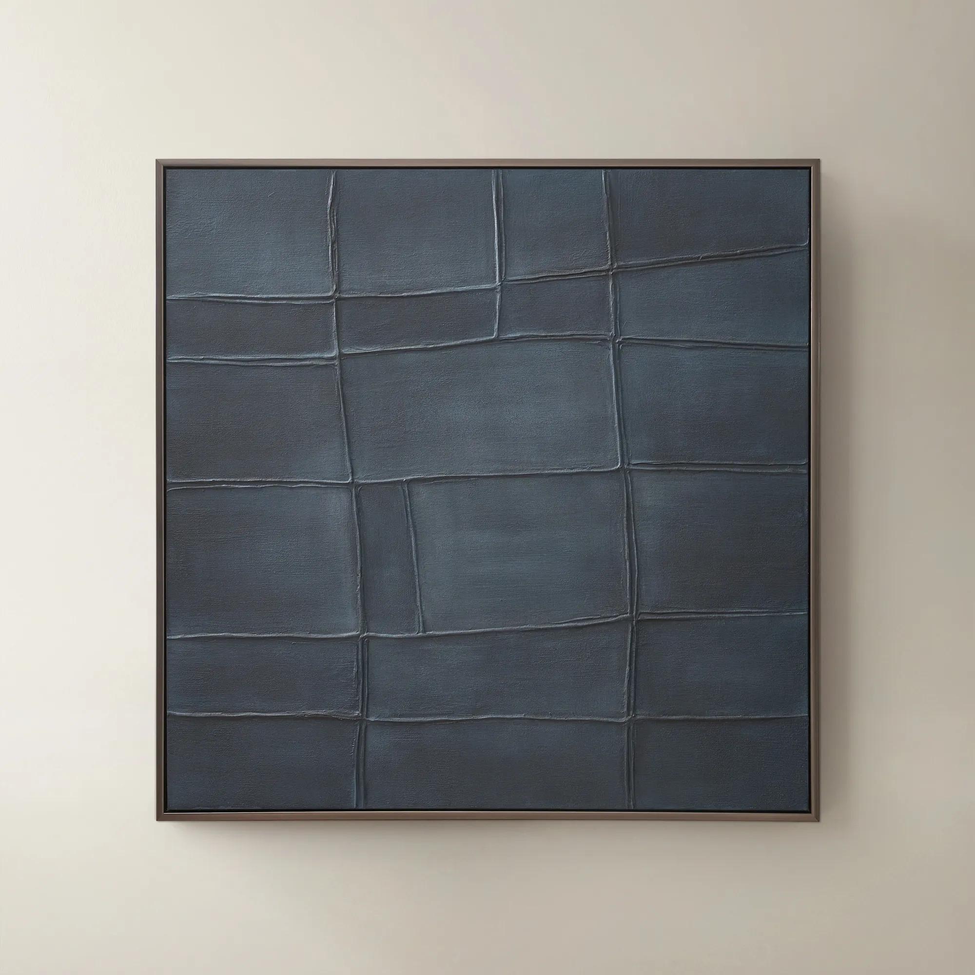
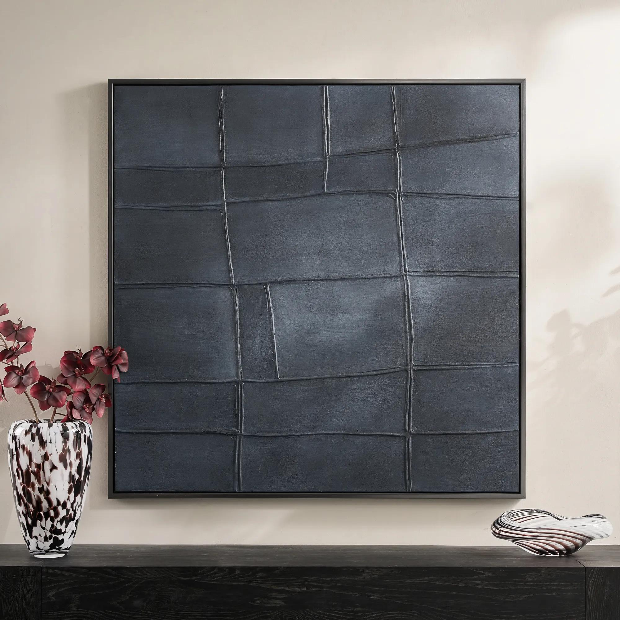 Ink Blue Interval Framed Painted Wall Art 48" x 48"$599
A hand-painted abstract canvas in deep ink blue, finished with a sleek gunmetal frame for modern appeal.
Add To Cart -
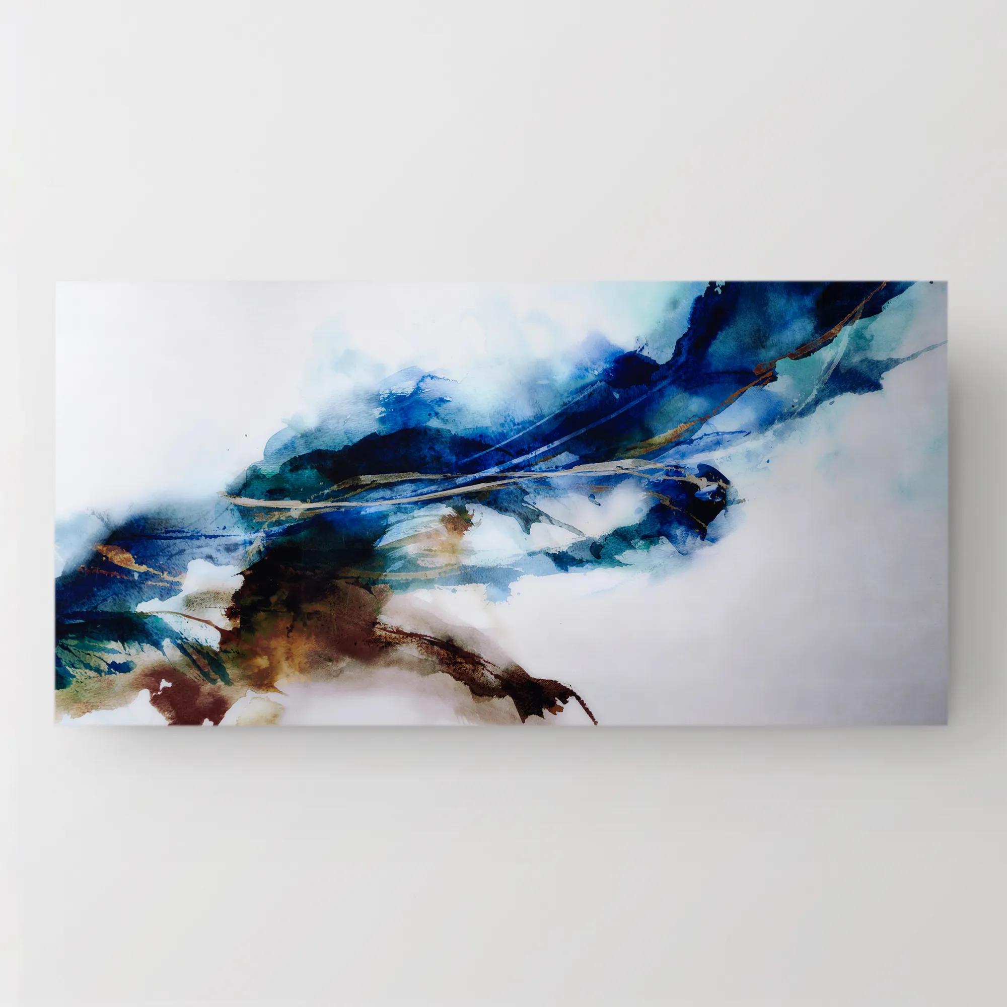 Cerulean Movement Acrylic Art 72" x 36"$1299
A vibrant abstract artwork printed on high-gloss acrylic, infusing your space with dynamic energy and movement.
Add To Cart -
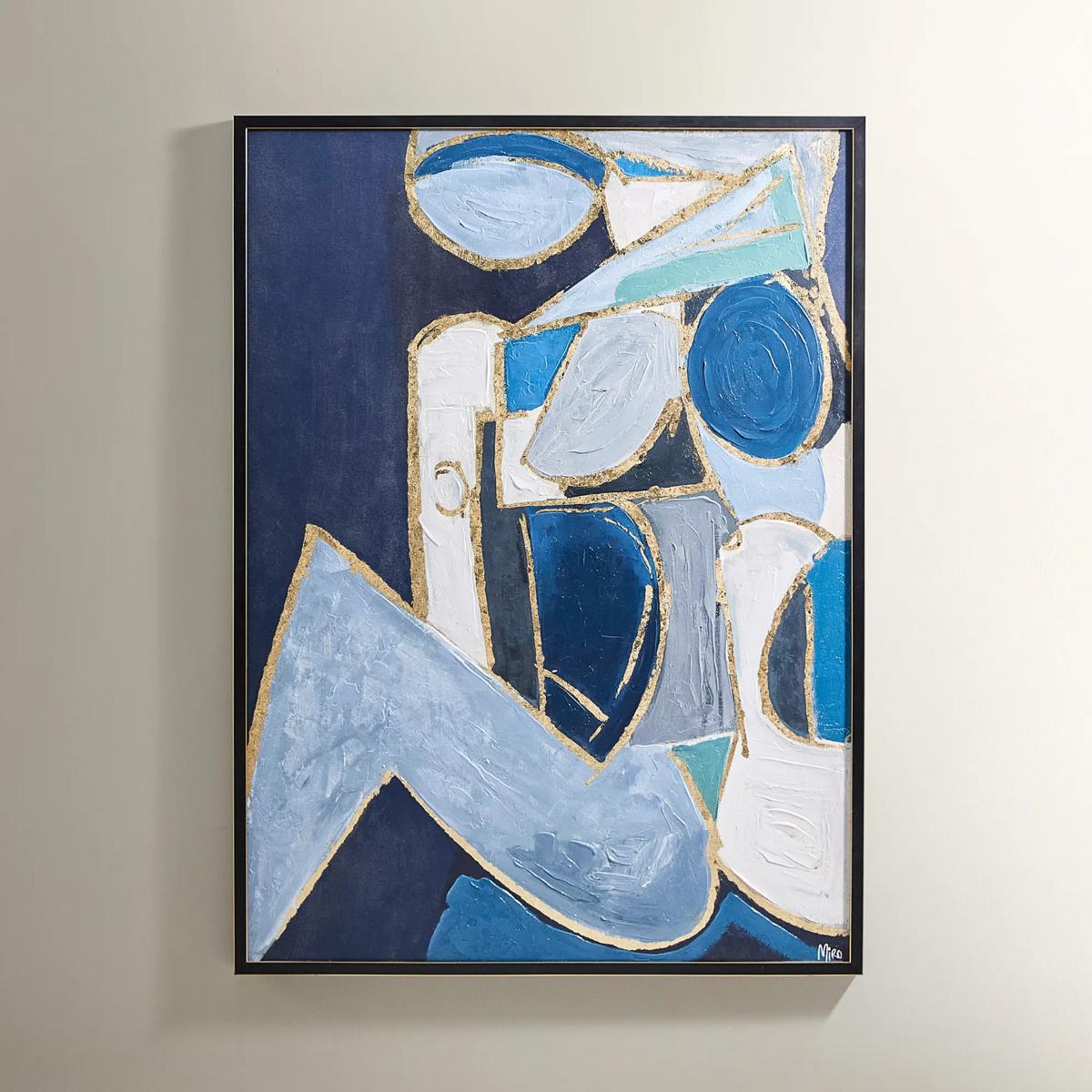
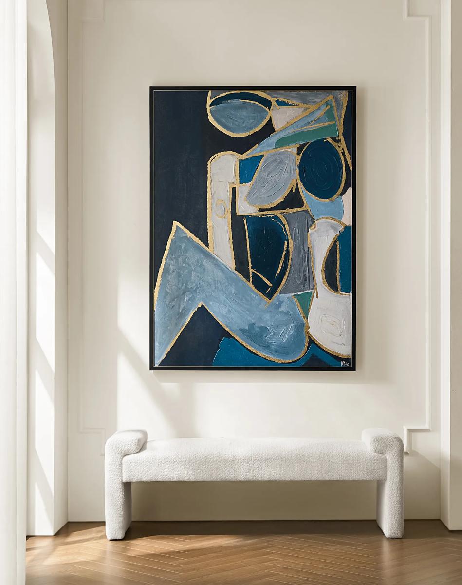 Figure in Cubism Painting$599
A hand-embellished canvas artwork featuring blue, gold, and white hues with elegant silver foil accents.
Add To Cart -
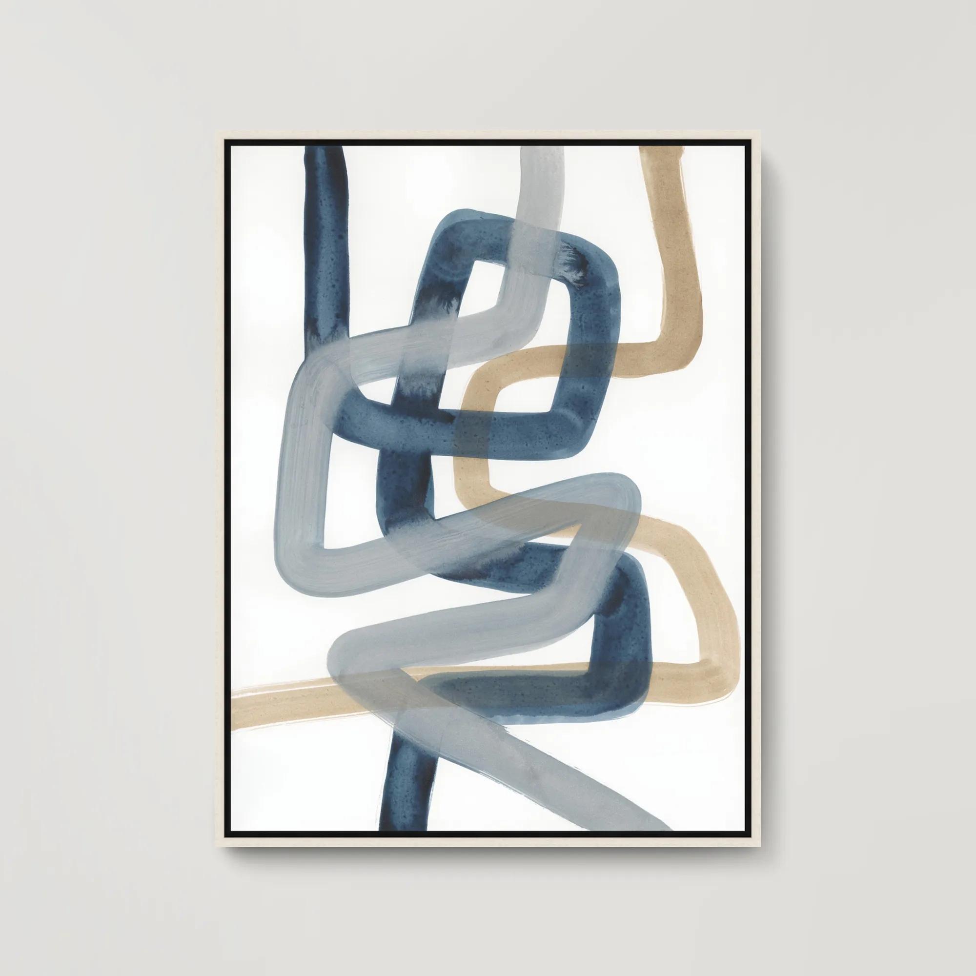 Looped In II Framed Wall Art 31.5" x 41.5"$699
A gallery-wrapped abstract canvas with hand-applied brush gel finish, set in a sleek white floater frame.
Add To Cart -
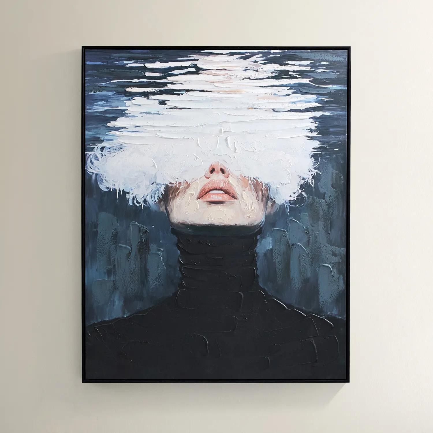
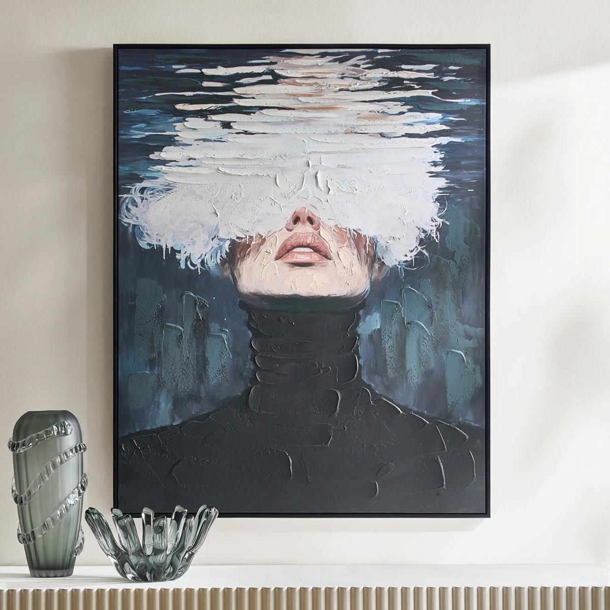 Submerged Framed Painted Wall Art 40" x 50"$599
A hand-painted canvas featuring a surreal portrait in black, blue, and white with a black floater frame.
Add To Cart -
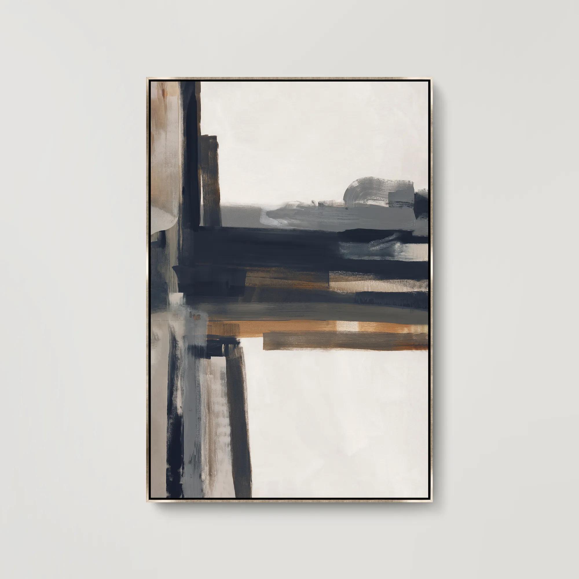
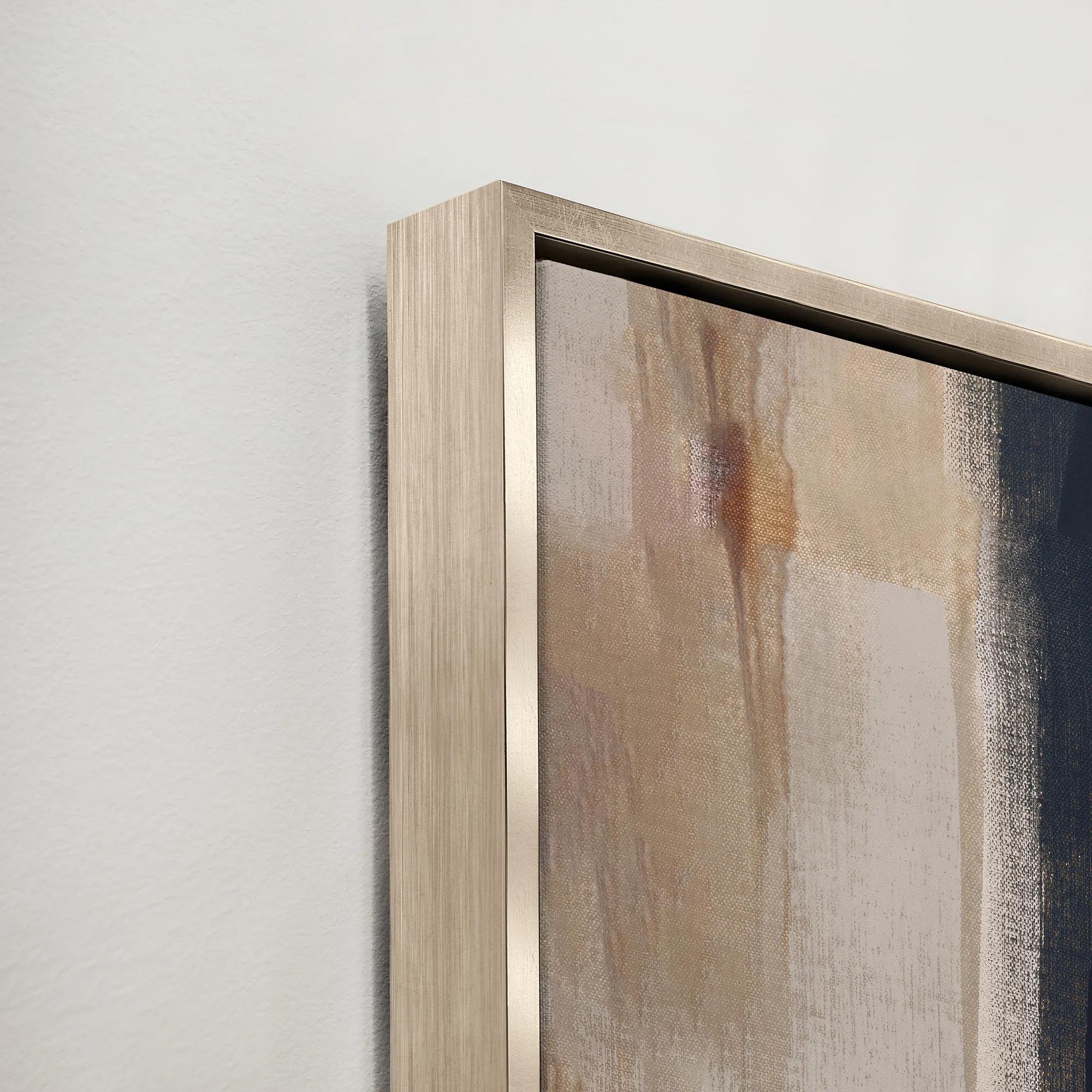 Imposing Construct I Framed Wall Art 41.5" x 61.5"$949
A gallery-wrapped abstract canvas featuring hand-applied brush gel and set in a sleek silver floater frame.
Add To Cart -
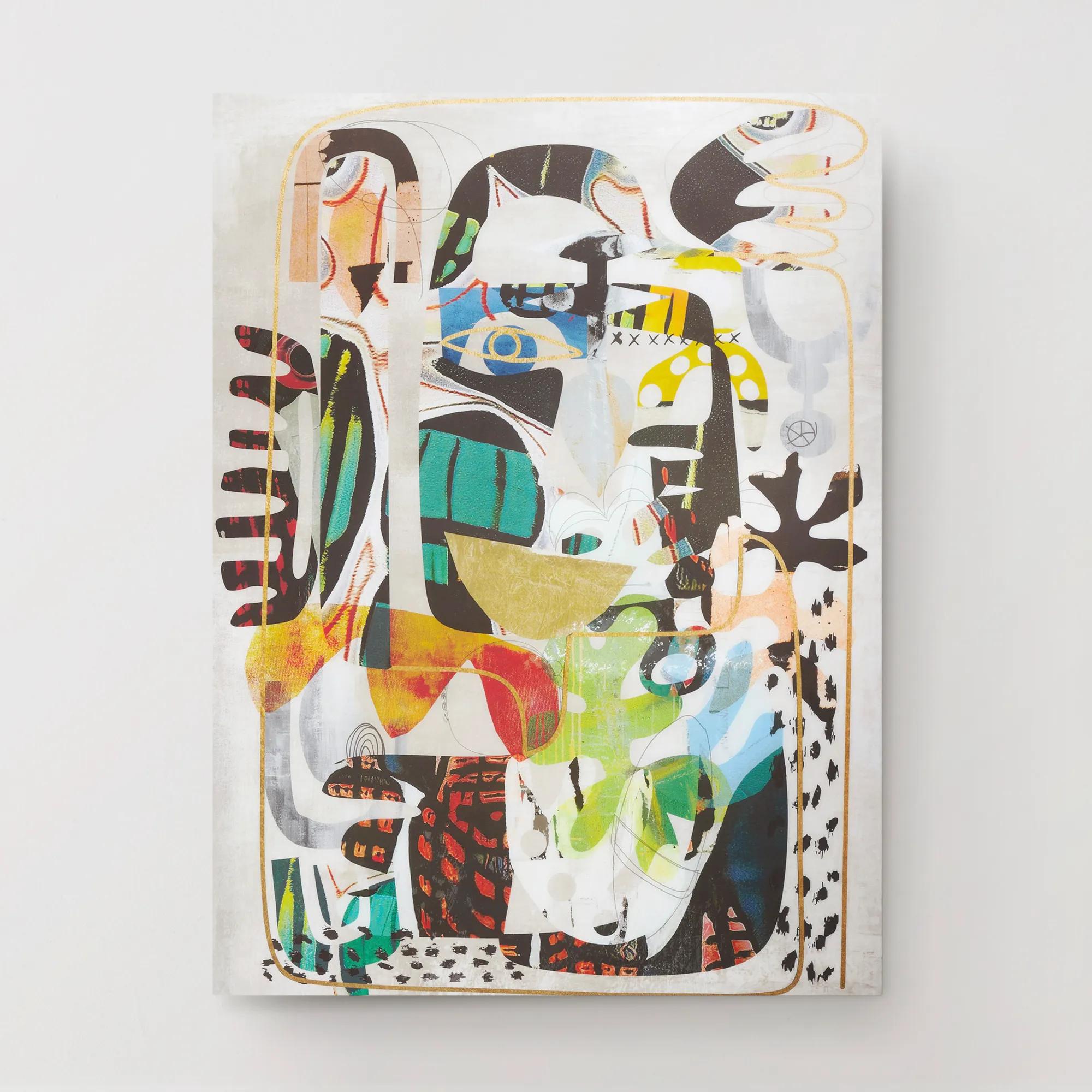
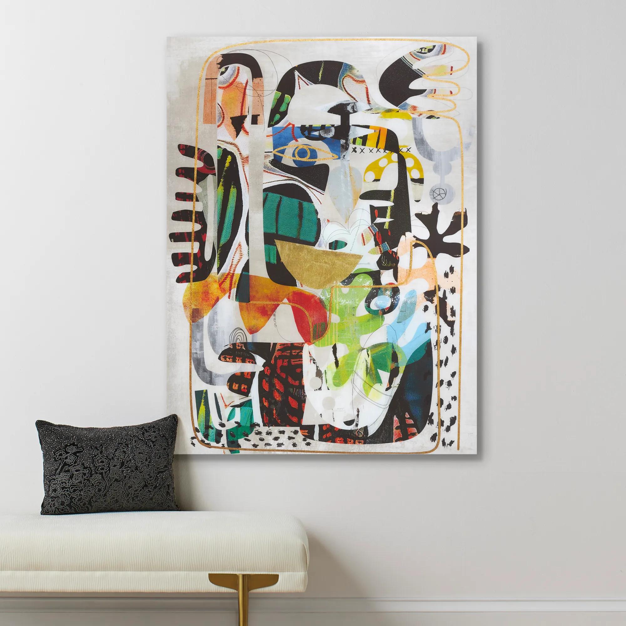 Nikki Chu Masked Wall Art 40" x 54"$899
A vibrant giclee print on canvas featuring a hand-applied glossy finish for a modern statement.
Add To Cart

Navy Blue Abstract Art For Homes
Navy blue abstract art for homes captures the essence of modern sophistication, inviting intrigue and depth into any space. With sweeping strokes and enigmatic forms, these pieces command attention—each canvas a portal to moody elegance and visual drama. The rich indigo hues evoke both serenity and boldness, transforming walls into curated galleries of expressive style. Whether you’re curating a grand living room or an intimate study, navy blue abstract art for homes becomes the statement that elevates your décor from expected to extraordinary. Let your interiors shimmer with artistry, where every glance reveals a new layer of inspiration.
Navy blue abstract art brings deep color, expressive movement, and a sense of composure to home interiors. Rather than depicting a recognizable scene, abstract artwork uses shape, line, texture, and contrast to create its visual language. In navy, that language can feel expansive and atmospheric: sweeping brushwork suggests motion, layered washes introduce depth, and sharp geometric forms lend architectural definition. Navy blue abstract art for homes can take several forms, including original paintings, canvas prints, and framed works on paper. Each offers a different presence on the wall, from the tactile character of a painted surface to the crisp detail of a carefully reproduced image. Digital artwork is another format, though a digital file requires printing and, often, framing before it becomes a physical display. The distinction matters because the surface is part of the experience. A richly textured painting catches light across its raised marks, while a smooth print emphasizes color relationships and the precision of the composition. Navy itself offers remarkable flexibility. Against ivory walls, it creates a striking focal point without the starkness of solid black; beside charcoal upholstery, it adds a subtle layer of color that rewards a closer look. Compositions with white or cream passages can feel open and luminous, while navy paired with gold-toned accents brings a more theatrical finish. Soft gray, muted taupe, and pale blue can temper the intensity without erasing its character. For a room furnished in neutrals, blue abstract wall art introduces personality without requiring every accessory to change. For an interior already rich in color, it can provide a visual anchor, especially when a trace of blue appears elsewhere in a rug, pillow, or decorative object. The strongest effect comes from a thoughtful relationship rather than exact matching: an inky field above a pale sofa, a fluid composition beside angular furniture, or a restrained arrangement of shapes within a room full of sumptuous texture. These contrasts give the artwork room to speak and make the surrounding interior feel deliberately composed.
Scale and composition shape how navy abstract artwork lives in a room. A large canvas above a sofa can establish the seating area as the center of attention, while a narrower vertical work can bring distinction to the wall beside a console or between architectural features. Artwork spanning roughly two-thirds to three-quarters of the furniture beneath it often creates a balanced starting point, although wall height, nearby windows, and the visual weight of the image all influence the result. A dense navy composition may feel commanding at a smaller size; a piece with generous pale space may need more room to achieve the same presence. In a living room, energetic strokes and layered color can hold their own beside sculptural lighting and substantial upholstery. A bedroom may call for softer transitions, hazy edges, or a quieter rhythm of forms, allowing the art to enrich the atmosphere without overwhelming it. Dining rooms welcome bolder contrast, particularly where navy balances the gleam of metallic finishes or the transparency of glass. In a home office, defined lines and measured geometry can lend a polished backdrop, while an entryway offers an opportunity for a confident first impression. Framing further refines that mood. A slim black frame outlines the composition with precision, a gold-toned frame adds warmth and radiance, and a natural wood frame introduces an organic counterpoint to the depth of blue. A pale mat around a work on paper creates breathing room and can make intricate marks easier to appreciate. Canvas presented in a floating frame creates a shadow gap around the edges, emphasizing the artwork as an object rather than simply an image. When several pieces share a wall, consistent spacing and a related palette help the arrangement feel intentional. They need not repeat the same design; a dialogue between fluid marks, quiet fields of color, and crisp shapes can offer more character than a perfectly uniform set. Leave enough space around the arrangement for each composition to remain legible, especially when nearby furnishings already contribute strong pattern or shine.
Materials, construction, and placement deserve as much attention as the image itself. Canvas commonly uses cotton or linen stretched over a supporting frame, while works on paper may range from smooth surfaces to subtly textured fine art papers. A print reproduces an existing image, whereas an original painting may retain visible brushwork, layered pigment, and variations created during the painting process; texture should be confirmed in the description rather than assumed from a photograph. For prints, information about paper quality, inks, and conservation-oriented framing can help clarify how the piece is intended to age. Archival materials and protective glazing may support longevity, but neither makes artwork immune to fading or environmental damage. Direct sunlight can affect pigments and paper over time, so a wall with indirect light is generally a more considerate setting than one receiving prolonged sun. Excess moisture is another concern, particularly for paper and stretched canvas, making a dry interior location preferable to a steamy bathroom. Care should follow the artwork’s stated instructions: gentle dusting may suit some frames and surfaces, while textured paint, delicate paper, and specialty finishes can require a more cautious approach. Spray cleaner onto an appropriate cloth rather than toward framed art, and avoid using household cleaning products on the artwork itself. Secure installation also protects the piece and the room around it; hanging hardware should suit both the work’s weight and the wall material. For someone establishing a new interior, navy offers a versatile foundation that can remain compelling as furnishings evolve. The related selection of Blue Abstract Wall Arts For New Homes extends that color story to spaces taking shape. Abstract art can also be a thoughtful housewarming or wedding gift when its scale, palette, and framing reflect the recipient’s taste. A dramatic collector may appreciate bold gesture and luminous contrast, while someone drawn to tailored interiors may favor precise geometry or subtle tonal layers. Chosen with that personal connection in mind, navy blue artwork becomes more than a finishing touch: it gives a home depth, distinction, and a visible expression of the people who live there.
FAQs
Navy blue abstract art is remarkably versatile, complementing a range of interior styles from modern and minimalist to coastal, boho, and classic. Its deep, rich tones ground contemporary spaces with sophistication, while its abstract forms add intrigue to eclectic or transitional rooms. Pairing navy artwork with metallic accents or neutral furnishings creates a balanced, elevated look that suits both bold and serene aesthetics.
Navy abstract art introduces a sense of depth and drama, instantly elevating the mood of any space. The color navy evokes calm and contemplation, while abstract forms infuse energy and creativity. Together, they create a visual anchor that can make a room feel more intimate, sophisticated, or inspiring, depending on the surrounding decor and lighting.
Absolutely. Navy blue abstract wall art makes a thoughtful and timeless gift for housewarmings, weddings, anniversaries, or milestone celebrations. Its universal appeal and adaptability ensure it can complement a variety of personal styles and living spaces, making it a cherished piece for years to come.
Artwork with navy blue pairs beautifully with a spectrum of palettes. For a calming effect, combine navy with soft neutrals like beige, gray, or ivory. To create a striking statement, introduce metallics such as gold or brass, or add pops of vibrant hues like emerald, coral, or aqua. The versatility of navy allows it to harmonize with both cool and warm tones, making it easy to integrate into existing decor.
To curate a cohesive gallery wall, select abstract navy blue art pieces that share a common theme, color palette, or artistic style. Mix different sizes and orientations for visual interest, and unify the display with consistent framing or matting. Layering navy pieces with complementary abstracts or metallic elements adds depth and character, resulting in a gallery wall that feels both curated and expressive.