Graphic Home Office Decor With Checkerboard Style
Graphic Home Office Decor With Checkerboard Style
-
 Vetra Checkerboard Oak and Maple Desk with Drawer (71")$2399
A modern desk featuring a hand-arranged oak and maple checkerboard veneer, gold accents, and a concealed drawer.
Add To Cart -

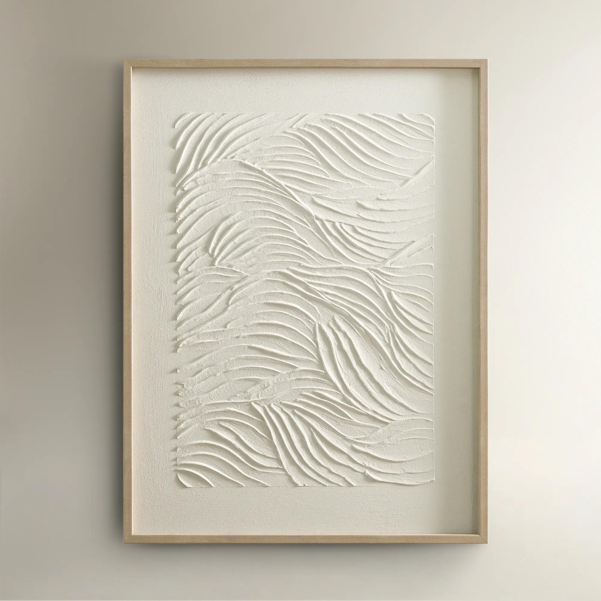
 Checkered Wings Wall Art$199
A striking checkered wing-inspired wall art piece adding graphic drama to modern interiors.
Add To Cart -
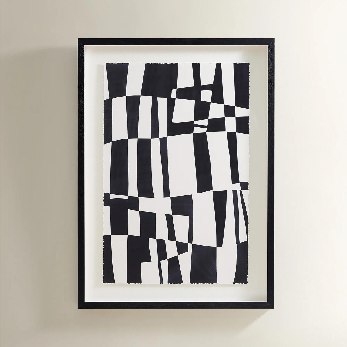 Matrix Art$369
A striking black and white abstract grid print set in a sleek black polyresin frame.
Add To Cart -
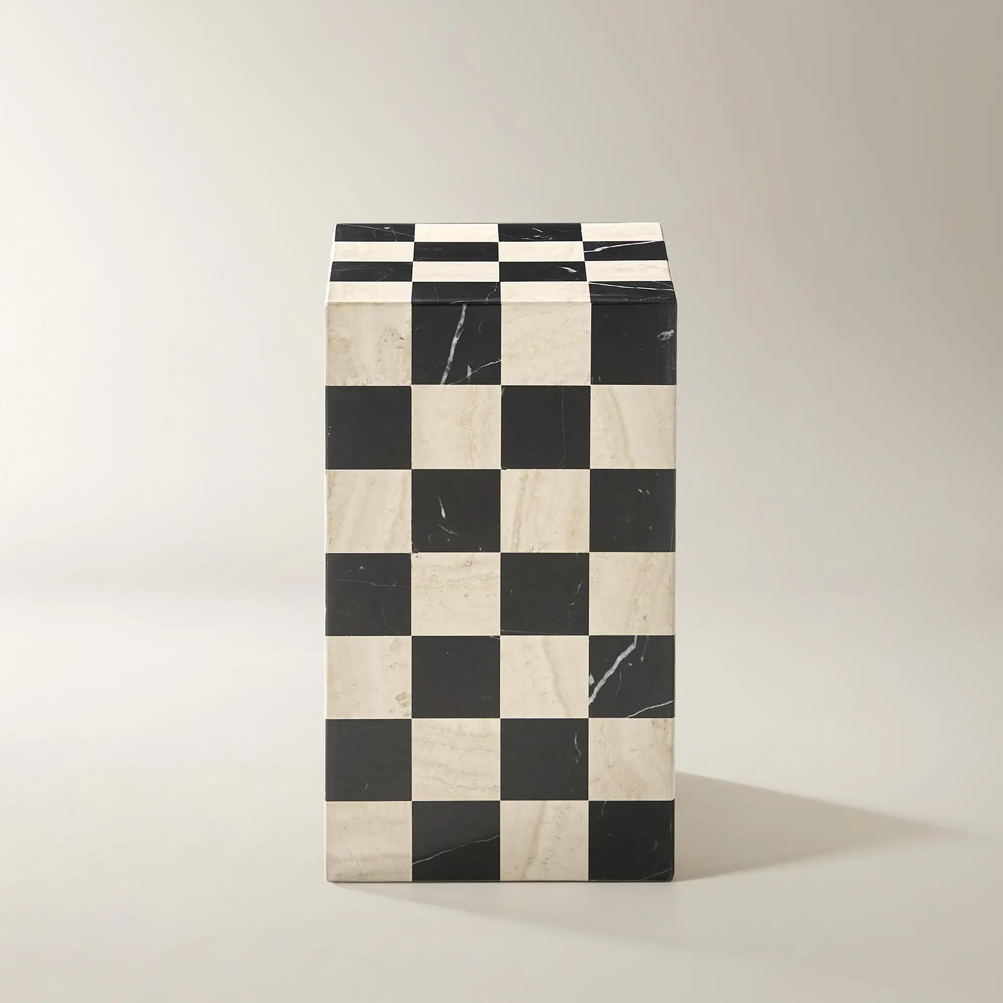 Chessa Square Chequered Marble End Table (12")$999
A sculptural end table featuring a bold black marble and travertine checkerboard mosaic design.
Add To Cart -
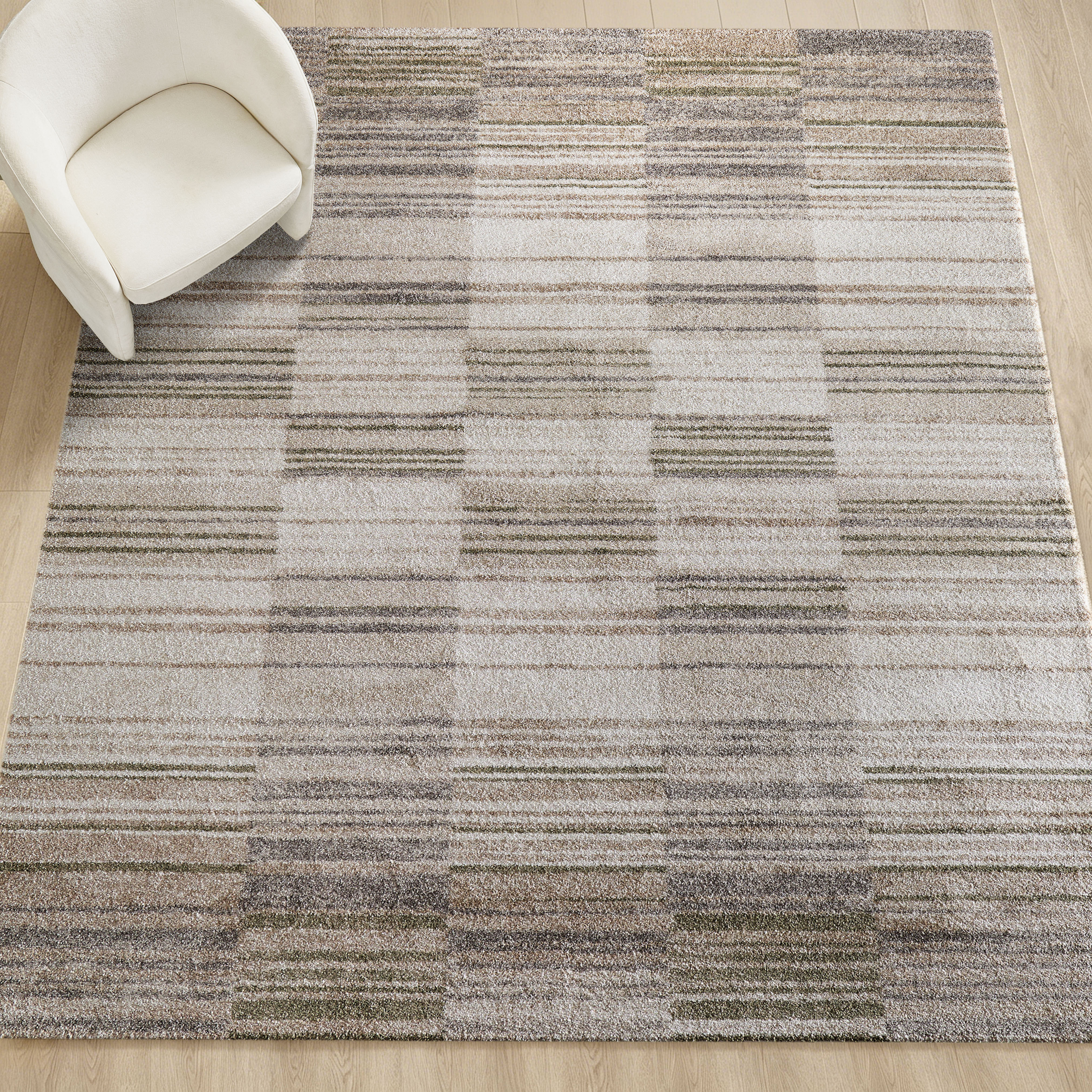
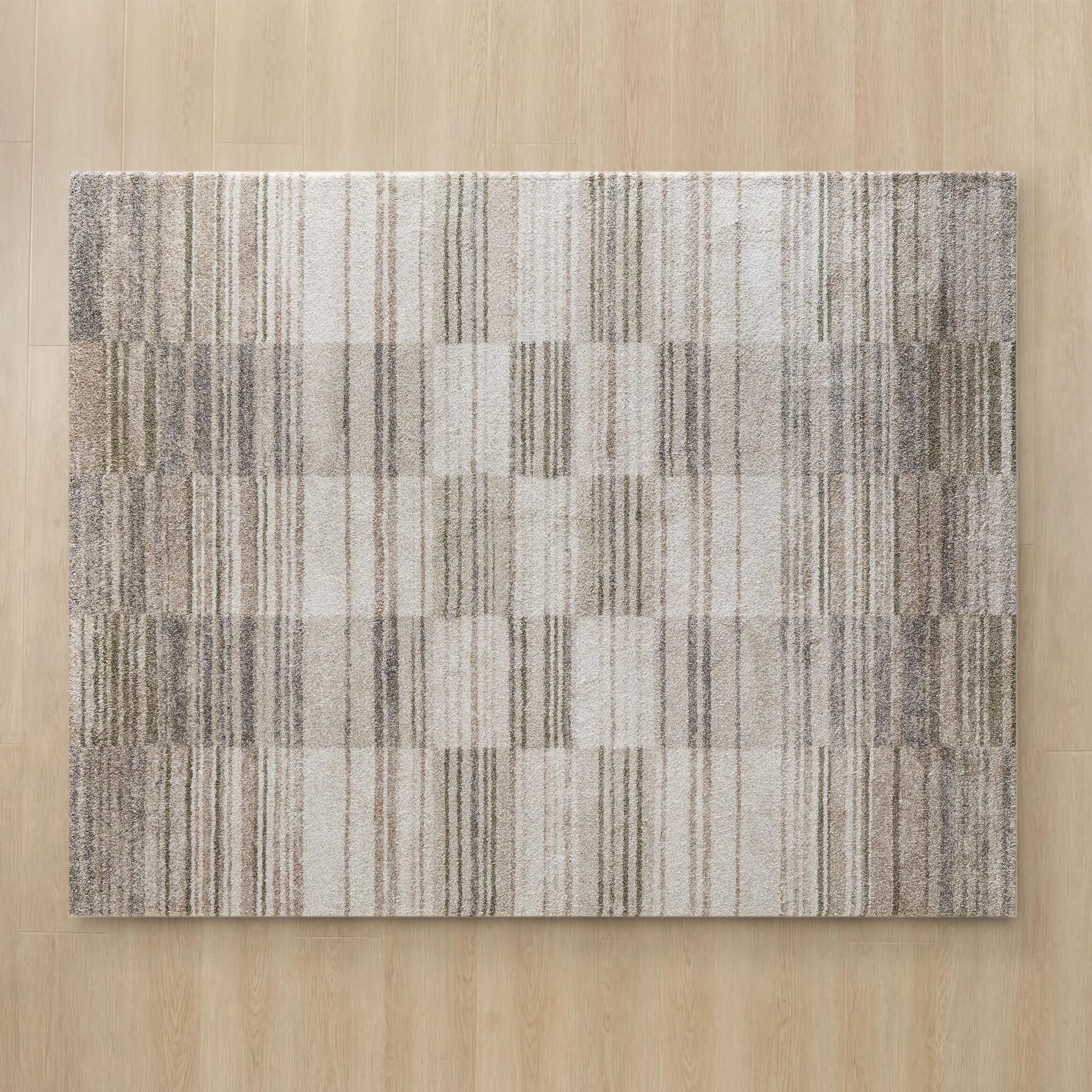 Checka Grey/Tan/Ivory/Soft Green Performance Power Loomed Rug$849
A plush, power-loomed rug featuring a soft check pattern in grey, tan, ivory, and green.
Add To Cart -
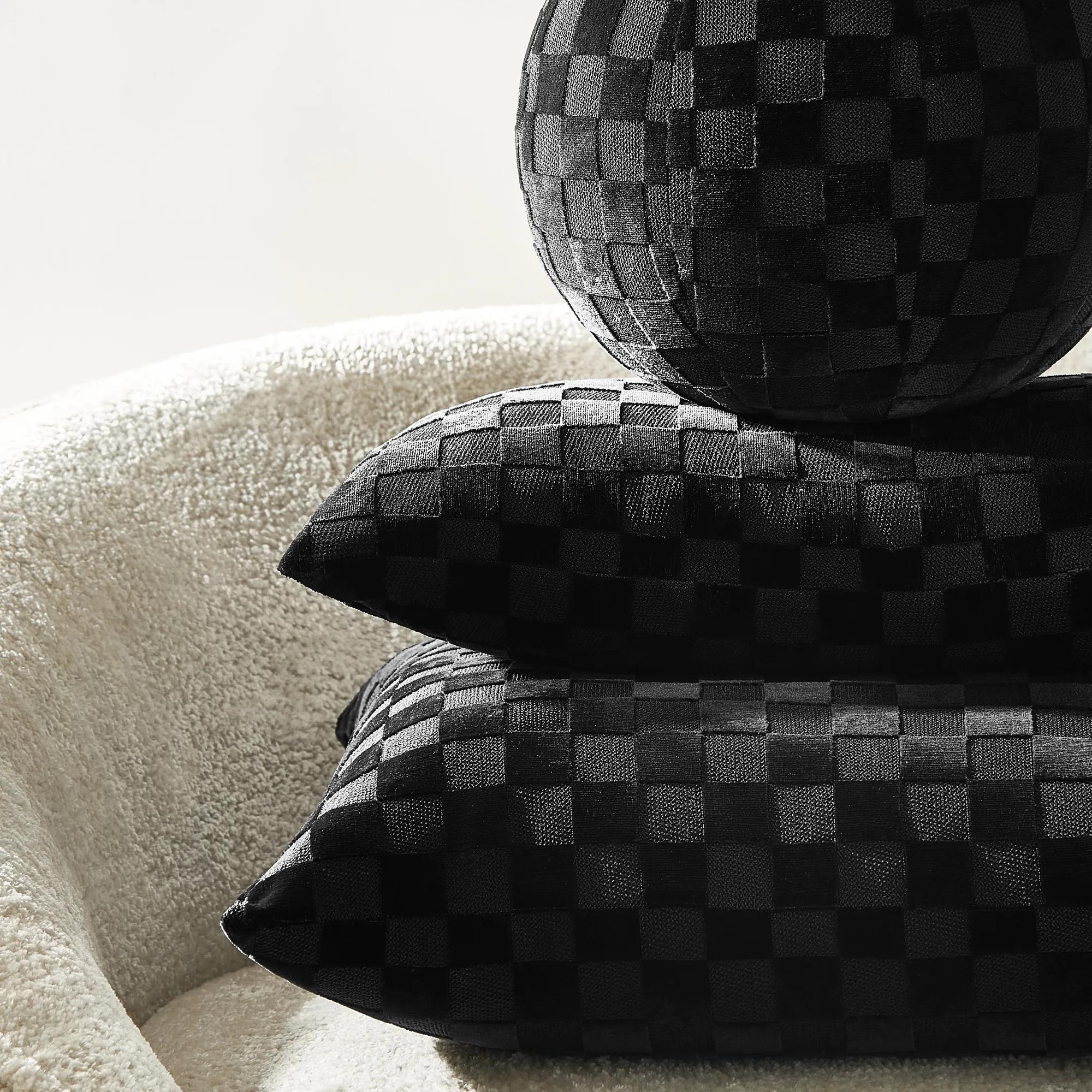
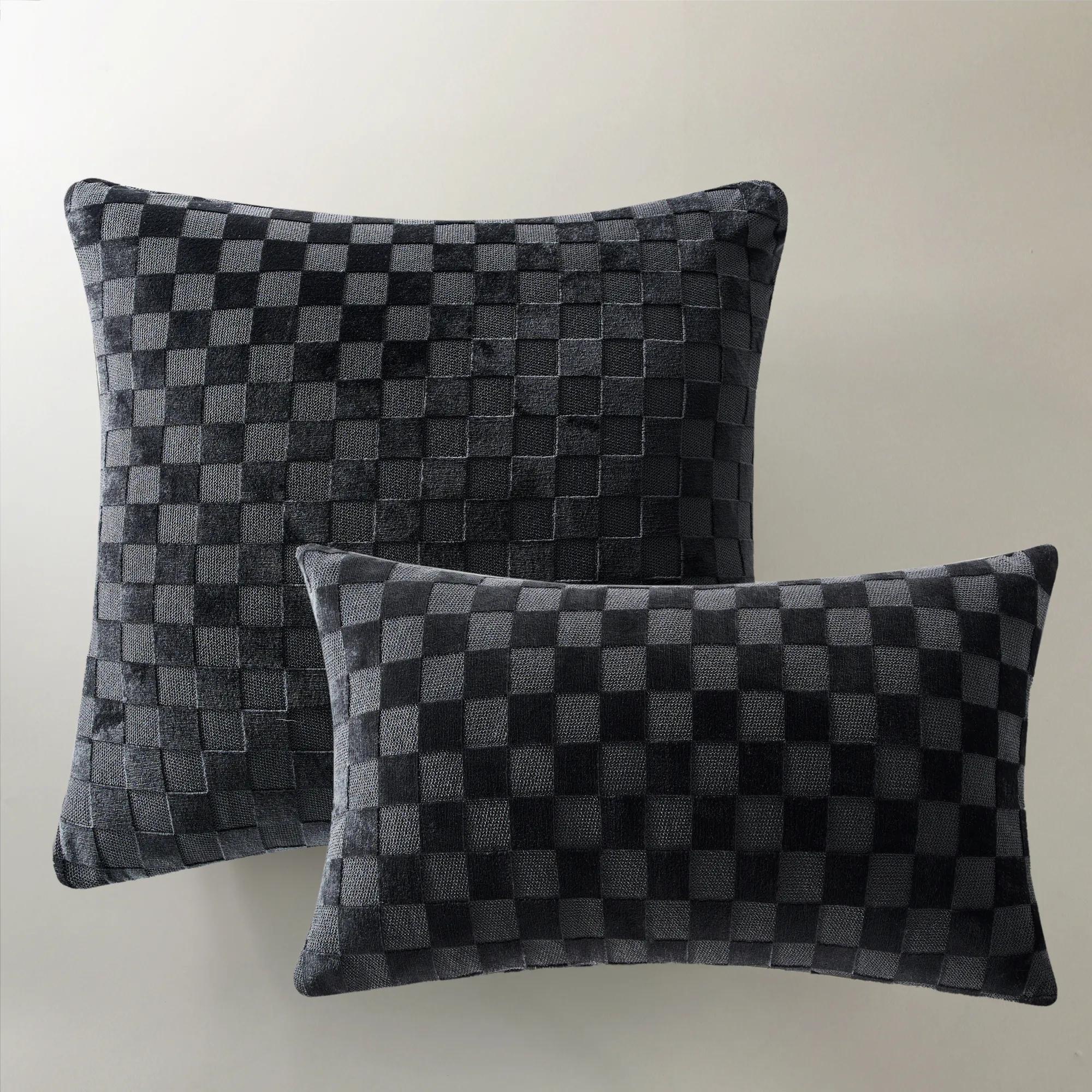 Checker Black Cut Velvet Pillow 22" x 22"$79
A sophisticated black cut velvet pillow featuring a geometric checkerboard pattern for subtle texture and depth.
Add To Cart -
 Checker Black Cut Velvet Lumbar 12" x 22"$59
A black cut velvet lumbar pillow featuring a sophisticated checkerboard pattern and removable feather-down insert.
Add To Cart -
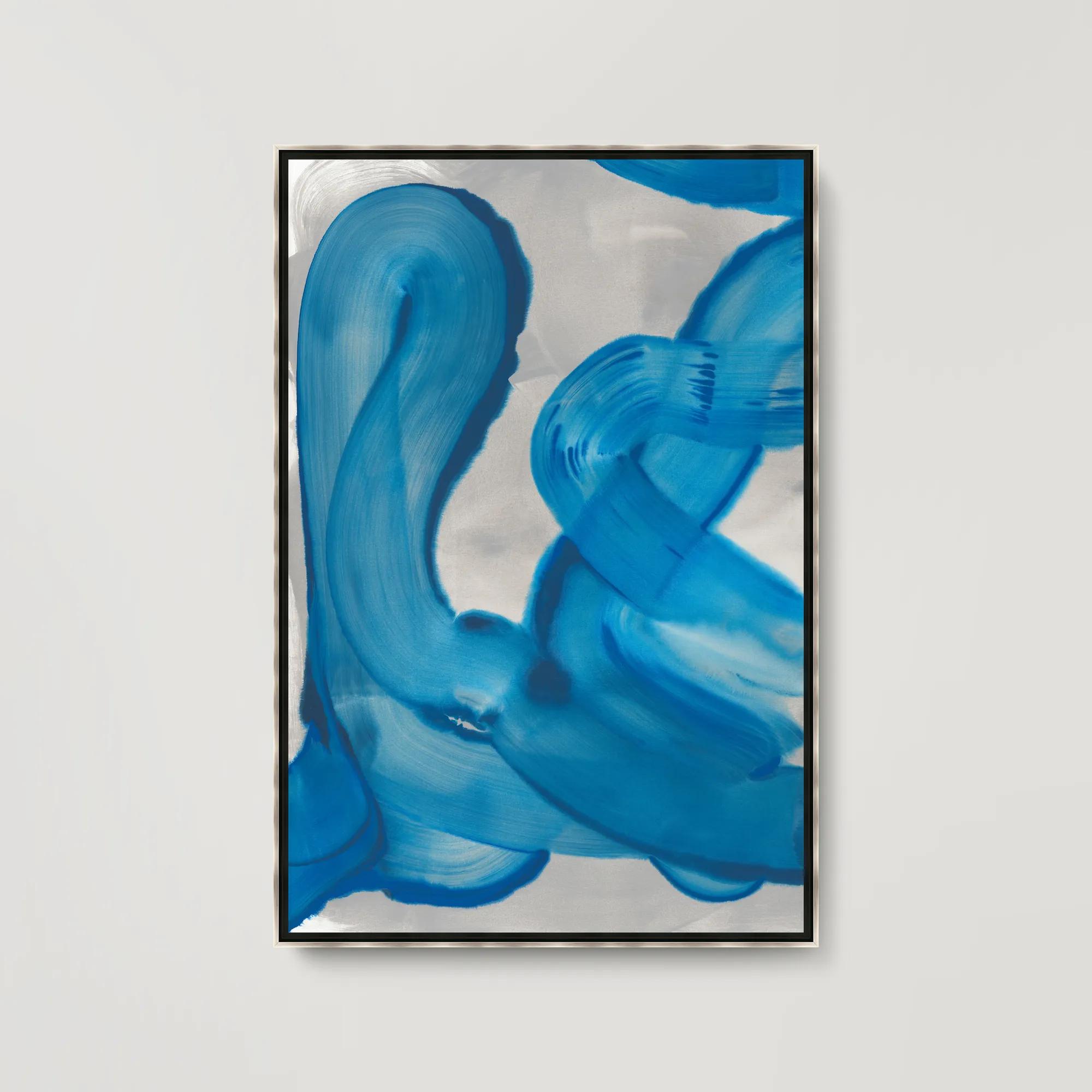 Royal Waves I Framed Wall Art 31.5" x 46.5"$699
A gallery-wrapped abstract canvas featuring hand-applied brush gel and set in a sleek silver floater frame.
Add To Cart -
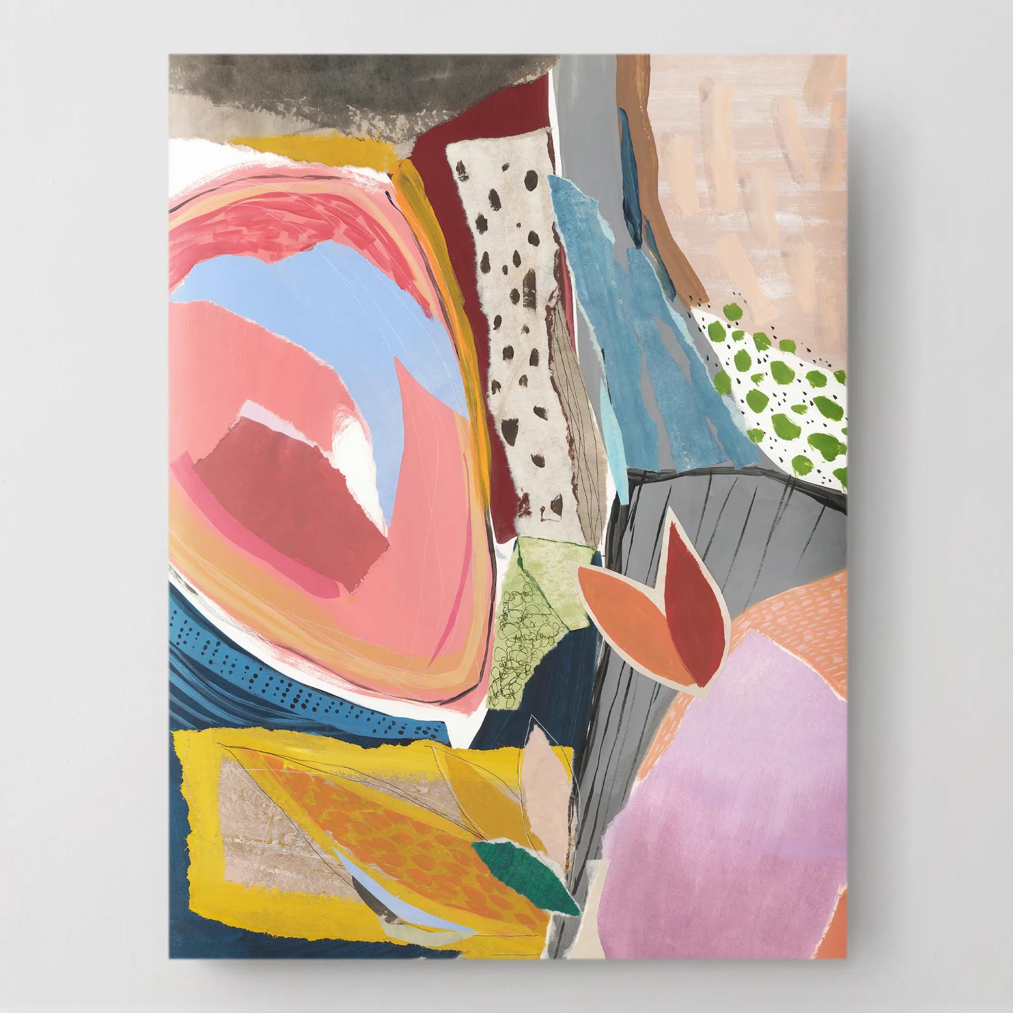
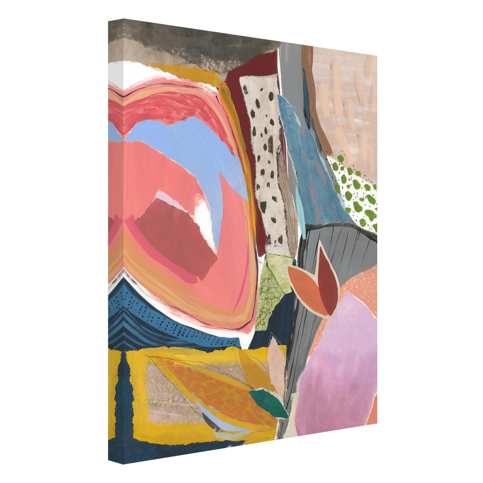 Sunday Vibes 1 Wall Art 30" x 40"$449
A gallery-wrapped canvas artwork featuring a hand-applied image brush gel finish for a textured look.
Add To Cart -
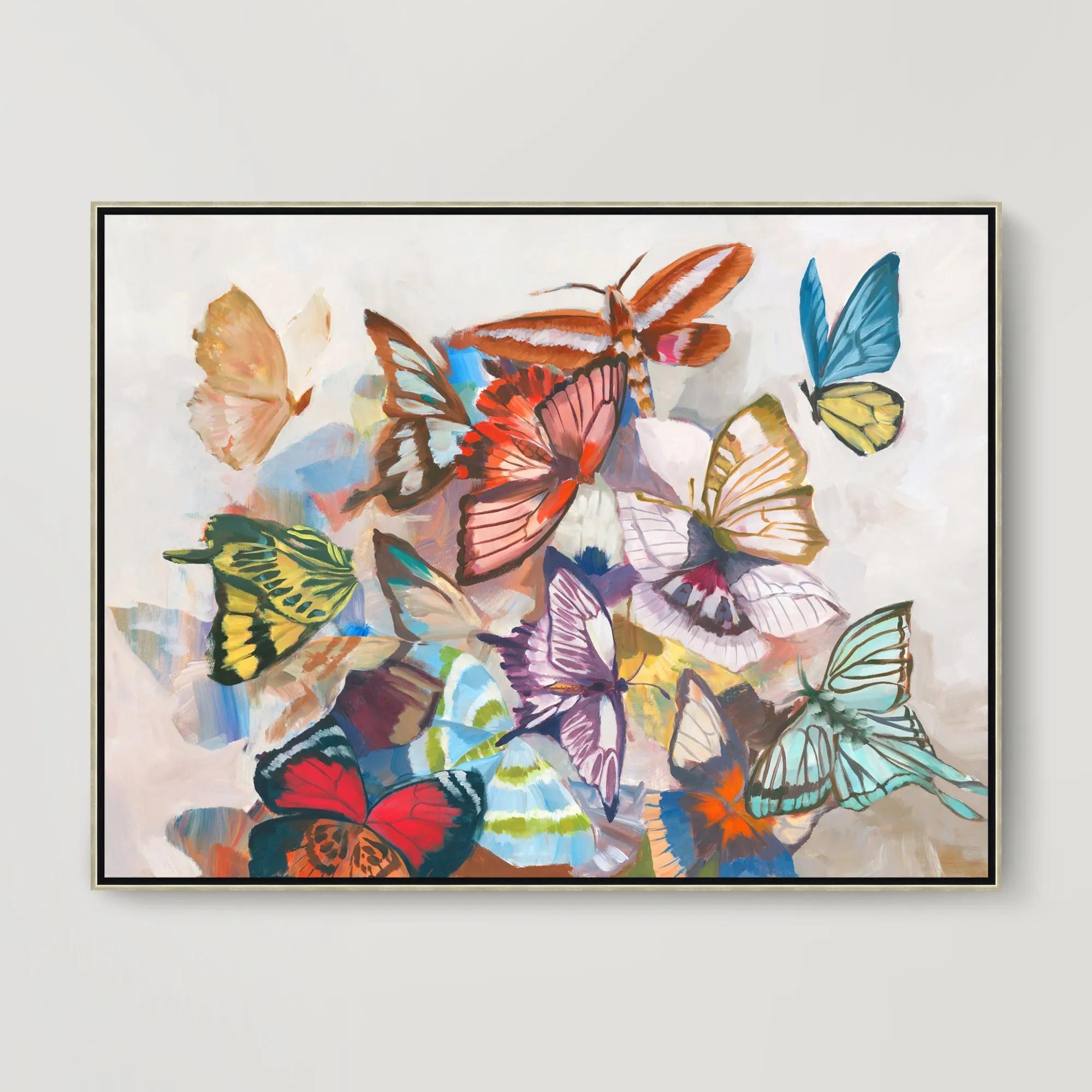 Sugar Wings Framed Wall Art 49.5" x 37.5"$799
A vibrant gallery-wrapped canvas artwork with hand-applied brush gel finish in a sleek silver floater frame.
Add To Cart -
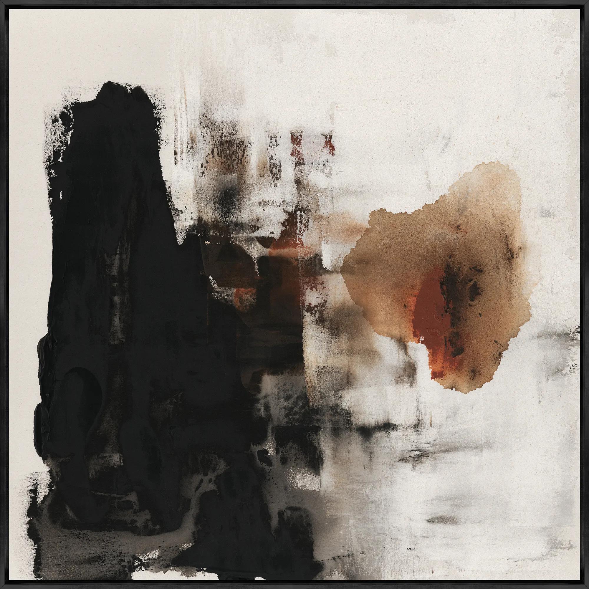 Burning for You I Framed Wall Art 40" x 40"$799
A gallery-wrapped canvas artwork with hand-applied brush gel, set in a sleek black floater frame.
Add To Cart -
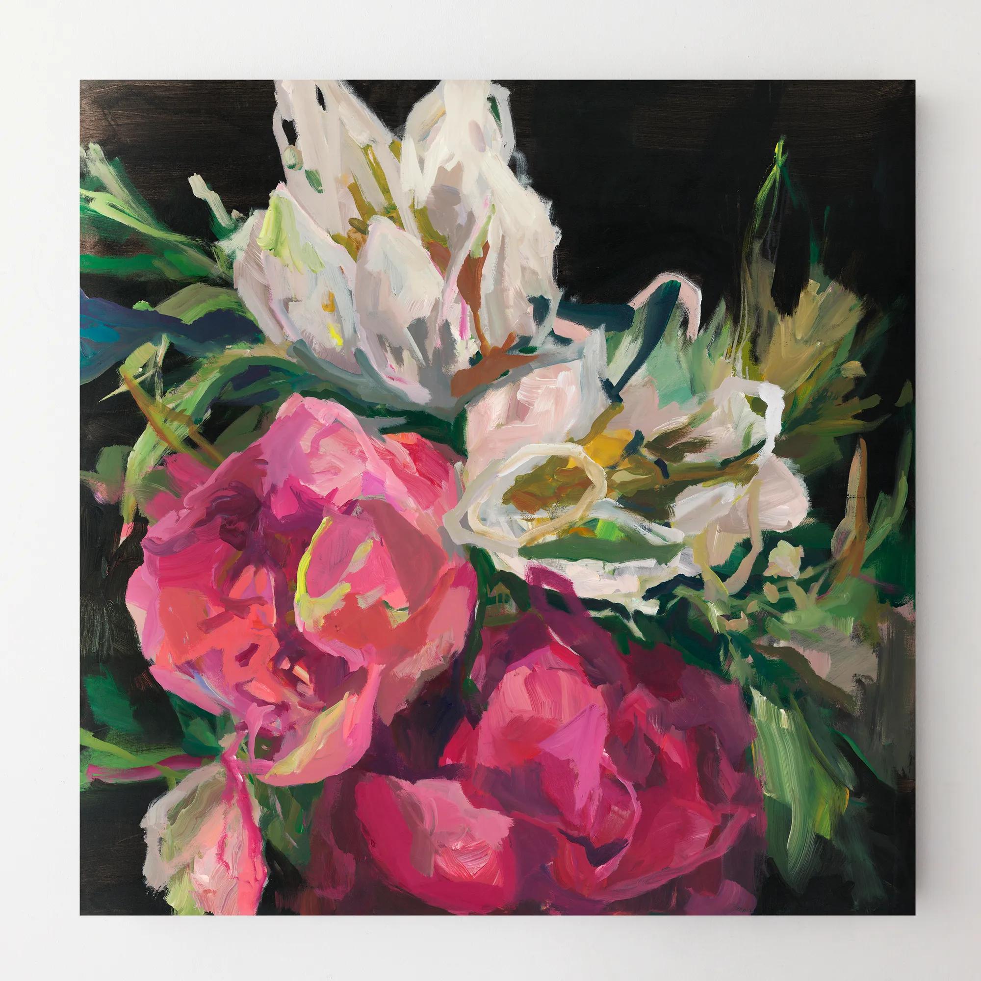
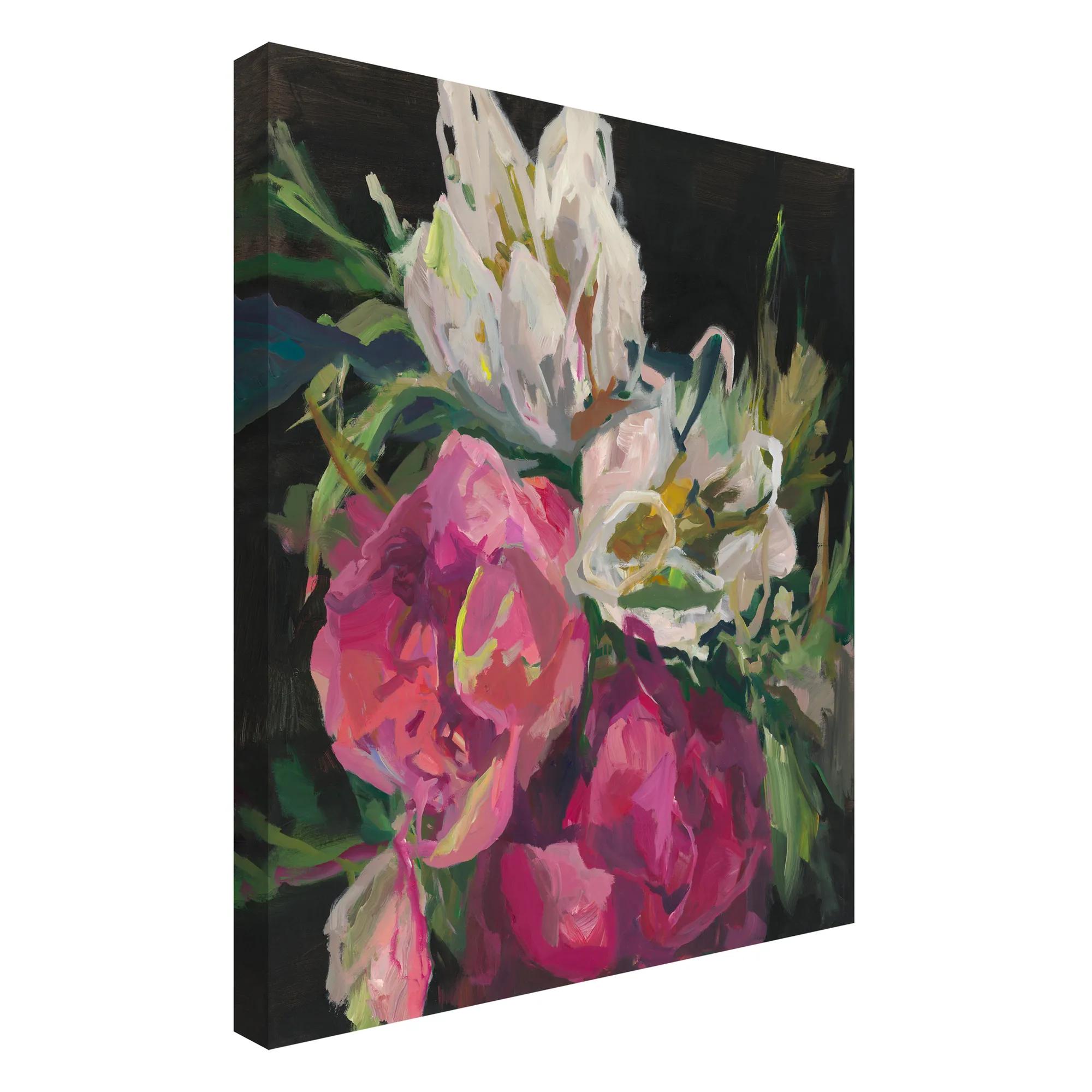 Wild At Heart Wall Art 30" x 30"$399
A gallery-wrapped canvas artwork featuring a hand-applied image brush gel finish for striking visual texture.
Add To Cart -
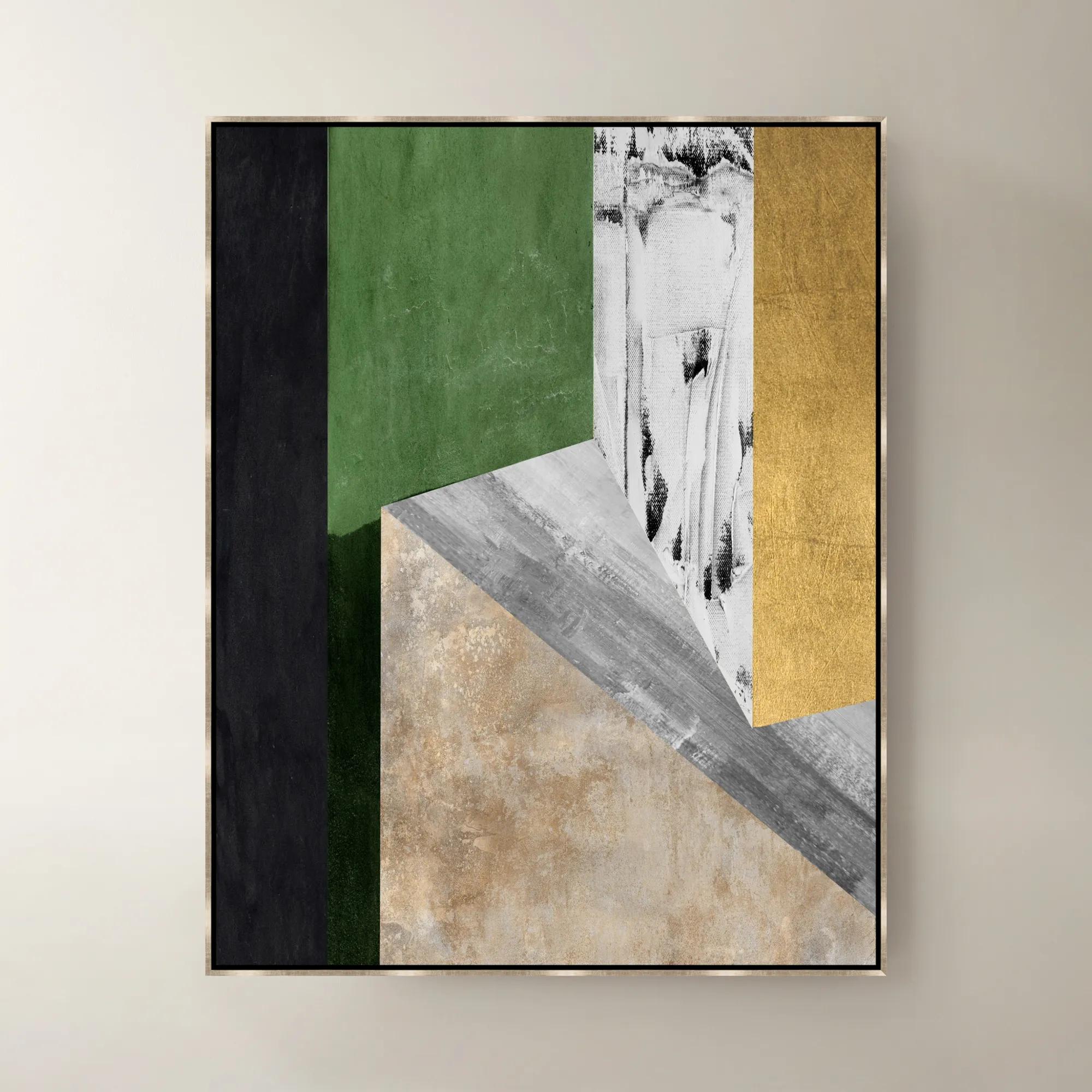
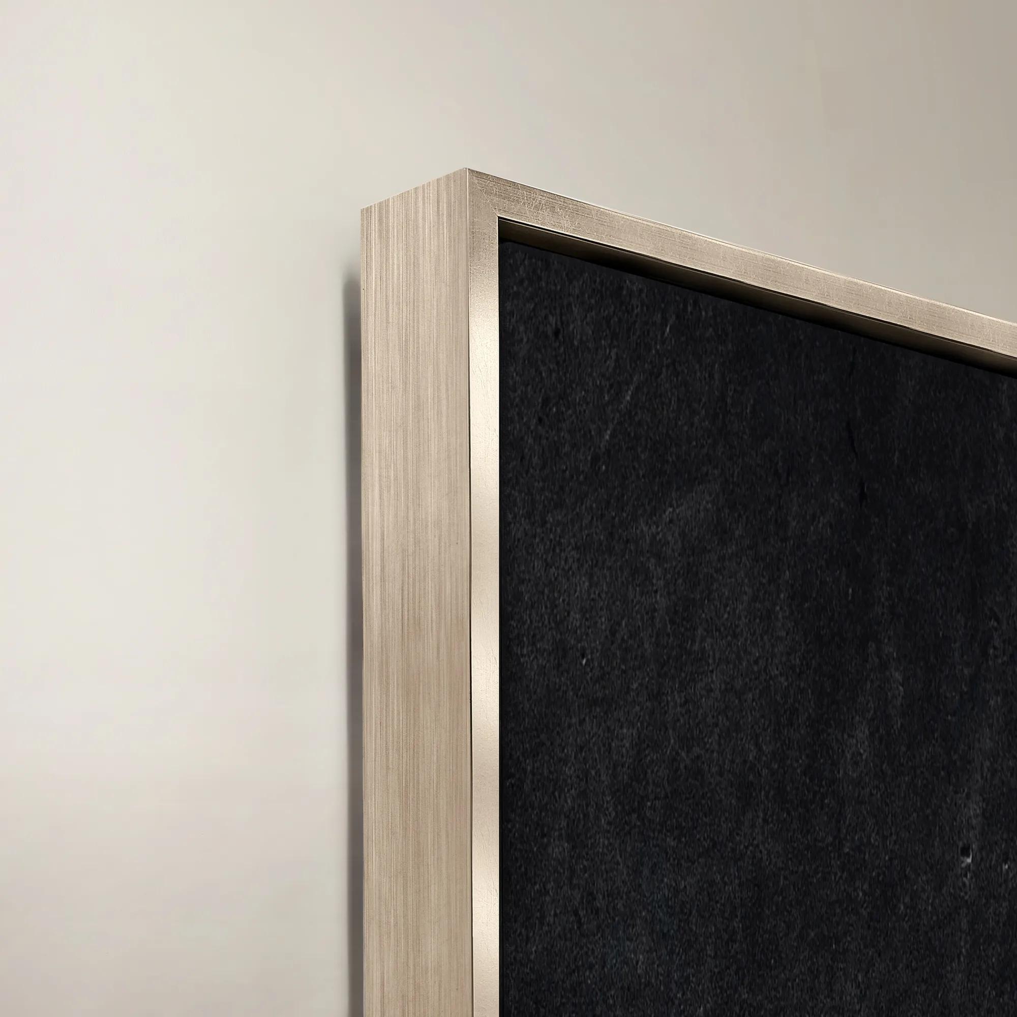 Blocked III Framed Wall Art 42" x 50"$1199
A striking abstract art piece featuring bold geometric shapes and modern design by Nikki Chu.
Add To Cart -
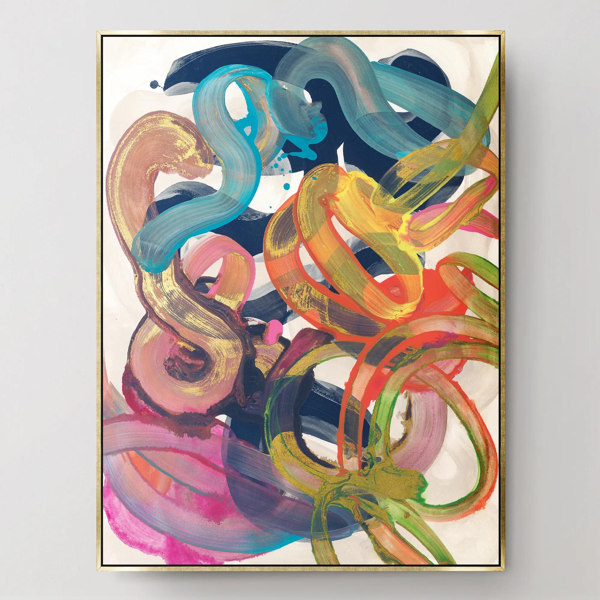
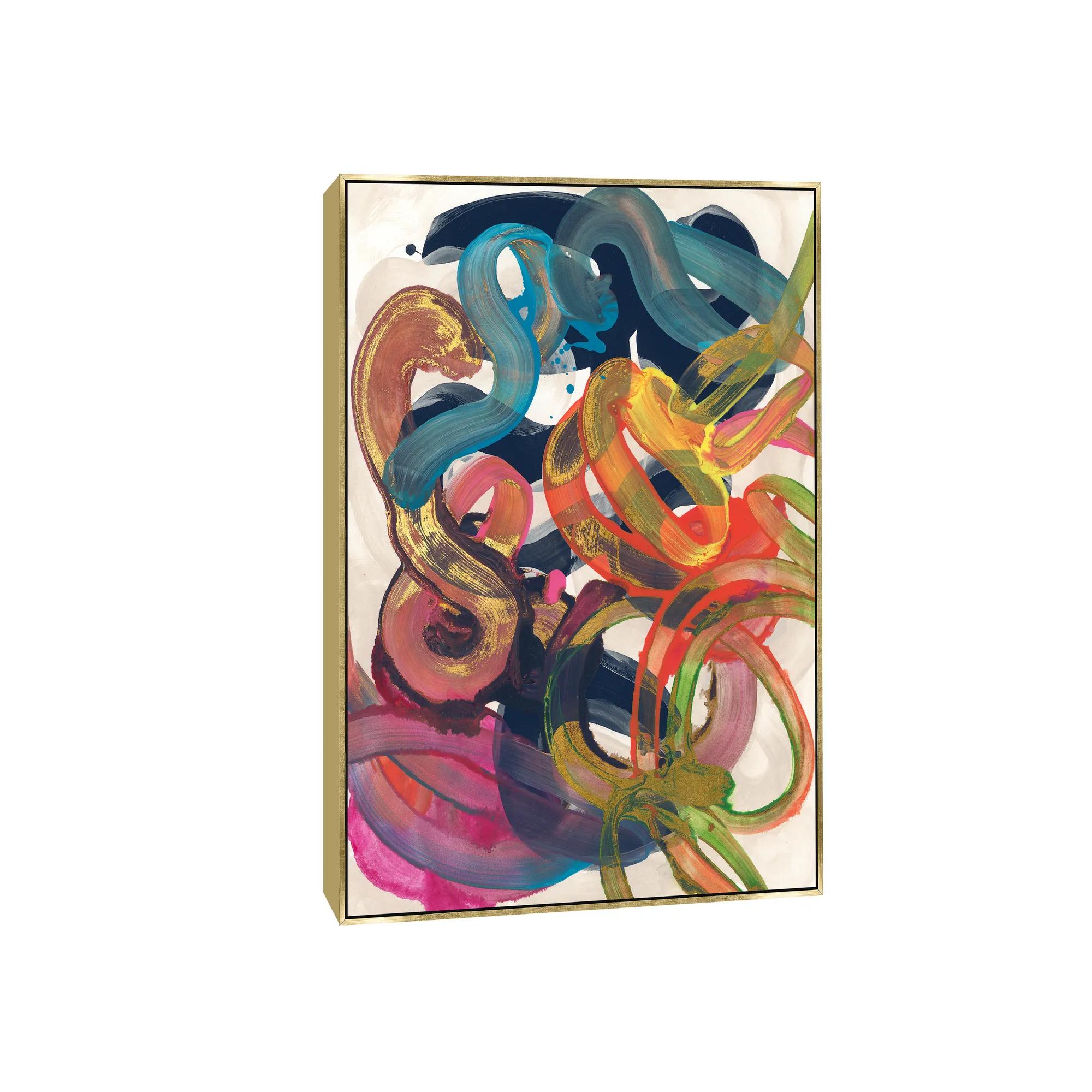 Illogical Conclusions Framed Wall Art 26" x 35"$499
A gallery-wrapped canvas artwork with a hand-applied gel finish, set in a gold float frame.
Add To Cart -
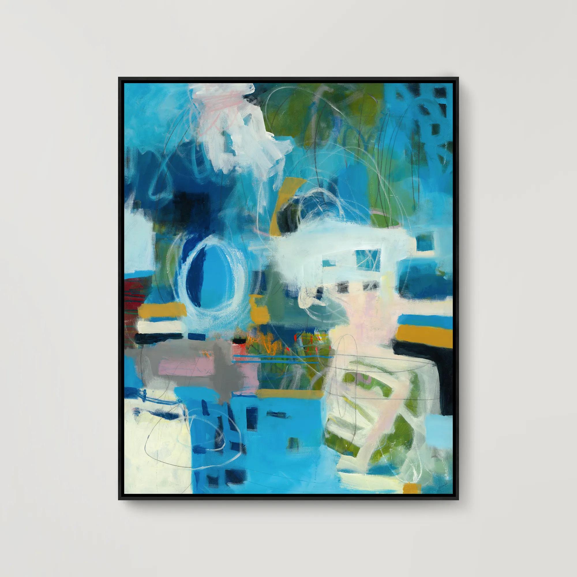
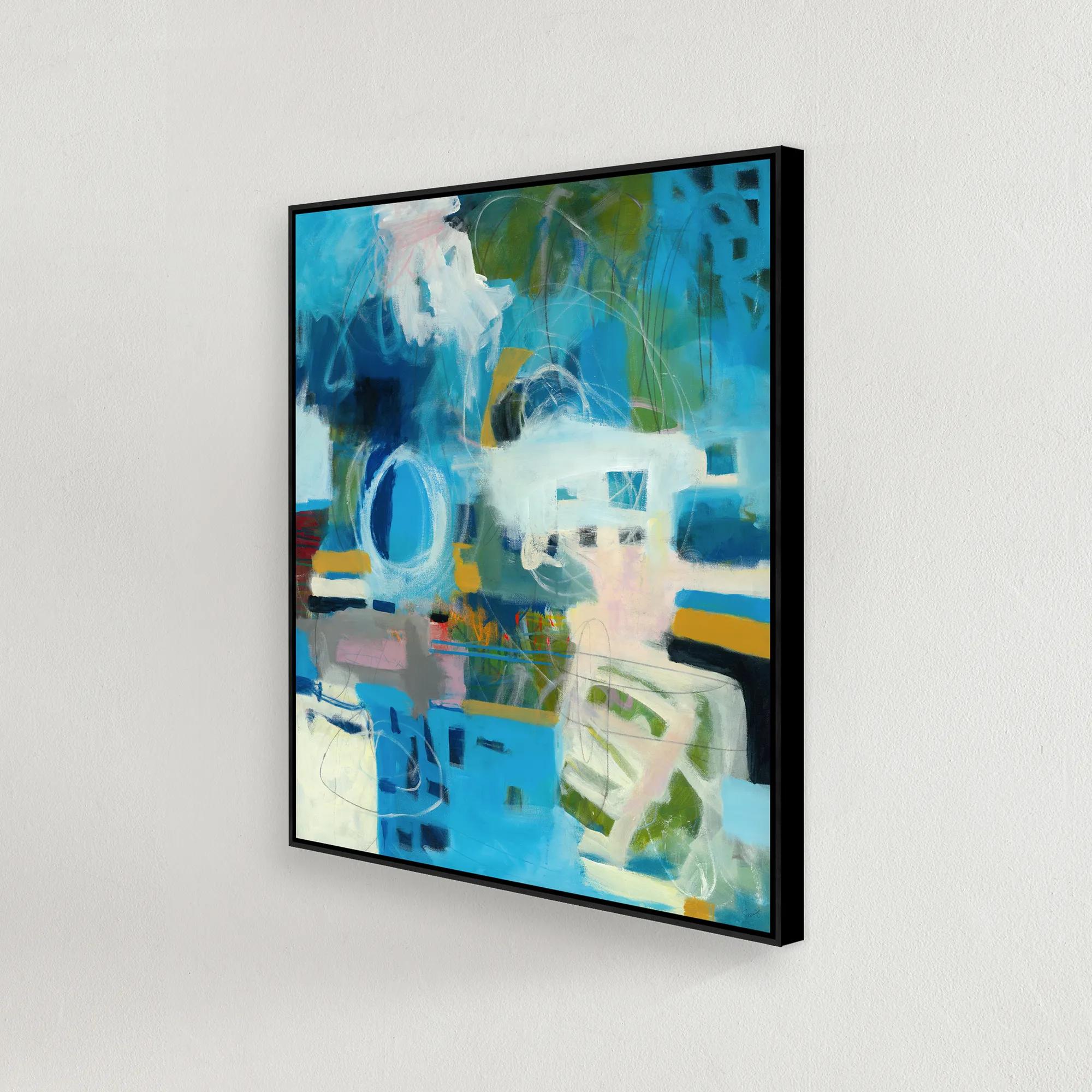 Just Across the Boarder Framed Wall Art 37.5" x 46.5"$749
A gallery-wrapped canvas artwork with hand-applied gel finish, set in a sleek black floater frame.
Add To Cart -
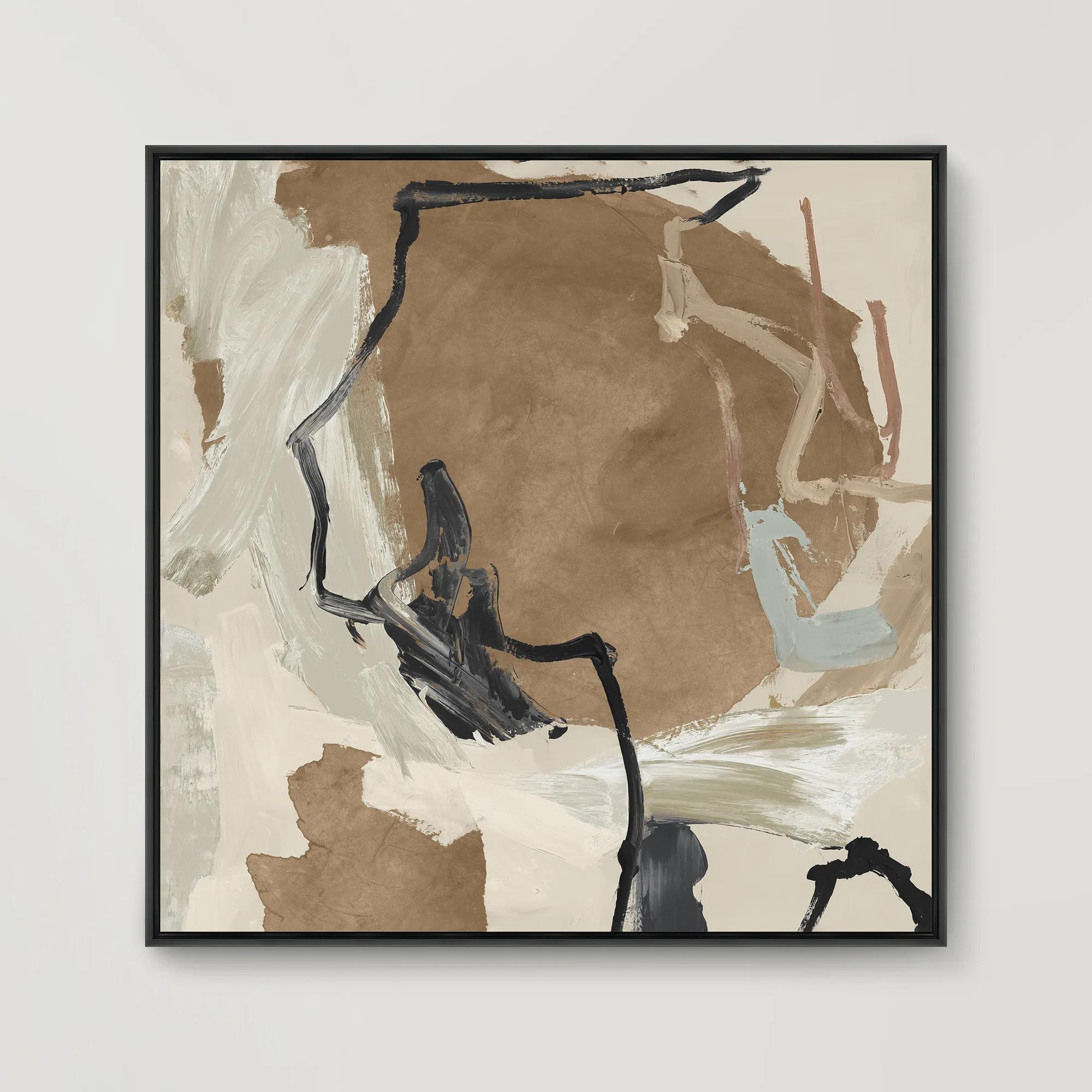
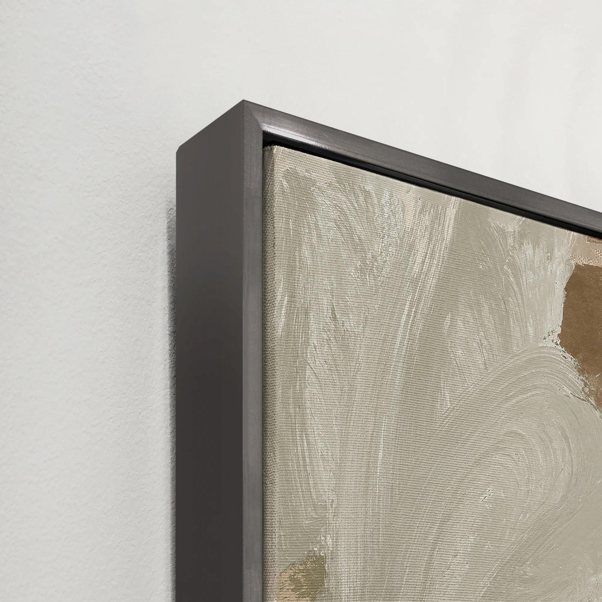 Borderlands IV Framed Wall Art 31.5" x 31.5"$499
A gallery-wrapped canvas artwork with a hand-applied brush gel finish in a sleek gray floater frame.
Add To Cart -
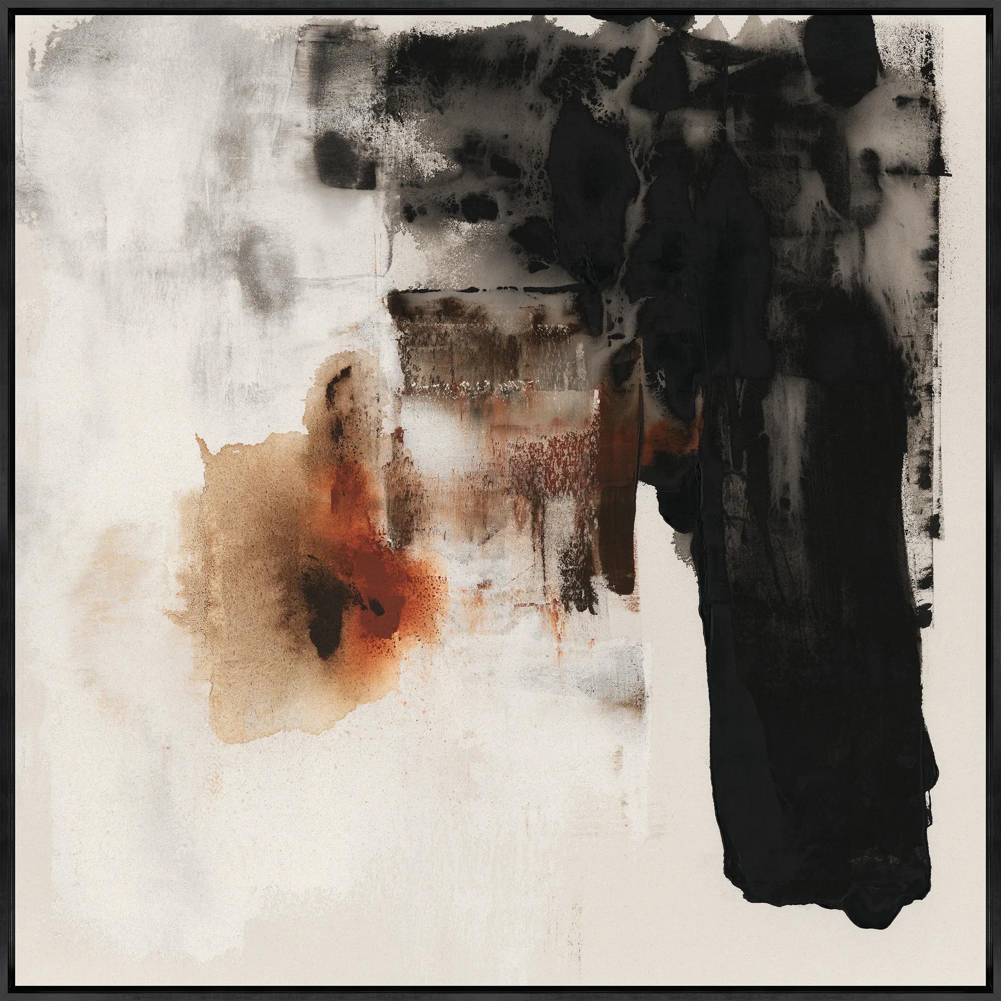
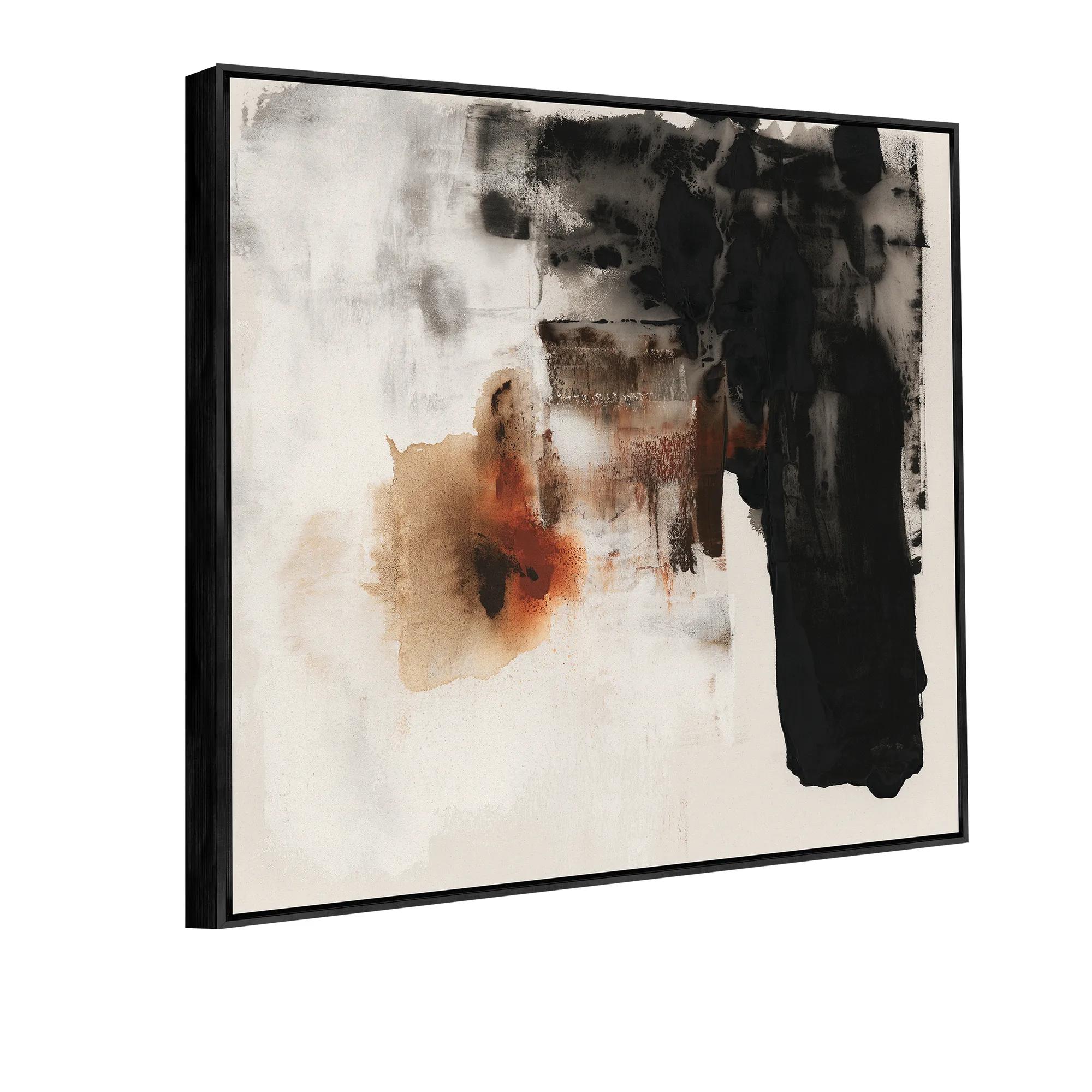 Burning for You II Framed Wall Art 40" x 40"$799
A gallery-wrapped canvas artwork with hand-applied brush gel, set in a sleek black floater frame.
Add To Cart -
 World At Night Framed Wall Art 40" x 50"$899
A gallery-wrapped canvas artwork featuring a hand-applied gel finish and set in a sleek black frame.
Add To Cart -
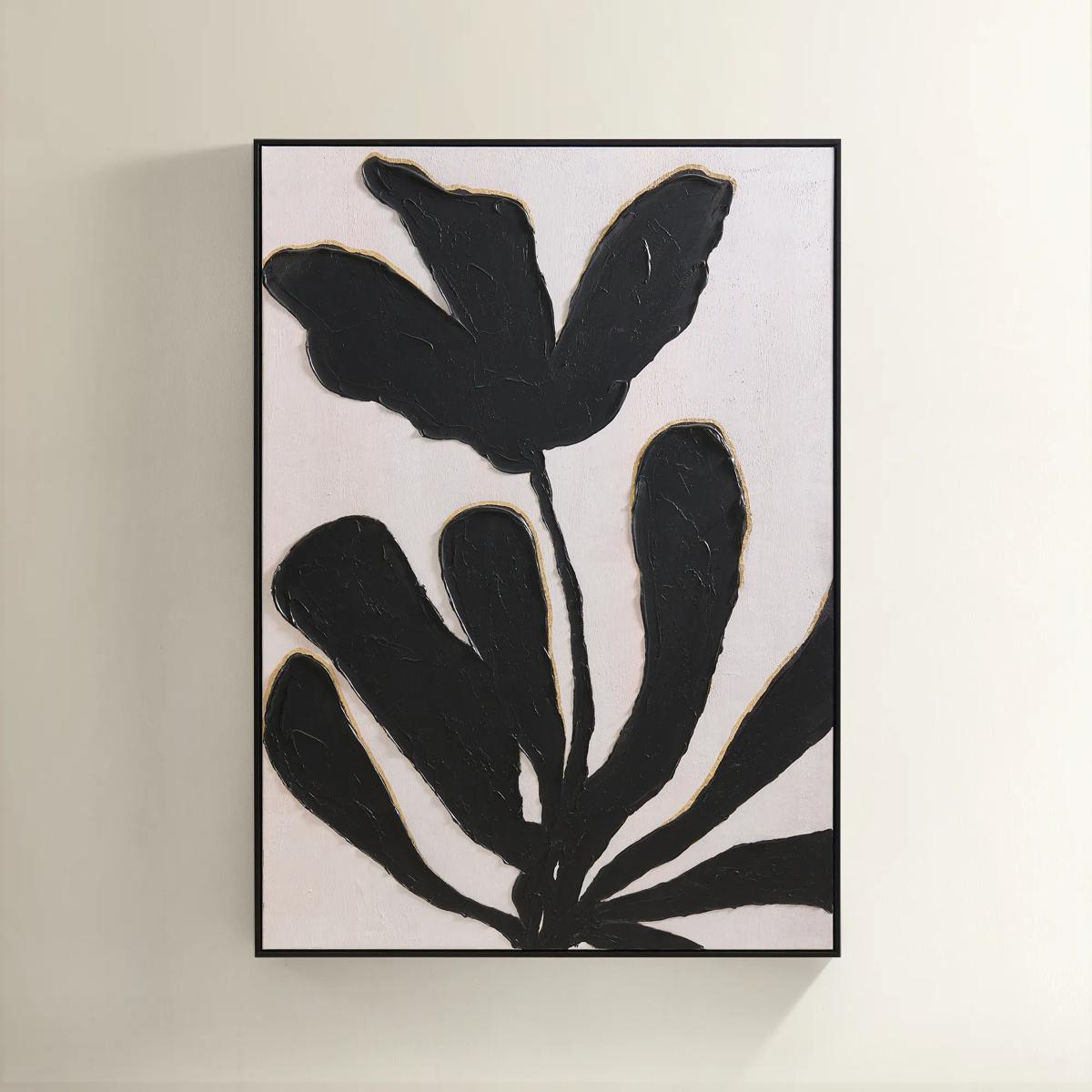
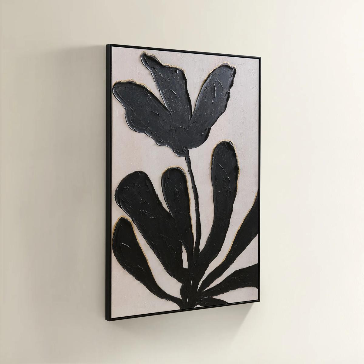 First Bloom Framed Painted Wall Art 39.25" x 55"$499
A hand-painted canvas featuring black abstract leaves and gold leafing on an ivory background in a black frame.
Add To Cart -
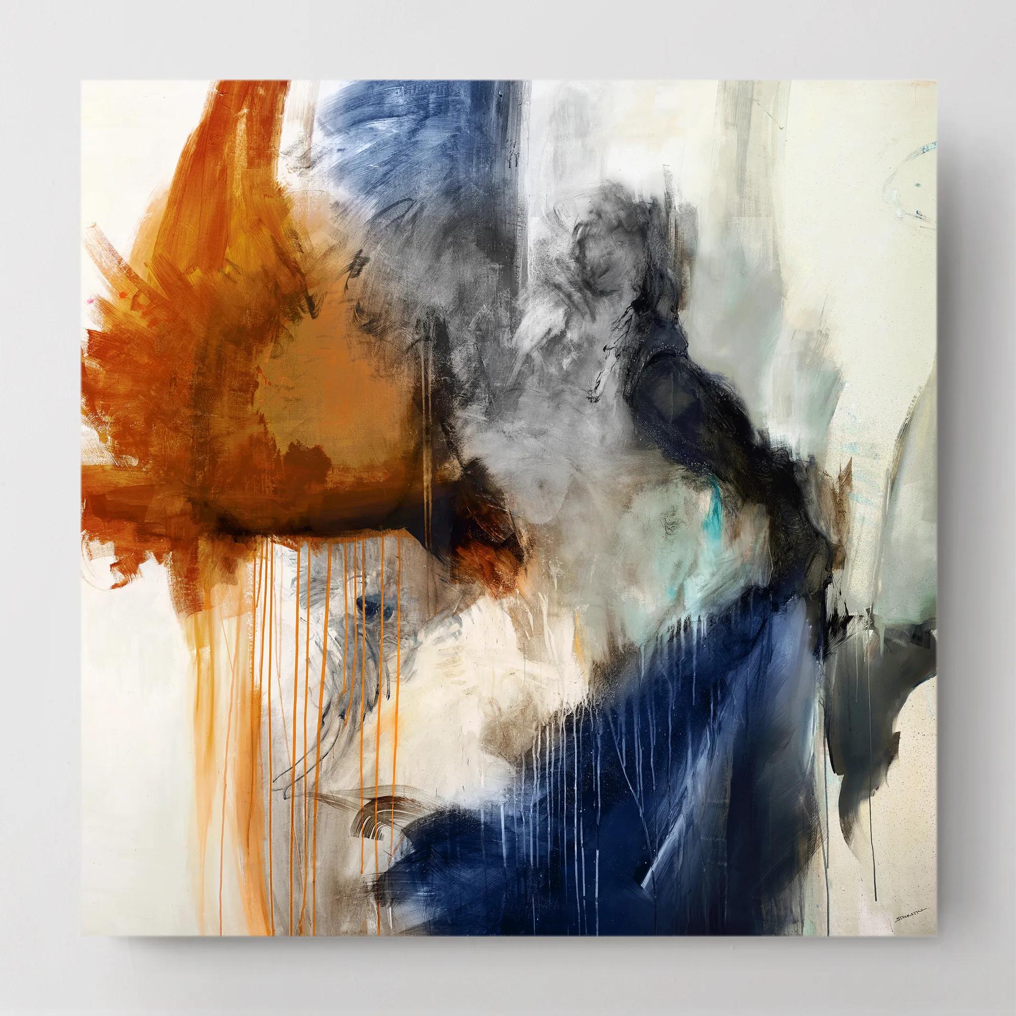
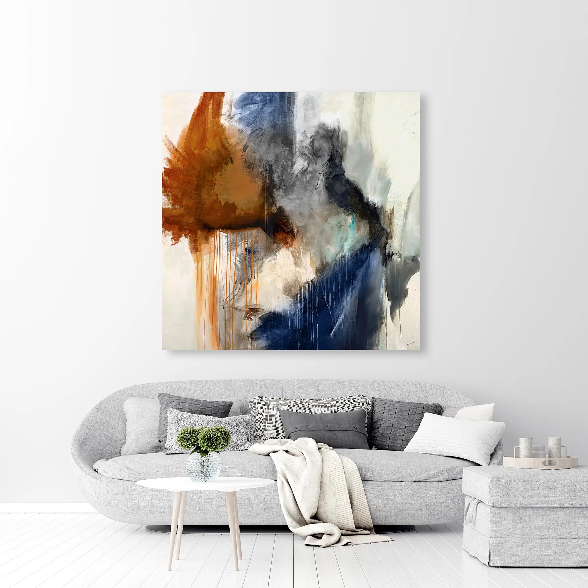 Swoon 6 Wall Art 54" x 54"$899
A gallery-wrapped canvas featuring a hand-applied image brush gel finish for a textured, artistic look.
Add To Cart -
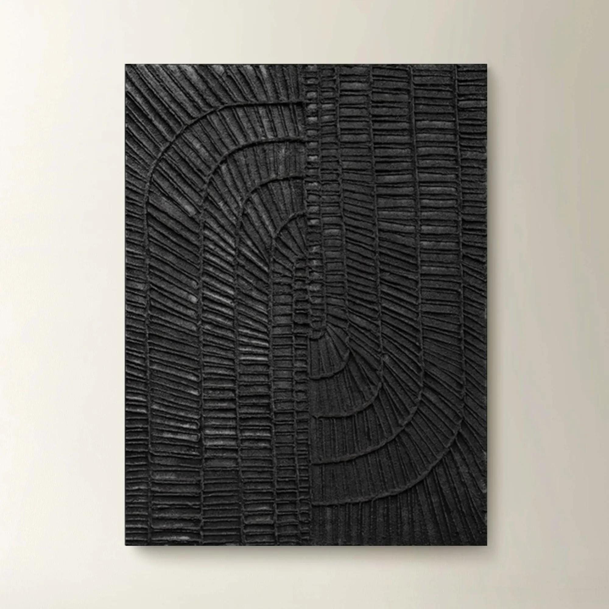 Textured Haze Black II Painted Wall Art 26" x 35"$499
A striking hand-painted black artwork featuring textured details for versatile vertical or horizontal display.
Add To Cart -
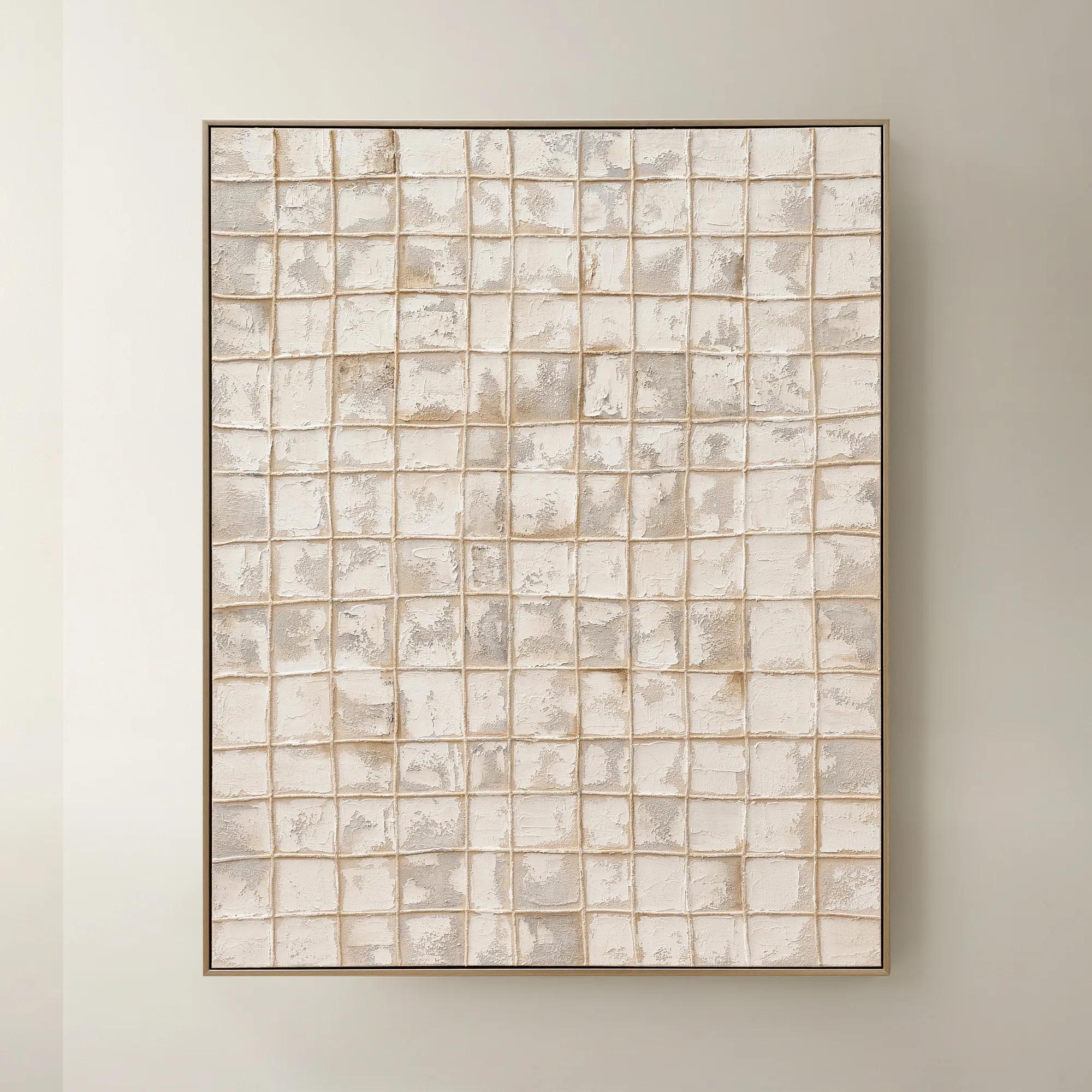
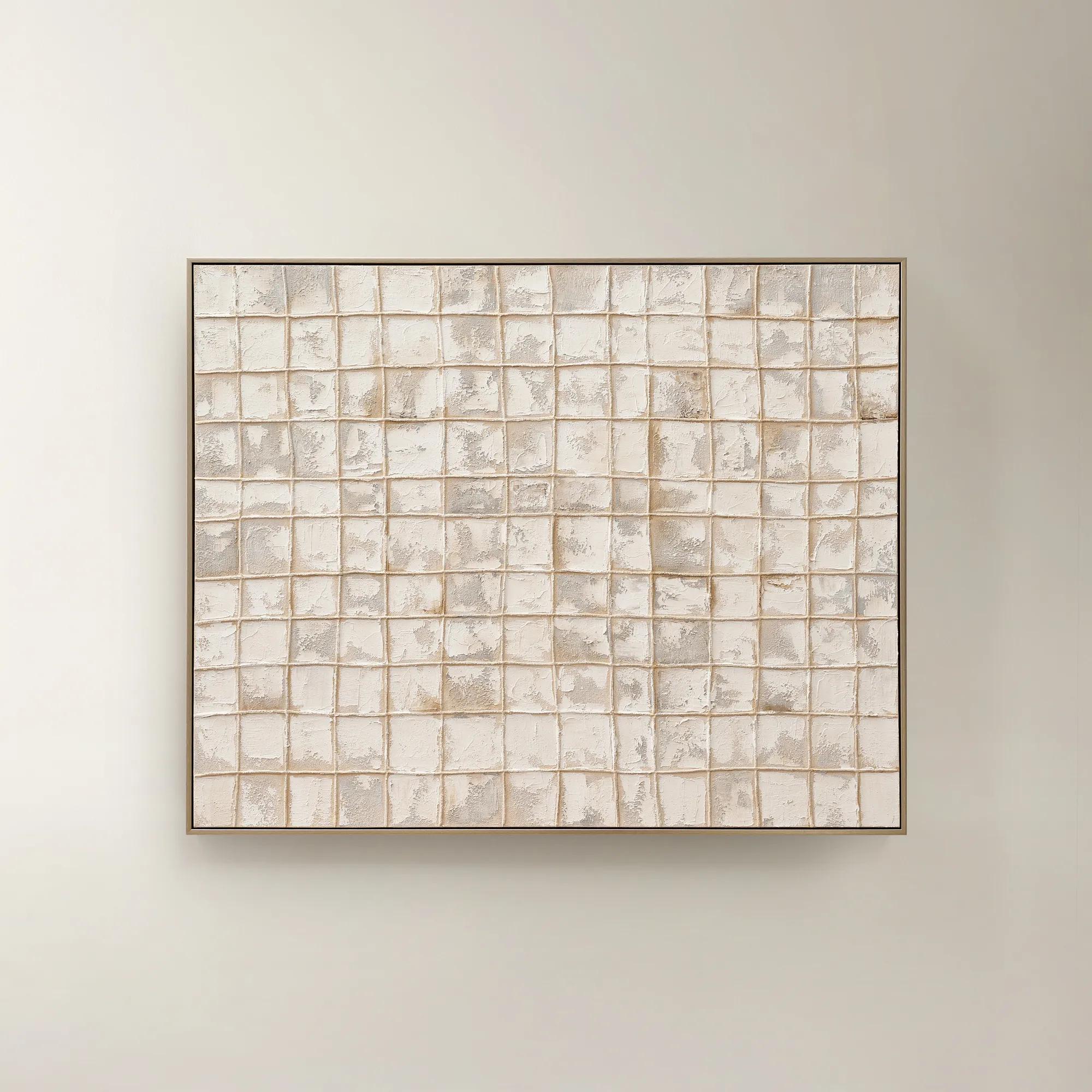 Painted Echos Framed Gold Leaf Wall Art 60" x 48"$699
A hand-painted abstract canvas with gold leaf accents and a champagne frame for modern, versatile display.
Add To Cart -

 Twin Abstract 1 Framed Wall Art 30" x 45"$699
A captivating abstract canvas artwork featuring layered blue and purple tones in a sophisticated framed presentation.
Add To Cart -
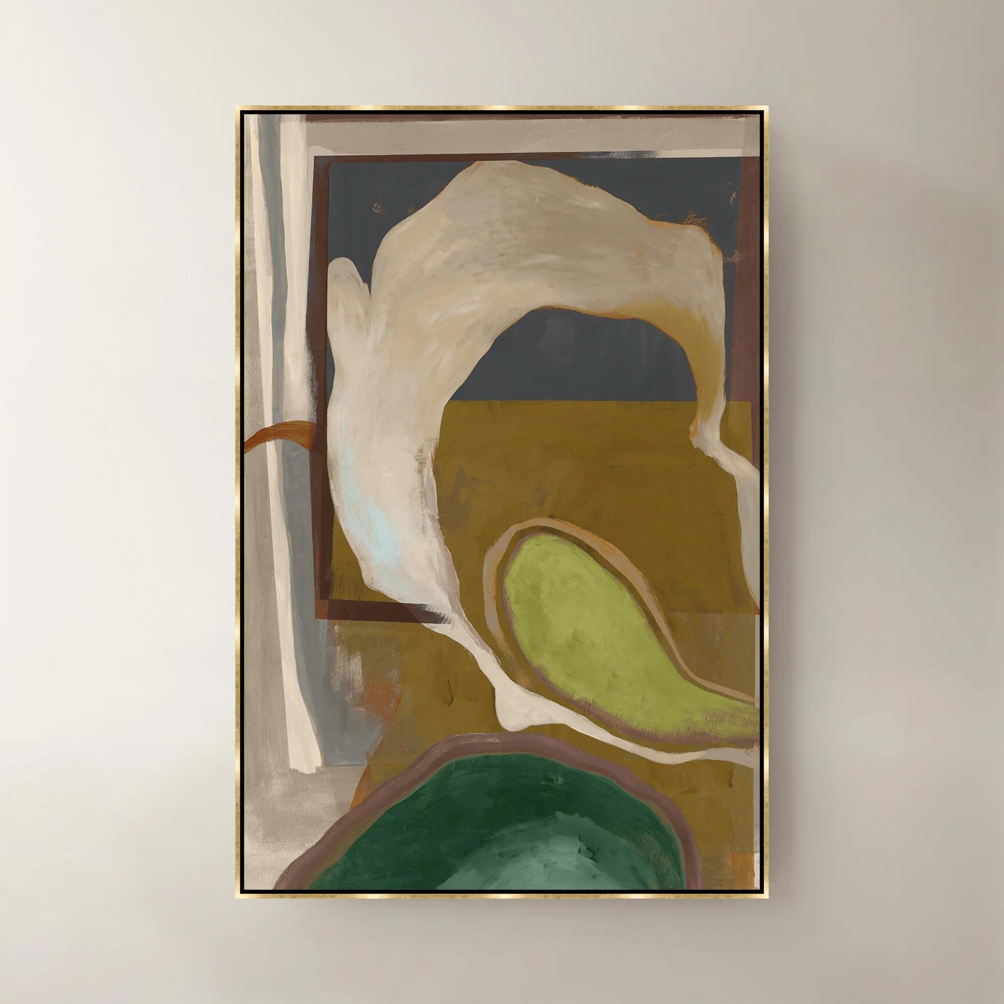 Olive Pearl Framed Wall Art 40"W x 60"$1099
A sophisticated green framed canvas artwork bringing layered color and modern elegance to your walls.
Add To Cart

Graphic Home Office Decor With Checkerboard Style
Graphic home office decor with checkerboard style brings bold pattern and polished contrast to your workspace. Explore a curated selection of modern office accents and furnishings designed to give desks, shelves, and surrounding spaces a distinctly expressive point of view—whether you’re creating a dramatic statement or layering graphic detail into an already refined room.
Graphic home office decor with checkerboard style brings a crisp, artistic rhythm to the room, transforming an everyday workspace into a setting with unmistakable personality. Defined by alternating squares, bold contrast, and a sense of visual order, the checkerboard pattern can feel both timeless and thoroughly modern. Black and white checks create a high-impact foundation, while combinations of cream, charcoal, taupe, sage, rust, or deep berry introduce warmth and dimension without losing the graphic appeal. The beauty of this look lies in its versatility: a checkerboard desk mat can frame the working area with polished pattern, a coordinating organizer can make daily essentials feel intentionally arranged, and graphic wall art can anchor the entire composition above a desk or console. Smaller accents are especially effective for renters, apartment dwellers, students, and anyone who wants to refresh a home office without committing to a complete redesign. They can also make thoughtful gifts for a remote-working friend, a recent graduate, a creative professional, or anyone building a more inspiring work-from-home environment. A patterned accessory tucked beneath a laptop, a framed print placed near a reading chair, or a sculptural decorative object on a bookshelf can lend the room the finished quality of a carefully styled studio. During the cooler months, when more time is naturally spent indoors, these expressive details help a workspace feel less like a temporary corner and more like a personal retreat for correspondence, creative projects, planning, and focused work.
When choosing checkerboard office decor, consider scale first. Large, widely spaced checks make a confident statement and can visually simplify a room, while smaller squares create a more intricate, collected effect. In a compact office, one substantial graphic element may be all the room needs; layering several competing patterns can make the space feel busy and diminish the impact of each piece. A desk mat or textile accent should be sized to complement the proportions of the desktop, leaving enough room for a keyboard, writing materials, and the natural movement of a working day. For wall decor, measure the available area before purchasing and consider how the artwork will relate to shelves, task lighting, and the height of the chair. A balanced arrangement can make even a narrow wall feel deliberate. High-contrast black-and-white checkerboard designs pair beautifully with warm wood tones, brushed metal, smoked glass, and soft neutral walls, allowing the pattern to remain the star while preventing the office from feeling stark. Upholstered seating, woven baskets, and tactile textiles can soften the geometry, while metallic finishes add a touch of glamour to the clean lines. For a more tonal approach, look for checks in layered neutrals or subdued color combinations that echo the room’s existing palette. Material matters, too: smooth finishes sharpen the contemporary mood, woven surfaces add depth, and plush accents bring a note of sumptuous comfort. Before selecting a piece, think about maintenance, durability, glare, and the way natural and artificial light will move across the room. A glossy surface may catch the glow of a lamp beautifully, while a matte finish can create a calmer backdrop for screens and video calls. Thoughtful contrast ensures that the checkerboard motif remains expressive rather than overwhelming.
The most successful graphic home office is not defined by pattern alone; it is shaped by the atmosphere those patterns create around the workday. Begin with a practical foundation, then add visual punctuation where the eye naturally rests: the wall behind a desk, the surface beside a monitor, the open shelf above a filing cabinet, or the corner where a morning coffee is set down. Keep frequently used items within reach, but choose storage and organization pieces that contribute to the composition instead of disappearing into it. A restrained palette helps a dramatic checkerboard element feel considered, while one or two unexpected accents—such as a gleaming metallic detail, a richly colored object, or a softly curved silhouette—can give the arrangement a sense of discovery. This is also where Decor for Stylish Offices can extend the mood with complementary forms, finishes, and accents suited to a polished work environment. Whether the space is a dedicated office, a bedroom alcove, or a shared living area, checkerboard decor offers a way to make functionality feel expressive. It can sharpen a minimalist desk, enliven a traditional setting, or add graphic structure to a room filled with layered neutrals. The result should feel personal rather than overly matched—an office with enough drama to spark ideas, enough order to support concentration, and enough comfort to welcome long afternoons of making, planning, and imagining. With the right balance of contrast, proportion, texture, and purpose, every square becomes part of a larger visual story: a home office that works beautifully and reflects the bold point of view behind it.
FAQs
Graphic home office decor with checkerboard style brings bold, geometric contrast into the workspace through pieces such as rugs, wall art, desk accessories, lamps, and accent furniture. The signature grid pattern creates a polished, editorial mood while giving the room an artful foundation.
Begin with one statement checkerboard piece, such as a dramatic area rug or graphic artwork, then layer in refined accents that echo its tones. Sleek silhouettes, gleaming metallic finishes, sculptural lighting, and plush upholstery create a sophisticated composition without overwhelming the room.
Classic black and white checkerboard patterns pair beautifully with jewel tones, warm woods, polished brass, chrome, and saturated shades such as emerald, cobalt, or burgundy. For a softer interpretation, combine the graphic pattern with ivory, taupe, blush, or smoky gray.
Yes. Checkerboard details can bring expressive contrast to contemporary, glam, eclectic, art deco, and transitional home offices. Choose crisp monochrome patterns for a sleek look, softened tones for understated elegance, or high-contrast accents for a room that embraces drama.
Repeat the checkerboard motif thoughtfully across one or two complementary details while keeping the surrounding pieces textural and refined. Balance the pattern with solid upholstery, sculptural forms, layered lighting, and curated accessories to create a workspace that feels intentional, artistic, and unmistakably yours.