Contemporary Gold And White Wall Art Sets
Contemporary Gold And White Wall Art Sets
-
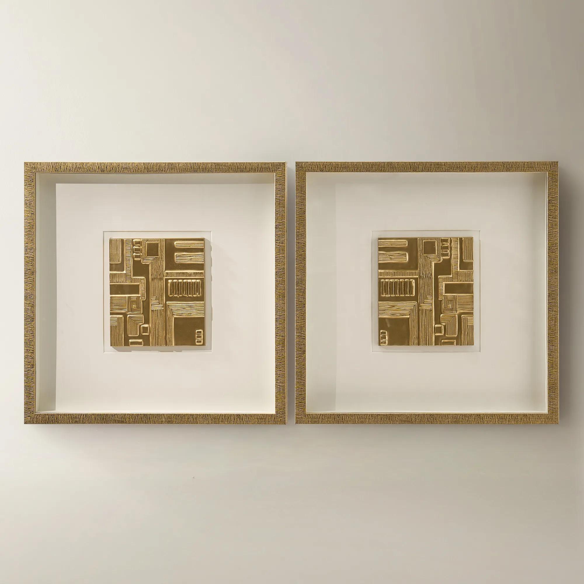
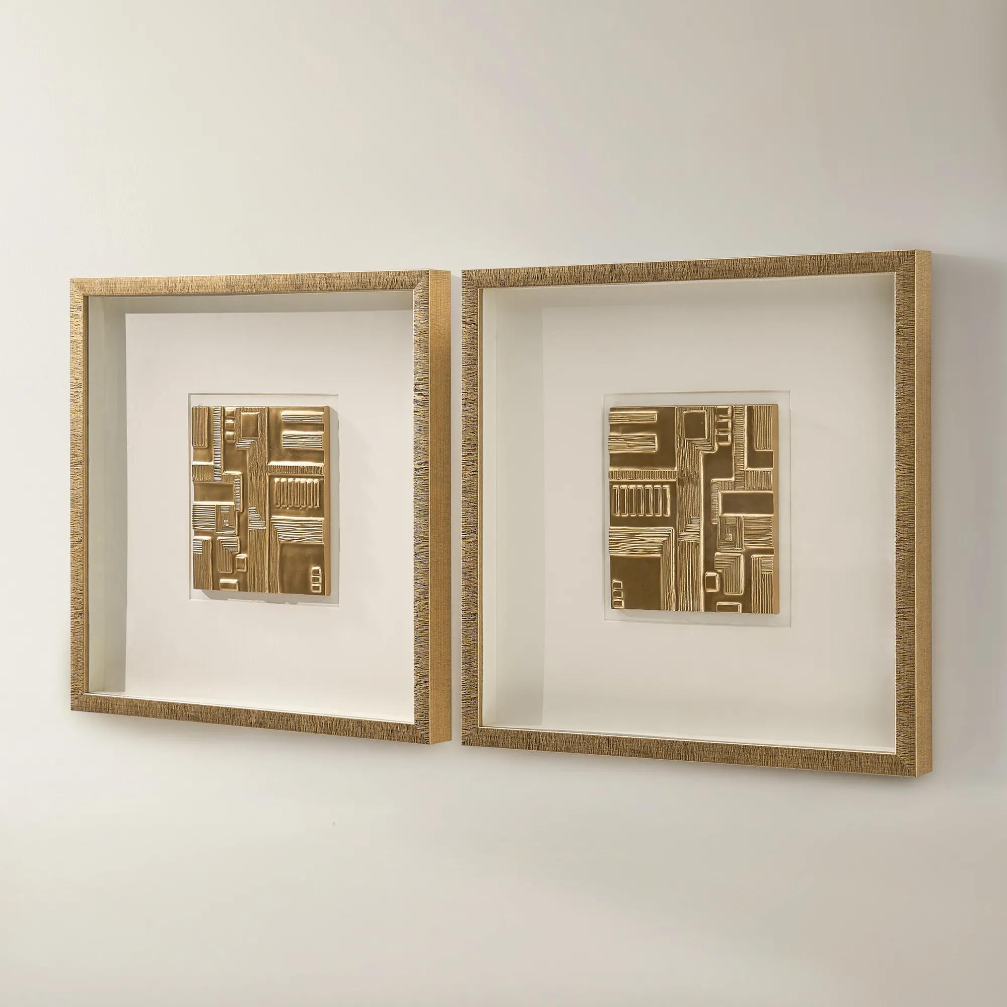 Ritual Framed Woodcarving Wall Decor Set of 2$329
A set of two gold-framed woodcarvings with ivory mats and dimensional relief for gallery-style wall decor.
Add To Cart -
 Etched in Gold$229
A hand-carved gold copper artwork set in a sleek black alloy frame for modern contrast.
Add To Cart -
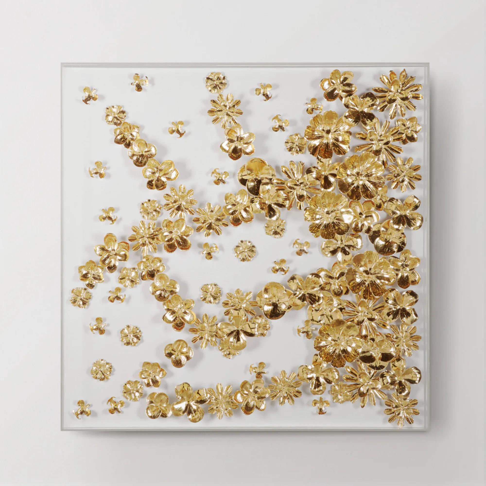
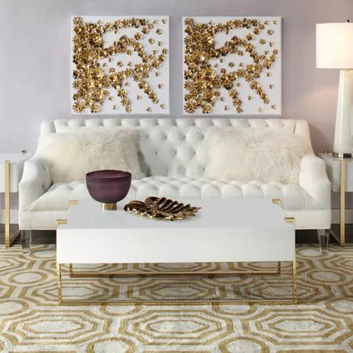 Gold Flora Handmade Foil Wall Decor in Acrylic 31" x 31"$499
A glam botanical wall art featuring handmade gold foil paper flowers on a white linen background.
Add To Cart -
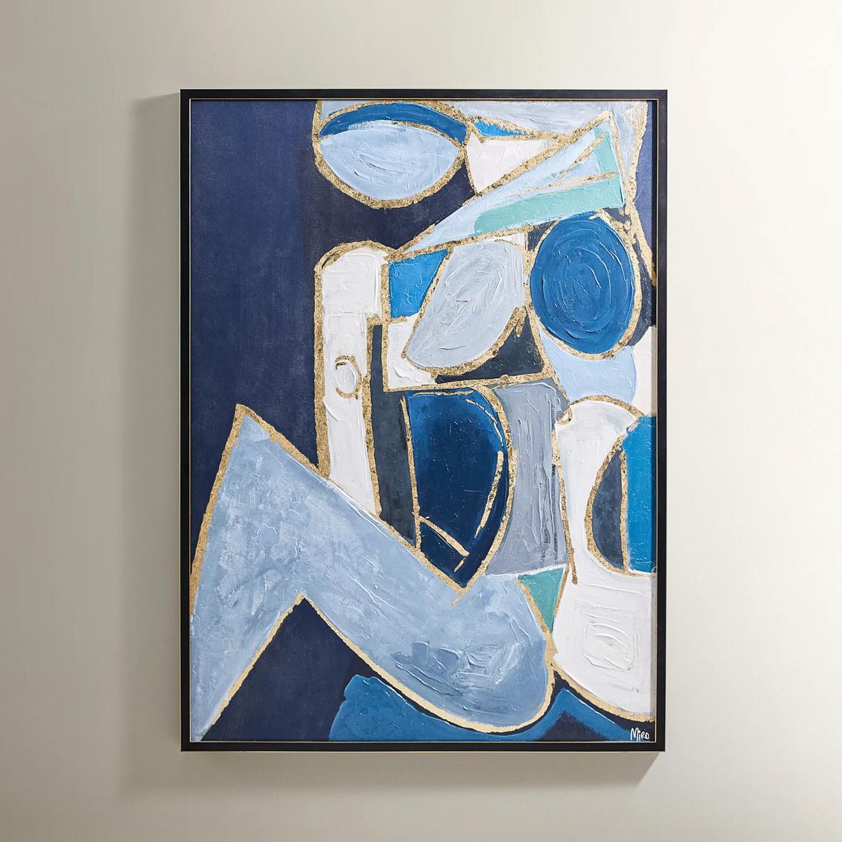
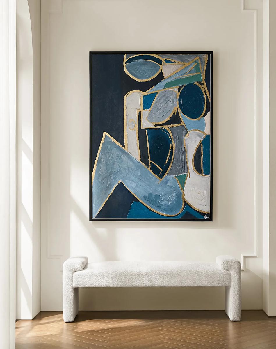 Figure in Cubism Painting$599
A hand-embellished canvas artwork featuring blue, gold, and white hues with elegant silver foil accents.
Add To Cart -
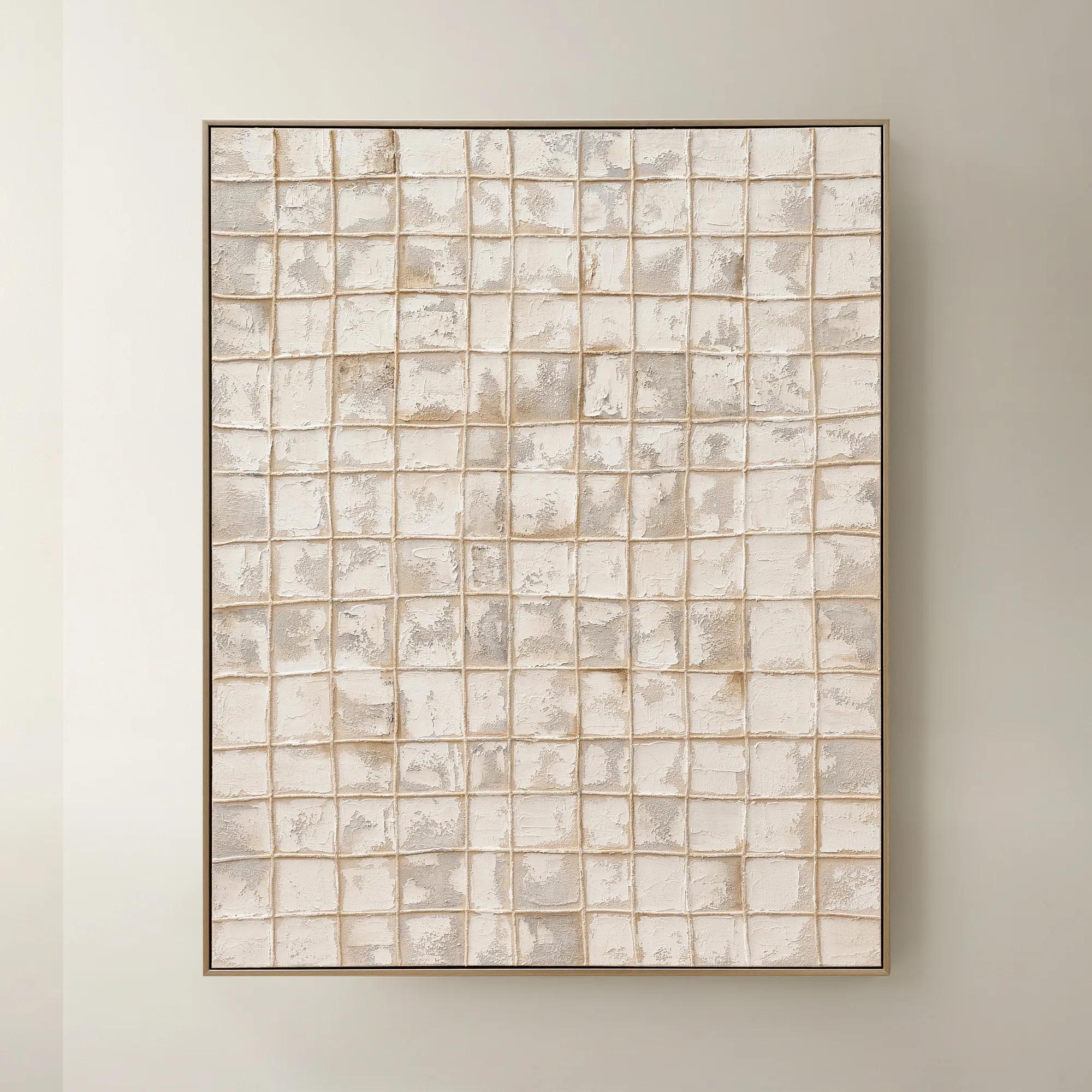
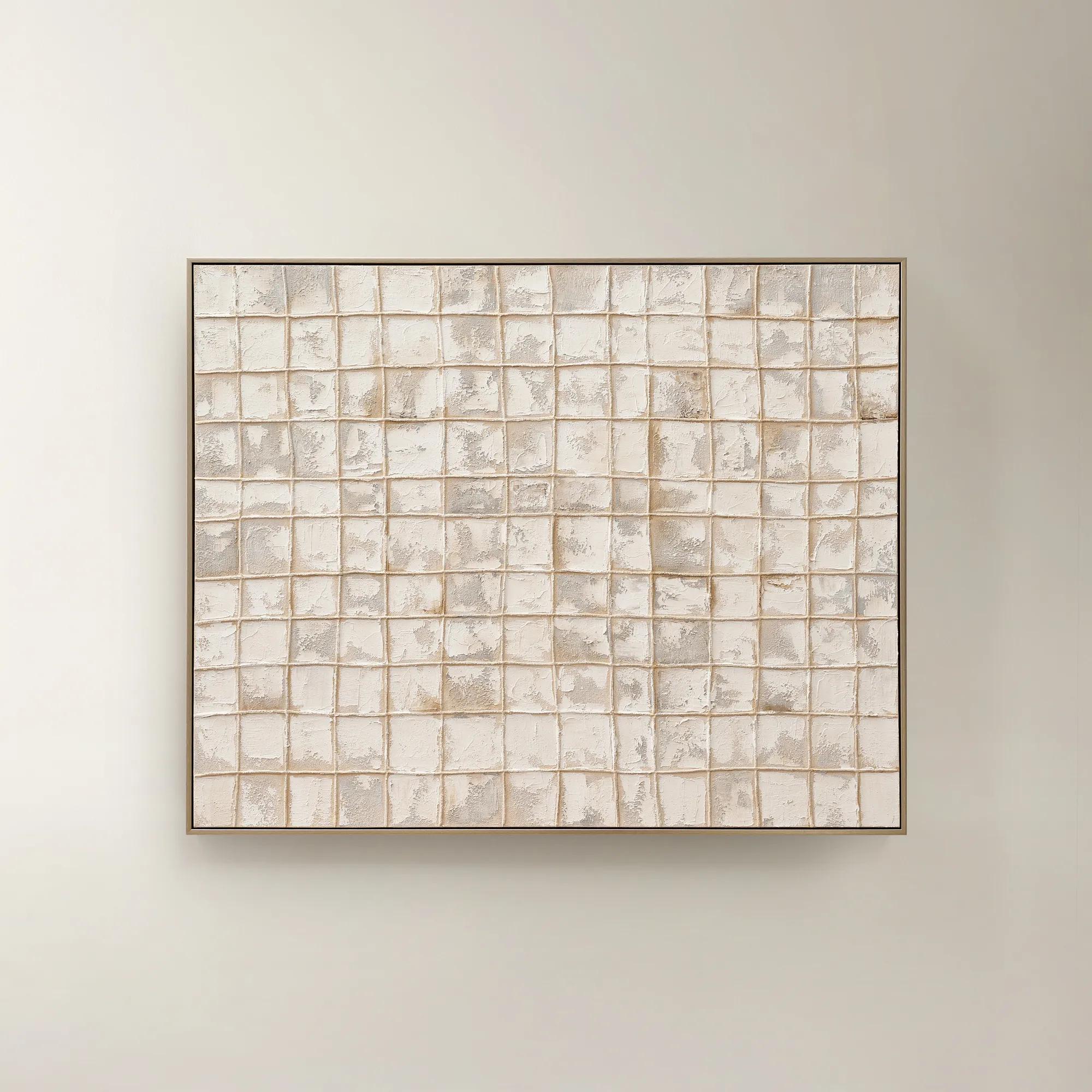 Painted Echos Framed Gold Leaf Wall Art 60" x 48"$699
A hand-painted abstract canvas with gold leaf accents and a champagne frame for modern, versatile display.
Add To Cart -
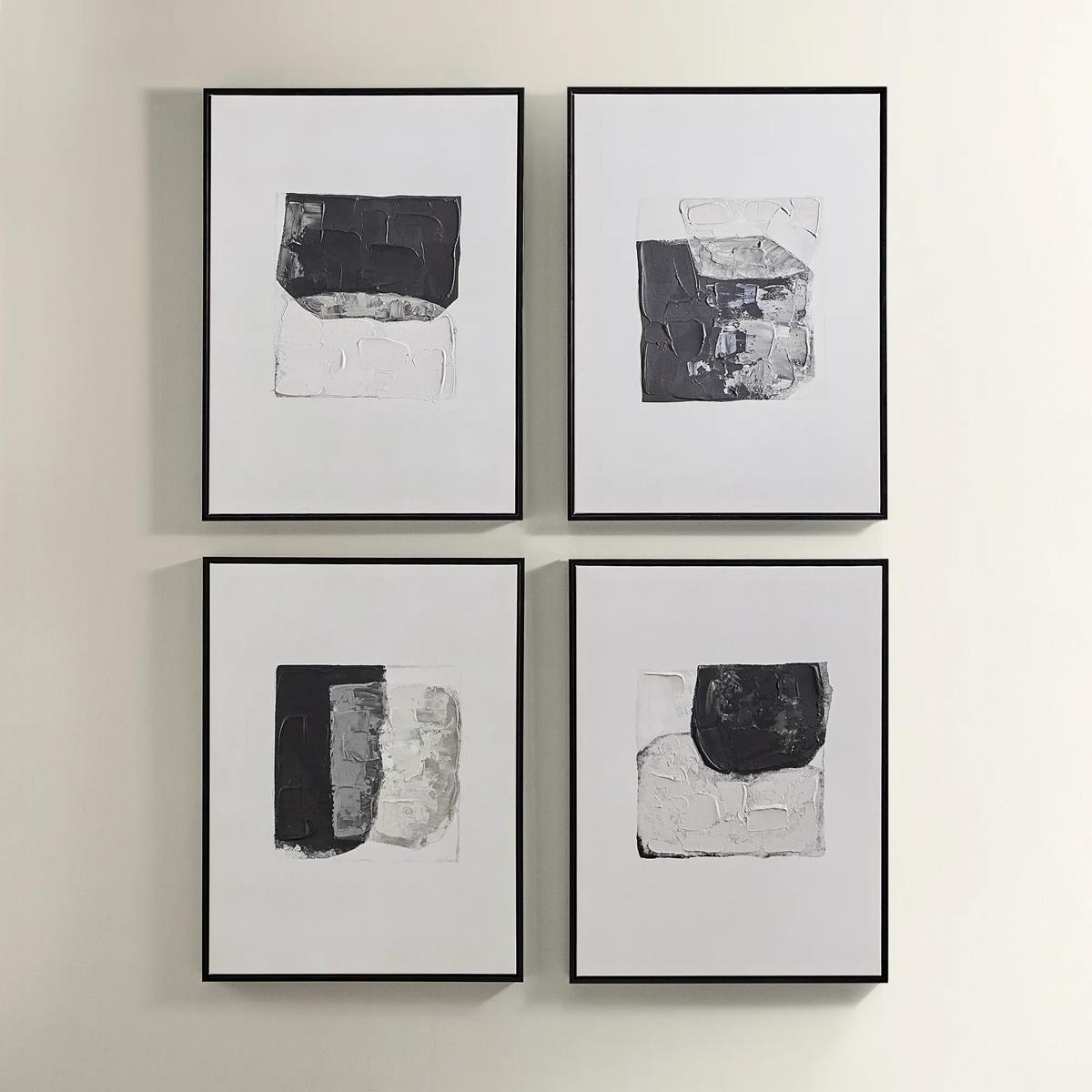
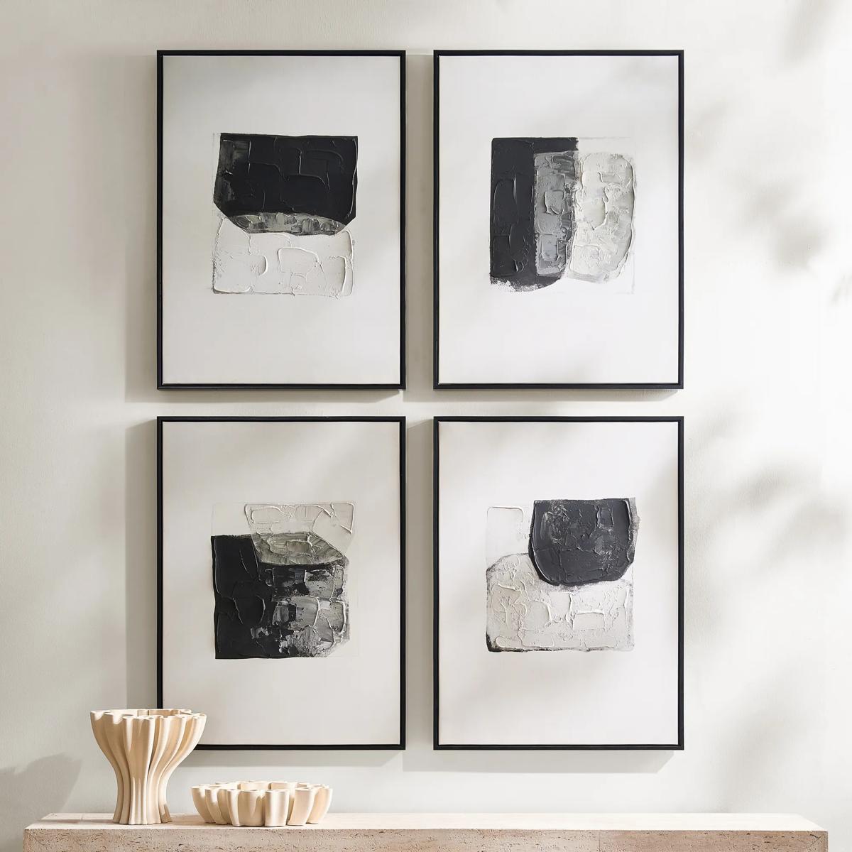 Shadows Framed Painted Wall Art Set of 4$299
A set of four hand-painted abstract canvases featuring black, white, and gold accents in black frames.
Add To Cart -
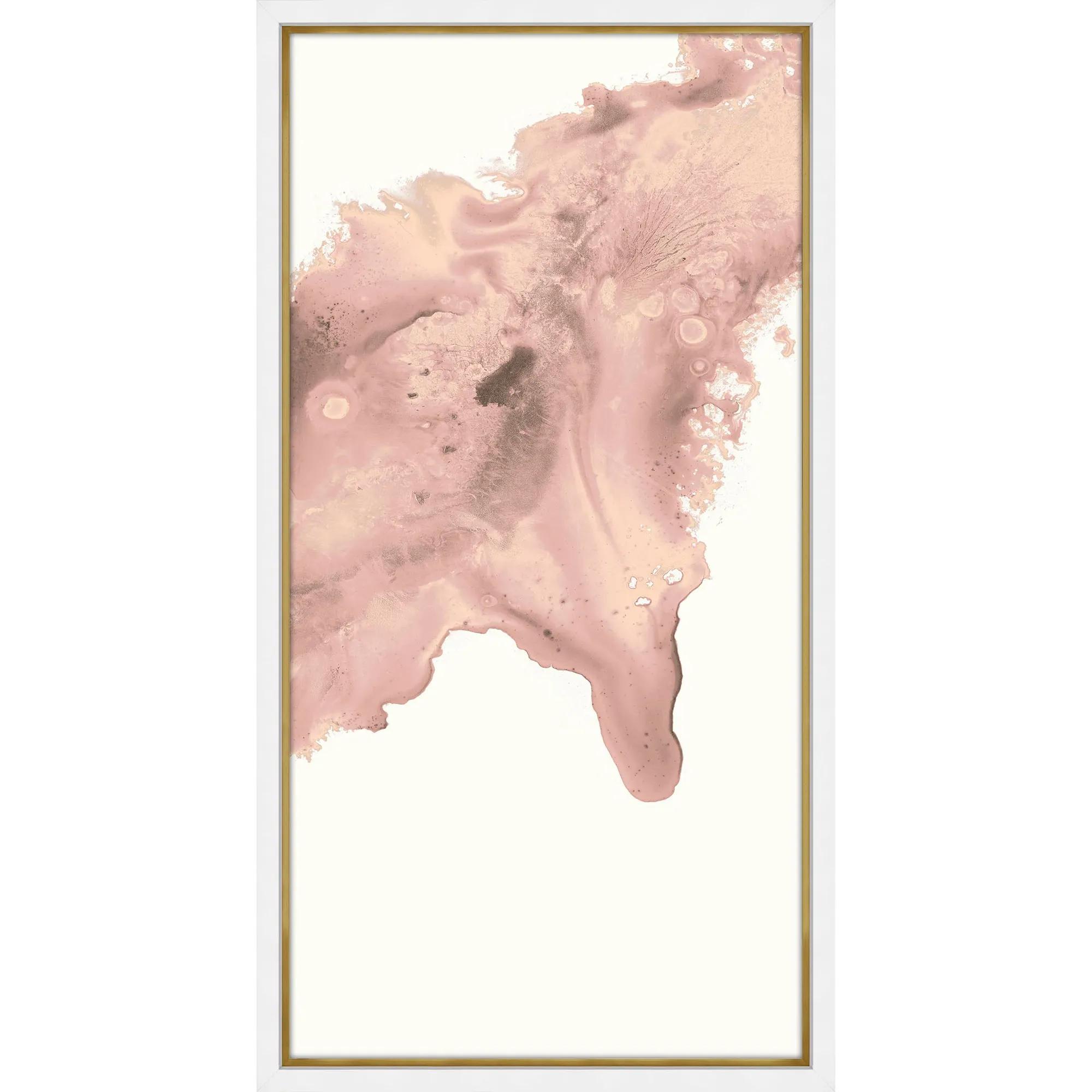
 Blush Conduit 2 Framed Wall Art 24" x 48"$849
A striking abstract print on pearl paper, elegantly framed in gold and matte white for modern appeal.
Add To Cart -
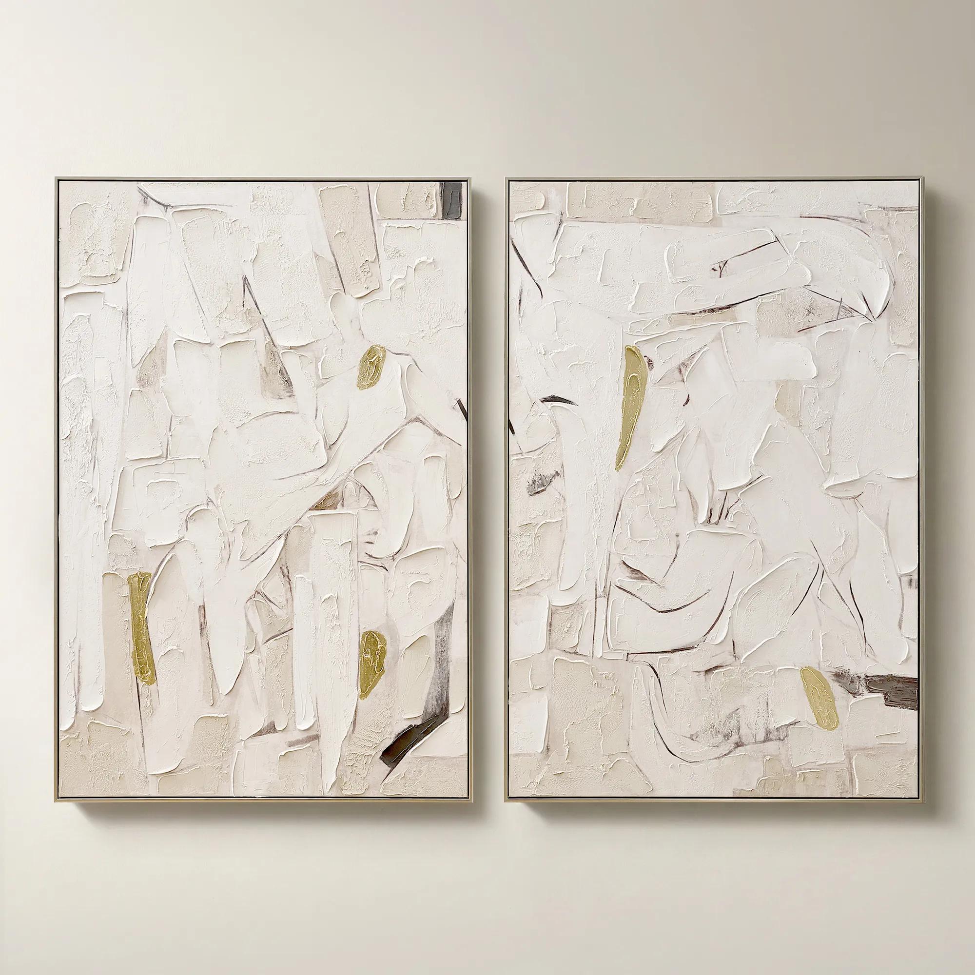 Beneath the Surface Framed Gold Leaf Painted Wall Art 40" x 60" Set of 2$799
A hand-painted abstract diptych featuring gold detailing and layered texture in alabaster and tawny hues.
Add To Cart -
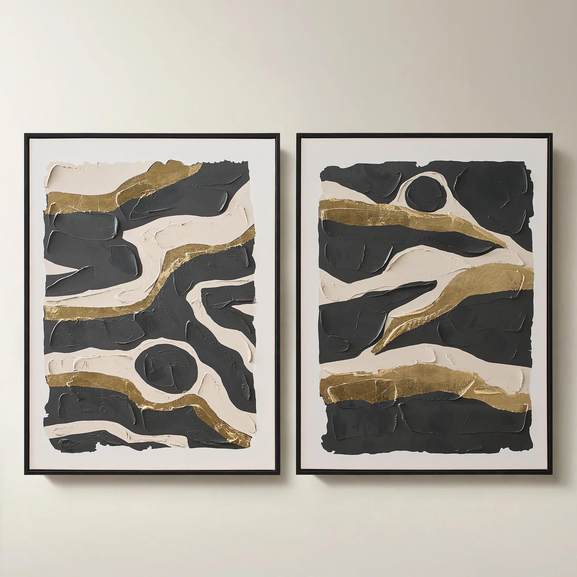
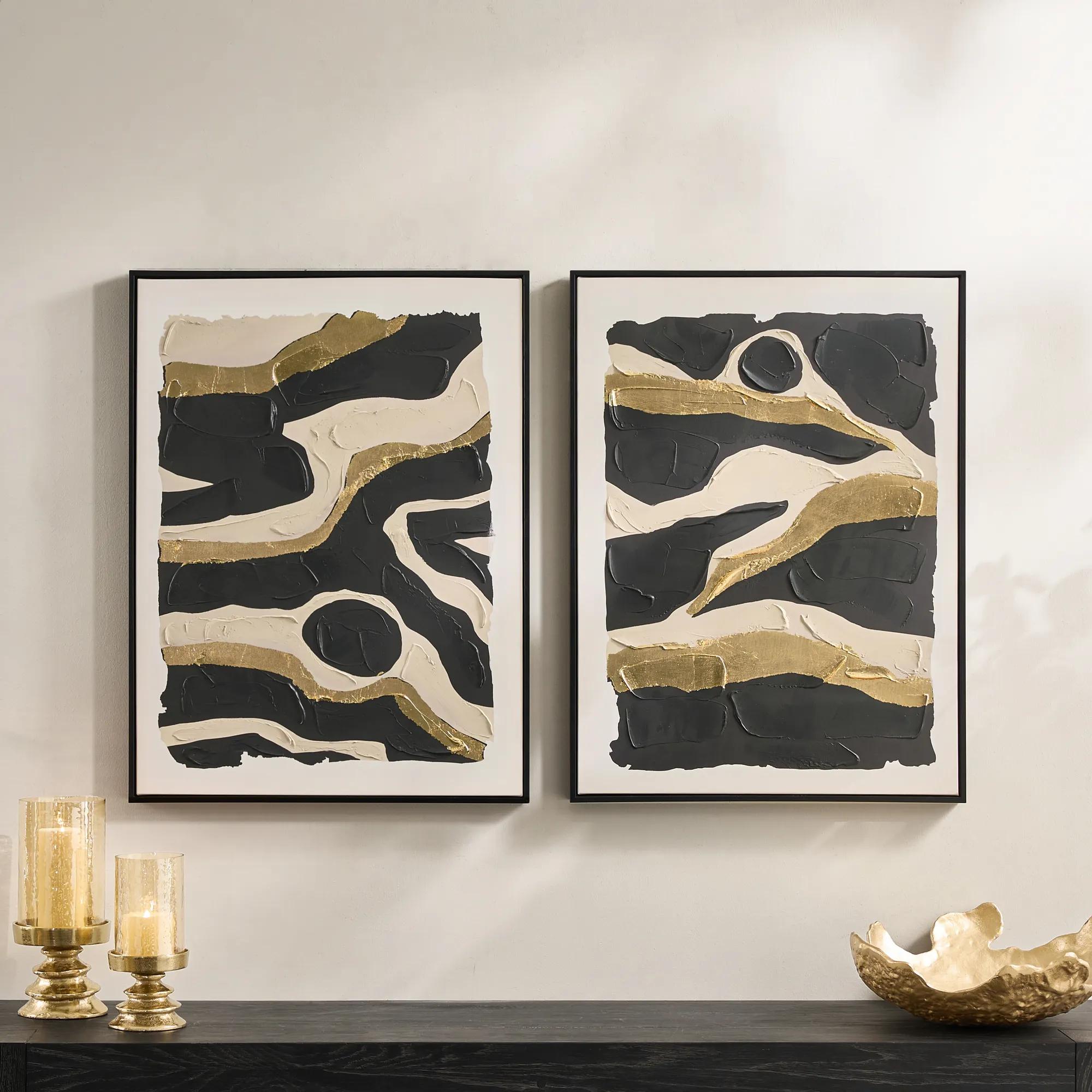 Untamed Framed Gold Leaf Painted Wall Art 24" x 32" Set of 2$199
A hand-painted diptych featuring abstract black and gold canvas art with expressive, gallery-inspired energy.
Add To Cart -
 Etched in Silver$229
An abstract hand-carved aluminum wall art featuring shimmering silver tones in a modern black alloy frame.
Add To Cart -
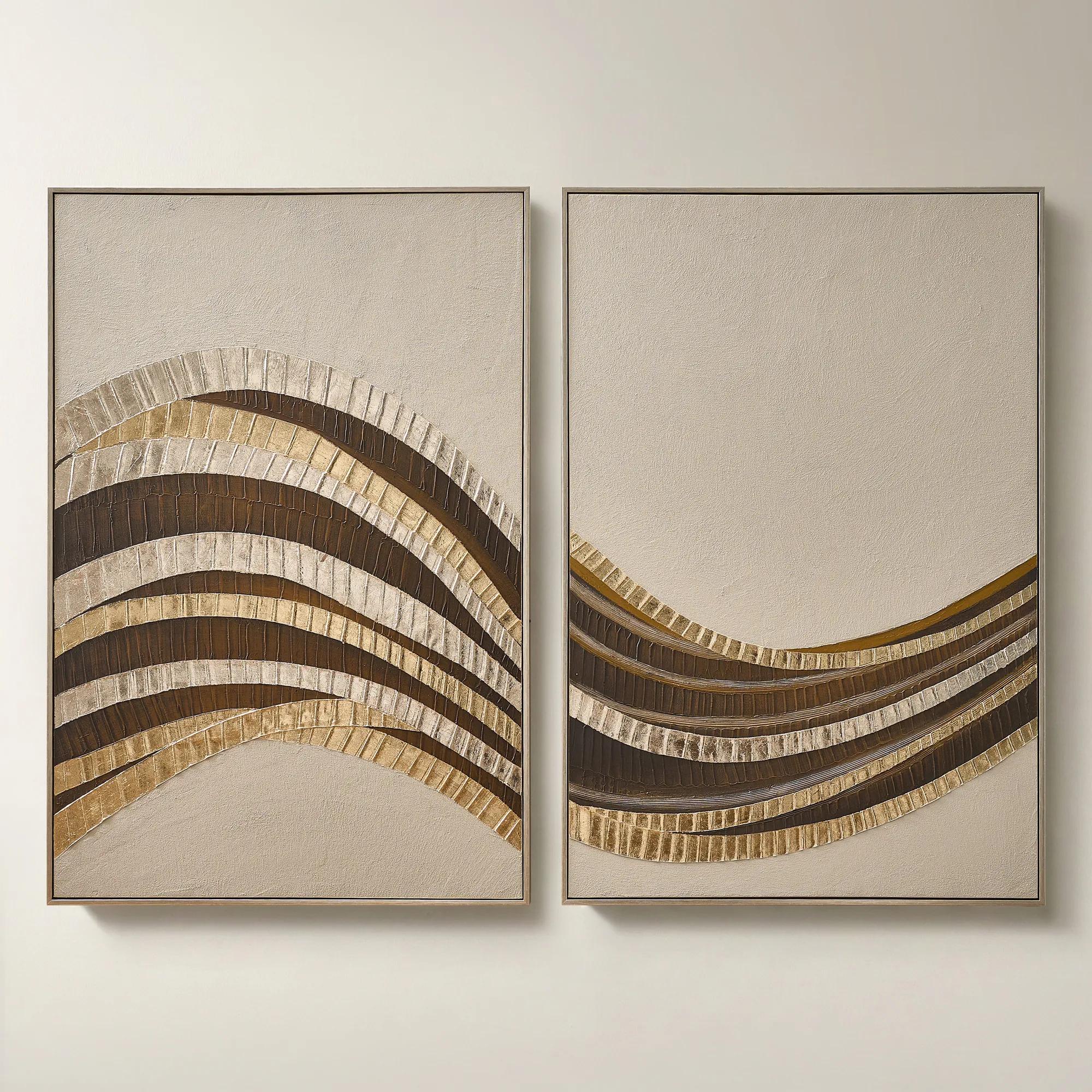 Stillness in Motion Framed Gold Leaf Painted Wall Art 40" x 60" Set of 2$899
A hand-painted abstract diptych with gold leaf accents, textured surface, and brushed champagne frames.
Add To Cart -

 Zebra Pop Framed Painted Wall Art 36" x 48"$449
A bold black painted canvas artwork in a sleek frame, bringing graphic energy to modern interiors.
Add To Cart -
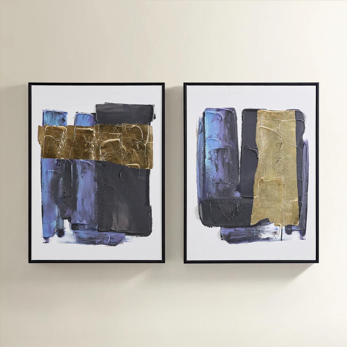
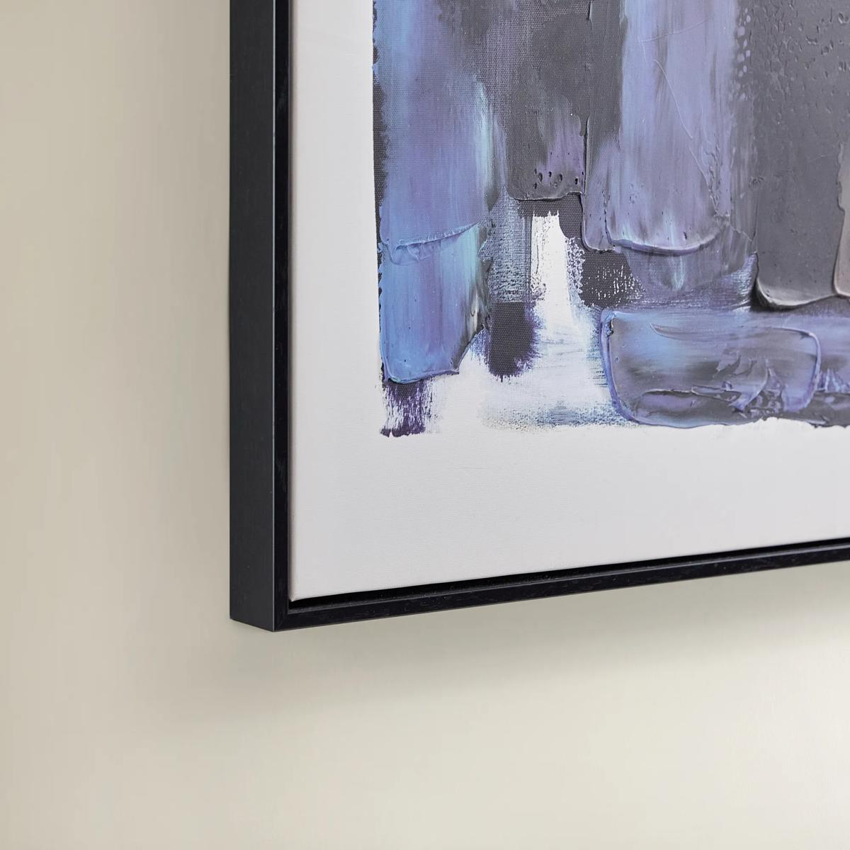 Deep Thoughts Gold Leaf Painted Wall Art Set of 2$199
A set of two hand-painted abstract canvases in blue and gold leaf, framed in sleek black.
Add To Cart -
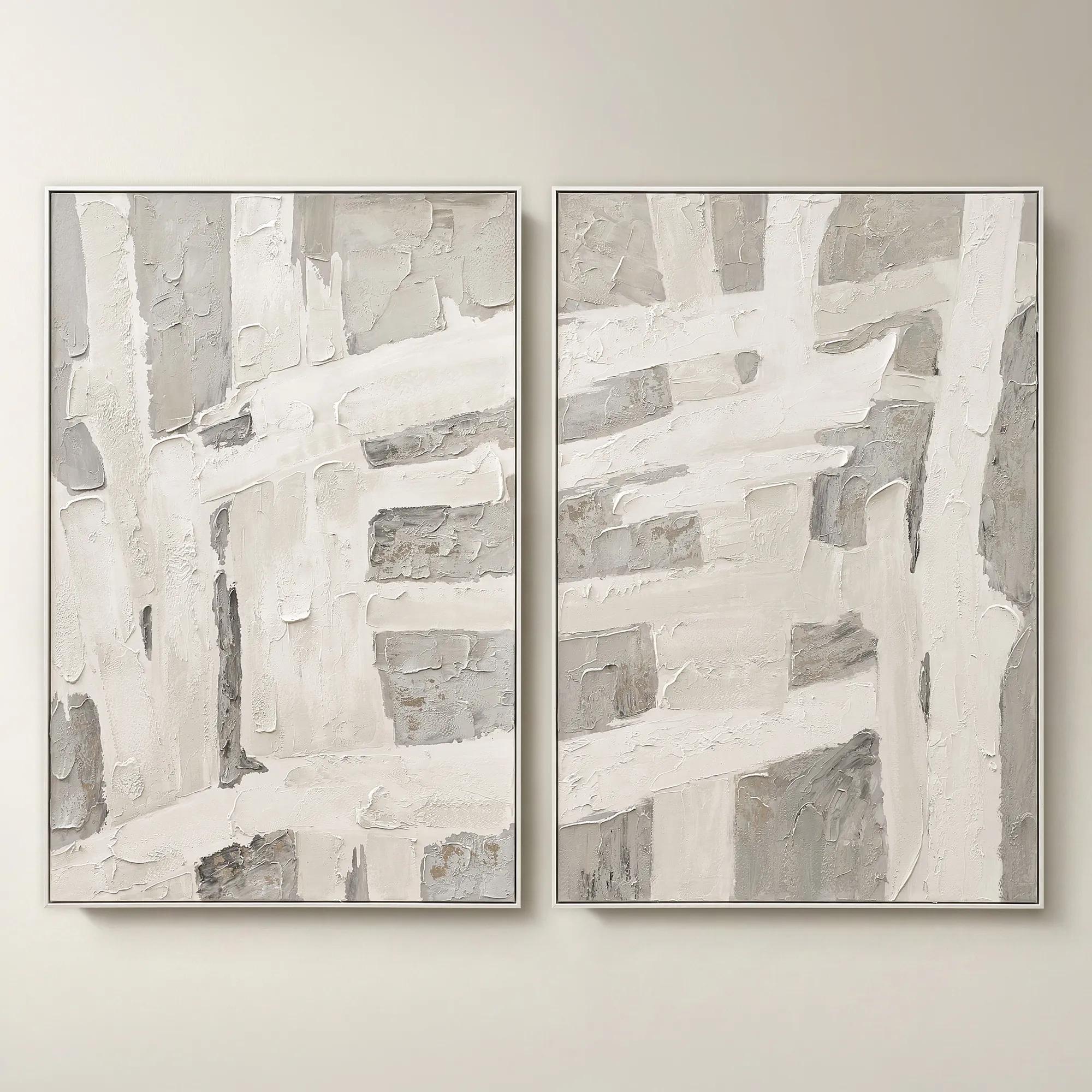 Traverse Framed Painted Wall Art 40" x 60" Set of 2$799
A hand-painted abstract diptych features champagne accents and soft grey, pearl, and alabaster tones in white frames.
Add To Cart -
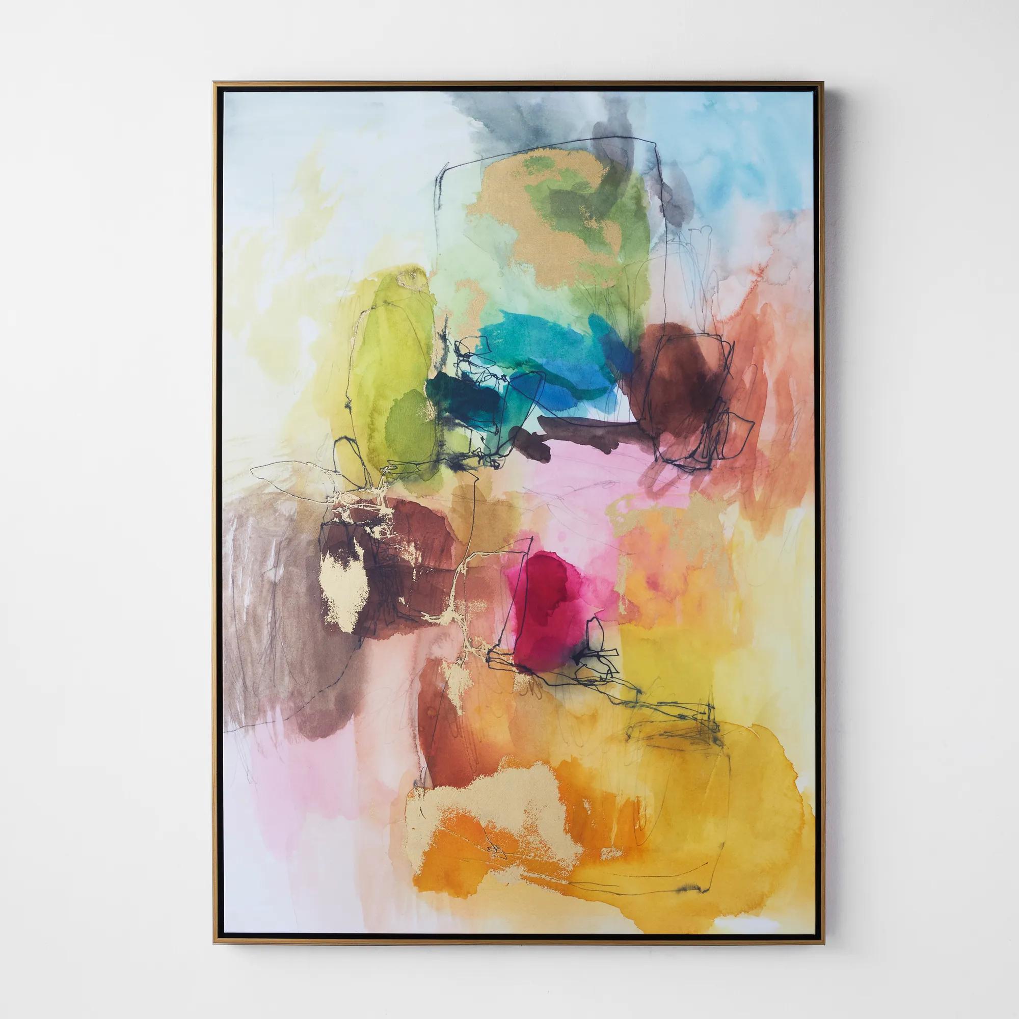 Apricity 3 Framed Wall Art 41" x 58"$899
A vibrant giclee on canvas featuring hand-applied gold gilding and a gold floater frame.
Add To Cart -
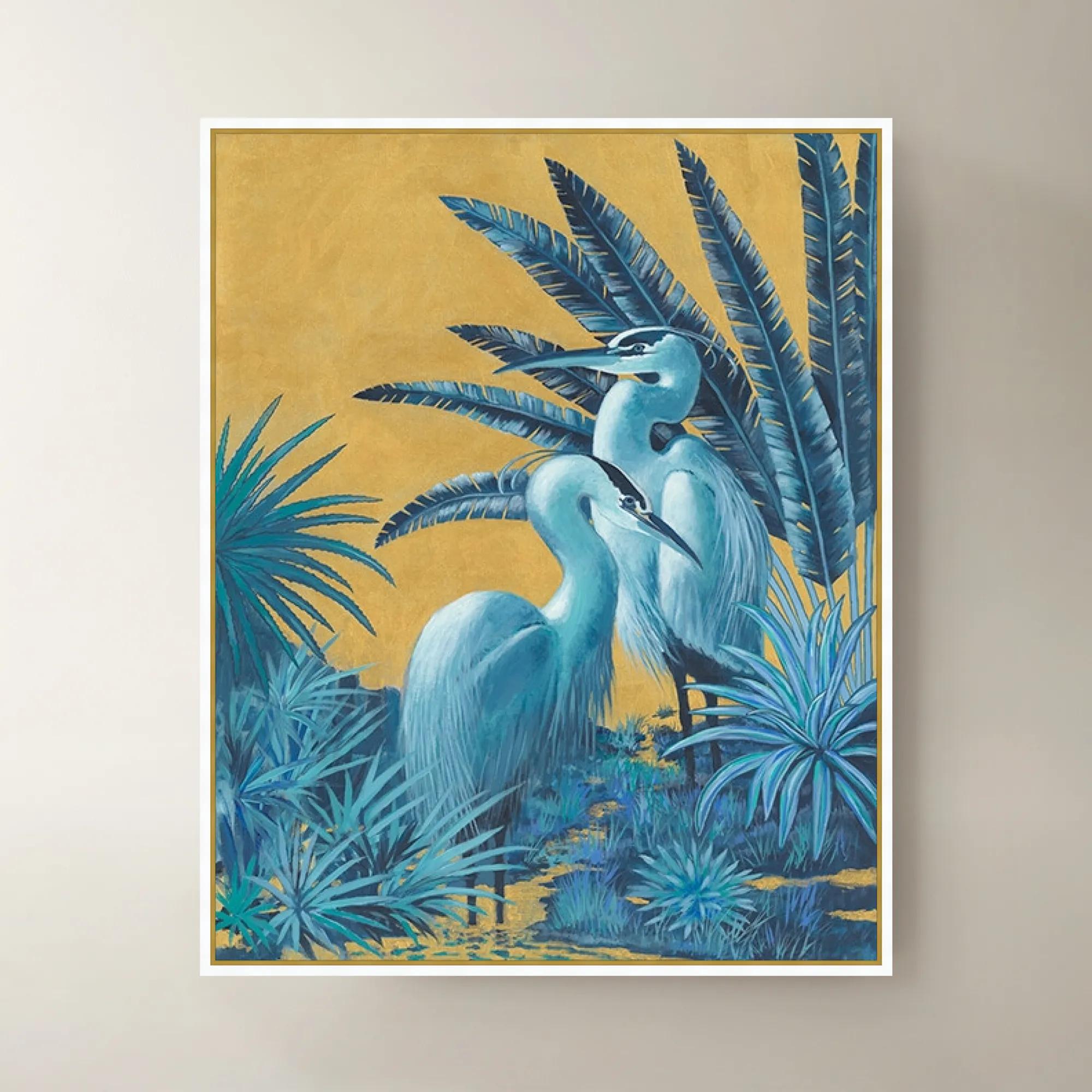
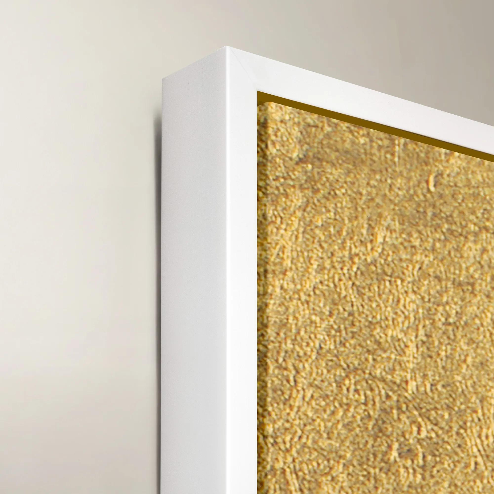 Blue Gold Herons Framed Wall Art 40" x 50"$1199
A striking blue and gold framed canvas artwork featuring elegant herons for sophisticated wall display.
Add To Cart -
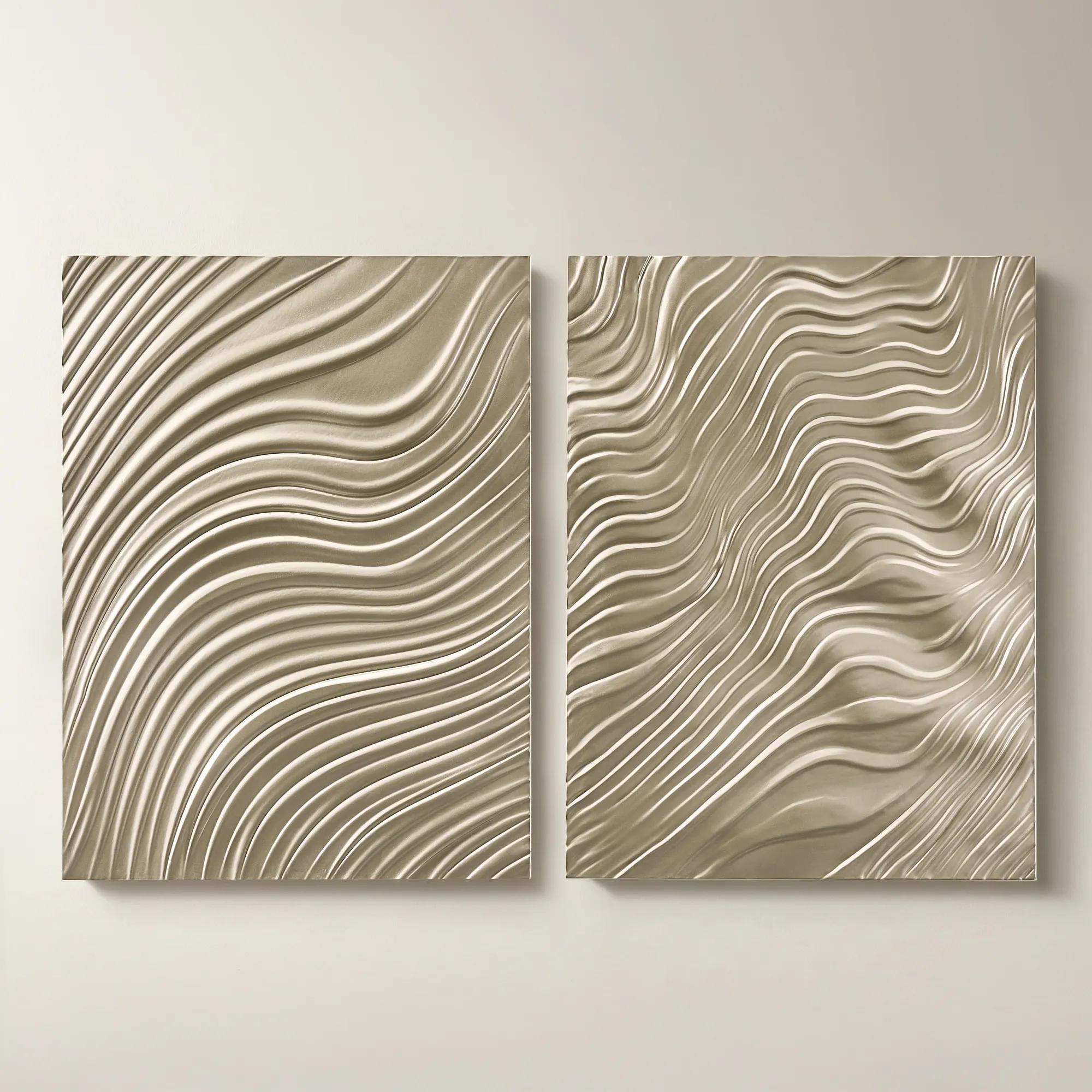
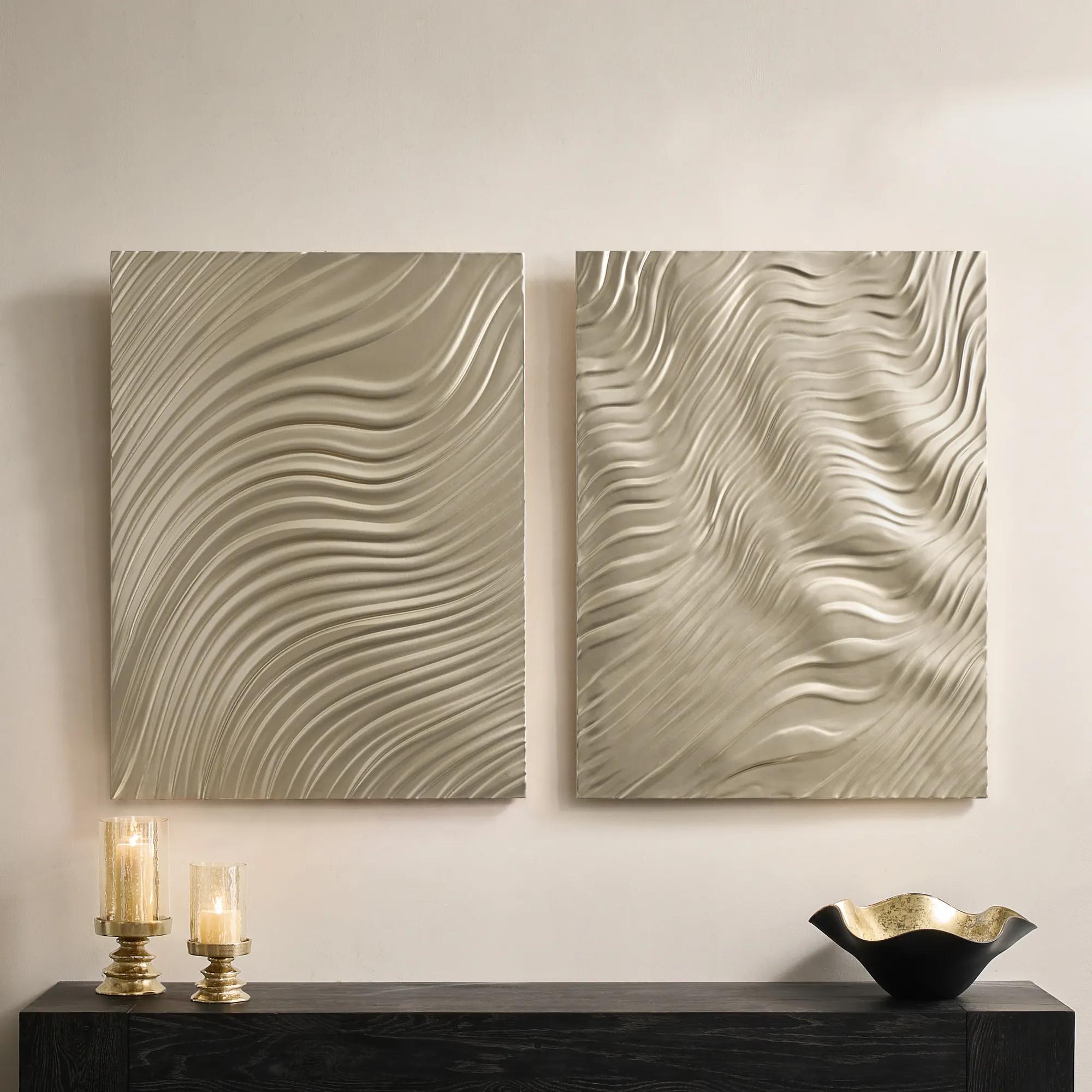 Mirage Champagne Carved Wood Wall Panels 30" x 40" Set of 2$799
A set of two intricately carved wood composite panels in a champagne finish with flowing 3D patterns.
Add To Cart -
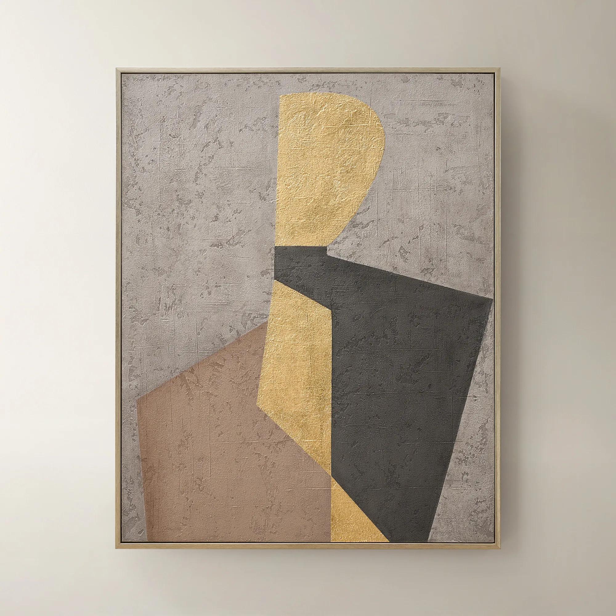 Aura of Gold Framed Painted Wall Art 40" x 50"$399
A hand-painted canvas with champagne leafing and a brushed champagne frame in mocha, grey, black, and gold.
Add To Cart -
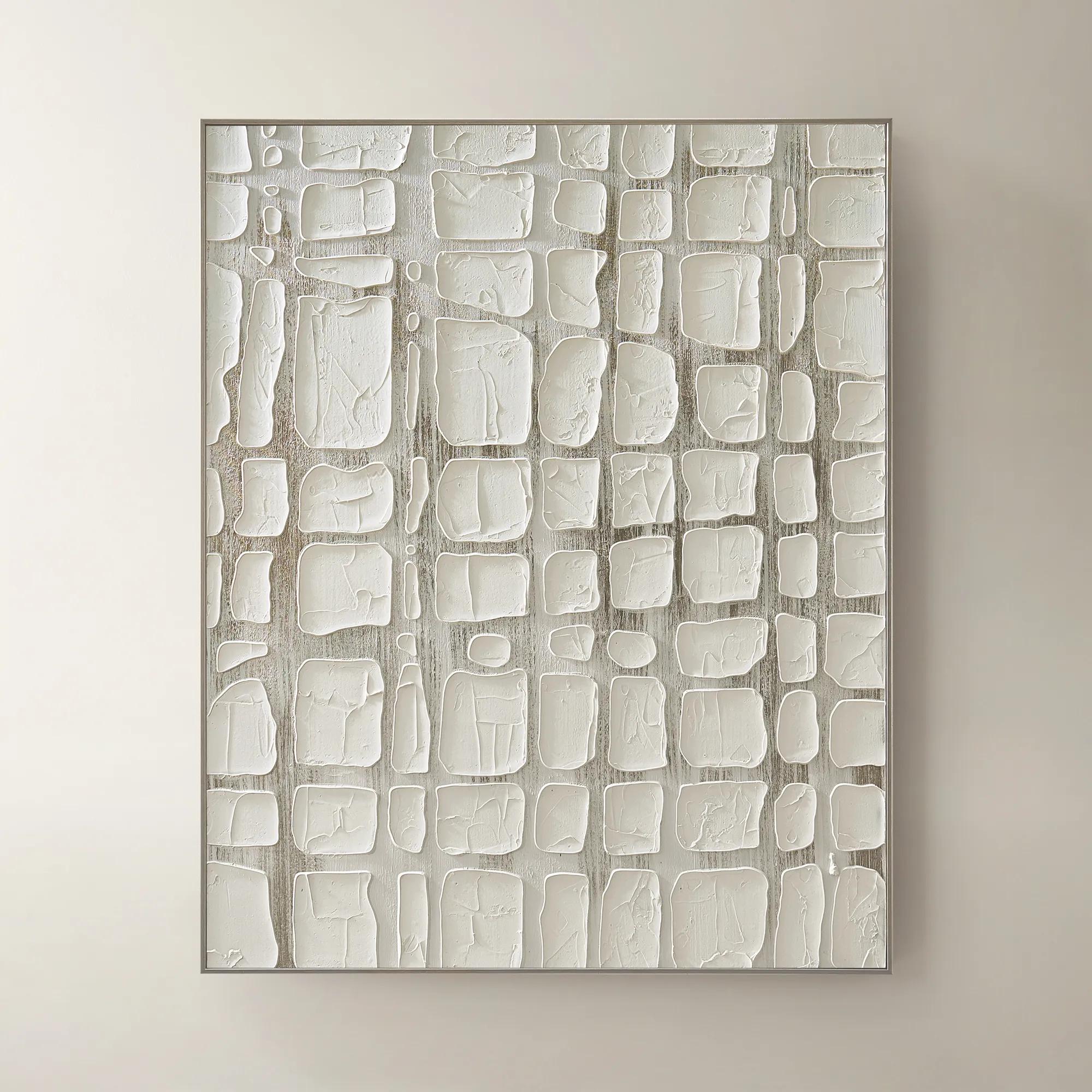
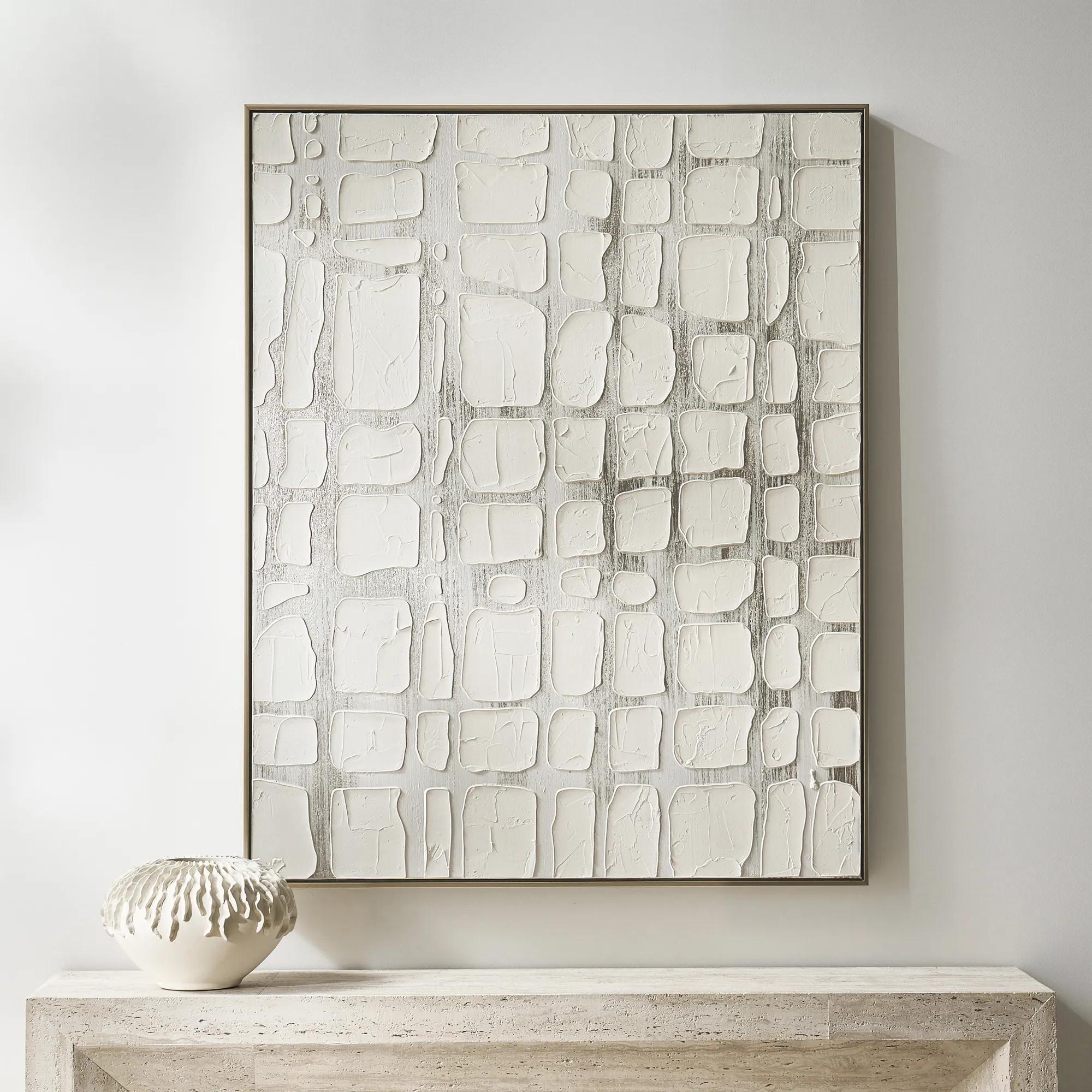 Vanish Framed Painted Wall Art 40" x 50"$499
A hand-painted canvas with raised white forms over champagne metallic ground in a refined floater frame.
Add To Cart -
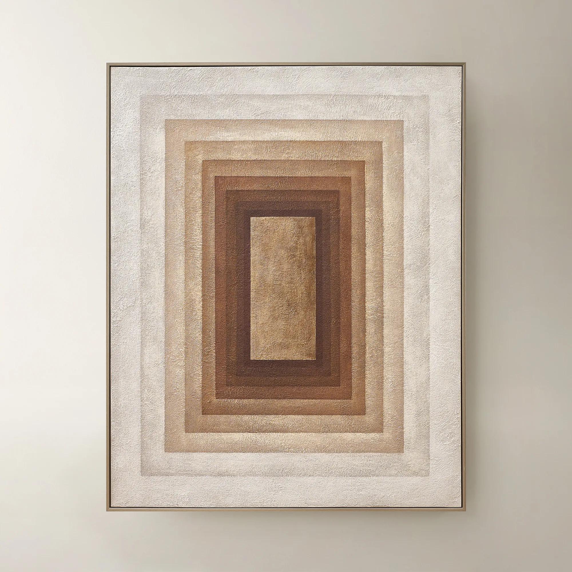 Monochrome Drift Framed Painted Wall Art 60" x 48"$699
A hand-painted abstract canvas with champagne leafing, featuring cocoa and gold tones in modern geometric design.
Add To Cart -

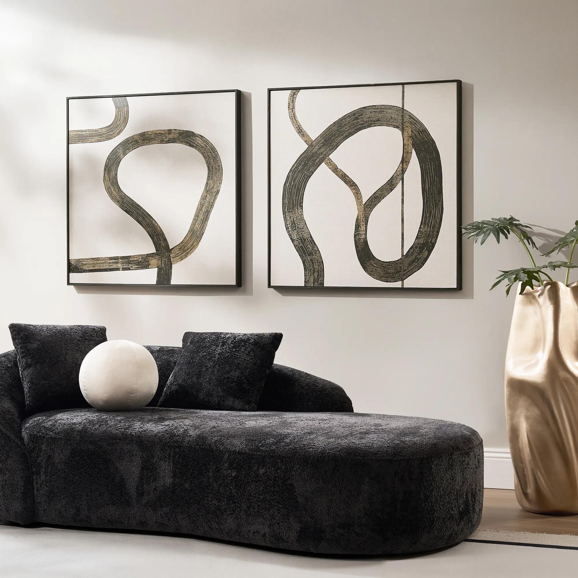 Live Wire Framed Gold Foil Painted Wall Art II 39" x 39"$349
A framed wall artwork featuring gold foil-painted detailing for glamorous modern display.
Add To Cart -
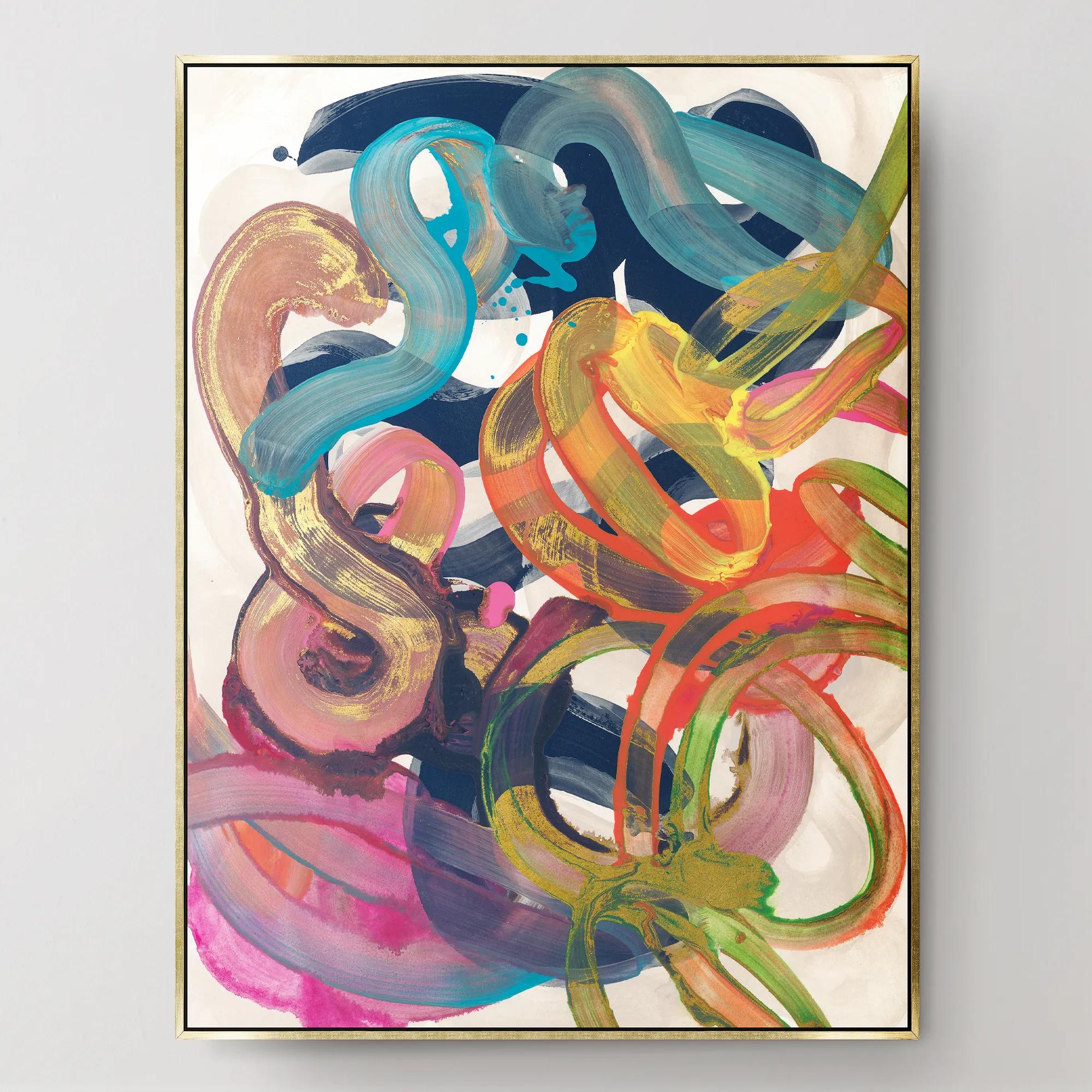
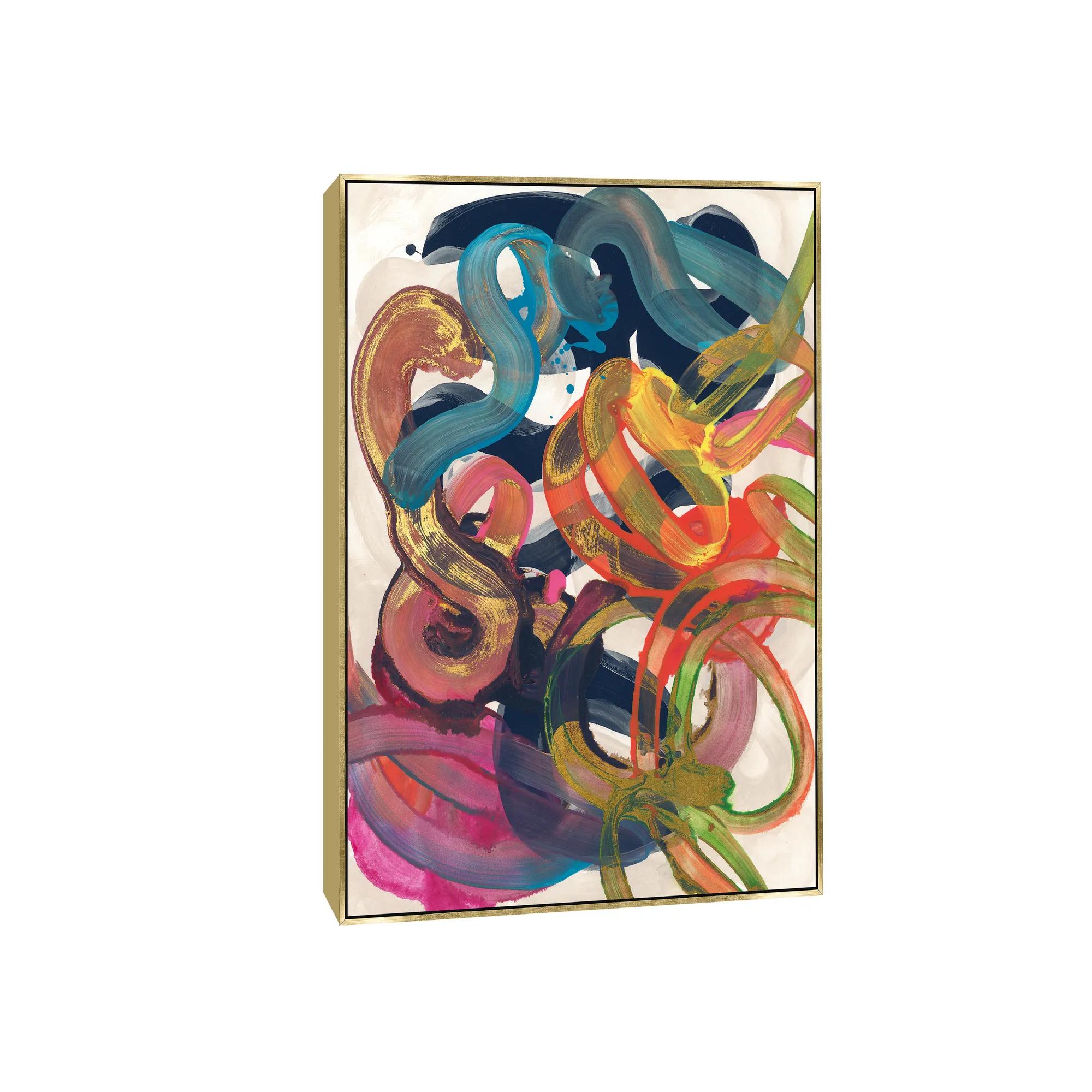 Illogical Conclusions Framed Wall Art 26" x 35"$499
A gallery-wrapped canvas artwork with a hand-applied gel finish, set in a gold float frame.
Add To Cart -

 Tribe V Framed Wall Art 24" x 28"$599
A striking contemporary art piece designed by acclaimed interior designer Nikki Chu.
Add To Cart -
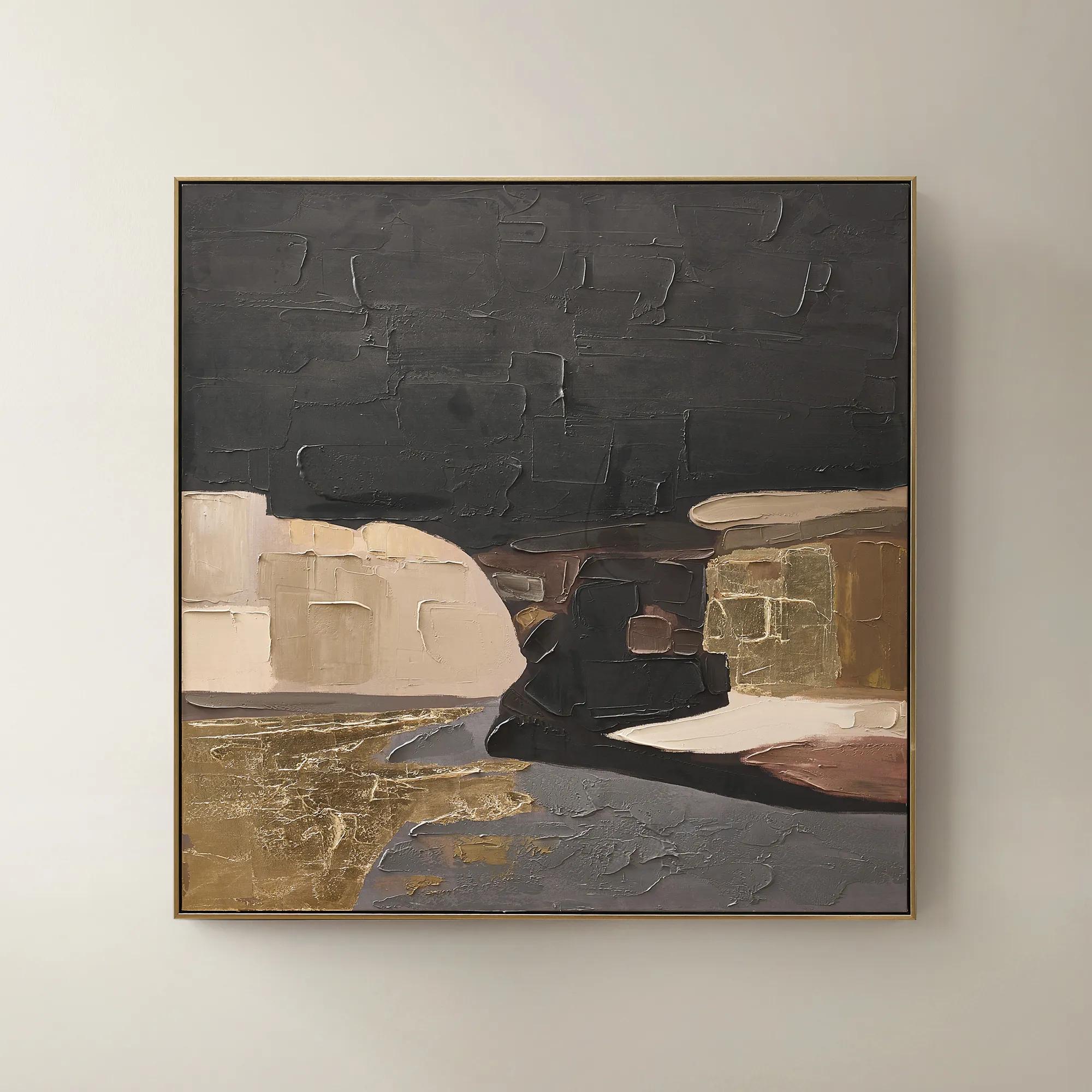 Obscured Light Framed Gold Leaf Painted Wall Art 48" x 48"$499
A hand-painted canvas with gold leaf accents and a black-gold frame in dramatic neutral tones.
Add To Cart

Contemporary Gold And White Wall Art Sets
Contemporary gold and white wall art sets are the ultimate expression of modern opulence—where luminous metallics meet crisp, gallery-inspired whites to create a canvas that dazzles with every glance. These curated ensembles transform blank walls into breathtaking focal points, infusing any space with radiant warmth and chic sophistication. Whether you’re orchestrating a serene sanctuary or a daring living room vignette, each set invites you to celebrate contrast, texture, and the art of bold self-expression. Elevate your interiors with pieces that don’t just decorate, but define—turning every wall into a masterpiece of contemporary glamour.
Contemporary gold and white wall art sets bring coordinated color, luminous accents, and a sense of composition to modern interiors. Typically arranged as diptychs, triptychs, or larger groupings, these sets use multiple panels to create a single visual statement. White introduces breathing room, while gold adds warmth and definition through expressive brushwork, geometric lines, metallic details, or sculptural texture. The result can feel serene or theatrical, depending on the balance of color, contrast, and movement. Broad fields of ivory with slender gold marks offer restrained glamour; sweeping metallic gestures against layered white surfaces create a more commanding focal point. Abstract compositions are especially versatile because their shapes and rhythms can connect with a room without prescribing a literal subject. Botanical silhouettes, architectural forms, and dimensional reliefs offer other interpretations of the palette, each bringing a distinct personality to the wall. Materials influence that personality as much as imagery does. Canvas has a woven surface that lends softness and depth to printed or painted compositions, while artwork on paper can deliver crisp detail within a framed presentation. Depending on the construction, metallic foil, gold-toned paint, textured mediums, or dimensional elements may contribute different degrees of sheen and relief. A printed gold color creates a different effect from a reflective metallic finish: one contributes warm color, while the other responds visibly to the light. That distinction matters in a room where the artwork will be seen from several angles. White, too, has nuance. Warm ivory feels inviting beside cream upholstery and natural wood, while brighter white creates sharper contrast with black furniture or polished metal. Together, these variations allow contemporary gold and white wall art to complement an expressive interior without making every surface compete for attention. The shared palette supplies continuity; the individual compositions supply the drama.
Scale gives a wall art set its presence. Above a generous sofa, a broad arrangement can establish a focal point that feels connected to the furniture rather than suspended above it. As a useful proportion, artwork spanning roughly two-thirds to three-quarters of the furniture’s width often feels balanced, though the room’s architecture and the visual weight of the composition also matter. A pair of tall panels may suit a narrower dining room wall, while a horizontal triptych can emphasize the length of a low console or upholstered headboard. In an entryway, a coordinated grouping creates an immediate impression without requiring a crowded arrangement of accessories. The space between panels becomes part of the design: consistent gaps, often around two to three inches for smaller or medium arrangements, help the eye read separate pieces as one composition. Larger works may benefit from more breathing room, particularly when bold shapes extend toward the edges. Measuring the complete arrangement, including those gaps and any frames, gives a more accurate sense of fit than considering each panel alone. Placement also shapes the experience. Artwork above seating generally feels more connected when it sits comfortably near the furniture, rather than close to the ceiling; on an open wall, a center near eye level provides a useful starting point. Gold and white can anchor very different settings within those proportions. Beside a curved velvet sofa, fluid metallic lines echo the upholstery’s softness. Over a dark wood credenza, pale panels offer a striking contrast that allows both the grain and the artwork to remain distinct. In a bedroom, generous white space and gentle gold movement can introduce richness without overwhelming a restful composition. For interiors that favor more expressive surface treatments or painterly gestures, artistic gold and white wall art sets offer a related direction within the same luminous palette. The most compelling room does not repeat gold everywhere; it lets a few considered details carry the connection.
Finish, framing, and everyday surroundings determine how comfortably these wall art sets live in a home over time. A slim gold-toned frame can sharpen the perimeter of a composition, while a floating frame introduces a shadow line that emphasizes the canvas as an object. White framing keeps the edge quiet; a dark frame adds definition and can relate the artwork to black lighting, window trim, or furniture legs. Glazing brings another consideration. Glass or acrylic can protect works on paper from dust and incidental contact, but reflective surfaces may catch windows and lamps, so placement deserves attention. Metallic details also change character under different lighting: indirect daylight can reveal subtle tonal variation, while carefully positioned accent lighting can emphasize raised texture and gleaming highlights. Harsh glare, by contrast, may obscure the image. Long-term care begins with the artwork’s specific materials and the maker’s instructions. Direct sunlight can contribute to fading or changes in some finishes, and excessive humidity may affect paper, canvas, frames, or adhesives. Interior walls away from splashes, steam, and heating vents are generally more suitable than exposed or moisture-prone locations unless the artwork is expressly designed for those conditions. A soft, dry cloth may be appropriate for an approved frame surface, while textured artwork and delicate metallic applications often need a lighter approach; cleaning sprays should never be applied directly to the art. Secure mounting is equally important, with hardware suited to both the wall type and the weight of each panel. These practical details preserve the clarity and dimension that make the palette so compelling. As a housewarming or wedding gift, a coordinated art set can be a thoughtful choice when the recipient’s taste, wall dimensions, and existing finishes are known. For a personal living space, its appeal is just as enduring: gold supplies radiance, white gives that radiance room to resonate, and the arrangement turns an ordinary stretch of wall into a deliberate expression of style.
FAQs
Contemporary gold and white wall art sets harmonize beautifully with a range of interior styles, from modern glam and transitional to art deco and even minimalist spaces seeking a touch of drama. Their versatile palette and metallic accents bring warmth and sophistication, making them a striking complement to plush furnishings, mirrored décor, and bold architectural lines.
To create a cohesive look, consider repeating gold and white elements in different rooms—perhaps a gold and white abstract art set in the living room, paired with gold-accented accessories or textiles in the dining area. Echoing finishes and motifs helps to unify your spaces, while varying the scale and placement of your artwork keeps the overall design feeling curated and intentional.
Gold and white wall art sets make exceptional gifts for housewarmings, weddings, anniversaries, or milestone celebrations. Their timeless elegance and versatile color scheme ensure they complement a variety of tastes and décor styles, making them a thoughtful and luxurious gesture for anyone who appreciates expressive design.
Lighting plays a transformative role in showcasing gold and white paintings. Natural daylight enhances the luster of metallic accents, while ambient or accent lighting can create dramatic shadows and highlights, amplifying the artwork’s depth and visual impact. Consider placing your art where it can catch both natural and artificial light to fully appreciate its dimensional beauty.
Absolutely—mixing gold and silver wall art with gold and white artwork can add rich layers and visual intrigue to your space. The interplay of metallic tones brings a dynamic, curated feel, especially when balanced with complementary textures and finishes throughout the room. This approach celebrates eclectic elegance and personal expression.