Clearance Home Decor Under $100
Clearance Home Decor Under $100
-
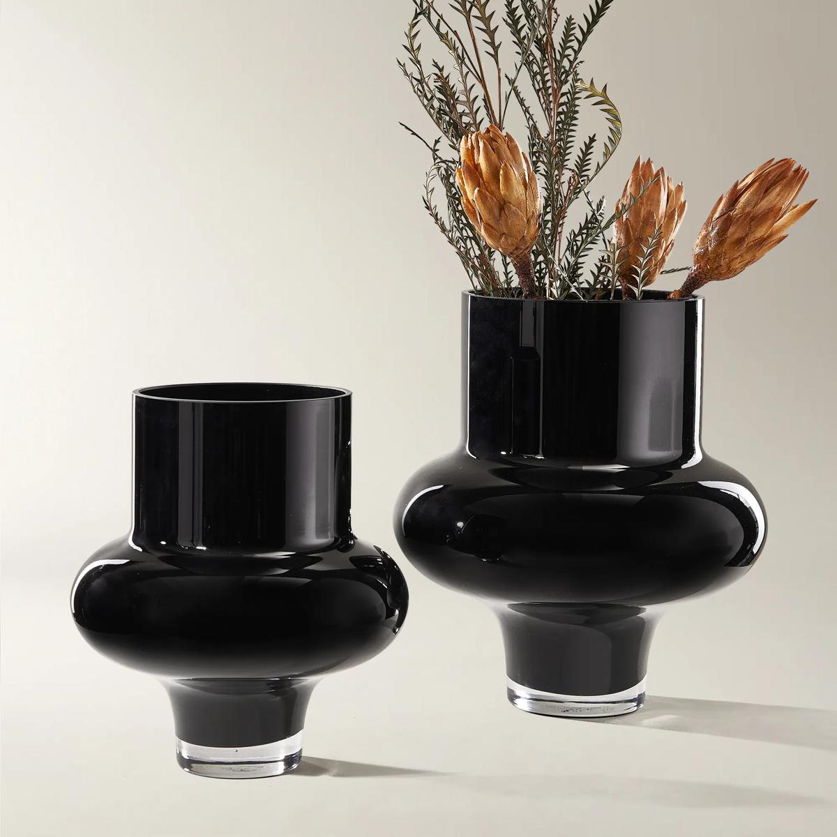
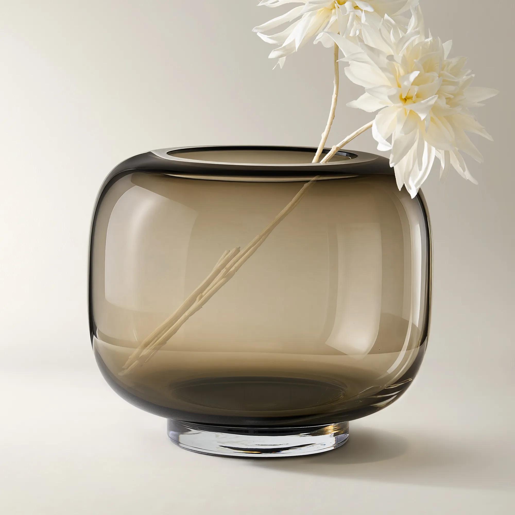
 Kors Glass Vase$69
A sculptural hand-blown black glass vase with a high-gloss finish and bold, curvaceous silhouette.
Add To Cart -
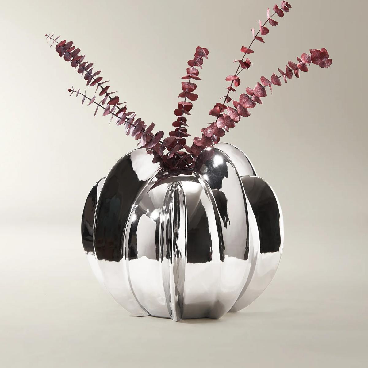
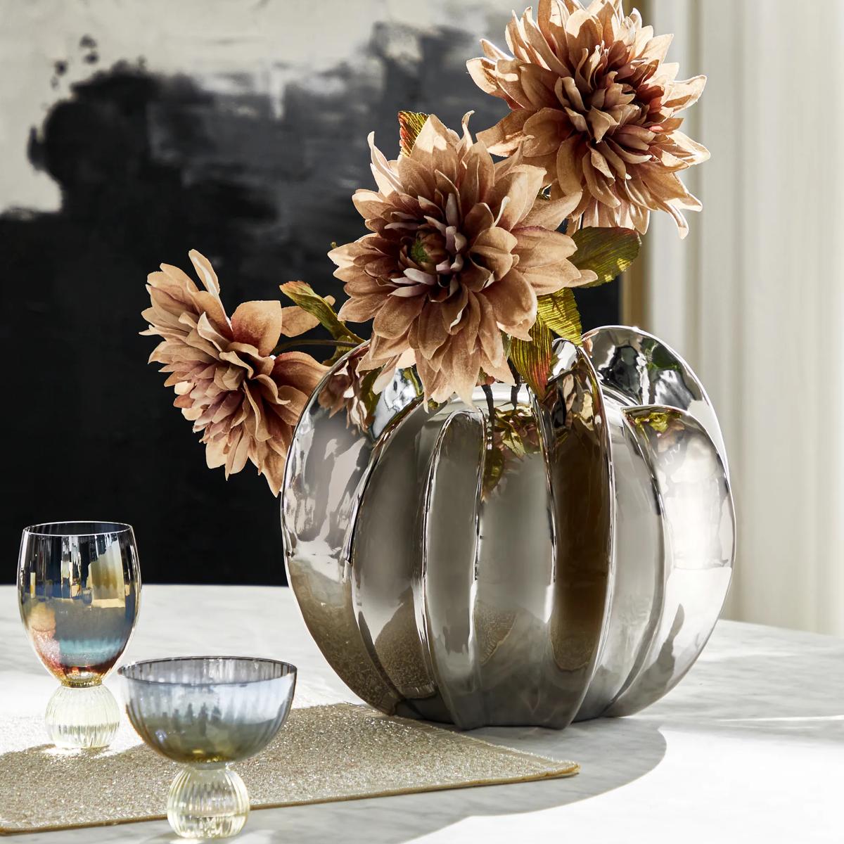 Voyage Vase$99
A reflective silver ceramic vase featuring a bold orb shape and dimensional vertical finned texture.
Add To Cart -
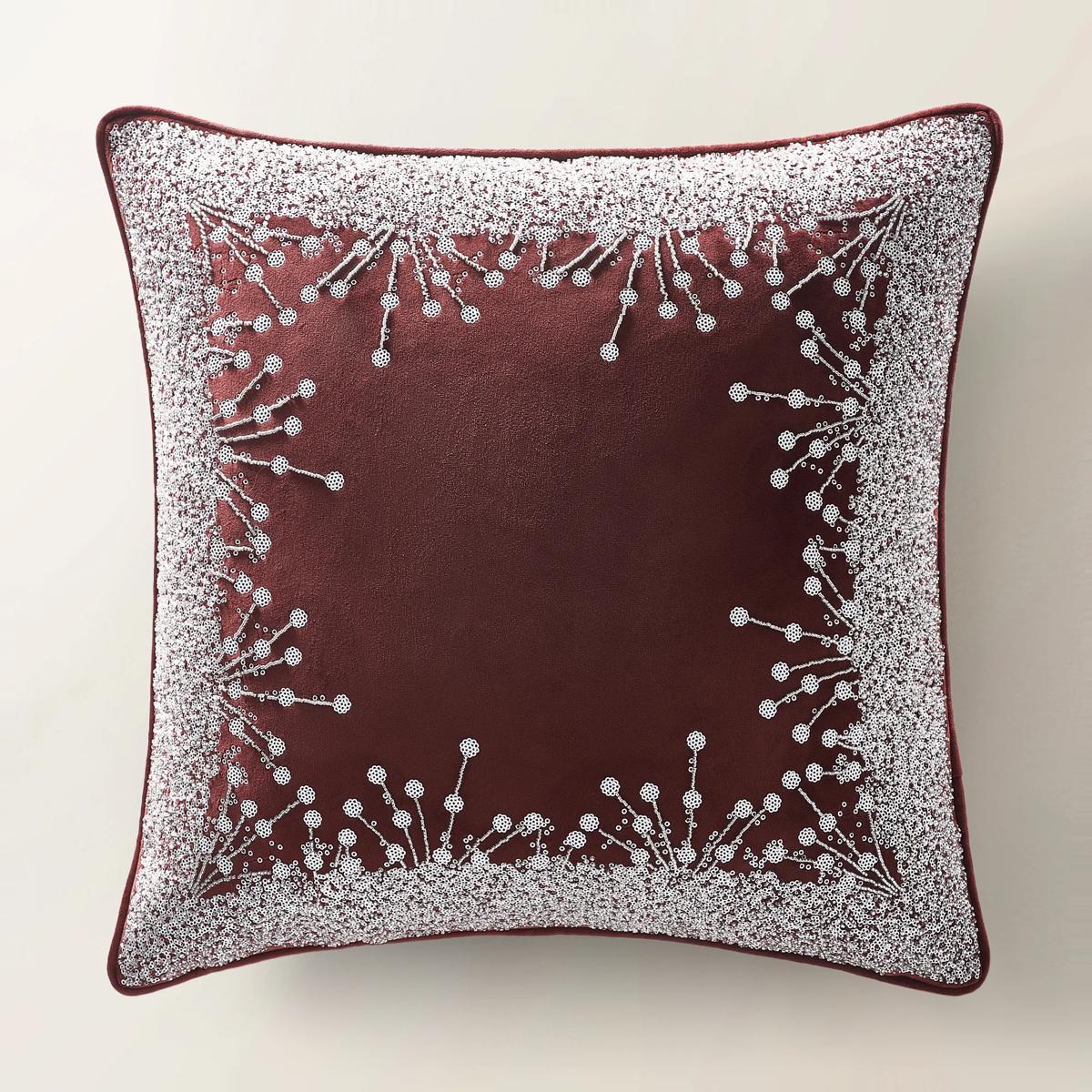 Grace Holiday Pillow 20" - Burgundy$89
A burgundy velvet pillow featuring intricate embroidery and hand-applied beading for festive seasonal elegance.
Add To Cart -
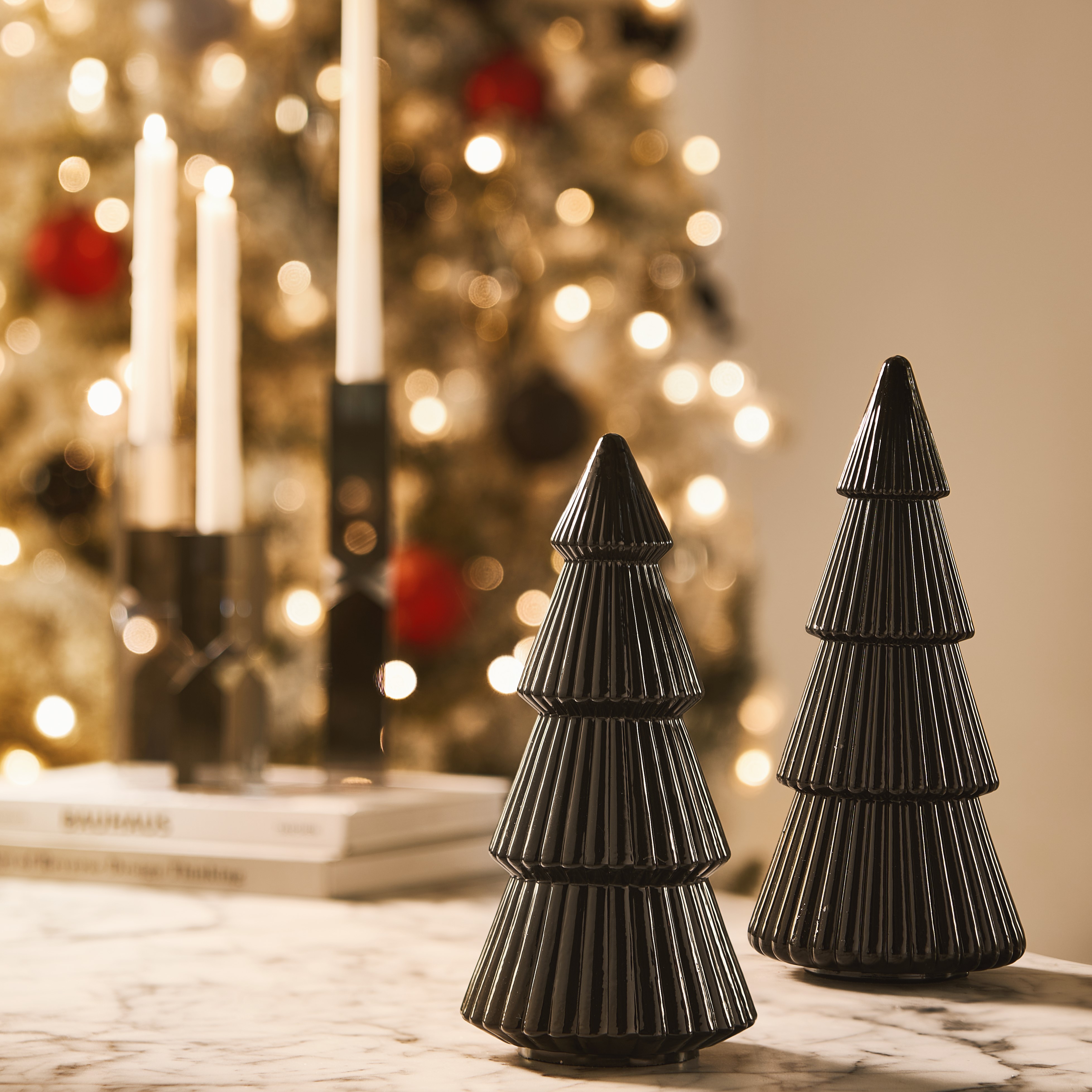 Black Glass Tree Set of 2 - 10" & 11"$79
A sculptural set of two fluted glass trees in a high-gloss black finish for modern holiday décor.
Add To Cart -
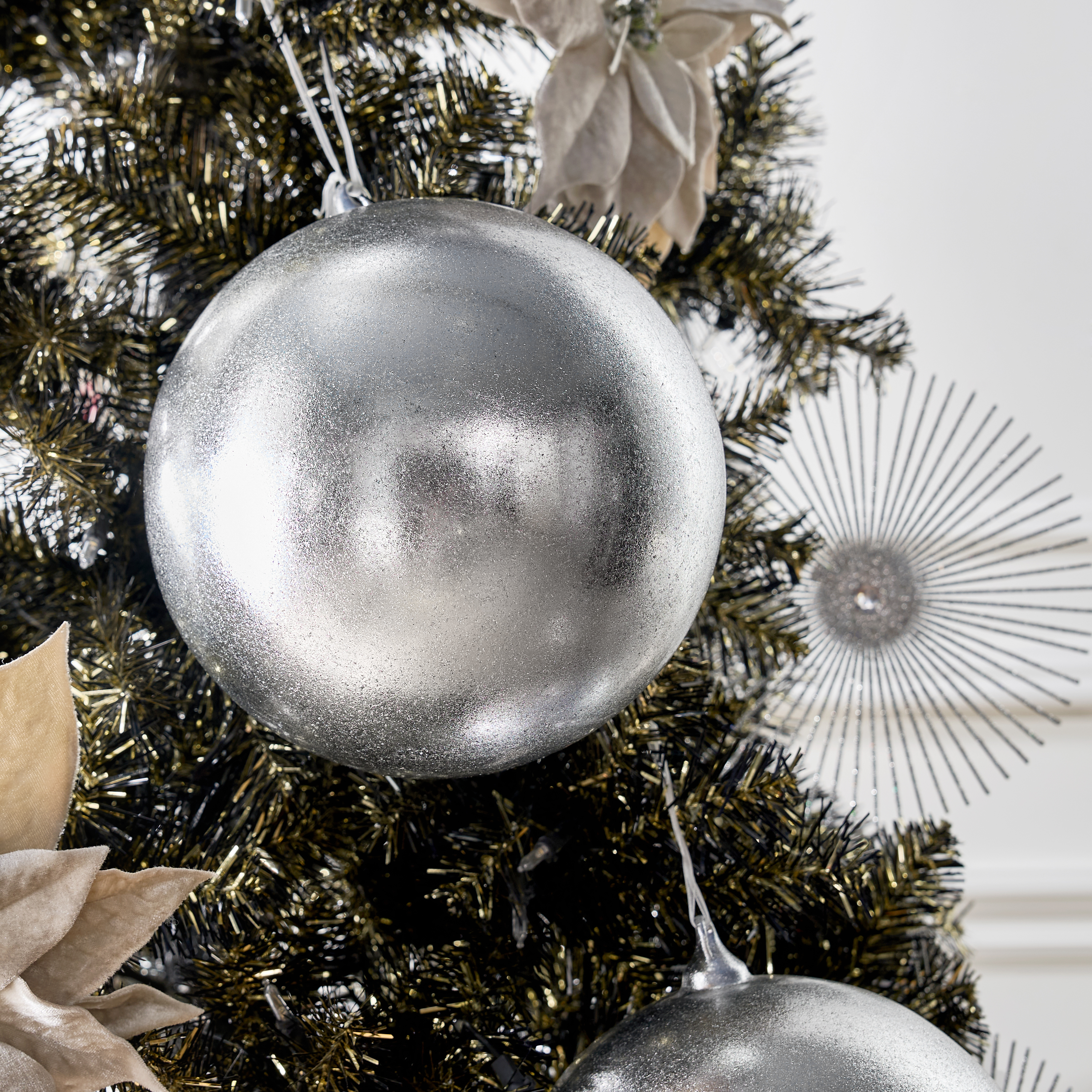
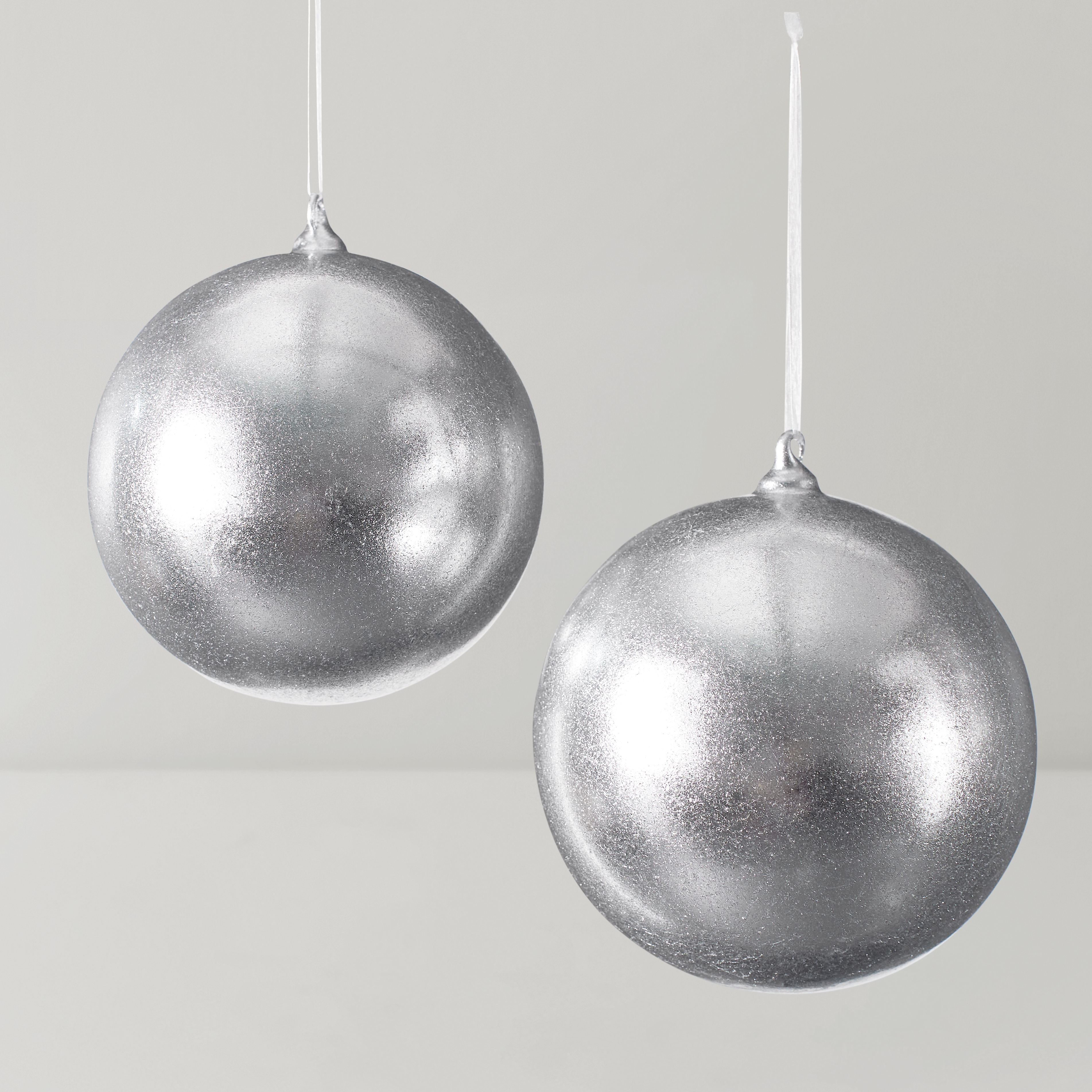 Oversized Silver Ornament 8" - Set of 2$79
A set of two oversized glass ornaments in a striking metallic silver finish for dramatic holiday decor.
Add To Cart -

 Black Glass Candy Ornament - Set of 6$39
A set of six glossy black glass ornaments shaped like wrapped candies for a modern, playful holiday touch.
Add To Cart -
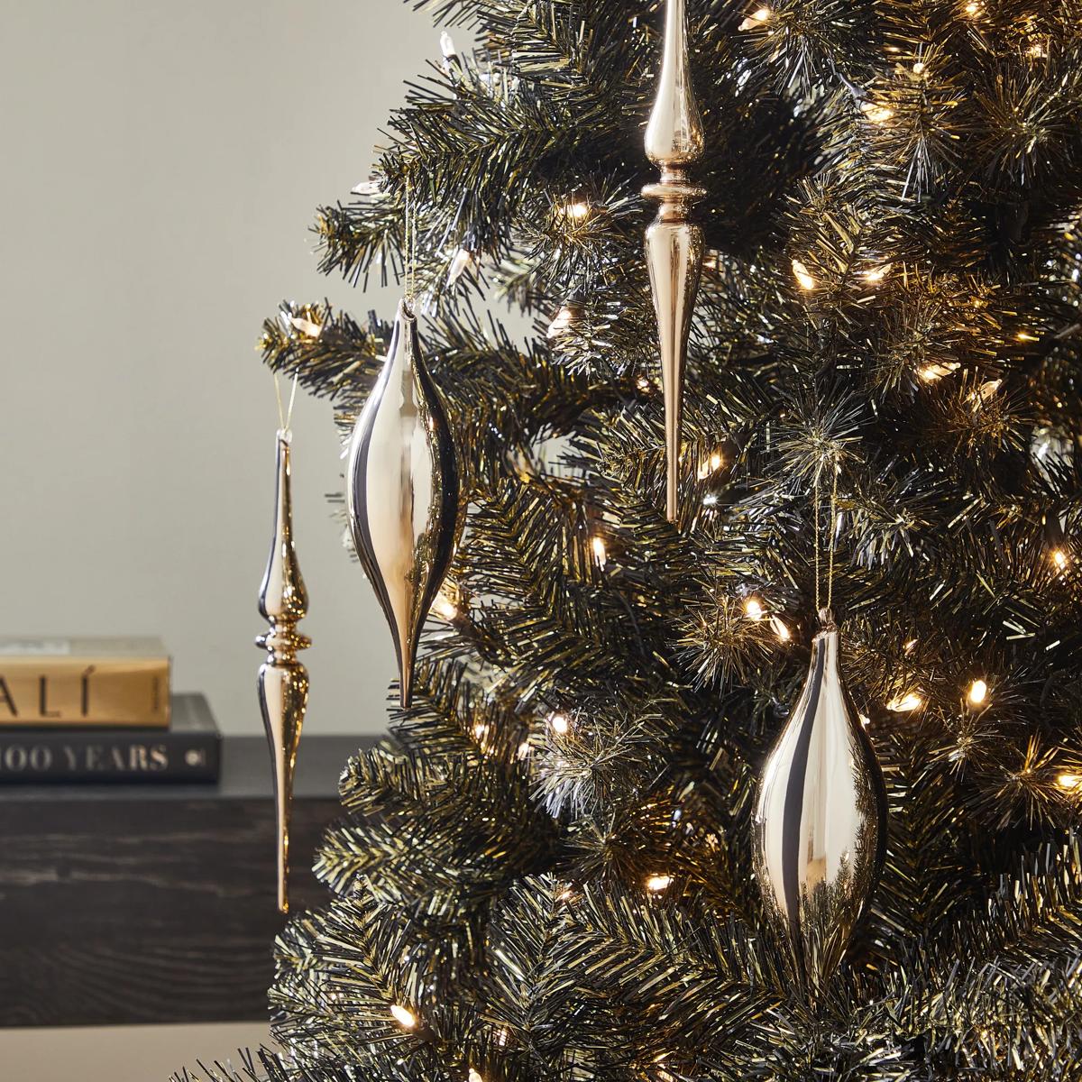
 Gold Stripe Finial Ornament - Set of 4$69
A set of four gold and black glass finial ornaments with a sleek, high-contrast metallic finish.
Add To Cart -
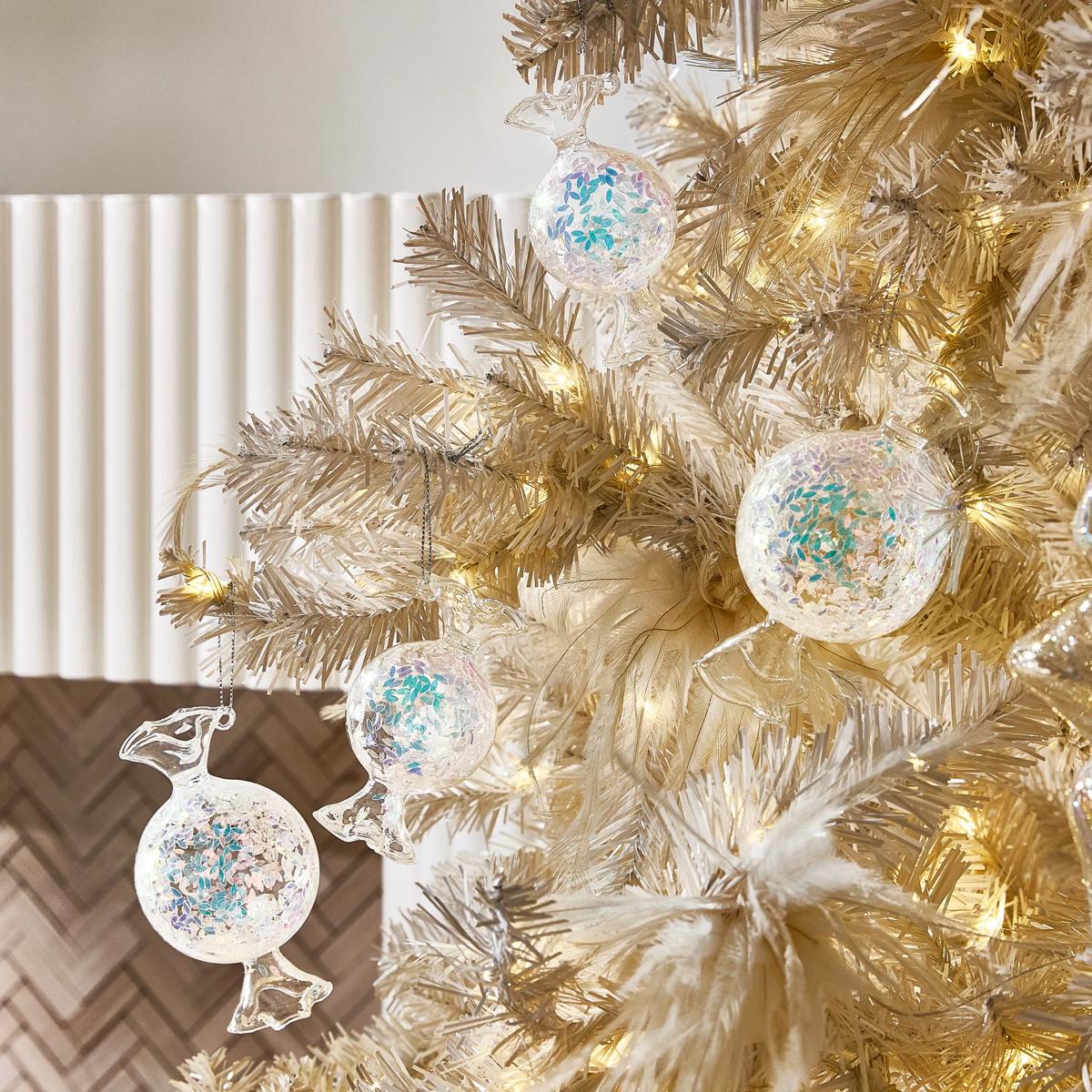
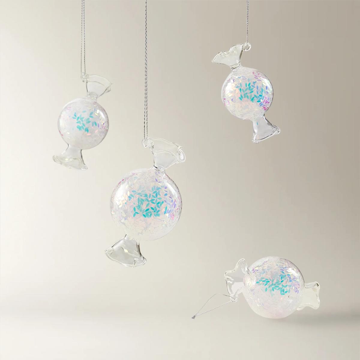 Iridescent Glass Candy Ornament - Set of 4$49
A set of iridescent glass ornaments featuring whimsical candy shapes that shimmer with a rainbow-like glow.
Add To Cart -
 Leon Coronado Black And Gold Wall Plaque 10" x 15"$59
A dramatic matte black lion wall plaque crowned with ornate metallic gold, crafted from lightweight resin.
Add To Cart -
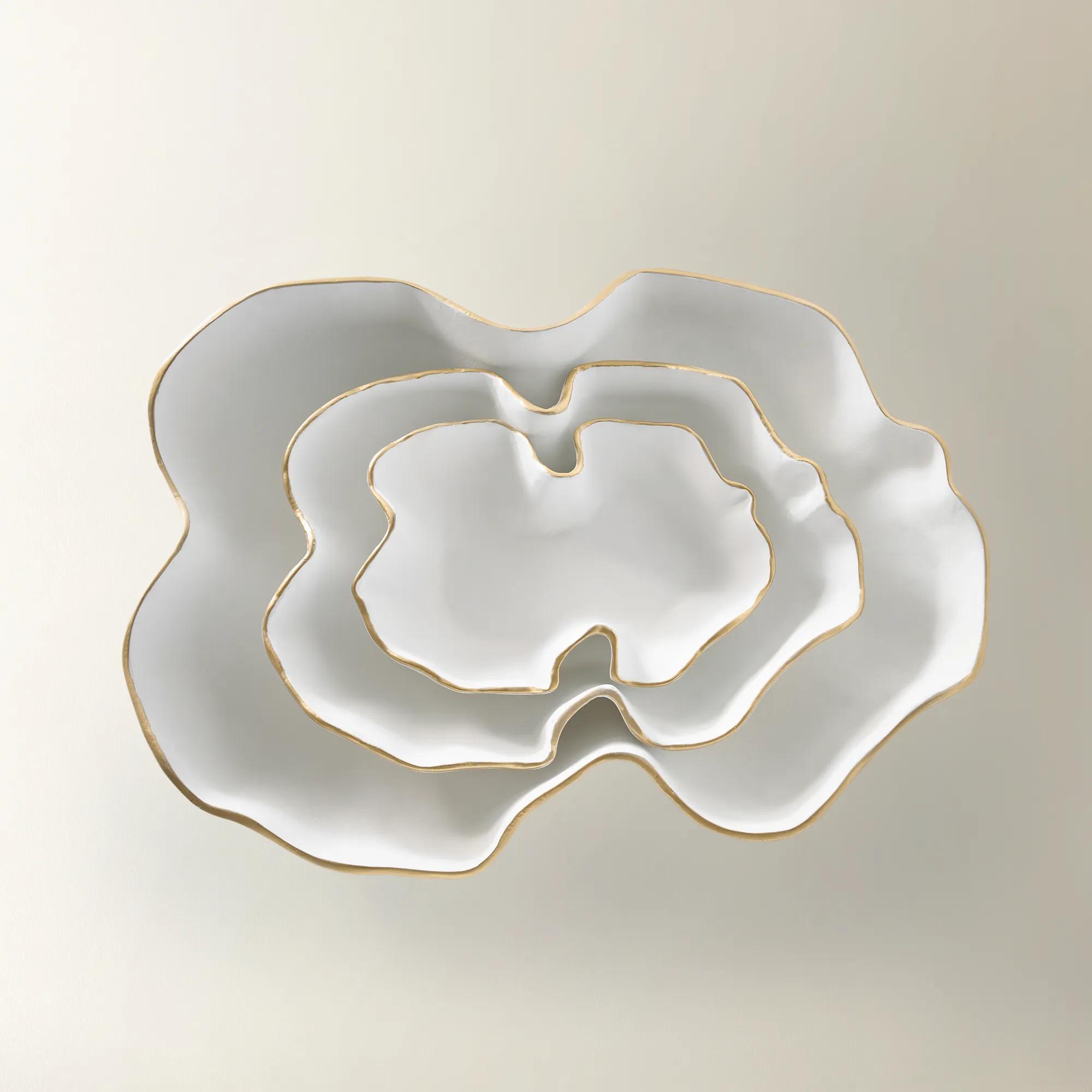 Lava White Gold Aluminum Decorative Nesting Bowls$99
A glossy white aluminum bowl with a golden rim, offering modern elegance for decorative display.
Add To Cart -

 Ethereal Eye Ornament$36
An enchanting glass ornament featuring a mystical eye design for a unique holiday tree accent.
Add To Cart -
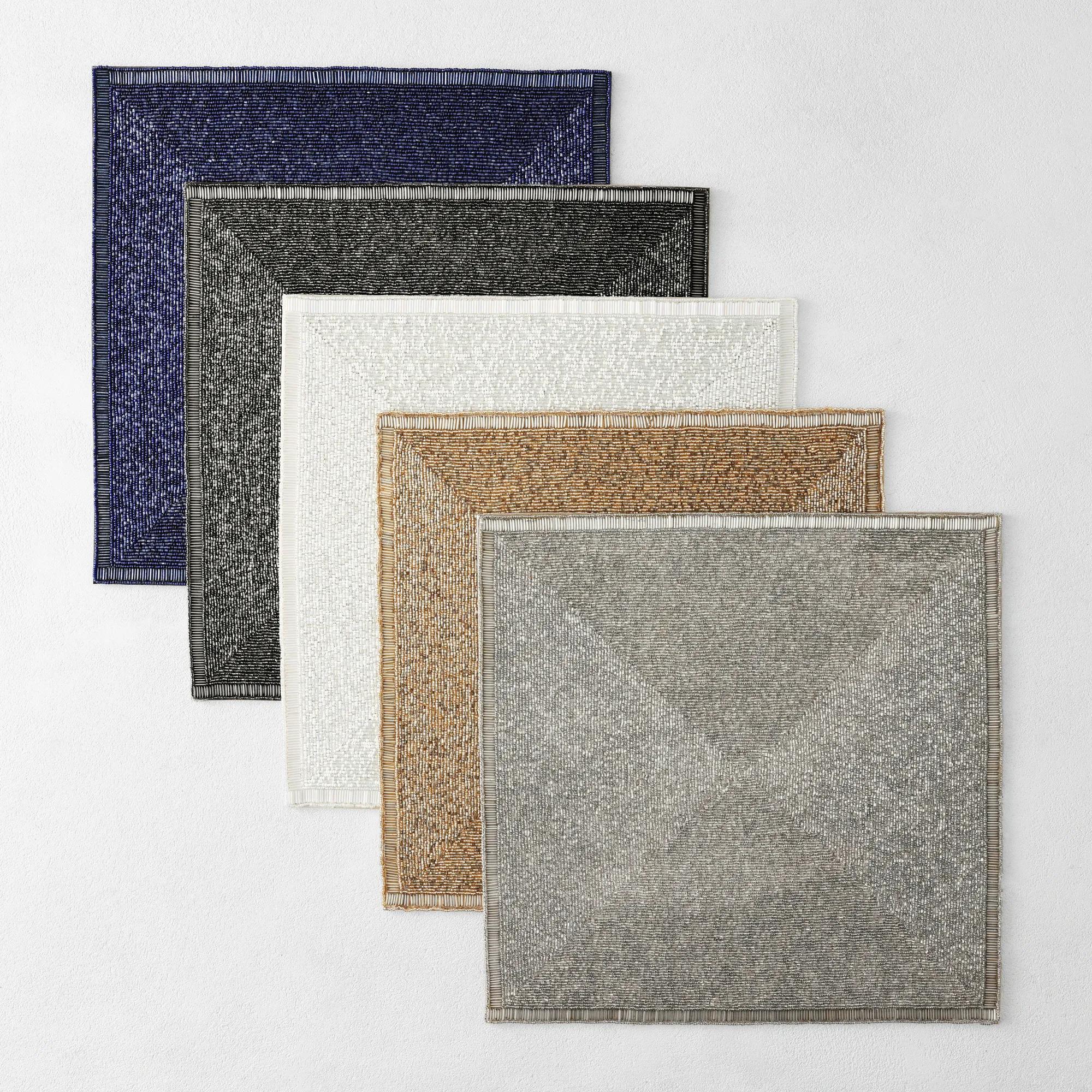
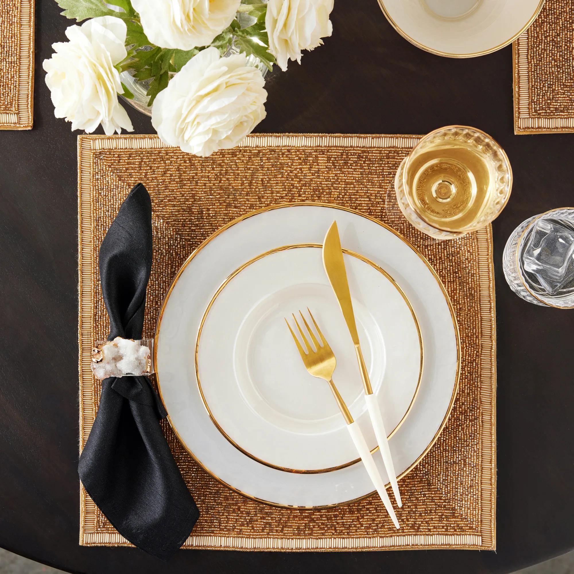 Beaded Placemat 15"$49
A sophisticated placemat featuring rich metallic beads and a silky polyester satin backing for elegant dining.
Add To Cart -
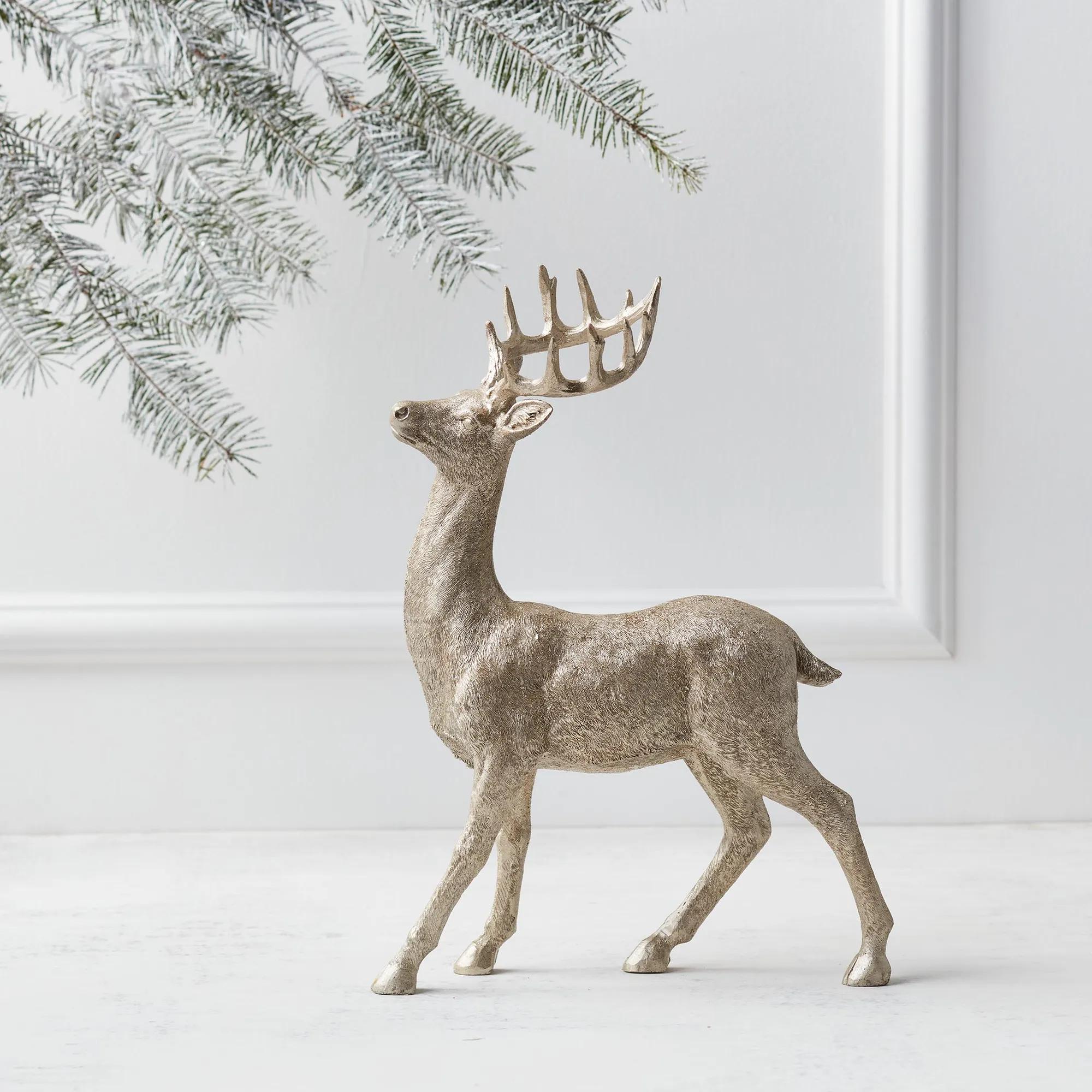
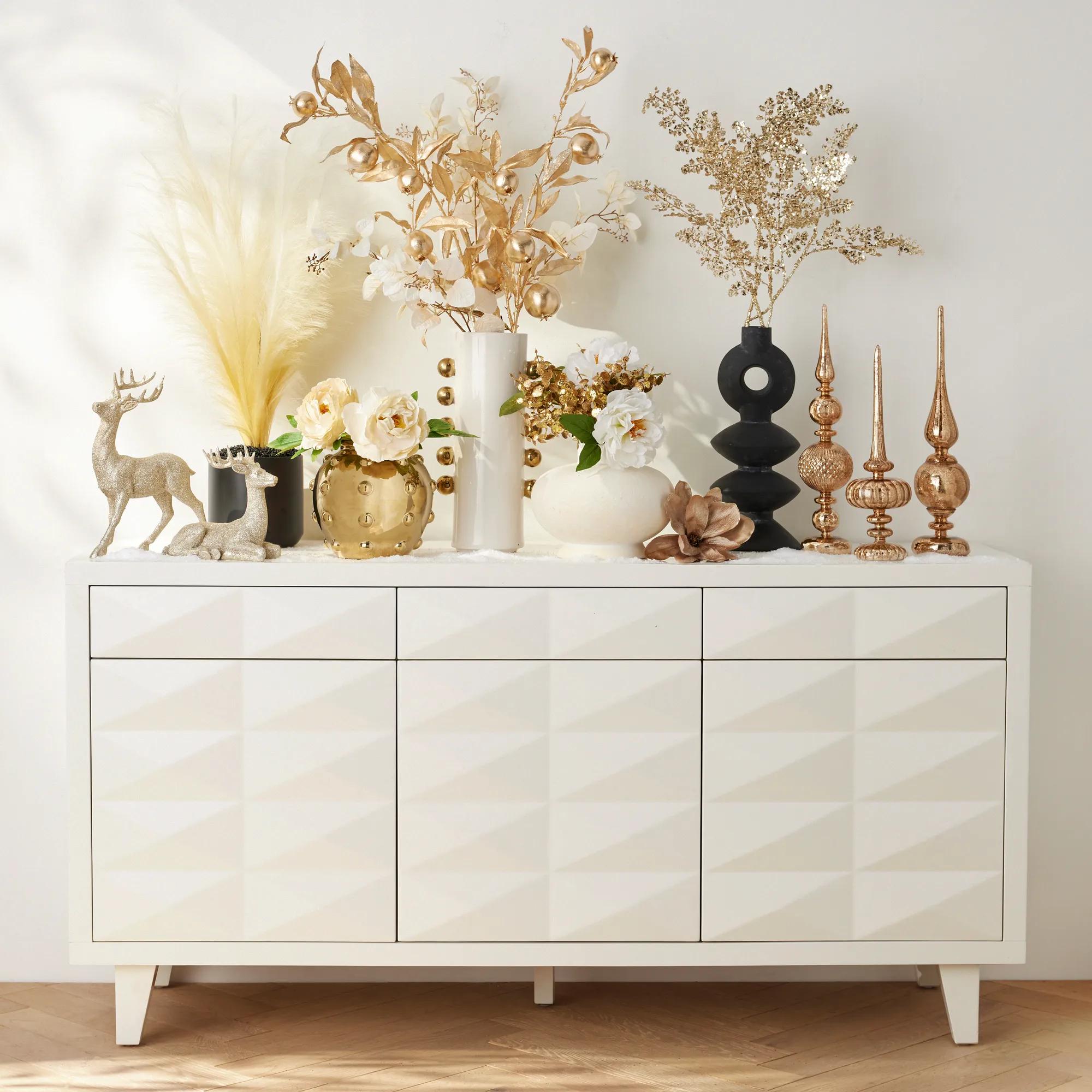 Majestic Deer Champagne Resin 14"$59
A pair of intricately detailed poly resin deer figures with a textured champagne metallic finish.
Add To Cart -
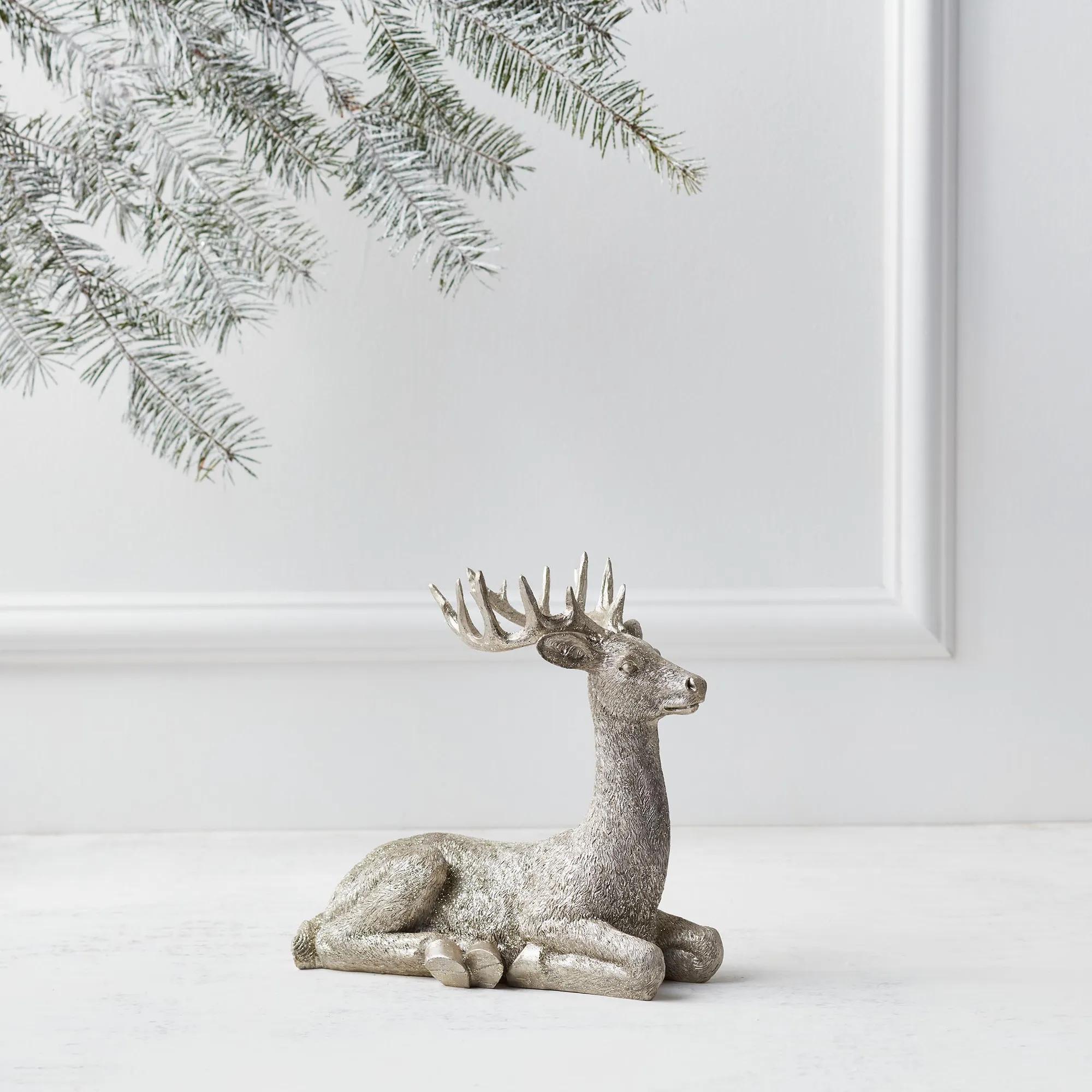 Majestic Deer Champagne Resin 8"$49
A pair of intricately detailed poly resin deer figures with a textured champagne metallic finish.
Add To Cart -
 Parfum Bottle Gold Ceramic High Gloss Coin Bank$39
A chic ceramic coin bank in a metallic gold finish, styled like an elegant perfume bottle.
Add To Cart -
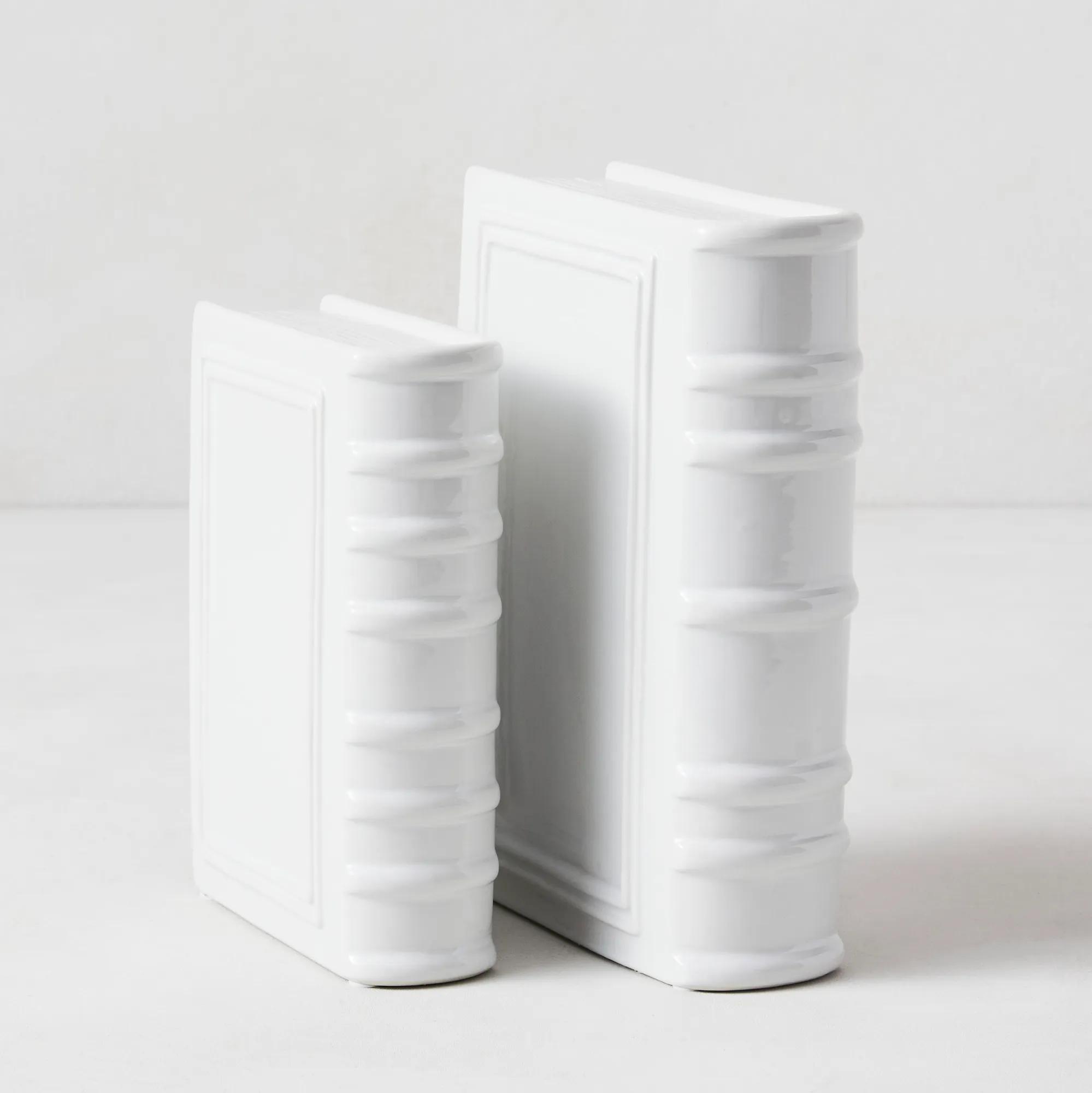
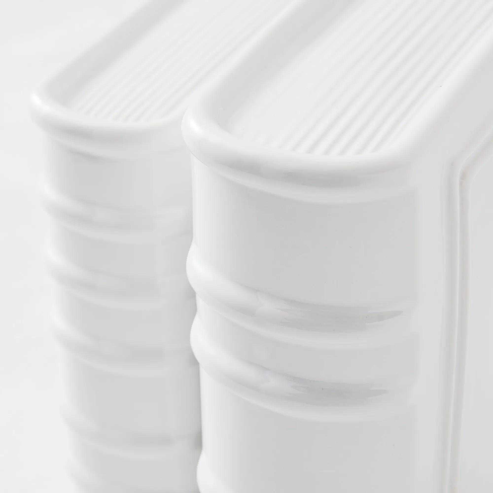 Ceramic Bookends - White$49
A pair of cream ceramic book accents that double as minimalist bookends or decorative console pieces.
Add To Cart -
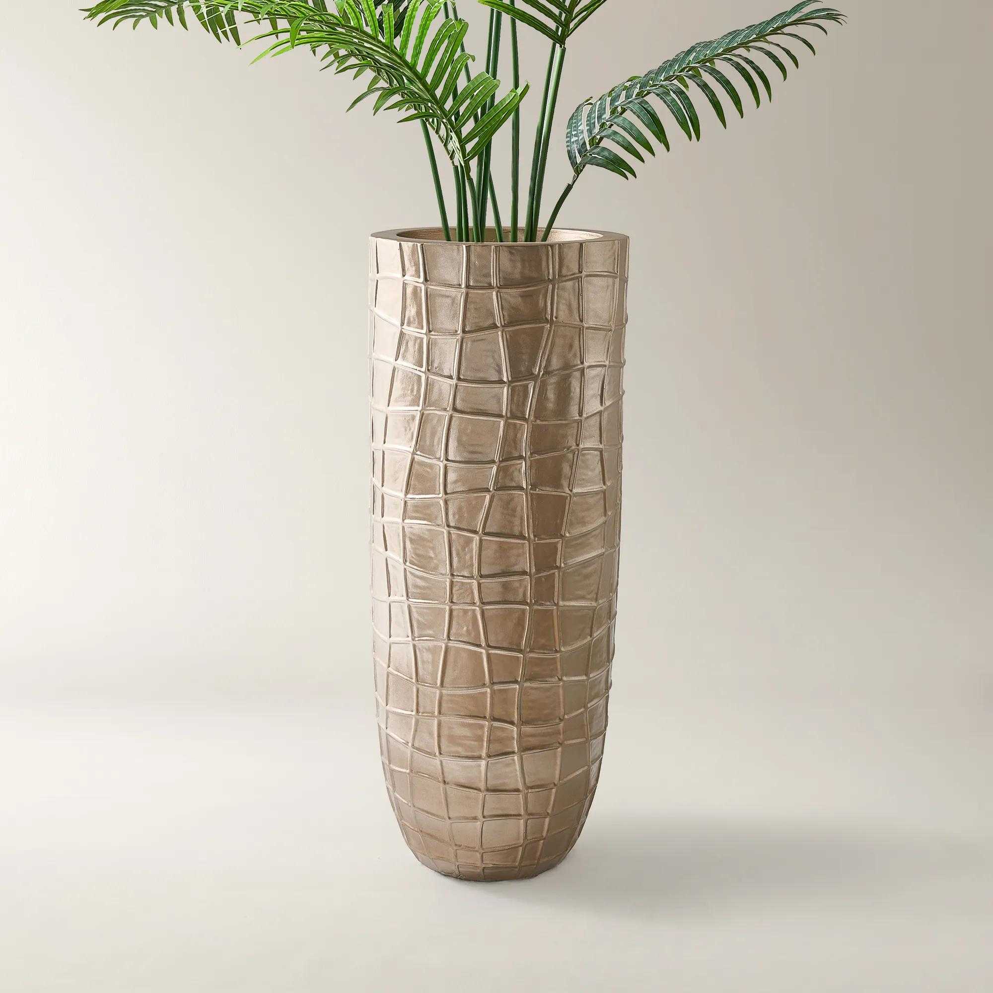
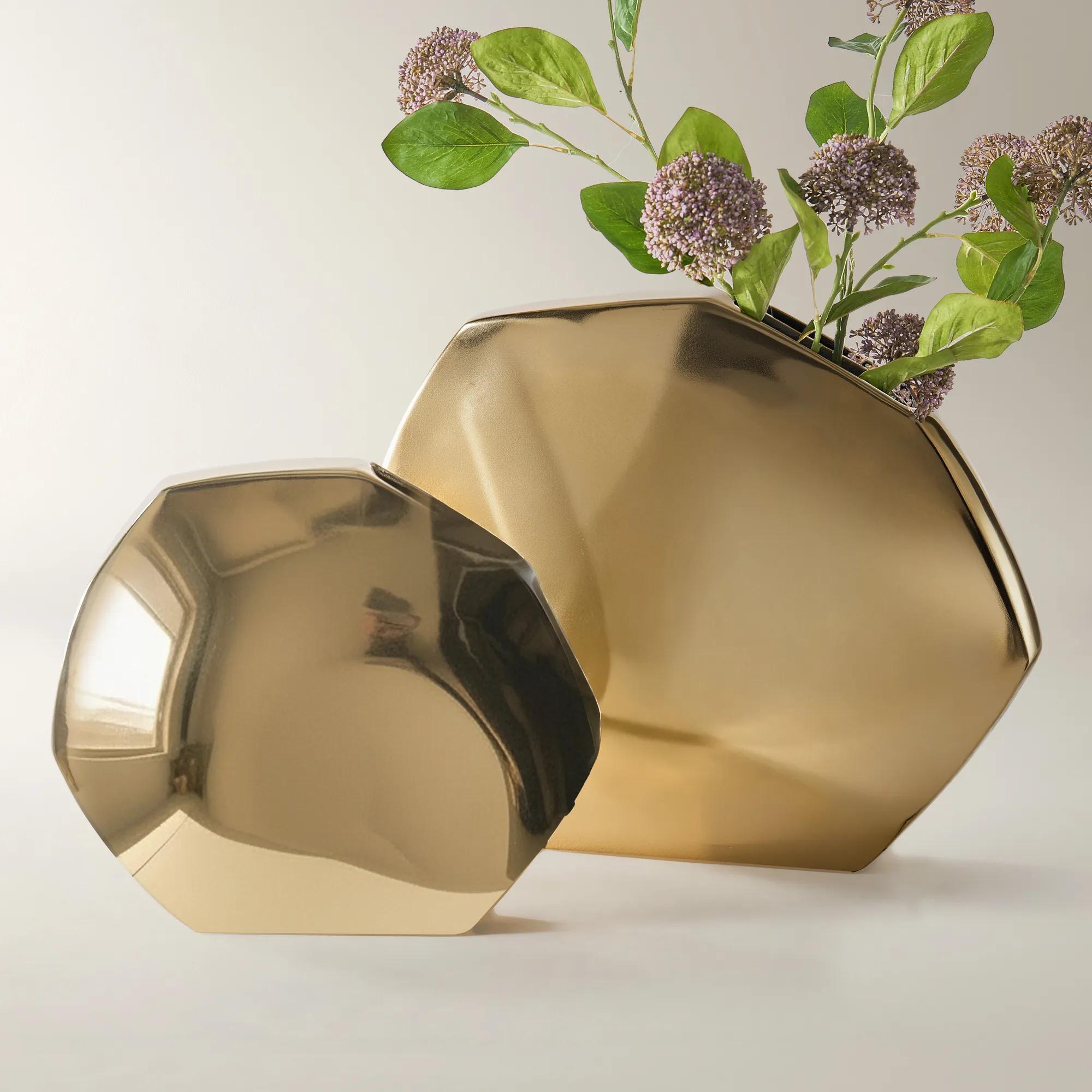
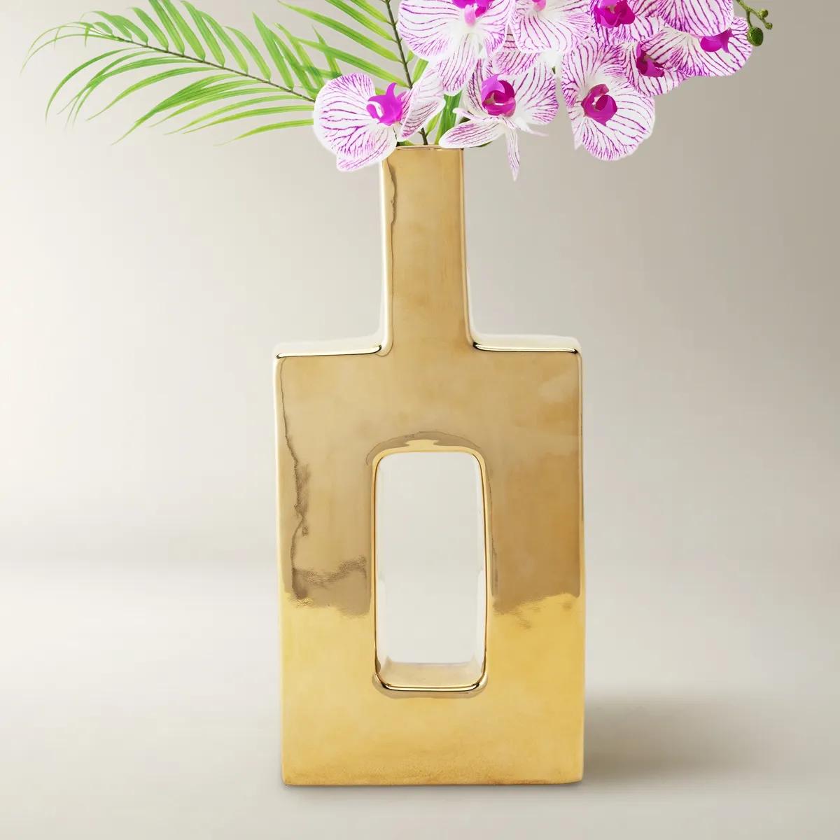 Miami Gold Ceramic High Gloss Vase 18.5"$69
A contemporary gold ceramic vase designed for decorative use or displaying faux foliage.
Add To Cart -
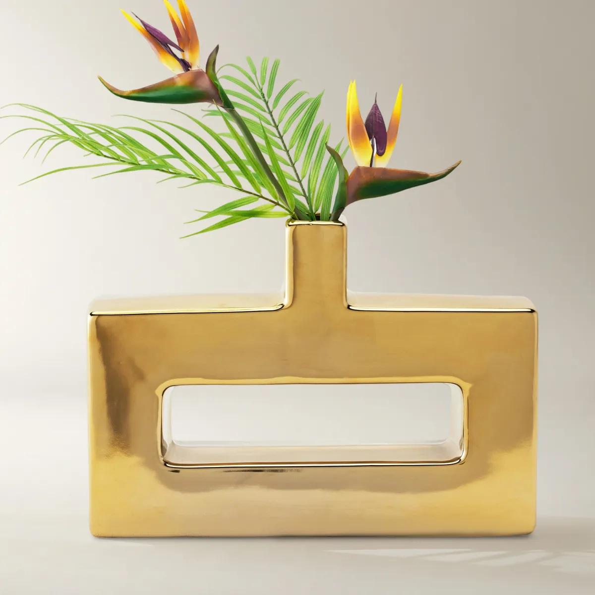 Miami Gold Ceramic High Gloss Vase 11.75"$69
A contemporary gold ceramic vase designed for decorative use as a sculptural accent or with foliage.
Add To Cart -
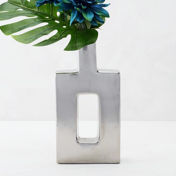
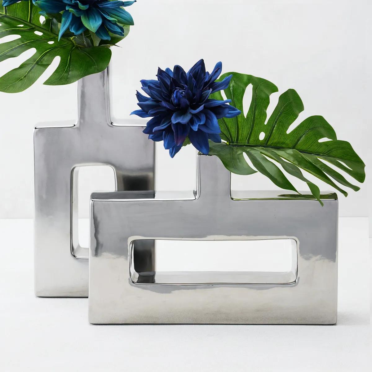 Miami Silver Ceramic High Gloss Vase 18.5"$69
A contemporary silver ceramic vase with a stylish gold glaze, perfect for decorative foliage or display.
Add To Cart -
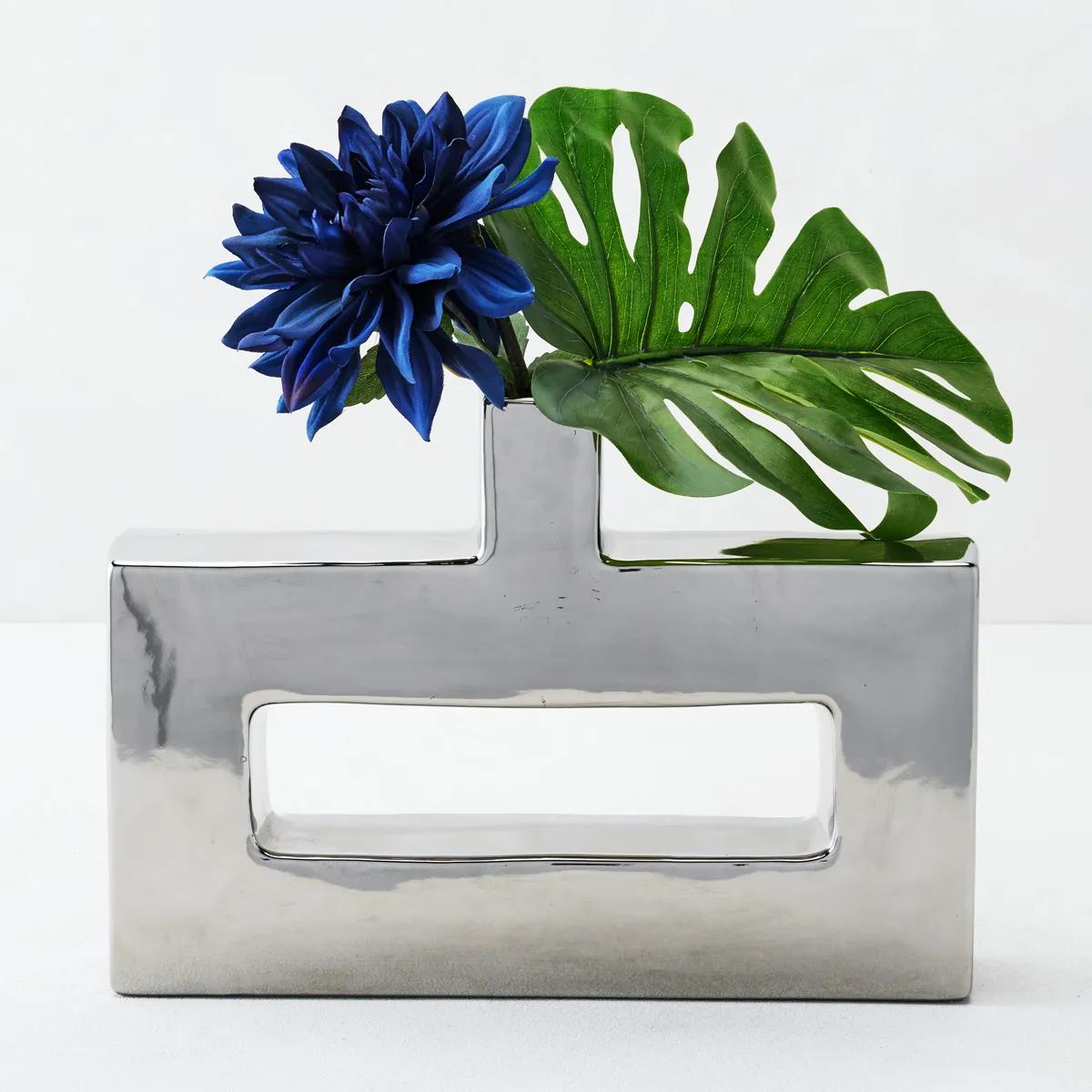 Miami Silver Ceramic High Gloss Vase 11.75"$69
A contemporary silver ceramic vase with a stylish gold glaze, perfect for decorative foliage or display.
Add To Cart -
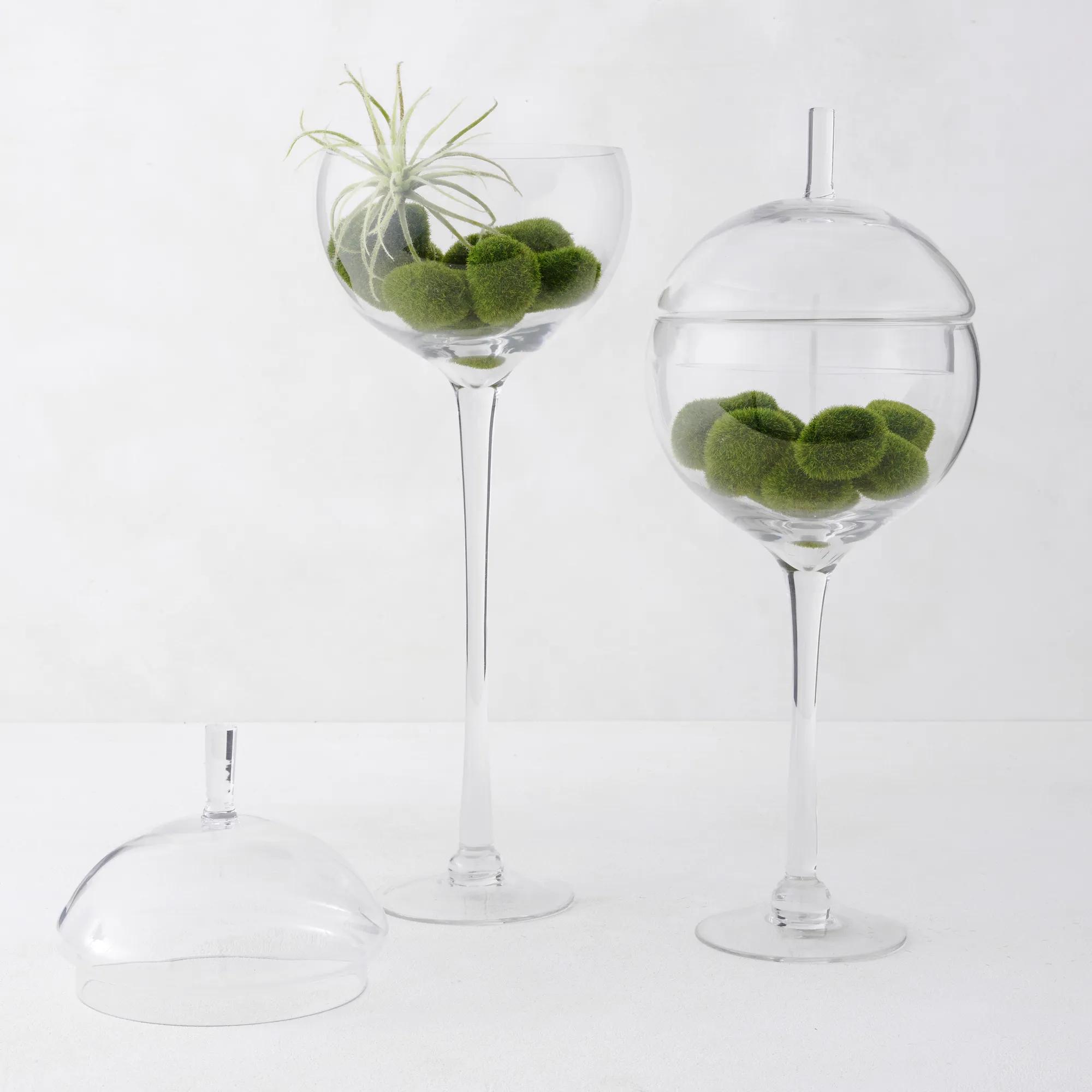 Jules Glass Decorative Canisters$89
A mouthblown glass terrarium perfect for showcasing decorative objects or cherished keepsakes.
Add To Cart -
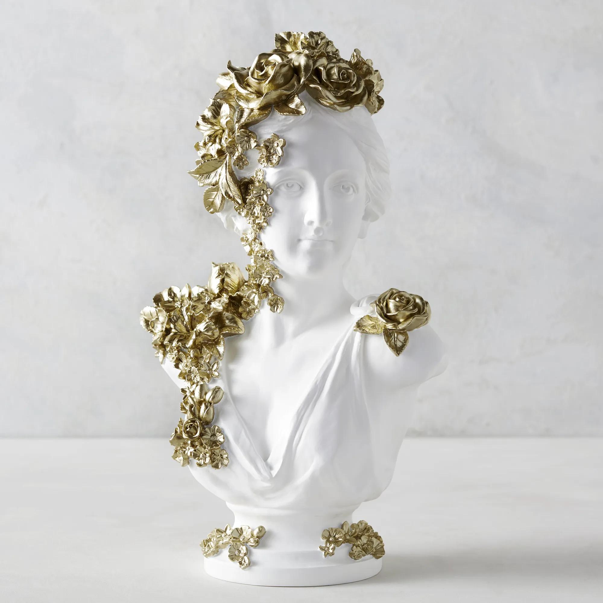 Gold Floral Bust Resin Decorative Object 16.5"$79
A striking resin bust adorned with intricate gold floral embellishments for a bold decorative accent.
Add To Cart -
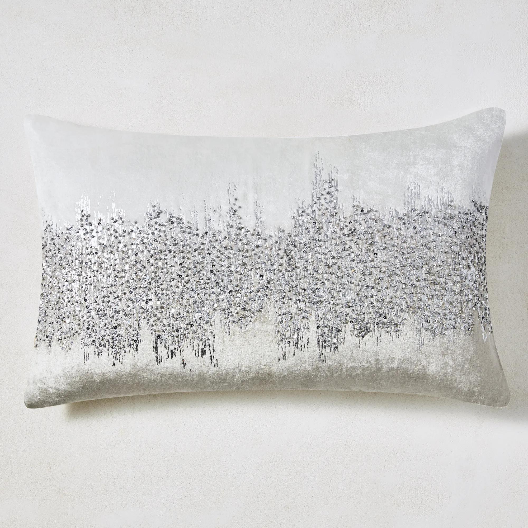 Joie De Vivre Lumbar Pillow 16" x 26" - Grey$99
A hand-dyed grey velvet lumbar pillow featuring metallic foil print and shimmering hand-beaded glass accents.
Add To Cart -
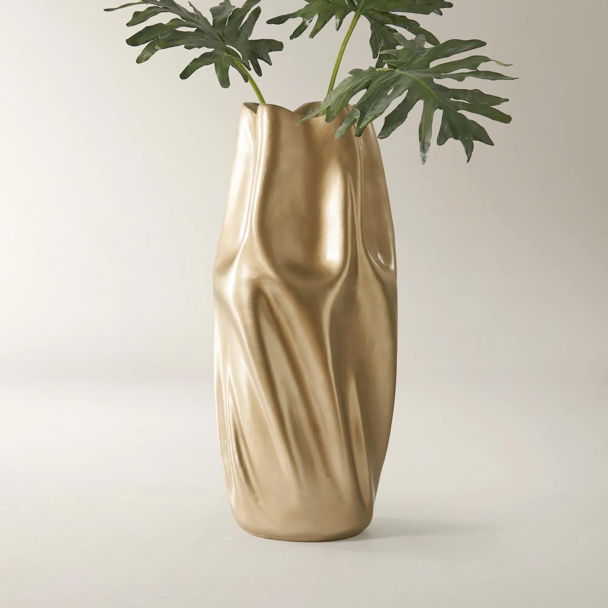
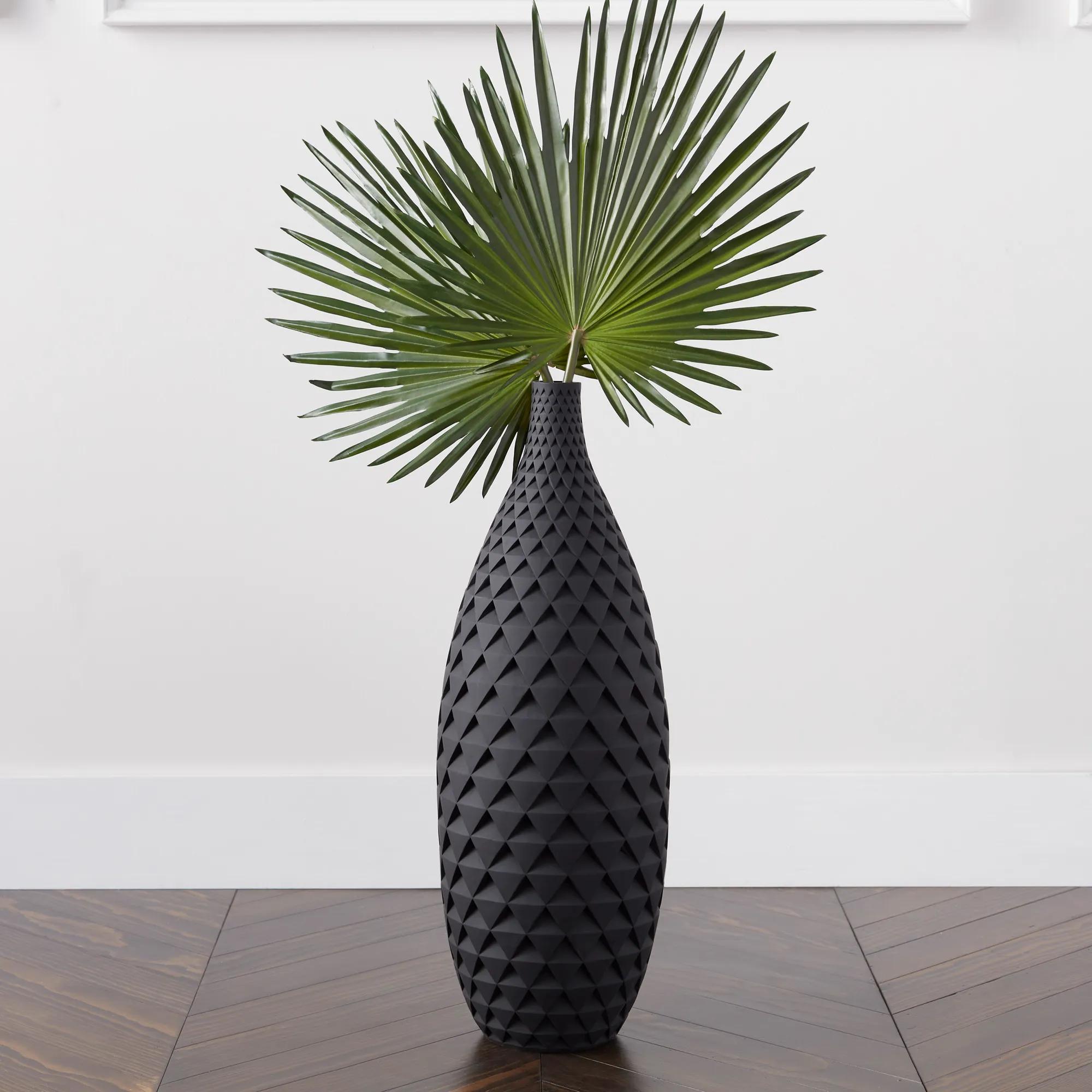 Cairo Floor Vase$99
A lightweight resin floor vase featuring a matte black finish and a striking scalloped texture.
Add To Cart

Clearance Home Decor Under $100
Explore clearance home decor under $100 for expressive finishing touches at reduced prices. Discover decorative accents to refresh a room, bring dimension to a display, or create a more dramatic focal point—all within a defined budget. Shop the selection for details that complement your space while giving it a distinctly personal point of view.
Home decor gives a room its unmistakable point of view: the gleam that catches the eye across a living room, the sculptural silhouette that interrupts a row of books, the rich texture that makes a favorite seat feel more inviting. Decorative accents can introduce that sense of intention without changing the furniture or architecture around them. On a streamlined console, a grouping of substantial shapes creates an expressive focal point; against a richly upholstered sofa, contrasting textures add depth rather than competing for attention. The most compelling arrangements have a visual connection, whether through repeated curves, a restrained palette, or finishes that echo details elsewhere in the room. A warm metallic accent can draw out the golden undertones of a wood surface, while clear glass allows the grain beneath it to remain part of the composition. Matte ceramic offers a quieter counterpoint to reflective surfaces, giving the eye somewhere to rest amid the shimmer. These relationships matter more than matching every detail. A room with personality often combines polished and organic elements, delicate lines and weightier forms, smooth surfaces and tactile fabrics. Scale gives those contrasts their confidence. A generous accent can anchor a broad tabletop, while a smaller grouping feels deliberate on a narrow shelf or compact bedside surface. Leaving open space around an arrangement preserves its shape and keeps the furniture useful. An entryway still needs a place to set down everyday essentials; a coffee table should leave room for a drink and conversation. Decorative accessories work best when they acknowledge those rhythms rather than interrupt them. For an apartment, a shared living space, or an established home ready for a different visual emphasis, thoughtful accents offer a way to express individual taste through manageable details. They can connect existing furnishings, lend definition to an overlooked corner, or bring a more artful presence to the spaces used every day. A single repeated finish can also establish continuity between adjoining rooms without making each arrangement look identical.
Materials influence both the atmosphere of a decorative accent and how comfortably it fits into daily life. Glass has an airy quality even when its shape is substantial, and its reflective surface can amplify nearby light without adding visual heaviness. Ceramic brings depth through glaze, texture, and variations in form; depending on its finish, it may feel glossy and dramatic or softly architectural. Metal introduces crisp definition, with polished surfaces delivering a pronounced gleam and brushed finishes creating a more subdued luster. Wood adds grain and warmth, while woven textiles soften the edges of sleek furniture and provide a tactile contrast to stone or glass. Beyond appearance, construction and intended use deserve attention. A decorative vessel is not necessarily watertight, a display tray may not be suitable for food, and an accent designed for indoor use should not be assumed to tolerate outdoor exposure. Product care information clarifies those distinctions and helps preserve the finish. A soft, nonabrasive cloth is often appropriate for routine dusting, while harsh cleaners and rough scrubbing can damage coatings or dull reflective surfaces; any cleaning method should follow the material-specific instructions. Textile care varies with fiber content, embellishment, and construction, so a removable cover does not automatically mean machine washing is suitable. Sunlight, moisture, and frequent handling can also affect finishes over time. Keeping delicate materials away from busy edges and damp areas helps protect their appearance, while stable bases and suitable surface protection reduce the chance of scratches or accidental tipping. Dimensions are equally important to a polished result. An accent needs enough clearance beneath a shelf, beside a lamp, or in front of a mirror to show its full outline. On a dining table, lower arrangements preserve sightlines; on a mantel, varied heights can create rhythm without crowding the composition. Weight also matters on floating shelves or delicate furniture, where the supporting surface should be appropriate for the objects placed on it. These practical details allow a dramatic room to remain comfortable, considered, and easy to live in.
Decorative accents can give each area of a home a distinct mood while keeping the overall interior connected. A bedroom benefits from textures and shapes that feel composed rather than crowded, with a few expressive details lending richness to a dresser or bedside arrangement. In a living room, a bolder contrast of finishes can reinforce the energy of the space, especially when a sculptural form stands against a simple backdrop. A home office can feel more personal with an artful accent positioned outside the main work area, leaving the desk clear for its everyday purpose. Open shelving offers another opportunity for balance: books, negative space, and decorative forms can sit together in a composition that feels collected rather than rigidly staged. Repeating one color at different heights helps lead the eye, while an unexpected texture keeps the arrangement from becoming too uniform. Coordinating these accents with pieces from Wall Decor Under $300 can extend the composition beyond furniture surfaces, bringing vertical space into the room’s visual story. The relationship does not need to be literal; a curved object can echo a rounded frame, or a metallic detail can pick up a subtle tone in artwork. That same sensitivity makes home decor a thoughtful gift for a housewarming, a wedding, or someone establishing a first home. The strongest choice reflects the recipient’s surroundings and habits, not just an appealing shape. A compact accent suits someone with limited display space, while a textural piece may resonate with a person who favors layered, expressive interiors. Neutral tones can integrate easily into an existing palette without feeling anonymous when the form or finish has character. For households with children or pets, placement and material resilience deserve extra consideration, particularly around low tables and frequently used walkways. Beautiful details should belong naturally to the life around them. Whether the effect is restrained shimmer or a more theatrical mix of texture and form, thoughtfully chosen home decor brings personality into focus and gives familiar rooms a renewed sense of presence.
FAQs
Give each accent a deliberate role in your room’s composition. Repeat a signature color, contrast lustrous finishes with tactile surfaces, and leave breathing room around expressive pieces. A thoughtful arrangement makes individual finds feel like part of a richly composed interior.
Look for a visual connection, such as a shared undertone, curved silhouette, or geometric motif. Then introduce contrast: a sculptural accent can bring fresh energy to a traditional setting, while an ornate detail adds intrigue to streamlined furnishings. The goal is a collected look that reflects your point of view.
Deep jewel tones lend a room a sumptuous mood, while ivory and warm neutrals create a luminous backdrop for dramatic accents. For sharper definition, pair black and white with a restrained gleaming finish. Carry your chosen palette through several decorative moments to give the space a confident visual rhythm.
Choose one accent with a compelling shape, pattern, or finish, then let quieter details frame it. An asymmetrical arrangement adds movement, while repeating one color keeps the composition connected. Allow the focal piece to command attention rather than surrounding it with equally bold elements.
Keep your foundational palette and shift the mood through accent colors, texture, and placement. Airy arrangements and luminous tones evoke spring and summer; deeper hues and richly layered displays bring an enveloping feeling to fall and winter. Reworking a favorite vignette can give familiar decor an entirely new expression.