
Chartreuse Home Accents
Chartreuse Home Accents
-
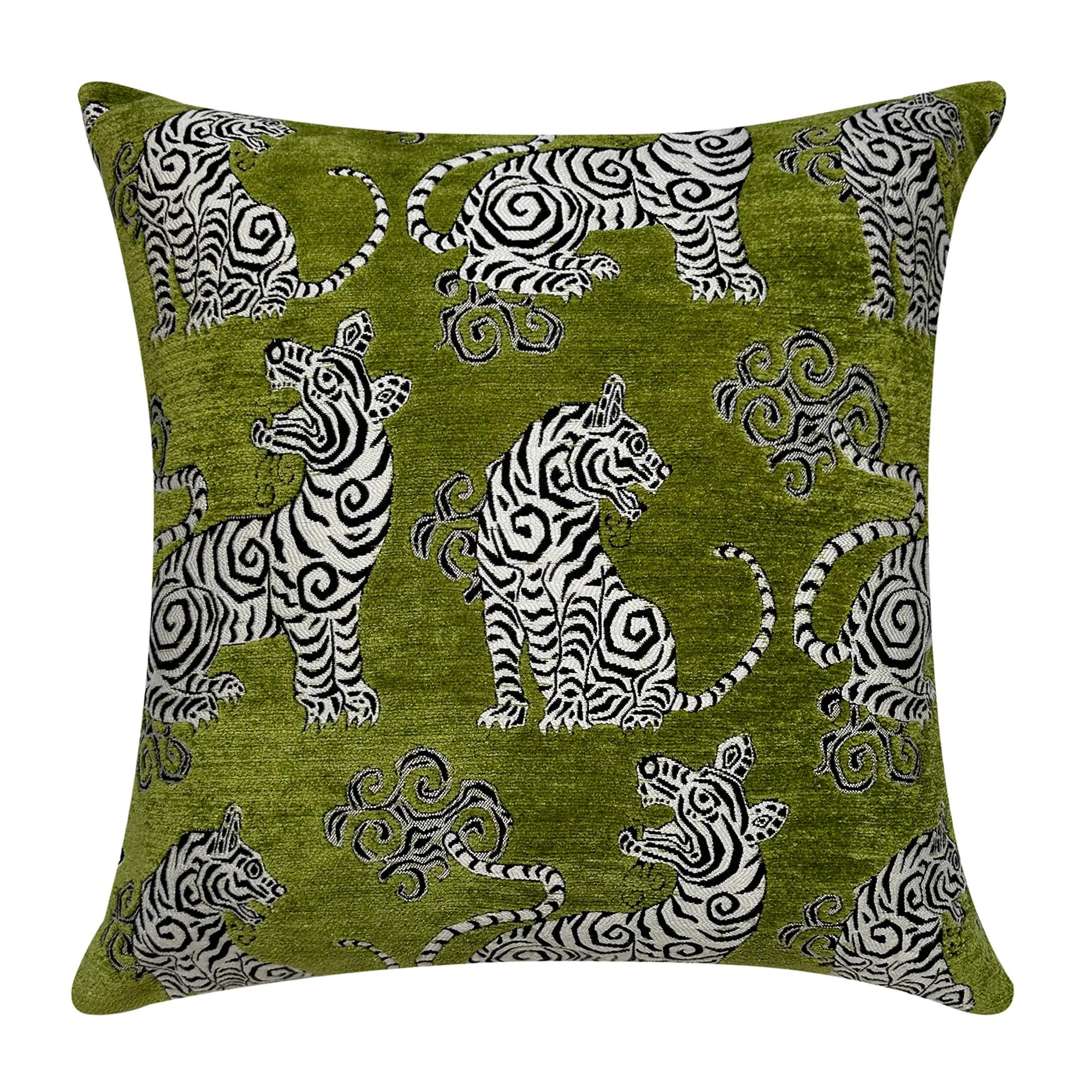
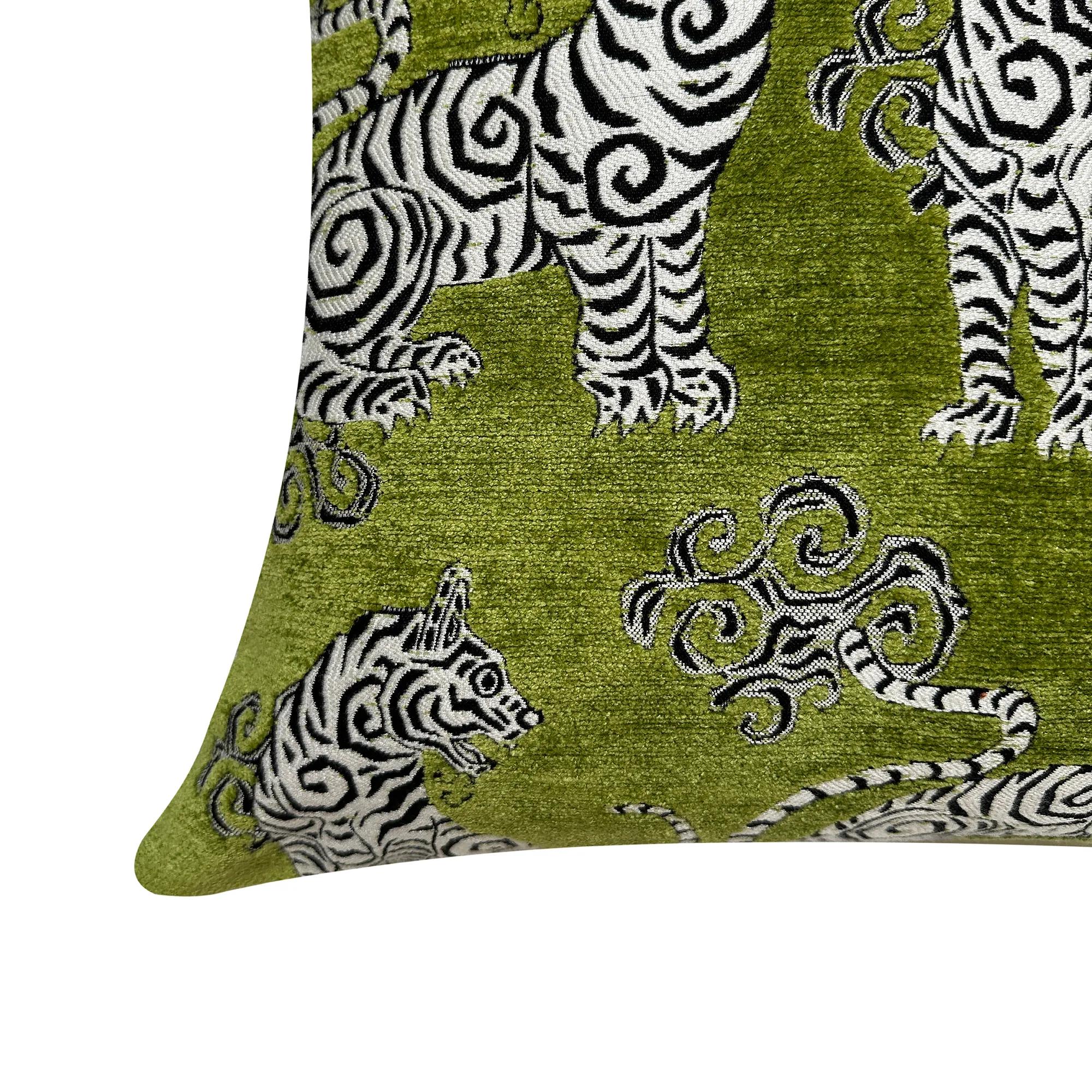 Tigress Citron Green Jacquard Chenille Velvet Pillow 20" x 20"$119
A plush citron green jacquard chenille pillow featuring a striking black and white mini tiger design.
Add To Cart -
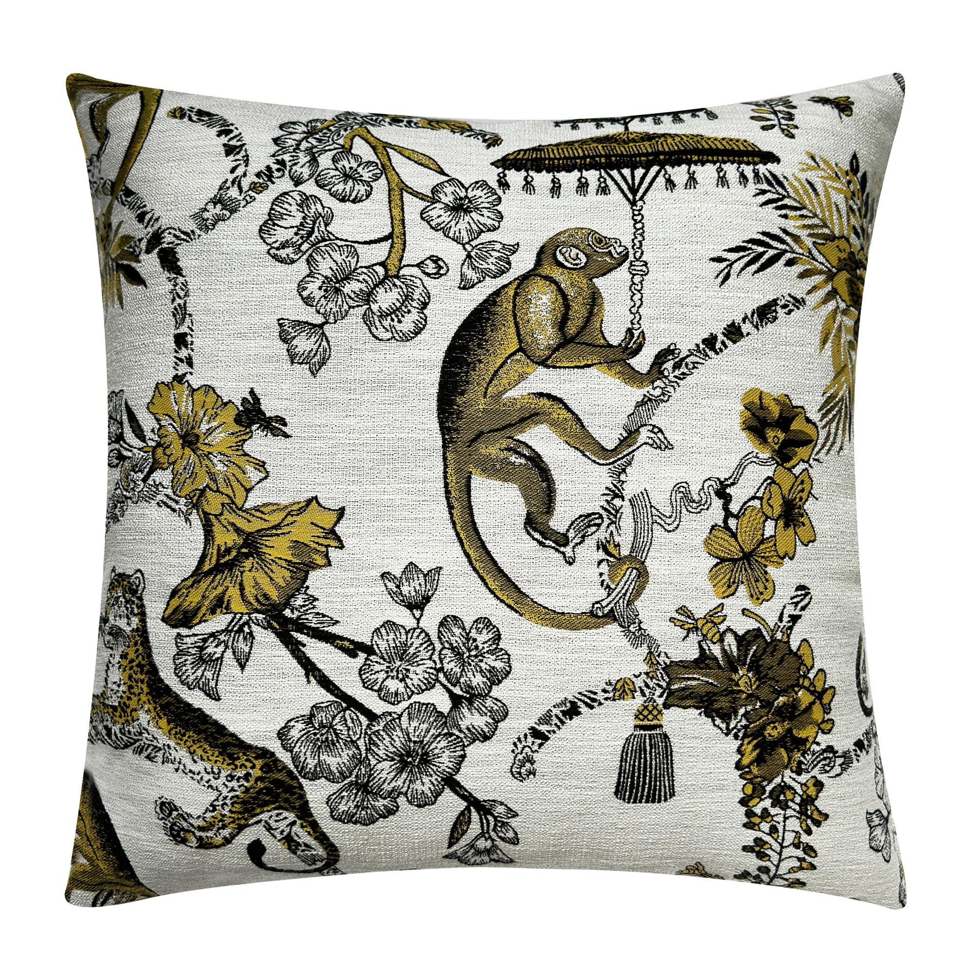
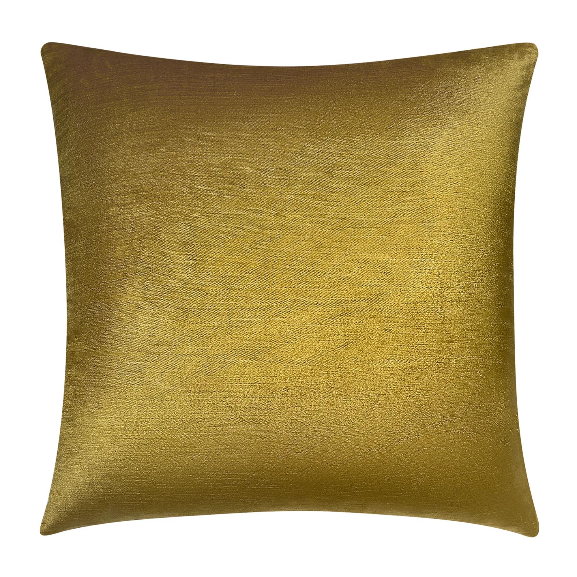 Monkey Jacquard Citron Yellow Velvet Pillow 20" x 20"$119
A playful jacquard pillow featuring a black and white monkey pattern with a citron yellow velvet back.
Add To Cart -
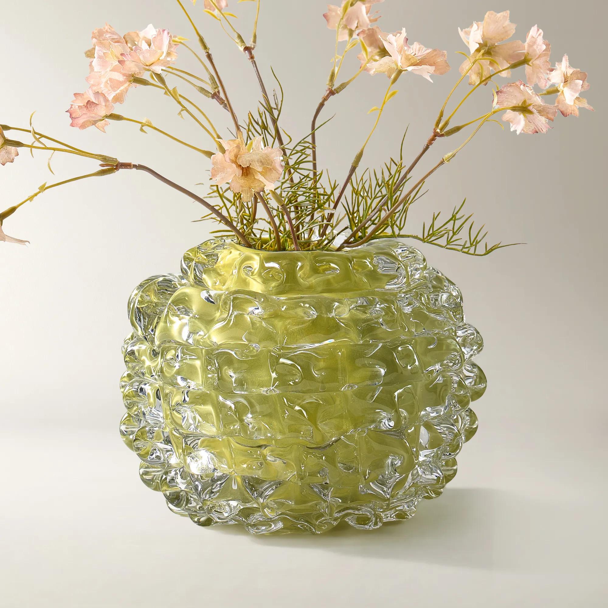 Citron Ice Glass Vase$169
A citron-hued glass vase adding vibrant, translucent color to modern décor.
Add To Cart -

 Hint of Spring Framed Painted Wall Art 48" x 48"$599
A framed, multicolored painted canvas artwork that brings a vibrant, artistic touch to contemporary interiors.
Add To Cart -

 Saguaro Outdoor Ball Pillow 12" - Bright Citron Yellow$79
A vibrant bright citron yellow outdoor accent pillow adding playful color to patios and lounging spaces.
Add To Cart -
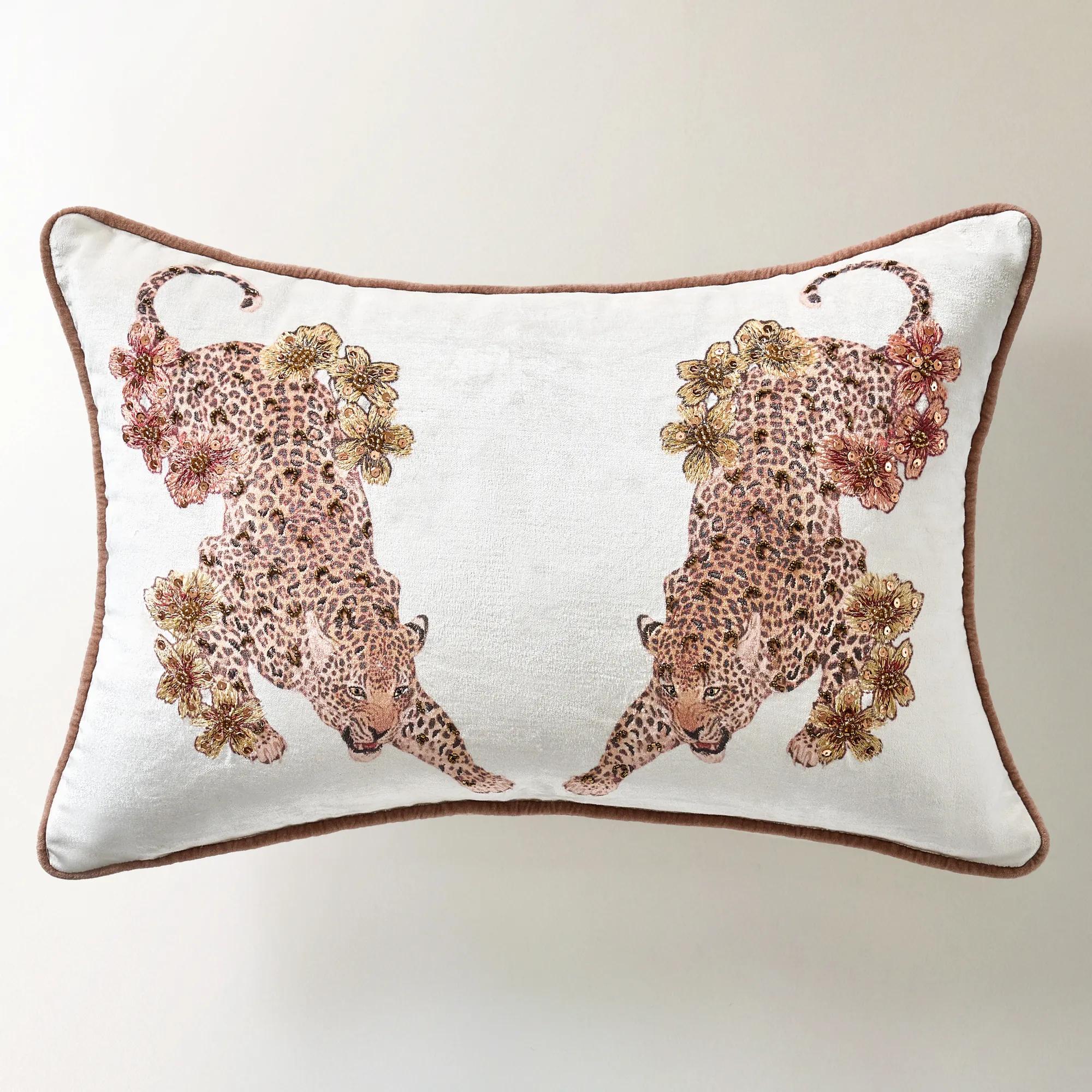
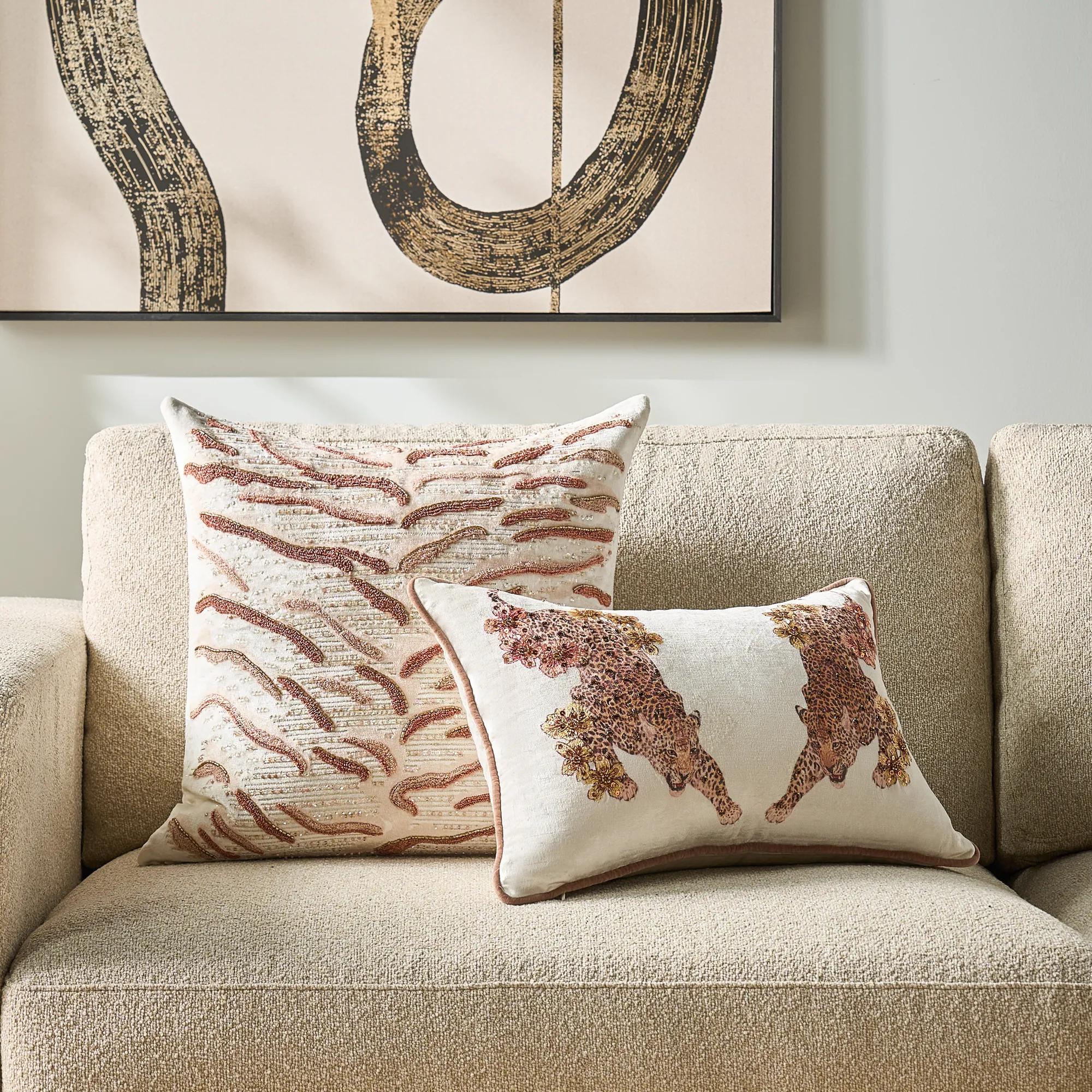 Jaya Embroidered Bead Lumbar 20" x 14"$119
A velvet lumbar pillow featuring hand-applied embroidery, bead accents, and contrast piping in soft neutral tones.
Add To Cart -
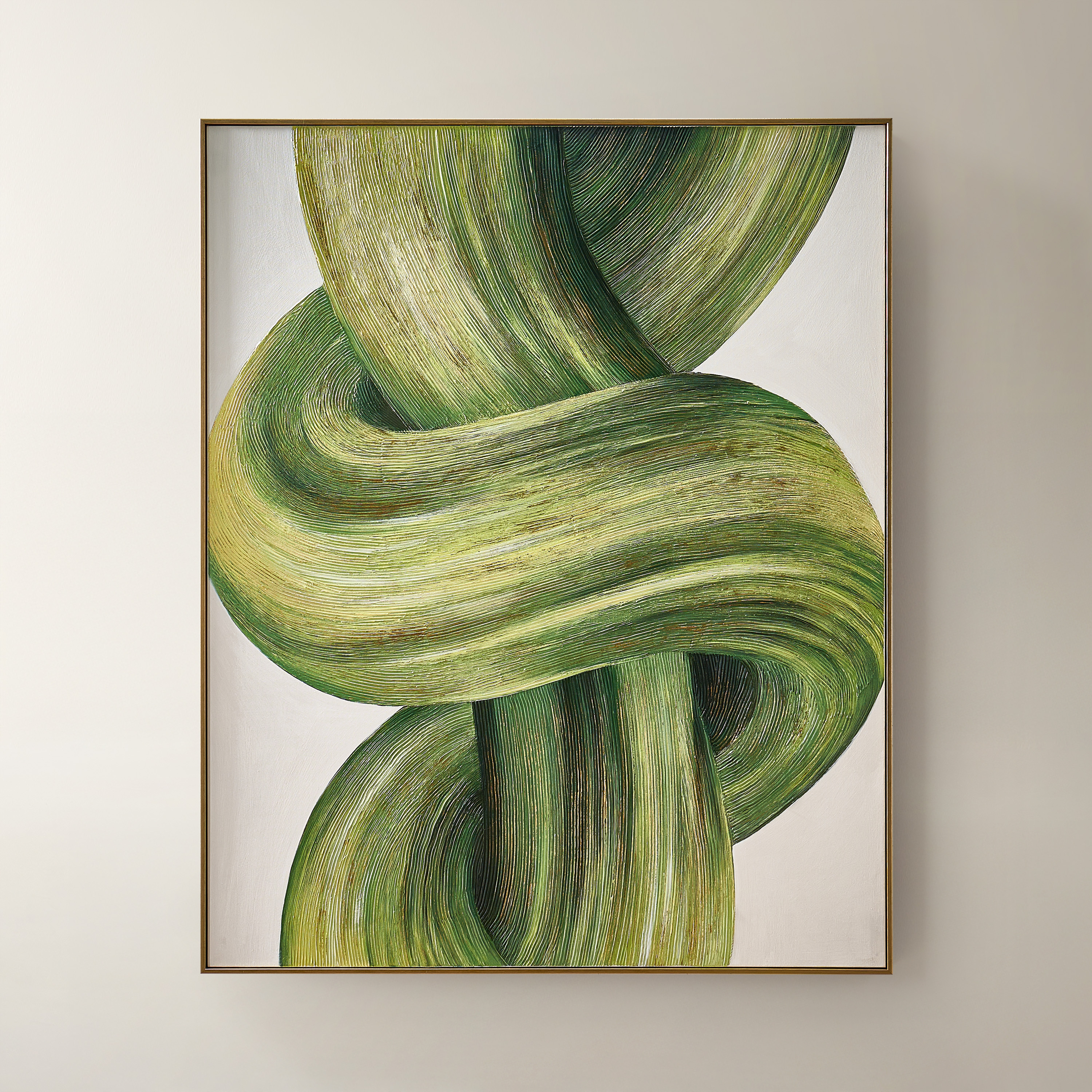
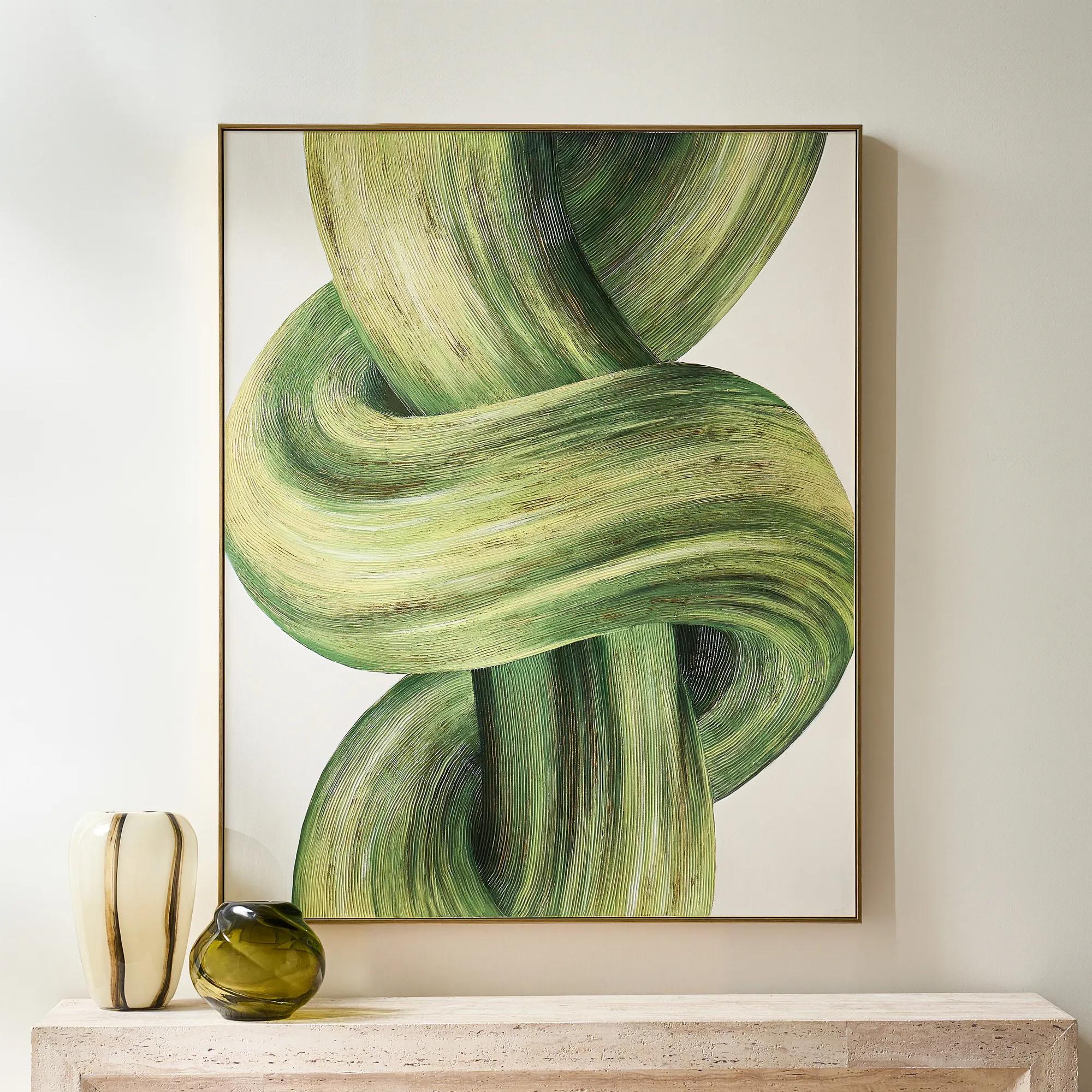 Knotted Framed Gold Leaf Painted Wall Art 40" x 50"$599
A hand-painted green and citron canvas with gold leafing, finished in a sleek PS floater frame.
Add To Cart -
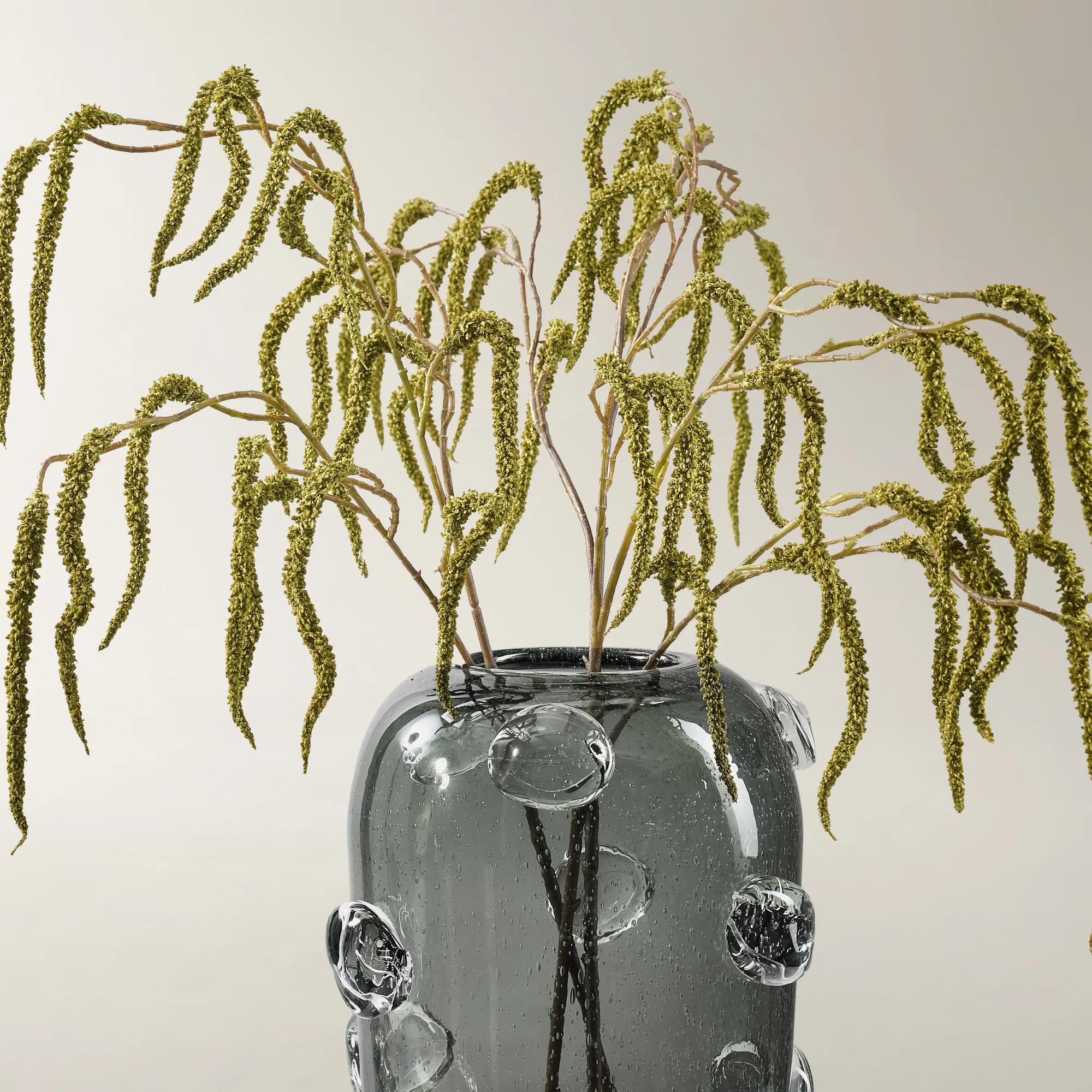 Faux Citron Green Amaranthus Stem 30" Set of 3$39
A set of three cascading faux amaranthus stems in vibrant citron green plastic for lush arrangements.
Add To Cart -
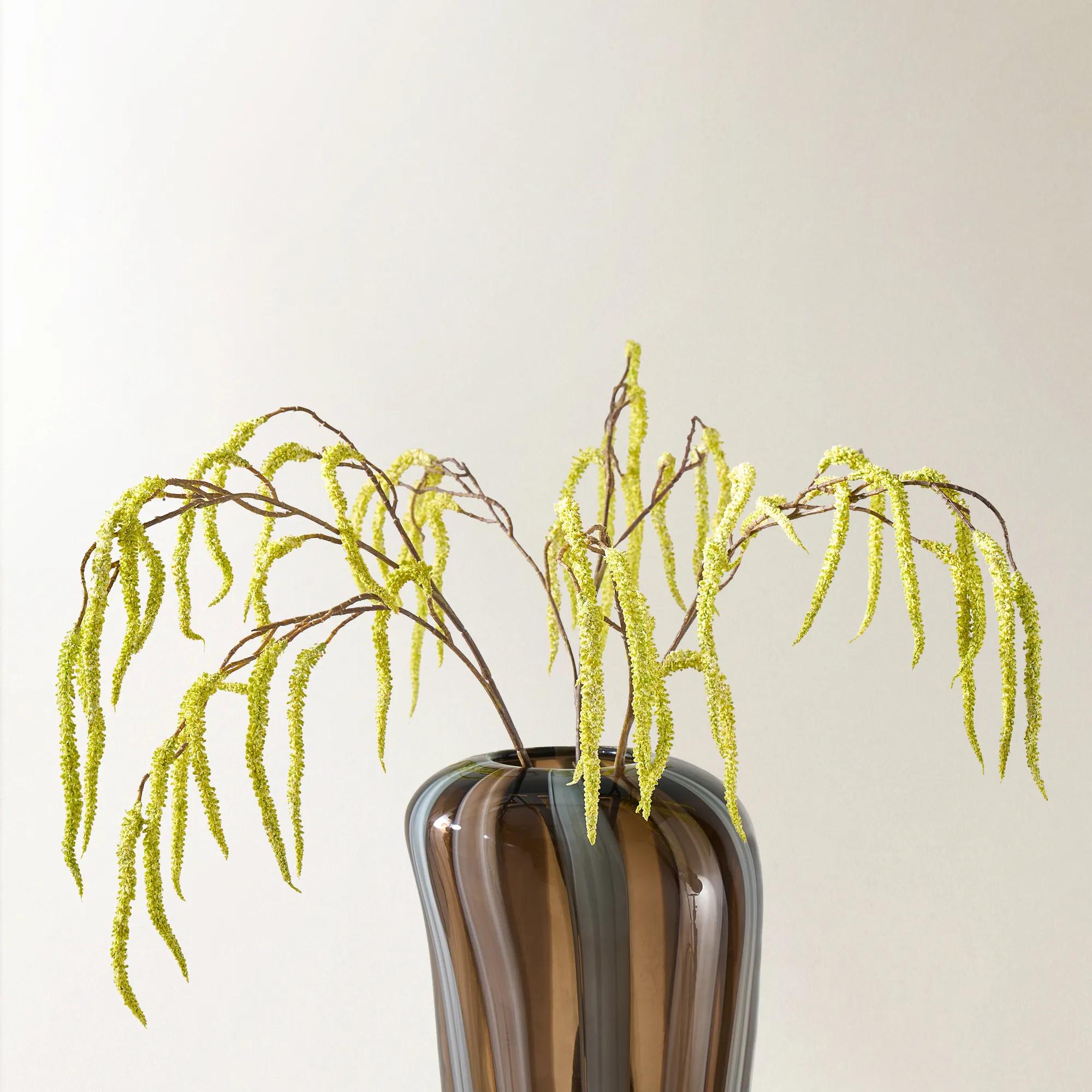
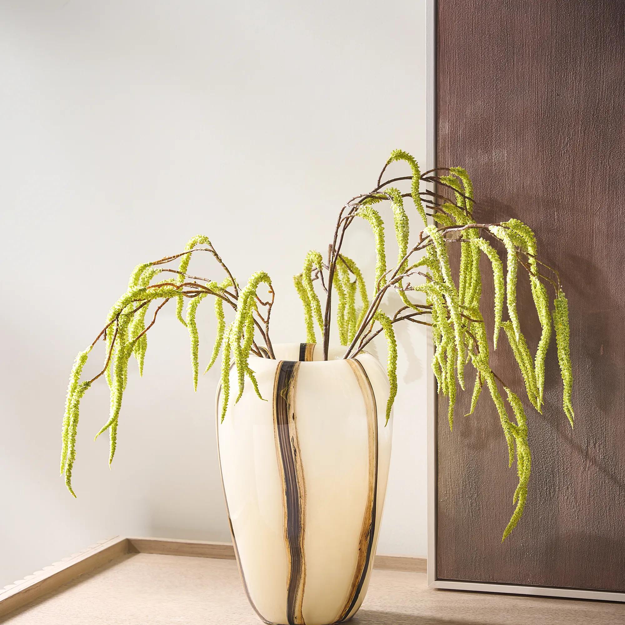 Faux Citron Yellow Amaranthus Stem 30" Set of 3$39
A faux floral stem set in citron yellow plastic with cascading form for layered arrangements.
Add To Cart -

 Leopard Pop Trim Outdoor Pillow 20"$79
A water-resistant black-and-white leopard print pillow with citron yellow piping for bold outdoor style.
Add To Cart -
 Delia Silky Velvet Pillow 20" - Citron Yellow$79
A silky velvet pillow in vibrant citron yellow, adding luxurious texture and contemporary color.
Add To Cart

Chartreuse Home Accents
Explore chartreuse home accents to bring a vivid yellow-green note to your decor. This color-focused selection lets you introduce the hue as a striking focal point or a supporting detail. Pair chartreuse with charcoal for dramatic contrast or layer it against warm neutrals for a softer, artful balance.
Chartreuse home accents bring a luminous yellow-green color to a room, creating a distinctive focal point through decorative textiles, ceramics, glass, and other expressive details. Positioned between yellow and green, chartreuse can feel citrus-bright or richly botanical depending on its undertone, material, and surroundings. Its appeal lies in that tension: energetic enough to interrupt a quiet palette, yet connected to the natural world in a way that makes bold color feel considered. Against charcoal upholstery, a chartreuse accent has a crisp, almost electric presence; beside warm ivory and walnut, the same hue becomes softer and more enveloping. Navy gives it depth, while aubergine introduces a sumptuous contrast suited to interiors with a flair for drama. Brass and gold-toned finishes draw out its yellow notes, and chrome or silver-toned details sharpen its contemporary edge. These relationships make chartreuse decor compelling across modern, eclectic, and traditional rooms rather than limiting it to a single design style. In a living room with a generous neutral sofa, a concentrated sweep of yellow-green can pull attention toward the seating area without competing with the architecture. In an entryway, a sculptural accent in this shade establishes an expressive mood before the rest of the home comes into view. Pattern offers another dimension: chartreuse threaded through an abstract motif feels different from a broad expanse of solid color, giving the eye places to pause among quieter tones. The amount of color matters as much as the shade itself. A small, saturated detail reads like punctuation, while a larger textile creates a more immersive impression. Repeating the hue in a few separated places can connect a room visually, especially when each appearance has a different texture or shape. The result is not a room dominated by one color, but an interior with a clear point of view, where even a modest accent has presence.
Material gives chartreuse its particular character, transforming the same yellow-green family from plush and moody to gleaming and translucent. Velvet creates shifting highlights across its pile, so a textile may appear deeper from one angle and brighter from another. Woven cotton and linen blends can give the color a more matte, tactile expression, with visible texture that sits comfortably beside wood grain, leather, or richly patterned upholstery. Fiber content, weave, and construction all influence how a decorative textile feels and performs; a soft surface alone does not indicate how well it will tolerate frequent handling. For seating used every day, well-finished seams, secure closures, and care requirements suited to the household are meaningful details. Removable covers may simplify cleaning when the care label permits it, while dimensional embroidery or delicate embellishments generally call for gentler treatment. Glass gives chartreuse a different kind of depth, allowing light and background colors to influence its appearance. A translucent surface near a light source can reveal golden edges or deeper green shadows, whereas opaque ceramic delivers a more concentrated statement. Glazed finishes may appear smooth and reflective or subtly varied, and those differences change the mood of a console, shelf, or tabletop arrangement. Matte surfaces absorb light for a quieter presence; glossy finishes create brighter highlights that echo nearby polished metal or mirrors. Scale and proportion keep these expressive materials in conversation with the room. A substantial accent can hold its own against a wide console or tall shelving, while a smaller form brings detail to a compact side table without overwhelming its usable surface. Textiles should relate to the furniture they accompany, leaving comfortable seating space and allowing upholstery details to remain visible. These practical distinctions are part of the visual pleasure: the most compelling accent feels deliberate not only in color, but also in weight, texture, placement, and the way it supports daily life.
Chartreuse is especially rewarding for people who enjoy expressive interiors but prefer to introduce strong color through details rather than permanent finishes. Decorative accents can establish a bold identity in a rental, enliven a home office, or give an established living room a new visual rhythm without changing its foundational furniture. A reading chair gains definition from a contrasting textile, while a dining room sideboard can become a more sculptural composition through an interplay of saturated color, reflective surfaces, and open space. In smaller rooms, preserving that open space keeps vivid accents from feeling crowded; a clear silhouette often has more impact than several objects competing at the same height. Practical fit extends beyond dimensions. Tabletop decor needs a stable, appropriately sized base, and delicate materials belong where passing bags, active pets, or busy entertaining are less likely to disturb them. Decorative vessels are not necessarily suitable for holding water or serving food, so their stated intended use matters. Protection beneath hard objects can help prevent scratches on furniture, particularly when an unglazed or textured base rests on a polished surface. Care also deserves attention before an accent becomes part of an everyday setting. Manufacturer instructions should determine cleaning methods; harsh abrasives can damage some finishes, and textiles may require spot cleaning or professional care rather than machine washing. Strong, prolonged sunlight can alter some dyes and finishes, making placement relevant to lasting color. For a housewarming or a design-minded host, chartreuse accents can make a thoughtful gift when the recipient already gravitates toward vivid palettes, artful shapes, or yellow-green details. A familiar material or compatible scale makes an adventurous color easier to welcome. Paired with Chic Home Accents in complementary tones and distinctive textures, chartreuse contributes to a layered composition rather than an isolated splash of brightness. Its lasting attraction is the way it gives familiar surroundings a more expressive identity: a flash of luminosity, a richer contrast, and a detail that rewards a second look.
FAQs
Chartreuse is a vivid yellow-green that brings an artful edge to interiors. Depending on its undertone, it can read as golden and electric or lush and botanical. Chartreuse home accents introduce expressive color that feels unexpected, making them a striking choice for a room with personality.
Chartreuse creates a dramatic contrast with navy, charcoal, and deep plum, while ivory and warm beige give its yellow-green tones room to shine. For a richly layered palette, pair chartreuse with emerald or teal. Gold-toned details add warmth; silver-toned finishes create a cooler, more graphic effect.
Begin with a deliberate moment of color, such as a decorative accent or an expressive piece of art. Echo the chartreuse elsewhere to create a visual connection, then let the neutral backdrop frame it. The result feels composed and confident, with color adding a distinctive point of view.
Chartreuse brings a daring note to both. In modern interiors, pair it with sculptural silhouettes and crisp contrasts for a gallery-inspired mood. For a glamorous setting, layer chartreuse with reflective finishes and richly textured surfaces. Its expressive character also complements eclectic rooms filled with art and pattern.
Choose a pattern that includes chartreuse or shares one of its companion colors, then balance it with solid accents. Abstract motifs lend a painterly quality, while geometric designs create a sharper rhythm. Keep a clear color connection across the room so the mix feels intentional rather than competing for attention.


