Chartreuse And Brown Decor
Chartreuse And Brown Decor
-
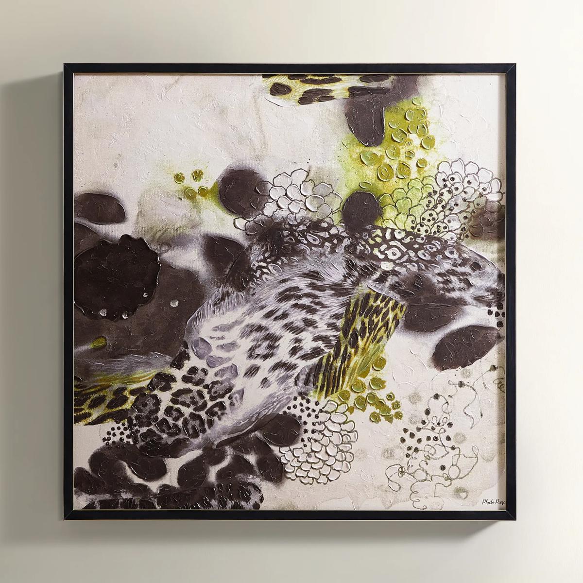
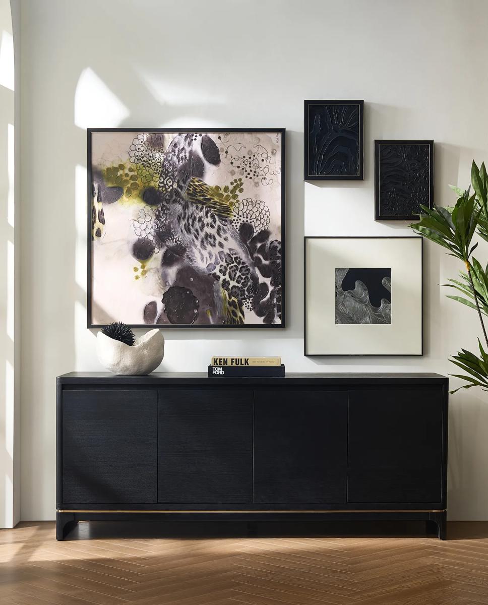 In the Wild$399
A hand-embellished canvas artwork featuring textured strokes in black, chartreuse, and sand, framed in ornate wood.
Add To Cart -
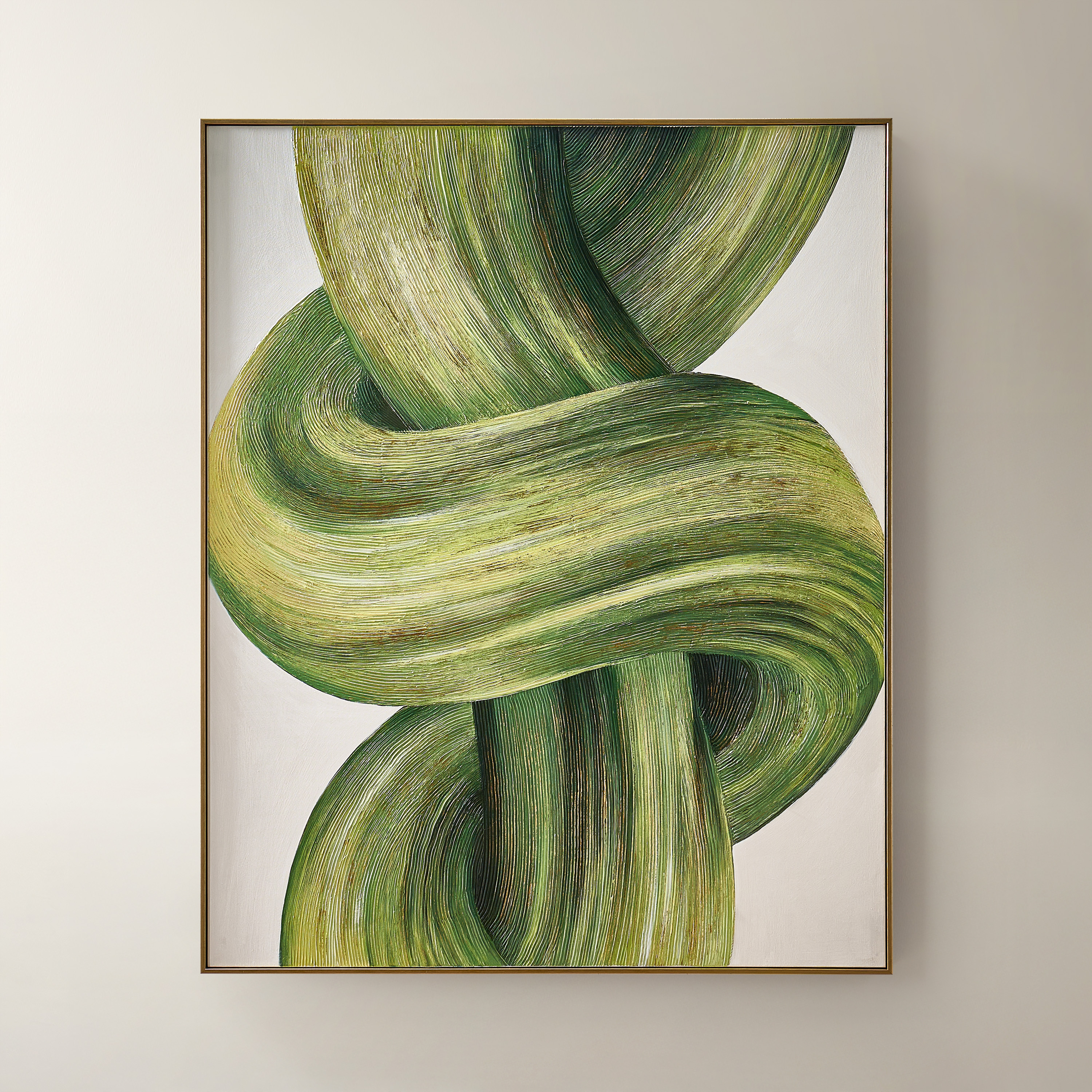
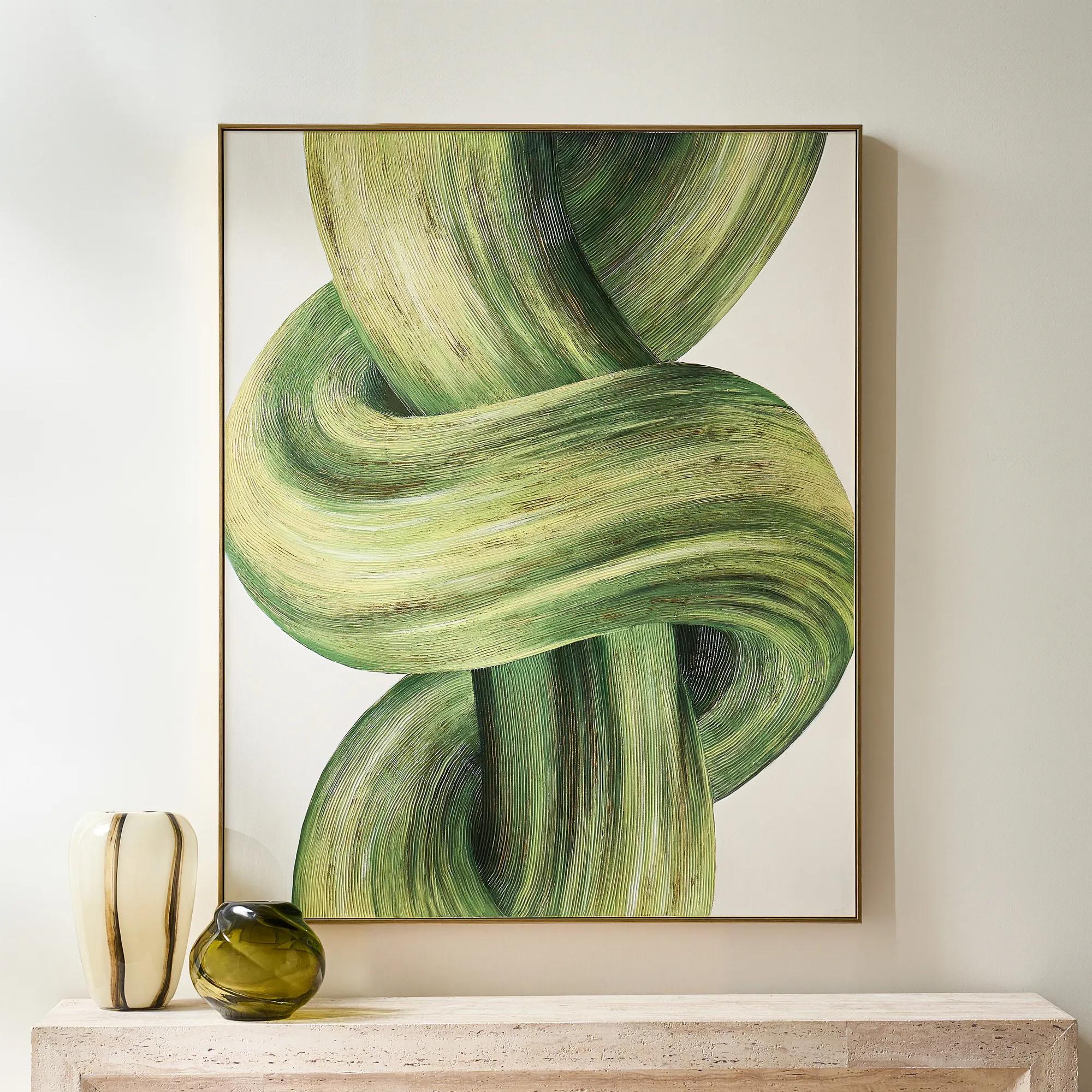 Knotted Framed Gold Leaf Painted Wall Art 40" x 50"$599
A hand-painted green and citron canvas with gold leafing, finished in a sleek PS floater frame.
Add To Cart -
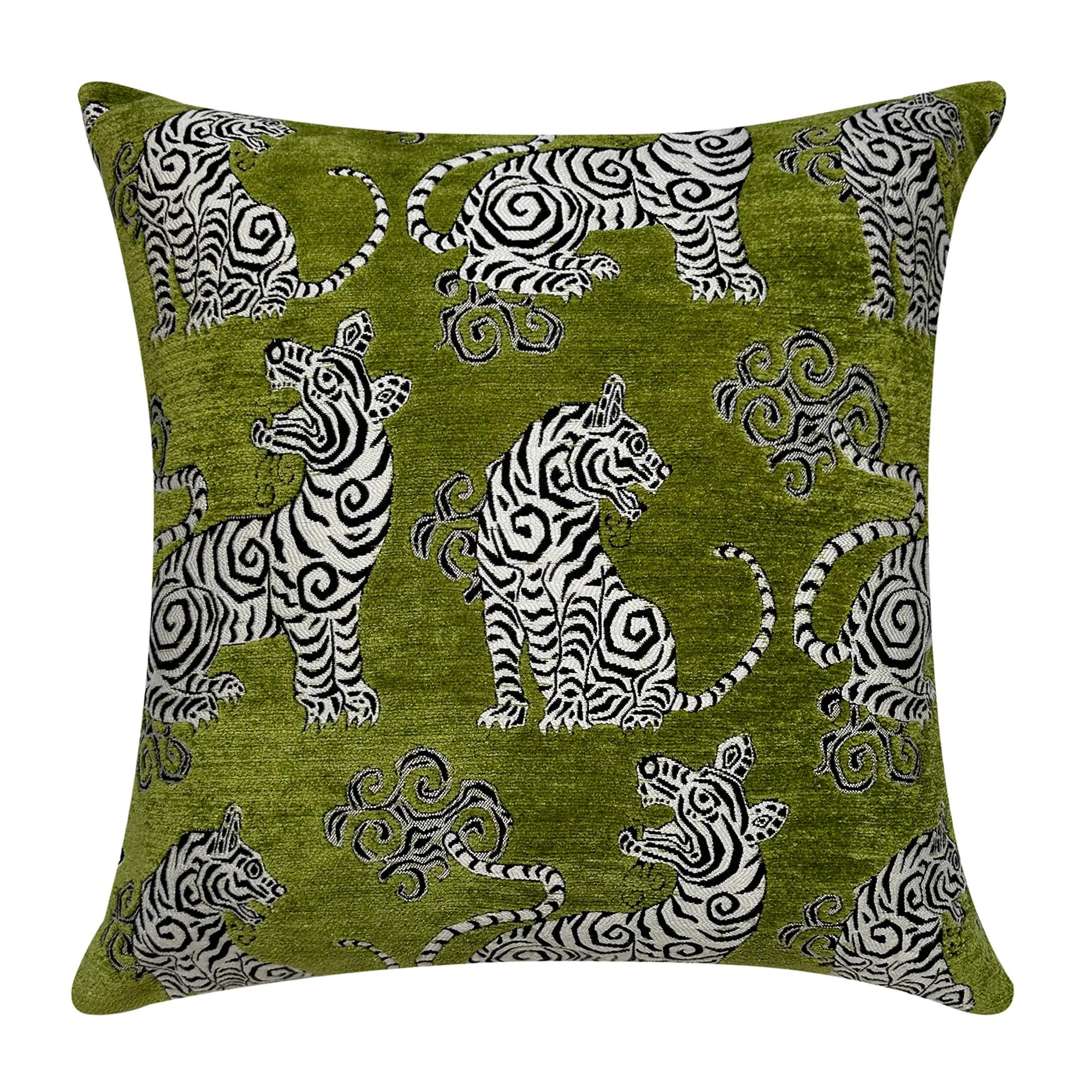
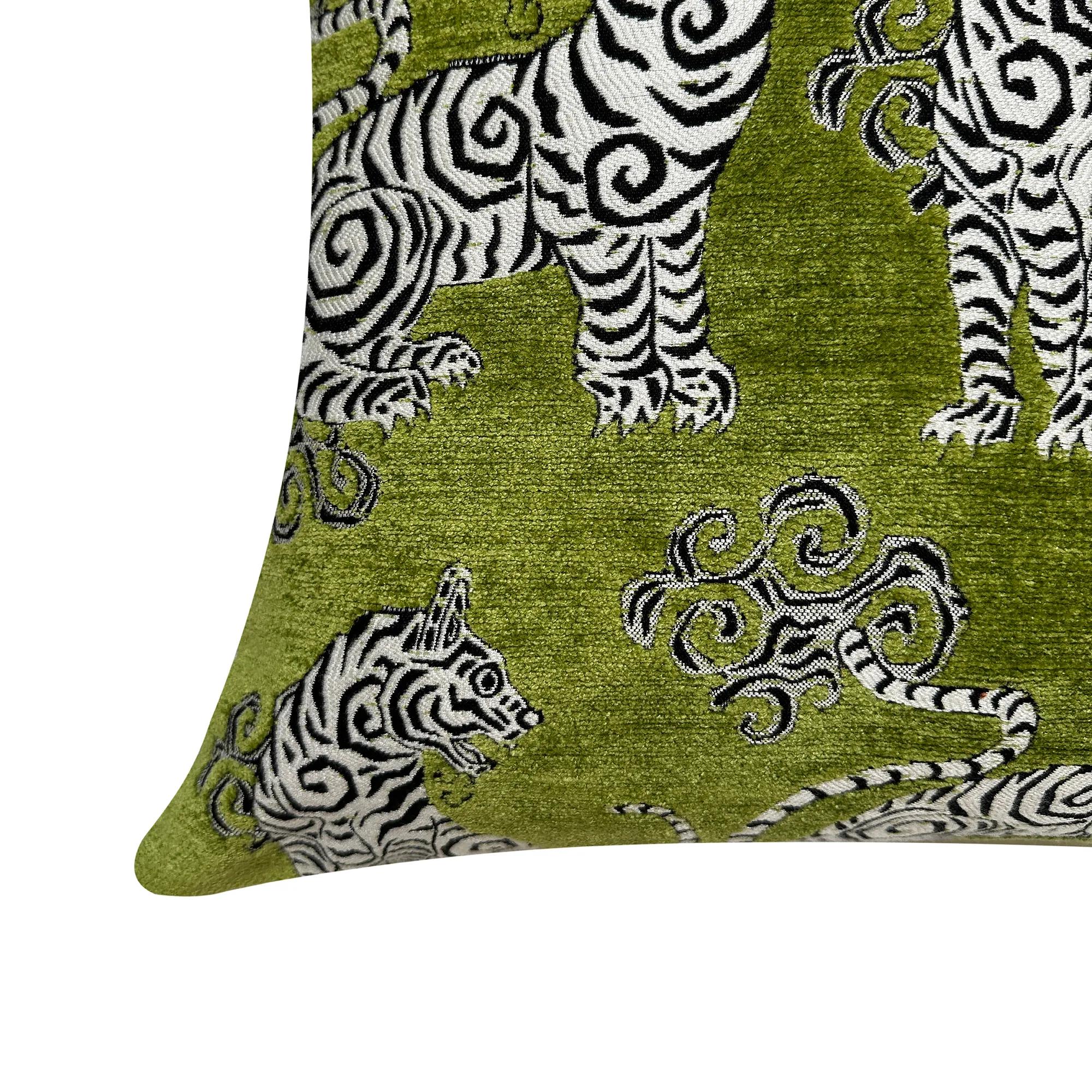 Tigress Citron Green Jacquard Chenille Velvet Pillow 20" x 20"$119
A plush citron green jacquard chenille pillow featuring a striking black and white mini tiger design.
Add To Cart -
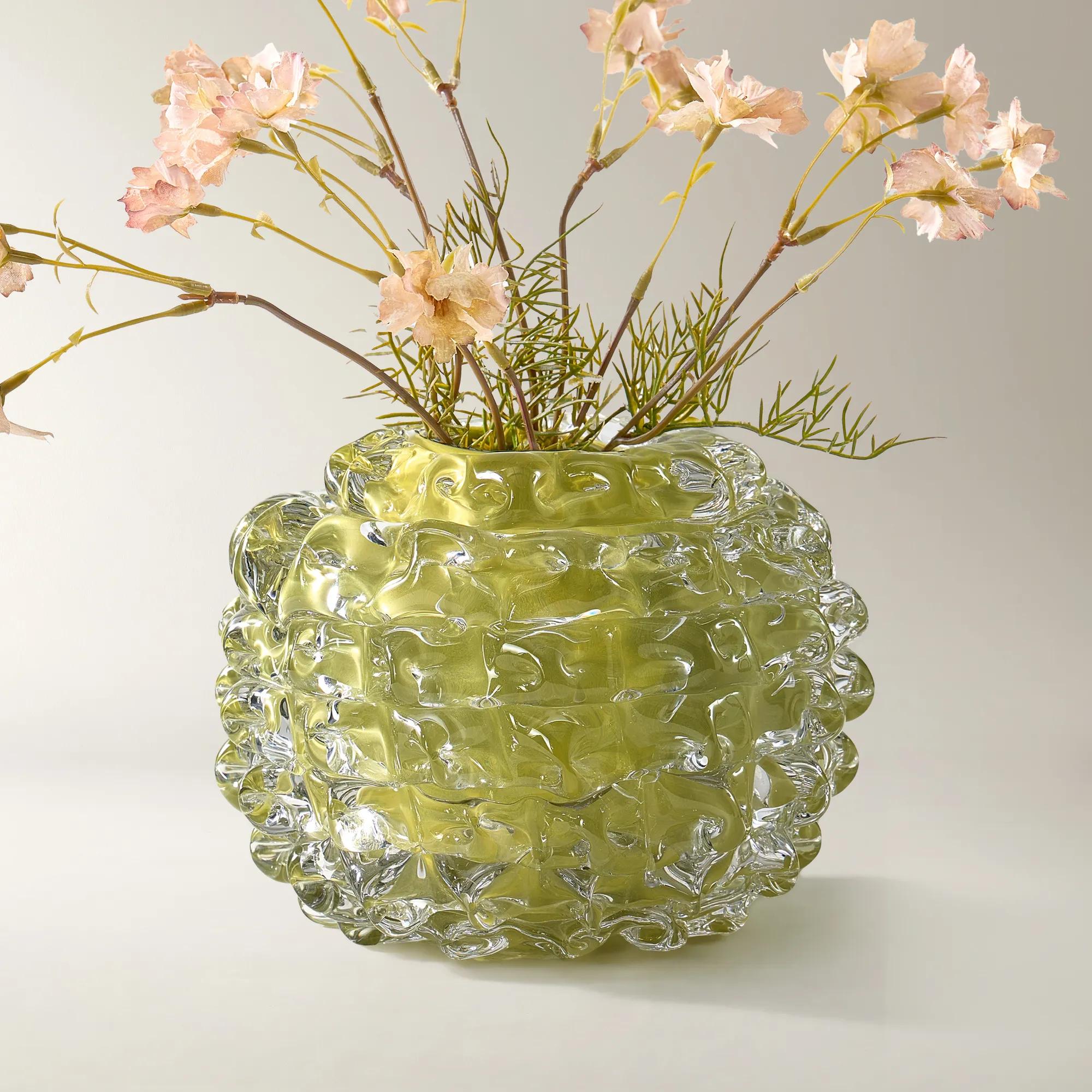 Citron Ice Glass Vase$169
A citron-hued glass vase adding vibrant, translucent color to modern décor.
Add To Cart -
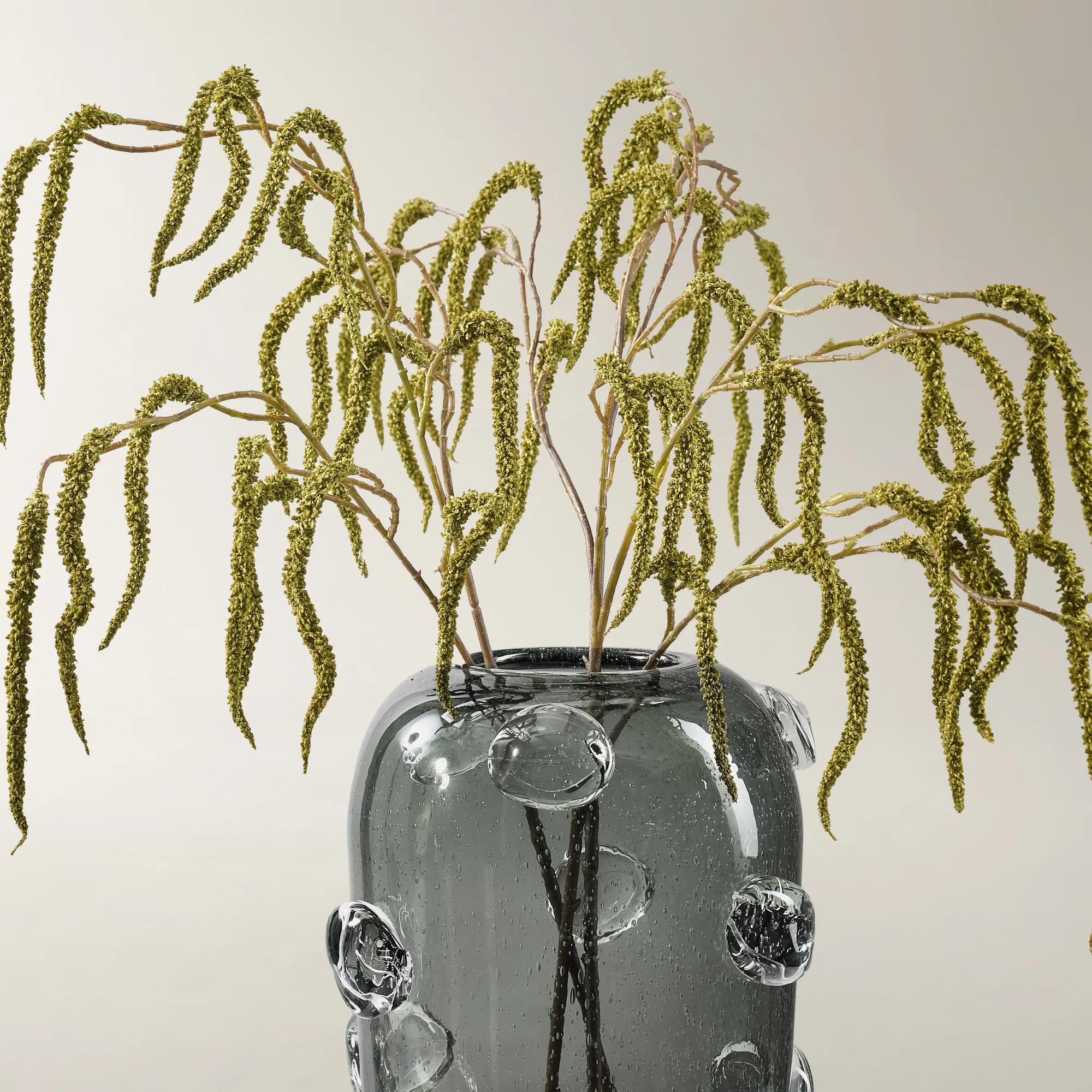 Faux Citron Green Amaranthus Stem 30" Set of 3$39
A set of three cascading faux amaranthus stems in vibrant citron green plastic for lush arrangements.
Add To Cart -
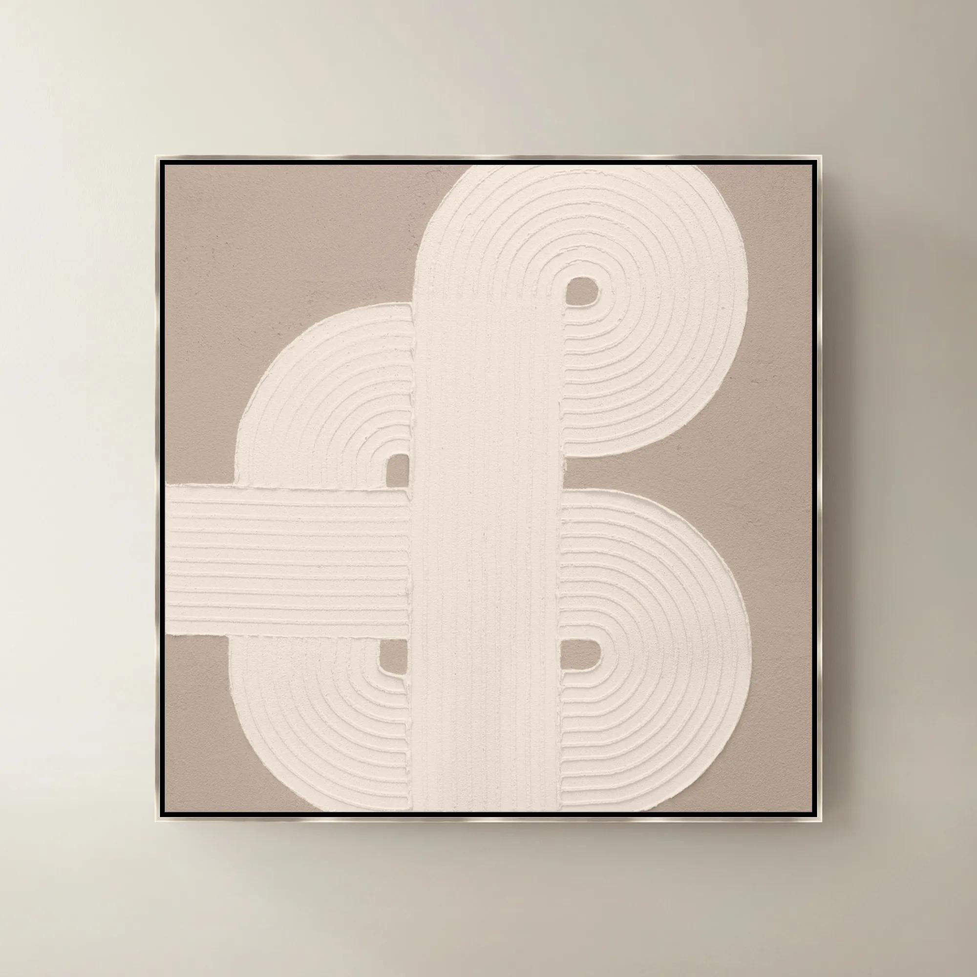
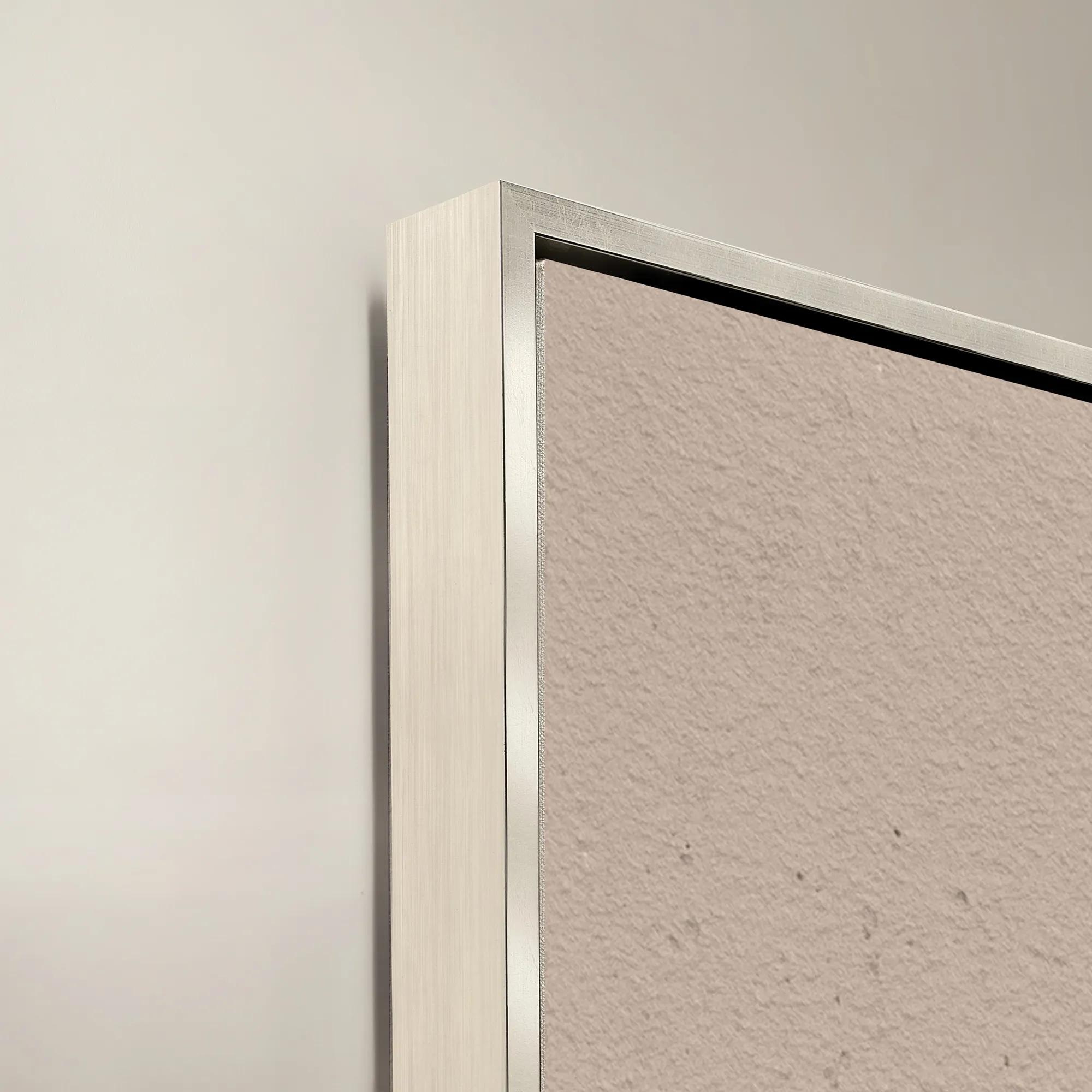 Sacred Geometry IV Framed Painted Wall Art 40" x 40"$1099
A striking abstract art piece featuring bold geometric patterns for a modern, sophisticated touch.
Add To Cart -
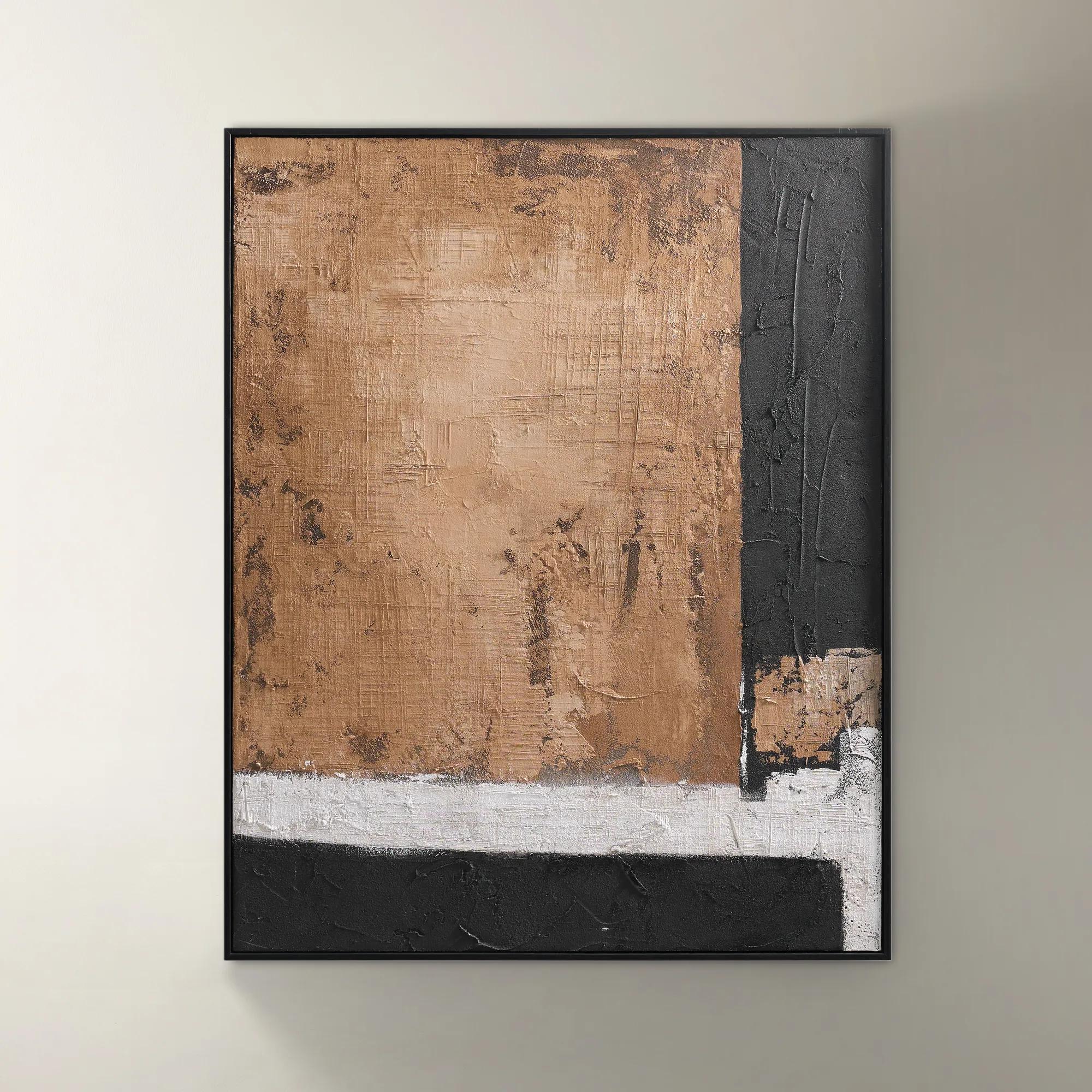 Drift Framed Painted Wall Art I 39.4" x 31.5"$299
A bold hand-painted abstract artwork featuring layered brown tones in a sleek black floater frame.
Add To Cart -
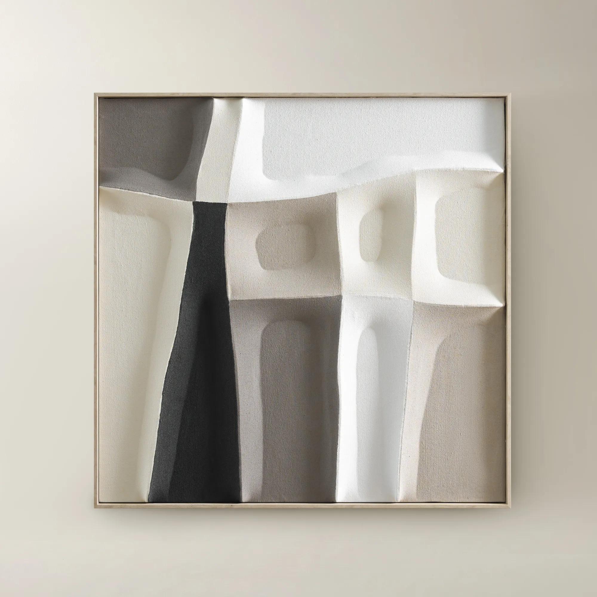 Shadow Painting 1$179
A hand-painted canvas featuring bold colors and sculptural textures in a warm whitewash floater frame.
Add To Cart -

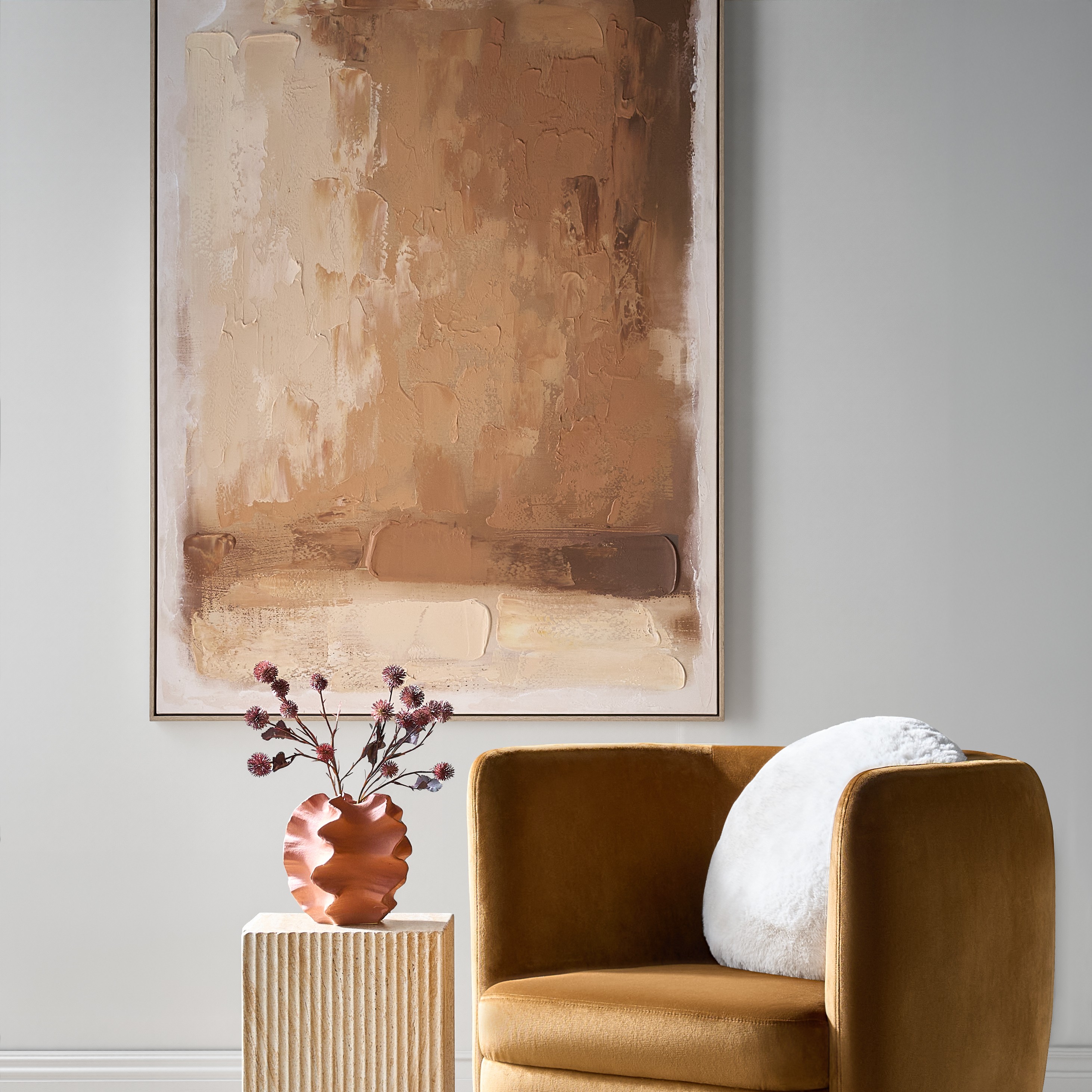 Ember Glow Framed Painted Wall Art 39.25" x 55"$499
A hand-painted abstract canvas blending ochre, terracotta, and golden clay hues in a light natural frame.
Add To Cart -
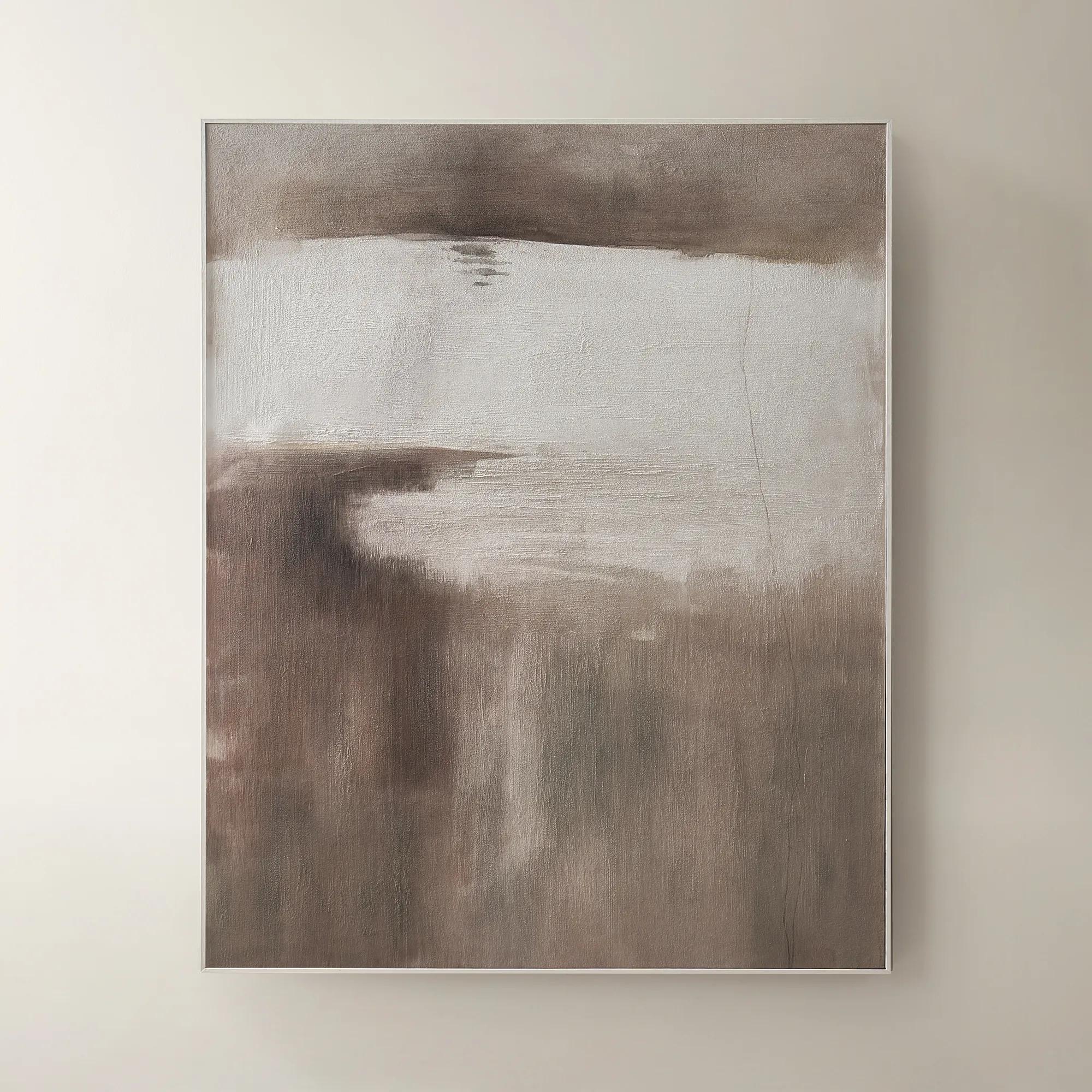 Desert Wind Art$599
A richly hued brown canvas artwork bringing warm, desert-inspired movement to modern interiors.
Add To Cart -
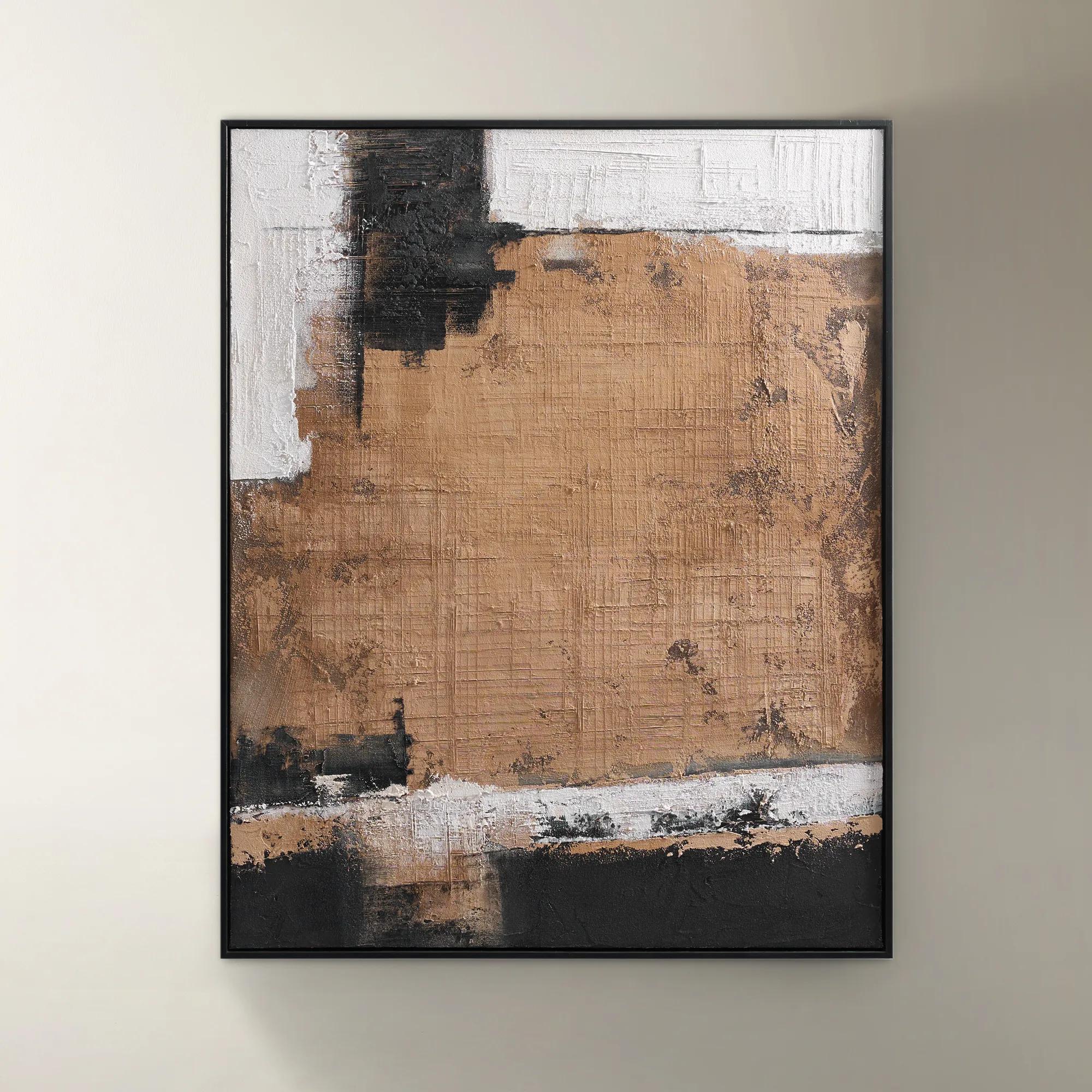
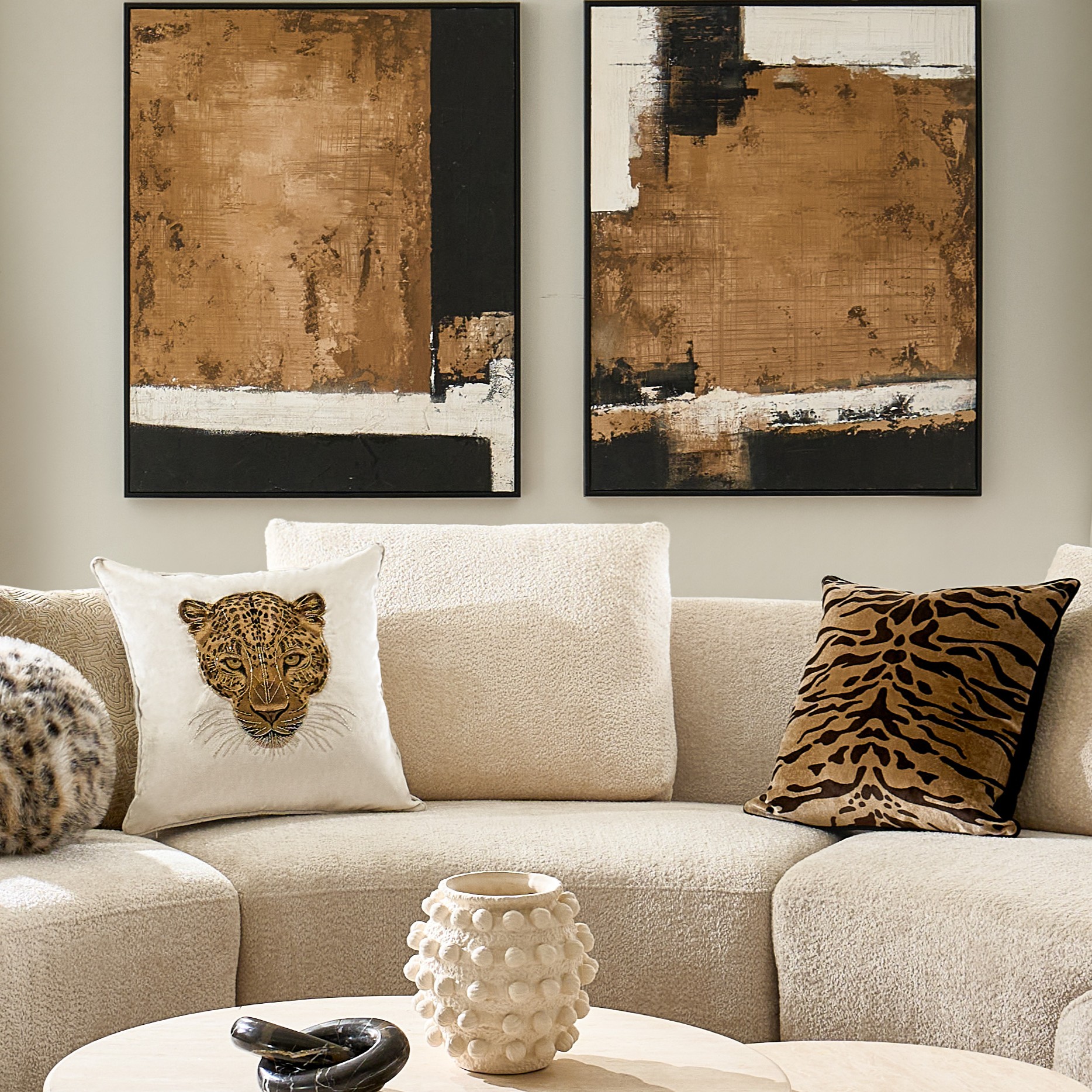 Drift Framed Painted Wall Art II 39.4" x 31.5"$299
A hand-painted canvas in brown, featuring bold texture and color interplay within a sleek black floater frame.
Add To Cart -
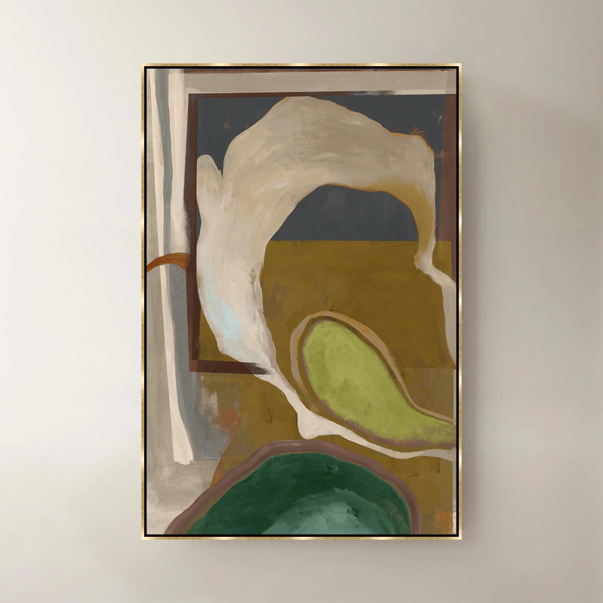 Olive Pearl Framed Wall Art 40"W x 60"$1099
A sophisticated green framed canvas artwork bringing layered color and modern elegance to your walls.
Add To Cart -
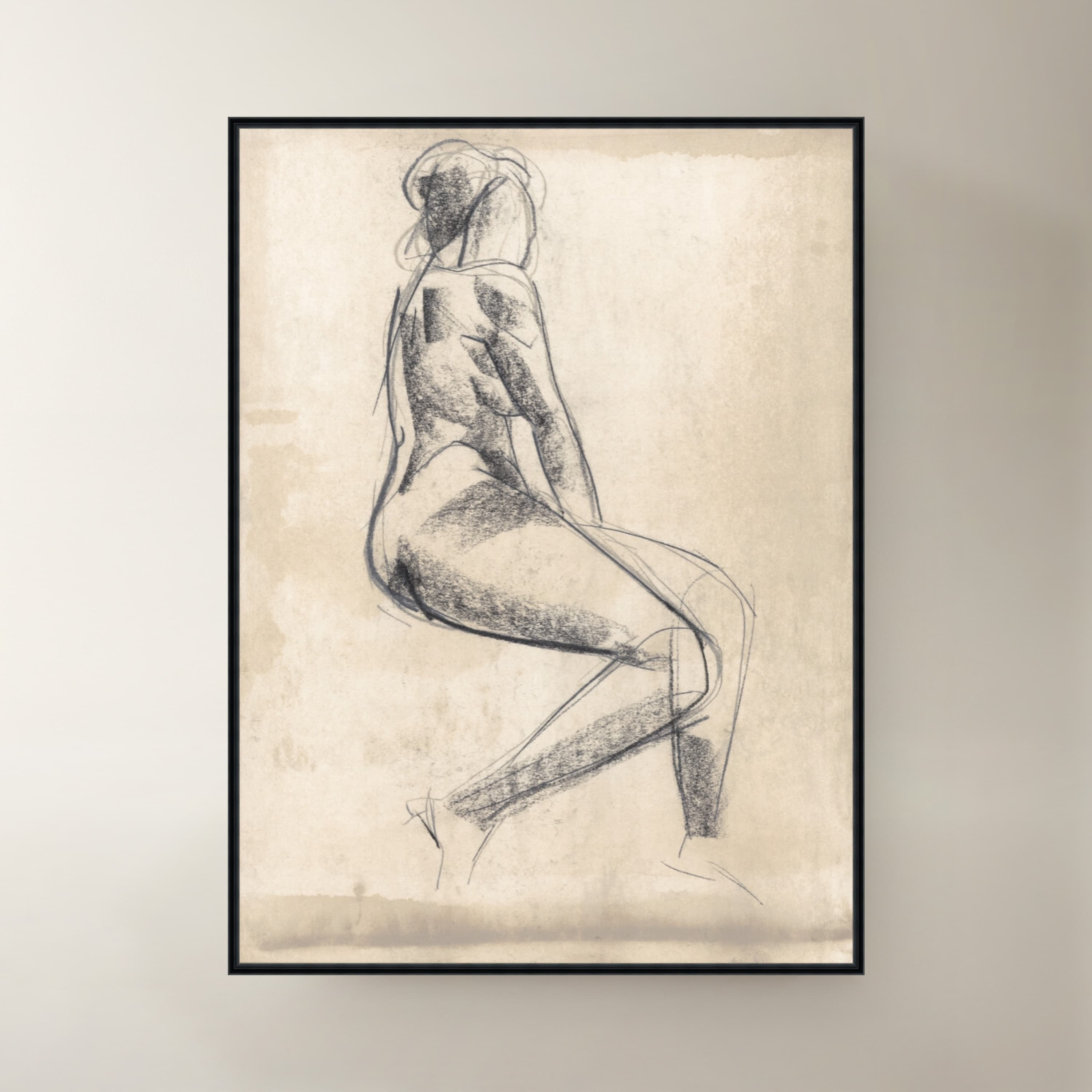
 Restful Figure I Framed Wall Art 20" x 27"$449
A serene figurative canvas artwork in warm brown tones, elegantly framed for sophisticated wall display.
Add To Cart -
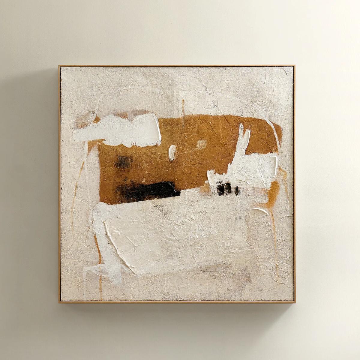 Instinct Framed Painted Wall Art 39.25" x 39.25"$349
An abstract hand-painted artwork featuring warm neutrals and black strokes on hessian with a light natural frame.
Add To Cart -
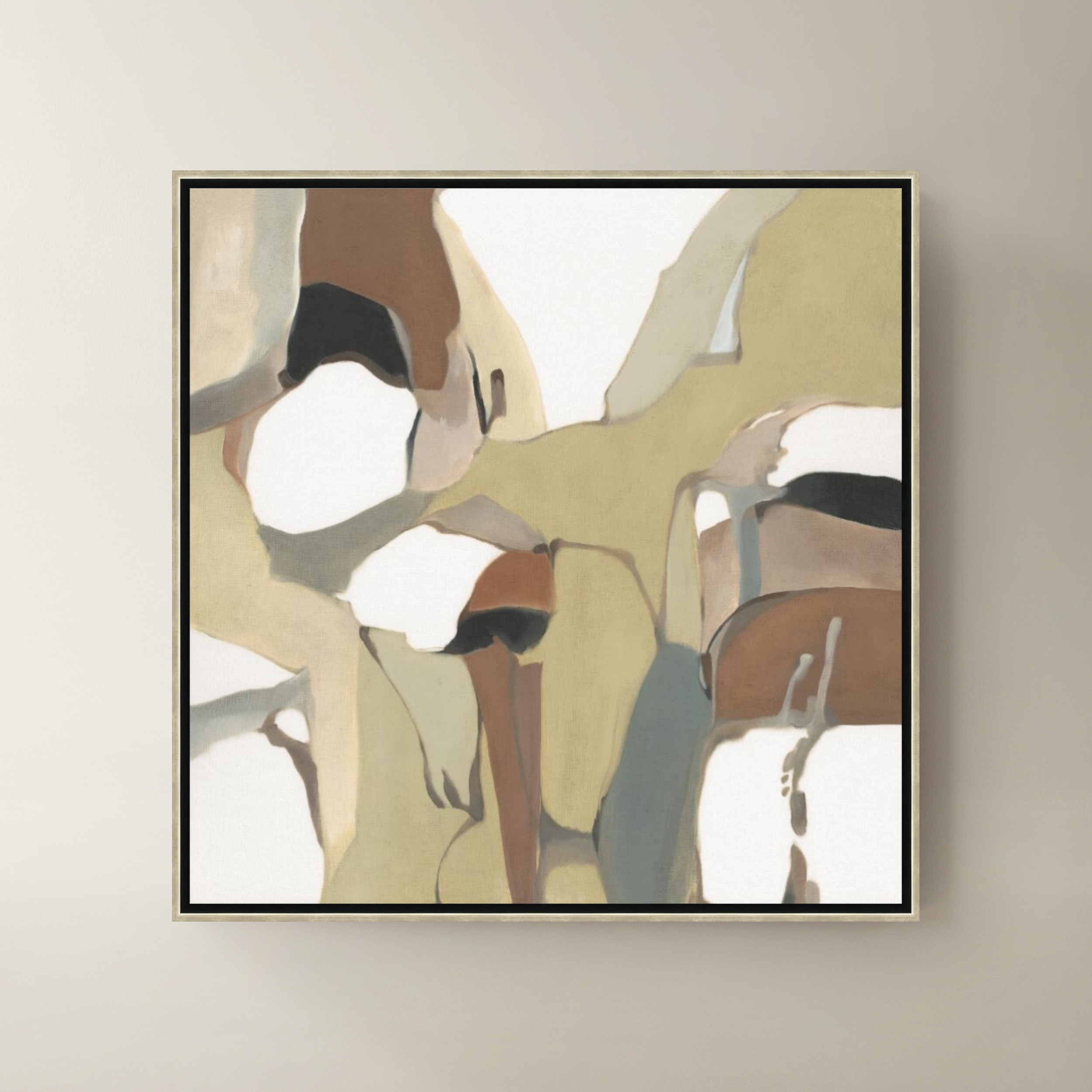
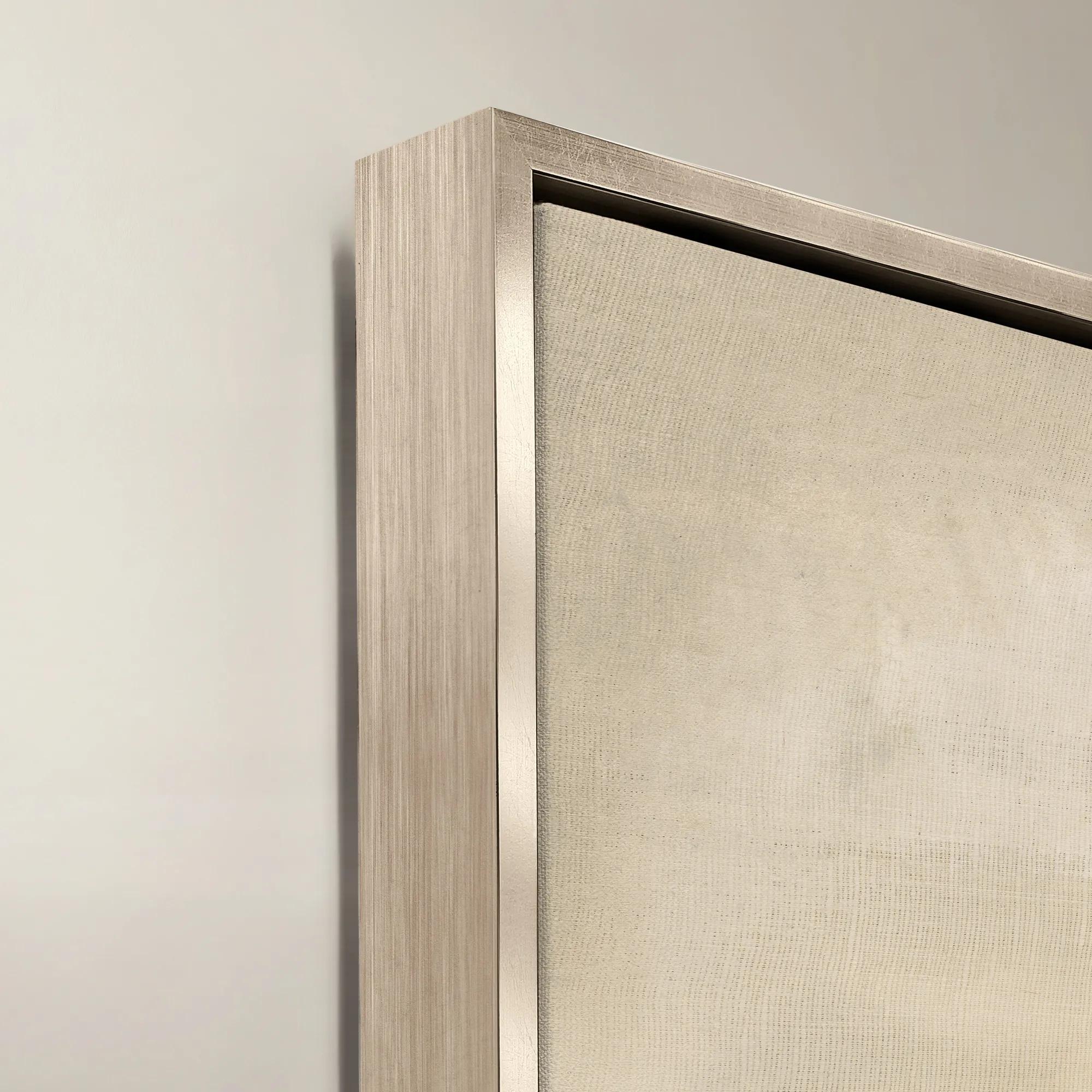 Organic Shape Framed Wall Art 47" x 47"$1099
A framed canvas artwork featuring an organic shape in rich brown tones.
Add To Cart -
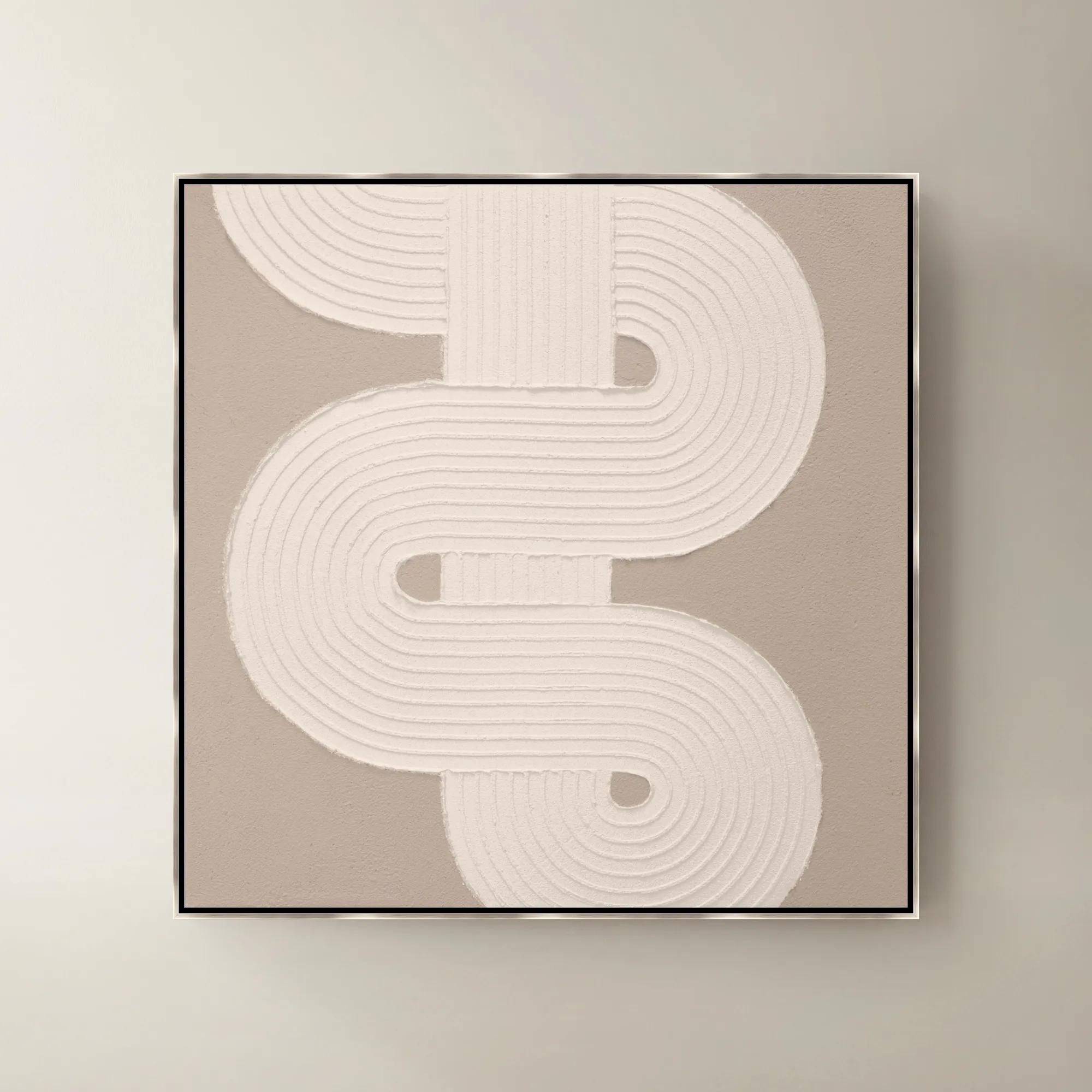
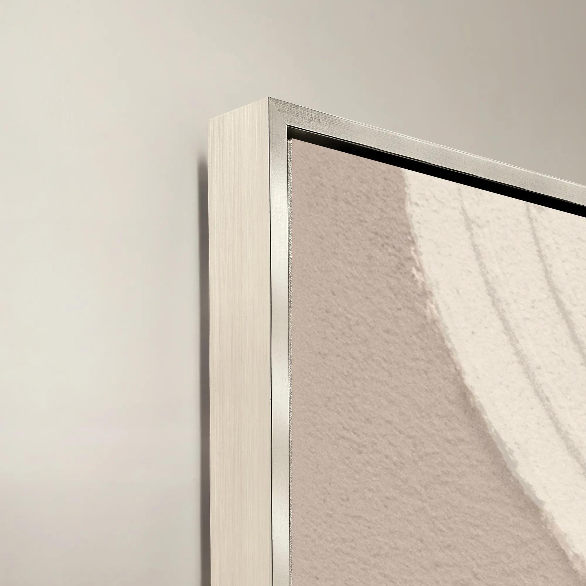 Sacred Geometry V Framed Painted Wall Art 40" x 40"$1099
A striking abstract art piece featuring bold geometric patterns for a modern, sophisticated touch.
Add To Cart -
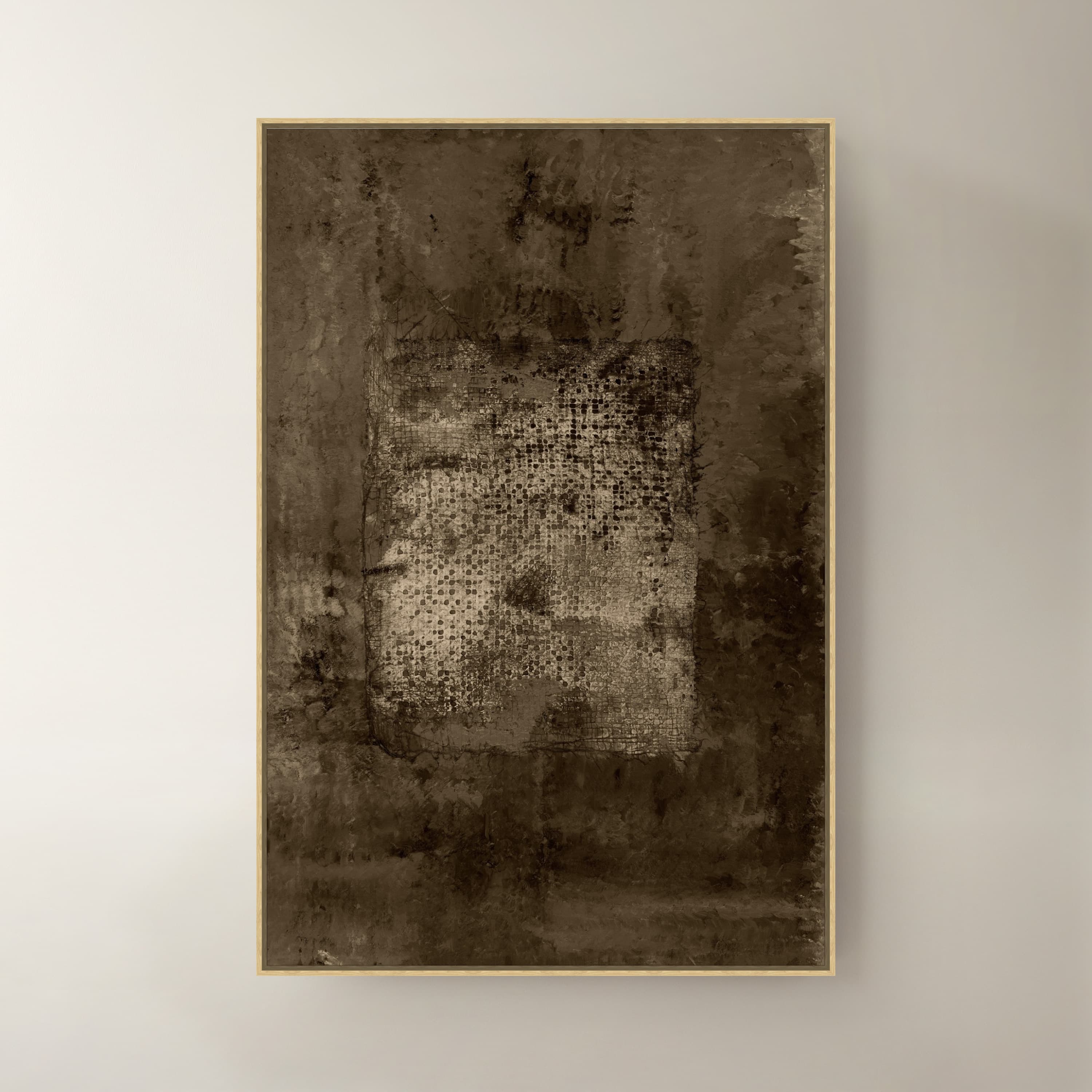
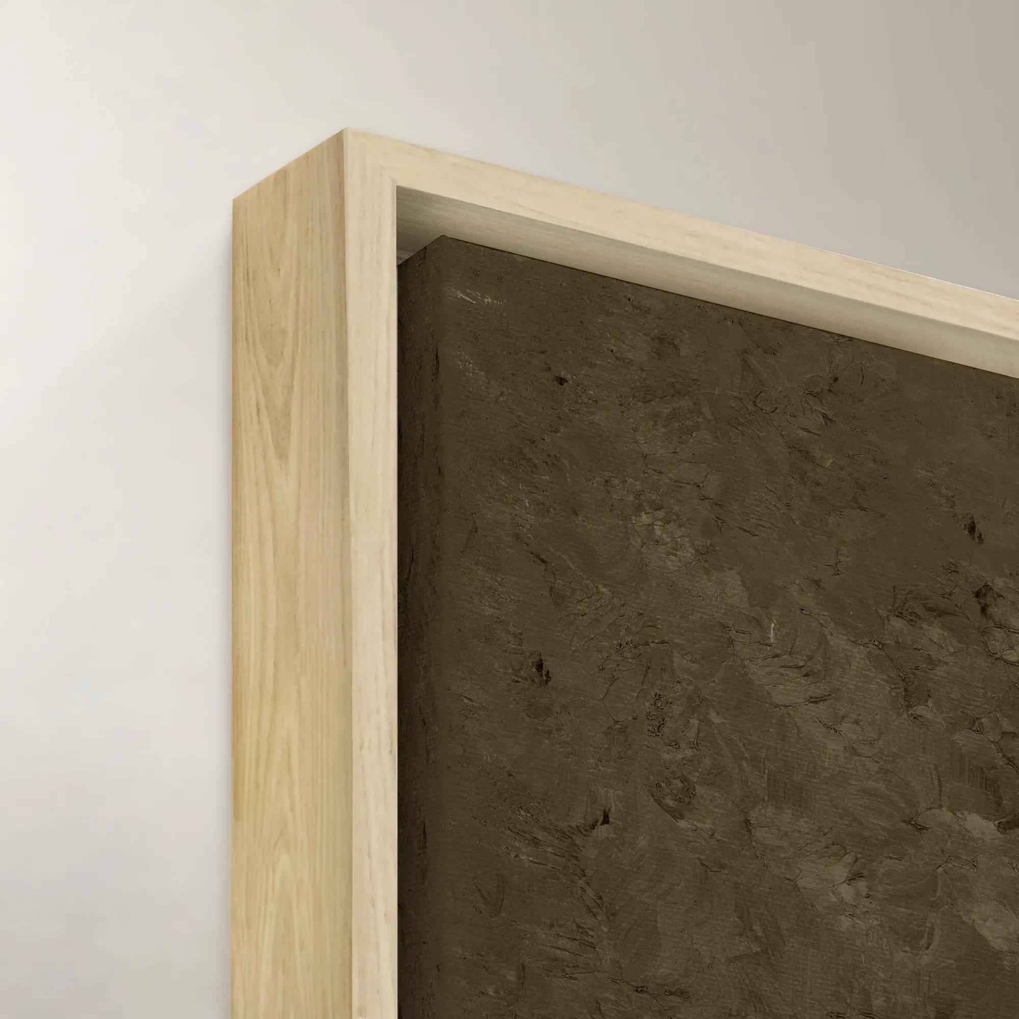 Ash IV Wall Art 40" x 60"$1399
A striking brown canvas artwork adding modern artistic depth to sophisticated interiors.
Add To Cart -

 Transformation Framed Wall Art 47" x 47"$1099
A sophisticated brown canvas wall artwork in a striking framed design for modern interiors.
Add To Cart -
 Shadow Painting 2$179
A hand-painted abstract canvas featuring bold textures and brown hues in a warm whitewash floater frame.
Add To Cart -
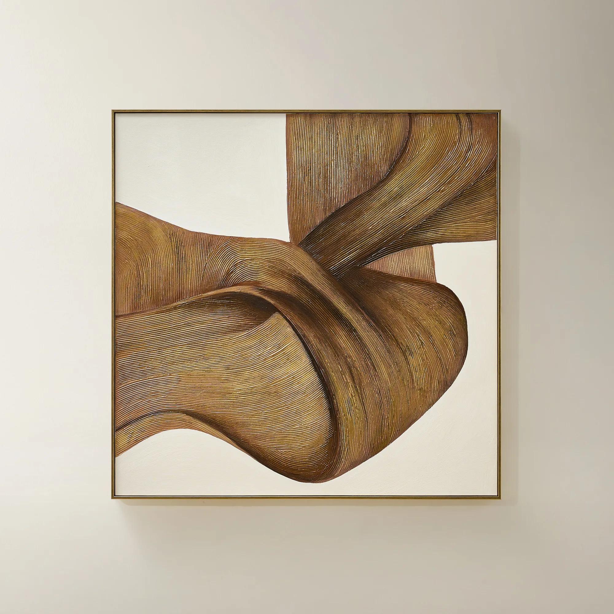
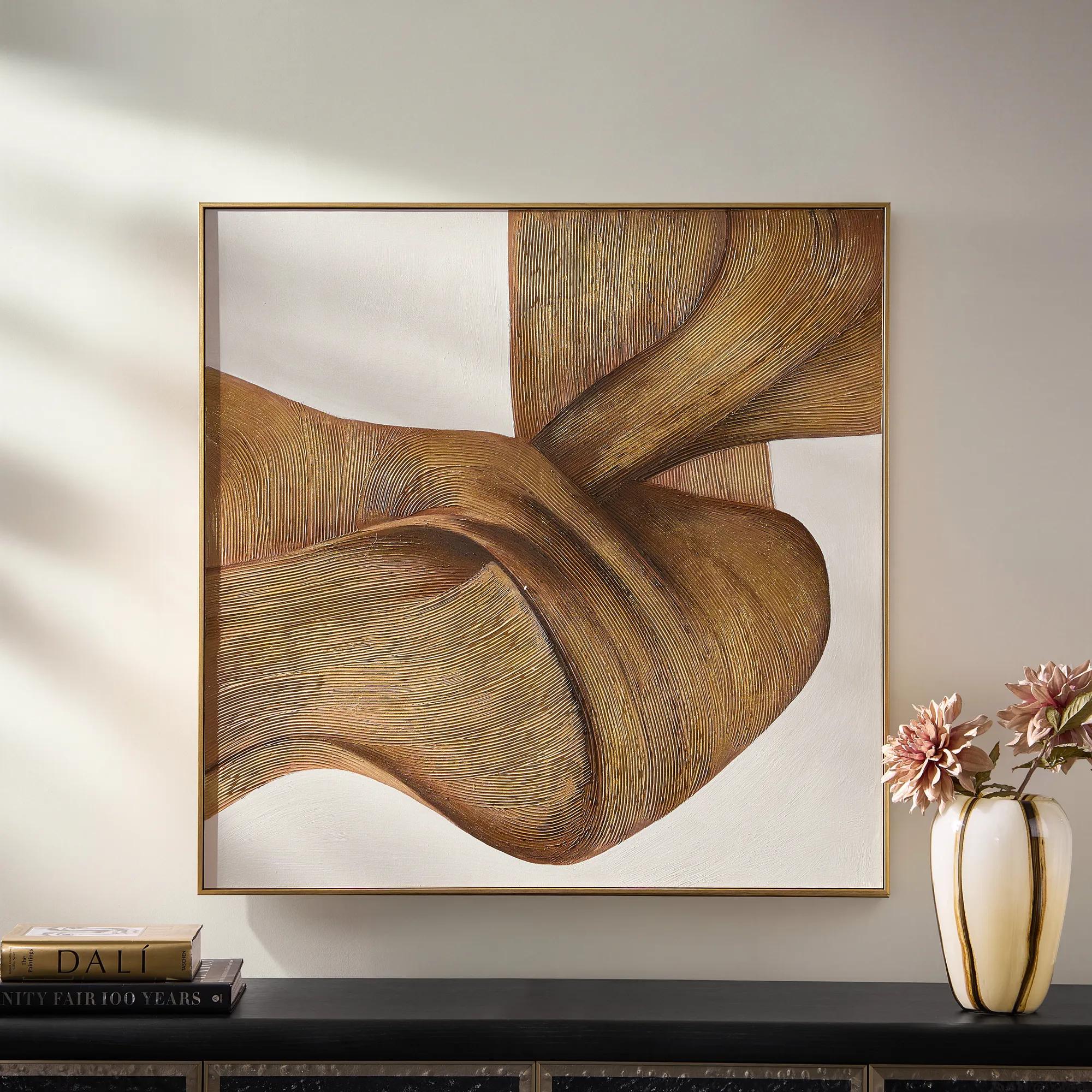 Latte Framed Gold Leaf Painted Wall Art 40" x 40"$499
A hand-painted canvas with fluid brown lines, luminous gold leafing, and a crisp black floater frame.
Add To Cart -
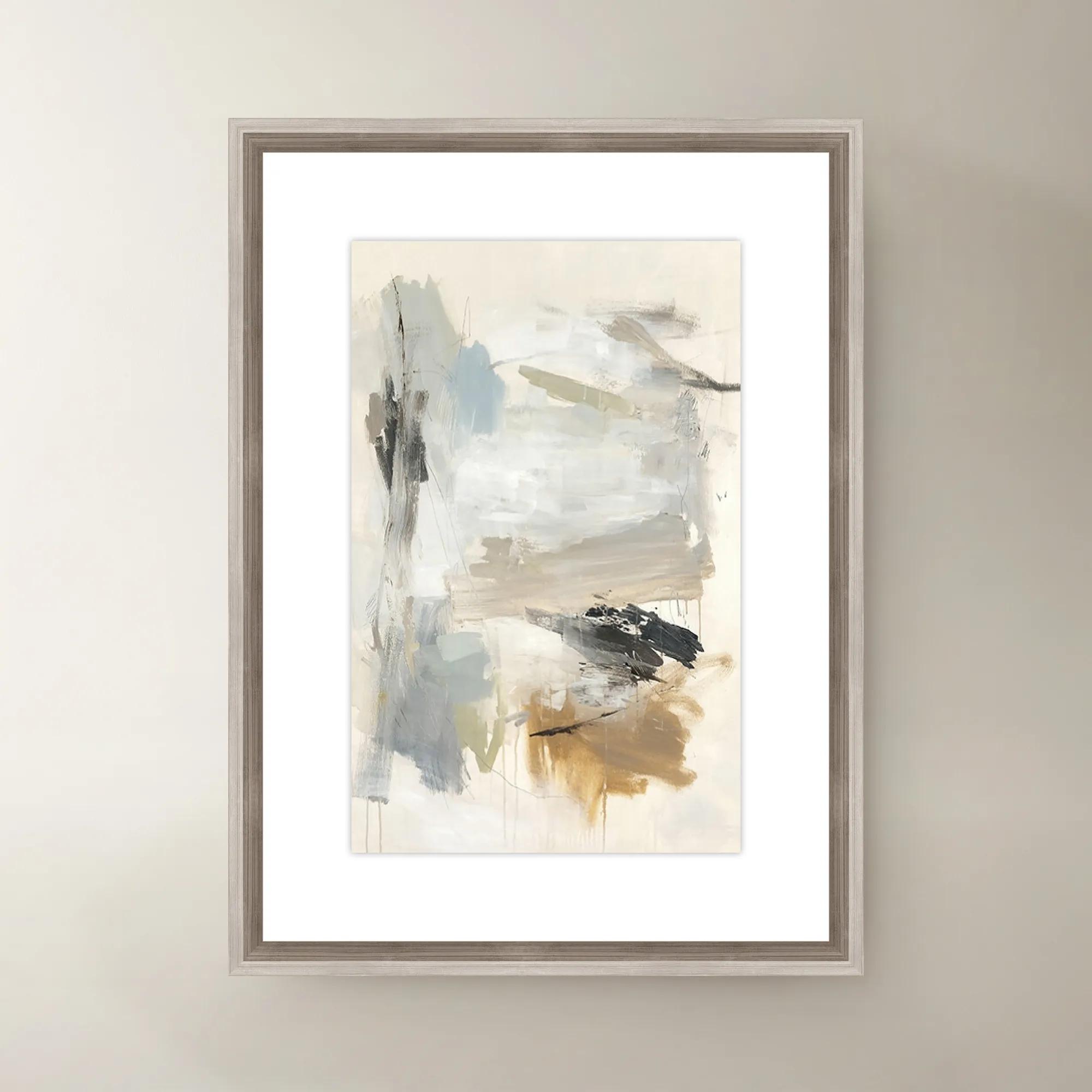
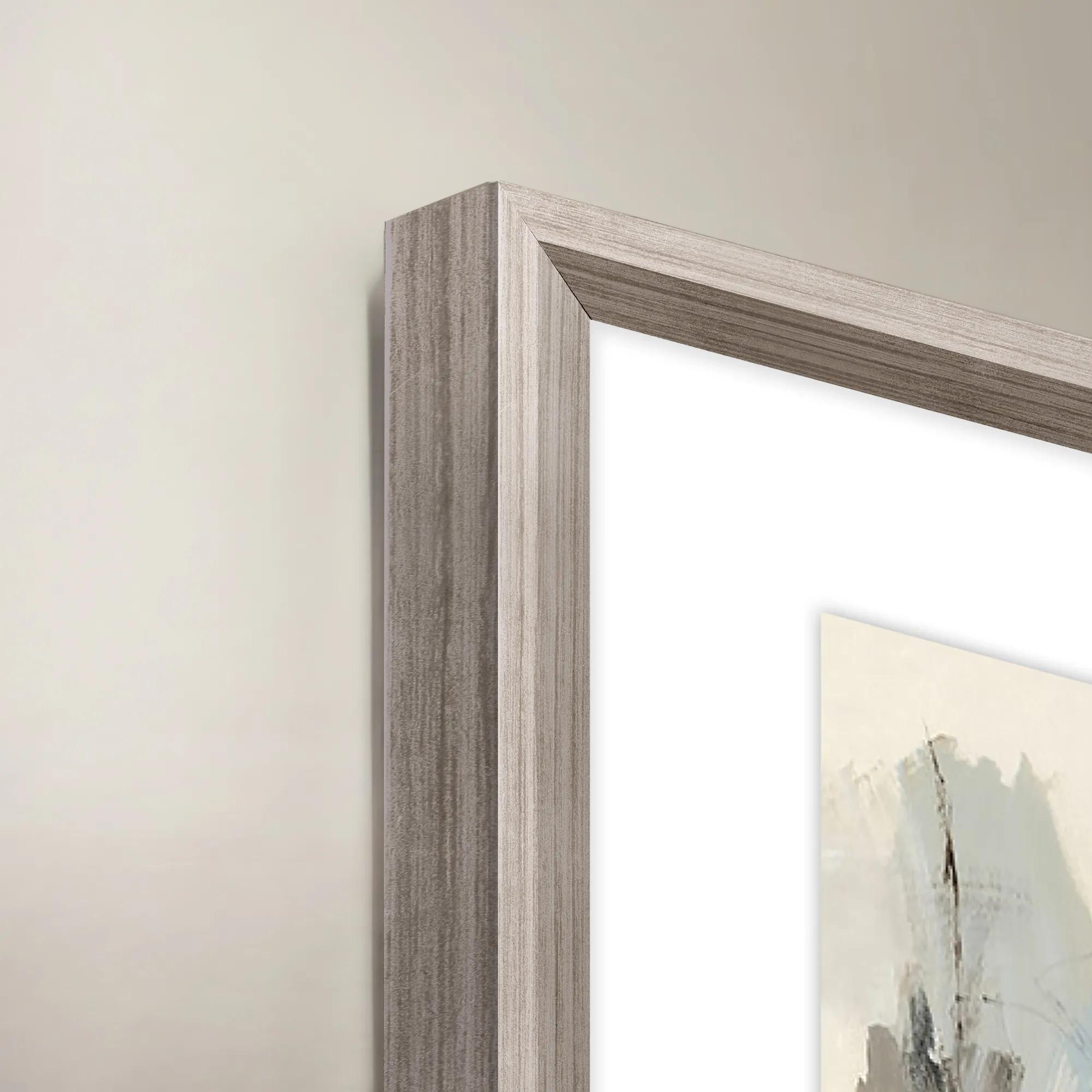 French Bakery II Framed Wall Art 20" x 30"$419
A colorful canvas wall art piece featuring a charming French bakery scene in a decorative frame.
Add To Cart -
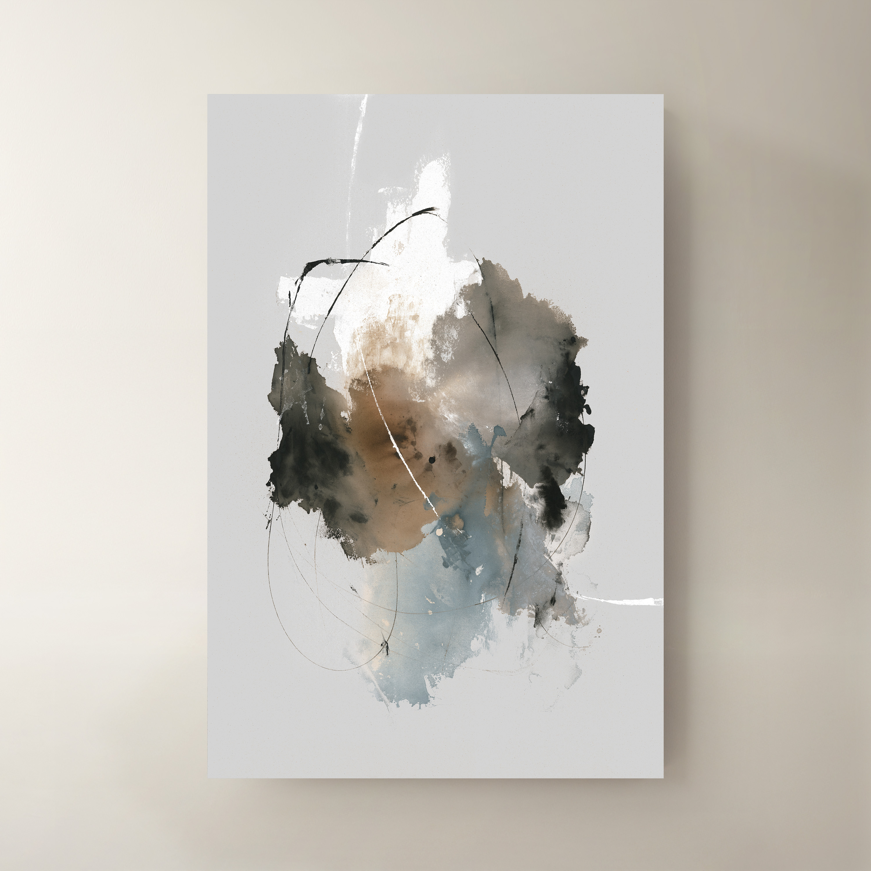
 Time IV Wall Art 40" x 60"$999
A striking multicolored canvas artwork bringing contemporary visual interest to modern interiors.
Add To Cart -

 Hint of Spring Framed Painted Wall Art 48" x 48"$599
A framed, multicolored painted canvas artwork that brings a vibrant, artistic touch to contemporary interiors.
Add To Cart -
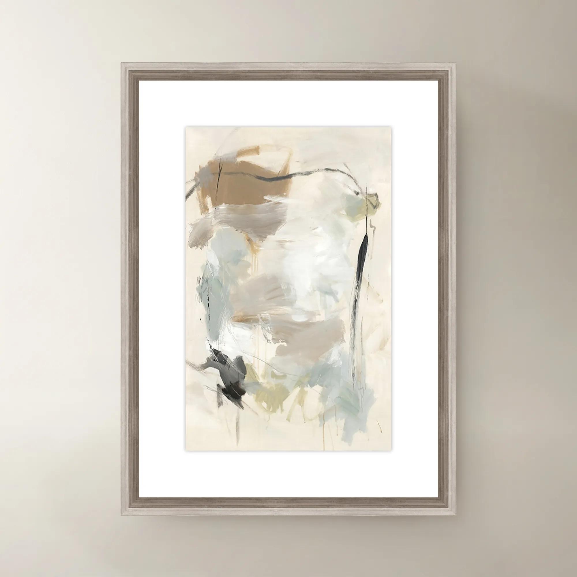
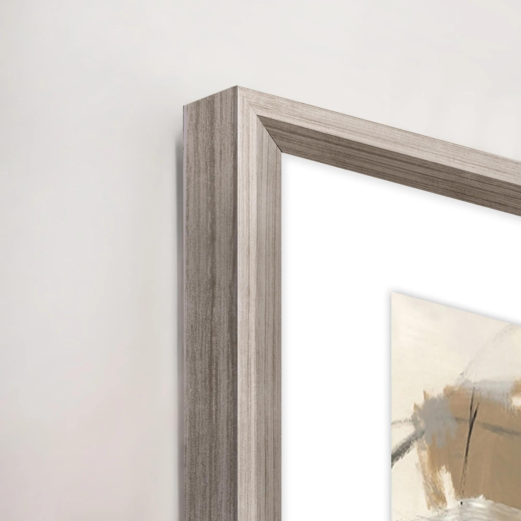 French Bakery I Framed Wall Art 20" x 30"$419
A multi-colored canvas wall artwork in a framed presentation, inspired by a charming French bakery.
Add To Cart

Chartreuse And Brown Decor
Explore chartreuse and brown decor for expressive accents in vivid yellow-green and rich, earthy tones. Ground your room with brown and let chartreuse command attention, or introduce touches of both shades to give a neutral space warmth, depth, and dramatic contrast.
Chartreuse and brown decor pairs a vivid yellow-green with earthy shades such as espresso, walnut, chocolate, and sienna for a look that feels bold, grounded, and distinctly expressive. Chartreuse supplies the electric note; brown gives that brightness depth and a substantial visual foundation. Together, the colors can suggest retro-modern glamour, an artful contemporary interior, or a richly layered room with an organic sensibility. The effect depends on the undertones and finishes surrounding them. A yellow-leaning chartreuse feels especially luminous against dark chocolate, while a greener interpretation creates a more botanical impression beside warm wood tones. Espresso brings crisp contrast and architectural weight; caramel and tobacco soften the relationship without diminishing its character. Across decorative accents, textiles, wall art, and furniture, this palette offers room for both dramatic gestures and smaller moments of discovery. A broad expanse of brown upholstery can make a chartreuse textile look almost jewel-like, while a restrained yellow-green detail can draw attention to the grain of nearby wood. Cream, ivory, and warm white create breathing room between the two colors, allowing their contrast to remain deliberate rather than crowded. Black adds definition, and touches of brass or muted gold introduce a gleaming accent without competing with the palette. The most compelling arrangements give each finish its own role: a matte surface absorbs light, a polished detail catches it, and a woven element adds tactile relief. Color also changes with its setting. Chartreuse may appear more golden under warm lamplight and greener in daylight, while brown can reveal reddish, gray, or amber undertones that are less obvious in a small image. Viewing color and material samples in the intended room, when possible, helps clarify those relationships. Rather than requiring every accent to match precisely, chartreuse and brown home decor gains richness from variations that share a clear visual connection—a repeated undertone, a related texture, or a shape that carries through the space.
Materials give this high-contrast pairing its depth. Velvet lends chartreuse a shifting surface, with highlights and shadows that make the color feel dimensional rather than flat. Woven fabrics offer a quieter interpretation, breaking up saturated color with visible fibers and subtle tonal variation. Brown leather introduces depth through natural markings and, depending on its finish, the possibility of developing a patina with use. Wood brings another kind of individuality: grain, stain, and surface sheen all influence whether brown reads as rustic, tailored, or sculptural. Solid wood and wood veneer have different construction and care considerations, so material descriptions matter as much as color when evaluating furniture for a particular room. Glass, glazed ceramic, and metallic finishes can punctuate softer textiles with light-reflecting surfaces, while a matte vessel or textured decorative object keeps a vignette from feeling overly polished. Scale is equally important. An expansive brown surface creates a visual anchor; a concentrated chartreuse accent can deliver impact without occupying much space. Larger rooms can accommodate broader areas of saturated color, while a compact seating area may feel more composed with chartreuse repeated in a few thoughtfully spaced details. Patterns introduce another layer of possibility, from abstract compositions that blend green and brown to graphic designs that keep their edges distinct. Pattern scale should relate to viewing distance and neighboring textures, especially when several upholstered or woven surfaces share the same room. Intended use also shapes the choice. Frequently used seating benefits from upholstery suited to everyday contact, secure construction, and care requirements that fit the household. Decorative textiles used primarily for display can place greater emphasis on intricate texture or delicate finishing. In dining areas, offices, and conversation spaces, dimensions and placement deserve the same attention as appearance: furniture should allow comfortable movement, tabletop accents should leave room for their intended activities, and decorative layers should enhance the room without making daily use cumbersome.
Chartreuse and brown decor feels particularly compelling in spaces that invite both personality and comfort. In a living room, brown establishes a welcoming backdrop while yellow-green accents bring an unexpected focal point to the seating area. In a bedroom, the same combination can feel enveloping when softened with ivory bedding and varied textile weights. A home office gains character from the contrast between grounded wood tones and a vivid accent, especially when the surrounding surfaces remain visually composed. For a softer counterpoint, Neutral Throws for Home Decor offer a way to introduce pale texture between saturated chartreuse and deeper brown. Their value is not simply visual: an inviting textile adds another dimension to a reading corner or an occasional seat. Care should follow the requirements of each material rather than the palette alone. Removable covers are not automatically machine washable, velvet may require specific cleaning methods, and decorative trims can call for more delicate handling. Following the manufacturer’s instructions, addressing spills promptly, and testing any permitted cleaning method in an inconspicuous area help protect color and finish. Wood surfaces generally benefit from protection against moisture and abrasive contact, while leather requires care appropriate to its particular finish. Prolonged direct sunlight can alter some dyes and finishes, making placement an important consideration for richly colored pieces. For households with children or pets, washable constructions, firmly attached details, and fabrics rated for the intended level of use can make an expressive room easier to enjoy. Decorative accents in this palette can also make thoughtful housewarming or wedding gifts for someone whose home already features earthy neutrals, warm woods, or confident color. Smaller-scale accents allow the recipient to explore the combination without committing an entire room to it. Whether expressed through a single vivid note or a more immersive arrangement, chartreuse and brown create interiors with warmth, definition, and unmistakable presence.
FAQs
Chartreuse and brown create an expressive pairing: the vivid yellow-green brings energy, while brown adds warmth and depth. Together, they feel richly layered rather than overly bright. Let brown establish the backdrop, then introduce chartreuse accents for a confident stroke of color.
Chocolate and espresso lend chartreuse a dramatic, sophisticated setting, while caramel and cognac create a warmer, golden palette. Cooler taupe-browns offer a softer contrast. Choose one dominant brown, then layer a few related tones to give the room depth without distracting from chartreuse.
Begin with a deliberate focal point, such as artwork or an arrangement of decorative accents featuring chartreuse. Echo the hue through pillows or other details to connect the composition. Against brown furnishings, these flashes of yellow-green can make familiar surroundings feel more artistic and unexpected.
Ivory and warm white give chartreuse and brown room to shine, while black adds crisp definition. For a more adventurous palette, introduce a restrained note of deep teal or aubergine. Keep additional colors intentional so the chartreuse-and-brown pairing remains the room’s defining expression.
Pair clean-lined furnishings with sculptural accents, expressive artwork, and contrasting textures. Use chartreuse in deliberate moments rather than across every surface, and let brown create visual continuity. A graphic pattern can connect the two hues, giving the room an artful rhythm without overwhelming the composition.