Beige Abstract Canvas Paintings
Beige Abstract Canvas Paintings
-
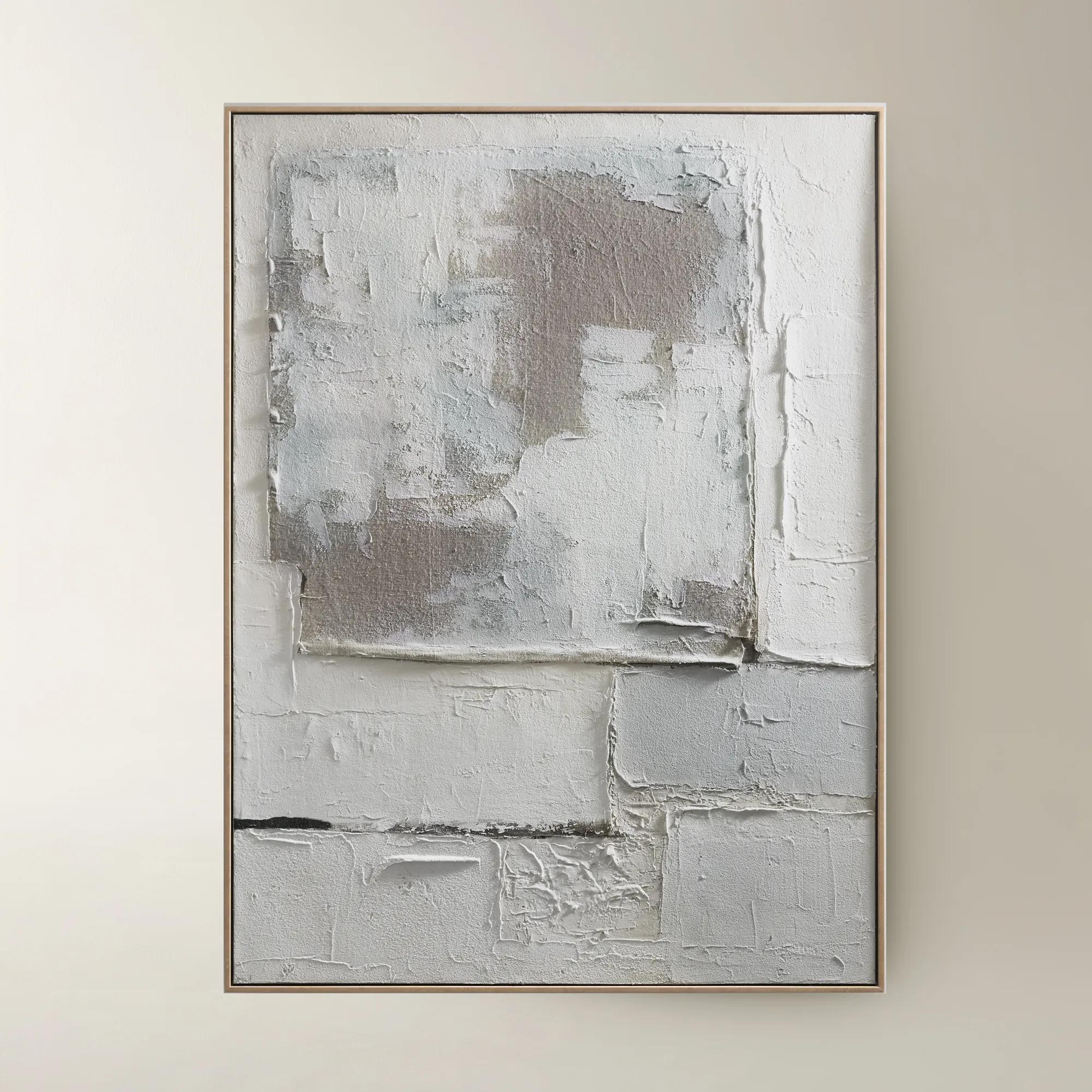
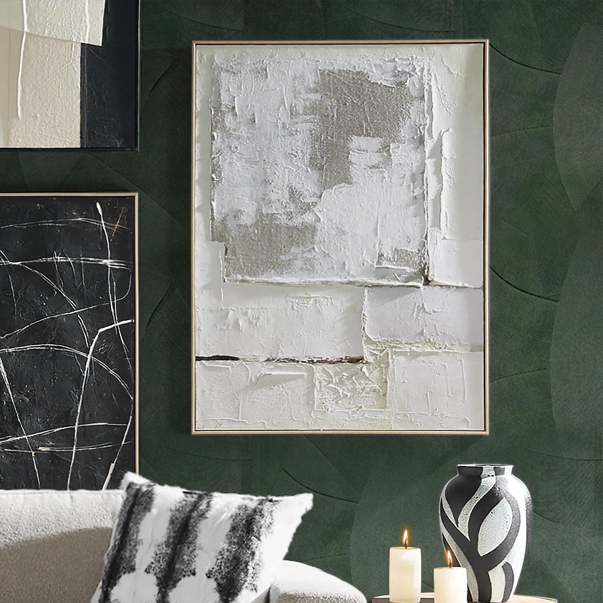 Marrow Painting$399
A hand-painted abstract canvas in subtle beige hues, elegantly framed in a warm beech wood floater.
Add To Cart -
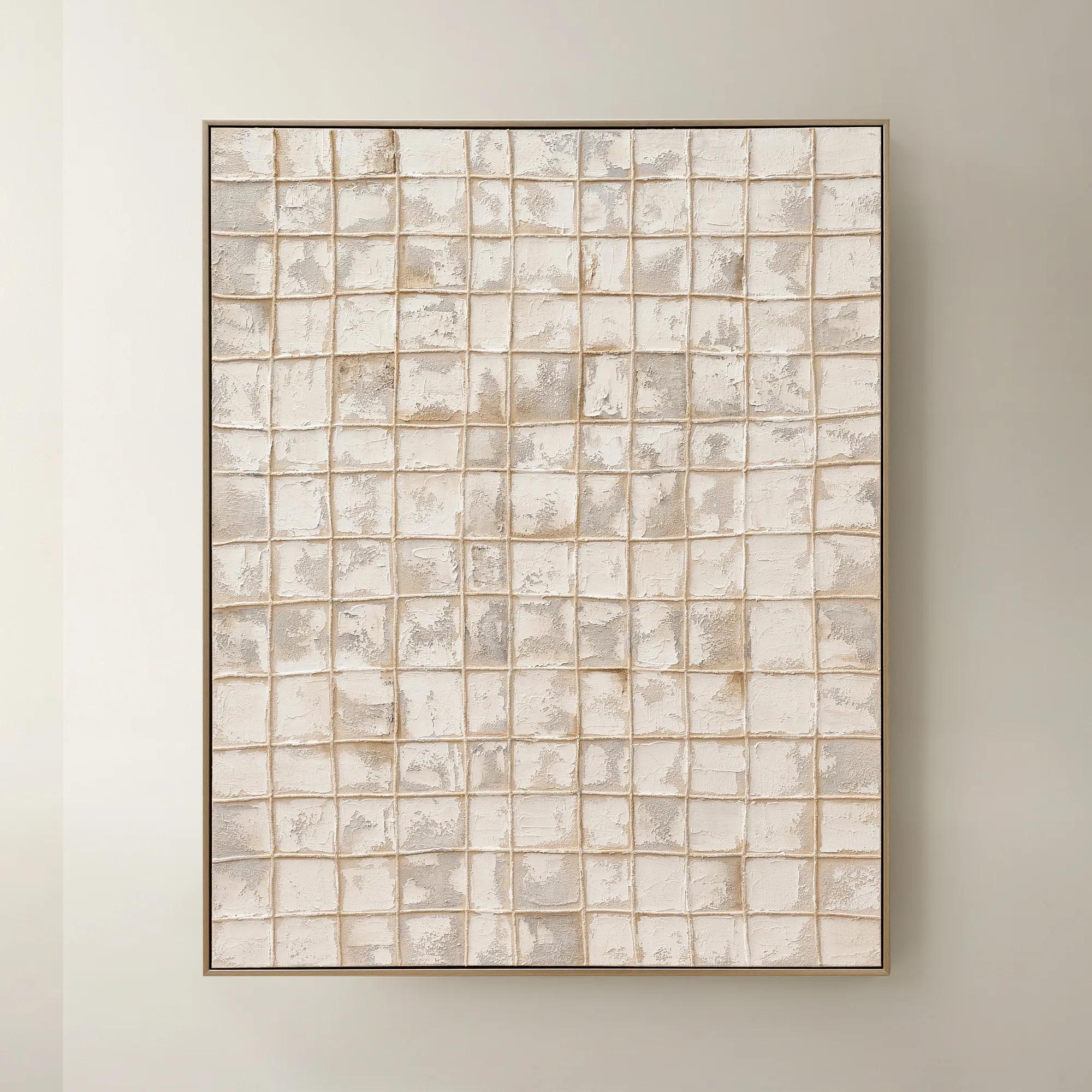
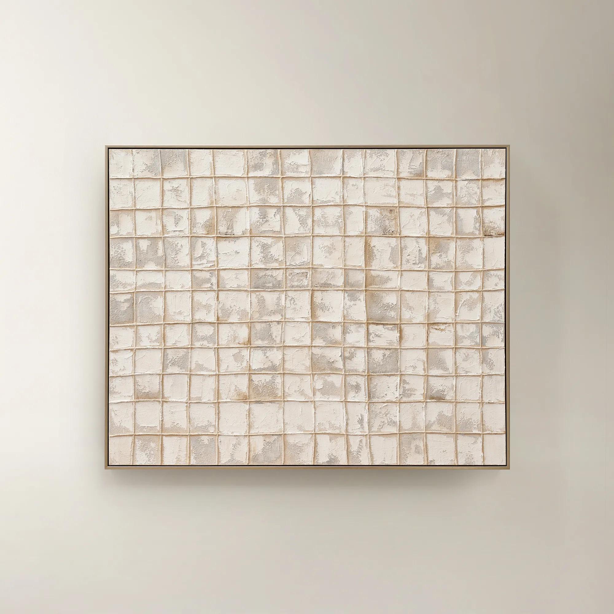 Painted Echos Framed Gold Leaf Wall Art 60" x 48"$699
A hand-painted abstract canvas with gold leaf accents and a champagne frame for modern, versatile display.
Add To Cart -
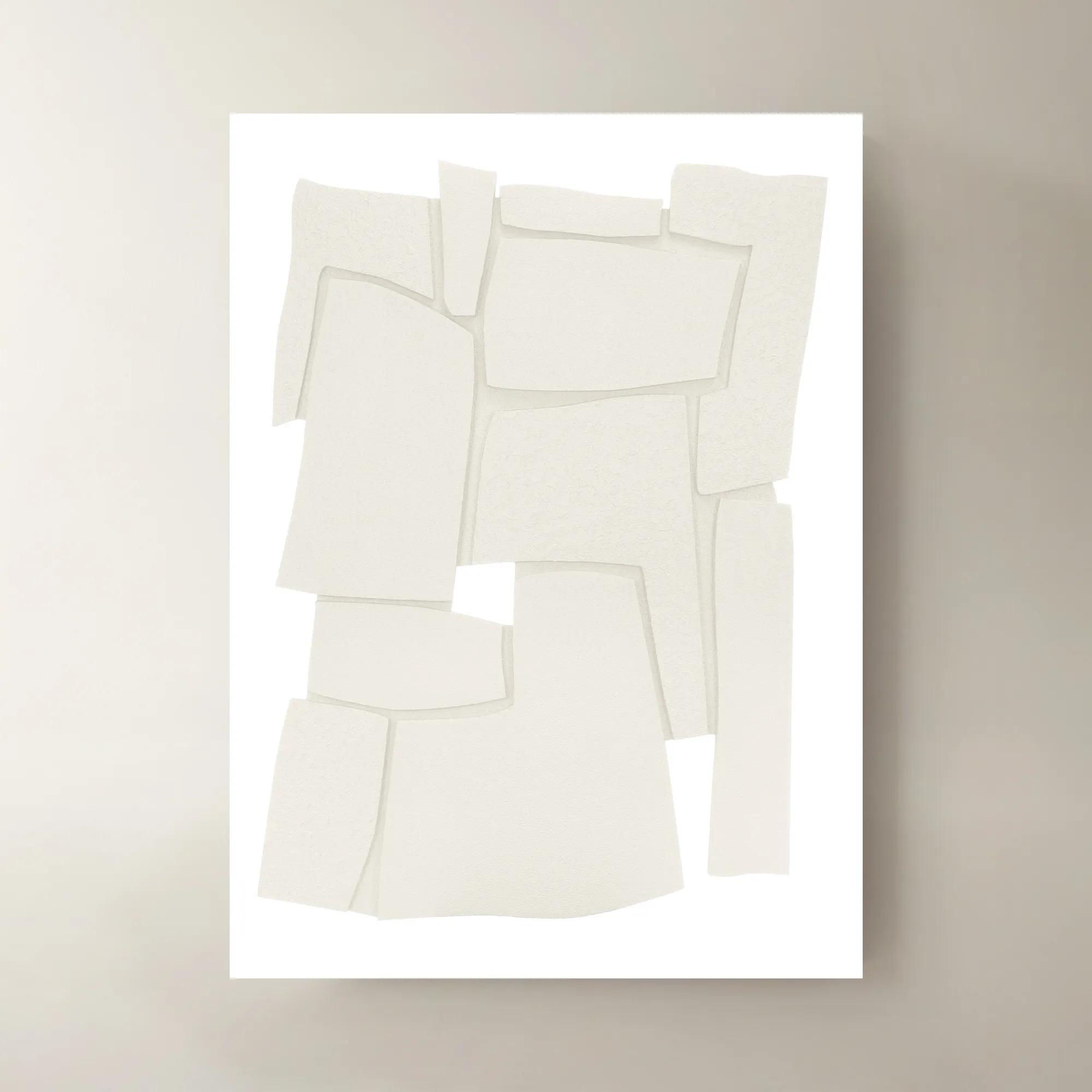
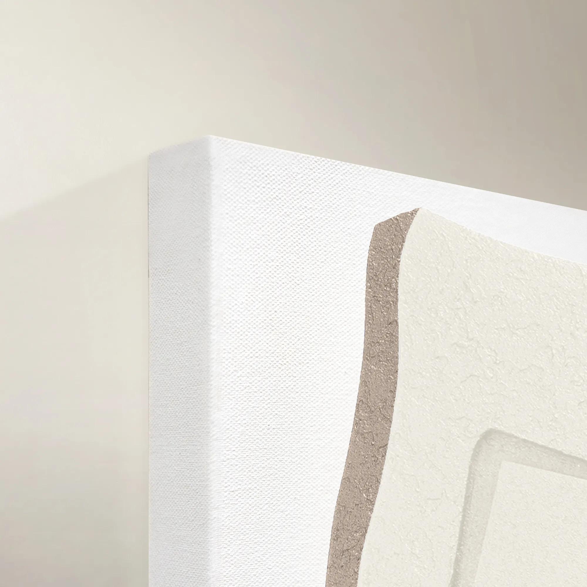 Wonder Maze III Wall Art 40" x 55"$1699
A contemporary canvas wall art piece featuring an intriguing abstract maze-inspired design.
Add To Cart -
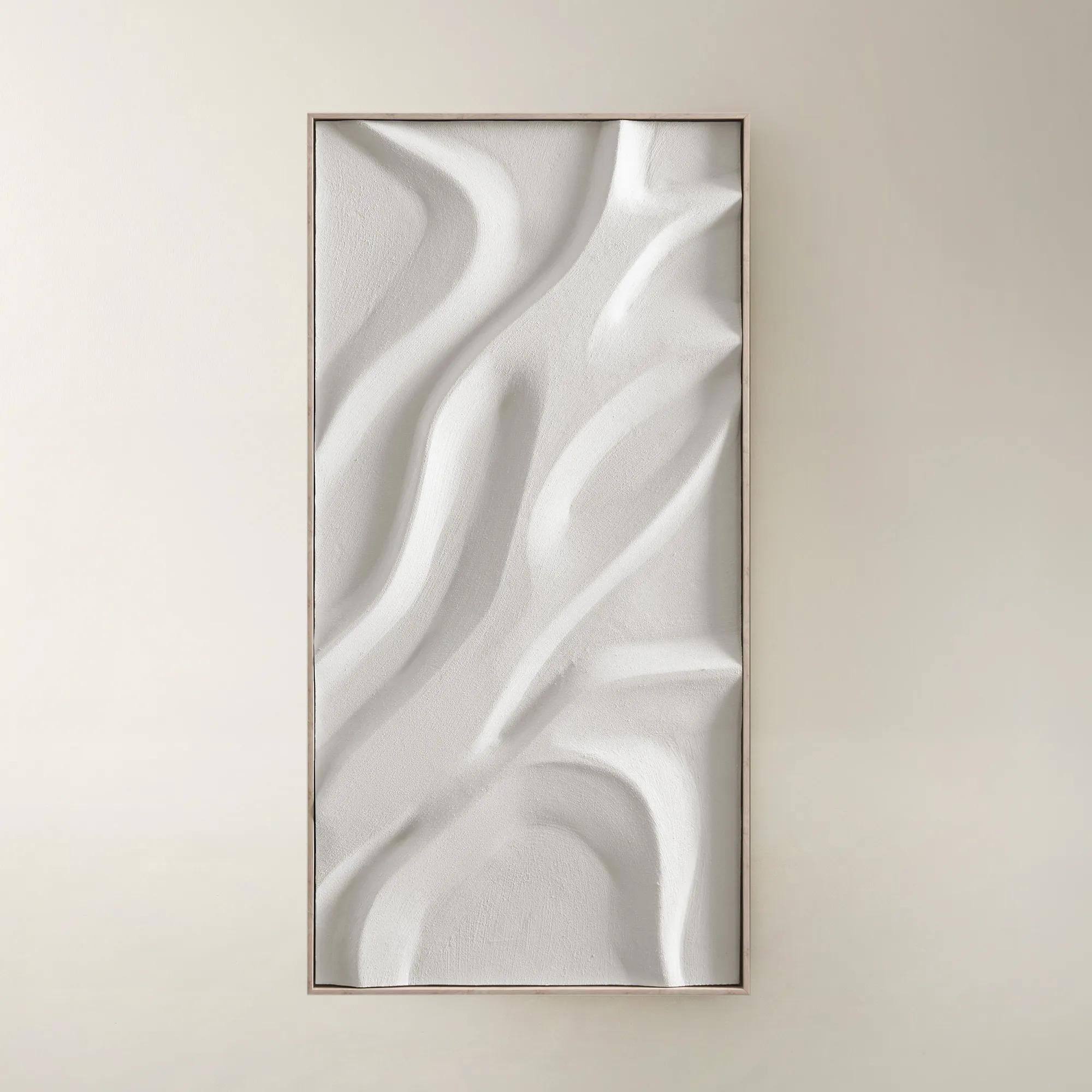
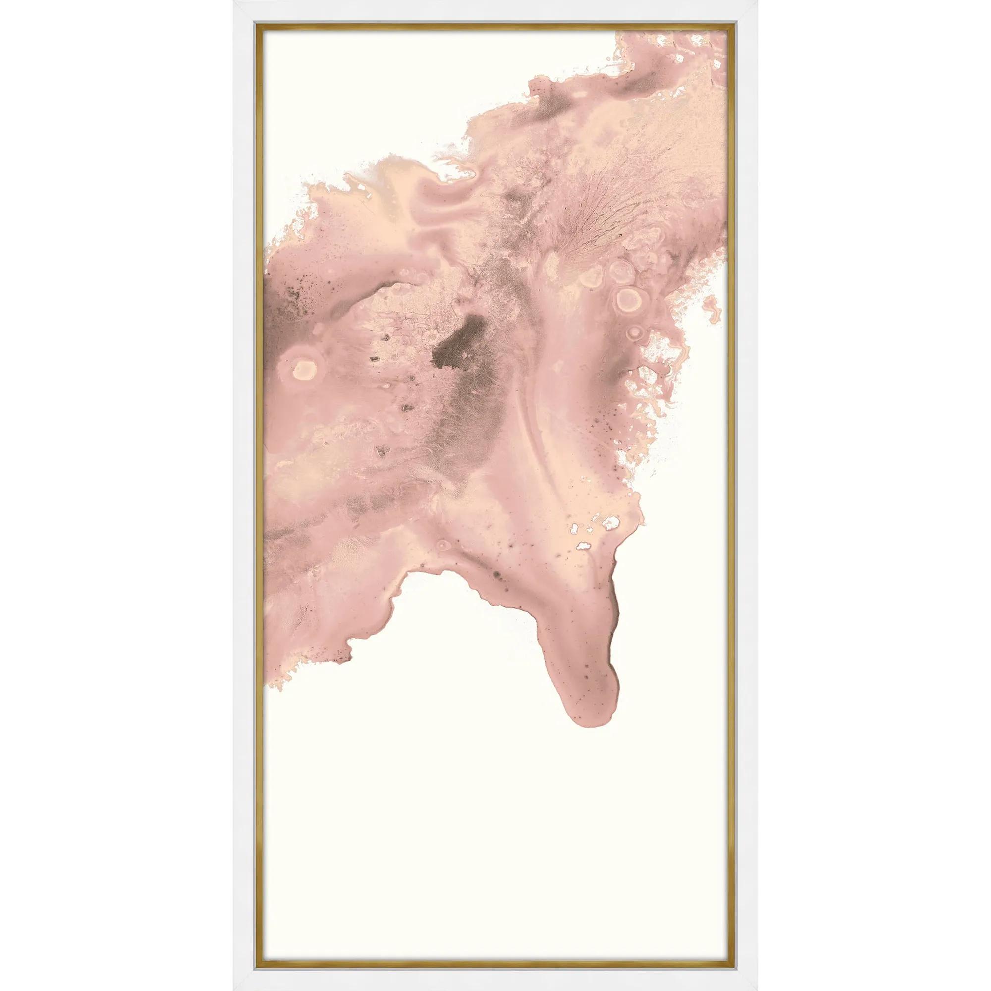
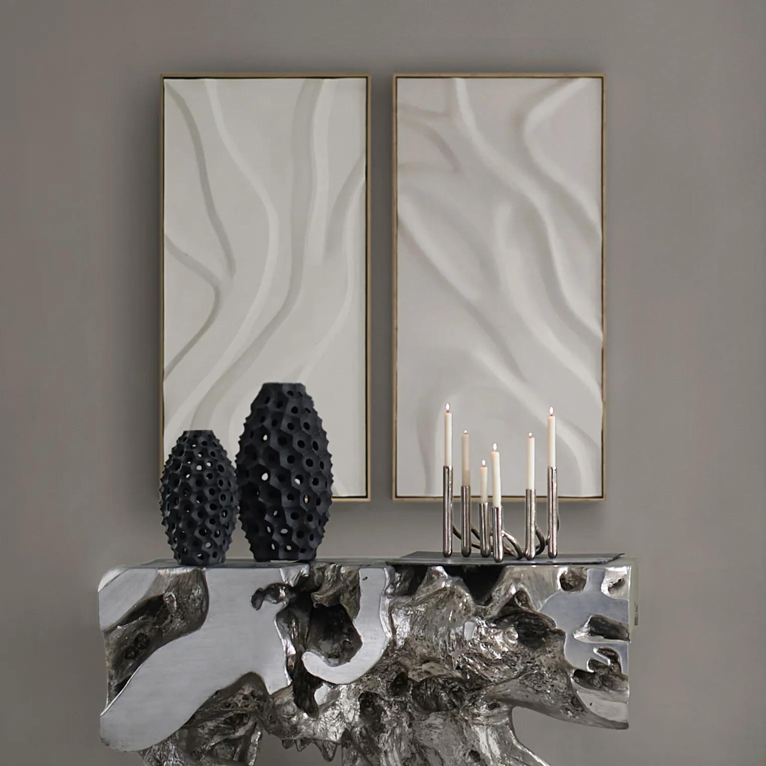 Au Lait Framed Painted Wall Art II 47.2" x 23.6"$199
A serene hand-painted canvas in beige, set in a warm whitewash floater frame for modern interiors.
Add To Cart -
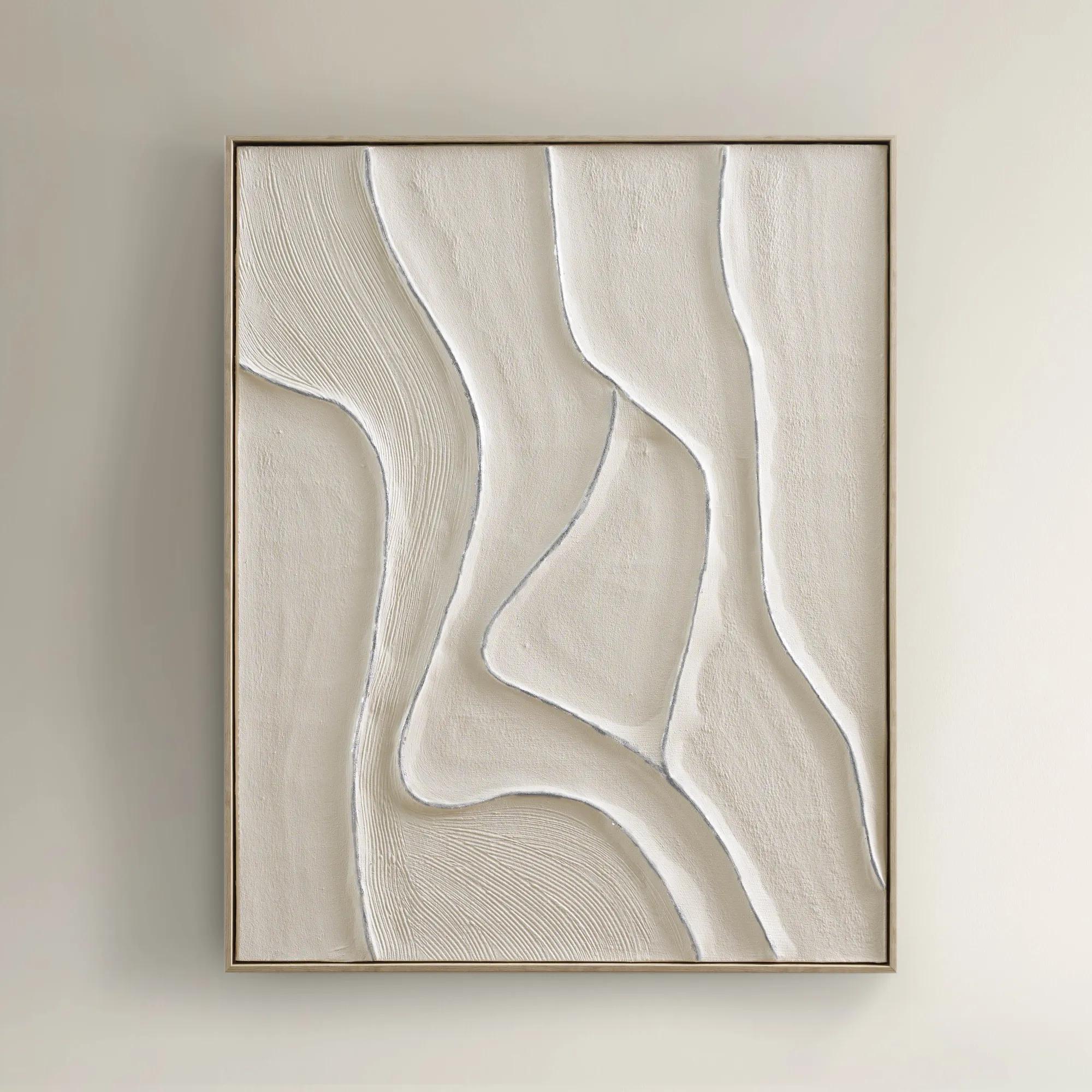
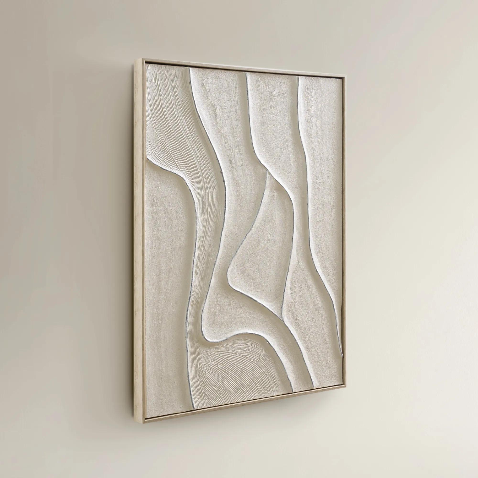 Vivre Framed Silver Leaf Painted Wall Art 39.25" x 31.5"$199
A hand-painted canvas featuring tranquil beige hues and flowing lines in a warm whitewash floater frame.
Add To Cart -

 Shift Framed Painted Wall Art 39.4" x 59"$499
A hand-painted canvas featuring bold black and beige contrasts with textured layers in a sleek black frame.
Add To Cart -
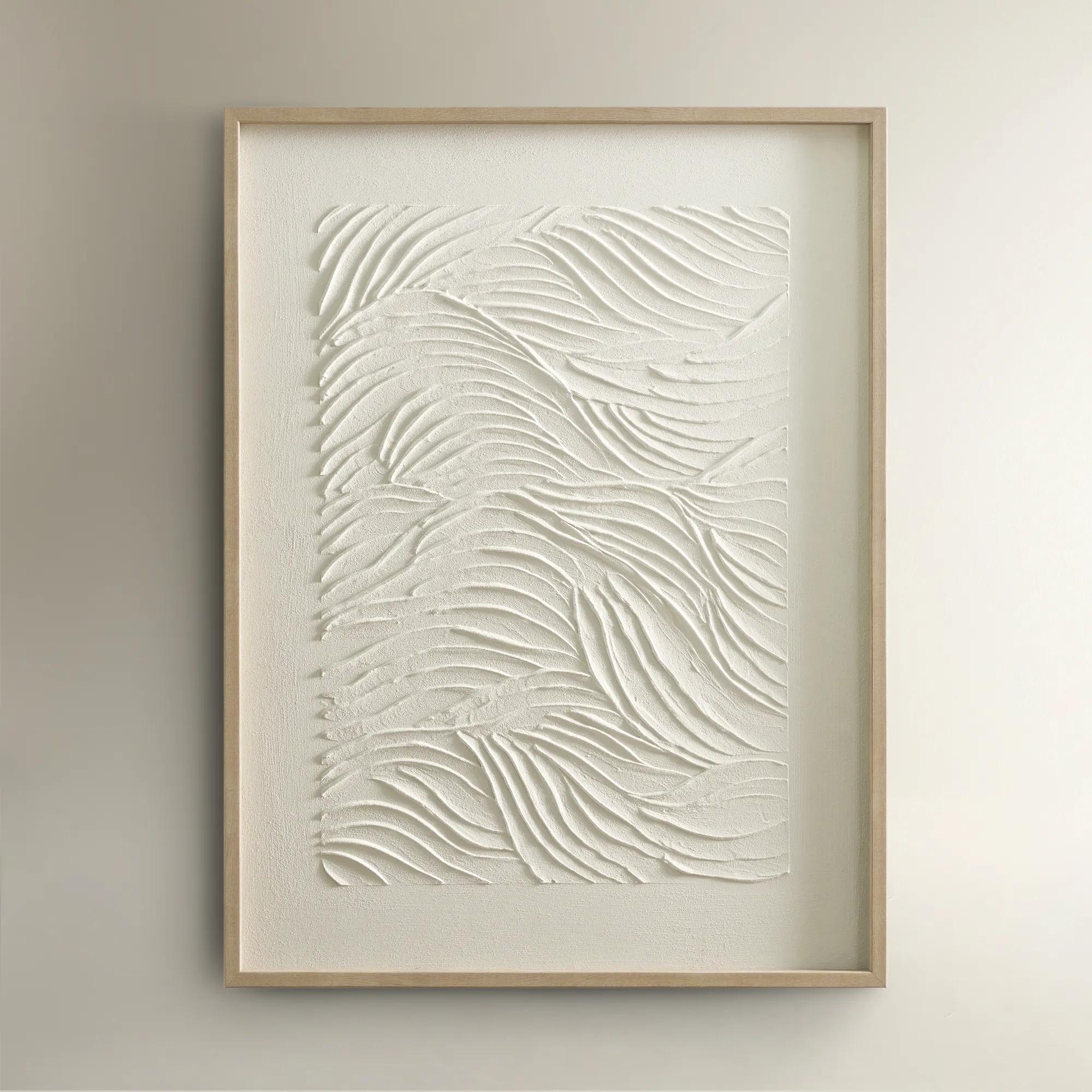
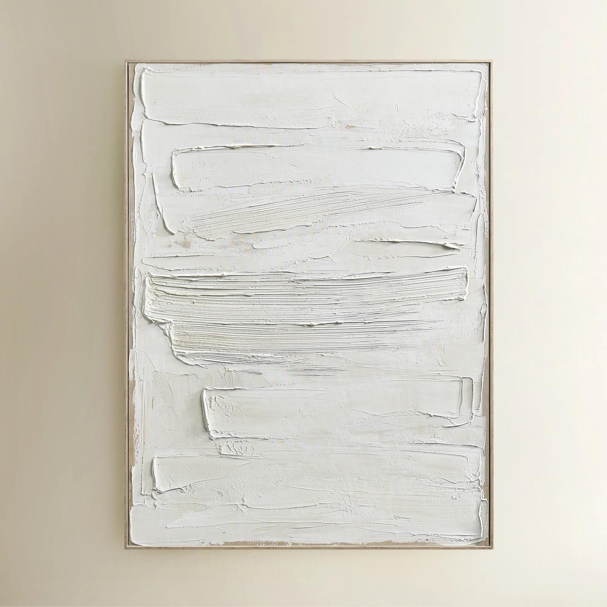
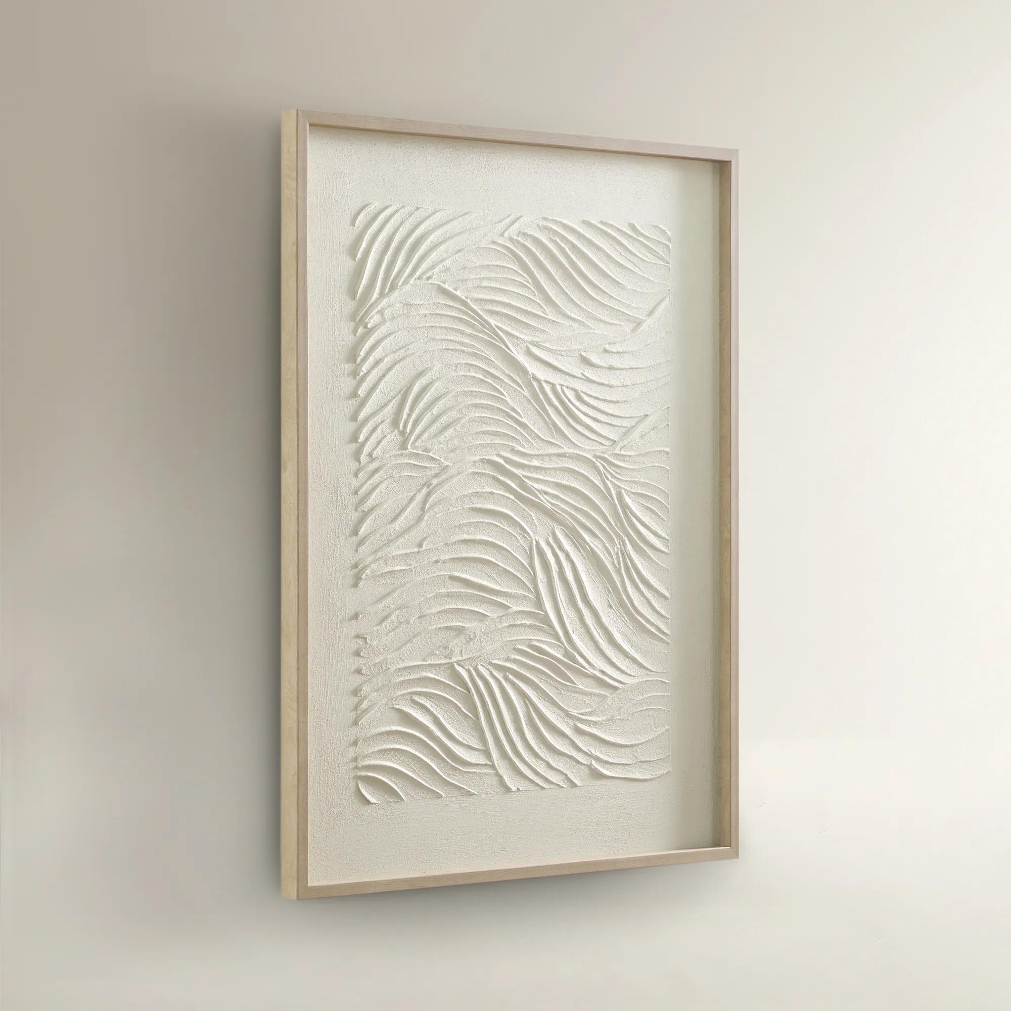 Sonnet Framed Painted Wall Art 23.5" x 31.5"$99
A hand-painted canvas featuring textured white shades and a warm blonde wood frame for elegant depth.
Add To Cart -
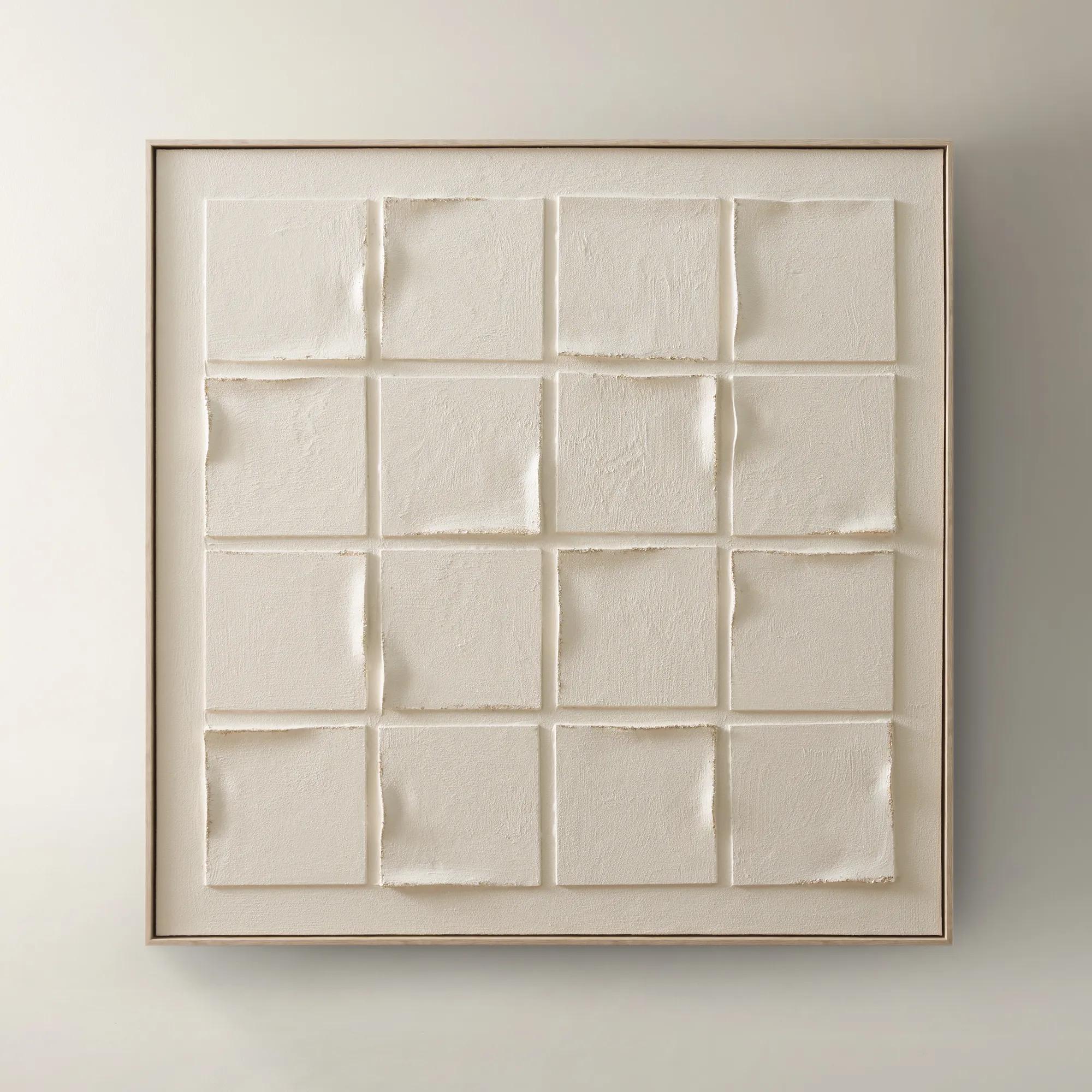 Gaze Framed Painted Wall Art 39.4" x 40"$329
A hand-painted canvas featuring subtle beige tones and textured depth in a warm whitewash floater frame.
Add To Cart -
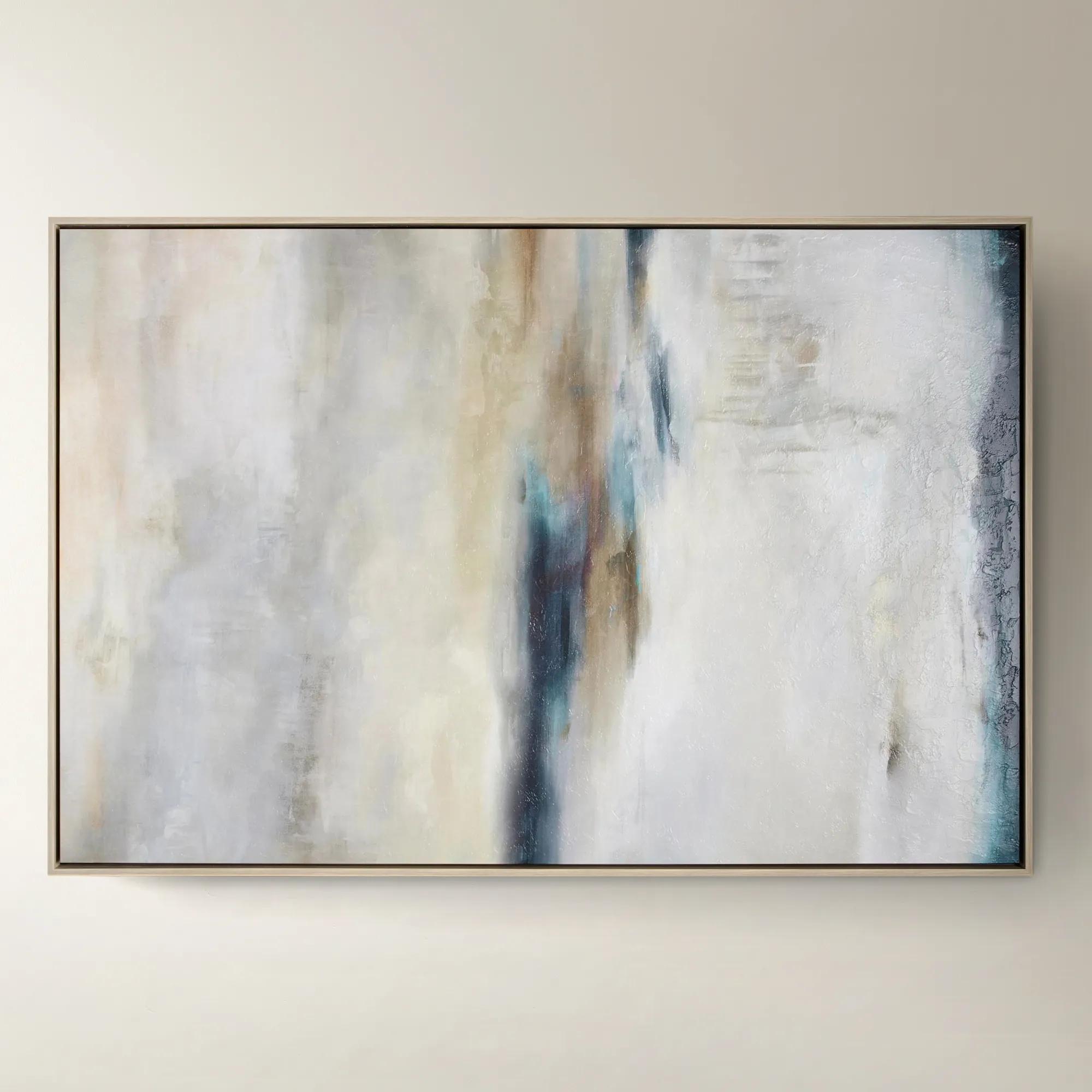
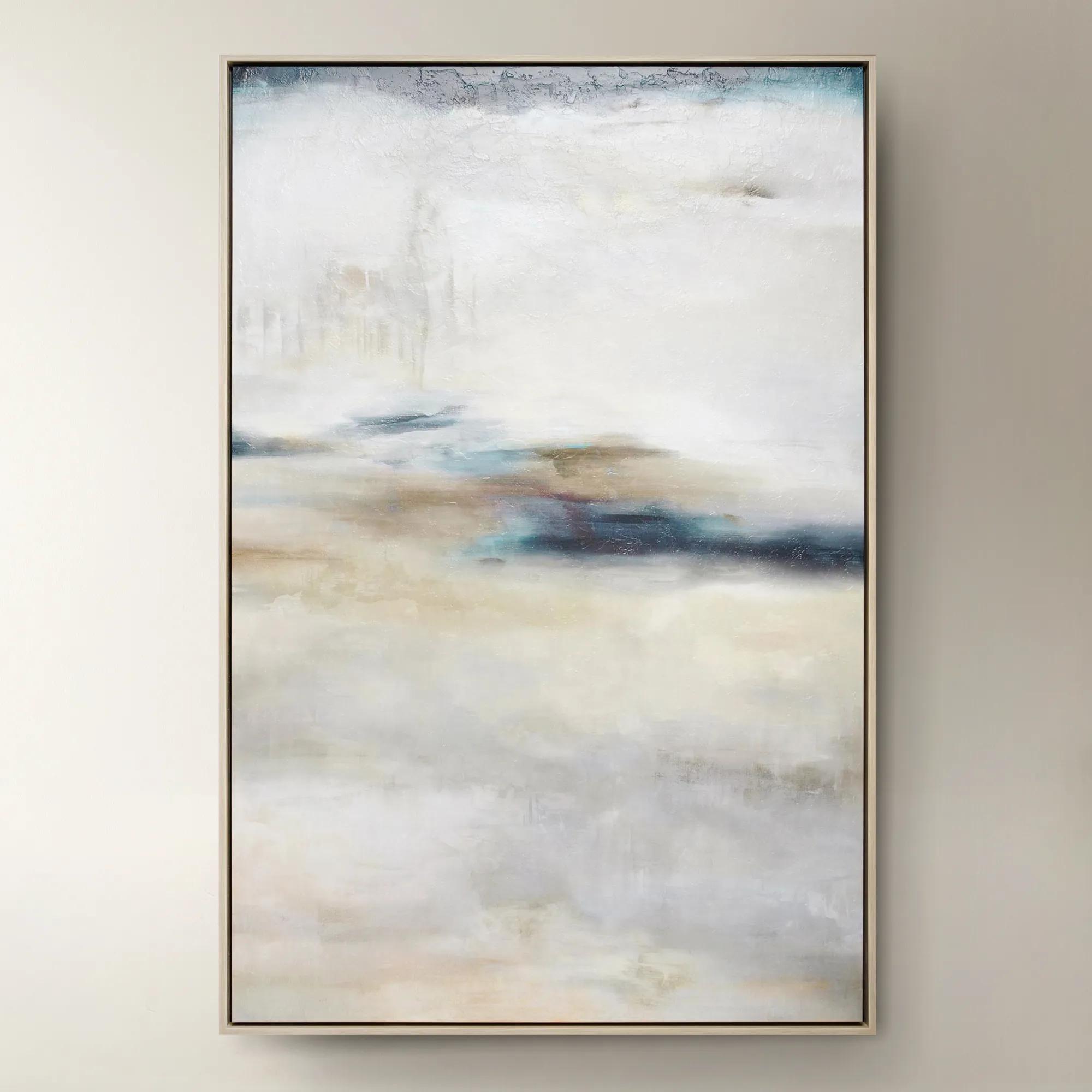 Forward Looking$1299
A softly layered abstract canvas print with a gel finish, set in a natural-hued floater frame.
Add To Cart -
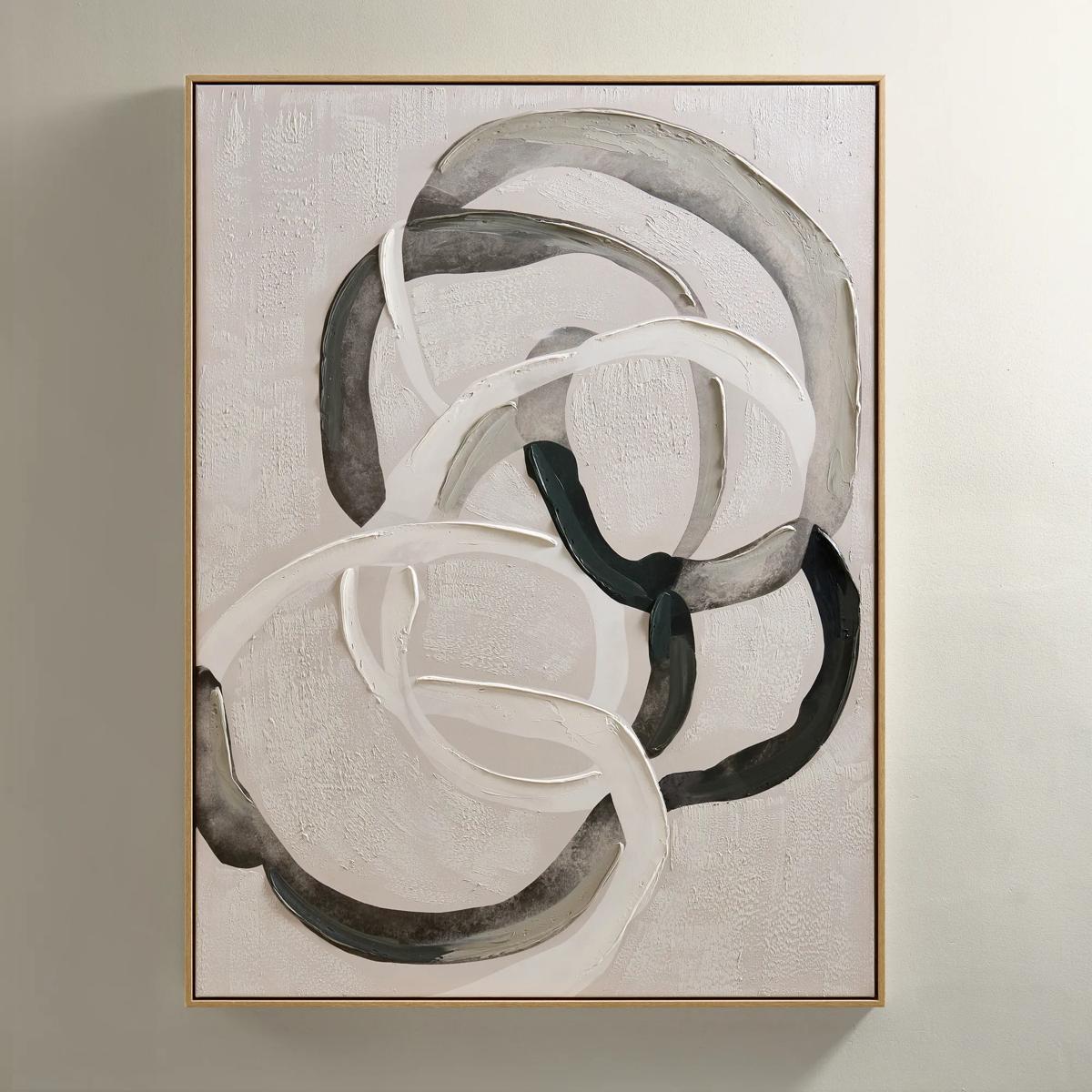
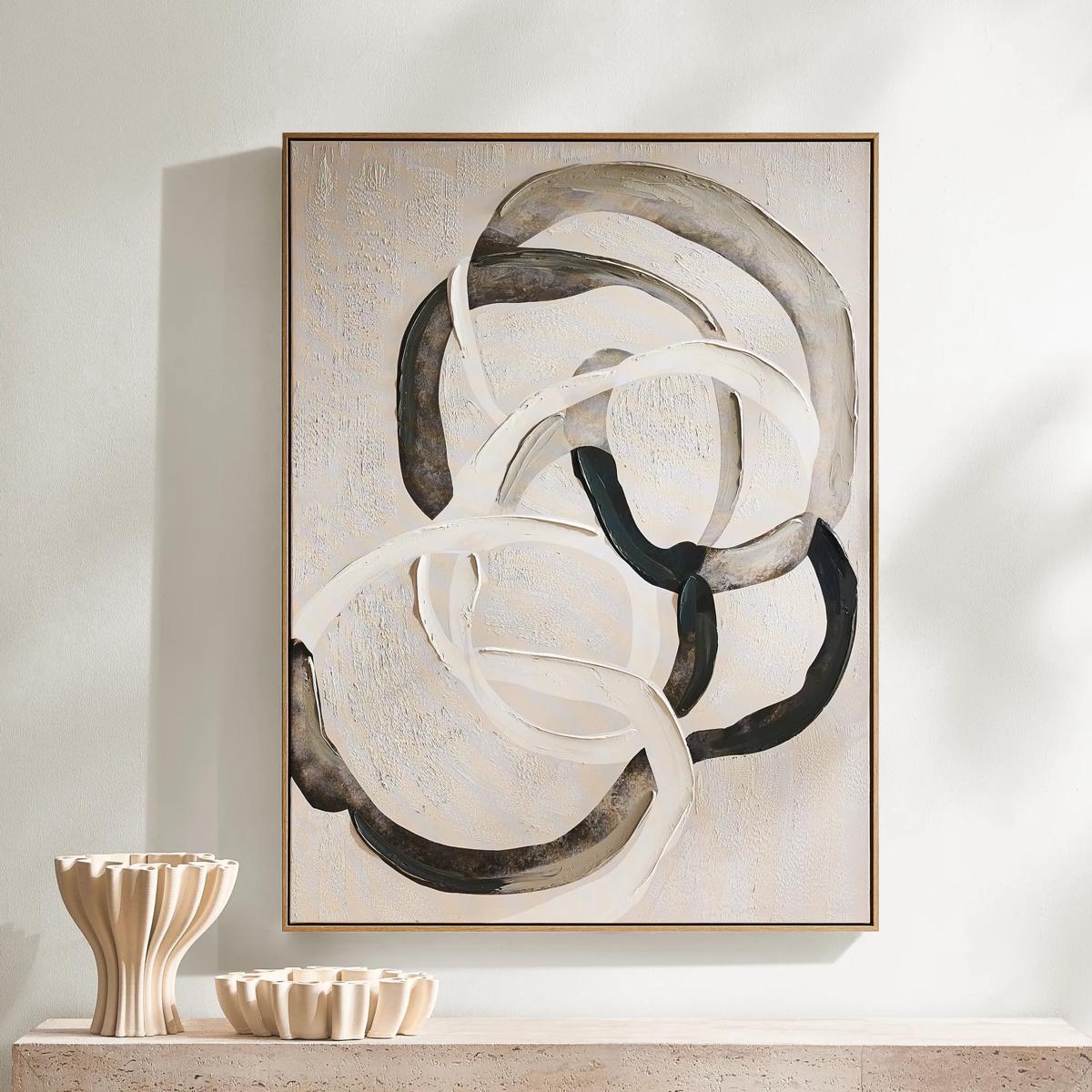 Round About Framed Painted Wall Art 35.25" x 47.25"$349
An abstract hand-painted canvas with tonal whites, charcoals, and taupes in a light wood floater frame.
Add To Cart -
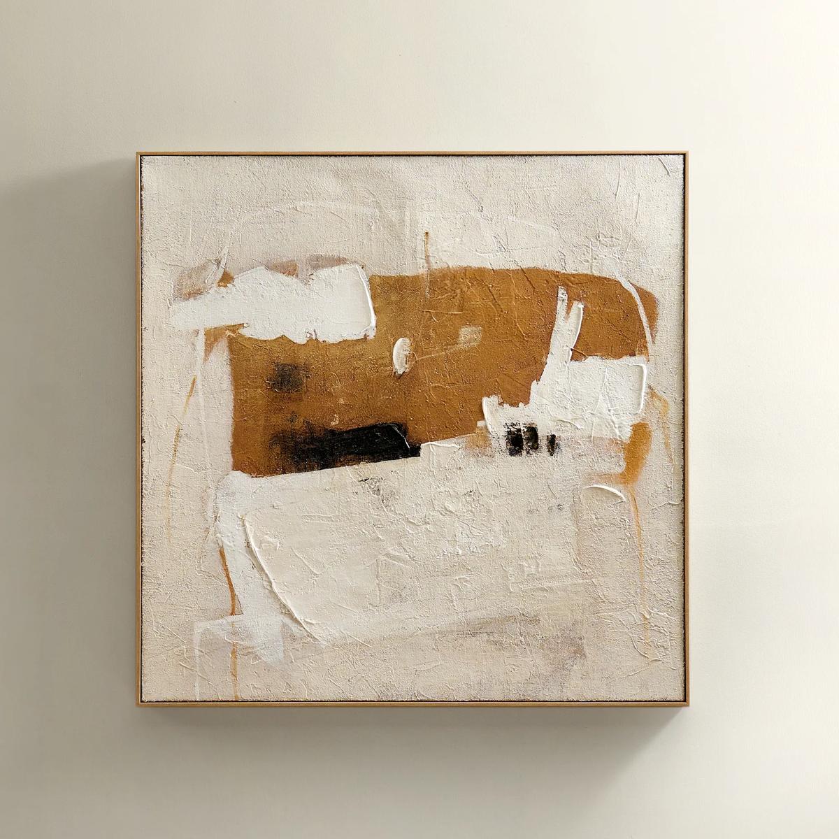 Instinct Framed Painted Wall Art 39.25" x 39.25"$349
An abstract hand-painted artwork featuring warm neutrals and black strokes on hessian with a light natural frame.
Add To Cart -
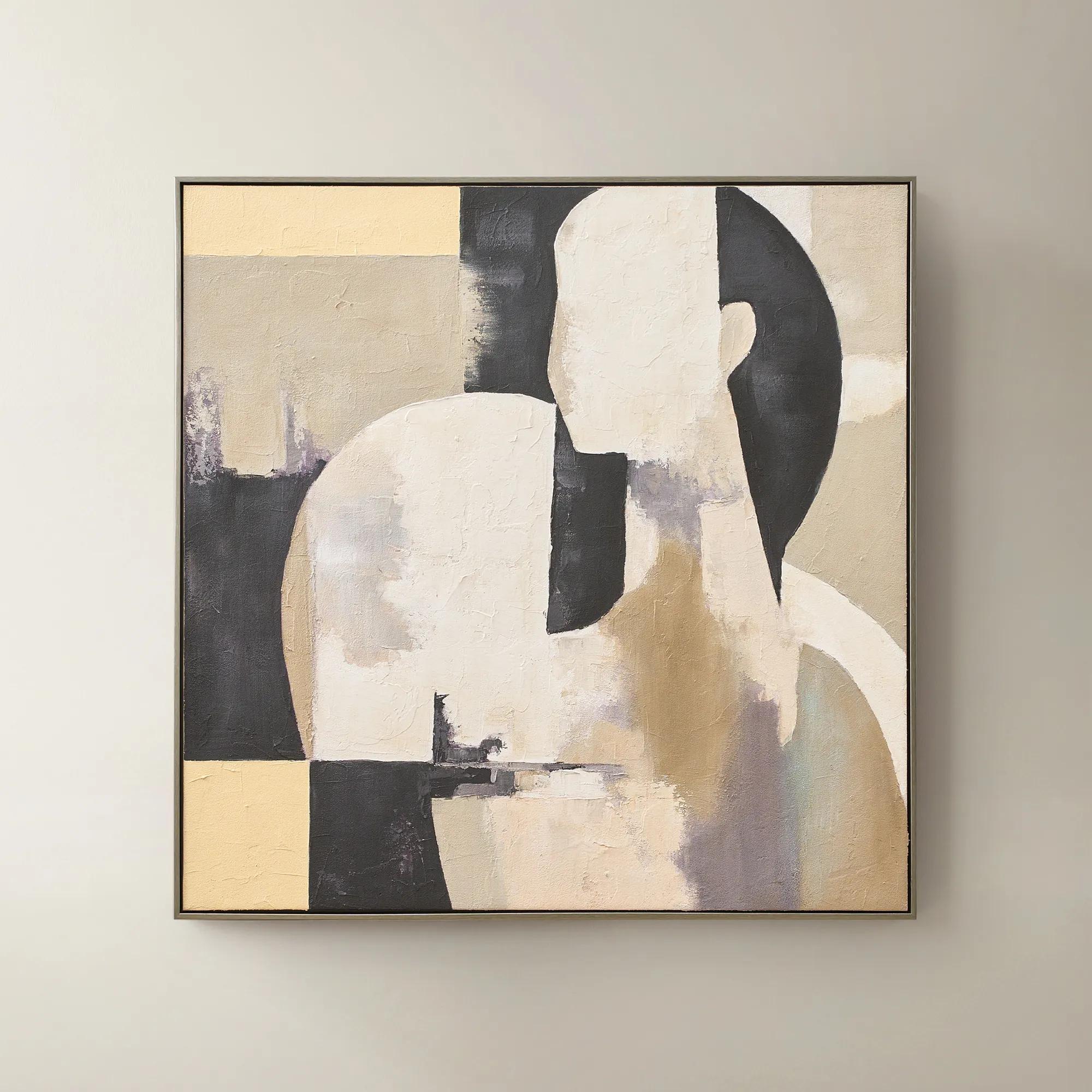 Afternoon Rest Framed Painted Wall Art 40" x 40"$399
A hand-painted abstract figure in buttercream, turtledove, and black hues framed in dark grey.
Add To Cart -
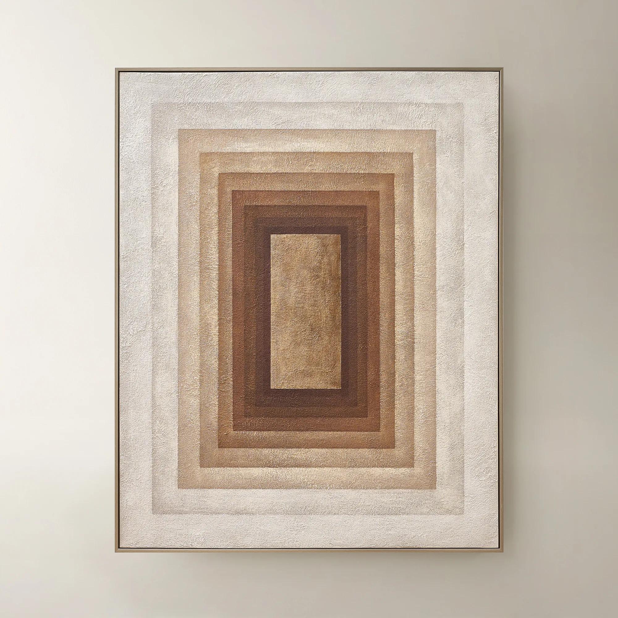 Monochrome Drift Framed Painted Wall Art 60" x 48"$699
A hand-painted abstract canvas with champagne leafing, featuring cocoa and gold tones in modern geometric design.
Add To Cart -
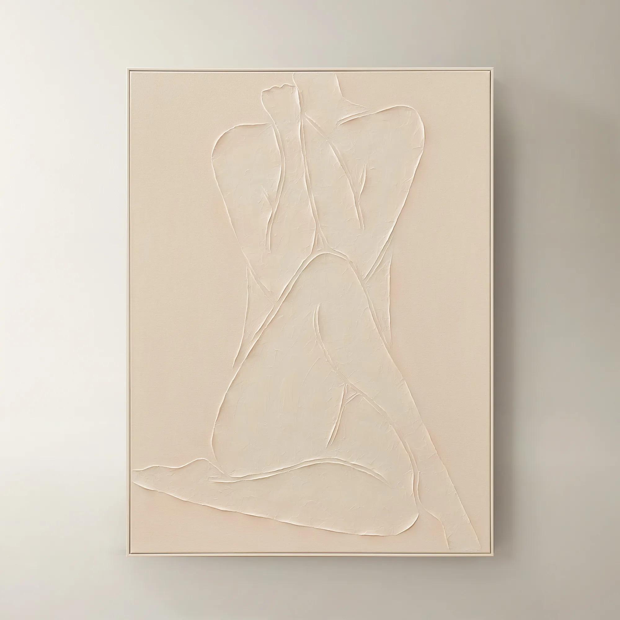
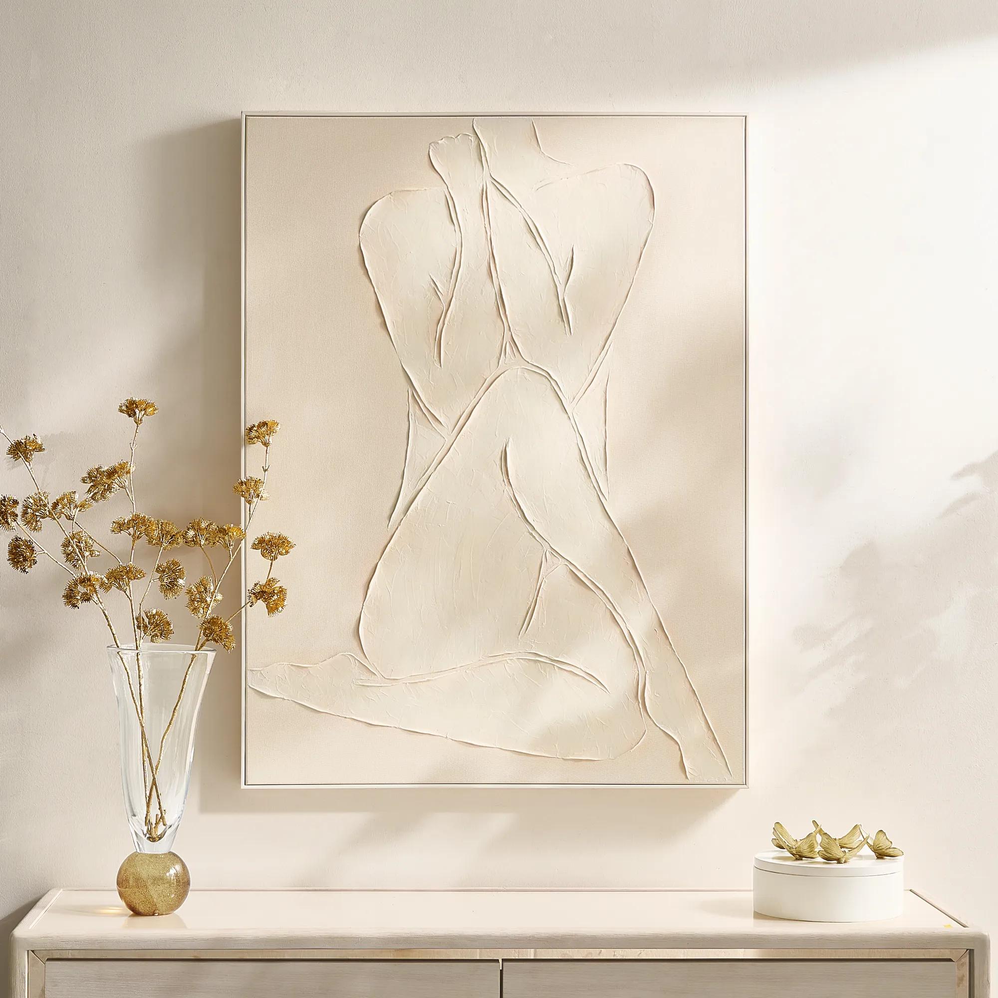 Modern Elegance Nude Ivory Framed Painted Wall Art 35.5" x 47.25"$599
A hand-painted ivory canvas in a white frame brings serene, modern artistry to any space.
Add To Cart -
 Shadow Painting 2$179
A hand-painted abstract canvas featuring bold textures and brown hues in a warm whitewash floater frame.
Add To Cart -
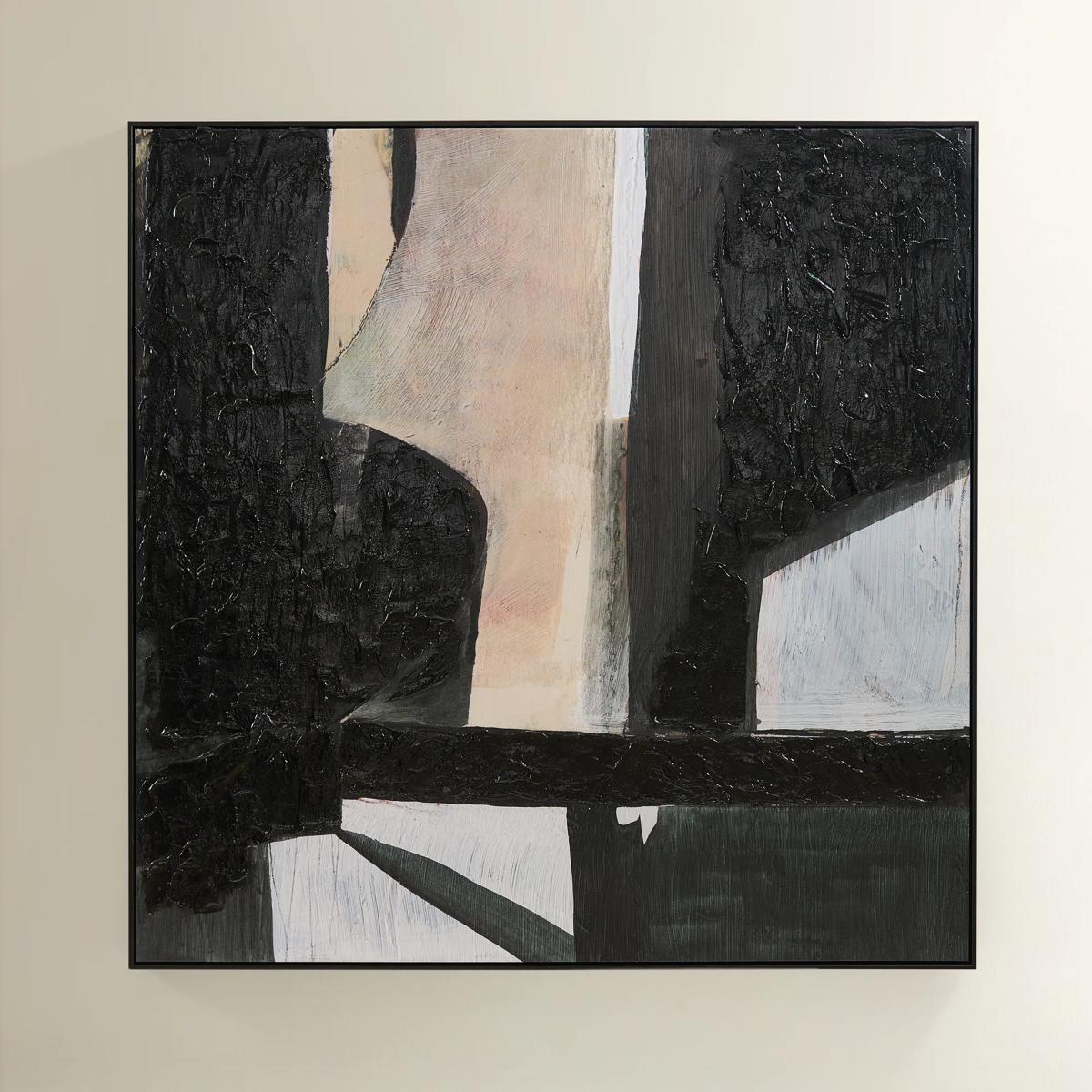 Grounded Painting$699
A hand-painted abstract canvas featuring black, cream, and earth tones in a sleek black floater frame.
Add To Cart -
 Espresso Framed Painted Wall Art 31.5" x 31.5"$149
A bold abstract artwork featuring rich brown hues on hand-painted canvas in a light wood floater frame.
Add To Cart -
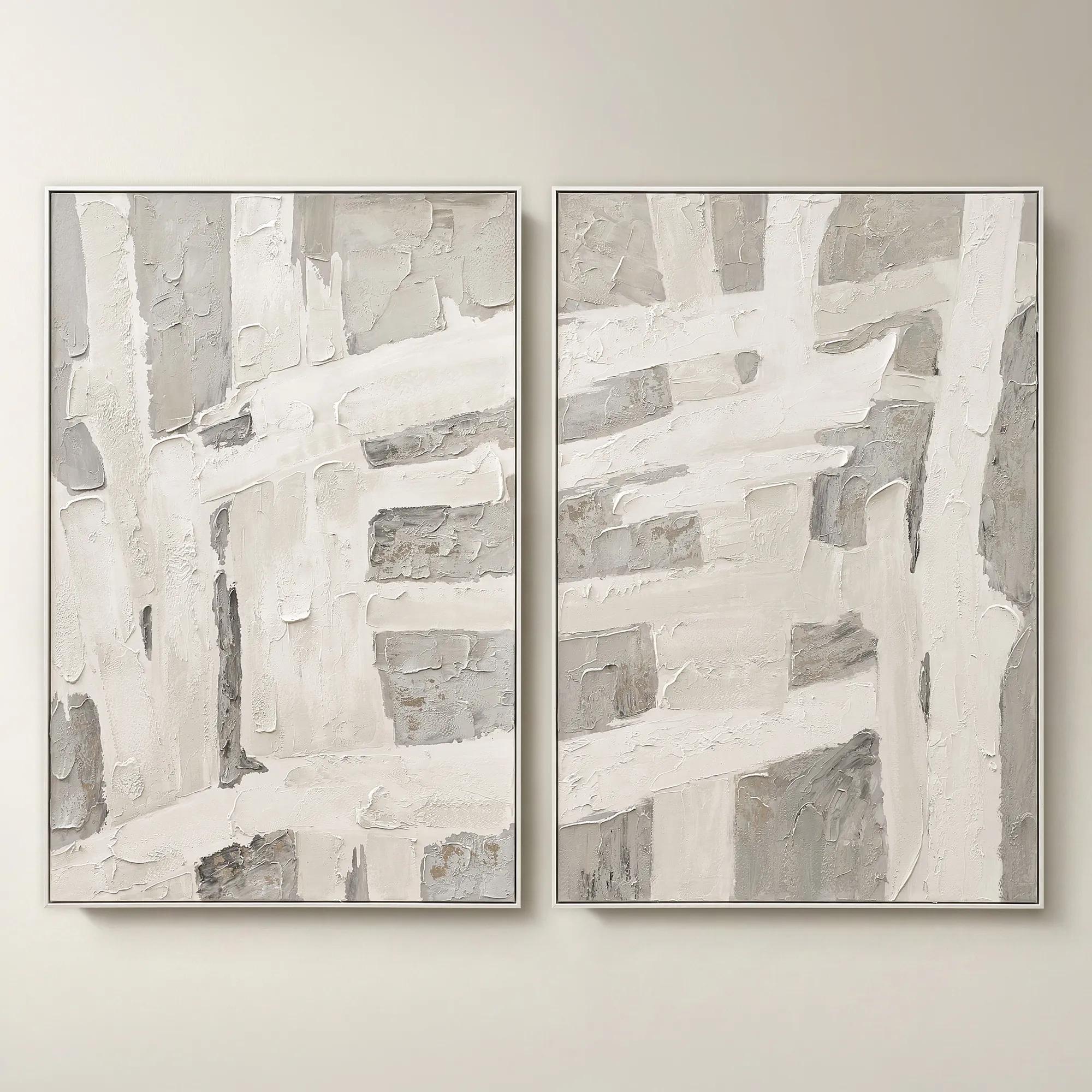 Traverse Framed Painted Wall Art 40" x 60" Set of 2$799
A hand-painted abstract diptych features champagne accents and soft grey, pearl, and alabaster tones in white frames.
Add To Cart -
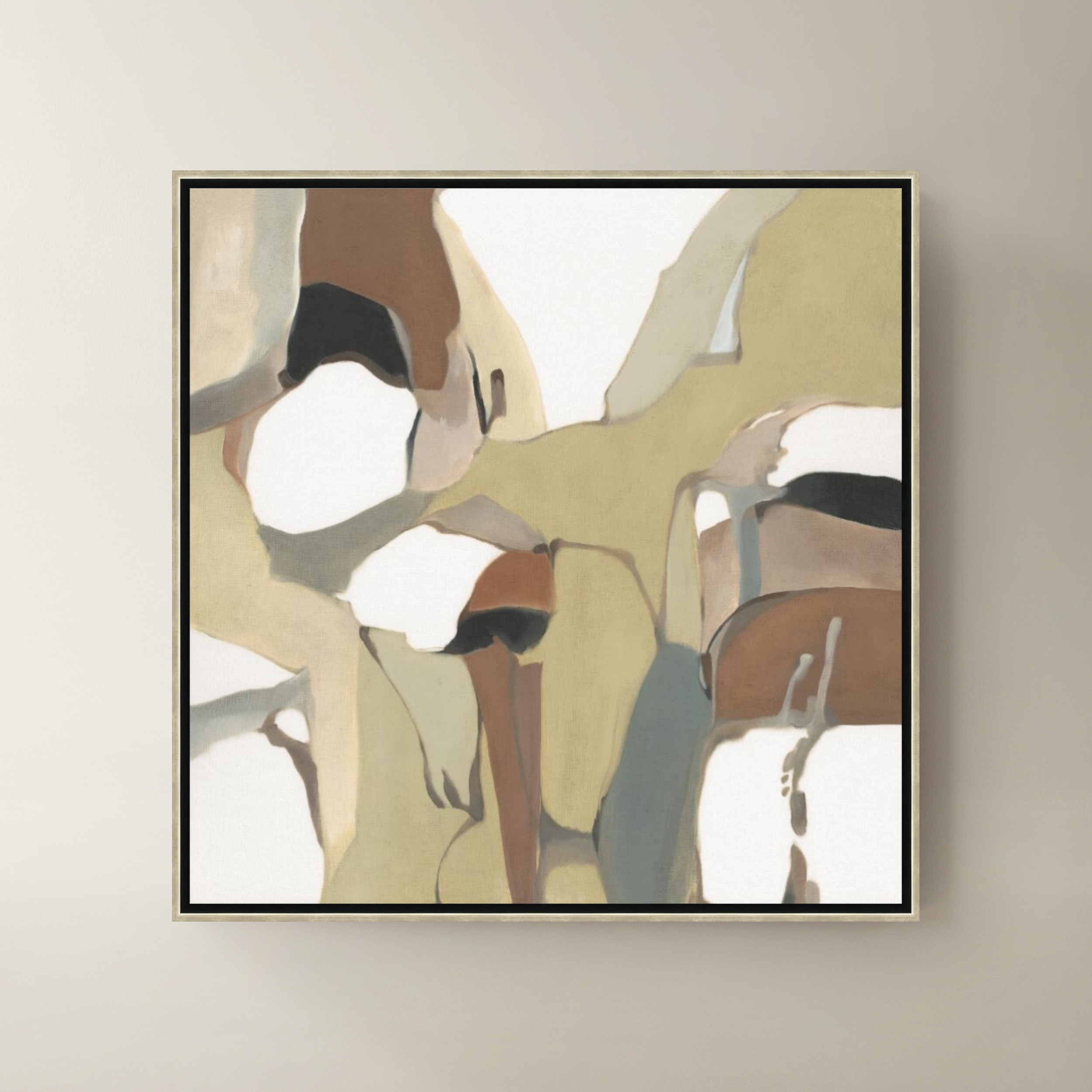
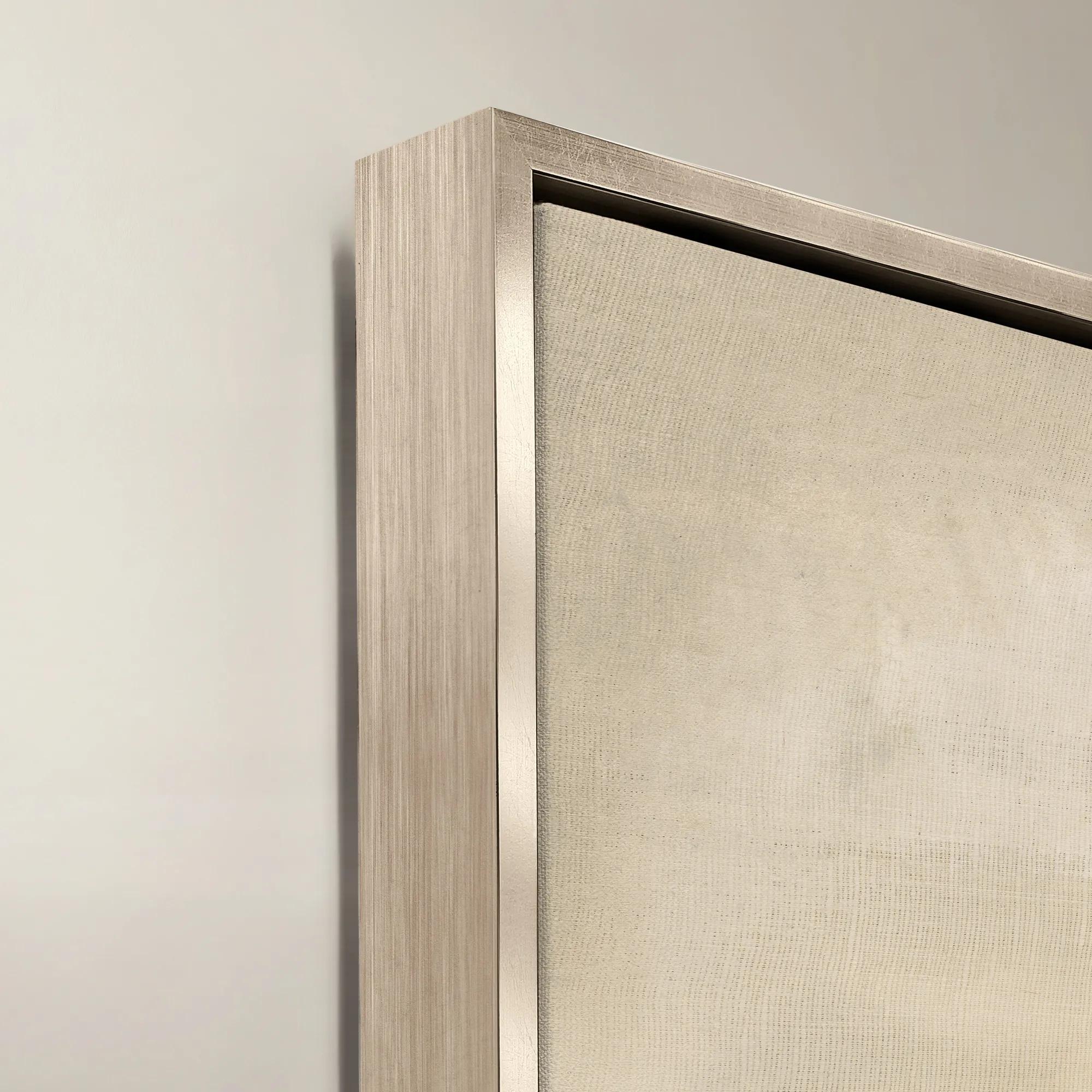 Organic Shape Framed Wall Art 47" x 47"$1099
A framed canvas artwork featuring an organic shape in rich brown tones.
Add To Cart -
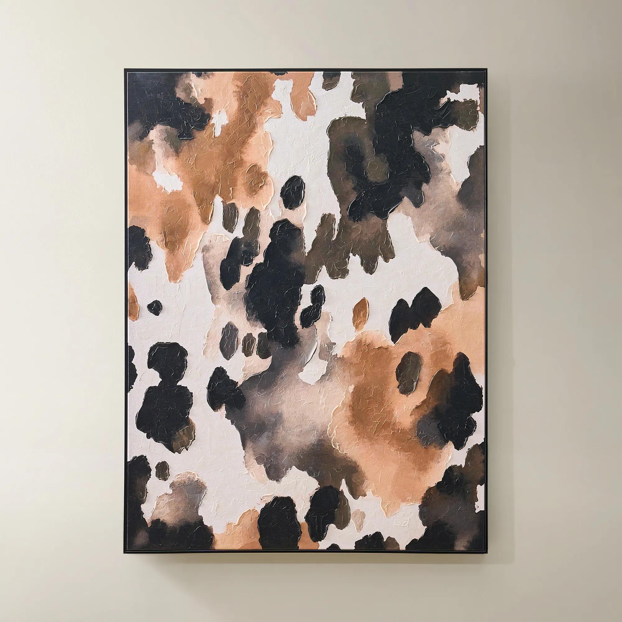
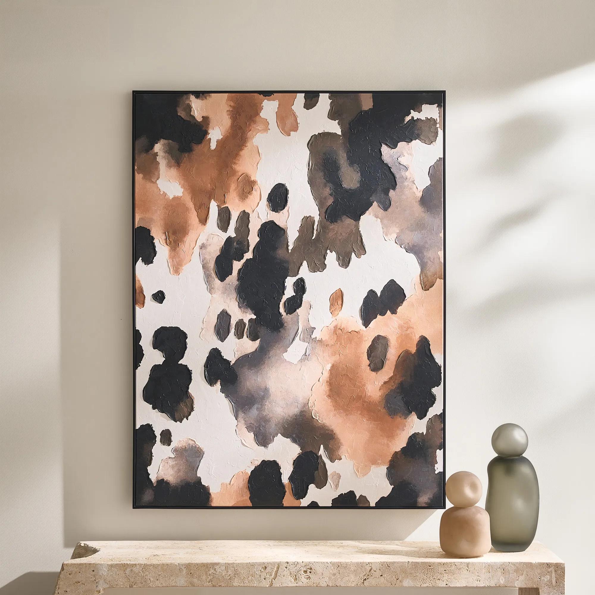 Wilder Framed Painted Wall Art 36" x 48"$499
An abstract hand-painted canvas featuring inky black, taupe, ivory, and coral hues in a sleek black frame.
Add To Cart -
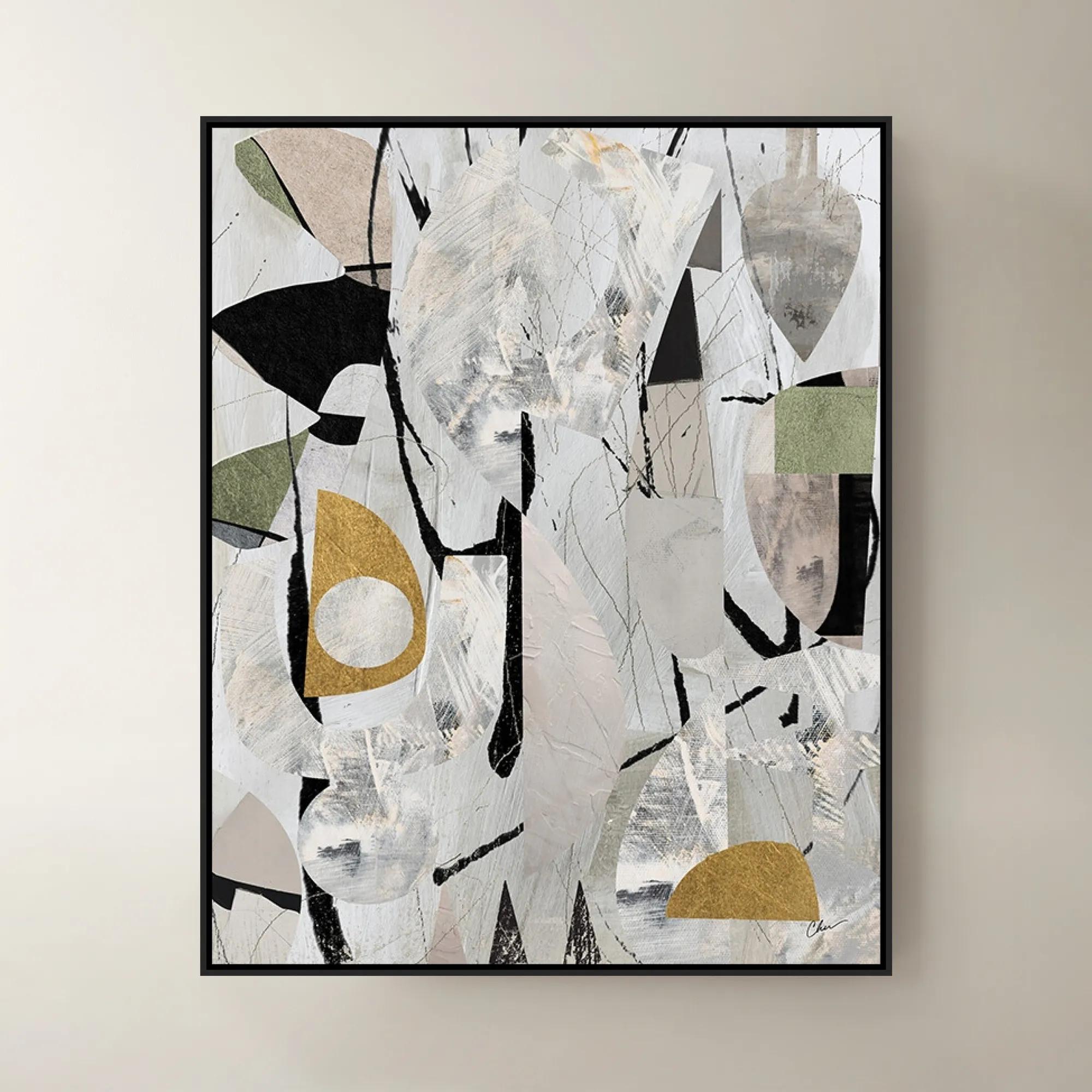
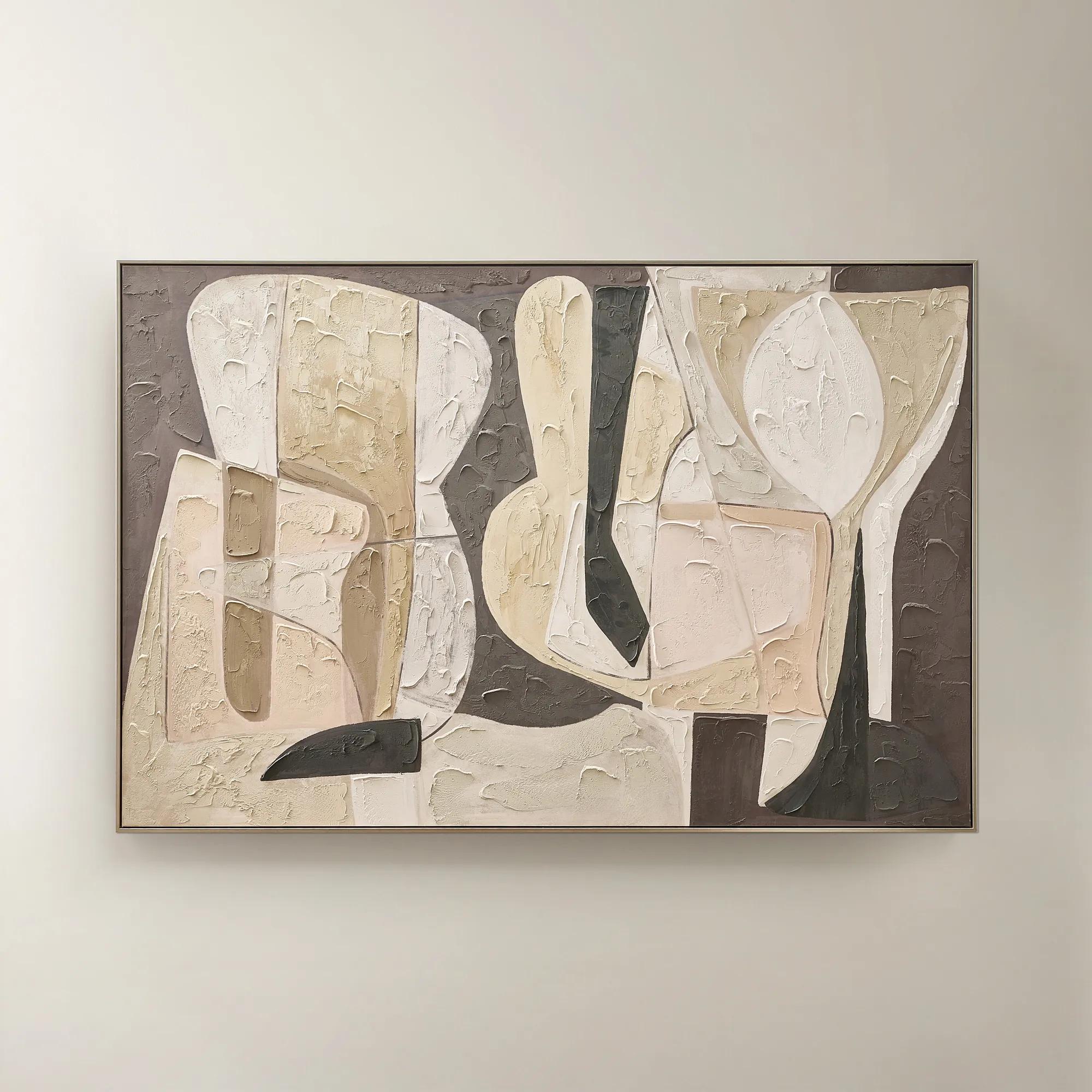 Wishful Thinking Framed Painted Wall Art 72" x 48"$599
A hand-painted abstract canvas featuring bold geometric forms and warm smoked plum, apricot, and tawny hues.
Add To Cart -
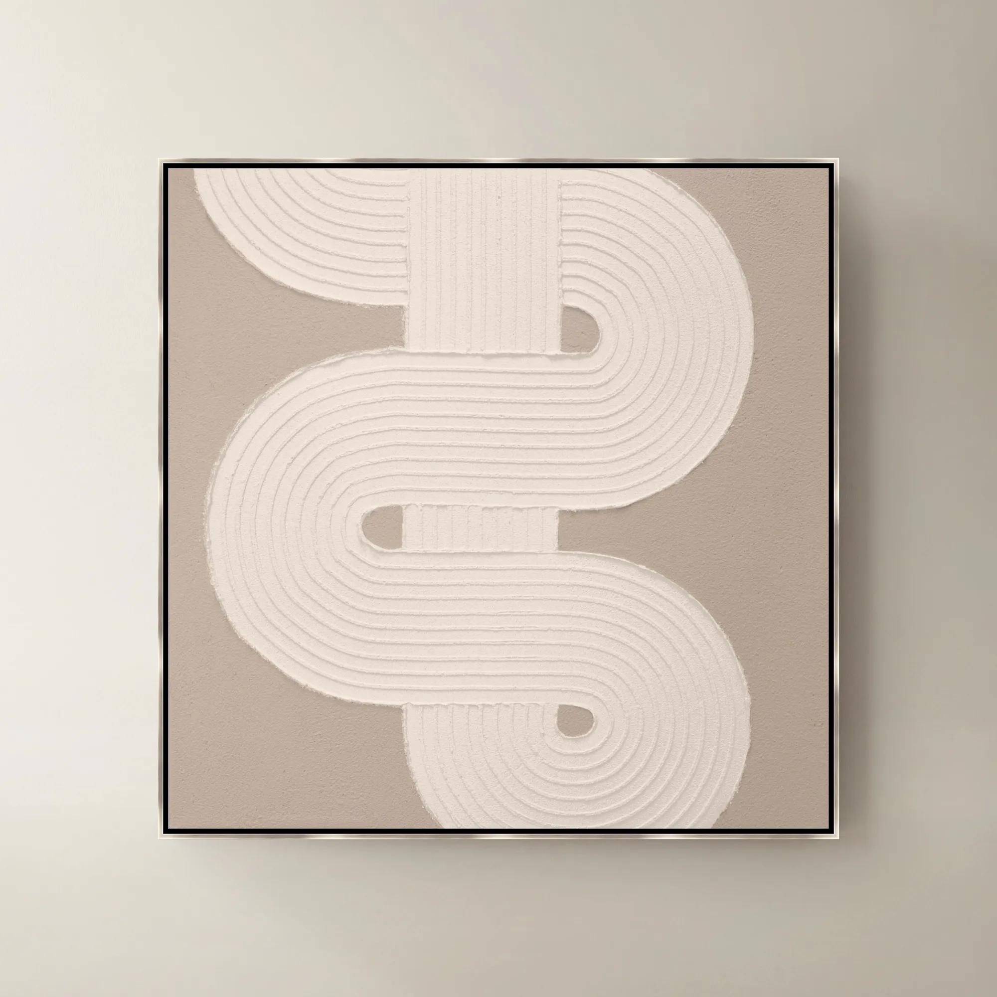
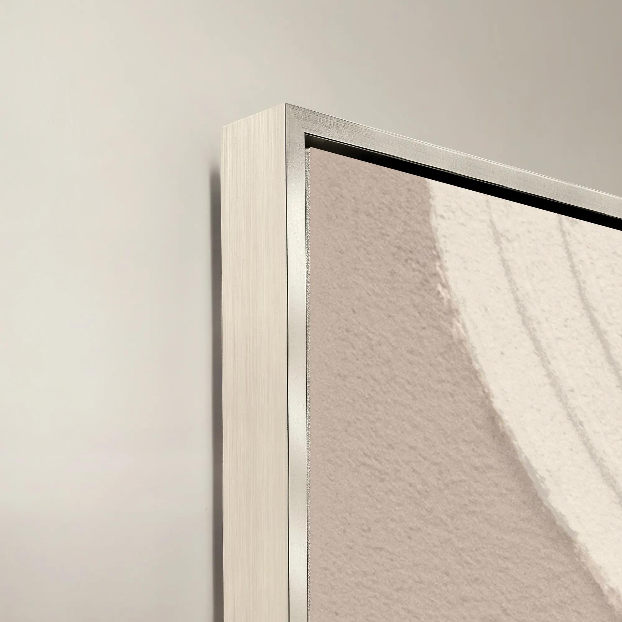 Sacred Geometry V Framed Painted Wall Art 40" x 40"$1099
A striking abstract art piece featuring bold geometric patterns for a modern, sophisticated touch.
Add To Cart -
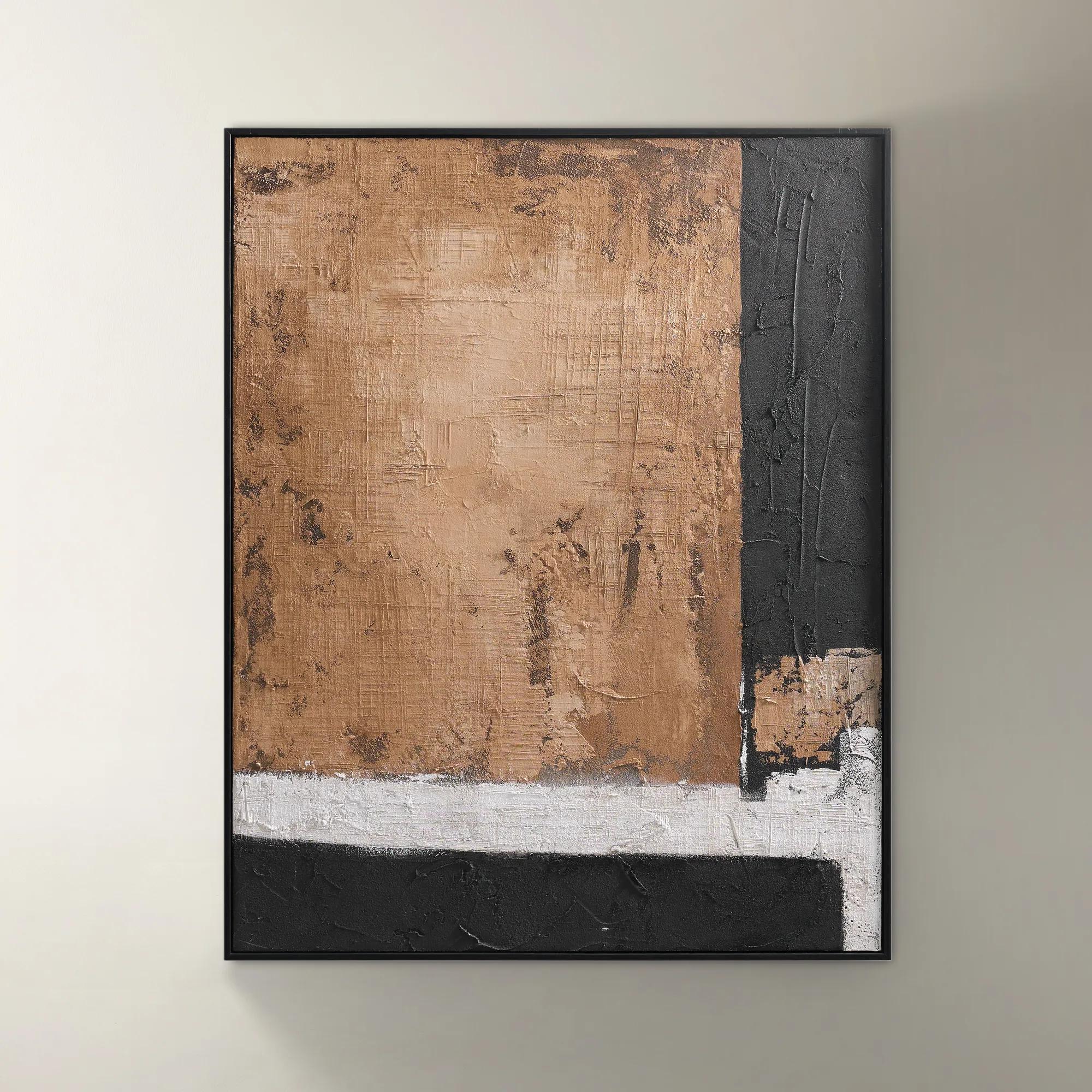 Drift Framed Painted Wall Art I 39.4" x 31.5"$299
A bold hand-painted abstract artwork featuring layered brown tones in a sleek black floater frame.
Add To Cart -
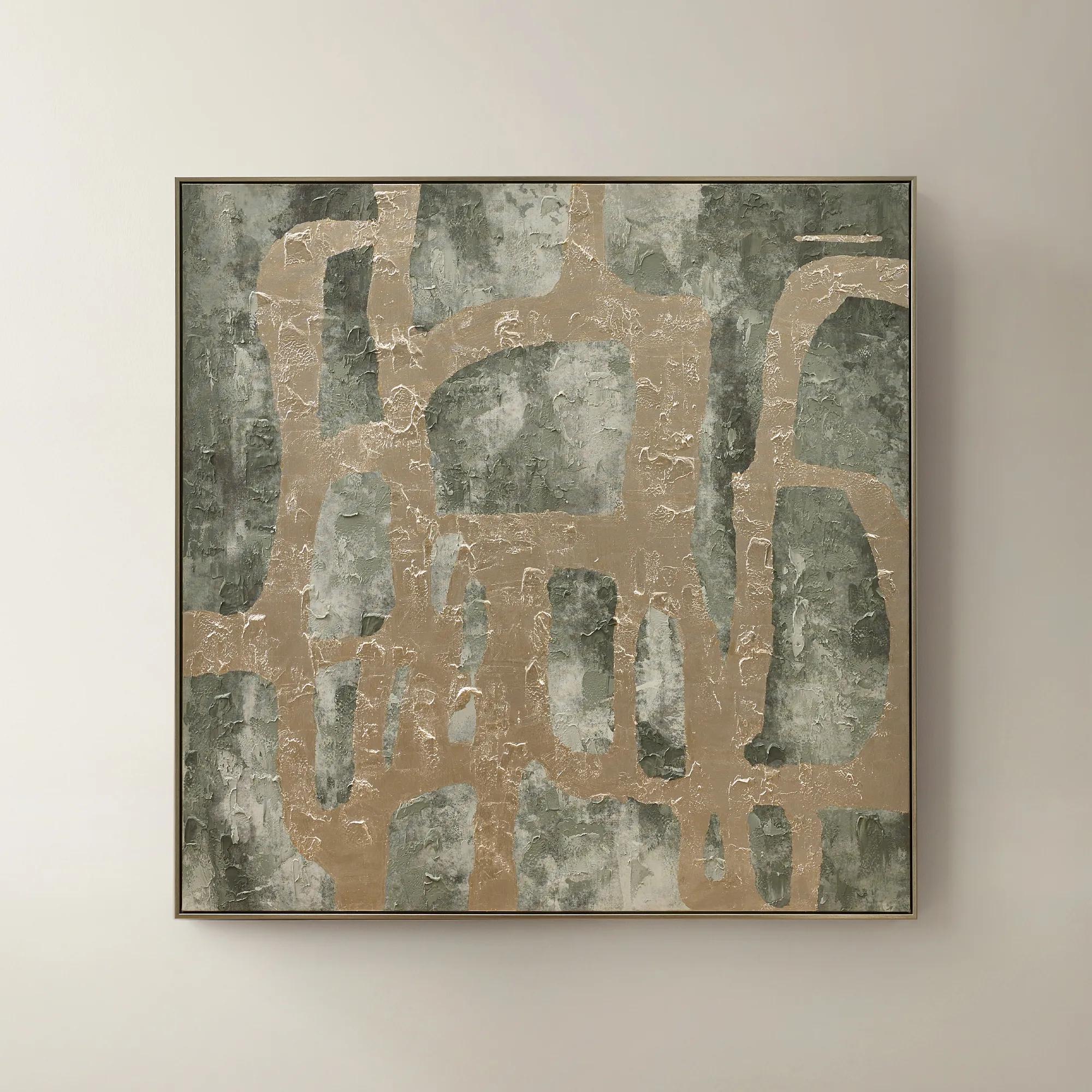 Illusions Framed Painted Wall Art 50" x 50"$599
A hand-painted canvas in sage and champagne tones with textural embellishments for modern, artful depth.
Add To Cart

Beige Abstract Canvas Paintings
Beige abstract canvas paintings invite a sense of refined tranquility into every room, blending understated elegance with expressive artistry. These works capture the allure of subtlety—where gentle neutrals and organic forms create a sophisticated backdrop for bold living. Each brushstroke whispers luxury, transforming blank walls into curated moments of serenity and intrigue. With beige abstract canvas paintings, your home becomes a gallery of effortless glamour, where every glance reveals new layers of depth and inspiration.
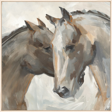
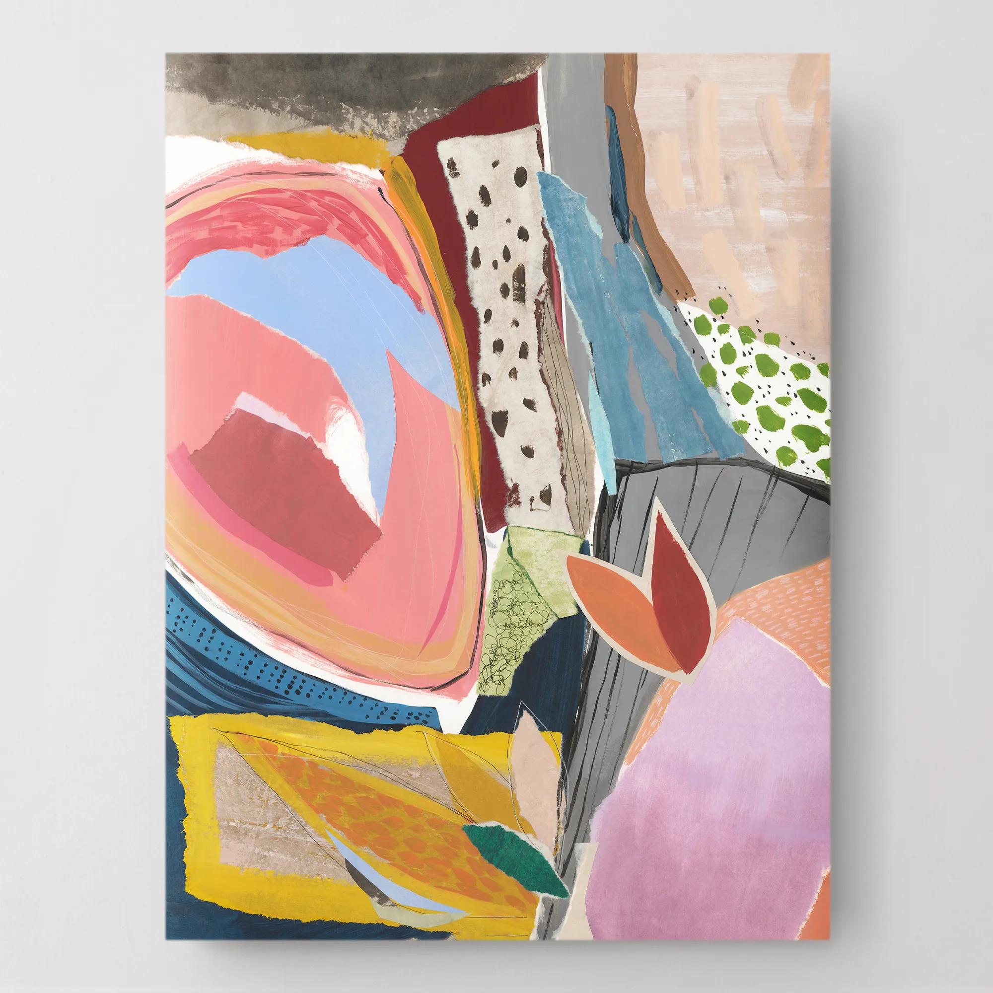
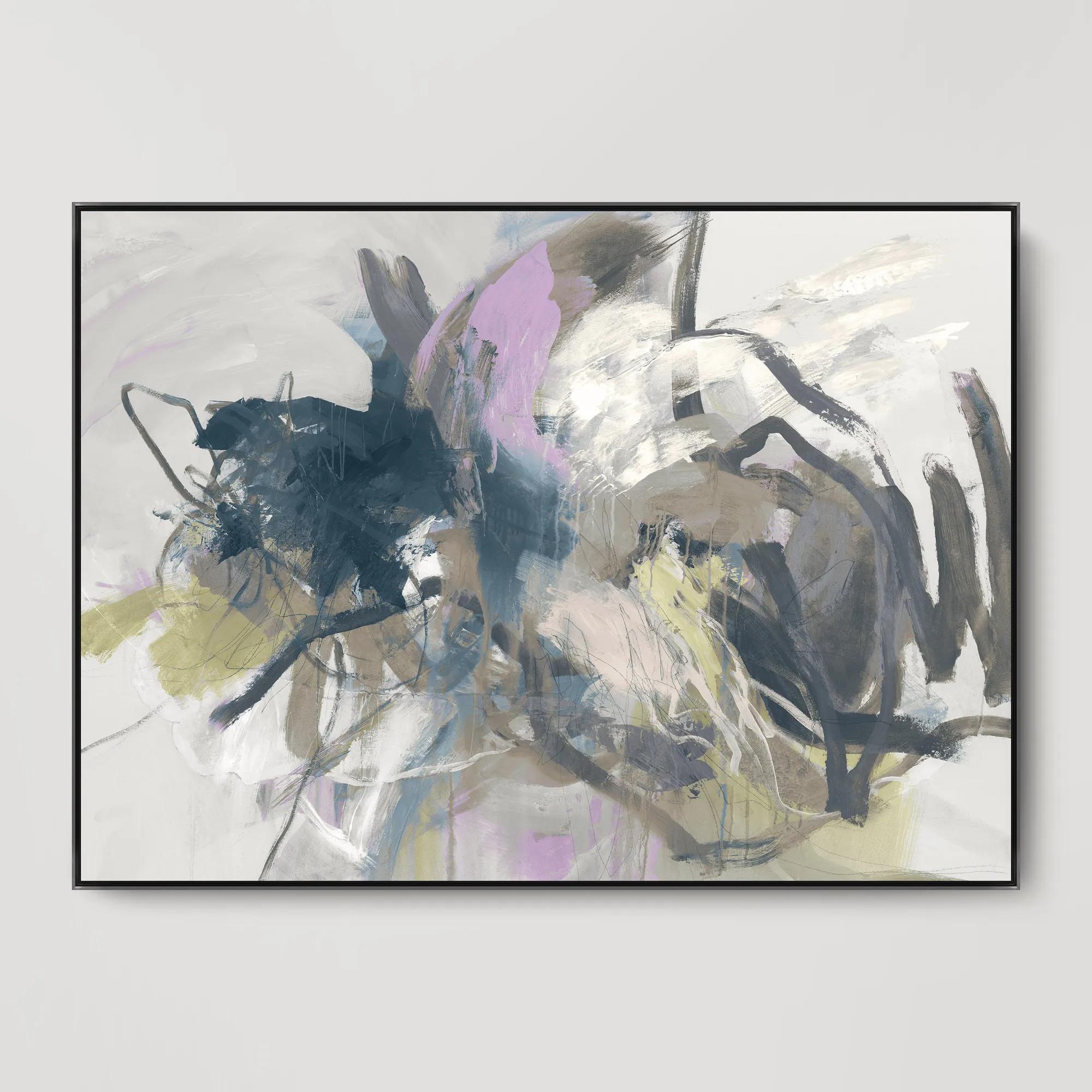
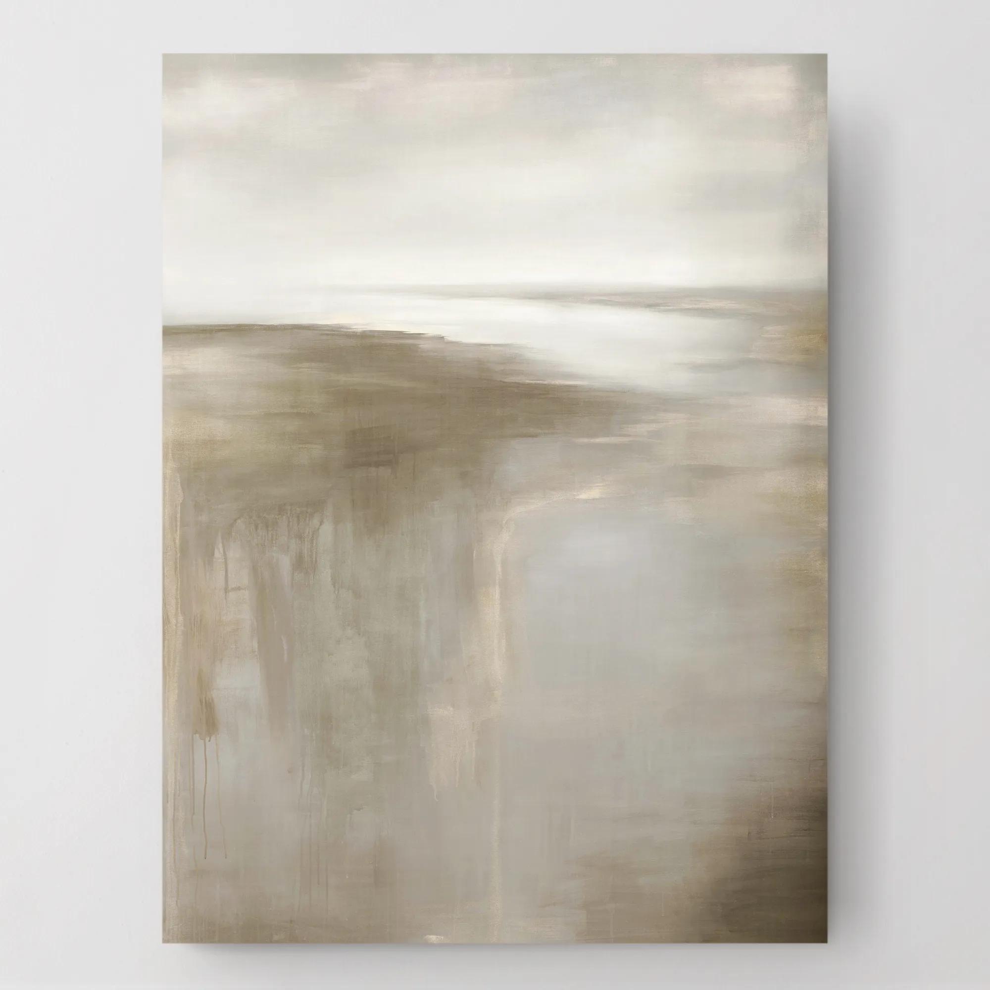
Beige abstract canvas paintings bring expressive form and tonal depth to a room without relying on literal subjects or saturated color. Their compositions may feature sweeping gestures, architectural shapes, layered fields of pigment, or delicate marks that seem to dissolve into the canvas. Within this neutral palette, the differences are compelling: pale sand can feel luminous and expansive, creamy ivory lends softness, and taupe introduces a smoky sophistication. A trace of charcoal gives an airy composition definition; a wash of warm ochre creates the impression of light passing across stone. These variations allow beige abstract wall art to feel serene without becoming anonymous. Above a velvet sofa, a generous canvas can establish a luxurious focal point while letting the upholstery retain its presence. In a dining room, loose, gestural forms offer a graceful counterpoint to a substantial table and sculptural lighting. A bedroom benefits from quieter compositions with softened edges, while an entryway can carry bolder contrasts and more assertive movement. The appeal lies in how much expression a restrained palette can hold. Some paintings evoke weathered plaster or mineral formations; others depend on crisp geometry and generous areas of open space. Neither approach requires a literal interpretation, leaving room for personal associations and a more intimate relationship with the artwork. For interiors layered with distinctive furniture and decorative objects, beige offers visual continuity rather than competition. In a more restrained setting, texture and brushwork can provide the drama. The category can include hand-painted canvases, printed reproductions, and prints enhanced with applied details, each with a different surface character. Hand-applied pigment may introduce dimensional ridges and individual variations, while a canvas print can reproduce subtle tonal transitions and intricate marks. Product descriptions and close-up images help distinguish actual raised texture from the appearance of texture within the image, an important difference when the artwork will be viewed at close range.
Scale gives beige abstract canvas paintings much of their architectural presence. A broad horizontal composition can visually unite a seating arrangement, while a tall, narrow canvas draws attention upward and lends poise to a slender wall. Oversized artwork creates a decisive moment with relatively few surrounding accents; smaller canvases offer intimacy beside a reading chair, above a compact chest, or within a thoughtfully spaced arrangement. Above furniture, an artwork or grouping spanning roughly two-thirds to three-quarters of the furniture’s width often feels balanced, though the proportions of the room and the composition itself matter more than a rigid formula. Leaving a comfortable interval between the furniture and the lower edge of the canvas helps the two read as a connected arrangement rather than unrelated elements. On an open wall, positioning the visual center near eye level usually makes the work feel accessible, with adjustments for seated viewing or unusually high ceilings. Beige also deserves a close look alongside the finishes already in the room. A pink-leaning beige can feel distinctly different from a golden sand or a gray-based taupe, especially beside upholstery, flooring, and wall paint. Repeating one undertone across those surfaces creates cohesion; introducing a deliberate contrast can make the canvas more pronounced. Warm wood, antiqued brass, and creamy textiles draw out a mellow richness, while blackened metal, polished stone, and crisp white lend sharper definition. For a deeper neutral statement, Large Brown Abstract Canvas Paintings offer a related direction with greater tonal weight, particularly in spaces anchored by dark wood or richly colored upholstery. Framing changes the effect as well: a slim dark frame outlines pale artwork with precision, a metallic finish introduces a gleaming accent, and a finished gallery-wrapped edge allows the composition to stand on its own. Light completes the impression. Gentle, even illumination reveals subtle color shifts, while angled light can emphasize genuine surface relief and cast fine shadows across raised brushwork.
Materials and construction shape how a canvas looks over time, particularly when pale colors and nuanced textures are central to its appeal. Canvas may be cotton, linen, or a blended fabric, and its weave can contribute a fine grain or a more tactile foundation beneath the image. The support matters just as much: a well-constructed stretcher helps hold the fabric evenly, while the depth of the canvas affects its profile on the wall. Acrylic and oil paintings have different surface characteristics and care requirements, and printed canvas may use protective finishes that vary by maker. A glossy coating can intensify contrast and catch reflections; a matte surface generally produces a quieter effect with less glare. Neither finish is inherently the better choice, but each changes the way the artwork interacts with nearby windows and lighting. Details about the medium, finish, framing, and hanging hardware are therefore worth reviewing before deciding where a piece belongs. In everyday living spaces, durability depends on appropriate placement as well as construction. Direct sunlight can contribute to fading, and persistent moisture or abrupt humidity changes can affect canvas and its supports, making a dry interior wall a more suitable setting than a splash-prone area. Care should follow the maker’s instructions; avoiding household cleaners, water, and vigorous rubbing helps protect delicate pigment and surface treatments. Where permitted, gentle dust removal should use the recommended dry method without pressing into raised details. Secure installation requires hardware suited to both the artwork’s weight and the wall material, with professional assistance useful for especially large or heavy framed canvases. Beyond their decorative role, beige abstract paintings can make thoughtful housewarming or wedding gifts for someone whose taste favors expressive neutrals. A smaller scale suits a recipient still shaping a room, while a substantial canvas is a more personal gesture when their space and preferences are well understood. The lasting attraction is not neutrality alone, but the way line, texture, and proportion give a familiar room an unmistakable point of view.
FAQs
Beige abstract canvas paintings are remarkably versatile and complement a wide range of interior styles. They shine in contemporary, modern, and transitional spaces, adding subtle sophistication to minimalist rooms and softening the edges of more eclectic or maximalist décors. Their neutral palette also makes them ideal for layering with bolder colors, metallic accents, or natural materials, creating a harmonious and inviting atmosphere.
Beige abstract paintings infuse a room with a sense of calm, balance, and understated elegance. The gentle interplay of neutral tones and textured brushwork creates a soothing backdrop that encourages relaxation and contemplation. These artworks are especially effective in spaces where tranquility is key, such as bedrooms, living rooms, or home offices, fostering an environment of peaceful inspiration.
Absolutely. Beige abstract canvas paintings make thoughtful and timeless gifts for a variety of occasions, from housewarmings and weddings to milestone celebrations. Their neutral hues and abstract forms appeal to diverse tastes and interiors, making them a safe yet sophisticated choice for anyone looking to elevate their home or workspace with art that invites personal interpretation.
To create a striking gallery wall, pair your beige abstract canvas with artworks in complementary tones or contrasting textures—think metallic frames, black-and-white photography, or sculptural wall décor. Vary the sizes and orientations for visual interest, and allow the beige piece to serve as a grounding element that brings cohesion and warmth to the overall display.
Beige abstract art stands out for its ability to evoke emotion and depth through a restrained, monochromatic palette. The subtle variations in tone and texture invite closer inspection, revealing layers of artistry that reward the viewer over time. Unlike more vibrant abstracts, beige pieces offer a quiet drama that enhances a space without overpowering it, making them both distinctive and endlessly adaptable.