
A designer’s approach to gallery wall ideas that feel composed, curated, and unmistakably refined.
The most memorable gallery walls never feel busy. They feel composed.
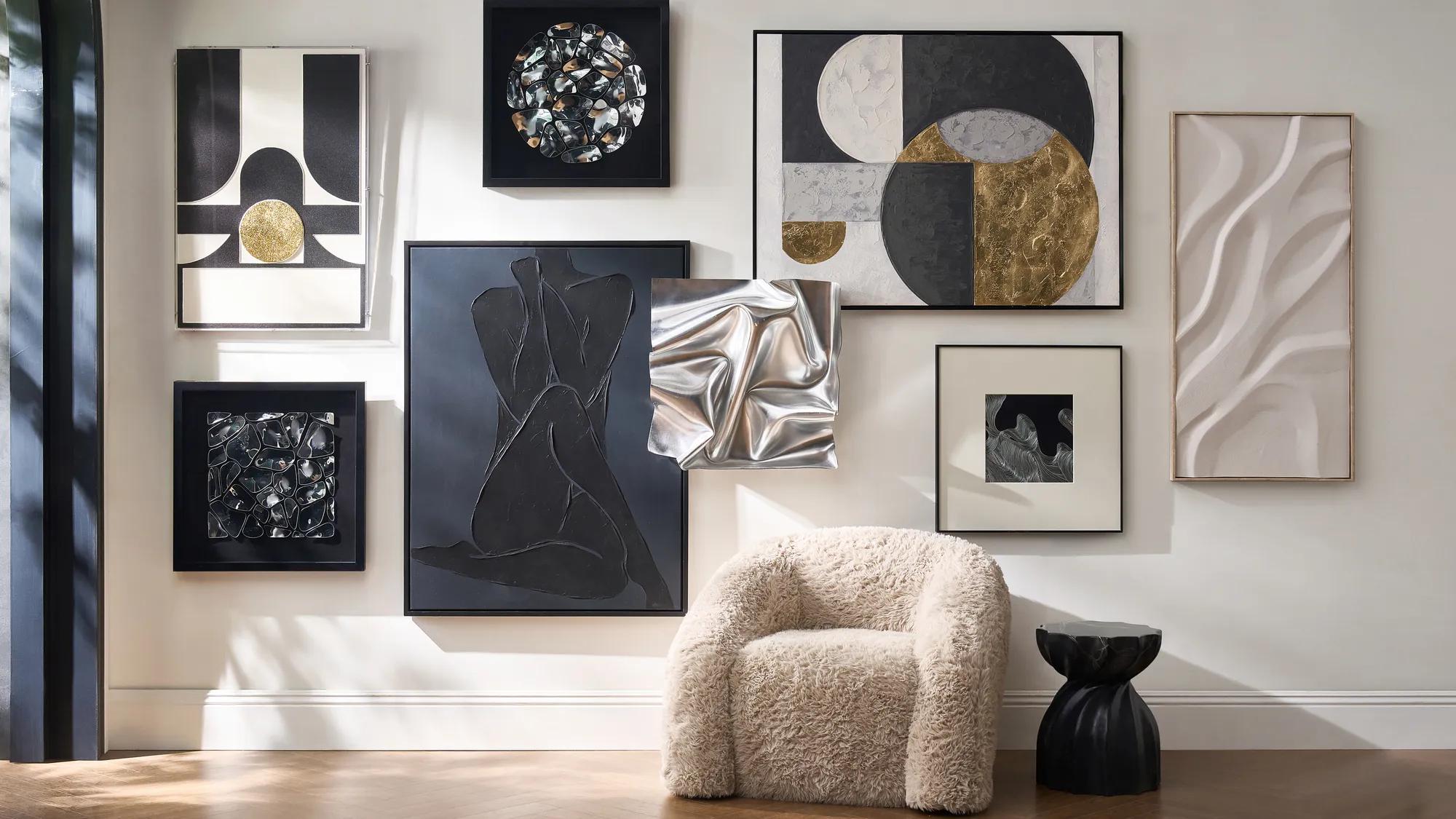
There is a quiet discipline behind the best gallery wall ideas, the kind that make a room feel curated rather than crowded. A balance of scale, repetition, and breathing room allows the wall to read less like decoration and more like a thoughtful installation.
In a well-designed home, walls are not simply filled. They are composed. A gallery wall becomes an extension of the architecture, a moment where artwork, frames, and negative space come together with intention.
The secret is restraint. Larger pieces, cohesive finishes, and carefully measured spacing transform an assortment of artwork into something that feels collected and elevated.

In This Story
-
The design principles behind truly elevated gallery wall ideas
-
How frame finishes, scale, and shine shape a curated composition
-
Stylist techniques that prevent gallery walls from feeling cluttered
-
Room-by-room approaches designers use to make installations feel effortless
The Design Codes
A refined gallery wall follows a quiet set of design rules. They are rarely obvious, yet they determine whether a wall feels curated or chaotic.
A Cohesive Palette
The artwork on a gallery wall should converse with the room around it.
Designers often begin with a palette already present in the space, pulling tones from upholstery, rugs, or architectural finishes. Soft neutrals, deep charcoals, warm metallics, and stone-inspired hues tend to create the most enduring compositions.
Many contemporary interiors combine natural materials with refined finishes, layering marble, brass, and textured surfaces to create visual depth. These elements bring warmth and sophistication to decorative compositions.
Stylist Note: When the palette feels intentional, even varied artwork begins to look cohesive.
Two or Three Frame Finishes
Luxury interiors rarely mix too many frame styles.
Instead, designers limit the composition to two or three materials, allowing repetition to unify the wall. A combination such as matte black, warm brass, and walnut creates contrast without visual chaos.
The repetition of materials allows each artwork to feel related, even when the subjects differ.
Discover The New Art Collection.
Consistent Matting
Matting introduces quiet structure to a gallery wall.
Wide white mats create visual breathing room around artwork while also enlarging the perceived scale of smaller pieces. When matting remains consistent across multiple frames, the wall instantly feels more curated.
This subtle consistency is one of the most powerful techniques in modern gallery wall design.
Scale Before Quantity
One of the most common mistakes in gallery wall ideas is using too many small pieces.
Designers typically anchor the composition with one or two larger works before layering smaller pieces around them. Larger artwork establishes visual gravity and prevents the arrangement from feeling scattered.

Larger anchor pieces provide visual structure and calm within a gallery wall composition.
A Measured Level of Shine
Reflective materials bring a subtle glow to a gallery wall, but only when used sparingly.
Brass frames, glass-front shadow boxes, or sculptural metallic accents introduce moments of light. Balanced with matte artwork, they create depth without overwhelming the composition.
Stylist Note: Luxury interiors rarely rely on sparkle alone. They layer matte and shine for quiet contrast.
The Stylist’s Rules
Designers approach how to design a gallery wall with discipline. These rules keep the arrangement composed and balanced.
Plan the Composition First
Before a single nail touches the wall, designers map the layout on the floor.
This allows the spacing, hierarchy, and rhythm of the pieces to reveal themselves naturally.
Anchor the Wall With a Hero Piece
Every gallery wall benefits from a focal point.
This anchor might be a large abstract painting, a dramatic photograph, or a sculptural framed work. Once the hero piece is established, supporting pieces can orbit around it with balance.
Keep Spacing Consistent
Spacing determines whether a gallery wall feels intentional.
A reliable gallery wall spacing guide suggests:
-
2 to 3 inches between smaller frames
-
3 to 4 inches between larger works
Uniform spacing creates rhythm, allowing the eye to travel comfortably across the composition.
Introduce One Unexpected Piece
The most compelling gallery wall arrangement tips often involve contrast.
A round mirror, a sculptural wall object, or a dimensional shadow box introduces variation and prevents the wall from feeling rigid.
Did you know? Designers frequently add one non-rectangular element to soften the geometry of framed art.
Stop Before the Wall Feels Full
The most refined gallery wall ideas always leave room to breathe.
Negative space allows each artwork to stand on its own, giving the entire composition a sense of calm.
Negative space frames the composition and allows each artwork to breathe.
The Room Formula
Different rooms call for different gallery wall layout ideas. The arrangement should respond to the furniture and proportions of the space.
Living Room
The living room is often the natural stage for gallery wall over sofa ideas.
Designers typically build a horizontal composition that mirrors the width of the sofa. A large central piece anchors the arrangement while smaller works extend outward.
The result feels balanced and architectural.
Dining Room
Dining rooms favor symmetry.
Structured rows or subtle grids create a sense of refinement, particularly when repeated frame finishes and artwork sizes bring visual order to the wall.
Bedroom
Bedrooms call for softer compositions.
Calming artwork, neutral palettes, and slightly wider spacing allow the gallery wall to feel serene rather than energetic.
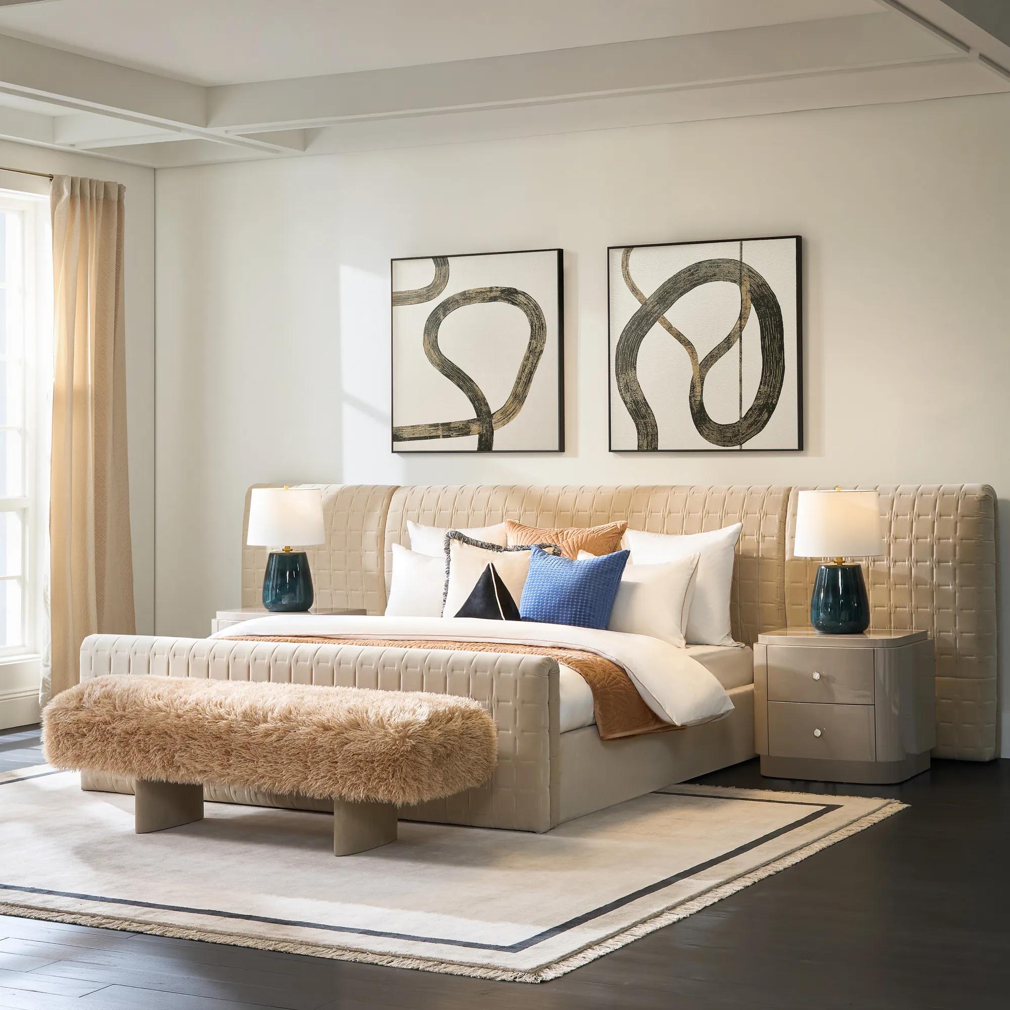
A softer palette and restrained composition create a restful gallery wall.
Entryway
In an entryway, vertical arrangements guide the eye upward.
Stacked artwork, asymmetrical groupings, or a combination of mirrors and art can transform a transitional space into a memorable introduction to the home.
Explore The Entryway Collection.
The Edit
Designers rarely rely on abundance. Instead, they refine the selection.
A sophisticated gallery wall often includes seven to nine thoughtfully chosen elements.
A balanced curated gallery wall might include:
-
Hero artwork
The anchor that establishes the composition. -
Two or three supporting works
Pieces that echo tone, palette, or theme. -
A repeated metallic frame
Introduces warmth and subtle shine. -
Consistent white mats
Creates visual rhythm and structure. -
One personal or float-mounted piece
Adds individuality and depth. -
One sculptural or round object
Softens the arrangement. -
Optional picture light
Brings atmosphere and highlights the artwork.
Stylist Note: A gallery wall should feel curated over time, never accumulated in a single afternoon.
Frequently Asked Questions
How many pieces should a gallery wall have?
Most sophisticated gallery wall ideas include between five and nine pieces. This allows the composition to feel curated while preserving negative space.
What is the best spacing for a gallery wall?
A typical gallery wall spacing guide recommends leaving two to four inches between frames. Consistent spacing creates a polished appearance.
Do gallery wall frames need to match?
Frames do not need to match exactly, but cohesive finishes help unify the wall. Limiting materials to two or three frame styles creates a refined look.
How high should a gallery wall be hung?
The center of the gallery wall should sit approximately 57 to 60 inches from the floor. When hanging art above furniture, leave about 6 to 10 inches between the frame and the piece below.
Can mirrors be part of a gallery wall?
Yes. Mirrors introduce light, depth, and variation. Designers often include a single mirror to break up the repetition of frames.
The Beauty of Restraint
The most elegant gallery wall ideas rely on restraint.
Scale establishes presence. Cohesion creates harmony. Negative space allows each piece to speak clearly.
When those elements come together, the wall becomes something more than decoration. It becomes a quiet exhibition of personal taste and thoughtful design.
Discover the finishing touches.
.jpg?w=2500&h=2500)


