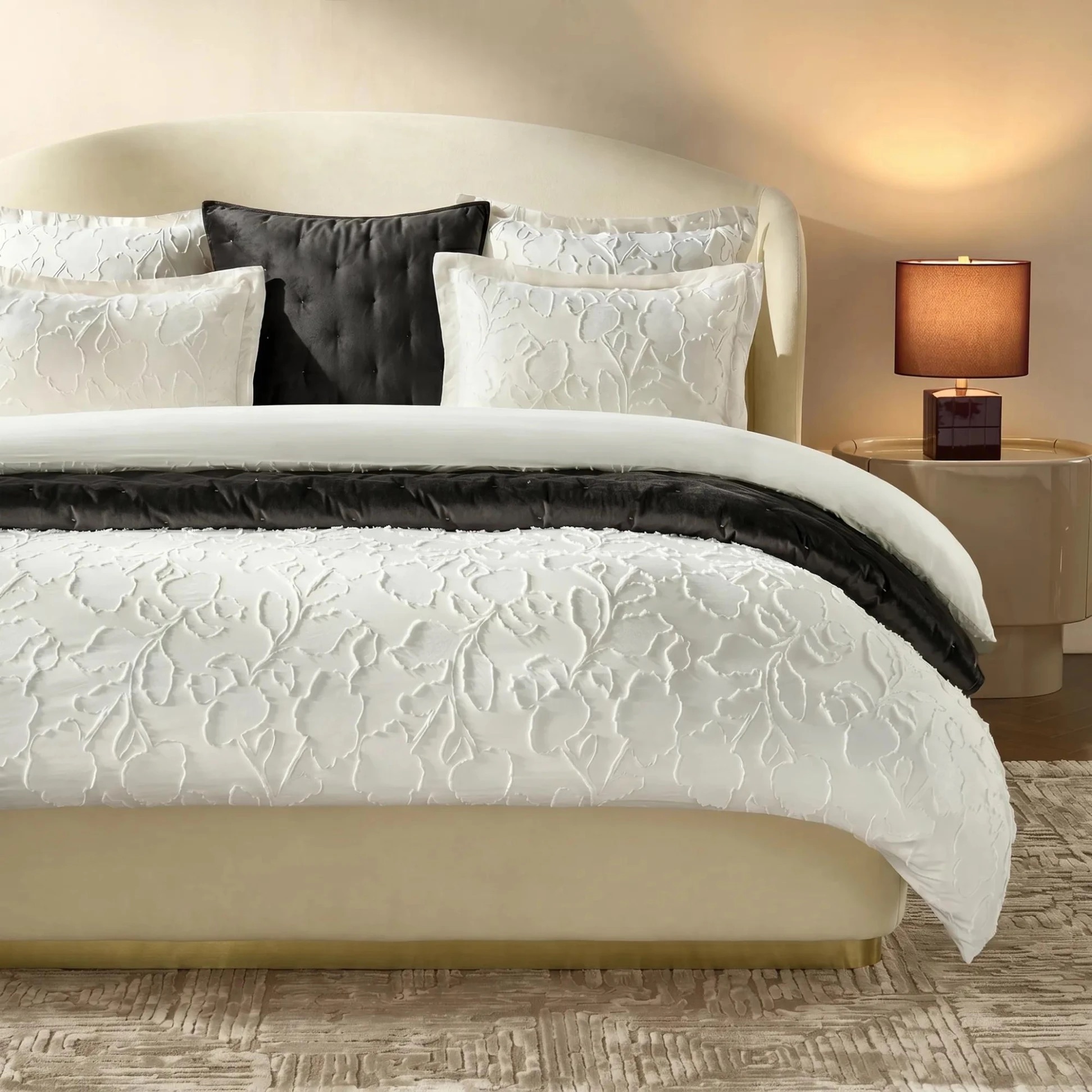
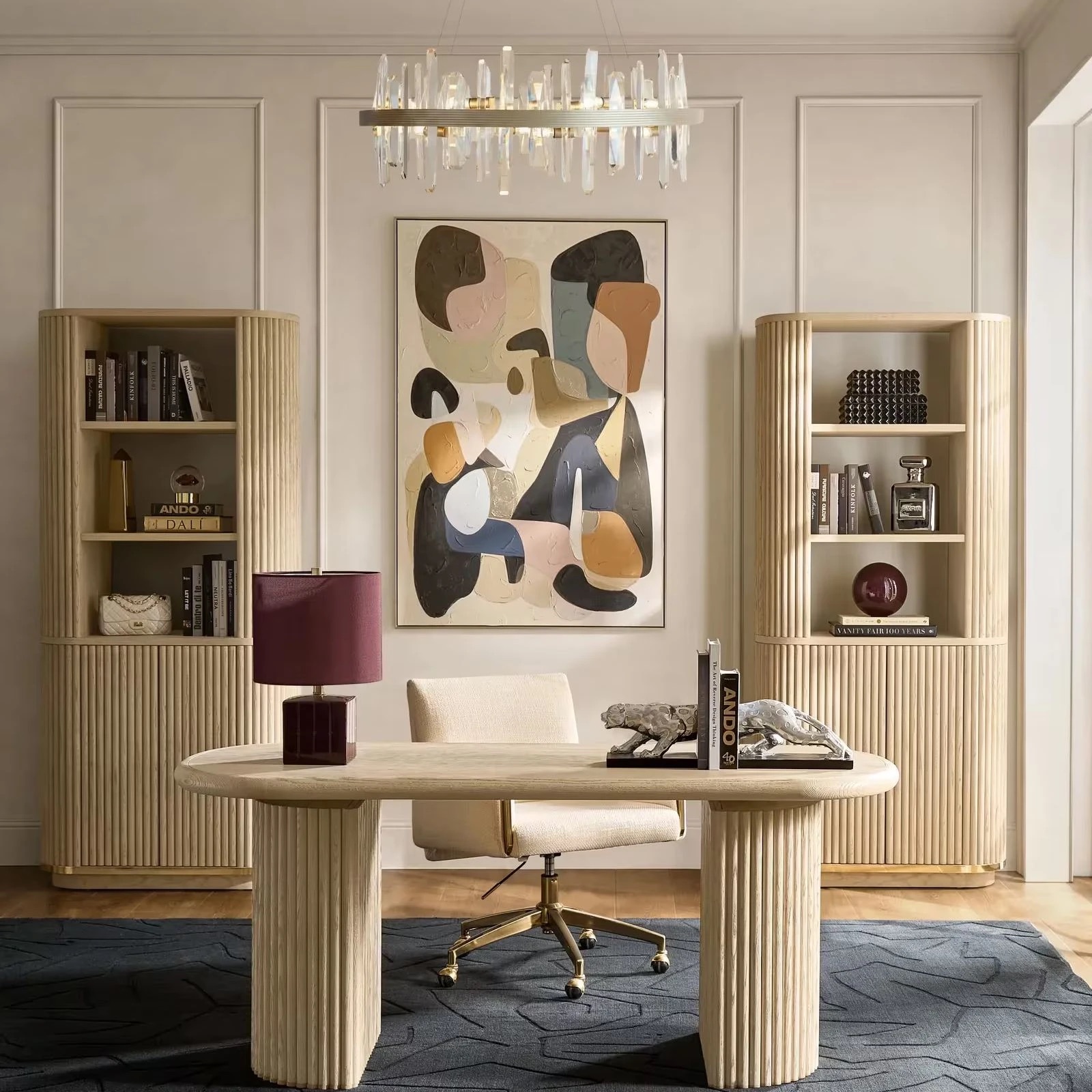
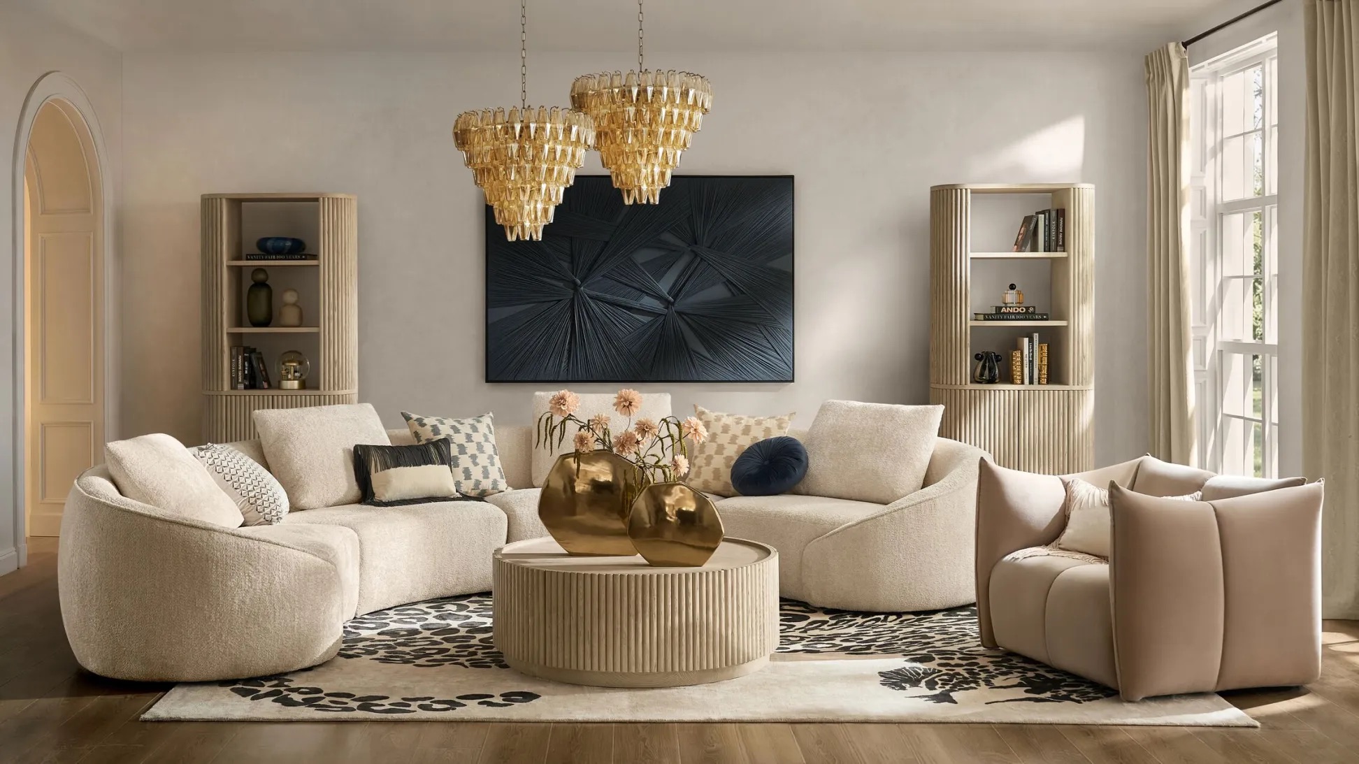
A room can have the right sofa, the right rug, even the right lighting, and still feel unfinished. Often, the missing layer is on the walls.
Wall art gives a room its point of view. It can pull color across a space, create height, balance a substantial piece of furniture, or turn an otherwise forgettable wall into the place your eye lands first. The difference between art that simply occupies a wall and art that feels truly considered usually comes down to three things: height, scale, and spacing.
The short answer? When hanging wall art on an open wall, start with the center of the artwork about 57 to 60 inches from the floor. Above furniture, keep the art visually connected to what sits beneath it. For gallery walls, treat the entire arrangement as one composition rather than a collection of individual frames.
Those measurements are a starting point, not a decorating constitution. The last few inches belong to the room and to you.
In this guide
- Wall art hanging measurements at a glance
- How high to hang art
- How to choose the right size art
- How to hang one statement piece
- How to arrange pairs and stacked art
- How to plan a gallery wall layout
- How much space to leave between artwork
- How to hang art above furniture
- Before you make the first hole
- Wall art FAQs
- Shop the edit
Wall art hanging measurements at a glance
| What you are hanging | A good starting point | Why it works |
|---|---|---|
| Art on an open wall | Center the artwork about 57–60 inches from the floor | Keeps art near a comfortable eye level |
| Art above a sofa or console | Keep the bottom roughly 6–8 inches above the furniture | Connects the art to the furniture below |
| Art above a sofa | Aim for art or a grouping around two-thirds the sofa's width | Creates enough scale to balance substantial seating |
| A pair of artworks | Leave approximately 2–3 inches between frames | Helps the pair read as one composition |
| A vertical stack | Center the complete stack as one unit | Prevents the arrangement from creeping too high |
| A gallery wall | Keep most neighboring pieces about 2–3 inches apart | Creates an underlying rhythm even with mixed art |
Think of these measurements as the tailoring pins of a room: enough structure to make the finished composition look intentional rather than accidental.
How high to hang art
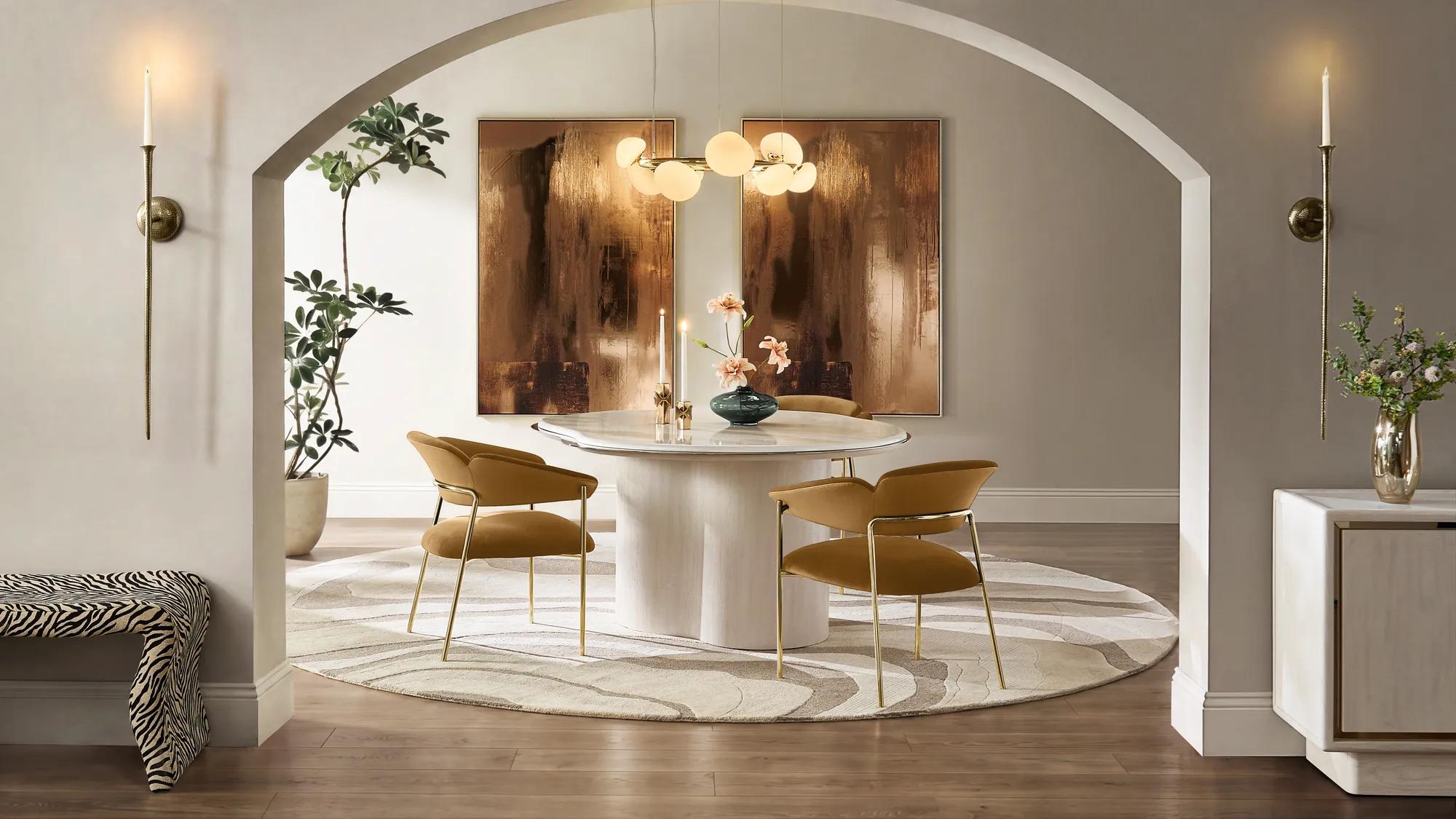
If there is one number worth remembering, it is 57 to 60 inches. That is a useful starting point for the height of the center of the artwork, rather than the top or bottom of the frame. It keeps art close to eye level and helps prevent one of the most common mistakes in hanging wall art: sending it so high that it seems to be negotiating with the ceiling.
On an empty wall, use eye level as your anchor. Measure from the floor to the center of the piece, then make small adjustments according to ceiling height, artwork scale, and how the room is used.
Above furniture, let the furniture lead. A painting over a sofa is not floating independently. The sofa and artwork should read as one composition, which means the relationship between them matters more than hitting one exact measurement.
With several pieces, measure the grouping rather than every frame. Imagine the outside edges of the arrangement forming one large rectangle. Find the center of that overall shape and position the grouping from there.
The goal is not to make the tape measure happy. It is to make the art feel connected to the room.
How to choose the right size art
Height gets plenty of attention, but scale is what makes wall art feel convincing. A beautifully hung piece can still look lost when it is too small for the wall around it. A postage stamp is charming on an envelope; it is less persuasive floating alone above a sectional.
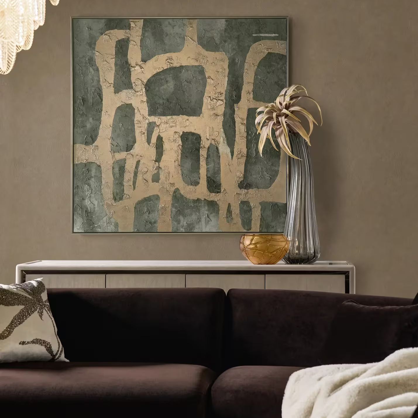
Above a sofa, think in thirds. A reliable starting point is artwork that measures roughly two-thirds the width of the sofa below it. If you are creating a gallery wall, use the total width of the complete grouping for the same comparison.
Let substantial furniture have substantial art. A long sideboard, sectional, king bed, or wide console can support artwork with real presence. One generous piece often looks more resolved than several small works scattered across the same amount of wall.
Use negative space intentionally. Every inch does not need filling. Breathing room around a strong work gives it importance and lets the eye understand where the focal point is.
This is where framed art can be especially useful. A defined frame adds an architectural edge to the artwork and helps establish its visual scale against the wall.
How to hang one statement piece
A single large artwork is the cleanest way to give a wall authority. It works particularly well above a sofa, bed, console, dining banquette, or mantel, anywhere the room already has a clear architectural or furniture anchor.
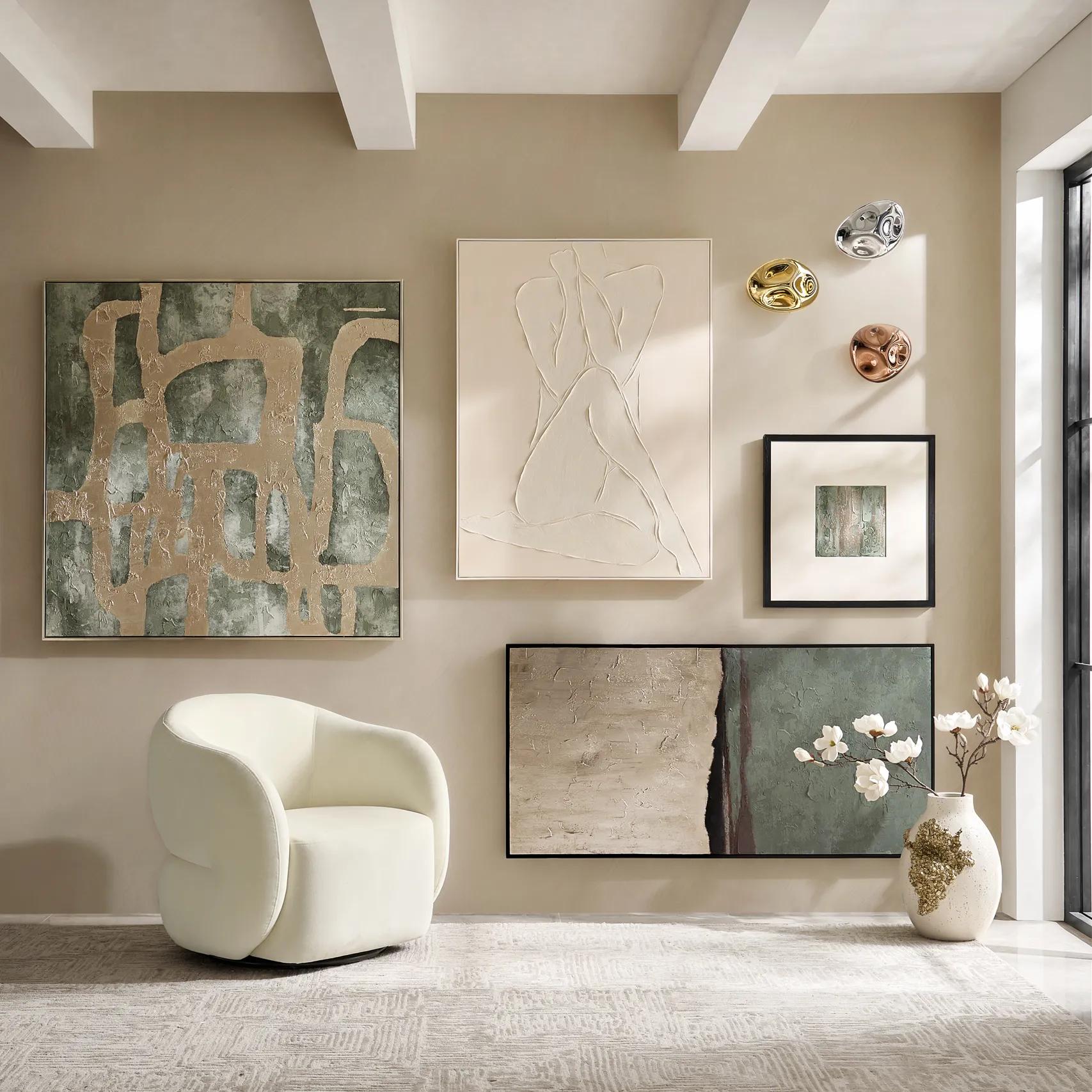
Center it on what matters. If the artwork hangs above a sofa, center it over the sofa, not necessarily on the wall itself. The same principle applies above a bed or console. Furniture creates the visual zone; the artwork completes it.
Do not be afraid to go large. A statement piece should have enough presence to justify the name. If you are deciding between two sizes, the larger work will often create the more finished result, provided the surrounding wall still has room to breathe.
Keep it close enough to belong. Art that sits too far above furniture begins to look disconnected. A starting gap of approximately 6 to 8 inches generally creates a stronger relationship between the two.
And a statement piece does not have to be a painting. Sculptural wall decor, reliefs, dimensional objects, and textured surfaces can bring shadows and movement to a wall in ways a flat image cannot.
How to arrange pairs and stacked art
Two artworks are one of the easiest ways to create the impact of a larger piece while introducing rhythm to the wall.
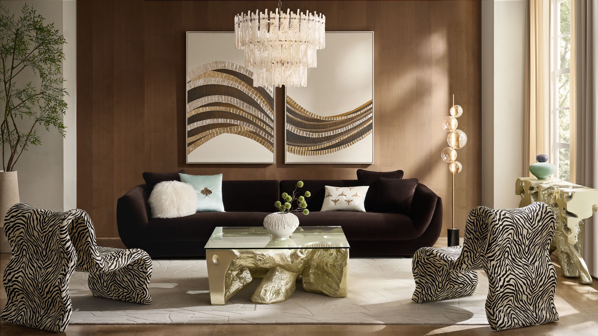
For a pair side by side, keep the relationship tight. A horizontal pair works naturally above a sofa, console, bed, or dining cabinet. Leave around 2 to 3 inches between the frames so the eye reads them together rather than as two unrelated pictures.
If both works are the same size, matching their top and bottom edges gives the arrangement a clean architectural quality. If they differ slightly, a shared centerline can create a more relaxed balance.
For a vertical stack, treat both pieces as one tall artwork. Vertical arrangements work especially well between windows, beside a doorway, at the end of a hallway, or anywhere a narrow stretch of wall needs height.
Find the center of the full stack, including the space between the frames, and use that point when deciding how high to hang the art. Centering each picture independently can quickly push the overall composition too high.
For three or more matching pieces, consistency is the luxury. A triptych or coordinated series depends on even spacing and a strong shared line. Resist the urge to spread the pieces apart simply because the wall is large. Too much distance breaks the connection.
When several works were designed as a set, hang them as though they are chapters of the same story.
How to plan a gallery wall layout
A successful gallery wall should feel collected, not chaotic.
The secret is not making every piece match. It is giving the arrangement enough repetition and structure that the differences feel intentional.
| Gallery wall layout | Best for | The effect |
|---|---|---|
| Grid | Matching frames or similar-size art | Clean, architectural, polished |
| Organic gallery | Mixed sizes, mediums, and subjects | Collected, expressive, personal |
| Linear row | Hallways, consoles, and long sofas | Calm, contemporary, orderly |
| Anchored gallery | One large work surrounded by smaller pieces | Dramatic but easy to balance |
| Vertical gallery | Narrow walls and stair landings | Draws the eye upward |
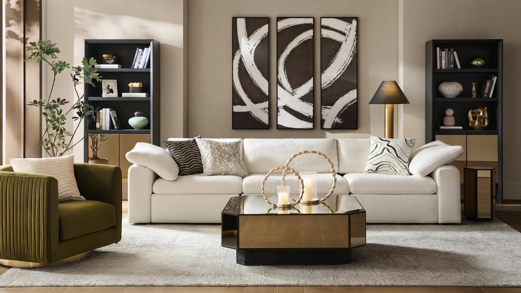
Start with an anchor. For an organic gallery wall layout, begin with the largest or most visually important piece. Place it near the center, though not necessarily perfectly centered and build outward. It gives the eye somewhere to land before it begins taking in the rest.
Repeat something. The easiest gallery walls have at least one element quietly connecting the pieces. It might be a shared frame finish, recurring color, similar matting, one artistic theme, repeated metallic accents, or simply consistent spacing.
You can mix abstract art with photography, dimensional wall objects, and even a mirror. The repetition is what keeps variety from becoming visual noise.
Keep the spacing disciplined. This is where gallery walls often go wrong. If every gap is different, the eye starts noticing the empty spaces before it notices the artwork.
Keeping most pieces approximately 2 to 3 inches apart creates an invisible framework around even a very eclectic arrangement. Smaller art generally wants tighter spacing; larger works can tolerate slightly more.
Lay out the gallery before you hang it. Build the arrangement on the floor first. Start with the anchor piece, add the largest secondary works, then fill smaller gaps. Photograph the finished arrangement so you have a reference when it moves to the wall.
For extra insurance, trace each frame onto kraft paper or newspaper and tape the templates to the wall before making a single hole. It is much easier to reconsider paper.
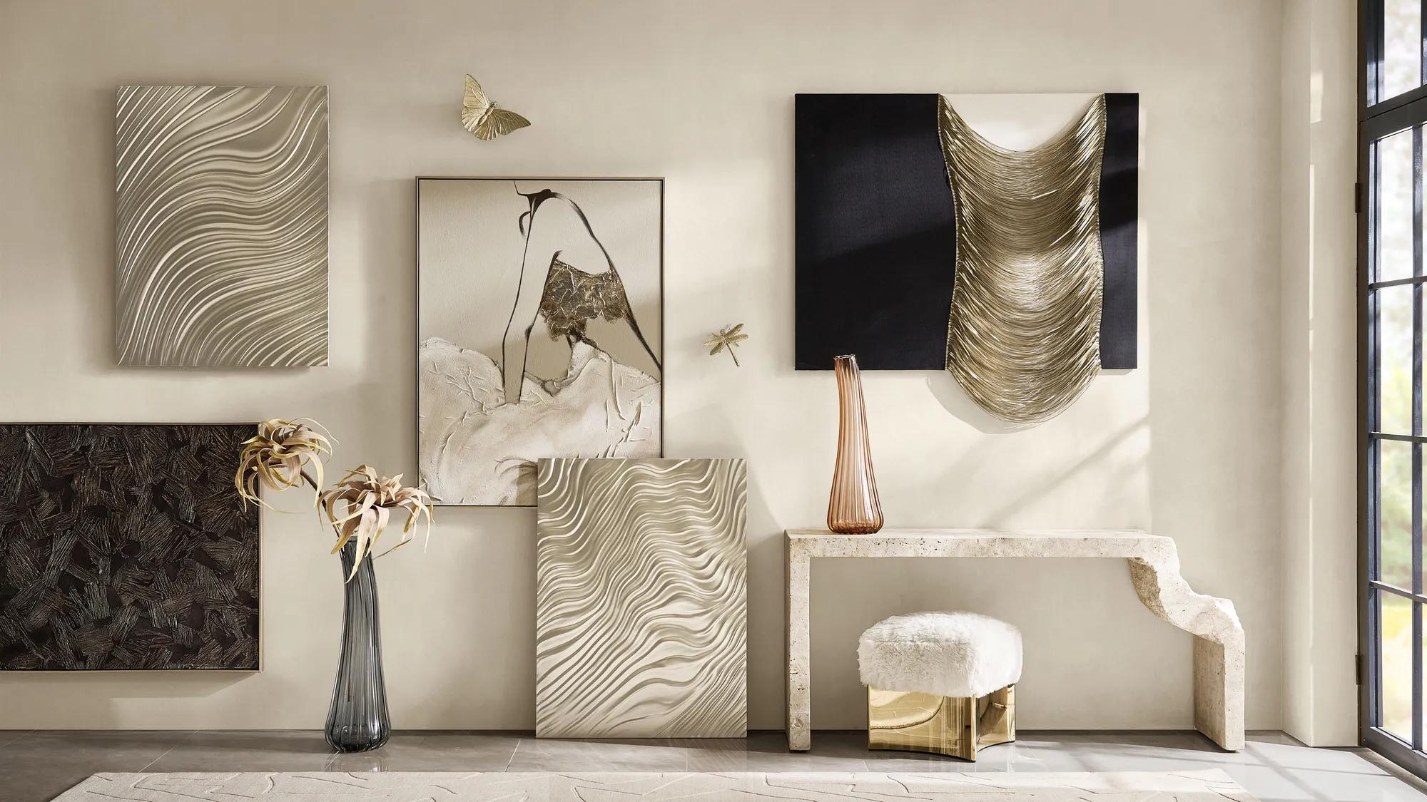
How much space to leave between artwork
For most pairs, stacks, and gallery walls, 2 to 3 inches between pieces is a useful place to begin.
The goal is visual connection. If artwork is spaced too far apart, the pieces stop reading as a group. Too close, and individual frames can lose their presence.
| Arrangement | Spacing approach |
|---|---|
| Small matching frames | Keep gaps tight and consistent |
| Large matching pieces | Allow slightly more breathing room |
| Organic gallery wall | Maintain a mostly consistent 2–3 inch rhythm |
| Diptych or triptych | Keep spacing especially disciplined so the set reads together |
| Mixed art and wall objects | Let dimensional pieces breathe while maintaining an overall rhythm |
The more varied the artwork, the more important consistent spacing becomes. It is the quiet geometry holding everything together.
How to hang art above furniture
Artwork above furniture should feel attached to the vignette below it rather than hovering in another visual zip code.
Above a sofa: Aim for a single piece or complete grouping around two-thirds the sofa's width. Keep the artwork low enough that it belongs to the seating area. If there is a wide band of empty wall between the sofa and the frame, bring the art down before assuming you need something bigger.
Above a bed: Center the artwork with the bed and treat the headboard as the visual foundation. A large horizontal work, pair, or triptych can echo the bed's width beautifully. If the headboard already has a dramatic shape or material, allow enough negative space for both elements to have their moment.
Above a console or credenza: This is a place to layer. Framed art can establish the backdrop while lamps, florals, books, and decorative objects create dimension in front of it. The strongest consoles do not necessarily depend on perfect symmetry; they balance height, shape, and visual weight.
Dimensional wall decor works particularly well here because light moves across the surface throughout the day, adding another layer to the composition.
Above a mantel: Keep the artwork visually related to the mantel instead of pushing it toward the ceiling. If the art is being installed above a functioning fireplace, always follow the fireplace manufacturer's clearance recommendations and use mounting hardware appropriate for the wall and conditions.
Before you make the first hole
A few minutes of planning can save a wall full of corrections.
- Measure the wall and the furniture below it.
- Arrange multiple artworks on the floor first.
- Treat grouped frames as one overall composition.
- Mark the centerline of the artwork or grouping.
- Measure from the hanging hardware, not simply from the top of the frame.
- Use a level before committing.
- Choose hooks, anchors, or screws appropriate for your wall material and rated for the artwork's weight.
- For especially heavy pieces, use a wall stud or properly rated anchoring system whenever appropriate.
Then stand back.
The most useful decorating tool after the tape measure is distance. What looks slightly off from six inches away can look exactly right from across the room and the opposite is equally true.
Wall art FAQs
How high should wall art be hung?
On an open wall, a good starting point is to position the center of the artwork about 57 to 60 inches from the floor. Above furniture, prioritize the relationship between the artwork and the piece below it rather than following that measurement rigidly.
How high should art hang above a sofa?
Start with the bottom of the artwork around 6 to 8 inches above the sofa. The goal is for the sofa and artwork to read as one composition rather than separate elements.
How big should art be over a sofa?
A single artwork or grouping that is roughly two-thirds the width of the sofa is a reliable starting point. Slightly larger can feel dramatic; significantly smaller may look disconnected unless it is part of a larger arrangement.
How far apart should pictures be on a gallery wall?
About 2 to 3 inches between neighboring frames works well for many gallery wall layouts. Consistency matters more than following one exact measurement.
Should all frames in a gallery wall match?
No. Mixing frames can make a gallery wall feel more collected, but repeat at least one element such as color, finish, mat style, subject, or spacing to create cohesion.
What is the easiest gallery wall layout?
A grid is the simplest when the frames are the same size. For mixed artwork, an anchored gallery wall, one larger work with smaller pieces arranged around it is often the easiest organic layout to balance.
Can you mix wall art with mirrors and wall décor?
Yes. Mixing framed art with mirrors or dimensional objects can keep a gallery wall from feeling flat. Look for a recurring finish, color, or shape to connect the different mediums.
Should a gallery wall be centered on the wall or the furniture?
When a gallery wall hangs above a sofa, console, bed, or other substantial piece of furniture, center the composition around the furniture first. The furniture defines the visual zone.
Shop the edit
The right wall art does more than fill an empty surface. It gives the room a focal point, establishes mood, and adds the finishing layer that makes everything below it feel deliberate. Start with one piece that deserves attention, then give it the scale and space to be seen. Or build a wall slowly, adding works as the room and your eye evolves.
Explore modern art for polished, gallery-inspired presentation, or bring another layer of texture and dimension to the room with wall decor.
Because the best walls do not simply hold art. They finish the room.