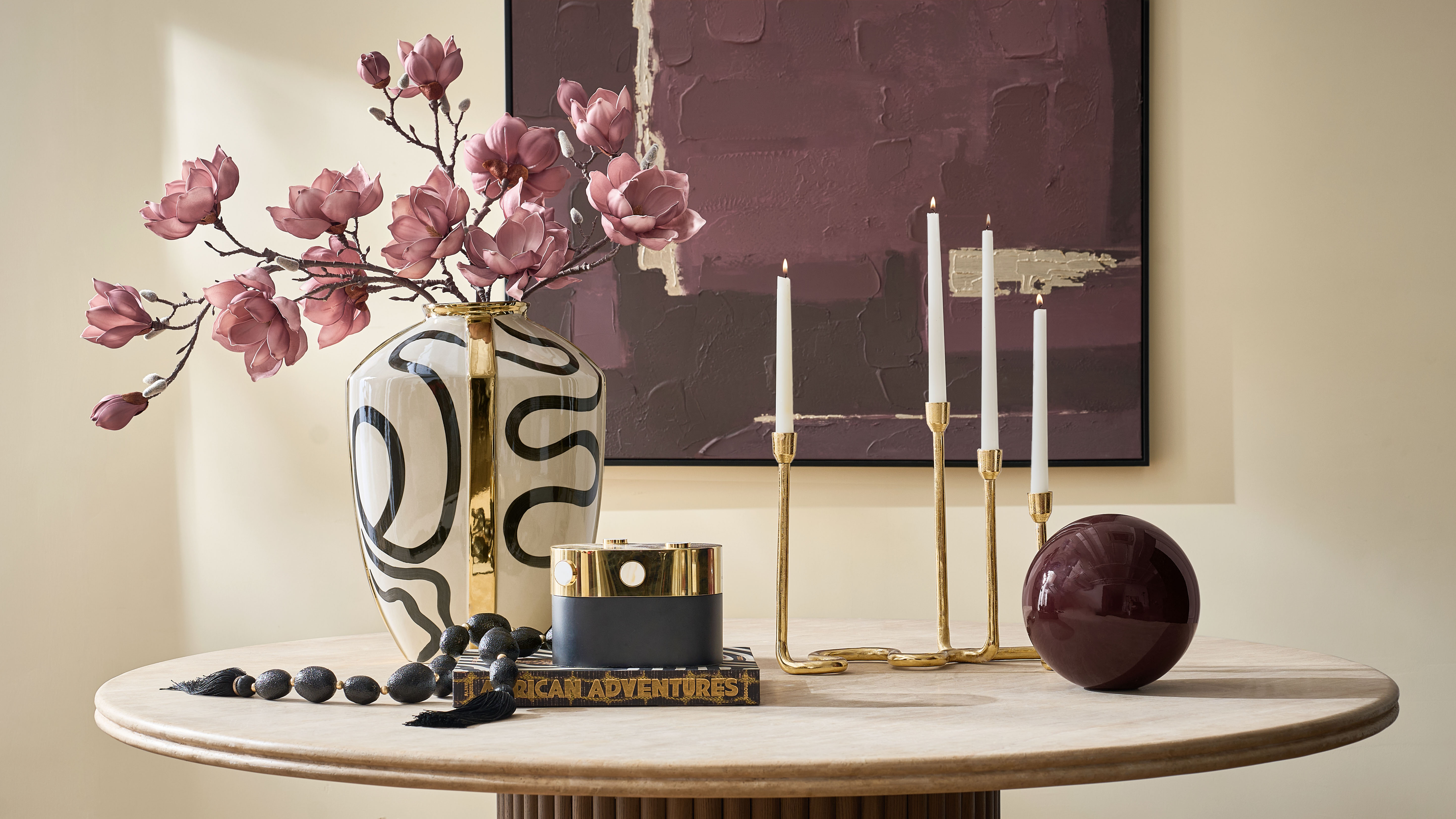
Dark Chocolate, Tawny, Cloud, Charcoal, Polished Soft Gold, and Seaglass make a convincing case for fall rooms that feel warm, sculptural, and nothing like the usual autumn palette.
By August, the room starts telling on itself. The light is still bright, but the pale summer layers suddenly feel a little thin. The linen pillow that looked perfect in June now wants something darker beside it. The room does not need pumpkins. It needs weight.
That is where the FW26 palette comes in.
For this edit, six shades lead the story: Dark Chocolate, Tawny, Cloud, Charcoal, Polished Soft Gold, and Seaglass. Dark Chocolate supplies depth. Tawny warms the space without veering into orange. Cloud gives the darker colors somewhere to breathe, while Charcoal draws a clean line through all that softness. Soft Gold catches the light. Seaglass arrives last, cool and slightly unexpected.
These are fall home decor colors for people who do not necessarily decorate for fall. They change the feeling of a room through velvet, wool, glass, oak, bronze, and sculptural finishes rather than seasonal objects that need to be packed away in January.
The broader FW26 Mod Naturalist palette layers warm earth tones with honeyed metallics, creamy neutrals, greens, and cool Seaglass. Its product stories move through Luxe Naturals, Modern Earthiness, sculptural form, art glass, and richly tactile surfaces.
Explore the wider season in From Gallerie to Life: Inside the FW26 Collection, or browse the full Fall/Winter 2026 Collection.
Fall color should change the atmosphere, not turn the room into a seasonal display.
The FW26 Palette at a Glance
A palette becomes much easier to use once every color has a job. You are not trying to divide the room equally among six shades. One sets the atmosphere. One provides structure. The others arrive in smaller, better-timed moments.
| Color | Its role in the room | Where it looks best | FW26 piece to know |
|---|---|---|---|
| Dark Chocolate | The anchor | Velvet, dark wood, faux fur | Stria Bed, Lowry Pillow |
| Tawny | The warmth | Wool, tinted glass, animal pattern | Pounce Wool Rug |
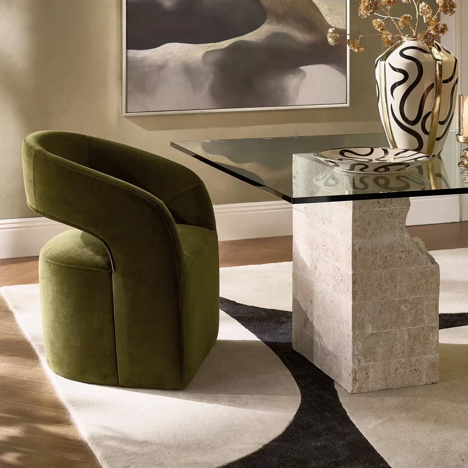
| Cloud | The breathing room | Velvet, leather, chenille, pale oak | Vesper Accent Chair |
| Charcoal | The outline | Wool rugs, dark oak, art, glass | Contour Wool Rug |
| Polished Soft Gold | The light | Gold leaf, metal trim, sculptural furniture | Sequoia Tables |
| Seaglass | The cool interruption | Mouth-blown glass, velvet, embroidery | Blair Lamp, Lowry Pillow |
The August mood board captures that hierarchy beautifully. Dark Chocolate carries the most visual weight. Cloud softens it. Tawny connects the two. Charcoal appears as a graphic interruption, while Soft Gold creates a narrow seam of light. Seaglass is used sparingly, which is exactly why it feels fresh.
Dark Chocolate Is the New Black
Black is useful. Dark Chocolate is often more interesting.
It gives a room the same sense of structure, but the warmth changes everything around it. Cream looks softer. Gold feels less formal. Pale oak becomes richer. Even charcoal begins to read as layered rather than severe.
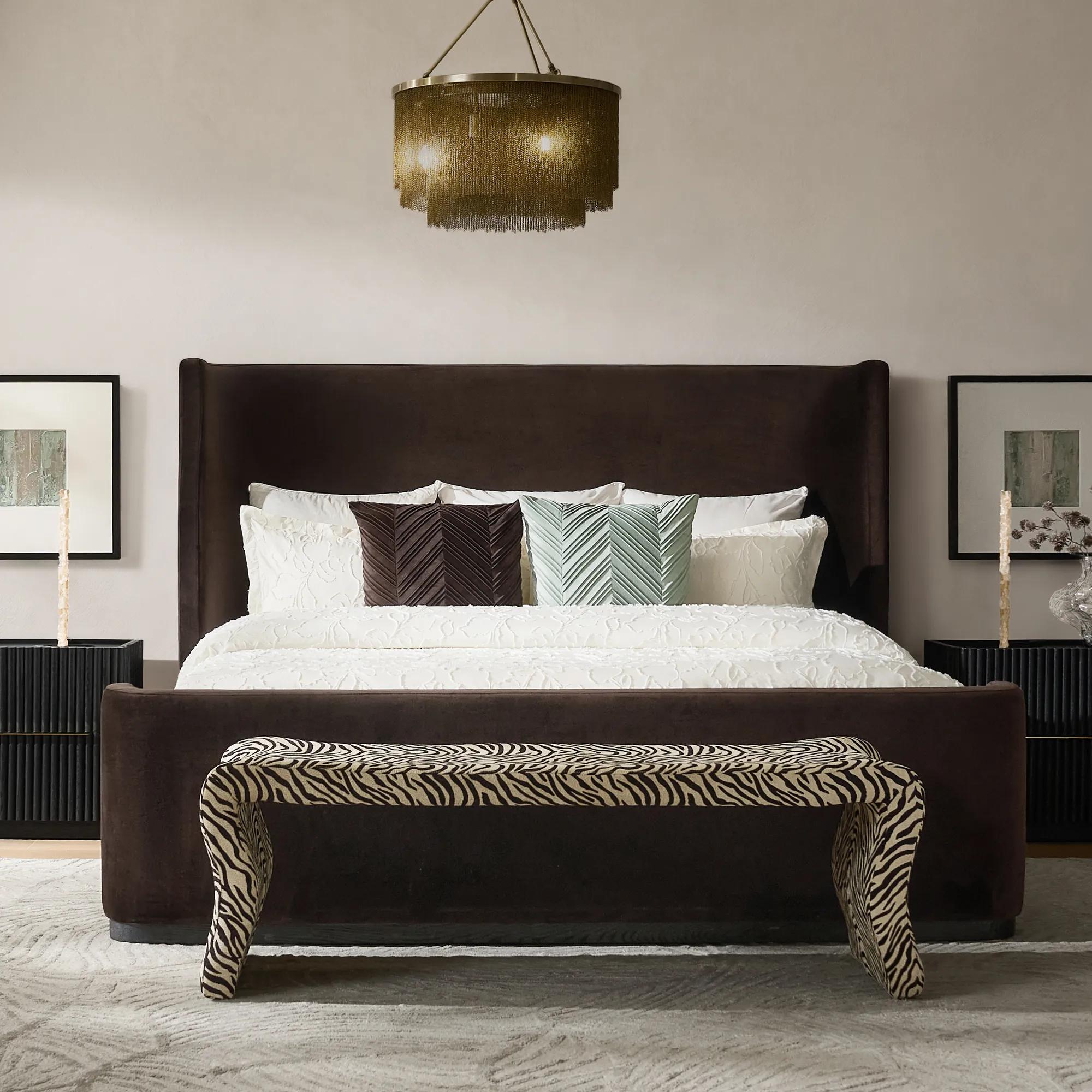
The Stria Dark Chocolate Velvet Upholstered Platform Bed shows what happens when this color is given real scale. Its tall wingback headboard creates an enveloping frame, while the velvet absorbs light rather than bouncing it back. An FSC-certified solid oak base provides a natural edge beneath the upholstery, which keeps the bed from looking like one large block of brown.
I would keep the bedding simple. Cloud white sheets, a lightly textured ivory duvet, and perhaps one Dark Chocolate or Seaglass pillow are enough. Resist the urge to add espresso nightstands, brown curtains, and several more chocolate accents. The bed has already established the mood.
Dark Chocolate also works beautifully in smaller doses. The Lowry Pleated Velvet Pillow in Dark Chocolate brings hand-pleated texture to the shade, while the Chaska Channel Fur story pushes it into something softer and more tactile. The FW26 textile direction specifically uses pleating, tonal embroidery, moiré pattern, and channelled fur to keep deep colors from feeling flat.
Editor’s note: Use Dark Chocolate where you might normally use black, especially on upholstery, pillows, or a major bedroom piece. Then bring in actual black only if the room still needs a sharper line.
Tawny Brings the Warmth
Tawny is the part of the palette that makes the room feel like fall, although it never has to announce itself that way.
It sits somewhere between camel, toast, weathered leather, and amber glass. There is warmth, but no obvious orange. That makes Tawny remarkably easy to live with, particularly beside Cloud, Dark Chocolate, Charcoal, and Soft Gold.
The Pounce Wool Rug in Tawny Brown is the strongest expression of the shade in FW26. Its animal-inspired pattern is softened through tawny brown and tan rather than high-contrast black and white. The rug is made from 100 percent wool and hand-tufted with loop and cut pile, so the pattern has physical depth as well as visual movement.
Picture it beneath a Cloud sofa with a Charcoal side table and one Dark Chocolate pillow. That is enough. Once Tawny appears across a large rug, it does not need to be repeated through every accessory in the room. A tortoise-finished lamp or warm glass vase can echo the color without matching it exactly.
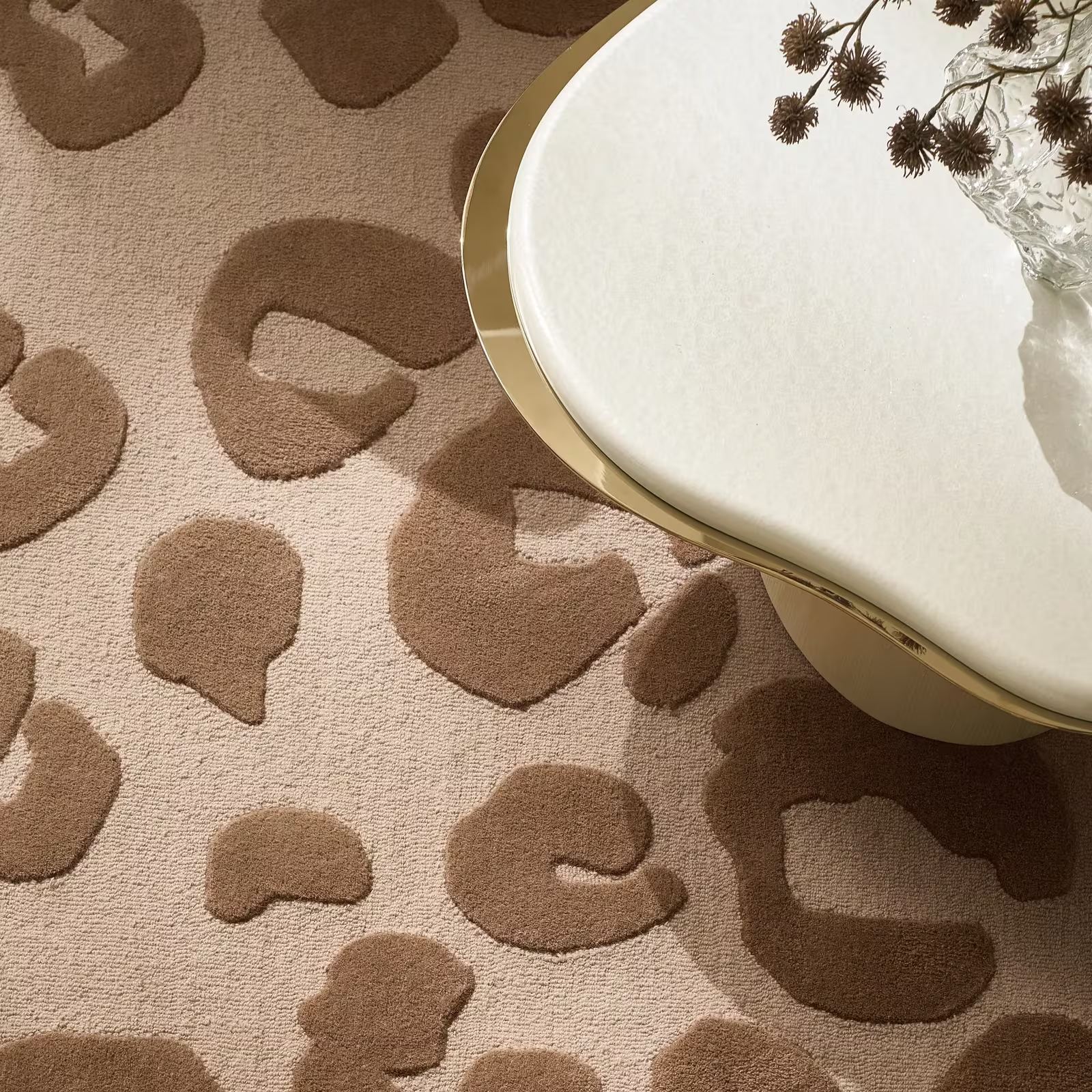
Tawny also provides a natural bridge to animal pattern. For ideas on using that connection without turning the room into a theme, read Animal Print Decor Is Back, but Not in the Way You Remember.
Cloud Gives the Room Some Air
Cloud is not plain white. It is softer, warmer, and much more forgiving.
Its role in this palette is not to disappear. It is to create a pause between the heavier colors. Without Cloud, Dark Chocolate, Tawny, Charcoal, and Soft Gold could begin to feel overly rich. With it, the room has light, space, and a place for the eye to rest.
The Vesper Cloud Velvet With Leather Swivel Accent Chair gives the color enough structure to keep it from feeling delicate. The chair combines Cloud velvet with tonal leather trim, crisp tailoring, an angular wraparound shape, and a 360-degree swivel base. From a distance, it reads as one quiet color. Up close, the shift between velvet and leather creates a more nuanced material story.
That tone-on-tone approach is worth borrowing elsewhere. A Cloud room looks far better when the materials change every time the color repeats. Pair Cloud velvet with ivory wool, pale oak, plaster-like art, or a nubby throw. The eye picks up the differences even when the palette remains restrained.
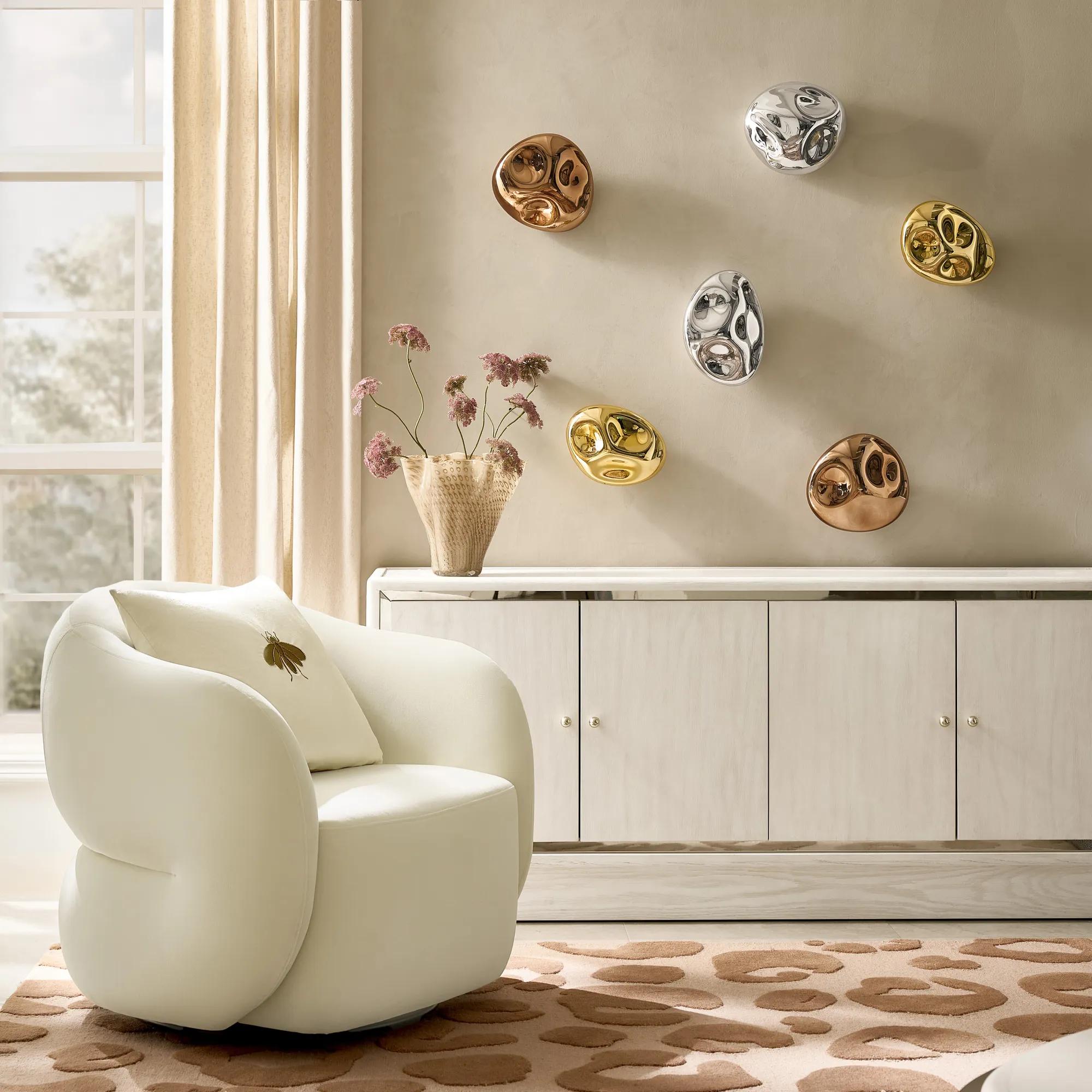
A Cloud sofa or chair is also the ideal background for one stronger note. Try a Lowry pillow in Dark Chocolate, a Seaglass lamp nearby, or a single Charcoal line in the rug. One contrast is usually more effective than five.
Charcoal Draws the Line
If Cloud is the pause, Charcoal is the punctuation.
It brings definition without the hard contrast of pure black. That makes it especially useful in rooms where the materials are soft, the shapes are curved, and the color story is mostly warm. A little Charcoal prevents the whole composition from drifting into beige.
The Contour Wool Rug in Ivory and Charcoal does this at floor level. Its warm ivory field is interrupted by organic Charcoal forms, while a hand-tufted, high-low construction gives the pattern relief. The shaped edge adds another quiet irregularity. It is graphic, but not rigid.
Charcoal can also appear through black oak, bronze mirror, a dark frame, or one piece of abstract art. The important thing is placement. Put it somewhere the room needs a boundary. Near the floor, it grounds. On the wall, it focuses the eye. In a lamp or side table, it can sharpen a cluster of softer furniture.
Do not scatter a dozen small black and Charcoal accessories around the room. That creates visual static. One confident dark line is stronger.
Soft Gold Is Better as Sculpture
Gold gets into trouble when it is treated like confetti.
A gold tray, gold lamp, gold frame, gold bowl, and gold table all competing in one view can make a room feel more coordinated than collected. The FW26 version is more restrained. Soft Gold is tied to texture, shape, and material, so the finish feels like part of the object rather than decoration applied at the end.
The Sequoia Champagne Gold Resin Coffee Table is the clearest example. Its sculpted resin base takes inspiration from natural root forms, then uses a Champagne Gold leaf finish to catch light across the ridges and contours. A clear glass top leaves that structure visible, giving the table presence without making it feel visually solid.
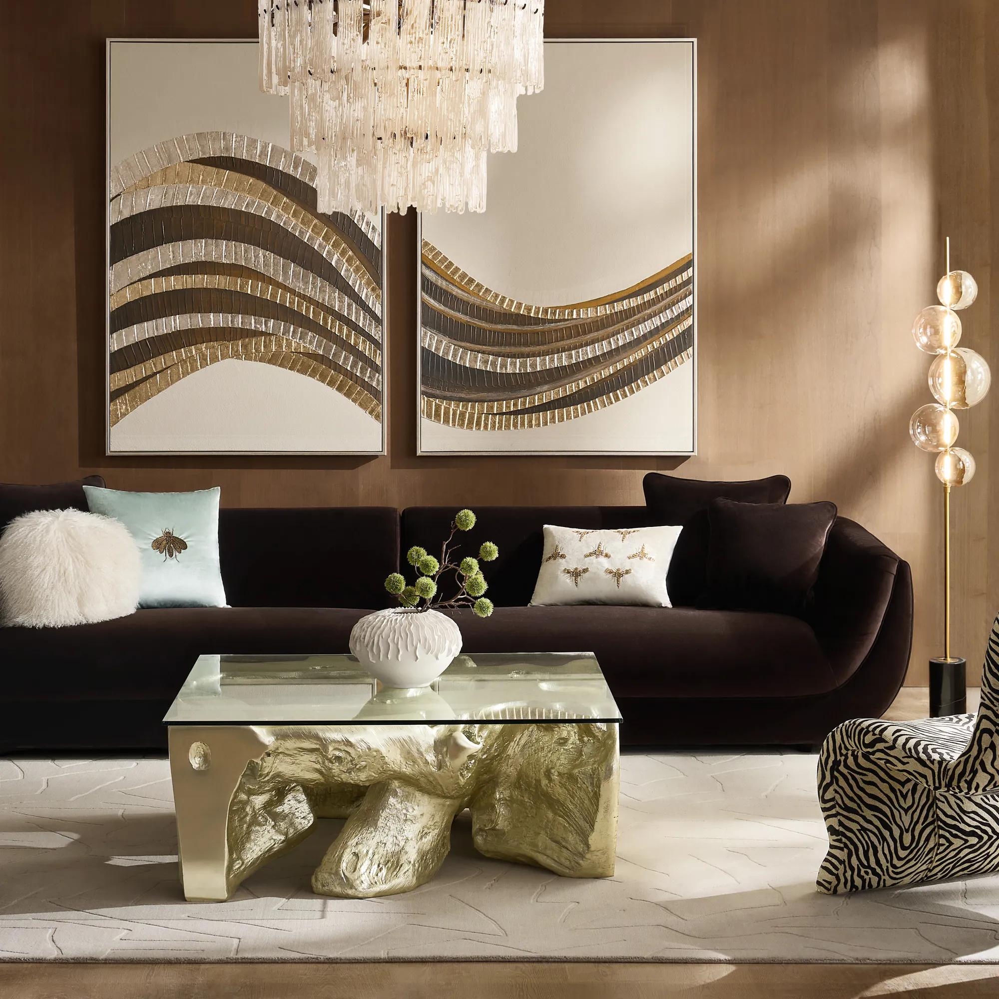
This is where the room should practice restraint. Let Sequoia be the gold moment. A slim brass picture frame or a small metallic detail can repeat the warmth elsewhere, but the repeats should be quieter.
The idea is explored more fully in The Best Rooms Never Match: The New Rules of Mixed Material Furniture. Gold looks more luxurious beside wood grain, velvet, glass, wool, and mirror than it does beside five more gold surfaces.
And when a piece already has this much personality, The One-Piece Rule applies. Give it air. Let the rest of the room support it.
Seaglass Changes the Temperature
Seaglass is the surprise.
Without it, this could become a very handsome room of browns, creams, Charcoal, and gold. Seaglass breaks that rhythm. It brings in a cool, watery note, but the color is soft enough to sit comfortably beside the warmer palette.
The Blair Glass Table Lamp in Sea Glass makes the color feel light rather than sugary. Its mouth-blown glass base has a rounded, inflated form, while antique brass hardware and an ivory linen shade connect it back to the warmer materials in the room. The lamp feels especially good beside Dark Chocolate velvet or Charcoal art because the contrast gives the pale blue-green glass more definition.
The Lowry Pleated Velvet Pillow in Sea Glass offers a softer application. Hand pleating gives the velvet movement, so the color shifts slightly with the light. On a Cloud chair or oatmeal sofa, it reads as quiet color. Against Dark Chocolate, it becomes much more noticeable.
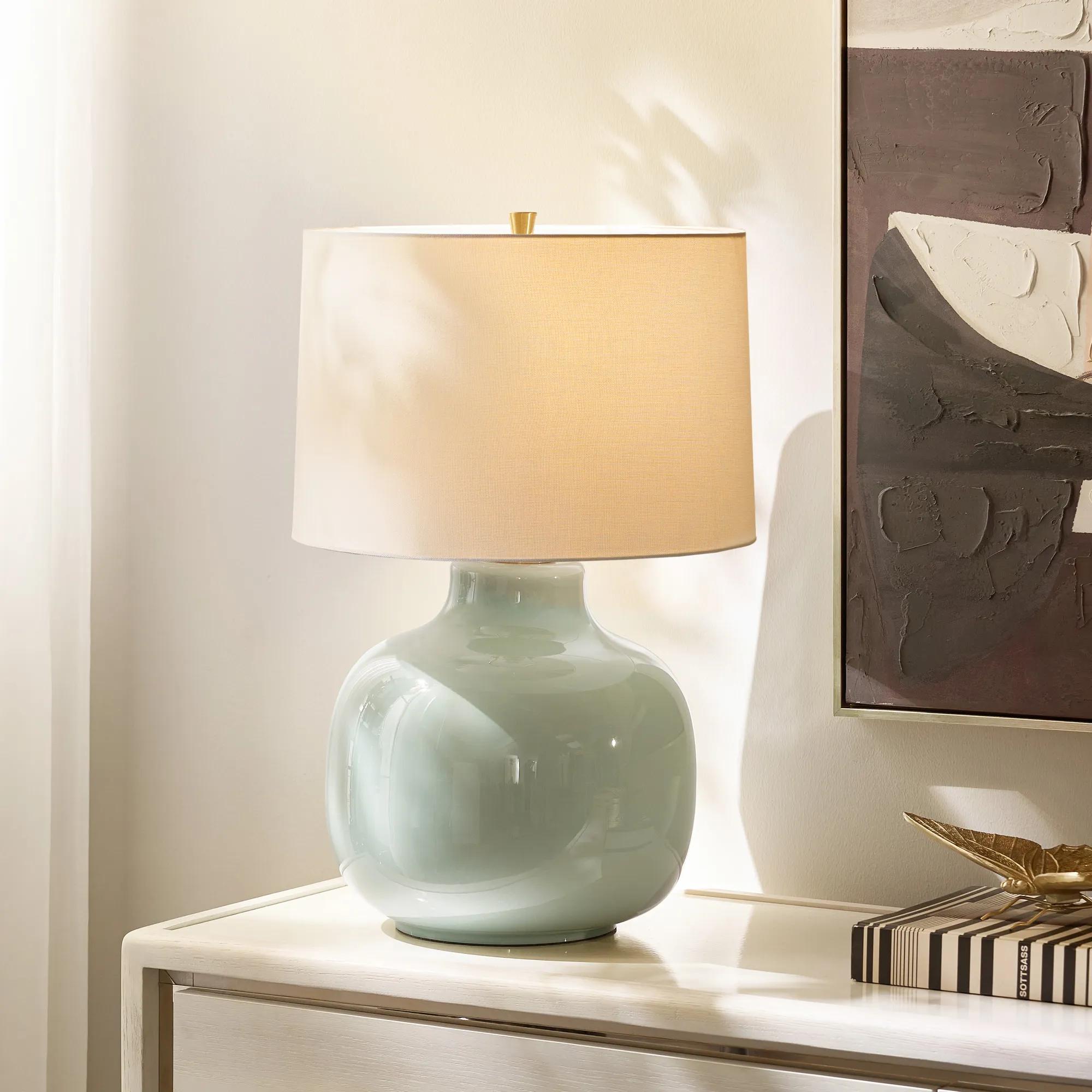
Seaglass does not need to cover a wall. One lamp, one pillow, or one handblown vase can change the room’s temperature. Use it where the palette feels too warm or too settled.
The color is only half the story. The material decides how loudly it speaks.
Three Rooms, Three Ways to Use the Palette
The living room: Cloud, Tawny, Charcoal, and Seaglass
Begin with Cloud on the largest upholstered piece. A sofa or accent chair in a warm white gives the room an open base without making it feel stark. Place the Pounce rug beneath the seating for a broad field of Tawny, then use Charcoal once, perhaps through a dark oak table, abstract artwork, or the outline of a mirror.
Finish with a Blair Sea Glass lamp on a console or side table. The cool glass will keep the brown and cream palette from becoming too expected. A small Soft Gold detail can appear nearby, but it should not compete with the lamp.
The room now has warmth, structure, and one moment of freshness. It does not need six more pillows.
The bedroom: Dark Chocolate, Cloud, and Soft Gold
Let the Stria Bed in Dark Chocolate lead. Dress it in Cloud bedding and keep the larger textile surfaces quiet. A lightly woven throw or tonal ivory coverlet will create softness without introducing another major color.
Bring in Soft Gold through one considered element. It might be a slim lamp, a picture frame, or a sculptural table. Seaglass can appear once on the nightstand, particularly if the room needs a cooler note. Charcoal is optional here. If the Dark Chocolate bed already provides enough depth, there is no reason to force in another dark color.
The bedroom should feel cocooning, not crowded.
The dining room or entry: Cloud, Charcoal, Tawny, and Soft Gold
A dining room can handle more contrast because it is often experienced in focused moments. Begin with Cloud upholstery or pale oak, then add Charcoal through artwork, a rug, or a dark frame. Tawny can arrive in glass, wool, or a small upholstered piece.
Use Sequoia as the Soft Gold statement. In a dining space, that might be the dining table or console. In an entry, a Sequoia console can carry the entire material story with only one lamp and a few books on top.
Small entry? Keep the recipe to three moves: one Cloud or pale neutral surface, one Charcoal outline, and one sculptural Soft Gold piece.
How Much of Each Color Should You Use?
There is no need to measure the room with a calculator, but hierarchy helps.
Let Cloud or Tawny cover the largest area. These are the colors that can comfortably sit across a sofa, rug, curtains, or bedding.
Use Dark Chocolate or Charcoal to provide structure. One may cover a major piece, while the other appears as a smaller line or pattern.
Save Polished Soft Gold and Seaglass for the final layer. These shades are most effective when they occupy less space and arrive through materials that catch the light.
A good room might be 60 percent Cloud, 25 percent Dark Chocolate and Tawny, 10 percent Charcoal, and 5 percent Soft Gold or Seaglass. Another might reverse the emphasis and let Dark Chocolate lead. The exact numbers matter less than the order of importance.
One color should clearly be in charge.
The Final Edit
Before calling the room finished, look at it in the evening.
Dark Chocolate velvet will deepen. Soft Gold will become more noticeable. Seaglass may look cooler, especially beside a warm lamp. Charcoal can appear heavier after sunset, while Cloud will pick up the color temperature of every light source nearby.
That shift is part of the appeal. These materials were chosen to change with the room.
Then take a quick phone photo from the doorway. The camera is blunt in a useful way. If every color appears at the same volume, remove one accent. If the gold is the first and only thing you notice, reduce the repeats. If the room feels heavy, add Cloud or move Seaglass closer to the center of the composition.
Most rooms do not need another object. They need one better edit.
A Fall Room Should Still Look Good in February
The smartest fall home decor colors are not the ones that announce the season most loudly. They are the ones that make a room feel richer when the light changes.
Dark Chocolate gives the room weight. Tawny supplies warmth. Cloud opens the composition. Charcoal defines it. Polished Soft Gold brings the glow. Seaglass keeps the whole story from becoming too predictable.
Together, they create a fall palette that feels tactile, sculptural, and modern. More importantly, it feels livable.
You do not need to repaint the walls. You do not need to replace every piece of furniture. Start with one deeper layer, one warmer material, or one cool glass accent. Let the room change slowly.
Sometimes a Dark Chocolate pillow and a Seaglass lamp are enough.
Frequently Asked Questions About Fall Home Decor Colors
What are the main fall home decor colors for 2026?
For this FW26 edit, the leading fall home decor colors are Dark Chocolate, Tawny, Cloud, Charcoal, Polished Soft Gold, and Seaglass. The wider Mod Naturalist palette also includes Rich Olive, Sage, Honey Gold, Plum Truffle, and Buttercream.
How can I decorate for fall without using orange?
Use colors that create warmth without looking overtly seasonal. Dark Chocolate, Tawny, cream, Cloud, Charcoal, olive, bronze, and Soft Gold can make a room feel ready for fall without relying on pumpkin orange or holiday-specific decor.
What colors look best with Dark Chocolate decor?
Cloud, ivory, oatmeal, Tawny, Seaglass, sage, Charcoal, and Soft Gold all work well with Dark Chocolate. Pale colors keep it from feeling heavy, while Seaglass introduces a cooler contrast.
Can Seaglass work in a fall color palette?
Yes. Seaglass is especially effective because it breaks up warmer browns, creams, and golds. Use it in a small dose through glass lighting, a velvet pillow, embroidery, or a decorative object.
Can Charcoal and brown be used in the same room?
Yes. Charcoal and brown feel sophisticated together when their roles are clear. Let Dark Chocolate or Tawny provide warmth, then use Charcoal as an outline through a rug, frame, table, or artwork.
How do I use Soft Gold without making the room feel too glamorous?
Use Soft Gold on one sculptural or architectural element, then repeat it once through a smaller detail. Pair the reflective finish with matte wool, oak, velvet, or plaster-like surfaces so the room includes materials that absorb light as well as reflect it.
Do I need to repaint my walls to use these fall colors?
No. Rugs, pillows, throws, lamps, art, and occasional furniture can shift a room’s color temperature without repainting. Start with one deeper textile, one dark grounding element, and one lighter or reflective accent.
How many fall colors should I use in one room?
Three or four are usually enough. Choose one dominant color, one supporting shade, one dark grounding tone, and one smaller accent. The other colors can appear in adjacent rooms rather than all competing in the same space.