

Sculptural cream sofas, a brass statement pendant, and deep-blue art—layered neutrals meet bold gestures for a lived-in luxury moment.
The End of Minimalism
Minimalism ruled for years—pared back, pale, and meticulously restrained. But as life moved inward, its rigor often felt clinical in real homes. In response, lived-in luxury has emerged as a warmer, more tactile approach that preserves intention while welcoming presence.
If you’re craving rooms that invite you in instead of warning you off, this editorial unpacks what the look is, why it resonates now, and how its core markers—texture, light, patina, and story—help spaces feel collected rather than constructed.
Key Takeaways
-
Lived-in luxury favors presence over perfection: layered materials, gentle light, and objects with narrative weight.
-
The shift reflects a broader desire for authenticity, comfort, and meaning at home.
-
Hallmarks include textured textiles, curated groupings, warm neutrals with deep accents, and a thoughtful mix of eras.
-
You don’t need a renovation—begin with lighting, edit surfaces, and add tactile layers that stand up to daily life.
Editor’s Note: For visual case studies and entry theory, see Fall/Winter Collection and The Art of the Arrival.
What Is “Lived-In Luxury”?
Presence Over Perfection
At its core, lived-in luxury embraces evidence of life: a crease in linen, a soft sheen on aged brass, evening light grazing a textured rug. Luxury here isn’t austerity; it’s a carefully edited fullness—refined yet unmistakably human. Surfaces remain intentional but forgiving, silhouettes encourage lingering, and materials feel good underhand.
A Sensory, Story-Driven Palette
The vocabulary is tactile and atmospheric: bouclé and velvet next to stone and wood; layered lighting that shifts from morning clarity to golden-hour calm; objects with provenance—books, ceramics, art—that introduce memory. The effect is considered rather than choreographed, cinematic rather than glossy, generous rather than spare.
Expert tip: Contrast is the quiet engine of the look. Pair matte linen with polished metal, plush upholstery with cool marble, ribbed glass with lacquer. Tension between textures creates depth you can see and feel.
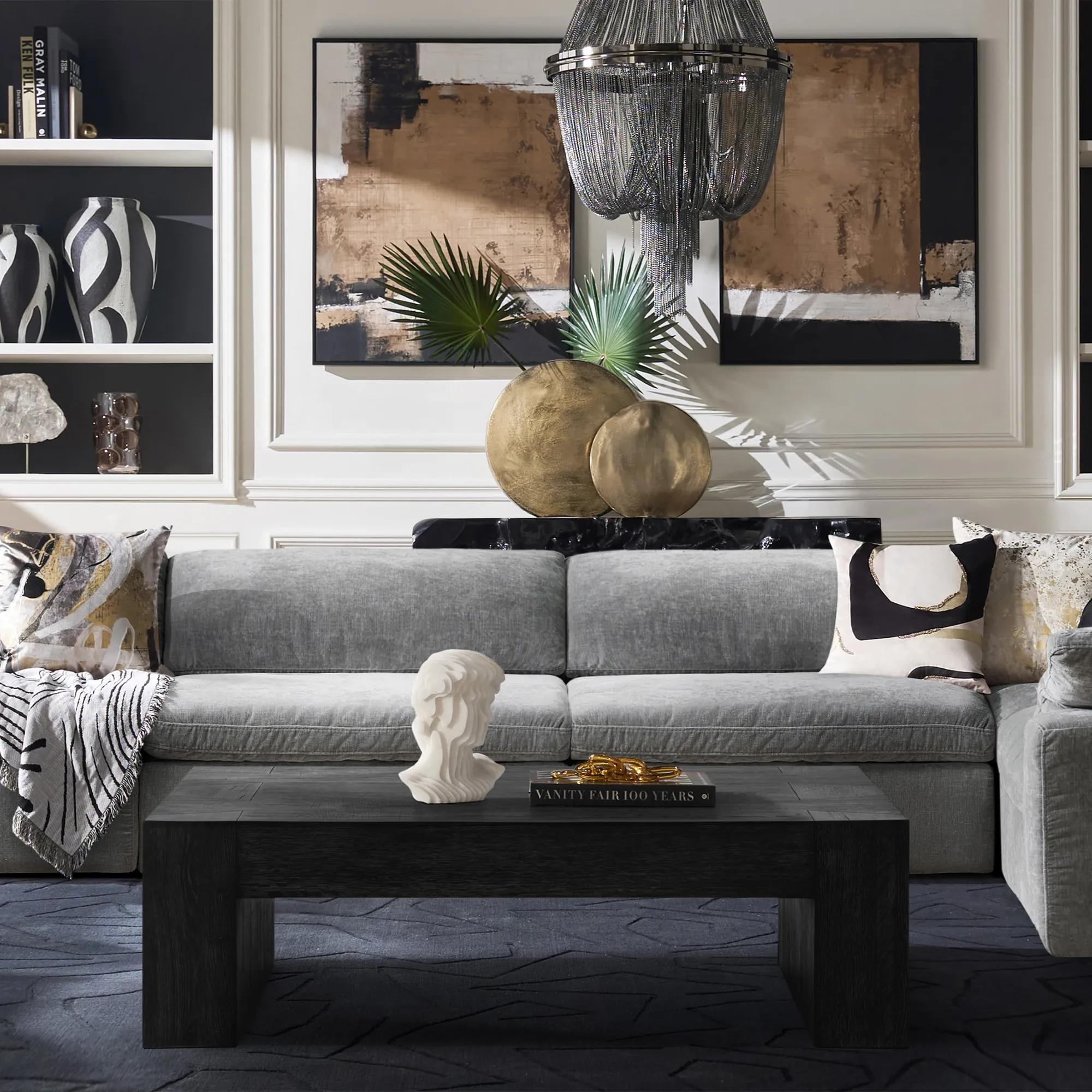
Lived-in luxury living room with warm neutrals, layered lighting, and mixed materials.
Why the Shift Is Happening Now
Comfort as a Design Value
Recent years re-centered domestic life. Seating needed to invite lingering, textiles had to be resilient and soft, and rooms had to flex. The approach offers that mix of comfort and clarity—cozy modern living guided by an editor’s eye.
Authenticity Over Algorithm
Uniform, ultra-curated grids once felt aspirational. Today, sameness fatigues. A layered interior favors personal cadence: collections formed slowly, patina accepted, composition relaxed. Beauty becomes less about immaculate emptiness and more about atmosphere and nuance.
Meaning Over Minimal
The new metric is resonance. A stool from a trip, a local maker’s vase, inherited candlesticks—together they say more than a pristine surface ever could. In this frame, lived-in luxury reframes “less is more” into “the right few are enough.”
Hallmarks of the Look
The following markers define lived-in luxury in practice and make it easy to recognize—and adapt—without remaking a room from scratch.
1) Texture Over Gloss
Select textiles you want to touch—linen, bouclé, velvet, mohair, raw silk. Let wood show its grain and stone its veining; allow metal to age with grace. Texture anchors a warm neutral foundation and gives the eye something to land on, which photographs beautifully but, more importantly, feels grounded.
2) Curated (Not Compulsive) Clutter
Here, “clutter” is code for narrative. Stack a few art books, introduce sculptural ceramics, allow a small cluster of heirlooms. Group in odd numbers, vary height and scale, and use trays or low boxes to frame compositions. The result reads as intentional rather than busy.
3) Layered Lighting for Cinematic Calm
Ambient light establishes mood; task light clarifies; accent light punctuates. A pendant or chandelier for breadth, sconces for vertical rhythm, floor or table lamps to soften corners, and candlelight to humanize it all. This layered approach makes lived-in luxury feel alive from morning to night.
4) Warm Neutrals with Deep Accents
Begin with oat, taupe, warm gray, and champagne-toned metal. Punctuate with oxblood, olive, or midnight to keep things grounded. The palette is calm but not sleepy—restrained, expressive, and forgiving to live with.
5) A Mix of Eras
Let mid-century lines meet contemporary sculpture and a traditional mirror. Cross-talk between periods yields spaces that feel accrued over time and keeps the aesthetic from reading as a theme or set. It reads as a life.
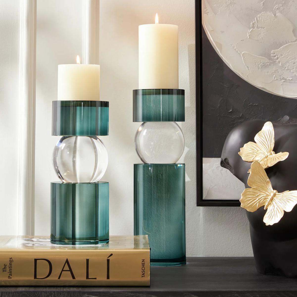
Teal glass candleholders, clear orbs, and a sculptural bust kissed with gold butterflies—small-scale drama, softly lit.
The Emotional Side of Design
Great rooms aren’t only seen; they are felt. The patina on a bowl, the soft edge of a well-washed throw, the way late light settles on plaster—small notes that accumulate into atmosphere. Lived-in luxury gives permission to keep the marks of living in view. Rather than polishing away the story, you allow it to surface.
“Every room has a heartbeat—a mix of texture, light, and memory that feels human.”
How to Bring the Look Home (Without Starting Over)
Begin with Light
Swap harsh, single-point overheads for layers. Add dimmers; flank walls with sconces to pull light upward. A pair of picture lights over art or shelving adds intimacy that photography rarely captures but you’ll feel by dusk. This is the simplest path to lived-in luxury without a major purchase.
Edit, Then Elevate
This isn’t maximalism. Edit first; then layer. Remove placeholders that don’t earn their keep. Reintroduce materials with integrity—stone that feels like stone, woods that show grain, textiles with real hand. A smaller number of better, tactile elements will do more than a roomful of filler.
Add Texture Where You Sit and Stand
Daily touchpoints matter most. A nubby rug underfoot, linen drapery that stirs with a draft, a velvet cushion you actually reach for—these micro-moments build comfort. Over time, they become rituals, which is the quiet promise of elevated and cozy interiors.
Compose, Don’t Display
On surfaces, think in vignettes rather than rows. Mix vertical (branching stems, tall vessels) with horizontal (low bowls, book stacks). Maintain negative space so the eye can rest. Refresh seasonally by rotating what you already own; the goal is cadence, not accumulation.
Further reading: Fall/Winter Collection • The Art of the Arrival • Design Services
Frequently Asked Questions
Is this compatible with small spaces?
Yes. Choose sculptural silhouettes that do more with less, keep the palette tight and warm, and favor pieces that offer presence without bulk. In compact rooms, the principles of lived-in luxury—light, texture, narrative—are amplified.
How do I keep “curated clutter” from tipping into mess?
Contain groupings on trays, edit aggressively, and vary height and scale. Rotate objects seasonally; leave open areas on each surface. The empty intervals are as important as the notes.
What’s the quickest change with the biggest impact?
Lighting. Layered light—dimmers, sconces, a considered table lamp—reshapes how you perceive color, texture, and even scale. It’s the backbone of collected luxury at any budget.
Which colors define the mood?
A warm neutral base (oat, taupe, warm gray) punctuated by deep, desaturated tones (olive, oxblood, midnight). Metallics skew soft—champagne rather than chrome—for a glow that flatters materials and skin.
Do I have to buy new pieces to get the feel?
Not necessarily. Reframe what you own: shift lighting, restyle surfaces, elevate textiles. Then, if needed, introduce one or two anchors with lasting materiality. Consider the room a long-form essay; you can revise without scrapping the draft.
Conclusion: A New Era of Style
Minimalism taught clarity; lived-in luxury adds humanity. The rooms that stay with us are the ones that invite touch, gather memory, and hold light in generous ways. If the last decade prized spotless restraint, the next belongs to spaces that breathe—edited, layered, and unmistakably yours.


