
Your cart contains items =

  • |
  • |

Blush / Red Art

Recommended
Sort:
6 items
Filter(6)
Filter
6 items
Availability
0 selected Reset
Color
0 selected Reset
Material
0 selected Reset
Size
0 selected Reset
Width
0 selected Reset
Height
0 selected Reset
Price
Maximum price is $1,258.99 Reset
$
$
Clear
Recommended
Sort:
  • Best Seller
    NEWBEST SELLER
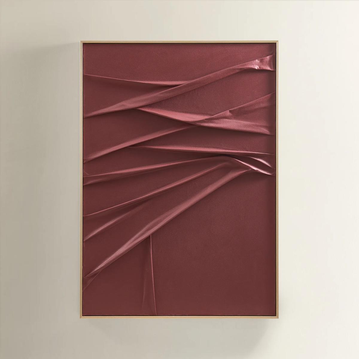
    Fallback Painting
    $499.00
    Add to Cart
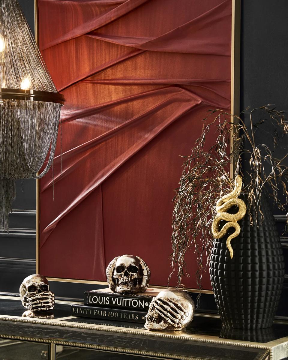
  • Crimson Painting Crimson Painting
    $599.00
    Add to Cart
  • $999.00
    Add to Cart
  • $849.00
    Add to Cart
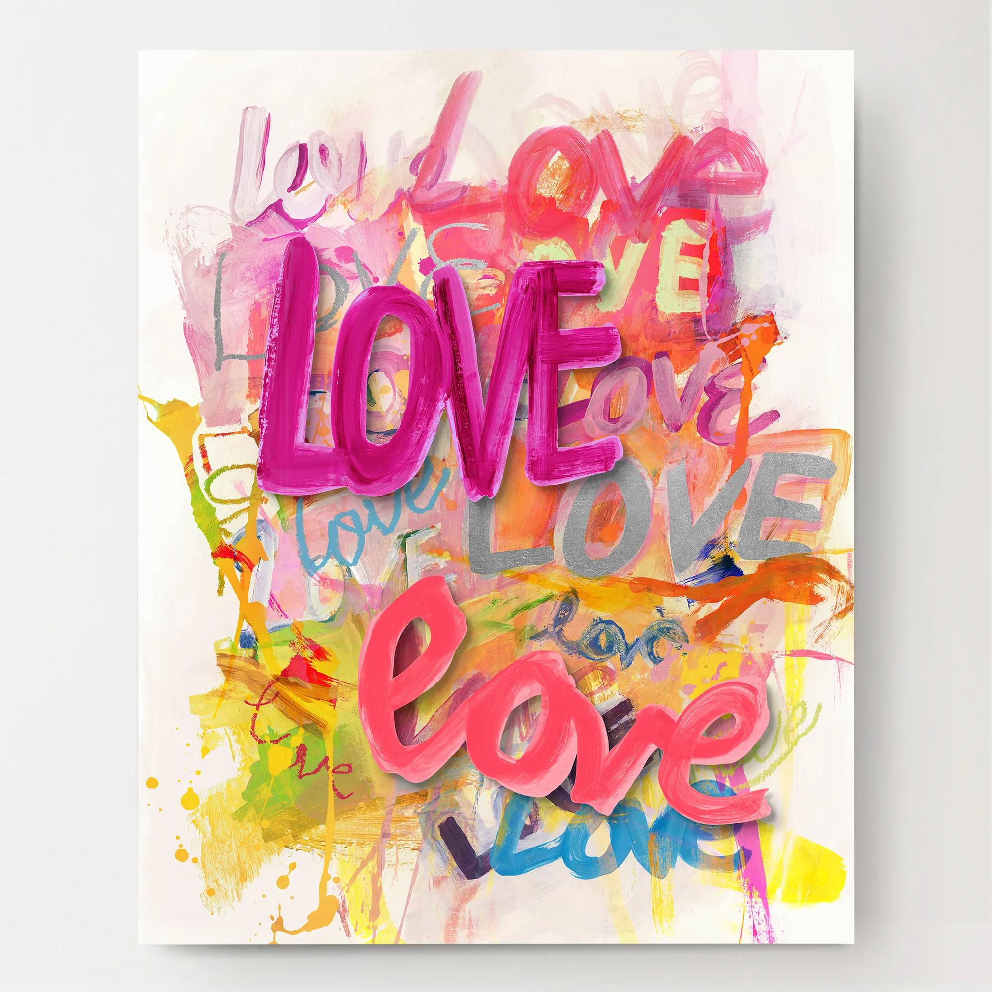
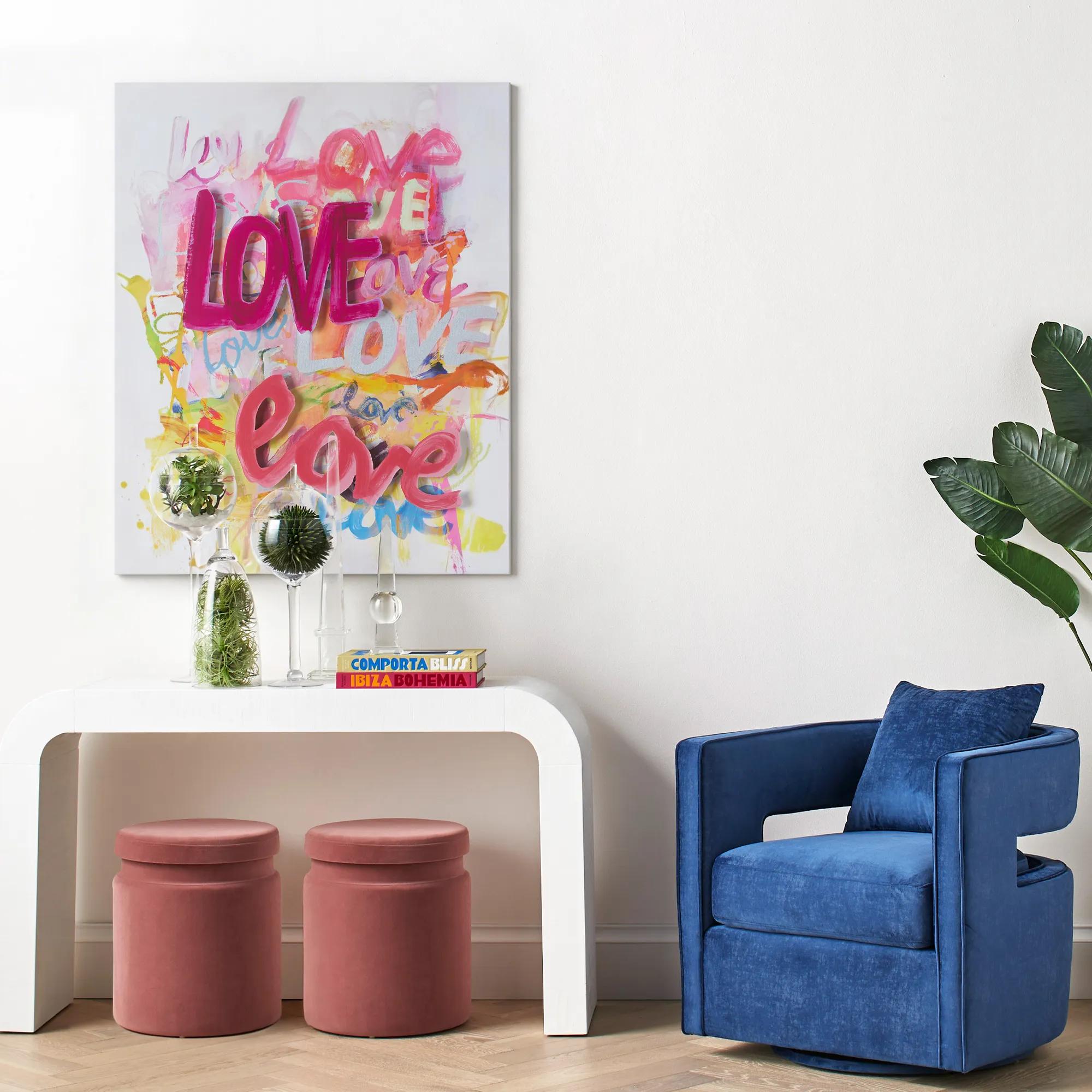
  • Love Is In The Air Love Is In The Air
    $1,399.00
    Add to Cart
  • $699.00
    Add to Cart

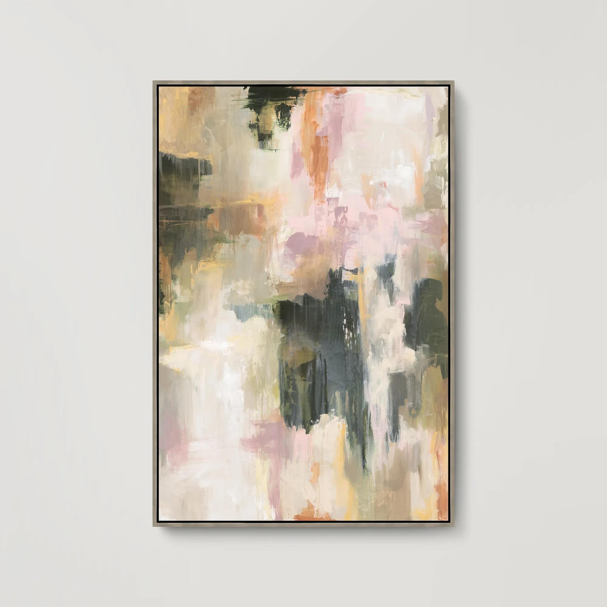
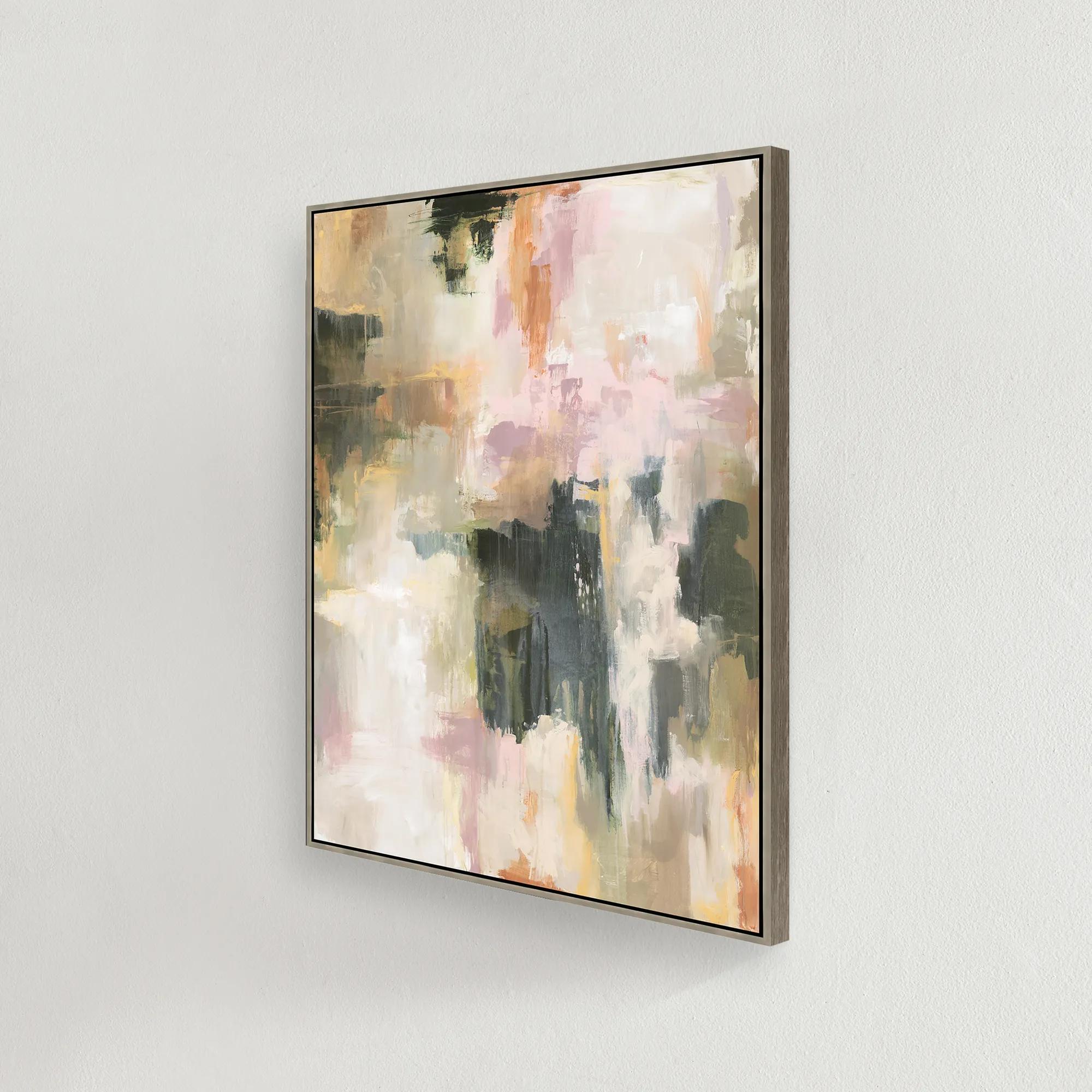
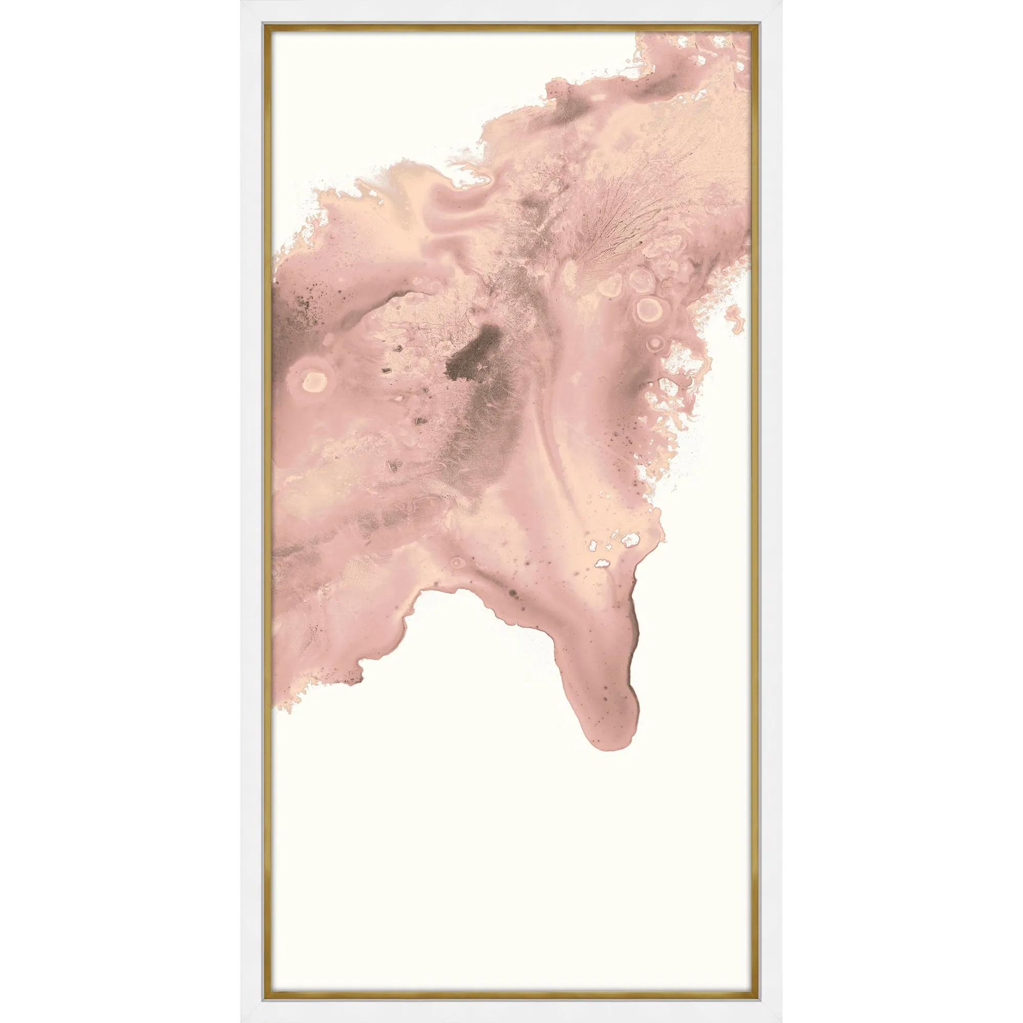
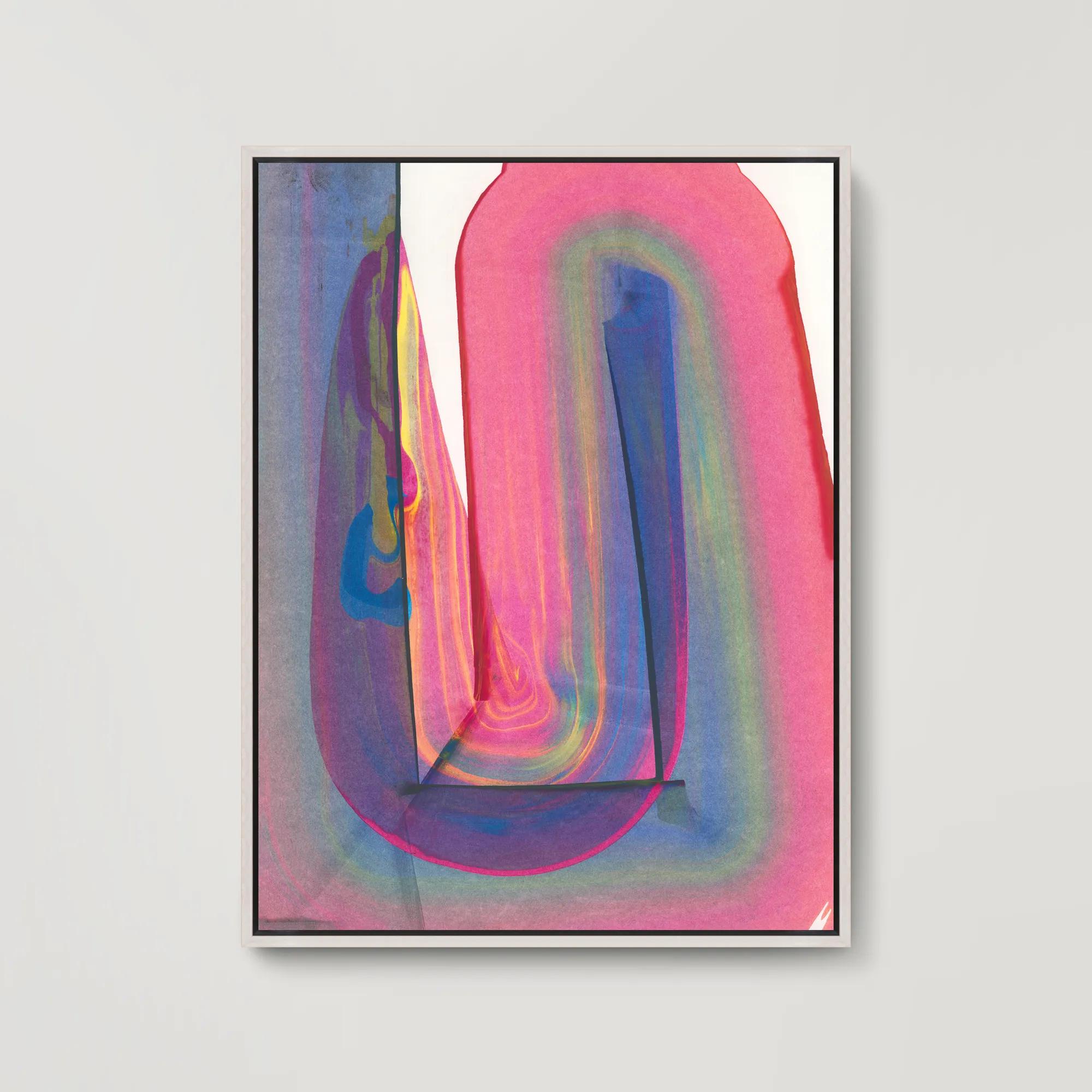
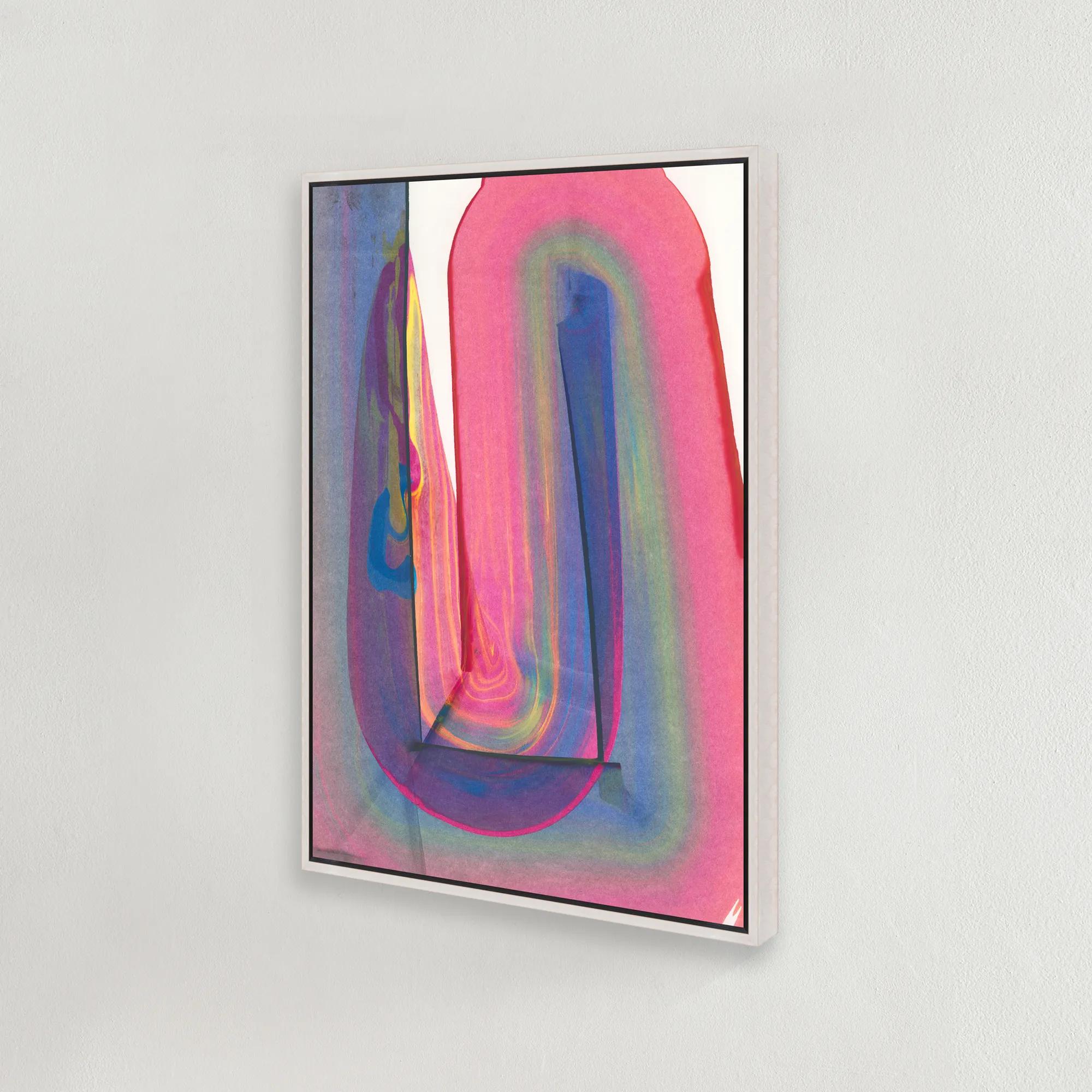
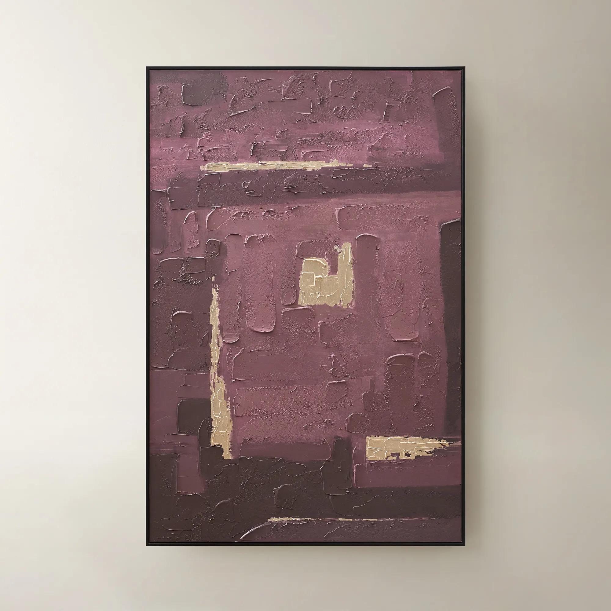
Z Gallerie blush art brings soft warmth and feminine sophistication to a wall. The collection spans abstract works in dusty pink and rose tones, floral pieces in soft pinks, figurative art with blush palettes, and mixed-media pieces that incorporate metallic and rose-gold accents. Each piece adds warmth without saturation.

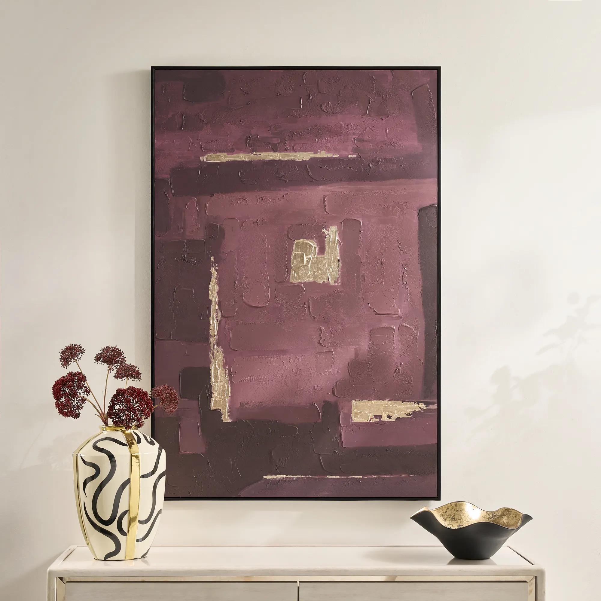
Blush art works especially well in bedrooms, dressing rooms, and sitting rooms where the soft tone supports a calming, considered feel. Pair with brass or rose gold accents, cream upholstery, and natural wood for a layered warm palette, or contrast with charcoal and black for more graphic punch.


Frequently Asked Questions


Is blush art only for feminine rooms?
No. Blush works as a soft warm neutral that suits many spaces. Paired with rich wood, leather, and bold contrasting tones (deep navy, black), blush art reads sophisticated and gender-neutral. The pairings determine whether the overall feel skews romantic, transitional, or modern.
What colors pair best with blush art?
Warm metals (rose gold, brass, copper), cream and ivory, charcoal and black for contrast, sage green for a softer pairing, and natural wood tones. Blush pairs poorly with strong cool tones like icy blue or stark white; the contrast can feel disjointed.
Where does blush art work best?
Bedrooms (for the warm restful palette), dressing rooms and vanities, sitting rooms, and entries where you want a welcoming first impression. Blush also works in dining rooms when paired with warm metallic accents on the table.
How saturated should blush art be?
Most blush art uses softer, dusty tones rather than bright pink, which keeps it sophisticated rather than juvenile. Saturated bright pinks read more playful; dusty blush, peach, and rose tones read more refined. The collection focuses on the dustier end of the palette.
Can I use blush art in modern interiors?
Yes. Blush works in modern rooms when paired with clean lines, neutral foundations, and one or two bolder contrasting accents (black, brass, or natural wood). The softness of blush balances the harder edges of modern furniture and architecture.