
Ever walk into your space and think, “It’s almost there but something’s off”? You’re likely bumping into a few common decorating mistakes that quietly shrink scale, flatten light, or muddle flow. The upside: these are easy to fix, and the right corrections deliver an instant, high-impact glow-up.
At Z Gallerie, modern glam is our love language; elegant, edited, and livable. Consider this your editor’s cut of the common decorating mistakes we see most, refined into stylish, buyer-friendly moves you can use today.
Key Takeaways
-
Scale wins rooms. Many common decorating mistakes start with pieces that are too small—go larger on rugs, mirrors, and art.
-
Light in layers. A layered lighting for living room plan (ambient + task + accent) adds depth and a flattering glow.
-
Name the star. Choose one focal point and style everything else to support it—goodbye visual chaos.
-
Edit like an editor. Curated surfaces, repeated finishes, and intentional texture read luxe.
-
Design for daily life. Clear pathways, concealed storage, and durable fabrics keep “curated, not cluttered” effortless.

Elevate fast: Start with a statement mirror, sculptural lighting, and a right-sized area rug. Three precise upgrades = instant editorial.
Mistake No. 1 — “Smaller Is Safer”
What goes wrong
Petite sofas, tiny art, and undersized rugs make rooms feel cluttered and oddly empty. This is one of the most common decorating mistakes because smaller pieces feel “safer”—but they actually reduce impact.
Refined move
-
How to choose the right rug size for living room: At minimum, the front legs of sofas and chairs should sit on the rug; in larger spaces, fit the entire seating group on it for a cohesive island.
-
Supersize the statement: Mirrors or art should span roughly ⅔ to ¾ of the wall—or the width of the furniture they anchor.
-
Balance presence with simplicity: Big scale + clean lines keeps the look powerful, not heavy.
Buyer benefit
Fewer, larger anchors reduce visual noise—so every accent pulls more weight and your budget works harder.
Expert tip: Between two sizes, the larger almost always looks more intentional.
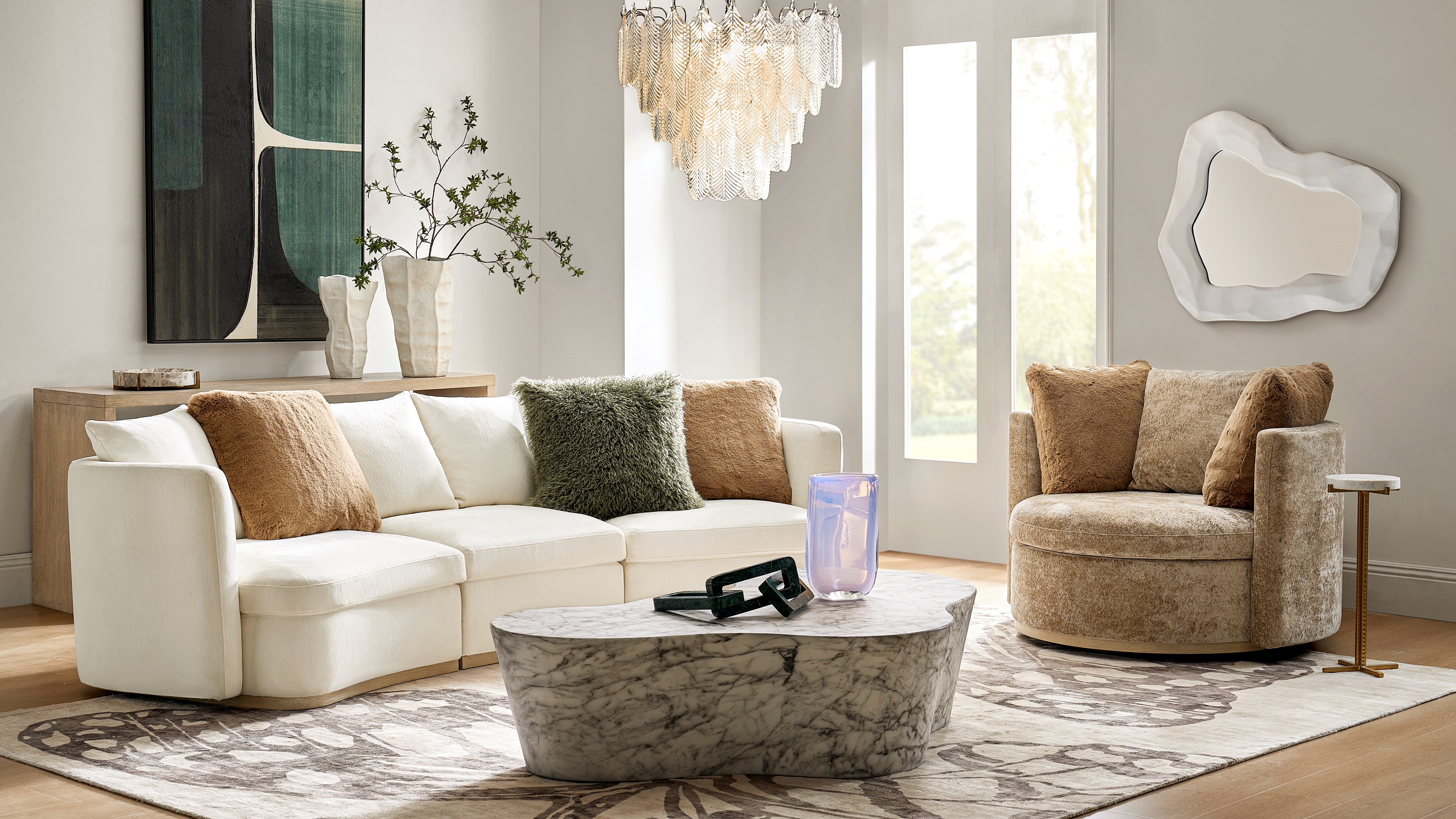
Right rug size and large mirror add balance and scale
Mistake No. 2 — One-Note Overhead Light
What goes wrong
A lone ceiling light flattens texture and casts harsh shadows—velvet, bouclé, and stone veining all lose dimension.
Refined move
-
Layered lighting for living room: Combine ambient (ceiling), task (table/floor lamps), and accent (sconces, picture lights).
-
Set the mood: Use 2700–3000K bulbs for a warm, flattering glow. Add dimmers to fine-tune evenings.
-
Bounce brilliance: Place mirrors where they reflect windows or lamps to double perceived light.
Buyer benefit
Layered light makes finishes richer and people radiant—high-end vibes, daily comfort.

Ambient, task, and accent lighting create an editorial glow
Mistake No. 3 — No Clear Star (The Common Decorating Mistake That Causes Clutter)
What goes wrong
If everything shouts, nothing sings. Without a focal point, rooms read busy instead of curated—one of the sneakiest common decorating mistakes.
Refined move
-
How to create a focal point in living room: Pick one hero—a sculptural chandelier, dramatic art, a showpiece coffee table, or a floor-to-ceiling mirror.
-
Style to support: Echo the hero’s finish or silhouette in smaller accents nearby.
-
Repeat with restraint: If your hero is brass, repeat that metal twice more (lamp, tray) for cohesion.
Buyer benefit
A clear star simplifies shopping. Everything either supports the hero—or doesn’t make the cart.

A bold focal point like this sculptural marble dining table instantly anchors your space—goodbye clutter, hello curated.
Mistake No. 4 — Decorating Only at Eye Level
What goes wrong
Styling the middle band of a room ignores height, so spaces feel squat rather than soaring—even with tall ceilings.
Refined move
-
Hang drapery high and wide: Mount near the ceiling and extend beyond the window to exaggerate height and width.
-
Create vertical rhythm: Tall branches in a sculptural vase, stacked art, or architectural floor lamps pull the eye up.
-
How to style a console table: Build a low-medium-tall triangle—tray, books, then a tall vase or figurine.
Buyer benefit
Vertical emphasis looks expensive and photographs beautifully—no renovation needed.
Vertical styling adds height and drama to a curated entry
Mistake No. 5 — Color Without Contrast (or Too Much of It)
What goes wrong
All-neutral can feel flat; too many hues can feel chaotic. Both are common decorating mistakes that drain depth from a room.
Refined move
-
Choose a hero hue (sapphire, amethyst, onyx—pick your mood) and repeat it 2–3 times for intention.
-
Add contrast through materials: Pair matte bouclé with glossy marble; smoked glass with velvet; mirrored finishes with warm wood grain.
-
Mixing metals in home decor: Limit to two finishes and repeat each at least twice so it looks deliberate.
Buyer benefit
A restrained palette with deliberate contrast makes investment pieces shine and accessorizing plug-and-play.
.jpeg?h=3003&q=90&w=3722)
Curated accents in varied heights and textures elevate styling while letting negative space breathe.
Mistake No. 6 — Over-Accessorizing… or Styling Bare
What goes wrong
Overflowing surfaces or empty ones both hide your best pieces—another common decorating mistake that’s easy to fix.
Refined move
-
Curate in odd numbers: Trios feel dynamic; vary height, silhouette, and texture.
-
Let negative space work: Editing reads luxurious; rotate accents seasonally.
-
Go bigger: One striking sculpture beats five tiny trinkets—scale signals confidence.
Buyer benefit
Curated surfaces clean faster, update easier, and look high-end in person and in photos.
Expert tip: Use a tray to visually “contain” a vignette so it reads intentional, not scattered.

Vertical styling and intentional scale—proof that less, done right, is always more.
Mistake No. 7 — Ignoring Flow and Function
What goes wrong
Gorgeous pieces become obstacles; cords, remotes, and clutter erode the mood you worked to create.
Refined move
-
Measure movement: Aim for 30–36" walkways; float furniture to create conversation zones.
-
Conceal the everyday: Credenzas, media consoles, and lidded boxes hide cables and chargers.
-
Choose durability smartly: The best performance fabric for sofas belongs where life happens; layer luxe textures via pillows and throws.
Buyer benefit
Function-first planning keeps spaces polished on a Tuesday night—not just after a weekend reset.
A statement mirror like this sculptural piece adds scale, reflects light, and creates a clear focal point—instant editorial impact.
The Editorial Edit — A 7-Step Mini Makeover (You Can Do Today)
-
Pick the star (mirror, art, chandelier) to focus every purchase.
-
Right-size the base (rug connects seating)—bigger usually looks better.
-
Layer the light (add one lamp + one accent beyond overhead).
-
Reach vertical (high/wide drapery; one tall element per vignette).
-
Refine the palette (repeat a hero hue; add metallic warmth).
-
Curate surfaces (style in threes; leave negative space).
-
Protect the flow (measure pathways; add concealed storage).
Your room, re-edited: Elevate fast with a focal-point art, sculptural lighting, and a plush rug. Add one metallic accent for signature Z Gallerie glam.
Frequently Asked Questions
How big should my living room rug be?
For how to choose the right rug size for living room, let at least the front legs of all seating sit on the rug. In larger spaces, fit the entire seating group on it to unify the zone and visually expand the room.
How high to hang art above sofa or console?
Center art around 57–60" from the floor (museum guideline). Above furniture, keep the bottom edge roughly 6–10" above the piece and aim for artwork width around ⅔ of the furniture below.
Can I mix metals in home decor without clashing?
Yes—limit to two finishes (e.g., champagne gold + polished nickel) and repeat each at least twice. This repetition looks intentional and welcoming.
What bulb temperature works best for layered lighting?
Warm white (about 2700–3000K) delivers that flattering, editorial glow and keeps whites from feeling stark at night.
What’s the easiest way to style a console table?
Think low-medium-tall: a tray, a stack of books, then a tall vase or sculpture. Repeat your hero hue or metal once nearby for cohesion.
Closing Note — Curated, Not Cluttered
Mastering these seven common decorating mistakes unlocks a home that feels taller, brighter, and effortlessly luxe: right-scaled anchors, layered lighting, purposeful color, edited surfaces, and smooth flow. That’s the Z Gallerie definition of modern glam—striking, considered, and ready for real life.
Ready to elevate? Explore statement mirrors, sculptural lighting, and plush rugs to build your editorial-worthy space today.


