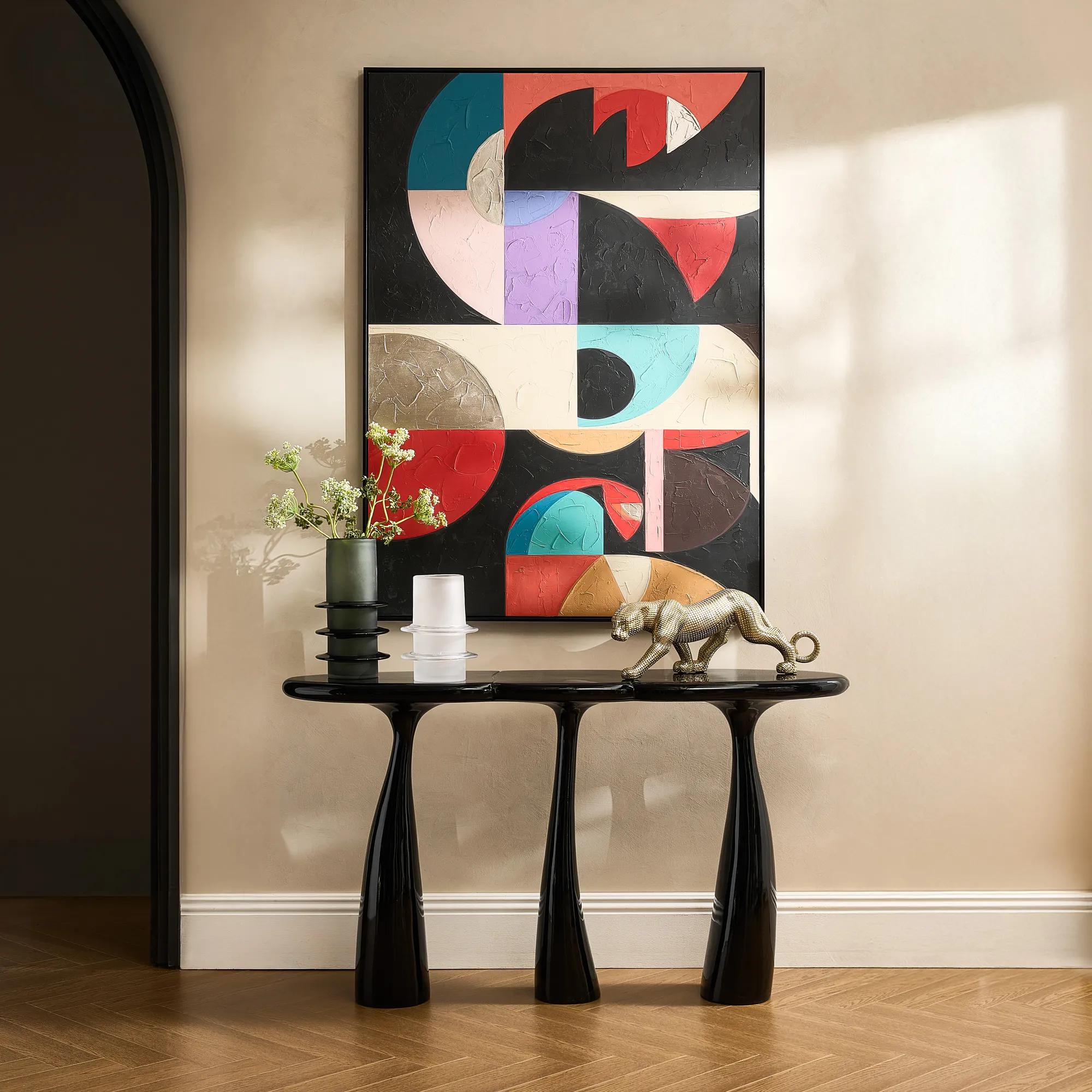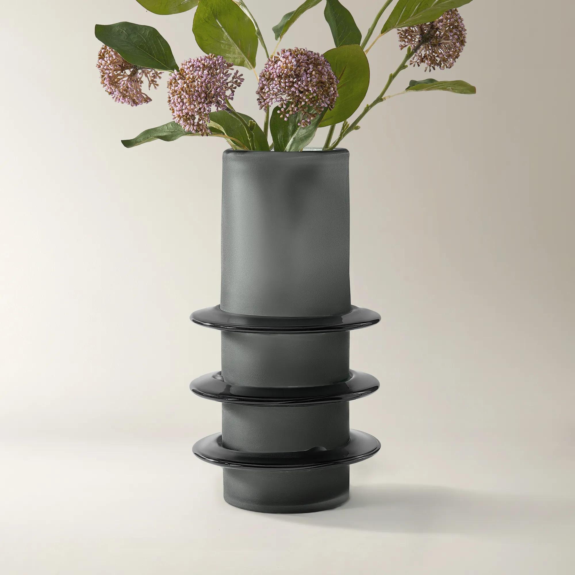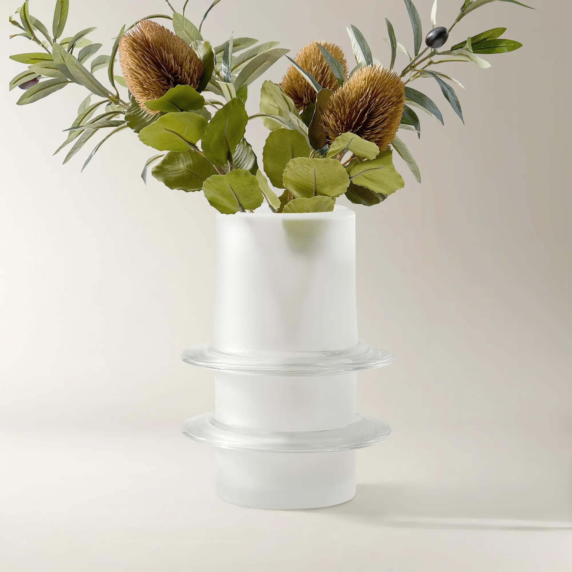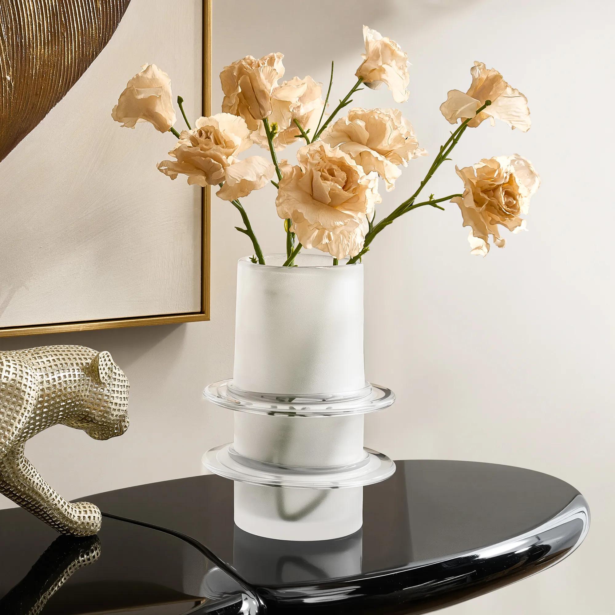

Make a confident first impression with the Chromatic Edge Entryway. The palette layers bold black-and-white pairings with one vivid accent color (deep emerald, sapphire, or jewel-tone) for an entry that reads modern, confident, and unmistakably designed. The look turns the entry from transitional space into the home's design introduction.
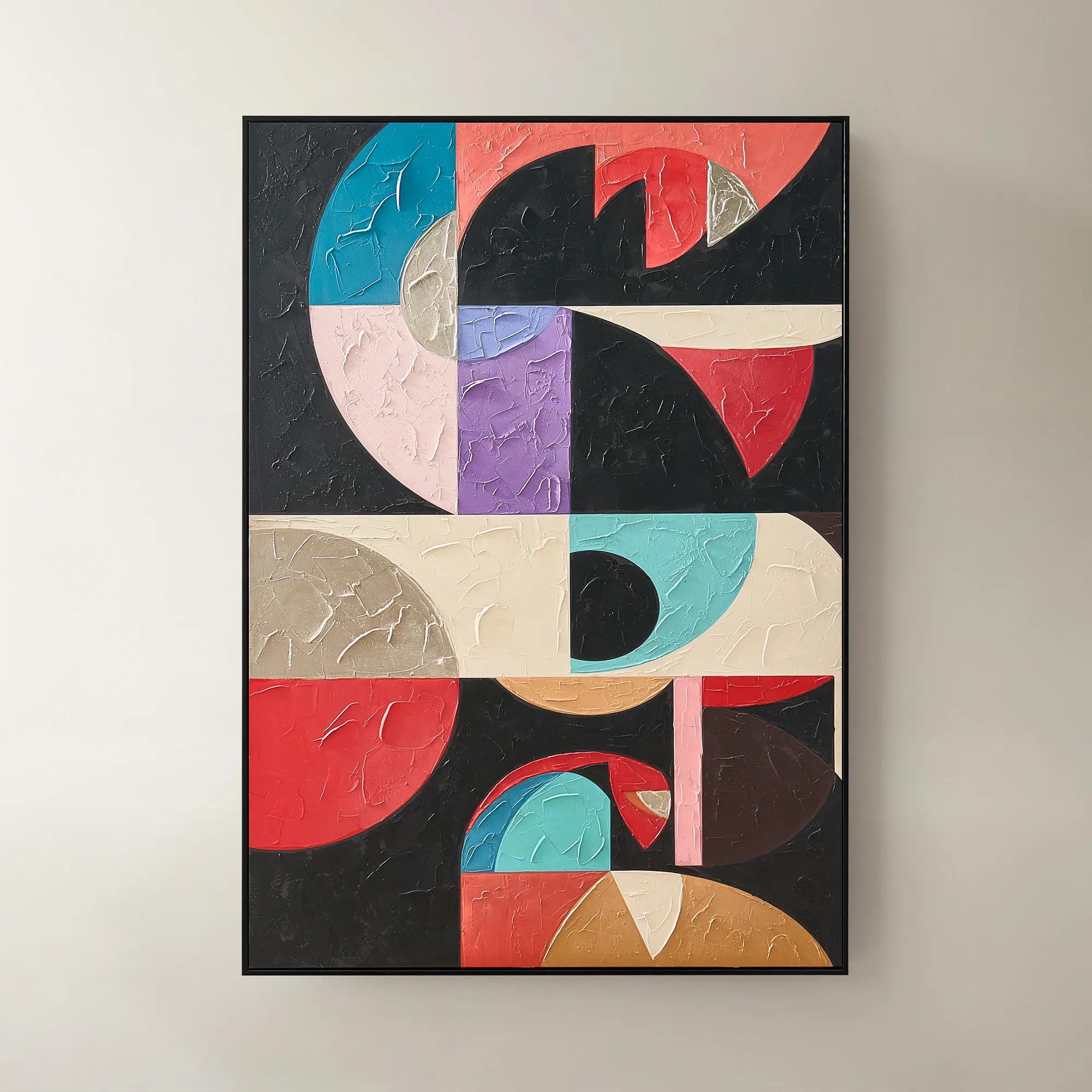
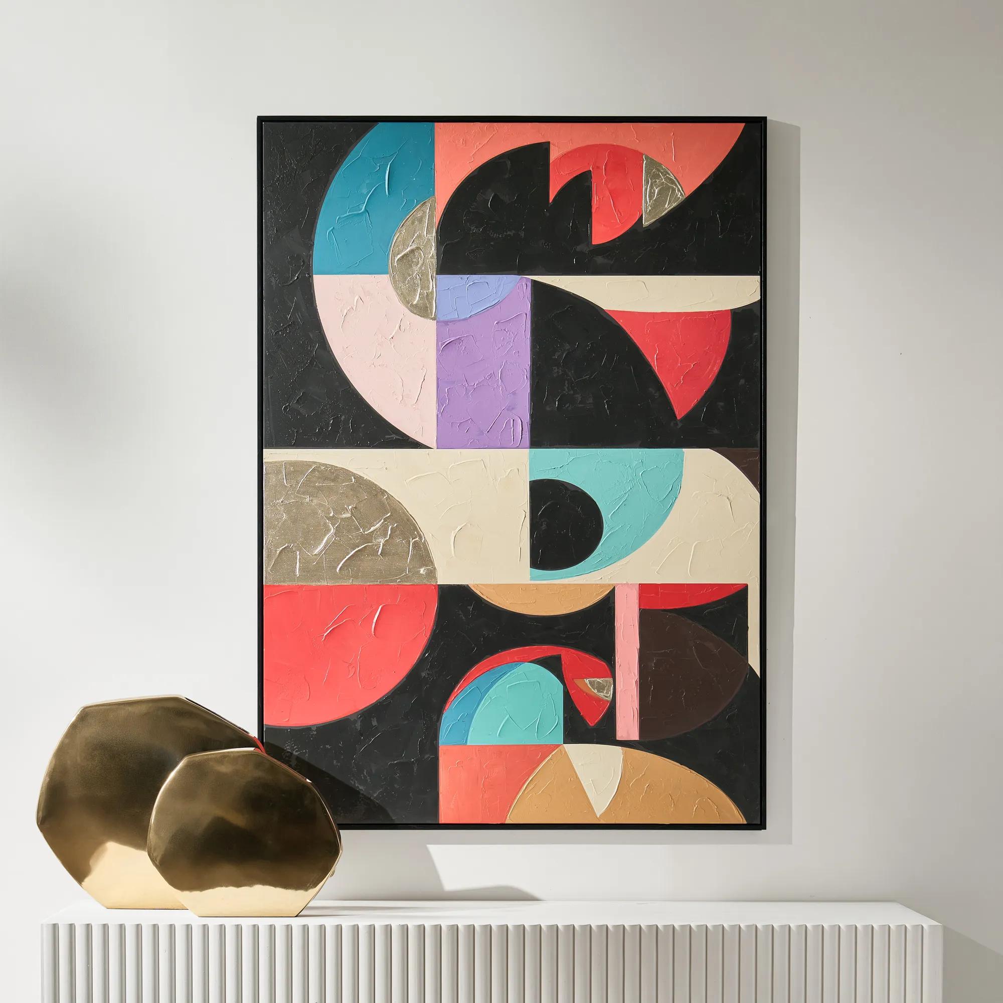
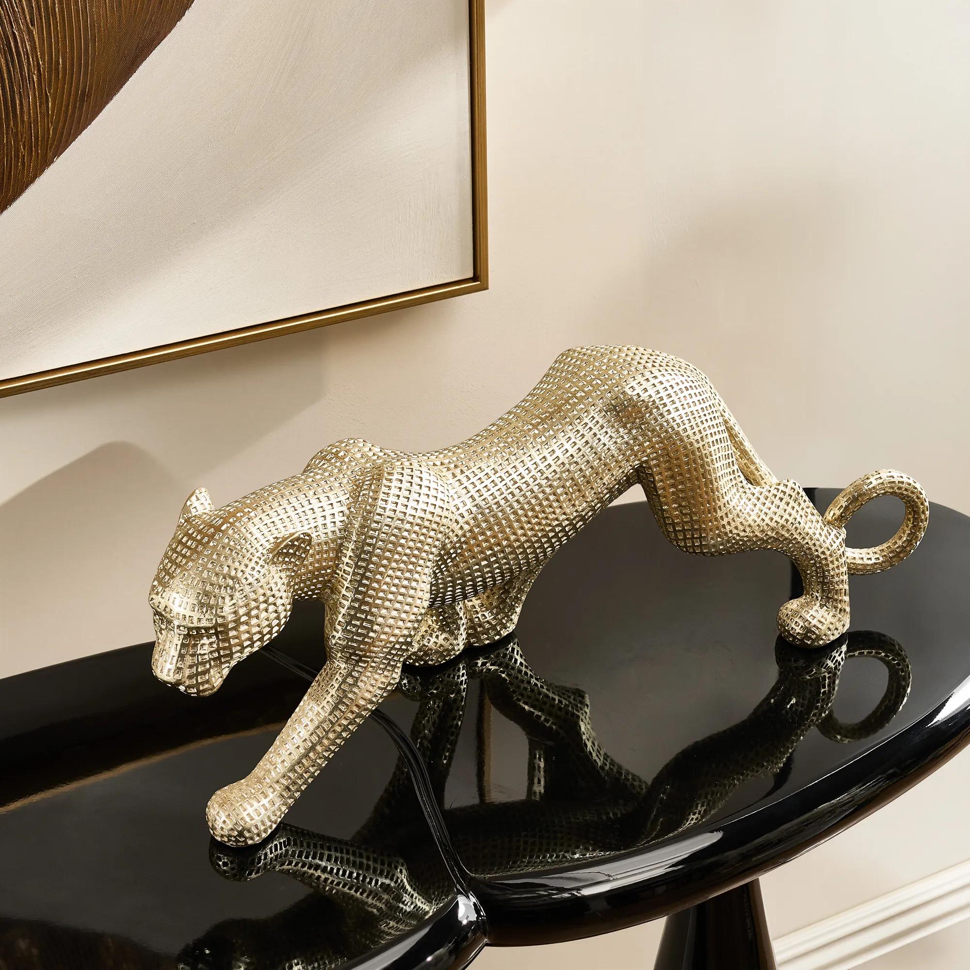
A narrow console in matte black or polished metal anchors the entry, paired with a statement mirror above (in a complementary frame). A sculptural lamp on the console, a piece of bold abstract art, and a single vivid accent (a colorful vase, a bright pillow on a bench) extend the chromatic palette. A geometric or graphic rug grounds the space. The entry signals confident design from the moment someone walks in.
Frequently Asked Questions
What's the right way to use one accent color in a black-and-white entry?▼
Pick one vivid accent and use it sparingly: a single bold vase, one colorful piece of art, or a single accent pillow on a bench. The accent should provide the unexpected note in an otherwise high-contrast neutral palette. Adding more accent colors quickly reads cluttered rather than designed.
How do I keep a black-and-white entry from feeling cold?▼
Add warmth through texture (boucle, faux fur, or woven natural fiber on accent pieces), warm metallic accents (brass, gold), and layered warm lighting. The graphic black-and-white provides the design impact; the warm details prevent the cold feel. Texture matters more than color in this balance.
What accent colors work best in a Chromatic Edge entry?▼
Deep emerald, sapphire blue, jewel-tone amethyst, or rich burgundy all work as confident accent colors. Avoid pale or pastel accents (they get lost against the high contrast) or warm earth tones (they fight the graphic palette). Choose saturated, confident accent colors.
Does this style work in small entries?▼
Yes, especially well. Small entries benefit from confident design choices that make them feel intentional rather than tentative. High-contrast palettes also tend to make small spaces feel intentional rather than apologetic. Avoid filling the small entry with too many pieces; let the bold choices breathe.
What kind of art reinforces the Chromatic Edge palette?▼
Bold abstract works in black and white, graphic prints, or photography with strong compositional contrast. The art should add to the design statement rather than blending into the background. One large piece reads more impactful than several smaller works in this high-contrast style.