Burgundy lacquer, pleated velvet, a glint of chrome: this fall’s most persuasive rooms have a little more to say.
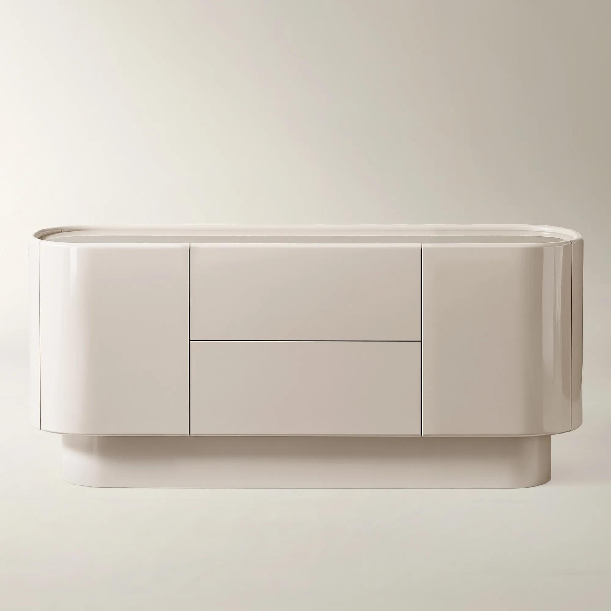
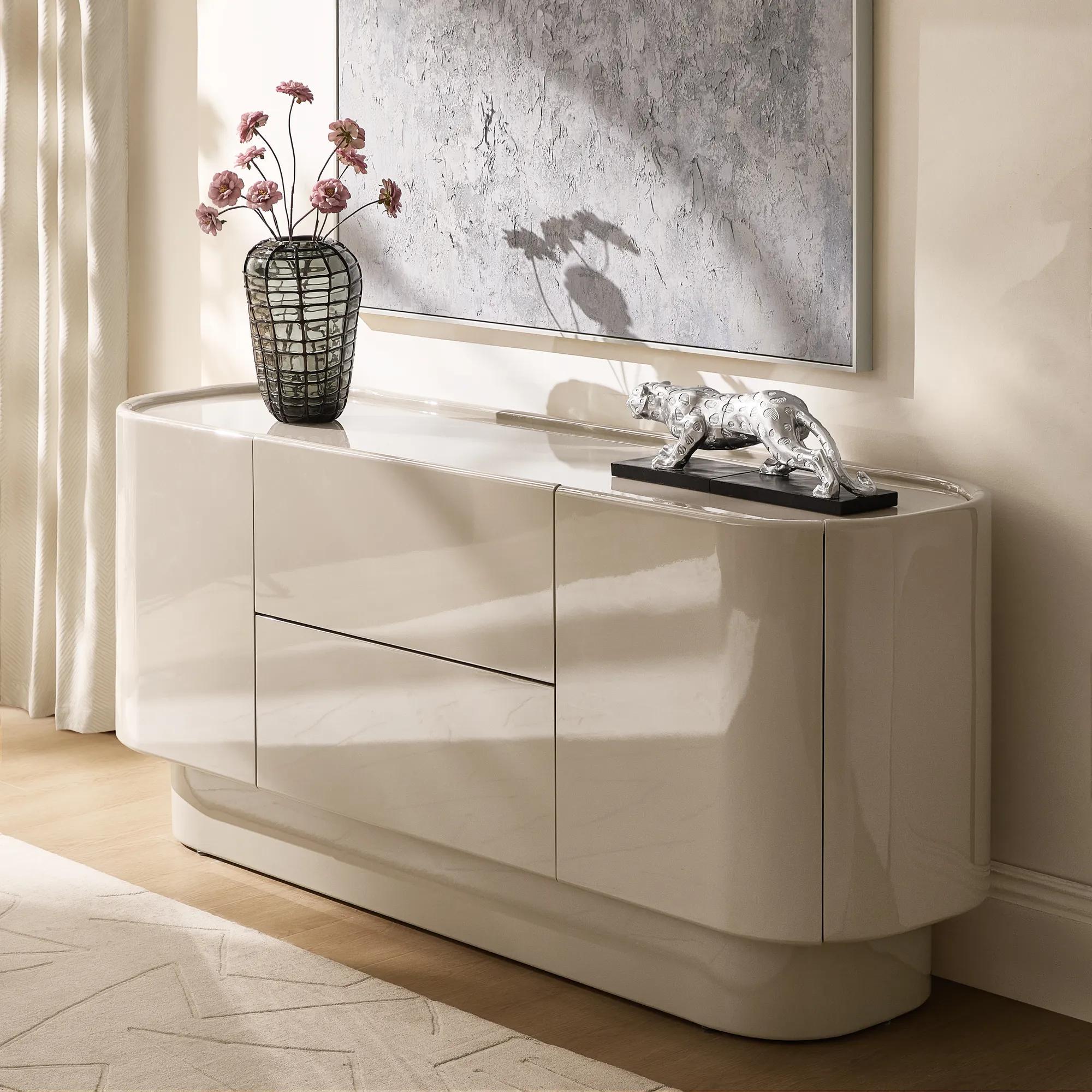
A burgundy cabinet is a surprisingly practical place to begin a conversation about timeless design. It has color, gloss, and enough presence to hold its own beneath a large painting. It also stores the serving platters. That last part matters.
Our edit of the fall interior design trends for 2026 starts with that balance: pieces you notice, and pieces you use. Glossy lacquer, jewel-toned velvet, sculptural lighting, tinted glass, and graphic pattern are the ingredients. The renewed interest in Neo Deco supplies a familiar design language, reworked for less formal rooms.
At Z Gallerie, the connection runs through Deco Pop and the Fall/Winter 2026 collection. Lacquer mixes with softer upholstery; burgundy and blues bring depth; reflective surfaces sit beside tactile ones. The appeal is the freedom to introduce something expressive without pretending the rest of your home has become obsolete.
Here are seven ideas worth considering and how to give them a life beyond fall.
1. Lacquer earns its place beyond the accent table
Lacquer is having a particularly good year. Its reach now extends from individual furniture pieces to cabinetry and architectural surfaces, a reminder that gloss can be part of a room’s structure rather than a decorative afterthought.
For a home that is already furnished, a freestanding cabinet is an easier commitment than a lacquered ceiling. It delivers a broad sweep of color, but you can move it, restyle it, and keep using it when the wall color changes.
The Velar Lacquered Ox Blood Buffet pairs its glossy finish with a back-painted tempered-glass top and rounded edges. Drawers and cabinet storage give the drama a useful purpose. Against a pale wall, that deep red can do much of the decorating on its own.
Resist the temptation to make everything around it equally shiny. Try a chalky ceramic vessel, a painting with a matte surface, or a worn wooden chair nearby. Those differences make the lacquer more noticeable.

Z Gallerie’s High Gloss Society edit is a good place to explore this side of the season. Choose the surface you want to notice first; give it something less reflective for company.
2. Burgundy gets some unexpected company
Burgundy is easy to picture in a fall room. Blue is where the palette becomes more interesting. Blue-green shades are making a convincing transition from summer into fall, particularly alongside deeper reds and browns.
For this Deco Pop-inspired edit, think burgundy with dusty blue, deep teal with ivory, or fig with a muted mauve. You do not need all of them. The useful move is to give a familiar rich color an unfamiliar companion.
Try a blue rug beneath a burgundy chair. Or place a small mauve textile against dark upholstery, where its softness will register without turning the room pastel. Deep teal is particularly appealing with a restrained glint of champagne gold.
Pay attention to proportion. Two strong colors can share a room without occupying equal amounts of it. Let one spread across upholstery or a rug; allow the other to appear in a smaller object, a textile, or a detail in the art.

For a gentler starting point, our guide to fall home decor colors explores the earthier side of the season. A neutral foundation leaves plenty of room for a more adventurous accent.
3. Velvet seating finds its shape
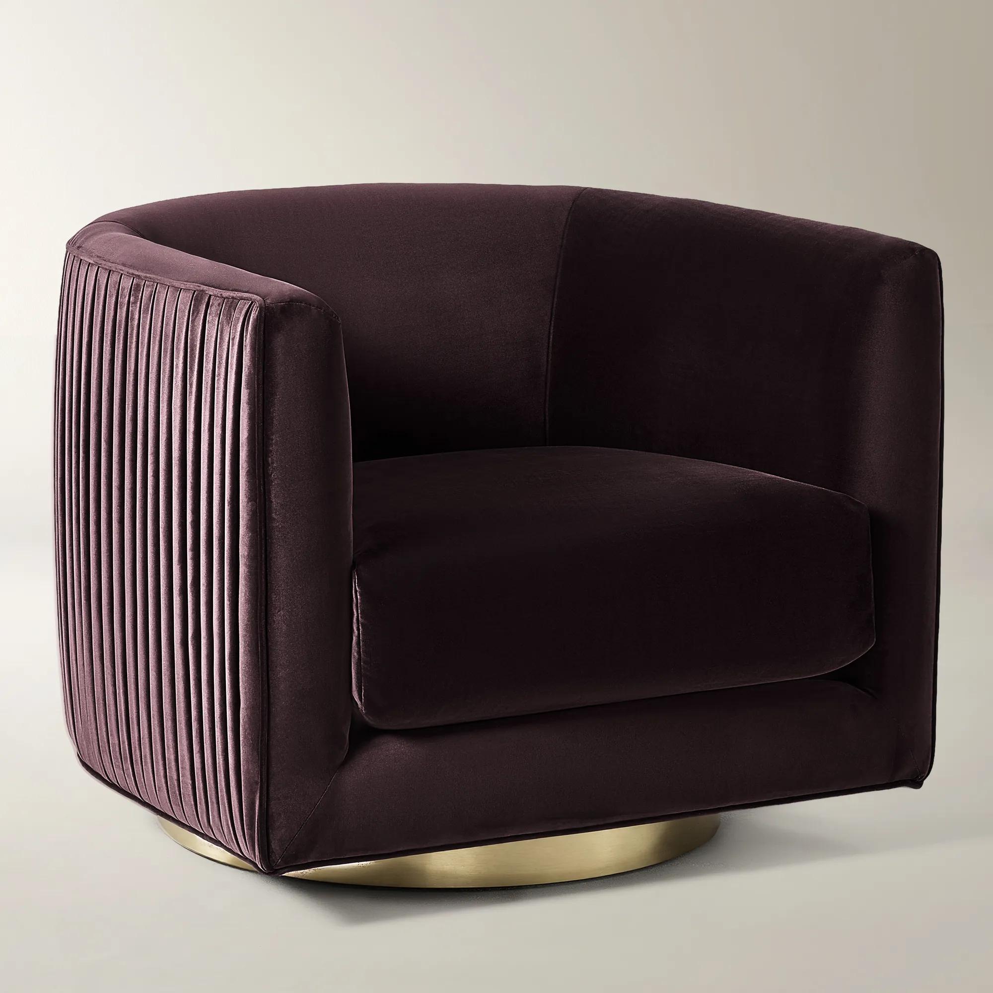
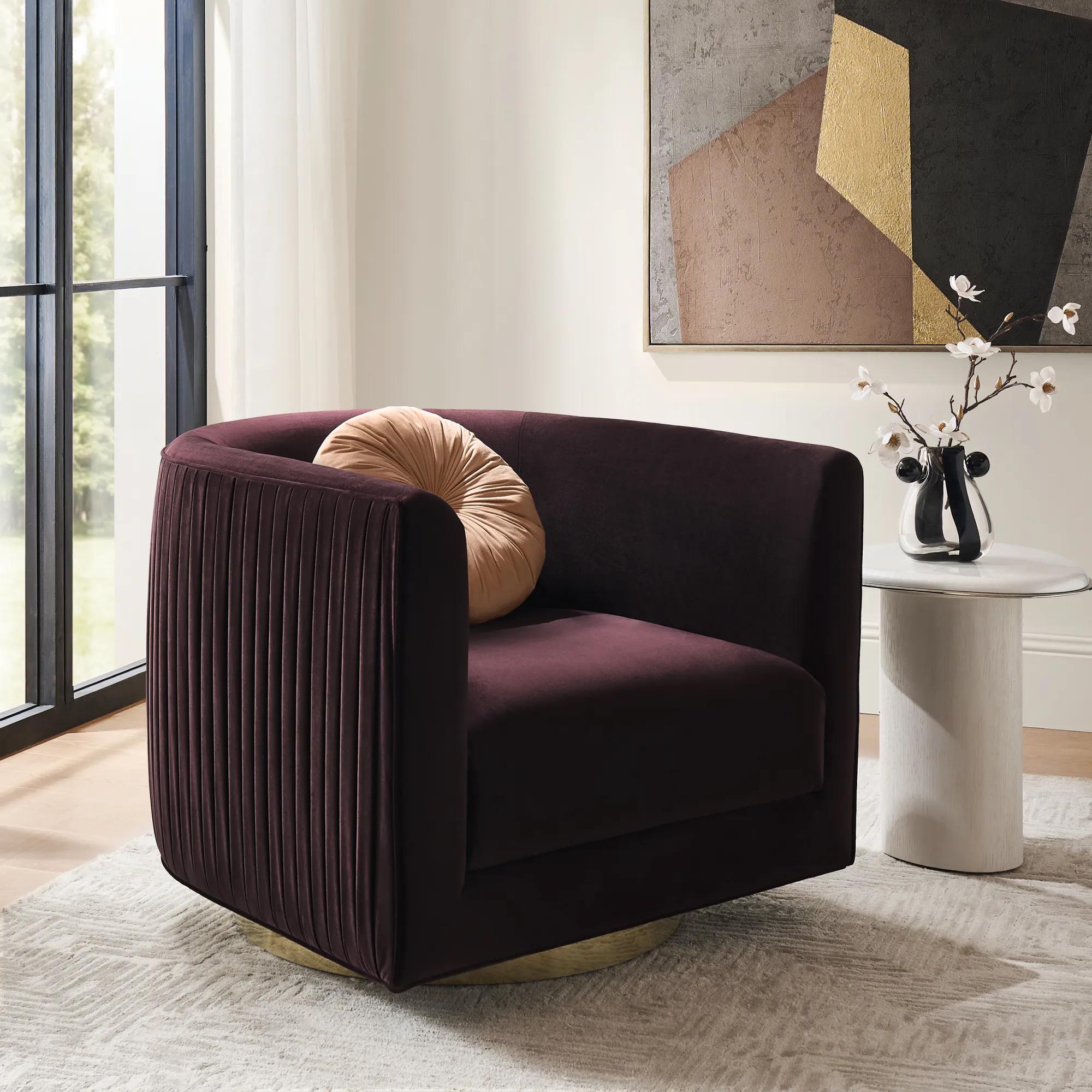
The autumn/winter 2026 upholstery forecasts place velvet in deeper shades, including oxblood, mulberry, and petrol teal. In a room, though, the color is only part of the decision. Look at the chair from the doorway. Look at its back. A strong silhouette should be worth seeing from more than one angle.

The Lyssa Pleated Fig Velvet Swivel Accent Chair has rounded lines, pleated outer panels, and a swivel base. Its pleats give the outside a different character from the smoother interior, a useful detail when the chair sits away from a wall.
This is a convincing way to approach Neo Deco seating: a recognizable shape, an expressive fabric, and a practical reason to use it. Place the chair where it can turn toward both the sofa and the window, with a table close enough to reach.
Then leave the upholstery visible. A sculptural chair does not necessarily need a decorative pillow, especially when the fabric and pleating are already doing something interesting.
Before committing to color, review a swatch in your own daylight and evening light. The version you love needs to be the one you live with, not only the one on your screen.
4. Chrome gets a warmer reception
There is still a place for chrome in 2026, especially in rooms that need a little coolness. The more useful question is what to put beside it. In a room with velvet, wood, and warm white walls, a cool reflective finish can feel quite different from the same finish surrounded by glass and hard edges.
Champagne gold offers another direction. Its softer color is appealing against deep teal or burgundy, particularly in a lamp, a frame, or a narrow furniture detail.
There is no need to replace one with the other. Our approach: give one finish the more prominent role, then introduce the second in a smaller piece. Avoid buying several near-matching golds simply because they are all described as warm; compare the actual finishes.
The Forma Stacked Chrome Side Table makes the case for shine at a manageable scale. Its rounded, tiered fiberglass form has an electroplated chrome finish. Beside a velvet chair, it offers a reflective counterpoint without turning the whole seating area metallic.
The material mix is what matters. A room can accommodate several finishes more easily when the shapes and colors give them a reason to be together.
5. Tinted glass does the decorating
Colored glass is back on the fall table, from tinted stemware to vintage finds. It offers a way to add color without another large expanse of upholstery or paint.
For something more permanent than a vase, consider the light fixture. The Elodie Rose Glass Chandelier combines swirled rose-colored glass with a chrome-finished frame. That pairing is especially appealing: the pink softens the metal, while the metal keeps the pink from becoming overly sweet.
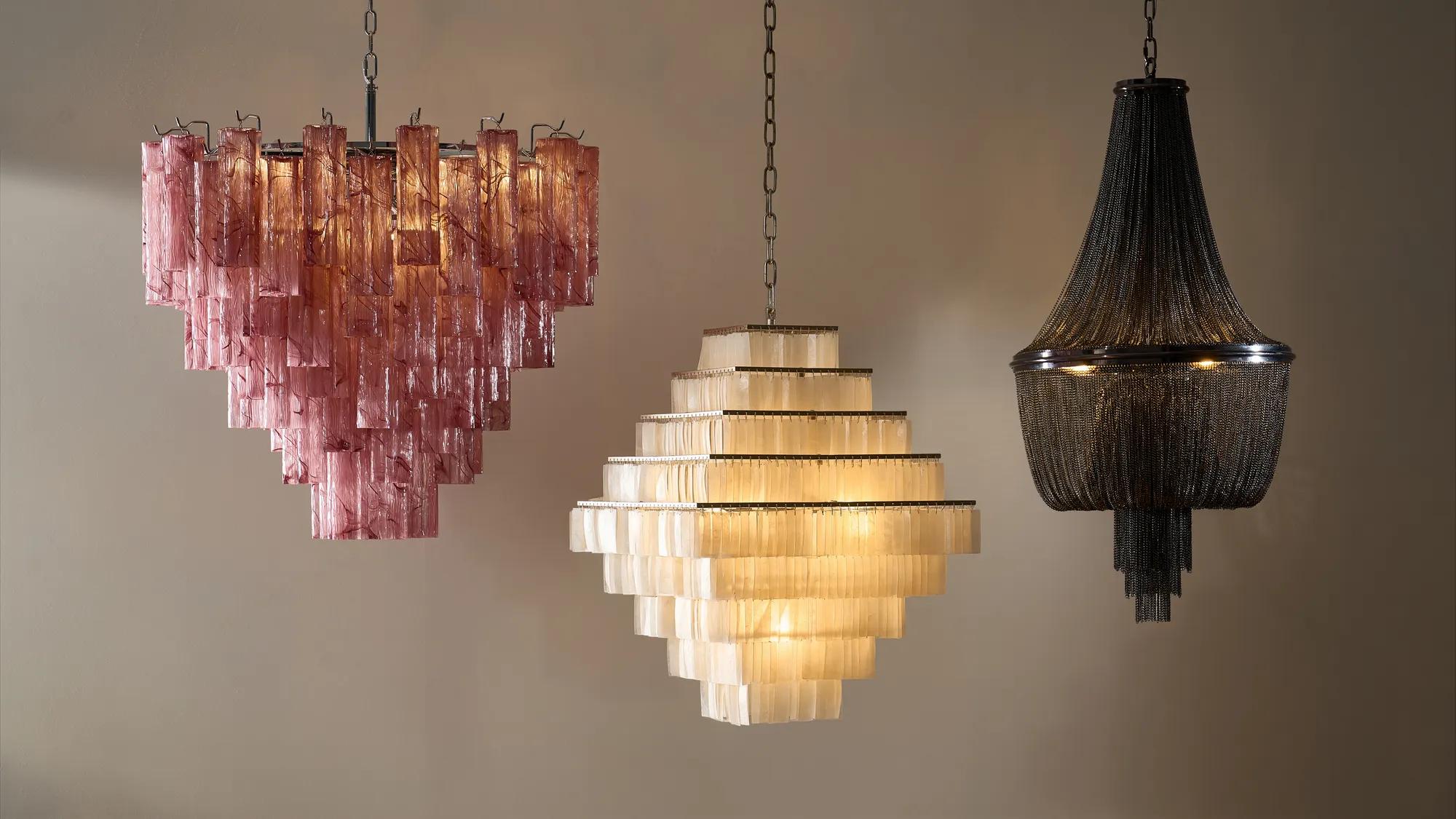
Imagine it over a plain dining table, where the glass has space to be seen. There is little reason to add a towering centerpiece directly beneath a fixture with that much detail. Keep the table low and useful, and let the chandelier occupy the air above it.
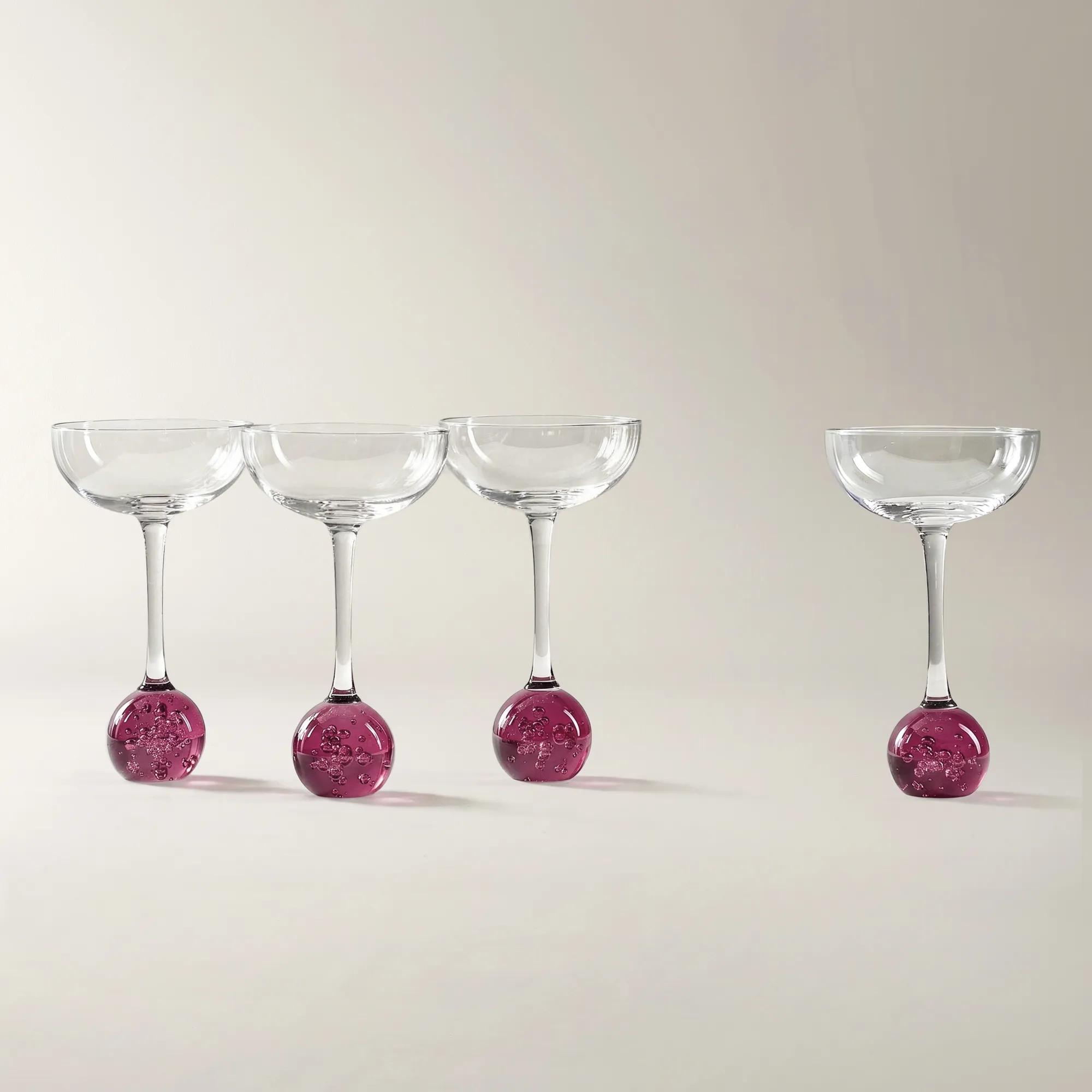
A smaller gesture works, too. The Dottie Fig Martini Glasses bring color to the table through fig glass and rounded stem details. Set them beside uncomplicated white plates, rather than trying to match every part of the place setting.
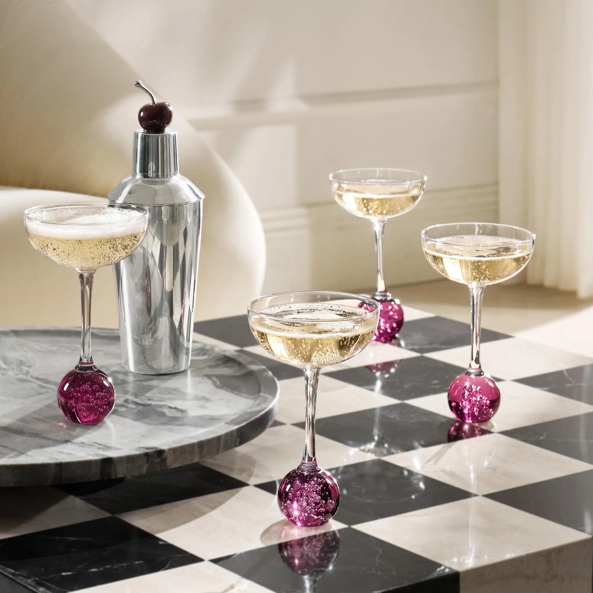
Among luxury fall decor ideas, this is one of the easiest to live with: change the glassware and the light before you change the room.
6. Graphic pattern moves into the furniture
A check does not have to arrive on a pillow. Putting pattern into a table changes its role: it becomes part of the furniture arrangement rather than an extra layer placed on top.
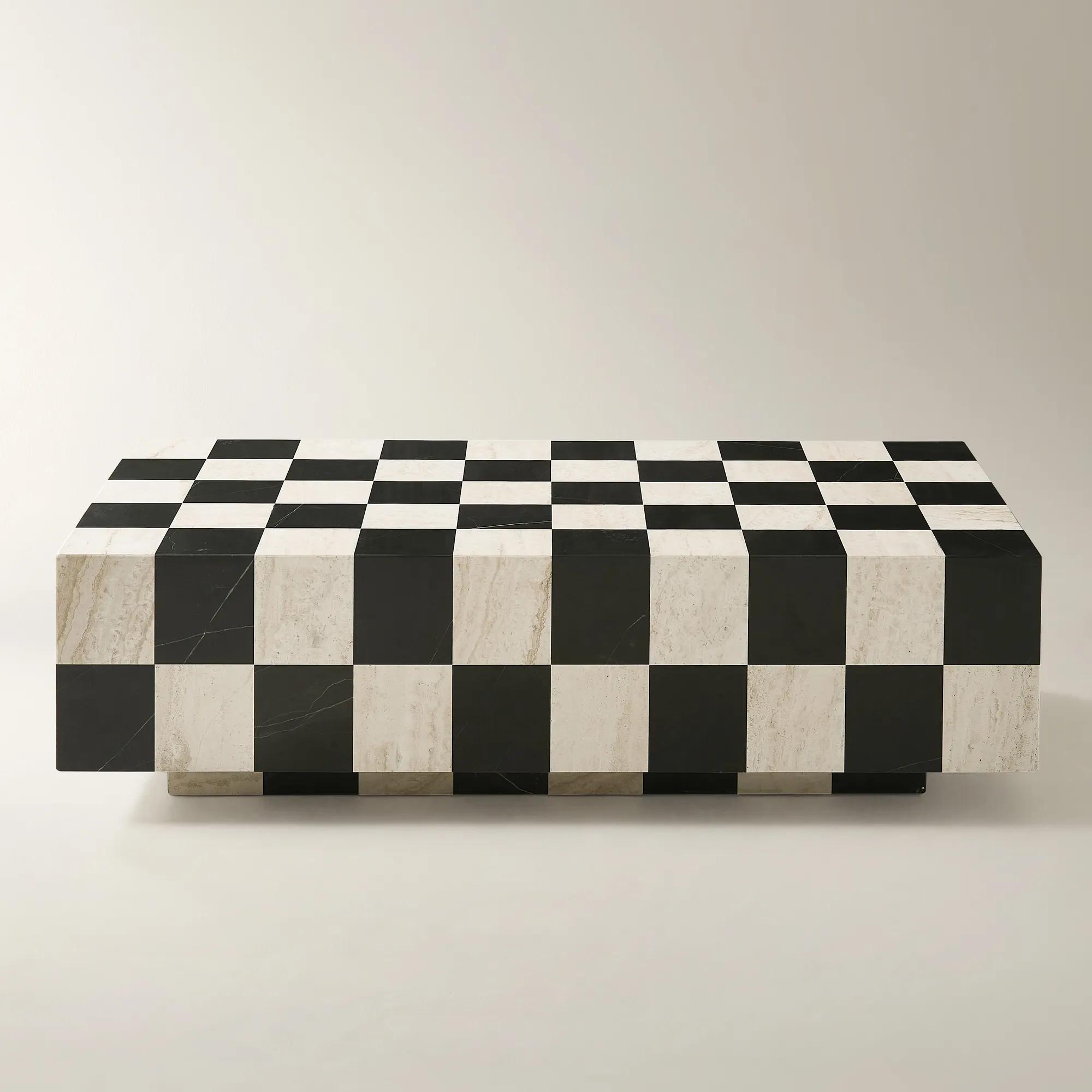
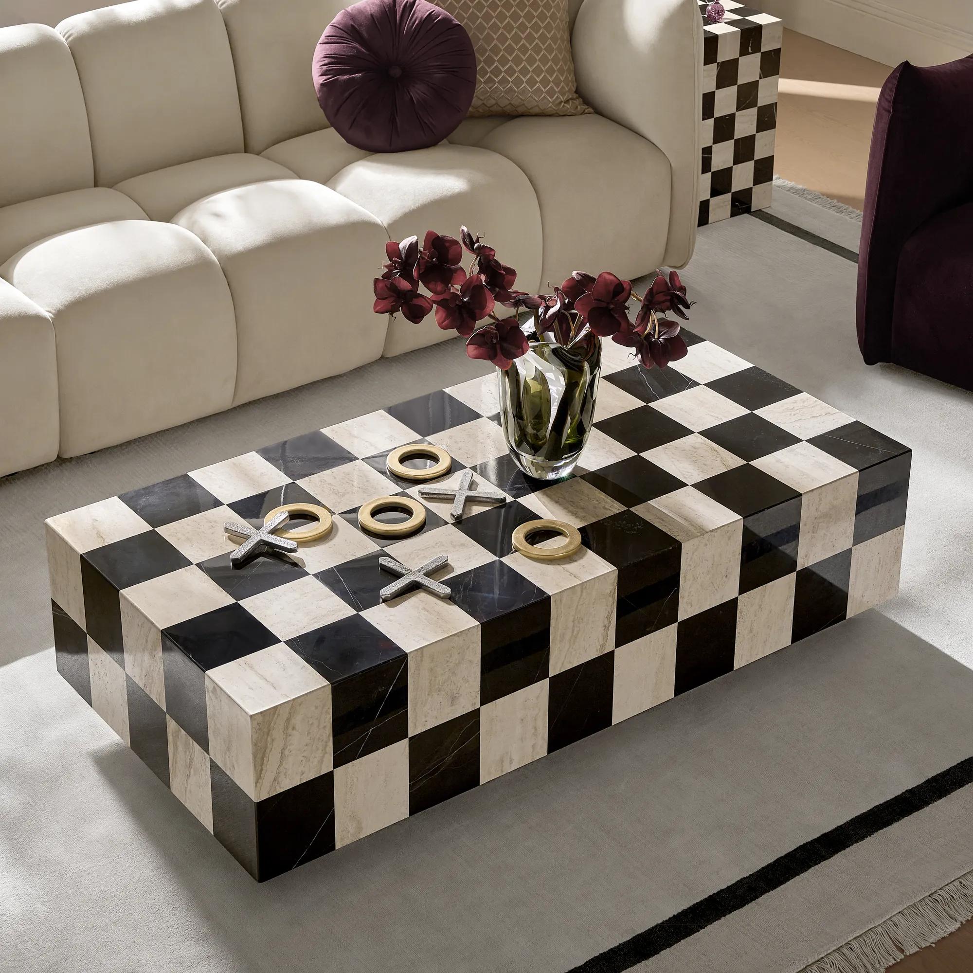
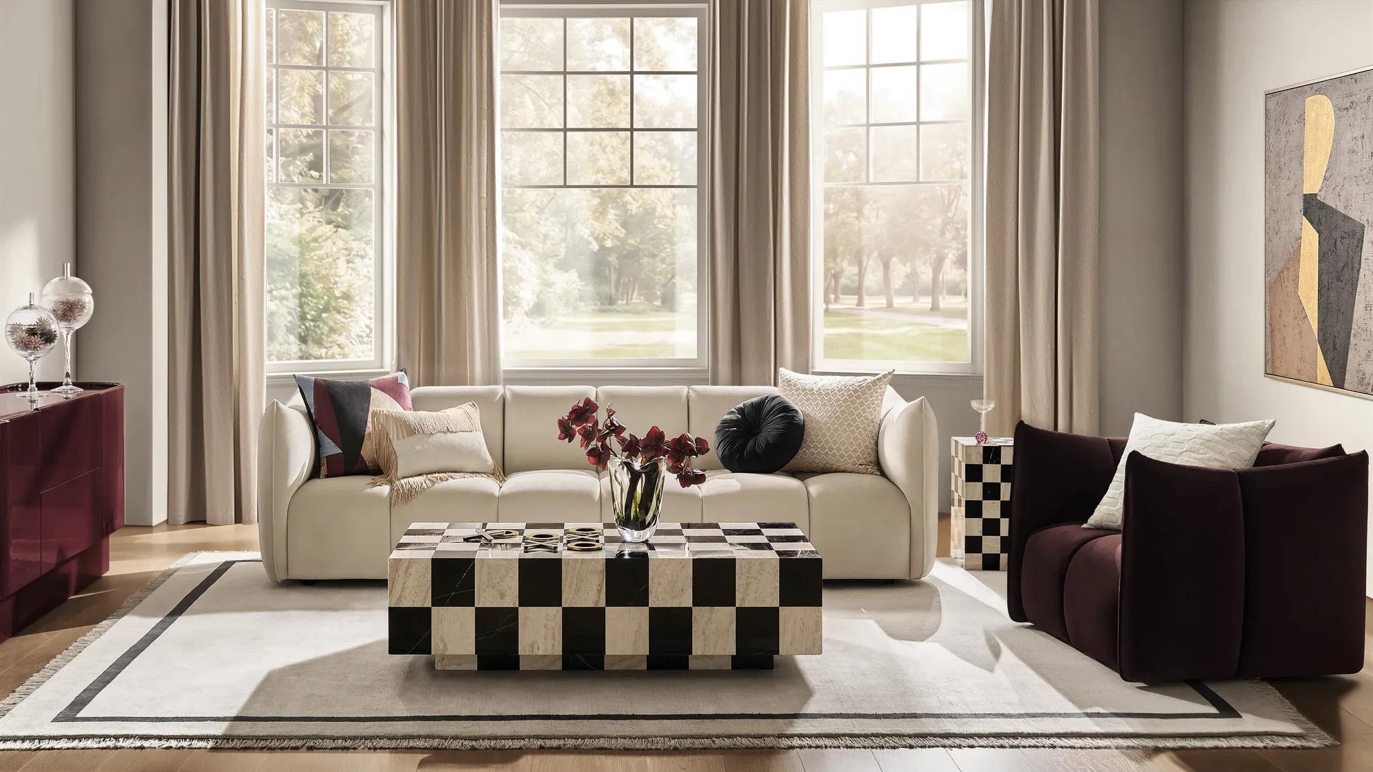
The Chessa Rectangular Chequered Marble Coffee Table combines black marble and travertine in a checkerboard composition. The contrast is graphic, while the variation in the stones gives you something else to look at up close.
Treat a patterned table as you would a patterned rug. It has already introduced a substantial motif, so surrounding pieces can be simpler. An upholstered sofa in a solid color and a rug with a quiet texture give the eye somewhere to rest.
This is also an opportunity to bring together different kinds of line. A squared-off table can sit comfortably with a rounded chair; the shapes do not need to imitate one another.
Prefer pattern in something easier to change? A zebra textile or an abstract cushion can provide a smaller intervention. Our guide to styling animal print decor takes that idea further. Start with the pattern you genuinely like, rather than adding several just to make the room feel finished.
7. The best finishing touch is a little strange
There is something reassuring about the renewed enthusiasm for personal collections. The 2026 Kips Bay Decorator Show House in New York offers a timely example, with expressive art and displays that favor personality over immaculate arrangements.
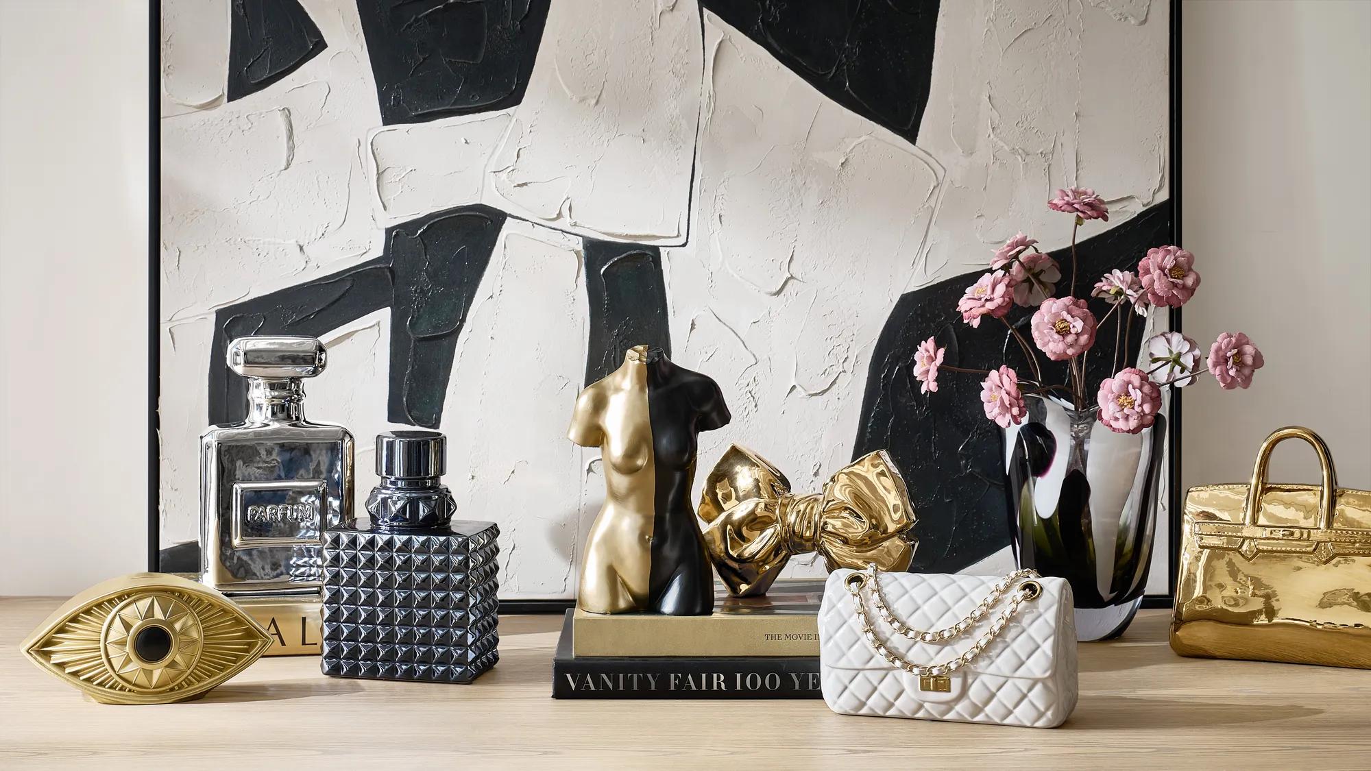
At home, that can mean leaving space for the object that does not quite match. A face-shaped sculpture. An unusually proportioned vase. A small piece you bought because it made you smile.
Z Gallerie’s Golden Eye Ceramic Decorative Object is one possibility: an elongated face in a reflective gold glaze. Set it among books you actually read, perhaps beside an older photograph, and it has more to respond to than a row of matching accessories.
Scale still matters. An eight-inch object is a detail for a shelf or tabletop, not a substitute for a large work of art above a sofa. Give small pieces a setting that lets you notice them.
And keep the things that are already yours. The most personal part of a new collection is what happens when it meets the collection you have been making all along.
How to bring the fall 2026 look home
These fall home decor trends for 2026 translate differently from room to room. Start where a change would make daily life more enjoyable.
Fall living room trends: change the conversation, not everything
Keep the sofa that still works. Introduce the Lyssa chair in Fig and a chrome side table, then see what the room needs before adding anything else. A plain rug may be exactly right. Pick up a color from an existing painting instead of searching for perfectly coordinated accessories.
When the room does need a larger change, browse new living room furniture with a specific job in mind: better seating, more useful storage, or a table that fits the way you gather.
The dining room: let color come to dinner
A wooden dining table can take on a different character with upholstered chairs and colored glass. The Odette Fig Velvet Dining Chair combines velvet, tonal faux leather, and gold-finished legs. It is a useful example of the material remix in a single piece.
Keep the place settings relatively simple. A rich chair color is enough to give an ordinary dinner a sense of occasion.
The bedroom: lower the volume
Carry the palette through in softer proportions: ivory bedding, a fig or mauve cushion, and a reflective bedside detail. There is no obligation to make the bedroom as exuberant as the living room. Using related colors at different intensities is enough to connect them.
The question worth asking is not whether every choice looks current. It is whether you would still like it beside the furniture, art, and objects you already love.
Keep the table. Consider the burgundy cabinet. Let the room take its time.
Explore the Fall/Winter 2026 collection and High Gloss Society to build your own fall edit.
A few questions about decorating for fall
What are the key fall interior design trends for 2026?
This edit focuses on glossy lacquer, jewel-toned velvet, Neo Deco seating, chrome and champagne-gold accents, tinted glass, sculptural lighting, and graphic pattern. Treat them as options to combine with existing pieces, rather than a checklist for a single room.
Which fall colors can work beyond the season?
Burgundy, deep teal, blue, fig, and mauve can all be used outside a seasonal decorating scheme. Choose the combination that works with your existing finishes, and keep some contrast in the palette. A rich color does not need to cover every surface to make an impression.
What is the easiest way to try Deco Pop?
Start with one change: a lacquered side piece, a velvet chair, or colored glassware. Notice how it works with what you own before adding another. Retaining familiar furniture and personal objects helps the new piece feel part of your home.