The room may look maximal. The decisions underneath it should be anything but.
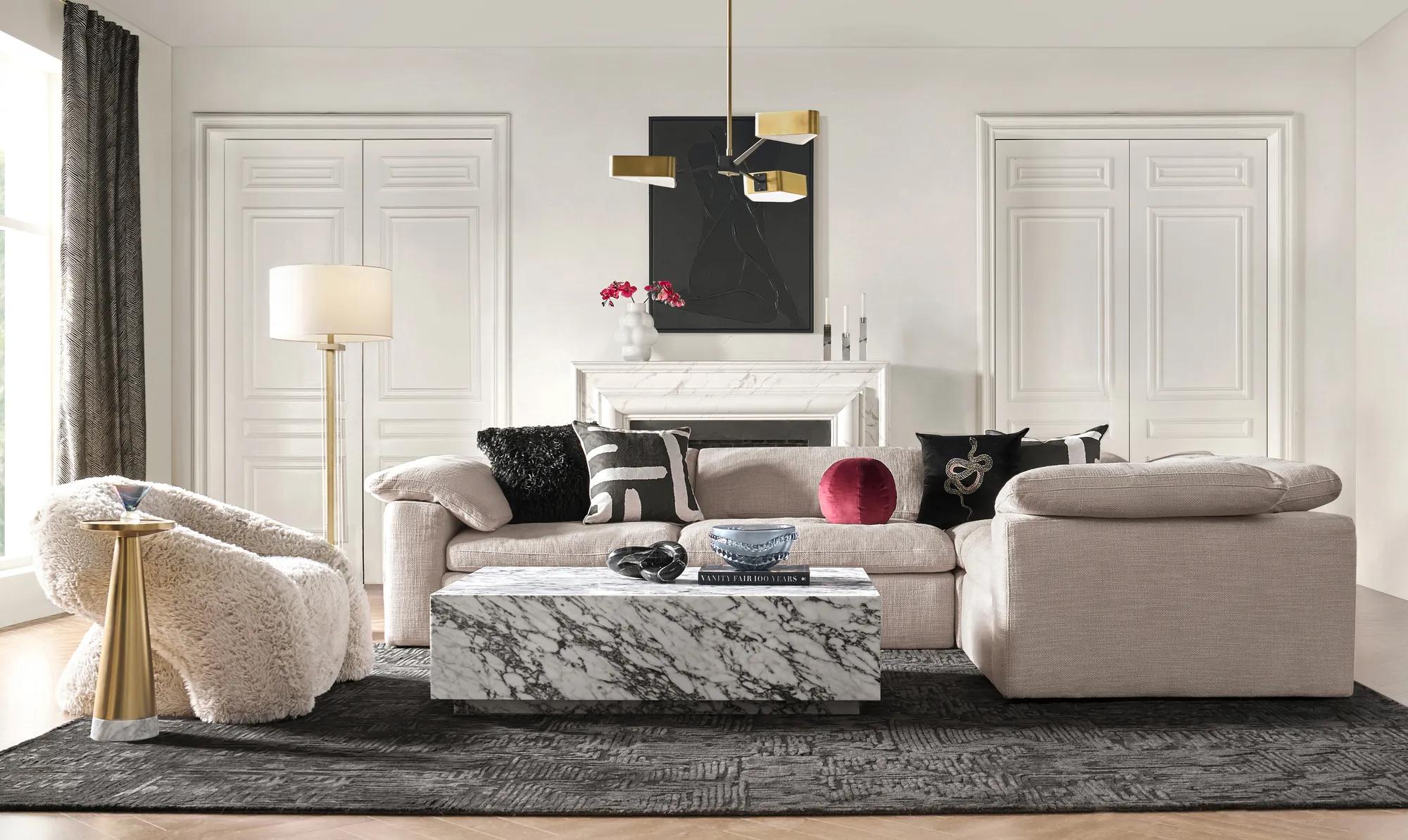
A patterned rug beneath a quiet velvet sofa. A geometric line at the window. Another shape turning up on a pillow across the room.
Individually, none of those choices is especially radical. Repeated with intention, however, they begin to alter the architecture of the room. Your eye stops reading each textile as an accessory and starts reading the repetition as the room’s point of view.
That is the appeal of pattern drenching.
At its most immersive, the same motif can travel across wallpaper, curtains, upholstery, and even a ceiling. But there is another version that is easier to live with: repeat the visual language rather than photocopying one print. A looping rug can converse with a chevron curtain. A stepped Deco line can reappear in a pillow. Fig can travel from the floor to a smaller detail without covering the entire room.
The result still feels saturated with pattern. It simply leaves room for the furniture—and the people in it—to breathe.

What is pattern drenching, really?
Pattern drenching may sound like a new decorating invention, but the instinct behind it is much older: use repetition to make a room feel enveloping rather than assembled piece by piece.
The most literal version uses one print repeatedly across several surfaces. Wallpaper might continue into curtains. Upholstery might echo the walls. A canopy, bed skirt, or lampshade might join the same pattern story.
That is different from ordinary pattern mixing.
Pattern mixing is about introducing separate prints that work together. Pattern drenching is about creating enough repetition that the pattern begins to define the room itself.
For a more modern interpretation, control can come through geometry, palette, and scale rather than exact matching. This is particularly useful in a living room, where a rug, curtain, pillow, artwork, and piece of furniture all need to coexist without becoming one continuous print.
Start by deciding what the room is repeating.
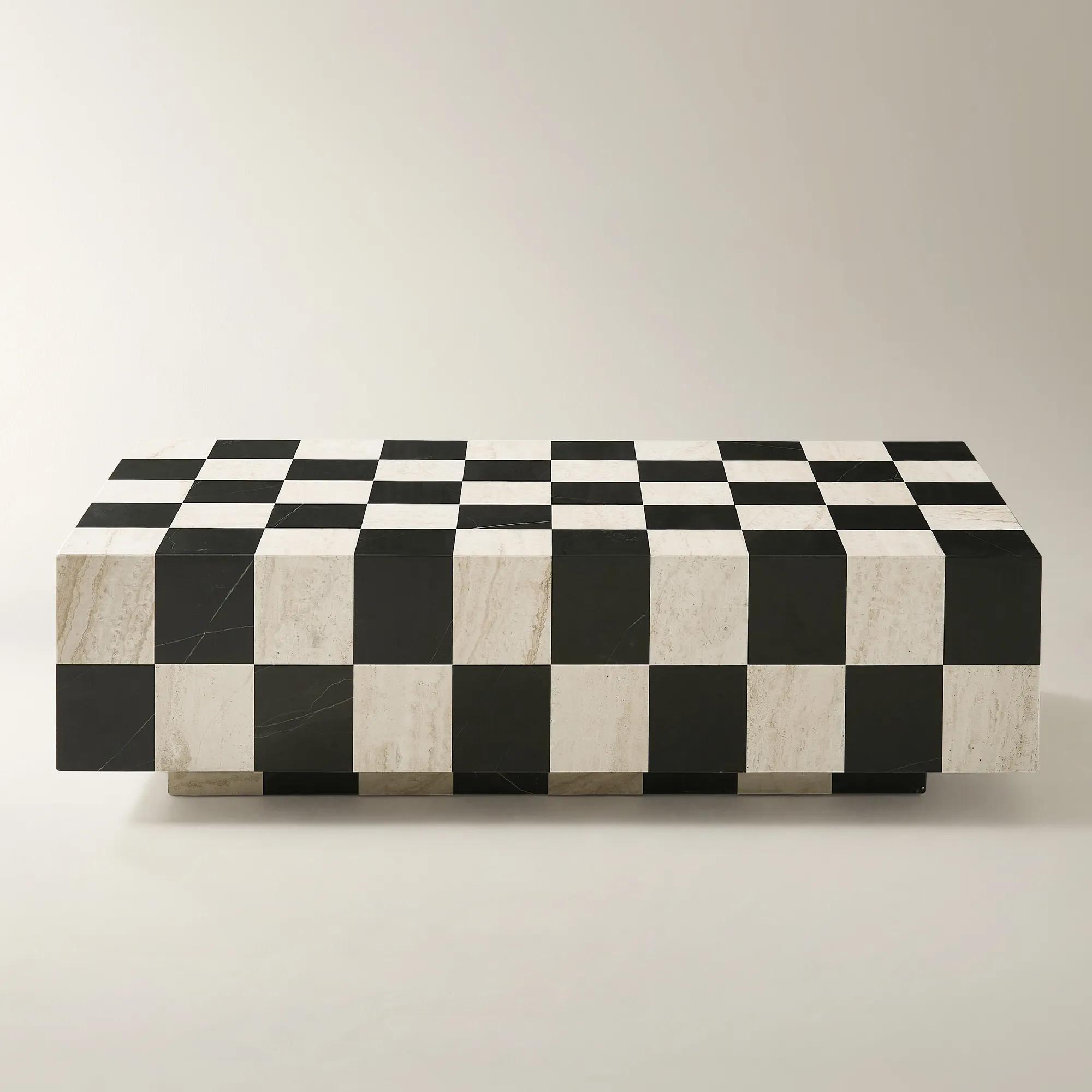
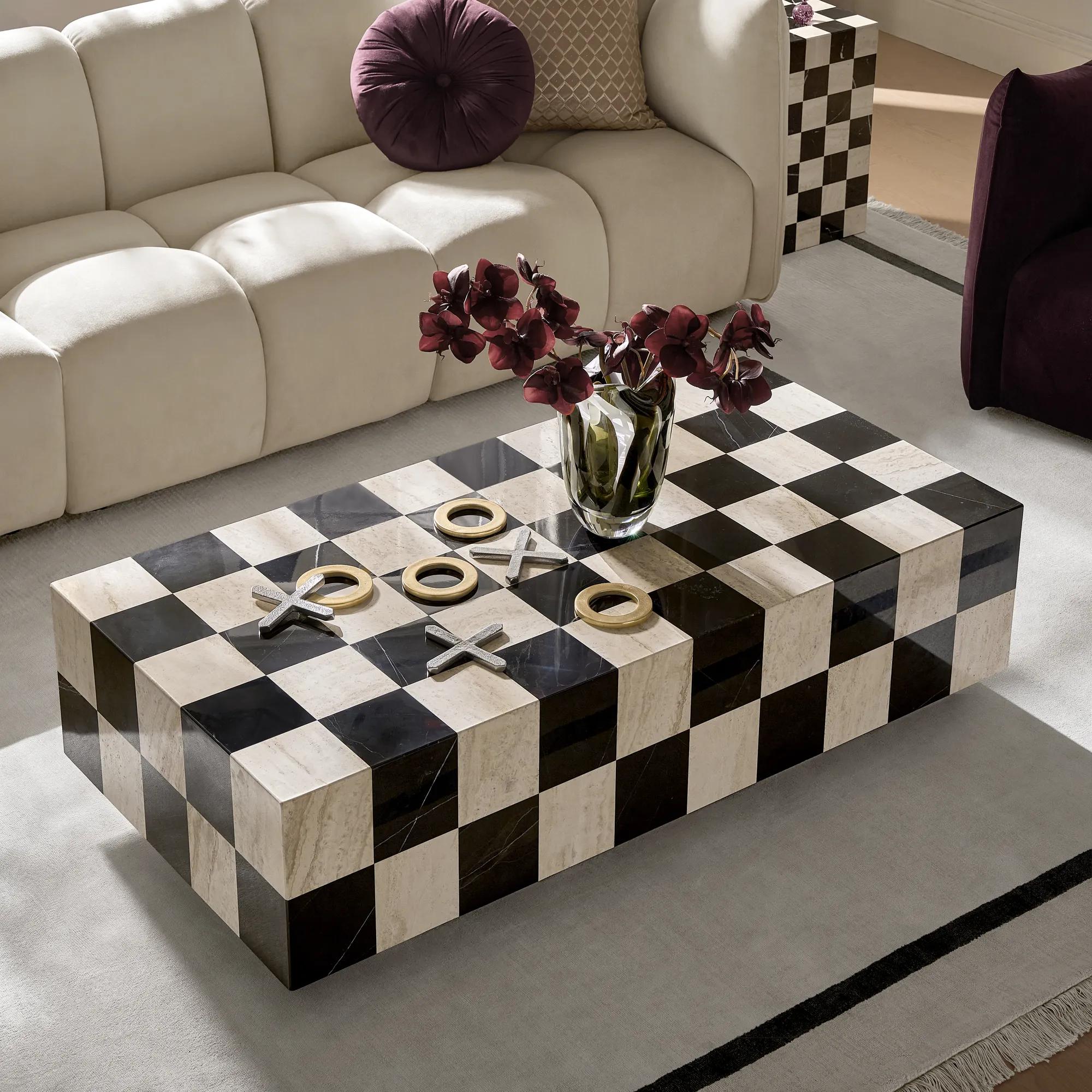
A curve. A zigzag. A stepped Deco line. An animal mark. A checkerboard.
If you can describe that visual idea in one sentence, the room already has a stronger chance of feeling cohesive.
Let the floor set the rhythm
A rug is often the easiest place to begin because it introduces pattern across a large surface without asking you to commit every wall to it.
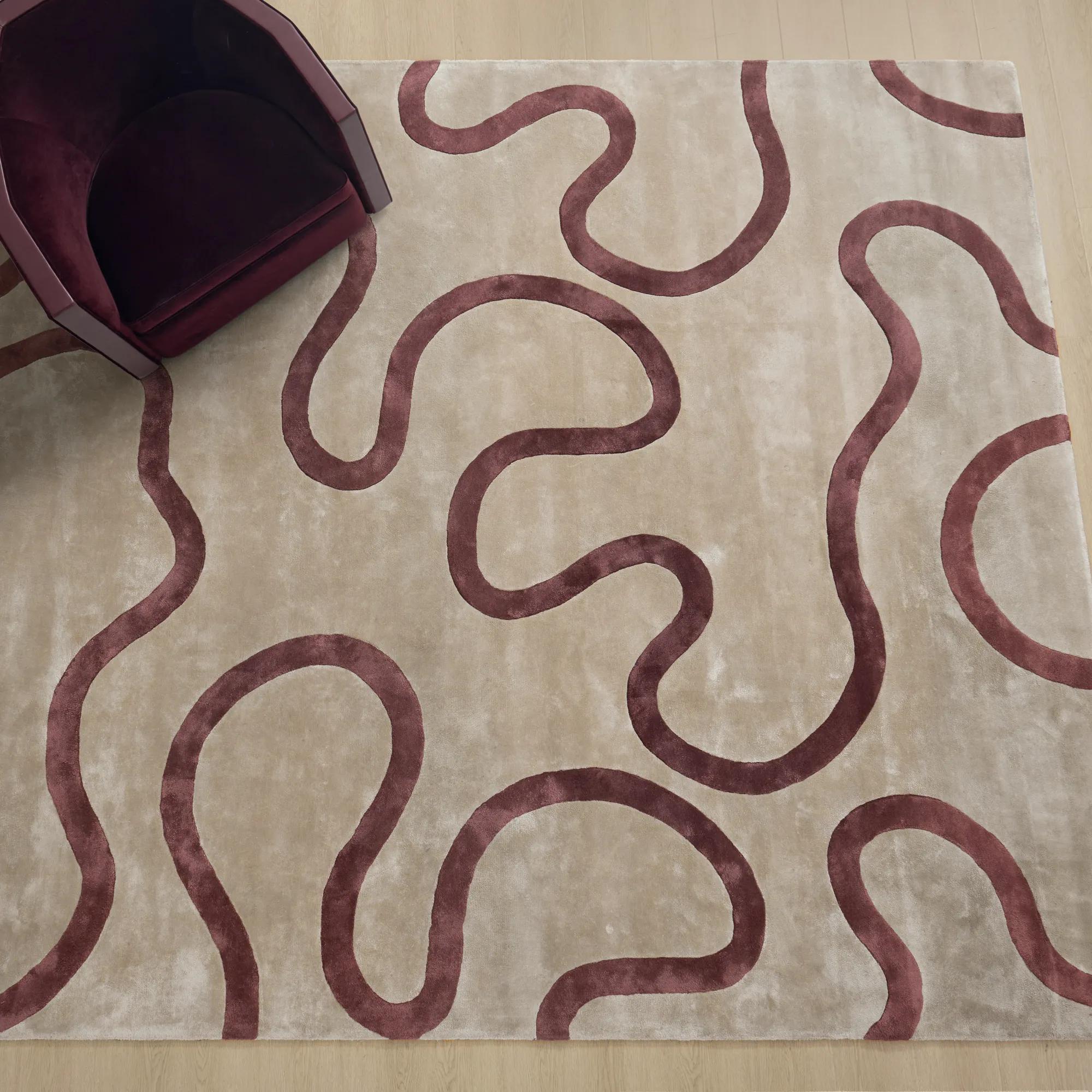
The Seraphine Fig/Taupe Rug uses looping forms in fig and taupe to create movement underfoot. The appeal is not only the color. It is the repeated curve—the shape that can give the rest of the room something to answer.
Once the rug is in place, resist shopping for another print immediately. Look at what the floor has already decided for you.
Pull out two or three colors. Notice the scale of the pattern. Decide whether the next motif should echo the curves or provide a sharper counterpoint.
A large looping pattern on the floor might lead to a smaller chevron at the window. Fig might appear once more in a lamp or pillow. Taupe can become the room’s quieter bridge.

If Seraphine is not the right palette for the room, begin with the broader patterned rug collection and choose the motif you would be happy to repeat somewhere else.
Take the pattern up the wall
Curtains are where a pattern story becomes architectural.
Closed panels occupy enough visual space to behave almost like a wall treatment, which means they can reinforce the room—or overwhelm it.
The Minka Pearl Curtain introduces a textured chevron rather than another looping motif. That distinction matters. The geometry changes, but the repetition of line keeps the room moving.
This is where color should become more disciplined.
If the rug is fig and taupe, the curtain does not need a new story in cobalt, emerald, coral, and gold. Pearl, natural, charcoal, or a related muted tone allows the pattern itself to do the work.
The less literally two patterns match, the more important their shared palette becomes.
Browse the patterned window collection with the rug nearby—or at least with a clear photograph of it. A curtain that looks beautiful alone still needs to belong to the room when it is fully closed.
Repeat, don’t photocopy
There is something undeniably dramatic about taking one print and using it everywhere.
But exact repetition is only one route.
A more flexible room repeats characteristics.
The curve in the rug becomes a scallop somewhere else. The chevron at the window becomes a smaller zigzag. A geometric border in the artwork relates to the same angular language without matching either textile.
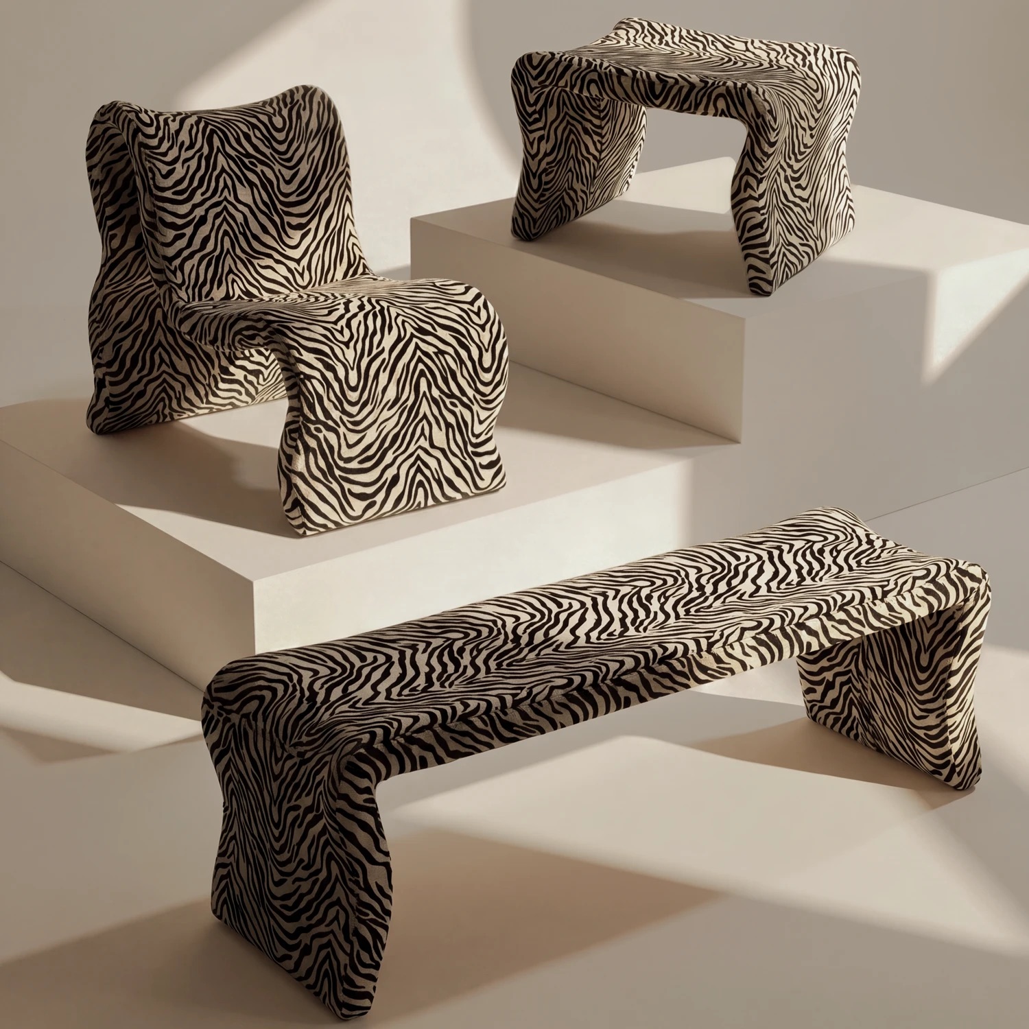
Even an animal motif can participate if the palette and scale are controlled.
The Namir Leopard Pillow in Dusty Blue is a good example of a pattern behaving like punctuation rather than wallpaper. The leopard motif has a strong identity, but the dusty blue velvet can connect it to a broader blue or Deco palette.
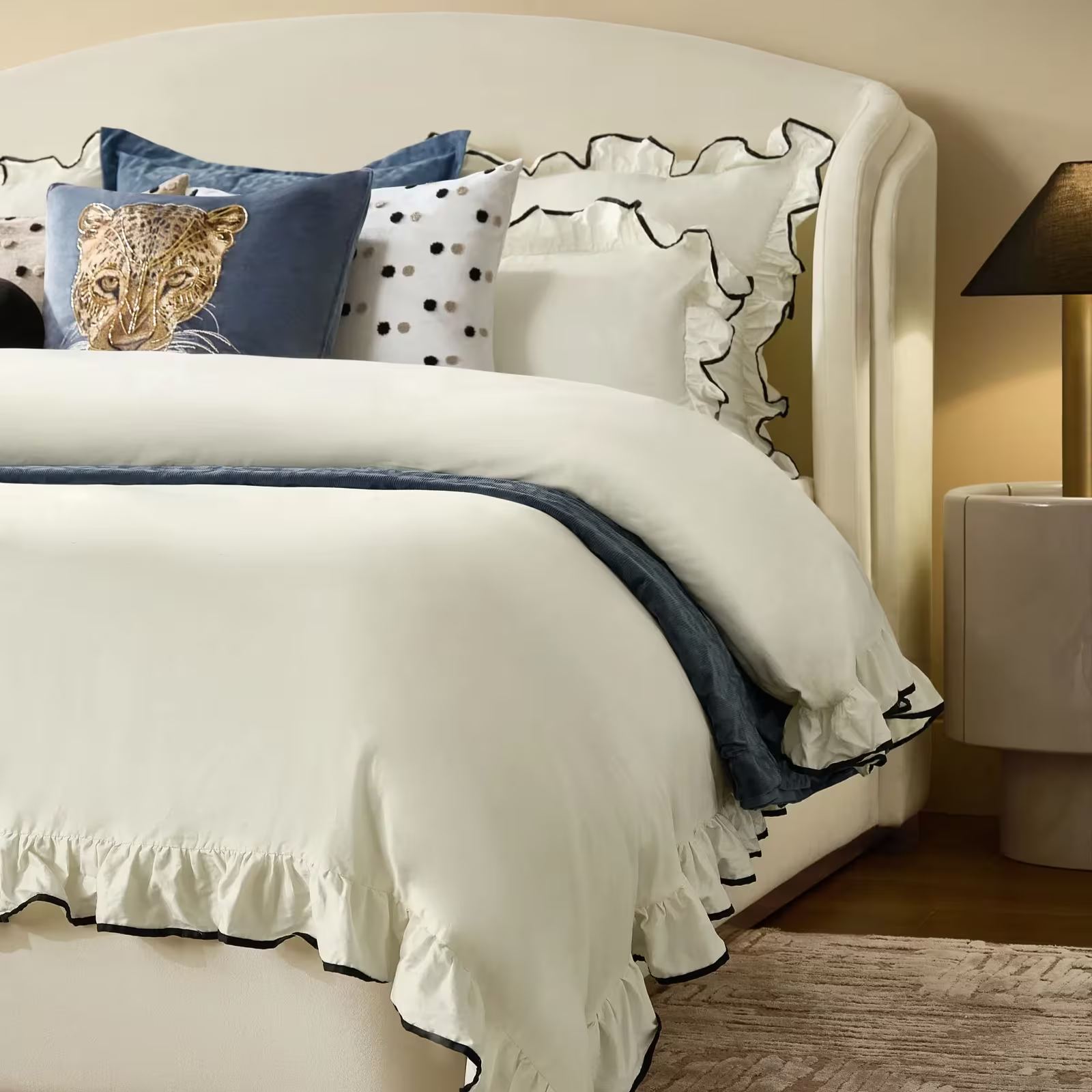
Use one piece like that—not five different animal prints arranged around the sofa.
A pattern-drenched room is not a competition for who can introduce the most motifs. It is an exercise in making each motif strengthen the ones already there.
The room needs silence somewhere
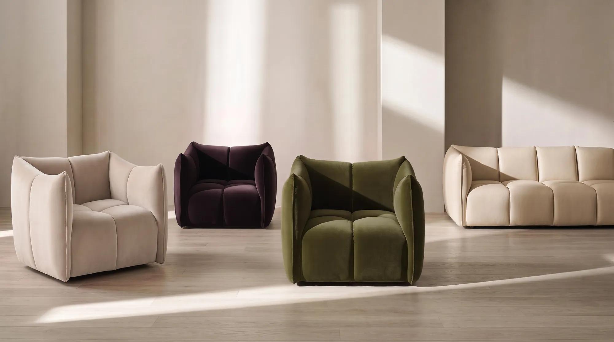
Perhaps the most important piece in a pattern-drenched room is the one with no pattern at all.
This is where a solid sofa earns its place.
The Reina Oatmeal Velvet Sectional has architectural channel tufting and a sculptural silhouette, but its upholstery remains a single quiet color.
Between a patterned floor and a patterned window, that restraint is useful. The sofa still has shape and texture; it simply declines to introduce another print.
The same principle can apply to a wall, pair of chairs, coffee table, or bed.
Decide which large surface gets to be quiet.
If the floor, window, pillows, artwork, upholstery, and every small object are all patterned at the same intensity, the eye loses hierarchy.
Pattern needs negative space for the same reason jewelry does: the detail becomes stronger when there is skin around it.
Break the pattern with shine
Too much textile can make an otherwise glamorous room feel visually soft.
Add one hard finish.
Chrome gives a graphic room a cool edge. Soft gold warms fig, burgundy, taupe, and dusty blue. Smoked glass can separate two patterned surfaces without adding another motif. A glossy ceramic lamp can introduce color without introducing print.
These materials are particularly useful because they catch light differently from fabric.
A glass table over a patterned rug interrupts without hiding it. A metallic lamp beside a patterned curtain creates a clean vertical line. A polished frame can give a complicated artwork a clear boundary.
Use shine as punctuation.
One reflective pause can do more than another patterned accessory.
Two rooms, two levels of commitment
Pattern drenching does not have to mean choosing between barely there and completely covered.
These two rooms use the same principles at different intensities.
| Approach | Start here | Repeat it through | Keep this quiet |
|---|---|---|---|
| Fig & Taupe Deco | A looping fig-and-taupe rug | Smaller geometric window texture, one fig accent, and a related curved or stepped motif | Oatmeal or turtledove upholstery |
| Dusty Blue Graphic | A blue or neutral geometric foundation | Chevron or linear curtains, one embroidered motif, and chrome or silver-toned accents | Cloud, ivory, or soft-grey seating |
Fig and taupe: pattern with warmth
Begin with the floor. Keep the sofa pale. Take a smaller geometry to the window, then bring fig back once—perhaps in a lamp, velvet pillow, or small piece of art.
Finish with soft gold or smoked glass.
The room feels rich because the colors repeat, not because every surface is saturated.
Dusty blue: pattern with a cooler edge
Start with dusty blue, ink, charcoal, and cloud.
Introduce one strong geometric foundation, then let the next pattern become smaller and more linear. Keep the main sofa solid and bring a playful motif into only one cushion.
Chrome or clear glass sharpens the palette and keeps the textiles from becoming overly soft.
Both rooms are bold. Neither needs every available surface to participate.
Can a small room handle pattern drenching?
Yes—and sometimes a smaller room makes the idea easier to understand.
A compact sitting room, bedroom, office, or powder room already has a clear visual boundary. Repetition can make that enclosure feel intentional instead of fragmented.
The rules simply become more important.
Use fewer colors. Choose one dominant pattern. Leave enough plain surface around smaller accessories. Avoid introducing a new motif every time you need to fill an empty corner.
If walls covered in print feel like too much commitment, begin with three surfaces:
Rug. Curtain. Pillow.
That is enough repetition for the eye to understand the idea.
A few questions about pattern drenching
Is pattern drenching the same as pattern mixing?
No. Pattern mixing combines different prints that relate through color, scale, or style. Pattern drenching is more immersive: one print or a recognizable motif repeats across enough surfaces that it begins to define the room.
Do the patterns have to match exactly?
Not necessarily. Exact matching produces the most enveloping version. For a more flexible interpretation, repeat geometry, palette, or visual rhythm at different scales. The connection should be noticeable without requiring every textile to come from the same pattern.
How many colors should a pattern-drenched room use?
Start with two or three main colors plus a neutral. A limited palette lets you vary the pattern without losing cohesion. Fig and taupe, dusty blue and ink, or black and ivory all give multiple patterns a common foundation.
What should stay solid?
Usually one substantial surface. A sofa, bed, pair of chairs, or section of wall in a solid color gives the eye somewhere to pause and makes the surrounding patterns look more intentional.
The confidence is in the repetition
Pattern drenching is bold, but it is not random.
The best rooms repeat something specific: a curve, a chevron, a color, a rhythm. Everything else exists to make that repetition easier to see.
Explore Z Gallerie’s patterned rugs , patterned curtains , and pillows with that idea in mind.
Begin with the motif that deserves the room. Give it enough repetition to become unmistakable—and enough quiet around it to become beautiful.