An unexpected autumn palette without a full makeover.

Blue has a reputation problem every fall.
September arrives, the light gets softer, and suddenly everyone starts reaching for rust, brown, burgundy, and whatever shade can reasonably be described as pumpkin. The blue sofa that looked perfect all summer is expected to wait politely until spring.
It does not have to.
The trick with blue fall decor is not making blue behave like an autumn color. It is changing what sits beside it. Put dusty blue next to dark chocolate instead of bright white. Add cream with texture. Bring in wood with a visible grain, a little aged brass, and enough warm light to soften the edges after dark.
Nothing about the blue itself has to change.
That is particularly useful if the biggest blue piece in the room happens to be the sofa.
A fall refresh should not require repainting the walls or replacing furniture you already love. The five moves below are smaller, faster, and more useful: they warm the room around the blue so it feels less coastal, less summery, and much more at home when the temperature drops.
The fall-blue formula
Blue starts to feel autumnal when the colors and materials around it get deeper, softer, and warmer. You do not need all of these in one room. Two or three are enough to change the temperature.
| Start With | Add for Fall | What It Does |
|---|---|---|
| Dusty or cornflower blue | Chocolate brown + ivory | Grounds the cool blue without making it dark |
| Sea glass blue | Tortoise brown + antique brass | Adds warmth while keeping the palette light |
| Navy or sapphire | Natural wood + cream | Softens a darker blue and keeps it from feeling formal |
| Blue velvet upholstery | Faux fur + textured pillows | Makes the room feel physically softer |
| Any blue room | Layered lamps + warm metallic finishes | Changes how the color reads after sunset |
The important part is contrast. Cool color, warm material. Smooth velvet, thick faux fur. Pale blue, dark brown. A polished metallic detail against natural wood.
1. Pair blue with chocolate brown
This is the fastest move in the room.
Blue and brown work because each gives the other something it does not already have. Blue brings coolness and clarity. Brown gives it weight.
That is why a blue and brown living room can feel both polished and comfortable instead of overtly seasonal. You are not adding orange leaves to a mantel. You are changing the color relationship underneath the room.
If the sofa is blue, start with one substantial brown element.
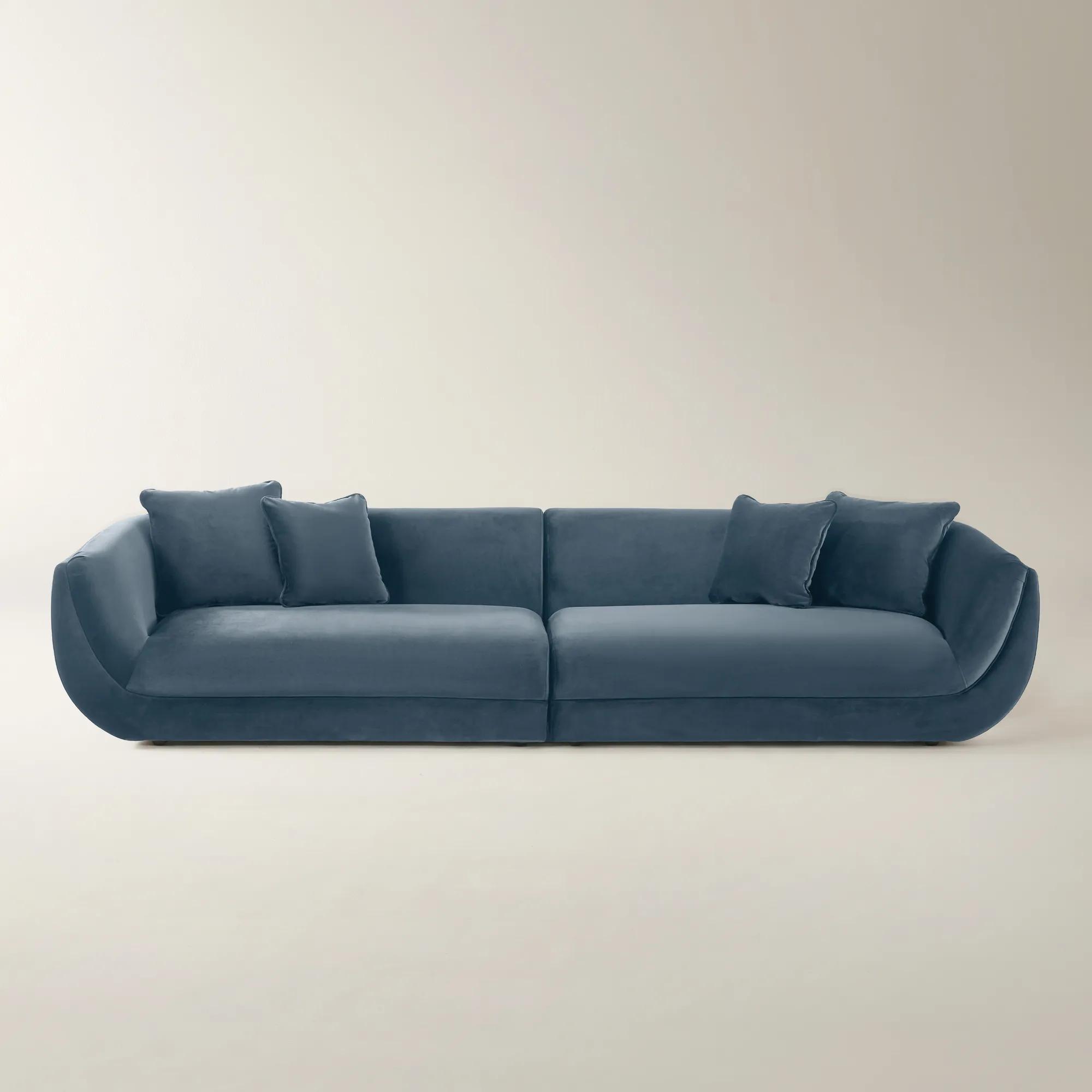
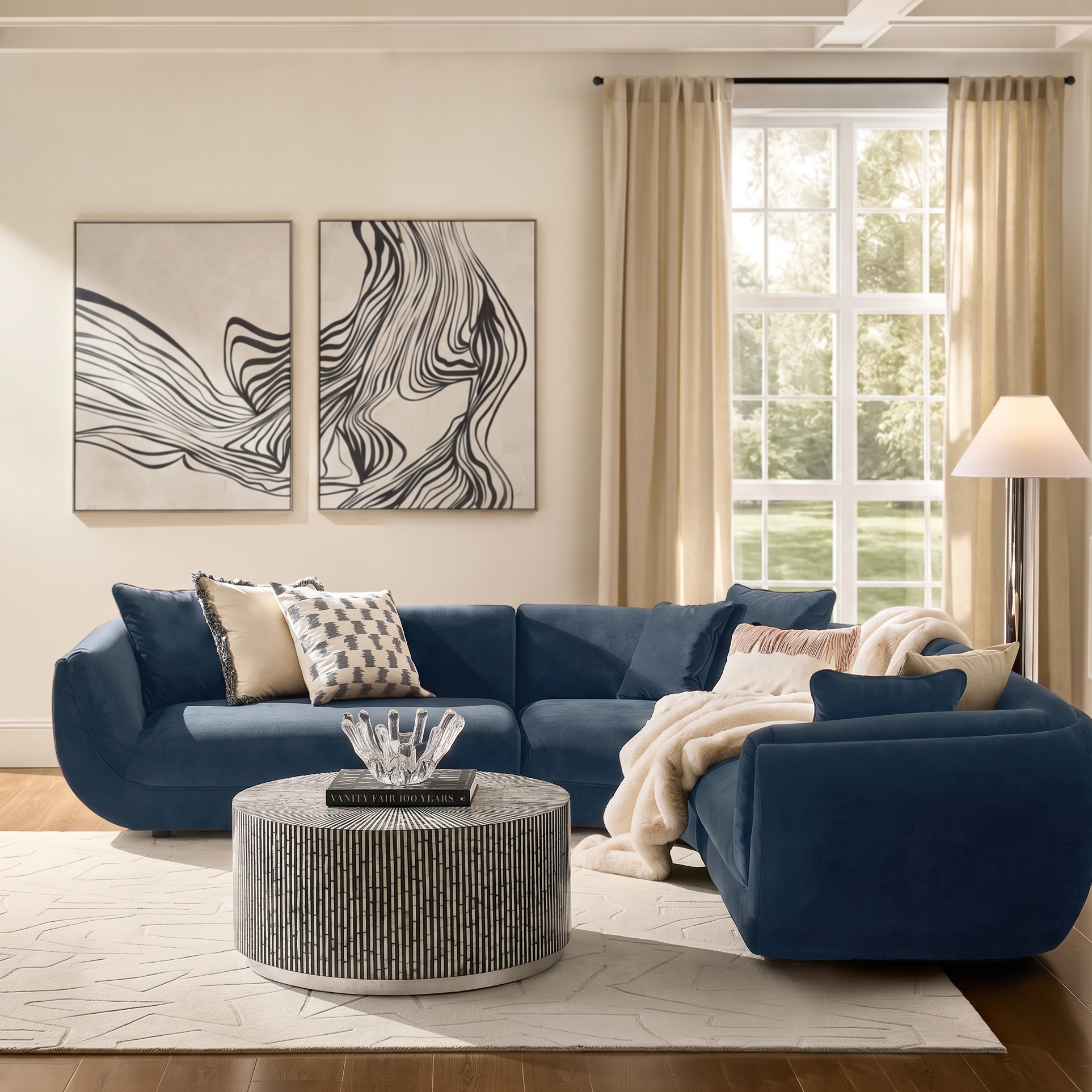
The Curvia Dusty Blue Velvet Grand Sectional is an easy example because the color is soft rather than icy and the velvet already gives it visual depth. Draping the Chaska Dark Chocolate Brown Faux Fur Throw over one corner changes the read immediately.
Do not spread the brown evenly across the whole room.
One dark throw. One wooden table. Maybe one tortoise-glass lamp.
That is enough.
The mistake is turning an interesting color pairing into a brown-and-blue theme. The room should feel collected, not color-coded.
The styling move: let the brown be darker than the blue. A mid-tone blue beside a similarly mid-tone tan can flatten out. Deep chocolate gives the blue an edge to work against.
If you already own a brown sofa, reverse the formula. Add dusty blue or sapphire pillows instead of changing the upholstery. The Namir Leopard Dusty Blue/Gold Velvet Pillow introduces both the cool color and the warm metallic connection in a single piece.

One color leads. The other grounds it.
2. Soften blue with cream and texture

There is a reason blue and crisp white reads so easily as summer.
The contrast is clean.
For fall, make it less clean.
Swap stark white for cream, ivory, oatmeal, or beige, then make sure at least one of those neutrals has a texture you can see from across the room.
Faux fur does more for a cozy blue living room than another seasonal color ever will because warmth is not only visual. A room starts to feel different when the surfaces look softer.
Try an ivory faux-fur throw over a blue chair, a thick cream pillow behind a smaller patterned one, or an oatmeal rug under blue upholstery. The current Z Gallerie throw collection moves through faux fur, faux Mongolian texture, woven pieces, and deeper fall shades, which makes this an easy layer to change without touching the larger furniture.
The useful formula is simple:
- Blue velvet + cream faux fur: polished but softer.
- Cornflower blue + oatmeal: lighter and more relaxed.
- Navy + ivory: high contrast without the crispness of pure white.
- Dusty blue + beige: tonal enough to feel calm, warm enough for fall.
Texture also solves another problem with seasonal decorating: it lasts longer than a motif.
A cream faux-fur throw still belongs in the room in February. A pillow covered in embroidered pumpkins has a much shorter career.
Shop throws and decorative pillows for the layers that change the room without changing the furniture.
3. Bring in wood with real warmth
If a blue room still feels cold after adding textiles, look at the hard surfaces.
A glass coffee table, silver lamp, pale rug, and blue sofa can all be beautiful individually and still add up to a room with no visual warmth.
This is where wood earns its place.
Not because every fall room needs to become rustic. It does not. The wood simply gives blue something organic to sit beside.
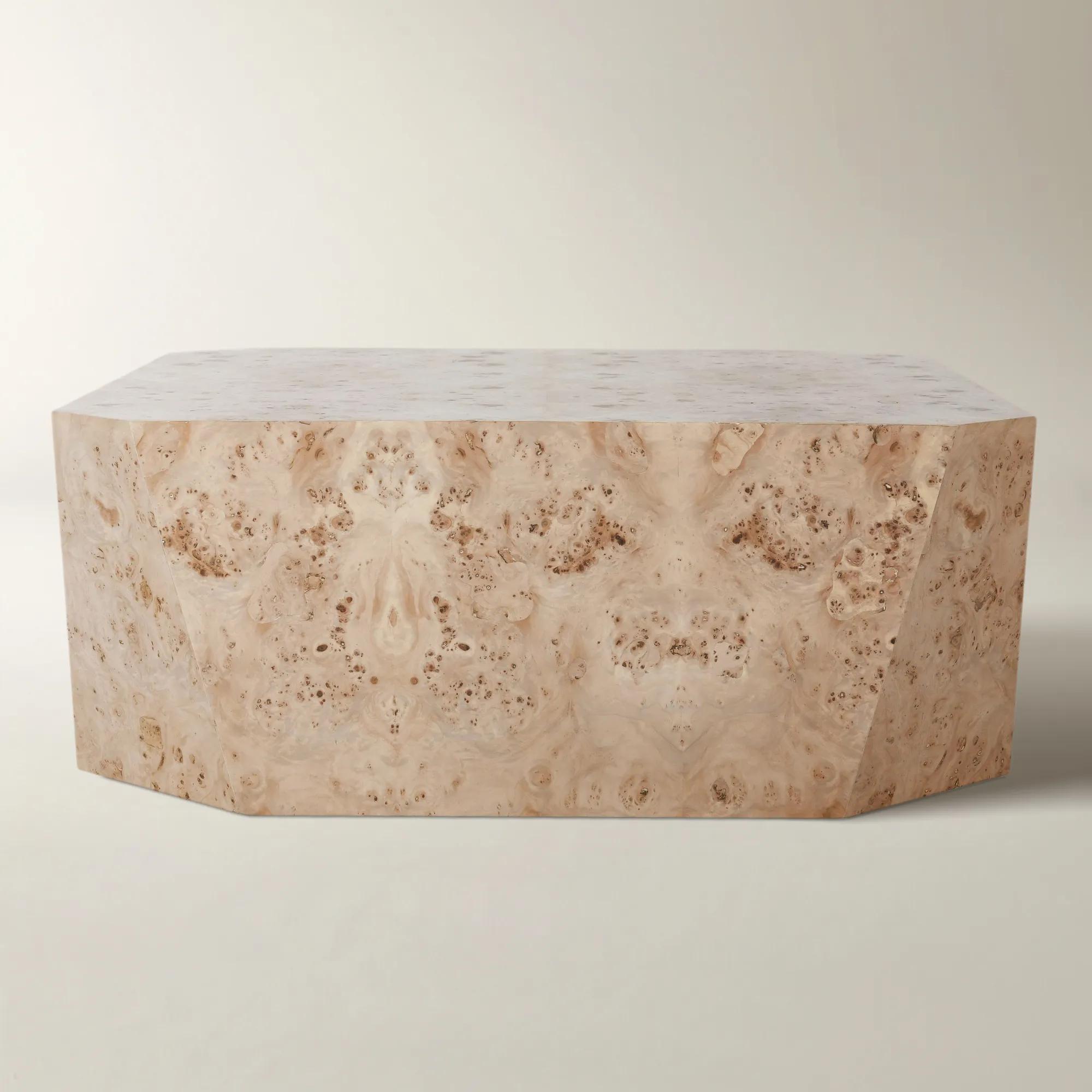
Burl is particularly good at this because its grain is active enough to feel decorative without requiring another color. The Avena Square Natural Burl Wood Coffee Table is a strong example: the natural wood surface becomes a warm center point against cooler upholstery while the simple square silhouette keeps it from feeling traditional.

Browse the current coffee table collection and look less at the label marked "brown" and more at the material itself. Mango wood, oak, burl, travertine-and-wood combinations, and warmer natural finishes all work.
The rule: if the upholstery is the color story, let the wood be the material story.
You do not need a matching wood media console, side table, and cabinet.
In fact, that can take the room in the wrong direction.
One warm wood surface in the center of the seating arrangement is often more useful than three matching brown pieces placed around the perimeter.
Then echo that warmth once somewhere smaller: a picture frame, decorative bowl, or the wooden spine of a book.
That is how the room starts to feel connected without becoming a furniture set.
4. Use brass as the temperature shift
Metal changes the temperature of a room faster than people give it credit for.
Chrome and silver sharpen blue.
Brass warms it.
Neither is better. They simply tell different stories.
For fall, a small amount of aged or brushed brass can make blue feel deeper without introducing another large block of color. The Sibyl Aged Brass Table Lamp , for example, gives you a warm metal surface and ambient light in one move.
The finish does not need to spread across every handle and table leg in the room.
One lamp.
One frame.
A metallic detail on a pillow.
Enough to catch the light.
This is also why dusty blue and gold make such an easy pairing. The blue stays calm; the gold stops it from becoming quiet.
The Namir Dusty Blue/Gold Pillow does that at accessory scale: blue velvet as the ground, gold detail as the interruption.
5. Layer the light
A blue room at noon and the same blue room at eight o'clock are not really the same room.
That is the final fall move.
Stop asking color to do all the work and change the light around it.
A ceiling fixture gives you illumination. It does not necessarily give you atmosphere. Add a table lamp near the sofa, a floor lamp in the darker corner, and a lower source on a console or side table so the room is not relying on one pool of light from overhead.
The Blair Sea Glass Blue Table Lamp is especially useful in this palette because it shows exactly how to warm blue without abandoning it: soft blue mouth-blown glass, antique brass detailing, and an ivory linen shade all in the same object.
That combination is the entire article in miniature.
Cool color.
Warm metal.
Soft neutral.
Then let the rest of the room get darker.
Do not light every corner equally. A cozy room needs variation.
Let the reading chair be brighter.
Let the console glow.
Let the far edge of the room recede a little.
Blue becomes more interesting when it is allowed to move between light and shadow instead of being evenly illuminated from wall to wall.

Shop table lamps and floor lamps to build light at more than one height.
What about cornflower blue for fall?
Cornflower blue is exactly the kind of color that makes this idea interesting because it refuses to look traditionally autumnal.
Do not try to make it.
Instead, give it a fall setting.
Put cornflower blue decor beside chocolate, tobacco, walnut, cream, antique brass, or soft gold. Avoid surrounding it entirely with bright white and cool silver if the goal is warmth; those finishes will pull the blue back toward spring.
If the cornflower blue is already a major piece, such as a sofa or chair, let the seasonal changes happen at accessory scale. A dark brown throw, an ivory pillow, and one warm lamp can be enough.
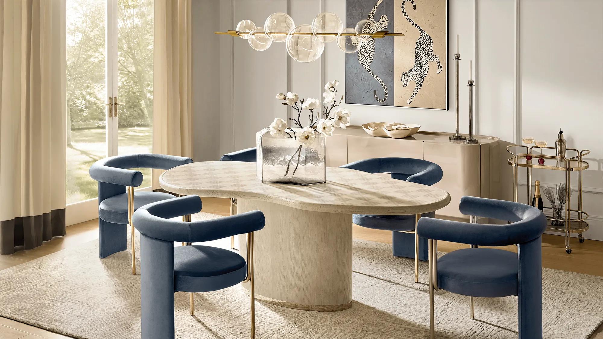
This is the broader point of the whole palette.
Blue fall decor FAQs
Is blue a good color for fall decor?
Yes. Blue becomes especially effective for fall when it is paired with warmer colors and materials such as chocolate brown, cream, natural wood, brass, velvet, and faux fur. Deeper navies feel naturally cocooning, while dusty and cornflower blues become warmer through contrast.
What colors go with blue for fall?
Chocolate brown, caramel, cream, oatmeal, burgundy, fig, warm wood tones, and aged brass all work well. You do not need to use all of them. Two warm counterpoints are usually enough to shift the room.
How do you make a blue living room feel cozy?
Start with texture and lighting. Add a soft throw, fuller pillows, a warm wood surface, and lamps at several heights. A room can feel dramatically warmer without changing the wall color or sofa.
Does blue and brown work in a living room?
Yes. Blue and brown balance one another particularly well because blue brings coolness while brown adds visual weight and warmth. For the strongest contrast, pair a mid-tone or dusty blue with a deeper chocolate brown rather than a brown of the exact same value.
What goes with cornflower blue decor?
For a warmer room, pair cornflower blue with dark brown, natural wood, ivory, muted beige, antique brass, or soft gold. For a lighter look, use cream rather than stark white so the palette stays soft.
Do I need to replace my blue sofa for fall?
No. The larger blue piece can stay exactly where it is. Change the layers around it instead: throws, pillows, wood, lighting, and one or two warmer decorative finishes. That is enough to make the room feel seasonal without making it temporary.
Fall without the color cliché
The best thing about decorating with blue in fall is that the room does not announce the season.
It simply feels warmer.
The chocolate throw gets deeper. The cream gets softer. The wood becomes more visible. Brass catches the lamp light. Blue, which looked clean and airy in July, suddenly feels richer because everything around it has changed.
That is a more useful kind of seasonal decorating because almost all of it can stay.
So keep the blue sofa.
Keep the blue art.
Keep the cornflower chair you already love.
Warm up the company it keeps.
Explore the full living room collection , or work with Z Gallerie's Design Services to build a palette around the pieces already in your room.